
NT-ST-701 - Regulator AMX - Free user manual and instructions
Find the device manual for free NT-ST-701 AMX in PDF.


| Product Type | Touch Panel Controller (Web-Based Configuration) |
| Model | NT-ST-701 |
| Brand | AMX |
| Display | Touch screen (estimated 7-inch) |
| Dimensions (approx.) | 200 mm x 130 mm x 30 mm |
| Weight (approx.) | 0.5 kg |
| Power Supply | PoE (Power over Ethernet) or external 12V DC |
| Network Interface | Ethernet (10/100 Mbps) |
| Configuration Interface | Web-based GUI (HTTP) |
| Main Functions | Device naming, network setup, password management, touch calibration, factory reset, reboot |
| Panel Builder | Create custom touch panel layouts with buttons, sliders, images, scripts |
| Logging | TCP/IP command log display |
| LLDP Support | Link Layer Discovery Protocol for network identification |
| Mobile Access | Access panels via SVSI Conductor Mobile app (iOS/Android) |
| User Management | Multiple user accounts with panel assignment |
| Brightness Control | Adjustable backlight with sleep mode and dimness |
| Discovery | Multicast packet transmission for network discovery |
| IP Modes | Auto IP, DHCP, Static |
| Firmware Update | Via web interface (internal firmware and web version) |
| Security | Password protection, project security code (PIN) |
| Compatibility | SVSI networked AV systems and third-party equipment |
| Maintenance | No user-serviceable parts; factory restore for reset |
Frequently Asked Questions - NT-ST-701 AMX
User questions about NT-ST-701 AMX
0 question about this device. Answer the ones you know or ask your own.
Ask a new question about this device
Download the instructions for your Regulator in PDF format for free! Find your manual NT-ST-701 - AMX and take your electronic device back in hand. On this page are published all the documents necessary for the use of your device. NT-ST-701 by AMX.
USER MANUAL NT-ST-701 AMX
The N-Touch web interface allows you to configure basic settings (e.g., unit name, network settings, screen brightness, passwords, etc.), view logs and LLDP information, set up mobile access, as well as create custom touch-panel layouts for display on the N-Touch device's screen.
This guide takes you through all of the N-Touch configuration options, screen-by-screen. For ease of navigation, it is organized to directly reflect the graphical user interface (GUI).
N-Touch Interface Overview
The N-Touch interface is divided into five main pages:
- Settings (described in detail beginning on page 7)
- Logs (described on page 9)
• LLDP (described on page 9) - Users (described on page 10)
• Panel Builder (described in detail beginning on page 11)
You can access the main pages by clicking on the links available at the top of any screen (see Figure 1).
NOTE: The Panel Builder page opens in a new webpage, therefore whichever page you launch it from remains accessible on a separate tab of your browser.
Access the main pages using these links.
![ANG N-Touch Controller | 00:19:0B:81:01:33 Settings Logs LLDP Users Panel Builder Wall Panel Controller Setup Settings Device Name: 00:19:0B:81:01:33 Panel Project: [Choose...] Home page: http://127.0.0.1/panels/?project+ Brightness Dimress Sleep Delay Sec (0 for never) 30 Network Setup IP Mode: AUTO IP AUTO IP IP address 169.254.245.18 169.254.245.18 Netmask 255.255.0.0 255.255.0.0 Gateway address 0.0.0.0 0.0.0.0 IP Address 2 Enable IP address 0.0.0.0 0.0.0.0](/content/2026/05/790256/images/3e222787ab62e88d354fc464e9fdf5047f0dc269c84ddbc62fa54c14cc2c4fae.jpg)
FIG. 1 Accessing the Main Pages
Settings Page
The first screen to display after you log in is the Settings page (shown in Figure 2). Here you can perform important unit setup operations such as:
- Changing the device's name and home screen.
- Performing an operating system reboot.
- Configuring network settings.
- Changing your password.
NOTE: If you need instructions for logging in to the unit, refer to the N-Touch device's Quick Start Guide (provided in shipment).
![N-Touch Controller | 00:19:0B:81:01:33 Settings Logs LLDP Users Panel Builder Wall Panel Controller Setup Settings Device Name: 00:19:0B:81:01:33 Panel Project: [Choose...] Home page: http://127.0.0.1/panels/?project: Brightness Dimness Sleep Delay Sec (0 for never) 30 Discovery Packet Transmit ✓ Enable Discovery Interval(sec) 10 Cancel Save Network Setup IP Mode: AUTO IP AUTO IP IP address 169.254.245.18 169.254.245.18 Netmask 255.255.0.0 255.255.0.0 Gateway address 0.0.0.0 0.0.0.0 IP Address 2 Enable IP address 0.0.0.0 0.0.0.0 Netmask 255.255.255.0 255.255.255.0 Manual DNS Enable DNS1 address 8.8.8.8 8.8.8.8 DNS2 address 8.8.4.4 8.8.4.4 DNS3 address 0.0.0.0 0.0.0.0 Save IP Settings Software Serial: NB307A00000151 MAC address 00:19:0B:81:01:33 Web version: 3/11/2016 Firmware Version: 3/14/2016 Calibrate Touch Factory Restore Reboot Change Password Change Password Old Password: New Password: Confirm Password: Change PN AMX | 256.461.7143 | svisupport@harman.com](/content/2026/05/790256/images/f93b58cec7b650cfa26404aaa1c403db18945a9f1277556483d5282efa8f617b.jpg)
FIG. 2 Settings Page
Refer to Table 1 for detailed descriptions of the options available on the Settings page.
TABLE 1 Settings Page Option Descriptions
| Option Description | |
| Settings | |
| Device Name | Change the name to something meaningful and more user-friendly so that it may be easily referenced. By default, the unit is named by its MAC address. |
| Panel Project | Once you have created panels in the Panel Editor, you can choose one from this list to be the panel's home page. See the section Panel Builder on page 11 for more information.NOTE: Active projects can also be set from within Panel Builder by selecting File > Save > Set project to Wall Controller. |
| Option | Description |
| Home page | Enter the URL for the screen you would like displayed as the home page on the N-Touch Wall Controller screen. The URL automatically populates when you select a saved panel from thePanel Projectdrop-down menu (see above). |
| Brightness | Adjust the backlight of the N-Touch Controller's active panel screen. (The screen dims automatically during sleep mode.) |
| Dimness | Adjust how dim the backlight will be when the N-Touch Controller panel screen goes into sleep mode. |
| Sleep Delay Sec | Enter time (in seconds) until the N-Touch Controller's panel screen goes into sleep mode when idle. Enter 0 for never. |
| Discovery Packet Transmit | Enable to send out multi-cast packets so the N-Touch Controller can be discovered. |
| Discovery Interval (sec) | Enter an interval (in seconds) to lapse in between transmission of the multi-cast packets. |
| Cancel/Save buttons | Cancel or save any changes made in theSettingssection of this page. When making changes to deviceSettings, no changes will occur until thisSavebutton has been clicked. One or more changes can be made at the same time.NOTE: This Cancel/Save choice does not apply to the other areas of the Settings page (Network Setup, Change Password, etc.). |
| Software | |
| Serial View the unit's serial number. | |
| Mac Address | View the MAC address of the unit's network interface. |
| Web Version | View the date code for the currently running version of the web interface. |
| Firmware Version | View the date code for the currently running version of the internal firmware. |
| Calibrate Touch | Click to begin an on-screen calibration test on the touch screen unit. Follow on-screen instructions to complete the test. |
| Factory Restore button | Click to restore the unit to its factory default settings. |
| Reboot | Click to reboot the device (does not affect current configuration). |
| Network Setup | |
| IP Mode | Select the IP mode from the drop-down menu. The options areAUTO IP, DHCP, andSTATIC. For most applications, aSTATICIP address is recommended. |
| IP Address (primary) | View the current IP address. When inSTATICmode, you can enter a new IP address here. All IP addresses must be unique. Two or more devices set to the same IP address will cause problems with the SVSI system and controls. This includes third-party IP devices as well. |
| Netmask | View the current subnet mask. When inSTATICmode, a new subnet mask can be entered here. |
| Gateway Address | View the current gateway address. When inSTATICmode, you can enter a new gateway address here. A gateway address is required even if a gateway is not present in the project. If this is the case, enter an IP address such as 169.254.1.1 (or a value that works with the desired IP scheme). |
| IP Address 2 | Check this box to enable a second IP address for the unit. |
| IP Address (secondary) | View the unit's second IP address. When inSTATICmode, you can enter a new IP address here. All IP addresses must be unique. Two or more devices set to the same IP address will cause problems with the SVSI system and controls. This includes third-party IP devices as well. |
| Netmask (secondary) | View the current subnet mask (forIP Address 2). When inSTATICmode, you can enter a new subnet mask here. |
| Manual DNS | Enable if you would like to manually assign your DNS (domain name system) server address(es). |
| DNS address (1-3) | Enter up to three DNS server addresses. |
| Option Description | |
| Save IP Settings button | Save the IP settings. This causes the device to change the IP address and apply all other changes made. Now change your web browser to the new IP address. Log in and confirm the new IP address. If the IP address is not confirmed, it will revert back to the previous IP address the next time the device is rebooted. |
| NOTE: IP settings should be configured by a networking specialist and should be set so that the N-Touch Controller shares the same network as the controlled units. | |
| Change Password | |
| Click the Change Password link to change the password from its default setting (of password) and increase system security. Once you have entered a unique password and confirmed it, click the Change PW button to accept the settings. | |
Logs Page
The Logs page displays a command log which lists all of the TCP/IP messages that the unit receives. It also displays the host PC's IP address and gives you options to Refresh and Reset Logs.
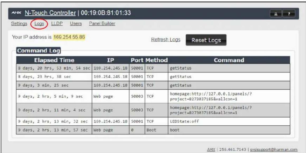
FIG. 3 Logs Page
LLDP Page
The LLDP page displays information from the LLDP (link layer discover protocol) packet which identifies the port number and switch that the device is connected to.
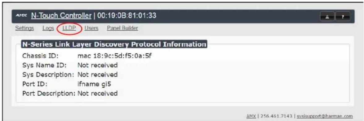
FIG. 4 LLDP Page
Users Page
The Users page allows you to set up mobile panel access. Follow these instructions to access panels from your mobile device.
Viewing Panels on the SVSI Mobile App
Once you have a panel created using Panel Builder, log in to the N-Touch using your web browser.
NOTE: Panel Builder functionality is described in more detail beginning on page 11.
- Click the Users link at the top of the page. The screen in Figure 5 is displayed.
![N-Touch Controller | 00:19:0B:81:01:33 Settings Logs LLDP Users Panel Builder Username admin PW: Add User Users Username Full Admin Auto Redirect Panel Project admin [...Choose] Save Delete User user [...Choose] Save Delete User bluetooth [...Choose] Save Delete User paneluser [...Choose] Save Delete User tester [...Choose] Save Delete User AMX | 256.461.7143 | svisupport@harman.com](/content/2026/05/790256/images/d52dfe08860e4c95b3bbc57b83f9ec942d3041132c76ef49a167d8d117152765.jpg)
FIG. 5 Users Page
- Use this page to assign the Panel Project you created to your Username (if needed, multiple users/login can be added using the Add User button).
- Enable the Auto Redirect checkbox.
- Download SVSI's free Conductor Mobile app to your iPhone or Android.
- Log in to Conductor Mobile using the same Username set in Step 2.
- The Panel Project assigned to your Username is displayed, allowing you to control the N-Touch from your phone.
NOTE: In order for this connection to be successful, your N-Touch must be on the WiFi network (on the same subnet).
Panel Builder
Panel Builder allows you to design attractive, intuitive, and easy-to-use touch panel layouts for controlling SVSI's Networked AV Systems and third-party equipment. Panel Builder provides an easy way to design a panel to control any room or facility with just a few simple steps. You can choose to use button and widget libraries that are part of Panel Builder, or import your own images to customize the panel to look exactly as you want.
This following sections explore the Panel Builder user interface, defining each option for easy reference. For more step-by-step project building instructions, refer to the tutorials provided in Panel Builder's Help menu (see Top Ribbon Option Descriptions section on page 13).
NOTE: Panel Builder is accessible through N-Touch (as discussed in this document), through N-Command (N8001/N8002/N8012 web-based controllers), and also through a stand-alone version that installs directly on your computer.
Beginning a Panel Builder Project
Follow these steps to begin a project in Panel Builder and explore the options provided in the Project Editor. 1. Launch Panel Builder. The Welcome screen appears.
![2. Click the New button. Welcome to the panel builder. Would you like to create a new, open, or import an existing project? Recent: [Choose...] New Open Import](/content/2026/05/790256/images/ccb190a60dccc5f613c4f8420110b6dc16b3b7c058e281538c0cc70115bbea34.jpg)
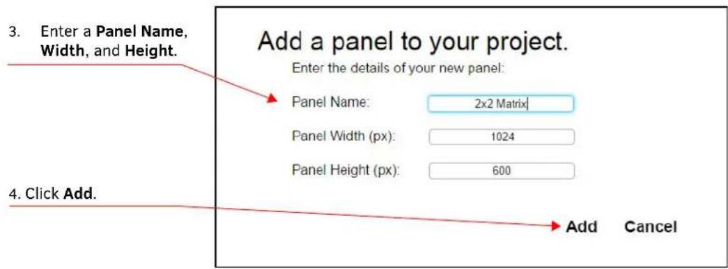
FIG. 6 Beginning a New Project in Panel Builder
- The system launches the Project Editor (as shown in Figure 7).
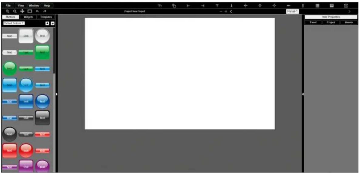
FIG. 7 Project Editor
NOTE: For step-by-step panel building instructions, refer to the Panel Builder Tutorial (available in the Panel Builder Help menu).
Once you arrive at the main Project Editor page, the following screen is displayed. See the sections referenced in the callouts for descriptions of each area of the Project Editor interface.
See the section Top Ribbon Option Descriptions on page 13 for descriptions of the interface's top ribbon of options and icons.
See the section Project Pane Option Descriptions on page 15 for descriptions of this section of the interface.
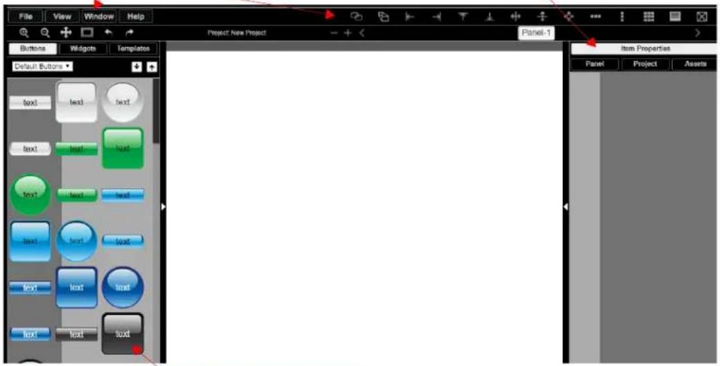
See the section Tools Pane Option Descriptions on page 18 for descriptions of this section of the interface.
FIG. 8 Project Editor Section References
Top Ribbon Option Descriptions
Refer to Table 2 for detailed descriptions of the options available in the top ribbon of the Project Editor initial page. Hold the Shift key when selecting multiple buttons/widgets (for aligning groups of objects, etc.).
TABLE 2 Top Ribbon Option Descriptions
| Option Description | |
| File | Open new and existing projects, save or delete projects, and perform import/export project functions. |
| View | Preview the current panel in a separate browser window or open the setup script in thePanel Buildereditor to view/edit. |
| Window | SelectTools Paneto display the left pane of the interface (which allows you to add buttons/sliders/etc. to your panel). SelectProject Paneto display the right pane of the interface (which allows you to further edit the panel you are building as well as the overall project, add scripts, etc.). |
| Help | SelectEditorto view a tutorial forPanel Builder,Modulesto view a list of module scripts,Scriptsto view a user guide forPanel Builderscripting, orCommandsto view a list of direct control API commands. |
| [KEZA] | Create a copy of the selected button or widget. This will also clone any scripts/conditionals that are loaded onto the button. |
| [DS7Y] | Use to make all buttons the same size. The first button you select (highlighted in green) will be the size that the other selected buttons (highlighted in blue) will conform to when this icon is clicked.Hold theShiftkey to select multiple objects. |
| [74DG] | Left-align the selected buttons or widgets to the main selected item. The first button you select (highlighted in green) stays in position as the other selected buttons (highlighted in blue) are aligned to it. Hold theShiftkey to select multiple objects. |
 | Right-align the selected buttons or widgets to the main selected item. The first button you select (highlighted in green) stays in position as the other selected buttons (highlighted in blue) are aligned to it. Hold theShiftkey to select multiple objects. |
 | Top-align the selected buttons or widgets to the main selected item. The first button you select (highlighted in green) stays in position as the other selected buttons (highlighted in blue) are aligned to it. Hold theShiftkey to select multiple objects. |
| [S45W] | Bottom-align the selected buttons or widgets to the main selected item. The first button you select (highlighted in green) stays in position as the other selected buttons (highlighted in blue) are aligned to it. Hold theShiftkey to select multiple objects. |
 | Center-align the selected buttons or widgets horizontally. Hold theShiftkey to select multiple objects. |
| [0TCG] | Center-align the selected buttons or widgets vertically. Hold theShiftkey to select multiple objects. |
| [ABKD] | Center-align the selected buttons or widgets horizontally and vertically. Hold theShiftkey to select multiple objects. |
| [AS48] | Align and evenly distribute the selected buttons or widgets horizontally. Hold theShiftkey to select multiple objects. |
 | Align and evenly distribute the selected buttons or widgets vertically. Hold theShiftkey to select multiple objects. |
 | Align the selected buttons or widgets to the grid. Allows you to select the number of rows/columns and then aligns the selected objects to that grid. Hold theShiftkey to select multiple objects. |
| [2040] | Open the script editor and assign/change scripts for the selected button or widget. |
 | Delete the selected button(s) and/or widget(s). |
| [W230] | Zoom in. |
| [SSAC] | Zoom out. |
| [A6ZS] | Click/drag to reposition the panel on the screen. |
 | Resize and center the project to fit the current browser window. |
| [KX53] | Undo previous action. |
 | Redo a previous action that was undone using the undo action (see above). |
| [TXZ0] | Delete a panel from the current project. |
| [ST75] | Add a panel to the current project. |
| [20K8] | Scroll through the panels of the current project. |
Project Pane Option Descriptions
On the right side of the main screen, you will find options that allow you to edit the current panel you are building, your overall project, as well as view your project assets (such as available images, created scripts, and related modules). If you do not see this pane displayed on the main page of the Project Editor, select Window > Project Pane.
This section shows the screens associated with these options as well as tables that contain details regarding each screen.
Item Properties Tab
Refer to Figure 9 and Table 3 for detailed descriptions of the options available on the Item Properties tab. You must have an item (budget or widget) selected before clicking this tab in order to view the options.
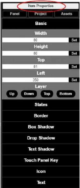
FIG. 9 Item Properties Tab Pane
TABLE 3 Item Properties Pane Option Descriptions
| Option Description | |
| Basic | View/edit the width, height, and location of the selected item (i.e., the selected button or widget). |
| Layer | Choose what layer the selected item is on. Send the item Up or Down one layer, send to front (Top), or send to back (Bottom). |
| States | Edit/add different states for the selected item (and the associated scripts and appearances during each state). |
| Border Set the border width/color/etc. for the selected item. | |
| Box, Drop, and Text Shadow | Add/remove/adjust shadow settings for the selected item. |
| Icon Choose an image to serve as an icon for the selected item. | |
| TextEdit the text to be displayed on the selected item. | |
Panel Tab
Refer to Figure 10 and Table 4 for detailed descriptions of the options available on the Panel tab.
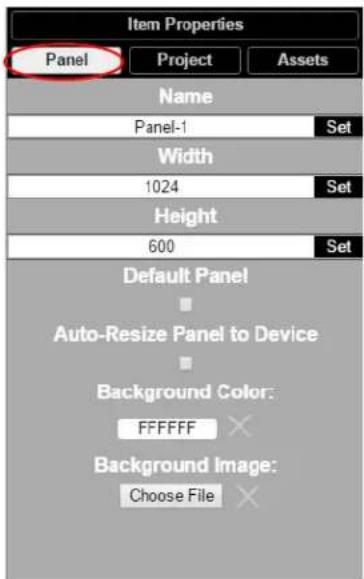
FIG. 10 Panel Tab Pane
TABLE 4 Panel Tab Option Descriptions
| Option Description | |
| Name | View/edit the current panel's name. Click the Set button to accept changes. |
| Width | Set the width of the current panel (in pixels). Click the Set button to accept changes. |
| Height | Set the height of the current panel (in pixels). Click the Set button to accept changes. |
| Default Panel | Enable this checkbox to set the current panel as the device's home screen. |
| Auto-Resize Panel to Device | Enable this checkbox to automatically size the current panel to fit the device's screen when viewed as the active panel. |
| Background Color Edit | the current panel's background color. |
| Background Image | Select an image from your computer to be displayed as the current panel's background. |
Project Tab
Refer to Figure 11 and Table 5 for detailed descriptions of the options available on the Project tab.
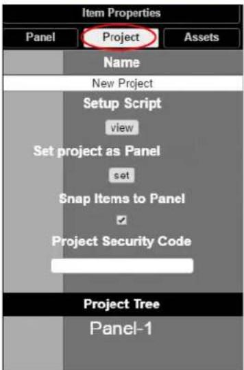
FIG. 11 Project Tab Pane
TABLE 5 Project Tab Option Descriptions
| Option Description | |
| Name View/edit the current project's name. | |
| Setup Script View/edit the setup script for the project. | |
| Set project as N-Touch Panel | Enable this checkbox to set the current panel as the home page on the N-Touch Wall Controller screen. |
| Snap Items to Panel | Enable this checkbox to force all buttons and widgets to remain on the panel background template of the editor (i.e., the white portion of the editor screen). |
| Project Security Code | Enter a pass code (any combination of numbers 1 through 8) if you would like a code to be required to access that panel on the N-Touch Wall Controller. If a code has been entered, a dialog appears on the N-Touch Wall Controller's screen prompting the user to enter the key for access. |
| Project Tree | Lists all items in the project. Click an item in the list to select it on the actual panel. |
Assets Tab
Refer to Figure 12 and Table 6 for detailed descriptions of the options available on the Assets tab.
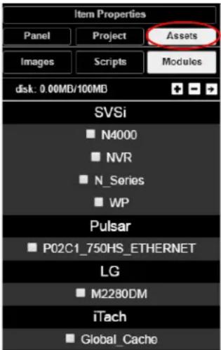
FIG. 12 Assets Tab Pane
TABLE 6 Assets Tab Option Descriptions
| Option Description | |
| Images View all images in the project. | |
| Scripts | Creates scripts that can be dragged and dropped onto multiple buttons at once. |
| Modules | Use to control a specific type of device with the commands specific to that item. |
Tools Pane Option Descriptions
On the left side of the main screen, you will find options that allow you to access/create buttons, access widgets (such as sliders, text fields, etc.), as well as store panel templates for future use. If you do not see this pane displayed on the main page of the Project Editor, select Window > Tools Pane.
To add a button or widget to your project, simply drag and drop it onto your module display as shown in Figure 13.
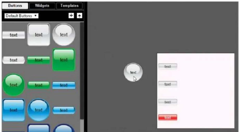
FIG. 13 Adding a Button to the Display
This section shows the screens associated with these options as well as tables that contain details regarding each screen.
Buttons Tab
Refer to Figure 14 and Table 7 for detailed descriptions of the options available under the Buttons tab.
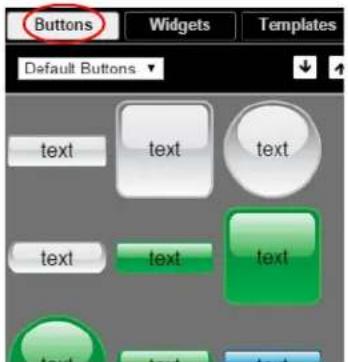
FIG. 14 Buttons Tab Pane
TABLE 7 Buttons Tab Option Descriptions
| Option Description | |
| Default/User Buttons | Choose Default Buttons from the drop-down menu to access all of the system buttons. Select User Buttons to access buttons created previously to use as a template. Drag and drop to add a button you created to theUser Buttonlibrary. |
 | Click the down arrow to export a selected button to your computer. Click the up arrow to browse to a (previously exported) button file and import it into theUser Buttonlibrary. |
Widgets Tab
Refer to Figure 15 and Table 8 for detailed descriptions of the options available on the Widgets tab.
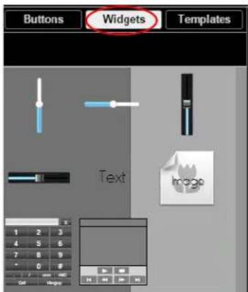
FIG. 15 Widget Tab Pane
TABLE 8 Widget Tab Option Descriptions
| Option Description | |
| Sliders | Allows script to fill in value from 0 to 100 (or custom values between two numbers). |
| TextAdds text to the panel. | |
| Image | Adds an image to the panel. Drag and drop this icon to the panel and then double-click it to select an image file (supports .gif, .jpg, or .png file types). |
| Dialer widget Adds keypad to the panel (for data entry). | |
| NVR Control widget | Adds play, stop, pause, etc. buttons for network video recorder (NVR) control. |
Templates Tab
Refer to Figure 16 and Table 9 for detailed descriptions of the options available on the Templates tab.
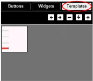
FIG. 16 Templates Tab Options
TABLE 9 Temp lates Tab Option Descri p tions
| Option Description | |
 | Click the left arrow button to add the current panel to the template page. Click the right arrow button to apply the template to the current panel. |
| [8570] | Deletes the currently selected template. |
| [1YCT] | Click the down arrow to export the template library to your computer. Click the up arrow to browse to a (previously exported) file and import it into the template library.NOTE:When buttons are exported, they become .zip files. |
Now that you have familiarized yourself with the interface options, use the tutorials provided in the Help menu of Panel Builder to further explore its capabilities.
- N-Touch Interface Overview
- Settings Page
- Logs Page
- LLDP Page
- Users Page
- Viewing Panels on the SVSI Mobile App
- Panel Builder
- Beginning a Panel Builder Project
- Top Ribbon Option Descriptions
- Project Pane Option Descriptions
- Item Properties Tab
- Panel Tab
- Project Tab
- Assets Tab
- Tools Pane Option Descriptions
- Buttons Tab
- Widgets Tab
- Templates Tab
Brand : AMX
Model : NT-ST-701
Category : Regulator