Photoimpact 12 - Audio and video software ULEAD - Free user manual and instructions
Find the device manual for free Photoimpact 12 ULEAD in PDF.


| Product Type | Photo Editing Software |
| Model | PhotoImpact 12 |
| Brand | Ulead |
| Category | Audio & Video Software (Image Editing) |
| Platform | Windows |
| Minimum OS | Windows 2000/XP |
| Minimum RAM | 512 MB |
| Minimum Disk Space | 1 GB |
| Display Resolution | 1024 x 768 pixels |
| File Formats Supported (Import) | JPEG, TIFF, PNG, BMP, GIF, PSD, RAW, etc. |
| File Formats Supported (Export) | JPEG, TIFF, PNG, BMP, GIF, PDF, etc. |
| Main Functions | Photo retouching, image enhancement, layer support, text effects, batch processing, and web graphics creation. |
| Language Support | English, French, German, Spanish, Italian, etc. |
| Package Contents | CD-ROM or download, user manual |
| License Type | Commercial, single-user license |
Frequently Asked Questions - Photoimpact 12 ULEAD
User questions about Photoimpact 12 ULEAD
0 question about this device. Answer the ones you know or ask your own.
Ask a new question about this device
Download the instructions for your Audio and video software in PDF format for free! Find your manual Photoimpact 12 - ULEAD and take your electronic device back in hand. On this page are published all the documents necessary for the use of your device. Photoimpact 12 by ULEAD.
USER MANUAL Photoimpact 12 ULEAD
First edition for Ulead® Photolmpact® 12, August 2006.
© 1992-2006 Ulead Systems, Inc.
All rights reserved. No part of this publication may be reproduced or transmitted in any form or by any means, electronic or mechanical, including photocopying, recording, or storing in a retrieval system, or translated into any language in any form without the express written permission of Ulead Systems, Inc.
Software license
The software described in this document is furnished under a License Agreement which is included with the product. This Agreement specifies the permitted and prohibited uses of the product.
Licenses and trademarks
©1995-2006 Ulead Systems, Inc. All rights reserved. Ulead, the Ulead logo, PhotoImpact, EasyPalette and Ulead GIF Animator are registered trademarks and/or trademarks of Ulead Systems, Inc. Intel and Pentium are registered trademarks of Intel Corporation. Microsoft, Windows, the Windows logo and other Microsoft products referenced herein are trademarks and/or registered trademarks of Microsoft Corporation in the United States and other countries. Apple, QuickTime and the QuickTime logo are trademarks of Apple Computer, Inc., registered in the United States and other countries. QuickTime and the QuickTime logo are trademarks used under license. Adobe, the Adobe logo, Acrobat and the Acrobat logo are trademarks of Adobe Systems Incorporated. Digimarc, MarcCentre and MarcSpider are registered trademarks of Digimarc Corporation. Java and all Java-based marks are registered trademarks of Sun Microsystems, Inc. in the U.S. and other countries. All other product names and any registered and unregistered trademarks mentioned are used for identification purpose only and remain the exclusive property of their respective owners.
Sample files
Files provided as samples on the program CD can be used for personal demonstrations, productions and presentations. No rights are granted for commercial reproduction or redistribution of any sample files.
North & South America Ulead Systems Inc.
http://www.ulead.com
Support: http://www.ulead.com/tech
Japan
Ulead Systems Inc.
http://www.ulead.co.jp
Support: http://www.ulead.co.jp/support
International
Ulead Systems, Inc.
http://www.ulead.com
http://www.asiapac.ulead.com
http://www.ulead.com.tw
Support:
http://www.ulead.com/tech
http://www.asiapac.ulead.com/tech
http://www.ulead.com.tw/tech
Germany
Ulead Systems GmbH
http://www.ulead.de
Support: http://www.ulead.de/tech
China
Ulead Systems, Inc.
http://www.ulead.com.cn
Support: http://www.ulead.com.cn/tech
United Kingdom
http://www.ulead.co.uk
Support: http://www.ulead.co.uk/tech
France
http://www.ulead.fr
Overview of the programs 14
PhotoImpact 14
Album 14
GIF Animator 14
Photo Explorer 15
Ulead COOL 360 15
What's new 15
Intuitive user interface 15
More multiple sharing functions 15
Optimized DSC features and professional effects 16
Complete creative suite 16
CHAPTER 2: GETTING STARTED .....19
Introduction to the workspace 20
The Welcome Screen 20
Working in ExpressFix mode 21
ExpressFix Panel 22
Overview: User Interface 24
Panel Manager 25
Layer Manager 25
Selection Manager 26
Document Manager 26
Browse Manager 27
EasyPalette 27
Color Panel 27
Quick Command Panel 27
Tool Settings 28
Histogram Panel 28
SmartGuide 28
Toolbox 28
Personalizing the workspace 29
Setting Preferences 29
Floating and docking toolbars and panels 30
Guidelines and grid 30
Using the Customize dialog box 31
About PhotoImpact dialog boxes 32
Using quick samples 32
Split View and Dual View 33
Using the EasyPalette 34
Loading and unloading galleries and libraries 37
Creating and organizing your galleries and libraries 37
Organizing your tab groups 37
Using your images as preview thumbnails 39
Modifying and adding Galleries thumbnails 40
Using Variations in the EasyPalette galleries 40
Adding custom effects to the EasyPalette 41
Packaging galleries and libraries 41
Customizing the EasyPalette 42
Basics 42
Creating new images 42
Creating an image for DVD menus 44
Creating a new Web page 44
Opening image files 45
Partially loading images 45
Opening CMYK files 46
Using the Browse Manager 47
Working with digital cameras and scanners 48
Using the Digital Camera Wizard 48
Acquiring images from scanners 48
Acquiring images from WIA devices ....49
Viewing images 50
Different viewing modes ....50
Zooming on an image 50
Adding a view 51
Using the Global Viewer ....51
Resizing an image 51
Changing resolution 52
Changing dimensions by resampling 52
Cropping an image 53
Perspective Crop ....55
Performing cut and copy operations 56
Performing a paste operation 56
Pasting images as objects .....56
Pasting images into a selection area 57
Pasting images to fit into a selection area 57
Pasting images as new images 57
Pasting images beneath the mouse pointer 58
Duplicating images 58
Using the clipboard 58
The Clipboard submenu 59
Recovering from mistakes 59
Converting between data types 60
Changing indexed image colors 60
Making a screen capture 61
Saving images 62
AutoSave 63
Sharing images as different file outputs 63
Photo Project 64
Creating your own Photo Project templates 65
Creating placeholders 66
Calendar 67
Web Album 67
Web Slideshow 68
Mobile Image 68
Color Management 69
Printing 69
Calibrating your printer 69
Using Print Preview 70
More print options 71
Print Multiple 71
Print Poster 72
Images and the Web 73
Sending images 73
Acquiring images from the Internet 74
Using plug-ins 74
Integration with Ulead products 75
CHAPTER 3: PHOTO EDITING .....77
Adjusting and enhancing your images 78
Style 78
Color Adjustment 78
Color Replacement 78
Invert 79
Posterize 79
Threshold 79
Equalize 79
Calculation 79
Light 79
SmartCurves 80
Brightness and Contrast 80
Enhance Lighting 80
Levels 81
Highlight Midtone and Shadow 82
Curves 83
Color 84
White Balance 84
Hue and Saturation 85
Color Balance 86
Color Cast 87
Correct Chromatic Aberration 88
Focus 89
Lens Distortion 89
Remove Red Eye 90
Enhancement effects 91
Blur 91
Motion Blur 91
Enhancing digital camera photos using RAW data support 102
High Dynamic Range 104
Enhancing the dynamic range of an image with SmartCurves .....105
Creating and saving a camera curve profile ....105
Importing a camera curve profile 106
Composing an HDR image using multiple images .....106
Optimizing the HDR image 109
Editing the HDR image 110
SmartRemove 111
Using the Retouch Tools 112
Using the Burn and Dodge Tools 113
Changing the colors of an image 113
Cloning parts of an image 114
Using the Touch-up Tool 115
Working with scanned images 115
Auto-process - Batch 116
Stitching images together 116
Automatic stitching 117
Manual stitching 118
Adding a frame and photo caption 118
CHAPTER 4: SELECTIONS & OBJECTS ...... 121
Working with selections 122
Pick Tool 122
Standard Selection Tool - selecting regularly shaped areas ..... 122
Lasso Tool - selecting irregularly shaped areas 123
Magic Wand Tool - selecting an area containing similar colors ..... 125
Determining color similarity 126
Select by Color Range 126
Expanding a selection area 127
Extracting objects 127
Step 1 of 4: Drawing the boundary 128
Step 2 of 4: Extracting the object 128
Step 3 of 4: Adjusting degree of extraction 129
Step 4 of 4: Refining the object 130
Mask Mode 130
Layer mask and object mask 132
Selecting on objects 134
Using the Selection Manager 134
Using a selection 134
Moving a selection area marquee 135
Preserving the base image 135
Creating smooth-edged selection areas 135
Softening a selection edge 136
Creating a border around a selection 136
Adding to or subtracting from a selection 137
Working with objects 137
Managing object layers 138
Setting an object's properties 138
Hiding and showing objects 139
Using the Object Properties dialog box 139
Using the Layer Manager 139
Sorting objects 139
Grouping and ungrouping objects 140
Changing an object's layer in an image 140
Editing objects 141
Using Defringe 141
Match Background Color 142
Adding a shadow to an object 142
Separating a shadow from its object 143
Copying and moving an object between images 143
Duplicating an object 143
Deleting an object 144
Spacing and aligning objects 144
Using libraries 145
Saving selections to the libraries 145
Using an image or selection from the Object Library 146
Using the Measure Tool 147
Using the Transform Tool 148
Rotating images 149
Straightening images 149
3D transformation 150
Working with Object Eraser Tools 151
Using the Stamp Tool 152
Using Component Designer 153
Rollover button 155
Lower-third 156
CHAPTER 5: USING THE PAINTING AND FILL TOOLS .....157
Using the Painting Tools 158
Erasing 159
Customizing Paint Tools 159
Using Paint Tool presets 160
Using the Tool Settings Panel 160
Special Paint Tools and Tricks 161
Using the Particle Brush 161
Using the Drop Water Tool 161
Painting with textures 162
Painting an outline or border 162
Using Paint as Object mode 163
Editing active objects only 164
Using the Fill Tools 165
Choosing a Gradient Fill method 166
Filling an area with a texture 167
Performing drag-and-drop texture and gradient fills 168
Working with Colors 169
Using the Ulead Color Picker 170
Picking colors from an image or entire screen 171
Changing foreground and background colors 171
Using the Color Panel 171
The Color tab 172
Setting a Single-color 172
Setting a Gradient color 173
Swatches tab 173
Gradients tab 174
Color Table tab 175
Understanding Indexed color images 175
Editing the Color Table 175
Loading and saving color tables 176
CHAPTER 6: WORKING WITH TEXT AND PATHS .....177
Adding text 178
Tool Settings 178
3D 179
Options 179
Style 179
Split Text 180
Applying text effects 180
Editing text as a path object 181
Saving text objects 182
Working with paths 182
Creating paths 182
The Path Drawing Tool 183
The Shape menus 184
Creating paths with the Path Drawing Tool 185
Customizing 3D path objects 185
Saving custom paths and attributes 186
The Outline Drawing Tool 186
The Line and Arrow Tool 188
Drawing curves and custom paths 189
Spline Tool 189
Bezier Tool 190
Freehand Tool 192
Drawing multiple paths 193
Importing Adobe Illustrator files 194
Tool Settings 195
Filling a path with the Even-Odd Fill option 195
Editing paths 196
Deforming the path shape 197
Using the Path Edit Tool 198
Editing basic shapes or line and arrow paths 198
Editing polygon shapes 201
Editing multiple paths 202
Grouping and ungrouping paths 203
Using the Bezier Curve Tool 203
Tracing and converting images into paths 205
Adding 3D properties 206
The Material dialog box 207
Color/Texture 207
Bevel 207
Bevel Settings 208
Reflection 208
Transparency 209
Border 209
Shadow 209
Light 209
Shading 210
Bump 210
Making the surface of 3D objects smoother 210
Creating transparent objects 210
Using bump maps 211
Saving material properties to the EasyPalette 212
Type effects 212
Wrap effects 213
Applying wrap effects from the EasyPalette 213
Creating your own wrap effects 213
Modifying wrap effects ......214
Bending text objects 218
The Z-Merge Tool 219
CHAPTER 7: SPECIAL EFFECTS ......221
Applying special effects 222
Lights 222
Artistic 223
Brick Tiles 223
Cartoon 223
Contour Drawing 224
Engraving 226
Finger Paint 227
Impressionist 228
Mosaic Tiles 229
Pen and Ink 230
Screening 231
Distort 233
Custom Effect 233
Creative Transform 233
Crystal and Glass 233
Magic Gradient 234
Paint on Edges 234
Turnpage 236
DeInterlace 236
Animation effects 237
Frame-based animations 237
Playing a frame-based animation 239
Storyboard-based animations 240
Saving animations 241
Saving GIF animation options 241
Kaleidoscope Fill 242
Texture Filter 243
Creative Warp 244
Crystal and Glass 245
Creative Lighting 246
Particle Effect 247
Creative Transform 249
Type Effect 250
CHAPTER 8: BATCH PROCESSING ....251
Using the Quick Command Panel 252
Using tasks in the EasyPalette 253
Using the History Tab 254
Applying commands to multiple files 255
Batch Manager 255
Batch Convert 256
Batch test in Image Optimizer 256
CHAPTER 9: ALL FOR THE WEB 257
Web pages 258
Structure of a Web page 258
Using blog templates in the EasyPalette 259
Using the Web Properties dialog box 260
General tab 260
Background tab 261
Image File tab 261
Slice tab 261
HTML tab 262
Adding Web images and objects to your Web page 262
Images for the Web 262
Opening an image/UFO file from a Web page 262
Opening a Web page as a single image 263
Creating a Web background image 264
Using Background Designer 264
Shifting a Web background 265
Creating a seamlessly tiled background 266
Button Designer 267
Slice Tool 268
Image Map Tool 270
Creating object-based image maps 271
Creating manual image maps 272
Optimizing file sizes and quality for the Web 273
Basic controls in Image Optimizer 273
Optimizing an image as a JPEG 274
Optimizing an image as a GIF 275
Optimizing an image as a PNG 276
Testing your files with different settings 277
Objects for the Web 278
Objects on a Web page 278
Linking multimedia objects ......278
Editing Linked objects 279
HTML Text objects 280
Converting HTML Text objects to image objects 282
Script effects 282
Advanced rollover button 287
Web Slideshow 288
Exporting a Web page 289
Previewing in a browser 289
Saving for the Web 289
Send using default e-mail program 290
Putting a Web page together 290
GIF Animator 292
CHAPTER 10: COMMANDS ......293
Command descriptions 294
Menus and dialog boxes 294
File Menu 294
Edit Menu 295
Adjust Menu 296
Photo Menu 297
Effect Menu 298
Selection Menu 298
Object Menu 299
Web Menu 301
View Menu 302
Window Menu 302
Help Menu 303
Toolbox 304
Panel Manager 305
Layer Manager and Selection Manager 305
Document Manager 306
Browse Manager 307
EasyPalette 308
Color Panel 308
Quick Command Panel 309
Tool Settings 309
Histogram Panel 309
Index 311
INTRODUCTION
Welcome to Ulead PhotoImpact, the software that delivers total image editing. Easily manage and enhance digital photos, create stunning graphics and produce high-impact Web pages for recreational or business use. Professional-looking photos are easy to make using one-click auto correction commands. Add pizzazz with loads of filters, special effects and professional raster, vector and 3D tools. Create a variety of photo projects and share it with your friends and relatives.
This chapter briefly explains what you can do in PhotoImpact and its accompanying programs, and lists the new features. Read on and learn how digital image editing can be fun and easy with PhotoImpact.
Overview of the programs
The following is a brief overview of the programs included in the PhotoImpact package:
PhotoImpact
PhotoImpact is an all-in-one image editing solution for photo enhancement, graphic design, and Web design. With a wealth of tools at your fingertips, there's virtually no limit to the images you can create for great-looking images for your home, business or school projects. The major program features are listed below:
- Digital Photography Offers professional techniques to enhance your photos. PhotoImpact's advanced, yet fun and easy-to-use digital imaging tools, are all you need to give your photos that professional edge.
- Integrated Web tools Allow you to visually create entire Web pages containing interactive rollovers and buttons as well as Javascript effects without the hassle of coding. Since Web pages are saved in the object-based UFO file format, you can update and edit Web page content any time.
- Powerful graphic imaging tools provide you with a host of features for Web and creative design.
- Productivity functions Let you work with a number of image files simultaneously for maximum speed and ease.
Album
Album is a powerful tool for multimedia file management. Not only can you organize and catalog your files visually through thumbnails, but you can create your own database that you can edit and update. Album also provides convenient tools for sharing your images over the Internet.
GIF Animator
Ulead GIF Animator is a powerful tool for creating high impact animation for Web pages, presentations, and multimedia titles. Composing, editing, and applying special effects can all be done in GIF Animator. The program also gives you total control over optimization and making animations compact and Web-ready while retaining excellent image quality. When producing the final animation file, a variety of file formats are available, including animated GIF, Windows AVI, QuickTime, Autodesk animation, image sequences, and even Flash animation.
Photo Explorer
Ulead Photo Explorer gives you everything you need to quickly acquire, manage, enhance, and share digital photos, audio, and video files. It is the perfect companion to digital cameras, web cams, DV camcorders and scanners.
Ulead COOL 360
With Ulead® COOL 360™, you can combine a series of photos into 360° or wide angle panoramic scenes.
- Create 360° and wide-angle photo panoramas in just 3 steps.
- Automated warping, aligning, and blending deliver great results fast.
- Directly output to e-mail, the Web, office documents, screen savers and printers.
What's new
PhotoImpact is a complete image-editing suite with easy-to-use tools for all your image and photo-editing needs. Advanced features match today's sophisticated cameras. Extensive creative tools help you realize your vision. Whether you're new to digital photography or want to take creative expression to the next level, PhotoImpact makes professional image editing easy.
Intuitive user interface
- ExpressFix Mode New ExpressFix mode features a simplified workspace that contains larger buttons and the most common functions mainly used for basic photo editing.
- SmartGuide This allows you to easily create new projects through step-by-step task-based tutorials. Links take you directly to the tools you need.
More multiple sharing functions
- Share image as greeting card or calendar Send personalized greeting cards and calendars to friends and relatives. PhotoImpact gives you a focused environment where you can easily create custom greeting cards and calendars.
Optimized DSC features and professional effects
For DSC beginners:
- Auto Reduce Noise Significantly and automatically reduces "electronic" noise generated by cameras or scanners, by blending surrounding colors without losing picture detail.
- Auto SmartCurves Using the SmartCurves' mechanism, Auto SmartCurves allows you to automatically correct your images' camera curve anomalies without the complexities of using levels, curves and histograms.
For DSC prosumers:
- White Balance The new White Balance corrects white balance problems caused by insufficient lighting. With more White Balance presets and tools, you can adjust color temperature and tint to suit the mood of the image.
- SmartCurves* SmartCurves is an image adjustment tool that compensates for camera response curve anomalies. SmartCurves uses advanced HDR imaging technology to calibrate custom camera curves.
- High Dynamic Range (HDR)* Combine bracketed exposures of the same scene to create professional images that capture color and detail in both shadows and highlights. HDR also allows you to import new curve profiles of different camera models.
- 16-bit/RAW/DNG support* RAW processing lets you adjust image exposure, temperature, saturation before converting to 8- or 16-bit images. Edit images in high-quality 16-bit per channel color depth.
Complete creative suite
- DVD Menu designs The EasyPalette comes with more DVD backgrounds, buttons, and frames for use with any DVD-authoring application. You can also take advantage of customizable SmartScene, HD DVD and widescreen menu templates for Ulead DVD MovieFactory and VideoStudio.
- Blog Templates The EasyPalette provides you with new blog design ideas and templates that you can customize to fit your style and taste.
- FREE DVD Menu Maker Available online, the DVD Menu Maker plug-in allows you to create your DVD menu templates using PhotoImpact tools and export to DVD authoring software such as Ulead DVD MovieFactory 5 and VideoStudio 10.
Note: You can download the DVD Menu Maker plug-in in Ulead's Web site.
- Component Designer* This wizard lets you easily customize different DVD menu title objects and buttons or export rollover buttons and banners to your Web pages.
- Path Tool* Choose between large and small node sizes for greater flexibility in working with paths. You can also save time by batch converting multiple path objects to images.
- Z-Merge* Maintain the spatial relationships between Z-Merged objects while resizing.
- Text Tool* Resize text directly on-screen without leaving the Text Tool.
* Indicates enhanced tools and features.
GETTING STARTED
This chapter explains the concepts behind PhotoImpact's user interface, beginning with a walkthrough of the workspace and its various components, followed by detailed descriptions of the various panels and toolbars and ways on customizing your PhotoImpact workspace. You will also learn how to use the EasyPalette and some of the basic program functions.
Introduction to the workspace
The PhotoImpact workspace can be displayed in ExpressFix, Full Edit, Web or Video & DVD modes which contain specific sets of tools depending on what you want to do in the program.
The Welcome Screen
When you run PhotoImpact for the first time, the Welcome Screen appears, which allows you to do the following:
Choose among the following modes:
- ExpressFix Mode offers a simpler workspace that addresses the more common tasks. This mode helps new users to easily learn the main tools of the program, and provides those users mainly interested in using basic program functions with a clean and intuitive workspace.
- Full Edit Mode displays the entire PhotoImpact toolset allowing you to perform a range of simple to complex tasks.
- Web Mode gives you tools to create images for the Web.
- Video & DVD Mode displays video and DVD menu-related functions on the workspace.
Select quick shortcuts to common tasks:
- Manage Photos launches Ulead Photo Explorer. This allows you to use tools for acquiring, viewing, organizing, adjusting and printing digital images in a single easy-to-use interface.
- Get Photos downloads images from a digital camera or retrieves images from a flash memory card that is inserted in a memory card reader.
- Create New Image allows you to create a new image.
- Photo Project Wizard opens a dialog box allowing you to create customized photo projects like greeting cards.
- Exit closes the Welcome Screen.
Tip: Selecting Window: Welcome Screen opens the Welcome Screen. It is also displayed when you start PhotoImpact in ExpressFix Mode.
Working in ExpressFix mode
ExpressFix is a time-saving tool that provides quick and easy fixes to common digital photo problems such as improper color, unbalance exposure and out of focus conditions.
![PhotolImpact - [Snowy Mountains. jpg (100%)] 600x400 File Edit Adjust Help Effect Window Help Digital Camera Remove Red Eye White Balance Share Before After Dual View (573, 179) R:0.45 G:0.72 B:1.00 / R:0.29 G:0.85 B:1.40 ExpressFix Full Edit Auto Process Reduce Noise SmallCurves Overall Exposure Su…](/content/2026/07/1411218/images/dfd5df9ff0cc19cf1f74fd945e49b8561911430c54ebbc1a59a6bbe1921887fc.jpg)
1 Preview Windows: (Before, After and Dual View) Displays the original and modified versions of an image.
2 Workspace Toolbar
Provides a shortcut for switching among different modes and workspace. Click ExpressFix to use ExpressFix mode.
3 ExpressFix Panel
See "ExpressFix Panel" for more details.
4 Document Manager
Allows you to switch among different documents by choosing image thumbnails.
Ideal for first-time users who want to apply basic photo enhancements,
ExpressFix presents various options to fix images through a simple yet intuitive user interface. You can easily compare original and modified images by using Dual View which provides two preview windows at the same time.

Dual View
In the ExpressFix Panel, you can use different image enhancement presets that you can also customize to achieve the result you want for your images. (See "ExpressFix Panel" for more details.) Aside from these enhancements in this panel, you have more options to choose from on the Adjust, Photo and Effect menus. To know more about these effects and adjustments, see Chapter 3, "PHOTO EDITING".
Note: ExpressFix workspace cannot be customized for advanced tools and panels such as Layer Manager. When in ExpressFix mode, you can only use Document Manager and the ExpressFix Panel.
ExpressFix Panel
The ExpressFix Panel, docked at the right side of the PhotoImpact window, displays all the photo enhancement options you can apply to your photos.
Auto-Process
- Reduce Noise Sets the noise degree for luminance and color.
- SmartCurves Instantly applies a camera curve to an image.
One-click Presets
• Overall Exposure Adjusts brightness and contrast of the whole image.
- Subject Exposure Adjusts the brightness of subject or background separately.
• Color Cast Adjusts the color temperature, making it cooler or warmer.
• Color Saturation Adjusts color hues.
- Focus Adjusts from soft to sharp focus.
- Beautify Skin Retouches skin areas by removing blemishes, softening its tone, and changing its color.

Before

After
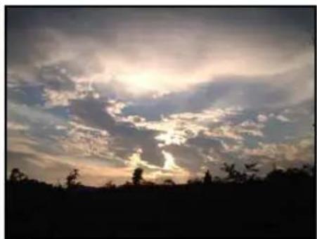
Before
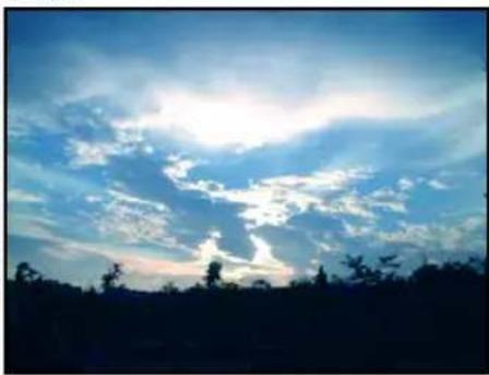
After
To use the ExpressFix Panel:
- When in ExpressFix mode, select File: Open and browse for the images you want to enhance.
- Choose your desired photo enhancement options in the ExpressFix Panel.
- Under One-click Presets, click a thumbnail to apply a quick fix.
Tip: To reverse the most recent action, click Undo [Ctrl + Z] or Redo [Ctrl + Y] on the Standard Toolbar.
- For finer adjustments, click Customize. Drag the sliders and watch the After view window to see how the new settings are affecting the image.
Tips:
- When you click Return to go back to One-click Presets, the customized thumbnail is added.
- If results are not too satisfactory and you want to remove the custom adjustments, click Reset in the ExpressFix Panel.
- Click Clear to restore all options to their default values.
Overview: User Interface
This section provides a brief overview of the PhotoImpact workspace. Familiarizing yourself with the components of the workspace is a great way to start learning the program. Use the page references to locate a specific topic of interest.

Standard Toolbar (Full Edit Mode)

Status Bar

Panel Manager
The Panel Manager, by default docked at the right side of the PhotoImpact window, allows you to open or close various panels. Just click a button to open the associated panel, and click again to close it.

*Toggles between Ulead Photo Explorer and Ulead GIF Animator
Layer Manager
The Layer Manager displays all the objects present in your active document as individual thumbnails. These thumbnails reflect any editing that you apply to the objects. Each thumbnail is numbered sequentially by the order (or layer) in which
it was created. Change the order, position and size, and object properties directly from within the Layer Manager. You can also show/hide objects by clicking the eye icon, or lock an object's position by clicking the lock icon in the Layer Manager.
Notes:
- To select multiple objects in the Layer Manager, press [Ctrl] or [Shift] as you click objects. To select all objects, press [Ctrl+Shift+A].
- Transparency and object merging options, both useful tools for changing an object's display qualities, are readily accessible beneath the Layer Manager Toolbar.
- Thumbnail menu commands contain a number of practical tools used for manipulating objects.
- The Global Viewer icon opens a separate area at the bottom of the Layer Manager, where documents can be magnified by adjusting a slider or using the zoom tools. When the document does not fit in the window, the frame on the document enables you to select the area to display.
Selection Manager
The Selection Manager lets you store up to 99 items or frequently-used selections and masks for easy storage and retrieval.
To place a selection in the manager, make a selection using any of the selection tools, then right-click to reveal the context menu, and choose Store Selection.
Document Manager
The Document Manager displays open documents in the workspace as thumbnails. It's easy to switch between a handful of open documents using the Document Manager.
Click or double-click (if the document is minimized) a document thumbnail to bring it to the top of the workspace.
Notes:
- The active document has a blue border around its thumbnail image in the Document Manager.
- Select multiple thumbnails then select one of the Batch Manager commands on the Toolbar to apply that command to all selected documents.
- Move your cursor over a thumbnail in the Document Manager to display that document's properties.
- The Global Viewer icon opens a separate area at the bottom of the Document Manager, where documents can be magnified by adjusting a slider or using the
zoom tools. When the document does not fit in the window, the frame on the document enables you to select the area to display.
Browse Manager
Browse for image files on your computer or local network with the Browse Manager. Image files can be identified more easily in the Browse Manager as they are displayed as thumbnails. Open files by double-clicking a thumbnail or by dragging the files to the workspace.
Click Recent Files to view the documents you have recently opened in the workspace. Double-click the thumbnail to open the file in the workspace. The number of recently opened files can be set in the Preferences dialog box [F6].
Right-click Recent Files to open a pop-up menu where it displays the folders that you have recently accessed.
Tips:
- Batch Convert - Convert the file format or data type of all images in the selected folder.
- Batch Task - Apply a previously recorded task to all images in the selected folder.
EasyPalette
The EasyPalette contains preset effects, masks and objects that you can easily access and use in your images. Galleries and Libraries hold numerous filters, styles, image objects, shapes, and more that you can simply drag and drop or double-click to add to your image. You can customize your own effects or objects and add them to the EasyPalette or export them as separate files outside the program for back-up or future use.
Color Panel
The Color Panel is a centralized color manager that sets and organizes colors for the various tools used throughout PhotoImpact. Select from a wide variety of preset solid and gradient colors for Paint, Retouch, Text, and Path Tools. You can also create and use other colors by adding it to the Color Panel.
Quick Command Panel
The Quick Command Panel gives you a fast way to access and apply commonly used commands and actions to your images. You can record a series of commands
and actions as tasks, then apply them to your images at a single click. With the Quick Command Panel, you can also easily retrace or redo steps you have done.
Tool Settings
The Tool Settings Panel allows you to define custom settings for the different tools in the Toolbox, which include the Text Tool, Path Tools, Paint Tools, Retouch Tools, Clone Tools, Stamp Tool, and Object Eraser Tools. See the chapters on these tools to know more about each tool and its Tool Settings Panel.
Histogram Panel
The Histogram Panel displays the color distribution of either the entire image or just the selected area of your image. You may then adjust color imbalances using Tone Map, Highlight Midtone Shadow, or Color Balance (in the Adjust or Photo menu) to further enhance your image.
SmartGuide
SmartGuide helps you work in different modes to create new projects such as web pages or DVD menus. This panel allows you to easily start a project by following through step-by-step tutorials.
Upon starting PhotoImpact, SmartGuide displays three categories to explore: Photo, Web and Video & DVD. These categories give numerous task-based tutorials that you can select to get you started on a project.
SmartGuide offers convenience through shortcut links in the procedures that will open dialog boxes or toggle between tools. Click the blue text links for instant access to a specific dialog box, wizard or tool.
To open the SmartGuide, select Window: Panels - SmartGuide.
Toolbox
For tools in the Toolbox, some have a submenu with further tools. To access these tools, click the triangle icon on the lower right of the button.
When the submenu pops up, you can drag it away from its original position to make it float anywhere on the screen or dock it to another part of the program window.

Personalizing the workspace
PhotoImpact gives you the flexibility to customize the workspace to suit your needs. Its toolbars and panels can be floated or docked to the workspace. The Standard Toolbar can be customized to include only icons of the tools that you commonly use. Read the following sections for more information.
Setting Preferences
Select File: Preferences - General or press [F6] to set various options specific to PhotoImpact and to customize the way the program works. The Category section in the Preferences dialog box contains all the different aspects that determine the program's performance. Clicking a category displays the options with their respective settings or attributes.
Floating and docking toolbars and panels
In the PhotoImpact interface, you can freely drag floating toolbars and panels around the workspace or dock them to the sides of the workspace.
The Standard Toolbar can be docked either to the top or bottom, or the left or right side of the program window while the Toolbox can be docked to the left and right side. The Attribute Toolbar can be docked either to the top or bottom. To dock a toolbar from the Toolbox, such as the Selection Tools or Retouch Tools, click on the title bar of the toolbar then drag it to any side of the workspace.
When docking a panel, 8 directional keys are shown for fast, easy and accurate docking. Drag and drop the panel to a directional (target) key to complete docking. To resize the panel, drag its borders with your mouse.
Multiple panels can be docked in the same group. Click Show/Hide Panels to expand or collapse a single panel or grouped panels.
Note: The docking mechanism can be toggled on/off in File: Preferences - General - Docking.
Guidelines and grid
Using guidelines or a grid is useful for accurately placing objects on your image. Guidelines are moveable lines that can be placed vertically or horizontally. A grid is composed of a set of lines that are fixed. Its size can be adjusted in the Preferences dialog box.
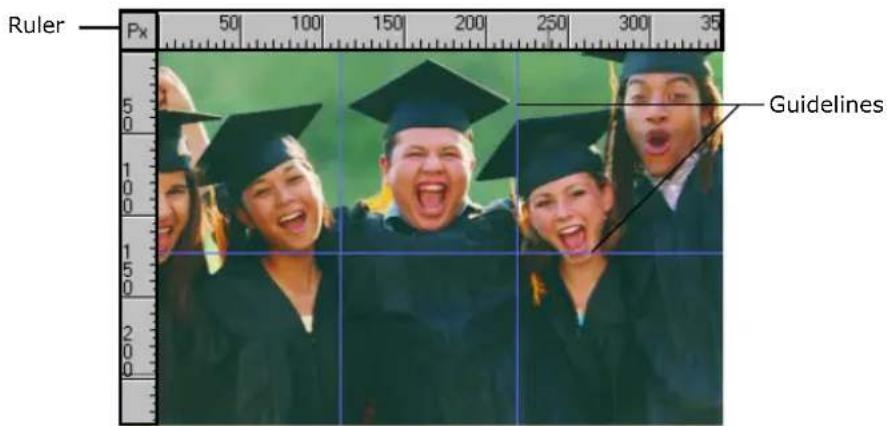
To display guidelines:
-
Select View: Show Ruler to display the ruler.
-
Select View: Guidelines and Grid - Guidelines [Ctrl+Shift+G] to begin using guidelines.
-
Drag the pointer from the Ruler towards your image to add a guideline. Drag from the left to create a horizontal guideline or drag from the top to create a vertical one.
Tips:
- Select Snap to Guidelines from View: Guidelines and Grid to make objects snap to the nearest guideline when being repositioned.
• To change the line style and color of the guideline, select File: Preferences - General [F6] and select the Guidelines and Grid category. - To remove a guideline, drag it to the edge of the workspace.
To display the grid:
- Select View: Guidelines and Grid - Grid [Ctrl+Shift+R] to display the grid.
- To change the grid style and color, click File: Preferences – General [F6] and select the Guidelines and Grid category. Adjust the Horizontal and Vertical spacing to increase or decrease the distance between gridlines.
Tip: Adjust Snap tolerance to set how close an object needs to be from a guideline or grid before snapping to it.
Using the Customize dialog box
Selecting Window: Customize opens the Customize dialog box for options on your preferred PhotoImpact interface.
- Profiles tab lets you to save, import, export and manage the user profiles for PhotoImpact. Save your profiles for later use, or import/export profiles for back-up or sharing.
- Toolbars tab lets you show or hide existing toolbars and create new ones for frequently-used tools.
- Commands tab has categories and lists of commands/tasks available in PhotoImpact. You can select a command icon and drag it directly to a menu or toolbar, or drag a unwanted icon from a toolbar to anywhere within the dialog box.
-
Toolbox tab lets you drag a tool to add to an existing toolbar, or drag from a toolbar and drop anywhere in the dialog box to remove it.
-
EasyPalette tab lets you set the order of Galleries and Libraries you can show or hide in the EasyPalette.
- Options tab gives you other choices for using large buttons and the tooltip feature.
After adjusting the PhotoImpact interface to your own preferences, you can save your profile in the Profiles tab. This adds your profile to the mode choices in the Workspace Toolbar.
About PhotoImpact dialog boxes
Most of the dialog boxes in PhotoImpact that can be used to adjust or enhance images provide quick presets that be directly applied to your images. These dialog boxes also contain Split View and Dual View windows which provide an easy way to compare the original image with the after image.
Tip: Select Open dialog box in Full Screen size in Preferences to display dialog boxes in full screen.
Using quick samples
Most of the Adjust, Photo, and Effect commands use dialog boxes that contain quick samples. Quick samples are presets represented by visual thumbnails that you can directly apply to your image. To apply a quick sample to your image, click the thumbnail that shows the result you want.
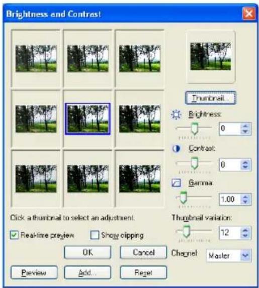
The quick samples in some dialog boxes such as Brightness and Contrast and Color Balance apply cumulative changes to your image. Each time you click a thumbnail, the respective preset is added to the current state of the image.
Note: In this type of dialog box, the center thumbnail represents the current state of the image and the surrounding thumbnails represent the different presets. Clicking a preset applies it to the center thumbnail. You can also manually adjust the settings in the dialog box.
Correction effects such as Blur and Sharpen under the Photo menu provide two levels of dialog boxes: a quick samples dialog box and a custom dialog box.
The presets in the quick samples dialog box apply a single result only. Each time you click a thumbnail, the selected preset is applied to the original state of your image. If you want to define settings for the effect, click Options to open the custom dialog box where you can tweak the settings.

Tip: To hide the quick samples dialog box, clear Display quick samples in the PhotoImpact category of the Preferences dialog box. This will allow the custom dialog box to be opened directly.
Split View and Dual View
Most of the image adjustment and effect dialog boxes provide two types of Preview Windows: Split View and Dual View. The preview dialog boxes are resizable and can be maximized, depending on your viewing preference.
- Dual View allows you to see a full view of the original and modified versions of your image by showing them in separate Preview Windows.
- Split View shows an overlapped display with the Splitter bar dividing your image into its original and modified versions.
Click to change how the preview image is to be divided (horizontal or vertical) then drag the Splitter Bar accordingly, depending on whether you want to see more of the original image or more of the image after the effect has

been applied. The Splitter Bar can be fully moved to the right or to the left.
Using the EasyPalette
The EasyPalette is a panel that provides quick access to preset and customized effects and objects. It contains filters, styles, images, shapes, templates, and animation. Galleries contain various effects you can apply to your images while Libraries contain various objects, paths, Web templates and more.
The easiest and most convenient method for applying effects or adding objects is by double-clicking their thumbnails in the EasyPalette. You can also drag these thumbnails directly onto the image, selection area, or object.
Galleries

Libraries

Note: Click Galleries or Object Libraries to use Gallery Manager or Object Library Manager.
Samples of effects and enhancement presets
| Image Enhancements: Photo Effects - Enhance | 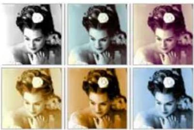 |
| Image Enhancements: Creative Lighting - Lightning |  |
| Image Enhancements: Brush - Paint Tools |  |
| Text/Path Effects: Wrap - Path Wrap |  |
| Text/Path Effects: Material - Skin |  |
By customizing effects and objects, you can create your own galleries and libraries. These can then be saved and shared with other PhotoImpact users.
To use the EasyPalette:
- Click or to switch between galleries and libraries.
- Click 📁 to toggle between displaying the EasyPalette in the Tree or Tab view.
- In Galleries, 📋 allows you to use your images as preview thumbnails.
- Thumbnail menu commands allows you to modify, apply, add, or view descriptions of effects and objects.
- Click Customize EasyPalette to modify EasyPalette properties and settings.
- Click Find to search for thumbnails in the current gallery or object library.
You can apply presets from the EasyPalette to selected files or folders in the Document Manager or Browse Manager by dragging the preset thumbnail from the EasyPalette onto the selected files or folders.
When applying presets to files or folders in the Browse Manager, the Batch dialog box will open. In the dialog box, you can choose to open the modified files on the workspace, save and close them without viewing the results or save your files in another folder before closing.
Note: You cannot drag and drop preset thumbnails when using Open from Web.
To apply an item from the EasyPalette:
- Click the EasyPalette icon in the Panel Manager.
- Click Galleries to access effects.
Click Libraries to access objects.
- In Tree view, click "+" / "-" or double-click each gallery/object library to display or hide the available effects and objects.
- Double-click the thumbnail or drag and drop it on the document to apply.
Loading and unloading galleries and libraries
Use Load and Export to share your galleries and libraries with other people or save them as backup.
- Load Allows you to import gallery files (SMP) or object library files (UOL) into the EasyPalette.
- Export Saves the active gallery/object library as another file in a specified folder. In Export Gallery/Object Library dialog box, the Package option allows you to include all linked files in the folder.
To load and export, click the Galleries/Object Libraries arrow and select Gallery Manager/Object Library Manager - Load/Export.
Note: You can also right-click the gallery/object library in Tree view and select Load/Export.
Creating and organizing your galleries and libraries
You can create your own galleries and libraries to have easy access to your personal collection of effects and objects. You can save these files for use in future projects or share them with other users.
To create a gallery or object library:
- Click the Galleries/Object Libraries down arrow and select Gallery Manager/Object Library Manager - Create.
- Create Gallery/Create Object Library dialog box is displayed. Enter a name for your gallery / object library in Name. To change the path and the folder, enter or browse for a new destination in Folder.
- Tab groups lists the tabs in the new gallery/object library. Click Add/Remove to manage your tab groups. See "Organizing your tab groups" for details.
- Click OK. The new gallery file (SMP) or object library file (UOL) is then created in the specified folder.
Organizing your tab groups
Galleries and libraries can store effects and objects such as images, filters, animation, masks, templates, and more. To easily locate these files, organize them by grouping them into tab groups.
In Tree view, click "+" before the name of the gallery/object library to display all the available tabs. You can create, delete, and arrange the order of tab groups in the EasyPalette.

Different tab groups in the EasyPalette
Note: You cannot edit a tab group in read-only galleries/object libraries. To disable this setting, right-click the gallery/object library in Tree view and clear Read-only (for Sharing).
There are a number of ways to create a new tab group:
- Right-click a gallery/object library in Tree view and select New Group. Enter a name for your new tab group in the New Group dialog box and click OK. Your new tab group is added to the selected gallery/object library.
- Right-click a gallery/object library or tab group and select Manage Group. In the Manage Group dialog box, click New to open the New Group dialog box and create a new tab group.
- When creating a new gallery/object library, click Add/Remove in the Create Gallery/Object Library dialog box. This also opens the Manage Group dialog box.
Note: When in Tab mode, you can simply right-click the tab and select Manage Group.
In the Manage Group dialog box, you can rename, arrange, and remove tab groups. Only custom tab groups, however, can be removed.
Tip: To sort galleries and object libraries alphabetically, click the Galleries/Object Libraries arrow and select Gallery Manager/Object Library Manager - Sort Ascending/Sort Descending.
Using your images as preview thumbnails
Clicking 🎨 on the EasyPalette (for Galleries only) lets you use the current image, selected area or active object as a thumbnail representation. This way, you get an immediate preview of how your image will look with different effects. Select a gallery thumbnail and click 🎨

For more options, click the arrow next to it and choose from the following options:
- Selected Thumbnails Changes the currently selected thumbnail(s) with the active image.
- Visible Thumbnails Changes the thumbnails that are visible in the EasyPalette window with that of the active image.
- All Thumbnails Changes all the thumbnails in the currently selected gallery with that of the active image.
- Reset All Thumbnails Brings the thumbnails back to their original preset.
Modifying and adding Galleries thumbnails
You might find it convenient to modify your collection of customized tools and special effects directly on the EasyPalette. By clicking Thumbnail menu commands, you can choose to modify thumbnail effects and add new effects, including Adobe Photoshop plug-in effects and image fills. You can also add a variety of commands for image adjustment and conversion by selecting Add Command Thumbnails.
To change and add a Gallery thumbnail preset:
- Select a Gallery thumbnail.
- Click Thumbnail menu commands or right-click a thumbnail, then select Modify Properties and Apply. The dialog box for that effect appears.
- Modify the settings of your thumbnail.
Tip: Click Add in the dialog box to store a modified thumbnail in the EasyPalette for future use. This adds a new thumbnail without replacing an existing one.
- Click OK to apply the settings to the active image.
Note: To update a particular thumbnail effect without adding a new thumbnail to the EasyPalette, select Properties from Thumbnail menu commands. This only works for special effect thumbnails.
Using Variations in the EasyPalette galleries
Some effects in the EasyPalette Gallery can be adjusted using the Variations command.
To adjust effects using Variations:
- Select a gallery thumbnail.
- Click Thumbnail menu commands and select Variations. You can also right-click on the thumbnail then select Variations.
- The Variations: (Effect) dialog box opens. A number of thumbnails will be displayed showing the filter applied to the image or object in varying degrees.
- Double-click the thumbnail or select the thumbnail then click OK to apply the effect.
Note: After you apply the effect, when you go back to the Variations dialog box of the same effect, the available thumbnails will have varying degrees from before. You can continue to choose the thumbnails until you achieve your desired effect.
Adding custom effects to the EasyPalette
The effects that you customize in the Adjust, Photo and Effect dialog boxes can be added to the EasyPalette.
Click in the dialog box to save all the settings of your custom effect into a gallery.
To add a custom effect to the EasyPalette:
-
Select a command from the Adjust, Photo or Effect menu.
-
Customize your effect using the available options in the dialog box.
-
Click Add.
Note: Some commands open a quick samples dialog box first. You need to click Options to open the custom dialog box. (See "Using quick samples" for details)
-
Enter a name for the effect in the Add to EasyPalette dialog box. Select also the gallery to put the effect in.
-
Click OK.
EasyPalette can also store settings that you apply to tools, such as paint brushes and stamps. To add custom settings for Tools, select a tool in the Toolbox, specify its settings on the Attribute Toolbar or in the Tool Settings Panel, and
click 📄 on the Attribute Toolbar. This opens the Add to EasyPalette dialog box. Enter a name for the tool setting, select the gallery to put the sample in, and click OK.
Note: By default, all the galleries (except My Gallery) in the EasyPalette are read-only. To put your effects and tool settings in an EasyPalette gallery, right-click the gallery and clear the Read-only (for Sharing) option.
Packaging galleries and libraries
When exporting, it is best to select Package if you are sharing galleries and libraries that contain your own original image files. This saves your active gallery/object library as a new file in a specified folder, including all the linked files.
To package a gallery or object library into a folder:
- Click 📄 or 📋 and then select Gallery Manager/ Object Library Manager - Export.
Note: You can also right-click the gallery/object library in Tree view and select Load/Export.
- The Export Gallery/Object Library dialog box opens.
- Specify the destination folder where your packaged gallery/library files and other external files will be saved.
- Enter a file name.
- Select Package.
- Click Save.
Customizing the EasyPalette
To modify the EasyPalette to suit the way that you work, click Customize EasyPalette. This opens the Customize EasyPalette dialog box that includes options for thumbnail display as well as category and object organization.
Basics
This section gets you started on the basics of using PhotoImpact. Here you will learn to create, modify, and save images, as well as acquire them from imaging devices or the Internet. Aside from this, you will also learn about how to print images in different forms or layouts and how to recover from making mistakes while working on your documents.
Creating new images
PhotoImpact gives you a wide range of options when creating a new image from scratch. These options let you customize the appearance of your image, including background, and set it for DVD menu, Web, or normal image editing. For more information on how to create a new Web page, see "Organizing your tab groups".
To create your own image from scratch:
- Select File: New - New Image [Ctrl+N].
-
Click the desired data type that defines the image format to use for the new image.
-
Select one of the Canvas options:
- White Sets the base image to plain color white.
- Custom color Sets the base image to be a solid color of your choice.
- Background color Sets the base image using the assigned background color in the Toolbox. By default, a document's background color is white.
- Transparent Hides the base image and displays the default background grid.
- Set the image dimensions in the Image size set of options.
- Standard Offers commonly used on screen and paper sizes.
• Active image Opens a new image with the same size as the currently active image in the workspace.
- Same as image in clipboard Opens a new image with the exact same size as the image in the clipboard.
- User-defined Lets you customize the size. Once you specify a size, you can click Reverse to switch the width and height, or click User-defined to add the dimensions as a preset for easy access. For the steps on how to customize a new page's dimensions, please refer to the procedure below.
- Enter Resolution values to determine the distance between the centers of the pixel. Increasing the resolution reduces the physical size of an image when printed on paper.
Note: Check the Preview Window to see how the new image looks so far. Preview displays your image's different possible destinations so that you can estimate if the current settings are applicable. If the image size is bigger than the printable area, a message "Exceeds page size" will appear.
- Click OK.
To customize the dimensions of a new image:
-
Click New Image. Under Image size, select User-defined. Enter the dimensions of the new page.
-
Click and then select Add User-defined Size.
-
In the following dialog box, type in a name for your customized size. Then click OK. The next time you click again, the new size created appears on the menu.
Note: You can also change the name and size of customized dimensions by selecting Edit User-defined Sizes from the menu.
Creating an image for DVD menus
PhotoImpact allows you to create images (with TV safe area) for use in DVD menus.
To create a DVD menu image:
- Select File: New - New DVD Menu.
- Select a preset which determines the dimensions of your DVD menu image.
- Click OK.
Notes:
- A 16:9 DVD menu image is compatible with Ulead DVD MovieFactory 4.0 or above.
- PhotoImpact provides a number of DVD menu samples in the EasyPalette.
Creating a new Web page
When creating a Web page, start out in one of two ways:
- Create a blank document already set up with basic Web properties.
- Create a blank document first, and then set up a more extensive range of its properties before designing the layout of the page.
To create a basic Web page:
-
Select File: New - New Web Page.
-
Title The title of the page appearing on the title bar of the browser window.
- Encoding The character set for the browser window to parse the page.
- Page size The dimensions of the image. User-defined dimensions can be added to the Standard list.
-
Generate background Select a color or image for the background, or leave this clear to hide the background.
-
Click Details to invoke the Web Properties dialog box to enter more detail about the page's properties.
-
Click OK.
Notes:
- To change the Web background later or set other HTML attributes, select Web:Web Properties.
- See "Putting a Web page together" for details.
Opening image files
There are several ways to open your image files:
- Click Open on the Standard Toolbar.
- Select File: Open [Ctrl+O].
- Double-click an associated image file name from Windows Explorer.
- Use the Browse Manager to browse for image files on your computer and open multiple images.
- Select File: Open Recent Files and choose a recently used file from the list.
Tips:
- You can specify the number of recently opened files to display in the Preferences dialog box.
- PhotoImpact can detect whether or not an image file contains a digital watermark. If an image file contains a commercial watermark (which embeds copyright and owner information about the image), you can select Effect:
Digimarc - Read Watermark to view the embedded data. As for files with banknote watermarks, PhotoImpact prevents you from opening, pasting and acquiring such files.
PhotoImpact is also able to open and edit RAW data files from digital cameras. For details, see "Enhancing digital camera photos using RAW data support".
Partially loading images
Working with large images can be a tedious task, especially while waiting for the screen to redraw every time you perform an action on it. Partial load can help speed up the editing process by displaying only the area you want to modify instead of loading the entire image.
Notes:
- Partial load can be applied to almost all file formats readable by PhotoImpact except *.UFO files or files with a saved selection area.
- RGB 48-bit and Grayscale 16-bit images do not support Partial load.
To partially open a file:
-
Select File: Open [Ctrl+O]. Select Partial load and then click the files to open. (Select files with [Shift] to select a range of files or [Ctrl] to randomly select multiple files.
-
Click Open. The image is divided into grids. Selecting Grid divides the image into equal parts. Enter values for the number of grid columns and rows.
Note: To select a custom area to load, clear Grid. Click the image and drag the handles of the frame to select an area of the image.
- Click OK. The selected area opens in the workspace.
Note: Once you have finished editing, save the image as usual. If you change the data type or dimensions of the partially loaded area, you must save it as a new image.

Opening CMYK files
With PhotoImpact, you can open a CMYK file in two ways: open the image as four separate grayscale images, each representing a color channel (cyan, magenta, yellow, and black), or let PhotoImpact automatically convert it to RGB 24-bit mode. You can edit the image and revert it to CMYK before saving and closing.
Upon opening a CMYK file, PhotoImpact will prompt you to choose the method your image will be opened. If you decide to open it by combining all color channels, you will be asked to specify the separation profile and the rendering intent method.
For a more convenient way of setting how to open CMYK images, go to File: Preferences - General.
Under Open & Save, click CMYK Settings and specify whether color channels will be combined or separated. Select Ask when opening if you want the dialog box to appear every time.
Using the Browse Manager
The Browse Manager can help increase productivity when working with images in several ways:
- It allows you to easily identify and open image files since they are displayed as thumbnails.
- It allows you to instantly view EXIF data before having to open a file in the workspace.
- You can apply presets from the EasyPalette to a single image, multiple selected images, or an image folder.
Tip: Click Recent Files (scroll up the Tree view to see the icon) to view the documents that you have recently opened in the workspace. Right-click to open a pop-up menu where it displays the folders you have recently accessed.
To open files using the Browse Manager:
-
Select File: Browse or click Browse Manager from the Panel Manager to open the Browse Manager window.
-
Browse for image files on your computer or local network by manually entering their location in the Address bar or by clicking Show/Hide Tree View and navigating to a specific folder.
-
Double-click a file to open it.
To open multiple files, drag your mouse over the image files to select them, then drag the selected files to the workspace.
- Resize the thumbnails by clicking Thumbnail Size on the Browse Manager Toolbar and selecting a preset display size.
- Click Sort to arrange files by name, file type, size, or date in ascending or descending order.
- You can view EXIF information of digital camera photos in the lower left window of the Browse Manager. Click √ to specify which EXIF tag information to display.
Note: You can drag selected image files from the Document Manager, and then drop them on the Browse Manager's right pane to make copies.
Working with digital cameras and scanners
Images can come from different sources. With PhotoImpact, transfer photos that were taken from a digital camera or transform photo prints or documents into digital images via scanners.
Using the Digital Camera Wizard
Getting images directly from a digital camera or retrieving images from a flash memory card can be accomplished quickly and easily using the Digital Camera Wizard.
To get images from a Digital Camera:
- Click Get Photos on the Welcome Screen, or select File: Digital Camera.
-
Select an option under Select Image Source then click the link next to it to specify where to get the images.
-
Digital camera Allows you to select your digital camera model.
- Camera drive or card reader Select this option if your digital camera or card reader is indicated by a specific path on your system.
-
Image folder Allows you to manually specify a folder (memory card, disc, or local drive folder) from which to copy images.
-
Click Browse and select the destination folder where the imported images will be saved.
-
Select the following options to delete or rename images after transferring them:
-
Delete files after successful transfer Select to remove all images from the memory card after they are transferred to your computer.
-
Renumber images to ensure every file name is unique Select to renumber images to avoid files having duplicated file names.
-
Click Start to transfer images. After the transfer is complete, the Browse Manager window opens allowing you to easily access your image.
Note: The Digital Camera Wizard also supports WIA devices.
Acquiring images from scanners
You can import images from any image input device that is TWAIN compliant. TWAIN is an industry standard for image input devices, drivers, and software applications allowing TWAIN-compatible applications and devices to communicate with each other.
To select the default image source:
- Select File: Scanner - Select Source. A list of TWAIN devices appears. Select a device as the image data source.
Note: If you only have one TWAIN device connected, that device automatically becomes the TWAIN source.
- Click Device Type to specify the type of input device and then click OK.
- In the Select Source dialog box, click the appropriate driver and then click Select. You are now ready to use your input device by clicking the corresponding button on the Standard Toolbar.
To acquire an image from a scanner:
- Click the arrow next to the Scanner icon on the Standard Toolbar.
- In the menu that appears, select "Device Name" TWAIN (where Device Name is the name of your source device) either with or without post-processing.
Note: Post-processing offers additional controls when acquiring an image. These include slicing, calibration, destination, and other settings.
- If you select TWAIN without post-processing, the TWAIN driver appears. To acquire images, simply follow the directions for that device.
If you select post-processing, then the Acquire Image dialog box appears. After making the desired settings, click Acquire. The driver for that device appears. Follow the directions for that device.
Notes:
- Make sure your TWAIN device is properly installed in your computer before acquiring.
- For more information on specific imaging options, see the image device manufacturer's documentation.
Acquiring images from WIA devices
Windows Image Acquisition (WIA) devices are digital scanners and cameras that support the plug-and-play technology found in newer versions of Windows operating systems.
To acquire images from WIA devices, click Open and select the drive that corresponds to the scanner, camera, or any other imaging device that is plugged into your PC. You can then select the file you want to open.
Note: PhotoImpact supports EXIF image data contained in most WIA-based images. For more information on using and exporting EXIF information, please refer to the PhotoImpact Album Manual.
Viewing images
When you open an image in PhotoImpact, the pixels of the image are "mapped" onto your screen pixels. Controlling the mapping of these pixels determines the way you see the images. For example, displaying an image in actual view (100%) maps one image pixel to one screen pixel. PhotoImpact offers you several tools to let you view your image as needed.
Different viewing modes
- Select View: Actual View to display the image at its actual view, with the window sized to fit the image within the workspace.
- Select View: Maximize at Actual View to display your image in its actual view (1x) with the window opened at its maximum level within the PhotoImpact workspace.
- Select View: Fit in Window to resize the current image to the largest magnification that completely fits in a window.
- Select View: Full Screen [Ctrl+U] to display the image in full screen mode, hiding the program window, as well as all docked toolbars. This lets you edit images without distractions made by the program window. Use shortcut keys to access tools, and press [Esc] to return to normal screen mode.
Zooming on an image
When you edit an image, you may want to see part of it in greater detail or more of it at a smaller size. You can do this in several ways:
- Select View: Zoom - Zoom In or Zoom Out.
- Select a Zoom ratio on the Standard Toolbar. You can also enter a specific zoom ratio/value in the entry box.
- To zoom in on images, press [+] . To zoom out, press [-] .
- Press [Z] and click to automatically zoom in on the image. To return to actual view, press [Z] and right-click.
Use the Zoom Tool in the Toolbox. To accurately zoom in or out on particular areas of an image:
- Click the area under your mouse pointer to zoom in.
- Right-click to zoom out. You can also press [Shift] and click.
- Drag along the area you want to zoom in. A marquee appears. Releasing the mouse button zooms in that area defined by the marquee.
- Drag the Zoom ratio slider on the Attribute Toolbar.
Note: Set the window to automatically fit the new zoom ratio by selecting Adjust window on the Attribute Toolbar for the Zoom Tool. This becomes the default for any zoom action performed when using any other tools.
Adding a view
Select View: Add a View to open another copy of your image. When you edit the original image or the duplicate copy, changes will be reflected on both.
Having an added view of your image allows you to zoom in and make more detailed modifications to the image, while at the same time see how changes are reflected when viewing the image in its entirety.
Using the Global Viewer
The Global Viewer lets you easily navigate around an image after you've zoomed in on it.
To reposition the viewer:
- Click the box that appears at the intersection of the scroll bars in the lower right corner of an image window.
This only appears when an image is magnified to a size that is larger than its window. Alternatively, press [G] on the keyboard. A thumbnail of the entire image appears. - While holding down the mouse button, drag the frame to the area you want to view.
If you used the shortcut method, simply move the mouse to the desired area. - Release the mouse button when you see the desired view in the window. If you used the shortcut, click once when you have the desired area.
Resizing an image
You can resize an entire image in two ways. The method that you choose depends on the desired quality and the target destination for the image.
Changing resolution
Resolution determines the physical size of an image by defining the number of pixels that appear per unit area.
Increasing the resolution places more pixels closer together, reducing the size of the image, while decreasing the resolution places pixels farther apart, making the image larger.
By resizing an image without actually changing the number of pixels it contains, you can retain its original quality. Since no pixels are added or removed, image file size remains unchanged.
Note: Defining a new resolution does not change the appearance of the image on-screen. Changes will only be apparent when you print the image or place it into another program that reads the resolution.
To change an image's resolution:
- Select Adjust: Resize.
- Turn resampling off by clearing Resample method. By doing this, PhotoImpact will automatically adjust image size according to the adjustments you made in the resolution (next step).
- In Resolution, choose between Display (on-screen presentation), Printer (print the image on black and white), or User-defined. Specify the value and unit of measurement.
- Click OK.
Note: For units of measurement, the only units available are pixel/inch and pixel/cm.
Changing dimensions by resampling
When you open images, their size on screen is determined by your screen resolution and the number of pixels the images contain.
Image Size allows you to adjust the number of pixels in an image. As resampling changes the image's number of pixels, the file size is modified correspondingly.
Use Resample when:
- Changing the size of an image as it is displayed on screen.
- Making the file size of an image smaller so that it takes less time to import it into another application and print it from there.
- Resizing or distorting an image.
To resample an image:
- Select Adjust: Resize.
- In Apply to, select which objects are being resampled.
If the image contains multiple objects, you can choose whether to resample only selected objects, or all objects including the base image.
- Specify the target dimensions for resampling in New image or Document size.
You can also change Resolution (usually for printing), and use Preview to check the effect of the new settings with reference to size and target output.
-
Select Resample and method of resampling.
-
Click OK.
Tip: PhotoImpact uses a resample method (interpolation algorithm) to add new pixels based on the existing pixels (color squares) in an image. Bicubic makes a fine and softer image using the smallest file size. Bilinear makes a soft image, while Nearest Neighbor makes a sharp image with the largest file size.
Cropping an image
Cropping trims the edges of an image and removes unwanted areas. To crop an image, select the area you wish to retain and select Edit: Crop [Ctrl+R]. Crop references crop dimensions, even if there are multiple objects in a document, or if the crop area covers only part of a selection.
To have better control on the crop dimensions, use the Crop Tool in the Toolbox instead. It provides you the capability of defining crop dimensions based on a selected area together with other objects present in the image. Another very important function it has is that it allows you to save the crop dimensions information to the EasyPalette, so you can use the same exact settings for trimming other images in the future.
Notes:
- If you select a non-rectangular area, the image is cropped to the smallest rectangle that can contain the selected area.
- When cropping the base image, all objects are not merged.
- Use either Auto-process Crop or Post-processing Wizard to quickly crop an image that has extra space along its borders.
To use the Crop Tool:
- Click Crop Tool in the Toolbox.
- Make a selection on your image. By default, all areas to be cropped will be covered by a semi-transparent shield.
You can make adjustments to your crop area by dragging the corners of the crop bounding box.
- Alternatively, you can use preset crop shapes by clicking Set aspect ratio of the crop box on the Attribute Toolbar. Choose an aspect ratio from the dropdown menu or click Custom aspect ratio to make a selection.
Notes:
- This feature does not actually give an exact-size crop, but provides a specific ratio of the crop shape.
-
When Set aspect ratio of the crop box is selected, the crop proportions are retained even when adjusting.
-
To determine where the crop will be applied, click Options menu on the Attribute Toolbar. You can choose between cropping Selection & All Objects, Active Selection/Object(s), or Entire Image.
5.
Click
or
press
[CTRL+R].
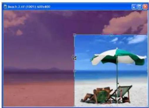

Image appearance on the workspace after the crop command
Entire image with a selected area to crop
Notes:
- To reset the crop bounding box or cancel the crop action, press [Esc].
- To reposition the bounding box, move your mouse within the bounding box. When the pointer changes to a 4-directional arrow, drag selection to the desired position.
- Click Add to save the current settings to the EasyPalette. From the EasyPalette, double-click or drag-and-drop to apply saved settings to an image(s).
Perspective Crop
Cropping an image doesn't have to be limited to rectangles or squares. Use the Perspective Crop Tool to diagonally stretch points of the traditional bounding box and create a shape that brings an illusion of change in angular view or perspective. This is especially useful when straightening images that have become distorted due to poor camera angle selection or cropping.

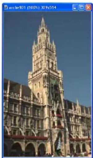
The building is tilted less to the right after Perspective Crop is applied
To use the Perspective Crop Tool:
- Click the bottom arrow of the Crop Tool in the Toolbox. Select the Perspective Crop Tool from the drop down menu.
- Make a selection on your image and then click Enable Perspective cropping on the Attribute Toolbar.
-
Adjust the four points of the crop bounding box independently by dragging the handles along the corners to create your desired crop shape.
-
To determine where the crop will be applied, click Options on the Attribute Toolbar. You can choose between cropping Selection & All Objects, Active Selection/Object(s), or Entire Image.
-
Click or press [CTRL+R].
Performing cut and copy operations
The most common methods for placing data onto the clipboard are by clicking Cut [Ctrl+X] and Copy [Ctrl+C] on the Standard Toolbar, or by selecting their respective commands from the Edit menu.
- Cut Deletes the selected area or object and places it onto the clipboard. When you cut a selected area, that area in the image is filled with the current background color.
- Copy Places a duplicate of a selected area or object onto the clipboard.
Note: When there is no selection area, both Cut and Copy apply to the entire image.
Performing a paste operation
To paste an image, click Paste [Ctrl+V] on the Standard Toolbar, or choose a command from the Edit: Paste submenu after cutting or copying image data to the clipboard. Whenever you paste data into an image, it becomes an object and floats above the base image and all other objects.
Notes:
- When pasting an object onto an image of a different data type, the pasted data is automatically converted (for example, when pasting a True Color image into an Indexed 16-Color image). This may cause extreme change in color.
- When pasting an image, it is placed pixel-on-pixel. If your source and target images are at different zoom levels, the clipboard image may appear to be enlarged or reduced after pasting.
- All Paste commands are disabled if the clipboard is empty or its contents are not supported in PhotoImpact.
Pasting images as objects
Select Paste: As Object [Ctrl+V] to paste an image as a separate object. The image is pasted at the top left corner of the current view. See "Working with objects" for details.
Pasting images into a selection area
After copying image data to the clipboard, you can now paste the contents to any selection area.
To paste image data into a selection area:
- Select an area on the image where you want to paste the clipboard image into.
- Select Edit: Paste - Into Selection. The clipboard image appears inside the selection and remains attached to your mouse.
Note: Press [Esc] to undo (before you have finished the pasting operation). The contents in the clipboard are not removed.
-
Move your mouse around to position the clipboard image in the desired selection area.
-
Click to anchor the clipboard image in the selection area.
Pasting images to fit into a selection area
Select Paste: Fit into Selection when you want to paste the clipboard image inside a selection area so that the entire image fills the selection. Try to make sure that the clipboard image and the selection area are about the same size.
If the sizes vary greatly, then the quality of the clipboard image is affected by resampling (resizing) to fit the selection.

Clipboard image Selection area After Fit into Selection
Pasting images as new images
Select Paste: As New Image to paste a selection in its own image window.
Alternatively, you can drag an object from an existing image to the workspace.
This is useful when you want to save an object or selection area as its own image, or when you have copied an image from another program and want to place it in its own window.
Pasting images beneath the mouse pointer
Select Paste: Under Pointer to place the clipboard image onto the base image wherever you click your mouse. This is useful when you know where to exactly anchor the clipboard image.
Duplicating images
As you work with an image, you may find the need to make copies of it. This can be useful because you can edit the copies without having to worry about causing any damage to the original image. Whenever you duplicate an image, a copy of it opens in a new window.
One method to do this is using the Edit: Duplicate submenu. You can choose from duplicating any of the following:
- Base Image with Objects [Ctrl+D] Duplicates the entire image, including the base image and all other objects.
- Base Image with Objects Merged Duplicates the image with all the objects merged onto the base image.
- Base Image Only Duplicates the base image only.
Another method to duplicate images is by using the mouse.
To duplicate an image by using the mouse:
- With the Standard Selection Tool active, right-click an image and select All from the resulting pop-up menu to select the entire image. (Make sure you have Selection: Preserve Base Image [F5] selected.)
- Click and drag the image onto an empty space in the program window.
- Right-click the image and select Merge from the resulting pop-up menu.
Notes:
- If Preserve Base Image is cleared, you can still duplicate an image by pressing [Ctrl] as you drag the selected image to an empty workspace.
- To copy part of an image, use any Selection tool to choose any part you want to duplicate and drag it to an empty workspace.
Using the clipboard
The clipboard acts as a temporary storage for different types of data, such as images, text, or sound. However, it only holds data one at a time.
Whenever new information is placed in the clipboard, the previous data is automatically overwritten, regardless of where the new data came from.
The Clipboard submenu
The following clipboard commands are available under Edit: Clipboard.
- Load Brings an image file onto the clipboard.
- Save Stores clipboard image data to a file.
- Display Shows the current clipboard image in a Windows clipboard viewer. To close the clipboard viewer, press any key or click your mouse.
Recovering from mistakes
PhotoImpact keeps track of actions and commands used in editing images. A maximum of 200 levels of Undo and Redo commands can be set in File:
Preferences - General, to help you monitor all the changes made since you last saved your document. There are four ways to recover from mistakes:
- To reverse the most recent action, click Undo [Ctrl + Z] or Redo [Ctrl + Y] on the Standard Toolbar.
• To reverse a sequence of actions to a specific step, select either Edit: Undo Before or Edit: Redo To. From the submenu, select the desired action. All actions prior to the action selected will be undone/redone.
- To cancel all changes made to the image since it was last saved, select File: Restore. This closes and reopens the file in its last saved state.
- To undo any changes made in the image, click the desired action in the History tab in the Quick Command Panel. To redo any changes, choose the desired action by moving the slider down. All actions prior to the item selected will also be undone/redone. The number of actions displayed in the History tab is equal to the number of Undo and Redo levels set in File: Preferences - General.
Notes:
• To remove all actions in the Undo Before and Redo To submenus, select Clear Undo/Redo History from the Edit menu. This removes all actions permanently.
- Restore cannot be undone, so it is advisable to duplicate an image before restoring it. See "Duplicating images" for details.
Converting between data types
Images come in various data types. A data type can generally be understood in terms of the number of colors an image contains, its bit resolution, and the number of channels it uses. Images with more colors tend to have larger file sizes compared to images with less colors. Common data type examples include: black and white, indexed 256-color, and CMYK true color.
To convert between data types:
- Click Adjust: Data Type then select which data type to use from the submenu. You can also do this directly by clicking Data Type (image) from the status bar.
Tip: To convert between data types while leaving your original file intact, select Adjust: Data Type – Convert as New Image, or click Data Type (image) on the status bar and select Convert as New Image. Clear this command to simply replace the data type of the image you are currently working on.
- Depending on what data type you are converting your image to, a dialog box may open where you can specify conversion options. After specifying the desired conversion options, click OK.
Changing indexed image colors
An indexed image is an image that contains up to 256 colors where all colors that are used in the image are stored in a color information table. You can change the way an indexed image appears by adding, removing, or replacing specific colors used by the image.
Note: Before performing any of these actions, make sure that your image is already in indexed format. See "Converting between data types" for details.
To change an indexed image's colors:
- Select Adjust: Color Table.
- In the Color Table dialog box, double-click the color square you want to change.
- In the Color Picker dialog box, select the desired replacement color and click OK.
- When finished changing the colors of the color table, click OK to save the new settings and return to the image.
Note: Click Load to change the entire palette in the Color Table dialog box. This will replace the existing color palette with a previously saved one.
Making a screen capture
Screen Capture can take screen shots of any images on your screen, including the PhotoImpact program window, just like a real world camera. You can specify capture options in order to save you editing time.
To start capturing an image:
- Select File: Screen Capture - Setup.
-
Set the default options for capturing.
-
Source Sets what and where to take the screen shot in your monitor screen.
- Destination Specifies where to send the captured image(s).
- Activation Determines the control you choose to start the capturing process. You can also set the Delay time between pressing the capture Hotkey and when the actual capturing begins. Select Auto scroll for capturing the length of image, text, and HTML documents beyond what is shown in the window.
- Pointer Lets you include your mouse pointer icon in the capture. You can also set it to capture application-specific and custom pointer icons as well.
-
Change Automatically changes the original resolution and data type to best suit your purpose when capturing. (If you do not set one, Capture uses the current display settings.)
-
Click Capture Now. If you don't want to capture images yet, click OK instead. Select File: Screen Capture - Start when you're ready to capture.
-
Depending on your capture settings, press the Hotkey specified in Activation to start capturing images.
Note: If you chose to capture a Selected area, you will have to define an area by clicking the mouse on the starting point of the selection and then drag it to enclose the area in a rectangle.
To capture a selected area:
- Select File: Screen Capture - Setup.
- Under the Source options, choose Selected area. You can also modify other capture options, if necessary.
- Click Capture Now to close the dialog box.
-
Locate the area that you want to capture. You can capture any area on the screen, including the PhotoImpact program window, other program windows, overlapping windows, or the entire Desktop.
-
Take the screen shot by pressing the Hotkey specified in Activation. A small viewer window appears. This window offers controls on the top edge that guide you when capturing. Among other functions, this allows you to:
-
Move the viewer window around the four corners of the screen by clicking any of the four buttons on the upper left of the window.
- Disable the window but continue to capture by clicking Close.
-
Disable the window & exit screen capture by clicking Stop or pressing [Esc].
-
Click once to mark the starting point - when you move the cursor, a rectangle appears, letting you specify the area to be captured. After marking the desired area, click again to signify the end point of the selection area.
Note: If the small viewer window gets in the way of what you want to capture, you can either move it around the four corners of your monitor screen or close it.
To capture a selected object:
- Select File: Screen Capture - Setup.
- Under the Source options, choose Selected object.
- Click Capture Now to close the dialog box.
- Take the screen shot by pressing the Hotkey specified in Activation.
The program then "divides" the active window into separate objects for each button, menu, or workspace. The mouse pointer changes from an arrow icon into a circle with crosshairs inside it.
- Select the object you want to capture by placing the cursor directly over the object.
You can tell if the object has been selected by the presence of a black border surrounding it.
- Click once to capture.
Saving images
PhotoImpact is an object-based editing program. Any work involving objects can be saved in the Ulead File for Objects format (*.UFO) which consists of the original base image and any additional objects created. See "Working with objects" for details.
Saving your file in this format allows you to edit the objects and the base image independently from one another as opposed to saving an image in other formats (ex. BMP and JPG) where all objects are merged onto the base image and cannot be edited the next time you open the file.
To save an image:
- Select File: Save [Ctrl+S] or File: Save As [Ctrl+Shift+S].
- Select the folder where you want to save the image in Save in and select a file format from Save as type.
- Enter the name for saving in File name. A file extension is not needed.
- Click Save.
Note: Select Effect: Digimarc - Embed Watermark to include a digital watermark into your images before saving them. This allows you to imperceptibly embed data (such as copyright and owner information) and protect your images from unauthorized use. Register first and acquire a Digimarc ID before you try to embed digital watermarks into your images. (Click Personalize in the Embed Watermark dialog box, then click Register to apply for a Digimarc ID.)
AutoSave
AutoSave automatically saves documents during set intervals where changes are tracked and saved in a temporary file. The original file is only modified when it is actually saved by pressing [Ctrl + S] or by clicking Save.
If you are working on a document and the program closes unexpectedly, the next time you run PhotoImpact, it checks for any temporary files generated by AutoSave and opens them as unsaved original documents.
To enable AutoSave, click Preferences - General. In Category of the Preferences dialog box, select Open & Save and set the interval between saves.
Sharing images as different file outputs
PhotoImpact makes it easy to share your photo to families and friends through various ways:
- Customize and print cards or send them by email.
- Personalize a calendar with your own photos.
• Post multiple images as a Slideshow or Album in your Web page. - Adjust images for transmission to your to your mobile device as large images might be distorted when viewed on a small-sized screen.
Photo Project
If you've already opened images in the workspace, you can choose Photo Project to create custom greeting cards, name cards, invitations and much more by providing you with a large range of templates.
Photo Project also contains a large selection of tools to prepare your images for projects, and special enhancements.
To create a photo project:
- Click File: Share - Photo Project.
- In the Template tab, select a project template from the project category dropdown menu (Greeting Card and CD/DVD Labels).
Or you can import Photo Project templates. Click Open Project and browse for the template file.
- The contents of the template folder will be opened in the workspace as thumbnails. Double-click a thumbnail to open it.
Note: If you select or open a photo, the photo will automatically be displayed in the template placeholder.
- Click the Customize tab to add and modify selected elements such as texts and images.
- To add text, click a point on the project where you want to place the text. A blinking cursor will automatically appear where you can enter your text.
Tip: Drag on of the corner handles to rotate or resize the text.
- To add an image, click a placeholder and then select an image from the image gallery in the leftmost part of the dialog box. (See "Creating placeholders" for more details)
Tip: You can add more images depending on the number of placeholders you have.
- In the Share tab, choose an appropriate method of sharing your work: Save, Email or Print.

Creating your own Photo Project templates
For starters, you can use the templates provided in the EasyPalette which you can customize to fit your taste. Or start creating your templates from scratch -- combining objects and layers or applying effects and enhancements. Read through the next chapters to learn how to work with objects, texts and special effects.
It is also important to have a placeholder included in your template. Otherwise, you won't be able to add new images. To learn to create placeholders for your template, see "Creating placeholders".
When you have successfully finished your template, make sure to save it in the Ulead File For Photo Projects format (*.UFP). This allows you to open and use your template in the Photo Project dialog box. In the Template tab, click Open Project and browse for the created file.
Creating placeholders
A placeholder is an image area or an active element on the project template that indicates that this may be replaced by another element or image. Creating placeholders can help you change or replace images in your template easily.
To create placeholders:
- Create or select an object that you want to use as a placeholder.
- To be able to assign the object as a placeholder, you need to create a layer mask on the object. See "To create a layer mask:" for more details.
Note: If the object is a path, it is important to convert it to an image. Select Object: Convert Object Type - From Text/Path to Image.
- Right-click the object and then select Properties.
- In the General tab of Object Properties dialog box, select Placeholder.
- Click OK.




Object assigned as placeholder
Calendar
Create a monthly calendar to remind you of important and special dates.
To create a calendar:
- Open an image and click File: Share - Calendar.
- In the Calendar dialog box, set the Template by selecting the Calendar type and Orientation. Click the thumbnail of your desired style.
- Set the start date by the year and month.
- When done, click Print or To Clipboard.
Web Album
If you want to create your own image gallery and post it on the Internet, an easy way to do it is to use Web Album. This generates simple Web pages in just a few minutes, complete with an index of thumbnails and pages for displaying images.
To compile images as Web Album:
- Click File: Share - Album.
- Specify the folder containing the images you want to include in the album and indicate the file type.
Note: Select Include all subfolders to add images from subfolders of your specified folder.
- In Export to Web Album dialog box, select Output or Burning options, Page Setup, thumbnail options and layout, image size and descriptions to display.
Tip: In Output tab, click Reorder to arrange the order of images.
-
When done, click one of the following actions:
-
OK to save images as Web Album.
- Burn Disc to burn Web Album onto a disc.
- Cancel to abort the action.
- Preview to preview album using your browser.
- Reset All to restore all options to their default values.
Web Slideshow
You can also transform all your image collections to slideshows for your Web pages.
To save images as a slideshow:
- Click File: Share - Slideshow.
- Specify the folder containing the images you want to include in the slideshow and indicate the file type.
Note: Select Include all subfolders to add images from subfolders of your specified folder.
- In Export to Web Slideshow dialog box, select your preferred Output or Burning options, Page Setup, Image size and Time settings.
Tip: In Output tab, click Reorder to arrange the order of images.
- Click OK or Burn Disc when done.
Mobile Image
Mobile Image lets you adjust images for transmission to your mobile device such as a cell phone or PDA. It lets you adjust the image for mobile device's screen size as large images might be distorted when viewed on a small-sized screen.
Note: To transmit the image to your mobile device, check its user guide for instructions.
To save an image for a mobile device:
-
Open the image you want to adjust then select File: Share - Mobile Image.
-
Choose an output target.
Target defines the height and width in pixels, file format and file size limit of the image allowed in your device. Select the device or define your own variables and click Next.
-
Set the range to crop by dragging the box or the four control points to define the part of the image you want to save. Then, click Next.
-
Select a file format and click Save As.
-
To transmit the image to your mobile device, check its user guide for instructions.
Color Management
Due to variations in monitor calibration, the color gamut of your device, and the type of paper you are printing on, the color you see on your screen may not necessarily be the color you get on your final printed copy. Therefore, you may need to use Color Management System (CMS) to match the colors on your monitor with a printed version.
A CMS has 3 key functions:
- Maps color gamuts between selected devices.
- Matches colors in different color models (for example, RGB to CMYK).
- Provides an accurate display of colors on screen.
Note: PhotoImpact includes Microsoft's "Image Color Matching" 2.0 (ICM 2.0), a color management technology producing consistent color results. ICM 2.0 is available if you use Windows 98, Windows 2000, or Windows XP.
To set up a Color Management Profile:
- Select File: Preferences - Color Management.
-
Select Enable Color Management and select Basic if you want to match the color displayed on your monitor with that of the color gamut of a selected device such as a printer; and select Proofing if you want to emulate the colors that make up your image to be displayed on another device.
-
Select color profiles for your Monitor and Printer from their respective lists.
Tip: If you selected Proofing Color Management in step 2, you can select a profile to emulate another device on your monitor and printer.
- Click OK.
Printing
To print an image, select File: Print [Ctrl+P] to open the Print dialog box. You can select the printer, paper size, number of copies to print, and where to place the image on the page.
Calibrating your printer
All printers print images differently. For example, some print shadowed areas too dark or highlighted areas too light. You can compensate for this printing problem through calibration.
To calibrate your printer:
-
Select File: Print [Ctrl+P].
-
Click Options for more detailed printer settings.
-
In the Calibration tab:
- Clear Use printer's default to manually adjust the calibration curve.
- Click Apply enhancement and choose an enhancement command to correct one or more of your printer's problems, or manually adjust the calibration curve.
- In the Halftone tab, clear Use printer's default to manually adjust the frequency and angle that will determine how your printer interprets each pixel to print. Click OK.

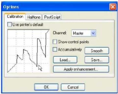
Using Print Preview
Every now and then, you would want to see how your image looks like before actually printing it. Simply use Print Preview to check whether your image now suits your target output.
To preview an image:
-
Select File: Print Preview.
-
Select a printer from Printer name. Change printer settings by clicking Printer Properties. You can also specify color printer options by clicking Color printer options at the bottom of the panel.
-
Select Paper size and Layout. If you want to adjust print margins, select File: Page Setup.
-
Adjust the image's location within the print Preview Window by dragging it. To resize the image while maintaining aspect ratio, drag the handles at the four corners of the image. To resize the image without maintaining aspect ratio, use the non-corner handles of the image.
-
Under Layout, specify settings of the image for printing. You can assign the paper's orientation, provide an image title, automatically resize it to fit the page, and center it horizontally and vertically.
- Specify number of copies to print in Copies.
- Click Print if you want to print, or Close to return to the normal editing mode.
Notes:
- Select the appropriate alignment settings in the Options Panel to reposition the document.
- Click Modify Printable Area on the Shortcut Bar to adjust the printable area.
- Click Reset to undo any change and return the image to its original state.
More print options
Let your creativity flow with PhotoImpact's unique capability to print CD labels, stickers, and even posters.
Print Multiple
Using Print Multiple, you can print the same image many times over or different images on a single page. Some layouts are designed for use with special paper available from Avery or Kodak, which you can use by selecting the corresponding product number. You can also use plain, non-branded paper by selecting either Disc Labels & Tray or Multiple Holders.
To print multiple images:
- With an image open in the workspace, select File: More Print Options - Print Multiple.
- Select a printer from Printer name. Change printer settings by clicking Printer Properties.
- Click Paper layout to select a preset layout from the list. Then select paper orientation. Then, click Next.
- Select whether to use the images found in the workspace, or add more images using a different source folder. Then, click Next.
-
If you are printing a single image multiple times, proceed to step 6 immediately. If you choose to print different images, drag selected image(s) from the thumbnail list to a placeholder in the Preview Window.
-
Adjust an image's location within the print Preview Window by dragging it. To resize the image while maintaining aspect ratio, drag the handles at the four corners of the image. To resize the image without maintaining aspect ratio, use the non-corner handles of the image. Repeat steps 5 and 6 until all images have been placed in the Preview Window and resized. Then, click Next.

Sample paper layouts in Print Multiple
-
Specify number of copies to print in Copies.
-
Click Print if you want to print, or click Close to return to the workspace.
Note: Click the Back Arrow button in case you change your mind and want to return to a previous panel.
Print Poster
Printing large-scale copies of your projects is now easy to do. The Print Poster feature prints a large image onto multiple pieces of paper which can be joined together to create a single poster.




To use Print Poster:
- With an image in the workspace, select File: More Print Options - Print Poster.
- Select a printer from Printer name. Change printer settings by clicking Printer Properties.
- Click Paper size to select the paper and set the number of copies. You can also select the paper orientation of your choice.
- Specify the height and width of your poster. You can do so using percent, inches, centimeters or pages as the unit of measurement.
To retain the image's ratio, select Keep aspect ratio. You can keep track of your settings via the Preview Window.
- Click Print to print or Cancel to return to the work area.
Images and the Web
With PhotoImpact, sending and acquiring images through the Web has never been easier. You can acquire images from Web pages and import them directly to PhotoImpact for editing.
Export the results as a Web page, a Web Album, a Web Slideshow, or images in SVG or RAW formats using a number of methods as outlined in this section.
Sending images
Send a document by e-mail as a single image or as a Web page. Just select File: Export - Send and choose one of the following options:
- Web page Creates a compressed *.EXE file, including the HTML code as well as its associated images. PhotoImpact then invokes your default e-mail program with the *.EXE file as an attachment ready for sending. The recipient only has to run this EXE file in order to view the Web page.
- Image file Sends the document as a single image attachment through your default e-mail program. Select Smart send to convert the image to a JPEG file first, making it a more appropriate size for sending via e-mail.
Notes:
- If the active image is a 48-bit RGB or 16-bit Grayscale and Smart send is selected, PhotoImpact will convert the source image to 24-bit RGB or 8-bit Grayscale.
• To send multiple images through e-mail, use File: Send in Ulead PhotoImpact Album.
Acquiring images from the Internet
For Web designers and Webmasters, having direct access to images on a Web site makes it easier to modify and update them. PhotoImpact offers you two ways to get images directly from the Internet.
First, use Select File: Open from Web - Image to open specific images from a Web page located either in your computer or on the Internet. For details, refer to the procedure below.
The second method is to use Select File: Open from Web - Web Page as
Image. This converts the entire Web page into the workspace as an image with all elements merged. This is convenient if you want to use an existing Web page as a template for others.
To open selected images from a Web page:
- Select File: Open from Web - Image.
- In the dialog box that appears, enter the desired Web page Address. You can also type a file path on your local computer.
- Locate your desired image on the page. Everytime you move your mouse over an image, it will be highlighted by a black border.
Notes:
- Always check for possible copyright issues when getting images from the Web. Ask the owner's permission whenever acquiring copyrighted material.
- Files saved to GIF format are of 256-Color (or indexed color) data type, while those saved as JPEG files are True Color images.
- If you selected an image from a Web page in your local computer and you want to find its original, non-optimized file, click Locate to automatically search the current folder, or click Browse to search the folder manually.
- Only image files can be opened by this method.
Using plug-ins
Plug-ins are small third-party programs that can be plugged into another piece of software to add functionality to it. Plug-ins for PhotoImpact usually come in the form of additional effects.
To import plug-ins into PhotoImpact:
- Locate and install the plug-in into your computer. Do not forget to take note of the installation directory.
-
From PhotoImpact select File: Preferences - General then select Plug-ins.
-
Locate the folder where you installed the plug-in and look for the folder which contains the file with the extension *.8bf (Ex. MyFilter,8bf).
-
Click OK then select the checkbox beside the specified folder.
-
Click OK to close the window then restart the program.
-
To select the plug-in, open an image then select Effect. You will see the plug-in at the bottom of the menu.
Note: To import plug-ins that do not need to be installed on your PC, simply locate the *.8bf file and then import it into PhotoImpact.
Integration with Ulead products
PhotoImpact allows you to go beyond image editing. Now, you can save and export your DVD menu images or overlays to other programs such as Ulead VideoStudio and DVD MovieFactory.
Or you can also continue creating different kinds of media such as animation or montages in GIF Animator or Ulead COOL 360. To use these programs, select Window: Switch and then choose the program you want to use.
PHOTO EDITING
PhotoImpact has a wealth of tools that lets you refine and enhance your digital and scanned photos. Learn also how to effectively use the High Dynamic Range feature, whether to combine same photos that were taken using different exposure settings, or even to remove moving objects in the images.
PhotoImpact provides you with a number of retouch tools to let you edit your photos such as: Touch-up Tool, Dodge Tool, Burn Tool, and more. Clone tools are also available to let you duplicate a part of your image and apply it to the same image or to another image.
PhotoImpact also gives you the ability to enhance digital camera images using RAW data and 48-bit image support, giving you more flexibility and better image quality in your photo editing.
Adjusting and enhancing your images
There are some issues to take into consideration when dealing with digital pictures and scanned images. Problems like overexposure, underexposure, poor lighting, or incorrect tint can be corrected by using the Adjust and Photo commands in PhotoImpact. These commands can be applied to selected areas, objects or entire images. Below are the most common commands used to fix photos.
When you choose a command, a dialog box opens, displaying sample thumbnails of the currently active image, object or selection area. Some commands display nine thumbnails and allow you to move through all possible settings by clicking each thumbnail accordingly.
Other functions have the Dual View and Split View tabs that allow you to view the original and enhanced images side by side or view the image with one half of it showing the original and the other half showing the enhancement applied.
Note: Some of the commands are not applicable to certain data types or they cannot be applied to selected areas in certain data types.
Tips:
- Adjusting a selection area converts it into an object.
- To jump directly to the Options dialog box, select Don't show these quick samples next time. To show quick samples again, select Display quick samples in File: Preferences - General - PhotoImpact category.
- You can also adjust the image by selecting presets in the EasyPalette's Effect Gallery.
Style
Style allows you to select a custom mood for your image by adding a tint or replacing a selected color's tint.
Color Adjustment
Color Adjustment helps you fine-tune your image's colors by adjusting levels between Cyan, Magenta, and Yellow and Red, Green, and Blue color properties.
Color Replacement
Color Replacement allows you to replace selected colors (and similar variants) With another color of your choice.
Invert
Invert changes each pixel color to its complimentary color. This is similar to creating a photograph negative, only without the orange mask present in film.
Posterize
Posterize allows you to adjusts images by reducing the number of tones into a specific number, with each pixel remapped to the nearest specified level, producing a dynamic, posterlike effect.
Threshold
Adjusting the threshold of images separates the image pixels into black or white extreme values.
Equalize
Equalize automatically redistributes all brightness levels of an image to adjust uneven and dark areas of your photo.

Before

After
Calculation
Merge specified color channels of an image file or files to produce a new image that shows remarkable depth using Calculation. When using different images, both images must have the same pixel dimensions.
Light
Light and camera flash are two factors that affect image quality, as they control the amount of light in a given photograph. However, many images are ruined due to improper use of these two settings. Read the following sections (SmartCurves,
Brightness and Contrast, Enhance Lighting, Levels, Highlight Midtone Shadow and Curves) to learn how to correct your image's lighting problems.
SmartCurves
SmartCurves produces high-quality tonal correction tailored for different cameras. For more details, see "Enhancing the dynamic range of an image with SmartCurves".
Brightness and Contrast
Adjusting the brightness and contrast allows you to fine-tune the luminance of an image by brightening or darkening each pixel in the image.
To adjust the brightness and contrast in an image:
- Select Photo: Light - Brightness and Contrast [Ctrl+B].
- Click a thumbnail. The center thumbnail is replaced accordingly. Use the sliders for finer control of the adjustments.
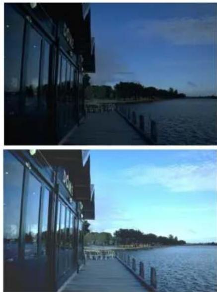
Tips:
- To simultaneously apply the new settings to the image in the workspace, select Real-time preview.
-
Click Add to place the adjustments in the EasyPalette for later use.
-
Click OK to apply the adjustments to your image.
Enhance Lighting
Enhance Lighting effectively repairs pictures by correcting light and flash errors. It adjusts specified pixels' brightness and notes the play between highlights, midtones and shadows.
To enhance an image's lighting:
- Select Photo: Light - Enhance Lighting.
-
Drag the Fill Flash slider or enter a value to adjust the image brightness. The higher the value, the brighter the image becomes.
-
Adjust Enhance Shadows to intensify the dark portions of the image. This will amplify contrast, thus creating a clearer picture.
-
Click OK.

Levels
Using Levels, you can adjust the tonal range of an image by adjusting the intensity levels of the image's shadows, midtones and highlights. The histogram serves as a visual guide for adjusting the image's Black, Gray and White tones.
To adjust an image using Levels:
-
Select Photo: Light - Levels.
-
Adjust entire color distribution through Input levels. The left anchor controls the distribution of black, the right controls white, while the middle adjusts the gamma.
-
Use Output levels to adjust the color range.
-
Click Stretch to locate the black and white points in the luminosity distribution by clipping the range.
Tips:
- Use the histogram data to further adjust the image. You can change the clipping range by clicking Options.
- You can also use Equalize to redistribute the brightness values of the image. This command automatically adjusts images that are too dark.
- Click OK to apply the changes.
Tip: Click Reset to go back to the image's original settings.


Highlight Midtone and Shadow
This feature redistributes the tone adjustment in an image to take advantage of the full tonal range. This is used to add, emphasize or remove shadows, improve contrast, and enrich highlights.
To adjust Highlight, Midtone, and Shadow in an image:
-
Select Photo: Light - Highlight Midtone Shadow [Ctrl+Shift+H].
-
Select either Dual View or Split View tab to view the changes you make in the image.
Note: To simultaneously apply the new settings to the image in the workspace, select Preview.
-
Select which color channel you want to adjust. Selecting Master affects all color channels.
-
Select which colors in the image to adjust.
-
Highlight remaps the colors starting with the light colors.
- Midtone remaps the colors concentrating with the "in-between" colors.
-
Shadow remaps the colors starting with the dark colors.
-
Drag the sliders and watch the Preview Window to see how the new settings are affecting the image.
Tips:
- Click Auto to let PhotoImpact automatically adjust the image.
-
Click if you want to save adjustments to the EasyPalette for future use.
-
Click OK.

Highlight=30 Midtone=0 Shadow=0

Highlight=0 Midtone=30 Shadow=0
Highlight=0 Midtone=0 Shadow=30
Curves
Editing curves is the most straight-forward color correction approach. It allows you to directly remap the tonal values in the image or any channels of the image. The most important thing to remember with curves is the X and Y axis relation. The horizontal axis represents current values of pixels in the image from 1 to 256. The vertical axis represents tonal values in the image.
To adjust an image using Curves:
- Select Photo: Light - Curves.
- Choose a color channel and select an Enhancement method to work on.
-
In the mapping window, drag the line to remap the color distribution according to your needs.
-
The gray graph shows the current distribution of colors in the image.
- The line shows how colors will be mapped to the image after clicking OK.
-
The horizontal axis represents the current image color values and the vertical axis represents the final color values.
-
Click OK to apply changes or Reset to reverse all previous actions and restore the image to its original state.


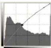


Color
There are some things to take into consideration when dealing with digital pictures and scanned images. Factors like overexposure, underexposure, poor lighting or incorrect tint may cause these images to appear differently from the original source. By using the color correction tools in PhotoImpact, you can remove most of the problems associated with color and lighting to produce stunning images that are sometimes better-looking than the original.
White Balance
White Balance restores the natural color temperature of an image by removing wrong color casts due to conflicting light source and incorrect camera settings.
For example, an object illuminated with incandescent lights may turn out too reddish or yellowish in an image. To successfully achieve its natural effect, you need to identify a reference point in your image which represents the color white. PhotoImpact gives you different options in selecting the white point:
- Auto Gives you automatic calculation of the fitted white point that is well-matched with the overall color of your image.
- Pick Color Allows you to manually select the white point in the image. Use the Eyedropper Tool to pick a reference area that should be white or neutral gray.
- White Balance presets Automatically selects white point by matching specific light conditions or scenarios.
- Temperature Allows you to specify color temperature of light sources in Kelvin (K). Lower values indicate Tungsten, Fluorescent and Daylight scenarios while Cloudy, Shade and Overcast fall under high color temperature.


To apply White Balance:
- Select Photo: Color - White Balance.
- Determine how you want to identify the white point. Choose among the different options in White point. (Auto, Pick Color, White Balance presets or Temperature)
- Enter a value to adjust the Level of sensitivity.
- Adjust Ambient light to determine brightness setting.
- Fine-tune your image by adjusting the red, green and blue cone spaces of the image.
- Click OK.
Hue and Saturation
As an alternative to the Levels, you might find it a lot more suitable to color correct by adjusting hue and saturation. Adjusting the hue affects color. Adjusting the saturation either intensifies or washes out colors. Adjusting Lightness affects the brightness of the image.
To adjust hue and saturation in an image:
- Select Photo: Color - Hue and Saturation [Ctrl+E].
- Select either Dual View or Split View tab to view the changes you make in the image.
-
In the Method option, select the reference for adjusting the image colors.
-
Master adjusts all the colors in the image based on those contained in the image.
- Range blocks only the sections of the color bar where editing is applied.
-
Colorize makes the image appear in different tones of a single color, making it appear like a monochrome image.
-
Drag the sliders and watch the Preview Window to see how the new settings are affecting the image.
Tip: Click if you want to save adjustments to the EasyPalette for future use.
- Click OK.

Image with the hat selected.


The color of the hat was changed after adjusting hue and saturation.
Color Balance
Color Balance takes all the colors in an image and adjusts them based on two colors specified by the user to make them appear more balanced. The Color Balance dialog box has two tabs for correcting the color balance: Smart and Preset.
To adjust the color balance of an image:
-
Select Photo: Color - Color Balance [Ctrl+L].
-
Click the Smart tab. This allows you to define a specific color to change in order to improve image appearance.
Tip: To proportionally adjust all the colors in the image, use the Preset tab.
- Click the Desired color square to open the Ulead Color Picker dialog box to specify the replacement color (right-clicking opens the Color Picker pop-up menu).
Tip: To simultaneously apply the new settings to the image in the workspace, select Real-time preview.
-
Click the spot on the image that you want to change (the Pointer changes into the Eyedropper Tool when you move the mouse over the image).
-
Click OK.

Preset tab

Smart tab
Color Cast
Color Cast corrects the unwanted color cast that different lighting conditions could give your pictures. Adjusting the color cast can also help you fix the overall discoloration of the photo.
To adjust color cast:
-
Select Photo: Color - Color Cast.
-
Pick a color from the Before View that should be the neutral tone (an area that should be pure white, gray or black but is not, because of the color cast). The cursor changes to the color picker when it moves over the source image.
-
After selecting a color, a reference point (represented by an "X") appears on the color wheel. The color wheel has a maximum of 100% saturation for each color at the edge of the circle, with neutral gray at the center (where red, green, and blue values are equal).
-
To adjust the color cast, pick another color from the Before View, drag the rectangular control point, or change hue and saturation.
-
When you are satisfied with the results, click OK.

Before
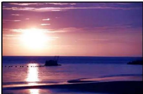
Before
Correct Chromatic Aberration
This feature corrects chromatic aberration, which is the colored (usually purple) fringing on image objects caused by different light wavelengths striking the camera's sensor at different angles.
To correct chromatic aberration:
-
Select Photo: Color - Correct Chromatic Aberration.
-
Select the aberrant color (usually purple) using Pick color from template, or the Eyedropper from Before View.
-
Adjust the degree of aberration in Level.
-
Click OK.
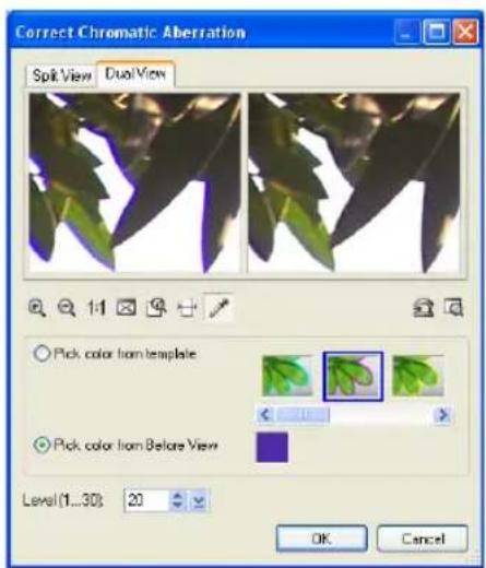
Focus
Selecting Focus adjusts the image's overall convergence to sharpen or blur it.
Lens Distortion
In the Camera Lens range of effects, the Lens Distortion effect simulates the bending of an image through different shaped lenses, distorting the image in various ways. The lenses can emulate spherical and trapezoidal lenses as well as a combination of the two.
To apply the Lens Distortion effect:
- Select Photo - Lens Distortion.
- Select Retain all image content if you wish to keep the entire distorted image within the bounds of the original dimensions of the document.
You may also wish to select a background color where the image edge becomes concave and forms a gap between itself and the document edge.
Leaving this option cleared will cause the document to increase in size and proportions.
-
To turn the image around, set the rotation angle to the desired degree. You can set the direction as clockwise or counterclockwise.
-
For Trapezoidal distortion, set the center by dragging the X icon instead. Again, you can use the sliders to set the vertical and horizontal distortion.
-
Adjust Spherical distortion, set the distortion center by dragging the O icon over the preview image.
Use the slider to set the vertical and horizontal degree of distortion. Adjusting the sliders left makes the image concave, while going toward the right makes it convex. To adjust Spherical

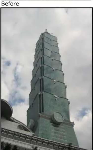
After
distortion, set the distortion center by dragging the O icon over the preview image.
Use the slider to set the vertical and horizontal degree of distortion. Adjusting the sliders left makes the image concave, while going toward the right makes it convex.
Note: The left window of Dual View displays a preview of the Spherical effect on the original image with an auxiliary mesh overlay, and the right window will display a preview of the effect upon the image in the left window.
6. Click OK.
Notes:
- Lens Distortion can be applied to RGB (24-bit True Color) documents only.
- Images longer or wider than 500 pixels will be temporarily resampled in the Dual View dialog box. During temporary resampling, the image will be shown in proportion with the longer side shown as 500 pixels.
Remove Red Eye
Fix red eye problems associated with photos taken using the camera flash with the Remove Red Eye tool or command.
To remove red eye using the Remove Red Eye command:
- Select Photo: Remove Red Eye.
- Select an eye of the subject.
Tips:
- To select the eye, must be pressed.
-
You can click 🔒 to zoom in the picture. After zooming in, click 📋 then drag the image to pan it.
-
Select the color of the eye you want to fix in Eye color.
- Adjust the Level until you get the desired results.
- Repeat steps 2 to 4 for the other eye.
- Click OK.
Enhancement effects
The enhancement effects in the Photo menu allow you to accentuate certain features in your images to make images look better or simulate a certain effect. The following sections illustrate how to use some of these effects.
Blur
This group of effects smoothen images by reducing fine image details and noise. These also suggest an out-of-focus effect. Motion Blur and Zoom Blur can be used to suggest fast camera or subject movement.
Motion Blur
Motion Blur adds life to your images by simulating movement. You can choose between applying Camera Shake, which simulates the unintentional movement when the camera is jiggled during shooting; Natural Motion, which copies the movement occurring when the photographers follows a moving subject; Object, which imitates the movement of an object in one direction; or Vibration, which mimics the back and forth movement of vibration.
To apply Motion Blur:
- Select Photo: Blur -Motion Blur.
- Choose a motion type to apply.
- Set the Moving Offset by entering a value. The higher the value, the farther the motion from the object.
- In Angle, set the motion angle, to give the movement its direction.
Note: When applying Motion Blur to a selection area or object, selecting Expand outside object enables Motion Blur to extend beyond the active selection.
- Click OK.

Before

After
Edge Preserving Blur applies blur effects to an image or selection but retains the sharpness of the edges. This filter works similarly like Blur, except that neighboring pixels whose values are more than the given threshold will not be blurred.
Edge Preserving Blur is helpful in simplifying images with a lot of noise.
To apply Edge Preserving Blur:
- Select Photo: Blur - Edge Preserving Blur.
- Set the level of Edge preservation you want to apply. A higher value means a higher threshold, resulting in sharper edges.
- Specify the blur area by adjusting Radius. Then, set the blur's intensity by adjusting Strength.
- Click OK.
Flatten Uneven Area
When working with a picture that is stitched or composited from two or more images, the area where the stitch or compositing occurred can sometimes look uneven. This results in stitch areas that are glaringly noticeable.

Flatten Uneven Area helps smoothen overlapped images to
create a seamless stitch. Using selection tools, pick the areas where you want this command applied. You can apply this command to multiple selections at the same time.
To smoothen uneven areas:
- Select areas within the image where you want the effect applied.
- Select Photo: Blur - Flatten Uneven Areas.
- Set the blur intensity by adjusting Lowpass. Conversely, set sharpening intensity by adjusting Highpass. Filter controls the degree in which the image will be made smooth.
- Click OK.
Zoom Blur
The Zoom Blur effect focuses on a point in your image, then creates a surrounding blur or whirlpool effect. This effect can be used on the whole image, a selection, or an image object.
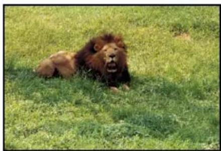
Before
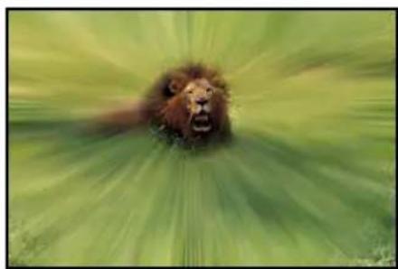
After
To apply Zoom Blur Effect:
- Select Photo: Blur - Zoom Blur.
- Select a zoom type from the Type pull-down menu.
- Click and drag the red spot on the left preview image to move the focus of the effect.
- Select a radius setting in Unblurred Area radius. There is a red dotted circle shown around the focus in the Preview Window. This circle delineates the barrier between the surrounding blur and the center blur.
- Specify a value for Inward blur. This also displays a scalable red circle on the image, concentric within the first one. The value specified here controls the size of the area between the circles, and the degree of blur in this area.
- Enter a value for Surrounding blur. This controls the amount of blur outside the first circle.
- For Clockwise and Counterclockwise blur effects, you can specify a value for Twist which will determine the extent of the blur effect revolving around the focus.
- For Breeze, Halo in and Halo out blur effects, specify the Direction (in degrees) that determines the path or course of the blur.
- Click OK.
Notes:
- Zoom Blur can be applied to RGB (24-bit True Color) documents only.
- Images longer or wider than 500 pixels will be temporarily resampled in the Dual view dialog box. During temporary resampling, the image will be shown in proportion with the longer side shown as 500 pixels.
Sharpen
This group of effects corrects blurred and out-of-focus photos. These effects enhance the edges by making them more distinct resulting to a crisper image.
Noise
This group of effects allows you to remove unwanted speckles within an image and random pixels that produce noise.
Reduce Noise
Reduce Noise effectively helps you in eliminating different visible noises in images generated by digital cameras and scanners.
To reduce noise:
- Select Effect: Noise - Reduce Noise.
- Drag the Luminance Noise and Impulse Noise sliders to reduce unwanted grains and speckles. The higher the setting, the greater the enhancement.


-
Select Color Noise to adjust its slider and eliminate color noise.
-
Click OK.
Enhance
This group of effects provides you with a variety of enhancements to apply to your photos such as Duotone Effect, Sunlight, Monochrome, and more.
Beautify Skin
Beautify Skin helps smoothen coarse and uneven skin. Beautify Skin works best when applied on a selection instead on the whole image.
To apply Beautify Skin:
- Select Photo: Enhance - Beautify Skin.
- Use the Eyedropper Tool and click to select a suitable skin tone from the original image. The selected tone will be shown in Skin tone.
-
In Level, determine the intensity of the effect. The higher the setting, the greater the enhancement.
-
Select a Complexion which controls the overall appearance of the skin, and the level of the effect. The higher the setting, the greater the variation.
Tip: Click to save the effect in the EasyPalette. Click Preview to view the effect at actual size. Zoom in to a region to see the effect at closer range.
- Click OK.


After smoothening, skin has more color compared to the original which looks a bit pale.
Note: Beautify Skin effect can only be applied to RGB (24-bit True Color) documents.
Diffuse Glow
Diffuse Glow brightens the entire image by applying luminosity to the highlights of the image. Light radiates from the center to its neighboring pixels. Aside from brightening the image,
Diffuse Glow adds noise to the entire image. The combination of adjusting brightness and adding noise creates an illusion of a foggy layer on top of the image.
Before
After
To apply Diffuse Glow Effect:
- Select Photo: Enhance - Diffuse Glow.
- Specify the area and extent of brightness adjustment in Threshold and Degree of glow parameters.
- Set the noise level by adjusting Graininess.
- Click OK to apply the effect.
Add Vignette
Vignetting is a situation in photographic lenses causing the darkening of edges in an image.
Add Vignette creates a framing effect by darkening the edges of an image, focusing the view on an image subject.
To add vignette:
-
Select Photo: Enhance - Add Vignette.
-
Create the shape and focus of the vignette by using the Freehand or the Ellipse tool.
Note: You can move, resize, and reshape the vignette by clicking and dragging on the control points of the vignette shape.
-
Adjust the settings for the inner and outer areas of the vignette. For example, Dreaminess decides how dreamy the image looks like.
-
Click OK.

Film Grain
While sometimes considered a photographic nuisance, Graining can also be used as an advantage to create some very special effects. Grain, especially when used in monochrome images, is helpful in giving pictures a weathered, antique look. PhotoImpact's Film Grain simulates this photographic effect by adding noise in an image that simulates film grains.
To apply Film Grain:
-
Select Photo: Enhance - Film Grain.
-
Set the film grains' attributes. Amount specifies the amount and density of the grains, while Size sets the grains' size on the image.
-
Click OK.

Before After
Add Moon
With the Add Moon effect, you can add a moon to an image and customize its phase, appearance and location.
To apply Add Moon effect to an image:
- Select Photo: Enhance - Add Moon.
-
In Dual View, drag the red dot to the location where you want the moon to appear.
-
Under Phase, select the moon phase that you want. Rotate the moon by dragging the red dot in the Rotation dial. Click + or - for more precise adjustments.
-
Under Surface, add dark crater-like areas on the moon by selecting Texture, and rotate the texture by adjusting the Angle dial to make the moon's appearance more suited to the scene's location. To choose a moon Color, select a preset color or select the desired color in the Ulead Color Picker.
-
To increase moon size, increase the Radius. To give the moon a spherical shape and three-dimensional look, lower the Flatness value.
-
To specify the intensity of light emanating from the moon, adjust Brightness. To make the crater-like areas more visible, lower the Softness value. You can also specify Halo.
-
To determine the overall brightness of the environment, adjust the Ambient light.
-
If you want a moon glow, select Glow and specify Strength and Range settings.
-
When you achieve the effect you like, click OK.

Before
After
Sunlight
Use the Sunlight effect to brighten up a neutral scene by simulating the effect of bright sunlight on the image.
To apply Sunlight to an image:
-
Select Photo: Enhance - Sunlight.
-
In the Dual View tab, if image correction is needed, apply a preprocessing filter before applying the Sunlight effect to the image.
Enhancement filters include:
- Gradual luminance (ND) Corrects the light distribution of an image by adjusting the highlights.
- Blue sky Adds a blue-white gradient on the specified effect area to enhance its appearance.
- Contrast Strengthens the color space in individual RGB channels.
- Combination of above Combines the enhancements of three filters: Blue sky, Gradient luminance (ND), and Contrast.
- Red Adjusts the R channel of an image. Apply this to enhance the warm tones of architectural photos or rock formations in landscape photos.
- Green Adjusts the G channel of an image. Apply this to enhance the greens of nature objects in landscapes and floral photographs.
- Blue Adjusts the B channel of an image. Apply this to enhance the blues of pictures with skies and water.
Note: With Gradual luminance, Blue sky, and Combination of above filters, adjust the transition point and direction of application. A red line appears on the source image, identifying the transition point between dark and light areas of the image. Drag the dot on the red line to the desired transition point on the source image. To rotate the angle or direction of application, adjust the Direction dial.
-
Under Sunlight settings, determine the Intensity of sunlight and increase Saturation for brighter colors. You can also adjust Contrast, and adjust the Cool-Warm slider to create a warmer appearance. Increase Soft focus for a misty effect.
-
When you achieve the effect you like, click OK.
Before
After
Lens Filters
In traditional and digital photography, filters are placed over the camera lens for the purpose of modifying the appearance of a photo. Different filters are used to achieve different effects such as eliminating reflections on shiny surfaces, saturate colors, or deepen blue skies. The same output can be achieved in digital imaging using PhotoImpact's Lens Filters.
Diffraction Filter
The Diffraction Filter creates rainbow-like reflections in highlights and point light sources. This effect adds a colorful and dramatic accent to images.
To create Diffraction Filter effects:
- To apply diffraction to a specific area on the image, use the Selection Tool to select an area.
- Select Photo: Lens Filters - Diffraction Filter.
- In the Dual View tab, the before and after views show the applied effects in real time. Use the zoom buttons to adjust the viewing size of your image and see the effects more clearly.
- From the Filter type list, select the type of formation for the diffraction effect. If Starburst or Circular is the selected filter type, specify the pairs of Streaks.
- Luminosity threshold determines the amount of highlights (or light areas) in the image to which the effect will be applied. Select a higher value to include a lesser coverage of highlights detail thus creating

Before
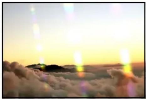
After
lesser diffractions. Otherwise, select a lower value to include more coverage of highlights details and create more diffractions.
- If there are too many diffractions generated which do not look quite realistic on your image, adjust Convergence. Increasing the value merges multiple clusters into one cluster and recalculates the center of the new cluster.
- Under Streak settings, drag the red dot on the Angle dial to change the angle of the beams. Click + or - for more precise settings. To change the color pattern
of the beams, adjust Hue Shift. You can also set the diffraction beams' Intensity, Length, Size, Spacing, and Glow size.
- If you made a selection on the base image, select Expand outside selection to make the diffraction go beyond the selection.
- Click OK.
Multivision Filter
Multivision Filter simulates the effect of a camera's multi-image filter, which creates reproductions of a subject.

Before

After
To create Multivision Filter effects:
- Select Photo: Lens Filters - Multivision Filter.
- In the Dual View tab, the before and after views show the applied effects in real time. Use the zoom buttons to adjust the viewing size of your image and see the effects more clearly.
- You can either select a Preset multivision filter or create a Custom filter.
To create your own custom filter, select a Filter type (which determines the formation of reproductions) and specify the number of Facets (i.e., the number of reproductions). If the selected filter type is Linear or Symmetrical, choose whether to create Reflected or Refracted images.
- In the Before View, drag the red dot to determine the location coordinates of the center of the image to be duplicated.
- Under Filter settings, change the Radius to adjust the subject's area and the distance between the center image and its reproductions. Also adjust the Transparency, Softness, and Rotation of the reproductions.
- When you achieve the effect you like, click OK.
Star Filter
Star Filter creates brilliant, star-like points in areas of an image where light is noticeably bright. This effect adds a dramatic and brilliant accent to ordinary-looking images.
To create Star Filter effects:
- With an image open, select Photo: Lens Filters - Star Filters.
- Specify the Filter Setting by entering the number of Spikes, and values for Variance. Determine the effect's generated density by setting the Luminosity Threshold.
- Choose between using a Standard Filter or PL (polarized light) Filter. PL filters simulate the use of two lenses while Standard uses one. Specify a value in Rotate (if you chose PL) to simulate the rotation of the lenses against each other.
- Set the star points' spikes by adjusting the Spikes setting. Depending on your filter setting, you can adjust the points' Brightness, Length, Width, and Spread Angle.
- Click OK.

Before
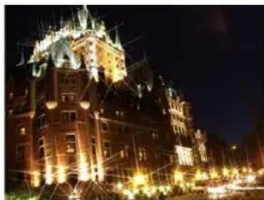
After
Handling 48-bit images
PhotoImpact supports 48-bit (16 bits per R, G, B channel) image processing and editing. This allows you over 280 trillion colors, tones and shades to work with in your images instead of the 16 million colors of 24-bit image editing.
Working with more colors gives you smoother gradations between colors in your image. And since there is more data per channel, a higher level of detail in images can be attained in 48-bit images. Editing in this mode also avoids major loss of color information during digital retouching and color correction processes. You can acquire 48-bit images via scanners, by opening a RAW file from a digital camera, and by adjusting/converting the data type of an existing image file.

The following are features that can be adjusted for 48-bit images:
- Brightness and Contrast
- Unsharp Mask
- Levels • Reduce Noise *
- Curves - Crop
- Hue and Saturation * • Rotate
- Highlight Midtone Shadow • Flip
• Color Balance * • Zoom - Invert • Auto-process
• Color Cast * • Color Adjustment * - Equalize • Posterize
• Gaussian Blur • Threshold
Notes:
- You can save 48-bit images in TIF or UFO format.
- * does not support 16-bit grayscale images.
Enhancing digital camera photos using RAW data support
With RAW data support, you can directly edit raw image data from popular digital camera formats. PhotoImpact lets you decide how to open RAW files by using essential parameters such as color temperature and exposure compensation. You can then use the same settings for batch processing in opening multiple RAW files.

To open RAW files, select File: Open and select the file you want to open. This will take you to the Open Camera RAW File dialog box.
- White balance Calibrates colors to correctly display white and other colors according to different lighting conditions. You can adjust white balance through:
- Scenario Lets you choose the lighting condition applied to the image. Choose from default scenarios (e.g. As Shot, Daylight, Tungsten etc.) or choose Custom to manually adjust the color temperature.
- Color temperature Sets the degree of warmth or coolness of a lighting source while the photo was taken. Lower value means warmer lighting (e.g. indoor), whereas higher value means cooler (e.g. outdoor).
- Tint Adjusts the color balance between green and magenta. Dragging the slider to the right increases the degree of green, while dragging to the left increases the degree of magenta.
- Exposure compensation Adjusts exposure variables for lighting issues.
- Brightness Allows you to fine-tune the luminance of an image.
• Saturation Intensifies or washes out colors.
- Shadow Intensifies the dark portions of the image.
- Sharpness Enhances the edges of an image by making it more distinct, resulting to a crisper image.
- Reduce noise Sets the noise degree for luminance and color.
• Luminance noise Reduces luminance noise.
• Color noise Reduces color noise.
- RGB color type Sets the color type to either 24-bit (8 bits/channel) or 48-bit (16 bits/channel).
- Apply to all subsequent selected files Applies the settings for batch processing the remaining RAW files if you have selected multiple RAW files to open.
High Dynamic Range
Dynamic range is the range of light that can be captured in a photo, from the darkest shadows to the brightest highlight. Digital camera sensors (or film in traditional cameras), unlike the human eye, can only capture a limited dynamic range when photographing in extreme light conditions or dark environments. For instance, a landscape will have a vast dynamic range of light that cameras are not able to completely capture, and photos either have enough exposure of shaded areas (like the mountain) but with blown highlights in the sky, or have clear blue sky but with dark shades. A bright outdoor or dark indoor scene most often also have exposure problems, resulting in darkly lit subjects or washed out highlights.
PhotoImpact's High Dynamic Range (HDR) compensates for a digital camera's limitations, and tries to resolve exposure problems that photographers frequently encounter when shooting photos that contain dramatic differences between light and shades. It produces an optimized image by combining different copies of the same scene and uses different exposure levels to extend its perceivable tonal range. To produce such an image, multiple shots with different exposures are first combined into a High Dynamic Range (HDR) image which will record the complete tonal information combined from all the shots. This information is then used to produce a final optimized image.
High Dynamic Range also has tools that let you fix areas in your photos that are different or retain areas that you don't want to be adjusted before you combine them to produce the HDR image. This eliminates the blurred areas in the HDR image due to the differences between photos.

The three photos on the left were taken with different exposure levels then combined into a single image to create the properly exposed image.
Enhancing the dynamic range of an image with SmartCurves
You can enhance the dynamic range of an image by directly applying a camera curve to an image. (To make a camera curve, see "Creating and saving a camera curve profile" for details.)
To enhance the dynamic range of an image with SmartCurves:
-
Select Photo: Light - SmartCurves.
-
Select a camera curve from the Use camera curve list.
Tips:
- You can create your own camera curve in the High Dynamic Range dialog box.
-
To import new camera curves, see "Importing a camera curve profile".
-
Click OK.
Creating and saving a camera curve profile
When using High Dynamic Range to optimize photos from a certain camera, you first need to select an existing or generate a camera response curve for your camera. (A camera response curve indicates how the camera's light sensor responds to different light intensity levels.) A camera response curve must be saved as a camera curve profile if you want to optimize a single-shot photo or a photo of a subject photographed in motion.
Tip: If you only have one photo of a particular scene and you don't have a camera curve profile for your camera, you can use one of the camera curve profile presets to create the HDR image.
To be able to create an accurate camera curve profile, the image shots that are used as basis to create the camera curve must show all the highlights, details, and shadows of the photographed scene. Here are some guidelines on how to set your digital camera when photographing the image shots:
- Mount your camera on a tripod and set your camera to aperture priority to shoot photos at a fixed aperture with varying shutter speeds.
• Take at least three shots (five shots or more is recommended) of the same scene with different exposures. - To capture large exposure differences when taking fewer shots (such as three to five shots), set the exposure in increments of at least +/- 1.0
Exposure Value. Whereas if you are taking a greater number of shots, you can set the exposure at lower increments but make sure that the number of shots are enough to cover a wide range of exposure levels.
To create and save a camera curve profile:
- Open the photos that were taken using various exposure levels.
- Select Photo: High Dynamic Range.
- In the Composition tab, select Auto generate camera curve from the Camera curve profile choices.
Note: If your photos retained the EXIF data recorded by the digital camera, the F-stop interval can automatically be determined based on the exposure time stored in the data. Whereas if your images are non-EXIF images, you need to manually specify the F-stop interval between your images.
- Click Save as button to save the camera curve profile.
Note: If you used your camera's Automatic Exposure Bracketing feature and took two (or more) sets of shots, some photos will have the same shutter speed and exposure time settings. A message appears when photos have identical settings. In the Image List Panel, click [-] to remove these photos.
- Click the Compose button to create an HDR image using the generated camera curve.
Tip: PhotoImpact includes preset camera curve profiles for some digital camera models. If there is a camera curve profile available for your camera, you can directly use it for your photos.
Importing a camera curve profile
To import a camera curve profile, click Import in SmartCurves or HDR dialog box. Browse for the camera curve profile file (*.ccf) and then click Open. Select the imported profile in Use camera curve.
Composing an HDR image using multiple images
Create an HDR image by combining photos that have different exposure levels. Before composing the HDR image, you can also choose to fix differences between the different photos to eliminate blurred areas when the HDR image is composed. After composing the HDR image, you are automatically taken to the Optimization tab.
To compose the HDR image:
- Open the photos that were taken using various exposure levels.
Tip: At least one image with EXIF data is required for creating an HDR image.
-
Select Photo: High Dynamic Range.
-
In the Composition tab, select the Camera curve profile of the camera you used to take the photos.
Tip: If your photos are handheld shots, select Auto crop after registration in Registration and click Apply to merge them and remove excess white space from the merged image.
- Select Remove artifacts to fix differences in your photos before they are combined to compose the HDR image. Select whether to use Auto or By Brush to designate areas in the photo that you want retained or removed.
See "To fix differences in the photo:" to learn how to use Remove artifacts.
Note: Remove artifacts is not available when you only have one image opened.

- Click the Compose button to create the HDR image.
The program then automatically brings you to the Optimization tab.
To fix differences in the photo:
- Select Remove artifacts.
- Choose a method, Auto or By Brush, how to fix differences in the photos.
- Auto Automatically fixes differences in the photos.
- By Brush Lets you manually define areas in your photos that you want to remove or retain.
Note: If you choose Auto, you do not have to do the proceeding steps. If you select By Brush, continue with the procedure below.
- Click an image in the Image List Panel. Select the image where there is an area you want to remove or retain.
- Click Brush-out then drag over the area that you want removed.
- Click Brush-in then drag over the area where you do not want any changes to be made.
When specifying the area to retain or remove, you don't have to be precise with the marked area. The area you want to fix or retain only has to be more or less covered by the brush strokes.
Tips:
- When the size of a zoomed-in image exceeds that of the Preview Window, you can right-click to pan the image.
- Select Stack images to superimpose all the photos to see if your brush-in/out areas have covered the areas that you want to remove/retain.
- You can adjust the Brush size to make the brush strokes thicker or thinner when painting over the photo.
- It is recommended that the brush stroke colors for Brush-out and Brush-in be different. Click the Color box to change the color.
6. Click Done.
Tip: Select Erase then drag over brush strokes to erase them. If you want to delete brush-in strokes, Brush-in must be pressed. If you want to erase brush-out strokes, Brush-out must be pressed.
Optimizing the HDR image
You can also refine the HDR image by adjusting its tone and contrast.
To optimize the HDR image:
- Click the Optimization tab.

- Histogram clipping displays the full histogram data of the HDR image. Drag the two triangle sliders (black and white) to define the optimized histogram range to be used in the HDR image.
The gray area is the optimized histogram range to be used in the HDR image while the pink area is the clipped histogram data not to be used in the HDR image. The pink area are the colors that cannot be displayed on screen.
-
The Histogram adjustments are separated into Coarse and Details. Drag the Coarse Contrast slider to adjust the overall contrast of the image.
-
Adjust the Highlight, Midtone or Shadow (both in Coarse and Details) to bring out finer details in the light, midtone or dark areas in the image.
Tips:
- Click View to view the HDR version of the composite image in the Preview Window. Use the slider to preview different exposure levels of the image.
- Select Show HDR color to display the HDR image's luminance quantities as floating point RGB values. Move the mouse over the image in the Preview Window to see the RGB values (displayed below the Preview Window).
Editing the HDR image
Rotate, resize, crop, or save the HDR image. The Operations tab lets you make further adjustments to the HDR image. This is also where you can save the image as an HDR image file to retain the full tonal information of the image.
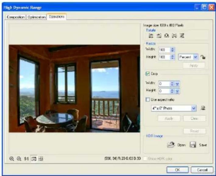
To edit the HDR image:
-
Click the Operations tab.
-
Edit the image by using Rotate, Resize, or Crop.
- Rotate Click a button to rotate or flip the image.
- Resize Enter the Height and Width value you want to resize the image to. Click Apply to resize the image.
- Check Crop then drag on the image to create the crop selection. You can also choose a preset size from the drop-down list. Click Apply to crop the image.
Tips:
- Click Resize lock to keep the aspect ratio when resizing or check Use aspect ratio when creating the crop selection.
- Click Reset to revert the image back to its original state before any adjustments were applied.
-
Click Save to save the image as an HDR file (HDR). This lets you open the HDR image in the future if you need to optimize it again.
-
Click OK to open the edited image as a new document in the workspace.
SmartRemove
SmartRemove lets you remove unwanted objects or areas from at least two images of the same scene. You can even expand your creativity by preserving and/or deleting particular objects or areas.
To use SmartRemove:
- Open at least two EXIF images of the same image size, aperture, shutter speed, and ISO values.
Note: Images without these data can also be used but the result may be limited.
- There are two ways you can use SmartRemove:
- Auto Automatically removes moving objects from the images (at least 3). Once Auto is clicked, automatic brush-out strokes are shown. Next, jump to Step 6 below.
- By Brush Lets you manually select the objects you want to remove from the images.

Result after applying SmartRemove
- Click an image in the Image List Panel. Select the image where there is an object you want to remove.
Tip: For best result, select an image with the minimum number of objects to be removed, and then click Set as key image (the lock button).
-
Click Brush-out and drag over the objects you want to remove.
-
Click Brush-in and drag over the objects you want retained.
Tips:
- You don't need to be precise in marking the objects. They only have to be more or less covered by the brush strokes.
- Select at least two images in the Image List Panel, and select Show brush-out result of stacked images to preview superimposed result of these selected images.
-
Click SmartRemove. The result is shown in the Preview Window. To make further changes, click SmartRemove again and continue with auto or brush options.
-
Click OK.
Using the Retouch Tools
The Retouch Tools are used to enhance areas of an image by adjusting existing color pixels. PhotoImpact offers a variety of tools to help edit your images such as: Dodge, Saturation, Burn, and more. To select a tool, click the lower right corner of the Retouch Tool in the Toolbox; a drawer of retouching tools opens and you can select the type of tool you want to use.
When you apply a Retouch Tool on an area, the tool uses the shape and size of the current brush each time you click the mouse. To apply the effect over a larger area, drag the mouse or increase the size of your brush. To reapply and increase the effect on a specific area, click repeatedly.
To apply a Retouch Tool:
- Open the image to edit.
- Select a Retouch Tool to use, in this case use the Remove Scratch Retouch Tool.
- Click Show or hide Tool Settings on the Attribute Toolbar to open the Tool Settings Panel. In the Shape group, define your brush attributes. You can also specify the strength of the effect for each brush stroke in the Options group.
Note: Options on the Attribute Toolbar and/or the Tool Settings Panel are different for each Retouch Tool.
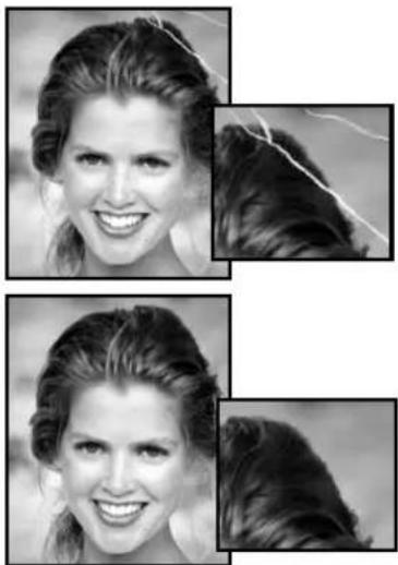
- Paint over the area to fix. PhotoImpact regenerates pixels to cover the damaged area based on neighboring pixels.
Some effects are subtle and you may have to work with the brush to get the desired results.
Note: The Retouch Tools can only be applied to Grayscale and True Color images.
Tip: You can apply a number of Retouch Tools to an image, burn for tan effect, dodge for light effect, blur to smoothen rough skin texture, and many others.
To specify the attributes of a Retouch Tool, open the Tool Settings Panel. The attributes for each Retouch Tool are displayed in three groups: Shape, Options (settings available vary according to the type of Retouch Tool), and Pressure options. The attributes for these tabs are identical to those for Paint Tools ("Using the Painting Tools").
Using the Burn and Dodge Tools
The Burn and Dodge Retouch Tools let you darken or lighten areas of an image. On the Attribute Toolbar or Options in the Tool Settings Panel, select to modify only the Shadows, Midtones or Highlights when using these Retouch Tools. To use these tools, select the tool then drag over the area in the image you want to lighten or darken.
Changing the colors of an image
There are two very useful Retouch Tools for colorizing or changing the color of images, these are:
- Color Transform Pen Alters the appearance of an image by changing the original color to another color. You can adjust the Hue and Saturation values but the luminance (lightness of a color) is retained. The result is vivid and more realistic than the Color Replacement Pen.
- Colorize Pen Applies a tint or shade to an image of uniform hue. To create a single color effect, apply Monochrome effect or use a Grayscale image (convert to RGB) then use the Colorize Pen to enhance. Or, you can access the Hue and Saturation dialog box and select Colorize.
To colorize old photos:
Use the Colorize Pen to make old photos vibrant.
- Scan an old photo then open it in PhotoImpact.
- Select Photo: Enhance - Monochrome to change the image into black and white without changing the RGB data type.
Note: The Monochrome effect converts an image to a uniform hue and saturation without changing the brightness values. When you apply color to an image, only the RGB and the brightness values changes.
-
Select an area on the image which you want to colorize.
-
Next, click the Retouch Tool in the Toolbox and select Colorize Pen.
-
Customize the brush settings on the Attribute Toolbar.
-
Drag your mouse over the selected area until you get the desired results.
Tip: To make the color look even smoother (e.g. facial color), select the Blur Tool in the Retouch Toolbox and drag your mouse over the area where the color was applied.
- Repeat steps 3 to 6 to colorize more areas of the image.
Tip: To colorize your photos faster, you can also select Photo: Color - Hue and Saturation then select Colorize to apply a single color.

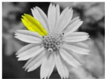

One petal selected then colorized.
Newly selected petals being colorized.
Cloning parts of an image
Cloning is the process of duplicating an object or parts of an image and "painting" it over another part of the same image or another image. Cloning is useful when you want to remove unwanted artifacts in a picture such as a bystander accidentally walking through a scene.
Note: You can only clone on Grayscale and True Color images.
To use the Clone Tool:
-
Click a Clone Tool in the Toolbox and adjust the settings on the Attribute Toolbar.
-
Press [Shift] and click the mouse over the area you want to clone (a crosshair appears).
-
Drag over the area where you want the cloned area to appear.

Before

After
Note: The size and shape of the area painted are determined by the current tool's size and shape settings.
Tip: Click Show or hide Tool Settings to open the Tool Settings Panel to adjust additional Clone Tool brush attributes.
Using the Touch-up Tool
The Touch-up Tool is primarily used to correct blemishes on a person's face or skin. Similar to the other Clone Tools, it copies pixels from one part of your image to another. In addition, the Touch-up Tool takes into consideration the texture and lighting of the image and therefore creating a realistic touch-up job.
To use the Touch-up Tool:
- Click the Touch-up Tool in the Toolbox.
- On the Attribute Toolbar, Set the options for the Touch-up Tool.
Source color and Source texture determine how much texture and color are copied from the source area.
- Set the Texture mode.
Replicate and Smoothen determine how the texture from the source area will be applied to the target area.
- Press [Shift] and click the mouse on the area you want to use as the reference point (a crosshair mark appears).
Drag your mouse over the area you want to touch up.
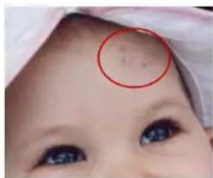

Working with scanned images
The Auto-process commands are used for automatic and intelligent control over image appearance. It automates the format process and lets PhotoImpact estimate and apply changes needed to enhance images accordingly.
The commands under Auto-process include the following:
• Levels Adjusts the image's tone map to meet the full tonal spectrum.
- Adjust Adjusts Brightness and Saturation by stretching the colors to fit the available gamut. Hue settings remain unchanged.
• Color Adjusts Hue, Saturation and Brightness settings.
- Focus Adjusts the image by softening sharp edges and enhances dull areas. Works well with both sharp and blurred images.
- Straighten Automatically rotates the image and straightens it to an absolute horizontal or vertical position.
- Crop Removes white space from the edges of the image.
- Enhance Automatically adjusts and smoothens tone to improve overall image quality.
- Contrast Adjusts the Brightness of the image, and retains the original Hue and Saturation setting.
- Reduce Noise Eliminates different visible noises in images generated by digital cameras and scanners.
To apply an Auto-process command (other than Batch) to your image, simply select an item under the Auto-process submenu.
Auto-process - Batch
Auto-process - Batch is a convenient way to apply multiple enhancements to your image at the same time. By selecting Auto-process- Batch, PhotoImpact will apply the commands in the specified order.
For a detailed description of each command, refer to the dialog box definition that is displayed when you select a particular process
To use Auto-process - Batch:
- Select Adjust: Auto-process - Batch [Ctrl+F9].
- Click the Auto-process option(s) you want to apply.
- To remove an option, click its button again or drag it off the queue at the bottom of the dialog box.
- Click OK to apply the Auto-process option(s) to the image.
Note: Most of the options in the Auto-process dialog box can be accessed independently by selecting their respective commands on the Adjust: Auto-process submenu.
Stitching images together
There are a number of instances in which your image may not be in one piece. For instance, an image might be too big for a scanner or that you have made separate screen captures of an image whose dimensions extend beyond that of the monitor.
Whatever the case, Stitch Scanned Images lets you accurately and efficiently reconstruct an image from multiple pieces.
The way in which you use Stitch to join image strips depends entirely on the condition of the images you have. For this reason, Stitch provides multiple options and controls for both manual and automatic stitching, giving you pixel-level control for seamless joining of images. You can:
- Set auto-stitching parameters to make automatic matches and align a floating image over an active image.
- Drag a floating image until it matches up with an active image.
- Define the reference point in each image to align the two images.
- Select Auto fine-tune to help the images snap into the correct relative position when manually stitching photos.
- Set the transparency of the floating image to aid manual stitching and to define how images are combined in the overlap area.
Notes:
- You can only join images that share the same data type and are either Grayscale or True Colo r.
- Stitch Scanned Images only works with base images; objects cannot be stitched. To stitch an object, it must first be merged onto the base image.
- It is not recommended to use Stitch Scanned Images to combine photos taken using a digital camera.
Automatic stitching
Auto-stitch is a fast and easy way to combine two images together. This option is best used for images that show a lot of detail and are fairly clear.
To stitch two images automatically:
-
Open the images you want to join together then click one to make it active.
-
Select Edit: Stitch Scanned Images.
-
In Stitch with, select the image you want to join to the active image.
Tips:
- If you cannot see all the images in the Preview Window, use the zoom options below the Preview Window.
- Use Switch direction to swap the positions of the images.
-
Select Auto-stitch and enter the values in Overlap range (percentage of overlap) and Vertical/Horizontal tolerance (misalignment of two images).
-
Click Test to preview the auto stitched image.
-
Click OK.
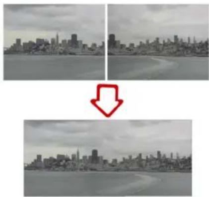
Manual stitching
Manual stitching gives you more control on how to combine the different images.
To stitch two images manually:
-
Follow steps 1 through 4 of the "To stitch two images automatically:"
-
Drag the floating image until you are satisfied with its position.
-
Click OK.
Adding a frame and photo caption
Use Photo Frame to add a frame to your image or object. This feature also lets you insert EXIF information as text for photos taken using a digital camera, type in a caption, or insert a custom logo on the photo.
Note: You can add both text and logo on one image.
To add a frame:
-
Select Photo: Photo Frame.
-
In the Frame tab, select Frame.
-
Select 2D Frame from the Style drop-down menu.
Tip: Select Do not merge frame to keep the frame as an object in your image. This allows you to resize and reposition the frame.
- Set the frame Options.
Tip: Select Shadow or Canvas to add a shadow or to enlarge the size of the document canvas. Click Options to customize the settings.
- Click OK.
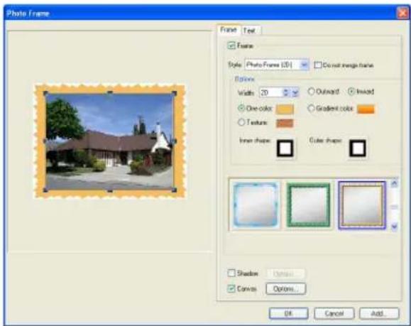
There are different frame styles available and each one has a different set of frame options. However, the procedure of adding a frame is the same for all frame styles.
To insert EXIF data as text on a photo:
-
Select Photo: Photo Frame and click the Text tab.
-
In the Text tab, select Text then click EXIF to open the EXIF dialog box.
Tips:
-
Click Add to save the contents in Text to the currently selected item in the Element list. You can then use the same content in the future by selecting it from the list.
• To add custom text, just type the text in the Text box. -
In the dialog box, select the EXIF tags that you want to include in the caption in the Available Tags List then click Add.
-
After adding the tags that you want included, click OK.
Tip: You can see a preview of the text in the Preview Window.
- Set the text options such as Font, Orientation and Position.
Tips:
- Select Shadow then click Options to add a shadow to your text.
- Select Do not merge text/logo to keep the text as an object in your image. This allows you to edit and reposition the text/logo.
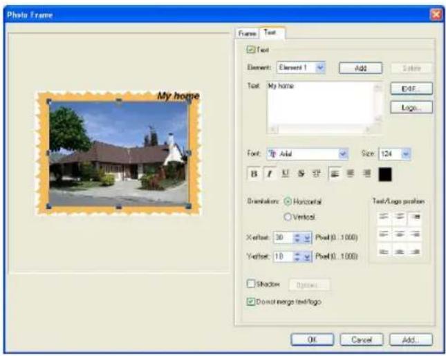
To insert a logo on a photo:
- Select Photo: Photo Frame and click the Text tab.
- In the Text tab, select Text then click Logo.
Tip: Click Add to save the logo in Text to the currently selected item in the Element list. You can then use the same logo in the future by selecting it from the list.
- In the dialog box, select the image you want to insert then click OK.
Tip: You can see a preview of the logo in the Preview Window.
- Set the alignment of the logo in Orientation and Position.
Tips:
- Select Shadow then click Options to add a shadow to your logo.
- Select Do not merge text/logo to keep the logo as an object in your image. This allows you to reposition the logo.
SELECTIONS & OBJECTS
In this chapter, you will learn how to work with selections and objects. PhotoImpact provides you with a variety of selection tools to let you select parts of images that you only want to edit. Selected areas in your image are indicated by a selection marquee.
Besides selections, you will also be introduced to objects. You will learn how to create, edit and manage objects using tools such as the Transform, Measure, and Object Eraser Tools.
Working with selections
When no area has been selected in an image, any command that you apply affects the entire image. To restrict the command to a certain area of an image, you need to create a selection area. Click the Selection Tools in the Toolbox, then choose a type of selection tool to use.
Tips:
- You can start and end your selection outside the image canvas making it easier to select the corners of your image.
- Press the [Spacebar] to toggle between showing and hiding a selection marquee.
Pick Tool
The Pick Tool is used mainly to select objects and static selections. With this tool you can perform the following functions:
- Click an object or static selection to make it active.
- Select multiple objects by dragging the Pick Tool from an empty area across the edges of a group of objects (or enclose them within the selection area).
- Select a set of objects by pressing [Ctrl] or [Shift] as you click them.
- Merge all the objects together as a single object: first select all the objects, and then select Object: Merge as Single Object, or right-click any object in the group then select Merge as Single Object.
With the Pick Tool, you can change the layers of objects by using the four order arrow buttons on the Attribute Toolbar, as well as change the alignment using the buttons in Align (or by selecting Object: Align).
Standard Selection Tool - selecting regularly shaped areas
The Standard Selection Tool lets you select areas of an image based on a preset size and/or shape, such as a rectangle or circle. You can also use this to convert selection areas into objects by dragging the selection.
To create a standard selection:
- Click the Standard Selection Tool and select the desired shape in Shape.
- Drag your mouse over the image. Once the dotted line area covers the area you want to select, release the mouse button.

Tips:
- If you want to create a selection area based on precise dimensions, select Fixed size on the Attribute Toolbar and then enter the desired width and height.
- To add to an existing selection, press [A] as you select. To remove parts of a selection, press [S] as you define the section to remove.
Lasso Tool - selecting irregularly shaped areas
The Lasso Tool lets you easily select irregularly-shaped subjects, such as a person's head. This is useful when you want to separate a foreground object from the background. This works best when the foreground subject and background have high contrasting colors.
- Click the Lasso Tool in the Toolbox.
- Select Smart lasso on the Attribute Toolbar to let you trace the edges of the subject you want to select.

Image on the left shows Area to consider when tracing set to 30 while the image on the right shows Area to consider when tracing set to 80.
- Set the Area to consider when tracing. This determines the area that the Smart lasso will consider when tracing the edges.
The Area to consider when tracing is represented by a circle. The larger the value, the larger the size of the circle.
Tip: If the subject you are selecting has irregular edges (e.g. flower petals) and you do not want to include unwanted areas in the selection, it is recommended to set Area to consider when tracing to a lower value.
-
Click to mark the starting point then trace the subject you want to select by moving the mouse over the edges of the subject (no need to hold down mouse button).
-
While tracing, when you have made a desired edge selection, click on the selection path to add an anchor point. Adding an anchor point prevents you from accidentally retracing (deleting) your selection path.
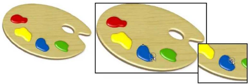
Tips:
- If you make a mistake in selecting, just retrace along the selection path to the point where you want to begin selecting again. You cannot retrace a path that is in between two anchor points.
- To delete a selection path that is between two anchor points, press [Backspace].
- Click on the starting anchor point to close the selection. The selection path, instead of the usual dotted path, becomes a line path.

Tip: You can also double-click to close the selection.
- Drag and adjust the nodes to make your selection more precise.
- Click to generate a lasso selection.
Tip: Click to cancel the current selection.
To use the Lasso Tool (no Smart lasso):
- Drag the mouse to select the subject.
Tip: If you are selecting a straight edge, release the mouse when you reach the starting point of the straight line then click the end of the straight line.
- Follow steps 6 to 8 of the "To use the Lasso Tool (Smart lasso):" procedure.
Tip: To add to an existing selection, press [A] as you select. To remove parts of a selection, press [S] as you define the section to remove.
Magic Wand Tool - selecting an area containing similar colors
The Magic Wand Tool creates a selection area by selecting specific colors. This is particularly useful if either the subject of the image or the background is a distinct color.
To use the Magic Wand Tool:
- Click the Magic Wand Tool in the Toolbox.
- Set Similarity value to determine the range of colors to select relative to the reference color.
- Select Line then click and drag to select all colors similar to the line selected or select Area then click and drag to select all colors similar to the area selected, based on the similarity value on the Attribute Toolbar.
Tip: Select Connected pixels on the Attribute
Toolbar to only select the similar pixels adjacent to your original selection. If this option is cleared, all pixels of a similar color within the image will be selected.
- Click the subject in the image to select the reference colors.

Click on the bird in the image.

Bird is now selected after clicking on it.
Note: If there are other objects or selection areas made by other Selection Tools, the Magic Wand will include parts of the objects or selection areas that are similar as well.
Tip: To add to an existing selection, press [A] as you select. To remove parts of a selection, press [S] as you define the section to remove.
Determining color similarity
To use Similarity, enter a value that you feel most closely reflects the range of colors you want to select. To help determine the color similarity range, consider the following:
- As you move the Magic Wand over the target pixels in the image, the RGB, Hex and HSB color values are displayed accordingly on the Status Bar.
- On the Attribute Toolbar, click Options and choose Compare by RGB or Compare by HSB color values to convert the Similarity value. In the RGB model, Similarity ranges from 0 to 255. In the HSB model, Similarity ranges from 0 to 100.
Below is a guideline on what to expect when choosing particular color ranges:
- A value of 0 selects neighboring pixels with exactly the same color value.
- A value of 255 selects pixels of all colors - thereby selecting the entire image.
- A value of 50 selects neighboring pixels that have values which differ from the pixel you click by 50. For example, if you click a pixel with values R25, G60, B190, neighboring pixels with values between R0, G10, B140, and R75, G110, B240 will be selected.
Select by Color Range
Color Range is a useful method of selecting areas with similar color properties while the Magic Wand selects all pixels that fall within the specified color range. Color Range creates a gradient selection mask based on a pixel's color similarity to the specified colors.
In making a selection, Color Range uses two sampling methods. The first, Sampled Colors, uses an eyedropper tool to make color selections from an image. Similarity

The selection against a black background.
determines the colors that will be incorporated into the selection, so that the higher the similarity, the more colors are included. The second method, Standard, uses the image's highlight, midtone, and shadow to determine the color range automatically.
To make a selection using Color Range:
-
With an image open, click Selection: Select by Color Range.
-
Select the method of selecting the color range that you want to use.
-
Select Sampled Colors then click a color from the image on the left that you want selected. Drag the Similarity slider to adjust the level of related colors that will be selected.
Tips:
- A higher Similarity value will select more colors.
- If you choose Standard, simply select Highlight, Midtone, or Shadow from the drop-down menu and specify the Similarity range. Color Range will automatically select the pixels that fit the specified tonal range.
-
To select additional colors, click the Add color sample. Conversely, click Remove color sample to remove colors from the color range.
-
Click OK. The colors you selected are surrounded by a selection border.
Expanding a selection area
If your initial selection is not big enough to include all parts of the image that you want, you have different ways of enlarging it:
- Click Selection: Similar (or right-click and select Similar). Based on the existing selection area, it expands the selection to include similar pixels from the entire image or from neighboring areas.
- Click Selection: Expand/Shrink (or right-click and select Expand/Shrink). All sides are expanded by equal values.
Extracting objects
Extracting is another method for selecting and drawing out a subject from your image or object for further compositing. Use Extract Object to extract an object from a selection. You can extract the object in 4 steps: Draw boundary, Extract object, Adjust degree of extraction, then Refine object.
Step 1 of 4: Drawing the boundary
Trace the edge of the subject you want to extract.
To draw the boundary:
-
Select Object: Extract Object.
-
In the Extract Object dialog box, set the Color and Size of the brush.
-
Drag to trace the edges of the subject that you want to extract. Make sure that the subject you want to extract is enclosed by the brush strokes.
Tip: If you want to remove parts of the selection, click Eraser then drag on the edges that you want to remove.
- Click Next.

Tip: Use the buttons at the lower-left hand side of the dialog box to change the zoom ratio of the image.
Step 2 of 4: Extracting the object
Define the area of the image you want to extract.
To extract the object:
-
Click the area outside the boundary of the subject you want to retain to remove it. You will notice that the area outside the boundary becomes a checkerbox.
-
Click Next.
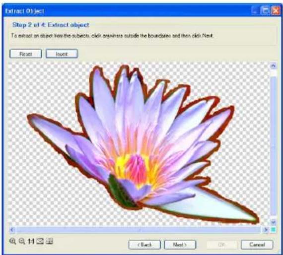
Tips:
- Click Invert to switch the selection to the unselected areas.
- Click Reset to revert to the original state.
Step 3 of 4: Adjusting degree of extraction
Set the detailed level of extraction.
To adjust the extraction degree:
- Adjust the Extraction Detail slider. The higher the value, the more details are selected when the object is extracted.
Note: It is recommended to set the Extraction Detail to a high value if the boundary you created contains details that are subtle but you want selected (e.g. hair strands). However, the higher the Extraction Detail value, the longer it will take to process.

- When satisfied with the results, click Next. If you do not need to refine the object, click OK.
Step 4 of 4: Refining the object
Remove unwanted areas in the extracted object or recover parts of the original image to add to the extracted object.
To refine the object:
- Set the Size, Transparency and Soft edge of the brush.
- Remove excess parts of the object by dragging on areas you want to remove.
To recover areas from the original image, click +/- to add or remove.
Tip: You can change the Background color and set the Background transparency. If Background transparency is set to 100, the original image will show through.
- After you remove or recover parts you want from the extracted object, click OK. The extracted object in the image is automatically selected after the dialog box closes. You can save it in the UFO file format to retain the object as needed.
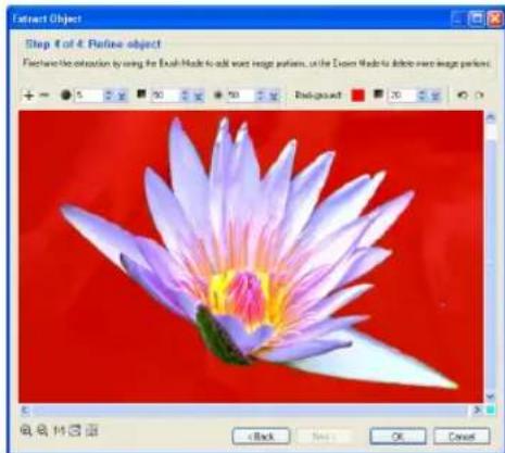

Mask Mode
Masking is a process where changes are applied to a selected area of an image, while the rest of the image is masked or protected from those changes. Masking an image provides a flexible, more creative way of making selections, where you can apply any combination of Text, Path, Paint, and Fill Tools, as well as various degrees of transparency to unmasked selections to transform them into complex selections.
Masking is particularly useful for selecting portions of the image that are not distinguishable from the background. A typical use for the Mask Mode is to select portions of images that you cut out and paste into another image to create a
collage. Also, since Mask Mode has transparency options, it lets you blend more effectively one image object with another.
Note: Mask Mode can only be used with RGB and 8-bit Grayscale images.
Mask Mode basically operates on a Grayscale buffer, which means that you make selections based on tonal values of the Grayscale. When in Mask Mode, you will only be able to access Grayscale values in the color palette. Each tonal value in the grayscale buffer represents a combination of two things: Degree of
transparency and Selection area status. Selecting white results in 0% selection transparency, while black results in 100% transparency (meaning that there's no selection). A gray value represents partial selection, or a selection with partial transparency. Keep in mind that when you paint on the mask itself, areas that you paint with black will become the default white mask, while areas that you paint on with white will completely penetrate the mask to reveal the image underneath.
To use Mask Mode:
-
Open an image in the workspace.
-
Select Edit: Mask Mode [Ctrl+K], click Mask Mode in the Status Bar, or click Enter Mask Mode in the Layer Manager. By default, a semitransparent red layer appears, covering the entire image. This means that you are now working in a Grayscale mask mode.
Note: You can always make a selection area first, then click Mask Mode. This is useful if the image is large and you only want to mask a small portion of it.
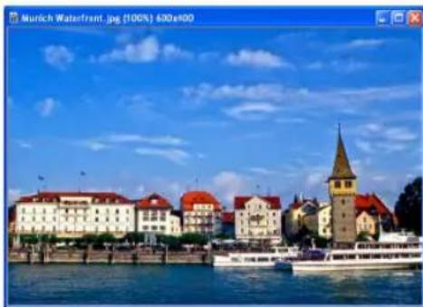
- Choose a Selection, Paint, or Fill Tool to modify the mask. Let's say you click the Paint Tool and select Paintbrush. Adjust the attributes of the brush in the Tool Settings Panel.
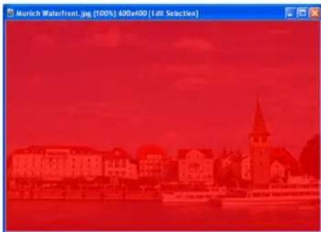
-
On the Attribute Toolbar, pick a color for the brush. Notice that only Grayscale values are available. Selecting black means that you will add to the mask, thus covering the image with the default mask color, while white subtracts from the mask so that the image appears clearly through the mask layer.
-
Paint on the image until you have the area you want. When you're done, select Edit: Mask Mode or click Mask Mode on the Status Bar (or Exit Mask Mode in the Layer Manager) to exit.
A selection marquee appears where you have painted on the mask. All areas that you painted using White and Grayscale values fall within the selection areas. Grayscale areas will be semitransparent, depending on the value of gray.
- You can either convert the selection to an object and paste it into another image, or you can edit the marquee further by returning to Mask Mode or using a Selection Tool.
Note: After you have created a selection using Mask Mode, you can save the selection as a mask and use it in the future for other images. See "Saving selections to the libraries" for details.


Layer mask and object mask
Layer mask gives you more freedom with your object mask by adding another mask. Then, combine the layer mask and the original object mask to create another object. You can move, rotate, resize, and even replace the layer mask's shape just like operating an object. Meanwhile, the object mask can be kept intact, so you can save the original object for later use or another creative object design.

Layer Mask options in Layer Manager Toolbar
To create a layer mask:
-
Click the object that you want to add a mask on. You can also select the object directly at the Layer Manager.
-
Make a selection using the tools available. Make sure the selection intersects with the object to be modified.
Tip: Use Path Drawing Tool or Outline Drawing Tool and select Mode: Selection for more shape variety for your selection.
- Click Create a new layer mask to change your selection into a layer mask. To edit the layer mask, click Enter Mask Mode and modify the layer mask with the Transform Tool. You can also click 🔒 to change the relative position between the object and the layer mask for more varieties. When you're done, click Exit Mask Mode.
Notes:
- Right-click the object mask or layer mask for more options such as Copy.
- An object can have one layer mask only. So, if you want to create more than one layer mask for the same object, please duplicate the object first.
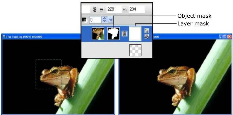
Layer mask (a rectangle here in the example) intersects with the original object.
Object with layer mask
Selecting on objects
PhotoImpact lets you create new selections on objects. You can create a new selection on an object or a group of objects. This is useful when there are several objects in your image and you only need to select on one particular object.
To select on objects:
- Select the object or objects where you want to create a selection area.
Tip: To select multiple objects, press [Shift] or [Ctrl] while clicking on each object.
-
Click a Selection Tool then click Select on object on the Attribute Toolbar.
-
Create the selection. To learn how to use the different selection tools, see "Working with selections".
Note: When selecting on several objects and the selection area includes areas that are not part of the group of objects, the areas that are not part of the objects will not be included in the selection.

New selection made using the Lasso Tool on an object.

Two leaves selected with a rectangular selection selecting parts of the two images.

Only parts of the leaves that are selected are converted into an object even if the selection area encompasses a larger area.
Using the Selection Manager
The Selection Manager is a storage place where you can save frequently used selections. For more details, see "Selection Manager".
Using a selection
To use a selection in your active document, double-click the selection from the Selection Manager or drag it into the active window. Once placed, you can modify an existing selection by clicking [+] or [-] on the Attribute Toolbar.
Moving a selection area marquee
After you have created a selection area with one of the Selection Tools, you might find that the selection area is not positioned exactly where you want it. For example, the selection might include part of the image that you don't want.
To move the selection marquee, click a Selection Tool then on the Attribute Toolbar, click Move Selection Marquee. After selecting Move Selection Marquee, drag the selection marquee to another area.
Preserving the base image
When a selection area becomes an object, the area in the base image where the selection was made can be affected in two ways: It can be either be retained or cut out. On the Attribute Toolbar, Preserve Base Image [F5] determines whether the selection area is duplicated or cut out.
- Select this option when you want to duplicate the selection area.
- Deselect this option to create a cutout of the selection and fill it with the current background color when you move the selection.

Left image is the result when Preserve Base Image is selected while the right image shows the result when Preserve Base Image is not selected.
Note: Press [Ctrl] as you move a selection to preserve the base image even if Preserve Base Image is not selected.
Creating smooth-edged selection areas
Choose Anti-aliasing from the Options menu to smooth out selection area edges. It is especially helpful in keeping curved selections smooth. However, since anti-aliasing modifies the edges of selection areas, the extent of the selection area may change.
Softening a selection edge
Click Selection: Soften (or right-click and select Soften) to make the edge of a selection area appear diffused, creating a "halo-like" effect. Higher values increase the diffusion of the edges. This effect will be apparent when you convert the selection to an object and move it to a different background.
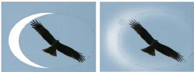
Left image: Soft edge=0 Right image: Soft edge=150
Note: If you do not have Preserve Base Image [F5] selected and you move the selection, you will notice that the base image shows a corresponding diffuse-edged hole filled in with the background color where the selection area was before.
Creating a border around a selection
There are various instances when you might want to create a border around a selection area. By applying a fill to this area, you can easily create a frame around the main subject of an image (for rectangular and oval selections). If you have an irregular selection, you can create a custom outline shape, or simply emphasize the subject of an image by outlining it. After creating a selection, select Selection: Border (or right-click and select Border). You can specify the width of the border and add a soft edge if desired. After the border selection has been created, fill it with a selected color or pattern.

From left to right: Original selection, selection with a border, and the border with a fill color.
Adding to or subtracting from a selection
You can select multiple parts of an image at one time. In the same way, you can also exclude portions of existing selection areas. Follow these procedures:
- To add an area, select from the Mode options on the Attribute Toolbar and click [+], or press [A] while selecting more of the image (the pointer changes to display a plus sign).
- To exclude an area click [-], or press [S] while selecting the unwanted area (the pointer changes to display a minus sign).


The original selection (left) and an area subtracted from the selection.
Working with objects
Objects float above the base image in independent layers, allowing you to move and edit them without affecting other objects or the base image.
There are several ways to create objects from selections:
- Drag a selection anywhere within the current document or directly into another open document in PhotoImpact.
- Drag a selection outside of the current document to create a new document containing only that object. This is useful if you want to edit this particular object independently from the rest of the original image. When you have finished working on it, you can then merge it back into the base image by dragging it as an object.
- Use the Transform Tool to rotate, flip, or distort the object. For details, see "Using the Transform Tool".
- Select Selection: Convert to Object.
- Select Object: Insert Image Object - Via Cut/Via Copy.
Managing object layers
The Layer Manager helps you keep track of objects within an image. To open the Layer Manager, click in the Panel Manager.
Tip: You can also open the Layer Manager by selecting Window: Panels - Layer/Selection Manager or press [F3]. If the panel opens and it does not display the Layer Manager, click the Layer Manager tab.
Here are some ways to manage objects in your image:
- Click an object in the Layer Manager to select that object in the workspace. This is particularly useful if the object is small, overlapped or hidden behind other objects.
-
Click Thumbnail Display to toggle between displaying your objects as thumbnails with details or thumbnails only.
• Each object thumbnail has the following icons: -
Eye Shows or hides an object (you can also open the Object Properties dialog box and select or clear Show).
- Lock Locks or unlocks the object to its position.
- Properties Identifies whether it is an image, text, path, Web object, or a group of objects.
- Z-merge Shows whether an object has undergone Z-merge or not.
Note: The Properties icon changes depending on the type of object.
Setting an object's properties
Setting Object Properties lets you further specify the attributes of image, text and path objects as well as Web component objects.
Different options are available, depending on what type of object is selected.
You can change an object's name, size and position, set its transparency, merge attributes, specify its position and dimensions, and assign an image map (when the selected item is a normal object) or a hyperlink (when the selected item is a Web object) to it.
You can change an object's properties by using any of the following methods:
- In the Layer Manager, double-click a property item (size, position, or object name) to directly change its value.
- Select Object: Properties.
• Right-click an object and select Properties.
Hiding and showing objects
Temporarily hide objects to view different variations of your image. When printing an image, hidden objects will not be printed.
Using the Object Properties dialog box
- Select the object you want to hide or show.
Note: Hidden objects can only be selected from the Layer Manager.
- With the object selected, select Object: Properties.
- To hide an object in the image, clear Show. To make it visible, select Show.
Using the Layer Manager
- Select the object you want to hide or show.
- Click Eye beside the object thumbnail. An opened eye means the object is showing; an empty square means the object is hidden.
Sorting objects
You can use Sort to arrange the objects' thumbnails in the Layer Manager. To sort, select Sort by Depth or Sort by Name in Thumbnail menu commands.
Tip: You can also sort the objects by right-clicking a thumbnail and selecting Sort by Depth/Name.
Sorting by Depth sorts the objects based on their layer level in the workspace, while sorting by Name is based on the object's name in the Layer Manager.
Grouping and ungrouping objects
While editing an image, it may be convenient to group objects so that you can move them as a unit or edit them collectively.
To group objects:
-
Press [Ctrl] as you click the thumbnails of the objects you want to group in the Layer Manager.
-
Select Group from Thumbnail menu commands 📄 (or right-click a thumbnail) to group the selected objects together.
When is pressed, thumbnails of the objects are merged as one and are marked as Group 1 with all the images displayed in a single object.
When is not pressed, the objects that belong to the group are highlighted.
Notes:
- You can also regroup grouped objects up to 16 times and increase the group level each time by 1.
- To ungroup objects, select Ungroup from Thumbnail menu commands (or right-click a thumbnail and select Ungroup).
- Ungrouping decreases the group level by one.
Changing an object's layer in an image
When an object is created, it is automatically placed on the top layer of an image. Converting a selection to an object places the object on the lowest layer.
There are different ways to position several objects on different layers:
- Select the Pick Tool then use the four Arrange arrow buttons on the Attribute Toolbar. These buttons move an object up one level, down one level, to the top level, and to the bottom level.

- Select Object: Arrange Order (or right-click an object and select Arrange) and use one of the four submenu commands.
- In the Layer Manager, drag a thumbnail to the desired layer in the image.
Editing objects
Objects can be edited on their individual layers without affecting any of the other objects or the base image. In addition to editing them as you would any other selection, you can also remove parts of the object so that images and objects that lie beneath it are visible, thus creating a transparent object effect. You can do this with the Object Paint Eraser and the Object Magic Eraser, both of which are located in the Toolbox.
To use the Object Paint Eraser, simply make adjustments to the brush on the Attribute Toolbar, then begin painting on the area of the object that you want to remove.
To use the Object Magic Eraser, set the Similarity of the colors that you want to select from the object, then click the desired color in the object. The selected color will become transparent. Using the Object Magic Eraser is similar to the Magic Wand Tool. For more information on how the Object Magic Eraser works, see "Working with Object Eraser Tools".
Using Defringe
Irregularly-selected objects may sometimes include some unwanted areas inadvertently selected along with the object. This happens often, especially when using the Lasso tool. (See "Lasso Tool - selecting irregularly shaped areas")
You can remove these unwanted pixels by using Defringe. It removes edge pixels from selections and blends the remaining edges with the background for a seamless merge effect.

Top image shows the selected object (seagull). In the middle image, you will notice that there is a blue border along the outline of the seagull's wing. The bottom image shows the results after Defringe was applied. You will notice that the blue border on the seagull's wing has been removed.
To apply Defringe on an object:
- With a document open and an object active, click Object: Defringe.
-
In the Defringe dialog box, specify the range of pixels for removal by entering a value between 1 and 10 in Depth.
-
Set the tolerance level of the pixels to be removed in Tolerance. This determines the similarity of the color for removal with any adjacent colors and removes them as well.
-
Use the color sample picker to specify a color that will be set as the Original background color. This color will be used to "wash" pixels affected by Defringe and blend them with the background.
-
Click OK.
Match Background Color
Match Background Color blends a selected object or image with the base image by softening the edges and matching its colors. This is useful when superimposing an object on another image.
To use, click an object and select Object: Match Background Color. The adjustment will be automatically made.

Note: This command only works for selections whose colors are similar with the base image's. If the similarity is too low, an error message will pop up informing you that the action is not possible.
Adding a shadow to an object
You can introduce depth to an image by applying a shadow to an object or a group of objects.
To add a shadow, select Object: Shadow (or right-click an object and select Shadow).
In the dialog box, you can control the direction, length, transparency, edge blending, and color of the shadow.

Shadow was added to the bottom bowling ball.
Separating a shadow from its object
Separating a shadow and making it as a separate object from its original image is easy.
To do this, select Object: Split Shadow or right-click an object and select Split Shadow. The shadow now becomes a new object whose attributes you can modify such as changing the color or applying a painting texture.

Bottom bowling ball shows the shadow as a separate object.
Note: Split Shadow is disabled when multiple objects are selected.
Copying and moving an object between images
You have the option of moving objects between images if you want. It is useful when you have created an object in one image and want to use it in another image.
To move objects between images, drag the object from the source image onto the destination image.
Tip: When you copy an object and paste it into another image, the position of the object when pasted will be relative to the position of the object in the source image.
Duplicating an object
You can duplicate any object or group of objects that you have created. You can duplicate objects by:
- Selecting the object or group of objects and selecting Object: Duplicate (or right-click and select Duplicate).
- Dragging the object or group of objects while pressing [Ctrl].
Note: By default, a duplicated object will be copied and superimposed on top of the source object. To displace the duplicated object and make it more visible, select File: Preferences - General and select Shift objects after doing Duplicate.
Deleting an object
To delete an object or group of objects, select it and then select Object: Delete (or right-click and select Delete) or press [Delete].
Spacing and aligning objects
To space objects evenly or align them within the document, use Object: Align. Aligning and spacing objects are useful when creating navigation buttons for your Web pages.
To align objects:
- Click the Pick Tool in the Toolbox.
- Select the objects to align. Press [Ctrl] or [Shift] to select multiple objects.
- Select Object: Align then from the submenu, choose how you want to align the objects.
Tip: You can also use the buttons on the Attribute Toolbar to align the objects.

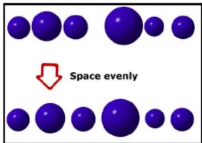
To space objects evenly:
- Click the Pick Tool in the Toolbox and select the objects.
- Select Object: Align - Space Evenly.
- Select which Direction you want to space the objects, Horizontally or Vertically.
- In Space, select how you want to space the objects, Even or Fixed.
Note: If Fixed is selected, enter how much space you want in between each object in Pixels.
- Click OK.
Using libraries
You can store images and selections conveniently using Libraries. Click Libraries in the EasyPalette.
All available libraries are listed below in a tree view. Click each library to see the thumbnails of any images, paths, and selections that are available.
Saving selections to the libraries
When you save a selection or an object to any of the Libraries, it is represented by a thumbnail in the library. Objects in an Object Library can be managed by right-clicking a thumbnail and selecting a command from the pop-up menu. This makes it handy to quickly delete, copy, or cut an object thumbnail to and from the library.
To store an object:
- Click Thumbnail menu commands (or right-click a thumbnail) and select Store Image.
- Drag an object from an image to the Object Library window of the EasyPalette.
Tip: You can also select Object: Copy To Object Library.
-
Enter a name for the object then select which Gallery/Library and Tab group you want to store the object into.
-
Click OK.

To store a selection:
- Click Thumbnail menu commands (or right-click a thumbnail) and select Store Selection.
- Drag a selection from an image to an Object Library. A Grayscale mask matching the size and shape of the selection is displayed.
Tips: You can also copy a selection into the Object Library by:
- Select Selection: Copy Selection to Object Library after you create a selection.
-
Press [M] as you drag a selection to the Object Library (regardless of whether Store Selection is selected or not).
-
Enter a name for the selection and click OK.
Note: To export a selection as a new image in the workspace, or to save it as a file in a specific file format, choose Selection: Export Selection.
To save the entire image to the Object Library:
- Select Selection: All (or right-click an image and select All).
- Drag it to the Object Library.
- Enter a name for the whole image and click OK.
To store an image as a selection:
- Prepare a Grayscale image of the image that you want to use as a selection.
Note: If the original image is in color, select Adjust: Convert Data Type - Grayscale.
- Open the Object Library in the EasyPalette. Click Thumbnail menu commands, and select Store Image as Selection.
- Select the entire image or a portion of the image to use as the selection mask.
- Drag the selection to the Object Library and save it.
Using an image or selection from the Object Library
To use an object or selection, drag them from the Object Library into an open document. Remember the following when using an image from the Object Library:
- When you drag an object to an open document, the object is placed when you release the mouse.
- When you double-click a thumbnail in the Object Library, or when you click Thumbnail menu commands and choose Copy Object to Image, the object appears at the top-left of the image.
-
When you drag an object back to its original image or another image of equal size, the object is placed in its original position. Each image element is repositioned automatically. This is especially helpful when you want to:
-
Preserve the position of image elements in an image whose background needs to be modified.
- Preserve the position of stationery objects across all sequences in image and animation sequences.
- When the base image is active, you can select Fit Mask (or right-click a thumbnail, or click Thumbnail menu commands in the EasyPalette). The mask object is centered and scaled to fit the image. If Fit Mask is cleared,
the mask object is placed at the mouse point when you drag the previously saved mask object into a new image and release the mouse.
Notes:
- When the destination image is of different size, the selection is placed wherever you release the mouse.
- When placing a selection that has been created from a Grayscale image into an Indexed-Color or Black & White image, the gray areas of the selection are converted to pure black or white.
- To import a previously saved selection (or any Grayscale image) into the active image as a selection area, click Selection: Import Selection.
Using the Measure Tool
The Measure Tool is composed of a Measure Handle and a Baseline, which are adjustable points and lines used to take measurements of images, objects or selections. The Measure Handle is poled by a square node and a circular node, each positioned by points X1, Y1 and X2, Y2, respectively. The Baseline, on the other hand, is a reference line for the angle measurement you make with the Measure Handle. By default, the baseline is set at 0 degrees, which is parallel to the image bottom. You can hide or show the baseline by clicking the toggle button on the Attribute Toolbar.
The Measure Tool helps you gain accurate information over dimensions, distances, and angles of an image, text or object component. It is best used when applying Rotation and Transform effects that require precision placement, X and Y coordinate positioning in image mapping, and encoding exact locations when designing web pages.
To use the Measure Tool:
- In the Toolbox, click the arrow on the Eyedropper and select the Measure Tool.
- Define the Measure Handle by clicking a starting point anywhere in the image then dragging the mouse to the ending point of what you want to measure.
When the mouse button is released, the Measure Handle will appear together with the Baseline.
Tip: You can show/hide the baseline by clicking Baseline on the Attribute Toolbar.
- You can now drag the poles to resize the Measure Handle and the Baseline, or drag the middle box to reposition the measure line in your image.
All values, distance, length, or angle, are displayed on the Attribute Toolbar. You can use these values to compute differences when applying Transform, Rotate, or other effects.
Using the Transform Tool
The Transform Tool allows you to take an image, text, path object, or selection and manipulate it so that it changes shape and even perspective.
To use the Transform Tool:
- Select an object that you want to transform.
- Click Transform Tool in the Toolbox.
-
Transform the object using the following options available on the Attribute Toolbar:
-
In Transform method, choose to apply Resize, Slant, Distort or Perspective.
- Choose to rotate an object using right angles (90 left, 90 right, and 180) or flip it horizontally or vertically.
- Click Rotate by degree to rotate images using a specified angle and direction (clockwise or counterclockwise).
- Click Copy rotate to rotate an image while leaving a copy of the image in its previous position.
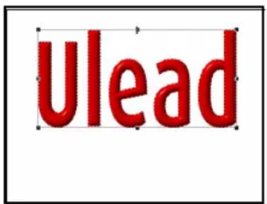
Resizing

Rotating using a horizontal line

Rotating in virtual 3D
Tip: To transform a selection instead of an object or image, click Selection on the Attribute Toolbar.
Notes:
- If you rotate or distort an entire image by anything other than 90, 180 or 270 degrees, extra space appears around the image, filled with the background color (Objects are not affected in this way).
- If there is no selection or active object, the transformation will be applied to the base image.
- If your selection area or object is a circle or an ellipse, a rectangular box will appear bounding the selection area. Transform your object/selection by dragging one of the control points on the four corners.
Rotating images
With the available buttons on the Attribute
Toolbar, you can rotate an image, text or path object by a specified number of degrees or freely move the object around its center. You can also easily straighten crooked images and even rotate them in 3D space.
To freely rotate an object:
- Select Rotate Freely under Rotate method on the Attribute Toolbar.
Tip: You will notice that the object will have a rotation center in the middle. Reposition the rotation center if necessary.
- Drag one of the corner handles to rotate the object. You can also click Rotate by degree to apply a more precise angle of rotation.
Tip: Click Rotate center: Center on the Attribute Toolbar if you moved the rotation center and want to reset it back to its original position.
Straightening images
Rotate Using a Horizontal line and Rotate Using a Vertical line are useful when you have an image which is not quite straight. This is often the case with scanned images.

To horizontally straighten an image:
- Select Rotate Using a Horizontal line under Transform on the Attribute Toolbar.
- Drag a control point to one end of a strong horizontal feature, such as the edge of the image.
- Drag the second control point to the other end of the feature, carefully aligning the control line along the feature.
- Double-click the image or any of the control points to rotate.
Note: You can also use Adjust: Auto-process - Straighten to quickly straighten an image.
3D transformation
PhotoImpact makes it easy to transform your images in three-dimensional space via Rotate in Virtual 3D.
This tool will be most useful when you want your images to appear in a different plane or perspective while at the same time retaining the proportions of the original image.
To perform a 3D transformation:
- Select an image, 2D text or path object.
To rotate an image in 3D space, convert it first into a path object. Select the base image or create a selection area, then select Object: Convert Object Type - From Text/Image to Path.
Tip: You can also right-click the object and select Convert Object Type - From Text/Image to Path.
- Click the Transform Tool.
- Select Rotate in Virtual 3D in Transform on the Attribute Toolbar. 3D Virtual Track Ball appears with a focal point at its center named Object Center (also the Projection Center).
- Drag the object to rotate in 3D space.
Tip: Double-click the Object Center to change it to Projection Center. Double-click again to change it back to Object Center.

Drag the object to rotate it.

Object Center mode

Projection Center mode
Notes:
- Moving the Object Center relocates its object handle, thus moving the entire image but retaining the Projection Center in its original position.
- When you see a round path with a focal point at the center, that is the Object Center and dragging anywhere within it transforms your object in a three-dimensional effect. When you see two rectangular paths around your image with a focal point at the center, you are in the Projection Center mode. Moving the handles lets you change your viewing angle of the object.
- The viewing angle is limited between 0 and 90 degrees.
Working with Object Eraser Tools
With Object Eraser Tools, PhotoImpact lets you directly and easily erase parts of an object to become transparent or semi-transparent.
These tools let you create interesting layering effects (if your image in the document contains several objects), or you can also use them to refine objects that you have created using
Mask Mode or the selection tools.
The Object Eraser Tools are:
- Object Paint Eraser Tool lets you erase parts of an object by painting it.
- Object Magic Eraser Tool lets you erase parts of image based on color similarity. When you click on a color, colors similar to color clicked will be erased.


Notes:
- Object Eraser Tools can only be used on image objects. To use the Object Eraser Tools on a path and text object, base image, or selection area, it needs to be converted into an image object first.
- Only 24-bit RGB, 8-bit Grayscale, Indexed color, and Black & White images can be edited with the Object Eraser Tools.
To erase parts of an object:
- In the EasyPalette - Image Library, select Rose 2 then drag it to the workspace.
- Click Object Eraser Tool in the Toolbox and select Object Paint Eraser.
- On the Attribute Toolbar, set Brush head to 10, Transparency to 10, Soft edge to 10, and Zoom to 200.
- Drag over the leaves to erase them.
Tip: Click Trim to remove any space around the object that is completely transparent. The results of this will be apparent when you view the thumbnail in the Layer Manager.
Note: Recover only works if you have already erased an area and have not yet applied Trim. Otherwise, you will have to use Undo [Ctrl+Z], which may result to going back more steps than desired.
Using the Stamp Tool
The Stamp Tool lets you paint ready-made objects onto an image. Choose from the preset stamp objects or create your own objects.

Examples of Stamp Tool objects.
To use the Stamp Tool:
- Click the Stamp Tool in the Toolbox.
- On the Attribute Toolbar, click the Stamp thumbnail to display stamp object choices. Click the desired stamp object.
- Set the Transparency, Scale, and Spacing for the stamp objects.
- Set how and what stamp objects appear in Order. For example, to use the same object in a straight line, select Angular. This means that the object type will only change when you switch direction as you drag the mouse.
- Specify how to insert the stamp objects in Placement and specify if the stamp objects will be treated as a single object or multiple objects in Object.
- Drag within the document to insert the stamp objects.
Notes:
- You can create your own stamps by saving your work as a UFO file. To add your stamp into the stamp thumbnails, select Add Stamp from the Stamp menu.
- PhotoImpact supports PaintShop Pro TUB file format. To add TUB files, select Import Picture Tube from the Stamp menu.
- Click View on the Attribute Toolbar to see the different stamp objects within the selected Stamp object.
Using Component Designer
PhotoImpact offers you a vast range of possibilities for creating fascinating objects through Component Designer.
It helps you quickly and easily create ten stunning high-quality path- and text-based Web and Video & DVD components, including banners, bullets, buttons, button bars, icons, rollover buttons, separators, lower-third, title objects and DVD menu buttons.
Its intuitive user interface lets you make a Web or Video & DVD component in just three steps: select a component template, customize it, then export it. You can export the image to PhotoImpact for further customization, or to Image Optimizer to minimize image file size and download time.
For button bars and rollover buttons, you can even export the HTML code directly to a Web page. After you have modified a component template, you can preview the changes in real-time, then export it immediately.
Individual components (including all templates for that component) are made up of several layers of text and paths, each with its own attributes. The layers may
have different names, but share similar attributes. This means that all components can be created using basically the same method. The following sections show you an example of how to create components using a Component Designer template.
Notes:
- In Component Designer, if you choose to export components as individual objects, they are still editable in PhotoImpact. However, their Component attributes are lost, making them uneditable in Component Designer.
- Component objects can be inserted into an RGB (24-bit True Color) format document only.
In Component Designer, components consist of a graphic, or a graphic with text. The following procedure illustrates the steps for using the Component Designer to create any of the components listed above.
To create a component object:
- Select Web: Component Designer. The Component Designer Wizard will appear.
- Click the plus (+) sign beside the component object type you want to create. This will expand its subfolder to display a template type list.
- Select a template type from the list. On the right, templates will be displayed. Click a template then click Next.
- Click the root layer or sub layers to modify their attributes in the tabs on the lower right pane.
Clicking tabs switches to different sets of attributes.
Notes:
- Depending on the component object, available layers and their names vary.
-
For the banner size, we recommend the use of preset default values, as they are already optimized to fit in a Web page.
-
Click Export to select where to save the banner:
-
To Image Optimizer Optimizes file sizes for the Web and saves it in GIF, JPEG or PNG format.
- As Individual Objects (in PhotoImpact) Keeps objects unmerged from the background.
However, it is not possible to further edit attributes in Component Designer, as this format loses all Component Designer attributes, allowing editing as normal images only.
- As Component Object (in PhotoImpact) Keeps objects intact for further editing in Component Designer.
Tip: Click Back to create more Web components, or click Close.
Rollover button
This is a special button whose appearance (such as color, graphic, or shape) changes, using up to three separate images. The transition depends on the mouse action in three states: normal (no mouse action), mouseover (cursor moving over the image), and mousedown (clicking the image).
Mouseover causes a previously invisible image to become visible, which is clickable to attract user's attention. Mousedown (activated after mouseover) opens an associated hyperlink.
A rollover button comprises JavaScript and associated images viewable in a browser. As a Web component, a rollover button has size, color, text, shadow, and hyperlink attributes.

Rollover buttons

Selected rollover button example
To create a rollover button with Component Designer:
- Select Web: Component Designer.
- Click the plus (+) sign to expand the Rollover Button folder for template lists, then select one.
-
Click a rollover button then click Next, or simply double-click it.
-
Set these two options in the Options tab:
-
Same text for buttons Whether to use the same text on all three button states of a rollover button.
-
Mouseover/Mousedown button offset Adjusts the position of these two states based on the X (horizontal) and the Y (vertical) axes.
-
Specify a URL and related options in the Hyperlink tab. This accesses a Web site after Mousedown takes effect.
-
Click other tabs and layers to modify them as needed.
Notes:
- Depending on the selected rollover button, available layers and their names may vary.
- You can always view and test your rollover button in the Preview tab by using the mouse throughout the whole creation procedure.
- Click Export to select where to send the rollover button. To HTML saves it to a Web page (HTM or HTML) with JavaScript code and associated image files.
Notes:
- Once the HTML is exported, open its source code to view detailed information on how to copy a correct portion of HTML then apply the rollover button to your own HTML document.
- Do not overlap the rollover object with other objects or the base image, in order to avoid unexpected file size increases, or file format and HTML attribute changes. The base image should be hidden while creating a Web page.
- If you are new to HTML coding, we strongly recommend that you apply the rollover object directly to your current PhotoImpact document. See "Advanced rollover button" for details.
Lower-third
PhotoImpact lets you create and add various objects for your video and DVD menu. Use a video lower-third to add animations or text at the bottom third portion of the video. Add navigation buttons, frames, and bullets for your DVD menus as needed.

Note: These objects can be used in other Ulead video and DVD applications as overlays with alpha channel transparencies.
To create a lower-third:
- Select Web: Component Designer.
- Click the plus (+) sign beside Lower-Third. This will expand its subfolder to display a template type list.
- Select a template and click Next.
- Enter title name and determine other settings as needed.
- Click Export to select where to save the lower-third.
USING THE PAINTING AND FILL TOOLS
The Paint and Fill Tools in PhotoImpact allow you to decorate and enhance existing images or create original artwork from scratch. Once you understand the concepts of selections and objects discussed in the previous chapter, you will be able take advantage of the full power that these tools have to offer. This chapter introduces you to just some of the things that you can do with the Paint and Fill Tools. With this knowledge as a basis, the best way for you to learn how to use these tools is simply to experiment and have fun with them - you will be amazed at the stunning results that can be achieved.
Using the Painting Tools
PhotoImpact is equipped with an extensive assortment of painting tools that allows you to paint, draw on an image, or create your own image.
To select a tool, click the lower right corner of the Paint Tool in the Toolbox; a drawer of painting tools opens, which lets you select the Paint Tool you want to use.
You can use the Paint Tools much as you would use real paintbrushes, pens, and other drawing tools to create stunning artwork. PhotoImpact gives you an amazing level of control over painting tools, right down to the coarseness of the bristles. When you select a Paint Tool, the Attribute Toolbar displays the basic characteristics of the tool that you can customize directly, such as its shape and size, as well as the color and transparency of the paint or the material that you want to apply.
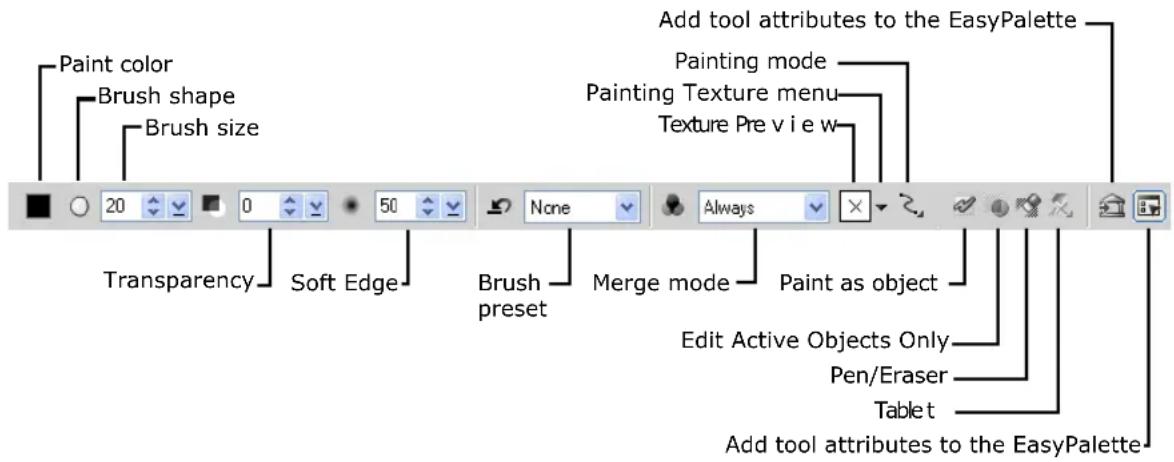
The procedure below introduces you to some of the common Paint Tool attributes.
To paint your own image from scratch:
- Click the Paint Tool in the Toolbox and select one of the Paint Tools.
- On the Attribute Toolbar, click Shape to choose a shape for the tool, then select a Size for it.
-
Click the color square to select the color to paint with, then set the Transparency of the paint. A Transparency of 0 means that the paint is opaque.
-
Select a Soft edge for the paint. A lower value means that the paint strokes will have harder edges.
-
Click Lines to specify a painting mode.
-
Freehand allows you to paint freely by dragging the cursor on the canvas.
- Straight Lines lets you paint in straight lines by clicking the start and end points of the line.
-
Connected Lines lets you paint multiple lines that are connected to one another.
-
Start painting by dragging on the canvas.


A high Soft edge value (left) and low Soft Edge value (right).
η
Freehand, Straight Lines, and Connected Lines modes (clockwise from top left).
Erasing
PhotoImpact provides you with a variety of tools to remove colors from your document.
To erase paint applied using one of the Paint, Clone or Retouch Tools, click Eraser Mode on the Attribute Toolbar or Tool Settings Panel while using one of the Paint Tools.
The Paint Tool then becomes an eraser and you can proceed to remove the colors, retouches or cloned images previously applied.
For image objects, you can use the Object Eraser Tools to delete certain portions of the image object. To learn how these tools work, see "Working with Object Eraser Tools".
Customizing Paint Tools
In addition to making basic customizations on the Attribute Toolbar, PhotoImpact gives you other options for fine-tuning Paint Tools in order to get the exact painting effect that you want.
You can also save your customizations to create your personal collection of tools.
Using Paint Tool presets
Each Paint Tool comes with a set of useful presets that you can use to paint your image. To choose a preset, first select a specific Paint Tool, and then choose a preset from the Preset menu on the Attribute Toolbar.
Once you have chosen a tool, you can use it as is, or you can further specify its characteristics on the Attribute Toolbar or in the Tool Settings Panel.
Note: When you modify any attributes of a preset, the Preset menu automatically switches to show None.
Using the Tool Settings Panel
The Tool Settings Panel conveniently puts all paint and editing tool attributes in one place, and gives you more advanced options for customizing individual tools as well.
To hide or display the Tool Settings Panel, click Show or hide Tool Settings on the Attribute Toolbar.
The various tabs contain different options, depending on which tool you select. Two of the groups that most tools have in common are the Shape group, which lets you fine-tune the Paint Tools right down to their bristles, and the Color group, which gives you the choice of working with single or multiple colors when painting.

Square, round, and flat angled brush shapes.
Multiple colors applied with Paintbrush, Crayon and Oil Paint tools.
After you customize a particular tool, you can save its attributes to My Gallery in the EasyPalette. Simply click Add on the Attribute Toolbar. To use these settings at a later time, drag the thumbnail from the EasyPalette to the image you are working on, and start painting.
Special Paint Tools and Tricks
PhotoImpact provides you with some unique Paint Tools that you can use to make stunning and creative images, whether you want to paint an image from scratch or transform a photograph into a stunning work of art.
Using the Particle Brush
The Particle Brush creates a dappled paint effect that can be useful for adding glitter and shimmers to your image or for creating an impressionistic painting, among others.
To use the Particle Brush:
- Select the Particle Brush from the Paint Tool menu.
- On the Tool Settings Panel, select the Color group. Select Single-color or Multiple-color mode, then click the color square to select the base color that you want to use.
Tip: If you choose Multiple-color, you can customize the color particles using further options in the Color group.
-
On the Attribute Toolbar, adjust settings for Shape and size of the Particle Brush, as well as the Transparency and Soft edge of the color particles.
-
Drag on the canvas to start painting.
Original image
After painting using the Particle Brush Tool.
Using the Drop Water Tool
The Drop Water Tool lets you smudge existing colors on an image. The example below shows you how to apply it to a photograph to transform it to a painterly masterpiece.
To use the Drop Water Tool:
- Select the Drop Water Tool from the Paint Tool menu.
- On the Attribute Toolbar, specify the Shape and size of the tool.
- Specify the transparency. Lower values decrease the amount of color that is smudged.
- Specify the Soft edge.
- Start painting on the image. Try using different stroke techniques to get the paint effect that you want.

Top: Original image
Bottom: After painting using the Drop Water Tool
Painting with textures
For almost all of the Paint Tools, you can apply color as if you were painting on a textured surface.
To paint with texture:
- Select a Paint Tool in the Toolbox.
- Click Painting Texture menu on the Attribute Toolbar.
- On the Painting Texture pop-up menu, select Select Texture then choose a texture pattern you want to use.
- Start painting on your image. The paint is applied with the texture you selected.
Tip: In the Painting Texture menu, you can use the Add Texture command to include your own texture files in the
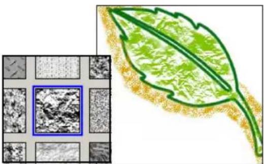
menu, and the Delete Texture command to remove texture files.
Painting an outline or border
The Paint on Edges command in the Effect menu allows you to easily, quickly, and accurately apply paint along the edges of a selection area or active object, using the Paint Tool that you have selected.
To paint a border on a selection:
- Create a selection area using one of the Selection Tools, or select an object or objects.
- Select the Paint Tool that you want to use for the effect, and define its color as well as other attributes.
- Select Effect: Creative - Paint on Edges or press [Shift+P]. The edges of the selection or object will be painted with the Paint Tool and attributes that you specified.

Using Paint as Object mode
PhotoImpact provides two modes when using the Paint, Clone, and Retouch Tools (with the exception of the Color Replacement Pen). The default mode is Normal Mode, which allows you to paint, clone or retouch the base image directly. The Paint as Object Mode lets you do the same but on an independent layer on top of the base image. This is convenient if you want to use a particular image as a basis for artwork, or if you want to apply paint on individual layers, for example.
To use the Paint as Object Mode:
- Click Paint as Object on the Attribute Toolbar.
- Paint, clone, or retouch the image as desired.
- When you are done, click Paint as Object again to deactivate the mode. The painted, cloned or retouched area turns into an object.

Editing active objects only
Sometimes you might have a project with many carefully positioned objects in it, and then you discover that you only need to edit selected objects. The Edit Active Objects Only mode allows you to edit selected objects that are overlapped by other objects without having to reposition them.
To edit active objects only:
- Select the objects in the project that you want to edit.
Note: If the objects are not image objects, convert them first to an image object by selecting Object: Convert Object Type.
- Click Edit Active Objects Only on the Attribute Toolbar (for selected editing tools only). The other objects become temporarily transparent.

Object selected (circle).

Edit Active Objects Only mode with circle selected and other objects temporarily transparent.
-
Edit the selected objects using one of the editing tools.
-
After you finish editing the objects, click Edit Active Objects Only again to leave the Edit Active Objects Only mode.
Tip: You can also leave Edit Active Object Only by clearing Edit: Edit Active Objects Only.

Paint applied to object in Edit Active Objects Only mode.

State of objects after leaving Edit Active Objects only mode.
Using the Fill Tools
The Fill Tools give you a convenient way to create backgrounds for your projects. In the Toolbox you can access the Bucket, Linear Gradient, Rectangular Gradient, Elliptical Gradient, and Texture Fill Tools. The Bucket Fill Tool is useful for quickly replacing solid colors, such as white to black. The three Gradient Fill Tools fill an area, using two or more colors, with a smooth color transition from one color to another. The Texture Fill Tool fills the selected image or object with a texture pattern.

Note: The Bucket Fill Tool works with all data types, while the Gradient Fill Tools only work with Grayscale and True Color images.
To fill a selection or object:
- Make a selection on the area of the image that you want to fill, or select an image object to fill.
Note: If you don't select an object or make a selection on the image, the fill is applied to the entire base image.

- Click the Bucket Fill Tool.
- Click Fill color on the Attribute Toolbar to select the color you want or right-click and choose a color selection method. (See "Using the Ulead Color Picker")
- Adjust the value in Similarity to change the range of colors affected by the fill. Higher values mean that more of the image will be filled.
- Enter a value in Transparency to specify the degree of transparency when applying a fill color (0 to 99%).
- Select from among the Merge options.
- Click to apply the fill to the image.
Tip: Fill an image or selection area with your default background color without having to open the Fill dialog box. On the Toolbox, click or right-click the Background color square to select the color you want to use, and then press [Delete]. The image or selection area is filled with the background color.
Choosing a Gradient Fill method
In PhotoImpact, when applying a Gradient Fill on your image you can choose between two methods: Two-color or Multiple-color.
All three Gradient Fill Tools (Linear, Rectangular and Elliptical) share the same attributes on the Attribute Toolbar.

The Two-color method applies a Gradient Fill to an image based on any two colors specified in the Fill colors color squares.
To change the color, either click the color square for the Ulead Color Picker dialog box, or right-click to display the Color Picker pop-up menu. The gradient applied will be a smooth transition from the first (start) to the second (end) color.

The Multiple-color method uses a palette ramp to apply a Gradient Fill to an image. The colors used for the fill are displayed in the Fill colors square. Click the color square to access the Palette Ramp Editor dialog box. This opens a palette library with a wide array of predefined color rings that you can apply to an image. The Palette Ramp Editor allows you to create your own color combination.
Note: You can also use the Color Panel to set your Two-color or Multiple-color gradient colors. Click the arrow below Mode in the Color tab to switch between Two-colors and Multiple-colors.
To make a Two-color gradient fill:
-
Click Fill in the Toolbox and select any of the gradient fill tools (except Texture Fill).
-
On the Attribute Toolbar, click Fill method and select Two-color.
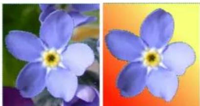
-
Select the start and end fill colors in the Fill colors color squares.
-
Click the point where you want the fill to start, and drag the mouse to the point where you want it to end, then release.
Note: If you are using the Linear Gradient Fill Tool, press [Shift] while dragging to constrain the fill to a certain angle. If you are using the Rectangular and Elliptical Gradient Fill Tools, press [Shift] to create a square and circular fills respectively.
To apply a Multiple-color gradient fill:
- Click Fill in the Toolbox and select any of the three gradient fill tools. Change the Fill method to Multiple-color gradient fill.
- Click the Fill colors color square. The Palette Ramp Editor dialog box opens with the palette library displaying thumbnails of color rings.
- Select a color ring on the thumbnail displayed. Right-click a specific control point to adjust the color of the ring and select Change Color.
- Select the color you want and click OK.
Tip: Enter a value from 0 to 359 in Hue shift to adjust the hue settings.
- Click the point where you want the fill to start, and drag the mouse to the point where you want it to end, then release.
Note: To save your customized palette ramp for later use, click Add. Your palette ramp then appears as a thumbnail in the Palette Ramp Editor dialog box.
Tip: Enter a value from 0 to 359 in Ring to adjust the rotation of the color ring.
- Click OK.


Filling an area with a texture
In PhotoImpact, you can fill an image or selection area with three different kinds of textures. Magic Texture fills are computer-generated, Natural Texture fills
include real-world textures such as wood grain, stone, and fabric, and Photo fills are photographic images that you can use as a fill.
To use the Texture Fill Tool:
-
Click the Texture Fill Tool in the Toolbox.
-
On the Attribute Toolbar, choose a Texture fill preset category from the drop-down menu: Photo, Natural or Magic. Alternatively, you can use your own image file by clicking Select other texture, then selecting any JPEG or BMP file stored on your computer.
-
Drag on the canvas to draw a box on the object or area that you want to fill. The texture then fills that area. Photo and Natural textures will tile themselves to fill the image.
Tips:
- For Photo and Natural textures, adjust the size of the texture fill. On the Resize drop-down menu, select Don't resize texture to retain the texture's original size, Keep aspect ratio to resize the texture while retaining its original proportions, or Resize Freely to adjust the texture's size as needed. Drag on the frame of the box to resize the texture.
- Reposition the Photo or Natural texture fill by dragging the box to the desired position.
- Specify the texture's Hue and Transparency on the Attribute Toolbar.
Tip: You can fill an image, object or selection area with tiled copies of another image that is currently open in the workspace. To tile copies of another image, drag one image to another image while pressing the [L] key.


Performing drag-and-drop texture and gradient fills
PhotoImpact makes it easy to apply a full range of predefined textures and color gradients to any image, object, or selection area through the Fill Gallery in the EasyPalette.
When you open the Fill Gallery, you can view thumbnails of various gradients and textures. To apply a Texture or Gradient Fill, drag its thumbnail onto an image, object, or selection area.


Notes:
- To adjust a preset, right-click a thumbnail and select Modify Properties and Apply.
- When a Texture or Gradient Fill is applied to a selection area, the base image within the selection area is filled with the texture.
Working with Colors
PhotoImpact provides extensive tools for selecting and editing colors for various tools used throughout PhotoImpact, including Paint, Fill, Text, and Path tools.
There are several ways to select a color:
- Use the color square, located on the Attribute Toolbar and the Color group of the Brush tool settings. Similarly, you can use the Foreground color square on the Toolbox. Click the color square to open the Ulead Color Picker dialog box (or the Choose Color From Palette dialog box when working in Indexed-color mode) then select the desired color. Right-click the color square to open the Ulead Color Picker pop-up menu where it gives you several options on how you can select a color.
- Use the Color Panel, a centralized color manager which also lets you easily apply predefined colors for your project. Access the Color Panel by selecting Window: Panels - Color Panel, or click Color Panel (see "Using the Color Panel") in the Panel Manager.
Note: You can set your own default color picker in File: Preferences - General - PhotoImpact - Tools.
Using the Ulead Color Picker
The Ulead Color Picker command opens a dialog box showing a continuous color spectrum. The color spectrum displays hue or color and luminance or the amount of brightness. When you move your mouse over the colors, their RGB and HSB values are displayed below the color spectrum.
For a more precise color selection, click one of the colored tabs above the color spectrum. For Grayscale images, the Ulead Color Picker changes to show just Grayscale values.
Web browsers display a common 216 colors while graphics use 256 colors. With Web Safe Color Palette, you can safely create or design graphics using 8-bit, 256 colors, or 24-bit millions of colors for display on the Web, monitors or videos. This prevents color inconsistencies and dithering (color shift).

The Ulead Color Picker gives you a few convenient ways to work with Web Safe colors:
- Select the Web Safe option at the bottom right of the dialog box while viewing colors in any tab.
- Click the Web Palette tab (third from the left) to display the 216-color Web Safe Palette.
- Enter a six-digit Hex value (combination of 00, 33, 66, 99, CC, and FF) directly in Hex while viewing colors in any tab.
Picking colors from an image or entire screen
There are two ways to select a color directly from an active image:
• Use the Eyedropper Tool, located in the Toolbox.
- Use the Eyedropper command, located on the Ulead Color Picker pop-up menu when you right-click a color square.
Notes:
- By zooming in on an image, you can precisely select the desired color by simply clicking on it.
• Color choices are limited to what the image contains.
Sometimes, the color you want to use might be visible within the monitor screen, but not necessarily within the PhotoImpact workspace. To select that color, right-click on a color square and use the Color on Screen command on the Color Picker pop-up menu. Once activated, the pointer changes to an eyedropper cursor, and you can then click on the spot on the screen that contains the desired color.
Changing foreground and background colors
The Foreground and Background color squares are found in the Toolbox for easy access. The Foreground color refers to the color currently being used for a specific tool, such as the Paint Tools, Bucket Fill Tools, and the Path Drawing Tool, among others.
The Background color is the base color of the canvas when you remove a portion of the image and Preserve Base Image is not selected. It is also the background color used when you drag an object out of a current document onto an empty area in the workspace.
Click or right-click the color squares to select the Background and Foreground colors respectively. Click to switch the Foreground and Background colors.
Using the Color Panel
The Color Panel is a centralized color manager that sets and organizes colors for the various tools used throughout PhotoImpact, including Paint, Fill, Text and Path Tools. It lets you apply predefined colors for your project easily. You can access the Color Panel by selecting Window: Panels - Color Panel or click Color Panel in the Panel Manager.
The Color tab
The Color tab in the Color Panel gives you an alternate location besides the Attribute Toolbar and Toolbox where you can set solid or gradient colors for the various PhotoImpact tools you work with. The colors specified here will become the default colors whenever you use a tool.
Click the arrow under Mode to choose between using a solid color (Single-color) or a gradient color (Two-color or Multiple-color).

Notes:
- Right-click the Hex field to open a pop-up menu where you can quickly copy the color's hex value or the color's HTML equivalent code to the clipboard to use in other programs.
- Click the arrow to open a pop-up menu where there are options for you to set what colors to use in the Color tab.
Setting a Single-color
The Single-color mode allows you to use a solid color for the various tools you work with.
There are several ways to set the color when in Single-color mode:
- Ulead Color Picker Click the color square to open the Ulead Color Picker dialog box and select a color.
- Color Picker pop-up menu Right-click the color square to open a pop-up menu where there are several methods available for choosing a color.
- RGB/HSB Enter the RGB and HSB values in their respective boxes.
- Hexadecimal value Enter the color's hexadecimal value in the Hex Box. Right-click this field to open the Copy for Web menu.
- Spectrum Bar Left-click to select the foreground color, and right-click to select the background.
Tip: Click [+] beside the color box to add the selected color to the Swatch Palette in the Swatches tab.
Note: When in Web Color mode, if the color selected is not a Web-safe color, the warning mark and the closest Web-safe color that matches the selected color will be shown. Click the Web safe color square to use that color.
Setting a Gradient color
To set gradient colors, click the arrow below Mode and select either Two-color or Multiple-color from the pop-up menu.
- Two-color Click the two color squares to select the colors you want to use. Click or right-click the color square to select a color or enter RGB values to set the colors. The Color ramp determines how the colors will change in a gradient fill. Click [+] beside the color box to add the defined gradient color to the Gradients tab.
- Multiple-color To add a color, click the Spectrum Bar and select a color from the Ulead Color Picker dialog box. Set hue values of your gradient by adjusting Hue Shift and using Ring to rotate the color spectrum.
To remove or edit an existing color on the spectrum, right-click the control point of the color for editing/removal.
You can also delete a color by dragging its control point off the tab. Click [+] beside the color box to add the defined gradient color to the Gradients tab.
Swatches tab
The Swatches tab displays a color palette where you can select colors for your tools.
Select a color by simply clicking a color in the
Swatch Palette and selecting whether to use it as foreground or background color for your current tool.
In the Swatches tab, the color row below the Swatch Palette represents the favorite colors that you set for quick selection. Set the colors by either

clicking or right-clicking a color square. You can also set the color by clicking on the swatch while a favorite color square is selected.
Click the arrow to open a pop-up menu where there are several commands that allow you to add, save, change the view or append swatches among others. Saving the current Swatch Palette, as a Ulead Swatch Library file (USL), allows you to use the same Swatch Palette for future projects or even share the palette to others.
Tip: You can select multiple swatches by pressing [Ctrl] while clicking the swatches you want selected. You can also press [Shift] to select several adjacent swatches. When multiple swatches are selected, Edit is disabled. To deselect the swatch, press [Ctrl] and click the swatch again.
To add a color to the Swatch Palette:
-
Click the arrow then select Add New Swatch on the pop-up menu or click Add Swatch.
-
In the Add New Swatch dialog box, click the color box to open the Ulead Color Picker dialog box and select the color you want to add.
Alternatively, you can enter the color's RGB and HSB in the respective boxes.
- Type in a Name for the new swatch color then click OK.
Tip: You can also add a new swatch from the Color tab. For details, see "The Color tab".
Gradients tab
The Gradients tab appears in the Color Panel except when working in indexed 256-color mode. Click a gradient square to select it.
The Gradients tab displays a palette of your gradient fills that you can use in the current project. It consists of two gradient palettes, one for Two-color gradients and another for Multiple-color gradients.
Click the arrow to open a pop-up menu where there are several commands that allow you to add, save, change the view or append gradients among others.
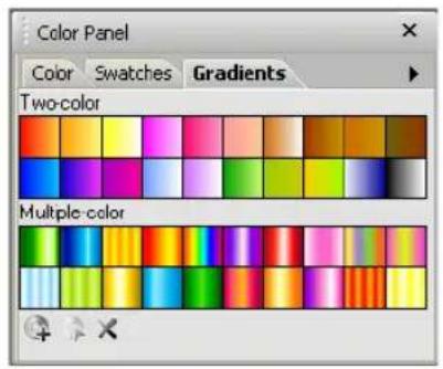
In this tab, you can also create custom gradient fills then save them as a Ulead Gradient Library file (UGL) which you can use for future projects.
Tip: You can select multiple gradients by pressing [Ctrl] while clicking on the gradients that you want selected. You can also press [Shift] to select several adjacent swatches. When multiple swatches are selected, Edit is disabled. To deselect the gradient, press [Ctrl] and click the gradient again.
To add a gradient to the Gradient Palette:
- Click the arrow then select Add New Gradient on the pop-up menu then select the type of gradient you want to add (either Two-color or Multiple-color). Alternatively, you can click Add Gradient
- In the resulting dialog box, set up the colors you want for your gradient color.
- Type in a name in the Name Box for the new gradient color.
Color Table tab
The Color Table tab only appears in the Color Panel when you are working in Indexed-color mode (maximum 256 colors.) The Color Table tab allows you to instantly set a tool color (similar to the Swatch Palette) by simply clicking a color.
Click the arrow to access the pop-up menu where you can open the Color Table (same as selecting Adjust: Color Table) or sort the Index-color Palette by different criteria.
Understanding Indexed color images
Indexed-color images are unique in that they are small in file size (compared to True Color images), yet offer a wide range of colors which can be arranged to make it appear as if they contain more. This is done through the use of a color table which allocates a single color in either 16 or 256 discrete cells (depending on the data type you are currently working in).
To view a color table, select Adjust: Color Table. You can also access the Color Table in the Color Table tab pop-up menu in the Color Panel. (This command is disabled when the active image is not Indexed-color.)
Editing the Color Table
As each color is in its own cell, you can change it to affect the color composition of an image. For example, you can change all occurrences of white by simply changing the white color cell.
To edit the Color Table:
- Click the arrow then select Color Table on the pop-up menu.
Note: You can also access the Color Table through Adjust: Color Table.
-
The Color Table dialog box appears. Edit the Color Table by using the different functions available.
-
Compact Removes all unused and duplicated entries on the table.
-
Expand Adds cells at the end of the table to represent unused entries. The maximum number of cells available depends on the data type of your image.
-
Click OK.
Loading and saving color tables
In PhotoImpact, you can save color tables and then load them into another compatible Indexed-color image. This ensures that two or more images share the same composition, which is particularly important if you are preparing images to be displayed in a 256-color display mode, such as CD titles or for the Web. You can also load in color tables to colorize an image.
Note: Color tables containing 16 colors can only be loaded into Indexed 16-Color images. Likewise, color tables containing 256 colors can only be loaded into Indexed 256-Color images.
WORKING WITH TEXT AND PATHS
With PhotoImpact, creating and editing text and path objects is quick, easy, and effortless. This chapter shows you how to add text to your images and how to use the different Path Tools to create basic geometric shapes as well as complex polygon shapes. Advanced techniques such as creating wrapping text, adding 3D properties to paths and text, and fusing objects using the Z-Merge Tool are also described in this chapter.
Adding text
Adding text titles and captions to your images is a snap with PhotoImpact. It allows you to enter, modify, and customize 2D or 3D text directly on the work area. You can add gradients, textures, and fills as well as add shadows and dozens of other effects to your text. With the Text Tool, you can create and modify dynamic and exciting text directly on a specific area in your workspace.

To add text:
- Click Text Tool in the Toolbox. Click a point on the image where you want to place the text. A blinking cursor will automatically appear where you can enter your text.
- Highlight a section or the entire text then apply formatting options by accessing the Text Panel. For more on the Text Tool's Tool Settings Panel, see the next section.
- Click OK.
To resize text:
There are two ways to resize text:
- Highlight the section or the entire text and then change its font size in the Attribute Toolbar.
- Using the Text Tool, click on the text. A selection marquee around the text indicates that the text has been selected. Drag the nodes around it to your desired size.
Tool Settings
The Tool Settings Panel contains a comprehensive range of functions, properties and effects that can be applied to your text objects. You can show or hide the Tool Settings Panel by clicking Show or hide Tool Settings on the Attribute Toolbar.
3D
Determines the appearance of depth, and the extent of the border of a 3D text object. Lighting effects can also be determined. See "Light" for details.
Note: Applying the 3D Pipe effect to a multicolored text block will change the color attributes of the whole block.
Options
Anti-aliasing controls the smoothness or sharpness of your text. Choose from three anti-aliasing levels.
Disable object pick mode while drawing lets you create new text wherever you click your mouse, even if you happen to click on another text object.
Style
Defines the font and character style for the text.
• Line spacing and Character spacing Apply to the entire text block.
- Automatic line spacing Applies to the entire text block. When Line spacing is set to zero (default value), this calculates the ideal spacing between lines based on the largest character in each line.
When Line spacing is set to a negative value, and the value approaches the negative equivalent of the font size, the lines will all merge to the same baseline. Decreasing the value past this point will not affect the text block further.
- Baseline shift Determines the amount of space between lines. This can be applied to individual characters, words, or the entire text block.
- Character spacing and Kerning Determine the amount of space between characters and words. These can also be applied to individual words and letters as well as the whole text block.
- Rotate This can be applied to individual characters, words or the whole text block.
Note: If you use Windows 2000 or higher and you have different languages installed, you can type in text in a selected language. If you use Windows 98, which has limited language support, then PhotoImpact will also have limited language support.
Baseline shift zero Baseline shift five Baseline shift twenty Baseline shift fifty


Split Text
Text objects can be split by characters, lines, words, or styles. Even when text objects are split, each segment retains its properties as a text object.
Note: Select Keep original text in Split Text to preserve a copy of the original text block.
Applying text effects
Once you've added and positioned the text on your image, the next step is to give it that extra spark of life to make it really stand out.
Below are some of the custom effects that you can create and apply to your text.
- Create custom color, gradients or texture fills, and give text a 3D look or add shadows to it.
- Twist your text into any shape you want by switching to Horizontal or Vertical Deform mode.
- Add unique effects to the surface of a text object by using the Material dialog box.
- Bend text objects or wrap your text on any path shape.


Editing text as a path object
You can make extreme and slick changes to individual letters in PhotoImpact by converting your text into a path object. Each letter in the text will be converted to a closed path, which you can easily reshape using the Path Edit Tool. Take note, however, that paths cannot be converted back into text. Text properties are lost and the text's contents and settings can no longer be modified.
To edit text as a path object:
- Click the Text Tool. Enter your text and select options for formatting your text.
- Select Object: Convert Object Type - From Text/Image To Path. Notice that the text attributes are grayed out in the Attribute Toolbar after your text has been converted into a path object.
- Click the Path Tool, then select the Path Edit Tool.
- Click Toggle to switch from path object mode to wireframe mode (or click the path object).
- Adjust the path nodes and segments in each path the way you want it. See "Editing paths" for details.
- Change to the Path Drawing Tool. In Mode, select a 3D option to give the path object a 3D look. Click Material to apply more 3D effects to the path object.

Saving text objects
Save text objects just as you would save image and path objects. There are two ways to save text objects:
- Save to EasyPalette You can save the attributes for each text object to My Library in the EasyPalette for easier access. Simply drag your text object into the My Library folder and enter a name for the object.
- Save as a UFO file To retain each text object's properties and be able to edit them, save them in a special Ulead File For Objects (UFO) format.
Working with paths
A path is an object that is composed of lines, curves, or a combination of both, which are interconnected by control points, or nodes. Use PhotoImpact's Path Tools to create 2D or 3D path objects in various shapes. For information on the different path drawing tools, see "Creating paths".
An advantage of path-based graphics over raster images is that they are not fixed in resolution and can be freely reshaped, resized or transformed in any way with no loss of quality.
To store editable path objects, you must save them in the native *.UFO (Ulead File For Objects) file format.
PhotoImpact also makes it possible for you to convert image objects and selection area marquees into paths. See "Tracing and converting images into paths" for details.
Creating paths
When creating path objects, you can either start with a True Color image file or an image with 256 colors.
Using a True Color image file gives you the most flexibility with path objects because you can then apply 3D properties and other effects to your objects. If you use an image with 256 colors or less, you can only create 2D path objects and selections.
The paths that you make can either be open or closed. The four tools provided by the Path Tools let you create and edit both types of paths. To draw closed paths,
use the Path Drawing Tool or Path Outline Drawing Tool. Use the Line and Arrow Tool to draw open paths. When you select one of these tools, the Attribute Toolbar changes to give you the drawing options for that tool. The fourth tool, Path Edit Tool, lets you adjust the shape of a path by giving you total control over the nodes, lines, and curve segments that make up a path. See "Using the Path Edit Tool" for details.

Examples of closed path and open path
The Path Drawing Tool
Everything from the most basic shape to the intricate and complex can be created with the Path Drawing Tool. You can start with the basics by using PhotoImpact's wide range of preset shapes, then move onto more advanced techniques, making your own creations from scratch, or even combining preset elements with your own unique shapes.
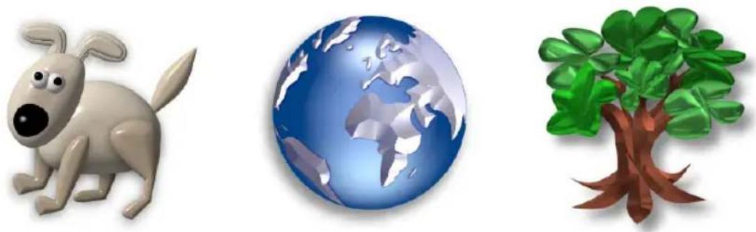
Examples of path objects created using the Path Drawing Tool
All the options for creating, customizing, and tweaking a shape are available on the Attribute Toolbar and the Tool Settings Panel of the Path Drawing Tool.
You can tweak various characteristics of a shape, including its shape, color, surface textures and materials, lighting, 3D effects, and more.
You can also choose the size of your nodes when working with paths. Select the size you want in Adjust node size of the Tool Setting Panel.
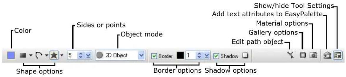
The Shape menus
There are three main types of shapes that can be created: Preset shapes, Freeform shapes, and Polygons.

The Preset Shape menu is itself divided into three groups. The top group holds basic geometric shapes, in which shapes on the first row are of unfixed proportions, while those on the second row are equilateral by default. The second group holds preset polygon shapes and also more complex shapes, all of which can further be modified by adjusting the number of sides or points after being created. The third group is Custom Shape, which provides a selection of preset shapes from EasyPalette's Shape Library.
The Freeform Shape menu showcases three important tools for creating custom, hand-drawn shapes. The first is the Spline Tool, which by default draws geometric curves, but can also draw straight sections. The second is the Bezier Tool which draws straight sections by default, but can also create curves. The final tool is the Freehand Tool which can be used to create entirely freeform shapes, but can nevertheless be edited using control nodes, like any other path object.
The Polygon Shape menu holds four types of polygon shapes. For each of these shapes, the number of sides (or points) can be adjusted from three to 32. This number can be specified either before or after drawing the shape.
Creating paths with the Path Drawing Tool
Use the Path Drawing Tool to create closed shapes with solid fill. A range of preset shapes is available, including standard geometric and more complex shapes, as well as freeform tools and polygon tools for creating entirely custom-made drawings.
To create a path object with solid fill:
- Click the Path Tools then select the Path Drawing Tool.
- Select a shape from one of the three drop-down Shape menus.
Note: You can also import Adobe Illustrator (AI) files.


- To draw the shape, click at a starting point, hold the button and drag your mouse to form the shape, then release the button.
- If you created a polygon shape, you can change the number of sides or pointed tips of the shape on the Attribute Toolbar.
- To add a surrounding border around the path object, click Border then set its width and color.
- Click Mode. Select 2D Object, or select a 3D Mode to give the object a three-dimensional appearance.
Note: To ensure smooth edges, select Anti-aliasing in the Options group in the Tool Settings Panel.
Customizing 3D path objects
PhotoImpact gives you many ways to customize the various aspects of 3D path objects. Choose from a large variety of presets, or customize individual aspects yourself. All aspects that you customize yourself can be saved for later use.
- Click Gallery on the Attribute Toolbar to open the EasyPalette, then select either Material Gallery or the Material Attribute Gallery.
Material Gallery contains combined properties of texture, light, bump, shadow, and more. Material Attribute Gallery contains presets for specific 3D characteristics, such as a type of bevel, shadow, shading, and other aspects. Choose a preset thumbnail and apply it by dragging and dropping.
- Click Material on the Attribute Toolbar to customize various 3D properties individually.
- Click Show or hide Tool Settings on the Attribute Toolbar to open the Tool Settings Panel. This lets you tweak the Width (bevel width) and Depth (bevel angle), adjust the direction of light that is projected on the object surface, and more.
Saving custom paths and attributes
To save the entire path object, including its attributes and 3D properties, simply drag it to the EasyPalette. The Add to EasyPalette dialog box opens, letting you save the object to the desired Object Library. Later on, you can simply drag the thumbnail of the path object to the workspace to add it to another document.
When you click Add on the Attribute Toolbar, the Add to EasyPalette dialog box opens, and by default allows you to save all the path attributes that you see on the Attribute Toolbar (except for the color) to My Gallery - Gallery 1 in the EasyPalette. Next time you want to use the same attributes, drag the thumbnail from My Gallery - Gallery 1 to the workspace. The Attribute Toolbar changes to reflect the saved attributes. You can then apply these attributes to the next path object that you create.
You can also save 3D properties to the EasyPalette. For details, see "Saving material properties to the EasyPalette".
Note: By default, the galleries and object libraries (except for the Shape Library, Outline Library, My Gallery, and My Library) are set to read-only to prevent the presets to be overwritten. To save custom settings and objects to a gallery or library, right-click its folder then clear Read-only (for Sharing).
The Outline Drawing Tool
The Outline Drawing Tool creates shapes similar to the Path Drawing Tool, but the shapes are hollow frames rather than solid filled objects. For more information about shapes, see "The Shape menus".
Examples of path objects created using the Path Outline Tool
The Attribute Toolbar options of the Outline Drawing Tool are the same as that of the Path Drawing Tool, but also has additional settings for defining outline width and style in the Tool Settings Panel.

To create an outline path:
- Click the Path Tools and select the Outline Drawing Tool.
- Select a shape from one of the three drop-down Shape menus.
Note: You can also import Adobe Illustrator (AI) files.
-
To draw the shape, click at a starting point, hold the button and drag your mouse to form the shape, then release the button.
-
If you created a polygon shape, you can change the number of sides or pointed tips of the shape on the Attribute Toolbar.
-
Click Mode. Select 2D Object, or select a 3D Mode to give the object a three-dimensional appearance.
-
Click the Color box on the Attribute Toolbar to modify the color, apply Gradient or Texture fills, or add a Fade-out effect.
-
You can set the Width and Style or modify the thickness of the outline and the type of line on the Attribute Toolbar.
Notes:
- To ensure smooth edges, select Anti-aliasing in the Options group in the Tool Settings Panel.
- 3D effects can be applied to Path Outline shapes the same way as they are to solid-filled Path shapes. For details on how to tweak 3D properties and to save them, see "Adding 3D properties".

The Line and Arrow Tool
The Line and Arrow Tool draws straight or curved lines and arrows, and renders them as a 2D or 3D object depending on the selected Mode in the Attribute Toolbar. The Freehand Drawing Tool, which allows freeform drawing, also belongs to this group of path tools.

To create a line and arrow path:
- Select the Line and Arrow Tool.
- Click Shape. Select Line/Arrow to draw a straight path. Select Bezier or Spline to draw a curved or irregularly-shaped path. Select Freehand to draw without constraints.
-
Draw the path:
-
Straight path Click at a starting point and drag your mouse in the intended direction of the path. Click again to end the path.
- Curve or irregularly-shaped path Click at several points to gradually form the shape of the path. Double-click to complete the path.
Note: For more information on drawing curves and irregularly-shaped paths, see next section.
- Set the line Width and Style on the Attribute Toolbar. Select an Arrow style for the start and end points.
- Select Anti-aliasing in the Options group of the Tool Settings Panel for smoother lines and curves. Add Shadow.
- Click Mode and make the path a 2D or 3D object. For further 3D properties, click Material.
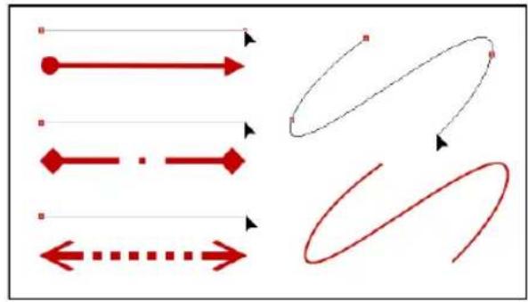

Samples of Line and Arrow path objects
Drawing curves and custom paths
Select the Spline Tool or Bezier Tool from the Freeform Shape menu on the Attribute Toolbar to draw curves and irregularly-shaped path objects. With the Freehand Tool, you can use your mouse or pen tablet just like you would use a pencil to make hand-drawn artwork.
Spline Tool
The Spline Tool is especially convenient for drawing shapes that consist primarily of curved paths, although it can be used to create linear paths as well. When you use this tool to draw paths, each line segment that you create automatically curves itself while you draw the path.
To draw a curved path:
- Click the Path Tools and select a drawing tool.
- From the Freeform Shape on the Attribute Toolbar, click Spline.
- Click in the document where you want the path to begin. A start node appears.
- Position the cursor where you want the first segment to end, then click.
-
Move the cursor around. Notice that the segment smoothly bends into a curve using the node as a reference point.
-
Continue clicking and moving your mouse until you have created the desired shape. The path automatically curves based on the position of the nodes.
-
Double-click to complete the path.
Note: Right-click at any time to cancel drawing.
![graph TD A["1"] --> B["2"] B --> C["3"]](/content/2026/07/1411218/images/e661f721cab41c49af0121aa5264d4627805ea46242bb23a8becd855f9221cbb.jpg)
To draw a line segment:
To draw a straight line segment within a path, hold down [Ctrl] while you click the start and end positions of the line segment. This prevents the Spline Tool from bending the segment into a curve.
![graph LR A["1: [Ctrl"] + Click at the start of the line segment] --> B["2: [Ctrl"] + Click at the end of the line segment] B --> C["3: Final curved arrow with red markers"]](/content/2026/07/1411218/images/bae98328b973dc281eeddc715176bc9929210e581e3f91c28e782c6f346ba0c4.jpg)
Drawing a line segment with the Spline Tool
Notes:
- To limit the angle between segments in 45 degrees, hold down [Shift] as you draw.
- Press [Backspace] to remove the previous curve or line segment drawn.
Bezier Tool
The Bezier Tool is especially convenient for drawing shapes that consist primarily of linear paths, although it can be used to create curved paths as well.
To draw a path with the Bezier tool:
- Click the Path Tools and select a drawing tool.
-
From the Freeform Shape menu on the Attribute Toolbar, click Bezier.
-
To draw a straight segment, click at the point where you want to start the line. A node appears. Move the cursor to the point at which you want your line to end, and click again to complete the segment.
-
To draw a curve segment, click at the point where you want the curve to start and then drag in one direction. Then click at the endpoint of the curve segment and drag in the opposite direction. (See illustration)
To draw an S-curve segment, click and drag your mouse in the same directions at the start point and end point of the segment. (See illustration)
-
Continue clicking and moving the cursor around until you have created the desired shape.
-
Double-click to complete the path.
Note: Right-click at any time to cancel drawing.
![graph TD A["1"] --> B["2"] B --> C["3"] C --> D["End"]](/content/2026/07/1411218/images/36875eee8f902915fb8fde502437dd29fa2c37765579308b13925ef1e945976b.jpg)
Drawing a straight path
![graph TD A["Start node"] --> B["Drag mouse downwards"] B --> C["End node"] C --> D["Drag mouse upwards"]](/content/2026/07/1411218/images/c753c41f5aa88338c1f89b6dccc325d97934dc9952ea5891384a416e35e0945c.jpg)
Drawing a curve with the Bezier Tool
![graph TD A["Start node"] --> B["Drag mouse downwards"] B --> C["End node"] D["Start node"] --> E["Drag mouse downwards"] E --> F["End node"]](/content/2026/07/1411218/images/0edf6ef51bf5455504ea29ecfe1a95142f61cda6336f52e87a5c9664508b79d8.jpg)
Drawing an S-curve with the Bezier Tool
Notes:
- To restrict the angle between segments to 45 degrees, hold down [Shift] as you draw.
- Press [Backspace] to remove the previous curve or line segment drawn.
- Use the same drawing procedures given in this section when drawing open-path lines and curves with the Line and Arrow Tool.
Freehand Tool
The Freehand Tool lets you create hand-drawn shapes. This tool is available to all path tools (except for the Path Edit Tool). After you have created the shape, you can apply any of the effects and editing options available to path objects.
To create a path using the Freehand Drawing Tool:
- Click the Path Tools then select one of the three drawing tools.
- Select the Freehand Tool from Freeform Shape menu on the Attribute Toolbar.
- In your document, click at the point where you want to draw your shape, then drag the mouse to form the shape.
- When you have finished drawing, release the mouse.
If you are drawing a shape using the Path Drawing Tool or Path Outline Tool, the path shape will be closed when you release the mouse.
Notes:
- By default, the Close smoothly option in the Freehand drawing group of the Tool Settings Panel is selected. This results in a smoother, curved effect between the start and end points if the mouse is released far from the starting point.
Deselecting this option will close the shape with a straight line. This setting cannot be changed for a shape after it has been created, and should be considered prior to drawing the shape. - To make the shape approximate as closely as possible to your original tracing, maximize the Accuracy setting in the Freehand drawing group of the Tool Settings Panel. This setting can only be adjusted for the most recently created Freehand path object.
-
To cancel drawing, click the right mouse button while you are dragging the cursor.
-
Change the color of your object by clicking Color on the Attribute Toolbar.
-
Click Mode. Select 2D Object or give the object a three-dimensional appearance by selecting a 3D Mode.
Note: To customize 3D properties of the path object, click Material on the Attribute Toolbar.
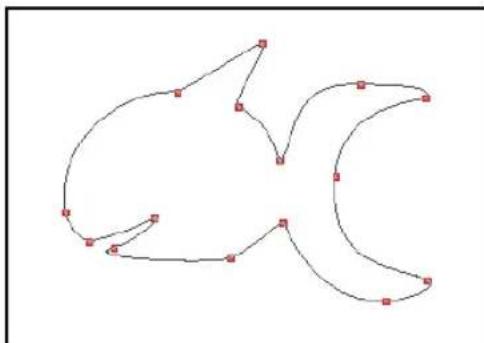

Drawing multiple paths
With the Path Drawing Tool, you can create a single object with multiple path shapes. After drawing the first shape, click Mode on the Attribute Toolbar and select Continue Draw Mode, then draw the next shape.
-
Drawing the 1st path
-
Drawing the 2nd path
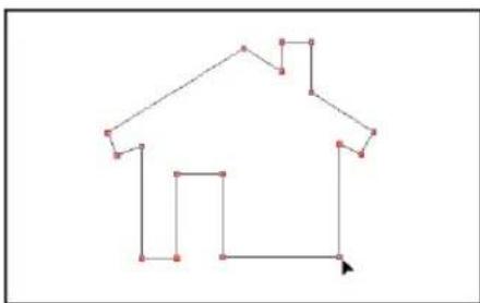

- Drawing the final path

- Final path object
Notes:
- Press [Esc] while creating a shape to cancel it.
• To move a path, click and drag it.
- After drawing multiple paths in Continue Draw Mode, use the Path Edit Tool to group and organize the paths. For more information, see "Using the Path Edit Tool".
Importing Adobe Illustrator files
You can import vector graphics created in Adobe Illustrator into PhotoImpact. You can directly use them as path objects or further edit them. Only closed path shapes and single-path outlines can be imported from Adobe Illustrator.
To import Adobe Illustrator files (*.AI):
-
Click the Path Tools, then select the Path Drawing Tool or Outline Drawing Tool.
-
From the Preset Shape menu on the Attribute Toolbar, select Custom Shape. The Custom Shape dialog box opens, displaying preset objects.
-
Click Import. The Input AI File dialog box opens.
- Select an AI file to import and click Open. The selected AI file is added to the selected gallery in the Custom Shape dialog box.
- Select the object and click OK.
- Click and drag your mouse to draw the object. The vector-based illustration now appears, allowing you to easily manipulate it using the Path Drawing Tool, Outline Drawing Tool, Path Edit Tool, or the Bezier Curve Tool.
Tool Settings
Commonly used path attributes can be accessed on the Attribute Toolbar as well as from the Tool Settings Panel. To show or hide this panel, click Show or hide Tool Settings on the Attribute Toolbar.
- 3D Determines the Depth of a 3D path shape, and the Width of its border. Adjust Lighting properties are also available in this group.
- Options The options determine how paths are drawn, for instance, whether shapes are generated from the center or from the corner, whether shapes have equal length sides or constant radius, whether to enable or disable anti-aliasing, and more. Available options depend on the selected drawing tool.
• Rounded rectangle Adjusts the roundness of rectangular shapes. - Freehand drawing Gives options for adjusting accuracy and closing points smoothly.
Filling a path with the Even-Odd Fill option
Whenever you render a path object, the object is always filled with the color specified in the Color square on the Attribute Toolbar. When Even-Odd Fill is selected in the Options group of the Tool Settings Panel, the fill only occupies alternate areas created by overlapping path(s). This option is ideal when you have an irregularly-shaped object which folds over onto itself or a complex object containing multiple shapes inside, and you want to keep overlapping areas free of paint. For instance, you can easily create a pattern with alternating fills. The unfilled areas will show the base image.
This alternate filling effect can only be applied to path objects drawn in Continue Draw Mode using the Path Drawing Tool.
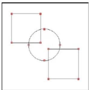
Multiple paths drawn in Continue Draw Mode

With Even-Odd fill Without Even-Odd fill

When the Even-Odd Fill option is not selected, the fill occupies the entire interior of the object whether paths overlap or not. There are instances, though, in which overlapping areas are still left unfilled, depending on how the path was drawn. If the path's inner curve or line segments were drawn in the opposite direction as the outer segments, overlapping regions will not be filled. See the sample illustrations below.

Inner path shapes drawn in the same direction as the outer shape
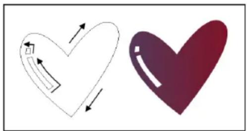
Inner path shapes drawn in the opposite direction as the outer shape
Editing paths
The limitless potential of path objects can be unlocked through editing existing paths. Add, delete, and move edit points in order to reshape, tweak, and adjust your shapes. Turn curved segments into straight sections, or vice versa. PhotoImpact gives you editing tools that let you completely customize and tweak path objects with great versatility.
When you edit path objects, they will be displayed as a wireframe structure. This structure essentially consists of the line and curve segments that comprise

the path. Each segment contains nodes and up to two control handles at each end, all of which you can adjust by dragging. Nodes let you control the start or end position of a line segment, whereas control handles let you control the shape of a curve.
- Nodes that are adjoined by two line segments do not have control handles, unless the path has been created with the Spline Tool.
- Nodes that are adjoined by two curve segments will display two control handles that let you adjust the curve.
- Nodes that are adjoined by one line segment and one curve segment will display one control handle that lets you adjust the curve segment only.
Deforming the path shape
When any of the drawing tools (Path Drawing Tool, Outline Drawing Tool or Line and Arrow Tool) is selected, you can easily distort the path horizontally or vertically by changing the Mode in the Attribute Toolbar to Horizontal Deform or Vertical Deform.

Horizontal Deform

Vertical Deform
When you select Horizontal Deform or Vertical Deform, a bounding box with four nodes then appears. When a node is clicked, the horizontal or vertical segment adjoining it will display control handles at each end.
Furthermore, all four control handles can be displayed by holding [Ctrl] and selecting one of the other nodes, or by clicking the canvas and dragging the mouse
over the bounding box. To adjust the path shape, reposition the nodes or drag the control handles.
After you have finished adjusting the shape, change back to the original Mode to render the path object.
Using the Path Edit Tool
The Path Edit Tool lets you modify path shapes with precision. Use the Attribute Toolbar options to add or remove nodes on your path, convert lines to curves or vice versa, group paths, and more.
Alternatively, you can access path editing commands on a pop-up menu by right-clicking the whole path or a single segment.

To easily change between the Path Edit Tool and the drawing tool which you used to create the object:
- Click Editing on the Attribute Toolbar.
- Right-click the object. From the pop-up menu, select Edit Path to switch to the Path Edit Tool or select Edit Attributes to return to the drawing tool.
Editing basic shapes or line and arrow paths
After drawing a preset path shape or a line and arrow path, you can further modify the path until it looks exactly the way you want it. Each segment in a path can be individually tweaked by adjusting the nodes and control handles at each of its ends.
To edit a basic shape or line and arrow path:
-
Click the Path Edit Tool, then click Toggle on the Attribute Toolbar, or click the path object itself. The path object is displayed as a wireframe structure.
-
To select a node or multiple nodes, make sure that Pick point is selected on the Attribute Toolbar.
- To select a single node, just click the node. To deselect a node, press [Ctrl] then click the node.
Selected nodes will be represented by hollow squares, while unselected nodes will be represented by solid squares.
- To select multiple nodes simultaneously, first click a node to select it, then press [Shift] or [Ctrl] while selecting other nodes. Alternatively, you can hold down [Shift] or [Ctrl], and then drag your mouse across the areas of the path that contain the nodes that you want to select. To deselect multiple nodes, press [Ctrl] then drag the mouse across the nodes.
- To move the selected node(s), click and drag the selected node(s) to the desired position.

Path object mode and Wireframe mode

Selecting an end node
-
To move the selected node(s), click and drag the selected node(s) to the desired position.
-
To reshape a curve segment, click either of its two end nodes. Up to two control handles will appear on the selected node. Drag a handle to adjust the shape of the curve.
Use the Edit mode buttons to change the way control handles affect curve segments.
- Non-free edit Moves both control handles simultaneously and reshapes the curves between a node and its adjacent nodes.
- Free edit Moves one control handle at a time and reshapes a curve without affecting other path segments.
- To change a curve segment into a line or vice versa, select the segment then click the Convert line button.
Tip: Multiple path segments can be selected in order to simultaneously convert them to line or curve segments. Click a segment of the path to select it, then press [Shift] or [Ctrl] while selecting other segments. To deselect a segment, press [Ctrl] then click on the segment.
![graph TD A["Top Process Block"] --> B{Path Segment} B --> C["End Step"] style A fill:#fff,stroke:#000 style B fill:#fff,stroke:#000 style C fill:#fff,stroke:#000 note1["•"] -.-> B note2["•"] -.-> C note3["•"] -.-> C](/content/2026/07/1411218/images/fcae3f794987b89171745db75ae49d989feb20db0ef2c0b6c0acc7653c422c00.jpg)
Dragging control handles to adjust curve shape

Editing in Free edit mode
- If you want to create a path with more detail and nuances, add more nodes and further adjust the path.
To add a node, select the target segment, click Add point on the Attribute Toolbar, then click on the part of the segment on which to add the node.
- Alternatively, if you want to create a smoother, simpler path, remove some nodes and adjust the remaining nodes. To remove a node, click Delete point on the Attribute Toolbar, then click a node to be removed.
Tip: When Pick point is selected on the Attribute Toolbar, press [Shift] and click a segment to add [+] node, or press [Ctrl] and click a node to delete [-] it.
- When you are satisfied with the result, click Toggle or Editing (or, right-click and select Toggle Mode) to render your path object.

Converting line to curve
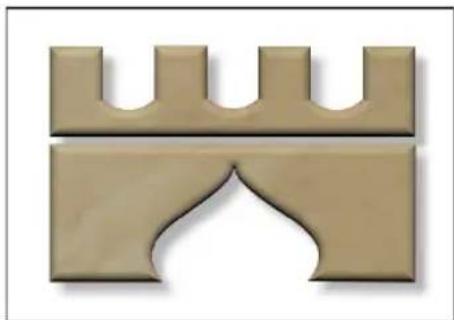
Editing polygon shapes
Like the basic path shapes, polygon shapes can be edited by dragging nodes, adjusting node control handles, adding and deleting nodes, switching curved for straight segments and vice versa. However, polygon shapes are special in that their nodes and segments can be adjusted simultaneously, so that the adjustments still result in a regular, symmetrical shape. This is due to the fact that they are comprised of node sets.
What are node sets?
In a polygon shape, a node set consists of nodes that are located on the same position on each side of the polygon. For example, all the convex points of a star-shaped path belong to one node set, while all the concave points belong to another. When you select a node in a polygon, all the other nodes in its set are automatically selected.
Consequently, when you adjust the position of a node or its control handles, all nodes and adjacent segments in the set are adjusted simultaneously, relative to the center of the polygon.
The original node set of a polygon that you create is the base node set. The number of nodes in the base node set can be specified on the Attribute Toolbar. You can add further node sets to a polygon shape simply by clicking on a side of the polygon path. The other nodes in the set will automatically appear on the corresponding positions of the polygon.
Similarly, you can create a node set by adding pairs of nodes that appear symmetrically on either side of a reference node. Because the nodes of a polygon shape come in sets, individual nodes on a polygon shape cannot be added, removed or edited. In order to do this, To edit nodes on a polygon path individually, click Convert on the Attribute Toolbar. The shape then converts to a standard path shape whose nodes can be edited individually.
To edit a polygon shape:
- Click the Path Edit Tool, then click Toggle on the Attribute Toolbar, or click the polygon object itself. The polygon shape is displayed as a wireframe structure consisting of nodes and segments.
-
To edit existing nodes and alter the path shape, click and drag nodes and their control handles. All the nodes in a set, along with their adjacent segments, will be altered simultaneously in the same way.
-
To add a new set of single nodes, click Add single-node set on the Attribute Toolbar, then click on the part of the segment to add it. A new set of nodes will appear on the corresponding segments on each side of the polygon, using your click point as a reference.
-
To add a set of paired mirror nodes, click Add paired-node set on the Attribute Toolbar, then click on the part of the segment on which to add it. A new set of nodes will appear on the corresponding segments, with each node pair equidistant to a reference node.

Adding a single-node set then reshaping the path

Adding a paired-node set then reshaping the path
Note: Paired-node sets cannot be added if you have already added a single node set to the polygon shape.
- To remove a node set, click Delete node set on the Attribute Toolbar and click the node to delete. All the nodes of that set will be deleted.
Note: The base node set of a polygon shape cannot be deleted.
Editing multiple paths
To select multiple paths while editing a path object drawn in Continue Draw Mode, press [Ctrl] or [Shift] and click the paths. Right-click and apply the menu commands you want on the selected paths or click the available buttons on the
Attribute Toolbar.
- Duplicate Creates a path with the same attributes as the selected path.
- Delete Removes the selected path(s).
- Alignment Aligns and distributes the selected paths.
- Grouping Groups or ungroups selected paths.
Note: These commands can only be applied to multiple paths created using the Path Drawing Tool's Continue Draw Mode. See "Drawing multiple paths" for details.
Grouping and ungrouping paths
If you have created a path object using Continue Draw Mode containing multiple paths, it is advisable that you group them into one or more groups of paths. Group related paths together when you want to fix their position in place while you continue to edit other portions of your path object. This makes managing paths easier and lets you move them together.
To group paths:
- Click the Path Edit Tool, then click Toggle on the Attribute Toolbar, or click the path object itself.
- Select the paths you want to group by holding down [Shift] or [Ctrl] while clicking each path. To deselect a path, press [Ctrl] while clicking the path.
- When all the paths are selected, right-click and select Group Path.
To separate grouped paths, right-click and select Ungroup Path.

Grouping paths
Using the Bezier Curve Tool
Another alternative you can use to create complex paths or selections is the Bezier Curve Tool from the Selection Tools. This tool works in two modes: Path and Selection modes. It allows you to create a closed path or make the path into a selection.
To draw and edit paths using the Bezier Curve Tool:
- Click the Selection Tools, then select the Bezier Curve Tool.
- Select a preset path shape from the Shape menu on the Attribute Toolbar, then draw the path. You can draw multiple paths.
Note: Free Path is ideal for drawing curves and irregularly-shaped paths. It draws paths exactly the same way as the Bezier Tool. Follow the same procedure in "Bezier Tool" to draw a free path.
- To edit the path(s) you have just drawn, select Edit existing path on the Attribute Toolbar.
- Click a path segment, then right-click and select Convert to Curve or Convert to Line to change a line segment into a curve or vice versa.
- Click a node to show control handles and adjust path segments. Use the Free edit option to determine how to adjust two connected path segments.
Notes:
- The Free edit option works the same way as the Edit mode buttons of the Path Edit Tool.
- How color fills overlapping paths is determined by the Even-Odd fill option.
-
To delete a node, click Options and select Delete Point.
-
Double-click to complete the path.
- Finally, to convert the path(s) to a path object, click the Path Tools and select the Path Drawing Tool. Then click Mode and render as a 2D or 3D object.
Note: After the path has been converted to a path object, nodes can be added using the Path Edit Tool.

Edit an existing path

With Even-Odd fill

Without Even-Odd fill
To make the path into a selection:
Click Toggle in the Bezier Curve Tool's Attribute toolbar. This button lets you switch between path and selection modes.
Note: The Bezier Curve Tool can be used to edit paths created with Path Tools. While a path tool is selected, set the path's Mode to Selection. Then, select the Bezier Curve Tool and click Toggle to switch to wireframe mode and edit the path.
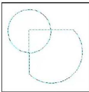
Making the path into a selection
Tracing and converting images into paths
The Edit: Trace Edges submenu contains commands that can convert any base image, selection area or object into a path. You can use these commands to trace a portion of an existing image and turn it into a path object. This saves you the time and the trouble of having to draw it from scratch. Later on, you can make adjustments to the object and give it a 3D look using the Path Tools.
- Edit: Trace - Selection Marquee traces a shape according to the edges of the marquee. Use any of the Selection Tools to mark the desired part of your image first, then apply this command.
- Edit: Trace - Image traces a shape based upon the luminosity values of the pixels in the image, retaining darker pixels and excluding lighter pixels. This command accurately converts a portion of an image into a path object when that part has high contrasting colors over the rest of the image. You can also use this command in cases where the area is easily distinguished from the background image, such as with text on an image.
To convert a raster image into a path:
-
Select Edit: Trace Edges - Selection Marquee to trace a selected area. Or, select Edit: Trace Edges - Image to automatically trace dark areas on the image.
-
In the right hand side of the Trace dialog box, you will see a preview of the traced path. Adjust the following settings to get as close as possible to the tracing that you want:
- Tolerance The accuracy of the tracing. A lower value results in greater accuracy.
- Jump point The smoothness of the curves used for tracing. A lower value creates smoother curves.
- Threshold The luminance value determines which pixels to include in the trace. All pixels whose luminance value falls below this are included.
-
Click OK.
-
The traced path appears on top of the raster image, with deformation handles visible. Drag the handles to change the path shape.
Note: To edit the traced path more precisely, use the Path Edit Tool. For more information, see "Using the Path Edit Tool".
Tip: You can also convert an image object to a path object by selecting Object: Convert Object Type - From Text/Image to Path. The boundaries of the object becomes a path which you can distort using the Path Drawing Tool's deform modes or reshape using the Path Edit Tool.


Tracing a selected area
Adding 3D properties
The Material dialog box is where you bring a text or path object to life. You can give it a 3D look by adding shadows, reflections, and other 3D properties. Click Material on the Attribute Toolbar while using either the Text or Path tools, to open the Material dialog box.
Note: If you create a text or path object on top of a base image, you can also change how the object appears against its background image. Right-click the object and click Properties to open the Object Properties dialog box. Different settings are available for resizing the object, repositioning, merging with background color, and more. The Image Map tab in the dialog box even lets you add hyperlink properties to the object. For more information on Web pages and creating hyperlinks with objects, see "Image Map Tool".
The figure below shows an example of a path object drawn using the Path Drawing Tool, then further enhanced by applying 3D properties.
![graph LR A["Rounded Rectangle"] --> B["3D Round with transparency"] B --> C["Final edited shape"] D["Ellipse"] --> E["3D Pipe with transparency"] E --> F["Duplicated shapes"] G["Rounded Rectangle"] --> H["3D Round with thin border"] H --> I["Final edited shape"] J["Rectangle"] --> K["Continue Draw"]…](/content/2026/07/1411218/images/fdb43ede559ed69a63c60d940e6b4ddcfdc66442eda85041fab3236f72f6f31c.jpg)
A 3D path object created by using simple shapes and applying 3D properties
The Material dialog box
This section briefly describes the different items in the Material dialog box.
Color/Texture
Lets you customize the object's appearance with either simple or gradient colors, or either a Natural or Magic Texture fill. Texture fills are applied to the area within an object's border whether the object is 3D or not. Click the Color and Texture Boxes to invoke their respective dialog boxes.
Bevel
Lets you define the 3D edge of an object with a variety of preset styles. The size of the bevel edge is determined by the Border/Depth settings.
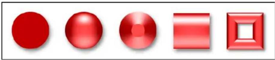
None (2D object)
3D Round 3D Chisel 3D Trim 3D Pipe

3D Custom Modes
Bevel Settings
Allows you to define the relative thickness of a 3D object, both in height (Depth) and beveled edge (Width). It also provides an option (Smooth spine) for removing sharp edges caused by the bevel effect on irregularly-shaped 3D objects and smoothen the object surface.
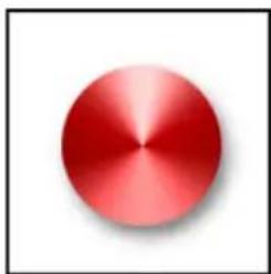
3D Chisel with maximum border

3D Chisel with smaller border

3D Pipe with maximum depth

3D Pipe with smaller depth
Reflection
Projects an image reflection onto the object's surface. This differs from Color/Texture which simply fills an object with an image.

With reflection image (Reflection Tab)
With texture image (Color/Texture Tab)
Transparency
Lets you set whether or not you can see through the object, and if so, to what degree.
Border
Lets you add a line border around a path object. The border color and width can be specified.
Shadow
Adds a drop-shadow to your object. It also gives you the option of having PhotoImpact render the backside of a transparent 3D object.
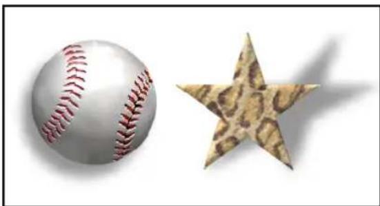
Light
Allows you to adjust the direction and number of lights shining on the object. This also provides an option for moving light sources in the same relative position to the object if the object is rotated (Rotate light when object rotates).
You can use up to four lights. To select a light and make adjustments to it, open the Material dialog box then select Light. Click and drag your mouse over the object surface to adjust the position of each light source.
Alternatively, you can select individual lights in 3D on the Tool Settings Panel. Select which light source to adjust, then click Adjust light and move the mouse over the document to view the effect. Click to lock down a light position. Press [Esc] to abort. Click More to add lights using the Material dialog box.
Shading
Shading allows you to define whether the material reflects light like metal or like plastic. Plastic, or Phong, refers to a glossy shading scheme. While Metallic refers to a diffused light.
Tip: PhotoImpact provides several image files in the Material folder which you can add as textures, reflections, and bump maps to your objects.
Bump
Create grooves and extrusions on the surface of a 3D object based on contrasting dark and light areas.
Making the surface of 3D objects smoother
If you created a complex or irregularly-shaped 3D text or 3D path object, bevel edges can sometimes be visibly prominent on the object surface. If you want to make the object surface look smoother, select Bevel Settings then select Smooth spine.
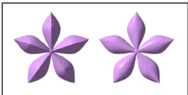
Without Smooth Spine With Smooth Spine
Note: The Smooth Spine option can only be used with 3D Round, 3D
Chisel and 3D Custom objects, and when the Bevel outline is "In".
Creating transparent objects
To create a transparent object, for example, a glass jar, draw a 3D object and simply make the transparency setting higher. The following procedure shows you how.
To create a transparent object:
-
Click the Path Drawing Tool, then select a Shape and draw the path.
-
Click Editing on the Attribute Toolbar to edit the path shape.
Click Editing again to return to the Path Drawing Tool.
-
Change the Mode of the path object to 3D Round on the Attribute Toolbar.
-
Click Material, then click Border/Depth. Lower the Border setting.
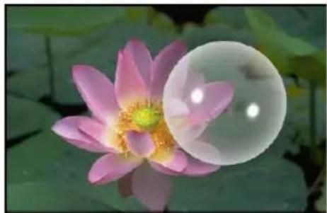
-
Click Transparency. Select Transparency then set it to at least 75% to mimic the appearance of glass. Set the minimum transparency to 35% for the object's edges.
-
Click Shadow and select the Render backface option.
-
Click OK.
Using bump maps
Bump map is a term describing an image file that, when applied to a text or path object, creates the appearance of 3D grooves and extrusions on the surface. The darker a particular region is, the deeper the groove, while the lighter a region is, the higher the extrusion appears.
To add a bump map texture to an object:
-
Create a 3D path object or 3D text.
-
Click Material and select Bump.
-
Click Bump map, then locate the file you want to use as a bump map and click Open.
-
Enter the Density of the bump, where 100% is the maximum and 0% is the minimum.

-
If the 3D path object has texture, select Displacement mapping to give the object a more realistic appearance. Change the X and Y values to adjust the texture's displacement over the bump map.
-
Clear the Use bump as reflection option if the object has a flat surface. However, if your object has a round or curved surface, select this option to map the image across the entire surface.
-
Select Invert bump map to make the image appear raised instead of carved out of the surface of the object.
- Click OK.
Saving material properties to the EasyPalette
After enhancing text and path objects using the Material dialog box, you can save custom attributes and 3D properties in the EasyPalette for future use. If you find that you use a particular look or effect frequently for text or path objects, this will help you save time by providing you with that effect ready to be used, instead of having to recreate the effect each time from scratch.
To save Material dialog box settings to the EasyPalette:
- Select a text or path object to make it active, then switch to its corresponding tool in the Toolbox, and click Material on the Attribute Toolbar.
- In the Material dialog box, click Add.
- In the Material: Save Options dialog box, select All to save everything or Partial to choose the specific settings to save.
- Click OK. The Add to EasyPalette dialog box then opens.
- Specify the Sample name, Gallery, and Tab group information for saving.
- Click OK to add the settings to the EasyPalette.
- Next time you want to apply the saved 3D properties to any text or path object, simply drag the thumbnail from the gallery to the active object.
Type effects
The EasyPalette's Type Gallery provides a wide selection of preset colors and gradients, as well as glass, metallic, and other outstanding textures that you can directly apply to text objects. Other visually striking effects such as fire, snow, neon glows, and more are also available. Each of these effects can be applied to path objects as well.
To apply a preset Type effect:
- Click the Text Tool on the Toolbox. Enter your text and click OK.
- Adjust the Font, Size and Color of the selected text on the Attribute Toolbar.
- Click EasyPalette on the Standard Toolbar to open the galleries and libraries.
-
Open Text/Path Effects in the EasyPalette, select Type gallery, then choose a preset effect.
-
Drag or double-click to apply the effect to the text.
Notes:
- Once a type effect has been applied, the text object becomes an image object, and you will not be able to further edit the text attributes.
- To create custom type effects and apply them to your text, select Effect: Creative - Type Effect.
Wrap effects
Wrap effects bend objects in unique ways by aligning them to the path of a shape. The EasyPalette's Wrap gallery provides ready-to-use wrap effects which can be directly applied to text and path objects. In addition to these presets, PhotoImpact allows you to create your own wrap effects.
Applying wrap effects from the EasyPalette
Preset wrap effects are found in the Wrap gallery of the EasyPalette.

Text Wrap

Path Wrap
To apply a wrap effect from the EasyPalette:
- Create a text or path object.
- Open Text/Path Effects in the EasyPalette, select Type gallery, then choose a preset effect.
The Wrap Gallery allows you to apply Bend Text, Text Wrap, and Path Wrap effects to both text and path objects.
- Drag or double-click a thumbnail to apply the effect.
Creating your own wrap effects
In PhotoImpact, you can create your own path object on which to wrap text and other path objects. In the Object: Wrap submenu, there are two commands that let you do this:
- Add Text to Active Path Creates text on a path. Use any of the Path Tools to draw a path, then click this command to enter text and place it on the path.
- Fit Together Wraps a text or path object over another path. Select the text object and the path on which to wrap the text, then click this command to combine them.

Notes:
- When you wrap a path object over another path, PhotoImpact automatically makes many duplicates of the object and lines them up over the path.
- Outline path objects as well as line and arrow path objects cannot be wrapped over a path.
- Objects can be wrapped on any type of path, including solid-filled path, outline path, or line and arrow path.
Modifying wrap effects
PhotoImpact allows you to change the way an object wraps. You can wrap a single object only, or create many duplicates of it and wrap them on a path. You can also deform the objects and make them follow the shape of their path more smoothly.
Use the Wrap dialog box to change an object's wrap properties. To access this dialog box, you can:
- Select the wrapped object, then select Object: Wrap - Properties;
- Right-click a wrapped object and select Wrap: Properties from the pop-up menu:
- Modify a wrap effect in the EasyPalette before applying it. Right-click a preset effect thumbnail in the Wrap gallery then select Modify Properties and Apply.
To change wrap properties:
- Specify the number of times the object will appear in Repeat.
• Automatic Determines the number of repeats automatically.
- Count Lets you specify the number of repeats.
- Spacing Sets the distance between text or duplicated objects.
- Stretch to fit Adjusts the spacing so that the line of the object(s) is the same length as the path.

Stretch to fit

Different Start height and End height
- Set Start height larger than End height, or vice versa, to give perspective to the objects. Entering negative values for both options will turn the objects upside down. Enter "100" in both fields to reset.
- By default, the objects start to wrap at the tip or the first point of a path. Enter a higher value in the Start position entry box to shift the objects along the path.
- Baseline Only available for path objects, this determines the side of a path on which objects wrap. For instance, you can set the value to "0" to place the objects on top of its path, or "100" to place them below the path (or inside a path shape).
- Select Advanced style options to further adjust the objects.

Objects at different sides of the baseline
- Fit text position to path Places text strings so that the base of each character is parallel to the path.
- Distort text to fit path If Fit text position to path is also selected, this will deform each character to fit into its allocated space evenly. If it is not selected, the characters will be displayed in perspective and use even-odd fill methods on overlapping adjacent characters.
- Mitre joint Only available if the above two options are selected. This will cause greater variability in character height and perspective, to make characters fit legibly.
- Vertical Places the left side of text string adjacent and perpendicular to the path.


Vertical wrapping
Above: Fit text position to path
Below: Without selecting Fit text position to path
Notes:
- When wrapping text objects, if Automatic is selected, the last string may be truncated. If this happens, try to reduce the number of duplicates.
- Click Add in the Wrap dialog box to save a wrap effect to My Gallery in the EasyPalette.

Above: Mitre Joint Below: Without Mitre Joint
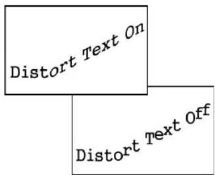
Above: Distort text to fit path Below: Without distorting text
Aside from modifying wrap properties, you can also adjust the path of a wrapped object. Use the Path Edit Tool (see "Using the Path Edit Tool") to reshape the path. Below is an example on how to edit the path of a wrapped object.
To edit the path on which objects wrap:
- Select the wrapped text or path object.
- Click the Path Edit Tool then click Toggle to switch between Path mode and Object mode, or click the path object.
- In Path mode, set the Edit mode to Free edit or Non-free edit mode. Click the nodes and drag the handles to adjust the path shape. (See "Editing paths")
- Click Toggle again to return to path object mode.
Notes:
- If you want to copy the path of a wrapped object and use it to wrap other objects, select Object: Wrap - Get Wrap Path to make a duplicate of the path.
- To remove wrap effects and change an object back to its normal form, select Object: Wrap - Remove Wrap. The Reset thumbnail in the Wrap Gallery also automatically removes wrap effects from an object.
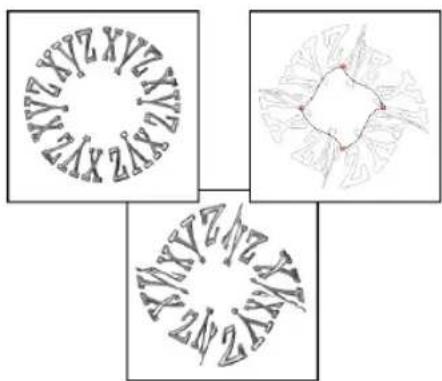
Editing the path of a wrapped text object

Editing the path of a wrapped path object
Bending text objects
The Bend effect in the Object: Wrap submenu is a special form of wrap effect for text objects. It curves your text into a semi-circular form or transforms the text into a full circular shape.
To apply the bend effect to a text object:
-
Create a text object with the Text Tool.
-
Select Object: Wrap - Bend.
-
Enter the number of duplicated text objects you want in Count, then set the Spacing between each duplicate.
-
Specify the extent of curvature in Amount.
At 50% (default), text bends downwards in a semicircle. 100% bends the text in a full circle. To bend text upwards, choose a negative setting.
- Give the Start height a different value from End height for a perspective effect. Entering negative values for both options will turn the text upside down.
Type in 100 for both the start and end heights to reset the text back to its original orientation and size.

Examples of text with Bend effect
-
By default, text starts to wrap at the left. Enter a higher Start position value to shift the starting position along the curve.
-
Select Advanced style options to further adjust the text and make it curve more smoothly.
Note: The bend effect simply deforms the text object. It does not add a path.
The Z-Merge Tool
One of the exciting features in PhotoImpact is the powerful Z-Merge Tool. Z-Merge introduces the third axis, enabling you to not only control the width and height of objects in your document, but also the elevation, or depth.
By doing this, Z-Merge enables complex interactions among Z-Merged objects in slick new ways. Z-Merge can be applied to both 2D and 3D objects including text objects.
Notes:
• Z-Merge cannot be applied to Web objects.
- Z-Merge can be applied to objects in RGB (24-bit True Color) documents only.
The Z-Merge Tool is located in the Toolbox. The Attribute Toolbar of the Z-Merge Tool is only activated when an object or group of objects that can be assigned Z-Merge values (z-values) is selected. By default, all Z-Merged objects have a z-value of zero.

Without Z-merge applied

With Z-merge applied
Assigning a z-value to an object will lift it out of the document towards you and above all non-Z-Merged objects, even if the z-value is negative. The greater the z-value, the greater the distance of the object from the surface of the document. Z-values can range from -1024 to 1024.
To assign a z-value to an object:
- Select an object or group of objects to elevate.
- Select the Z-Merge Tool in the Toolbox.
- Select Z-Merge.
- Assign a value to the elevation of the object or objects using the Z-Elevation slider.
Note: Any object with a z-value will appear to be positioned higher in the stack than an object without a z-value, even if the object without a z-value is positioned higher in the Layer Manager.
Now that objects have been assigned z-values, they can interact with each other instead of sliding independently over and under one another.
Notes:
- When multiple Z-Merged objects are selected, the Z-Elevation slider box will display the z-value of the object with the lowest z-value.
- If the value in the Z-Elevation slider box is changed, the new value will be applied to only the lowest z-value object. All other selected objects will calculate their new value by adding the difference between its original z-value and the lowest object's original z-value, to the new value entered in the box. (See illustration)
- To reset all objects to zero, click Reset elevation.
SPECIAL EFFECTS
PhotoImpact categorizes effects into related groups, so you can easily locate and apply them to your images. Preset effects are grouped into galleries in the EasyPalette that you can just drag and drop to apply to your images. Customizable lighting, artistic, distort, and other special effects are grouped under the Effect menu.
Applying special effects
Choose from the special effects in the Effect menu to customize and apply to your images. Various effects ranging from lighting, artistic, distort, to animated effects and custom filters are available.
The following sections illustrate how to use some of these effects.
Notes:
- Filters and effects can only be applied to True Color (24-bit) or Grayscale (8-bit) image data types. Convert images of other data types to True Color or Grayscale using the Adjust: Convert Data Type submenu, or by clicking Data Type located at the lower right hand corner of the PhotoImpact's status bar.
- Custom effects and filters can be stored in the EasyPalette for later use.
Lights
The Lights effect allows you to add a spotlight or soft ambient light to an image, selection area or object. It uses a combination of Brightness and Contrast adjustments to create the light and shadows effects.
To add a Light effect:
- Select Effect: Lighting - Lights. Click Options.
-
In the dialog box adjust these settings:
-
Exposure The amount of light on the image. Exposure settings range from 0 and 200% . The higher the value, the more light on the image.
- Ambience brightness The general light over the whole image. Click or right-click the color box to specify its color.
- Light color and brightness The color of the light focus can be selected from the color box. Use the sliders to set the intensity.
- Light angle Drag the light angle nodes (or set the Skew, Spread, Distance, and Elevation settings manually).

Original image
Lights are cast on the center of the image to emphasize the wine glass at the middle.
3. Click OK.
Artistic
The effects under the Effect: Artistic menu transform your photos into works of art. Convert your photos into artwork such as cartoons, mosaic tiles, or pen and ink. Imitate different types of art media to produce painting effects such as impressionist, finger paint, oil paint, and more.
Brick Tiles
This effect creates outlined tiles, each filled with a graded blend of the colors from the original image or tiled using the original image.
To apply the Brick Tiles effect:
- Select Effect: Artistic - Brick Tiles.
- Select a preset brick Shape.
-
Under Settings, adjust the characteristics of the brick pattern. Set the Brick size, Spacing between bricks, and the Canvas color (that is, the color of the gaps between bricks). You can also adjust the Angle of the brick pattern by dragging the red grip on the dial or manually entering an angle.
-
Under Tiling, select Artistic tiles or Source image.
-
Click OK.

Artistic tiles will create a tiled brick pattern with each tile filled with a graded blend of the underlying colors from the original image.
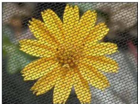
Source image will display the original image through a brick pattern.
Cartoon
Cartoons are simplified sketches that have been popularly used in animation for decades, and also as still images to depict humor and satire. PhotoImpact's Cartoon effect transforms images into stills in the style of contemporary cartoons. When this effect is applied to a true-color image, it detects and outlines the edges in the image, and paints areas of the image with smooth or flat colors.
To apply the Cartoon effect:
-
Select Effect: Artistic - Cartoon.
-
Choose a shading style. Select Flat to produce a cartoon-like look, or select Smooth to have a closer resemblance to the original image.
-
Adjust the amount of Detail. A lower value includes lesser detail from the original image and gives a more cartoon-like look, while a higher value includes more detail and gives a less pronounced effect.
Note: To detect edges around the prominent shapes in the original image and draw the outlines in the resulting image, select Trace edges. You can adjust characteristics of the edge outlines. To increase or decrease the line length that will be picked up as an edge outline from the source image, adjust the Threshold value. You can also set the outline Color and Thickness.
- Click OK.


Shading Style= Smooth Shading Detail=1
Shading Style= Flat Shading Detail=15 Trace edges: Thickness=4 Threshold=1
Contour Drawing
This effect transforms a true-color image into an illustration drawing by outlining the detected edges in the image into simple brush strokes.
Note: The best settings for this effect are greatly dependent on the image you are working with. This effect works particularly well with images containing higher contrast and bold shapes.
To apply the Contour Drawing effect:
-
Select Effect: Artistic - Contour Drawing.
-
For an image showing a lot of detail (especially on the subject's background), set Edge sensitivity to Low to avoid picking up too much unwanted detail.
If the subject from which contours will be drawn has a plain background, you can choose a Moderate or High sensitivity level.

Original image


Smoothness=100
Thickness=2


- Set the amount of detail to be traced and drawn with contours by adjusting the Threshold range slider.
First, try to set a wide range to have more contours drawn. If this results in too much unwanted background noise, drag the left clipping tab of the slider to the left until the background noise is removed.
To draw more contours on the subject, drag the right clipping tab of the slider to the right.
- Another setting that you can adjust to reduce background noise and draw more contours on the subject is the Edge length range.
If you set a wide range, various lengths of contours will be drawn. To reduce unwanted background noise, drag the left clipping tab of the Edge length range slider to the right.
To draw longer contours on the subject, drag the right clipping tab of the slider to the right.
- Choose a Color for the drawing canvas.
Tip: To make the source image show through the canvas, increase the Transparency level.
-
Set the brush stroke color, smoothness, width, and texture to use for drawing the contours.
-
Click OK.
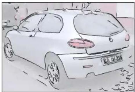
Engraving
Engraving is a traditional graphical technique where an image is scratched into a metal surface. The surface is coated with ink, and then paper is applied to it. When the paper is pulled away, it bears an impression of the original image.
PhotoImpact's Engraving effect replicates this technique, providing three detailed layers of filters and settings to enable maximum fine tuning.
To apply the Engraving effect:
-
Select Effect: Artistic - Engraving.
-
There are three layers that can be activated to achieve various depths of this effect. The settings available are the same for all three layers. By default, only the bottom layer is selected. To enable the other layers, click the layer tabs and select Enable layer.
Note: The Merge mode option is enabled only in the middle and top layers. This sets how the current layer blends with the underlying layer.
- When customizing each layer, first choose a Pattern to simulate a certain engraving. Preset patterns include Line, Circle, Ellipse, and Sine Wave. Adjust the available settings for the selected pattern.
Note: Available settings depend on the chosen pattern. For instance, when selecting Line, you can only adjust the Line angle, Density, and Max. thickness.
- Determine the Threshold range for the current layer. This is the tonal range (from 0 to 255) from the source image where the effect will be applied. The following is the default range that is chosen for each layer:
- Bottom Layer The full tonal range is selected to cover the whole source image in the effect.
- Middle Layer All the shadows and a substantial part of the highlights and midtones are covered.
- Top Layer Only the shadows are covered.
Adjust the threshold range to fine tune the depth of the effect.
- For each layer, you can also adjust the Brightness and Contrast of the areas that are applied with the engraving effect.
- For the resulting image, choose a color for the engraving. You can use a solid color or the colors from the source image. (Usually, the standard color is black).
You can also set the color for the canvas (that is, the non-engraved areas).
- Click OK.
Original image
Only Bottom Layer enabled

Bottom and Middle Layers enabled

Bottom, Middle and Top Layers enabled
Finger Paint
Finger painting is a painting style using the fingers instead of a brush to apply paint to the canvas. The result is a rustic and fun effect that conveys spontaneity and gives the image a dynamic sense of movement.
To apply the Finger Paint effect:
- Select Effect: Artistic - Finger Paint.
- Select a brush Style to use for painting.
- Adjust the brush Stroke size. A higher setting results in thicker and overlapping strokes.
- Change the Density value to adjust the spacing between the strokes. A higher setting results in more tightly packed strokes.
- Adjust the Variations. The higher the setting, the more random the strokes will appear to be.
- Select a Canvas color underlying the brush strokes.
-
Adjust the angle of the brush strokes by dragging the red grip on the dial or manually entering an angle.
-
Click OK.


After
Note: The steps for applying the Decoupage, Smear, Oil Paint, Etching, Halftone, Weave, and Pattern Fill effects are similar to Finger Paint. There are only slight differences in the dialog box settings of these effects.
Impressionist
Impressionism began as a 19th century art movement, rejecting traditional painting techniques and embracing a fresh new perspective of depicting the world. Although diverse, the movement is generally characterized by spontaneous brush strokes and colors conveying movement and light. PhotoImpact's Impressionist effect applies this dynamic appearance to your images.
To use Impressionist:
- Select Effect: Artistic - Impressionist.
- Select a texture for the brush. To choose from available presets, click the box next to the Texture option then select a texture.
Note: To import and use a custom texture, click the down arrow then select Add Texture.
-
Set the Density, Stroke length, Stroke width, and Stroke opacity. The higher the settings are, the more abstract the result will be.
-
Increase the Size variation if you want to apply brush strokes in different sizes.
-
Increase Color variation to apply brush strokes in different colors.
-
Click OK.

Before
After
Mosaic Tiles
Mosaic art is an ancient design technique featuring an assembly of many tiny colored tiles to form an image or a pattern. The shapes and sizes of the tiles may vary as well as colors and surface texture, and often intricate detailed patterns can be seen nested in the larger design. Use PhotoImpact's Mosaic Tiles effect to transform your images to mosaic artwork.
To apply the Mosaic Tiles effect:
-
Select Effect: Artistic - Mosaic Tiles.
-
Select a Tile shape to use for the effect. To choose from preset shapes, select Texture then click the box next to this option and choose a shape.
Note: To import and use a custom shape, click the down arrow then select Add Texture.
-
Set the Density. The higher the setting, the less mortar (spaces) will be shown between the tiles.
-
Set the dimensions of the tiles in Length and Width. The greater the tile size, the more abstract the result will be.
-
Set the Displacement and Size variation. Generally, the higher these settings are, the greater the mosaic tiling effect will be.
-
Set a Canvas color to fill the mortar (spaces) between the tiles.
-
Click OK.

Before

Density=60 Tile shape= Rectangle

Density=100 Tile shape= Rectangle
Pen and Ink
Pen and Ink is an illustration style using fine pen strokes that can be applied to portray entirely abstract forms as well as more photorealistic effects with depth and shadow. PhotoImpact's Pen and Ink effect can transform your images with a range of pen and ink techniques into traditional drawings or contemporary art.
To apply the Pen and Ink effect:
- If you will be compositing the image onto another background after applying the Pen and Ink effect, first convert the image to an object or make a selection. Otherwise, skip this step.
- Select Effect: Artistic - Pen and Ink.
- Choose the brush stroke Texture and set its Size.
-
Select a Custom stroke color for a two-toned effect. Alternatively, select Source image to render pen strokes in the underlying colors from the original image.
-
Set the canvas color.
-
If you converted your image to an object or made a selection in step 1, you can adjust the canvas Transparency to blend the resulting image well with the background that you will be compositing the object or selection to.
Note: To detect edges around the prominent shapes in the original image and draw the outlines in the resulting image, select Trace edges.
You can adjust characteristics of the edge outlines. To increase or decrease the line length that will be picked up as an edge outline from the source image, adjust the Threshold value. You can also set the outline Color and Thickness.
7. Click OK.
Note: The steps for applying the Stippling effect is similar to Pen and Ink.
Before

After

With traced edges
Screening
This effect replicates a preset shape or a loaded image into multiple small, varied-size elements to form another image. These replicated elements show a single color to result in a two-tone effect, or they may reveal colors of the original image.
The result is reminiscent of Pop Art images created from highly magnified printed artwork revealing the detailed and textured finish of newsprint.
To apply the Screening effect:
-
If you will be compositing the after image onto the original image or another background after applying the Screening effect, first convert the image to an object or make a selection. Otherwise, skip this step.
-
Select Effect: Artistic - Screening.
-
Select a Texture. This texture will be replicated to form the screen elements in the resulting image. To choose from available presets, click the box next to the Texture option then select a texture.
Note: To import & use a custom shape, click the down arrow & select Add Texture.
-
Set the Size of the screen elements. A lower setting will produce an image that has a closer likeness to the original, while a higher setting will yield more abstract results.
-
Select an Arrangement for the screen elements.
Note: If you select the first layout pattern, you can adjust the extent of the Displacement.
-
Select a color for the screen filter and canvas.
-
If you converted your image to an object or made a selection in step 1, you can adjust the canvas Transparency to blend the resulting image well with the background that you will be compositing the object or selection to.
-
Click OK.

Image converted to an object

Resulting image composited to the original image
Distort
The Effect: Distort menu provides various warping effects that can change the physical appearance of a subject, such as making a person slimmer or fatter. Some effects also simulate water and wind activity such as a light breeze, a storm, or ripples on a pond.
Custom Effect
This custom effect distorts the pixel positions in an image by changing their x and y coordinates. In this effect, distortion of pixels applies to the entire image.
To create a custom effect:
- Select Effect: Distort - Custom Effect.
The graph displayed in this dialog box represents the physical placement of pixels in an image. In general, a steeper curve moves pixels in (pinching), while a shallow curve moves pixels out (punching).
-
Click Methods then select a predefined mapping curve.
-
Click and drag the mapping curve to change its shape. Check the preview on the Preview Window above.
Tip: Show control points creates line segments for point-oriented curve adjustments. Specify a value in the points entry box to define the number of control points to add.
-
Click Add this effect to the EasyPalette or Save. Add saves the effect to the EasyPalette, whereas Save exports the effect to a *.CEF file (Custom Effect Files).
-
Click OK.
After applying Custom Distort
Creative Transform
Creative Transform can be applied to a still image, or customized as an animated effect. For details, see "Creative Transform".
Crystal and Glass
Crystal and Glass can be applied to a still image, or customized as an animated effect. For details, see "Crystal and Glass".
Magic Gradient
Magic Gradient generates sophisticated gradient patterns that cannot be made with the Gradient Tool or a Gradient fill. Magic Gradient can be applied to the whole image, a selection, or to an object.
To apply a Magic Gradient effect:
- Create a selection area using a Selection Tool, or make an object active in the workspace.
- Select Effect: Fills and Textures - Magic Gradient.
- Click Edit to select the desired Palette ramp in the Palette Ramp Editor. Or select a gradient preset in the Mode Panel.
Note: To edit a ramp on the fly, enter new values in the Hue shift or Ring entry box. The color spectrum of the ramp will shift.
-
In the Palette Ramp Editor dialog box, click and drag the nodes in the thumbnail window of the Palette ramp to reposition the center of the gradient effect.
-
Click OK to return to the Magic Gradient dialog box.
-
In the Magic Gradient dialog box, drag the little red square to adjust the Slope dial (or click the + or -) which will adjust the position of the gradient.
Note: The available attributes below the Mode list depend on the Mode selected.
Before After
- Click OK.
Paint on Edges
The Paint on Edges command allows you to easily, quickly, and accurately apply paint along the edges of a selection area or an active object.
To paint on edges:
-
Create a selection area using one of the Selection Tools or select an object or objects. (To apply the effect on the entire image, right-click the image and select All).
-
Select the Paint Tool, and open the Tool Settings Panel on the Attribute Toolbar.
- Define brush settings in the Shape and Color in the Tool Settings Panel. (See "Using the Tool Settings Panel")
- Select Effect: Creative - Paint on Edges or [Shift+P]. The edges of the selection or object will be painted in the color specified in the Tool Settings Panel.

A selection created on the subject

Paint on Edges applied to the selection
Turnpage
The Turnpage effect gives your image the appearance of curling up from the corner as if it were a piece of paper or a page in a book. With this effect, you can 'turn' an image at any degree from any corner.
To create a Turnpage effect:
-
Select Effect: Creative - Turnpage. In the dialog box, adjust these settings:
-
Type Whether the curled up corner is cylindrical or conical.
• Corner The corner of the image where the curling action starts, and the direction of the pointed end if it is a cylindrical curl. - Mode The reverse side of the image which is visible during the curl. Choose from Opaque (non-transparent curled edge), Reverse (reflection of the original image on transparent film) or Transparent (transparent film with no image).
- Angle The tightness of the curled edge as it turns inward. The higher the value, the tighter the curl.
• Color The color under the image that is revealed as the page turns. -
Lighting direction The direction of the light on the curl.
-
Click OK.
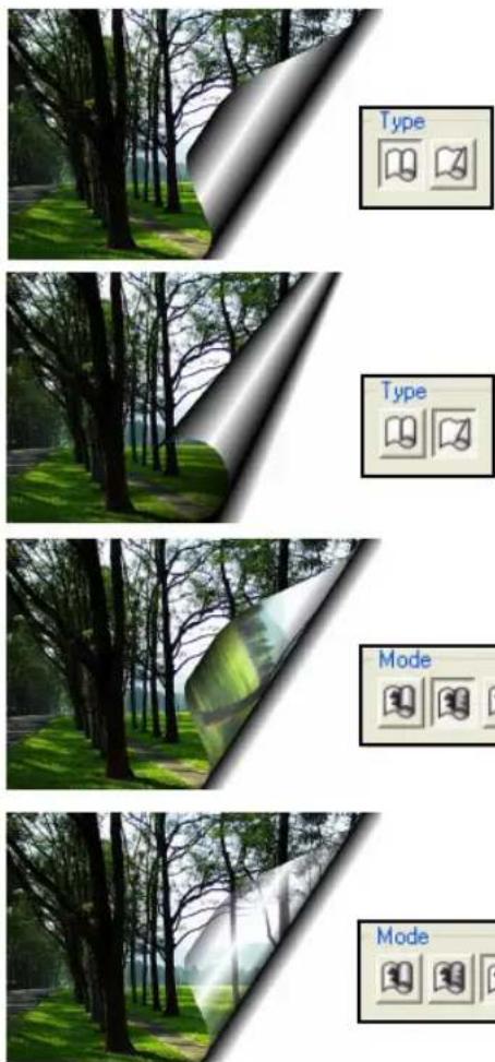
DeInterlace
A common problem among video captures is the inadvertent capture of two or more frames in one image, resulting in the presence of ungainly lines throughout. DeInterlace solves this problem by eliminating one overlying frame and smoothing out the remainder.
To adjust a captured image using DeInterlace:
-
Select Effect: Video - DeInterlace.
-
Choose between retaining the Odd field or the Even field.
-
Select the Fill using method. Duplication copies the retained field to the eliminated field while Interpolation regenerates the eliminated field.
-
Click OK.

Before
After
Animation effects
Creating animations to place on your Web pages doesn't have to be difficult. Some of the more popular effects in PhotoImpact have integrated animation dialog boxes to assist you in creating them.
There are two types of animation creation sections available in Effect dialog boxes. These are Frame-based, including the Crystal and Glass, Animation Studio, Creative Lighting, Particle Effect, Texture Effect and Type Effect dialog boxes; and Storyboard-based, including the Creative Warp, and Creative Transform dialog boxes.
Frame-based animations
Frame-based animations are a sequence of images (frames) with incremental changes from one to the next, that create the illusion of movement when viewed in succession. Frames in the sequence that mark important visual transitions are called key frames. Frames filling in the incremental positions of the object or effect between key frames are calculated and inserted to create a smooth animation.
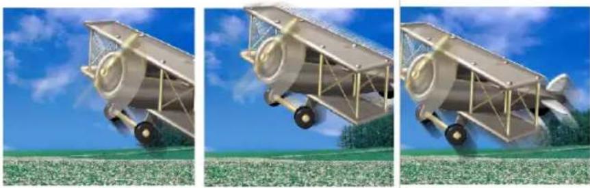
Jump animation key frames
The Key frame control Panel in PhotoImpact makes it very simple to create GIF animations. The selection or image to be animated appears above the panel to the left, where you can move the object or the focus of effect from key frame to key frame. Above the panel are the parameters of the object or effect's behavior. Under the Preview Window is the effects gallery with presets to apply to your animation.
By default, animations have 10 frames, of which the first and last frames are key frames. The number of frames can be adjusted at any time using the Total frames slider bar. Use the navigation buttons (previous frame, next frame, previous key frame and next key frame buttons) to navigate through the frames. Alternatively, type the number of the frame you wish to edit in the Current frame box.

- Creating key frames: A frame can be assigned as a key frame in one of two ways. Either navigate to a regular frame then click the (+) button, or change the parameters of a regular frame. It will automatically become a key frame.
Note: Parameters marked with an asterisk (*) apply only to that particular key frame. Unmarked parameters apply to all frames.
- Moving key frames: Key frames can be clicked and dragged across the key frame marker slider bar.
The larger the space between key frames, the more regular frames there will be between them, and the slower the animation will be in that segment of the animation.
- Removing key frames: To remove a key frame so that it becomes a regular frame, select its marker on the slider bar then click the [-] button.
Playing a frame-based animation
Animations can be repeated continuously in two modes. Selecting Auto Reverse will play the animation forward to the last frame, then backward to the first frame. Selecting Loop will continuously repeat the animation from front to end.
After playing the animation, if you find the animation playback is not smooth enough, increase the total number of frames.
To use frame-based animation dialog boxes:
- Select Effect: Creative then choose from Animation Studio, Particle Effect, or Type Effect.
You can also choose Effect: Lighting - Creative Lighting, or Effect: Distort - Crystal & Glass or Effect: Fills and Textures - Texture Filter.
Alternatively, select an animation preset from the Animation Gallery in the EasyPalette.
-
Specify the total number of frames in your animation in the Key frame control Panel.
-
Select a specific frame position by entering the frame number in the Current frame entry box. Click the (+) button to assign it as a key frame.
-
Click Play to view the animation.
-
Click OK then select Save Animation File and Create New Object.
-
To view an animation effect, click Preview in the Attribute Toolbar or select File: Save for Web - As HTML then view the file through a browser. (See "Previewing in a browser")
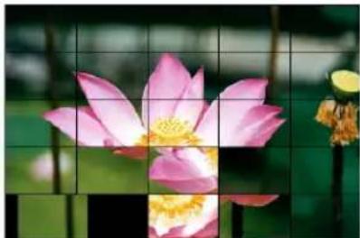
Puzzle Effect in Animation Studio
More dialog box options:
- Save Creates an animation file as an animated GIF. After saving, the dialog box remains open so you can continue to modify the animation.
- Add Saves a frame as an image or the complete animation to the EasyPalette.
- Preview Displays a preview of the effect of the current animation frame at full size.
Storyboard-based animations
The layout of Storyboard-based animation dialog boxes differs from effect to effect. However, they each have two sections in common: an Effect Template section and a Storyboard section.
The purpose of the Storyboard is to display a modifiable sequence of applied effects. Each template effect is applied to the previous slide of the animation, which is viewable in the Storyboard section. In most cases, you can click Reset to start a new slide with a fresh copy of the original image instead of continuing to apply effects to the previous slide.
To use storyboard-based animation dialog boxes:
- Select Effect: Distort - Creative Warp, or Effect: Distort - Creative Transform.
- Click Advanced to display the Storyboard. (Not necessary for the Transform dialog box).
-
Select a template effect to apply, then click Insert to add it to the Storyboard. Repeat this procedure to apply as many effects as you like. You can insert up to ten frames in the animation.
-
Modify a storyboard entry by clicking the corresponding thumbnail image and then selecting another template effect. Click Delete to remove an entry or Delete All to start over.
- Click Save to create an animation file. After saving, the Effect dialog box remains open so you can continue modifying the effects settings. (See "Saving animations" for details)
- Click OK to close the dialog box and apply the current frame position's effect settings to the image.


Changed face shape after Creative Transform
Note: In most Transform effects, you can move your mouse over the Preview Window and paint over the image to manually adjust the effect.
Saving animations
An animation or a sequence of transformations can be saved to a file format that best suits your final target destination. In the Save As dialog box, you may save the animation's individual frames as independent files by selecting Sequence BMP files from the Save as type drop-down list, or select Animated GIF files to save the animation as a single GIF file. When saving to a Sequence BMP format, each frame in the sequence is labeled name001.bmp where you can specify name in the Save As dialog box.
Saving GIF animation options
- Colors The maximum number of colors the color palette can contain to display images. Higher values tend to increase file size, but lower values may degrade the quality.
- Infinite loop Creates a continuous animation. Clear it and enter a number in the adjacent box to define a limited duration.
- Frame delay time How long a frame will be displayed, in hundredths of a second, before switching to the next one.
- Transparent background Creates empty, transparent spaces between images when the animation is played in a Web browser.
-
Dither Allows GIF Animator to compensate for colors not found in the palette. It then simulates missing colors by mixing combinations of existing colors in the area that the original color occupied.
-
Interlace Allows the image layer to open gradually as it downloads, simulating a 'fade-in' effect. This however may increase file size a little.
- Open with Ulead GIF Animator Launches Ulead GIF Animator for viewing and further editing your GIF animation files. (This option is available only if you have a version of Ulead GIF Animator program installed on your computer.)
Kaleidoscope Fill
The Kaleidoscope Fill effect allows you to create wild, psychedelic patterns and semi-random animations using Palette ramps. It works in conjunction with GIF
Animator when creating animations and lets you generate single image layers that can be applied to both selection areas and objects.
To create a Kaleidoscope Fill:
- Select Effect: Fills and Textures - Kaleidoscope Fill.
- Click Edit to customize the Palette ramp or change to an entirely new one. Select the Palette ramp you wish to use or modify the existing one, then click OK.
Alternatively, to edit the existing ramp from within the Kaleidoscope Fill dialog box, adjust the Hue shift, Ring and Repeat.


Before and after the selected kaleidoscope effect
- Select a style from the Pattern samples or create a new set of 6 by selecting a base image from the Pattern templates. The Pattern templates define the basic 'warp' that is applied to the Palette ramp.
- Click OK.
To create an animation:
- In the Kaleidoscope Fill dialog box, click Advanced to continue.
- Drag a sample from the Pattern samples box to the storyboard to add it to the animation sequence. The entries in the storyboard will morph from one into the next.
- Click Save to save as an animated GIF file. After saving, the Effect dialog box remains open so you can continue modifying the effects settings. (See "Saving GIF animation options")
- Click OK.
Texture Filter
Artists express themselves using different types of drawing or painting media and surfaces. PhotoImpact gives you these creative options with Texture Filter. There are several textures that you can use depending on your desired image effect.
- Translucent Glass Converts your image's surface into glass. - Embossed Adds a relief of different particles such as water drops and bubbles. You can also choose other coarse-surfaced materials such as snakeskin.
• Animal Hide Embosses your image on rough animal skin.
- Smooth Leather Impresses your image on treated animal hide.
- Metal Converts your image's surface into metal.
- Creased Paper Simulates the appearance of your image when printed on paper then crumpled.
- Plastic Converts your image's surface into plastic.
- Stone Converts your image's surface into stone.
- Contour-Lines Creates radial lines of different hues within your image.
To apply the Texture Filter:
- Select Effect: Fills and Textures - Texture Filter.
- Choose a preset texture from the Effect gallery.
- Adjust the parameters to adjust texture properties.
- If you want to create an animation, click Animate to display the Key frame control.
Note: Click Still if you don't want to create an animation.
- Specify play properties using Key frame controls and click Save. Otherwise, click OK.


Creative Warp
Creative Warp lets you create a kaleidoscopic effect, but rather than having an output of just a single frame, you can create an animation or an image sequence by using multiple kaleidoscopic effects simultaneously.
To create a Creative Warp effect:
-
Select Effect: Distort - Creative Warp.
-
Select a Pattern template.
-
Click Advanced to expand the dialog box and display the storyboard at the bottom. Drag the warped image from the right-hand preview pane down to the storyboard or click Insert to add it to the sequence.
To remove an image from the sequence, first click the icon in the Storyboard then click Delete. To clear out the storyboard, click Delete All.
-
Click Save to create an animation file first. After saving, the dialog box remains open so you can continue modifying the effects settings. (See "Saving GIF animation options")
-
Click OK.

Creative Warp using a different pattern
Crystal and Glass
Crystal and Glass places transparent, curved objects over your image, refracting light and simulating distortions seen when viewing images through a crystal. This effect can be applied to the whole image, a selection, or an object. The crystal's shape, size, position and other properties can be adjusted in the Crystal and Glass dialog box.
To use the Crystal and Glass effect:
- Click Effect: Distort - Crystal and Glass.
- Select a Crystal template from the Effect Panel.
Note: By default, Keep aspect ratio will be selected. This constrains the crystal's maximum size to the shorter dimension of the image or selection.
- Adjust the dimensions and proportions of the crystal with the Width and Height variables in the Model tab.
Note: Attributes vary from template to template.
- Adjust the position of the crystal in the image by clicking and dragging it across the Preview Window.
- Adjust the lighting in the Lighting tab.
- Add (+) and remove (-) crystals to the frame as required in Elements. More than one type of crystal can be applied to the image.
Reposition them in the stack using the up and down arrows.
- Click Preview to view the effect at full size.


Applying more than one element
- Click Save to save the animation as a GIF file. After saving, the dialog box remains open so that you can continue modifying settings.
- Click OK then choose whether to apply the current frame settings to the image or save to an animation file before creating a new object.
Note: This effect can only be applied to RGB (24-bit) images.
Creative Lighting
Creative Lighting effects allow you to simulate natural phenomena to produce fantastic animations for Web pages. Each lighting effect has its own attributes that can be customized individually. You can apply this effect to an image, selection area or active object.
To apply the Creative Lighting effect:
- Select Effect: Lighting - Creative Lighting.
- Select a preset from the Effect thumbnails at the bottom of the Creative Lighting dialog box.
- Click the image in the Preview Window to adjust the light source and direction for that particular frame in the animation sequence. This will automatically assign this frame as a key frame.
- Click the Basic or Advanced tab on the right of the Preview Window to define attributes such as color, size, and angle (attributes vary depending on the preset).
- Move the slider (or enter a value) to modify the overall brightness in Ambient light. To change the image's color tone, click the color box.
- Add (+) or delete (-) lights in the animation from Elements. Click up and down arrows to rearrange the position of the element in the stack. Rearranging elements will change the effect at intersecting areas.
Some lighting effects allow you to alter the position of the light source on the image. In the Preview Window, move your mouse over an effect item and when the cursor changes to a cross-hair, click and drag to desired position.
- Click Play to preview the animation.
- Click Save to create an animation file first. After saving, the Effect dialog box stays open so you can continue modifying the effects settings.
- Click OK then choose whether to apply the current frame settings to the image or save to an animation file before creating a new object.

Lightning effect

Light bulb and Comet effects

Flashlight effect
Particle Effect
The Particle Effect adds the realism of fire, smoke, snow, and other natural effects to your images. Each effect has its own self-contained set of attributes which can be individually customized. The Particle Gallery in the EasyPalette also provides preset particle effects that can be directly applied to images.
PhotoImpact now allows you to create animations based on Particle effects. This means you can simulate falling rain, thunderstorms, cloud formations, brush fires and other special effects and save your images as animated GIFs or sequenced BMPs. Choose the motion type for your particles: Manual - where all particles are manually placed, Directional - where all particles follow one motion, or Emitter - where the particles seem to emanate from one source then radiate away from the center. Although your animation closely simulates the real behavior of these particles, you can control the movement by adjusting the parameters available in the Particle dialog box.
To add a Particle effect:
- Select Effect: Creative - Particle Effect.
- Select a particle from the Effect gallery.
- Define the number of particles by specifying a value in the Density.
-
Using the Basic tab, define the other attributes of the elements in the Particle Parameters Panel. The available attributes vary depending on the effect.
-
Click OK.
Rain effect
Note: Some elements can be modified within the Preview Window. You can also drag individual particles to reposition them.
To create animation with Particle Effect:
-
Select Effect: Creative - Particle Effect.
-
Select a Particle effect from the Effect gallery.
-
Define the number of elements by specifying a value in Density.
-
On the Advanced tab, select a motion type: Manual, Directional, or Emitter.
Note: For Rain and Snow, only the Directional method is available.
-
Define other attributes in the Particle Parameters Panel. The available attributes vary depending on the effect.
-
Specify duration, sequence, and other behavior using the Key frame controls.
-
To loop your animation, click Repeat. This cycles your particle animation so that it appears continuous.
-
Click OK and select Save Animation File and Create New Object.
-
Save the file by assigning a name and specifying a location.

Snow effect
Creative Transform
The Creative Transform effect turns your image into virtual clay, allowing you to push its pixels around in order to transform the surface. It differs from the
Transform Tool on the Tool Panel in that it doesn't allow you to manipulate the position of a selection or object, but rather manipulate its consistency.
To transform an image:
-
Select Effect: Distort - Creative Transform.
-
Select a template from the Transformation template gallery.
-
Adjust parameters in the Transformation control Panel. To apply transformation effects to the image, click Insert to save the image to the Storyboard. Click Reset to restore image to its original state between creating storyboard thumbnails.
Note: Once the image is inserted in the Storyboard, you may use it as a frame for animation. You can edit the frame sequence by using the Frame controls.
- Click OK to apply transformation to your image. Click Save to save the transformation as an *.GIF animation or an *.BMP image sequence file.


Trimming body parts using Creative Transform (Before and After)
Tips:
- You can exclude areas in your image from the transformation effect. The Solid Colors panel defines regions that would not be included in transforming the image.
- Change the position of Storyboard thumbnails by dragging them and dropping them in front of, or after other thumbnails.
Type Effect
The Type Effect allows you to modify text or objects in ways beyond the capabilities of the Text and Path Tools. You can add fire, ice, neon glow and emboss effects among others to objects. Combined with the functions of other tools, this effect can be powerful.
To add a special Type Effect:
-
Select Effect: Creative - Type Effect.
-
Select an Effect template from the Effect gallery.
-
Modify the effect's parameters in the Parameters Panel.
-
Click OK then choose whether to apply the current frame settings to the image or save to an animation file first then create as a new linked object.
Note: When you apply a Type Effect to text objects, you will lose the text attributes of that object. Thus, you will not be able to use the Text Tool anymore for further editing.

BATCH PROCESSING
Batch processing provides quick solutions to operating a series of commands. This is particularly useful when you are processing a large number of commands or images.
Using the Quick Command Panel
With the Quick Command Panel (QCP), PhotoImpact provides a fast way to access commonly used menu commands and toolbar actions, to retrace or redo steps you have done, as well as an easy way to record a series of steps (known as macros) that you can apply to your image or file and thus save precious time for more productive activities. In addition to customizing commands, you can efficiently organize a series of tasks to perform while working on your images.
To activate the Quick Command Panel:
- Select Window: Panels - Quick Command Panel.
- Click Quick Command Panel in the Panel Manager,
- Drag-and-drop (or double-click) a task saved in the EasyPalette, or
- Press [Ctrl+F2].
The Quick Command Panel contains two tabs:
- History Displays a history list of commands applied to the currently selected image. Undo or redo commands to any stage in the image development by using the slider or clicking a particular stage, duplicate any stage, or purge the undo/redo cache to liberate system resources.
- Task Displays a series of commands that you have recorded. You can apply these individually to the current image, or you can apply an entire sequence of actions to an image. (For more details, see the following procedure.)

To record a quick command:
-
In the Task tab, click Create a new task.
-
Enter a name for the sequence of actions that you want to record, then click Record.
-
Begin applying a series of commands to your image. For instance, you can firstly create several objects. Then, click to select an object and choose Properties from the right-click menu. Here, you can change the Merge method, Transparency, and so on. You can also apply menu commands or toolbar actions. All of these will be automatically recorded in the QCP.
-
After you have applied the desired commands, click Stop. To add more commands to the task, click Record again and continue working on image.
Note: You can also rearrange the task commands here by simply dragging a task command to a different location on the Task list. You can also right-click the list to open a pop-up menu to customize the Task list.
After recording a series of actions, you can apply them all or just a select few to another image.
- To apply an entire series of actions to an image, simply click Play in the Task tab. All recorded actions will be applied.
- To apply a single command to an image, use the Task tab and click the desired command.
Notes:
- Click Task menu commands and select Task Manager on the pop-up menu to organize and edit tasks in a set.
- Click Batch Task to apply a command to all image files in a selected folder.
- Click Add to EasyPalette to save a task in the EasyPalette for later use. You can choose the current image or a default task icon as the EasyPalette thumbnail.
Using tasks in the EasyPalette
EasyPalette provides the Task Gallery in which a number of commonly used preset tasks are available. You can also store your own tasks in the EasyPalette.
To apply a task stored in the EasyPalette:
- In the EasyPalette, drag a task to an image in the workspace.
- In the EasyPalette, double-click a task.
- Select one or more image files in the Document Manager or the Browse Manager, and then drag a task to these files.
Using the History Tab
The History tab is a very useful tool when you often use the Undo/Redo commands, which are very important tools when you want to test the effect of a function applied to your image. After making a large number of changes to an image, the quickest way to return to a previous state is to select it from the list in the History tab.
The History tab is also useful when you want to experiment with the same image while applying different effects or if you want to limit the resources used by PhotoImpact.
To duplicate an earlier image state:
- In the History Tab, drag the slider or select the state in the history list.
- Click Duplicate on the toolbar.
- Select the original image in the workspace, then drag the slider or select the last command in the history list to reapply all commands.
Notes:
- Click Clear Undo/Redo History to purge the history list for the selected image. This can be beneficial for program performance as it frees up system resources. If you find that your system's performance is slow after applying a lot of effects, click Change Undo Level to decrease the number of undo levels to improve performance.
- When Enable/Disable Undo is depressed, Undo is enabled. If you are running a low-memory system, you can disable Undo to improve overall performance.
Applying commands to multiple files
When working with a large number of files, you will often want to edit, save, or perform the same commands on some or all of them. To save time and effort, PhotoImpact provides you with a number of options that help you perform the same commands across a number of files.
Batch Manager
Batch Manager displays file names and thumbnails of all images that are open in the workspace, including all commands that can be applied.
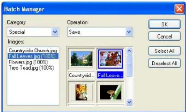
To process images with Batch Manager:
-
Select Window: Batch Manager. You'll find all open images displayed as thumbnails.
-
From the list of open images, select the ones where you want the operation applied. You can select multiple images by holding [Ctrl] or [Shift] while clicking, or click Select All to choose all files.
-
Select the command you to run from the Category and Operation lists.
-
Click OK.
Notes:
- Clicking the Batch Manager icon instead of the arrow next to it performs the last specified batch command. To find out what the last command is, place the mouse pointer over the icon for a few seconds.
- Batch Manager can also be accessed through the Document Manager.
Batch Convert
Batch Convert offers a convenient way of converting image files (including an entire folder of image files) without having to actually open them one by one in any image editing program.
To batch convert files:
- Select File: Batch Convert.
- Select the folder or files for conversion in Source. Type determines what file formats are included in the conversion process.
- Select where to send the converted files by specifying options in Destination.
- Select the file format or data type conversion method.
- Click OK.
Batch test in Image Optimizer
The Batch test in the Image Optimizer lets you try different color and compression settings on your file before you actually save it, so you can experiment more quickly with the variables that affect these image file formats the most.
To perform a batch test:
- Click the Batch button in the Image Optimizer dialog box.
- For GIF and PNG, enter the lowest number of colors to test in the Fewest colors box. For JPEG, enter a number for Lowest quality.
- For GIF and PNG, enter the highest number of colors to test in the Most colors box. For JPEG, enter the Highest quality percentage.
- Select either a specific number of tests to perform, or perform a single test for each increment of 0-20 colors. If you choose to have tests done by Increment, then be aware that entering a smaller number of increments results in more tests.
- Click OK. Once the tests have been generated, you can view the results in the Batch Results dialog box that appears. Highlight a particular test image, and then click the Select button to use the settings to optimize your image in the Image Optimizer's main window.
ALL FOR THE WEB
Not only is PhotoImpact the complete image-editing package, it is also a dynamic and creative Web design tool embraced by both professional and novice Web developers.
This chapter explores the Web capabilities of the program, covering everything from creating basic Web pages, enhancing images, designing components, applying script effects, to assembling the entire site from scratch. PhotoImpact also makes it easy by providing you a variety of cool and unique blog templates in the EasyPalette.
Other export options are also discussed in this chapter, including creating Web Albums and managing Web slideshows.
Web pages
A Web page is a hypermedia document coded with Hypertext Markup Language (HTML). HTML forms tag elements such as text and graphics so browsers like Internet Explorer and Netscape Navigator can recognize and display a Web page properly on the World Wide Web.
Notes:
- To create a complete Web page, see "Putting a Web page together".
- PhotoImpact currently does not support the making of multi-frame Web pages. However, you can make a Web page with frames and define linked Web pages in an HTML editor first. Then create these pages in PhotoImpact.

Sample Web page
<HTML>
<HEAD>
<TITLE>Ulead Systems - Creative Intelligence</TITLE>
<META HTTP-EQUIV="Content-Type" CONTENT="text/html; CHARSET=iso-8859-1">...
</HEAD>
<BODY BGCOLOR="#FFFFFF" BACKGROUND="images/bg_all gif" LEFTMARGIN="0" TOPMARGIN="0">...
<TABLE WIDTH="100%" BORDER="0" CELLSPACING="0" CELLPADDING="0">
<TR>
<TD ROWSPAN="2" WIDTH="150" ALIGN="top">
<IMG SRC="images/UleadLogo.gif" WIDTH="150" HEIGHT="92" BORDER="0" USEMAP="#Map">...
</TD>
<TD WIDTH="600" ALIGN="top" BGCOLOR="#000066">
<IMG SRC="images/top2.gif" HEIGHT="43" WIDTH="600" USEMAP="#Top" BORDER="0">...
</TD>
</TR>
</TABLE>
</BODY></HTML>
Sample partial HTML source code
Structure of a Web page
Just what exactly is a Web page? Creating one is simple in PhotoImpact because you are spared the pain of having to code everything manually. However, because HTML code is involved, creating Web pages is not as straightforward as creating
images. The following illustration will show you how a browser interprets and analyzes a Web page. It looks like neatly organized graphics and text that you could create in text and graphics editing programs.
In reality, though, the page itself is built with an HTML document (HTM or HTML) at its core, which contains all the code and information in plain text. The code, in turn, tells the browser what it should display and how.
The most fundamental outline of an HTML document follows this structure:
![graph TD A["Defines the document as HTML"] --> B["HTML"] A --> C["HEAD"] A --> D["</HEAD"] A --> E["BODY"] A --> F["</BODY"] A --> G["HTML"] B --> H["Contains internal browser relevant information, as well as JavaScript"] C --> I["Contains page content, such as text and images"]](/content/2026/07/1411218/images/463b87e153db857cbe8b284a5b9cc91371c33f247569fb73b3f15d45bdc9c518.jpg)
All of the images you see in the browser (the background, buttons, banners, etc.) are simply embedded in the HTML code as links to the original image files, so if the browser is going to display the images properly, the linked images need to be there along with the HTML document itself. The HTML code tells the browser to load the linked image files like this:
<IMG SRC="imagename.gif">
<IMG> tags are inserted between the <BODY></BODY> tags.
So when you are creating an entire Web page in PhotoImpact, it looks like you are simply working with graphics as usual, but PhotoImpact is really simulating how the page would look like in a browser, so that you can visually construct a Web page in PhotoImpact. Once it's done, you can export it as an HTML document and related images. Later, you can still edit the page itself as any of the linked images in PhotoImpact if you saved them in the UFO file format. This allows you to retain all components of the Web page as individual objects with their HTML attributes.
Note: PhotoImpact outputs both the HTML document describing the basic layout of the page, and the images linked to the document.
Using blog templates in the EasyPalette
The easiest way to start designing a Web page is to use blog templates from the EasyPalette. Not only will templates provide you with pre-designed images, objects and layout, this can also help you generate more design and style ideas for your Web site.
In the EasyPalette, click Libraries and select Template. Double-click a blog template thumbnail you want to use under Web Pages category. You can start rearranging images, editing HTML texts or adding more objects and layers to achieve your ideal Web page.
When editing text, right-click the text you want to revise and then select Edit HTML Text Object. You can start writing your own text in the HTML Text Entry Box. Here, you can also
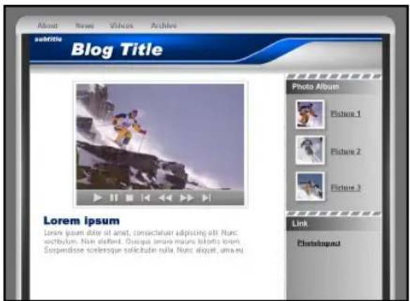
Sample of a blog template in the EasyPalette
customize the Style, Font and Size of your text or click 📄 to add a hyperlink to a Web site or a local file. See "To create HTML Text Script Effects:" for more details.
Read more on this chapter to learn about adding Script Effects, using Image Optimizer, designing backgrounds or buttons and putting a Web page together.
Using the Web Properties dialog box
This feature sets detailed properties for your Web page at any time. Select Web: Web Properties or start a new Web page then click Details to open this dialog box. The Web Properties dialog box presents the following features:
General tab
• Title Text entered here will appear in the title bar of the browser window.
• Author, Keywords & Description Used for search engines only. Information entered in these fields will not affect the content of the Web page.
- Favorites icon Allows you to select an icon to be displayed in the address bar of Internet Explorer, and as an icon when the page is added to Favorites. The page must first be uploaded to a server then added to Favorites before the icon will take effect.
- Encoding Determines how a browser will interpret the Web page source code. The default encoding set is the same as the user's operating system. For example, the default encoding is Western European for users with English Windows.
Background tab
- Generate background Provides a series of options for the background. Select a color, an image file, a texture, or even an animated GIF. You can also select an image with a transparent background together with a color, which will display through the background.
- Using CSS Instructs browsers how to generate the background image. The default setting is repeat and scroll, whether or not Using CSS has been selected.
Using a file as the background will make the fadeout and offset options available. These options can be adjusted for the background image, but it will regenerate an image instead of displaying the original.
Image File tab
- Optimizer setting Specifies default file formats for images in your Web pages. Files will be optimized then saved in the specified format.
- File naming pattern Customizes the system for assigning default names to image files. Also provides the option of making file names comply with Macintosh and Unix standards.
- Put image files in 'image' subfolder, Copy background image to 'image' subfolder, Copy linked files to 'image' subfolder It is highly advisable to keep these options selected to save your files systematically and help keep your images organized.
Slice tab
- Enable slicing Selected by default, this prevents from your entire document being merged to a single image file in your Web page. It is highly advisable to keep this option selected.
- Generate by table/CSS Either generate tables in your HTML to position your slices, or generate Cascading Style Sheets (CSS). Output CSS by ID, by class, or inline.
- ID Allocates a unique ID to styles and uses these style IDs to determine the position of slices.
- Class Allocates a unique ID to classes, and uses these class IDs to determine the position of slices.
- Inline Outputs a
- Slice naming pattern Customize the system for assigning default names of all slices.
HTML tab
- Formatting Determines the appearance of HTML tags and attributes in the code.
- Generate relative URL for reference Makes the code in each page reference the location of external files relative to its own position in the site. This makes the whole site easily transportable to a Web server. It is highly advisable to keep this option selected.
- Conform to XHTML specification Outputs the code in XHTML (Extensible Hyper Text Markup Language).
Adding Web images and objects to your Web page
For more information on placing Web images and objects, and linking multimedia files on your Web page, see "Linking multimedia objects".
Images for the Web
Images are a powerful means of communicating ideas and messages where words can only say so much. They can convey moods, thoughts, events, experiences; they can capture a moment.
Photographs and graphics add flair, individuality and personality to Web pages. They can enhance and strengthen corporate identities, drive home a message, and add the finishing touch to your content.
To create a Web image from scratch, see "Creating a new Web page".
Opening an image/UFO file from a Web page
You can open an image (or its original working UFO file) directly in PhotoImpact from a Web page while browsing.
This is particularly useful if you are the author of the HTML document, since PhotoImpact helps you easily locate the original file of a selected image for modification.
To open the original file of a Web page:
- Select File: Open from Web - Image.
-
Type the URL of the Web page (or the file path on your local computer) in Address, then press [Enter].
-
Select an image then select one of the following options:
- To download the selected image from the Web page and open it as a new image in PhotoImpact, click Open.
- To open the original working file of the image (on your computer), click Locate or Browse to search for the file then click Open Original.
Note: The original file can be image files or UFO files.
- After editing, select from the options below:
- If the opened original file is an image file, select File: More Save Options - Save for Web - Update Image in Web Page.
- If the opened original file is a UFO file, save the UFO file then select File: More Save Options - Save for Web - As HTML (skip steps 5 and 6).
- Select the image to replace in the Preview Window. Click Preview to see how the revised image looks on the Web page.
Note: This updating feature works only if the file to be replaced is on your local computer.
- Click Update.
Opening a Web page as a single image
In addition to opening an image directly from a Web page, you can open an existing Web page as an image file.
This image can be used as a template for designing a Web page. This template page can come from the Internet or your local computer.
To open a Web page as a single image:
-
Select File: Open from Web - Web Page as Image.
-
Type the URL of the Web page (or the file path on your local computer) in the Address box, then press [Enter].
-
Select Entire page to capture the whole Web page, or clear it to capture only a segment specified in the dimensions fields below.
This is measured from the top-left corner of the Web page.
- Click Open.
The Web page opens into the workspace as the base image.
Notes:
- Selecting Entire page will capture the entire height of the Web page as an image, but not the width. This may not be a problem for Web pages that can automatically resize, otherwise, if you want to convert the whole Web page, you will have to specify a width that will accommodate the page.
- Hyperlinks in Web pages are disabled in the Open Web Page as Image browser, therefore you must specify the exact Web page location.
Creating a Web background image
In addition to selecting a Web page background from the Web Properties dialog box, you can also create your own backgrounds by designing and tiling an image.
When creating a background image for your Web page, keep in mind the word readability. No matter how cool your design is, if your text isn't legible because the background is distracting or too busy, then it is counterproductive.
Note: In addition to Background Designer described below, you can simply create a new image file in the workspace. Optimize and save it, then insert it as a Web background to your Web page document.
Using Background Designer
Background Designer helps you create tileable backgrounds. The image that you want to tile can be of any size, but the smaller it is, the faster it will download. Also, the smaller the image is, the more frequently it will repeat itself in the background. A good rule is to make the size of the average background tile about 80 x 80 pixels. This will make the file relatively small and fast to download, allowing it to tile approximately 50 times in the background on a typical 800 x 600 display.
When creating a Web page background, there are two ways to open Background Designer:
Note: If there is no document in the current workspace or Generate a new tile is selected, Background Designer creates a single background tile only. This appears as a new image in the workspace. Optimize and save it as an image file, then insert it as a Web background to your Web page document by selecting Web: Web Properties.
To create a tiled background:
- Select Web: Background Designer.
Or, select Web: Web Properties. On the Background tab, select Background Designer texture.
-
Enter the dimensions of the background tile in the cell size boxes (80 x 80 pixels are recommended).
-
Select the style of wallpaper from Schema to define the tile texture.
-
Select from Background type to modify the texture pattern for a more random and unique appearance.
Note: Click Edit to open the Palette Ramp Editor. This modifies the color gradient for the texture.
-
Adjust the Frequency, Density, Amplitude and Darken or Lighten to customize the variable appearance of the tile.
-
Click OK.
Note: Press [Ctrl+F5] to hide the base image and display the background in the document as needed, except when you are creating a background as a new image file.
Shifting a Web background
Sometimes you might feel that an image is not laid out properly as the background, either sitting too far to one side or appearing in such a way that it becomes a distraction to the viewer. You can shift the image to tile more naturally.
To shift a Web background:
-
With the base image hidden, select Web: Shift Image.
-
Click and drag your mouse over the Preview Window, and move it around until you get the desired result. You can also use the horizontal and vertical offsets for precise positioning.
-
Click OK.
Notes:
- If the base image is displayed, the Shift command repositions the base image instead.
- The Shift image offset boxes (on the Background tab of the Web Properties dialog box) also provide the shifting option.

Background before shifting

Background after shifting
Creating a seamlessly tiled background
When tiling an image selection as a Web page background, you can create a tile that is "seamless", or one that tiles in a way giving the appearance of a single texture. So, distinctions between tiles become invisible. These tiles are not only eye-catching but less distracting when reading the Web contents.
To create a seamlessly tiled background:
- Create a selection (not an object) in an image.
- Select Web: Create Seamless Tile.
- Adjust the Merge size and Merge ratio boxes to change how strongly the image selection area overlaps upon itself and how strongly it blends the overlap with the native image pixels.
- Click Preview to see how the image selection area appears when tiled. Clicking anywhere on the preview image or pressing [Esc] returns you to the previous dialog box.
Note: A smaller image selection provides more tiles. A very large image selection may not tile. PhotoImpact automatically detects this situation when you click Preview.
- Click OK. A new tile appears in the workspace as a new image. Save it as an image file for later use as a background.

Image selection in the original image

Displayed Preview Window when no seamless effect is applied
Displayed preview result when a seamless effect is applied
Button Designer
Most graphics-oriented Web sites contain graphic navigational interfaces, usually in the form of buttons. These buttons are very useful for creating easy to understand and interesting navigational aids.
In addition to the button presets in Component Designer (see "Using Component Designer"), PhotoImpact provides Button Designer where a button can be created out of any shape object. The easiest and most basic type are those that conform to simple geometric shapes.
To create a simple button:
- Create a rectangular selection area or object on an image. If not, the entire base image (when it is not hidden) will be used as the button.
- Select Web: Button Designer - Rectangular.
- Select from Style, or find a preset button on the thumbnail pane below the Preview Window.
-
Select a Direction:
-
Inward Constrains the button size to the dimensions of the current selection or image.
-
Outward Expands the dimensions of the current selection, object or image.
-
Select a width setting under Options:
-
The first option makes the value of the left side equal to the top and the right side equal to the bottom.
• The second option makes values for all sides equal. -
The third option allows a different width value for each side.
-
Set transparency and colors for each side of the button as needed (available options depending on previous settings).
-
Click OK.
To create an irregularly shaped button:
- Create a path object or select one from the Path Library.
- Select Web: Button Designer - Any Shape.
-
Select the Basic tab. This tab gives you quick access to some of the more commonly modified settings, including the light angle and elevation and the bevel size and smoothness.
-
Select the Bevel tab. Besides the Basic settings, there are more specific settings to choose from including the bevel type, control and symmetry. Repeat re-applies the bevel type.
- Select your preferred Bevel type, size and smoothness. The size is measured in pixels, so, for an object 20x20 a bevel of 10 would be drawn to a central point. The lower the smoothness the more distinct the bevel.
- Select the Light tab and select the number of lights you want shining on the button.
Then select the angle, elevation, color, value and specular intensity for each light. The lower the specular value. the more the reflective light.
- Adjust the Highlight, Shadow and Face brightness.
With these settings you make changes to the overall lighting effect, not each individual light. Highlight adjusts the intensity of the areas highlighted by the lights. Shadow adjusts the intensity of the darkened areas. Face brightness adjusts the intensity of the lighting on the entire button.
- Select the Shadow tab.
Add a drop-shadow to your button by selecting one of the shadow directions and then making adjustments to the offsets and transparency settings. Glow is only available for shadows that are equal around the entire button.
- Select the Warping tab if you would like to distort the bevel. Adjust the Smoothness setting for greater distortion.
Notes:
- Irregularly shaped image selections do not render very well. Instead of using the selection to make a button, consider making a button from a path object and then pasting the image selection on top.
- To make buttons for Rollovers, duplicate the object you want to use for the button before opening the Button Designer. Then select Pressed to create one button and clear Pressed to make the other.
- After using Button Designer to create a button your settings are stored until PhotoImpact is restarted at which point the settings return to the defaults.
- If you are using an outer button style, depending on the size of the button and the dimensions of your image, you may need to select Adjust: Expand Canvas and adjust the canvas dimensions to see the result.
Slice Tool
Slice Tool cuts your Web document into rectangular cells, allowing each cell to be loaded separately into a Web page browser. You can insert images, HTML text, hyperlinks, Script Effects, and other Web objects in each cell. They can be saved individually in different Web image formats, enabling the entire image to be downloaded more efficiently.
For example, a cell that is predominantly a simple color can be saved as a GIF which provides better compression for solid colors; whereas a cell with a more complex image can be saved as a JPEG.
Note: By default, Web and linked multimedia objects are protected. The option can be switched off by clearing Protect Web Objects on the Attribute Toolbar. It is strongly recommended, however, that this option is kept selected.
Objects in Web pages that have Slicing disabled will combine with the background, effectively turning all elements into a single image file when displayed by a browser.
The Slice Tool can be accessed directly on the Toolbox. When selected, it displays a selection of tools on the Attribute Toolbar.
By default, selecting the Slice Tool will generate one cell that encompasses the entire image.
Selecting Auto Slice will automatically generate cells that snap around objects. Use this function to prepare your groundwork of slices, then add, erase or tweak lines as required.

To manually slice an image:
- Select Slice Tool in the Toolbox.
Note: On selecting the Slice Tool, by default, Protect Web Objects will be selected. This option will not work, however, if Erase All or Slice Evenly are used.
- Click the arrow accompanying Method on the Attribute Toolbar. Select a horizontal, vertical or rectangular slice tool.
Alternatively, right-click an object then select Slice Around Object. This will automatically snap a cell around the object.
Note: After selecting Slice Around Object, slice lines will extend across the page and may slice other objects. In this case, apply this function to all objects that require protecting.
- Click the image to place the slice line, drag the mouse in the intended direction of the line or rectangle, then release the mouse button. A line separating cells will be displayed.
Note: When creating horizontal and vertical slice lines, press [Ctrl] to toggle between the two options.
- Repeat Step 3 to add more lines as needed. Click Pick Mode then click and drag a slice line to adjust its position. Click Erase then click an unwanted slice line to remove it.
Note: To move a section of a slice line, click Pick Mode then press [Ctrl] while moving it. To delete a section of a slice line, click Erase then press [Ctrl] when selecting the line to delete.
-
Click Pick Mode then select a cell to assign a name and hyperlink information to it in Cell properties in the Tool Settings Panel.
-
In Pick Mode, select a cell then select an image file format and optimization method in Optimizer.
Notes:
- To save your image as a Web page, select File: More Save Options - Save for Web - As HTML. This will save your page with all necessary image files.
- See "Script effects" for more information.
Image Map Tool
An image map is an area on a Web page to which hyperlinks are assigned, or "mapped". Clicking an image map allows users to access linked targets and can also launch Script Effects. (See "Script effects" for details)
Two kinds of image maps can be created with PhotoImpact: object-based image maps and manually created image maps. Object-based image maps can be split from the objects through which they are created and can then effectively be treated as manually created image maps.
Creating object-based image maps
All types of PhotoImpact objects can have image maps assigned to them. Assigning hyperlink properties to an object creates an object-based image map. A semi-transparent shadow will be shown over the area to indicate the image map.
To create an object-based image map:
- Double-click an object, or right-click it then select Properties.
-
Select the Image Map tab. This tab controls the following features:
-
Shape By default, the rectangle will be selected. Select the Shape button that corresponds to the shape of the object.
- URL The target object of the hyperlink.
• Target The name of the frame where the target page will be opened. - Alt text Alternative text to appear in place of the hyperlinked image, to describe the function of that image. This function is for browsers that do not display images, and for those where image loading has been switched off.
- Status bar The message to be displayed in the status bar of the browser on mouseover of the hyperlink.
3. Click OK.
Note: To save your image as a Web page, select File: More Save Options - Save for Web - As HTML. This will save your page with all necessary image files.

Irregularly shaped object

The image appears with Alt text on mouseover, and a message in the Status bar in the browser.
Creating manual image maps
The Image Map Tool offers a more versatile way of creating hyperlinks. It allows you to demarcate complex areas on your image then assign hyperlink properties to these areas without the need to first convert them to objects. These areas are image maps.
To create an image map manually:
- Click the Image Map Tool [U] in the Toolbox.
- Select a Shape tool on the Attribute Toolbar.
- Click and drag a rectangle or circle to mark out the area to be made clickable. Double-click the polygon tool to complete the shape. A semi-transparent shadow will be shown over the area.
Note: Image maps can be resized.
- Enter hyperlink information for the marked area in the Image Map Panel.
- Select a series of image maps by pressing [Ctrl], then use an Align button on the Attribute Toolbar to reposition them further if required.
Note: Display or hide your image maps by toggling Show Image Maps on the Toolbox.
After creating your image maps, right-click to display a pop-up menu with options to duplicate, or to select other image maps. To reposition an image map in the stack, click it, then click an Arrange button.
Note: By default, more recently created image maps are stacked higher than older ones. If image maps are overlapping, the hyperlink of the highest image map is active.
Object-based image maps (see "Creating object-based image maps" for details) are displayed with a similar semi-transparent shadow to manually created image maps. Object-based image maps can be peeled off their host objects by right-clicking then selecting Split Object-based Image Map. The peeled image is now equivalent to a manually created image map. It has retained all of its previous hyperlink properties, and these can now be edited through the Image Map Panel.
Note: Colors of the shadow for both manually created and object-based image maps can be changed in File: Preferences - General. Select Web & Internet to adjust.
Optimizing file sizes and quality for the Web
Once you've created the images for your Web page, whether they are backgrounds or navigational elements, you can save them in a Web-optimized format such as the two most common Web formats: GIF and JPEG, or a newer format named PNG.
PhotoImpact offers a user-friendly GIF, JPEG and PNG Image Optimizer to save your images with the highest possible quality at the lowest possible file sizes. You can open Image Optimizer in a number of ways:
- Select File: Save As and choose JPEG, GIF, or PNG from the Save as type list.
Then click Options. You can select from the Display save options list (in the Preferences: Open & Save tab), so every time you select Save/Save As, Image Optimizer opens first before the saving process starts.
- Select File: More Save Options - Save for Web and its submenu.
• Right-click a selected object and select Image Optimizer.
- Click Export: To Image Optimizer in Component Designer.
- Click Image Optimizer (represented as an icon) in Slicer or Rollover.
- Select Web: Image Optimizer.
Note: When opening Image Optimizer in various ways, the dialog box and available features can be slightly different to meet appropriate situations.
Basic controls in Image Optimizer
Image Optimizer provides the following control buttons:

Zoom in Increases the image magnification in the Preview Windows.
Zoom out Decreases the image magnification in the Preview Windows.
Show actual size Displays images at 1:1 ratio in the Preview Windows.
Fit in window Displays images with the largest magnification to fit in the Preview Windows.
Center in window Places images in the center of the Preview Windows.
Display the original and compressed images / Display the compressed image Toggles the display between both the original and compressed images, or only the compressed image in the Preview Windows.
Modem speed menu The modem speed to use as the basis for calculating Internet download time.

Browser preview Shows how the optimized image looks in a browser.
Resample Resizes the image by resampling pixels. Be careful when using this feature as resampling may deteriorate the image quality. Crop Cuts away unwanted portions of the image.
Display with/without Preview Windows Shows or hides Preview Windows of both original and compressed images.
Whenever the optimization settings are changed, both the original file size as well as estimated download time and the optimized ones are displayed above the
Preview Windows. This gives you quick reference to judge the desired file size and download time.
Note: Use the Zoom in mode, and move the mouse over the images in the Preview Windows to a specific location. This provides a closer look at the image quality.
Optimizing an image as a JPEG
JPEG Image Optimizer saves your images as JPEGs, which tend to be smaller than GIF files. The JPEG format is a lossy format, meaning that the more it is compressed, the more image data is lost.
Yet, you can control precisely how much compression is applied to images in order to get exactly the results you want. JPEGs support 24-bit colors, so they are especially suitable for photorealistic images.
To optimize an image as a JPEG:
-
Select Web: Image Optimizer. If objects have been selected, decide how to save these objects for optimization:
-
Entire image Combines all objects and the Web background (or the base image, depending on which one is displayed on screen).
- Selected objects Saves selected objects as one whole image.
-
Selected objects individually Saves selected objects one by one. Image Optimizer prompts a confirmation message before displaying the next object, once the saving process of the current displayed object is completed.
-
Select a type of JPEG file from the Preset list or the Mode list on the JPEG Options tab:
- Progressive Creates an image that gradually fades in as it downloads. This creates a smaller file, but some browsers may have difficulty displaying it properly.
- Standard Creates an image compatible with all browsers. But the file is usually larger than one using the Progressive method.
- Standard Optimized Creates the smallest possible file using a non-progressive compression technique.
-
Drag the slider or enter a value in Quality, or use Compress by Size to compress the image to a specific file size or ratio. Higher compression levels lead to lower image quality.
-
Click Matte on the Mask Options tab to select a background color. The matte color will also fill the transparent pixel area if the image already has a mask, or you select one from Mask.
-
Click Save As.
Notes:
- Unlike GIF and PNG, the JPEG file format does not support transparent backgrounds. The background remains white when selecting None or White as the matte.
- To display a matte color directly, use non-rectangular objects for optimization. However, you can still display a matte color in rectangular images by selecting Pick Color from the Mask list. Next, click Add to Mask and then click an image area as a mask. Finally, choose a matte from the Matte list.
Optimizing an image as a GIF
GIF Image Optimizer saves files as GIF images with the transparent option. You can also assign a mask or matte to it. Because GIFs support maximum 256 (8-bit) colors, it is more suitable for line art or text than for photorealistic images.
To optimize an image as a GIF:
-
Select Web: Image Optimizer. If objects have been selected, decide how to save these objects for optimization.
-
Click GIF Image Optimizer.
-
Select a color palette from Preset in the GIF Options tab. Customize it further with options such as number of colors.
-
Click Transparency or Matte (depicted as an arrow) in the Mask Options tab to select a background color. The transparent background displays an object that merges with the Web background smoothly on a Web page. The matte color will also fill the transparent pixel area if the image already has a mask, or you select one from Mask.
Notes:
- Although making a background transparent means that it will not show on a Web page, try to crop the image (using Crop) as close as possible to reduce the file size.
-
Using Compress by Size compresses the image to a specific file size or ratio.
-
Modify the current palette in the Palette tab as needed. For example:
-
To modify a color, click a color cell, then click Palette menu to select a command.
- To ensure all colors can be seen in browsers, select all cells (Click the first cell, and then click the last one while holding down [Shift]). Next, click Web snap.
-
If you already have a standard color palette, click Load a palette to locate the palette you need.
-
Click Save As.
Tip: For transparent GIF images used for a Web page, be sure to select Indexed as the file type in the GIF Options tab. Next, in the Mask Options tab, click Transparency or Matte to select a background color. This ensures the best image quality displayed on a Web page, because transparent GIFs can blend smoothly with the Web background.
Optimizing an image as a PNG
PNG Image Optimizer saves image files in a PNG format. This file format offers 24-bit images and supports gamma information and transparency.
An advantage to PNG (over JPEG and a lesser extent GIF) is that it uses a lossless compression method while supporting True Color images.
To optimize an image as a PNG:
- Select Web: Image Optimizer. If objects have been selected, select an optimization method. See "Basic controls in Image Optimizer" for details.
- Click PNG Image Optimizer.
- Select a color palette from Preset in the PNG Options tab. Customize it further through options such as number of colors.
Note: Using Compress by Size (not available for True Color images) compresses the image to a specific file size or ratio.
- Click Transparency or Matte in the Mask Options tab to select a background color.
The transparent background displays an object that merges with the Web background smoothly on a Web page.
The matte color will also fill the transparent pixel area if the image already has a mask, or you select one from Mask.
-
For an indexed PNG file (no more than 256 colors), further customize the current palette in the Palette tab.
-
Click Save As.
Tips:
- For transparent True Color or Grayscale PNG images used for a Web page, there is no need to choose a mask option. This is because these types of PNGs inherently come with a mask. Yet, the file size could be large and might not be displayed properly in some browsers.
- For transparent indexed PNG images used for a Web page, they share the same characteristics as indexed transparent GIF images.
Testing your files with different settings
The Batch dialog box in Image Optimizer allows you to try out different color and compression settings on the JPEG, GIF and PNG files before these files are actually saved.
Here, you can quickly experiment with the variables that affect these image file formats the most.
The Batch dialog boxes for both GIF and PNG test the number of colors, while the Batch dialog box for JPEG tests the extent of compression.
To perform a batch test:
-
Click Batch in the Ulead Image Optimizer dialog box.
-
For GIF and PNG, enter the lowest number of colors to test in Fewest colors. For JPEG, enter a percentage (0 to 100%) of compression in Lowest quality.
-
Similarly, for GIF and PNG, enter the highest number of colors to test in Most colors. For JPEG, enter a percentage of compression in Highest quality.
-
Select either Number of tests to perform a specific number of tests or Increment to perform a single test for every increment of 0-20 colors.
If you choose to have tests done by Increment, entering a smaller number of increments will result in more tests being performed.
Note: For PNG True Color images, the Batch test is based on the Filter options and is automatically performed for six times.
5. Click OK.
Once the tests have been generated, you can view the results in the Batch Results dialog box. Highlight a test result and click Select to apply the setting into Image Optimizer's Preview Window.
Objects for the Web
In addition to the background, a Web page comprises objects such as images, hyperlinks, text and so on. You can create these using PhotoImpact's versatile Web tools and its WYSIWYG interface, where all objects you see in a document remain in the same position when viewed on its exported Web page.
Objects on a Web page
All kinds of objects created in PhotoImpact can be placed on a Web page. You can create and incorporate many Web objects - Component Objects, Rollover Objects and HTML Text Objects in your Web page.
Furthermore, PhotoImpact now allows you to link a wide range of multimedia files to your Web page.
To be easily distinguishable from regular objects, Web objects can be displayed with a bounding box in a different color (red is the default). To do so, select View: Show Box Around Objects.
Notes:
- Web objects can be inserted into an RGB (24-bit True Color) format document only.
- Image objects linked from a file or from the Web must be in one of the three Web formats: JPEG, PNG, or GIF (incl. animation GIF).
- An image object inserted by selecting Object: Insert Image Object - From File is not a linked object. Image objects inserted this way are not restricted to JPEG, PNG or GIF format.
Linking multimedia objects
Multimedia objects that can be linked in Web pages created in PhotoImpact range from files stored locally, objects on the Web, audio files, Java applets, Flash animations, to Shockwave interactive objects and video files.
Note: Linked Objects should not overlap other objects or the base image, in order to avoid unexpected file size increases and file format and HTML attribute changes. The base image should be hidden while the document is used for creating a Web page.
To link a multimedia object:
- Select Web: Link Object - (select multimedia category).
Note: This step applies to all multimedia types in the menu.
-
Select a multimedia file to insert. By default, PhotoImpact will initially display files with expected file extensions.
-
A placeholder with the file type's icon will be displayed to represent the multimedia file.
-
If the object is not a JPEG or GIF file, you will need to resize it. By default, the Transform Tool is auto-enabled, allowing you to resize the object from the Attribute Toolbar by entering in the exact height and width of the object.
Notes:
- The object's dimensions should be noted before linking it in PhotoImpact. The default size of link objects on insertion is 32 x 32 pixels, except video files, which are 320 x 240.
- A linked applet may be displayed incorrectly when previewed depending on the presence of required related files.
- When linking audio/video files, ensure first the related software has been installed with your browser (e.g. QuickTime player).

Resized Java Applet object placeholder
Editing Linked objects
Applications for editing linked image, audio and video files can be associated so that they can be called up from within PhotoImpact and used to make changes to multimedia files. Links can then be refreshed in PhotoImpact to reflect changes.
Note: Linked JPEG and GIF objects will always be opened in PhotoImpact, while animated GIF objects will be always be opened in Ulead GIF Animator which is included with PhotoImpact.
To associate applications with multimedia files:
- Select Web: Object Editor Manager then click Add.
- Browse for the executable file of the application to associate with your multimedia files.
- Click OK.
Notes:
- With the exception of files linked from the Web: if a document with linked multimedia objects is closed while its linked objects are changed and saved, the linked objects will be automatically refreshed when the document is re-opened. If the document is open while its linked objects are being updated, they will need to be refreshed manually by selecting Web: Web Attributes - Refresh Link.
- Preferences can be set up to help keep links updated. Select File: Preferences - General. Click PhotoImpact then Web Object. Select both options.
To edit and manually update a multimedia object:
- Right-click the object's placeholder then select Edit Linked Object (multimedia type). This opens the multimedia file in the application with which it is associated. Edit the file as required.
- To update the Web page, save the source image. Select the linked object then select Object: Web Object Attributes - Refresh Link.
Notes:
- At the time of printing, objects like Shockwave and Flash files that are exported in a different format from their original project files cannot be updated in this way. However, this limitation in the original application may be addressed by the vendors of the original packages.
- Select Web: Object Editor Manager to customize the associated program with a file format.
HTML Text objects
PhotoImpact doesn't just let you place images on a Web page, you can also insert HTML text. HTML text differs from the text that you create with the Text Tool.
HTML text appears on a Web page as plain text, while text created with Text Tool appears as a bitmapped graphic. You can use both forms to create text for a Web page. However, there are advantages and disadvantages to both:
- HTML text You can easily enter or modify text. Plain text speeds up downloading, and is more useful for text-rich content such as itemized lists, articles and essays. However, fonts and type effects are limited.
- Bitmapped graphics as text You can use any fonts installed on your system, and the same editing capabilities used for image editing. This means that you can create interesting type effects, such as 3D bevels, gradient and texture fills, distortions, and much more. Yet, this does require a bit more time and effort. Bitmapped text is usually used for logos, banners, button bars, and other graphically oriented objects on a Web page.
To insert an HTML Text Object:
-
Select Web: HTML Text Object.
-
Set Style, Font and Size of the text. Also, create itemized lists, specify the alignment.
-
Select a background color for the pane in which the text appears. Clearing the Background option makes the background transparent.
-
Select a Text color, then enter the text in the text entry box. After the body of text, add a blank row to ensure all HTML text can be properly displayed in browsers using different text size.
Welcome to Ulead Systems
Welcome to Ulead Systems
Variations in style and size in a single HTML text block
Welcome to Ulead Systems
HTML text object
Note: HTML text characters can now have individual color and size settings.
-
Highlight the word or section of text to be a hyperlink. Click Hyperlink to specify a URL. PhotoImpact now allows you to specify the target window for the hyperlink.
-
Click OK. The pane containing the text appears in the current document. You can now move it to another position, or change the dimensions of the text object using the Transform Tool.
Notes:
• To apply different effects to individual letters or words, highlight them then set their attributes.
- When using the Transform Tool to change HTML text object dimensions, the text wraps within the bounding box. By default, this box adopts the smallest possible dimensions depending on the text object's original size.
- To edit the HTML text object later, right-click it then select Edit HTML Text Object.
- It is advisable to avoid overlapping HTML text objects with other objects or the base image in order to avoid unexpected file size increases, and/or file format and HTML attribute changes.
Converting HTML Text objects to image objects
You have greater flexibility with HTML text objects as PhotoImpact now allows you to convert HTML text objects to image objects. This removes the restraints placed on text by HTML, such as text wrapping within its boundaries when it is resized, and allows you to manipulate these objects the same way as any other image object.
To convert an HTML text object to an image object:
- Select the HTML text object to be converted.
- Select Web: Web Attributes - Convert HTML Text to Image.
Script effects
Harness the power of JavaScript to create dynamic elements in your Web pages with PhotoImpact's Script Effects. With Image Map Script Effects, you can effortlessly create pop-up menus, status bar messages and swap images, while Slice Tool Script Effects creates not just these, but also an impressive range of text effects. PhotoImpact does all the hard work of creating the code.
Note: Some browsers may not support all Script Effects.
Script Effects can be applied to your Web page after slicing your document and/or creating image maps (see "Slice Tool" and "Image Map Tool" for more details). First follow these initial steps to create your Script Effects.
Here is a list of Script Effects that you can create using PhotoImpact:
- Blink Text Flashes your text in different colors.
- Highlight Text Emphasizes each character within one text by glowing it one at a time. Highlighting can be from left to right or vice versa. This effect is available in HTML Text Cells.
- Pop-up Menu Inserts a selection menu during a mouse event. You can assign each item in the pop-up menu with a hyperlink. This option is available in image cells only.
- Rainbow Text Displays your HTML text in a spectrum of rainbow colors or gradient fill colors.
- Rollover Text Defines the behavior of text during a mouse event. You can change text color and other text properties on mouseover and mousedown. This script effect is available in HTML Text Cells only.
- Vertical Scroll Displays typed and exported text in directional mode. You can specify entry and exit directions of your text.
- Slideshow Enables images to be displayed in a slideshow presentation during a specified mouse event.
- Status Bar Message Displays a message in the Status Bar of the Web browser while accessing the page. You can specify different messages for each type of mouse event.
- Swap Image Replaces an image with another one during a specified mouse event.
To get started with Script Effects:
-
Select either Slice Tool or Image Map Tool on the Toolbox.
-
Select the Slice cell or image map which will trigger the Script Effect.
-
In Script Effects of the Tool Settings Panel, there are two options:
- Triggered by page This will start the Script Effect when the page is loaded in the browser window.
- Triggered by cell This will start the Script Effect when cell-specific events take place. For instance, when the mouse is over the cell, the script effect will begin.
- Click Add Script Effect. A drop-down list will display the available Script Effects. For example, if the slice cell does not contain HTML text, none of the text options will be available.
The following procedures detail the steps each of the Script Effects. To update an existing Script Effect, click Modify Script Effect. Click Delete Script Effect to remove it.
To create a Pop-up menu Script Effect:
-
Select the cell or image map that will trigger the Slice Effect, then open the Pop-up menu dialog box.
-
Fill the following fields as required:
- Text The text string of the menu item.
- URL The target object of the hyperlink.
• Target The name of the frame where the target object will be opened.
- Alt text Alternative text to appear in place of the hyperlinked image.
- Status bar The message in the status bar of the browser window.
- Click Add. The entered information will be displayed in the window below, and will still be displayed in the fields.
- Select font face, size and style.
- Specify the coordinates within the slice of the start position of the top left corner of the pop-up menu. An irregularly shaped image map will calculate the start position from the top left corner of a hypothetical bounding rectangle around the image map.
- To enter more menu items, click Add again. To edit an existing menu item, select it and then click Update.
Alternatively, repeat steps 2 to 4.
-
Select font and background color settings.
-
Select items in the window then click the up and down arrows to re-order menu items in the stack if necessary.
-
Click OK.
The Script Effect will now be represented in the Script Effect dialog box window as a sub-menu of the type of Script Effect.
Notes:
- The window only displays Script Effects belonging to the currently selected cell/image map.
- A single Slice cell can have multiple Script Effects, but only one of each type.
To create a Vertical Scroll Effect:
- Select the cell that will trigger the Script Effect, then open the Vertical Scroll dialog box.
- Select whether an image or HTML text will be scrolling up through the cell.
- For a text scroller, enter information in Text and select a font face and size for each text string.
- Set a hyperlink by specifying a URL or browsing for a local file. Specify the page where you want to display the link in the Target box.
Set the scroll direction by clicking any of the directional arrows. Specify speed, delay settings and other animation options.
- Click Add. The entered information will be displayed in the window below, and will still be displayed in the fields.
Alternatively repeat steps 2 to 5. - To enter more sequences, click Add again. To edit an existing sequence, select it and then click Update.
- Click OK.
To create a Status Bar Script Effect:
- Select the cell or image map that will trigger the Script Effect, then open the Status Bar dialog box.
- Select an event which will start the Status Bar effect.
- Select Display effect on event: (event type). It is possible to select more than one event type that will start the effect. Clicking the down-arrow beside Event will display a check beside all events that will start the effect.
- Type in the message you want to add.
-
Select an effect type:
-
Normal The text string appears character by character from the left side where it is justified.
- Shrink scrolling The text string will appear character by character, sliding across from right to left.
-
Marquee The entire text string will scroll from the right to left.
-
Select whether to repeat the message.
-
Click OK.
To create a Swap Image Effect:
- Select the cell or image map that will trigger the Script Effect, then open the Swap Image dialog box.
Note: Using an image map to trigger the effect requires the image to be sliced beforehand to ensure that there is a destination cell for the Swap Image effect.
- Select an event which will start the Swap Image effect from Event.
- Select Display effect on event: (event type). It is possible to select more than one event type that will start the effect. Event will display a check beside all events that will start the effect.
- Select the cell where the effect will be displayed in Cell to display swap effect.


- Click Browse for file to select an image to swap into the cell.
- Click OK.
To create HTML Text Script Effects:
- Select a cell with HTML text that will host the Script Effect, then select a Text effect dialog box.
-
For Blink Text effect:
-
To add a color, click the Color box to select a font color that the text will change to, then click +The font color will be listed with its hexadecimal code in the window.
- The effect will cycle through the colors in the order they appear on the list.
- Click to remove colors from the list, or to edit colors.
For Highlight Text effect:
- Select font face, style, size, color and background color for the effect.
- Select the direction of the effect, and whether it should bounce.
- Specify the delay time between repeats.
For Rainbow Text effect:
- Select Standard spectrum, Reverse standard spectrum, or
- Two custom colors at each end of the spectrum.
For Rollover Text effect:
- Select an event type that will trigger the effect from Event.
- Select Display effect on (event type) event. More than one event type can be selected.
Event will display a check beside all events that will start an effect. Effects for each event can be customized.
- Select a font face, style, size and color for the effect, and a color for the background, for each event.
-
Select whether to restore the original text on mouseoff.
-
Click OK.
Advanced rollover button
In addition to the rollover button presets in Component Designer, PhotoImpact maximizes your creative potential with tools for developing unique rollover buttons (objects) from scratch.
Once created, the rollover object will be placed onto your current PhotoImpact document directly. To edit it later, right-click the rollover then select Edit Rollover Object.

As with other Web objects, rollover buttons that overlap other objects should be in the highest layer to prevent errors when generating the Web page.
Care should also be taken to ensure that Web objects are placed wholly within the document boundaries to avoid errors.
To create a rollover button:
-
Select two or three objects from your True-Color PhotoImpact document.
-
Select Web: Rollover.
-
The object furthest to the left is used when there is no mouse action on the rollover. You can change the object from the object list by clicking the arrow below it.
-
Select the Mouseover and Mousedown options to use different images for the rollover.
-
Use the X, Y axis offset boxes, or click one of the Align buttons (below the offset boxes) to further adjust the rollover appearance as needed.
-
Enter hyperlink information.
Note: The Preview area in the upper right pane displays the preview result. Move your mouse over the preview image to test the mouseover effect, and click the object to test the mousedown effect. You can also click Preview in Browser below the Preview area to test the rollover within a browser.
-
Select a file format (JPG, GIF or PNG) for object saving then click Image Optimizer to optimize the image when saving.
-
Click OK. The rollover button (object) is now in the current document.
Web Slideshow
Web slideshows are a popular way of presenting images. However, creating them usually requires intensive coding and programming knowledge. With PhotoImpact, you can now incorporate slideshows into your Web pages without worrying much about the tediousness task of coding.
A single web page can hold multiple slideshows. Like script effects, you can specify the event that precedes each show. You can control mouse-click behavior and add descriptions to each slide, or set the Play duration.
To create a Slideshow:
- Using the Slice Tool, slice a Web page according to your preferences.
- Select an image cell where you will place the Web Slideshow. Under Script Effects in Tool Settings Panel, select Triggered by Cell.
- Click in Tool Settings Panel and select Slideshow.
- In the Images tab, select image files that you want to use as slides in your slideshow. Click Add for every image you want included. Repeat this step until you get all images you want. You can also drag images in the Preview Window images to rearrange the order.
Note: Set a hyperlink for each of your images by specifying a remote or local file in the URL. You can also add some image information by typing a short description in the Description text box.
- Click the Layout tab and select a cell where you will place slideshow controls.
- Select the slideshow controls to add and assign functions to each. Optionally, you can add description regions in the Image tab.
Note: Each cell can be assigned one slideshow control. Try to use smaller cells for every control.
- In the Options tab, set how long each image will be displayed by specifying the number of seconds in Duration. You can also set other general slideshow properties, add mouse click behaviors, and set thumbnail attributes in this tab.
- Click OK.
Exporting a Web page
How does the Web page look on the Net? How do people view my Web page? Who can help me fix problems? These are often the questions in mind when creating a Web page. PhotoImpact provides these solutions along with a diagnostic mechanism.
When you are trying to preview, save, or export a Web page in PhotoImpact, this automatic mechanism detects possible HTML rendering problems. If found, a dialog box appears with details of each error.
Note: The dialog box will not appear if the document is not in RGB format, or if it in Mask Mode.
In the dialog box, click each error item; a solution is displayed accordingly in the box below the list. Adjustments can be made without closing the dialog box. Click Refresh to update error messages.
Previewing in a browser
Whether the current Web page or image is completed or still in progress, you can always preview it as an entire Web page in a browser of your choice.
In the File: Preview in Browser submenu, by default, Internet Explorer is already listed for quick access. You can customize it with the following commands:
- Edit Browser List To add and remove browsers from the list as needed.
- As Tiled Background When using an image as a tiled background for a Web page, select this command to preview the edited image as it would appear on that Web page.
Note: For further editing at a later time, select File: Save to save the current edit window in the UFO file format. This retains all Web attributes you previously set. All individual components also remain independent objects. After editing a UFO file, you can always export it as a Web page.
Saving for the Web
When you are done working with your images or Web pages, there are five ways to save them specifically for the Web. These commands are located in the File: More Save Options - Save for Web submenu.
- As HTML Saves as an HTML document (HTM or HTML) and its associated images. By default, images are saved to the "images" subfolder (in the same folder as the HTML document).
- Update Image in Web Page Replaces an image in a Web page.
- Entire Image Optimizes and saves the image, with all objects merged to form a single image.
- As Single Object Optimizes, saves, and merges the selected objects into a single image.
- As Individual Objects Optimizes and saves the selected objects in separate image files with different file names.
Send using default e-mail program
PhotoImpact can be set up to open up your default e-mail client to send images as image files or as Web pages.
To send an image:
- Select File: Export - Send.
- The first time you use this function, a dialog box will provide instructions for you to check and adjust settings in your default e-mail client. Thereafter it will always skip to Step 3.
- A dialog box will prompt you to select whether you wish to send the file as a Web page or as an image file, and to name the file. Click OK.
- A new e-mail message will be displayed with the image or Web page already attached. After the e-mail is sent, you will be returned to PhotoImpact.
Putting a Web page together
So the next thing you'll want to know is how to put together all the things you want to form a Web page? PhotoImpact gives you these options.
To create a complete Web page:
- Select File: New - New Web Page. Enter a title for the page and select a background type.
Click Details to set the attributes of a page in the Web Properties dialog box. (See "Using the Web Properties dialog box" for details.)
Note: A fast way to create a Web page is dragging a preset from the Template Library in the EasyPalette to the workspace. Next, customize each object and then export it as a Web page.
- Place objects you want on the page. These can be Web objects, linked multimedia files or images.
Note: Images can be objects created from scratch, images used for graphics/illustrations, or any Web components created from the Web menu.
- Select File: Preview in Browser, then select a browser to use for previewing the page.
Tip: Select Edit Browser List to add and remove browsers from the list as needed.
When you have the Web page the way you want it, select File: Save to save it in the UFO file format. This preserves all objects as well as all HTML attributes, so that you can edit it at a later time.
- Finally, select File: More Save Options - Save for Web - As HTML. This outputs the Web page as an HTML file (HTM or HTML) along with its associated image files. By default, the images are stored in a subfolder labelled "images", within the folder where the HTML file is saved.
To view the Web page, double-click the HTML file. The default browser will open to display the page.
Document file of a Web page in PhotoImpact

Previewing the Web page in a browser
Notes:
- Do not use the base image as the Web page background, because the base image is for image editing rather than Web page creating. Thus, the base image should be hidden while the document is used for creating a Web page.
- To edit a Web page created in PhotoImpact later, open its UFO file or use the Open Original button in the Open Image from Web Page dialog box. (See "Opening an image/UFO file from a Web page" for details.)
GIF Animator
Ulead PhotoImpact includes the multiple award-winning, feature-packed GIF Animator, opening up endless possibilities for your Web page.
Create everything from basic animations to the most complex multiple-object animations. Add awesome text and transition effects, tweak transparency levels, animate buttons, banners, logos, and more.
Discover the undisputed superiority of GIF Animator's optimization and compression techniques, and export your animations to a wide range of file formats, including Flash, AVI, MPEG and Quicktime.
Fast and powerful, GIF Animator is all you need to create sophisticated animations with total precision, speed and flexibility.
For a detailed user guide on GIF Animator, refer to GA-5 MANUAL.PDF on the included PhotoImpact CD. For further information and tutorials, visit Ulead's Web site at http://www.ulead.com.
To prepare images for animation:
Before switching to Ulead GIF Animator to create your animated GIF, follow these steps to streamline the process.
- Resize all your images to a similar size.
-
GIF images are limited to a 256 color palette (either optimized or standard). Convert all your images to a single palette:
-
Open all the images to be included in the animation.
-
Select Window: Batch Manager.
-
In the Batch Manager dialog box, select all the images for the animation and select Adjust from the Category menu.
-
From the Operation menu, click Convert Data Type to Indexed 256 color, Convert Data Type to Web Optimized (standard) or Convert Data Type to Optimized Indexed 256 color (optimized).
-
Click OK to convert the selected images to 256 color mode.
COMMANDS
Command descriptions
The information below provides a quick reference to commands in menus and panels.
Menus and dialog boxes
File Menu
Provides commands for file input, output, and management. For example, you can open, save, export, import, print, and so on.
| File Menu | |
| New | Opens an empty window in the workspace to create either a new image, a new Web page, or a DVD menu. |
| Open | Calls up the Open dialog box for selecting files to open in the workspace. |
| Browse | Lets you find and open image files easily by showing large window size and thumbnails. |
| Open from Web | Opens an image file from within a Web page, or transforms a part or the whole of a Web page into an image. |
| Restore Returns the image to its previously saved state. | |
| Close Closes the active image without ending the program. | |
| Save/ Save As Saves your work as a new or existing image or Ulead (UFO) file. | |
| More Save Options | Include advanced save options. You can use these options to save your project for videos or web. |
| Preview in Browser Lets you preview your image on the Web. The default browser is marked with a check mark. | |
| Batch Convert Converts the image data type and/or file format of all files in a selected folder. | |
| Digital Camera | Opens the Digital Camera Wizard dialog box for you to determine how images from your digital camera or memory card reader will be saved to your computer. |
| Scanner Allows you to use your scanner to scan images directly into the program. | |
| Export | Use your image to create wallpaper, send it by e-mail or export it to an SVG file. |
| Share | Provides a number of ways to export and share your projects. |
| Screen Capture Captures parts or the whole computer screen as an image. | |
| Page Setup | Opens the Page Setup dialog box to determine the size and the layout for a page to be printed. |
| Print Preview | Displays approximately how the image will appear on a page after printing. |
| Print Sends the active image to the currently selected printer for output. | |
| More Print Options | Provides a number of special printing functions. You can use these options to print multiple images on a single sheet of paper or print large-scale posters on multiple sheets of paper. |
| Image Properties | Displays the statistical information about the image such as data type, file format, size, and EXIF data (if any). |
| Preferences Provides a number of options to set your preferred settings of PhotoImpact. | |
| Open Recent Files | Shows up to the last nine files opened. Clicking a file on this list opens it in the workspace. |
| Exit Closes the program. | |
Edit Menu
Provides commands for editing. For example, you can undo, redo, cut, copy, paste, and so on.
| Edit Menu | |
| Undo Before Displays a subm | enu of up to the last 99 actions you performed that can be reversed. |
| Redo To Displays a submenu | of all actions you have undone. |
| Clear Undo/Redo History | Removes all actions currently in the Undo and Redo submenus. |
| Repeat | Repeats the previously applied command. |
| Cut | Removes the selected area or object and places it on the clipboard. |
| Copy | Copies the selected area or object to the clipboard while leaving a copy in the active window. |
| Paste | Shows a submenu offering options for pasting clipboard data into an image. |
| Clear | Permanently removes the selected area or object from the active window. |
| Duplicate Shows a submenu for creating a new image consisting of elements in the current image. | |
| Clipboard Displays a submenu for working directly with clipboard data. | |
| Crop Discards the image content outside a selected area and resizes the image accordingly. | |
| Rotate and Flip Shows a submenu for changing the orientation of an image. | |
| Place as Base Image Opens an image file to place in the current image. | |
| Fill | Fills the whole image, a selected area, or a mask with a color, gradient color, texture, or image. |
| Fade-out | For an active object or a selection, this command opens the Fade-out dialog box to make colors to disappear gradually. |
| Stitch Scanned Images Creates a new image by connecting two images together. | |
| Trace Edges Creates a path object by tracing the high contrast edges in an image or a selection marquee. | |
| Edit Active Objects Only | Paint or edit selected image objects only, so that other elements in the document are not affected. |
| Mask Mode | Toggles between Mask Mode and Normal mode. |
Adjust Menu
Provides commands for adjustments. For example, you can correct color balance, convert data type, post-process scanned images, and so on.
| Adjust Menu | |
| Auto-process Shows a submenu for you to select a command for automatically adjusting level, contrast, and so on. | |
| Style | Creates a custom mood for your image by adding a tint or replacing the tint of a selected color with another. |
| Color Adjustment | Fine-tunes your image's colors by adjusting RGB color properties. |
| Color Replacement | Replaces selected colors (and similar variants) with another color of your choice. |
| Invert | Changes every pixel in the image to its complimentary color. This is similar to what you might see when looking at a photograph negative. |
| Posterize | Changes the number of divisions for the color channels in the image. |
| Threshold | Separates the image pixels into black or white extreme values. |
| Equalize Automatically adjusts | an image that is too dark by redistributing the brightness values. |
| Calculation Merges two images | of the exact same size together based on the selected source channel, with the first image laid over the other, to make a new image look like a superimposed picture. |
| Scanned Image Fix | Opens the Scanned Image Fix Wizard dialog box, which takes you step by step through the process of refining your image by straightening, cropping and adjusting the color balance, brightness and contrast. |
| Resize Resizes an image by changing the total number of pixels. | |
| Resolution Changes the physical size of an image. | |
| Expand Canvas Expands the canvas area of the current window by a selected number of pixels. | |
| Convert Data Type Changes | the data type of the current image. |
| Color Table | Changes the colors in the color table of an indexed 16- or 256-color image. |
Photo Menu
Provides commonly used functions for enhancing digital photo photography. For example, you can change brightness, contrast, remove red eyes, and so on.
| Photo Menu | |
| Auto-process Shows a submenu for you to select a command for automatically adjusting level, contrast, and so on. | |
| Light | Provides light-related commands such asSmartCurvesandLevels. |
| Color | Provides color-related commands such as White Balance and Color Cast. |
| Focus Makes an image appear sharper or more blurry. | |
| Lens Distortion | Simulates viewing an image through an ultra wide-angle lens resulting in pincushion or barrel distortions in addition to perspective effects. |
| Remove Red Eye | Removes the "red eye" effect created by camera flashes, as well as "yellow eye" and "green eye" effects with animals. |
| Blur | These effects smoothen images by reducing fine image details and noise. |
| Sharpen These effects enhance the edges by making them more distinct resulting to a crisper image. | |
| Noise | These effects allow you make an image look like it came from a degraded television. |
| Enhance Improves an image with assorted photographic effects. | |
| Lens Filters In traditional photography, filters are placed over the camera lens for the purpose of modifying the appearance of a photo. Different filters are used to achieve different effects such as eliminating reflections on shiny surfaces, saturate colors, or deepen blue skies. The same output can be achieved in digital imaging using PhotoImpact's lens filters. | |
| High Dynamic Range Creates the HDR image by combining photos that have different exposure levels. | |
| SmartRemove Removes unwanted objects or areas from at least two images of the same scene. | |
| Photo Frame Adds a frame, shadow, or text (custom, EXIF data or logo) to the image. | |
Effect Menu
Provides commands for effects and filters such as Contour Drawing and Impressionist. All of them are arranged by categories like Lighting, Artistic, and so on.
Selection Menu
Provides commands for selection related functions such as Soften, Convert to Object, and so on.
| Selection Menu | |
| Show/Hide Selection Toggles | between showing and hiding the active selection. |
| None Deselects all selected areas in the image. | |
| All Selects the entire image. | |
| Invert | Selects all unselected areas while deselecting all selected areas in the image. |
| Border | Creates a border around the current selected area which becomes the new selected area. |
| Expand/Shrink Increases or decreases the size of the current selection area. | |
| Similar | Selects other pixels whose values fall within a range of those already selected. |
| Soften Gradually fades the edges around a selection by blending it more smoothly with the background. | |
| Select by Color Range | Automatically selects portions of the image based on color similarity. |
| Convert to Object Creates a new object from the current selection. | |
| Preserve Base Image Leaves the base image unchanged when moving a selection. | |
| Store Selection | Similar to saving selections theSelection Manager, Store Selection lets you keep your selections in theSelection Managerand makes them available for future use. |
| Load Selection Applies a previously stored selection onto the document. | |
| Import Selection Use a grayscale image as the basis for creating a selected area. | |
| Export Selection Saves a selection as a grayscale image for use as a mask. | |
| Copy Selection to Object Library | Creates a grayscale mask from the current selection and copies it to the Object Library. |
Object Menu
Provides commands for object related functions such as Merge, Convert Object Type, and so on.
| Object Menu | |
| Insert Image Object Creates/Opens new image objects. | |
| Duplicate Creates a copy of the selected object onto the current image. | |
| Merge Fuses the selected object with the base image. | |
| Merge All Fuses all objects with the base image. | |
| Merge as Single Object Creates a single object from all currently selected objects. | |
| Merge Layer Mask as New Object | Based on the intersection area between an object mask and its layer mask and make a new object. |
| Delete Removes selected objects from the image. | |
| Select All Objects | Selects all the objects in the active image. |
| Deselect All Objects | Deselects all the objects in the active image. |
| Defringe | Blends the object's edges with the background by removing unnecessary pixels. |
| Match Background Color | Blends an object with its background based on color similarity. |
| Extract Object Extract Object | is another method for selecting and drawing out a subject from your image or object for further composition. |
| Edit Object / Edit Path / Edit Text / Edit HTML Text / Edit Rollover | Modifies the selected object. |
| Wrap Bends or wraps text and | path objects. |
| Trim Object Deletes the excess | borders of the selected object to make the area surrounding it transparent. |
| Convert Object Type Changes | the properties of a selected object. |
| Group Bundles together all selected objects, so you can move them or apply a command to all of them simultaneously. | |
| Ungroup Separates a previously grouped set of objects back into individual objects. | |
| Align Aligns the top, bottom, left or right sides or the horizontal or vertical centers of the selected objects. | |
| Arrange Order Arranges the layer order of your object in the workspace. | |
| Shadow | Opens the Shadow dialog box for adding shadow effects to your object. |
| Split Shadow Separates a previously applied shadow from the active object. | |
| Import Object | Replaces the selected object with an imported object from an open or previously saved image. |
| Export Object | Exports the selected object to an untitled image in the workspace or a file. |
| Copy to Object Library | Copies the selected object and adds it to the Object Library. |
| Properties | Review and change the properties for the selected object such as name, transparency, and soft edge as well as hiding the object to prevent it from appearing in the image. |
Web Menu
Provides commands for Web page use such as HTML text object, Component Designer, and so on.
| Web Menu | |
| HTML Text Object | Adds HTML text to your Web image, which will appear as a Web object in your image. |
| Link Object Inserts objects into the current document. | |
| Rollover | Creates rollover buttons using images or shapes that you design. |
| Component Designer | The Component Designer is a powerful tool that helps you create path and text based Web components such as banners, bullets, buttons, icons, rollover buttons, button bars, separators, and lower-thirds. |
| Background Designer Creates unique textured backgrounds ideally suited for use as backgrounds for Web pages. | |
| Button Designer | Select from the submenu to quickly create regular or irregular 3-dimensional buttons. |
| Web Properties Modify or assign HTML attributes. | |
| Check HTML Rendering Errors | Indicates the reasons why your HTML file failed to load properly in the browser. |
| Web Attributes Opens a submenu of options for changing a Web object (such as link, component or rollover) attributes. | |
| Shift Image | Shifts the image so that its top left corner has a margin from the absolute corner of the frame. |
| Create Seamless Tile | Creates a new image from the current selection area that can be used as a seamlessly tiled background. |
| Object Editor Manager | Displays and manages the external application editors associated with linked objects. |
| Helper Program | Specify the location of the application you want to use to open the current image in. |
| Image Optimizer Image Optimizer saves your images with the highest possible quality at the lowest possible file size, ensuring that your images won't exceed the byte budget for the Web. | |
View Menu
Provides commands for viewing options such as Zoom, Show Ruler, and so on.
| View Menu | |
| Add a View Opens and links a new window of the active image at the highest magnification that will fit in the current workspace. | |
| Actual View Resizes the image to 1x (100%) magnification. | |
| Maximize at Actual View | Enlarges the current window to fit the whole workspace and adjusts the image to its actual size. |
| Zoom In/ Zoom Out Shows submenus for zooming in or out on the current image. | |
| Fit in Window | Resizes the current image to the largest magnification that will completely fit in a window. |
| Full Screen Hides the Windows interface, filling the screen with the current image.To return to Windows, press [Esc]. | |
| Show Base Image Shows or hides the base image. | |
| Show Marquee Shows or hides the selection marquee (dotted lines or outline boundary) of your selected objects. | |
| Show Box Around Objects | Shows or hides the colored bounding box surrounding the objects in the image: red for Web objects and green for other types of objects. |
| Show Ruler Shows or hides the ruler along the top and left sides of the current image as a reference to determine image size or align objects. | |
| Show Slice Line | Shows or hides the slice lines created on the image using the Slice Tool. |
| Show Image Map | Shows or hides the image maps created on the image using the Image Map Tool. |
| Guidelines and Grid | Shows a submenu for guidelines and grids. |
Window Menu
Provides commands for windows options such as Cascade, Welcome Screen, and so on.
| Window Menu | |
| Cascade | Arranges all open windows diagonally in the workspace from left to right and top to bottom. |
| Tile Horizontally | Evenly distributes all open windows horizontally in the workspace. |
| Tile Vertically Evenly distributes all open windows vertically in the workspace. | |
| Arrange Icons Arranges icons of all minimized windows along the bottom of the workspace. | |
| Close All Closes all windows in the workspace. | |
| Close All but Active Closes all windows except for the one currently active. | |
| Batch Manager | Select several open images and apply the same command to all of them. |
| Welcome Screen Provides quick access to frequently used functions such as browsing images, importing images from digital camera, and so on. | |
| Panels Contains a sub-menu for selecting various panels. | |
| Panel Manager | Shows/Hides various panels and the EasyPalette. |
| Standard Toolbar Shows/Hides Standard toolbar. | |
| Attribute Toolbar Shows/Hides Attribute toolbar | |
| Status Bar Shows/Hides Status Bar. | |
| Toolbox | Shows/Hides Toolbox. |
| Customize | Modifies and saves your current workspace configurations. |
| Switch | Allows you to switch from PhotoImpact to another Ulead program such as GIF Animator. |
Help Menu
Provides commands for online help options such as Ulead Web site info.
| Help Menu | |
| PhotoImpact Help | Opens an online help file where you can search for assistance. |
| Product Updates on the Web | Launches your Web browser then takes you to the page on the Ulead Web site where you can check for product updates, promotions, and free items related to Ulead PhotoImpact. |
| Online Registration Connects | to the Ulead Product Registration Web page for you to register your Ulead software. Registering your software ensures periodic updates of all Ulead products. |
| System Information | Opens the System Information dialog box with showing memory, hard disk, display, error log, and plug-in information pertaining to Ulead programs. |
| About PhotoImpact | Provides copyright and other information about PhotoImpact. |
Toolbox
The Toolbox provides all the editing tools you need to work on images.
| Toolbox | |
| Pick Tool | Use the Pick Tool to move selections and objects around the image. |
| Selection Tools When no area | has been selected in an image, any command that you apply affects the entire image. To restrict the command to a certain area of an image, you need to create a selection area. Click the Selection Tools in the Toolbox, then choose a type of selection tool to use. |
| Z-Merge Tool | The Z-Merge Tool introduces the third axis, enabling you to not only control the width and height of objects in your document, but also the elevation, or depth. |
| Path Tools | The Path Tools provide four tools for you to create path objects and edit their shapes. |
| Text Tool | To add text to your image using the Text Tool, click an area on your image then type in your text. |
| Crop Tools | The Crop Tool lets you easily remove unwanted parts from an image object. The Perspective Crop Tool gives you more cropping options by allowing angle adjustments on the crop bounding box. |
| Transform Tool | The Transform Tool allows you to resize, rotate, and deform images. |
| Retouch Tools | Refine and touch up many aspects of your image with the Retouch Tools. |
| Paint Tools | You can use the Paint Tools much as you would use real paintbrushes, pens, and other art media to create stunning artwork. |
| Stamp Tool | The Stamp Tool lets you paint ready-made objects onto an image. |
| Clone Tools | Duplicate areas of an image and paint it onto the same image, or onto a new image with the Clone Tools. |
| Eraser Tools | The Eraser Tools let you remove parts of the image object. |
| Fill Tool The Fill Tool offers five ways to fill an area with color or texture.Depending on the selected tool and its settings, the fill can be a texture, solid color, or gradually changing range of colors. | |
| Eyedropper and Measure Tools | The Eyedropper Tool allows you to select drawing colors visually by clicking on a color in an open image.The Measure Tool measures the height, width, length, and angle of any given area, selection or object within an image. |
| Slice Tool | The Slice Tool divides the image into several sections. |
| Image Map Tool | The Image Map Tool allows you to create areas with hyperlinks in your document without the need to create objects first. |
Panel Manager
The Panel Manager allows you to open or close various panels. Just click the button to open the associated panel, and click again to close it.
Layer Manager and Selection Manager
The Layer Manager and Selection Manager are located on the same panel and help you to easily organize objects and selections in your image.
| Layer Manager | |
| Selection Manager | Switches to the Selection Manager. |
| Thumbnail size Opens a pop-up menu where you can set the size of the thumbnails. | |
| Thumbnail/List display mode | Thumbnail mode displays only thumbnails, while List mode displays detailed object properties, such as the type of object, object name, dimensions, and more. |
| Show/Hide Global Viewer | Opens the Global Viewer at the bottom of the Layer Manager. Click again to close the Global Viewer. |
| Display group as single/multiple objects | Toggles between showing and hiding components of grouped objects. |
| Thumbnail menu commands | Opens a pop-up menu that contains commands that allow you to edit and manage objects in the document. |
| Layer Manager Options | Opens a pop-up menu where you can search objects in your document or customize the Layer Manager. |
| Create a layer mask Makes your current selection become a layer mask. | |
| Delete the layer mask Removes the selected layer mask. | |
| Enter/Exit Mask Mode Toggles between showing and hiding the layer mask. | |
| Delete select object(s) Removes the selected object(s) from the document. | |
| Merge Method Determines which composite characteristics of the object you want to apply to the base image. | |
| Transparency | Allows other images below the object to show through more clearly. |
| Show/Hide base image Toggles between showing and hiding the base image. | |
| Object layers Lists the base image and the objects used in the current document.Displays object properties such as size, position, type of object, and more. | |
| Global Viewer | In the Global Viewer, drag the slider or click the zoom buttons to zoom in or out of the current image. Drag the rectangular box in the thumbnail preview to pan around the image. |
| Selection Manager | |
| Layer Manager | Switches to the Layer Manager. |
| Selection Manager Options | Opens a pop-up menu where you can search selections in the current image and customize the look of the Selection Manager. |
| Make new selection Clears current selection and creates a new one. | |
| Change the selection by addition | Adds an area to the current selection. |
| Change the selection by subtraction | Removes an area on the current selection. |
| Save current selection | Stores the current selection in the document in the Selection Manager. If there no selection is made, the function is disabled. |
| Update stored selection | Replaces the stored selection with a new or modified selection made on the image. |
| Duplicate selection | Duplicates the active item on the Selection Manager. |
| Delete selection | Deletes the active item on the Selection Manager. |
| Delete all stored selections | Deletes all stored selections in the Selection Manager. |
| Selection list Lists the selections used in the current image and properties such as size, position, and description name. | |
Document Manager
The Document Manager shows all open documents in the workspace and allows you to easily switch to any document. Click a thumbnail in the Document
Manager (when the associated document is minimized) to make it active and bring it to the top of the workspace.
| Document Manager | |
| Quick Command Manager | Opens a menu where you can select to apply the current task set up in the Quick Command Panel or apply a preset task from the list. |
| Batch Manager | Allows you to select several open images and apply the same command to all of them. This saves you the trouble of activating each image individually and repeating a command. |
| Sort Opens a pop-up menu where you can choose your preferable way of sorting all the thumbnails in the Document Manager window. | |
| Thumbnail size Opens a pop-up menu where you can set the size of the thumbnails. | |
Browse Manager
Browse for image files on your computer using the Browse Manager. Image files are represented as thumbnails for easier identification. Double-click on the thumbnail to open the image as a new file. Drag the thumbnail into the document to paste the image as a new object in the active document.
| Browse Manager | |
| Folder Tree Displays the available folders in the drives connected to the computer. | |
| Browse Pane | Displays all the images files in thumbnails that are stored in the selected folder. |
| EXIF Pane Displays digital camera information embedded in the selected image file. | |
| EXIF data Click to open a dialog box where you can choose what EXIF tags to display in the EXIF pane. | |
| Expand/Restore Browse Manager | Toggles between maximizing the Browse Manager to occupy the workspace and restoring to its previous size. |
| Back Opens the most recently selected folder. | |
| Forward Opens the next folder in the sequence of previously selected folders. | |
| Up one level Opens the parent folder of the currently viewed folder. | |
| Refresh | Updates the contents to reflect the changes made to your files. |
| Search | Opens a dialog box that allows you to search for specific image files within a folder. |
| Digital Camera | Opens the Digital Camera Wizard dialog box that allows you to import images from a digital camera to your computer. |
| Open Opens selected images in the workspace. | |
| Print Opens a dialog box that allows you to print the selected image on paper. | |
| Rotate Left 90° | Rotates the selected image thumbnail(s) 90 degrees counterclockwise. |
| Rotate Right 90° | Rotates the selected image thumbnail(s) 90 degrees clockwise. |
| Batch Convert | Simultaneously processes selected multiple files based on the set options in the Batch Convert dialog box. |
| Batch Task | Simultaneously applies an operation on selected multiple files based on the set options in the Batch Task dialog box. |
| Show/Hide Tree View | Toggles between showing and hiding the Browse Manager folder tree pane. |
| Show/Hide EXIF View | Toggles between showing and hiding the Browse Manager EXIF pane. |
| Sort Opens a menu where you | can choose to arrange files by name, file type, size, or date in ascending or descending order. |
| Thumbnail Size | Click to change the display size of the thumbnails in the Browse Pane. |
EasyPalette
The EasyPalette contains preset effects, masks and objects that you can easily access and use in your images.
| EasyPalette | |
| Gallery tab Contains various effects you can apply to your images | |
| Library tab Contains various objects, paths, Web templates and more. |
Color Panel
The Color Panel is a centralized color manager that sets and organizes colors for the various tools used throughout PhotoImpact.
| Color Panel | |
| Color tab | Sets solid or gradient colors for the various PhotoImpact tools you work with. The colors specified here will become the default colors whenever you use a tool. |
| Swatches tab | Displays a palette for choosing a color to use in editing images. Click a cell to select a swatch color, which becomes the default color when you switch to the Toolbox. |
| Gradients tab Displays a list of all gradient fills (Two-color and Multiple-color) available. This is only available when working with True Color or Grayscale documents. | |
| Color Table | Available only in indexed 16- and 256-color images. It displays a list of colors used in the currently active image, and allows you to add, edit, delete, and sort the colors. |
Quick Command Panel
The Quick Command Panel gives you a fast way to access and apply commonly used commands and actions to your images. You can record a series of commands and actions as tasks, then apply them to your images at a single click.
| Quick Command Panel | |
| History tab | The History tab displays a history list of actions that were applied to the current document, and lets you easily undo or redo these actions. Drag the slider or click an item on the list to retrace backward or redo a series of actions. |
| Task tab | The Task tab lets you record sequenced menu commands and toolbar actions that you can later apply to your images. All you need to do is create a new task, record the sequence of commands, and then apply the task to your images. You can also add the tasks that you have created in the Quick Command Panel to the EasyPalette for easy access. |
Tool Settings
The Tool Settings panel allows you to define custom settings for the different tools in the Toolbox, which include the Text Tool, Path Tools, Paint Tools, Retouch Tools, Clone Tools, Stamp Tool, and Object Eraser Tools.
Histogram Panel
The Histogram Panel displays the color distribution of either the entire image or just the selected area of your image.
| Histogram Panel | |
| Histogram The gray graph shows the current distribution of colors in the image.Drag the triangular handle or pointer to obtain the histogram reading in the Statistics area on the right. | |
| Channel Choose which color channel you want to get a graphic reading of.Choosing Luminosity gives you a histogram of all channels simultaneously. | |
| Image & object(s) Displays a graphic reading for the whole image document (that is, base image and objects). | |
| Active selection/object Displays a graphic reading for a selection or object only. |
Index
Numerics
3D 150
3D text 179
Adding 3D properties 206
Path objects 185
Transformation 150
A
Acquiring 48
Images from scanners 48
Images from the Internet 74
Images from WIA devices 49
Add Moon 97
Adding 40
3D properties 206
Color to the Swatch Palette 174
Custom effects to the EasyPalette 41
Frame and photo caption 118
Gallery thumbnail preset 40
Light effect 222
Particle effect 247
Shadow to an object 142
Special Type Effect 250
Text 178
View 51
Vignette 96
Web images and objects to your Web page 262
Adjusting and enhancing your images 78
Adobe Illustrator files 194
Album 14
Aligning objects 144
Ambient light 85
Anchor point 124
Animation 237
Effects 237
Frame-based animations 237
GIF Animator 292
Playing a frame-based animation 239
Saving 241
Storyboard-based animations 240
To create an animation 242
To create animation with Particle Effect 248
To prepare images for animation 292
Applying 255
Special effects 222
Task stored in the EasyPalette 253
Text effects 180
Artistic 223
Auto-process 22, 115, 296
Auto-process - Batch 116
B
Background Designer 264
Baseline 147
Basic controls in Image Optimizer 273
Batch Convert 27, 256
Batch convert files 256
Batch Manager 26, 255
Batch processing 251
Batch Task 27, 253
Batch test in Image Optimizer 256
Beautify Skin 22, 94
Bending text objects 218
Bevel Settings 208
Bevel tab 207
Bezier Curve Tool 203
Bezier/ Polygon Tool 190
Blog templates 259
Blur 91
Edge Preserving Blur 92
Flatten Uneven Area 92
Motion Blur 91
Zoom Blur 93
Border 136, 298
Border tab 209
Painting an outline or border 162
Brick Tiles 223
Browse Manager 25, 27, 47
Bucket Fill Tool 165
Bump maps 211
Bump Tab 210
Burn and Dodge Tools 113
Button Designer 267
C
Calculation 79
Calendar 67
Camera curve profile 106
Creating and saving 105
Importing 106
Capturing 61
Screen Capture 61
Selected area 61
Selected object 62
Cartoon 223
Changing 40
Changing Gallery thumbnail preset 40
Dimensions by resampling 52
Foreground and Background colors 171
Indexed image colors 60
Object's layer in an image 140
Resolution 52
Choosing a Gradient Fill method 166
Clipboard 58
Cloning parts of an image 114
Color 84
Color Adjustment 78
Color Balance 86
Color Cast 22, 87
Color Management 69
Color Panel 25, 27, 171
Color Range 126
Color Replacement 78
Color Saturation 22
Color similarity 126
Color tab 172
Color Table 60
Color Transform Pen 113
Color/Texture tab 207
Colorize old photos 113
Colorize Pen 113
Temperature 103
Color Management System 69
Component Designer 153
Contour Drawing 224
Converting between data types 60
Converting HTML Text objects to image objects 282
Copying and moving an object between images 143
Correct Chromatic Aberration 88
Create New Image 20
Creating 290
Animation 242
Complete Web page 290
DVD menu image 44
Irregularly shaped button 267
Key frames 239
Manual image maps 272
New images 42
New Web page 44
Object-based image maps 271
Seamlessly tiled background 266
Smooth-edged selection areas 135
Transparent objects 210
Web background image 264
Creating and organizing your galleries and object libraries 37
Creative Lighting 246
Creative Transform 233, 249
Creative Warp 244
Cropping 53
Crop Tool 29
Perspective Crop 55
Crystal and Glass 233, 245
Curves 83
Curves, drawing 189
Custom Effect 233
Customize the dimensions of a new image 43
Customizing 31
3D path objects 185
Customize dialog box 31
EasyPalette 42
Paint Tools 159
D
Deforming paths 197
Defringe 141
DeInterlace 236
Deleting an object 144
Dialog boxes 32
Diffraction Filter 99
Diffuse Glow 95
Digital Camera Wizard 48
Distort 233
Document Manager 25, 26
Drop Water Tool 161
Dual View 22, 33
Duplicating an object 143
Duplicating images 58
DVD menus 44
E
EasyPalette 25, 27, 34
EasyPalette, saving material properties 212
Edit Active Objects Only 164
Editing 110
Active objects only 164
HDR image 110
Linked objects 279
Multiple paths 202
Objects 141
Path Edit Tool 198
Paths 196
Polygon shapes 201
Text as a path object 181
Engraving 226
Enhancing 94
Dynamic range of an image with Smart-Curves 105
Enhance Lighting 80
Enter Mask Mode 133
Equalize 79
Eraser Mode 159
Erasing 159
Even-Odd Fill 195
EXIF 118
Exit Mask Mode 133
Expanding a selection area 127
Exporting a Web page 289
Exposure compensation 103
ExpressFix mode 20, 21
ExpressFix Panel 22
Extracting objects 127
Adjusting degree of extraction 129
Drawing the boundary 128
Refining the object 130
Extracting the object 128
Extraction Detail 129
F
Fill a selection or object 165
Fill Tools 165
Filling an area with a texture 167
Film Grain 96
Finger Paint 227
Fit Mask 146
Flatten Uneven Area 92
Floating and docking toolbars and panels 30
Focus 22, 89
Freehand Tool 192
Full Edit mode 20
G
Galleries 34
Get Photos 20
Get started with Script Effects 283
GIF Animator 14, 75, 292
Global Viewer 26, 51
Gradient Fill Tools 165
Gradients tab 174
Grouping and ungrouping objects 140
Grouping paths 203
Guidelines and grid 30
H
Handling 48-bit images 101
Hexadecimal value 172
Hiding and showing objects 139
High Dynamic Range 104
Composing the HDR image 106
Editing 110
Optimizing HDR image 109
Highlight, Midtone and Shadow 82
Histogram clipping 109
Histogram Panel 25, 28
HTML Text objects 280
HTML Text Script Effects 286
Hue and Saturation 85
I
Images 42
Image Map Tool 270
Image Size 52
Images for the Web 262
Images on the Web 73
Import plug-ins into PhotoImpact 74
Impressionist 228
Indexed color images 175
Insert a logo on a photo 120
Insert an HTML text object 281
Insert EXIF data as text on a photo 119
Integration with Ulead products 75
Invert 79
K
Kaleidoscope Fill 242
Key frames 237
Key frame control Panel 238
L
Lasso Tool 123
Layer Manager 25
Layer mask 132
Lens Distortion 89
Lens Filters 99
Level of sensitivity 85
Levels 81
Lights 222
Line and Arrow Tool 188
Linking multimedia objects 278
Lower-third 156
M
Magic Gradient 234
Magic Texture fills 167
Magic Wand Tool 125
Manage Photos 20
Managing object layers 138
Manual stitching 118
Manually slice an image 270
Mask Mode 130
Match Background Color 142
Material dialog box 207
Measure Handle 147
Measure Tool 147
Mobile Image 68
Modifying and adding Galleries thumbnails 42
Mosaic Tiles 229
Move Selection Marquee 135
Moving a selection area marquee 135
Moving key frames 239
Multimedia files 280
Multimedia object 280
Multiple files 255
Multiple paths 202
Multiple-color 166, 173
Multivision Filter 100
N
Natural Texture fills 167
Node sets 201
Noise 94
0
Object Eraser Tools 151
Object Libraries 34
Object mask 132
Object Properties 139
Object-based image maps 272
Objects 137
Objects for the Web 278
Objects on a Web page 278
One-click Presets 23
Opening 45
CMYK files 46
Image files 45
Image/UFO file from a Web page 262
Web page as a single image 263
Optimization tab 109
Optimize the HDR image 109
Optimizing 275
File sizes and quality for the Web 273
Image as a GIF 275
Image as a JPEG 274
Image as a PNG 276
Organizing your tab groups 37
Outline Drawing Tool 186
Overall Exposure 22
P
Package a gallery or object library into a folder 42
Paint on Edges 234
Painting 162
Border on a selection 163
Outline or border 162
Paint as Object mode 163
Paint Tool presets 160
Paint your own image 158
Painting with textures 162
Tools 158
Panel Manager 25
Partially loading images 45
Particle Brush 161
Particle Effect 247
Pasting 56
Image as objects 56
Images as new images 57
Images beneath the mouse pointer 58
Images into a selection area 57
Images to fit into a selection area 57
Paths 182
Adding 3D properties 206
Continue Draw Mode 193
Creating 182
Deforming path shape 197
Multiple 193
Path Drawing Tool 183
Path Edit Tool 198
Shape menus 184
Transparent objects 210
Wrap effects 213
Pen and Ink 230
Perform a batch test 256, 277
Performing 56
Batch test 256
Cut and copy operations 56
Paste operation 56
Performing drag-and-drop texture and
gradient fills 168
Photo Explorer 15
Photo fills 168
Photo Project 64
Creating your own Photo Project templates 65
Photo Project Wizard 20
Placeholder 66
PhotoImpact 14
Pick Tool 122
Picking colors from an image or entire screen 171
Placeholder 66
Plug-ins 74
Pop-up menu Script Effect 283
Posterize 79
Post-processing 49
Preferences 29
Preserve Base Image 136
Preserving the base image 135
Previewing in a browser 289
Printing 69
Calibrating your printer 69
More print functions 71
Print Multiple 71
Print Poster 72
Print Preview 70
Process images with Batch Manager 255
Putting a Web page together 290
Q
Quick Command Panel 25, 27, 252
History tab 252, 254
Record a quick command 253
Task 252
Quick samples 32
R
Recovering from mistakes 59
Reduce noise 22, 94, 103
Reflection Tab 208
Removing 90
Artifacts 107
Key frames 239
Red eye 90
Replicate 115
Reposition the viewer 51
Resample 53
Resize 110
Resizing an image 51
Resolution 52
Retouch Tools 112
RGB color type 103
RGB/HSB 172
Rollover button 155
Advanced rollover button 287
Rotate 110
By degree 148
Copy rotate 148
Rotate in Virtual 3D 150
Rotating images 149
S
Save the entire image to the Object Library 146
Saving 62
Animations 241
GIF animation options 241
Images 63
Material properties to EasyPalette 212
Saving for the Web 289
Selections to the object libraries 145
Text objects 182
Scanned images 115
Scenario 103
Screening 231
Script effects 282
Select by Color Range 126
Select the default image 49
Selecting on objects 134
Selection Manager 25, 26, 134
Send using default e-mail program 290
Sending images 73
Separating a shadow from its object 143
Setting a Gradient color 173
Setting a Single-color 172
Setting an object's properties 138
Shading 210
Shadow 142
Shadow tab 209
Sharpen 94
Shifting a Web background 265
Show HDR color 109
Single-color mode 172
Slice Tool 268
Smart lasso 123
SmartCurves 22, 80, 105
SmartGuide 25, 28
SmartRemove 111
Smoothen 115
Soften 136
Softening a selection edge 136
Sorting objects 139
Source color 115
Source texture 115
Spacing and aligning objects 144
Spacing objects evenly 144
Spectrum Bar 173
Spline Tool 189
Split Shadow 143
Split View 33
Splitter bar 34
Stamp Tool 152
Standard Selection Tool 122
Star Filter 101
Status Bar Script Effect 285
Stitching 117
Automatic stitching 117
Scanned Images 117
Stitch two images manually 118
Stitching images together 116
Store a selection 145
Store an image as a selection 146
Store an object 145
Straightening images 149
Structure of a Web page 258
Style 78
Subject Exposure 22
Sunlight 97
Swap Image effect 285
Swatches tab 173
T
Testing your files with different settings 277
Text 178
Effects 180, 212
Objects, bending 218
Tool settings 178
Texture Fill Tool 165
Texture Filter 243
Threshold 79
Thumbnail menu commands 26, 36
Tint 103
Tool Settings 25, 28
Tool Settings Panel 160, 195
Toolbox 28, 304
Touch-up Tool 115
Tracing images and converting to paths 205
Transform Tool 148
Transparency tab 209
Turnpage 236
TWAIN 48
Two-color 166, 173
Type Effect 212, 250
U
Ulead Color Picker 170
Ulead COOL 360 15, 75
Ulead File for Objects 62
Ulead File For Photo Projects 65
Ulead Gradient Library file (UGL) 175
Ulead Swatch Library file (USL) 174
User Interface 24
Using 31
Bump maps 211
Burn and Dodge Tools 113
Clipboard 58
Color Panel 171
EasyPalette 36
Fill Tools 165
Lasso Tool (no Smart lasso) 125
Lasso Tool (Smart lasso) 123
Magic Wand Tool 125
Mask Mode 131
Measure Tool 147
SmartRemove 111
Touch-up Tool 115
V
Variations 40
Variations in the EasyPalette galleries 40
Vertical Scroll Effect 284
Video & DVD mode 20
View HDR Image 109
Viewing images 50
Vignette 96
W
Web Album 67
Web mode 20
Web Properties dialog box 260
Web Slideshow 68, 288
Welcome Screen 20
What's new 15
White Balance 84, 103
White Balance presets 85
White point 85
WIA 49
Working with Colors 169
Working with Object Eraser Tools 151
Working with selections 122
Workspace 20
Wrap effects 213
Z
Z-merge 29, 138
Z-merge Tool 219
Zooming on an image 50

- SOFTWARE LICENSE
- LICENSES AND TRADEMARKS
- SAMPLE FILES
- NORTH & SOUTH AMERICA ULEAD SYSTEMS INC
- JAPAN
- ULEAD SYSTEMS INC
- INTERNATIONAL
- ULEAD SYSTEMS, INC
- SUPPORT
- GERMANY
- ULEAD SYSTEMS GMBH
- CHINA
- UNITED KINGDOM
- FRANCE
- OVERVIEW OF THE PROGRAMS 14
- WHAT'S NEW 15
- CHAPTER 2: GETTING STARTED .....19
- INTRODUCTION TO THE WORKSPACE 20
- WORKING IN EXPRESSFIX MODE 21
- OVERVIEW: USER INTERFACE 24
- PERSONALIZING THE WORKSPACE 29
- ABOUT PHOTOIMPACT DIALOG BOXES 32
- USING THE EASYPALETTE 34
- BASICS 42
- CHAPTER 3: PHOTO EDITING .....77
- ADJUSTING AND ENHANCING YOUR IMAGES 78
- ENHANCEMENT EFFECTS 91
- ENHANCING DIGITAL CAMERA PHOTOS USING RAW DATA SUPPORT 102
- HIGH DYNAMIC RANGE 104
- USING THE RETOUCH TOOLS 112
- CLONING PARTS OF AN IMAGE 114
- WORKING WITH SCANNED IMAGES 115
- CHAPTER 4: SELECTIONS & OBJECTS ...... 121
- WORKING WITH SELECTIONS 122
- WORKING WITH OBJECTS 137
- USING LIBRARIES 145
- USING THE MEASURE TOOL 147
- USING THE TRANSFORM TOOL 148
- WORKING WITH OBJECT ERASER TOOLS 151
- USING THE STAMP TOOL 152
- USING COMPONENT DESIGNER 153
- CHAPTER 5: USING THE PAINTING AND FILL TOOLS .....157
- USING THE PAINTING TOOLS 158
- USING THE FILL TOOLS 165
- WORKING WITH COLORS 169
- CHAPTER 6: WORKING WITH TEXT AND PATHS .....177
- ADDING TEXT 178
- WORKING WITH PATHS 182
- ADDING 3D PROPERTIES 206
- TYPE EFFECTS 212
- WRAP EFFECTS 213
- THE Z-MERGE TOOL 219
- CHAPTER 7: SPECIAL EFFECTS ......221
- APPLYING SPECIAL EFFECTS 222
- ANIMATION EFFECTS 237
- CHAPTER 8: BATCH PROCESSING ....251
- USING THE QUICK COMMAND PANEL 252
- APPLYING COMMANDS TO MULTIPLE FILES 255
- CHAPTER 9: ALL FOR THE WEB 257
- WEB PAGES 258
- IMAGES FOR THE WEB 262
- OBJECTS FOR THE WEB 278
- SCRIPT EFFECTS 282
- EXPORTING A WEB PAGE 289
- PUTTING A WEB PAGE TOGETHER 290
- GIF ANIMATOR 292
- CHAPTER 10: COMMANDS ......293
- COMMAND DESCRIPTIONS 294
- INDEX 311
- INTRODUCTION
- OVERVIEW OF THE PROGRAMS
- PHOTOIMPACT
- ALBUM
- GIF ANIMATOR
- PHOTO EXPLORER
- ULEAD COOL 360
- WHAT'S NEW
- INTUITIVE USER INTERFACE
- MORE MULTIPLE SHARING FUNCTIONS
- OPTIMIZED DSC FEATURES AND PROFESSIONAL EFFECTS
- FOR DSC BEGINNERS
- FOR DSC PROSUMERS
- COMPLETE CREATIVE SUITE
- GETTING STARTED
- INTRODUCTION TO THE WORKSPACE
- THE WELCOME SCREEN
- WORKING IN EXPRESSFIX MODE
- 2 WORKSPACE TOOLBAR
- 3 EXPRESSFIX PANEL
- 4 DOCUMENT MANAGER
- EXPRESSFIX PANEL
- AUTO-PROCESS
- ONE-CLICK PRESETS
- TO USE THE EXPRESSFIX PANEL
- TIPS
- OVERVIEW: USER INTERFACE
- STATUS BAR
- PANEL MANAGER
- LAYER MANAGER
- NOTES
- SELECTION MANAGER
- DOCUMENT MANAGER
- BROWSE MANAGER
- EASYPALETTE
- COLOR PANEL
- QUICK COMMAND PANEL
- TOOL SETTINGS
- HISTOGRAM PANEL
- SMARTGUIDE
- TOOLBOX
- PERSONALIZING THE WORKSPACE
- SETTING PREFERENCES
- FLOATING AND DOCKING TOOLBARS AND PANELS
- GUIDELINES AND GRID
- TO DISPLAY GUIDELINES
- TO DISPLAY THE GRID
- USING THE CUSTOMIZE DIALOG BOX
- ABOUT PHOTOIMPACT DIALOG BOXES
- USING QUICK SAMPLES
- SPLIT VIEW AND DUAL VIEW
- USING THE EASYPALETTE
- TO USE THE EASYPALETTE
- TO APPLY AN ITEM FROM THE EASYPALETTE
- LOADING AND UNLOADING GALLERIES AND LIBRARIES
- CREATING AND ORGANIZING YOUR GALLERIES AND LIBRARIES
- TO CREATE A GALLERY OR OBJECT LIBRARY
- ORGANIZING YOUR TAB GROUPS
- USING YOUR IMAGES AS PREVIEW THUMBNAILS
- MODIFYING AND ADDING GALLERIES THUMBNAILS
- TO CHANGE AND ADD A GALLERY THUMBNAIL PRESET
- USING VARIATIONS IN THE EASYPALETTE GALLERIES
- TO ADJUST EFFECTS USING VARIATIONS
- ADDING CUSTOM EFFECTS TO THE EASYPALETTE
- TO ADD A CUSTOM EFFECT TO THE EASYPALETTE
- PACKAGING GALLERIES AND LIBRARIES
- TO PACKAGE A GALLERY OR OBJECT LIBRARY INTO A FOLDER
- CUSTOMIZING THE EASYPALETTE
- BASICS
- CREATING NEW IMAGES
- TO CREATE YOUR OWN IMAGE FROM SCRATCH
- TO CUSTOMIZE THE DIMENSIONS OF A NEW IMAGE
- CREATING AN IMAGE FOR DVD MENUS
- TO CREATE A DVD MENU IMAGE
- CREATING A NEW WEB PAGE
- TO CREATE A BASIC WEB PAGE
- OPENING IMAGE FILES
- PARTIALLY LOADING IMAGES
- TO PARTIALLY OPEN A FILE
- OPENING CMYK FILES
- USING THE BROWSE MANAGER
- TO OPEN FILES USING THE BROWSE MANAGER
- WORKING WITH DIGITAL CAMERAS AND SCANNERS
- USING THE DIGITAL CAMERA WIZARD
- TO GET IMAGES FROM A DIGITAL CAMERA
- ACQUIRING IMAGES FROM SCANNERS
- TO SELECT THE DEFAULT IMAGE SOURCE
- TO ACQUIRE AN IMAGE FROM A SCANNER
- ACQUIRING IMAGES FROM WIA DEVICES
- VIEWING IMAGES
- DIFFERENT VIEWING MODES
- ZOOMING ON AN IMAGE
- ADDING A VIEW
- USING THE GLOBAL VIEWER
- TO REPOSITION THE VIEWER
- RESIZING AN IMAGE
- CHANGING RESOLUTION
- TO CHANGE AN IMAGE'S RESOLUTION
- CHANGING DIMENSIONS BY RESAMPLING
- TO RESAMPLE AN IMAGE
- CROPPING AN IMAGE
- TO USE THE CROP TOOL
- PERSPECTIVE CROP
- TO USE THE PERSPECTIVE CROP TOOL
- PERFORMING CUT AND COPY OPERATIONS
- PERFORMING A PASTE OPERATION
- PASTING IMAGES AS OBJECTS
- PASTING IMAGES INTO A SELECTION AREA
- TO PASTE IMAGE DATA INTO A SELECTION AREA
- PASTING IMAGES TO FIT INTO A SELECTION AREA
- PASTING IMAGES AS NEW IMAGES
- PASTING IMAGES BENEATH THE MOUSE POINTER
- DUPLICATING IMAGES
- TO DUPLICATE AN IMAGE BY USING THE MOUSE
- USING THE CLIPBOARD
- THE CLIPBOARD SUBMENU
- RECOVERING FROM MISTAKES
- CONVERTING BETWEEN DATA TYPES
- TO CONVERT BETWEEN DATA TYPES
- CHANGING INDEXED IMAGE COLORS
- TO CHANGE AN INDEXED IMAGE'S COLORS
- MAKING A SCREEN CAPTURE
- TO START CAPTURING AN IMAGE
- TO CAPTURE A SELECTED AREA
- TO CAPTURE A SELECTED OBJECT
- SAVING IMAGES
- TO SAVE AN IMAGE
- AUTOSAVE
- SHARING IMAGES AS DIFFERENT FILE OUTPUTS
- PHOTO PROJECT
- TO CREATE A PHOTO PROJECT
- CREATING YOUR OWN PHOTO PROJECT TEMPLATES
- CREATING PLACEHOLDERS
- TO CREATE PLACEHOLDERS
- CALENDAR
- TO CREATE A CALENDAR
- WEB ALBUM
- TO COMPILE IMAGES AS WEB ALBUM
- WEB SLIDESHOW
- TO SAVE IMAGES AS A SLIDESHOW
- MOBILE IMAGE
- TO SAVE AN IMAGE FOR A MOBILE DEVICE
- COLOR MANAGEMENT
- TO SET UP A COLOR MANAGEMENT PROFILE
- PRINTING
- CALIBRATING YOUR PRINTER
- TO CALIBRATE YOUR PRINTER
- USING PRINT PREVIEW
- TO PREVIEW AN IMAGE
- MORE PRINT OPTIONS
- PRINT MULTIPLE
- TO PRINT MULTIPLE IMAGES
- PRINT POSTER
- TO USE PRINT POSTER
- IMAGES AND THE WEB
- SENDING IMAGES
- ACQUIRING IMAGES FROM THE INTERNET
- TO OPEN SELECTED IMAGES FROM A WEB PAGE
- USING PLUG-INS
- TO IMPORT PLUG-INS INTO PHOTOIMPACT
- INTEGRATION WITH ULEAD PRODUCTS
- PHOTO EDITING
- ADJUSTING AND ENHANCING YOUR IMAGES
- STYLE
- COLOR ADJUSTMENT
- COLOR REPLACEMENT
- INVERT
- POSTERIZE
- THRESHOLD
- EQUALIZE
- CALCULATION
- LIGHT
- SMARTCURVES
- BRIGHTNESS AND CONTRAST
- TO ADJUST THE BRIGHTNESS AND CONTRAST IN AN IMAGE
- ENHANCE LIGHTING
- TO ENHANCE AN IMAGE'S LIGHTING
- LEVELS
- TO ADJUST AN IMAGE USING LEVELS
- HIGHLIGHT MIDTONE AND SHADOW
- TO ADJUST HIGHLIGHT, MIDTONE, AND SHADOW IN AN IMAGE
- CURVES
- TO ADJUST AN IMAGE USING CURVES
- COLOR
- WHITE BALANCE
- TO APPLY WHITE BALANCE
- HUE AND SATURATION
- TO ADJUST HUE AND SATURATION IN AN IMAGE
- COLOR BALANCE
- TO ADJUST THE COLOR BALANCE OF AN IMAGE
- COLOR CAST
- TO ADJUST COLOR CAST
- CORRECT CHROMATIC ABERRATION
- TO CORRECT CHROMATIC ABERRATION
- FOCUS
- LENS DISTORTION
- TO APPLY THE LENS DISTORTION EFFECT
- CLICK OK
- REMOVE RED EYE
- TO REMOVE RED EYE USING THE REMOVE RED EYE COMMAND
- ENHANCEMENT EFFECTS
- BLUR
- MOTION BLUR
- TO APPLY MOTION BLUR
- TO APPLY EDGE PRESERVING BLUR
- FLATTEN UNEVEN AREA
- TO SMOOTHEN UNEVEN AREAS
- ZOOM BLUR
- TO APPLY ZOOM BLUR EFFECT
- SHARPEN
- NOISE
- REDUCE NOISE
- TO REDUCE NOISE
- ENHANCE
- BEAUTIFY SKIN
- TO APPLY BEAUTIFY SKIN
- DIFFUSE GLOW
- TO APPLY DIFFUSE GLOW EFFECT
- ADD VIGNETTE
- TO ADD VIGNETTE
- FILM GRAIN
- TO APPLY FILM GRAIN
- ADD MOON
- TO APPLY ADD MOON EFFECT TO AN IMAGE
- SUNLIGHT
- TO APPLY SUNLIGHT TO AN IMAGE
- LENS FILTERS
- DIFFRACTION FILTER
- TO CREATE DIFFRACTION FILTER EFFECTS
- MULTIVISION FILTER
- TO CREATE MULTIVISION FILTER EFFECTS
- STAR FILTER
- TO CREATE STAR FILTER EFFECTS
- HANDLING 48-BIT IMAGES
- ENHANCING DIGITAL CAMERA PHOTOS USING RAW DATA SUPPORT
- HIGH DYNAMIC RANGE
- ENHANCING THE DYNAMIC RANGE OF AN IMAGE WITH SMARTCURVES
- TO ENHANCE THE DYNAMIC RANGE OF AN IMAGE WITH SMARTCURVES
- CREATING AND SAVING A CAMERA CURVE PROFILE
- TO CREATE AND SAVE A CAMERA CURVE PROFILE
- IMPORTING A CAMERA CURVE PROFILE
- COMPOSING AN HDR IMAGE USING MULTIPLE IMAGES
- TO COMPOSE THE HDR IMAGE
- TO FIX DIFFERENCES IN THE PHOTO
- CLICK DONE
- OPTIMIZING THE HDR IMAGE
- TO OPTIMIZE THE HDR IMAGE
- EDITING THE HDR IMAGE
- TO EDIT THE HDR IMAGE
- SMARTREMOVE
- TO USE SMARTREMOVE
- USING THE RETOUCH TOOLS
- TO APPLY A RETOUCH TOOL
- USING THE BURN AND DODGE TOOLS
- CHANGING THE COLORS OF AN IMAGE
- TO COLORIZE OLD PHOTOS
- CLONING PARTS OF AN IMAGE
- TO USE THE CLONE TOOL
- USING THE TOUCH-UP TOOL
- TO USE THE TOUCH-UP TOOL
- WORKING WITH SCANNED IMAGES
- AUTO-PROCESS - BATCH
- TO USE AUTO-PROCESS - BATCH
- STITCHING IMAGES TOGETHER
- AUTOMATIC STITCHING
- TO STITCH TWO IMAGES AUTOMATICALLY
- MANUAL STITCHING
- TO STITCH TWO IMAGES MANUALLY
- ADDING A FRAME AND PHOTO CAPTION
- TO ADD A FRAME
- TO INSERT EXIF DATA AS TEXT ON A PHOTO
- TO INSERT A LOGO ON A PHOTO
- SELECTIONS & OBJECTS
- WORKING WITH SELECTIONS
- PICK TOOL
- STANDARD SELECTION TOOL - SELECTING REGULARLY SHAPED AREAS
- TO CREATE A STANDARD SELECTION
- LASSO TOOL - SELECTING IRREGULARLY SHAPED AREAS
- TO USE THE LASSO TOOL (NO SMART LASSO)
- MAGIC WAND TOOL - SELECTING AN AREA CONTAINING SIMILAR COLORS
- TO USE THE MAGIC WAND TOOL
- DETERMINING COLOR SIMILARITY
- SELECT BY COLOR RANGE
- TO MAKE A SELECTION USING COLOR RANGE
- EXPANDING A SELECTION AREA
- EXTRACTING OBJECTS
- STEP 1 OF 4: DRAWING THE BOUNDARY
- TO DRAW THE BOUNDARY
- STEP 2 OF 4: EXTRACTING THE OBJECT
- TO EXTRACT THE OBJECT
- STEP 3 OF 4: ADJUSTING DEGREE OF EXTRACTION
- TO ADJUST THE EXTRACTION DEGREE
- STEP 4 OF 4: REFINING THE OBJECT
- TO REFINE THE OBJECT
- MASK MODE
- TO USE MASK MODE
- LAYER MASK AND OBJECT MASK
- TO CREATE A LAYER MASK
- SELECTING ON OBJECTS
- TO SELECT ON OBJECTS
- USING THE SELECTION MANAGER
- USING A SELECTION
- MOVING A SELECTION AREA MARQUEE
- PRESERVING THE BASE IMAGE
- CREATING SMOOTH-EDGED SELECTION AREAS
- SOFTENING A SELECTION EDGE
- CREATING A BORDER AROUND A SELECTION
- ADDING TO OR SUBTRACTING FROM A SELECTION
- WORKING WITH OBJECTS
- MANAGING OBJECT LAYERS
- SETTING AN OBJECT'S PROPERTIES
- HIDING AND SHOWING OBJECTS
- USING THE OBJECT PROPERTIES DIALOG BOX
- USING THE LAYER MANAGER
- SORTING OBJECTS
- GROUPING AND UNGROUPING OBJECTS
- TO GROUP OBJECTS
- CHANGING AN OBJECT'S LAYER IN AN IMAGE
- EDITING OBJECTS
- USING DEFRINGE
- TO APPLY DEFRINGE ON AN OBJECT
- MATCH BACKGROUND COLOR
- ADDING A SHADOW TO AN OBJECT
- SEPARATING A SHADOW FROM ITS OBJECT
- COPYING AND MOVING AN OBJECT BETWEEN IMAGES
- DUPLICATING AN OBJECT
- DELETING AN OBJECT
- SPACING AND ALIGNING OBJECTS
- TO ALIGN OBJECTS
- TO SPACE OBJECTS EVENLY
- USING LIBRARIES
- SAVING SELECTIONS TO THE LIBRARIES
- TO STORE AN OBJECT
- TO STORE A SELECTION
- TIPS: YOU CAN ALSO COPY A SELECTION INTO THE OBJECT LIBRARY BY
- TO SAVE THE ENTIRE IMAGE TO THE OBJECT LIBRARY
- TO STORE AN IMAGE AS A SELECTION
- USING AN IMAGE OR SELECTION FROM THE OBJECT LIBRARY
- USING THE MEASURE TOOL
- TO USE THE MEASURE TOOL
- USING THE TRANSFORM TOOL
- TO USE THE TRANSFORM TOOL
- ROTATING IMAGES
- TO FREELY ROTATE AN OBJECT
- STRAIGHTENING IMAGES
- TO HORIZONTALLY STRAIGHTEN AN IMAGE
- 3D TRANSFORMATION
- TO PERFORM A 3D TRANSFORMATION
- WORKING WITH OBJECT ERASER TOOLS
- TO ERASE PARTS OF AN OBJECT
- USING THE STAMP TOOL
- TO USE THE STAMP TOOL
- USING COMPONENT DESIGNER
- TO CREATE A COMPONENT OBJECT
- ROLLOVER BUTTON
- TO CREATE A ROLLOVER BUTTON WITH COMPONENT DESIGNER
- LOWER-THIRD
- TO CREATE A LOWER-THIRD
- USING THE PAINTING AND FILL TOOLS
- USING THE PAINTING TOOLS
- TO PAINT YOUR OWN IMAGE FROM SCRATCH
- ERASING
- CUSTOMIZING PAINT TOOLS
- USING PAINT TOOL PRESETS
- USING THE TOOL SETTINGS PANEL
- SPECIAL PAINT TOOLS AND TRICKS
- USING THE PARTICLE BRUSH
- TO USE THE PARTICLE BRUSH
- USING THE DROP WATER TOOL
- TO USE THE DROP WATER TOOL
- PAINTING WITH TEXTURES
- TO PAINT WITH TEXTURE
- PAINTING AN OUTLINE OR BORDER
- TO PAINT A BORDER ON A SELECTION
- USING PAINT AS OBJECT MODE
- TO USE THE PAINT AS OBJECT MODE
- EDITING ACTIVE OBJECTS ONLY
- TO EDIT ACTIVE OBJECTS ONLY
- USING THE FILL TOOLS
- TO FILL A SELECTION OR OBJECT
- CHOOSING A GRADIENT FILL METHOD
- TO MAKE A TWO-COLOR GRADIENT FILL
- TO APPLY A MULTIPLE-COLOR GRADIENT FILL
- FILLING AN AREA WITH A TEXTURE
- TO USE THE TEXTURE FILL TOOL
- PERFORMING DRAG-AND-DROP TEXTURE AND GRADIENT FILLS
- WORKING WITH COLORS
- USING THE ULEAD COLOR PICKER
- PICKING COLORS FROM AN IMAGE OR ENTIRE SCREEN
- CHANGING FOREGROUND AND BACKGROUND COLORS
- USING THE COLOR PANEL
- THE COLOR TAB
- SETTING A SINGLE-COLOR
- SETTING A GRADIENT COLOR
- SWATCHES TAB
- TO ADD A COLOR TO THE SWATCH PALETTE
- GRADIENTS TAB
- TO ADD A GRADIENT TO THE GRADIENT PALETTE
- COLOR TABLE TAB
- UNDERSTANDING INDEXED COLOR IMAGES
- EDITING THE COLOR TABLE
- TO EDIT THE COLOR TABLE
- LOADING AND SAVING COLOR TABLES
- WORKING WITH TEXT AND PATHS
- ADDING TEXT
- TO ADD TEXT
- TO RESIZE TEXT
- 3D
- OPTIONS
- SPLIT TEXT
- APPLYING TEXT EFFECTS
- EDITING TEXT AS A PATH OBJECT
- TO EDIT TEXT AS A PATH OBJECT
- SAVING TEXT OBJECTS
- WORKING WITH PATHS
- CREATING PATHS
- THE PATH DRAWING TOOL
- THE SHAPE MENUS
- CREATING PATHS WITH THE PATH DRAWING TOOL
- TO CREATE A PATH OBJECT WITH SOLID FILL
- CUSTOMIZING 3D PATH OBJECTS
- SAVING CUSTOM PATHS AND ATTRIBUTES
- THE OUTLINE DRAWING TOOL
- TO CREATE AN OUTLINE PATH
- THE LINE AND ARROW TOOL
- TO CREATE A LINE AND ARROW PATH
- DRAWING CURVES AND CUSTOM PATHS
- SPLINE TOOL
- TO DRAW A CURVED PATH
- TO DRAW A LINE SEGMENT
- BEZIER TOOL
- TO DRAW A PATH WITH THE BEZIER TOOL
- FREEHAND TOOL
- TO CREATE A PATH USING THE FREEHAND DRAWING TOOL
- DRAWING MULTIPLE PATHS
- IMPORTING ADOBE ILLUSTRATOR FILES
- TO IMPORT ADOBE ILLUSTRATOR FILES (*.AI)
- FILLING A PATH WITH THE EVEN-ODD FILL OPTION
- EDITING PATHS
- DEFORMING THE PATH SHAPE
- USING THE PATH EDIT TOOL
- EDITING BASIC SHAPES OR LINE AND ARROW PATHS
- TO EDIT A BASIC SHAPE OR LINE AND ARROW PATH
- EDITING POLYGON SHAPES
- WHAT ARE NODE SETS
- TO EDIT A POLYGON SHAPE
- EDITING MULTIPLE PATHS
- ATTRIBUTE TOOLBAR
- GROUPING AND UNGROUPING PATHS
- TO GROUP PATHS
- USING THE BEZIER CURVE TOOL
- TO DRAW AND EDIT PATHS USING THE BEZIER CURVE TOOL
- TO MAKE THE PATH INTO A SELECTION
- TRACING AND CONVERTING IMAGES INTO PATHS
- TO CONVERT A RASTER IMAGE INTO A PATH
- ADDING 3D PROPERTIES
- THE MATERIAL DIALOG BOX
- COLOR/TEXTURE
- BEVEL
- BEVEL SETTINGS
- REFLECTION
- TRANSPARENCY
- BORDER
- SHADOW
- SHADING
- BUMP
- MAKING THE SURFACE OF 3D OBJECTS SMOOTHER
- CREATING TRANSPARENT OBJECTS
- TO CREATE A TRANSPARENT OBJECT
- USING BUMP MAPS
- TO ADD A BUMP MAP TEXTURE TO AN OBJECT
- SAVING MATERIAL PROPERTIES TO THE EASYPALETTE
- TO SAVE MATERIAL DIALOG BOX SETTINGS TO THE EASYPALETTE
- TYPE EFFECTS
- TO APPLY A PRESET TYPE EFFECT
- WRAP EFFECTS
- APPLYING WRAP EFFECTS FROM THE EASYPALETTE
- TO APPLY A WRAP EFFECT FROM THE EASYPALETTE
- CREATING YOUR OWN WRAP EFFECTS
- MODIFYING WRAP EFFECTS
- TO CHANGE WRAP PROPERTIES
- TO EDIT THE PATH ON WHICH OBJECTS WRAP
- BENDING TEXT OBJECTS
- TO APPLY THE BEND EFFECT TO A TEXT OBJECT
- THE Z-MERGE TOOL
- TO ASSIGN A Z-VALUE TO AN OBJECT
- SPECIAL EFFECTS
- APPLYING SPECIAL EFFECTS
- LIGHTS
- TO ADD A LIGHT EFFECT
- ARTISTIC
- BRICK TILES
- TO APPLY THE BRICK TILES EFFECT
- CARTOON
- TO APPLY THE CARTOON EFFECT
- CONTOUR DRAWING
- TO APPLY THE CONTOUR DRAWING EFFECT
- ENGRAVING
- TO APPLY THE ENGRAVING EFFECT
- FINGER PAINT
- TO APPLY THE FINGER PAINT EFFECT
- IMPRESSIONIST
- TO USE IMPRESSIONIST
- MOSAIC TILES
- TO APPLY THE MOSAIC TILES EFFECT
- PEN AND INK
- TO APPLY THE PEN AND INK EFFECT
- SCREENING
- TO APPLY THE SCREENING EFFECT
- DISTORT
- CUSTOM EFFECT
- TO CREATE A CUSTOM EFFECT
- CREATIVE TRANSFORM
- CRYSTAL AND GLASS
- MAGIC GRADIENT
- TO APPLY A MAGIC GRADIENT EFFECT
- PAINT ON EDGES
- TO PAINT ON EDGES
- TURNPAGE
- TO CREATE A TURNPAGE EFFECT
- DEINTERLACE
- TO ADJUST A CAPTURED IMAGE USING DEINTERLACE
- ANIMATION EFFECTS
- FRAME-BASED ANIMATIONS
- PLAYING A FRAME-BASED ANIMATION
- TO USE FRAME-BASED ANIMATION DIALOG BOXES
- MORE DIALOG BOX OPTIONS
- STORYBOARD-BASED ANIMATIONS
- TO USE STORYBOARD-BASED ANIMATION DIALOG BOXES
- SAVING ANIMATIONS
- SAVING GIF ANIMATION OPTIONS
- KALEIDOSCOPE FILL
- TO CREATE A KALEIDOSCOPE FILL
- TO CREATE AN ANIMATION
- TEXTURE FILTER
- TO APPLY THE TEXTURE FILTER
- CREATIVE WARP
- TO CREATE A CREATIVE WARP EFFECT
- TO USE THE CRYSTAL AND GLASS EFFECT
- CREATIVE LIGHTING
- TO APPLY THE CREATIVE LIGHTING EFFECT
- PARTICLE EFFECT
- TO ADD A PARTICLE EFFECT
- TO CREATE ANIMATION WITH PARTICLE EFFECT
- TO TRANSFORM AN IMAGE
- TYPE EFFECT
- TO ADD A SPECIAL TYPE EFFECT
- BATCH PROCESSING
- USING THE QUICK COMMAND PANEL
- TO ACTIVATE THE QUICK COMMAND PANEL
- TO RECORD A QUICK COMMAND
- USING TASKS IN THE EASYPALETTE
- TO APPLY A TASK STORED IN THE EASYPALETTE
- USING THE HISTORY TAB
- TO DUPLICATE AN EARLIER IMAGE STATE
- APPLYING COMMANDS TO MULTIPLE FILES
- BATCH MANAGER
- TO PROCESS IMAGES WITH BATCH MANAGER
- BATCH CONVERT
- TO BATCH CONVERT FILES
- BATCH TEST IN IMAGE OPTIMIZER
- TO PERFORM A BATCH TEST
- ALL FOR THE WEB
- WEB PAGES
- STRUCTURE OF A WEB PAGE
- USING BLOG TEMPLATES IN THE EASYPALETTE
- USING THE WEB PROPERTIES DIALOG BOX
- GENERAL TAB
- BACKGROUND TAB
- IMAGE FILE TAB
- SLICE TAB
- HTML TAB
- ADDING WEB IMAGES AND OBJECTS TO YOUR WEB PAGE
- IMAGES FOR THE WEB
- OPENING AN IMAGE/UFO FILE FROM A WEB PAGE
- TO OPEN THE ORIGINAL FILE OF A WEB PAGE
- OPENING A WEB PAGE AS A SINGLE IMAGE
- TO OPEN A WEB PAGE AS A SINGLE IMAGE
- CREATING A WEB BACKGROUND IMAGE
- USING BACKGROUND DESIGNER
- TO CREATE A TILED BACKGROUND
- SHIFTING A WEB BACKGROUND
- TO SHIFT A WEB BACKGROUND
- CREATING A SEAMLESSLY TILED BACKGROUND
- TO CREATE A SEAMLESSLY TILED BACKGROUND
- BUTTON DESIGNER
- TO CREATE A SIMPLE BUTTON
- TO CREATE AN IRREGULARLY SHAPED BUTTON
- SLICE TOOL
- TO MANUALLY SLICE AN IMAGE
- IMAGE MAP TOOL
- CREATING OBJECT-BASED IMAGE MAPS
- TO CREATE AN OBJECT-BASED IMAGE MAP
- CREATING MANUAL IMAGE MAPS
- TO CREATE AN IMAGE MAP MANUALLY
- OPTIMIZING FILE SIZES AND QUALITY FOR THE WEB
- BASIC CONTROLS IN IMAGE OPTIMIZER
- OPTIMIZING AN IMAGE AS A JPEG
- TO OPTIMIZE AN IMAGE AS A JPEG
- OPTIMIZING AN IMAGE AS A GIF
- TO OPTIMIZE AN IMAGE AS A GIF
- OPTIMIZING AN IMAGE AS A PNG
- TO OPTIMIZE AN IMAGE AS A PNG
- TESTING YOUR FILES WITH DIFFERENT SETTINGS
- OBJECTS FOR THE WEB
- OBJECTS ON A WEB PAGE
- LINKING MULTIMEDIA OBJECTS
- TO LINK A MULTIMEDIA OBJECT
- EDITING LINKED OBJECTS
- TO ASSOCIATE APPLICATIONS WITH MULTIMEDIA FILES
- TO EDIT AND MANUALLY UPDATE A MULTIMEDIA OBJECT
- HTML TEXT OBJECTS
- TO INSERT AN HTML TEXT OBJECT
- CONVERTING HTML TEXT OBJECTS TO IMAGE OBJECTS
- TO CONVERT AN HTML TEXT OBJECT TO AN IMAGE OBJECT
- SCRIPT EFFECTS
- TO GET STARTED WITH SCRIPT EFFECTS
- TO CREATE A POP-UP MENU SCRIPT EFFECT
- TO CREATE A VERTICAL SCROLL EFFECT
- TO CREATE A STATUS BAR SCRIPT EFFECT
- TO CREATE A SWAP IMAGE EFFECT
- TO CREATE HTML TEXT SCRIPT EFFECTS
- ADVANCED ROLLOVER BUTTON
- TO CREATE A ROLLOVER BUTTON
- TO CREATE A SLIDESHOW
- EXPORTING A WEB PAGE
- PREVIEWING IN A BROWSER
- SAVING FOR THE WEB
- SEND USING DEFAULT E-MAIL PROGRAM
- TO SEND AN IMAGE
- PUTTING A WEB PAGE TOGETHER
- TO CREATE A COMPLETE WEB PAGE
- TO PREPARE IMAGES FOR ANIMATION
- COMMANDS
- COMMAND DESCRIPTIONS
- MENUS AND DIALOG BOXES
- FILE MENU
- EDIT MENU
- ADJUST MENU
- PHOTO MENU
- EFFECT MENU
- SELECTION MENU
- OBJECT MENU
- WEB MENU
- VIEW MENU
- WINDOW MENU
- HELP MENU
- LAYER MANAGER AND SELECTION MANAGER
- INDEX
- NUMERICS
- A
- B
- C
- D
- E
- F
- G
- H
- I
- K
- L
- M
- N
- 0
- P
- Q
- R
- S
- T
- U
- V
- W
- Z
Brand : ULEAD
Model : Photoimpact 12
Category : Audio and video software