
Motion 5.1 - Software APPLE - Free user manual and instructions
Find the device manual for free Motion 5.1 APPLE in PDF.


| Type de produit | Software |
| Marque | Apple |
| Modèle | Motion 5.1 |
| Catégorie | Motion Graphics & Compositing |
| Plateforme | macOS |
| Langue du manuel | Anglais |
| Fonctions principales | Animation basée sur les comportements, plus de 200 comportements, près de 300 filtres, keyframing, compositing 3D, systèmes de particules, réplicateur, animation de texte, modèles Final Cut Pro X, suivi de mouvement, édition audio |
| Nombre de pages du manuel | 999 |
| Formats d'exportation | QuickTime, séquence d'images, image fixe, HTTP Live Streaming, Compressor, partage vers Apple TV, YouTube, Facebook, iTunes |
| Interface utilisateur | Navigateur de projet, espace de travail, Canvas, Inspecteur, barre d'outils, Timeline, bibliothèque, navigateur de fichiers, HUD |
| Type de licence | Commerciale (accompagnée d'un contrat de licence) |
| Configuration requise | Mac compatible, macOS requis (détails non spécifiés dans le manuel) |
Frequently Asked Questions - Motion 5.1 APPLE
User questions about Motion 5.1 APPLE
0 question about this device. Answer the ones you know or ask your own.
Ask a new question about this device
Download the instructions for your Software in PDF format for free! Find your manual Motion 5.1 - APPLE and take your electronic device back in hand. On this page are published all the documents necessary for the use of your device. Motion 5.1 by APPLE.
USER MANUAL Motion 5.1 APPLE
Copyright © 2014 Apple Inc. All rights reserved.
Your rights to the software are governed by the accompanying software license agreement. The owner or authorized user of a valid copy of Motion software may reproduce this publication for the purpose of learning to use such software. No part of this publication may be reproduced or transmitted for commercial purposes, such as selling copies of this publication or for providing paid for support services.
The Apple logo is a trademark of Apple Inc., registered in the U.S. and other countries. Use of the “keyboard” Apple logo (Option-Shift-K) for commercial purposes without the prior written consent of Apple may constitute trademark infringement and unfair competition in violation of federal and state laws.
Every effort has been made to ensure that the information in this manual is accurate. Apple is not responsible for printing or clerical errors.
Note: Because Apple frequently releases new versions and updates to its system software, applications, and Internet sites, images shown in this manual may be slightly different from what you see on your screen.
Apple
1 Infinite Loop
Cupertino, CA 95014
408-996-1010
www.apple.com
Apple, the Apple logo, Apple TV, Finder, Final Cut, Final Cut Pro, FireWire, GarageBand, Geneva, Inkwell, iPad, iPhone, iPhoto, iPod, iTunes, iTunes Plus, Logic, Mac, Macintosh, Mac OS, MacBook, Pages, Pixlet, QuickTime, Spotlight, and TrueType are trademarks of Apple Inc., registered in the U.S. and other countries.
Mission Control and Multi-Touch are trademarks of Apple Inc.
iTunes Store is a service mark of Apple Inc., registered in the U.S. and other countries.
Adobe, the Adobe logo, Acrobat, the Acrobat logo, Distiller, PostScript, and the PostScript logo are trademarks or registered trademarks of Adobe Systems Incorporated in the U.S. and/or other countries.
Helvetica is a registered trademark of Heidelberger Druckmaschinen AG, available from Linotype Library GmbH.
Java and all Java-based trademarks and logos are trademarks or registered trademarks of Sun Microsystems, Inc. in the U.S. and other countries.
The YouTube logo is a trademark of Google Inc.
Some images in this manual were acquired from Getty Images, Inc. All rights reserved.
Audi trademarks are used with permission of Audi of America, Inc. (Closed course with drivers wearing safety equipment. Do not attempt on public roads; always obey local traffic laws.)
OpenEXR Copyright 2002, Industrial Light & Magic, a division of Lucas Digital Ltd. LLC. All rights reserved. Redistribution and use in source and binary forms, with or without modification, are permitted provided that the following conditions are met: Redistributions of source code must retain the above copyright notice, this list of conditions and the following disclaimer. Redistributions in binary form must reproduce the above copyright notice, this list of conditions and the following disclaimer in the documentation and/or other materials provided with the distribution. Neither the name of Industrial Light & Magic nor the names of its contributors may be used to endorse or promote products derived from this software without specific prior written permission. THIS SOFTWARE IS PROVIDED BY THE COPYRIGHT HOLDERS AND CONTRIBUTORS "AS IS" AND ANY EXPRESS OR IMPLIED WARRANTIES, INCLUDING, BUT NOT LIMITED TO, THE IMPLIED WARRANTIES OF MERCHANTABILITY AND FITNESS FOR A PARTICULAR PURPOSE ARE DISCLAIMED. IN NO EVENT SHALL THE COPYRIGHT OWNER OR CONTRIBUTORS BE LIABLE FOR ANY DIRECT, INDIRECT, INCIDENTAL, SPECIAL, EXEMPLARY, OR CONSEQUENTIAL DAMAGES (INCLUDING, BUT NOT LIMITED TO, PROCUREMENT OF SUBSTITUTE GOODS OR SERVICES; LOSS OF USE, DATA, OR PROFITS; OR BUSINESS INTERRUPTION) HOWEVER CAUSED AND ON ANY THEORY OF LIABILITY, WHETHER IN CONTRACT, STRICT LIABILITY, OR TORT (INCLUDING NEGLIGENCE OR OTHERWISE) ARISING IN ANY WAY OUT OF THE USE OF THIS SOFTWARE, EVEN IF ADVISED OF THE POSSIBILITY OF SUCH DAMAGE.
Other company and product names mentioned herein are trademarks of their respective companies. Mention of third-party products is for informational purposes only and constitutes neither an endorsement nor a recommendation. Apple assumes no responsibility with regard to the performance or use of these products.
019-2629
Contents
26 Chapter 1: Motion basics
26 What is Motion?
27 About Motion projects
28 About input devices
29 Chapter 2: Introduction to the Motion interface
29 Motion interface overview
29 Project Browser
30 Workspace
30 File Browser
30 File Browser overview
31 File Browser preview area
32 File Browser sidebar
33 Manage folders and files
34 Display icon view or list view
35 Sort columns
35 Collapse animations
35 Library
35 Library overview
36 Library preview area
37 Library sidebar
37 Library file stack
38 Library content
39 Display icon view or list view
40 Add items from the Library
40 Inspector
40 Inspector overview
41 Inspector preview area
41 Properties
41 Behaviors
42 Filters
42 Object
44 HUD
46 Toolbar
46 Toolbar overview
47 2D Transform tools
49 3D Transform tool
49 View tools
50 Shape tools
50 Path Shape tools
51 Paint Stroke tool
51 Text tool
51 Mask tools
52 HUD button
52 Object controls
53 Effects controls
53 Timing display
55 Canvas
55 Canvas overview
56 Status bar
57 Canvas view options
62 Zoom the Canvas
63 Advanced Quality settings
63 Canvas rulers
65 Mini-Timeline
65 Canvas buttons and transport controls
67 Player mode
67 Canvas shortcut menu
67 Work in 3D mode
69 Project pane
69 Project pane overview
70 Layers list
75 Media list
79 Audio list
81 Timing pane
81 Timing pane overview
83 Zoom the Timing pane
83 Timing pane ruler
84 Timeline
90 Audio Timeline
90 Keyframe Editor
96 View the Canvas or Timing pane on a second display
97 Use full-screen view
98 Chapter 3: Motion menus
98 Motion menus overview
98 Application menu
99 File menu
100 Edit menu
101 Mark menu
103 Object menu
106 Favorites menu
106 View menu
111 Share menu
111 Window menu
113 Help menu
114 Chapter 4: Preferences
114 Motion Preferences overview
114 General pane
116 Appearance pane
117 Project pane
119 Time pane
120 Cache pane
121 Canvas pane
123 3D pane
124 Presets pane
124 Presets pane overview
125 Project Preset Editor
126 Gestures pane
127 Chapter 5: User interface controls
127 User interface controls overview
127 Toolbar controls
127 Slider controls
127 Basic slider
128 Value slider
128 Coordinate controls
129 Dial
129 Value field
130 Activation checkbox
130 Menus
130 Pop-up menu
131 Parameter selection menu
132 Source well
132 Color controls
132 Basic color controls
133 Pop-up color palette
133 Colors window
134 Eyedropper
134 Expanded color controls
135 Gradient controls
135 Basic gradient controls
135 Gradient preset pop-up menu
135 Gradient editor
137 Gradient editor tasks
138 Modify gradient editor tags
139 Edit color and opacity direction and distribution
140 Save gradient presets
140 Onscreen gradient controls
142 Generic Inspector controls
143 Rasterization indicator
144 Text field shortcut menu
145 Chapter 6: Create and manage projects
145 Create and manage projects overview
145 Create projects
145 Create Projects Overview
146 About the Project Browser
147 Open a project
148 Create projects from templates
149 Create a blank Motion project
150 Create Final Cut Pro X templates
150 Bypass the Project Browser
151 Create, edit, and delete presets
153 Moving presets between computers
153 Project background color
153 Organize groups and layers
153 Organize groups and layers overview
156 Select layers and groups
157 Show and hide layers and groups
158 Collapse and uncollapse group hierarchies
158 Reorganize in the Layers list
159 Group and ungroup layers
160 Nest groups inside other groups
160 Constrain group size
161 Lock layers and groups
162 Rename groups
162 Search for layers and groups
163 Add media to a project
163 Add media to a project overview
163 Add and remove files
165 About file types
174 Manage media
174 Manage media overview
174 Source media and Motion layers
174 Reveal source media
175 Duplicate files
175 Online versus offline media
177 Delete objects from a project
178 Exchange media in a project
178 Source media parameters
181 About networked disks and removable media
182 Work with the Library
182 Library overview
182 Add Library elements to a project
183 Add iTunes and iPhoto files from the Library
183 Save custom elements to the Library
185 Manage Library folders and files
186 When Library media becomes unavailable
186 Work with Library themes
187 Manage projects
187 Save projects
189 Use autosave
189 Revert projects
189 Open and close projects
191 Move and archive Motion project files
191 Search for projects using the Finder
191 Project properties
196 Customize and create templates
196 Customize projects created with templates
197 Drop zones
201 Create templates
201 Template rules of thumb
202 Organize templates in the Project Browser
203 Control project playback
205 Chapter 7: Basic compositing
205 Basic compositing overview
206 Group and layer order
207 Arrange objects
207 Arrangement commands in the Object Menu
207 Reorder nonconsecutive selections
208 Transform layers
208 Select layers to transform
209 Select hidden or inactive layers
209 Transform layers and groups
210 2D transform tools
211 Move layers in the Canvas
211 Move layers in the Canvas overview
212 Use object alignment commands
213 Use the Select/Transform tool
217 Use the Anchor Point tool
219 Use the Drop Shadow tool
219 Use the Distort tool
221 Use the Crop tool
222 Use the Edit Points tool
222 Use the Transform Glyph and Adjust Item tools
222 Layer properties in the Inspector
222 Adjust layer Properties in the Inspector
223 Parameters in the Properties Inspector
226 Make clone layers
227 Opacity and Blending parameters
227 Opacity
228 Preserve Opacity option
229 Blend Modes
244 Drop shadows
244 Drop shadows overview
245 Drop Shadow tool
246 Drop Shadow controls in the Properties inspector
246 Retiming
246 Retiming overview
246 Timing controls in the Properties Inspector
248 Manage retiming analysis
249 Expose commands
251 Chapter 8: Timeline
251 Timeline overview
252 Manage Timeline layers
252 Manage Timeline layers overview
252 Enable Timeline tracks
253 Timeline track display
254 Collapse and expand groups and layers
254 Lock Timeline tracks
255 Manage audio-video links
255 Timeline view options
256 Zoom in the Timeline
256 Adjust Timeline track height
257 Customize track display
257 Name objects in the Timeline layers list
257 Manage track order
258 Nest groups and layers
260 Add objects to the Timeline
260 Add objects to the Timeline overview
261 Add an object using Composite edit
262 Add an object using Insert edit
263 Add an object using Overwrite edit
264 Add an object using Exchange edit
265 Add multiple objects to the Timeline track area
266 Set drag-and-drop preferences
266 Add objects to the Timeline layers list
267 Edit objects in the Timeline
267 Edit objects in the Timeline overview
268 Move objects
269 Trim objects
271 Slip video layers
272 Split tracks
273 Delete objects
274 Copy and paste objects
275 Retime in the Timeline
277 Group tracks
278 Edit in the group track
279 Display and modify keyframes in the Timeline
280 Work in the ruler
280 Work in the ruler overview
280 Navigate in the Timeline
282 Define the play range
283 Project duration
284 Work with regions
286 Markers
286 Markers overview
287 Add, move, and delete markers
288 Edit marker information
289 Navigate with markers
290 Mini-Timeline
290 Mini-Timeline overview
290 Edit in the mini-Timeline
293 Behaviors overview
295 Behaviors versus keyframes
295 Browse for behaviors
296 Where applied behaviors appear
297 Use behaviors
297 Use behaviors overview
293 Chapter 9: Behaviors
298 Add standard behaviors
299 Apply Parameter behaviors
301 Apply a Parameter behavior to a behavior parameter
301 Modify behaviors
301 Modify behaviors in the Inspector or the HUD
303 Work with behaviors
303 Behavior controls in the Layers list and Timeline
304 Copy, paste, move, and reorder behaviors
306 Behavior order of operations
307 Modify behavior timing
307 Behavior timing overview
307 Stop a behavior
307 Trim behaviors
308 Control Simulation behaviors
309 Move behaviors in time
309 Change the offset of Parameter behaviors
310 Combine behaviors with keyframes
310 Combine behaviors with keyframes overview
311 Behaviors and keyframes in the Keyframe Editor
312 Animate behavior parameters
312 Keyframe behaviors
312 Convert behaviors to keyframes
313 Save and share custom behaviors
313 Save custom behaviors
315 Delete custom behaviors
315 Move behaviors to another computer
316 Basic Motion behaviors
316 Basic Motion behaviors overview
316 Fade In/Fade Out
317 Grow/Shrink
318 Motion Path
322 Motion Path tasks
325 Move
326 Point At
327 Snap Alignment to Motion
328 Spin
330 Throw
332 Parameter behaviors
332 Parameter behaviors overview
332 Audio
333 Average
333 Clamp
334 Custom
334 Add a Custom behavior
335 Exponential
336 Link
339 Logarithmic
340 MIDI
340 Add a MIDI behavior
341 Negate
342 Oscillate
344 Create a decaying oscillation
344 Quantize
345 Ramp
346 Randomize
347 Rate
348 Reverse
348 Stop
348 Track
348 Wriggle
349 Retiming behaviors
349 Retiming behaviors overview
349 Flash Frame
350 Hold Frame
350 Loop
350 Ping Pong
351 Replay
351 Reverse
351 Reverse Loop
351 Scrub
352 Set Speed
352 Strobe
352 Stutter
353 Simulation behaviors
353 Simulation behaviors overview
353 Align to Motion
354 Attracted To
355 Attractor
357 Drag
357 Drift Attracted To
358 Drift Attractor
359 Edge Collision
360 Gravity
361 Orbit Around
363 Random Motion
364 Repel
365 Repel From
366 Rotational Drag
366 Spring
366 Vortex
368 Wind
369 Additional behaviors
370 Chapter 10: Rigs and widgets
370 Rigs and widgets overview
371 How rigging works
371 Add a rig to a project
372 Add and modify widgets
374 Widget types
374 Checkbox widget
375 Pop-up menu widget
376 Slider widget
378 Manage parameter snapshots
378 Snapshots overview
379 Record snapshots
380 How snapshots are saved
381 Control rigs from parameter Animation menus
382 About widget animation
382 Use rigs in Motion
382 Use a single rig
384 Use multiple rigs
384 Publish rigs
385 Chapter 11: Final Cut Pro X templates
385 Final Cut Pro X templates overview
385 Template types
386 How templates work
386 How templates work overview
387 Final Cut Effect template
388 Final Cut Transition template
389 Final Cut Title template
390 Final Cut Generator template
391 Create and edit an effect
391 Create an effect template
392 Modify a Final Cut Pro X effect
393 Example: Modify the Bokeh Random effect
397 Advanced example: Create an SLR effect template using rigging
406 Create and edit a title
406 Create a title template
408 Create a title background
409 Modify a Final Cut Pro X title
409 Create and edit a transition
409 Create a transition template
411 Create a transition background
412 Modify a Final Cut Pro X transition
413 Example: Create a Prism Blur transition
416 Create and edit a generator
416 Create a generator template
417 Modify a Final Cut Pro X generator
418 Publish a standard Motion project as a Final Cut Pro X generator
418 Use images in template placeholders
420 Publishing parameters in templates
420 Publishing parameters in templates overview
422 Publish parameters in templates
425 Publishing text parameters
427 Animation and timing in templates
428 Template markers
428 Template markers overview
429 Template marker types
432 Add template markers
433 Template resolution
433 Using masks in templates
434 Template files and media save location
435 Add multiple display aspect ratios to a template
437 Tips for creating templates
439 Chapter 12: Keyframing
439 Keyframing overview
442 Keyframing methods
444 Animate in the Canvas
444 Animate in the Canvas overview
445 Manipulate animation paths in the Canvas
447 Animate via the HUD
448 Keyframes at the beginning and end of the curve
448 Animate via the Inspector
448 Animate parameters in the Inspector
449 Animation menu
450 Manage keyframes with the Animation menu
451 Keyframe controls in the Inspector
452 Use keyframes to modify behaviors
452 Apply keyframes to behaviors
453 About combining keyframes and behaviors
453 Keyframes in the Timeline
453 View keyframes in the Timeline
454 Modify keyframes in the Timeline
456 Keyframes and effect duration
456 Keyframe Editor
456 Keyframe Editor overview
458 Parts of the Keyframe Editor
461 Filter the parameter list
465 Modify keyframes and curves
472 Save an animation curve
474 Advanced curve modification
482 Mini-curve editor
483 Animate on the fly
484 Keyframe thinning
487 Chapter 13: Keying
487 Keying overview
488 Keyer filter
488 Keyer filter overview
488 Automatic versus manual keying
488 Keyer filter controls
497 Use the Keyer filter
504 Animate parameters in the Keyer filter
505 Luma Keyer filter
505 Luma Keyer filter overview
505 Luma Keyer filter controls
508 Keying refinement filters
508 Matte Magic
509 Spill Suppression
509 Use masks to aid keying effects
509 Garbage masks
511 Holdout masks
512 Apply multiple keys to a single subject
513 Chapter 14: Particles
513 Particles overview
513 Anatomy of a particle system
516 Particle systems and layer sizes
516 Create particle systems
516 Add particle systems to a project
519 Multiple cells in a single emitter
520 Adjust a particle emitter in the HUD
520 Adjust the Emitter HUD
522 Emitter HUD controls
524 Adjust a particle emitter and its cells in the Inspector
524 Emitter and cell parameters overview
525 Single-cell versus multi-cell emitter parameters
526 Emitter parameters
536 Cell parameters
543 Adjust a particle emitter in the Properties Inspector
544 Particle Emitter Timing controls
544 Create graphics for particle systems
544 Create still-image graphics to use as particle cells
545 Create animations to use as particle cells
546 Animate objects in particle systems
546 Animate particle system objects overview
546 Apply behaviors to emitters
547 Apply behaviors to cells
547 Apply parameter behaviors to emitter or cell parameters
547 Apply Particles behaviors to emitters or cells
548 Particles behavior parameters
549 View animated emitter curves in the Keyframe Editor
550 Use masks with particle systems
551 Apply filters to particle systems
551 Particle system examples
551 Example 1: Create an animated background
553 Example 2: Create animated pixie dust
558 Save custom particle effects to the Library
559 Chapter 15: Replicator
559 Replicator overview
560 Anatomy of a replicator
562 About replicator cell source layers
563 Create a replicator
563 Add a replicator to a project
566 Modify a replicator
567 Adjust a replicator and cells in the HUD
567 Display the Replicator HUD and Replicator Cell HUD
567 Replicator HUD controls
570 Replicator Cell HUD controls
570 Adjust a replicator and cells in the Inspector
570 Replicator and cell parameters overview
572 Replicator parameters
583 Replicator cell parameters
591 Adjust a replicator in the Properties Inspector
591 Replicator Timing controls
592 Use replicator onscreen controls
593 Use image and geometry objects
595 Animate replicators
595 Animate replicators overview
595 Apply behaviors to replicators
596 Special behavior considerations
596 Apply the Sequence Replicator behavior
598 Add parameters to the Sequence Replicator behavior
600 Adjust the Sequence Control parameters
601 Sequence Replicator controls
605 Use the Sequence Replicator Custom Traversal option
607 Use Parameter behaviors with the Sequence Replicator behavior
608 Display replicator animation curves in the Keyframe Editor
608 Use replicators in 3D space
609 Use masks with replicators
610 Apply filters to replicators
611 Save custom replicators to the Library
612 Chapter 16: Text
612 Text overview
613 Set preferences for text
613 Create text
613 Add text in the Canvas
615 Add paragraph text in the Canvas
617 Add text with the Text editor
619 Use text files created externally
619 Add a text file to a project
619 About TXT and RTF files
620 Edit margins and tabs in RTF files
620 Copy and paste text from another application
621 Ways to edit text
621 Text tools in the toolbar
622 About fonts
622 Which fonts are used?
622 Preview fonts
623 Navigate the font list
623 Change fonts
624 Text HUD
624 2D and 3D Text HUDs
625 Text controls in the HUD
626 Text Inspector
626 Edit text in the Inspector
627 Edit text format
627 Text Format pane
628 Text formatting controls in the Format pane
631 Format text
632 Edit text style
632 Text Style pane
633 Text Face controls in the Style pane
634 Face-related tasks
640 Texture parameters in the Style pane
641 Texture-related tasks
645 Outline controls in the Style pane
646 Outline tasks
647 Glow controls in the Style pane
648 Glow tasks
648 Drop Shadow controls in the Style pane
649 Drop shadows tasks
650 Preset text styles
653 Edit text layout
653 Text Layout pane
653 Layout controls in the Layout pane
655 Text Rendering controls in the Layout pane
656 Behavior controls in the Layout pane
657 Type On controls in the Layout pane
657 Path Options controls in the Layout pane
659 Text path-related tasks
665 Margins controls in the Layout pane
667 Tab controls in the Layout pane
667 Margin and tab-related tasks
669 Text glyphs
669 Text glyphs overview
669 Transform Glyph HUD controls
670 Display onscreen glyph controls
670 Select characters with the Transform Glyph tool
671 Reset glyph position, rotation, or scale
672 Adjust glyph attributes
673 Animate glyphs
673 Find and replace text
673 How to find and replace text
674 Find and Replace window options
674 Apply filters to text
676 Chapter 17: Animated text
676 Animated text overview
677 Text animation behaviors
677 Types of text behaviors
677 Apply a Text behavior
679 Sequence Text behavior
679 Use the Sequence Text behavior
684 Use the Text Style pane with the Sequence Text behavior
685 Use the From Keyframes sequencing option
686 Sequence the distortion of style attributes
688 Sequence Text controls
696 Scroll Text behavior
696 Use the Scroll Text behavior
697 Scroll Text controls
698 Text Tracking behavior
698 Use the Text Tracking behavior
699 Text Tracking controls
699 Type On behavior
699 Use the Type On behavior
700 Type On controls
701 Preset Text Sequence behaviors
701 Preset Text Sequence behaviors overview
701 Customize a preset Text Sequence behavior
704 Change the default settings of Text Sequence behaviors
704 Change the speed of Text Sequence behaviors
705 Save a modified text behavior to the Library
706 Use behaviors to animate text in 3D
706 Animate text with keyframes
706 Animate with the Transform Glyph tool
708 Add nontext behaviors to text
709 Chapter 18: Generators
709 Generators overview
709 Add a generator
710 Modify a generator
718 Parameters common to all generators
719 Image generators
719 Image generators overview
719 Caustics
720 Cellular
720 Checkerboard
721 Clouds
722 Color Solid
722 Concentric Shapes
724 Gradient
724 Grid
725 Lens Flare
726 Membrane
727 Noise
727 One Color Ray
728 Op Art 1
729 Op Art 2
730 Op Art 3
730 Soft Gradient
731 Spirals
733 Star
734 Stripes
734 Two Color Ray
735 Text generators
735 Text generators overview
735 File
736 Numbers
738 Time Date
740 Timecode
741 Chapter 19: Filters
741 Filters overview
742 Browse and preview filters
742 Apply and remove filters
744 Filter performance considerations
744 Filters and cropping
744 Adjust filters
744 Adjust filters overview
745 Enable, rename, and lock filters
745 Copy, paste, move, and duplicate filters
747 Reorder filters
748 Change filter timing
749 Adjust filter onscreen controls
750 Types of onscreen controls
753 Animate filter parameters
754 Apply behaviors to filter parameters
755 Publish filter parameters and onscreen controls
757 Manipulate alpha channels using filters
757 Blur filters
757 Blur filters overview
758 Channel Blur
758 Circle Blur
759 Compound Blur
760 Defocus
760 Directional Blur
761 Gaussian Blur
761 Gradient Blur
762 Prism
763 Radial Blur
763 Soft Focus
764 Variable Blur
764 Zoom Blur
765 Border filters
765 Border filters overview
765 Bevel
766 Simple Border
766 Widescreen
767 Color Correction filters
767 Color Correction filters overview
767 Brightness
768 Channel Mixer
769 Color Balance
772 Use the Color Balance filter to match two composited layers
774 Color Reduce
774 Colorize
775 Contrast
776 Gamma
776 Gradient Colorize
777 Hue/Saturation
777 Levels
778 Negative
778 OpenEXR Tone Map
779 Sepia
779 Threshold
780 Tint
780 YIQ Adjust
781 YUV Adjust
781 Distortion filters
781 Distortion filters overview
781 Black Hole
781 Bulge
782 Bump Map
783 Disc Warp
783 Droplet
784 Earthquake
785 Fisheye
786 Flop
786 Fun House
786 Glass Block
787 Glass Distortion
788 Insect Eye
788 Mirror
789 Page Curl
790 Poke
791 Polar
792 Refraction
792 Ring Lens
793 Ripple
793 Scrape
794 Sphere
795 Starburst
795 Stripes
796 Target
796 Twirl
797 Underwater
798 Wave
798 Glow filters
798 Glow filters overview
799 Aura
799 Bloom
800 Dazzle
800 Gloom
800 Glow
801 Light Rays
801 Outer Glow
802 Overdrive
802 Sharpen filters
802 Sharpen filters overview
803 Sharpen
803 Unsharp Mask
804 Stylize filters
804 Stylize filters overview
804 Add Noise
804 Bad Film
806 Bad TV
806 Circle Screen
807 Circles
807 Color Emboss
808 Crystallize
808 Edges
809 Extrude
810 Halftone
810 Hatched Screen
811 Highpass
812 Indent
812 Line Art
813 Line Screen
814 MinMax
814 Noise Dissolve
815 Pixellate
815 Posterize
815 Relief
816 Slit Scan
817 Slit Tunnel
818 Texture Screen
819 Vignette
819 Wavy Screen
820 Tiling filters
820 Tiling filters overview
820 Kaleidoscope
821 Kaleidotile
822 Offset
822 Parallelogram Tile
823 Perspective Tile
823 Random Tile
824 Tile
824 Triangle Tile
825 Time filters
825 Time filters overview
825 Echo
826 Scrub
826 Strobe
826 Trails
826 WideTime
827 Video filters
827 Video filters overview
827 Broadcast Safe
827 Deinterlace
828 Chapter 20: Shapes, masks, and paint strokes
828 Shapes, masks, and paint strokes overview
829 Draw simple shapes
832 Add shapes from the Library
832 Draw complex spline shapes and masks
832 Bezier shapes and B-Spline shapes overview
833 Draw Bezier shapes and masks
835 Draw B-Spline shapes and masks
836 Draw masks using the Freehand Mask tool
837 Edit shape fill, outline, and feathering
839 Draw paint strokes
839 Paint strokes overview
840 Create a paint stroke
842 Paint Stroke tool controls in the HUD
843 Convert shape outlines to paint strokes
845 Edit control points
845 Edit control points overview
845 Display control points
846 Select and deselect control points
847 Move control points to adjust a shape
847 Modify shape edges
848 Transform multiple control points
848 Add and delete control points
850 Lock control points
850 Edit Bezier control points
852 Edit B-Spline control points
854 Use dynamic guides and snapping
855 Shape parameters
855 Shape Inspector
855 Style pane
859 Style pane movie controls
860 Stroke pane
866 Use the Width Over Stroke onscreen controls
867 Advanced pane
868 Geometry pane
869 Shape controls in the HUD
870 Edit shapes as layers
871 Shape behaviors
871 Shape behaviors overview
872 Apply Pen Pressure
873 Apply Pen Speed
874 Apply Pen Tilt
875 Oscillate Shape
875 Randomize Shape
877 Sequence Paint
879 Track Points
880 Wriggle Shape
881 Write On
882 Create "write-on" paint strokes
884 Keyframe the Shape Animation parameter
886 Save shapes and shape styles
888 Copy styles between shapes
888 Masks and transparency
888 Masks and transparency overview
889 Create a mask
891 Mask objects in a 3D project
892 Combine multiple masks
893 Feather masks
895 Apply filters to masks
896 Apply behaviors to masks
896 Keyframe a mask's shape for animation and rotoscoping
898 Rotoscoping tips
899 Mask controls in the Inspector
902 Image masks
905 Convert between shapes and masks
908 Chapter 21: 3D compositing
908 3D compositing overview
909 3D Transform tool
909 3D Transform tool overview
910 Use 3D onscreen controls
913 3D transform HUD controls
914 Relative coordinates
915 Layer order and depth order
918 3D workspace and views
918 3D workspace and views overview
919 3D Canvas overlays
924 Viewport layouts
925 2D and 3D group intersection
925 2D and 3D group intersection overview
926 Root-level behavior
926 Group Inspector
927 2D group properties
927 3D group properties
928 Cameras
928 Cameras overview
929 Camera controls
931 Scale, position, and animate cameras
932 Isolate an object in the Canvas
933 Depth of field
935 Camera behaviors
939 Lighting
939 Lighting overview
940 Properties affecting the appearance of lights
940 Light controls
943 Object lighting parameters
944 Disable lighting
944 Shadows
944 Shadows overview
945 Shadow controls
949 Shadows and complex 3D objects
950 Shadows without lights
951 Disable shadows
951 Reflections
951 Reflections overview
951 Reflection controls
953 Reflections and groups
953 Disable reflections
954 Limit recursive reflections
955 Chapter 22: Motion tracking
955 Motion tracking overview
956 How a tracker works
957 Tracking behaviors
957 Tracking behaviors overview
957 Motion Tracking
958 Track Points
959 Track
959 About tracking behavior data
959 Tracking workflows
959 Tracking workflows overview
960 Analyze Motion workflow
962 Match Move workflows
971 Stabilize workflow
974 Unstabilize workflow
974 Track Points workflow
978 Track behavior workflow
978 Adjust onscreen trackers
980 Strategies for better tracking
980 General tracking guidelines
981 Basic strategies to improve tracking results
984 Advanced strategies to improve tracking results
988 Track perspective, scale, or rotational shifts
988 Track obscured or off-frame points
990 Track retimed footage
990 Basic strategies to improve stabilization
991 Remove black borders from stabilized clips
992 Track groups
993 Save tracks
994 Tracking behavior controls
994 Analyze Motion controls
996 Match Move controls
1001 Stabilize controls
1003 Unstabilize controls
1003 Track Points controls
1006 Track controls
1010 Chapter 23: Audio
1010 Audio overview
1010 Import audio files
1010 Import audio files overview
1011 Preview audio files
1011 Add an audio file
1013 Add a multichannel audio file
1014 Play audio
1014 Scrub an audio track
1014 View audio files
1016 Edit audio tracks
1016 Edit audio tracks overview
1017 Cut, copy, and paste audio tracks
1017 Delete an audio track
1017 Slip and slide audio tracks
1018 Trim audio tracks
1019 Select output channels
1020 Work with the Master track
1021 Animate audio level and pan settings
1022 Crossfade audio tracks
1022 Sync audio and video tracks
1022 Retime audio
1022 Retime audio overview
1023 Adjust Timing controls in the Inspector
1023 Adjust a track's speed in the Audio Timeline
1024 Loop an audio clip in the Audio Timeline
1024 Use markers with audio
1025 Audio behaviors
1025 Audio behaviors overview
1025 Auto Pan
1026 Fade In/Fade Out
1026 Audio parameter behavior
1030 Chapter 24: Share Motion projects
1030 Share Motion projects overview
1030 Share to Apple devices
1031 Share to iMovie, GarageBand, and other Apple applications
1032 Create a DVD, Blu-ray disc, AVCHD disc, or disk image
1034 Share to email
1035 Publish to video-sharing sites
1038 Export a QuickTime movie
1039 Export audio only
1040 Export an image sequence
1040 Export a still image
1041 Export for HTTP Live Streaming
1042 Export using Compressor
1043 Render settings
1044 Background rendering
1044 About Share Monitor
1045 Chapter 25: About rasterization
1045 Groups and rasterization
1047 Examples of rasterization
1047 Text and rasterization
1048 Shapes and rasterization
1049 Particles, replicators, and rasterization
1050 Filters and rasterization
1052 Shadows and rasterization
1053 Chapter 26: Video and file formats
1053 Video and file formats overview
1053 Popular video codecs for file exchange
1055 Field order
1056 Pixel aspect ratio
1056 Square versus nonsquare pixels
1057 Standard-definition (SD) video displays
1057 Differences in color between computer graphics and video
1058 Fonts and line art
1058 High-resolution graphics
1058 High-resolution graphics overview
1059 Graphics guidelines for HD projects
1059 Graphics guidelines for 2K and 4K projects
1060 Chapter 27: Gestures
1060 Gestures overview
1060 Configure gesture setup
1060 Set Motion gesture preferences
1061 OS X Ink preferences
1062 Set Wacom tablet preferences
1063 Use gestures
1063 Use gestures overview
1063 Playback control
1064 General navigation
1065 General commands
1066 Timeline navigation and editing
1068 Chapter 28: Keyboard shortcuts
1068 Keyboard shortcuts overview
1068 Enable function keys on portable Macintosh computers
1068 General interface commands
1069 Menu commands
1074 Audio list
1074 Tools
1074 Tools overview
1075 Global transform commands
1075 Select/Transform tool
1075 Crop tool
1075 Edit Points tool
1076 Pan and Zoom tools
1076 Rectangle and Circle tools
1076 Bezier tool
1076 B-Spline tool
1077 Paint Stroke tool
1077 Text tool
1077 Rectangle Mask and Circle Mask tools
1078 Bezier Mask tool
1078 B-Spline Mask tool
1078 Transport controls
1079 View options
1080 Miscellaneous
1080 HUD
1080 File Browser
1081 Inspector
1081 Keyframe Editor
1081 Layers
1082 Library
1082 Media list
1082 Timeline editing and navigating
1083 Keyframing commands
1084 Shape and Mask commands
1084 Toolbar
1085 3D commands
1085 Use the Command Editor
1085 Use the Command Editor overview
1086 Command Editor interface
1087 Identify a specific shortcut
1089 Customize keyboard shortcuts
1090 Import and export command sets
Motion basics
1
What is Motion?
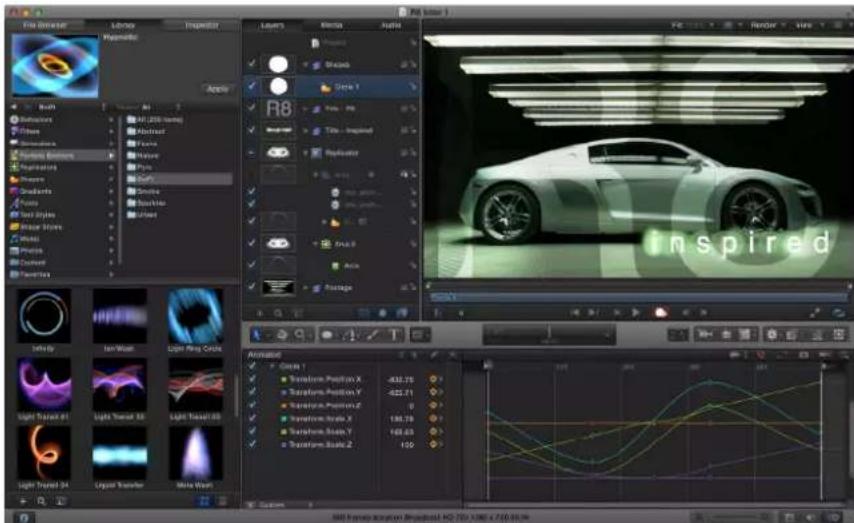
Motion is a behavior-driven motion graphics application used to create stunning imaging effects in real time for a wide variety of broadcast, video, and film projects.
In Motion, you can:
- Create sophisticated animations on the fly using any of more than 200 built-in motion and simulation behaviors, such as Spin, Throw, or Orbit, which allow you to add dynamic motion to your projects in real time, with no preview rendering time necessary.
- Build complex visual effects using one or more of nearly 300 filters such as Glow, Strobe, or Bleach Bypass.
- Animate the traditional way, using keyframes and modifiable curves, to create precise timing effects.
- Create polished text effects, from the simple (lower-thirds and credit rolls) to the complex (3D titles, animated effects, sequencing text).
- Create custom effect, transition, title, and generator templates for automatic export to Final Cut Pro X. You can also modify the effects, transitions, titles, and generators that ship with Final Cut Pro.
- Use rigging to map multiple parameters to a single Inspector control (for example, a slider that simultaneously manipulates size, color, and rotation of text) in Motion compositions or in templates exported to Final Cut Pro X.
- Build compositions by selecting from royalty-free content, such as vector artwork, animated design elements, and high-resolution images.
-
Retime footage to create high-quality slow- or fast-motion effects.
-
Stabilize camera shake or create complex motion-tracking effects such as match moves and corner-pinning.
- Perform advanced compositing and green screen effects.
- Build fluid 3D motion graphics compositions for show intros, bumpers, commercials, or title sequences.
- Create sophisticated particle systems involving large numbers of automatically animated objects in 2D or 3D space.
- Build complex patterns of repeating elements using the powerful replicator tool, then animate the resulting collages in 2D or 3D space.
- Publish your projects directly to websites such as YouTube and Facebook, or send your motion graphics to iTunes for syncing with Apple devices such as iPhone, iPad, and Apple TV.
About Motion projects
In Motion, you create 2D or 3D motion graphics and compositing projects with imported images (such as Adobe Photoshop or Illustrator files), image sequences, QuickTime movies, and audio files, as well as with objects created in Motion. These objects include text, masks, shapes, particles, paint strokes, and so on.
A Motion project is made up of groups that contain layers. All media imported into Motion, or elements created within a project (such as shapes or particles), are referred to as layers. A layer is contained in a group. The group acts as a "parent" to its layers. A group can be 2D or 3D. For more information on layers and groups and how to modify them, see Select layers to transform on page 208.
Any item in Motion can be referred to as an object, but an item that you can see in the Canvas, such as an image, shape, or text, is generally referred to as a layer. A camera, light, rig, filter, behavior, and so on is generally referred to as an object.
Cameras and lights can be added to projects. When you add a camera to a project, you can switch the project to 3D mode or remain in 2D mode (unless the project is empty or completely 2D, in which case it is automatically switched to 3D mode). 2D groups can exist in a 3D project. A 2D group can be nested in a 3D group. A 3D group can be nested in a 2D group. When a 3D group is nested in a 2D group, the group is flattened. This means that the nested 3D group acts like a flat card and ignores the camera. In addition, the flattened group does not intersect with layers of the 2D group or other groups in the project. For more information on working in 3D, see 3D compositing overview on page 908.
Any transforms, filters, or behaviors applied to a group are applied to all layers in the group. If you move or apply a filter or behavior to a group, all layers in that group are affected. You can also apply filters and behaviors to individual layers in a group.
A filter is a process that changes the appearance of an image. For example, a blur filter takes an input image and outputs a blurred version of that image. For more information on using filters, see Filters overview on page 741.
A behavior is a process that applies a value range to an object's parameters, creating an animation based on the affected parameters. For example, the Spin behavior rotates an object over time at a rate that you specify. For more information on using behaviors, see Behaviors overview on page 293.
Groups and layers can be moved and animated by using behaviors or by setting keyframes. For information about keyframing, see Keyframing overview on page 439. Filters can also be animated.
A project represents a single flow of image data built from the bottom up. In a composite with a single group, the layers in that group are stacked above one another. Filters and behaviors applied to a layer appear beneath the layer in the Layers list. The group represents the image that results from its combined layers and their applied behaviors, filters, and composite modes (blend modes). For more information on building projects, see Create and manage projects overview on page 145. For more information on basic compositing, see Basic compositing overview on page 205.
In a simple example, a group contains a single image with applied color correction and blur filters (in that order). The image provides the input data to the color correction filter. The output data of the color correction is the input data for the blur filter. The group represents the result of that image data flow. Groups and layers are also stacked one above the other in a project—the output of the lower layer is the input to the layer above it in the list.
When working in 3D mode, a layer that is below another layer in the Layers list can appear above that layer in the Canvas if its Z (depth) position is closer to the camera. You can force the layers to respect their order in the Layers list by selecting the Layer Order checkbox in the Group pane of the Inspector.
About input devices
If you have a two- or three-button mouse connected to your computer, you can right-click to access the same controls specified by the Control-click commands in this documentation.
Some keyboard shortcuts require you to use the Function key (Fn—next to the Control key) in conjunction with the keys specified in the user documentation. For more information about keyboard shortcuts in Motion, see Keyboard shortcuts overview on page 1068.
If you have a Multi-Touch device, such as a Magic Mouse or trackpad, you can use various gestures for interface navigation, scrolling, frame-scrubbing, and zooming. You can also use gestures to change the size of icons in the File Browser and Library. These gestures are discussed in their relative sections of the documentation.
Introduction to the Motion interface
2
Motion interface overview
The Motion interface has two main windows:
- Project Browser: Use this window, which appears when you open Motion, to create new projects or open existing projects.
- Main workspace: Use this window to build, modify, and preview your motion graphics projects. The main workspace is divided into several functional areas: File Browser, Library, Inspector, Canvas, toolbar, Project pane, and Timing pane.
To learn more about each of these interface elements, choose a topic in the Help table of contents (the sidebar to the left of this window).
For general information about how to use the different types of controls found throughout the Motion interface (buttons, sliders, pop-menus, and so on), see User interface controls overview on page 127.
Project Browser
The Project Browser appears every time you open Motion or when you create a project. Use this window to create new projects, to open recent projects or templates (including templates for Final Cut Pro X), or to create a project from a specific file. In the Project Browser, you can also search for projects based on assigned categories and themes. See About the Project Browser on page 146.

Workspace
When you open a Motion project from the Project Browser or as a default project, the Motion workspace fills your screen as a single project window with dedicated areas that can be shown or hidden:
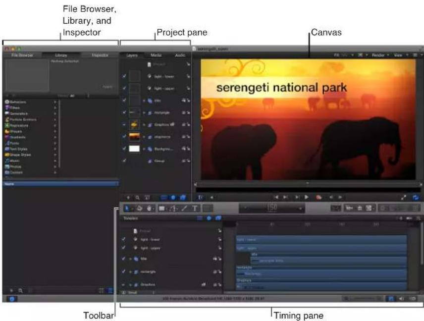
- File Browser, Library, and Inspector: Use these three panes to import media files into your project; to locate and apply effects and other content that Motion provides; and to modify settings of all the media and effects in your project. The most commonly used Inspector controls are also available in the heads-up display (HUD) a floating window that you can show or hide. For more information, see File Browser overview on page 30, Library overview on page 35, Inspector overview on page 40, and HUD on page 44.
- Canvas: Arrange, manipulate, and play back your composition in this main work area of the interface. For more information, see Canvas overview on page 55.
- Toolbar: Use these tools and controls to create and edit elements in the Canvas. For more information, see Toolbar overview on page 46.
- Project pane: Use the three lists in this area—Layers, Media, and Audio—to organize all the objects in your composition; to display all external images, clips, and audio files linked to your project; and to display all audio tracks in your project. For more information, see Project pane overview on page 69.
- Timing pane: Use the three panes in this area—Timeline, Audio Timeline, and Keyframe Editor—to see and manipulate timing aspects of a project. For more information, see Timing pane overview on page 81.
File Browser
File Browser overview
The File Browser displays all files on your computer and networked disks. Navigating the File Browser is similar to navigating a window in the Finder. You can drag items from the File Browser to your project.
The File Browser, Library, and Inspector share the same area on the left side of the Motion workspace.
Open the File Browser
Do one of the following:
- Click File Browser in the top-left corner of the Motion workspace.
- Choose Window > File Browser (or press Command-1).
The File Browser opens.
Collapse or expand the pane containing the File Browser, Library, and Inspector
Do one of the following:
- Choose Window > File Browser (or press Command-1).
- Click the "i" button in the lower-left corner of the Motion workspace.
File Browser preview area
When you select a file in the File Browser, a visual preview appears in the top-left corner of the Motion workspace, along with text information, including filename, media type, file size, and frame rate. If the file is a video or audio clip, the preview area also contains an audio mute button.
Note: When displayed in the preview area, audio files contain a text description but no image preview.

Play a preview of a file
■Select the file in the File Browser.
If the file is a media clip, it starts playing in the preview area.
Note: If you do not want selected items to play automatically in the preview area, deselect the "Play items automatically on a single click" checkbox in the General pane of Motion Preferences.
Pause or resume playback of a file
- Move the pointer over the visual preview, then click the Pause or Play button that appears over the thumbnail.
Import a file displayed in the preview area
1 Select the file in the File Browser.
2 Click the Import button in the preview area.
The file is added to the project (to the Canvas, Layers list, Timeline, and Media list).
Note: For a larger preview, double-click a file in the File Browser. A viewer window appears, displaying the file at its native size. You can also Control-click a file and choose Open in QuickTime Player from the shortcut menu.
Directly underneath the preview area is the sidebar, which contains a list of servers, drives, and folders available on your computer. Clicking a drive or folder in the sidebar displays its contents in the file stack below. Above the list of drive and folder icons in the sidebar are controls to navigate and sort the contents of the window.
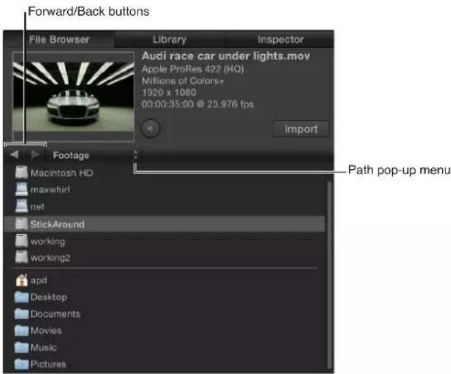
- Forward and Back buttons: Steps forward and backward through the folders most recently viewed.
If you have a Mac with a Multi-Touch trackpad, you can also swipe left or right with three fingers to navigate up or down the folder hierarchy.
- Path pop-up menu (unlabeled): Displays the file system hierarchy (folders inside of folders) for the current folder.
File Browser stack
Underneath the File Browser sidebar is the file stack, which displays the contents of the folder selected in the sidebar. You can scroll through long stacks using a scroll bar or with a two-finger swipe on a Multi-Touch trackpad.
When you Control-click a file in the File Browser stack, a shortcut menu displays the following commands:
- Open in Viewer: Opens the file in a viewer window.
- Open in QuickTime Player: Opens the file in a QuickTime window.
- Reveal in Finder: Displays the location of the file in the Finder.
- Rename: Turns the name of the file into an active text field so you can enter a new name.
- Move to Trash: Moves the file into the Trash.
View the contents of a folder displayed in the file stack
Do one of the following:
■Double-click the folder.
■Select the folder, then press Return.
Return to a previously viewed folder
Do one of the following:
- Click the Back button beneath the preview area (to the left of the Path pop-up menu).
- Choose a folder from the Path pop-up menu beneath the preview area.
■Press Command—Up Arrow.
■ Swipe left with three fingers on a Multi-Touch trackpad.
Add media from the File Browser
You can drag files to your project from the File Browser, or use the Import button.
Add media via the File Browser
Do one of the following:
- Select media files in the File Browser, then click the Import button.
The files are added to the project at the center of the Canvas. - Drag a file from the File Browser to the Canvas or to a group in the Layers list.
For more File Browser import options, see Add and remove files on page 163.
Manage folders and files
In the File Browser, you can rename, move, or delete files. You can also change how files are displayed.
Rename a folder or file
Do one of the following:
■ Control-click the file or folder, then choose Rename from the shortcut menu. When the text field becomes active, enter the new name, then press Return.
In the stack, click the name of the folder or file once to select it, then click it again to activate the text field. Enter the new name, then press Return.
WARNING: Renaming folders or files from the File Browser renames the item on your local or networked hard disk. If projects use files from the originally named folder, Motion may list the footage as missing.
Delete a folder or file
Do one of the following:
In the stack, Control-click the file, then choose Move to Trash from the shortcut menu.
- Drag the file from the stack to the Trash icon in the Dock.
WARNING: Deleting folders or files from the File Browser removes the files from your hard disk or networked hard disk and places the files in your Trash.
Create a folder
- Click the Add button (+) in the lower-left corner of the File Browser.

Move a file into a folder
- Drag the file to the folder icon.
The file is moved inside that folder.
Note: Changes you make to your file structure in the Motion File Browser are reflected in the Finder.
Search for a file
- Click the Search button, then enter text in the Search field.
The contents of the file stack are filtered to include only files whose names contain the entered text.
Note: The Search field is not available unless the Search button is selected.
Clear a file search
- Click the Clear button at the right side of the Search field.
Display icon view or list view
The file stack can be displayed in icon view or list view. Each view is useful for different situations.

natural_image
Grid of 24 underwater photo thumbnails with various images, no visible text or symbols
List viewIcon view
View the File Browser in icon view
- Click the Icon View button in the lower-right corner of the File Browser.
View the File Browser in list view
- Click the List View button in the lower-right corner of the File Browser.

Change the size of the icons while in icon view
- Click the Scale button in the lower-left corner of the File Browser, then drag the slider to the right to make the icons larger, or to the left to make them smaller.

- On a Multi-Touch trackpad, pinch open to make the icons larger or pinch closed to make the icons smaller.
Sort columns
When in list view, you can sort the list by any column. This can be helpful if you are looking for a specific file and you know the approximate size or modification date.
Sort the File Browser list
- At the top of the stack, click the header of the column to sort.
The column header is highlighted and the contents of the window are sorted by that column.
Collapse animations
Sometimes, animated sequences are delivered as a series of sequentially numbered still images. Motion lets you import these sequences as a single object, with each image used as a sequential frame in a movie.
Import a series of numbered still images as a single object
1 Click the "Show image sequences as collapsed" button in the lower-right corner of the File Browser.

The File Browser displays multiple items collapsed into a single object.
2 Drag the object from the File Browser to the Canvas, Layers list, Timeline, or Media list.
Note: Images from digital cameras are often numbered sequentially but are not part of an animation sequence. You can turn off this option to import a single still image from a digital camera.
Library
Library overview
The Library displays effects, content, presets, fonts, music, photos, and other elements available in Motion. You can add this pre-existing content to your projects. For more information, see Add Library elements to a project on page 182.
You can also expand the Library content by adding fonts, music, or photos, or by saving content and effects that you create in Motion.
The Library, File Browser, and Inspector share the same area on the left side of the Motion workspace.
Like the File Browser, the Library is divided into three sections. The top section is the preview area; the middle section is the sidebar; and the bottom section is the file stack, where effects and other objects are displayed.
Open the Library
Do one of the following:
- Click Library in the top-left corner of the Motion workspace.
- Choose Window > Library (or press Command-2).
The Library opens.
Collapse or expand the pane containing the Library, File Browser, and Inspector Do one of the following:
- Choose Window > Library (or press Command-2).
- Click the "i" button in the lower-left corner of the Motion window.
Library preview area
When you select an item in the Library, a visual preview appears in the top-left corner of the Motion workspace. The preview area also contains text information for the selected item, such as a description of the behavior, filter, or generator.

Play a preview of a Library element
In the Library, select a category (such as Replicators), select a subcategory, then click an item in the stack below.
The preview plays in the preview area.
Pause or resume preview playback
■ Move the pointer over the visual preview, then click the Pause or Play button that appears over the thumbnail.
Library sidebar
Underneath the Library preview area is the sidebar, which contains a list of folders of effect types and content available in Motion. Clicking a folder in the sidebar displays its contents in the file stack below. Above the Library categories in the sidebar are several controls to navigate and sort the contents of the window.

- Forward and Back buttons: Steps forward and backward through the folders most recently viewed. These buttons work similarly to the Forward and Back buttons in a web browser. If you have a Multi-Touch trackpad, you can also swipe left or right with three fingers to navigate up or down the folder hierarchy.
- Path pop-up menu (unlabeled): Displays the file system hierarchy (folders inside of folders) for the current folder.
- Theme pop-up menu: Lets you sort and organize Library content by theme. For more information about working with themes, see Work with Library themes on page 186.
Library file stack
Under the Library sidebar is the file stack, which displays the contents of the folder selected in the sidebar. You can scroll through long file stacks using the horizontal scroll bar or with a two-finger swipe on a Multi-Touch trackpad.
View the contents of a folder displayed in the file stack
Do one of the following:
■Double-click the folder.
■Select the folder, then press Return.
The contents of the folder replace the current file stack view.
Return to a previously viewed folder
Do one of the following:
- Click the Back button beneath the preview area.
- Choose a folder from the Path pop-up menu beneath the preview area.
■Press Command-Up Arrow.
■ Swipe left with three fingers on a Multi-Touch trackpad.
Library content
The Library contains all effects, presets, fonts, and other content available in Motion. These items are grouped into categories listed in the left sidebar. Choose any of these items to display a list of subcategories in the right sidebar. The Library also contains two additional categories—Music and Photos—that provide quick access to your iTunes and iPhoto libraries.
For information on adding Library content to your project, see Add Library elements to a project on page 182.
The Library contains the following categories:
- Behaviors: Contains all behaviors, divided into individual subcategories. A behavior must be attached to an image layer to have an effect. Some behaviors can only be applied to specific objects. For example, Text Animation and Text Sequence behaviors can only be applied to text objects. For more information, see Use behaviors overview on page 297.
- Filters: Contains all filter special effects, divided into individual subcategories. A filter must be attached to an image layer to have an effect. Third-party FxPlug filters appear in the category to which they belong. Most filters can be applied to any layer (text, images, shapes, footage, particles, and so on) or mask in your project. For more information, see Filters overview on page 741.
- Generators: Contains a selection of checkerboards, noise patterns, color rays, animated text objects, and other computer-generated elements for use in your projects. Generators can be modified after you add them to your project. For more information, see Generators overview on page 709.
- Particle Emitters: Contains a selection of preset particle systems organized into subcategories. Particle emitters let you add effects ranging from simulations of smoke, fire, and explosives to animated abstract textures that you can use in different ways. All premade particle systems can be customized after you add them to your project. For more information, see Add particle systems to a project on page 516.
- Replicators: Contains a selection of preset replicators organized into subcategories. Replicators let you add background, transitional, or other types of animated patterns. All premade replicators can be customized after you add them to your project. For more information, see Add a replicator to a project on page 563.
- Shapes: Contains a collection of premade shapes that you can use as visual elements or as image masks. Each shape is a Bezier shape and can be customized using Motion's shape-editing tools. For more information, see Shapes, masks, and paint strokes overview on page 828.
- Gradients: Contains a selection of preset gradients that can be applied to shapes, text, particles, and replicators. For more information, see Gradient editor on page 135.
- Fonts: Contains all fonts available on your system. Fonts are organized into subcategories based on the categories of fonts defined in the Font Book application. For more information about Font Book, see OS X Help (in the Finder, choose Help > Help Center). For information, see Change fonts on page 623.
- Text Styles: Contains a collection of preset type styles that can be applied to text, changing their style parameters. These style parameters include Face, Outline, Glow, and Drop Shadow. Dragging a text style onto a text object instantly applies that style to the text. For more information, see Use preset text styles on page 650.
- Shape Styles: Contains a collection of preset shape styles that can be applied to shapes, changing their style parameters. Dragging a shape style onto a shape instantly applies that style. For more information, see Shapes, masks, and paint strokes overview on page 828.
- Music: Allows you to browse for and import audio files from your iTunes library. The Music subcategories include the library and playlists created in iTunes. The contents of each playlist appear in the file stack. When displayed in list view, the Music category shows the Name, Artist, Album, Duration, and Size information created in iTunes.
Note: Rights-protected AAC files cannot be imported into Motion and do not appear in the file stack. This includes music purchased from the iTunes Store. Video content from iTunes cannot be imported to a Motion project.
- Photos: Allows you to browse for and import image files from your iPhoto library. The Photos subcategories include the library and albums created in iPhoto. The contents of each album appear in the file stack.
Note: When importing a large-scale image into Motion, you can scale the image to the size of the Canvas. For more information, see About high-resolution still image files on page 167.
- Content: Contains elements used in the templates and other presets that ship with Motion. Use these images, text elements, patterns, and animations to create custom design elements, such as particles and replicators, which can be saved to the Library for later use.
Note: Dragging a media object into the Content category leaves its corresponding file on disk in its original location. For this reason, centralize all media you plan on importing into the Library for future use into a dedicated and predictable location on disk, to prevent accidentally moving, renaming, or deleting those files.
- Favorites: By default, customized objects are saved into their corresponding Library categories. The Favorites category provides a place to put objects—built-in or custom-made—that you use frequently, including cameras, layers, or groups. You can also place frequently used media files (such as PDF or TIFF files) into the Favorites category. Objects you place in the Favorites category are available to every project you create in Motion.
Objects dragged into the Favorites category are saved into the /Users/username/Library/Application Support/Motion/Library/Favorites/ folder.
Note: The preview area does not display descriptions of built-in presets copied to the Favorites category. Control-click the favorite, then choose Edit Description from the shortcut menu to add a description that will appear in the preview area of the Library.
- Favorites Menu: Objects you place in the Favorites Menu folder appear in the Favorites menu, for even faster access. When you choose an item from the Favorites menu, that item is placed into the selected layer and is positioned at the center of the Canvas. Objects you put in the Favorites Menu are available to every project in Motion.
Objects dragged into the Favorites Menu category are saved to the /Users/username/Library/Application Support/Motion/Library/Favorites Menu/ folder.
Display icon view or list view
The Library file stack can be displayed in icon view or list view.
View the Library in icon view
- Click the Icon View button in the lower-right corner of the Library.
View the Library in list view
- Click the List View button in the lower-right corner of the Library.
Change the size of the icons while in icon view
- Click the Icon Scale button in the lower-left corner of the Library, then drag the slider to the right to make the icons larger, or to the left to make them smaller.
- On a Multi-Touch trackpad, pinch open to make the icons larger or pinch closed to make the icons smaller.
Add items from the Library
The easiest way to add Library elements to your project is using the Apply button.
Add Library content
1 Select the layer or group to apply the effect or content element to.
2 Select an element in the Library, then click the Apply button.
For additional options and information, see Add Library elements to a project on page 182.
Inspector
Inspector overview
In Motion, you modify images, clips, and effects by adjusting parameters—numeric attributes that define each characteristic of a project. The Inspector is where you find the controls to modify parameters: sliders, dials, pop-up menus, checkboxes, and so on. (For more information on Inspector controls, see User interface controls overview on page 127.)
When you select an image, clip, or effect in Motion, its parameter controls become available in the Inspector, ready for adjustment. In other words, the Inspector is contextual: what appears in the Inspector is based on the selected object. An object must be selected for its parameters to appear in the Inspector.
The Inspector contains four panes, each of which displays parameter controls for the selected object. The first three panes, Properties, Behaviors, and Filters, are present for any selected object. The fourth pane, generically called the Object pane, changes its name and contents depending on the type of object selected.
Open the Inspector
Do one of the following:
- Click Inspector in the top-left corner of the Motion workspace.
- Choose Window > Inspector (or press Command-3).
The Inspector opens.
Collapse or expand the pane containing the Inspector, File Browser, and Library Do one of the following:
- Choose Window > Inspector (or press Command-3).
- Click the "i" button in the lower-left corner of the Motion workspace.
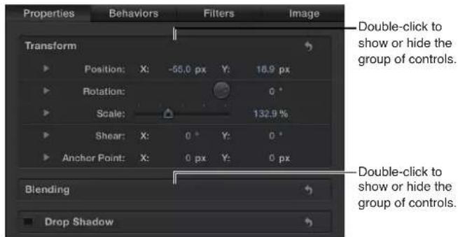
Show or hide a group of controls using the Show/Hide button
1 Position the pointer over the row that contains the group name.
2 Click Show to display the parameters or Hide to conceal the parameters.
For more information, see Generic Inspector controls on page 142.
Show or hide a group of controls by double-clicking
■ Double-click the empty space in a row that contains a group name.
Inspector preview area
The preview area contains a visual preview of the object and can show the multiple frames of moving footage. The Inspector preview area is similar to the File Browser and Library preview areas, but it has no Apply or Import button.

Properties
This pane, also referred to as the Properties Inspector, contains controls for setting basic attributes of the selected object, including the following:
- Transform controls for modifying an object's position, scale, rotation, and so on
- Blending controls for modifying an object's opacity, blend mode, and so on
- Shadows controls
• Four Corner controls - Crop controls
- Controls for designating an object's In and Out points
The available controls vary depending on the type of object selected. For example, when a 3D group is selected, the Lighting and Reflection controls appear in the pane, but the Crop, Drop Shadow, and Four Corner controls do not.
When the Project object (located at the top of the Layers list) is selected, controls become available in the Inspector that allow you to modify the project's background color, aspect ratio, field rendering, motion blur, reflections, and so on. For more information on project properties, see Project properties overview on page 191.
Behaviors
This pane, also referred to as the Behaviors Inspector, contains controls for adjusting attributes of applied behaviors. If the object has no applied behaviors, the Behaviors Inspector remains empty. If the object has multiple applied behaviors, grouped controls for each behavior appear stacked in this pane, with controls for the most recently applied behavior at the top.
When you select a behavior in a project, the Behaviors Inspector is displayed. When you select multiple behaviors, the Properties or Object Inspector is displayed (the last pane used), allowing for the editing of parameters common to the selected objects.
For more information, see Behaviors overview on page 293.
Filters
This pane, also referred to as the Filters Inspector, contains controls for adjusting attributes of applied filters. If the object has no applied filters, the Filters Inspector remains empty. If the object has multiple applied filters, grouped controls for each filter appear stacked in this pane, with controls for the most recently applied filter at the top.
When you select a filter in a project, the Filters Inspector is displayed. When you select multiple filters, the Properties or Object Inspector is displayed (the last pane used), allowing for the editing of parameters common to the selected objects.
For more information on using filters, see Filters overview on page 741.
Object
This pane, also referred to as the Object Inspector, contains controls that vary depending on the type of object selected. The name of the pane is also context-sensitive, changing depending on the type of object selected. The different Object Inspectors are described below:
- Object: Appears when there is no selected object. There are no parameters in the Object pane.
- Image: Appears when an image, image sequence, movie, or drop zone is selected. When media is selected, this pane contains the Drop Zone checkbox, the state of which determines whether the image selected is a drop zone target. When the checkbox is selected, additional parameters become available. For more information, see Drop zone parameters on page 199.
- Group: Appears when a group is the selected object. The Group pane contains the Type parameter, used to convert a group from 2D to 3D, and vice versa. A 2D group has different available parameters than a 3D group.
When set to 2D, Fixed Resolution parameters become available, which allow you to manually define the size of a group. By default, Fixed Resolution is disabled, and the size of the group is determined by the layers in that group. For more information, see Constrain group size on page 160.
Note: When selected, Fixed Resolution crops the group to the size specified in the Fixed Width and Fixed Height parameters around the anchor point of the group.
When set to 3D, the Flatten and Layer Order parameters become available. When the Flatten checkbox is selected, all elements in the 3D group are flattened like a card or billboard. When the Layer Order checkbox is selected, the project elements are sorted by their order in the Layers list rather than their order in Z space. For more information, see Layer order and depth order on page 915.
- Project: Appears when the Project object (located at the top of the Layers list) is selected. The Project Inspector contains two panes: Publishing and Snapshots. The Publishing pane lists all parameters set to be published in a template (except for filter onscreen controls). The Snapshots pane is used to create different display aspect ratios for templates. For more information on publishing and templates, see Final Cut Pro X templates overview on page 385.
-
Camera: Appears when a camera is selected and contains controls specific to a scene camera, including angle of view and depth of field parameters. For more information on using cameras, see Cameras overview on page 928.
-
Light: Appears when a light is selected and contains controls to change the light type, color, intensity, and falloff. When the Shadows checkbox is selected, parameters become available that control the shadow cast by a Point or Spot light. For more information on working with lights and shadows, see Lighting overview on page 939 or Shadows overview on page 944.
- Rig: Appears when a rig is selected and contains buttons that allow you to choose widget types to map multiple parameters to a single control. For more information on rigging, see Rigs and widgets overview on page 370.
- Media: Appears when an item is selected in the Media list of the Project pane. (For more information see Project pane overview on page 69.) These parameters deal mostly with attributes of the file on disk or how the file is interpreted by Motion. Because multiple project objects can reference a single media file, the pane contains a list of linked objects. Making changes in this pane affects all objects that refer to the selected media file. For more information on working with media parameters, see Source media parameters on page 178.
-
Text: Appears when text is selected and contains all controls that affect the text. The Text Inspector is divided into three panes:
-
Format: Contains standard controls to adjust font, size, tracking, kerning, justification, alignment, line spacing (leading), and so on. Additionally, this pane contains a large text-entry field where you can edit the contents of text used in your project. The Format pane also includes a pop-up menu of preset text styles.
- Style: Contains controls to adjust the fill, outline, glow, and drop shadow of selected text. Each section is grouped and can be turned on or off by selecting the checkbox next to the category name. The Style pane also includes a pop-up menu of preset text styles.
-
Layout: Contains paragraph style controls to set text on a path, text direction, text rendering, how text objects are affected when behaviors are applied, and how anchor points are used. This pane also contains controls to create a type-on effect or to modify text path options. For more information on working with text parameters, see Text overview on page 612.
-
Mask: Appears when a mask is selected and contains controls to change the mask's shape, to define how multiple masks interact, to invert a mask, to smooth the shape of a mask or adjust its softness, or to change the color of the mask in the Canvas. This inspector also contains position value sliders for mask control points. For more information on working with mask attributes, see Mask controls in the Inspector on page 899.
- Image Mask: Appears when an image mask is selected and contains Mask and Mask Options controls. These controls allow you to change the mask's source, reference frame (if the source is a clip), offset, wrap mode, source channel, blend mode, and so on. For more information, see Image masks overview on page 902.
-
Shape: Appears when a shape is selected and contains controls that affect the shape. The controls are divided into four panes:
-
Style: Contains controls to modify the fill and outline of a shape and the brush type of an outline or paint stroke. This pane also includes a pop-up menu of preset shape styles.
- Stroke: Contains controls for modifying paint strokes. Use these controls to set stroke color and brush scale, and to adjust opacity, spacing, width, and other parameters.
- Advanced: Contains controls that allow the dabs of a paint stroke to be animated like particles.
-
Geometry: Contains controls that allow you to change the shape type, to close or open a shape, to smooth a shape, and to adjust the position of a shape's control points using value sliders. For more information on working with shapes, see Shapes, masks, and paint strokes overview on page 828.
-
Emitter: Contains controls for modifying a particle emitter, including emitter shape, space (2D or 3D), angle, and range. This pane also provides access to cell controls. For emitters with multiple cells, these controls affect all cells. For more information on using particles, see Particles overview on page 513.
- Particle Cell: Contains controls for modifying particle cells. Particle cells can only be selected in the Layers list or Timeline layers list. This pane contains controls for attributes such as birth rate, speed, angle, and color.
- Replicator: Contains controls for modifying replicator attributes, including shape, space (2D or 3D), pattern, size, and cell controls. For more information on using the replicator, see Replicator overview on page 559.
- Replicator Cell: Contains controls for modifying replicator cells. Replicator cells can only be selected in the Layers list or Timeline layers list. This pane contains controls for attributes such as angle, color, and scale.
- Generator: Displays the parameters and attributes of the selected generator, such as the Center, Size, and Intensity parameters of a Lens Flare generator. The parameters listed depend on the selected generator. For more information on generators, see Generators overview on page 709.
- Audio Track: Contains controls for adjusting an audio file selected in the Audio list of the Project pane or in the Audio Timeline, including level, pan, and output bus. For more information on working with audio, see Audio overview on page 1010.
- Master: Contains controls for adjusting a Master audio track selected in the Audio list of the Project pane, including level, pan, and the output bus of audio tracks in the project. For more information on working with audio, see Audio overview on page 1010.
Note: When an object other than a filter or behavior is selected, the Object Inspector becomes available if it was the last pane used. If the Properties Inspector was last used, the Properties Inspector becomes available.
HUD
The HUD (heads-up display) is a dynamically updating floating window that puts the common controls for a selected object within easy reach. For example, an image HUD contains opacity, blend mode, and drop shadow controls.

Some HUDs contain controls for effects. For example, the 2D Particle Emitter HUD contains a single control that provides a visual way to manipulate three particle system parameters: Emission Range, Emission Angle, and Speed. These unique controls allow you to set multiple parameters simultaneously and in an intuitive way.

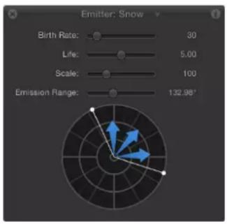
When multiple effects are applied to an object, you can cycle through the effects' HUDs. A small downward-facing arrow next to the HUD name indicates that additional effects are applied to the selected object.

Note: It is easier to enter a specific value for a slider parameter in the Inspector.
Display a HUD
Do one of the following:
- Select an object, then choose Window > Show HUD (or press F7).
- Select an object, then click the Show/Hide HUD button in the toolbar (to the right of the timing display).
■Press D.
Switch between HUDs of a selected object
Do one of the following:
- Click the downward arrow in the HUD title bar to list all possible HUDs that can be displayed for the selected object, then choose the HUD to view from the pop-up menu.

- Press D to cycle through all HUDs for the selected object. To cycle the HUDs in reverse, press Shift-D.
The HUDs are cycled in the order in which the effects are applied.
When you select multiple objects of the same type, a combined HUD appears (with "Multiple Selection" displayed in its title bar).
Jump to the Inspector from the HUD
Most of the time, the HUD displays a subset of the parameters visible in the Inspector for the selected object. If you are working in the HUD, you can jump to the Inspector to access the remainder of the controls for that object.
- Click the Inspector icon (the "i") in the upper-right corner of the HUD.
The Inspector corresponding to the HUD appears.
Toolbar
Toolbar overview
The toolbar, located in the center of the Motion workspace, provides access to the tools for manipulating objects in the Canvas, as well as controls for adding objects to a project. There are tools that transform objects in 2D or 3D space; tools that create text, shapes, and masks; buttons that add cameras, lights, and generators; pop-up menus that apply filters and behaviors to objects; and buttons that create particle systems and replicators.
The left side of the toolbar contains tools grouped into categories of use. The three tools on the far left let you modify the view and manipulation method in the Canvas. The next four tools are used to add content to a project, including text, shapes, and paint strokes. Next are the mask tools, which are contained in a pop-up menu. For detailed instructions on each tool, see Toolbar controls on page 127.

natural_image
Toolbar interface with icons for selection, hand, brush, and letter (no text or symbols)At the center of the toolbar is the timing display. For more information, see Timing display overview on page 53.

To the right of the timing display is the Show/Hide HUD button. For more information about the HUD, see HUD button on page 52.
The rest of the controls on the right side of the toolbar are used to add content and other objects to your project. The first set are object controls, used to add cameras, lights, or generator objects to a project. The group farthest to the right are effects controls to add filters, behaviors, particles, or replicators to your project.

natural_image
Toolbar with application icons including video, audio, gear, and document (no readable text or symbols)Note: After you select an object in the Canvas and select a tool, you can switch between tools by pressing Tab. Tabbing cycles the tools from the Select/Transform tool (the default) to the 3D Transform tool, to the remaining 2D transform tools (Anchor Point tool, Drop Shadow tool, and so on). Press Shift-Tab to cycle through the tools in the reverse order.
Tools that have multiple modes or options are available in pop-up menus in the toolbar. For instance, a shape tools pop-up menu contains the Rectangle, Circle, and Line tools. Pop-up tool menus have a tiny downward arrow in the lower-right corner of the visible tool.

For more information about each tool and control in the toolbar, see the list in the Help table of contents (the sidebar to the left of this window).
2D Transform tools
Choose a 2D transform tool from the pop-up menu at the far-left side of the toolbar to adjust and manipulate objects in the Canvas. Click and hold the tool to select a different mode from the pop-up menu. When you choose a 2D transform tool in the toolbar and then select an object in the Canvas, onscreen controls appear. Manipulate the onscreen controls to move or transform an object in the Canvas.
Icon Name Keyboard shortcut Description
| Select/Transform tool (arrow) | S (Press Tab to cycle through tools. An object must be selected before you can tab through the tools.) | Activates selection and transform controls in the Canvas for the selected object. Scale objects by dragging a corner point; rotate objects by dragging the center point. This is the default tool in the 2D transform tools pop-up menu. |
| Icon Name Keyboard shortcut Description | ||
 | Anchor Point tool S (Press Tab to cycle through tools.) | Activates an anchor point control (the point around which an object scales or rotates) in the Canvas for the selected object.Modify the anchor point by dragging it to a new position. |
 | Drop Shadow tool S (Press Tab to cycle through tools.) | Activates a drop shadow control in the Canvas for the selected object.Drag a corner handle to change the direction and offset of an object's drop shadow. (This control doesn't move the object.) |
 | Distort tool S (Press Tab to cycle through tools.) | Activates shear and distortion handles in the Canvas for the selected object. Drag a midpoint handle to shear two adjacent corners at the same time, leaving the other two corners locked into place; drag a corner handle to distort a corner, leaving the other three corners locked into place. |
 | Crop tool S (Press Tab to cycle through tools.) | Activates crop handles in the Canvas for the selected object. Drag the edge or corner of the object to crop (hide) a portion of the object. |
 | Edit Points tool S (Press Tab to cycle through tools.) | Activates points and Bezier handles in the Canvas for masks, shapes, and motion paths. |
 | Transform Glyph tool S (Press Tab to cycle through tools.) | Activates handles in the Canvas for selected text characters (glyphs). |
 | Adjust Item tool S (Press Tab to cycle through tools.) | Activates handles in the Canvas that modify specific parameters such as the amount or angle of a Directional Blur, the shape of a particle emitter, or the start and end points of a gradient. |
3D Transform tool
Select the 3D tool to adjust and manipulate objects in the Canvas in 3D space.
Icon Name Keyboard shortcut Description

3D Transform tool Q Activates 3D transform
controls in the Canvas. To display rotation controls in the Canvas, hold down the Command key while dragging a handle.
View tools
Choose a view tool from the pop-up menu to pan and zoom in the Canvas.
Icon Name Keyboard shortcut Description

Pan tool H Activates pan mode in
the Canvas, allowing you to drag the Canvas view in different directions. (This control never moves individual objects). To reset the pan, double-click the Pan tool (in the toolbar). To pan the Canvas without selecting the Pan tool, press the Space bar and drag in the Canvas.

Zoom tool Z Activates zoom mode in
the Canvas. Click in the Canvas to zoom in 50 percent increments. Press Option and click in the Canvas to zoom out in 50 percent increments. Drag right or left in the Canvas to smoothly zoom in or out. To reset the zoom, double-click the Zoom tool (in the toolbar).

Walk 3D View tool None
Activates controls
allowing you to navigate through a 3D scene from the camera's POV using the Up Arrow, Down Arrow, Right Arrow, and Left Arrow keys.
Shape tools
Choose a shape tool from the pop-up menu to create rectangles, circles, and lines.
Icon Name Keyboard shortcut Description
| Rectangle tool R Activates rectangle- | drawing mode. Drag in the Canvas to create a rectangle. Press Shift while you drag to draw a square. | |
| Circle tool C Activates circle-drawing | mode. Drag in the Canvas to create an ellipse shape. Press Shift while you drag to draw a circle. | |
| Line tool None Activates line-drawing | mode. Drag in the Canvas to draw a line segment. Press Shift while you drag to constrain the line segment to specific angles. |
Path Shape tools
Choose a path shape tool from the pop-up menu to create Bezier or B-Spline shapes.
Icon Name Keyboard shortcut Description
 | Bezier tool B (Switches Bezier/B-Spline tool.) | Activates freeform shape-drawing mode with Bezier point vertices.Click repeatedly in the Canvas to create a shape.To close the shape, click the first point of the shape or press the C key.To create an open-ended shape, double-click the last point. (The resulting shape, although open, is filled by default.) |
 | B-Spline tool B (Switches Bezier/B-Spline tool.) | Activates freeform shape-drawing mode with B-Spline vertices.Click repeatedly in the Canvas to create a shape.To close the shape, click the first point of the shape or press C. To create an open-ended shape, double-click the last point. (The resulting shape, although open, is filled by default.) |
Paint Stroke tool
Select the Paint Stroke tool to create paint strokes.
Icon Name Keyboard shortcut Description

Paint Stroke tool P Activates shape-based
paint stroke mode. Drag in the Canvas to draw strokes. Command-drag to adjust the size of the brush stroke before you create the stroke.
Text tool
Select the Text tool to add text to a project.
Icon Name Keyboard shortcut Description

Text tool T Activates text-entry and
text-editing mode. Click in the Canvas and begin typing text. Choose the Select/Transform tool (or press Esc) to grab or move the new text layer. To change existing text, select the Text tool (in the toolbar), then click the text in the Canvas.
Mask tools
Choose a mask tool from the pop-up menu to hide portions of a selected layer. Mask tools can be accessed only when a layer (a visible object in the Canvas, such as an image, replicator, or flattened text) or 2D group is selected. By default, the area inside the mask remains visible. For more information about masks, see Shapes, masks, and paint strokes overview on page 828.
Icon Name Keyboard shortcut Description

Rectangle Mask tool Option-R Activates rectangle mask-
drawing mode. Drag in the Canvas to draw a rectangular mask. Press Shift while you drag to draw a square mask.

Circle Mask tool Option-C Activates circle mask-
drawing mode. Drag in the Canvas to draw an elliptical mask. Press Shift while dragging to constrain the mask to a circle.

Freehand Mask tool None
Activates freeform mask-
drawing mode in the Canvas. The shape closes the mask between the first and last points.
Icon Name Keyboard shortcut Description
| Bezier Mask tool Option-B (switchesBezier/B-Spline Mask tools) | Activates freeform mask-drawing mode, with Bezier point vertices.Click repeatedly in the Canvas to create a mask shape. To close the mask, click the first point of the mask or press C. To create an open-ended mask, double-click the last point. | |
 | B-Spline Mask tool Option-B (switchesBezier/B-Spline Mask tools) | Activates freeform mask-drawing mode, with B-Spline vertices.Click repeatedly in the Canvas to create a mask shape. To close the mask, click the first point of the shape or press C. To create an open-ended mask shape, double-click the last point. |
HUD button
Click the HUD button (the first button to the right of the timing display) to show and hide the heads-up display (HUD).
Icon Name Description

Show/Hide HUD Shows or hides the heads-up
display (HUD), a small floating window that contains the most commonly used parameter controls of the selected object.
Object controls
Use the three object controls (to the right of the HUD button) to add cameras, lights, and generators to a project.
Icon Name Description

New Camera Adds a camera to the project.
When you add a camera to a 2D project, a dialog appears asking if you want to convert 2D groups to 3D groups. Although a camera can be added to a 2D project, the camera has no effect on a 2D group.

New Light Adds a light to the project. When
you add a light to a 2D project, a dialog appears asking if you want to convert 2D groups to 3D groups. Although a light can be added to a 2D project, the light has no effect on a 2D group.
Icon Name Description
Add Generator Activates a pop-up menu of
| generators. Choosing an item from the menu adds that generator to the project. |
Effects controls
Use the last four controls on the right side of the toolbar to apply the most common effects: filters, behaviors, particle emitters, and replicators. Because these controls apply effects to objects, they are not available unless an object is selected.
Icon Name Description
Add Filter Activates a pop-up menu of filters.
| Choosing an item from the menu applies that filter to the object. Filters can only be applied to groups or layers (images, text, shapes, particle emitters, masks, replicators, generators, and so on). Filters cannot be applied to cameras, lights, behaviors, or other filters. |
Add Behavior Activates a pop-up menu of
| behaviors. Choosing an item from the menu applies that behavior to the object. Behaviors can be applied to layers (images, particle emitters, and so on), groups, cameras, and lights. |
Make Particles Creates a particle system using the
| selected layer (shape, text, image, and so on) as the source for a particle cell. |
Replicate Creates a replicator using the
| selected layer (shape, text, image, and so on) as a source cell. |
Timing display
Timing display overview
The timing display, located in the center of the toolbar, lets you view the current frame (or timecode number) of the playhead, or the total duration of the project. You can also use the timing display to navigate to a specific frame, move frames in small or large increments, and scrub frames. Additionally, you can modify the duration of the project.

Switch between the current time (timecode or frame number) and the project duration Do one of the following:
- Click the clock icon.
When the project's duration is displayed, the clock icon looks like this:
When the current time is displayed, the clock icon looks like this:
- Click the right side of the timing display (the inverted triangle) to open the pop-up menu, then choose Show Current Time or Show Project Duration.
Modify the duration dynamically
- With the timing display pop-up menu set to Show Project Duration, drag over the numbers in the display, up to increase the value or down to decrease the value.
Change the project to a specific duration
- Double-click in the timing display, enter a duration into the field, then press Tab or Return to confirm your entry.
Modify the current time dynamically
- With the timing display pop-up menu set to Show Current Time, drag over the numbers in the display, up to move the playhead forward or down to move it backward.
Change the duration in seconds, minutes, or hours
1 Ensure that the timing display pop-up menu is set to Show Project Duration.
2 Double-click the timing display, then do one of the following:
- To set the duration in seconds, enter the number of seconds followed by a period. For example, to create a 10-second project, enter "10." (10 followed by a period) in the field, then press Return.
- To set the duration in minutes, enter the number of minutes followed by two periods. For example, to create a 10-minute project, enter "10.." (10 followed by two periods) in the field, then press Return.
- To set the duration in hours, enter the number of hours followed by three periods. For example, to create a 1-hour project, enter "1..." (1 followed by three periods) in the field, then press Return.
This procedure works in timecode as well as frames.
Navigate using the timing display
You can also use the timing display to navigate the Timeline playhead.
Move the playhead to a specific time
- With the timing display pop-up menu set to Show Current Time, double-click the number display, type the desired timecode or frame number, then press Return to confirm your entry.
Increase or decrease the current time one frame at a time
- With the timing display pop-up menu set to Show Current Time, press the Left Arrow key (or Page Up key) to move backward or the Right Arrow key (or Page Down key) to move forward.
Move ahead or back in seconds, minutes, or hours
1 Ensure that the timing display pop-up menu is set to Show Current Time.
2 Double-click the timing display, then do one of the following:
- To move forward in seconds, enter a plus sign (+), enter the number of seconds to move forward, enter a period, then press Return. For example, to move 2 seconds ahead, enter "+2." (with a period after the numeral 2), then press Return. To move ahead in minutes, enter two periods after the numeral, then press Return. To move ahead in hours, enter three periods after the numeral, then press Return.
- To move backward in seconds, enter a minus sign (−), then enter the number of seconds to move backward, enter a period, then press Return. For example, to move 2 seconds backward, enter “−2.” (with a period after the numeral 2), then press Return. To move backward in minutes, enter two periods after the numeral, then press Return. To move backward in hours, enter three periods after the numeral, then press Return.
Move forward or backward a specific number of frames
- Enter a plus sign (+) followed by the number of frames to move forward, then press Return.
- Enter a minus sign (−) followed by the number of frames to move backward, then press Return.
Timecode versus frame counters
Motion offers two ways of looking at the frame numbers for your project. You can view the time as incremental frames, starting at 1 or 0 and continuing indefinitely. Or you can view the time in the video-standard, eight-digit timecode system, which runs like a clock from 00:00:00:00 to 23:59:59:29. The first two digits represent hours; the second two digits represent minutes; the third two digits represent seconds; and the final two digits represent frames, as in HH:MM:SS:FF.
Some timecode formats skip numbers to accommodate the inexact frame rates of certain video formats.
Frames and timecode counters have specific advantages, depending on the format in which you are originating and finishing. For example, if you are designing a title sequence for a 35mm film that must be exactly 720 frames, it is easier to set counters to frames.
If you are building a television spot to be transferred to videotape or broadcast, use timecode so the frame numbers correspond with the numbers on the videotape.
Switch between timecode and frame numbers
- Choose Show Frames or Show Timecode from the timing display pop-up menu (the inverted triangle).

Canvas
Canvas overview
Most of the Motion interface is occupied by the Canvas. Similar to the document window in many other applications, the Canvas is the visual workspace where you arrange and lay out objects in your composition. Adding layers and effects to your project is as simple as dragging them from the Library or File Browser to the Canvas.
Use the transport controls at the bottom of the Canvas to view your project at regular speed or frame by frame. On either side of the transport controls are buttons that show and hide panes of the interface, turn audio playback on and off, and turn player mode on and off.
The mini-Timeline—above the transport controls and below the main body of the Canvas—provides a view of where selected layers in the Canvas begin and end in time, allowing you to manipulate the timing of those elements.
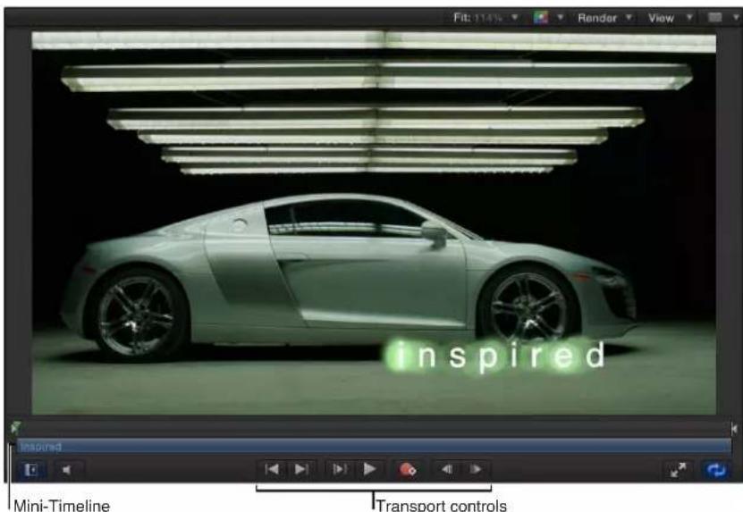
The composition in the Canvas is what will be output when you share a project. However, this window is not only a place to view the results of your work; it's also where you modify and arrange the elements of your project.
You can drag in the Canvas to modify object attributes such as position, scale, and rotation. For more information, see Move layers in the Canvas overview on page 211. Familiar drag-and-drop techniques may be used to apply behaviors or filters to the items in the Canvas. See Behaviors overview on page 293 and Filters overview on page 741 to learn more about how to use these features.
Status bar
The status bar at the top-left side of the Canvas provides information about the current project—dynamic tool information, color, coordinates, and frame rate.

You control the display of this information in the Status Bar section of the Appearance pane in Motion Preferences.
Display dynamic tool information in the status bar
1 Type Command-Comma to open Motion Preferences.
2 In the Appearance pane of Motion Preferences, select the Dynamic Tool Info checkbox.
3 Adjust an object in the Canvas.
The status bar displays information about the adjustment as you drag in the Canvas. For example, when you scale an object in the Canvas, the width and height values are displayed.
Display pixel color in the status bar
Some motion graphics projects require you to match or align colors in your project. The status bar can provide visual and numeric information about the color of the pixel under the pointer, as well as the value of the alpha channel. No clicking is necessary—as you move the pointer over the Canvas, the status bar updates.
1 In the Appearance pane of Motion Preferences, select the Color checkbox.
2 Choose a color format from the Display Color As pop-up menu:
- RGB: The red, green, blue, and alpha components of the color are represented in values from 0–1. Super-white values can exceed the 0–1 value range.
- RGB (percent): The red, green, blue, and alpha components of the color are represented in values from 1–100.
- HSV: The hue is represented in values from 1–360, and the saturation and value (luminance) are represented in values from 1–100.
3 Move the pointer over the Canvas.
The color information displayed in the status bar updates as you move the pointer.
Display the current pointer position in the status bar
For precise placement of objects in the Canvas, it can be helpful to know the exact pixel position of the pointer. The status bar can display this information in an X and Y coordinate system (Cartesian). The center point of the Canvas is 0, 0.
In the Appearance pane of Motion Preferences, select the Coordinates checkbox.
When you move the pointer in the Canvas, the coordinate information updates in the status bar.
Monitor the project's playback frame rate
Part of the way Motion plays back a project in real time is by lowering the frame rate when a sequence is too complex to render at full speed. You can monitor the current frame rate—in frames per second (fps)—in the status bar.
Note: The frame rate appears in the status bar the only while a project is playing.
FPS: 60
In the Appearance pane of Motion Preferences, select the "Frame rate (only during playback)" checkbox.
When you play the project, the frame rate appears in the upper-left corner of the status bar.
Canvas view options
The pop-up menus to the right of the status bar provide access to the Canvas view settings—zoom level, channels, render settings, view and overlay options, and 3D view layouts.

Zoom Level pop-up menu
The Zoom Level pop-up menu offers several default zoom levels. Zooming the Canvas changes the current view of the window, not the size of the images in your project. You can set the view to percentages of 12, 25, 50, 100, 200, 400, 800, or 1600, or to Fit In Window. For more information, see Zoom the Canvas on page 62.
Channels pop-up menu
The Channels pop-up menu (the color spectrum icon) controls which color channels are displayed in the Canvas. Use this menu to view a single color channel in the Canvas, to examine layers' alpha channels, or to manipulate effects that affect only a single color channel. This menu has the following options:
- Color: Shows the image as it would appear on a video monitor. Visible layers appear in natural color and transparent areas reveal the background color as set in the Properties Inspector for the project. The background color is black by default. To change it, press Command-J, then choose a color from the Background Color control in the Properties Inspector.
Note: The Background pop-up menu in the Properties Inspector must be set to Solid to export the background color with the project. This option creates a solid alpha channel on export (when exporting using a codec that supports alpha channels). When the Background pop-up menu is set to Transparent, the color is visible in the Canvas, but does not render as part of the alpha channel.
- Transparent: Shows the background area of the Canvas as transparent. A checkerboard pattern appears by default where no images block the background.
- Alpha Overlay: Displays the image in normal color, but adds a red highlight over transparent areas of the image.
- RGB Only: Displays the normal mix of red, green, and blue channels but displays transparent areas (including semitransparent areas) as opaque.
- Red: Displays only the red channel as a range of black to white.
- Green: Displays only the green channel as a range of black to white.
- Blue: Displays only the blue channel as a range of black to white.
- Alpha: Displays the alpha (transparency) channel of the layers in the Canvas.
- Inverted Alpha: Displays an inverted view of the alpha (transparency) channel.
Render menu
The Render pop-up menu controls the quality and resolution of the Canvas display and lets you enable or disable features that can impact playback performance. When an option is active, a checkmark appears beside the menu item. If a complex project is causing your computer to play at a very low frame rate, you can make changes in this menu to reduce the strain on the processor. This frees you from waiting for the image to be rendered at full resolution each time you make an adjustment, allowing you to watch complex projects at high frame rates while you work.
The Render pop-up menu displays the following items:
- Dynamic: Reduces the quality of the image displayed in the Canvas during playback or scrubbing in the Timeline or mini-Timeline, allowing for faster feedback. Also reduces the quality of an image as it is modified in the Canvas. When playback or scrubbing is stopped, or the modification is completed in the Canvas, the image quality is restored (based on the Quality and Resolution settings for the project).
• Full: Displays the Canvas at full resolution (Shift-Q).
• Half: Displays the Canvas at half resolution.
• Quarter: Displays the Canvas at one-quarter resolution. -
Draft: Renders objects in the Canvas at a lower quality to allow optimal project interactivity. There is no antialiasing.
-
Normal: Renders objects in the Canvas at a medium quality. Shapes are antialiased, but 3D intersections are not. Floating-point (32-bit) footage is truncated to 16-bit. This is the default setting.
- Best: Renders objects in the Canvas at best quality, which includes higher-quality image resampling, antialiased intersections, antialiased particle edges, and sharper text.
- Custom: Allows you to set additional controls to customize rendering quality. Choosing Custom opens the Advanced Quality Options dialog. For information on the settings in the Advanced Quality Options dialog, see Advanced Quality settings on page 63.
- Lighting: Turns the effect of lights in a project on or off. This setting does not turn off lights in the Layers list (or light scene icons), but it disables light shading effects in the Canvas.
- Shadows: Turns the effect of shadows in a project on or off.
• Reflections: Turns the effect of reflections in a project on or off. - Depth of Field: Turns the effect of depth of field in a project on or off.
- Motion Blur: Enables/disables the preview of motion blur in the Canvas. Disabling motion blur may improve performance.
Note: When creating an effect, title, transition, or generator template for use in Final Cut Pro X, the Motion Blur item in the View pop-up menu controls whether motion blur is turned on when the project is applied in Final Cut Pro.
- Field Rendering: Enables/disables field rendering. Field rendering is required for smooth motion playback on many TV monitors. Field rendering nearly doubles rendering time, so disabling this item may improve performance.
Note: When creating an effect, title, transition, or generator template for use in Final Cut Pro, the Field Rendering setting in the View pop-up menu does not control whether field rendering is applied in Final Cut Pro. Rather, field rendering is controlled in the Properties Inspector for the project. (Press Command-J to open the Properties Inspector.) When Field Order is set to anything other than None, field rendering is used in Final Cut Pro, regardless of the Field Rendering status in the View pop-up menu.
- Frame Blending: Enables/disables frame blending in the Canvas. Frame blending can smooth the appearance of video frames by interpolating the pixels between adjacent frames to create a smoother transition.
View and Overlay pop-up menu
The View and Overlay pop-up menu provides access to the guides and controls that can be viewed in the Canvas. When an option is active, a checkmark appears beside the menu item. (Many of these menu options are also available in the View pull-down menu.)
The View and Overlay pop-up menu displays the following items:
- Show Overlays: Turns the display of overlays in the Canvas on or off. This setting must be on to view any other overlay items (grids, guides, and so on). To turn the camera overlays on or off, use Show 3D Overlays.
Note: You can also press Command-Slash (/).
- Rulers: Turns display of the rulers along the edge of the Canvas on or off. You can specify where the rulers appear in the Canvas pane (Alignment section) of Motion Preferences. For more information, see Canvas rulers on page 63.
Note: You can also press Shift-Command-R.
- Grid: Turns a grid display on and off over the Canvas. You can set the spacing and color of the grid in the Canvas pane (Alignment section) of Motion Preferences.
Note: You can also press Command-Apostrophe (').
- Guides: Turns display of manually created guides on and off. Guides can only be created if rulers are displayed. You can change the color of the guides in the Canvas pane (Alignment section) of Motion Preferences.
Note: You can also press Command-Semicolon (;).
- Dynamic Guides: Turns display of automatic dynamic guides on and off. These guides appear when dragging a layer past edges of other layers when snapping is enabled (choose View > Snap). You can change the color of dynamic guides in the Canvas pane (Alignment section) of Motion Preferences.
Note: You can also press Shift-Command-Colon (:).
- Safe Zones: Turns display of the title safe and action safe guides on and off. By default, these guides are set at 80% and 90%. You can change these settings and the color of the guides in the Canvas pane (Zones section) of Motion Preferences.
Note: You can also press the Apostrophe key (').
- Film Zone: Turns display of film aspect ratio guides on and off. This can be helpful if you are creating a project for videotape to be transferred to film. You can change the size of the guides as well as their color in the Canvas pane (Zones section) of Motion Preferences.
Note: You can also press Shift-Quotation Mark (").
- Handles: Turns display of object handles in the Canvas on and off. Some onscreen transformations, such as resizing, require visible object handles. Handles appear only on selected objects.
- Lines: Turns display of lines that outline an object on and off. Lines appear only on selected objects.
- Animation Path: Turns animation paths on and off. These editable paths indicate the route along which animated objects travel. If the selected object is not positionally animated, this command does not appear to have any effect. If handles are not displayed, the path curves cannot be adjusted in the Canvas. Except for the Motion Path behavior, animation paths created by behaviors are for display only and are not editable.
- Show 3D Overlays: Turns 3D overlays in the Canvas on and off, including Camera overlays, 3D View tools, Compass, Inset view, 3D grid, and 3D scene icons. (3D overlays appear in projects that contain 3D groups.)
Note: You can also press Option-Command-Slash (/).
- 3D View Tools: Turns the Camera menu and 3D View tools in the Canvas on and off. For more information, see 3D View tools on page 920.
- Compass: Turns the 3D Compass in the Canvas on and off. Using red, green, and blue axes, the compass shows your current orientation in 3D space. The red axis is X (horizontal), the green axis is Y (vertical), and the blue axis is Z (depth). For more information, see 3D workspace and views overview on page 918.
- Inset View: Turns the Inset view in the Canvas on and off. When enabled, a temporary window appears in the lower-right corner of the Canvas displaying an Active Camera or Perspective view of the project, helping you stay oriented as you move objects in 3D space. In the 3D pane of Motion Preferences, you can change the size of the Inset view, as well as control whether the Inset view appears on transform changes, on all changes, or manually. For more information, see Inset view on page 922.
- 3D Grid: Turns the grid in the Canvas on and off. The 3D grid helps you stay oriented and can be used to guide the placement of objects in your project. The 3D grid appears when you are in a 3D workspace.
- 3D Scene Icons: Turns the display of cameras and lights in the Canvas on or off. Scene icons appear in the Canvas as wireframe icons. Lights appear with red (X), green (Y), and blue (Z) adjust 3D handles that let you transform and rotate them. The handles are still displayed when the 3D scene icons command is turned off. For more information, see 3D scene icons on page 923.
- Correct for Aspect Ratio: Applies an artificial distortion of the Canvas in projects with nonsquare pixels. When the setting is on, the computer monitor simulates what a TV monitor displays. When the setting is off, projects with nonsquare pixels appear stretched. This is because computer monitors have square pixels. This setting does not modify the output of the project.
• Show Full View Area: When enabled, this setting lets you see the portion of a layer that extends beyond the edge of the Canvas. This setting is disabled by default, because it slows your project's interactivity.
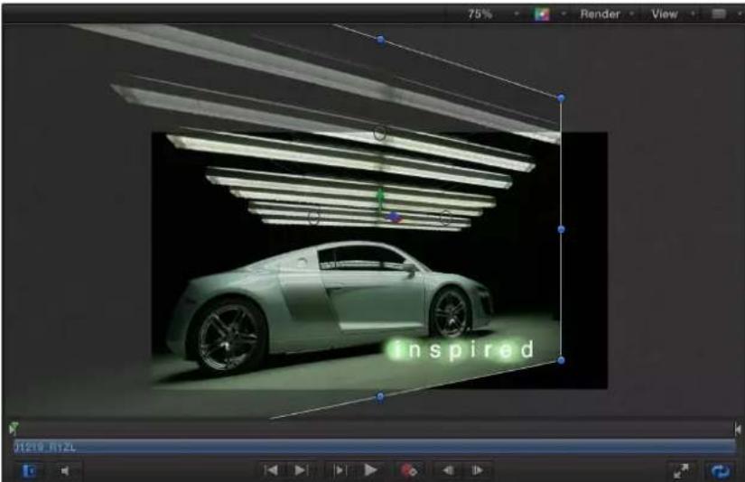
natural_image
3D rendering of a light green sports car with a projected interior lighting, displayed in a graphics editing interface (no text or symbols on the car or background)- Use Drop Zones: Turns drop zones on and off. When Use Drop Zones is enabled, a checkmark appears next to the menu item, and drop zones accept objects dragged to them. When this command is turned off, drop zones ignore objects dropped onto them. For more information, see Drop zones overview on page 197.
- Save View Defaults: Saves the current state of all settings in this menu as the default state for new projects.
View Layouts pop-up menu
The View Layouts pop-up menu lets you specify how to view your project in the Canvas. You can view the Canvas as a single workspace or choose from available window arrangements in the menu. (Although the workspace views are available for 2D projects, they are most useful when working in 3D space.)
The View Layouts pop-up menu displays the following items:
- Single: The default value, displays a single window in the Canvas.
- Two-up, side by side: Displays two windows in the Canvas, one next to the other.
- Two-up, top and bottom: Displays two windows in the Canvas, one on top of the other.
- Three-up, large window below: Displays three windows, two next to each other on top and a larger window below.
- Three-up, large window right: Displays three windows, two stacked on the left side and a larger window spanning the right side.
- Four-up, large window right: Displays four windows, three stacked on the left side and one larger window on the right side.
- Four-up: Displays four windows, all the same size.
Zoom the Canvas
You can zoom in on the Canvas to allow precision alignment and placement of objects, and you can zoom out to get a sense of the big picture or to see the path of a moving object.
Zoom in or out on the Canvas
- Choose a zoom level from the Zoom Level pop-up menu.
Use the dynamic zoom mode
- Holding down the Space bar and Command key (in that order), drag diagonally or horizontally in the Canvas. The zoom occurs around the spot clicked in the Canvas.
Zoom in and out using a Multi-Touch device
- Pinch closed to zoom out or pinch open to zoom in.
After you zoom in, use a two-finger swipe in any direction to scroll around.
Zoom in and out of a specific area of the Canvas
- Holding down the Space bar and Command key (in that order), drag the area of the Canvas to zoom. While still holding down the keys, click in the Canvas to zoom in 50 percent increments of the current zoom level. Holding down the Space bar, Command key, and Option key (in that order), click in the Canvas to zoom out in 50 percent increments of the current zoom level.
Note: To pan the Canvas without selecting the Pan tool, hold down the Space bar and drag in the Canvas.
Zoom the Canvas so the viewable area of the project fills the window
- Choose Fit In Window from the Zoom Level pop-up menu.
Reset the Canvas Zoom level or Pan
Do one of the following:
- Choose 100% from the Zoom Level pop-up menu.
In the toolbar, double-click the Zoom tool (located in the Pan tool pop-up menu).
In the toolbar, double-click the Pan tool.
Zooming the Canvas does not change the size of the images in your project. It only changes the view of the entire window.
Advanced Quality settings
When you choose Custom in the Quality section of the Render pop-up menu (or in the View >Quality menu), the Advanced Quality Options dialog appears.

The Advanced Quality Options dialog provides additional controls to fine-tune rendering performance and quality. It contains the following items:
- Quality: A pop-up menu that sets rendering quality. These settings are identical to the Quality settings in the Render pop-up menu. (For more information on the Render popup menu, see Canvas view options on page 57.)
Choose one of four settings from this pop-up menu (each setting activates different options in the dialog):
- Draft: None of the quality options are selected, and the Text Quality parameter is set to Low. This option allows optimal project interactivity.
- Normal: "Shape antialiasing" is selected, and the Text Quality parameter is set to Medium. This option allows project interactivity that is slower than Draft, but much faster than Best.
- Best: "High quality resampling," "Shape antialiasing," and "Antialias 3D intersections" are selected. Text render quality is set to High. This option slows down project interactivity.
- Custom: No options are selected until you select individual quality settings in the Advanced Quality Options dialog.
- High Quality Resampling: Turns on high-quality resampling (increasing or reducing the number of pixels in an image).
- Text Quality: A pop-up menu that sets text-rendering quality to Low, Medium, or High. When High is selected, project interactivity may slow.
- Shape antialiasing: Renders shapes at a higher resolution, then scales objects back to regular resolution to ensure smooth edges.
- Antialias 3D intersections: Renders objects intersecting in 3D space at a higher resolution, then scales objects back to regular resolution to ensure smooth edges.
Canvas rulers
Using rulers in the Canvas can help you compose or align elements of your project, as well as snap objects to rulers.
Turn on rulers
In the View pop-up menu, enable Rulers (or press Shift-Command-R).
When Rulers are enabled, a checkmark appears next to the item in the pop-up menu.
By default, rulers appear along the left and top sides of the Canvas.
Change the location of the rulers
1 Choose Motion > Preferences.
2 In the Canvas pane, click Alignment, then choose a ruler layout from the Ruler Location pop-up menu.
Add a horizontal or vertical guide to the Canvas
1 Click in the gray area of the horizontal or vertical ruler, and drag into the Canvas.
As you drag, the position of the guide is displayed in the Canvas.
Note: Guides must be enabled in the View pop-up menu (or by pressing Command-Semicolon) to display the guides.

The ruler units are in pixels, with the 0, 0 point in the center of the Canvas.
2 When the guide is in the location you want, release the mouse button.
Simultaneously add a horizontal and vertical guide to the Canvas
-
Drag from the corner where the rulers meet into the Canvas.
-
When the guides are in the location you want, release the mouse button.
Remove a guide from the Canvas
■Drag the guide off the Canvas.
To delete the guide, drag into the Project pane or Timing pane areas, then release the mouse button.
Change the color of the guides
1 Choose Motion > Preferences.
2 In the Canvas pane, click Alignment, click or Control-click the Guide Color well, then select a color.
Mini-Timeline
The mini-Timeline lies above the transport controls and below the Canvas. The mini-Timeline offers an easy way to see where selected objects fit into the project as a whole. The mini-Timeline also provides controls to perform quick edits such as moving, trimming, and slipping objects without opening the Timing pane.

The playhead indicates which frame you are viewing. In and Out markers identify the play range. The length of the mini-Timeline represents the duration of the project.
You can add objects (such as clips, images, particle emitters, and so on) to a project at a specific time by dragging items from the File Browser or Library to the mini-Timeline.
Add an object to the mini-Timeline
- Drag the item from the File Browser or Library to the mini-Timeline, releasing the mouse button when the tooltip identifies the frame you want.
Move an object in time
- Select the object to move, drag the object bar in the mini-Timeline to the left or right to reposition it in time, then release the mouse button when you reach the position you want.
Shorten or lengthen an object
- Select the object, position the pointer over the beginning or ending edge of the object in the mini-Timeline, then drag the edge of the object bar to change its duration.
A tooltip appears indicating the In or Out point and the amount of change your edit is causing.
For more information, see Edit in the mini-Timeline on page 290.
Canvas buttons and transport controls
In the lower portion of the Canvas, there are several buttons that modify the workspace and let you control playback of the project.
The first two buttons modify the workspace and audio playback:
- Show/Hide Project pane: Shows and hides the Project pane (which includes the Layers, Media, and Audio lists). The keyboard shortcut is F5.
Note: If you use a Multi-Touch device, three-finger swipe right or left to show or hide the Project pane.
- Play/Mute audio: Turns audio playback on or off.

Note: Turning audio off can improve playback performance.
The group of buttons centered at the bottom of the Canvas are transport controls. Use these buttons to play your project and see how it looks over time.

- Go to start of project: Returns the playhead to the beginning of the project. The keyboard shortcut is Home.
- Go to end of project: Moves the playhead to the end of the project. The keyboard shortcut is End.
- Play from start: Plays from the play range In point to the play range Out point, letting you watch a portion of the entire project. To learn how to define the In and Out points, see Define the play range on page 282.
- Play/Pause: Starts and stops playback. The keyboard shortcut is the Space bar.
- Record: Enables or disables animation recording. When recording is enabled, the values for animatable parameters appear red in the Inspector. This is to inform you that any change you make to a parameter (such as moving an object in the Canvas or adjusting a slider) creates a keyframe.
- Go to previous frame: Moves the playhead backward by one frame. Clicking the button (or holding down the shortcut key) rewinds the project one frame at a time. The keyboard shortcut is the Left Arrow (or Page Up) key.
Note: If you have a Multi-Touch trackpad, you can rotate left to go to the previous frame.
- Go to next frame: Advances the playhead by one frame. Clicking the button (or holding down the shortcut key) advances the project one frame at a time. The keyboard shortcut is the Right Arrow (or Page Down) key.
Note: If you have a Multi-Touch trackpad, you can rotate right to go to the next frame.
The last two buttons modify the Canvas workspace and looping of video playback.
- Player Mode: Hides the File Browser, Library, Inspector, Project pane, and Timing pane to maximize Canvas space. For more information, see Player mode on page 67.

- Loop playback: Controls whether playback loops indefinitely, or whether playback stops when the end of the play range is reached. The keyboard shortcut is Shift-L. For more information, see Define the play range on page 282.

Player mode
When you click the Player Mode button below the Canvas, the Canvas expands to fill the Motion workspace. This is helpful for watching project playback without the distraction of the software interface. In this mode, the menus, toolbar, and timing display remain active. The Show/Hide Timeline, Show/Hide Audio Timeline, and Show/Hide Keyframe Editor buttons at the lower-right corner of the workspace also remain available, as does the Show/Hide File Browser/Library/Inspector button at the lower-left corner of the workspace.
Switch into player mode
Do one of the following:
■Choose Window > Player Mode.
- Click the Player Mode button above the toolbar.
■Press F8.
Return to normal view
Do one of the following:
- Position your pointer over the menu, then choose Window > Player Mode again.
■Press F8 again.
Canvas shortcut menu
When no objects are selected, the Canvas has its own shortcut menu, used to access several tools.
Use the Canvas shortcut menu
- Control-click an empty area of the Canvas (in the gray area outside the project) and choose an item from the shortcut menu:
- New Group: Adds a group to the project above existing groups in the Layers list.
- Import: Opens the Import Files dialog, used to import files from the Finder.
- Paste: Pastes any item copied to the Clipboard into the selected group in the project.
- Project Properties: Opens the Properties Inspector for the project, where you can modify the project's background color, aspect ratio, field rendering, motion blur, reflections, and so on. For more information on project properties, see Properties Inspector controls on page 192.
Work in 3D mode
In addition to the traditional 2D project workspace, Motion provides a 3D workspace that includes cameras and lights with tools for manually changing your view, viewing a scene from a reference camera, or viewing a scene through any camera added to your project.
When you switch to 3D mode, additional controls become available in the Canvas. A small set of 3D View tools appears in the upper-right corner of the Canvas, and a 3D Compass appears in the lower-left corner. The upper-left corner of the Canvas contains the Camera menu, where you can choose which camera to use to view the project in 3D space. For more information, see 3D compositing overview on page 908.
Important: You must add at least one camera or light to your project to create a 3D workspace.
Add a camera to your project
1 Click the New Camera button in the toolbar.
A dialog appears, prompting you to switch your 2D groups to 3D groups.
2 Click Switch to 3D to add a camera and create a 3D project.
If you click Keep as 2D, a camera is added to your project, but groups remain 2D groups.
Add a light to your project
1 Click the New Light button in the toolbar.
A dialog appears, prompting you to switch your 2D groups to 3D groups.
2 Click Switch to 3D to add the light and create a 3D project.
If you click Keep as 2D, a light is added to your project, but all groups remain 2D groups. Lights have no effect in 2D projects.
Set the current view
- Choose a camera view from the Camera menu in the upper-left corner of the Canvas.

For more information, see Camera pop-up menu on page 920.
Use the 3D View tools
- Drag the Pan, Orbit, or Dolly tool in the 3D View tools.

The view in the Canvas moves, rotates, or zooms.
For more information, see 3D View tools on page 920.
Reset your camera
Do one of the following:
■Double-click the Pan, Orbit, or Dolly tool.
- Choose Reset View from the Camera menu (in the upper-left corner of the Canvas).
In the Properties Inspector for the camera, click the Transform parameters reset button.
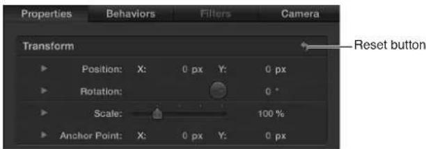
Project pane
Project pane overview
The Project pane—located between the File Browser, Library, or Inspector and the Canvas—contains three lists, each of which provides access to a different aspect of your project:
- Layers list: Displays the hierarchy of objects (groups, layers, cameras, lights, behaviors, filters, and so on) in your project. For more information, see Layers list overview on page 70.
• Media list: Shows the files imported into your project. For more information, see Media list overview on page 75. - Audio list: Provides access to, and control of, audio files in your project. For more information, see Audio list overview on page 79.
More than simple lists of items in a project, these panes let you organize key attributes of a motion graphics composition, including the stacking order of image layers, audio settings, and source media settings.

Collapse or expand the Project pane
Do one of the following:
- Choose Window > Show Project Pane (or press F5).
- Click the Show/Hide Project Pane button in the bottom of the Canvas.

Resize the Project pane
Do one of the following:
■Drag the right edge of the pane left or right.
- Choose Window > Hide Timing Pane (or press F6).
The Timing pane is hidden and the Project pane is lengthened.
Layers list
Layers list overview
The Layers list of the Project pane displays an overview of all image layers, effects, and masks used in a project. The top row of the Layers list contains the Project object, which, when selected, gives you access to the project's global settings (in the Project Inspector). Beneath the Project object are the groups, image layers, and effects objects that combine to form the composition displayed in the Canvas. In a 2D project, the stacking order of layers and groups in the Layers list determines which layers appear in front of others in the Canvas.
All image layers and effects objects—except for cameras, lights, rigs, and the Project object—must reside in groups. Masks, behaviors, and effects can be applied to groups or to layers. Applied masks, behaviors, and effects are listed beneath the group or layer to which they are applied. The masks, behaviors, and effects appear indented in the list.
The Layers list displays several icons that indicate linked audio, 2D/3D status, and lock status. Similarly, layers modified by masks, behaviors, or filters display icons for each effect. Clicking mask, behavior, or filter icons turns the display of these objects, as well their effect on the project, on or off.
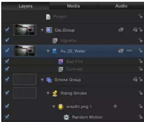
Display the Layers list
Do one of the following:
If the Project pane is visible, click Layers at the top of the pane.
- Choose Window > Layers (or press Command-4).
Layers list controls
The Layers list contains the following controls:

Activation checkbox
- Activation checkbox: Turns the visibility of the object (or its effect) on or off. When the object's visibility is off, you can still modify the object's parameters and manipulate its onscreen controls.
- Preview: Contains a thumbnail of the object. The group thumbnail represents the cumulative result of the composite up to that point in the project. You can turn the display of the preview on or off in the Layers Columns section of the View menu.
- Name field: Identifies the object by name. To edit the name, double-click the text area of a selected object, enter a new name, then press Return. In projects containing a camera, the Isolate button appears in the Name column.
- Isolate button: Appears for a selected layer, group, or camera in a project that contains a camera. The button has an active and inactive state. Clicking the Isolate button for a layer or group sets that object to its original face-forward orientation (so you can apply a mask, for example). Clicking the button again returns to the previous view. Clicking the Isolate button for a camera takes you to that camera's view.
Note: When a group or layer is isolated, the name of the item replaces the current camera listing in the Camera menu (in the upper-left corner of the Canvas). - Mask icon: Appears when a mask is applied to the layer or group. To turn off the effect of the mask, click the icon. A red slash appears through a disabled mask's icon.
- Behavior icon: Appears when a behavior is applied to the layer or group. To turn off the effect of the behavior, click the icon. A red slash appears through a disabled behavior's icon.
- Filter icon: Appears when a filter is applied to the layer or group. To turn off the effect of the filter, click the icon. A red slash appears through a disabled filter's icon.

- Link icon: Appears when the layer has a corresponding audio element, such as a multichannel QuickTime file. To unlink the video and audio (to edit them separately), click the link icon. When they are unlinked, a red slash appears through the icon.
- 2D/3D icon: Switches a group between 2D or 3D mode. The same icon appears at the left of the group name and indicates the 2D/3D status of the group. Layers cannot be 2D or 3D—they are always 2D elements in a 2D or 3D group.
- Lock icon: Locks an object to prevent changes from affecting that object. Locking a group prevents changes to layers and effects in that group. When the lock is disabled, its icon appears open.
- Opacity slider: Displays the opacity (transparency) of the group or layer. You can adjust the slider to change the item's opacity. This slider is not displayed by default. To display the Opacity slider in the Layers list, choose View > Layers Columns > Opacity.
- Blend Mode pop-up menu: Displays the blend mode of the layer or group. Click the pop-up menu to choose a blend mode. You can turn the display of the blend mode pop-up menu on or off in the Layers Columns section of the View menu. This pop-up menu is not displayed by default. To display the Blend Mode pop-up menu in the Layers list, choose View > Layers Columns > Blend Modes. For more information on blend modes, see How blend modes work on page 231.
Add or remove items from the Layers list
Use the Layers list to add and remove items from the project.
Add an item via the Layers list
- Drag an object from the File Browser or Library to a group in the Layers list.
For more information, see Reorganize in the Layers list on page 158.
Create a group in the Layers list
Do one of the following:
- Click the Add button (+) in the lower-left corner of the Project pane.
- Choose Object > New Group (or press Shift-Command-N).
An empty group is added above the current group.
Note: You can also create groups when dragging files to the Layers list from the File Browser or Library. For more information, see Add and remove files on page 163.
Remove an object from the Layers list
Do one of the following:
■ Control-click the object to remove, then choose Cut or Delete from the shortcut menu.
- Select the object to remove, then choose Edit > Delete (or press Delete) or Edit > Cut.
The object is removed. This action removes the object from the Canvas as well.
Note: If you delete a media file (an imported image, image sequence, audio file, or QuickTime movie) from the project, the file is also removed from the Media list unless "Automatically manage unused media" is deselected in the General pane of Motion Preferences. When this setting is turned off, media files are deleted from the Layers list (and Canvas) but remain in the project in the Media list. Drag an item from the Media list into the Canvas to add it to the Layers list.
Customize the Layers list
You can choose which Layers list items are displayed or hidden, and you can control the height of the rows. You can also search for specific items in the Layers list.
Adjust row height
Do one of the following:
- Position the pointer over a horizontal line and drag up or down to decrease or increase the height of all rows.
Icons and thumbnails resize themselves as you make the adjustment.
- Click the Scale button at the bottom of the Layers list, then drag the slider. Drag left to decrease the height of the rows and drag right to increase their height.
Filter the Layers list
- Click the Search button, then enter the name of the objects to view in the Search field.

When you begin typing in the Search field, the Layers list hides objects that do not contain the text you type. Hidden objects continue to appear in the Canvas.
Stop filtering and return to the complete list
■Click the Clear button at the right of the Search field.
The Search field is cleared, and the Layers list returns to the unfiltered view.
Turn on and off the display of masks in the Layers list
■Click the Show/Hide Masks button.

Turn on and off the display of behaviors in the Layers list
■Click the Show/Hide Behaviors button.

Turn on and off the display of filters in the Layers list
- Click the Show/Hide Filters button.
Note: Hiding the effect in the Layers list does not hide it in the Canvas or prevent you from modifying the effect's parameters or its onscreen controls.
Additional Layers list options
The Layers list shortcut menu gives you access to additional commands to help organize and manipulate layers. Control-click a layer in the Layers list, then choose a command from the shortcut menu. The command is applied to the layer you Control-clicked. The menu contains the following commands:
- Cut: Removes the layer and places it on the Clipboard.
• Copy: Copies the layer to the Clipboard. - Paste: Places the contents of the Clipboard in the current location.
- Duplicate: Creates a layer identical to the selection.
- Delete: Removes the selected layer.
- Group: Places the selected layers into a group. (For more information, see Group and ungroup layers on page 159.)
- Ungroup: Restores the components to their ungrouped state if the selection contains a group.
• Active: Turns the layer on or off. This is equivalent to clicking the activation checkbox in the On column.
- Solo: Hides other layers in the project. When a layer is soloed, checkboxes for other layers and groups are dimmed. You can solo multiple layers and groups at a time.
- Isolate: Isolates the selected layer, group, or camera (when a project contains a camera). For a layer or group, choosing Isolate changes the item back to its original face-forward orientation to allow the application of a mask, for example. Clicking a camera's Isolate button activates that camera's view. This is the same as clicking the Isolate icon in the Name column.
• 3D Group: Switches the group from 2D mode to 3D mode.
- Blend Mode: Sets the blend mode for the selected layer. This is equivalent to setting a value using the Blend Mode pop-up menu (when chosen in View > Layers Columns).
- Add Image Mask: Adds an image mask to the selected layer. An image mask creates transparency in another object by deriving an alpha channel from another layer, such as a shape, text, movie, or still image. For more information, see Image masks overview on page 902.
- Make Clone Layer: Clones the selected layer. Like the Duplicate command, Make Clone Layer lets you make copies of a selected layer. However, copies created by the Make Clone Layer command are automatically modified to match changes made to the original layer. For more information, see Make clone layers on page 226.
- Reveal Source Media: Opens the Media list and highlights the media file associated with the selected clip.
When no items are selected in the Layers list, the shortcut menu provides this set of commands:
- New Group: Adds a group to the project above existing groups in the Layers list.
- Import: Opens the Import Files dialog, used to import files from the Finder.
- Paste: Pastes any item copied to the Clipboard into the selected group in the project.
- Project Properties: Opens the Properties Inspector for the project, where you can modify the project's background color, aspect ratio, field rendering, motion blur, reflections, and so on. For more information, see Project properties overview on page 191.
Media list
Media list overview
The second list in the Project pane itemizes all media files (audio, image, image sequence, and QuickTime movie files) in the project. The items in this list are links to source media files that remain on your hard disk or networked hard disk. Applied effects (such as filters or behaviors) and graphics content created in Motion (such as masks, shapes, or text) do not appear in the Media list.
Display the Media list
Do one of the following:
If the Project pane is visible, click Media at the top of the pane.
- Choose Window > Media (or press Command-5).
- To display additional columns in the Media list, drag the scroller at the bottom of the Media list.
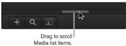
Items added directly to the Media list do not appear in the project until you drag them to the Canvas. For more information, see Add and remove files on page 163.
Media list columns
The Media list contains the following columns:
| Column Description | |
| Preview Displays a thumbnail of the media object. | |
| Name Lists the filename of the source media on disk where the object is linked. If you change the name of corresponding linked objects in the Layers list, this name doesn't change. | |
| Kind Lists the type of file: still image, QuickTime movie, image sequence, or audio file. | |
| In Use Indicates that the media is in use in the project. | |
| Duration Displays the total duration of the object, in frames or timecode, depending on what is displayed in the Timeline. | |
| Frame Size Displays the frame size of the object, in pixels. | |
| Format | For QuickTime movies, displays the codec used. For still images, displays the method of compression that is applied based on the file type. |
Column Description
Depth Specifies the color depth of the image.
Vid Rate Displays the video frame rate of the object, in frames
per second.
Audio Rate For audio files and QuickTime movies, displays the
sample rate of the audio.
Audio Bit Depth For audio files and QuickTime movies, specifies the bit
depth of the audio.
File Size Shows the size of the source media file on disk.
File Created Shows the file creation date of the source media file
on disk.
File Modified Shows the file modification date of the source
media file on disk. This is a useful parameter for file
management.
Customize the Media list
You can choose which Media list columns are displayed or hidden, control the width of the columns, and sort the list based on any one of the columns.
Show or hide a column
■ Control-click a column header, then choose the item to show or hide from the shortcut menu.
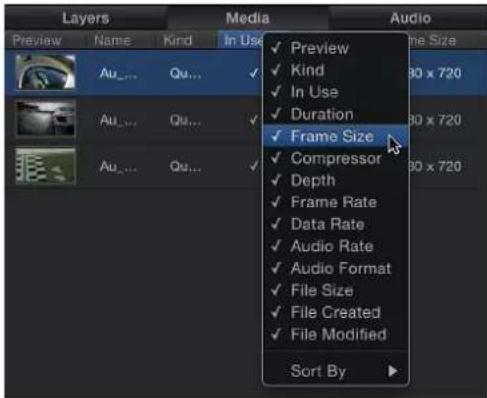
Items in the list with a checkmark are displayed in the Media list. Items with no checkmark are hidden.
Reorder columns
- Drag the column left or right to a new position.
Adjust column width
In the header row, drag a column border to resize the width.
Adjust row height
Do one of the following:
- Position the pointer over a horizontal line and drag up or down to decrease or increase the height of all rows. Icons and thumbnails resize themselves as you make the adjustment.
- Click the Scale button at the bottom of the Media list, then drag the slider. Drag left to decrease the height of the rows and drag right to increase their height.

Increase or decrease the size of each item's thumbnail in the Media list
Do one of the following:
■Use the scale control at the bottom of the Media list.
- Drag the separator between the rows of items.
Sort items in a column by file type
- Click the column header.

Note: Sorting does not work in the Layers list or Timeline layers list.
The layers are sorted in the column and a small arrow appears indicating the direction of the sort.
Reverse the direction of the sort
- Click the header of the column that contains the small arrow.
The arrow points in the opposite direction, and the data is sorted in reverse order.
Filter the Media list
- Click the Search button, then enter the name of the objects to view in the Search field.
When you begin typing in the Search field, the Media list hides objects that do not contain the text you type.
Stop filtering and return to the complete list
- Click the Clear button at the right of the Search field.
The Search field is cleared, and the Media list returns to the unfiltered view.
Additional Media list options
The Media list shortcut menu gives you access to commands to help organize and manipulate layers. Control-click an item in the Media list, then choose a command from the shortcut menu. The command is applied to the item you Control-click.
The menu contains the following commands:
- Open in Viewer: Opens the selected item in the viewer window. This is equivalent to double-clicking a file in the File Browser.
- Open in QuickTime Player: Opens the selected item in the QuickTime Player application.
- Reveal in Finder: Opens a Finder window where the Media file resides on disk.
- Reconnect Media: Opens the Reconnect Media dialog, where you can assign a source file on disk to correspond to the media file in Motion.
- Cut: Removes the file and places it on the Clipboard.
• Copy: Copies the file to the Clipboard. - Paste: Places the contents of the Clipboard in the current location.
- Duplicate: Creates a file identical to the selected file.
- Delete: Removes the selected file.
When no items are selected in the Media list, the shortcut menu provides this set of commands:
- Import Media: Imports media into the Media list but does not place the media in the Canvas or Layers list.
- Reconnect Missing Media: Reconnects offline media. When a source media file is moved from where it was stored on disk, you must reconnect the media to your project. This command displays a dialog that lets you navigate to the new location of the file.
- Remove Unused Media: Removes the source media not used in the project from the Media list.
- Paste: Pastes media files in the Clipboard into the Media list, but does not place the media into the project.
- Project Properties: Opens the Properties Inspector for the project, where you can set basic project information such as project width and height, pixel aspect ratio, background color, and much more. For more information on the Properties Inspector, see Create a blank Motion project on page 149.
Audio list
Audio list overview
The Audio list displays all audio files and files containing audio (such as a multitrack QuickTime movie) in your project. You can modify the levels of individual files (also called tracks) or you can modify the overall audio level of the project. For more information on working with audio in Motion, see Audio overview on page 1010.

Display the Audio list
Do one of the following:
If the Project pane is visible, click Audio at the top of the pane.
- Choose Window > Audio (or press Command-6).
Controls in the Audio list
The Audio list contains the following adjustment controls and information about audio components of the project:
- Activation checkbox: Turns the audio track on or off.
- Name field: Identifies the file by name. To edit the name, double-click the text area of a selected file, enter a name, then press Return.
- Level slider: Controls the level (volume) of the file. Numbers are measured in decibels (dB). Modify the Level parameter by dragging the slider, by dragging in the value slider, or by entering a numerical value in the value slider.
- Audio Output pop-up menu: Specifies audio output channels such as Stereo, Left, Right, Center, and so on. Choose an output channel for the audio track.
- Pan slider: Displays the left-right balance of the sound. Modify the Pan parameter by dragging the dial, by dragging in the value slider, or by entering a numerical value in the field. Negative numbers move panning to the left; positive numbers move panning to the right.
- Mute button: Mutes all sound from a selected file. When the icon is inactive, audio from the file plays back based on the level value.

- Solo button: Mutes all but the selected audio track. You can solo more than one audio track to hear the soloed files rather than the entire mix.
- Link icon: Disconnects an audio track from its video source. You can unlink video and audio to retime them separately or to delete the audio track.
- Lock icon: Locks an audio track to prevent changes. This column can also include a link icon when a file has a corresponding video element.
Master audio track
Each project has a Master audio track. The controls for the Master track are located at the bottom of the Audio list, below the audio tracks. Using the Master track's controls, you can make changes that affect the final mixed output of all audio tracks. For example, you can lower the volume of all tracks simultaneously or pan all tracks to the left or right.
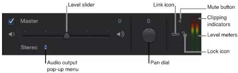
The Master track is turned on by default. When it is deselected, no sound is audible when you play the project, and no audio is included when you export your project. When it is turned on, all audio tracks that are turned on are included in your export.
To the right of the Master track controls are stereo level meters that display the combined level of all audible tracks.
Except for an editable name field and a solo icon, the Master track has the same controls as the individual audio tracks. For more information, see Work with the Master track on page 1020.
Add and remove audio
The Audio list has controls to add files and to remove files from the project.
Add an audio file to the project
- Click the Add button (+) in the lower-left corner of the Project pane; then, in the Import Files dialog, navigate to the file to import, select the file, and click OK.
For more options, see Add an audio file on page 1011.
Remove a file from the Audio list
- Select the file to remove, then choose Edit > Delete (or press Delete).
Additional Audio list options
The Audio list shortcut menu gives you access to commands to help organize and manipulate audio tracks. Control-click a track in the Audio list, then choose a command from the shortcut menu. The command is applied to the track you Control-clicked. The menu contains the following commands:
- Cut: Removes the file and places it in the Clipboard.
• Copy: Copies the file to the Clipboard. - Paste: Places the contents of the Clipboard in the current location.
-
Duplicate: Creates a file identical to the original file.
-
Delete: Removes the selected file.
- Active: Turns the file on and off. This is equivalent to clicking the activation checkbox in the On column.
- Mute: Mutes the track. This is equivalent to clicking the Mute button in the Status column.
- Solo: Solos the track. This is equivalent to clicking the Solo button in the Status column.
- Reveal Source Media: Opens the Media list and highlights the media file associated with the selected track.
When no items are selected in the list, the shortcut menu provides this set of commands:
- Import Audio: Opens the Import Files dialog, which you can use to navigate to the audio file to import.
- Paste: Pastes any audio data in the Clipboard into the Audio list and Media list.
- Project Properties: Opens the Properties Inspector for the project, where you can set project information such as project width and height, bit depth, aspect ratio, background color, render settings, and much more. For more information on the Properties Inspector, see Create a blank Motion project on page 149.
Timing pane
Timing pane overview
The Timing pane, located at the bottom of the Motion workspace, has three components; each controls a different timing aspect of a project:
- Timeline: Provides an overview of objects in the project and how they are laid out over time. For more information, see Timeline overview on page 84.
- Keyframe Editor: Displays the animation curves for animated parameters and effects. For more information, see Keyframe Editor overview on page 90.
- Audio Timeline: Provides an overview of audio components of the project and how they are laid out over time. For more information, see Audio Timeline overview on page 90.
The Timing pane lets you view and modify the time component of a project's contents. Objects, keyframes, and audio tracks are shown in a time graph and can be adjusted to coordinate timing of sequence events such as visual effects and audio-video sync.
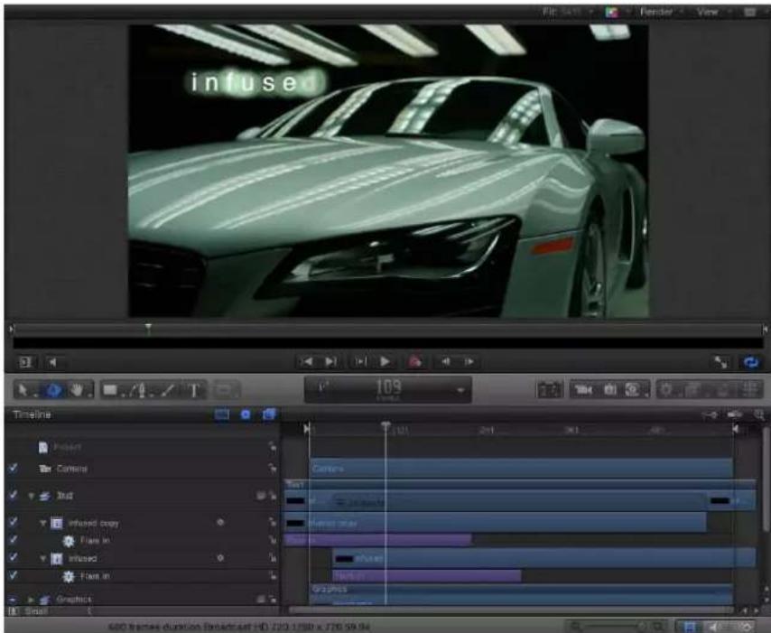
Display the Timing pane
Do one of the following:
■ Choose Window > Show Timing Pane (or press F6).
- Click one (or more) of the Show/Hide Timeline, Show/Hide Audio Timeline, or Show/Hide Keyframe Editor buttons in the lower-right corner of the Motion project window.

- Choose Window > Video Timeline (Command-7), Keyframe Editor (Command-8), or Audio Timeline (Command-9).
Resize the Timing pane
Do one of the following:
■ After the Timing pane appears, drag the toolbar that contains the timing display (above the Timing pane) up to raise the Timing pane or down to lower the pane.
- Drag the boundary (the gray line) between the File Browser, Library, or Inspector and the Timing pane list to the left or right to widen or narrow the pane.
- Deselect the "i" button in the lower-left corner of the Motion Project window to widen the Timing pane.
Zoom the Timing pane
Zoom the Timing pane using the zoom/scroll control
A zoom/scroll control at the bottom of the track area lets you zoom in and out to focus on detail in the Timeline. Below the zoom/scroll control is the zoom slider, which zooms in and out based on the location of the playhead.

Do one of the following:
- Click the handle of the control and drag it away from the center to zoom out and toward the center to zoom in. The Timeline updates as you drag.
- Drag the control left to zoom right or right to zoom left.
Zoom the Timing pane using the zoom slider
- Drag the slider to the left to zoom out and to the right to zoom in.

Zoom the Timing pane using a Multi-Touch device
- Pinch open to zoom in, or pinch closed to zoom out. After you zoom in, use two-finger swipes to scroll left or right.
Zoom the Timing pane to fit the entire project or play range
Do one of the following:
- Click the Zoom Time View button in the upper-right corner of the Timeline.

- Choose View > Zoom Time View > To Project or View > Zoom Time View > To Play Range.
Timing pane ruler
Along the upper edge of the Timing pane is the ruler that provides a gauge for the positions and durations of objects in your project.

The ruler can contain indicators to help mark important frames or sections of the project, such as:
- The playhead, which tracks the frame visible in the Canvas. You can drag the playhead or reposition it using the transport controls described in Canvas buttons and transport controls on page 65. The playhead in the Timing pane and the playhead in the mini-Timeline are linked. Moving one moves the other.
- Play range indicators (also called In and Out points), which limit the area of the project to be played. See Define the play range on page 282.
- Project markers, which can be added to your project to identify an important frame or range of frames. See Markers overview on page 286.
The ruler can be viewed in frames or timecode.
Timeline
Timeline overview
The Timeline displays the visual elements in your project (the layers) and cameras, lights, keyframes, and effects such as masks, behaviors, and filters. The left side contains the Timeline layers list. The right side contains the Timeline track area. For more information on using the Timeline, see Timeline overview on page 251.
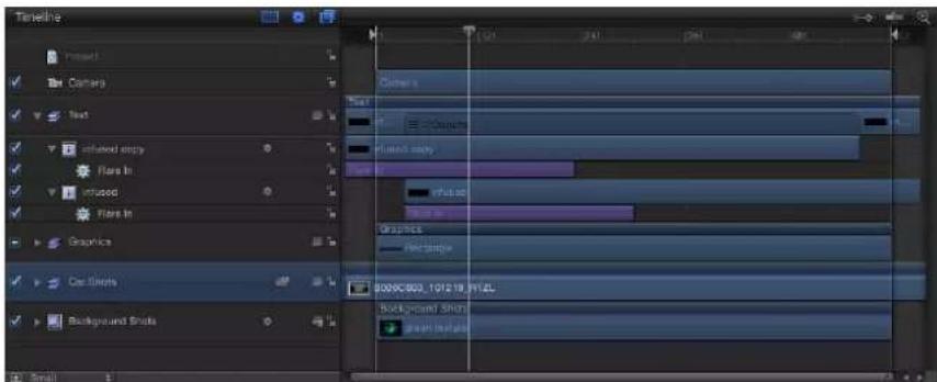
Display the Timeline
Do one of the following:
- Choose Window > Video Timeline (or press Command-7).
■ Select the Show/Hide Timeline button in the lower-right corner of the workspace.
Timeline Layers list
The left side of the Timeline is the Timeline layers list. Like the Layers list in the Project pane, objects appear in the project hierarchy categorized into layers and groups. The Timeline layers list contains many of the same controls as the Layers list in the Project pane:
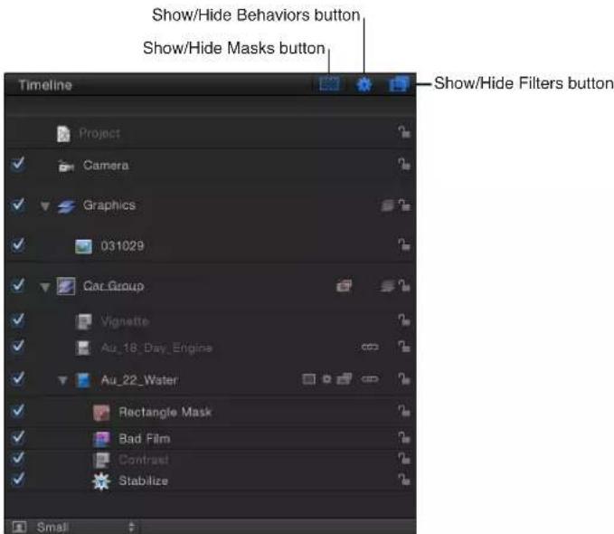
- Activation checkbox: Turns the visibility of an object on and off. When the object visibility is off, you can still modify the object's parameters and manipulate its onscreen controls.
- Name field: Identifies the object by name. (This column is identical to the Name field in the Layers list.) To edit the name, double-click the text area of an object, enter a name, then press Return. In projects that contain a camera, the Isolate button also appears in this column.
- Isolate button: Appears for a layer, group, or camera in a project that contains a camera. The button has an active and inactive state. Clicking the Isolate button for a layer or group sets that object to its original face-forward orientation (so you can apply a mask, for example). Clicking the button again returns to the previous view. Clicking the Isolate button for a camera takes you to that camera's view.
Note: When a group or layer is isolated, the name of the item replaces the current camera listing in the Camera menu (in the upper-left corner of the Canvas).
- Mask icon: Appears when a mask is applied to the layer or group. To turn off the mask, click the icon. A red slash appears through a disabled mask's icon.
- Behavior icon: Appears when a behavior is applied to the layer or group. To turn off the behavior, click the icon. A red slash appears through a disabled behavior's icon.
- Filter icon: Appears when a filter is applied to the layer or group. To turn off the filter, click the icon. A red slash appears through a disabled filter's icon.
- Link icon: Appears when the layer has a corresponding audio element, such as a multichannel QuickTime file. To unlink the video and audio (to edit them separately), click the link icon. When they are unlinked, a red slash appears through the icon.
- 2D/3D icon: Switches a group between 2D or 3D mode. The same icon appears at the left of the group name and indicates the 2D/3D status of the group. Layers cannot be 2D or 3D—they are always 2D elements in a 2D or 3D group.
- Lock icon: Locks an object to prevent changes from affecting that object. Locking a group prevents changes to layers and effects in that group. When the lock is disabled, it appears "open."
• Timeline Row Size pop-up menu (unlabeled): Sets the Timeline tracks and Timeline layers list items display size to Mini, Small, Medium, or Large.
Note: You can also position the pointer over any horizontal row separator and drag up to decrease or down to increase the height of all tracks.
- Show/Hide Masks button: Turns the display of masks on or off in the list and Timeline. Showing or hiding masks in the list does not control whether the mask effects appear in the Canvas. This button is located in the upper-right corner of the Timeline layers list.
• Show/Hide Behaviors button: Turns the display of behaviors on or off in the list and Timeline. Showing or hiding behaviors in the list does not control whether the behavior affects project objects. This button is located in the upper-right corner of the Timeline layers list.
• Show/Hide Filters button: Turns the display of filters on or off in the list and Timeline. Showing or hiding filters in the list does not control whether the filter effects appear in the Canvas. This button is located in the upper-right corner of the Timeline layers list.
For more information, see Manage Timeline layers overview on page 252.
Show or hide mask, filter, or behavior timebars
You can reduce organizational clutter in the Timeline by hiding mask, filter, or behavior timebars.
- Click the Show/Hide Masks, Show/Hide Filters, or Show/Hide Behaviors button at the top of the Timeline layers list.
When set to Hide, the button is dimmed, and the effect timebar disappears from the Timeline layers list and track area. However, the effect remains active in the Canvas.
Disable mask, filter, or behavior effects in the Canvas
- Click a mask icon, filter icon, or behavior icon next to the layer name in the Timeline layers list.

A red slash appears over the icon, and the display of the effect is temporarily turned off.
Timeline track area
The main part of the Timeline, to the right of the Timeline layers list, is called the track area. Each object in a project is represented by a colored bar (known as a timebar). Different colors represent different types of objects. For example, behaviors and filters are purple and masks are gray. For a complete table of colors, see Timeline track display on page 253.

When a group containing more than one object is selected, the group track displays an indicator that identifies how many objects reside in that group. Layers, cameras, and lights are counted in that total. Effects such as masks, behaviors, and filters are not counted.
Add objects to the Timeline
You can add items to your project by dragging them from the Library or File Browser to the Timeline.
Add an item to the Timeline
1 Drag an object from the File Browser or Library to the Timeline track area.
As you drag in the track area, a tooltip appears at the pointer to tell you the frame number.
2 When you reach the frame where you want the layer to start, position the pointer over the layer you want as the background, and hold down the mouse button until the drop menu appears.
3 Choose an option from the drop menu:
- Choose Composite to add the item to the project in the active group.
- Choose Insert to push the existing track forward in time to make room for the new item.
- Choose Overwrite to replace the existing object with the new object.
- Choose Exchange to exchange an object using the original object's duration. This option is only available when you exchange the same type of media (such as a QuickTime movie or image sequence).
For more information on using the drop menu, see Add objects to the Timeline overview on page 260.
For more information about moving, trimming, slipping, or retiming objects, see Edit objects in the Timeline overview on page 267.
Adjust the Timeline
You can adjust the Timeline to customize track height, track area width, timebar display, and other features.
Adjust track height
Do one of the following:
- In the Timeline layers list, position the pointer over a horizontal row separator and drag up to decrease or down to increase the height of all tracks.

- Choose Mini, Small, Medium, or Large from the pop-up menu in the bottom-left corner of the Timeline layers list.

Note: Dragging the row separators up or down sets the pop-up menu to Custom.
Change the width of the Timeline
1 Position the pointer over the rightmost edge of the Timeline layers list.

2 When the pointer changes to the column adjust pointer, drag right to narrow or left to widen the track area.
Collapse or expand a group or layer
You can collapse a group or layer so tracks for objects in the group are temporarily hidden.
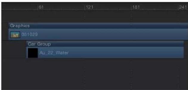
Groups collapsed

Groups expanded
- Click the disclosure triangle to the left of the group or layer name in the Timeline layers list.
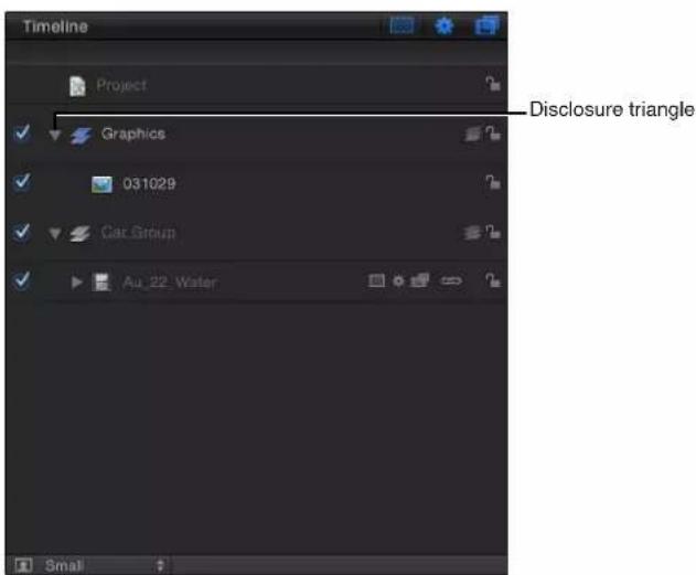
Turn on or off the display of keyframes in the Timeline
Additionally, the Timeline lets you display keyframes. When keyframes are shown, each track becomes a little taller, and the bottom section is used to show keyframes that exist for the layer.
- Click the Show/Hide Keyframes button in the upper-right corner of the Timeline track area.

Audio Timeline
Audio Timeline overview
The Audio Timeline provides a view of audio elements over time. The audio tracks appear as green bars with the audio waveform on top of the bar, and can be edited like other objects in the Timeline.
The Audio Timeline uses the same ruler, buttons, and other controls as the Timeline. For more information on the Timeline interface, see Timeline overview on page 84.

The green bar in the mini-Timeline also shows the duration of the audio file.
Audio behaviors applied to tracks appear as purple bars in the Audio Timeline and mini-Timeline.
Audio level and pan parameters can be animated. When an audio track is selected, its keyframes can be modified in the Keyframe Editor. Keyframes appear as diamonds, and curves appear as solid lines. Areas before the first keyframe and after the last keyframe are represented with dotted lines. For more information, see Animate audio level and pan settings on page 1021.
For complete information on using audio, see Audio overview on page 1010.
Display the Audio Timeline
Do one of the following:
- Choose Window > Audio Timeline (or press Command-9).
- Click the Show/Hide Audio Timeline button in the lower-right corner of the workspace.
Note: If you have a Multi-Touch device, and the Audio Timeline (or Timeline and Audio Timeline) is visible, swipe up or down with three fingers to show or hide the Audio Timeline.
Play audio
- Click the Play button in the transport controls.
Keyframe Editor
Keyframe Editor overview
You animate an object by creating at least two keyframes for a parameter, such as Opacity, at different points in a project. A keyframe is a point that records a change in the value of a parameter. For example, to create an animation in which an object is transparent at frame 1 and becomes opaque at frame 120, you create two keyframes: an Opacity keyframe set to a value of 0% at frame 1 and an Opacity keyframe set to a value of 100% at frame 120. The image fades in from 0% to 100% over the 120 frames. The opacity keyframes are positioned on a line over time; values for the keyframes change the shape of that line and create an animation curve. The smooth, fade-in transition between the adjacent keyframed values is called interpolation.
There are two keyframing methods available to suit your preferred workflow:
- Record Button: After the Record button is turned on, any adjustment to any parameter in the Canvas, Inspector, or HUD adds a keyframe.
- Initial Keyframe: After a keyframe has been added to a parameter, any adjustment to that parameter in the Canvas, Inspector, or HUD adds a keyframe, independent of the state of the Record button.
For more information, see Keyframing methods on page 442.
Use the Keyframe Editor
The Keyframe Editor is where you can view and modify the attributes of filters, behaviors, and other effects over time. Each parameter can be displayed as a curve showing how the parameter's value changes over time. You can manipulate the points in that curve (called keyframes) to create a variety of powerful effects. For more information on using the Keyframe Editor, see Keyframing overview on page 439.

Display the Keyframe Editor
Do one of the following:
- Choose Window > Keyframe Editor (or press Command-8).
- Click the Show/Hide Keyframe Editor button in the lower-right corner of the workspace.
Create keyframes by moving an object across the screen using the Record button
1 Click the Record button under the Canvas (or press A) to turn on keyframe recording.

natural_image
User interface toolbar with playback controls and a blue downward arrow pointing to a play button (no text or symbols)2 Place the playhead at the starting frame, then place the object in a starting position in the Canvas.
3 Move the playhead forward, then drag the object to the ending position you want.
An editable animation path appears in the Canvas and keyframes appear in the Keyframe Editor for the selected object.
4 Click the Record button (or press A) to turn off keyframe recording.
Animate an object across the screen by setting an initial keyframe
1 In the Canvas, position the object to your desired starting location.
2 To create an initial Position keyframe, do one of the following:
- Press Control-K.
Note: Pressing Control-K adds a keyframe to the last-modified parameter of the object.
- In the Properties Inspector, open the Position parameter's Animation menu (the downward arrow on the right), then choose Add Keyframe.
Note: The Animation menu and the Add/Delete keyframe buttons appear when you place the pointer over the end of the parameter row in the Inspector. You can also Control-click a parameter's name to reveal a shortcut menu.
- In the Properties Inspector, click the Position parameter's Add/Delete Keyframe button.
A keyframe is added at the current playhead position, and the parameter appears red in the Inspector.
3 Move the playhead to a new time position.
4 Move the object to a new position in the Canvas.
A keyframe is added at the current playhead position. When you play back the project, the object moves over the interval you set.
Keyframe Editor controls
The left side of the Keyframe Editor contains a list of parameters. You can choose which parameters to display by using the Show Curve Set pop-up menu at the top of the list. This menu has an option for creating custom curve sets so you can focus on specific parameters in the Keyframe Editor. For more information on creating and viewing parameter sets, see Create a custom curve view on page 463.
There are a number of controls above the parameter list, described below.
Show Curve Set pop-up menu
The Show Curve Set menu determines which parameters are displayed in the Keyframe Editor. The pop-up menu items include:
- All: Displays all parameters for the selected object, whether or not the parameters are animated.
- Animated: Displays only animated parameters and curves for the selected object. This includes animation curves created by keyframing as well as behaviors. This is the default setting. With the Keyframe Editor active, you can also press the U key to choose Animated from the Show Curve Set pop-up menu.

Note: When the selected object is not animated, nothing appears in the Keyframe Editor in this state.
- Modified: Displays only curves that are modified for the selected object. This includes modifications that are not animated. For example, if you change the color of a shape (without animating the color change), the parameter appears in the Modified list because the color was changed from the default color. Animated parameters also appear in the list.
- Active: Shows only parameters being modified. When this option is selected, nothing appears in the Keyframe Editor unless you are modifying an object (in the Canvas, Inspector, or HUD). For example, when Active is selected and you move an object around in the Canvas, the X and Y Position parameters and curves are displayed.
- Position: Displays only the Position parameters for the selected object.
-
Rotation: Displays only the Rotation parameters for the selected object.
-
Scale: Displays only the Scale parameters for the selected object.
- Shear: Displays only the Shear parameters for the selected object.
- Anchor Point: Displays only the Anchor Point parameters for the selected object.
- Opacity: Displays only the Opacity parameters for the selected object.
- Retiming: Displays only the Retime Value parameter for the selected object. This parameter appears in the Keyframe Editor only when Time Remap is set to Variable Speed in the Timing controls of the Properties Inspector.
- New Curve Set: Lets you create a custom curve set.
- Manage Curve Sets: Lets you manage (delete, duplicate, and so on) custom curve sets.
Note: For more information on using curve sets, see Create a custom curve view on page 463.
Keyframe editing tools
To the right of the Show Curve Set menu, there are three tools for editing keyframes and curves in the Keyframe Editor. For more information about using these tools, see Add, delete, and modify keyframes on page 465.

- Edit Keyframes tool: Use to select and edit keyframes.
- Sketch Keyframes tool: Use to draw curves with keyframes. A parameter must be active (its checkbox enabled) and selected in the list before you can sketch a curve.
- Transform Keyframes tool: Use to drag a selection box around keyframes and then manipulate the selected keyframes.
Parameter list controls and features
The parameter list contains the following controls and features, from left to right, in rows.
- Activation checkbox: Turns the display of parameters on and off in the keyframe graph. Activating the checkbox next to an object name turns all parameters for that object on or off for display purposes—but the animation of the object is not affected.
- Name: Lists the name of the selected object and its parameters.
- Value: Displays the value for the playhead position for that parameter. You can drag in the value slider to set keyframe values, or double-click in the value slider and enter a new value. For more information, see Add, delete, and modify keyframes on page 465.
- Add/Delete Keyframe button: Lets you add or delete keyframes, regardless of the status of keyframe recording (the Record button). Click the button to add a keyframe. If a keyframe exists for that parameter at the current playhead position, clicking the button deletes the keyframe.
Animation menu options
At the far right of the parameter list, the Animation menu controls animation and keyframing attributes for a given parameter. To open the menu, place the pointer over the column (in the row of the parameter to modify). When the downward arrow appears, click it to open the pop-up menu, which contains the following items:
- Enable/Disable Animation: Enables or disables keyframes for the parameter. This menu item is unavailable until keyframes are applied to the parameter. When the parameter is animated, the menu item is renamed to Disable Animation. Choosing Disable Animation hides the keyframes you have set, restoring the parameter to its default value. However, the keyframes are not discarded. Choosing Enable Animation restores the parameter to its last keyframed state.
- Reset Parameter: Removes keyframes and settings for this parameter. The parameter value is restored to its default value.
- Add Keyframe: Adds a keyframe at the current frame. If the playhead is positioned on a frame where a keyframe has been added, this menu item is unavailable. A keyframe is automatically added to the last modified parameter of the object (regardless of the status of the Record button) at the current playhead position.
- Delete Keyframe: Deletes the current keyframe. The Delete Keyframe command is only available if the playhead is positioned on a frame where a keyframe exists. You can also Control-click a keyframe and choose Delete from the shortcut menu, or select the keyframe and press Delete.
- Previous Keyframe: Moves the playhead to the previous keyframe for this parameter. The Previous Keyframe command is only available if a keyframe exists earlier in the project. You can also press Option-K to advance to the next keyframe.
- Next Keyframe: Moves the playhead to the next keyframe for this parameter. The Next Keyframe command is only available if a keyframe exists later in the project. You can also press Shift-K to advance to the next keyframe.
- Interpolation: Sets the type of curve for the parameter by applying values between keyframes. This is called interpolation. See the table in Set curve interpolation on page 474 for examples of interpolation methods.
- Before First Keyframe: Defines the animation before the first keyframe of a parameter. This is called extrapolation. For examples of extrapolation methods, see Set curve extrapolation on page 478.
- After Last Keyframe: Defines the animation after the last keyframe of a parameter, by applying extrapolation. For examples of extrapolation methods, see Set curve extrapolation on page 478.
- Lock/Unlock Parameter: Locks the parameter to prevent changes. When a parameter is locked, neither keyframes nor curves are adjustable.
- Reduce Keyframes: Applies a thinning algorithm to the selected parameter to reduce the number of keyframes while attempting to maintain a similar curve shape. For more information, see Keyframe thinning on page 484.
- Curve Snapshot: Reverts keyframe changes made in the selected curve to the most recent snapshot. This menu item is available only when the Take/Show Curve Snapshot button is enabled. For more information, see Additional Keyframe Editor controls on page 95 and Curve snapshots on page 472.
Additional Keyframe Editor controls
The upper-right corner of the Keyframe Editor contains six buttons that provide additional control over the Keyframe Editor window.
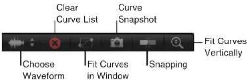
- Choose Background Audio Waveform: Displays a list of available audio tracks in the project. When a track (or the Master track) is chosen, its waveform appears behind the animation curves. Use this view to sync animation with audio.

- Clear Curve List: Empties the parameters list. This control is active for custom curve sets.
- Fit Visible Curves in Window: Scales the graph vertically and horizontally (in time) to show keyframes of active parameters.
- Take/Show Curve Snapshot: Saves a "snapshot" of the current curve state for use as an overlay to compare with subsequent curve modifications. When this setting is enabled, the original curve (as it appeared when you took the snapshot) retains its original color. The modified curve appears white.
- Snapping: Turns on magnetic snapping so keyframes easily line up with other keyframes, markers, grid points, and other items.
- Auto-Scale Vertically to Fit Curves: Turns on a view mode that stretches the graph vertically to show all curves.
The Keyframe Editor uses the same zoom/scroll control as the Timeline. For more information about zooming and scrolling, see Adjust the Timeline on page 88.
Keyframe graph
The keyframe graph, located to the right of the parameter list, displays all curves and keyframes for selected parameters. Parameters are represented by different colors. Keyframes appear as diamonds, and curves appear as solid lines. Areas before the first keyframe and after the last keyframe are represented by dotted lines. Selected parameters and keyframes appear white.

line
| Time | Series 1 | Series 2 | Series 3 | Series 4 | Series 5 | |------|----------|----------|----------|----------|----------| | 1 | 0 | 0 | 0 | 0 | 0 | | 61 | 0 | 0 | 0 | 0 | 0 | | 121 | 0 | 0 | 0 | 0 | 0 | | 181 | 0 | 0 | 0 | 0 | 0 | | 241 | 0 | 0 | 0 | 0 | 0 |You can manipulate keyframes by dragging them in the graph. Moving keyframes left and right changes their position in time, while dragging them up and down changes their values. You can also double-click a keyframe, enter a number into the pop-up value field, and then press Return to change its value.
Control-click a keyframe to access shortcut menu options as well as an Interpolation submenu, which lets you change curve types. For more information on manipulating keyframes and curves in the graph, see Add, delete, and modify keyframes on page 465 and Set curve interpolation on page 474.
A ruler at the top of the keyframe graph provides a visual gauge for positions and durations of keyframes and curves. For more information, see Timing pane ruler on page 83.
View the Canvas or Timing pane on a second display
If you have two displays connected to your computer, you can show the Canvas or Timing pane on the second display.
Note: You can also drag Motion project windows to the second display, allowing you to view more than one project at a time.
Show the Canvas on a second display
- Choose Window > Show Canvas on Second Display.
The Canvas and Project pane (Layers, Media, and Audio lists) appear on the second display. Drag the right edge of the Project pane left or right to resize the Canvas and Project pane.
Show the Canvas in the main window
Do one of the following:
- Choose Window > Show Canvas in the Main Window.
- Choose Window > Revert to Original Layout.
Show the Timing pane on a second display
■Choose Window > Show Timing Pane on Second Display.
The Timing pane (Timeline, Audio Timeline, and Keyframe Editor) appears on the second display. Drag the right edge of the Timeline layers list left or right to resize the Timing pane and layers list.
Note: Click the Show/Hide Timeline button, Show/Hide Audio Timeline button, and Show/Hide Keyframe Editor button in the lower-right corner of the Timing pane to show or hide the Timing pane interface elements.
Show the Timing pane in the main window
Do one of the following:
- Choose Window > Show Timing Pane in the Main Window.
- Choose Window > Revert to Original Layout.
Use full-screen view
You can increase the size of your workspace by switching to full-screen view.
Enter full-screen view
Do one of the following:
- Choose Window > Enter Full Screen (or press Control-Command-F).
- Click the full-screen button in the upper-right corner of the Motion interface.

Exit full-screen view
Do one of the following:
■Press Control-Command-F.
- Move the pointer to the top of the screen, and when the menu bar appears, click the full-screen button.
Motion menus
3
Motion menus overview
The Motion menu bar provides access to many categories of commands in the application.
Some of these commands (such as Open, Save, Cut, Copy, Paste, and so on) are common to most Mac applications. Some commands are common to other Apple applications including Final Cut Pro X, Logic Pro X, and others. Learning such commands (including some of those found in the Share, Mark, and View menus) will enable you to work effectively and quickly across these different applications. The remaining menu items are commands unique to Motion.
Many commands are context-sensitive—they change depending on the current state of the Motion application. For example, a menu item might appear dimmed when a command is not available due to the current state of the application or what is selected.
To learn more about each of these commands, choose a topic in the Help table of contents (the sidebar to the left of this window).
Note: Many commands have shortcut keys that allow you to perform the same action from the keyboard. In this chapter, these shortcuts are listed in parentheses after the command description.
Application menu
The first Motion menu contains general functions to control the application, modify the preferences, and access the Apple website. It also provides access to system-level services.
- About Motion: Opens the About Motion window, which contains version, registration, and trademark information.
- Preferences: Opens Motion Preferences. See Motion Preferences overview on page 114 for a detailed description of the settings in that window.
- Commands: Opens a submenu of the following items for customizing keyboard shortcuts:
- Customize: Opens the Command Editor. For more information, see Use the Command Editor overview on page 1085.
- Import: Opens a dialog used to import a customized key command set.
- Export: Opens a dialog used to export a customized key command set.
- Command Sets: Lets you load a customized key command set.
- Final Cut Pro Set: Sets the active keyboard to match the default key command layout in Final Cut Pro X wherever possible. Select from English, Japanese, French, or German.
- Standard Set: Sets the active keyboard to the default key command layout. Choose English, Japanese, French, or German.
- Provide Motion Feedback: Opens a web page where you can send comments to Apple about Motion.
- Download Additional Content: Downloads additional Motion Library content such as templates, particle emitters, and replicators when your computer is connected to the Internet.
- Services: Provides access to commands that work across different applications. See OS X Help for more information about this submenu.
- Hide Motion: Hides all Motion windows. The application is still running in the background. You can bring it back to the front by clicking the Motion icon in the Dock. (Command-H)
- Hide Others: Hides windows from all applications other than Motion. (Option-Command-H)
- Show All: Shows all windows from all applications currently running.
- Quit Motion: Stops the application from running. You are prompted to save your open document. (Command-Q)
File menu
This menu contains functions and commands that deal with files associated with Motion.
- New: Opens the Project Browser dialog, where you can choose a project type or template to create a document. If a default project is set in the Project pane of Motion Preferences, a new document is created with that setting. (Command-N)
- New From Project Browser: Use this option to create a project from the Project Browser dialog. (Option-Command-N)
- Open: Opens a Finder dialog where you can choose a Motion project to open. (Command-O)
- Open Recent: Opens a submenu that lists the most recently opened files, giving you quick access to the projects you have been working on recently. You can clear the list by choosing Clear Menu from the bottom of the submenu.
- Close: Closes the current project. If the project has not been saved, Motion asks you to save the project before closing the window. (Command-W)
- Save: Stores the current state of the project to disk. If the current project is a Final Cut Title, Final Cut Generator, Final Cut Transition, or Final Cut Effect, the Publish window appears. (Command-S)
- Save As: Saves the current state of the project with a new name. If the current project is a Final Cut Title, Final Cut Generator, Final Cut Transition, or Final Cut Effect, the Publish window appears. (Shift-Command-S)
- Publish Template: Available when the current project is a standard Motion project, this command saves the current project as a Motion template or a Final Cut Generator template (for use in Final Cut Pro X). When saved, Motion templates appear in the Compositions category in the Motion Project Browser; Final Cut Generators appear in the Final Cut Pro Generators category in the Motion Project Browser; and so on. For more information on working with templates, see Final Cut Pro X templates overview on page 385.
- Revert to Saved: Restores the selected project to the last saved state. All of the work done after the last save is lost. Use caution; you cannot undo this operation.
- Restore from Autosave: Displays a dialog where you can choose a project previously saved to the Autosave Vault. For more information on the Autosave Vault, see Cache pane on page 120.
- Import: Opens the Import Files dialog and lets you choose a file from disk to import into your project. (Command-I)
-
Import as Project: Displays the Import File as Project dialog. A new project is created from the chosen file, using the file's dimensions and duration. If multiple items are selected, they are all placed in the same project. Additional options are available if an image sequence is selected. For more information, see Open and close projects on page 189. (Shift-Command-I)
-
Reconnect Media: Reestablishes a link to a file on disk when a layer in your project has been moved or modified.
- Remove Unused Media: Removes a media item from your project when the item is imported into the Media list but not into the project.
- Remove Optical Flow Retiming: Flushes the retiming information file when a media item has been processed for retiming. For more information on optical flow retiming, see Retiming overview on page 246.
- Page Setup: Displays the standard system Page Setup dialog where you can set paper size and orientation for printing. (Shift-Command-P)
- Print: Displays the standard system Print dialog, where you can print the contents of the Canvas. (Command-P)
Edit menu
This menu contains familiar commands such as Undo, Cut, Copy, and Paste and also contains commands to select and delete objects, modify project properties, and control the Motion spelling checker.
- Undo: Restores the project to the state prior to the action previously taken. This command is usually followed by the name of the last command performed (Undo Move or Undo Rotation Change, for example). If the menu item is dimmed, you cannot undo. (Command-Z)
- Redo: Performs the action that was previously undone. This command is usually followed by the name of the last command performed (Redo Move or Redo Rotation Change, for example). It is only active if one or more actions have been undone. (Shift-Command-Z)
- Cut: Removes the selection and stores it on the Clipboard so it can be pasted later. (Command-X)
- Copy: Copies the selection and stores it on the Clipboard so it can be pasted later. (Command-C)
- Paste: Adds the current Clipboard selection to the project based on the current selection. This command is not available if nothing is on the Clipboard or if the contents of the Clipboard cannot be pasted to the current selection—for example, text cannot be pasted onto a keyframe. (Command-V)
- Paste Special: Gives you the choice to paste the contents of the Clipboard into the active Timeline by inserting (pushing existing objects out of the way) or exchanging or overwriting (replacing existing objects with the selected object). Additional options are available. For more information, see Copy and paste objects on page 274. (Option-Command-V)
- Duplicate: Makes a copy of the current selection and immediately adds it to the project. (Command-D)
- Delete: Removes the current selected object, leaving a gap in the Timeline. (Delete)
- Ripple Delete: Removes the selected object and closes the gap in the Timeline. (Shift-Delete)
- Insert Time: Adds blank space into the Timeline. You can use Insert Time only after selecting a time region in the Timeline ruler. For more information on regions, see Work with regions on page 284.
-
Split: Breaks an object into two objects, each on its own Timeline track. The split occurs at the current playhead position. If no object is selected, or the playhead is not positioned over a selected object, this menu item is dimmed.
-
Transform Control Points: When multiple control points of a shape or mask are selected, choosing this command creates a transform box around the points. For more information, see Add and delete control points on page 848. (Shift-Command-T)
- Select All: Selects all objects in the project. (Command-A)
- Deselect All: Releases any objects selected in the project. (Shift-Command-A)
- Project Properties: Selects the Project object in the Layers list and opens the Properties Inspector. Use this pane to change the settings for the project. For details about the Properties Inspector, see Project properties overview on page 191. (Command-J)
-
Spelling and Grammar: Accesses a submenu of spell-checking controls that allow you to search through the selected text for spelling and grammatical errors. For more information on using the spelling checker, see Add text with the Text editor on page 617. Submenu items include the following:
-
Show/Hide Spelling and Grammar: Opens the system Spelling and Grammar dialog. This command is active only when a body of text is selected (in the Layers list, Canvas, or Text editor). For more information, see OS X Help. (Command-Colon)
- Check Document Now: Turns on the spelling checker for the selected text in the Text editor (the text-entry area in the Format pane) in the Text Inspector. Mistyped or misspelled text is underlined in red. This command functions on text in the Text editor, but not in the Canvas. (Command-Semicolon)
- Check Spelling While Typing: Turns automatic spell checking on and off for text selected in the Text editor in the Format pane of the Text Inspector. When active, a checkmark appears next to the menu item. This command functions on text in the Text editor, but not in the Canvas.
- Check Grammar With Spelling: Turns automatic grammar checking on and off for text selected in the Text editor in the Format pane of the Text Inspector. When active, a checkmark appears next to the menu item. Text with potential grammatical errors is underlined in red. This command functions on text in the Text editor, but not in the Canvas.
- Correct Spelling Automatically: Corrects misspelled words that do not begin with a capital letter or that appear on a line of their own for text selected in the Text editor in the Format pane of the Text Inspector. This command functions only on text in the Text editor, not in the Canvas.
- Find and Replace: Opens the Find and Replace dialog, where you can locate and change a word (or any set of characters) that you've used in a Motion project. For more information, see How to find and replace text on page 673.
- Special Characters: Opens the OS X Characters Palette, which provides access to nontypical text characters like bullets, arrows, and currency icons. It can be used when typing in a text object in the Canvas, or when typing in the Text editor in the Text Inspector.
Mark menu
This menu contains commands to set the beginning and end points of your objects, add markers to the Timeline, navigate through your project, and control animation of effects.
- Mark In: Sets the beginning frame of the play range to the current playhead position if no object is selected. If an object is selected, this command trims the In point for that object to the current playhead frame. (I)
-
Mark Out: Sets the ending frame of the play range to the current playhead position if no object is selected. If an object is selected, this command trims the Out point for that object to the current playhead position. (O)
-
Move Selected In Point: Moves the selected object or objects so the In point aligns with the current playhead position. (Shift-Left Bracket)
- Move Selected Out Point: Moves the selected object or objects so the Out point aligns with the current playhead position. (Shift-Right Bracket)
- Markers: Contains submenu commands for creating, modifying, and deleting markers. For more information on using markers, see Markers overview on page 286. The submenu commands include the following:
- Add Marker: Adds a marker at the current playhead frame. If an object is selected, an object marker is added. If no object is selected, a project marker is added. (Press M or the Tilde key to add an object marker; press Shift-M to add a project marker.)
- Edit Marker: Opens the Edit Marker dialog, where you can set a marker's name, type (for project markers), color, duration, and comment. A marker must be selected for this menu item to be active. (Option-Command-M)
- Delete Marker: Removes the selected marker from the project.
- Delete All Markers: Removes all markers from the selected object. If no object is selected, this command deletes all project markers.
- Mark Play Range In: Sets the play range In point to the location of the playhead. (Option-Command-I)
- Mark Play Range Out: Sets the play range Out point to the location of the playhead. (Option-Command-O)
- Reset Play Range: Moves the play range In and Out points to the first and last frame of the project. (Option-X)
- Play: Starts playback of the project. (Space bar)
- Loop Playback: Turns looping on and off. When looping is enabled, playback repeats from the beginning of the play range after the end is reached. (Shift-L)
- Record Animation: Turns keyframe recording on and off. For more information on recording animation, see Canvas buttons and transport controls on page 65.
- Recording Options: Opens the Recording Options dialog, where you can define user preferences for keyframe recording. For more information, see Keyframe thinning on page 484.
- Go to: Contains submenu commands to navigate to a specific frame in a project. These commands move your playhead to a new location:
- Project Start: Moves the playhead to the first frame of the project. (Home)
- Project End: Moves the playhead to the last frame of the project. (End)
- Play Range Start: Moves the playhead to the project In point. (Shift-Home)
- Play Range End: Moves the playhead to the project Out point. (Shift-End)
- Previous Frame: Moves the playhead backward by one frame. (Left Arrow)
- Next Frame: Moves the playhead forward by one frame. (Right Arrow)
- 10 Frames Back: Moves the playhead backward ten frames. (Shift–Left Arrow)
- 10 Frames Forward: Moves the playhead forward ten frames. (Shift–Right Arrow)
- Previous Keyframe: Moves the playhead to the previous keyframe in the project. (Option-K)
- Next Keyframe: Moves the playhead to the next keyframe in the project. (Shift-K)
- Previous Marker: Moves the playhead to the closest marker earlier in time. (Option–Command–Left Arrow)
-
Next Marker: Moves the playhead to the closest marker later in time. (Option–Command–Right Arrow)
-
Selection In Point: Moves the playhead to the first frame of the selected object. (Shift-I)
- Selection Out Point: Moves the playhead to the last frame of the selected object. (Shift-O)
- RAM Preview: Contains submenu commands to play back your project in real time, by temporarily storing the frames in a RAM buffer. For more information on how and when to use the RAM Preview functions, see Control project playback on page 203. Submenu commands include the following:
- Play Range: Renders the area between the project In and Out points and stores the frames in RAM. After the frames are stored, the region plays back at full speed. (Command-R)
- Selection: Renders the range of time occupied by the selected objects and stores the frames in RAM. After the frames are stored, the region plays back at full speed. (Option-Command-R)
- All: Renders the entire project and stores the frames in RAM. After the frames are stored, the region plays back at full speed. (Option-Shift-Command-R)
- Clear RAM Preview: Clears the RAM cache.
Object menu
This menu contains commands for manipulating objects in Motion, including object placement in the layer hierarchy and physical alignment in the Canvas.
- New Group: Adds a new empty group to the project. (Shift-Command-N)
- New Camera: Adds a new camera to the project, and lets you specify whether to use 2D or 3D mode. (Option-Command-C)
- New Light: Adds a new light to the project, and lets you specify whether to use 2D or 3D mode. (Shift-Command-L)
- New Drop Zone: Adds a new drop zone to your project. Drop zones allow you to replace footage in a project by dropping clips onto the Canvas. A drop zone appears as a large arrow placeholder graphic. The drop zone's layer name appears in the center of the drop zone. Any media item dragged and dropped into the region defined by the drop zone object replaces the placeholder graphic. When media is dragged over the drop zone, a highlight appears around the drop zone area. (Shift-Command-D)
- New Rig: Adds a new rig to the project. Rigging lets you create complex animations that are easy to modify. This is done by aggregating many separate parameters into a single control, such as a slider or pop-up menu. For more information, see Rigs and widgets overview on page 370.
- Bring to Front: Moves the selected object to the top of the layers in a group. (Command–Right Brace)
- Send to Back: Moves the selected object to the bottom of the layers in a group. (Command–Left Brace)
- Bring Forward: Moves the selected object upward in the Layers list by one object. (Command–Right Bracket)
- Send Backward: Moves the selected object downward in the Layers list by one object. (Command–Left Bracket)
- Alignment: Contains submenu commands for aligning and distributing multiple objects in the Canvas. For more information on arranging objects in the Canvas, see Use object alignment commands on page 212. Submenu commands include the following:
- Align Left Edges: Moves the selected objects so their left edges line up with the leftmost edge in the selection.
- Align Right Edges: Moves the selected objects so their right edges line up with the rightmost edge in the selection.
- Align Top Edges: Moves the selected objects so their top edges line up with the topmost edge in the selection.
- Align Bottom Edges: Moves the selected objects so their bottom edges line up with the bottommost edge in the selection.
- Align Far Edges: In 3D mode, aligns the farthest edges of each object along the Z (depth) axis.
- Align Near Edges: In 3D mode, aligns the nearest edges of each object along the Z (depth) axis.
- Align Horizontal Centers: Lines up the selected objects on their horizontal center points.
- Align Vertical Centers: Lines up the selected objects on their vertical center points.
- Align Depth Centers: Lines up the selected objects on their Z (depth) center points.
- Distribute Lefts: Spreads the selected objects evenly between the leftmost and rightmost objects based on their left edges.
- Distribute Rights: Spreads the selected objects evenly between the leftmost and rightmost objects based on their right edges.
- Distribute Tops: Spreads the selected objects evenly between the topmost and bottommost objects based on their top edges.
- Distribute Bottoms: Spreads the selected objects evenly between the topmost and bottommost objects based on their bottom edges.
- Distribute Far: Spreads the selected objects evenly between each object's farthest point.
- Distribute Near: Spreads the selected layers evenly between each object's nearest point.
- Distribute Horizontal Centers: Spreads the selected objects evenly between the leftmost and rightmost objects based on their horizontal center points.
- Distribute Vertical Centers: Spreads the selected objects evenly between the topmost and bottommost objects based on their vertical center points.
- Distribute Depth Centers: Spreads the selected objects evenly between the nearest and farthest objects, based on their Z (depth) center points.
- Group: Combines the selected objects into a group. (Shift-Command-G)
- Ungroup: Removes the grouping so you can manipulate the objects individually. (Option-Command-G)
- Active: Sets whether an object is active. When an object is not active, it doesn't appear in the Canvas and doesn't appear in the final output. When the selected item is active, the menu item has a checkmark beside it. (Control-T)
- Solo: Hides all other objects in the project (but not the selected object). When the selected item is soloed, the menu item has a checkmark beside it. (Alternatively, you can Control-click an object in the Layers list and choose Solo from the shortcut menu.) You cannot solo a camera, light, or rig. (Control-S)
- Isolate: Displays the selected object in its original orientation. For example, if you want to apply a mask to or rotoscope a layer that has been transformed in 3D space, you can isolate the layer so it appears in its original orientation (2D, facing the front of the project). Isolating an object does not alter its actual position in the project, but temporarily changes the display so you can see it in the original orientation.
Isolate is available only in projects that contain a camera. When an object can be isolated, a small Isolate button appears to the right of the object's name in the Layers list. Click the button to isolate the object. When you isolate an object, the object name appears in the Camera menu in the Canvas as the name of your current view. Isolating a camera activates that camera's view. You cannot isolate a light or rig. (Control-I)
- Lock: Prevents any changes from affecting the selected object. When the selected object is locked, the menu item has a checkmark beside it. (Control-L)
- Unsolo: Accesses a submenu that lets you turn a soloed object back to its normal state. There are three choices: Video Only (Control-Shift-S), Audio Only, or Video and Audio. This menu item is available only when a soloed object is selected.
- 3D Group: Changes the selected group to a 3D group. Deselecting the menu option changes the group back to a 2D group (Control-D).
- Blend Mode: Accesses a submenu for setting the blend mode of the selected layer. An object must be selected for blend mode options to be available. A layer can only have one blend mode set at a time. The current setting is indicated with a checkmark beside the menu item. For descriptions and examples of the various blend modes, see How blend modes work on page 231.
- Add Image Mask: Adds a mask to the selected layer. (Shift-Command-M)
- Add Keyframe: Adds a keyframe to the selected object, based on the last parameter adjusted. The name change is based on your last action (positioning an object, adjusting the scale handles, and so on). (Control-K)
- Convert to Keyframes: Converts all behaviors to keyframes on the parameters that the behaviors affect. This command is available only when the selected object or objects have behaviors applied. (Command-K)
- Convert to Mask: Converts a selected shape to a mask and applies the mask to the enclosing group. This command is available only when the selected object is a shape in a 2D group or a flattened 3D group. For more information on converting shapes to masks, see Convert between shapes and masks on page 905.
- Make Particles: Uses the selected layer as a cell source for a new particle emitter. (E)
- Replicate: Replicates the selected layer. (L)
- Make Clone Layer: Creates a clone of the selected layer or group. In a motion graphics project, sometimes it is necessary to reuse an object in other parts of the project multiple times. Although you can duplicate or cut and paste any object, if you update the original, none of the changes you make are applied to the copies. Making clone layers instead of duplicates lets you control all copies by modifying the original and also improves project playback and rendering performance.
Each cloned item is copied and named "Clone Layer," "Clone Layer 1," and so on. When you clone a layer, the cloned layer is placed in its original group. When you clone a group, a new group is created that contains the clone. Cloned items are identified in the Layers list with an icon for a cloned layer and an icon for a cloned group. For more information, see Make clone layers on page 226. - Reveal Source Media: Opens the Media list and highlights the item that corresponds with the selected object. The Inspector is also updated to reveal the properties of the source media. (Shift-F)
Favorites menu
The Favorites menu remains empty until you create your own favorite effects. After you have created favorites and stored them in the Favorites Menu folder in the Library, they appear in the Favorites menu, grouped by type. Use this menu to apply saved favorites to your project.
• Show Favorites Menu Items: Opens the Library and displays the Favorites Menu folder.
View menu
The View menu contains commands for controlling the Motion interface. Most of these items affect the Canvas, but some also apply to the Timeline and other panes.
- Zoom In: Zooms into the Canvas. (Command–Equal Sign)
- Zoom Out: Zooms out of the Canvas. (Command-Hyphen)
- Zoom Level: This submenu lets you set a specific zoom level, including a Fit in Window option. (Shift-Z)
- Zoom Time View: Opens a submenu of the following commands for zooming the contents of the Timeline:
• To Project: Zooms your Timeline so the entire duration of the project fills the window.
•To Play Range: Zooms your Timeline so the area between the project In and Out points fills the window.
- Correct for Aspect Ratio: Adjusts the display of the Canvas to simulate the nonsquare pixels that appear on a TV monitor.
- Show Full View Area: Turns on or off the display of layers that extend beyond the edges of the Canvas. Areas that extend beyond the edges of the Canvas appear semitransparent. (Shift-V)
- Use Drop Zones: Turns drop zones on and off.
- Save View Defaults: Saves the current state of all overlay settings (rulers, safe zones, animation paths, 3D overlays, and so on) as the default state for new projects. For more information on overlays, see Canvas view options on page 57.
- 3D View: Opens a submenu of commands for setting the view to a scene camera or default camera in a 3D project. A scene camera is a camera that you add to a project. A default camera is a built-in camera view, such as Perspective, Right, or Top. This menu is used in the same way as the Camera menu in the upper-left corner of the Canvas. For more information on cameras and views, see 3D compositing overview on page 908.
Note: Because project objects are 2D (flat), they are not visible when you use the orthogonal camera views (Front, Back, Left, Right, Top, and Bottom) unless the objects are rotated in 3D space. This is because orthogonal views are at right angles (perpendicular) to the elements. When an object is selected, a thin white line represents the object in the Canvas.
The 3D View submenu contains the following commands:
•Active Camera: Shows the view from the active camera. Cameras added to your project appear in this list as Camera, Camera 1, Camera 2, and so on. (Control-A)
•Perspective: Shows the perspective camera view. The perspective view defaults to a view from the front center. Use the 3D View tools to pan, orbit, or dolly the camera.
- Front: Shows the front camera view. Use the 3D View tools to pan, orbit, or dolly the camera.
- Back: Shows the back camera view (the view from the back of the scene). Use the 3D View tools to pan, orbit, or dolly the camera.
- Left: Shows the left camera view (the view from the left of the scene). Use the 3D View tools to pan, orbit, or dolly the camera.
•Right: Shows the right camera view (the view from the right of the scene). Use the 3D View tools to pan, orbit, or dolly the camera.
- Top: Shows the top camera view (the view from the top of the scene). Use the 3D View tools to pan, orbit, or dolly the camera.
- Bottom: Shows the bottom camera view (the view from the bottom of the scene). Use the 3D View tools to pan, orbit, or dolly the camera.
- Next Camera: When the Canvas is active, this command changes your view to the next scene camera based on camera order in the Layers list. (Control-C)
- Select Active Camera: Selects the "active" camera in the project—the topmost camera in the project that is visible at the current frame (when there are multiple cameras existing at the same frame in time). (Control-Option-C)
- Reset View: Resets the camera view to its default orientation. (Control-R)
- Fit Objects into View: Reframes the current camera to fit the selected objects into the Canvas. (F)
- Frame Object: Frames the selected objects in the active view. If no objects are selected, Frame Object resets the reference camera to view all objects in the scene. For more information on camera views, see 3D View tools on page 920. (Shift-Command-F)
- Focus on Object: Used when a camera has depth of field turned on. Adjusts the camera's Focus Offset to the selected object. For more information, see Depth of field overview on page 933. (Control-F)
- Channels: This submenu sets the Canvas to display individual color or transparency channels. Current settings are indicated with a checkmark beside the item in the menu. This menu is identical to the Channels pop-up menu above the Canvas.
•Color: Shows the image just as it would appear on a video monitor. Visible layers appear in natural color and transparent areas reveal the background color as set in the Project Properties. This is black by default. (Shift-C)
- Transparent: Shows the background area of the Canvas as transparent. A checkerboard pattern appears by default where no images block the background. (Shift-T)
- Alpha Overlay: Displays the image in normal color, but adds a red highlight over transparent areas of the image. (Option-Shift-T)
- RGB Only: Displays the normal mix of red, green, and blue channels but transparent areas (including semitransparent areas) are treated as opaque. (Option-Shift-C)
- Red: Sets the Canvas to display only the red channel as a range of black to white. (Shift-R)
- Green: Sets the Canvas to display only the green channel as a range of black to white. (Shift-G)
- Blue: Sets the Canvas to display only the blue channel as a range of black to white. (Shift-B)
- Alpha: Sets the Canvas to display the alpha (transparency) channel of the layers in the Canvas. (Shift-A)
- Inverted Alpha: Sets the Canvas to display an inverted view of the alpha (transparency) channel. (Option-Shift-A)
- Toggle Current & Alpha: Switches back and forth between viewing the current state and just the alpha channel. (V)
- Resolution: Opens a submenu of commands for setting whether proxy scrubbing is enabled, and also for setting the quality level of the Canvas. Reducing the resolution improves playback performance. The current setting is indicated with a checkmark beside the menu item. The menu items include the following:
- Dynamic: Reduces the quality of the image displayed in the Canvas during playback or scrubbing in the Timeline or mini-Timeline, allowing for faster feedback. Also reduces the quality of an image as it is actively modified in the Canvas. After playback or scrubbing is stopped or the modification is completed in the Canvas, the image quality is restored (based on the Quality and Resolution settings for the project).
•Full (Shift-Q), Half, or Quarter: Sets image quality. Each lower setting further degrades the image.
- Quality: Opens a submenu of the following commands for setting the display mode for objects in the Canvas, such as text and images:
- Draft: Renders objects in the Canvas at a lower quality to allow optimal project interactivity. There is no antialiasing.
- Normal: Renders objects in the Canvas at a medium quality (the default setting). Shapes are antialiased, but 3D intersections are not.
- Best: Renders objects in the Canvas at best quality, which includes higher-quality image resampling, antialiased intersections, and antialiased particle edges. This option slows down project interactivity.
- Custom: Lets you set additional controls to customize render quality. Choosing Custom opens the Advanced Quality Options dialog. For more information, see Advanced Quality settings on page 63.
Tip: When working in your project, work in Draft or Normal for better interactivity. When you are ready to export your project, use Best or Custom.
- Render Options: Opens a submenu containing rendering controls that typically impact playback speed. Turn these items off to improve system performance:
- Lighting: Turns off lighting to improve performance. When lighting is enabled, a checkmark appears beside the menu item. (Option-L)
- Shadows: Turns off rendering of shadows to improve performance. When shadow rendering is enabled, a checkmark appears beside the menu item. (Control-Option-S)
- Reflections: Turns off rendering of reflections to improve performance. When reflection rendering is enabled, a checkmark appears beside the menu item. (Control-Option-R)
- Depth of Field: Turns off depth-of-field rendering to improve performance. When depth-of-field rendering is enabled, a checkmark appears beside the menu item. (Control-Option-D)
- Motion Blur: Turns off motion blur rendering to improve performance. When motion blur rendering is enabled, a checkmark appears beside the menu item. (Option-M)
- Field Rendering: Turns off field rendering to improve performance. When field rendering is enabled, a checkmark appears beside the menu item. (Option-F)
•Frame Blending: Turns off frame blending to improve performance. When frame blending is enabled, a checkmark appears beside the menu item. (Control-Option-B)
- Show Overlays: Turns the display of all overlays on and off in the Canvas. This setting must be on to view any other overlay items (rulers, grids, guides, and so on). When Show Overlays is active, a checkmark appears beside the menu item. (Command-Slash)
- Show Rulers: Turns display of rulers in the Canvas on and off. When rulers are visible, a checkmark appears beside the menu item. (Shift-Command-R)
• Overlays: This submenu turns the various indicators, guides, and grids in the Canvas on and off.
- Grid: Turns the display of a grid on and off. You can customize the grid in the Canvas pane of Motion Preferences. When the grid is displayed, a checkmark appears beside the menu item. (Command-Apostrophe)
•Guides: Turns the display of guides on and off. When guides are visible, a checkmark appears beside the menu item. (Command-Semicolon)
- Dynamic Guides: Turns dynamic guides on and off. Dynamic guides are the lines that appear when you drag one item into alignment with another layer. When dynamic guides are enabled, a checkmark appears beside the menu item. Press N to turn snapping on or off. (Shift-Command-Semicolon)
- Safe Zones: Turns the display of title-safe and action-safe guides on and off. You can customize the safe zones in the Canvas pane (Zones) of Motion Preferences. When safe zones are displayed, a checkmark appears beside the menu item. (Apostrophe)
- Film Zones: Turns the display of film-based aspect ratio guides on and off. You can customize the film zones in the Canvas pane (Zones) of Motion Preferences. When film zones are displayed, a checkmark appears beside the menu item. (Shift-Apostrophe)
- Handles: Turns the display of object handles in the Canvas on and off. The handles are the corner points that let you manipulate an object. When handles are displayed, a checkmark appears beside the menu item.
- Lines: Turns the display of object border lines on and off. When lines are displayed, a checkmark appears beside the menu item.
- Animation Path: Turns the display of keyframe animation paths on and off. Animation paths are the lines that show where an object moves in the Canvas. When animation paths are displayed, a checkmark appears beside the menu item.
- Guides: Opens a submenu of commands that control the guides in the Canvas:
- Lock Guides: Causes all guides to be fixed in their current position. This prevents you from accidentally moving a guide instead of moving an object. (Option-Command-Semicolon)
- Unlock Guides: Releases guides to be manually manipulated.
- Clear Guides: Removes all guides from the Canvas.
- Add Vertical Guide: Adds a moveable, vertical guide to the center of the Canvas.
- Add Horizontal Guide: Adds a moveable, horizontal guide to the center of the Canvas.
- Snap: Turns object snapping on and off in the Canvas and Timeline. Snapping aligns objects as you drag them. When snap is enabled, a checkmark appears beside the menu item. (N)
- Show 3D Overlays: Turns all 3D overlays on and off, including the 3D View tools, 3D Compass, Inset view, 3D grid, and 3D scene icons.
- 3D Overlays: Opens a submenu of the following items that set the display of 3D overlays in the Canvas:
- 3D View Tools: Turns the Camera menu and 3D View tools on and off.
- Compass: Turns the 3D Compass on and off. The compass shows your current orientation in 3D space. The red axis is X (horizontal), the green axis is Y (vertical), and the blue axis is Z (depth). Move the pointer over the compass and choose a new view by clicking a colored view icon, such as Front, Left, Right, Perspective, and so on. The Canvas animates the view change.
- Inset View: Turns on Inset view, a window in the lower-right corner of the Canvas that displays a perspective or active-camera view of your project as you move objects in 3D space, helping you stay oriented. In the 3D pane of Motion Preferences, you can change the size of the Inset view and specify when it appears—during transform changes, during all changes, or when manually invoked.
- 3D Grid: Turns the 3D grid on and off. The 3D grid helps you stay oriented while working in 3D space and can be used to guide the placement of objects in your project. The 3D grid appears only when you are in 3D mode. (Shift-Command-Apostrophe)
- 3D Scene Icons: Turns all 3D scene icons, such as lights and cameras, on and off. The scene icons appear in the Canvas as wireframe icons, and each includes red, green, and blue handles that let you transform and rotate the camera or light.
- Layers Columns: Opens a submenu of the following commands to turn the following controls on or off in the Layers list of the Project pane:
-Preview: Shows a thumbnail of the object. The group thumbnail represents the cumulative result of the composite up to that point in the project.
- Opacity: Displays the current opacity (transparency) of the group or layer. You can adjust the slider to change the item's opacity.
- Blend Mode: Displays the current blend mode of the layer or group. Choose a new blend mode from the pop-up menu. For more information on blend modes, see How blend modes work on page 231.
- Media Columns: Opens a submenu of the following commands to turn on or off the display of technical information in the Media list of the Project pane:
-Preview: Shows a thumbnail of the media file. The thumbnail for an audio file (with no associated image) appears as a speaker icon.
- Kind: Identifies the type of media, including QuickTime movie, still image, QuickTime audio, or PDF. For a list of supported codecs and file types, see File types supported by Motion on page 165.
- In Use: Indicates whether a media item is being used in your project. When this menu item is unchecked, the media item is not used. If "Automatically manage unused media" is selected in the General pane of Motion Preferences, Motion removes unused media from the Media list. Disable this setting if you prefer to manage the contents of the Media list manually.
•Duration: Displays the duration of the media in frames or timecode.
•Frame Size: Displays the native size of the image in pixels. The numbers represent width and height. This column remains blank for audio-only files.
- Format: Displays the format of the clip. This is also sometimes referred to as a codec.
- Depth: Displays the number of colors (bit depth) of the file. Any item listed as Millions of Colors+ indicates that the media contains an alpha channel in addition to the RGB data.
• Video Rate: Displays the frame rate of the media.
•Audio Rate: Displays the sample rate in the audio track, measured in kilohertz (kHz).
•Audio Bit Depth: Displays the bit depth of the audio file.
- File Size: Displays the overall file size of the media on disk.
- File Created: Displays the creation date of the media.
- File Modified: Displays the last date on which the media was modified.
- Show/Hide Fonts: Displays (or hides) the OS X Fonts window for selecting fonts and font attributes. (Command-T)
- Show/Hide Colors: Displays (or hides) the OS X Colors window for selecting colors. (Shift-Command-C)
Share menu
The Share menu contains commands for exporting your project. You can export high-quality movies and image sequences, send projects to the Media Browser for use in other Apple applications, or publish to popular sharing websites such as YouTube and Facebook. You can also create your own custom export settings. See Share Motion projects overview on page 1030.
- Apple Devices: Publishes your project to iTunes, allowing you to watch it on Apple TV, or to download it to iPad, iPhone, or iPod. See Share to Apple devices on page 1030.
- DVD: Lets you burn your project to a DVD or to a disk image. For more information, see Create a DVD, Blu-ray disc, AVCHD disc, or disk image on page 1032.
- Blu-ray: Lets you burn your project to a Blu-ray disc, an AVCHD disc, or a disk image. See Create a DVD, Blu-ray disc, AVCHD disc, or disk image on page 1032.
- Email: Opens your mail application and attaches your project as a rendered movie file. See Share to email on page 1034.
- YouTube: Publishes your project to YouTube. See Publish to video-sharing sites on page 1035.
• Facebook: Publishes your project to Facebook. See Publish to video-sharing sites on page 1035.
• Vimeo: Publishes your project to Vimeo. See Publish to video-sharing sites on page 1035. - CNN iReport: Publishes your project to CNN iReport. See Publish to video-sharing sites on page 1035.
- Export Movie: Exports your project as a QuickTime movie to a Finder folder to use in other projects and applications or to distribute manually. See Export a QuickTime movie on page 1038.
- Export Selection to Movie: Exports the current selection as a QuickTime movie to a Finder folder. For more information, see Export a QuickTime movie on page 1038.
- Export Audio: Exports only the audio portion your project as an audio file to a Finder folder. See Export a QuickTime movie on page 1038.
- Save Current Frame: Saves the frame currently visible in the Canvas as a still image file to a Finder folder. For more information, see Export a still image on page 1040.
- Export Image Sequence: Exports your project as an image sequence to a Finder folder. See Export a QuickTime movie on page 1038.
- Export for HTTP Live Streaming: Exports a QuickTime reference movie for web hosting. See Export for HTTP Live Streaming on page 1041.
- Send to Compressor: Renders your project through Compressor, allowing you to further customize your export settings and output a single movie file to a Finder folder. See Export using Compressor on page 1042.
- Export using Compressor Settings: Renders your project using a predefined export setting (created in Compressor). See Export using Compressor on page 1042.
• Show Share Monitor: Launches Share Monitor. See About Share Monitor on page 1044.
Window menu
This menu contains controls to show and hide the panes in the Motion interface.
- Minimize: Shrinks the active window to the Dock. This is equivalent to clicking the Minimize button at the upper left of the window. (Command-M)
-
Minimize All: Shrinks the Motion project window and the viewer window (if you are using a viewer window to preview an image or clip) to the Dock.
-
Zoom: Resizes the active window to maximize desktop real estate. Switches between full screen and the previously saved non-full screen state.
- Show Inspector: Opens a submenu to provide access to the four panes in the Inspector: Properties (F1), Behaviors (F2), Filters (F3), and Object (F4). The Object pane changes depending on what type of object is selected.
• Show/Hide Project Pane: Turns the display of the Project pane on or off. (F5)
• Show/Hide Timing Pane: Turns the display of the Timing pane on or off. (F6)
• Show/Hide HUD: Turns the display of the HUD on or off. (F7)
• Show/Hide Task List: Displays the Background Task List window, which shows any background processing when Motion performs optical flow retiming. For more information on optical flow, see the Optical Flow pop-menu item in Timing controls in the Properties Inspector on page 246. - Player Mode: Fills your entire monitor with the Canvas, transport controls, and toolbar. In this mode, you can do all normal Canvas operations, including playback. To leave Player mode, choose the menu item again. (F8)
• Show Canvas on Second Display/Show Canvas in the Main Window: Shows the Canvas and Project pane (Layers, Media, and Audio lists) on a second display, if you have two displays connected to your computer. Choose Show Canvas in the Main Window to show the Canvas in the main project window.
• Show Timing Pane on Second Display/Show Timing Pane in the Main Window: Shows the Timing pane (Timeline, Audio Timeline, and Keyframe Editor) on a second display, if you have two displays connected to your computer. Choose Show Timing Pane in the Main Window to show the pane in the main project window. - Revert to Original Layout: Shows the Timing pane or Canvas in the main project window if the Timing pane or Canvas is displayed on a second monitor.
- File Browser: Displays the File Browser. (Command-1)
- Library: Displays the Library. (Command-2)
- Inspector: Displays the Inspector. (Command-3)
- Layers: Displays the Layers list in the Project pane. (Command-4)
• Media: Displays the Media list in the Project pane. (Command-5)
• Audio: Displays the Audio list in the Project pane. (Command-6) - Video Timeline: Turns the display of the Timeline on or off. If the Timing pane is not visible, this command causes it to appear. (Command-7)
- Keyframe Editor: Turns the display of the Keyframe Editor on or off. If the Timing pane is not visible, this command causes it to appear. (Command-8)
- Audio Timeline: Turns the display of the Audio Timeline on or off. If the Timing pane is not visible, this command causes it to appear. (Command-9)
- Bring All to Front: Moves the Motion window to the front if the main Motion window is behind windows of other applications. If any viewer windows are hidden behind windows from other applications, this command moves the viewer windows in front of the other applications.
- Enter Full Screen: Hides the menu bar and the Dock. (Control-Command-F)
- Open Project/Untitled List: Displays a list of open projects and any images that are open in a viewer window. Unsaved projects are listed as "Untitled." Choosing an item from this list brings that item to the front.
Help menu
The Help menu provides access to resources for learning more about Motion.
- Motion 5 Help: Opens the Motion 5 User Manual.
- Service and Support: Opens a webpage that contains up-to-date technical support information about Motion.
Preferences
4
Motion Preferences overview
Motion Preferences let you customize your workspace, tailor the interface for different types of projects, and define the presets for new projects and exported finished movies. The Motion Preferences window contains panes that group global settings according to function: General, Appearance, Project, Time, Cache, Canvas, 3D, Presets, and Gestures.
Open Motion Preferences
- Choose Motion > Preferences (or press Command-Comma).
Reset Motion Preferences
1 Hold down the Option and Command keys while opening Motion.
2 In the dialog that appears, click Delete Preferences.
Motion opens, and preferences are reset to the application defaults.
To learn more about each of the panes in the Motion Preferences window, choose a topic in the Help table of contents (the sidebar to the left of this window).
General pane
The General pane of the Preferences window contains global settings grouped into the following categories: Startup, Interface, File Browser & Library, and Media.

Startup
This section of the General Preferences pane defines what Motion does when first opened.
- At Startup: A pop-up menu that sets one of two default behaviors when Motion is launched:
- Create New Project: Opens a new empty project. If a default preset has not been chosen, the Project Browser appears at startup.
- Open Last Project: Opens the saved project from the previous session.
Interface
This section of the General Preferences pane lets you set general options for the interface.
- Drop Menu Delay: A slider that sets how long you must wait before the drop menu appears when dragging to the Timeline, Layers list, or Canvas. The drop menu provides additional choices for editing and importing objects into the project.
• Show Tooltips: A checkbox that turns tooltips on and off across the application. Tooltips provide explanatory information such as names and basic usage techniques. They appear when you pause the pointer over tools and controls.
These settings in the General Preferences pane affect how the File Browser and Library display their contents.
- Display Folders: A pop-up menu that sets how folders appear in the File Browser and Library. Menu items include the following:
•Alphabetically in List: Lists folders alphabetically.
- Last in List: Groups the folders together at the end of the list after all nonfolder items.
- Show preview icons: A checkbox that turns preview icons on and off in the File Browser and Library. For example, when looking at replicators in the Library with the "Show preview icons" checkbox selected, thumbnails of the replicators are shown.
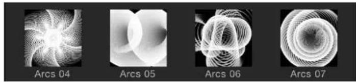
natural_image
Four grayscale 3D spiral patterns labeled Arcs 04 to Arcs 07, showing different geometric surfaces without any text or symbols.When the checkbox is deselected, the generic icon for each item type is displayed.
- Play items automatically on a single click: A checkbox that controls whether the preview area plays the contents of the item selected in the file stack.
Media
This section in the General Preferences pane contains the "Automatically manage unused media" checkbox. When the checkbox is selected, Motion removes unused media from the Media list when you delete that media from the Canvas, Layers list, or Timeline. If you want to retain (in the Media list) a copy of media that is no longer used in your project, deselect this checkbox.
Appearance pane
The Appearance pane of the Preferences window contains settings that control visual elements of the Motion interface, grouped into the following categories: Timeline, Canvas, Thumbnail Preview, and Status Bar.

Timeline
This section of the Appearance pane in Motion Preferences lets you choose how to display the bars that appear in the Timeline to represent your objects.
• Timebar Display: A pop-up menu with three options for Timeline display:
•Name: Displays bars in the Timeline track area by object name.
- Name Plus Thumbnail: Displays bars in the Timeline track area by name and with a thumbnail image representing the first frame of the object. This setting is the default. Only layers (shapes, images, image sequences, text, and so on) display a thumbnail. Objects such as cameras, lights, and behaviors do not display a thumbnail.
- Filmstrip: Displays bars in the Timeline as a continuous strip of frames. The name text does not appear. Only layers (shapes, images, image sequences, text, and so on) display a continuous strip of frames. Objects such as cameras, lights, and behaviors do not display frames.
Canvas
This section of the Appearance pane in Motion Preferences contains a setting that controls the opacity of objects that extend beyond the Canvas edges.
• Full View Opacity: A slider that controls the opacity of the part of a layer that extends beyond the edge of the Canvas into the background. When set to 100%, the layer is transparent. When set to 0%, the layer is fully opaque. This setting takes effect when Show Full View Area is enabled in the View menu.
Thumbnail Preview
The thumbnails that appear in the Layers list can provide helpful information about the items selected in that window. For items that are partially transparent (contain an alpha channel), you can set the background that appears behind the image.
- Background: A pop-up menu with two options for thumbnail backgrounds:
- Checkerboard: Displays a checkerboard pattern where transparent pixels appear.
•Color: Displays a solid color where transparent pixels appear.
- Background color control: When Color is chosen from the Background pop-up menu, this color control lets you select a new background color from the OS X Colors window or the Motion pop-up color palette.
Status Bar
The status bar is the area in the Motion workspace above the Canvas and below the project title bar. Use these settings to customize the information displayed in the status bar.
- Dynamic Tool Info: A checkbox that enables the display of transform information when you actively adjust an object using the onscreen controls. When rotating an object in the Canvas, for example, the original rotation value and the current degree of change are displayed in the status bar.
- Color: A checkbox that enables display of pixel color value when you move the pointer in the Canvas. Colors are displayed in the format chosen in the Display Color As pop-up menu.
- Coordinates: A checkbox that enables display of the X and Y coordinates of the current pointer position.
- Frame rate (only during playback): A checkbox that enables display of playback frame rate. Nothing is displayed unless the project is playing.
- Display Color As: A pop-up menu that sets the style of color data display (when the Color checkbox is selected). Menu items include the following:
- RGB: Displays the red, green, blue, and alpha values of each pixel in ranges of 0–1, although super-white values can exceed the 0–1 value range.
- RGB (Percent): Displays the red, green, blue, and alpha values of each pixel in ranges (percentages) of 1–100.
• HSV: Displays the color as hue, saturation, and value (brightness), where hue is a percentage from 1–360, and saturation and value are ranged from 1–100 degrees. Alpha is also displayed in a range of 1–100 degrees.
Project pane
The Project pane of the Preferences window contains settings for project and layer duration and other project options. There are two categories of controls: Default Project Settings and Still Images & Layers.

Default Project Settings
These controls determine default values for new projects.
Note: These settings only take effect in projects created after the preferences are set and Motion is quit and reopened. To change the settings of an open project, use the Properties Inspector instead (press Command-J, or click the Project object in the Layers list, then click Properties in the Inspector).
- Project Duration: A value field that sets the default duration for new projects. You can enter a number into the value field and choose Frames or Seconds from the pop-up menu.
- Background Color: A color control that sets the color of the background for any new projects created. Does not change the background color of the current project.
Note: To render a new background color into your final output, you must choose Solid from the Background Color pop-up menu in the Properties Inspector (press Command-J).
- For New Documents: These buttons determine what occurs when you create a project.
• Show Project Browser: Sets the Project Browser to appear whenever you create a project.
- Use Project: Sets a specific project to be opened whenever you create a project. When you select Use Project, the Choose button becomes available. Click Choose to specify the project to be opened. (If the project you want does not appear in the browser, click Open Other to locate the project using the Finder.) For more information on bypassing the Project Browser, see Bypass the Project Browser on page 150.
Still Images & Layers
These settings control the default duration, placement, and size of still images and imported layers, as well as layers created in Motion, such as text, shapes, and masks.
- Default Layer Duration: Buttons that set the duration of still images, generators, and other layers that lack an inherent duration. There are two options:
- Use project duration: Sets all layers to have the same duration as the project.
- Use custom duration: Sets a custom layer duration, defined in the adjacent value field.
- Create Layers At: Buttons that set where new layers are placed in the Timeline. There are two options:
- Current frame: Creates layers at the current playhead position.
- Start of project: Creates layers at the first frame of the project.
- Large Stills: A pop-up menu that sets the size of imported files. There are two options:
- Do Nothing: Imports the image at its original size.
- Scale to Canvas Size: Imports and scales the image to fit the project size while maintaining the file's aspect ratio.
Note: For more information on the differences between the Large Stills options, see Import large still images on page 167.
Time pane
The Time pane of the Preferences window contains settings for how time is displayed in the project, as well as for playback and keyframing options. There are three categories of controls: Time Display, Playback Control, and Keyframing.

Time Display
These controls set how the time is counted in the Motion toolbar's timing display.
- Display Time As: A pop-up menu containing the following two items:
- Frames: Shows incrementing frame numbers in the timing display.
•Timecode: Shows eight-digit timecode numbers in the timing display.
• Frame Numbering: A pop-up menu that sets whether frame counts begin at 0 or 1.
Playback Control
These settings control how Motion plays back your project.
- Time View Updating: A pop-up menu that sets how the Timeline updates when you play a project. Menu items include:
- Don't update: Prevents the Timeline from advancing as you play. This setting improves performance.
- Jump by pages: Sets the Timeline track area to jump forward when the playhead reaches the far right side of the Timeline.
- Scroll continuously: Sets the Timeline to scroll behind a static playhead.
- If Audio Sync Is Lost: Buttons that set how Motion attempts to keep audio and video playback in sync if the project is too complex to play both audio and video smoothly. Choose from one of two options:
- Skip video frames: Plays audio continuously but skips video frames to keep up.
- Pause audio playback: Temporarily suspends audio playback when the project cannot play smoothly.
- Limit playback speed to project frame rate: A checkbox that, when selected, prevents the playback rate from exceeding the frame rate of the project. By default, Motion plays back your project as fast as possible based on the complexity of the effects and the processing power of your computer. When this checkbox is deselected, playback rate is limited only by your processor power; consequently, playback rate may exceed project frame rate.
- Loop audio while scrubbing: A checkbox that, when selected, sets the audio for the frames where you drag the playhead to repeat. When this checkbox is deselected, the audio for those frames plays only once.
Keyframing
These controls lock keyframes in time and to enable sub-frame keyframing.
- Lock keyframes in time in Keyframe Editor: A checkbox that, when selected, sets the values of keyframes in the Keyframe Editor, but prevents you from moving the keyframes forward or back in time. This helps prevent changing your animation timing as you adjust parameter values.
- Allow sub-frame keyframing: A checkbox option that ensures smoother animations when recording during playback or when scaling a group of keyframes in the Keyframe Editor using the Transform Keyframes tool.
Cache pane
The Cache pane of the Preferences window contains settings to manage the memory and disk usage for projects. There are three categories of controls: Memory & Cache, Autosave, and Optical Flow Retiming.
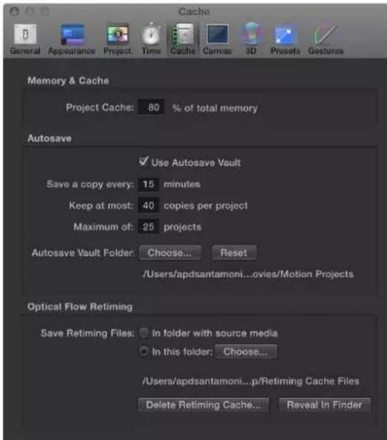
Memory & Cache
This setting in the Cache pane of the Motion Preferences window lets you specify how much memory is allocated to the project cache.
- Project Cache: A value field that specifies the percentage of your total system memory to use for the project cache. Enter a larger number to make more memory available to Motion to cache frames, to ensure consistently smooth playback.
Autosave
These settings control how frequently projects are saved, as well as the location of the saved files. Saved projects are time- and date-stamped. For more information about customizing autosave, see Use autosave on page 189.
- Use Autosave Vault: A checkbox that, when selected, stores autosaved projects to the location specified by the Autosave Vault Folder path. By default, the Autosave Vault folder is located in a folder called Motion Projects in the Movies folder of your home directory.
- Save a copy every: A value field that specifies how often, in minutes, a project is saved.
- Keep at most: A value field that specifies how many versions of the autosaved project to store in the vault.
- Maximum of: A value field that specifies the maximum number of autosaved projects to store in the vault.
- Autosave Vault Folder: A group of controls that let you set where the autosave files are kept. The Reset button sets the autosave location back to its default.
Optical Flow Retiming
When you retime footage, Motion stores the retiming files on your computer. The settings in this section of the Cache pane specify the storage location.
- Save Retiming Files: Two buttons that set the storage location of retimed footage:
• In folder with source media: When enabled, this button tells Motion to save the retiming files in the same location as the source footage.
- In this folder: When enabled, this button sets a custom storage location. Click Choose, then select a new location in the file dialog. By default, the Optical Flow folder is located in the /Users/username/Library/Caches/com.apple.motionapp/Retiming Cache Files/ folder.
- Delete Retiming Cache: A button that deletes any optical flow retiming files and resets any objects with optical flow to frame blending. An alert dialog appears asking if you want to remove all retiming files.
- Reveal in Finder: A button that, when clicked, shows the location of the retimed file folder in the Finder.
Canvas pane
The Canvas pane of the Preferences window contains settings to customize your Canvas view. Changes made in this pane take immediate effect in your current project. There are two categories: Alignment and Zones.

Alignment
These settings control the color and display of the optional grid, rulers, and guides that appear in the Canvas. Grids, guides, and rulers can be turned on and off in the View menu or in the View pop-up menu in the upper-right corner of the Canvas.
- Grid Spacing: A slider that sets the width for the grid in pixels.
- Grid Color: A color control that sets the color of the grid lines.
- Guide Color: A color control that sets the color of guides.
- Dynamic Guide Color: A color control that sets the color for dynamic guides.
- Snap Objects At Their: A pop-up menu that defines how objects are aligned with other objects when moved in the Canvas. There are three options:
•Center: Aligns objects at their centers.
•Edges: Aligns object at their edges.
- Center and Edges: Aligns objects at their centers and edges.
- Ruler Location: A pop-up menu the sets the position of the ruler in the Canvas. There are four options:
•Bottom Left
•Top Left
•Top Right
•Bottom Right
Zones
These settings control safe zone sizes and colors. Safe zones are special guides to help you avoid placing images in areas of the screen that might not appear correctly on consumer television sets. Images that appear outside the action-safe region might be cut off. The area outside the title-safe region might have distortions that make text hard to read.

When producing output to be used for both television and film, it is helpful to see the area of the TV frame that will be cut off when the clip is converted to film. The film zone settings allow you to display a guide that identifies the aspect ratio of the film gauge you are working in.
The safe zone and film zone guides can be turned on and off in the View menu, or in the View pop-up menu in the upper-right corner of the Canvas.
- Action Safe Region: A slider that sets the percentage of the Canvas where the action-safe guides appear. (Default is 90% of Canvas.)
- Title Safe Region: A slider that sets the percentage of the Canvas where the title-safe guides appear. (Default is 80% of Canvas.)
- Safe Zone Color: Controls that set the color of the safe zone guides.
- Film Zone: A pop-up menu that sets the guide size to match a standard aspect ratio. Entering a number into the value field to the right of the pop-up menu sets a custom aspect ratio. There are five menu choices:
• Academy Flat 1.85:1
•Anamorphic Scope 2.35:1
•High Definition 16:9
• Academy Standard 4:3
- Custom
- Film Zone Color: Controls that set the color of the film zone guides.
3D pane
The 3D pane of the Preferences window lets you control various aspects of working in the Motion 3D workspace. There are two categories of controls: General 3D and 3D Grid.

General 3D
These settings let you control the Inset view and choose whether new groups default to 2D or 3D mode.
- Display Inset View: A pop-up menu that sets when the Inset view (a temporary window that displays a camera view) appears in the Canvas. Inset View must be enabled in the View menu or View pop-up menu (in the upper-right corner of the Canvas) for the Inset view to appear. There are three menu items:
- On Transform Change: Sets the Inset view to appear when adjusting an object's transform parameters, such as position, rotation, or scale.
- On All Changes: Sets the Inset view to appear when making adjustments specific to an object, such as adjusting the parameters of a replicator, in the HUD or Inspector.
- Manually: Sets the Inset view to be displayed all the time.
- Inset View Size: A slider that sets the size of the Inset view.
For more about using the Inset view, see Inset view on page 922.
- Default New Group Type: A pop-up menu that specifies whether new groups are created in 2D or 3D mode. When set to Automatic, Motion determines the type of group that is created based on the project. For example, when Automatic is selected and you are working in a 3D project, new groups are 3D. If you are working in a 2D project (no camera), new groups are 2D.
3D Grid
These controls let you modify settings for the grid that appears in the Motion 3D workspace.
- 3D Grid Spacing: A slider that specifies the spacing between grid lines, in pixels.
- Primary Grid Color: Controls that set the color of the main grid lines. The main grid lines appear slightly heavier than the secondary grid lines.
- Secondary Grid Color: Controls that set the color of the secondary grid lines (the lines that appear within the main grid lines).
Presets pane
Presets pane overview
The Presets pane of Motion Preferences contains presets for project settings. In this pane, you can choose defaults, as well as create, modify, and delete settings. The default project preset determines the settings assigned when you create a project. You can change any of these settings while you are working by selecting the Project object in the Layers list, then clicking Properties in the Inspector.
After a default project is set in this pane, all new projects opened from the Project Browser are created with this setting (unless you choose another option from the Preset pop-up menu in the Project Browser).
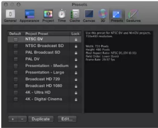
- Project Preset list: Displays the current list of presets. The checkbox to the left of each name identifies the default preset. The column on the right shows which presets are locked. Locked presets cannot be modified. You can duplicate a locked preset and edit the copy.
- Default: A checkbox that designates the default project setting used for new projects. Check a different box to select a new preset.
- Summary box (not labeled): To the right of the Project Preset list, the Summary box displays details of the selected preset.
- Add Preset (+): A button that displays the Project Preset Editor dialog used to create a preset.
-
Delete Preset button (–): A button that removes a preset selected in the Project Preset list above.
-
Duplicate: A button that creates a duplicate of the a preset selected in the Project Preset list above.
- Edit: A button that displays the Project Preset Editor, where you can modify preset settings. See Project Preset Editor on page 125.
Project Preset Editor
The Project Preset Editor is where you make changes to a project preset. This window opens when you click the Add Preset button (+) or attempt to edit any of the existing presets in the Presets pane of the Motion Preferences window. For more information on how to create, edit, or delete project presets, see Create, edit, and delete presets on page 151.
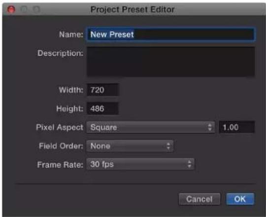
Note: Locked presets cannot be edited. If you attempt to edit a locked preset, an alert dialog appears, a duplicate copy of the preset is made, and your edits are applied to the duplicate.
The Project Preset editor contains the following settings:
- Name: An editable field containing the name for the preset.
- Description: A field containing descriptive text to identify the preset. You can enter your own descriptive text in this field. The new text will appear in the summary box in the Preset pane of Motion Preferences.
Note: In the lower-right corner of the Project Browser, only the resolution, field order, and aspect ratio appear—the descriptive text (or preset name) does not appear.
- Width and Height: These fields set the frame size for the preset.
- Pixel Aspect Ratio: A pop-up menu that sets the pixel aspect ratio for the preset. This setting should match the type of media in your project.
- Field Order: A pop-up menu that sets the field order for your project. DV projects typically use the Lower First setting.
• Frame Rate: A pop-up menu that sets the frame rate for your preset.
Gestures pane
The Gestures pane of the Preferences window contains settings pertaining to using a Wacom Intuos graphics tablet to control Motion.
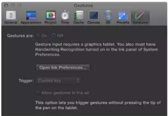
You cannot turn on gestures in Motion unless you have a tablet attached to your computer and Handwriting Recognition turned on in the Ink preferences in OS X System Preferences. For convenience, you can open Ink Preferences from the Gestures Preferences pane by clicking the Open Ink Preferences button.
For more information, see Gestures overview on page 1060.
Note: Swipes, pinches and other multi-touch gestures performed on a Multi-Touch device are unaffected by any settings in the Gestures pane of Motion Preferences.
- Gestures are: Buttons that turn gestures on or off.
- Open Ink Preferences: A button that opens the Ink pane of OS X System Preferences.
- Trigger: A pop-up menu that sets which trigger method is used: Pen Button 1, Pen Button 2, or the Control key on your keyboard.
- Allow gestures in the air: A checkbox that, when selected, lets you trigger gestures without pressing the tip of the pen on the tablet. This option is available only when a pen button is set as the trigger to activate gestures.
User interface controls
5
User interface controls overview
In Motion, you build and modify your compositions by adjusting parameters—numeric attributes that define each characteristic of the objects, clips, and effects comprising a project. Although there are thousands of parameters in Motion, you can easily adjust all of them by mastering a small set of intuitive user interface controls.
To learn more about each of these controls, choose a topic in the Help table of contents (the sidebar to the left of this window).
Toolbar controls
The Motion toolbar is located in the middle of the main window, underneath the Project pane and Canvas.
The left side of the toolbar contains controls to create and edit elements such as text, shapes, and masks. The center of the toolbar contains the timing display. The right side of the toolbar includes buttons that do the following:
• Show or hide the heads-up display (HUD)
- Add cameras, lights, or generators
- Apply filters and behaviors
- Create particle systems and replicators

Toolbar controls with multiple modes or options are available as pop-up menus, identifiable by a small downward arrow in the lower-right corner. For example, the default Rectangle Mask tool can be set to Rectangle, Circle, Freehand, Bezier, or B-Spline mode.
Access a toolbar control's additional modes or options
- Click any tool with a small downward arrow in the lower-right corner, and hold down the mouse button as you choose a mode or option from the pop-up menu.
For a description and use of each tool, see Toolbar overview on page 46.
Slider controls
Basic slider
Sliders adjust parameters that span a fixed range of numeric values. For example, opacity must fall between 0% and 100%. Drag the slider to set a value anywhere within that range.

Although sliders are fixed-range controls, some parameters can be set to values outside of that limited range. For those parameters, a second type of slider control is available—a value slider, which is described in the next section.

Change the value of a basic slider
Do one of the following:
- Drag the slider to the left to decrease values or to the right to increase values.
- Option-click to the left or right of the slider to decrease or increase by a value of 1.
Value slider
Although basic sliders are fixed-range controls, some parameters can be set to values outside of a limited range. For those parameters, a second type of slider control is often available, known as a value slider. A value slider appears as a light gray number, often to the right of a basic slider. For example, the Amount parameter in the Gaussian Blur filter has a basic slider with a default range of 0 to 64; however, you can adjust this parameter up to 600 using the adjacent value slider.
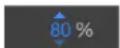
Parameters with effectively infinite ranges, such as Scale, can be set to any positive or negative value. The value slider can display up to 18 digits to accommodate large values.
Modify the value of a parameter using a value slider
Do one of the following:
- Drag right or left over the numbers to increase or decrease the value.
To change the value in larger increments, press Shift while dragging. To change the values in smaller increments, press Option while dragging.
- Click or double-click the number, then enter a value in the field.
Coordinate controls
Parameters that define a specific location in the Canvas are controlled using three value sliders to set the X, Y, and Z coordinates. Parameters that define a specific location in a two-dimensional object have two value sliders, for X and Y coordinates.

Note: In most cases, only the X and Y axis value sliders are visible; clicking the adjacent disclosure triangle displays both value sliders in a vertical stack. However, for 3D groups operating with three dimensions, clicking the adjacent disclosure triangle reveals the additional Z axis value slider.

The most common coordinate control is the Position parameter, which places the center point for an object at a given position in the Canvas. But coordinate controls are used for any parameter that defines a position in the Canvas—the center of a lens flare or the origin of a particle system, for example.
Additionally, most coordinate parameters can be set by moving an object or onscreen control in the Canvas. For example, the Center parameter of the Radial Blur filter exposes a coordinate control in the Canvas that you can drag to adjust the epicenter of this effect visually.
Modify a coordinate value in the inspector
■ Use the value sliders for the X, Y, and (when applicable) Z axes.
If a coordinate onscreen control is visible in the Canvas, drag it to another location.
For more information on using value sliders, see Value slider on page 128.
Dial
Parameters measured in degrees (such as Rotation or Hue) employ the dial control.

Some parameters are limited to a value between 0 and 360 degrees. If you rotate such a dial more than one revolution, the numbers repeat. Other parameters can be set to negative values or multiple rotations.
Dials have a value slider beside them to indicate the value set by the dial. Dial value sliders can be manipulated directly as well.
Adjust a parameter using a dial
Do one of the following:
- Drag the dial in a clockwise or counterclockwise direction to increase or decrease the value.
■Adjust the value slider to the right of the dial.
For more information on working with value sliders, see Value slider on page 128.
Value field
This control allows direct entry of text to set the value of the parameter.

An example of a parameter that uses a value field is the text-entry field. Motion also uses numeric value fields.
Activation checkbox
A parameter that must be on or off uses a checkbox control. For example, the All Caps and Align to Path settings for text objects are controlled with checkboxes.
Preserve Opacity: √
Unlike parameters with sliders and dials, parameters controlled by a checkbox cannot be keyframed.
Note: Filters and Behaviors in the Inspector have special checkboxes that turn an effect on and off. These checkboxes are blue when the effect is turned on, and gray when the effect is turned off.
Activate or deactivate a parameter controlled by a checkbox
- Click the checkbox.
Menus
Pop-up menu
Motion uses a variety of menus and menu-like controls. These include pop-up menus, value lists, parameter selection menus, and tracking selection menus.
Menus cannot be keyframed.
Parameters that have a predefined set of options are controlled with pop-up menus. In some cases the choices available in the pop-up menu change depending on the settings of other related parameters. Several varieties of pop-up menus appear throughout the Motion interface, but they function identically.
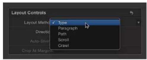


Change the value of a pop-up menu
- Click the menu and choose an item from the list.
Parameter selection menu
The parameter selection menu is a special type of pop-up menu, specifically for Parameter behaviors. Usually labeled "Apply To," the parameter selection menu appears in the Behaviors Inspector after you apply a Parameter behavior. The menu consists of a display field listing the parameter that the behavior is modifying and a To pop-up menu from which you can choose a different target parameter.

Source well
Many effects in Motion apply specific parameters from one object to another. For example, the Bump Map filter applies texture from object A to object B. The Orbit Around behavior causes object C to circle around object D. You set these object relationships using a control known as a source well (sometimes called an Image well or Object well). A source well is an empty box into which you drag a source object to influence a target object.

Use a source well
- Drag an object from the File Browser, Library, Layers list, or Media list into the empty box.
A thumbnail of the object appears in the well, indicating that the object is used as a source for the effect.
Replace the contents of a source well
■Drag an object onto the well.
The old source is replaced with the new one.
Clear a source well
■Drag the icon out of the well.
The well is emptied.
Color controls
Basic color controls
There are several basic color controls in Motion:

• Color well: A small color swatch that, when clicked, opens the OS X Colors window
- Downward arrow: A button beside the color well that opens the Motion pop-up color palette, an alternative to the OS X Colors window
- Eyedropper: A control used to pick a color in use in the Motion Canvas
- Disclosure triangle: A control that, when clicked, reveals advanced color controls
Change the color of an object using the basic Motion color controls
Do one of the following:
- Click the color well swatch, then pick a color from the OS X Colors window. For more information, see Colors window on page 133.
- Click the downward arrow or Control-click the color well, then pick a color from the Motion pop-up color palette. For more information, see Pop-up color palette on page 133.
- Click the eyedropper, then click an object of the desired color in the Canvas. For more information, see Eyedropper on page 134.
- Click the disclosure triangle on the left side of the color controls to expose individual Red, Green, Blue, and, when applicable, Opacity sliders. For more information, see Expanded color controls on page 134.
Pop-up color palette
When you Control-click a color well or click the adjacent downward arrow, the Motion pop-up color palette appears. Click in the top area to select a color from the spectrum of hues, saturation, and lightness. Click in the bottom gradient to select a grayscale value.

As you drag in either area, the pointer becomes an eyedropper, the column on the right displays the RGB and HLS values for the sampled colors, and two swatches above the RGB information display the current and sampled colors. As you sample in the spectrum, the selected object in the Canvas updates dynamically.
Colors window
You can also use the OS X Colors window in Motion, giving you access to the familiar color pickers such as the Web Safe Colors palette or the Crayons palette.
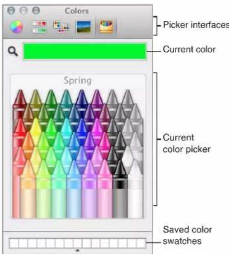
The Colors window has four sections: the icons at the top select picker interfaces; the large color swatch shows the current color; the middle section shows the active picker; and the row of boxes can be used to save swatches.
Show the Colors window
Do one of the following:
- Click a color well.
- Choose View > Show Colors.
■Press Shift-Command-C.
Pick a color in the Colors window
Do one of the following:
- Click a color in the color picker area.
- Click the magnifying glass, then click anywhere on the computer screen to choose a color.
Note: When you open the Colors window by clicking a Motion color well, the color you click in the Colors window loads into the well, and the selected object in the Canvas changes color. However, when you open the Colors window from the View menu (or by pressing Shift-Command-C), clicking a color in the Colors window does not load the color into the well or change the selected object. In this case, drag a color swatch from the Colors window to the color well. Similarly, if you leave the Colors window open and select another object in the Canvas, clicking in the Colors window does not change the newly selected object.
Save a color to the saved swatch area in the Colors window
1 Select a color in the picker or by using the magnifying glass.
2 Drag the color from the large swatch to a white square at the bottom of the Colors window.
Colors saved in this area remain accessible across applications and restarts.
Eyedropper
An eyedropper control beside the color well lets you pick a color in use in the Motion Canvas. By choosing from colors in your scene you ensure that elements remain in the same palette, creating a more cohesive and integrated design.
Pick a color using the eyedropper
1 In the Inspector, click the eyedropper for the color parameter you want to set.
The pointer turns into an eyedropper.
2 Click a color in the Canvas.
That color is assigned to the color well.
Expanded color controls
Sometimes you need precise numerical control over colors. You might also need to match two colors exactly or adjust a color channel independently.
Every set of color controls has a disclosure triangle, which, when clicked, reveals sliders for the Red, Green, and Blue color channels. You can choose or fine-tune a color by adjusting these sliders. Among other uses, these controls are handy when you need to keyframe each color channel differently. For more information on using sliders, see Basic slider on page 127.

Gradient controls
Basic gradient controls
Most attributes that can be filled with a color can also be filled with a gradient. Like color controls, gradient controls are a group of compound settings that can be expanded for more precise control.

- Gradient preview bar: A horizontal bar that displays the currently selected gradient
- Gradient preset pop-up menu: A menu containing a list of gradient presets
• Disclosure triangle: A control that, when clicked, expands to show the gradient editor
Gradient preset pop-up menu
When the gradient editor is collapsed, you can select a preset gradient from the Gradient preset pop-up menu, located to the right of the gradient preview bar.

Change the current gradient to a saved preset
- Click the Gradient preset pop-up menu and choose a gradient preset from the list.
The new gradient is shown in the gradient bar and applied to the selected object in the Canvas.
Gradient editor
To customize or modify a gradient, click the disclosure triangle in the Gradient row to expand the controls and reveal the gradient editor. Use the gradient editor to change the color, color position, number of colors, opacity, direction, and interpolation of a gradient. The color and opacity of a gradient can be animated.
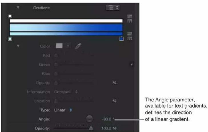
Controls in the gradient editor
- Graphical controls: Three horizontal bars that let you set and preview the opacity, color, and spread of a gradient.
The narrow, white top bar (the opacity bar) controls opacity and transparency in the gradient. Adjust the spread of opacity across the gradient by dragging one of the small box-shaped opacity tags horizontally along the bar. Click in the opacity bar to add opacity tags, creating a gradient with varying levels of transparency. Delete an opacity tag by dragging it away from the color bar. Change the value of an opacity tag by selecting it and dragging the Opacity slider (described below).
Opacity tags have a value range of 0% (completely transparent) to 100% (completely opaque). Adjust the transition between two opacity tags by dragging the middle control—a small triangle between adjacent tags, available when Interpolation is set to Continuous (described below). By default, the opacity of a gradient applied to text is 100%.
The wide middle bar shows a preview of the current gradient.
The narrow bottom bar (the gradient bar) controls color in the gradient. Adjust the spread of color across the gradient by dragging one of the small box-shaped color tags horizontally along the bar. Click in the gradient bar to add more color tags. Delete a color tag by dragging it away from the gradient bar. Change the value of a color tag by selecting it and choosing a color from the color well below, or by double-clicking the tag and choosing a color from the Colors window. Adjust the transition between color tags by dragging the middle control—a small triangle between adjacent tags, available when Interpolation is set to Continuous (described below).
Selecting a color tag activates the Color and Location controls (described below). Selecting an opacity tag activates the Opacity slider (described below). Selecting a middle control activates the Middle slider (described below).
- Color: A color well and eyedropper that sets the hue of a selected color tag in the gradient bar. For more information about color wells, see Basic color controls on page 132.
- Opacity: A slider that sets the transparency of a selected opacity tag in the opacity bar. Values range from 0% (completely transparent) to 100% (completely opaque).
-
Interpolation: A pop-up menu that sets the interpolation of a selected color tag or opacity tag. There are three options:
-
Linear: Creates a uniform distribution of opacity or color between the tags.
- Continuous: Sets an adjustable rate of change between adjacent opacity or color tags. Adjust the rate of change by dragging a middle control in the opacity bar or gradient bar, or by dragging the Middle slider (described below).
- Constant: Creates a constant color distribution from the color or opacity tag, moving from left to right in the gradient. For example, if the left color tag is set to Constant, the area of the gradient between that tag and the next one to the right is a single, solid color.
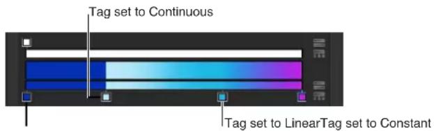
- Middle: A slider that duplicates the function of the middle controls in the opacity bar and gradient bar, adjusting the transition point between opacity tags or color tags. When you select a middle control, the Middle slider becomes available.
- Location: A slider that adjusts the location of a selected opacity tag or color tag.
- Type: A pop-up menu that lets you choose a linear or radial gradient.
- Start: Value sliders that set the start position of the gradient in the selected object. This parameter affects the gradient as a whole—colors and opacity. Clicking the disclosure triangle stacks the X and Y value sliders vertically instead of horizontally.
•X: Controls the X start position of the gradient.
• Y: Controls the Y start position of the gradient.
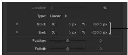
- The Start and End parameters, available for nontext gradients, define the start and end positions of the gradient.
- End: Value sliders that set the end position of the gradient in the selected object. This parameter affects the gradient as a whole—colors and opacity. Clicking the disclosure triangle stacks the X and Y value sliders vertically instead of horizontally.
• X: Controls the X end position of the gradient.
• Y: Controls the Y end position of the gradient.
Note: The Start and End parameters do not appear in text gradients.
- Angle: When the Type pop-up menu is set to Linear, this dial specifies the direction of a linear gradient. This parameter only appears for text gradients.
Gradient editor tasks
The gradient editor is a flexible and powerful tool, allowing you to create custom styles.
Change the colors in a gradient
1 Click the Gradient disclosure triangle to show the gradient editor.
2 To change the color of a color tag in the gradient editor, do one of the following:
- Double-click a color tag.

The Colors window appears. Use the Colors window to set a color for the tag.
- Click a color tag, click the disclosure triangle to the left of Color parameter name, then adjust the Red, Green, and Blue color channel sliders.

- Control-click a color tag to display the pop-up color palette. Drag the eyedropper in the palette to select a color. Drag in the lower palette to set the tag to a grayscale color.
- Click a color tag, then Control-click the color well to display the pop-up color palette.
- Click a color tag, click the eyedropper tool, then click a color in the Canvas.
Change the opacity in a gradient
1 Click an opacity tag.
The Opacity slider is enabled.

2 Use the Opacity slider or adjacent value slider to change the level of transparency.
The gradient transparency reflects the new opacity values.
Tip: The lower the percentage of the opacity, the greater the transparency.
Add a color tag to a gradient
- Position the pointer in the lower gradient bar where you want to add the new color, then click. A new color tag is added to the gradient.

Note: Although the color, opacity, and position of the tags of a gradient can be animated, the number of color tags and opacity tags cannot.
Add an opacity tag to a gradient
- Position the pointer in the opacity bar where you want to add the tag, then click.
A new opacity tag is added to the gradient.
Until the value is adjusted, the gradient opacity is 100%.
Remove a color or gradient tag from the gradient
■Drag the tag away from the gradient bar.
The tag is removed.
Modify gradient editor tags
There are many ways to manipulate tags in the gradient editor to create a custom gradient.
Move the position of a color tag or opacity tag
1 Click the color tag or opacity tag to move.
2 Do one of the following:
- Drag the color tag left or right.
- Use the Location slider (or adjacent value slider) to modify the position of the selected tag. A value of 100% is the rightmost position of the gradient, and a value of 0% is the leftmost position of the gradient.
Duplicate a color or opacity tag
■Option-drag the tag to a position.
Change the transition midpoint between adjacent color or opacity tags
- Drag the small triangle between adjacent color tags or opacity tags to change the point where one tag's effect ends and the next tag's effect begins. The closer the middle control is to a tag, the sharper the color or opacity transition.

Note: The middle control does not appear for color or opacity tags set to Linear or Constant.
Change the color or opacity tag interpolation
- Click a tag, then choose Constant, Linear, or Continuous from the Interpolation pop-up menu.
Edit color and opacity direction and distribution
You can reverse the direction or evenly distribute the gradient color and opacity tags.
Reverse the gradient color or opacity direction
- Click the reverse tags icon next to the opacity or color bar.

The tags are reversed.
Evenly distribute the gradient color or opacity tags
- Click the distribute tags icon next to the opacity or color bar.

Change the direction of a shape's gradient
1 With the shape selected and the Inspector open, click the Gradient disclosure triangle to show the gradient editor.
2 Use the Start and End value sliders to change the direction of the gradient.
Save gradient presets
As with shape styles, after you create a gradient, you can save it in the Library.
Save a gradient in the Library
1 Select the object with the gradient to save.
2 From the Gradient preset pop-up menu, choose Save Gradient.

3 In the Save Preset To Library dialog, enter the name of the gradient.
4 Click Save.
The custom gradient appears in the Gradients category in the Library. Custom presets can be identified in the Library by the small user badge that appears in the lower-right corner of the larger gradient icon. The gradient also appears in the Gradient preset pop-up menu.
Onscreen gradient controls
Onscreen controls provide a more interactive way to edit a gradient's color, location and value of color tags and opacity tags, and start and end points. You can also use onscreen controls to add color tags and opacity tags, as well as change their interpolation.

Display the onscreen gradient controls
Do one of the following:
In the Canvas, Control-click the object with the applied gradient, then choose Edit Gradient from the shortcut menu.
- Choose the Adjust Item tool from the 2D transform tools pop-up menu.
The onscreen controls appear.
Adjust the start and end gradient positions
Do one of the following:
- To adjust the Start X and Y position of the gradient, drag the top triangle (at the end of the gradient line).
- To adjust the End X and Y position of the gradient, drag the bottom triangle (at the end of the gradient line).
Change the location of gradient tags
Do one of the following:
■ To change the location of gradient colors, drag the color tags along the gradient line.
- To change the location of the gradient opacity, drag the opacity tags along the gradient line.
Remove a color or opacity tag
- Drag the color tag or opacity tag away from the gradient line and release the mouse button.
Add a color or opacity tag
Do one of the following:
■To add a color tag, double-click the gradient control line.
- Control-click the gradient control line where you want the tag, then choose Add Color Tag or Add Opacity Tag from the shortcut menu.
- Option-click the gradient control line where you want a color tag.
- Option-Shift-click the gradient control line at the location where you want the tag.
Change the color or opacity of a gradient tag
- Control-click the tag, then drag the eyedropper in the pop-up color palette to select a color or opacity value. For Opacity, white represents more opaque values and black represents complete transparency. As you drag, the gradient is actively updated.
Change a tag's interpolation
- Control-click the gradient control line next to the tag, then choose Constant, Linear, or Continuous from the Color Interpolation submenu.
Reverse the direction of the gradient
■ Control-click the gradient control line, then choose Reverse Color or Reverse Opacity from the shortcut menu.
Evenly distribute the tags
■ Control-click the gradient control line, then choose Distribute Color from the shortcut menu to distribute color tags, or Distribute Opacity to distribute opacity tags.
Generic Inspector controls
In addition to the parameter control types listed above, several other controls are widely used in the Inspector.
- Show/Hide button: A hidden button that exposes or conceals a group of parameters in the Inspector. When you hold the pointer over a group header, the Show/Hide button appears. Click Show to display the parameters. Click Hide to conceal the parameters.
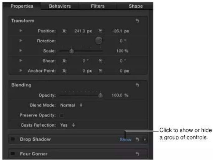
- Reset button: A curved arrow button on the ride side of a parameter row. Click the Reset button to restore a parameter (or in some cases, a set of parameters) to the default value.
Blending

Reset
- Preset pop-up menu: A pop-up menu, found in various Inspectors, used to choose a preset text, shape, gradient, or other style to apply to an object. These are the same presets found in the Motion Library. For example, the Shape Style preset pop-up menu lets you apply a style to the selected shape (including paint strokes). Through this menu, you can also save custom text and shape presets to the Library.
Shape Style:

- Animation pop-up menu: A hidden pop-up menu on the right side of many parameter rows in the Inspector. The Animation pop-up menu lets you perform animation- and parameter-related tasks: adding keyframes, assigning Parameter behaviors, managing rigs, and so on. To open an Animation pop-up menu in the Inspector, move the pointer to the right side of the parameter you want to animate and, when the downward arrow appears, click it.

For more information on animating parameters by using options in the Animation pop-up menu, see Animation menu on page 449.
Rasterization indicator
In the Properties Inspector, a small red "R" indicator appears when a group becomes rasterized. This icon is called a rasterization indicator. The rasterization indicator is not a control; it is an alert telling you that a group is rasterized.
Some operations, as well as the application of specific filters or a mask, cause a group to be rasterized. When a group is rasterized, it is converted into a bitmap image. Rasterization affects 2D and 3D groups in different ways. When a 2D group is rasterized, the blend modes on objects within the group no longer interact with objects outside the group. When a 3D group is rasterized, the group cannot intersect with objects outside the group. The rasterized 3D group is treated as a single object and uses layer order, rather than depth order when being composited in the project.
When the adjustment of a parameter triggers rasterization of a group, a rasterization indicator appears to the left of that parameter's name in the Properties Inspector.

Additionally, a frame appears around the 2D or 3D group icon (the stack icon to the left of the group name) in the Layers list and Timeline.

For more information on rasterization, see Groups and rasterization on page 1045.
Text field shortcut menu
All text fields in Motion have a shortcut menu that can be used to edit the text in those fields (including Inspector value fields and name fields in the Layers list, Timeline layers list, Media list, or Audio list).
The shortcut menu contains commands for looking up words in the Dictionary; searching Spotlight or Internet search engines; cutting, copying, and pasting; checking spelling and grammar, and so on.
Use the text field shortcut menu
1 Double-click a text or value entry field to make the text editable.
2 Control-click the field, then select an item from the shortcut menu.
Create and manage projects
6
Create and manage projects overview
A Motion project contains a single composition made up of multiple image layers and applied effects. When you import still images and video clips into a project, Motion creates a linked reference to the source media files on disk but doesn't move, duplicate, or modify the original files on your hard disk. Motion project files store information about how a composition is assembled, what media files on disk are used, and what effects from the Library have been applied. In addition to imported media, project files also contain shapes, masks, and text layers you create in the application.
To learn more about creating and managing projects, choose a topic in the Help table of contents (the sidebar to the left of this window).
Create projects
Create Projects Overview
Creating a project is the first step in the Motion workflow. There are three ways to start a project:
- Open one of the supplied templates.
- Open a blank project using a project preset.
- Open a blank project using your own settings (for example, if you need an unusual frame size or frame rate not included in the project presets).
Motion is resolution-independent, which means it supports projects using a range of frame sizes and frame rates. You can create small movies for streaming on the web, standard-definition and high-definition movies for broadcast, and even film-resolution files for large-screen display. Regardless of the resolution you choose, the Motion workflow is the same (although high-resolution projects using large media files can have higher memory and graphics card requirements than projects with smaller resolutions).
Motion is also hardware-dependent. This means that the type of graphics card installed on your computer affects performance and determines the maximum file size you can import into Motion. For most recommended cards, the image size limit is 4K or 8K. However, other factors affect performance, including the amount of VRAM on your computer and the number of monitors connected to your graphics card. For the best results, resize very large images to the largest size required in the project, but no larger. Computers with minimum amounts of VRAM may experience poor performance (or other issues) when creating 4K projects. For more information, visit the Motion website at http://www.apple.com/finalcutpro/motion.
Note: Because of hardware limitations and differences, the appearance of projects shared between computers with different installed graphics cards may vary.
Each project in Motion has a single group of project properties that define the duration of the project, the size of the Canvas, the frame rate of playback, and other details that affect how the composition is formatted. Later, when you finish the project and are ready to export it, these project properties define the media file that is created. Although you can change these settings later, it's best to choose the settings that match your planned output format before you begin the project.
Regardless of the project settings, Motion lets you import nearly any kind of media file supported by QuickTime. Further, you can mix media files with different properties in the same project. For example, you can combine video clips of different frame sizes with graphics files. In the end, the file you output uses the frame size and frame rate specified by the project properties.
About the Project Browser
The easiest way to open a new, saved, or recent project is to use the Project Browser window. When you open Motion, the Project Browser appears, giving you access to Motion projects, new and old.

The Project Browser contains three columns: a sidebar with a list of project categories, a project stack in the center displaying thumbnails of available projects based on the sidebar selection, and an information column on the right listing file format details.
To filter available projects by type, select an item from the list in the sidebar. The categories include:
- All: Displays all available projects in the project stack: blank projects, recently opened projects, Motion templates, and Final Cut Pro X templates.
- Blank: Displays the five blank project types: Motion Project, Final Cut Effect, Final Cut Generator, Final Cut Transition, and Final Cut Title. When starting a project, choose one of these items. For more information, see Create a blank Motion project on page 149 and Final Cut Pro X templates overview on page 385.
- Recent: Displays a list of recently opened Motion projects.
- Compositions: Displays a list of preset templates in several categories, including Atmospheric, Pulse, Snap, Splash, and Swarm.
- Final Cut Effects: Displays a list of saved effect templates for use in Final Cut Pro X.
- Final Cut Generators: Displays a list of saved generator templates for use in Final Cut Pro X.
• Final Cut Transitions: Displays a list of saved transition templates for use in Final Cut Pro X.
- Final Cut Titles: Displays a list of saved title templates for use in Final Cut Pro X.
The project stack at the center of the File Browser displays thumbnails of available projects (blank and saved) in the category selected in the sidebar.
You can further filter the contents of the stack by entering a word in the search field or using the Theme pop-up menu at the bottom of the stack. Choosing a theme limits the display to projects assigned to that theme. You can control the size of the thumbnails in the project stack by dragging the scale slider at the bottom of the window, which lets you view more items without scrolling.
When you select an item in the stack, the right column of the Project Browser displays file settings and a video preview, if one is available.

Before opening a new project, you can modify its preset resolution, frame rate, and duration using the pop-up menus above the preview area.
Open a project
There are several ways to locate and open a Motion project from the Project Browser.
Note: When more than one Motion project is open, choose a project name from the lower portion of the Window menu to bring that project to the front. Additionally, you can use the OS X Mission Control and Exposé system commands to see all open project windows at once. For more information on how to use the Mission Control and Exposé commands, see OS X Help (in the Finder, choose Help > Help Center).
Open a project from the Project Browser
1 Select a category of content in the sidebar to limit which items are displayed in the project stack.
2 Select an item from the project stack.
A video preview, if available, plays in the preview area on the right.
3 Modify the resolution, frame rate, and default duration, if necessary, using the pop-up menus above the preview area.
4 Click Open.
The Project Browser closes and the project you selected opens in the Motion workspace. If you selected an existing project, that project opens to its last saved state. if you select a blank project type, preset project type, or Final Cut Pro X template, a new, unsaved project is opened. Saving that project does not overwrite the preset project or template.
Open an existing Motion project file that does not appear in the Project Browser
Using the buttons at the bottom of the Project Browser, you can also open a specific project that doesn't appear in the Project Browser, but is accessible through the Finder. Alternatively, you can open a specific media file or group of files—movies, still images, and so on—and create a Motion project containing those files.
1 In the Project Browser, click Open Other or press Command-O.
The Open dialog appears.
2 In the Open dialog, navigate to the Motion project file to open, select it, then click Open.
Open a recent project
- From the File menu, choose a project's filename from the Open Recent submenu.
Create a project prepopulated with specific media files
1 In the Project Browser, click Create Project From File.
The Import Files as Project dialog appears.
2 Navigate to and select the one or more media files, Shift-clicking to select contiguous items or Command-clicking to select noncontiguous items.
As you select files, format settings at the bottom of the dialog become available. Settings inherent to the selected files remain dimmed, but propagate to the new project. For example, because movie files have an inherent frame rate, aspect ratio, and field order, those settings are dimmed in the Import Files as Project dialog. Because still images do not have a frame rate or a field order, those settings are enabled in the dialog, allowing you to choose a frame rate and field order for the new Motion project.
3 If needed, set the frame rate, aspect ratio, field order, and audio mix settings.
If you selected an item from an image sequence, select the Image Sequence checkbox to have Motion use each image as a frame in a movie clip. For more information, see Image sequences on page 169. Except for Frame Rate, these settings can be modified after the project is created, in the Properties Inspector. For more information, see Project properties overview on page 191.
4 Click Import as Project.
The file opens in a new Motion project window.
Create projects from templates
An easy way to create a project in Motion is to open and modify an existing template. Motion templates—shown in the Compositions category in the sidebar—are premade, royalty-free projects that you can customize. Each template contains graphics, text objects, and backgrounds.
You can also create templates for frequently used layouts, customizing them with updated text and graphics.
Create a project from a template
1 Choose File > New (or press Command-N).
2 When the Project Browser appears, select a template category from the Compositions section in the sidebar.
The templates for that category appear in the project stack.
3 Click a template to see an animated preview in the preview area, along with additional information, including resolution, duration, and frame rate.
4 To create a project from the selected template, click Open a Copy.
A new project opens in the Motion workspace. You can customize the project by editing the text or exchanging the graphic elements with your own. The changes you make to projects created using templates are not saved to the source template file. For more information about using, modifying, and creating templates, see Customize projects created with templates on page 196.
Create a blank Motion project
You can create a Motion project from scratch, using the standard projects settings in the preview area of the Project Browser. If none of the presets meet your needs, you can create a project with custom settings.
Create a project
1 Choose File > New (or press Command-N).
2 In the Project Browser, select the Blank category in the sidebar, then click the Motion Project icon.
3 Choose a resolution from the Preset pop-up menu and a frame rate from the Frame Rate pop-up menu in the right column, then click Open.
A new, untitled Motion project opens. The project is not saved to disk until you choose a save command from the File menu. For more information on saving project files, see Save projects on page 187.
Create a project with custom project settings
1 Choose File > New (or press Command-N).
The Project Browser appears.
2 Select the Blank category in the sidebar, then click the Motion Project icon in the stack.
3 Choose Custom from the Preset pop-up menu above the preview area.
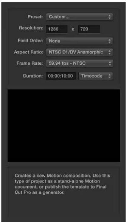
Additional settings controls appear.
4 Choose the resolution (width and height), field order, aspect ratio, frame rate, and default duration for your custom project.
5 Click Open.
A new Motion project opens using the settings you specified.
Create Final Cut Pro X templates
A special set of templates in the Project Browser lets you create special effects, animated titles, editing transitions, and graphics generators for use in Final Cut Pro X. Available in the Blank category of the Project Browser sidebar, the Final Cut templates contain placeholders designed to simplify customization.
When Motion 5 and Final Cut Pro X are installed on the same computer, saving a Final Cut template in Motion sends the custom effect to Final Cut Pro X, where it can be applied to clips in the editing Timeline. For more information, see Final Cut Pro X templates overview on page 385.
Bypass the Project Browser
If you consistently create projects with a specific preset, template, or other starting project, you can bypass the Project Browser. This way, when you create a project, it is opened in the Motion workspace with the settings you established.
These settings are controlled in the Project pane of Motion Preferences.
Set a default project preset
1 Choose Motion > Preferences (or press Command-Comma).
The Motion Preferences window appears.
2 Click the Project icon to open the Project pane.
3 In the For New Documents setting, click Use Project.
Note: If you haven't assigned a preset project, the setting reads: Use Project: Nothing Selected. When you choose a project, the text updates to reflect the name of the selected project.
4 Click Choose.
A window opens containing the contents of the Project Browser.
5 In the Project Browser window, select a category in the sidebar and a project type from the center stack, then choose a preset from the right column.
6 Click Open.
The selected project is assigned to the Use Project option in the Project pane of the Preferences window. From now on, the Project Browser does not appear when you choose File > New (or press Command-N). Instead, a new project opens in the format set in Motion Preferences.
Create, edit, and delete presets
If you commonly create projects using custom settings that don't match any available preset, you can create a preset with these settings for future use. Presets are created, modified, and deleted in the Presets pane of Motion Preferences. For a detailed description of the options and settings available in the Project Presets Editor, see Project Preset Editor on page 125.

Note: The Default checkbox in the Presets pane of Motion preferences has no effect. To set a default project preset, see Bypass the Project Browser on page 150.
Create a custom preset
1 Choose Motion > Preferences (or press Command-Comma).
2 Open the Presets pane.
3 Click the Add button (+) beneath the presets list.
The Project Preset Editor appears.

4 In the Project Preset Editor, do the following:
a In the Name field, enter a descriptive name for the preset.
b In the Description field, enter a brief description of what that preset is for. Include significant characteristics of that preset, such as frame size and frame rate.
c Enter a frame size into the Width and Height fields.
d Choose a Pixel Aspect Ratio, Field Order, and Frame Rate from the corresponding pop-up menus.
5 Click OK.
The new preset appears in the Presets pane and in the Presets pop-up menu in the Project Browser.
6 If you're done creating project presets, close Motion Preferences.
Note: For more information on industry-standard frame sizes, pixel aspect ratios, field order, and frame rates, see File types supported by Motion on page 165.
Duplicate a preset before editing it
1 In Motion Preferences, select a preset in the Presets pane.
2 Click Duplicate.
The duplicated preset appears underneath the original preset with "copy" appended to its title.
Edit a preset
1 In Motion Preferences, select a preset in the Presets pane.
2 Click Edit.
3 When the Project Preset Editor appears, make your changes, then click OK.
Note: You cannot edit or delete locked project presets.
Delete a custom preset
1 In Motion Preferences, select a preset in the Presets pane.
2 Click the Delete button (−) underneath the presets list.
Note: You cannot edit or delete locked project presets. You cannot unlock a preset that is built into Motion. When the preset is double-clicked, an alert appears stating that the preset cannot be modified. To create a copy of the preset that you can customize, click OK.
Moving presets between computers
Each preset you create is saved as a separate file. If you create custom presets that you rely on, you can move them to other computers that have Motion installed.
Copy a project preset to another computer
- Copy your custom preset files to that computer's /Users/username/Library/Application Support/Motion/Presets/ folder.
Note: The Library folder is hidden in the OS X Finder. To show your Library folder, hold down the Option key, then choose Go > Library.
Project background color
Two parameters in a project's Properties Inspector affect the background color of a project and affect how a composition appears when exported out of Motion. (To open a project's Properties Inspector, choose Edit > Project Properties.)
- Background Color: Use this color well to set the color appearing in the Canvas when no other object obscures the background.
Note: To export a project with a premultiplied alpha channel, Motion always renders against black.
- Background: Use this pop-up menu to set whether the background color is rendered as part of the alpha channel. If set to Solid, the background color creates a solid alpha channel. If set to Transparent, the background color does not render as part of the alpha channel. In either case, the background color is visible in the Canvas.
Organize groups and layers
Organize groups and layers overview
When you drag a media file from the Library or File Browser into the Canvas, Layers list, or Timeline, or generate an image from within Motion, the resulting element is represented as a layer. Think of layers as a series of clear overlays stacked on top of each other. These layers combine to create the composite you see in the Canvas. Motion provides a graphical representation of this layer hierarchy in the Layers list and in the Timeline. You can rearrange the stacking order of layers in your composition by dragging them to a new location in either list.
Layers, in turn, are nested in containers known as groups. When you create a layer, that layer is placed inside a group. You can drag a layer from one group to another, but layers cannot exist on their own, outside a group. Layers nested inside groups appear indented in the Layers list and Timeline.

A group can also contain other groups nested inside it. In this way, you can construct complex hierarchies of nested groups, with each nested group subordinate to the group that contains it.

It's a good idea to group layers that work together as a unit. Doing so ensures that animation and effects applied to the enclosing group affect all layers nested in that group. By nesting related layers you want to animate inside a group, you can save time by animating the enclosing group, instead of animating each layer.
For example, when you select a group that has three layers nested in it, the entire group is selected as a single unit.

Moving a selection in the Canvas moves all three layers simultaneously.

natural_image
Two abstract diagrams showing purple and orange wave-like shapes with green spheres, set against black background (no text or symbols)After moving groupBefore moving group
Regardless of how they're nested, layers can always be animated independently. Subordinate groups can also be animated independently. In the following example, a filter is applied to a layer in a group containing three fish layers. All other layers in the group remain unaffected.

natural_image
Two yellow and white fish swimming against a black background, with a circular patterned object in the foreground (no text or symbols)However, if you apply the same filter to the group, all layers in that group are affected by the filter, as if they were a single layer.
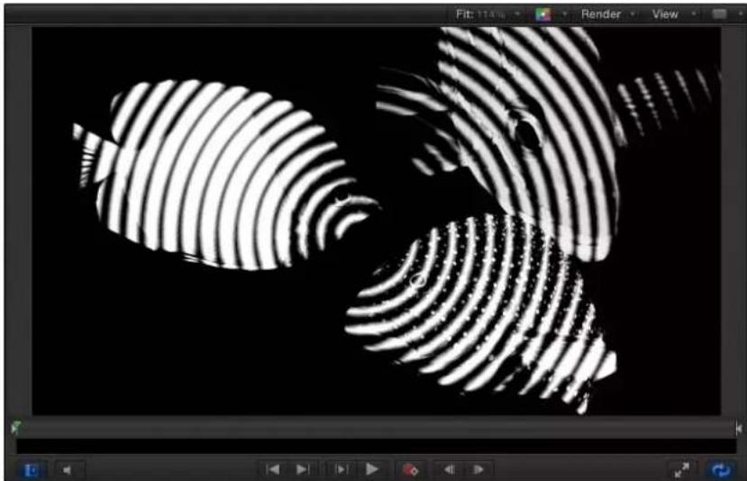
natural_image
Abstract black-and-white pattern with concentric curved lines forming a symmetrical design (no text or symbols)Many filters produce different results when applied to a group, rather than individual layers in a group, as shown in the images below.

natural_image
Abstract black-and-white pattern with concentric wavy lines forming a symmetrical design (no text or symbols)
natural_image
Abstract black-and-white pattern with concentric circular ridges and a stylized fish-like shape (no text or symbols)Filter applied to each layer in groupFilter applied to group
Select layers and groups
To reorganize layers and groups in a project, you must select which ones to move. This section covers the methods to select layers in the Layers list.
Select one layer or group
■Click a layer or group in the Layers list.
Doing so deselects all other selected objects.
Note: Selecting a group does not also select the layers nested underneath it. However, operations performed on a selected group also affect layers nested in it.
Select multiple contiguous layers or groups
Do one of the following:
■Shift-click any two layers in the Layers list.
Doing so selects both layers, and all layers in between.
- Click to the left of the thumbnail column and drag up or down to select multiple layers. (This method works only when you begin dragging above the first or below the last object.)
Select or deselect multiple noncontiguous layers or groups
Do one of the following:
- Command-click any unselected layer or group to add it to the selection.
■Command-click any selected layer or group to deselect it.
Select all layers or groups in the Layers list
Do one of the following:
- Choose Edit > Select All (or press Command-A).
- Click the first group or layer in the list, then Shift-click the last group or layer in the list.
Deselect all objects or groups in the Layers list
- Choose Edit > Deselect All (or press Shift-Command-A).
Show and hide layers and groups
Layers and groups appearing in the Layers list can be hidden to make them invisible in the Canvas without removing them from your composition. For example, if you place a large object into your project and it's in the way of objects you want to move or rotate in the Canvas, you can hide the offending object. You can also hide objects you're not sure you want to keep, while preserving their placement in case you want to use them later.
If you hide a group, you also hide all layers and groups nested in it. Hidden layers and groups are not rendered when your project is exported.
Show or hide selected layers
Do one of the following:
- Click the checkbox to the left of an object or group in the Layers list or Timeline.
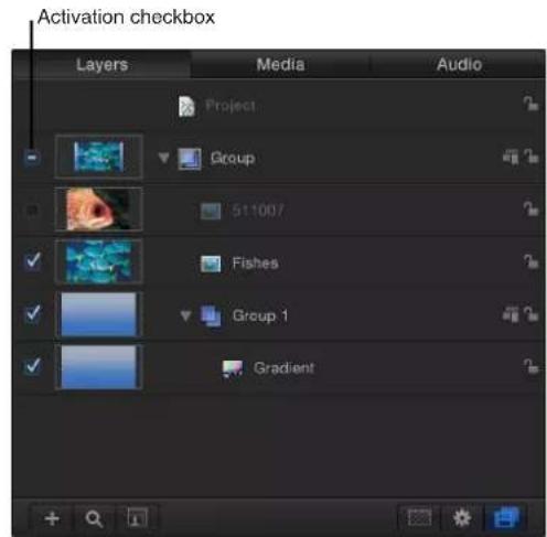
- Select an object or group, then choose Object > Active (or press Control-T) to turn the layers on or off.
■ Control-click a layer or group, then choose Active from the shortcut menu.
Note: If you hide layers in a group, the enclosing group's checkbox displays a dash instead of a checkmark, to indicate that some layers are not visible.
Solo a layer
You can "solo" a layer or group to hide all other layers in the project. This technique can be useful to isolate a single object in the Canvas to animate or manipulate without interfering with other objects in your composition.
1 Select layers or groups to solo.
2 Choose Object > Solo (or press Control-S).
Note: You can also Control-click an object in the Layers list, then choose Solo from the shortcut menu.
All other layers or groups are deactivated, and only the soloed object is visible in the Canvas. When the selected item is soloed, the solo menu item displays a checkmark.
Collapse and uncollapse group hierarchies
Groups and layers in the Layers list appear in a hierarchy that shows which layers are nested inside which groups. Nested layers and groups appear underneath and indented to the right of the group they're nested in.
To make the Layers list easier to manage, you can collapse all layers that appear nested in a single group using that group's disclosure triangle. Collapsed groups appear as a single row in the list, and can be moved or nested like any other layer. Each group's thumbnail displays a preview of its composite, making it easy to see what's nested inside.
Open or collapse a single group
Do one of the following:
- Click the disclosure triangle to the left of that group's name and icon.
- Press the Up Arrow and Down Arrow keys to navigate up and down the Layers list, then press the Right Arrow key to open a group or the Left Arrow key to collapse a group.
Reorganize in the Layers list
The order in which layers and groups appear in the Layers list helps determine the layout of the composition. The order of layers and groups determines which objects appear in front of other objects in the Canvas. You can change the ordering of objects in the Canvas or in the Layers list.
Note: When using 3D groups, you can rearrange the order in 3D space to override the hierarchy visible in the Layers list. For more information about layer order in 3D groups, see 2D and 3D group intersection overview on page 925.
Move a layer or group up or down in the Layers list
- Drag a layer or group up or down in the Layers list.
A position indicator shows the new position the selection occupies when you release the mouse button.
Note: You can also use the Bring and Send commands in the Object menu to move layers up and down in the nested hierarchy in any group. This is especially useful when working with selected objects in the Canvas. For more information, see Arrangement commands in the Object Menu on page 207.
Create a new, empty group
To organize the objects in a project into multiple groups, you can create new, empty groups.
Do one of the following:
- Click the Add button (+) at the bottom of the Layers list.
- Choose Object > New Group (or press Shift-Command-N).
New groups appear at the top of the Layers list, and are numbered incrementally based on the number of groups you've created so far.
Move a layer from one group to another
When you have more than one group, you can move layers back and forth between them, changing their nested relationship in your project.
1 Select one or more layers.
2 Do one of the following:
- Drag the selected layers to a position underneath another group. A position indicator appears, showing where the layer is placed when you release the mouse button.
- Choose Edit > Cut (or press Command-X), then select the group to paste into, and choose Edit > Paste (or press Command-V).
Copy a layer from one group to another
Do one of the following:
- Option-drag selected layers from one group to another.
- Select layers, choose Edit > Copy (or press Command-C), then select the group to paste into, and choose Edit > Paste (or press Command-V).
Copy a layer or group from one project to another
When you have more than one project open, you can copy layers or groups back and forth between projects.
1 Select one or more layers in the active project window.
2 Do one of the following:
- Drag the selected object to a position in the target project's Layers list. A position indicator appears to show where the object is placed when you release the mouse button.
- Choose Edit > Copy (or press Command-C), select the group to paste into, then choose Edit > Paste (or press Command-V).
- Option-drag a layer in the Canvas to the Canvas or Layers list of another open project.
Group and ungroup layers
You can nest layers together in a group using the Group command. You can group layers that appear in the same group, or you can group groups that are nested at the same level relative to the hierarchy of your project. You cannot group groups that appear at different levels.
Group selected layers together, nesting them in a group
1 Select all layers or groups you want to group together.
2 Choose Object > Group (or press Shift-Command-G).
A new group is created and is numbered incrementally based on the number of groups you've created so far. The layers or groups you selected are nested in the group.
Ungroup nested layers
Groups of nested layers or groups can also be ungrouped, which deletes the containing group and moves objects and layers in it up the group hierarchy.
1 Select the group containing the nested layers or groups to ungroup.
2 Choose Object > Ungroup (or press Option-Command-G).
Note: You cannot ungroup groups that are at the root (project level) of the Layers list hierarchy.
Nest groups inside other groups
You can also nest groups inside other groups. You might do this if you're creating a layer hierarchy to control the relationship of one group of layers to another, or if you're grouping layers to which you want to apply a single set of behaviors and filters.
Nesting a group works the same way as nesting a layer.
Move a group inside another group
1 Select one or more groups.
2 Do one of the following:
- Drag the groups onto another group.
- Drag the groups to a position underneath another group.
- Choose Edit > Cut (or press Command-X) to cut the groups, then select the group where you want to paste, and choose Edit > Paste (or press Command-V).
Constrain group size
By default, the size of a group is determined by the layers in that group. Because animated objects often grow in size, the active height and width of a group (its resolution) can become large. You can constrain the resolution of a group to a specific width and height in the Group pane of the Inspector.
The project in the following image contains a particle system. The animated particles, although not visible when they move off the Canvas, make the group containing them large.

You can crop the size of a group that contains growing objects using the Fixed Resolution checkbox in the Group pane of the Inspector. If a project contains animated objects that move or expand beyond the edges of the Canvas and you don't activate the Fixed Resolution checkbox, your computer processing time can increase.
Note: The Group pane of the Inspector (which contains the Fixed Resolution parameter) is only accessible when a group is selected in the project.
When the Fixed Resolution checkbox is selected, objects in the group but outside the Canvas are cropped to the size of the group defined in the parameter.
If the group's anchor point is offset, the cropping might not occur around the edges of the Canvas, and objects can become cut off.

Selected group with an offset anchor point before Fixed Resolution setting is enabled.
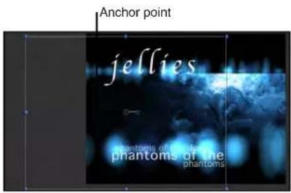
Selected group with Fixed Resolution enabled, and set to project size. Notice that text objects are cut off.
Fix the resolution of a group
1 In the Layers list (or the Timeline), select the group.
2 In the Group inspector, select the Fixed Resolution checkbox.
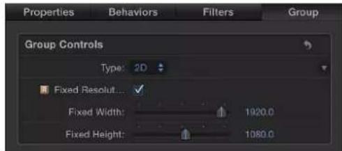
By default, the group's resolution is set to the project size. An indicator appears to the right of Fixed Resolution, informing you that the group is rasterized. For more information on rasterization, see Groups and rasterization on page 1045.
3 To define a resolution other than that of the project, adjust the Fixed Width and Fixed Height sliders.
Note: When you select a layer in a fixed-resolution group, the bounding box around the layer appears at its original size, unaffected by the containing group's resolution.
Lock layers and groups
When you finish making adjustments to a layer or group, you can lock it to prevent accidental modification. Locked layers cannot be moved, and their parameters cannot be altered or animated. Animation and behaviors applied to the layer before being locked still play. Locking a group also locks all layers and groups nested in it.
Note: You cannot lock objects that contain published parameters (for use in Final Cut Pro X). Such objects display a dimmed lock control. For more information about publishing parameters, see Publishing parameters in templates overview on page 420.
Lock layers or groups
Do one of the following:
- Click the layer's lock icon in the Layers list.

- Select layers or groups, then choose Object > Lock (or press Control-L).
The locked layer's bounding box in the Canvas turns white to indicate it is locked.
Rename groups
You can rename the groups and layers that appear in the Layers list to further organize your project and make each group's and object's purpose easier to identify. When you rename a layer, the original name of the source media file on disk remains unchanged. Also, changing a layer's name in the Layers list does not change the name of its corresponding source media in the Media list. You cannot change the name of source media in the Media list.
Rename a group or layer
1 In the Layers list, double-click the name of a group or layer.
2 When the name is highlighted, enter a new name.
3 When finished, press Return to accept the name.
The new name is also accepted when you click another layer or group.
Search for layers and groups
If you have difficulty finding a single group or layer in a large project, you can use the Search field at the bottom of the Layers list, Media list, and Audio list. This field is similar to the Search field in the File Browser, and lets you filter the window, limiting the view to items containing the search term you enter.
Find a group or layer by name in the Layers list
1 At the bottom of the Layers list, Media list, or Audio list, click the Search button.
The Search field appears.

2 Enter a search term in the Search field.
As soon as you begin typing, all groups and layers with names that don't contain the search term are hidden from view, leaving only a list of groups and layers that match.
Note: Groups and layers hidden as the result of a search operation are not disabled in the Canvas, and they are not prevented from rendering during export.
Clear the search results
- Click the Clear button at the far right of the Search field to restore the full contents of the Layers list, Media list, or Audio list.
Click to clear Search field.
Add media to a project
Add media to a project overview
After you create a project, you typically import media files to create a composition. All media types—movie clips, still images, and audio files appearing in the File Browser, or other media items appearing in the Motion Library—are added to your project using the same methods. To learn about the File Browser, where you access files on your disks, see File Browser overview on page 30. To learn about the Library, where you find the content built into Motion, see Library overview on page 35.
Note: Layered Photoshop files have additional import options available from the drop menu. See Layered Photoshop files on page 170.
Add and remove files
You can add media files to a project using the File Browser or the Import command in the File menu. In most cases, the File Browser is more convenient and gives you more control over how the resulting objects appear in the project. You can add files to a project individually or in groups.
Note: Although you can add iTunes and iPhoto files via the File Browser, it's better to add them via the Music and Photo categories in the Motion Library. When you add iTunes and iPhoto files via the Library, you can browse for files using the playlist or photo album features available in iTunes and iPhoto. For more information, see Add iTunes and iPhoto files from the Library on page 183.
Add media files to a new group
1 If the Create Layers At setting in the Project pane of Motion Preferences is set to "Current frame," move the playhead to the frame in the Timeline where you want the first frame of the file to start.
Note: If the Create Layers At setting is set to "Start of project," this step is unnecessary because imported files are placed at frame 1.
2 Select media files in the File Browser.
3 Do one of the following:
- Make sure no group is selected, then drag the files into the Canvas, placing them at any position.
- Make sure no group is selected, then click the Import button to add the files to the center of the Canvas.
- Drag the files into the empty lower area of the Layers list.
- Drag the files into the empty lower area of the Timeline.
A new group appears the top of the Layers list, and all imported files appear as layers nested in the group. Each new layer's start time in the Timeline is set to the position of the playhead in step 1.
Alternatively, you can add media files to a project by choosing File > Import, selecting files in the Import Files dialog, then clicking open.
Add media files to an existing group
1 If the Create Layers At setting in the Project pane of Motion Preferences is set to "Current frame," move the playhead to the frame in the Timeline where you want the first frame of the file to start.
Note: If the Create Layers At setting is set to "Start of project," this step is unnecessary because imported files are placed at frame 1.
2 Open the File Browser and Layers list.
3 Select media files in the File Browser.
4 To nest the media files in a group, do one of the following:
- Drag the files on top of a group in the Layers list. The imported files appear as new layers in the group, placed above existing layers in the group.
- Drag the files between any layers in a group. A position indicator shows where the layers will be placed when you release the mouse button.
- Drag the files into the Timeline, placing them between any layers nested in an existing group. Note: For more information on adding objects to the Timeline, see Timeline overview on page 251.
When you add a media file to a project, the file appears as a layer in the Canvas, Timeline, Layers list, and Media list. Each layer's start time in the Timeline is set to the position of the playhead in step 1.
Add media files to a project without using them in the composition
You can also add media files to your project without having them appear in the composition.
You do this by dragging a file into the Media list, thereby storing media objects you might want to use in the future.
1 Open the Media list.
2 Do one of the following:
- Drag media files from the File Browser into the Media list.
- Click the Add button (+) in the lower-left corner of the Project pane; then, in the Import Files dialog, select a file to add and click Import.
- With the Media list active, choose File > Import (or press Command-I); then, in the Import Files dialog, select a file to add, and click Import.
- Control-click in the Media list, choose Import Media from the shortcut menu, then add a file via the Import Files dialog.
To import an image sequence in the Import Files dialog, turn on the Image Sequence checkbox. If this checkbox is deselected, only files selected in the Import dialog are imported. To select multiple files, Shift-click the files; to select noncontiguous files, Command-click the files.
The resulting media objects are added to the project but don't appear in the Canvas, Layers list, or Timeline.
Add unused files from the Media list to the project
- Drag the file from the Media list to the Canvas.
Filter the Media list
- Click the Search button, then enter the name of the objects to view in the Search field.

+ Q
When you begin typing in the Search field, the Media list hides objects that do not contain the text you type. Hidden objects continue to appear in the Canvas.
Stop filtering and return to the complete Media list
- Click the Clear button at the right of the Search field.
Remove a file from the Media list
Do one of the following:
■ Control-click the file, then choose Delete or Cut from the shortcut menu.
- Select a file to remove, then choose Edit > Cut (or press Delete).
The media is removed. If the media is used in the Canvas, an alert appears asking you to confirm that you want to remove the files from the project.
About file types
File types supported by Motion
Motion accepts the most popular multimedia file formats supported by QuickTime in the following categories:
QuickTime video codecs
- Animation
• DV - PAL
• DV/DVCPRO - NTSC - DVCPRO - PAL
• DVCPRO HD 1080i50, 1080i60, 1080p25, 1080p30, and 720p50, 720p60 - DVCPRO50 - NTSC
- DVCPRO50 - PAL
• Uncompressed 8- and 10-bit 4:2:2
• HDV 1080i50, 1080i60, 1080p24, 1080p25, and 720p24, 720p25, 720p30 - Motion JPEG
• MPEG IMX 525/60 (30Mb/s, 40 Mb/s, 50 Mb/s)
• MPEG IMX 625/50 (30Mb/s, 40 Mb/s, 50 Mb/s) - Photo - JPEG
• Apple ProRes 4444 (XQ) - Apple ProRes 4444
• Apple ProRes 422 (HQ) - Apple ProRes 422
• Apple ProRes 422 (LT)
• Apple ProRes 422 (Proxy)
• XDCAM HD 1080i50, 1080i60, 1080p24, 1080p25, 1080p30 (35 Mb/s VBR)
• H.263
• H.264
Still image formats
- Photoshop
- BMP
• GIF - JPEG
- PNG
• TIFF
• TGA - OpenEXR
Other image formats
- Layered Photoshop files
- PDF files
Audio formats
You can import audio files with sample rates up to 192 kHz and with bit depths up to 32 bits. Mono and stereo files are supported. Multichannel audio files are also supported. Motion supports the following audio file types:
- AAC (listed in the Finder with the .m4p file extension)
• AIFF
• CAF
• WAV
Important: You cannot import rights-managed AAC files, such as those purchased from the iTunes Store.
For more information about the file formats supported by Motion, go to the Motion website at http://www.apple.com/finalcutpro/motion.
QuickTime movies
Motion supports QuickTime movies using any file format (codec) installed on your computer.
Although you can import movies in nearly any codec, avoid using highly compressed clips in projects. Excessively compressed clips can display undesirable visual artifacts. Fortunately, QuickTime provides many codecs ideal for moving uncompressed or minimally compressed video files between applications, including Apple ProRes 4444 (XQ), Apple ProRes 4444, Apple ProRes 422 (HQ), Apple ProRes 422, Uncompressed 8- and 10-bit 4:2:2, Pixlet, None, Animation, Apple M-JPEG A and B, DVCPRO-50, and Apple DV/DVCPRO.
Some codecs support alpha channels, which define areas of transparency in the clip. If a QuickTime clip has an alpha channel, Motion uses the alpha channel in your project.
You can combine clips that are compressed with different codecs in the same project. You can also combine clips that have different frame sizes, pixel aspect ratios, and interlacing. To learn more about alpha channels, interlacing, pixel aspect ratio, frame rates, and frame sizes, see Video and file formats overview on page 1053.
About high-resolution still image files
You can import still image files using most popular still image formats, including SGI, Photoshop, BMP, JPEG, TIFF, TGA, and JPEG-2. As with video clips, you can mix still image files with differing frame sizes and pixel aspect ratios. For a full list of eligible file types, see File types supported by Motion on page 165.
A common and effective use of still images in motion graphics work is the animation of high-resolution files. The dots per inch (DPI) of image files as defined in programs like Photoshop does not apply to video, because the dimensions of each imported still image are defined by the number of pixels. If the dimensions of an imported image are larger than the frame size of the Motion project, the image extends beyond the borders of the Canvas.
You can reduce the scale of the image to fit the project's frame size. You can also animate its Scale parameter (in the Properties Inspector) to zoom into or out of the image, or animate its Position parameter to pan the image.
Because Motion is graphics-card dependent, file-size import limitations vary from computer to computer. When you import an image that is too large, an alert dialog appears, stating: "This media is too large to render at full resolution, and will be shown at a lower quality." Click OK to import the image at a lower quality. For more information on recommended graphics cards, visit the Motion website at http://www.apple.com/finalcutpro/motion.
For guidelines about working with high-resolution graphics, see High-resolution graphics overview on page 1058.
When you import a still image, the image assumes a duration equal to the current duration of the project. Increasing the duration of the project does not increase the duration of an image that's imported. Still images have infinite duration in Motion, so you can stretch them in the Timeline to be as long as necessary. For more information about modifying objects in the Timeline, see Timeline overview on page 251.
Import large still images
For importing large still images, you can set an option in the Preferences window to import files at their original size or to scale images to fit the Canvas size.
Set the large still image import preference
1 Choose Motion > Preferences (or press Command-Comma).
The Motion Preferences window appears.
2 In the Still Images & Layers area of the Project pane, choose a setting from the Large Stills pop-up menu.

There are two options:
- Do Nothing: Imports the image at its original size.
In the following example, a 2311 x 1525 image is imported into a Broadcast HD 1080 project (1920 x 1080) with Do Nothing selected in the Preferences. The image is larger than the Canvas.

natural_image
Underwater view of a large ship with visible hull and support structures, captured in a video editing interface (no text or symbols on the vessel itself)- Scale to Canvas Size: Imports and scales the image to fit the project size while maintaining its native aspect ratio.
In the following example, the same image is imported with Scale to Canvas Size selected in Preferences.

natural_image
Underwater scene of a large ship with visible hull and crew, captured in a video editing interface (no text or symbols on the image itself)The image is scaled—the equivalent of using the Select/Transform tool to scale down the image in the Canvas while pressing Shift.
3 To observe that the image is merely transformed and has not changed resolution, select the image file in the Media list, then open the Media Inspector.
The Fixed Width and Fixed Height parameters display the resolution of the original file.
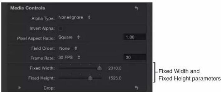
Image sequences
Numbered image sequences store video clips as individual still image files. Each image file has a number in the filename that indicates where it fits into the sequence. In a film clip that's been digitally scanned, each file represents a single frame. In a video clip that's been converted to an image sequence, each file contains both fields of a single video frame, with the upper and lower lines of the image saved together.
Image sequences use the same variety of file formats as still image files. Some of the most popular formats for saving image sequences include SGI, BMP, JPEG, TIFF, and TGA. Like still image formats, many of these image sequence formats support alpha channels, which are used by Motion.
Because image sequences have been around for so long, they remain the lowest-common-denominator file format for exchanging video across editing and compositing applications. Although QuickTime is increasingly used to exchange video clips between platforms, image sequences are still used, especially in film compositing.
As with QuickTime video clips, you can mix image sequences of different formats, using different frame sizes, pixel aspect ratios, frame rates, and interlacing. For more information, see File types supported by Motion on page 165.
Important: Any imported image sequence must contain three or more digits of padding—for example, "imagename.0001.tif."
Collapse image sequences
The "Show image sequences as collapsed" button at the bottom of the File Browser lets you display image sequences as a single object, rather than as the collection of files on your disk.

Note: You can turn this feature off for numbered image files that aren't used as an image sequence. For example, pictures taken with digital cameras often have numbered filenames that can be mistaken for an image sequence.
Layered Photoshop files
You can also import layered Photoshop files. Many motion graphics professionals create layouts in Photoshop, then import the resulting multilayered file into Motion, where the layers are animated and combined with other imported and Motion-generated objects.
There are several ways to import layered Photoshop files:
- With all Photoshop layers merged together as a single Motion layer
- With each Photoshop layer preserved as a separate Motion layer, nested in a new group
- By choosing a single Photoshop layer
When you import all Photoshop layers as individual Motion layers, Motion places them in a new group in the Layers list and Timeline. Each layer retains the position, opacity, and blend mode of its corresponding original Photoshop layer.
Although you can import Photoshop text layers, the text appears in Motion as noneditable bitmap graphics.
The following Photoshop effects are not imported into Motion:
- Layer effects
- Layer masks
- Adjustment layers
- Paths
- Shapes
Add a layered Photoshop file using the drop menu
1 Drag a layered Photoshop file from the File Browser into the Canvas, Layers list, or Timeline.
2 Before releasing the mouse button, pause until the Canvas drop menu appears and the pointer becomes curved.
This menu presents commands for importing the layered file.
3 Continuing to hold down the mouse button, drag the curved pointer over a command in the drop menu, and when the menu item is highlighted, release the mouse button.
The layers of the Photoshop file are added using the command you choose.
The Canvas drop menu has the following options:
- Import Merged Layers: All layers of the Photoshop file are collapsed into a single Motion layer.
- Import All Layers: A group is created, and each layer of the Photoshop file is preserved as a separate Motion layer in this new group.
- [Individual layers]: Each layer in the Photoshop file appears as a separate item in the drop menu. Selecting a layer adds only that layer to the project, where it appears as a single Motion layer.
Note: When a Photoshop file contains more layers than can be displayed in the drop menu, the Choose Layer option appears in the drop menu. After you click the Choose Layer option, the Pick Layer to Import dialog appears.
Add a layered Photoshop file using the Import command
1 Choose File > Import.
2 Select the layered Photoshop file to import, then click Import.
The Pick Layer to Import dialog appears.
3 Choose a command from the Layer Name pop-up menu:
- Merged Layers: All layers of the Photoshop file are collapsed into a single Motion layer.
- All Layers: A group is created, and each layer of the Photoshop file is preserved as a separate Motion layer in this group.
- [Individual layers]: Each layer in the Photoshop file appears as a separate item in the drop menu. Selecting a layer adds only that layer to the project, where it appears as a single Motion layer.
If you don't like the layer you chose, you can pick a different one from the Photoshop file without deleting or importing again. You do so by selecting the recently imported Photoshop layer, then choosing a different Photoshop layer from the Layer pop-up menu in the Properties Inspector.
PDF files
The PDF file format is a PostScript-based document format that accommodates PostScript-based graphics and text, as well as bitmap graphics. Areas of transparency in a PDF file are also transparent in Motion.
PDF files are capable of storing PostScript-based illustrations. Unlike graphics file formats such as TIFF and JPEG, which save images as a collection of pixels at a given resolution divided into red, green, and blue channels, PostScript-based illustrations are saved as mathematical descriptions of how the artwork is drawn. As a result, PDF files using PostScript-based artwork and text have infinite resolution.
The practical difference between bitmap files and PostScript-based files is that scaling a bitmap beyond 100 percent results in the image progressively softening the more you increase its size. PostScript-based illustrations remain sharp and clear no matter how large or how small you scale them.
When importing a PDF file, its size is relative to the original page size of the file. As a result, even small graphics can have a large frame size, with empty space surrounding the graphic. When exporting a graphic as a PDF file for use in Motion, you may want to scale the graphic to fit the page dimensions, or reduce the page size in the source application's page preferences to fit the graphic's dimensions.
Fixing the resolution of a PDF object
Although PDF files have unlimited resolution, large PDF objects can consume a lot of video memory, which can hinder performance in Motion. To avoid this problem, limit the resolution of each PDF image to save video memory. By using fixed-resolution parameters, the files are rendered once, ensuring better performance.
The fixed-resolution parameters for PDF objects are adjusted in the Media Inspector. Select the PDF source media in the Media list to activate the Media pane of the Inspector. Adjust the following controls to modify the PDF's fixed-resolution parameters:
- Pixel Aspect Ratio: Use this pop-up menu to assign a nonsquare pixel aspect ratio to the file. In most cases, the "From file" menu option is the best choice because it assigns the PDF source file's native aspect ratio. Choose a different menu item only if you want to override that native setting.
- Fixed Resolution: Select this checkbox to fix the resolution of PDF source media to the size specified in the Fixed Width and Fixed Height sliders.
- Fixed Width: Use this slider to set the maximum horizontal resolution to which a PDF object can be smoothly scaled.
- Fixed Height: Use this slider to set the maximum vertical resolution to which a PDF object can be smoothly scaled.
- Use Background Color: Select this checkbox to substitute a custom background color for transparent portions of the PDF. Choose the background color in Background Color controls
- Background Color: Use these color controls, available when Use Background Color is selected, to set the background color for transparent portions of the PDF.
- Crop: Use these sliders (Left, Right, Bottom, and Top) to crop the edges of the PDF image, if necessary. These controls crop the PDF source media (and all layers linked to that source media). To crop an individual layer, use the Crop parameters in the layer's Properties Inspector.
Mixed content in PDF files
Although PDF files can contain a mix of PostScript-based art, PostScript text, and bitmapped graphics, each format has different scaling properties. PostScript-based art and text scale smoothly, but bitmapped graphics embedded in a PDF file are subject to the same scaling issues as other bitmapped graphics formats. As a result, bitmapped graphics can soften if scaled larger than their original size.
Note: Form objects, buttons, and JavaScript objects that are present in an imported PDF file do not appear in Motion.
Multipage PDF files
You can import multipage PDF files. When you do, a parameter called Page Number appears in the Properties Inspector when the PDF object is selected. Drag the slider to set which page is displayed in the Canvas. Animate this parameter to display different pages over time.
Important: Multilayered PDF files are not supported. To import a multilayered illustration, export each layer as a separate PDF file and import these as a nested group of objects in Motion.
About alpha channels
Ordinary video clips and image files have three channels of color information: red, green, and blue. Many video and image file formats also support an additional alpha channel, which contains information defining areas of transparency. An alpha channel is a grayscale channel where white represents areas of 100 percent opacity (solid), gray regions represent translucent areas, and black represents 0 percent opacity (transparent).
When you import a QuickTime movie or an image file into a project, its alpha channel is immediately recognized by Motion. The alpha channel is then used to composite that object against other objects behind it in the Canvas.
There are two ways to embed alpha channel information into files. Motion attempts to determine which of these methods a media file uses:
- Straight: Straight alpha channels are kept separate from the red, green, and blue channels of an image. Media files using straight alpha channels appear fine when used in a composition, but they can look odd when viewed in another application. Translucent effects such as volumetric lighting or lens flares in a computer-generated image can appear distorted until the clip is used in a composition.
- Premultiplied: The transparency information is stored in the alpha channel as well as in the visible red, green, and blue channels, which are multiplied with a background color (generally black or white).
The only time it really matters which kind of alpha channel an object has is when Motion doesn't correctly identify it. If a media item's alpha channel is set to Straight in the Media list when it's really premultiplied, the image can appear fringed with the premultiplied color around its edges. If this happens, select the problematic item in the Media list, then change its Alpha Type parameter in the Media Inspector.
Audio files
You can import many audio file formats into your project, including WAV, AIFF, .cdda, MP3, and AAC. Although Motion is not a full-featured audio editing and mixing environment like GarageBand or Logic Pro, you can import music clips, dialogue, and sound effects. If you import a QuickTime file with mono or stereo tracks of audio, the audio appears in the Audio Timeline.
You can import audio clips with various sample rates and bit depths. When you do, Motion resamples audio tracks to the sample rate and bit depth used by your computer. The default is 16-bit, 44.1 kHz float for the built-in audio interface. If you use a third-party audio interface, audio is remixed to the sample rate and bit depth used by that device.
You can import audio files with sample rates up to 192 kHz and with bit depths up to 32 bits. Mono and stereo files are supported. Multichannel audio files are also supported.
For more information about file formats Motion supports, see File types supported by Motion on page 165. For more information on using audio in Motion, see Audio overview on page 1010.
A seamless way to browse for and import music from your iTunes library is to use the Music category in the Motion Library. For more information, see Add iTunes and iPhoto files from the Library on page 183.
Note: You cannot import rights-managed AAC files, such as non-iTunes Plus tracks, purchased from the iTunes Store.
Text files
Motion can read and work with a variety of text files, both as media elements and as text data to incorporate in generators, particle systems, and replicator effects. For more information, see Add a text file to a project on page 619.
Manage media
Manage media overview
After you add a media file to your project, a corresponding image layer appears in the Canvas, Layers list, and Timeline. You can duplicate any image layer or effects object in the Canvas, Layers list, or Timeline to create as many copies as you need. Because each copy you create has its own parameters in the Inspector, you can customize each duplicate layer separately from the others.
Source media and Motion layers
Every media file you add to your project places corresponding source media in the Media list. This means that if you import the same file into your project five times, five identical source media items are added in the Media list. However, if you duplicate a layer in the Layers list, you create an instance of the layer but not a new source item in the Media list. Rather, both duplicate layers are linked to a single source item in the Media list.
Remember, Motion is a nondestructive application. This means that changes you make to media objects in a Motion project are not applied to the source media files on the hard disk.
When you add a file to a project, the file must remain available on your hard disk for as long as you work on that project. If you move, delete, or rename media files that correspond to layers in a Motion project, those layers go "offline." If this happens, it's easy to reconnect the offline layers in your project with new copies of the media you lost, assuming those files are still available. For more information, see Online versus offline media on page 175.
Two useful parameters let you see the relationship between image layers in the composition and their source media in the Media list:
- Media parameter: This image well in the Properties Inspector identifies the source media of the selected layer in Layers list.
- Linked Objects list: This list in the Media Inspector displays all image layers in the Layers list that correspond to the source media selected in the Media list. Changing a layer's name in the Layers list updates the name that appears in the Linked Objects list.
By default, media files added to your project are managed by Motion. If you delete a layer from the Canvas or Layers list, the source media files is removed from the Media list (but not deleted from the hard disk). You can turn off this media management feature in the General pane of Motion Preferences. For more information, see General pane on page 114.
Reveal source media
A fast way to find a layer's source media in the Motion Media list is to use the Reveal Source Media command.
Reveal a layer's source media in the Media list
Do one of the following:
■ Control-click a layer in the Canvas, Layers list, or Timeline, then choose Reveal Source Media from the shortcut menu.
- Select a layer, then choose Object > Reveal Source Media (or press Shift-F).
The Media list opens, with the source media selected. The Media Inspector also opens, displaying the source media's parameters.
Duplicate files
If you need more copies of an object in your project, use the Duplicate command or drag a source media files from the Media list to the Canvas or Timeline. Both methods create a new instance of the source media file. Another way to duplicate an object is to use the Make Clone Layer command. For more information on the Make Clone Layer command, see Make clone layers on page 226.
In a project with duplicated layers, you can adjust the attributes of all duplicates simultaneously by adjusting the source media's parameters. You do this by selecting the source media in the Media list, then modifying its parameters in the Media Inspector. These parameters define the source media's essential properties, including frame rate, pixel aspect ratio, interlacing, and alpha channel parameters. There are also parameters that allow you to define source media's end condition, reversal, cropping, and timing.
For more information on Media parameters, see Source media parameters on page 178.
Online versus offline media
Adding a media file to a Motion project creates a link between the resulting image layer in Motion and its corresponding media file on disk. If you move, delete, or rename media files on disk, the linked layers in Motion go offline. Media can also go offline if you give someone a project file without also providing the source media it uses.
Offline layers appear as checkered rectangles that occupy the entire bounding box of the missing image.

natural_image
Composite image showing a clownfish, underwater turtle, and starfish on a checkered background (no text or symbols)When a layer goes offline, a question mark icon appears beside the empty preview thumbnail in the Layers list.

In the Media list, a question mark icon replaces the missing preview thumbnail.

When you open a project file with offline media, a dialog appears listing all files that can't be found. If the media files were moved to another folder or disk instead of being deleted, you might be able to locate them on your computer using the offline media Search feature. If you know the location of the missing media files, you can display a manual reconnection dialog and navigate to the files without searching. If the file was renamed, you must locate it manually.

Manually reconnect an offline file
1 In the alert dialog, click Reconnect.
In the manual reconnection dialog that appears, navigate to the location of the missing file.
2 Select the file, then click Open.
The file is reconnected. If more than one missing media file appears in the same folder, all files are reconnected.
Search for and reconnect offline media files
If you can't find the file manually, use the offline media Search feature.
1 In the alert dialog, click Search.
Motion attempts to find the first missing file in the list. If the search is successful, a dialog shows the missing media file.
2 Select the file, then click Open to reconnect it.
If the search is unsuccessful, use the manual reconnection dialog to navigate to the file. When you locate it, select the file, then click Open.
Cancel an active search
1 Click Cancel.
The manual reconnection dialog appears.
2 In the dialog, navigate to the file's location, select the file, then click Open.
The file is reconnected.
Restore offline media using the Reconnect button
1 In the alert dialog, click Reconnect.
A manual reconnection dialog appears.
2 In the dialog, navigate to the file's location, select the file, then click Open.
The file is reconnected.
Reconnect offline media via the Media Inspector
If you do not immediately reconnect an offline layer, you can still save changes to the project and even close it again, then reconnect the offline layers later, via the Reconnect Media File button in the Media Inspector.
1 Open the Media list.
2 Select the offline layer to reconnect.
3 Open the Media pane in the Inspector.
4 Click the Reconnect Media File button under the Linked Objects list.
Motion attempts to find the first missing file in the list. If it is found, a file browser dialog appears with the missing media file selected. If the search is unsuccessful, you navigate manually to file's location, then select the file.
5 Click Open to reconnect the file.
Note: You can also use the File > Reconnect Media command.
If more than one missing media file appears in the same folder, clicking Open reconnects all files.
Delete objects from a project
You can remove a single instance of an object (an image layer or effects object) in Motion by deleting it from Layers list, Timeline, or Canvas. Alternatively, you can remove all instances of objects corresponding to source media by deleting that source media from the Media list.
Delete a single instance of an object from a project
1 Select an object or objects by doing one of the following:
- To delete an object, select it in the Layers list, the Timeline, or the Canvas.
- To delete multiple objects, Shift-click to select the objects.
Note: In the Layers list or Timeline, you can Command-click to select noncontiguous objects.
2 Do one of the following:
- Choose Edit > Delete.
- Press Delete.
The objects are deleted from your project.
Delete all objects that correspond to source media file in the Media list
1 Open the Media list, then select the source media file to delete.
2 Do one of the following:
- Choose Edit > Delete.
- Press the Delete key.
A dialog appears and prompts you to confirm the deletion.
3 Click Delete.
The source media file is deleted from the Media list, removing all instances of that media from your Motion project. (However, the original media remains intact on your hard disk.)
Exchange media in a project
You can overwrite an image layer with media from a different file in the File Browser or Library. This process, called exchanging media, replaces the layer's original source media link with a new source media link. When you exchange a layer's source media, the layer retains its Property Inspector parameter values (including Position, Scale, and Opacity, and Blend Mode), as well as applied filters, behaviors, masks, or keyframes.
The exchange operation lets you replace layers in your project even after you've modified and animated them. If you're unhappy with an element of your composition, exchange it with a new one.
Important: You can only exchange layers that are linked to media files on disk. You cannot exchange Motion-generated objects such as particle systems, generators, shapes, or text objects.
Exchange media in a layer
1 Drag a media file from the File Browser onto a layer in the Layers list.
2 When a curved pointer appears, release the mouse button.
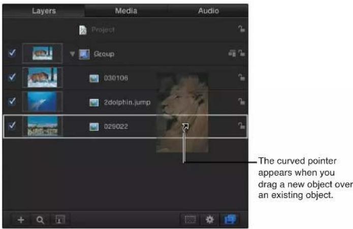
The layer's original source media is replaced by the new source media.
Exchange source media via the Media Inspector
1 In the Media list, select the object to replace.
2 Open the Media Inspector or HUD.
3 Click Replace Media File.
A file navigation dialog appears.
4 Navigate to the file that will replace the current source media.
5 Click Open.
The original source media is replaced by new source media in the Media list and in any layers in the project linked to the source media.
Source media parameters
When you select a source media item in the Media list, the Media Inspector displays adjustable parameters that define how the image or movie clip is displayed and composited in the project.
Motion attempts to interpret the correct parameter settings for each source media item you add to a project. However, additional manual adjustment is sometimes necessary. Because Motion is a nondestructive application, changes made to these parameters are not applied to the source media files on disk. Parameter changes affect how objects are drawn in Motion.

The following controls let you modify source media in the Media list. Modifying source media modifies all layers in a project linked to that source media.
Note: The parameters described below do not apply to Photoshop files imported as separate layers. PDF files with transparent backgrounds do not have the Alpha Type or Invert Alpha parameters.
Parameters in the Inspector
- Alpha Type: Use this pop-up menu to choose how Motion deals with alpha channels in the media item. An alpha channel contains information about areas of transparency in the image or movie. When you import an image file or QuickTime movie, its alpha channel is immediately recognized by Motion. There are several different ways to embed alpha channel information into files, which correspond to the options in this menu. Motion assigns an option based on an analysis of the object when it is imported, but you can override the default if necessary, by choosing any of the following:
- None/Ignore: This is the default setting for objects with no alpha channel. This option also allows you to ignore an object's alpha channel, so the entire object appears solid.
- Straight: These alpha channels are kept separate from the red, green, and blue channels of an image. Media files using straight alpha channels appear fine when used in a composition, but they may look odd when viewed in another application. Translucent effects such as volumetric lighting or lens flares in a computer-generated image can appear distorted until the clip is used in a composition. If Straight is chosen but you see a black, white, or colored fringe around the object, this parameter is incorrectly set and should be changed to a Premultiplied option, depending on the color of the fringe.
- Premultiplied-Black: This type of alpha channel is multiplied with the clip's red, green, and blue channels. As a result, objects with premultiplied alpha channels look correct, even with translucent lighting effects, because the entire image is precomposited against a solid color. This option interprets alpha channels that are precomposited against black.
- Premultiplied-White: This option interprets alpha channels that are precomposited against white.
- Guess Alpha Type: This option forces Motion to analyze the file in an attempt to figure out what kind of alpha channel is used. If you're unsure, use this setting.
- Invert Alpha: Select this checkbox to invert an alpha channel that is incorrectly generated in reverse. Ordinarily, an alpha channel is a grayscale channel, where white represents areas of 100 percent opacity (solid), gray regions represent translucent areas, and black represents 0 percent opacity (transparent).
- Pixel Aspect Ratio: Use this pop-up menu to set the type of pixel relevant to the project, square or nonsquare. In general, objects created for computer display, film, and high-definition video use square pixels, while objects created for some video formats (such as DV, HDV, DVCPRO HD, and others) use nonsquare pixels. A value field to the right of this pop-up menu displays the numeric aspect ratio, in case you need a custom ratio. By correctly identifying each object you add to your project, you can mix and match both kinds of media.
- Field Order: Use this pop-up menu to choose a field order that matches the field order of the device used to capture an interlaced clip. There are two choices: Upper (Odd) or Lower (Even). If you choose incorrectly, you'll notice that the video stutters during playback. When this happens, choose the opposite field order. Clips shot on film or with a progressive scan video camera have no interlacing; therefore Field Order should be set to None. By correctly identifying each object in your project, you can mix and match clips with a different field order. For more information, see Field order on page 1055.
- Frame Rate: Use this pop-up menu to choose a frame rate in frames per second (fps) that matches a clip's native rate. For example, film is 24 fps, PAL video is 25 fps, and NTSC video is 29.97 fps. Additional frame rates are available for other video formats. If the frame rate you require is not listed, enter a number in the text field to the right of the pop-up menu. If you modify a QuickTime file's frame rate but need to change it back to the file's original rate, choose "From file" at the bottom of the Frame Rate pop-up menu.
Although you can mix clips using different frame rates, clips playing at a frame rate different from that of the project might not play smoothly.
Note: Project frame rates are determined by the project preset. To edit a preset or to create a preset, choose Motion > Preferences and use the options in the Presets pane.
- Fixed Width and Fixed Height: Use these sliders (available for still images) to change the resolution of source media. When the Large Stills control (in Motion Preferences) is set to Scale to Canvas Size, these values display the resolution of the original file. For more information, see Import large still images on page 167.
When a PDF is selected in the Media list, these controls set the maximum resolution to which a PDF object can be smoothly scaled. For more information, see PDF files on page 171.
- Crop: Click the disclosure triangle to reveal four sliders that define the number of pixels to be cropped from each of the source media's four sides, relative to the outer edge of the bounding box that surrounds that source media. Cropping an item in the Media list also crops all instances of that item in layers of the project. A similar Crop parameter appears in the Properties Inspector when you select a layer in the Layers list. For more information, see Parameters in the Properties Inspector on page 223.
- Timing: Use these value sliders to set the start, end, and duration of the source media:
- Start: Sets the In point of the source media, in constant and variable speed modes. Adjusting this parameter moves the In point to the specified frame without affecting the duration of the media.
- End: Sets the Out point of the source media, in constant and variable speed modes. Adjusting this parameter moves the Out point to the specified frame without affecting the duration of the media.
- Duration: Sets the total duration of the source media. If Time Remap is set to Constant Speed, adjusting Duration also affects the Speed and Out point. If Time Remap is set to Variable Speed (in the Timing controls of the Properties Inspector), adjusting Duration does not affect variable speed playback.
- Linked Objects: Use this list to see all objects in the Layers list that are linked to the selected source media in the Media list. The first column shows the name of the group containing an instance of the source media; the second column shows the layer name. Changing the layer name in the Layers list updates the name appearing in this list.
- Replace Media File: Use this button to relink media in your project to a source file on disk. This feature is primarily useful for relinking offline media, but can also be used to change source media (changing all layers that are linked to that source media).
- Metadata: Use this information pane to see the properties of the media file on disk that is linked to the item selected in the Media list.
About networked disks and removable media
Be careful when adding media files from a remote server to your project. Although the File Browser can access the contents of disks on other computers on your network, dragging remote media to your project does not copy the source file to your computer. The media source file remains on the remote disk. As a result, when that remote disk becomes unavailable, the corresponding item in your project goes offline. Further, depending on the speed of your network, you may experience performance issues when using media files on other computers.
Ideally, copy all media files used in your project onto a disk that's physically connected to your computer. If you must use media from a networked hard disk, ensure that the drive is always mounted on your system and that you have a high-performance network.
This is especially true for media from removable devices, such as flash drives, DVDs, and removable hard disks that are frequently disconnected from your computer. Always copy media files from such media to your local hard disk.
Work with the Library
Library overview
Motion ships with a collection of built-in media and effects that you can use in projects. This content is available in the Library.
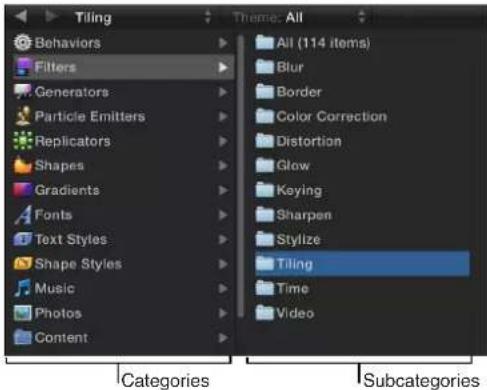
The Library sidebar consists of a two-column pane. The left column displays the categories of media and effects. When you select a category, subcategories appear in the right column. Selecting a subcategory displays a collection of related media or effects in the Library stack below.
For a description of each Library category, see Library content on page 38. For information about general Library navigation, see Library overview on page 35.
Add Library elements to a project
Effects and content elements can be added to a project from the Library in different ways. You can drag an element from the Library stack to your project, or you can select an element in the Library stack and then click the Apply button in the preview area.
Note: To add behaviors and filters, a third option is available. You can select objects in the project and use the Add Behavior or Add Filter pop-up menus in the toolbar.
Add a Library effect or element to a project
1 Select the layer or group (in the Canvas, Layers list, or Timeline layers list) to apply the effect or content element to.
2 Select the element in the Library.
For example, click the Filters category, click a filter subcategory, then click the filter to apply from the stack.
3 Click the Apply button in the preview area.
The filter is added to the layer or group in your project. If you apply an element such as a generator, the element is added to the selected group at the center of the Canvas.
Drag a Library effect or element to a project
1 Select the layer or group (in the Canvas, Layers list, or Timeline layers list) to apply the effect or content element to.
2 Drag the element in the Library to the Canvas.
The center of the object is dropped where you release the mouse button.
For more information about placing and reordering objects in a project, see Organize groups and layers overview on page 153.
Note: When you drag a custom mask from the Library into a project, the mask retains the position where it was saved (relative to the image or footage it is dropped on).
Add iTunes and iPhoto files from the Library
You can add files from your iTunes and iPhoto libraries to a project via the Motion Library. The iTunes library and playlists and iPhoto albums appear in two Library subcategories, Music and Photos.
Note: Although a connected iPod appears in the File Browser as a hard disk, you can only browse for and import iPod files that are stored as data. Music transferred to the iPod via iTunes cannot be imported into Motion.
Add an audio file from iTunes
1 In the Library, select the Music category.
The iTunes library and playlists appear. By default, All is selected (the iTunes library).
2 Select a playlist, then select an audio file from the stack.
Note: When displayed in list view, the Music category shows information created in iTunes, such as Name, Artist, Album, Duration, and Size of the file.
3 Do one of the following:
• In the preview area, click Apply.
- Drag the audio file to the Canvas, Layers list, or Audio Timeline.
Note: Rights-protected AAC files cannot be imported into Motion and do not appear in the file stack. This includes non-iTunes Plus music purchased from the iTunes Store.
For more information on working with audio files, see Audio overview on page 1010.
Add a file from iPhoto
1 In the Library, select the Photos category.
The iPhoto albums appear. By default, All is selected (the iPhoto library).
2 Select an album, then select a file from the stack.
Note: When displayed in list view, the Photos category shows information created in iPhoto, such as Name and Size of the file.
3 Do one of the following:
• In the preview area, click Apply.
- Drag the file to the Canvas, Layers list, or Timeline.
Note: When importing large-scale images into Motion, you can import the files at their native resolution or at the resolution of the Motion Canvas. For more information, see Import large still images on page 167.
Save custom elements to the Library
You can save nearly any object in Motion to the Library, including animated cameras and lights, customized behaviors, filters, particle systems or replicators, shapes and text, as well as layers and groups. After an object is placed in the Library, it can be added to a project like any other element in the Library.
You can save multiple objects to the Library as one file or multiple files. For example, if you create an effect using multiple filters and you want to save the cumulative effect of those filters to apply to other objects, you can save the filters as one item in the Library.
Although you can save custom objects into their namesake folders, it is better to save customized objects that you use frequently to the Favorites category. Because some Motion Library categories contain numerous items, placing custom items in the Favorites or Favorites Menu categories can save you search time. In the Favorites category, you can create additional folders to better organize custom items.
Note: You can create folders in the built-in categories, such as the Color Correction filters subcategory; however, those folders only appear in the Library stack and not the sidebar. Folders added to the Favorites category appear in the Library sidebar.
Save an object to the Library
1 Open the Library and select the Favorites, Favorites Menu, or other category.
2 Drag the customized object to save from the Layers list, Timeline, or Inspector into the stack at the bottom of the Library.
Objects saved to the Favorites Menu category can be applied to objects using the Favorites menu.
When you save a customized object, it is placed in your /Users/username/Library/Application Support/Motion/Library/ folder.
Note: Items dragged to the wrong category are placed into their namesake categories. For example, if a custom behavior is dragged to the Filters category, it is placed in the Behaviors category and the Behaviors category becomes active.
Save multiple objects to the Library
1 Open the Library and select the Favorites, Favorites Menu, or another category.
2 In the Layers list, select all objects to save, then drag them to the stack, holding down the mouse button until the drop menu appears.
3 From the drop menu, choose "All in one file" or "Multiple files."
"All in one file" saves all the objects together, listing them as one item in the Library. "Multiple files" saves the objects as individual objects in the Library.
Note: Objects dragged to the Canvas that were saved with the "All in one file" drop menu option are dropped where you release the mouse button and are positioned according to their arrangement when originally saved to the Library. If you use the Apply button in the preview area to add the object, the objects are added at the center of the Canvas.
4 To name the files, do one of the following:
- Control-click the icon in the Library stack, choose Rename from the shortcut menu, then enter a name.
- Select the icon, click "Untitled," then enter a name.
Create a custom note for a saved Library object
- Control-click the icon in the Library stack, choose Edit Description from the shortcut menu, enter notes in the dialog that appears, then click OK.
Manage Library folders and files
Although you can't modify the effects, elements, and folders built into Motion, you can organize custom effects, elements, and folders in the Library stack in the same way you manipulate files in the Finder. You can create folders and delete certain files or folders.
You can also easily create, save, and organize files and themes in the Library.
Create a new folder
- Click the New Folder button (+) in the lower-left corner of the Library.

For more information on saving custom Library content, see Save custom elements to the Library on page 183.
Rename a folder or file
Do one of the following:
- In the Library stack, Control-click the custom file or folder, then choose Rename from the shortcut menu. When the text field becomes active, enter a name, then press Return.
- Click the name of the folder or file once to select it, then click it again to activate the text field. Enter a name, then press Return.
WARNING: Renaming a custom folder or file in the Library renames the item on your hard disk or networked hard disk. If projects use files from the originally named folder, Motion may list the item as missing.
Create a subcategory in a category
When you add your own content, you can create additional folders to add subcategories that appear in the subcategory column.
1 Open the Library and select a category.
2 Click the New Folder button (+) at the bottom of the Library.
3 Rename the folder to suit your needs.
This folder appears in the subcategory column when that category is selected.
Remove objects or folders from a Content category
- Select an object or folder in the Library stack, then do one of the following:
- Choose Edit > Delete.
- Press Command-Delete.
Delete a folder or file
In the stack, Control-click the custom file, then choose Move to Trash from the shortcut menu.
WARNING: Deleting a custom folder or file in the Library removes the file from your hard disk or networked hard disk and places the file in your Trash.
Move a file into a folder
■Drag the file to the folder icon.
The file is moved inside that folder.
Search for a file
- Click the Search button, then enter text in the Search field.
The contents of the file stack are filtered to include files whose names contain the entered text. Folders containing no matches are filtered out.
Note: The Search field is not available unless the Search button is selected.
Clear a file search
- Click the Clear button at the right side of the Search field.
Note: Folders are not filtered.
When Library media becomes unavailable
As with any other object used in a Motion project, Library media used by a project must be present and installed on your computer for that media to appear correctly in Motion. If someone gives you a project file and you don't have the same filters or fonts used in the file, a warning appears when you open the project, listing the items that are unavailable.
You can close the project and install the necessary files on your computer, or you can open the file. When you open a file with missing media, the following occurs:
- Missing Content: Missing content is treated like any other missing media item. For more information about reconnecting media, see Online versus offline media on page 175.
- Missing Filters: When a filter is missing, a placeholder object appears in the Layers list and Timeline. When you reinstall the missing filter, the filter object replaces the placeholder, and the effect is applied properly.
- Missing Fonts: When fonts are missing, the text objects that use those fonts default to Helvetica as a temporary substitute. Missing international fonts substitute the default system font for the relevant language.
Work with Library themes
Library themes help you organize projects that may share objects by allowing you to label specific objects with a default theme, such as Abstract, Nature, or SciFi, or to assign objects to a custom theme. By default, some preset Library objects are assigned to a theme. For example, the Hypnotic particle emitter preset is in the SciFi category.
Note: Library themes are different from the themes in the Themes pop-up menu of the Project Browser. Project Browser themes are applied to entire Motion projects and shared between Motion 5 and Final Cut Pro X when creating templates. For more information on creating templates for Final Cut Pro, see Final Cut Pro X templates overview on page 385.
Sort using the Theme pop-up menu
Do one of the following:
- Select a category in the Library sidebar or stack, then choose a theme from the Theme pop-up menu.
- To sort using the default themes, select the Content category, then choose an item from the Theme pop-up menu.
Create a new custom theme
1 In the Library, below the preview area, choose New Theme from the Theme pop-up menu.
2 In the Create New Theme dialog, type a theme name, then click OK.
A new theme is added to the Library. New themes appear in the Theme pop-up menu.
Custom themes are saved in the "themes" document in your /Users/username/Library/Application Support/Motion/Library/ folder.
Assign a theme to custom content
- Control-click a custom item in the Library stack (such as a shape saved to the Favorites folder), choose Theme from the shortcut menu, then choose a theme from the submenu.
An item must be saved in the Library before you can assign a theme. For more information, see Save custom elements to the Library on page 183.
Items that can be assigned a theme include the following:
- Replicators
- Emitters
- Shapes
- Gradients
- Text styles
- Shape styles
- Layers or groups
Note: You cannot assign a theme to behaviors, filters, fonts, images, image sequences, or movies.
Remove a custom theme
1 Choose the theme to remove from the Theme pop-up menu.
The Remove Theme item becomes available in the Theme pop-up menu.
2 Choose Remove Theme from the Theme pop-up menu.
The theme is removed from the list.
Note: You can only remove custom themes.
Manage projects
Save projects
As with any application, it's wise to save early and often as you work on your project. In addition to preserving your work for future use, Motion's save commands can be used in other ways to manage the development of your project. For example, if you're happy with your current composition but want to create a variation, use the Save As command to save a copy of the current project. You can then alter the duplicate, leaving your original project alone in case you don't like your changes.
When saving a project, you can gather the all the media used in the project. Motion collects these files and places them into a single folder, making portability and backup easier. By default, Collect Media is turned off.
Save a project
1 Choose File > Save (or press Command-S).
If the project has not been saved, the Save As dialog appears.

Note: If the project has been saved, the project file is updated without opening a dialog.
2 Enter a name into the Save As field, choose a location on your hard disk to save the file, then click Save.
Save a duplicate of a project
1 Choose File > Save As (or press Shift-Command-S).
The Save As dialog appears.
2 Enter a name into the Save As field, choose a location on your hard disk, then click Save.
Save a project and copy all project media into a folder
1 Choose File > Save As (or press Shift-Command-S).
The Save As dialog appears.

2 Choose Copy to Folder from the Collect Media pop-up menu.
Motion creates a folder with the name specified in the Save As field and places two items in the folder:
• A project file with the same name as the folder
- A folder named "Media," which contains all media files used in the project
When you save a project and collect media into a folder, you can specify whether unused media files are collected as well.
Important: When using the Save As command, use a name that is different from the name of any saved versions of the same project. Otherwise, you run the risk of overwriting a version of this project file you want to keep.
For information about customizing autosaved projects, see Use autosave on page 189.
Use autosave
Motion saves backups of your project in a folder on your hard disk. In the Cache pane of Motion Preferences, you can specify how frequently projects are saved, as well as the location of the saved files. Saved projects are time- and date-stamped. For more information about autosave, see Cache pane on page 120.
Store autosaved projects in a specific location
1 Choose Motion > Preferences (or press Command-Comma).
2 Click Cache.
3 In the Autosave group, select Use Autosave Vault.
By default, the Autosave Vault folder is located in your /Users/username/Movies/Motion Projects/folder.
Set a location for the Autosave Vault folder
In the Cache pane of Motion Preferences, click Choose and select a location in the dialog.
Revert to an autosaved project
1 Choose File >Restore From Autosave.
The Restore Project dialog appears.
2 Choose a saved project from the pop-up menu.
Revert projects
The Revert to Saved command discards all changes you've made to a project since the last time you saved it. The Revert command is useful as a tool for trying out changes in your project. You can save your project in the state you like it, then make the changes you want. If you don't like the result, use the Revert to Saved command to immediately go back to the way it was before.
Note: You can also use the application's unlimited undo feature to achieve the same purpose in incremental steps. For more information on the Undo command, see Edit menu on page 100.
Revert a project to the last saved version
- Choose File > Revert to Saved.
Important: This command cannot be undone.
Open and close projects
You can open a saved project file in the Finder or from within Motion. Multiple projects can be open at the same time.
Open a project file in the Finder
Do one of the following:
■Double-click a Motion project file.
- Select a Motion project file, then drag it onto the Motion application icon in the Applications folder or in the Dock (if you've placed a Motion application icon in the Dock).
- Select a Motion project file, then choose File > Open (or press Command-O).
■ Control-click a Motion project file, then choose Open from the shortcut menu.
Motion starts and opens the selected project.
Open a project file from within Motion using the Open command
1 Choose File > Open (or press Command-O).
The Open dialog appears.
2 In the Open dialog, navigate to the project file you want, then click Open.
Create a project prepopulated with specific media
1 Choose File > Import as Project or press Shift-Command-I.
The Import Files as Project dialog appears.

2 Navigate to and select the files to populate the project, Shift-clicking to select contiguous items or Command-clicking to select noncontiguous items.
As you select files, format settings at the bottom of the dialog become available. Settings inherent to the selected files remain dimmed, but propagate to the new project. For example, because movie files have an inherent frame rate, aspect ratio, and field order, those settings are dimmed in the Import Files as Project dialog. Because still images do not have a frame rate or a field order, those settings are enabled in the dialog, allowing you to choose a frame rate and field order for the new Motion project.
3 If needed, set the frame rate, aspect ratio, field order, and audio mix settings.
If you selected an item from an image sequence, select the Image Sequence checkbox to have Motion use each image as a frame in a movie clip. For more information, see Image sequences on page 169.
Except for frame rate, these settings can be modified in the Properties Inspector after the project is created. For more information, see Project properties overview on page 191.
4 Click Import as Project.
The file opens in a Motion project window.
You can also open existing projects and templates, and create projects from presets using the Project Browser. For more information, see About the Project Browser on page 146.
Close projects
■Close the project window, or press Command-W.
Move and archive Motion project files
To move a Motion project file to another computer, you must also move all media that the project uses, including all QuickTime, still image, and audio files. In addition, any third-party Motion plug-ins or nonstandard fonts used in the project must be installed on the new computer, or they'll be unavailable to your project.
Similarly, when you finish a project and want to archive it, it's a good idea to archive the project file and all media (especially media that wasn't captured from a device-controllable video or audio source), graphics, fonts, custom behaviors, filters, and third-party add-ons used in the project. If you need to restore the project for later revisions, you'll have everything you need to get started quickly. If you have a recordable CD or DVD drive, backing up your media is easy. For more information on copying files to a CD or DVD, see OS X Help (in the Finder, choose Help > Help Center).
The easiest way to collect all media for your project is to use the Collect Media feature. For more information, see Save projects on page 187.
Note: If you move a project to another computer without collecting, its media can go offline even though you've moved its media files with it. For more information on how to relink media files to your project, see Online versus offline media on page 175.
Search for projects using the Finder
Spotlight indexes the following properties of Motion projects, allowing you to perform advanced searches. Use Spotlight in the Finder to take advantage of this feature.
| Project property Description | |
| Width Project width, in pixels | |
| Height Project height, in pixels | |
| Duration Project duration, in seconds | |
| Layer name The name of a layer in a project | |
| Media name The name of a media object in a project | |
| Pathname The path to a media object in a project | |
| Text The content of a text object in a project | |
| Description Text in the Project Description field in the PropertiesInspector | |
| Marker name The name of a marker in the Timeline of a project | |
| Marker comment | Text of a marker comment in a project |
Project properties
Project properties overview
When you create a project, you specify a set of project properties—Resolution, Frame Rate, Duration, and so on. You can change most of these properties at any time, even after you add objects to the project.
The Properties Inspector lets you define the most essential attributes of a project. By choosing different parameters, you can accommodate nearly any video or film format you need to output to. These properties are the default settings used when you export your project.
Edit the properties of an existing project
1 Do one of the following:
- Choose Edit > Project Properties (or press Command-J).
- Select the Project object at the top of the Layers list, then open the Inspector and click Properties (if that pane is not showing already).
The Inspector opens and displays the Properties pane.
2 In the Properties Inspector, change any necessary parameters, then click OK.
Important: Project Frame Rate cannot be changed after a project is created.
The Properties Inspector for the project contains settings for video file format, timecode display, motion blur, and other project attributes.
Properties Inspector controls
The Properties Inspector is divided into several control groups: General, Motion Blur, Reflections, and Description.

General controls
Use the controls in the General group to set or modify your project's basic attributes.
- Preset: Use this pop-up menu to choose a common video format to base your preset on. After choosing a preset, you can adjust the other parameters in the Properties Inspector to customize your format settings. For more information about managing Motion project presets, see Create, edit, and delete presets on page 151.
- Width and Height: Use this value slider to define the size of the Canvas and the default output resolution of your project. Drag left or right over the values to decrease or increase them. Frame size is usually defined by the video format you plan on outputting to. For example, NTSC DV format video is 720 x 480, whereas PAL DV format video has a frame size of 720 x 576.
- Pixel Aspect Ratio: Use this pop-up menu to set whether the project is created using square or nonsquare pixels. Computer displays, film, and high-definition video use square pixels, while standard-definition video uses nonsquare pixels. Choose Square for projects intended for the web, high-definition projects, and film, or choose a nonsquare pixel ratio corresponding to each international standard-definition broadcast format. A value slider to the right of this pop-up menu displays the numerical aspect ratio, in case you need to change the dimensions manually.
- Field Order: Use this pop-up menu to set field order if the project uses interlaced video. Project field order should match the field order of the device being used to output the resulting QuickTime file to video. When working with progressive-scan video or film, choose None.
- Frame Rate: Use this display field to see the project frame rate (in frames per second). Frame rate should match that of the format you output to. For example, film is 24 fps, PAL video is 25 fps, and NTSC video is 29.97 fps.
Important: Frame rates cannot be changed for existing projects.
- Duration: Use this value field to modify the project's Timeline duration. Use the adjacent pop-up menu to define the duration units (Frames, Timecode, or Seconds).
- Override FCP: This checkbox appears only in Final Cut Transition projects. When creating custom transitions in Motion for use in Final Cut Pro X, select this checkbox to override the default transition duration (as defined in the Editing pane of Final Cut Pro Preferences). For more information, see Final Cut Pro X templates overview on page 385.
- Start Timecode: Use this value field to set the starting timecode displayed in the project.
- Background Color: Use this color control to set the background color of the Canvas.
- Theme: Use this pop-up menu to assign a theme to the project.
- Designed for 4K: This checkbox appears only in Final Cut Effect, Transition, Generator, or Title template projects. For more information, see Template resolution on page 433.
- Background: Use this pop-up menu to define whether the Background Color is rendered as part of the alpha channel. Regardless of the selection, the Background Color is visible in the Canvas. Choose from these three options:
- Transparent: The background color does not render as part of the alpha channel.
•Solid: The background color creates a solid alpha channel.
- Environment: The background color creates a solid alpha channel and interacts with 3D projects, including blend modes and reflections. In the following images of the Canvas, Reflection is turned on for the elliptical shape (in the shape's Properties Inspector). In the left image, the elliptical shape retains its original white color because Background is set to Solid. In the right image, the pink background is reflected in the elliptical shape because Background is set to Environment.

natural_image
Pink background with scattered red star shapes and a white oval (no text or symbols)
natural_image
Pink background with scattered red star shapes and a faint circular pattern at the bottom (no text or symbols)Motion Blur and Reflections controls
Below the General section of the Properties Inspector are two groups of controls that can affect how your project looks when exported: Motion Blur and Reflections.
The Motion Blur controls simulate the effect a camera's mechanical shutter has on a frame of film or video when the camera or its subject is moving. In Motion, motion blur affects objects in your project that are animated using behaviors or keyframes, creating more natural-looking motion in your project, even though the animation is artificial. As with a camera, faster objects have more blur; slower objects have less blur.
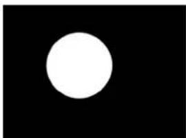
natural_image
A white circle centered on a black background, no text or symbols present.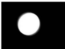
natural_image
A bright white circular shape centered on a black background, resembling a moon or light source against a dark background.
natural_image
A bright circular light source against a black background, resembling a celestial body or lens flare (no text or symbols visible).No motion blur Motion blur at 360°Motion blur at 180°
The Motion Blur section of the Properties Inspector has two settings:
- Samples: Use this slider to set the number of subframes rendered per frame, where one frame represents 360 degrees. Higher Samples values result in a higher-quality motion-blur effect, but are more processor-intensive. The default Samples value is 8. The maximum possible value is 256.
- Shutter Angle: Use this slider to define the size of the motion blur that appears for animated objects. Increasing the shutter angle increases the number of frames over which the shutter is open.
The following image shows a shape keyframed to move quickly across the Canvas horizontally.

natural_image
Pure geometric diagram with a square and horizontal line intersecting at center (no text or symbols)In the next image, Motion Blur is enabled and Samples is set to the default value of 8.

natural_image
Simple white square centered on black background, no text or symbols presentNote: When using larger Shutter Angle values, it may be necessary to increase the Samples value to eliminate unwanted artifacts.
In the above image, the Shutter Angle is set to the default of 360 degrees, which represents 1 frame. In the following image, Shutter Angle is set to 600 degrees.
natural_image
Abstract grayscale gradient rectangle with no text or symbolsThe Reflections section of the Properties Inspector has one parameter:
- Maximum Bounces: Use this slider to limit the number of recursive reflections that can occur when two or more shiny objects reflect one another. This parameter is intended to prevent an endless repetition of reflective bounces.
For more information about reflections, see Reflections overview on page 951.
Description field
At the bottom of the Properties Inspector is a field where you can enter a brief description of the project, including significant characteristics of the project preset, such as frame size and frame rate.
About project frame size
When you change the frame size of a project (via the Width and Height parameters in the Properties Inspector), you effectively change the size of the Canvas, increasing or reducing layout space for objects in the project.
Changing the size of the Canvas does not change the size or position of objects in the Canvas. Further, because the coordinate system in Motion uses 0, 0 as the center of the frame, all objects remain arranged in their current positions relative to the center of the frame as the edge of the frame shrinks toward the center. This can result in objects being cut off as the frame shrinks past their edges.
In the following example, a project with a frame size of 1280 x 720 is reduced to 320 x 240. The 720 x 480 video clip is smaller than the original frame size but bigger than the reduced frame size.

natural_image
Two dolphins leaping out of the ocean under a clear sky (no text or symbols visible)Original frame size (1280 x 720)

natural_image
Dolphin leaping out of the ocean with a small globe icon in the sky (no text or symbols)Reduced frame size (320 x 240)
Note: Because Motion is resolution-independent, it's not usually necessary to change your project's frame size. You can output a project at any size, regardless of the current frame size, by changing the settings in Motion's Share windows. For example, if you build a project with a frame size for standard-definition broadcast, you can still export a half-resolution version of the project to post on the web by exporting to the necessary size.
Customize and create templates
Customize projects created with templates
When you open a new project file from a template, the project is a duplicate of the original template. There's nothing special about template-based projects, and they can be edited and modified like any other project.
Most templates, especially those you create yourself, are intended to simplify the process of creating titles and graphics for recurring projects. Examples include titles and lower thirds for news and interview programs, graphics for magazine shows, and any repeating program that requires graphics with a consistent look that must be updated from show to show. Well-designed templates allow you to exchange key objects and edit the text to update them for the next show in the series.
Changes you make to projects created from templates have no effect on the original templates.
Exchange media
The easiest way to customize a template-based project is to exchange the media used in the template with your own media, from the File Browser or the Library. When you exchange media, the new media item appears in your project with the same parameter values used by the previous object. In addition, filters, masks, behaviors, or keyframed parameters applied to the original media remain applied to the exchanged media.
For more information about exchanging objects, see Exchange media in a project on page 178.
Customize text objects
Text objects are easily updated using the Text tool. Editing a text object does nothing to change the format, style, or layout of the text. Further, simple edits made to text objects have no effect on filters, masks, behaviors, or keyframed parameters applied to that object.
For more information on editing text objects, see Ways to edit text on page 621.
Modify behaviors and keyframes
Objects in template-based projects are animated using a combination of behaviors and keyframed parameters. These can be edited to customize the motion of the objects. For more information on modifying behaviors, see Modify behaviors in the Inspector or the HUD on page 301. For more information on modifying keyframes, see Add, delete, and modify keyframes on page 465.
Use objects, behaviors, and keyframes from templates
Occasionally, you might want to use a keyframed parameter or behavior from a template in a project of your own. You can create a template-based project, select the keyframes or behaviors you want to use, copy them, and paste them into your own project.
All graphics objects used by the templates appear in the Content category of the Library, in the Template Media subcategory. If there's a graphic you want to use, you can find it in the Library.
Drop zones
Drop zones overview
Drop zones let you replace footage in a Motion template by dragging clips onto the Canvas. A drop zone layer appears as a rectangle with a downward arrow in its center. The drop zone's layer name appears in the center of the drop zone. Any media item (image or footage) dragged into the region defined by the drop zone object replaces the drop zone placeholder graphic. When you drag media over the drop zone, a highlight appears around the drop zone area.

natural_image
Simple white download arrow icon on gray background (no text or symbols)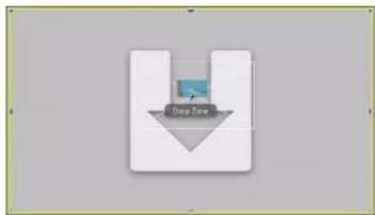
QuickTime movie being dragged onto drop zoneBlank drop zone
Note: If there are multiple overlapping drop zones in the Canvas, the topmost one has priority when you drag an item over the zone. You can force all drop zones to appear by using the expose feature. For more information, see Control and expose drop zones on page 200.
Adding a drop zone to a Final Cut Pro X template in Motion enables Final Cut Pro users to easily assign media to an editing project. For more information about creating templates for use in Final Cut Pro, see Final Cut Pro X templates overview on page 385.
Create drop zones
You create drop zones in either of two ways: by adding an empty drop zone object or by converting an existing layer into a drop zone. Any still image or video clip can be converted into a drop zone via the Image Inspector.
Add an empty drop zone
1 Choose Object > New Drop Zone or press Shift-Command-D.
A drop zone layer is added to the project.
2 Position and scale the drop zone object.
3 If needed, rename the drop zone layer in the Layers list.
4 Open the Inspector and click Image to access the drop zone parameters.
For more information about using these parameters, see Drop zone parameters on page 199.
Scale a drop zone
- Select the drop zone object, then resize the drop zone in the Canvas using the Select/Transform tool.
Convert an image layer to a drop zone
1 Add a video clip or still image to your project.
2 Position and scale the image or clip where you want the drop zone to appear.
3 Open the Image Inspector and click the Drop Zone checkbox.
The drop zone parameters appear.
4 To replace the original image with a drop zone graphic, click the Clear button.
An active drop zone replaces the original image. For more information about using remaining Drop Zone parameters, see Drop zone parameters on page 199.
Modify drop zone images
After you add a source image to the drop zone, you can pan or scale the image within the boundary of the drop zone. You can add a solid color to the drop zone to fill empty areas that are the byproduct of panning or resizing the image.
Add an image to a drop zone
Do one of the following:
- Drag an image from the File Browser or Library to the Drop Zone in the Layers list. When the pointer changes to a curved arrow, release the mouse button.
- Drag an image from the File Browser, Library, or Media list (in the Project pane) to the Drop Zone in the Canvas. When the pointer changes to a curved arrow and the drop zone is highlighted in yellow in the Canvas, release the mouse button.
- Drag an image from the Media list to the Source Media well in the Image Inspector.
In the Image Inspector, click To and select a media item in the project from the pop-up menu.
Scale a drop zone image in the Canvas
1 Select the drop zone.
2 Do one of the following:
• In the Canvas, double-click the drop zone.
The Adjust Item tool is automatically selected.
• In the toolbar, select the Adjust Item tool.
The drop zone bounding box appears as a dotted line.
3 Drag the scale handles in the Canvas to resize the image.
The image's bounding box appears as a solid line and scales uniformly. Portions of the image that extend beyond the edges of the drop zone appear semitransparent.
Scale a drop zone image in the Inspector
1 Select the drop zone.
2 In the Image Inspector, drag the Scale slider. To adjust the horizontal or vertical scale independently, click the Scale disclosure triangle to reveal the X and Y subparameters.
Pan a drop zone image in the Canvas
1 Select the drop zone.
2 In the toolbar, select the Adjust Item tool.
The drop zone bounding box appears as a dotted line.
3 Place the pointer over the drop zone image, and, when the Pan tool appears, drag within the drop zone to pan the image.
The image's bounding box appears as a solid line. The dotted line represents the edges of the drop zone. Portions of the image that extend beyond the edges of the drop zone appear semitransparent.
Pan a drop zone image via the Inspector
1 Select the drop zone.
2 In the Image Inspector, adjust the Pan parameter X and Y value sliders.
Assign a background color to a drop zone
1 Select the drop zone.
2 In the Image Inspector, select the Fill Opaque checkbox.
Any empty portion of the drop zone is filled with black.
3 Use the Fill Color controls to choose a custom drop zone fill color.
Drop zone parameters
You can add any media object to any drop zone, but the object might not have the same dimensions as the drop zone. Motion provides controls to help ensure the image placed in the drop zone is handled as you want—scaling, stretching, and positioning the object correctly.
The Image Inspector contains the following drop zone controls:
Parameters in the Inspector
- Drop Zone: When an image is selected, select this checkbox in the Image Inspector to convert an image layer into a drop zone.
Note: Drop zones in Final Cut Pro templates do not have a Drop Zone checkbox.
- Source Media: Use this image well to assign an image to the drop zone. Drag a media item from the Layers list, Media list, File Browser, or Library.
- To: Use this pop-up menu an alternative method of assigning an image to the drop zone. The menu contains a list of media items in your project. Select an item to assign it to the drop zone.
- Pan: Drag in the value sliders to pan the image within the drop zone. Adjust the X value slider to move the image horizontally and the Y value slider to move the image vertically.
-
Scale: Adjust this slider to uniformly scale the image in the drop zone. To resize the image horizontally or vertically, click the Scale disclosure triangle and adjust the X or Y parameter.
-
Fill Opaque: Select this checkbox to fill the drop zone background with a color when the drop zone is scaled down or panned. If the Fill Opaque checkbox is not selected, the empty drop zone area is transparent.
- Fill Color: Use this color control to set a color when the Fill Opaque checkbox is selected.
- Use Display Aspect Ratio: Select this checkbox to resize the drop zone according to selected Display Aspect Ratio Snapshot (in the Snapshots pane of the Project Inspector). For more information about display aspect ratios, see Add multiple display aspect ratios to a template on page 435.
- Clear: Use this button to clear the image from the drop zone, replacing it with a downward-arrow graphic.
Control and expose drop zones
When constructing your template, you can disable drop zones so you don't accidentally drop a clip. Later, when using the template, you can turn drop zones back on.
Use the expose feature in Motion to reveal obscured drop zones in the Canvas. The expose command shows an exploded view of valid drop zones in the Canvas.
Turn drop zones on and off
■Choose View > Use Drop Zones.
A checkmark appears next to the menu item when drop zones are enabled (which means they accept objects dragged to them). When no checkmark appears next to the menu item, drop zones are disabled (which means they ignore objects dragged to them).
Expose all drop zones in a project
1 Use the Library or File Browser to locate an item to import into the project.
2 While holding down the Command key, drag the item onto the Canvas.
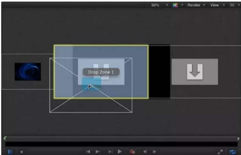
Objects in the Canvas shrink and separate in an exploded view so you can see them all. Moving the pointer over an object reveals its Layers list name.
Note: You cannot Command-drag nonimage objects (shapes, Motion projects, particles, and so on) to the Canvas.
3 Drop the object onto its target.
The object replaces its target, and the Canvas view returns to normal.
Create templates
In addition to using and customizing templates that ship with Motion, you can build new templates. Template files contain everything that ordinary projects do, including media layers, text objects, shapes, generators, behaviors, and filters, in any combination.
You can create custom templates for commonly used shots that you regularly create. For example, if you make titles for a news program, you can create templates for the opening title, interstitial graphics, bumpers, and other repetitious shots.
To save a Motion project as a template
Templates are standard Motion projects that are saved in a special way.
1 Choose File > Publish Template.
A save dialog appears.
2 Enter a name for the template and choose a category from the Category pop-up menu.
The template is organized in the Project Browser under the category you assign. Create a custom category by choosing New Category from the menu.
3 Choose New Theme from the Theme pop-up menu, enter a descriptive name in the New Theme dialog, then click Create.
4 If you want the template project to retain media in the Media list that isn't present in the composition, select "Include unused media."
5 If you want a preview of the template to appear in the Project Browser, select Save Preview Movie.
Note: If you want to add the template to a Final Cut Pro project, select the "Publish as Final Cut Generator" checkbox. For more information, see Final Cut Pro X templates overview on page 385.
6 Click Publish.
The template is saved in the /Users/username/Movies/Motion Templates/Compositions/folder on your computer.
Note: If you selected the "Publish as Final Cut Generator" checkbox, the template is saved in the /Users/username/Movies/Motion Templates/Generators/ folder. For more information, see Publish a standard Motion project as a Final Cut Pro X generator on page 418.
Template rules of thumb
When designing templates, there are a few useful rules of thumb:
- Use descriptive group and layer names: Group and layer names in a template should describe each object's function. For example, text objects in a titling template might be named "Main Title," "Starring," "Guest Star," and so on. If you use visual elements in the template's composition, their layer names should describe their function—"Background Texture," "Divider," and "Main Title Background," for example. Descriptive layer names are especially important if others use the template.
- Use snapshots to create alternate versions of a template for each resolution you need: If you regularly create projects for a variety of output formats, you can build alternate versions of a template in different display aspect ratios—all within a single template. For example, when you create a template with a 16:9 aspect ratio, you can add an alternate version customized for 4:3 displays. When the template is applied to a clip in Final Cut Pro, the editing application chooses the version that matches its current display aspect ratio. These alternate display versions of a single template are called snapshots. Snapshots eliminate the need to create multiple versions of the same template for different display ratios. For more information about snapshots, see Add multiple display aspect ratios to a template on page 435.
- Place all media files used in a template in a central folder: To avoid problems with offline or missing media, move all media files for the template into a central folder on your computer before you begin the working on the project. Although customized templates are saved in the /Users/username/Movies folder on your computer, media added to the template remains in its original location on disk. A central location for all media resources ensures that files are not lost. Alternatively, you can use the File > Save As command, and use the Collect Media option. For more information, see Save projects on page 187.
Organize templates in the Project Browser
You can organize and access custom templates in the Project Browser. All templates are organized into categories. You can add, delete, and rename categories in the Project Browser.
Add a category in the Project Browser
1 Choose File > New From Project Browser.
The Project Browser appears.
2 Select a template type (Compositions, Final Cut Effects, Final Cut Generators, Final Cut Transitions, Final Cut Titles) from the sidebar (on the left).
3 Click the Add button (+) at the bottom of the sidebar.
4 Enter a name for the category in the dialog that appears.
5 Click Create.
The new category appears in the column at the left under the template type you selected.
Delete a category in the Project Browser
1 Choose File > New From Project Browser.
The Project Browser appears.
2 Select a category in the sidebar.
3 Press Delete or click the Delete button (−).
An alert dialog prompts you to confirm the deletion.
The directory on your disk corresponding to that category is placed in the Trash, but is not deleted. Template files in that category's directory are also placed in the Trash.
Delete individual templates from the Project Browser
1 Choose File > New From Project Browser.
The Project Browser appears.
2 Select a category from the sidebar.
3 In the project stack, select the template to delete.
4 Press Delete.
An alert dialog prompts you to confirm the deletion.
5 Click the Delete button.
Control project playback
Use the transport controls in the Canvas to play back your project.

Each time you play a project in the Canvas, Motion performs complex calculations to represent the objects and effects that appear in each frame. This is called rendering. The project plays back as quickly as possible up to the frame rate specified in the Properties Inspector. With a very complex project, the frame rate can be significantly reduced, making it difficult to see how the project looks when played at full frame rate.
To improve real-time playback, you can manually render parts of your project and store the frames in RAM Preview. Using RAM Preview, you can render the play range, a selection, or the entire project.
RAM Preview your entire project
- Choose Mark > RAM Preview > All.
The RAM Preview dialog appears, and displays a progress bar that shows which frame is being rendered, how many more frames remain, and an approximation of the time remaining. When RAM Preview is completed, the dialog closes.

Note: Because some sections of a project may be more complex than others, the "Time remaining" value may be somewhat inaccurate.
Interrupt the RAM Preview
■Click the Stop button.
The section that has been rendered is stored in RAM.
When a section of your project is stored in RAM, a green glow appears along the bottom of the Timeline ruler and the mini-Timeline.

Clear RAM Preview
You can manually delete RAM Preview to make room for a new RAM Preview or to free up RAM for other operations.
- Choose Mark > RAM Preview > Clear RAM Preview.
RAM Preview the play range
You can restrict which frames are rendered by choosing to preview the play range or a selection. Using RAM Preview on a selection renders all visible layers in the project from the first frame of the selection until the last.
- Choose Mark > RAM Preview > Play Range.
The RAM Preview dialog appears and displays a progress bar. When RAM Preview is completed, the dialog closes.
For more information on setting a project play range, see Define the play range on page 282.
RAM Preview a selection
1 Holding down the Command and Option keys, drag In the Timeline to select a region to preview. A highlight appears over the selected frames.
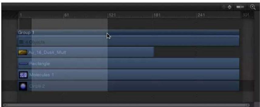
For more information on regions, see Work with regions on page 284.
2 Choose Mark > RAM Preview > Selection.
The RAM Preview dialog appears. When RAM Preview is completed, the dialog closes.
Basic compositing
7
Basic compositing overview
Compositing is the process of combining at least two images to produce an integrated final result. The process can be as simple as placing text over an image, or as complex as combining live actors with drooling space aliens who shoot laser beams from their eyes. Motion graphics artists use various compositing techniques to create animated visual effects, including changing group and layer order, transforming the physical properties of layers (such as scale), adjusting layer opacity and blend mode settings, applying filters to layers, and creating text and shapes. Motion graphics projects often combine layout and design techniques with special effects such as keying, masking, color correction, and creation of particle systems.
After you import the layers you need for your project, the first step in the compositing workflow is to arrange the layers in the Canvas to rough out the general design of your piece. Before you animate anything, you should decide on a layout, taking into account the size, placement, and rotation of the layers in your composition.
Use the Motion editing tools to perform basic layout tasks—selecting, moving, rotating, scaling, distorting, cropping, changing a layer's anchor point, and manipulating drop shadows. These editing tools are available on the left side of the toolbar. When you choose an editing tool, specific onscreen controls become available in the Canvas; drag these controls to perform the selected action.

Additional controls in the HUD let you change each selected layer's opacity, blend mode, and drop shadow settings.
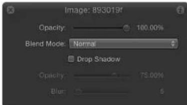
The onscreen controls and the HUD controls correspond to parameters that appear in the Properties Inspector. Adjustments made in the Canvas are simultaneously updated in the Inspector and HUD, and vice versa. For example, if you're using the Select/Transform tool and you change a layer's scale by dragging its corner handles in the Canvas, the layer's Scale parameter is updated in the Properties Inspector.
When you begin to lay out a composition, it's a good idea to start by creating a static layout of your project that represents how it looks at the beginning, end, or at a particular moment in time. In addition to manipulating the geometry of layers in your project, you can also alter their opacity to adjust how overlapping elements of your layout merge together. Blend modes provide further control over the appearance of overlapping layers, accentuating or stylizing the colors of the topmost layers based on the colors of underlying layers.
After you create an initial layout, you can animate the layers you've added to set your project in Motion. For more information about animating layers and their properties, see Keyframing overview on page 439.
To learn more about compositing, choose a topic in the Help table of contents (the sidebar to the left of this window).
Group and layer order
In the Motion workspace, every project is visually represented by a Project object at the top of the Layers list. Beneath the Project object are the groups, image layers, and effects objects that make up your project. Except for cameras, lights, and rigs, all layers and objects in the Layers list must be contained in a group.
In a purely 2D project, the order in which layers and groups appear in the Layers list (known as the layer order) determines which image layers appear in front of others in the Canvas. Before you use the tools described in this chapter, you should arrange the layers and groups in your project so they appear in the proper order. For information about layer order, see Reorganize in the Layers list on page 158.
Objects and layers
In Motion, any element that appears stacked in the Layers list (and Timeline) is an object. Objects encompass the entire range of images, effects, video clips, audio clips, lights, cameras, and other items that combine to form a finished composite. A layer is a special class of object defined as any image-based element—a movie clip, a still image, a shape, text, a particle system, a replicator, and so on—that is visible in the Canvas. For example, a rotating a triangle shape is a layer, but the behavior object that animates it is not; a sepia-tone video clip is a layer, but the Sepia filter that makes it so warmly old-timey is not. In the Motion documentation, the term object is often used to describe the superset of all manipulable elements that act upon and form a composition. Layer, however, always refers to the image-based elements acted upon.
Arrange objects
Arrangement commands in the Object Menu
As an alternative to rearranging layer order in the Layers list, you can change layer order using commands in the Object menu. The Object menu commands are useful when you want to move a layer to the front of your composition while you're working in the Canvas. The arrangement commands in this menu can be used with layers, objects, groups, or groups nested in another group. Reordering a group reorders all objects nested in that group.
Note: You cannot use the Object menu reorder commands to move image layers out of the group they're nested in.
There are four arrangement commands in the Object menu:
- Bring to Front: Places the selected layer in front of all other layers in the same group by moving the layer to the top of the nested group in the Layers list and Canvas.
- Send to Back: Places the selected layer behind all other layers in the same group by moving the layer to the bottom of the nested group in the Layers list and Canvas.
- Bring Forward: Moves the selected layer up one level in the hierarchy of layers nested in the same group in the Layers list and Canvas, moving it closer to the front in the Canvas.
- Send Backward: Moves the selected layer down one level in the hierarchy of layers nested in that group in the Layers list and Canvas, moving it closer to the back in the Canvas.
Reorder nonconsecutive selections
When you apply the Bring Forward or Send Backward arrangement command to noncontiguous selected layers (Command-click to select noncontiguous layers), the layers move up or down the object hierarchy together, and any space between the layers remains.
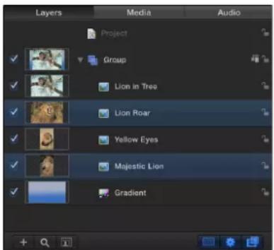
Nonconsecutive layers selected
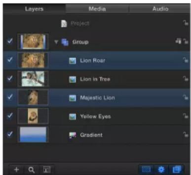
Bring Forward command applied
When you apply the Bring to Front or Send to Back arrangement command on noncontiguous selected layers, the layers move up or down the object hierarchy together.
Transform layers
Select layers to transform
Transforms are operations that you perform on layers—such as moving, resizing, or rotating. Layer transforms can be performed using onscreen controls (transform handles), or by changing the layer's parameters in the Properties Inspector. In general, the controls in the Canvas give you a more hands-on method of working, while the parameter controls in the Properties Inspector are better suited for subtle adjustments requiring greater numerical precision. For more information about each transform's corresponding parameter and its numerical values, see Adjust layer Properties in the Inspector on page 222.
Before you can transform layers and groups, you must make a selection in the Canvas, Layers list, or Timeline. Selecting a group or layer in one place also selects it in the others. When a layer is selected in the Canvas, it is surrounded by a bounding box with transform handles corresponding to the selected transform mode. These handles allow you to transform each selected layer.
Select a single layer in the Canvas
■Click any layer in the Canvas.
Select multiple layers in the Canvas
Do one of the following:
- Drag a selection box over the layers to select.
■Holding down the Shift key, click the layers to select them.
Add layers to a selection
- With one or more layers already selected, hold down the Shift key and drag a selection box over additional layers to add them to the selection.
Deselect one of multiple selected layers in the Canvas
Do one of the following:
■Shift-click a layer to deselect.
All other selected layers remain selected.
- Holding down the Shift or Command key, drag a selection box over the layers to deselect.
Select all layers in the Canvas
Do one of the following:
- Choose Edit > Select All.
■Press Command-A.
Deselect all layers in the Canvas
Do one of the following:
■ Choose Edit > Deselect All.
■Press Shift-Command-A.
Select hidden or inactive layers
From time to time, a layer might be hidden behind another layer in the Canvas. The best way to select a hidden layer is to select it in the Layers list or Timeline. When you do so, the layer's bounding box and transform handles appear in the Canvas, even if the layer is completely obscured.

natural_image
A zebra standing on a grassy field against a solid blue background (no text or symbols visible)Note: When you select an inactive layer (a layer whose activation checkbox is deselected in the Layers list), only the layer's bounding box appears in the Canvas—the layer itself is not visible.
For more information on how to select objects and groups in the Layers list, see Select layers and groups on page 156.
Transform layers and groups
You can transform a single layer or multiple layers simultaneously. You can also transform a group, which modifies all layers within that group.
Transform a single layer
If you select a single layer, the changes you make affect only that layer. All unselected layers remain untouched.
- Select a layer in Layers list, Timeline or Canvas, then drag a transform handle in the Canvas. The selected layer alone is transformed.

natural_image
Collage of four animal photos: leopard, tiger, and cheetah, all against a blue sky (no text or symbols)Before
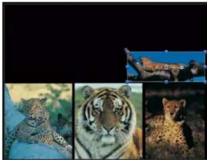
natural_image
Collage of four animal photos: a cheetah, a tiger, a cheetah with its face, and a cheetah in natural habitat (no text or symbols)After scaling
Transform multiple layers
If you select multiple layers in the Canvas, changes made to one layer are simultaneously made to the other selected layers.
Shift-click to select multiple contiguous layers, or Command-click to select noncontiguous layers in the Layers list, Timeline, or Canvas, then drag a transform handle in the Canvas.
All selected layers are transformed. Each transform occurs around each layer's own anchor point, so the effect is the same as if you applied the transform to each layer's handles, one at a time.
natural_image
Collage of four animal photos: a leopard on a branch, a tiger in flight, a close-up photo of a tiger's face, and a close-up of a cheetah (no text or symbols visible)Before

natural_image
Illustration of a leopard on a branch with three inset images showing tiger portraits against a blue background (no text or symbols)After scaling
Transform a group
If you select an entire group, all layers and groups nested in it are treated as a single layer.
- Select a group in the Layers list or Timeline, then drag a transform handle in the Canvas.
One set of transform handles appears on a bounding box that encompasses every layer in that group. All layer transforms occur around a single anchor point belonging to the group.

natural_image
Collage of four animal photos: leopard, tiger, and cheetah, all against a blue sky background (no text or symbols)Before

natural_image
Black-and-white photo collage showing a tiger in flight, four framed photos of animals (no text or symbols)After scaling
If you select a layer and its parent group (but not the other layers in the group), the following occurs:
- The scale handles of the parent group remain available, and the scale handles of the individual layers within the group are dimmed. Dragging the group's scale handles scales the group, not its nested objects.
- The rotation handles of the individual layers remain available. Dragging an object's rotation handle rotates that object independently of the other objects in the group.
2D transform tools
Before you transform a layer in the Canvas, make sure the pointer is set to the correct tool. These tools are selected from the toolbar. Selecting a 2D transform tool in the toolbar activates a corresponding onscreen control in the Canvas; you modify layers by manipulating the active onscreen control. For a list of available tools, see 2D Transform tools on page 47.
Note: Some of the tools are activated automatically when specific layers are selected. For example, the Edit Points tool is selected after you create a shape or mask layer, so you can immediately adjust the Bezier or B-Spline control points.
Switch among tools
Do one of the following:
- Click the Select/Transform tool in the toolbar, then, while holding down the mouse button, choose a tool from the pop-up menu.
- With a layer in the Canvas selected, press Tab. Pressing Tab repeatedly cycles through the tools in order.
Note: When pressing Tab, the 3D Transform tool is activated between the 2D Select/Transform tool and the Anchor Point tool. For more information about 3D transforms, see 3D Transform tool overview on page 909.
■ Control-click any layer in the Canvas, then choose a tool from the shortcut menu.
The options in the shortcut menu vary depending on the type of layer selected. For example, a shape contains shape-specific options such as Stroke, Edit Gradient, and Edit Points. Those options do not apply to an image.
Note: Press Shift-Tab to cycle through the tools in reverse.
Move layers in the Canvas
Move layers in the Canvas overview
The simplest thing you can do to start arranging the layers in your project is to move them around. Except for the Drop Shadow tool, all transform tools let you reposition layers, so this is the one operation you can perform regardless of the selected tool.
The easiest way to reposition a layer is to drag it in the Canvas. If you want to make more precise adjustments to a layer's position, you can also change the numerical values of a layer's X and Y Position parameters in the Properties Inspector. For more information on layer properties, see Parameters in the Properties Inspector on page 223.
Pressing Shift while dragging constrains movement to the X or Y axis, even when working in a 3D group.
You can move layers anywhere in the frame defined by the Canvas, but you can also drag layers past the edge of the frame. By default, when you move a layer past the edge of the frame, it becomes invisible, although you can still manipulate it using its bounding box. The bounding box that indicates the position of layers located offscreen only appears when those layers are selected.

natural_image
Black rectangle with a blue border and an elephant photo, no text or symbols presentYou might need to move a layer past the edge of the frame when you plan on animating a layer flying onscreen. Before animating it, you need to move it to a position offscreen to achieve this effect.
Note: To make a layer that is partially or totally outside the Canvas visible, choose Show Full View Area from the View pop-up menu (above the right side of the Canvas).
Move layers in the Canvas
1 Select layers.
2 Do one of the following:
- Drag a layer to another location in the Canvas. If more than one layer is selected, dragging one layer moves them all.
- Holding down the Command key, press the Right Arrow, Left Arrow, Up Arrow, or Down Arrow key to nudge the selected layers one pixel at a time.
- Holding down the Command and Shift keys, press the Right Arrow, Left Arrow, Up Arrow, or Down Arrow key to nudge the selected layers ten pixels at a time.
Tip: When repositioning very small layers, zoom into the Canvas to get a better view. See Zoom the Canvas on page 62.
To move a layer in 3D space, you must select the 3D Transform tool or use the 3D onscreen controls. For more information on moving layers in 3D space, see 3D Transform tool overview on page 909.
Duplicate a layer
Do one of the following:
■Select the layer to duplicate, then Option-drag the layer.
Note: You can also Option-drag layers between different open Motion projects (to the Canvas or Layers list).
■ Control-click the layer, then choose Duplicate from the shortcut menu.
A duplicate is created in the Canvas.
Use object alignment commands
The Alignment submenu in the Object menu contains commands that let you reposition any number of simultaneously selected layers to align with one another in various ways. These commands make it easy to organize a jumble of layers into an even layout.

natural_image
Four white circles with blue grid lines arranged in a scattered pattern on black background (no text or symbols)
natural_image
Five identical circular white circles with blue dots at each center, arranged horizontally on a black background (no text or symbols)Before After using alignment commands
In each operation, the left, right, top, and bottom of the selected layers are defined by the bounding box that surrounds each layer. The position of the anchor point is ignored.
Each of the following commands affects the Position parameter of each layer:
- Align Left Edges: Layers are moved horizontally so their left edges line up with the leftmost layer in the selection.
- Align Right Edges: Layers are moved horizontally so their right edges line up with the rightmost layer in the selection.
- Align Top Edges: Layers are moved vertically so their tops line up with the topmost layer in the selection.
- Align Bottom Edges: Layers are moved vertically so their bottoms line up with the bottommost layer in the selection.
- Align Far Edges: Layers are moved in Z space so their far edges line up with the furthest layer in the selection.
- Align Near Edges: Layers are moved in Z space so their near edges line up with the closest layer in the selection.
- Align Horizontal Centers: Layers are moved horizontally so their centers line up along the center point between the leftmost and rightmost layers in the selection.
- Align Vertical Centers: Layers are moved vertically so their centers line up along the center point between the topmost and bottommost layers in the selection.
- Align Depth Centers: Layers are moved in Z space so their centers line up along the center point between the farthest and nearest layers in the selection.
- Distribute Lefts: Layers are moved horizontally so the left sides of all layers are evenly distributed, from right to left, between the leftmost and rightmost layers in the selection.
- Distribute Rights: Layers are moved horizontally so the right sides of all layers are evenly distributed, from right to left, between the leftmost and rightmost layers in the selection.
- Distribute Tops: Layers are moved vertically so the tops of all layers are evenly distributed, from top to bottom, between the topmost and bottommost layers in the selection.
- Distribute Bottoms: Layers are moved vertically so the bottoms of all layers are evenly distributed, from top to bottom, between the topmost and bottommost layers in the selection.
- Distribute Far: Layers are moved in Z space so the far edges of all layers are evenly distributed along the Z axis, from closest to furthest, between the closest and furthest layers in the selection.
- Distribute Near: Layers are moved in Z space so the near edges of all layers are evenly distributed along the Z axis, from closest to furthest, between the closest and furthest layers in the selection.
- Distribute Horizontal Centers: Layers are moved horizontally so the centers of all layers are evenly distributed, from left to right, between the leftmost and rightmost layers in the selection.
- Distribute Vertical Centers: Layers are moved vertically so the centers of all layers are evenly distributed, from top to bottom, between the topmost and bottommost layers in the selection.
- Distribute Depth Centers: Layers are moved in Z space so the centers of all layers are evenly distributed, from closest to furthest, between the closest and furthest layers in the selection.
Use the Select/Transform tool
The default tool is the Select/Transform tool, which activates onscreen controls that enable you to adjust a layer's scale, position, and rotation.

When the Select/Transform tool is active, the following onscreen handles become available:
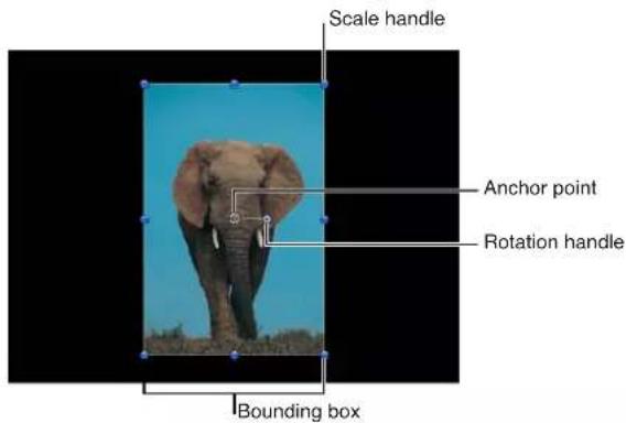
Resize the height and width of a layer in the Canvas independently
When you select a layer, eight scale handles appear around the edge of the layer's bounding box. Drag the handles to resize the layer. By default, the width and height of a layer are not locked together when you adjust scale handles. This means that the aspect ratio of a layer can be changed. (The aspect ratio of a layer is the ratio of its width to its height.) To preserve a layer's aspect ratio, press Shift while dragging a scale handle. Changes made to the scale of a layer are applied to the Scale parameter in the Properties Inspector.
Note: The onscreen Select/Transform controls for Motion-created shapes include a roundness handle in the upper-left corner of the bounding box; this control is not present in the Select/Transform controls for other layers. For more information, see Draw simple shapes on page 829.
1 Click to select the layer in the Canvas.
By default, the Select/Transform tool is the active tool.
Note: If you have another tool selected, such as a Mask or Shape tool, pressing the S key returns you to the 2D transform tools.
A bounding box appears around the selected layer. You can also Control-click the layer in the Canvas, then choose Transform from the shortcut menu.
2 Do one of the following:
- Drag a corner handle to resize the layer's width and height at the same time. By default, you can resize the width and height independently, by any amount.
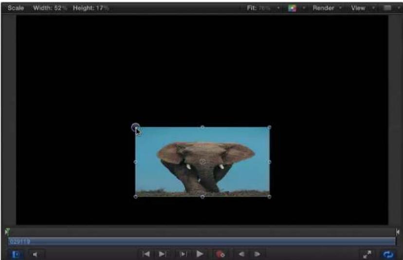
natural_image
Photograph of an elephant standing in a blue sky, captured within a video editing interface (no text or symbols on the image itself)- Press Shift, then drag a corner handle to resize the layer while locking its width and height together, maintaining the layer's current aspect ratio.

natural_image
Screenshot of a video editing interface showing an elephant image within a frame (no text or symbols on the image itself)- Drag the top or bottom scale handle to limit scale changes to the layer's height, or drag the left or right scale handle to limit scale changes to the layer's width.
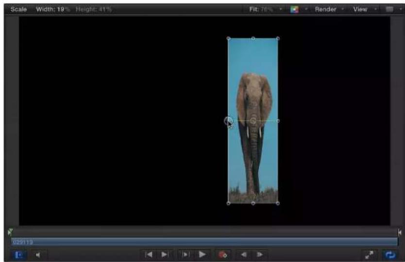
natural_image
Photograph of an elephant standing in a blue sky, displayed within a video editing interface (no text or symbols on the image itself)- Press Option while dragging any scale handle to resize a layer around its anchor point, rather than unilaterally.
As you drag the scale handles, the new width and height percentages appear in the status bar above the Canvas.

Note: Scaling the width or height of a layer by a negative value reverses the image, flipping its direction.
Rotate a layer in the Canvas
The Select/Transform tool also activates a handle used to rotate the image around its anchor point. For animation purposes, Motion keeps track of the number of times you've rotated the layer and stores this value in that layer's Rotation parameter in the Properties Inspector.
1 Click to select the layer in the Canvas.
Note: The Select/Transform tool is the default mode when Motion opens. If the Select/Transform tool is not enabled, choose it from the 2D transform tools pop-up menu in the toolbar.
2 Do one of the following:
- Drag the rotation handle to rotate the layer.
- Press Shift while you drag the rotation handle to constrain the angle of the selected layer to 45-degree increments.
As you drag the rotation handle, the original angle of the layer is indicated by a small circle that appears on a larger circle surrounding the layer's anchor point. Additionally, the status bar shows you the new angle of rotation.
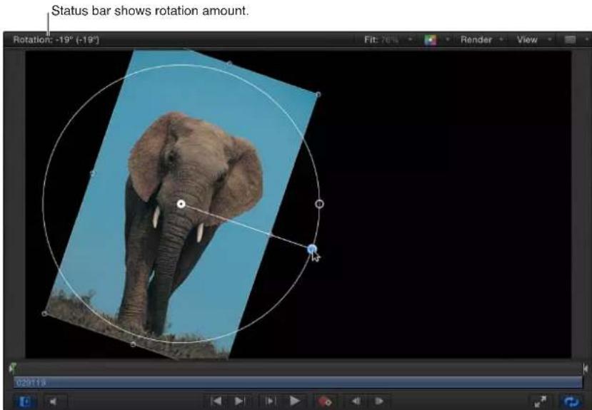
Use the Anchor Point tool
Using the Anchor Point tool, you can move any layer's anchor point, changing the way different geometric transforms are performed.

Layers rotate around the anchor point, but the anchor point also affects resizing operations. For example, the default anchor point for any layer is the center of the bounding box that defines its edges. If you rotate a layer, it spins around this central anchor point.

If you offset the anchor point, however, the layer no longer rotates around its own center, but instead rotates around the new anchor point.
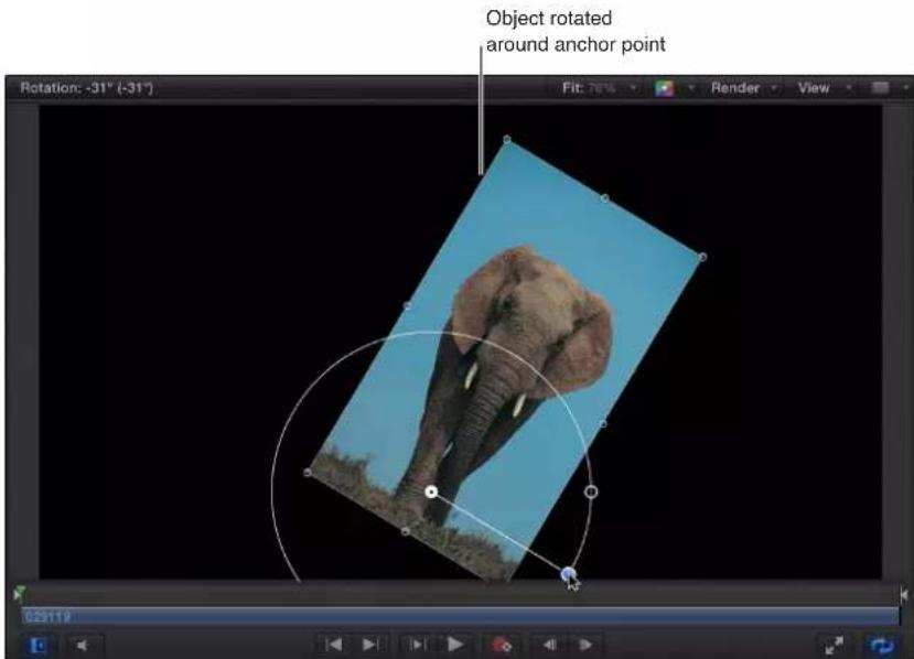
This not only affects the rotation of a layer, but any moving and scaling operations performed upon that layer as well. Changes made to a layer's anchor point are stored in the Anchor Point parameter of the Properties Inspector.
Change the anchor point of a layer in the Canvas
1 Choose the Anchor Point tool from the 2D tools pop-up menu in the toolbar.
In the Canvas, the layer's anchor point appears as a round target surrounded with three colored arrows representing the X, Y, and Z coordinate axes. For more information on coordinate axes, see Use 3D onscreen controls on page 910.
2 Do one of the following:
- Drag the white circle to move the anchor point vertically or horizontally.
- Drag an arrow to move the anchor point along the corresponding axis.
As you drag the anchor point, a line stretches from the default position of the anchor point to its new position. Additionally, the status bar shows you the anchor point's new coordinates and the delta (amount of change) between the anchor point's new and old positions.
Note: If the anchor point is close to the center or edges of the layer, and both Snapping and Dynamic Guides are turned on, the anchor point snaps to that location.
Use the Drop Shadow tool
The Drop Shadow tool activates onscreen controls that can be used to change the blur, angle, and distance of a layer's drop shadow.

Drag the onscreen handles to change the blur parameters.
natural_image
Simple geometric shape: a yellow circle centered within a square frame, with no text or symbols.Default drop shadow
(before adjusting with the Drop Shadow tool)

natural_image
Simple geometric diagram with a yellow circle centered within a square, surrounded by four gray dots (no text or symbols)After adjusting blur, angle, and distance
Adjust the drop shadow of a layer in the Canvas
1 Choose the Drop Shadow tool from the 2D tools pop-up menu in the toolbar.
2 In the Canvas, drag a corner handle to adjust the blur of the drop shadow.
3 To adjust the distance and angle of the drop shadow, drag inside the shadow's bounding box.
For more information on working with drop shadows, see Drop shadows overview on page 244.
Use the Distort tool
The Distort tool lets you reposition a layer's corner points independently, and slant or shear its midsection points horizontally or vertically.

Distort a layer in the Canvas
1 Choose the Distort tool from the 2D tools pop-up menu in the toolbar.
2 In the Canvas, drag the four corner handles to stretch the layer into a shape.

natural_image
Photograph of an elephant standing in a grassy savanna under a clear blue sky (no text or symbols visible)After you distort a layer, you can revert to the layer's original shape by deselecting the layer's Four Corner checkbox in the Properties Inspector. Doing so resets the shape of the layer without resetting the shape you defined in the Four Corner parameters of the Properties Inspector.
Shear a layer in the Canvas
1 Choose the Distort tool from the 2D tools pop-up menu in the toolbar.
2 In the Canvas, drag a shear handle to slant the layer. The top and bottom handles angle the layer horizontally. The left and right handles angle the layer vertically.
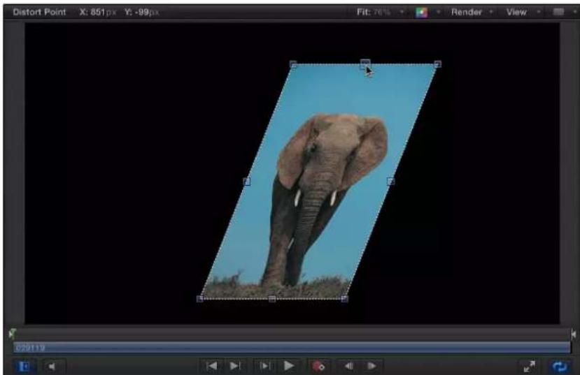
natural_image
Photo of an elephant standing on grass under a blue sky, displayed within a video editing interface (no text or symbols on the image itself)Note: Shearing a layer using the Distort tool does not affect the Shear parameter in the Properties Inspector. Instead, the Distort tool modifies the Four Corner parameters to simulate a Shear effect. You can still modify the Shear parameter, effectively shearing the shear simulation for interesting results.
Use the Crop tool
The Crop tool activates onscreen cropping handles that you can drag to resize the borders of a layer.

Cropping lets you chop off any of the four edges of a layer to eliminate parts you don't want to see in your composition. Common examples of layers you'd want to crop are video clips with a black line or unwanted vignetting around the edges. You can use the crop operation to remove these undesirable artifacts. You might also crop a layer to isolate a single element of the image.

natural_image
Photo of an elephant standing in a grassy field under a clear blue sky, with no visible text or symbols.When you crop an imported image using the Crop tool (which yields the same result as using the Crop controls in the layer's Properties Inspector), only the instance of that file is cropped. The source image in the Media list is not cropped. To crop the source image, you must select the layer in the Media list, then use the Crop tools in the Media Inspector. For more information, see Source media parameters on page 178.
Note: If you must isolate a more irregularly shaped layer, or you want to create a border of a specific shape, see Shapes, masks, and paint strokes overview on page 828.
Crop a layer in the Canvas
1 Choose the Crop tool from the 2D tools pop-up menu in the toolbar.
2 In the Canvas, drag any of the eight handles around the edge of the layer to crop the sides:
- Drag the top, left, right, or bottom handle to only crop one edge.
- Drag a four-corner handle to crop two adjacent edges simultaneously.
- Press Shift while you drag to constrain corner- or edge-cropping to the aspect ratio of the layer.
Note: If a layer is modified with the Distort tool, the Crop tool and its onscreen controls become disabled. However, you can still crop a distorted layer by adjusting its Crop parameter settings in the Properties Inspector.
Move the crop area while keeping the underlying image in place
- Drag inside the crop area.
The crop area moves, allowing you to adjust the crop to a new location without changing its size or shape.
Move the image while keeping the crop area in place
■Press Command while you drag inside the crop area.
The crop area remains static, but the image underneath it moves, allowing you to change the visible area of the layer.
Use the Edit Points tool
You can modify a shape or mask in the Canvas using the Edit Points tool.

Modify a shape's control points in the Canvas
1 After you create the shape or mask, choose the Edit Points tool from the 2D tools pop-up menu in the toolbar.
Note: You can also double-click the shape, or Control-click the layer, then choose Edit Points from the shortcut menu.
The layer's control points become active.
2 In the Canvas, drag the points to modify the shape of the layer.
For more information on working with shapes and masks, see Shapes, masks, and paint strokes overview on page 828.
Use the Transform Glyph and Adjust Item tools
The Transform Glyph tool, available when a text layer is selected, activates onscreen controls that allow you to modify the position and X, Y, or Z rotation for individual characters (glyphs) in a text layer.

For information on using the Transform Glyph tool, see Adjust glyph attributes on page 672.
The Adjust Item tool activates onscreen controls that allow you to manipulate filters, behaviors, generators, and other objects.

For example, you can use the Adjust Item tool to adjust the center point of a blur filter, the shape of a particle emitter, or the settings of a gradient.
Layer properties in the Inspector
Adjust layer Properties in the Inspector
Manipulating an onscreen transform handle also changes the corresponding parameter in the Properties Inspector. If you want to transform a layer more precisely than the onscreen controls allow, you can change that parameter's value in the Properties Inspector.
When you select a single layer and open the Properties Inspector, the layer's parameters are displayed. Making changes to the values in the Properties Inspector affects the selected layer. If more than one layer is selected in the Canvas, Layers list, or Timeline, the parameter values displayed in the Properties Inspector become inaccessible. However, you can still adjust the onscreen controls. Manipulating an onscreen transform handle affects every selected layer equally.
Modify parameter values in the Properties Inspector
Do one of the following:
- Select a parameter value field, enter a new number, then press Return.
If the parameter has a graphical control, such as a slider or dial, adjust the control. - To reset a parameter to its default state, click its reset button, or choose Reset Parameter from the parameter's Animation menu.
- Drag left on the parameter value to decrease, or right to increase the value.
For more information on how to use the parameter controls, see User interface controls overview on page 127. For a description of the controls in the Properties Inspector, see Parameters in the Properties Inspector on page 223.
Parameters in the Properties Inspector
The Properties pane of the Inspector displays the following parameters for most layers and groups:
Transform parameters
- Position: Value sliders that define the X (horizontal), Y (vertical), and Z (depth) positions of each layer.
The coordinate system used by Motion specifies the center of the Canvas as 0, 0, 0 regardless of the frame size of the project. Moving a layer to the left subtracts from the X value, while moving to the right adds to the X value. Moving a layer up adds to the Y value, and moving a layer down subtracts from the Y value. Moving a layer closer adds to the Z value, while moving further away subtracts from the Z value.
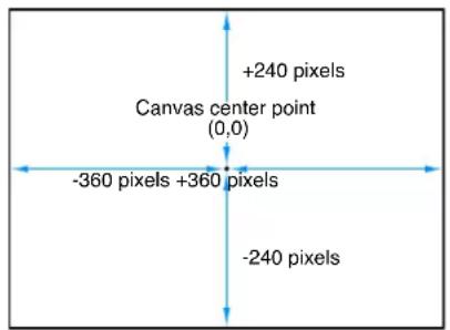
Each layer's position is centered on its anchor point. Offsetting the anchor point also offsets the position of the layer relative to the X, Y, and Z position values you have set.
- Rotation: A dial that controls a one-dimensional value representing the number of degrees of rotation around the Z axis. A positive value rotates the layer counterclockwise. A negative value rotates the layer clockwise.
Rotating a layer beyond 360 degrees results in multiple rotations when the Rotation parameter is animated.
Click the disclosure triangle next to the Rotation parameter to reveal dials that adjust rotation around all three axes (X, Y, and Z), as well as the Animate pop-up menu.
- Animate: A pop-up menu that sets the interpolation for animated 3D rotation channels to one of two options:
- Use Rotation: The default interpolation method. Layer rotates from its start angle to its final angle. Depending on the animation, the layer might twist before reaching its final orientation (the last keyframed value). For example, if the X, Y, and Z Angle parameters are animated from 0 degrees to 180 degrees in a project, the layer rotates on all axes before reaching its final orientation.
- Use Orientation: This alternate interpolation method provides smoother interpolation but does not allow multiple revolutions. Use Orientation interpolates between the layer's start orientation (first keyframe) to its end orientation (second keyframe).
Note: The Rotation parameter must be keyframed for the Animate parameter options to have any effect.
- Scale: A slider that controls the percentage representing the layer's scale, relative to its original size. By default, the horizontal and vertical scale of a layer is locked to the layer's original aspect ratio—represented by a single percentage. Click the disclosure triangle to display independent percentages for the X, Y, and Z scales of the layer.
Note: Setting a layer's scale to a negative value flips the layer.
- Shear: Value sliders that define the X and Y shear of the layer. A layer with no shear has X and Y shear values of 0. Positive values shear in one direction, while negative values shear in the other.
- Anchor Point: Value sliders that define the X and Y position of the anchor point relative to the center of the layer. Coordinates of 0, 0 center the anchor point in the bounding box defining the outer edge of the layer. Click the disclosure triangle to expose an additional value slider defining the Z position.
Blending parameters
- Opacity: A slider that sets the transparency of the layer. For more information, see Opacity on page 227.
- Blend Mode: A pop-up menu that sets the Blend Mode of the layer. For more information, see Blend modes overview on page 229.
- Preserve Opacity: When this checkbox is selected, the layer appears only where another layer is visible behind it in the composite. The front layer uses the opacity value of the layer behind it. For more information, see Preserve Opacity option on page 228.
- Casts Reflections: A pop-up menu that determines whether a layer casts a reflection. Choose from three options:
- Yes: The layer is seen reflected in nearby reflective layers.
•No: The layer is ignored by reflective surfaces.
- Reflection Only: The layer becomes invisible, but will appear in reflective surfaces around it.
Note: Reflections are only visible when layers are in a 3D group. For more information on 3D groups, see 3D group properties on page 927.
Lighting parameters
The Lighting parameter controls appear only when the parent group is set to 3D.
- Shading: A pop-up menu that sets how a layer responds to lights in the scene. There are three options:
•Inherited: The layer uses the shading value of its parent.
- On: The layer can be lit.
- Off: The layer ignores scene lights.
- Highlights: When this checkbox is selected, lit layers in the scene show highlights. This parameter has no effect if Shading is set to Off. Click the disclosure triangle to reveal an additional Shininess parameter.
- Shininess: A slider that sets the strength of a layer's highlights. Higher values create a glossier appearance. This parameter is disabled when the Highlights checkbox is deselected.
For more information, see Lighting overview on page 939.
Shadows parameters
The Shadows parameter controls appear only when the parent group is set to 3D.
- Cast Shadows: A checkbox that sets whether a shadow is cast when a layer lies between a light source and another layer.
Note: This parameter does not affect drop shadows.
- Receive Shadows: Controls whether neighboring layers' shadows affect the current layer. When this checkbox is deselected, light affects the layer as if the shadow-casting layer did not exist.
- Shadows Only: A checkbox that, when selected, specifies that a layer blocks light and casts a shadow, while the layer itself does not appear in the scene.
For more information, see Shadows overview on page 944.
Reflection parameters
The Reflection parameter controls appear only when the parent group is set to 3D. The Reflection parameter controls are not available for 3D particle emitters, 3D replicators, or normal text layers. However, the Reflection parameters are available for flattened text, which is activated by the Flatten checkbox in the Layout pane of the Text Inspector.
- Reflectivity: A slider that controls the shininess of the layer's surface. When set to 0% , there is no reflectivity. When set to 100% , the layer is totally reflective, like a mirror.
- Blur Amount: A slider that controls how blurry the reflection appears, creating the appearance of soft focus due to the surface quality of the reflecting layer.
- Falloff: A checkbox that controls whether the reflection fades with distance from the layer, producing a more realistic result. Click the disclosure triangle to show additional controls that adjust the falloff effect: Begin Distance, End Distance, and Exponent. The Exponent slider adjusts how quickly the reflection becomes fainter as reflected layers move away from the reflecting layer.
- Blend Mode: A pop-up menu that determines the blend mode used for the reflection.
For more information, see Reflections overview on page 9 51.
Additional parameters in the Properties Inspector
- Drop Shadow: An activation checkbox turns the drop shadow of a layer on and off. When selected, additional controls become available. For more information about working with drop shadows, see Drop shadows overview on page 244.
- Four Corner: An activation checkbox to turn distorting on and off. If a layer is distorted and this checkbox is deselected, the layer resumes its original shape, although the distorted coordinates are maintained. Reselecting the checkbox re-enables the distort effect specified by the Four Corner coordinate parameters.
When the Four Corner checkbox is selected, value sliders to modify the X and Y coordinates of the layer's four corner points (Bottom Left, Bottom Right, Top Right, and Top Left) become available. You can also control these parameters visually in the Canvas using the Distort tool. For more information, see 2D transform tools on page 210.
- Crop: An activation checkbox to turn cropping on and off. If a layer is cropped and this checkbox is deselected, the layer resumes its original size, although the cropping values are maintained. Reselecting the checkbox re-enables the cropping effect specified by the crop parameters.
When the Crop checkbox is select, four sliders to modify the crop parameters become available. Each slider defines the number of pixels to be cropped from the layer's four sides, relative to the outer edge of the bounding box that surrounds it. These parameters are similar to the crop parameters in the Media Inspector (available when you select a layer in the Media list). However, whereas cropping a layer via the Media Inspector crops all instances of that layer in your project, cropping a layer in the Properties Inspector crops only a single instance of the layer; duplicates of the layer remain uncropped. For more information, see Source media parameters on page 178.
- Timing: Value sliders to control all aspects of clip retiming. For more information, see Retiming overview on page 246.
Make clone layers
In a motion graphics project, sometimes it is necessary to reuse a complex layer in other parts of the project multiple times. Although you can duplicate or cut and paste any layer, if you update the original, none of the changes you make are applied to the copies. Keeping track of these changes can become a tedious and difficult management task. If you find yourself applying the same filters and masks to more than one copy of a layer, you should take advantage of the Make Clone Layer command. Making clone layers has the additional benefit of improving project playback and rendering performance.
You can make clone layers out of images, video clips, groups, particle systems, text, shapes, and replicators.
Create a clone layer
Do one of the following:
- Select the layer to clone, then choose Object > Make Clone Layer (or press K).
■ Control-click a layer in the Canvas, then choose Make Clone Layer from the shortcut menu.
■ Control-click a layer in the Layers list or Timeline, then choose Make Clone Layer from the shortcut menu.
A clone layer is created and appears in the Canvas on top of the original layer. In the Layers list, the clone layer appears with the default name "Clone Layer." A clone layer icon appears next to the name.

The clone layer inherits the following properties from its source layer: Rotation, Scale, Opacity, Blend Mode, and Drop Shadow. Adjustments made to any of these properties of the source layer after clone layer creation do not propagate to any clone layers made from the same source layer. The clone layers only inherit changes made to filters and masks in the source layer.
Important: Changes to behaviors don't propagate to clone layers, unless the behavior affects a filter or mask in the source layer.
Clone layer layers can be manipulated in the Canvas and Timeline in exactly the same way as the source layer. However, a clone layer created from retimed layers cannot have its Frame Blending parameter changed from that of the source layer.
Opacity and Blending parameters
Opacity
The opacity and blending controls for each layer appear in the Properties Inspector and in the default HUD for any selected layer.
By stacking layers with varying opacities, you can merge images together in ways not otherwise possible. For example, if you have two full-screen background images you want to use together, you can set the opacity of the layer in front to 50%, allowing the layer in back to show through.

natural_image
Silhouette of an elephant standing by water at sunset, no text or symbols visibleImage in front
natural_image
Silhouettes of elephants and a child across a dry savanna at sunset (no text or symbols visible)Image in back Front Image at 50% opacity
natural_image
Silhouetted figures in a desert landscape at sunset, no visible text or symbolsYou can overlap as many layers as you want, and by varying their opacities, selectively reveal layers in the back.
Change a layer's opacity
Do one of the following:
- Adjust the Opacity slider in the Blending section of the Properties Inspector.
■Adjust the Opacity slider in the HUD.
Note: Some layers, such as text and shapes, have additional opacity parameters in their respective panes in the Inspector. For example, setting a shape's Opacity value in the Properties pane and setting its Opacity value in the Style pane require separate controls that have multiplicative effects. In other words, if Opacity is set to 50% in the Properties pane, then set to 50% in the Shape Style pane, the resulting opacity for the text is 25%.
For information on limiting overlapping layers' visibility or selectively revealing a part of a layer, see Preserve Opacity option on page 228.
Preserve Opacity option
The Preserve Opacity checkbox in the Properties Inspector lets you limit a layer's visibility to areas of the Canvas where the layer overlaps nontransparent regions of other layers. For example, you might place two overlapping layers into your project, as shown below:

natural_image
Dolphin swimming underwater with red fish in the background (no text or symbols visible)If you select Preserve Opacity for the Dolphin layer in front, the result is this:

natural_image
Dolphin swimming underwater with colorful fish in the background (no text or symbols visible)The only area of the Dolphin layer visible is the area that overlaps the sea life picture layer behind it. At first, this might not appear to be very exciting, but the Preserve Opacity checkbox can be used in combination with the opacity and blend mode to create some very interesting effects.
Note: The layer with the enabled Preserve Opacity parameter takes the opacity value of the layer beneath it in the composite stack.
Preserve Opacity is an easy way to selectively reveal part of a layer. In this example, by setting the blend mode of the top color wash layer to Exclusion, you get the resulting image:
natural_image
Illustration of a hand holding a transparent object against a red and yellow abstract background (no text or symbols)By selecting the Preserve Opacity checkbox for the color wash layer on top, only the overlapping parts are displayed, and the superimposed image only affects the Dolphin layer.

natural_image
Close-up of a whale head with visible corneal and tail against black background (no text or symbols)Turn on Preserve Opacity
- With a layer selected in the Canvas, Layers list, or Timeline, select the Preserve Opacity checkbox in the Properties Inspector.
Blend Modes
Blend modes overview
While the Opacity parameter defines a uniform level of transparency for a layer, the blend modes allow you many more creative options to control how the overlapping images interact, based on the colors in each layer. By default, each layer's blend mode is set to Normal, so changes to a layer's opacity uniformly affect every part of the image equally.
Blend modes can create transparency in a layer regardless of the setting of its Opacity parameter. This is because the pixels of an image with a selected blend mode are combined with the pixels of any layers lying immediately below in the Canvas. For example, if you overlap two layers, then set the blend mode of the top one to Screen, the darker areas of the screened image become transparent, while the lighter areas remain more solid, resulting in the following image:
natural_image
Silhouette of elephants and cows walking across a golden sunset landscape (no text or symbols visible)Important: The transparency created by most of the available blend modes only affects how a layer combines with overlapping layers underneath. These blend modes do nothing to affect a layer's alpha channel. For information about blend modes that do affect a layer's alpha channel, see Blend modes that manipulate alpha channels on page 242.
Each blend mode combines layers in different ways. For example, setting the top layer's blend mode to Multiply yields a result opposite to that of the Screen blend mode, as the darker areas of the image remain solid, and the lighter areas become transparent.
natural_image
Silhouette of a person standing in an open field at sunset, with trees and distant hills in the background (no text or symbols visible)Blend modes only affect the combination of a layer with the layers below it. Any layers appearing above have no effect on this interaction, even if the layer is transparent. In the following example, the text layers on the top level have no effect on the blended images below.

For overlapping layers with different blend modes, the bottommost pair of layers is combined first, and that combination then interacts with the next layer up, and so on until all overlapping layers are combined for the final image. In this case, each layer with a specified blend mode only interacts with the image below it, whether that image is a single layer or a pair of layers blended together.
Each of Motion's blend modes works in conjunction with the Opacity parameter to alter the interaction between the foreground and background layers. Adjusting a layer's opacity lessens the blending effect assigned to it, even as it reduces that layer's visibility, allowing you to customize any blend mode to better suit your needs.
Blend modes only affect overlapping layers, and have no interaction with your project's background color (unless the background is set to Environment). If you specify a blend mode for a layer that doesn't overlap anything, that layer remains as it was before.
Change a selected layer's blend mode
Do one of the following:
- Choose an item from the Blend Mode pop-up menu in the HUD.
- Choose an item from the Blend Mode pop-up menu in the Properties Inspector.
- Choose Object > Blend Mode, then choose an item from the submenu.
- Display the Blend Mode column in the Layers list (choose View > Layers Columns > Blend Mode), then choose an item from a layer's Blend Mode pop-up menu.
- Control-click a layer in the Canvas, then choose an item from the Blend Mode submenu in the shortcut menu.
- Control-click a layer in the Layers list or Timeline, then choose an item from the Blend Mode submenu in the shortcut menu.
How blend modes work
Each blend mode presents a different method for combining two or more images together. Blend modes work in addition to a layer's alpha channel and opacity parameter.
To understand the descriptions of each blend mode in this chapter, it's important to understand that blend modes mix colors from overlapping images based on the brightness values in each color channel in an image. Every image consists of red, green, blue, and alpha channels. Each channel contains a range of brightness values that define the intensity of each pixel in the image that uses some of the channel's color.
The effect that each blend mode has on overlapping layers depends on the range of color values in each layer. The red, green, and blue channels in each overlapping pixel are mathematically combined to yield the final image.
These value ranges can be described as blacks, midrange values, or whites. These regions are loosely illustrated by the chart below.
Blacks Midrange color values Whites

natural_image
Gradient bar transitioning from dark to light (no text or symbols)For example, the Multiply blend mode renders white color values in an image transparent, while black values are left alone. All midrange color values become translucent, with colors in the lighter end of the scale becoming more transparent than the colors in the darker end of the scale.
Use blend modes with groups
Blend modes work differently depending on whether they're used with groups or layers. In particular, the Pass Through blend mode is available only for groups.
Pass Through
When a group is set to Pass Through, each layer is blended with all layers and groups that appear underneath it in the Layers list. In this example, the Swirls layer is set to Stencil Luma, and the Fishes layer is set to Add.

With the enclosing group set to Pass Through, the Swirls layer stencils all other layers underneath it, including the Gradient layer in the bottom group. The result is that all layers are stenciled against the background color. The Fishes layer is likewise added to the combined stack of layers.

natural_image
Abstract blue glowing shapes against a dark background, no text or symbols visibleNormal
When a group is set to Normal, the layers nested in that group can only be blended with one another. Layers nested in that group do not blend with layers in other groups beneath it in the Layers list. In the following example, the Fishes and Swirls layers in the topmost group are blended only with themselves when the topmost group is set to Normal.

The Gradient layer in the bottom group is left unaffected, although the transparency in the top group caused by the combination of the Add and Stencil Luma blend modes reveals the gradient in the background.

natural_image
Underwater scene with dark blue background and faint skeletal structure (no visible text or symbols)Other blend modes
When you set a group to an available blend mode, each layer nested in that group is blended according to its blend mode. The resulting image is then blended with the groups underneath, according to the selected blend mode for that group. In this example, the topmost group is set to Multiply. As a result, the combination of the Added Fishes and the Stenciled Swirls layers is multiplied with the Gradient layer in the bottommost group.
natural_image
Solid blue gradient background with no visible text, symbols, or objectsBlend modes
The following section describes how blend modes cause layers to combine to create different results. The blend modes are presented in the order in which they appear in the Blend Mode pop-up menu, arranged into groups of modes that create similar results.
Most of the examples in this section are created by combining the following two reference images:

natural_image
Abstract geometric composition with a gray square and three colored rectangles (red, yellow, blue) arranged in a cluster (no text or symbols)
natural_image
Three-panel photo collage of a chimpanzee's head, showing facial features and facial expression (no text or symbols)Boxes object Chimp object
The resulting image illustrates how differently the color values from each image interact under each blend mode. When examining the results, pay attention to the white and black areas of the colored squares, as well as the highlights and shadows in the chimpanzee image. These show you how each blend mode treats the whites and blacks in an image. The other brighter and darker colors serve to illustrate each blend mode's handling of overlapping midrange color values. The yellow, red, pink, and blue squares, in particular, all have very different color and luminance values that contrast sharply from example to example.
Important: Depending on the blend mode, layer and group ordering may or may not be important. Some blend modes behave differently depending on which image is on top.
Normal blend mode
The default blend mode for layers. In a layer set to Normal, any transparency is caused by the Opacity parameter or by an alpha channel.
Darkening blend modes
The following blend modes tend to create a result darker than either of the original images.
- Subtract: Darkens all overlapping colors. Whites in the foreground image go black, while whites in the background image invert overlapping color values in the foreground image, creating a negative effect. Blacks in the foreground image become transparent, while blacks in the background image are preserved. Overlapping midrange color values are darkened based on the color of the background image. In areas where the background is lighter than the foreground, the background image is darkened. In areas where the background is darker than the foreground, the colors are inverted. The order of two layers affected by the Subtract blend mode is important.

natural_image
Two abstract digital art pieces with glowing bokeh and pixelated textures, no visible text or symbolsBoxes object on top

natural_image
Composite image showing a close-up of a monkey's face with overlaid geometric shapes (no text or symbols)Chimp object on top
- Darken: Emphasizes the darkest parts of each overlapping image. Whites in either image allow the overlapping image to show through completely. Lighter midrange color values become increasingly translucent in favor of the overlapping image, while darker midrange color values below that threshold remain solid, retaining more detail. The order of two layers affected by the Darken blend mode does not matter.

natural_image
Composite image showing a close-up of chimpanze faces with overlaid colored square panels (no text or symbols)The Darken blend mode is useful for using one image to texturize another selectively, based on its darker areas. You can also use Screen, Color Burn, and Linear Burn for variations on this effect.

natural_image
Close-up of a zebra's head showing black and white stripes (no text or symbols visible)
natural_image
Sunset over a colorful sky with orange and purple hues (no text or symbols)
natural_image
Close-up of a zebra's face with vibrant yellow and black stripes against a warm-toned background (no text or symbols)- Multiply: Like Darken, Multiply emphasizes the darkest parts of each overlapping image, except that midrange color values from both images are mixed together more evenly. Progressively lighter regions of overlapping images become increasingly translucent, allowing whichever image is darker to show through. Whites in either image allow the overlapping image to show through completely. Blacks from both images are preserved in the resulting image. The order of layers affected by the Multiply blend mode does not matter.
natural_image
Composite image showing a chimpanzee profile alongside a colorful abstract panel with icons (no text or symbols)The Multiply blend mode is useful in situations where you want to knock out the white areas of a foreground image and blend the rest of the image with the colors in the background. For example, if you superimpose a scanned sheet of handwritten text over a background image using the Multiply blend mode, the resulting image becomes textured with the darker parts of the foreground.


natural_image
Buck leaping out of calm sea with snow-capped mountains in the background (no text or symbols visible)
- Color Burn: Intensifies the dark areas in each image. Whites in the background image replace the foreground image, while whites in the foreground image become transparent. Midrange color values in the background image allow midrange color values in the foreground image to show through. Lighter midrange color values in the background image allow more of the foreground image to show through. Darker midrange values in all visible overlapping areas are then mixed together, resulting in intensified color effects. The order of two layers affected by the Color Burn blend mode is important.

natural_image
Composite image showing three chimpanzee portraits with abstract geometric shapes in the background (no text or symbols)
natural_image
Composite image showing a chimpanzee and abstract colorful shapes (no text or symbols)Boxes object on top Chimp object on top
- Linear Burn: Similar to Multiply, except that darker overlapping midrange color values are intensified, as with Color Burn. Progressively lighter color values in overlapping images become increasingly translucent, allowing darker colors to show through. Whites in either image allow the overlapping image to show through completely. The order of two layers affected by the Linear Burn blend mode does not matter.

natural_image
Composite image showing a chimpanzee, a red square with green and purple symbols, and a blue cat silhouette (no text or symbols present)Lightening blend modes
The following blend modes tend to create a lighter result than either of the original images.
- Add: Emphasizes the whites in each overlapping image and lightens all other overlapping colors. The color values in every overlapping pixel are added together. The result is that all overlapping midrange color values are lightened. Blacks from either image are transparent, while whites in either image are preserved. The order of two layers affected by the Add blend mode does not matter.

natural_image
Two panels: left shows a chimpanzee face with a green square overlay; right shows a colorful abstract graphic with gradient shapes (no text or symbols)The Add blend mode is useful for using one image to selectively texturize another, based on its lighter areas such as highlights. You can also use Lighten, Screen, Color Dodge, and Linear Dodge to create variations of this effect.

natural_image
Underwater scene with numerous fish swimming in blue water (no visible text or symbols)
natural_image
Abstract dark blue and white striped pattern resembling a stylized fish or coral (no text or symbols)
natural_image
Abstract blue-toned illustration of a swirling vortex or vortex pattern (no text or symbols)- Lighten: Emphasizes the lightest parts of each overlapping image. Every pixel in each image is compared, and the lightest pixel from either image is preserved, so the final image consists of a dithered combination of the lightest pixels from each image. Whites in both images show through in the resulting image. The order of two layers affected by the Lighten blend mode does not matter.

natural_image
Abstract graphic with green and blue shapes, no text or symbols present- Screen: Like Lighten, Screen emphasizes the lightest parts of each overlapping image, except that the midrange color values of both images are mixed together more evenly. Blacks in either image allow the overlapping image to show through completely. Darker midrange values underneath a specific threshold allow more of the overlapping image to show. Whites from both images show through in the resulting image. The order of two layers affected by the Screen blend mode does not matter.
natural_image
Two panels: left shows a close-up of a monkey's face with green and white squares; right shows a colorful abstract graphic with layered shapes (no text or symbols)The Screen blend mode is useful for knocking out the blacks behind a foreground subject, instead of using a Luma Key. It's mainly useful when you want the rest of the foreground subject to be mixed with the background image, based on its brightness. It's good for glow and lighting effects and for simulating reflections. You can also use the Add, Lighten, and Color Dodge blend modes to create variations of this effect.
natural_image
Abstract artistic rendering with flowing orange and yellow light streaks against a dark background (no text or symbols)
natural_image
Composite image showing an elephant's head, a large elephant's foot, and silhouettes of two children in a natural setting (no text or symbols)
natural_image
Composite image showing elephants, a large elephant, and a sunset landscape with elephants in the water (no text or symbols)Top object Bottom object Screen composite
• Color Dodge: Preserves whites in either the foreground or background image. Blacks in the background image replace the foreground image, while blacks in the foreground image become transparent. Midrange color values in the background image allow midrange color values in the foreground image to show through. Darker values in the background image allow more of the foreground image to show through. All overlapping midrange color values are mixed together, resulting in interesting color mixes. Reversing the two overlapping images results in subtle differences in how the overlapping midrange color values are mixed together.

natural_image
Composite image showing a chimpanzee face and a colorful abstract graphic with pixelated shapes (no text or symbols)
natural_image
Two abstract geometric shapes: one with a light green square and another with colorful squares and triangles (no text or symbols)Boxes object on top Chimp object on top
- Linear Dodge: Similar to Screen, except that lighter midrange color values in overlapping regions become intensified. Blacks in either image allow the overlapping image to show through completely. Whites from both images show through in the resulting image. The order of two layers affected by the Linear Dodge blend mode does not matter.

natural_image
Composite image showing a chimpanzee face and a colorful abstract graphic with pixelated shapes (no text or symbols)Complex blend modes
The following blend modes create results by applying a combination of effects, based on the original images. Each mode can create a variety of results depending on the specific values of the images being mixed together. Some of these modes are designed to simulate the effect of shining a light through the top layer, effectively projecting upon the layers beneath it.
- Overlay: Causes whites and blacks in the foreground image to become translucent and interact with the color values of the background image, causing intensified contrast. Whites and blacks in the background image replace the foreground image. Overlapping midrange values are mixed together differently depending on the brightness of the background color values. Lighter background midrange values are mixed by screening. Darker background midrange values are mixed by multiplying. The visible result is that darker color values in the background image intensify the foreground image, while lighter color values in the background image wash out overlapping areas in the foreground image. The order of two layers affected by the Overlay blend mode is important.

natural_image
Composite image showing a chimpanzee's face profile alongside three abstract color blocks (yellow, green, blue) with no visible text or symbols.
natural_image
Split image showing a close-up of a chimpanzee's face and a colorful abstract graphic with shapes (no text or symbols)Boxes object on top Chimp object on top
The Overlay blend mode is useful for combining areas of vivid color in two images.
natural_image
Underwater scene with colorful fish swimming in green and blue water (no text or symbols visible)
natural_image
A yellow crab standing in shallow water, no visible text or symbols.
natural_image
Underwater scene with a colorful crab swimming among blue fish (no text or symbols visible)- Soft Light: Similar to the Overlay blend mode, makes whites and blacks in the foreground image translucent. However, the translucent whites and blacks continue to interact with the color values of the background image. Whites and blacks in the background image replace the foreground image. All overlapping midrange color values are mixed together, creating a more even tinting effect than the Overlay blend mode. The order of two layers affected by the Soft Light blend mode is important.
natural_image
Composite image showing three chimpanzee portraits with overlaid colored square and rounded rectangle overlays (no text or symbols)
natural_image
Two-panel image: left shows a close-up of a monkey's face with a black square overlay; right displays abstract geometric shapes in red, yellow, green, and blue (no text or symbols)Boxes object on top Chimp object on top
The Soft Light blend mode is useful for softly tinting a background image by mixing it with the colors in a foreground image.
natural_image
Close-up of a red seashell swimming among vibrant orange coral branches (no text or symbols visible)
natural_image
Underwater photo of a diver swimming near the seabed (no text or symbols visible)
natural_image
Underwater scene with a diver swimming near coral-like water (no text or symbols visible)- Hard Light: Causes whites and blacks in the foreground image to block the background image. Whites and blacks in the background image interact with overlapping midrange color values in the foreground image. Overlapping midrange color values are mixed together differently depending on the brightness of the background color values. Lighter background midrange values are mixed by screening. Darker background midrange values are mixed together by multiplying. The visible result is that darker color values in the background image intensify the foreground image, while lighter color values in the background image wash out overlapping areas in the foreground image. The order of two layers affected by the Hard Light blend mode is important.
natural_image
Composite image showing a chimpanzee's face and abstract geometric shapes (no text or symbols)
natural_image
Composite image showing a chimpanzee with facial features and a colorful abstract panel (no text or symbols)Boxes object on top Chimp object on top
- Vivid Light: Similar to the Hard Light blend mode, with two exceptions: Vivid Light mixes midrange color values together more intensely, and preserves whites and blacks from either overlapping image in the end result. (Dithering can cause overlapping areas of solid white and solid black.) Overlapping midrange color values are mixed together differently depending on the brightness of the background color values. Lighter midrange values become washed out, while the contrast of darker midrange color values is increased. The overall effect is more pronounced than with the Hard Light blend mode. Reversing the two overlapping images results in subtle differences in how the overlapping midrange color values are mixed together.
natural_image
Composite image showing a chimpanzee, abstract colorful shapes, and a separate red-and-blue graphic (no text or symbols)
natural_image
Composite image showing a chimpanzee and abstract colorful shapes (no text or symbols)Boxes object on top Chimp object on top
- Linear Light: Similar to the Hard Light blend mode, except that overlapping midrange color values are mixed together with higher contrast. Whites and blacks in the foreground image block the background image. Whites and blacks in the background image interact with overlapping midrange color values in the foreground image. Overlapping midrange color values are mixed together. Lighter background colors brighten the foreground image, while darker colors darken it. The order of two layers affected by the Linear Light blend mode is important.

natural_image
Abstract composition with a dark animal face, green light, and colorful geometric shapes (no text or symbols)
natural_image
Collage of four images showing a chimpanzee, a colorful abstract square, and a purple object (no text or symbols)Boxes object on top Chimp object on top
- Pin Light: Similar to the Hard Light blend mode, except that overlapping midrange color values are mixed together differently based on their color value. Whites and blacks in the foreground image block the background image. Whites and blacks in the background image interact with overlapping midrange color values in the foreground image. The methods used by the Pin Light blend mode to mix two images are somewhat complex. Overlapping midrange color values are treated differently depending on which of the four regions of the luminance chart they fall into:
•Lighter and darker areas of the foreground image falling close to the whites and blacks are preserved.
- Areas of the foreground image falling near the center of the midrange are tinted by the background color.
• Darker areas of the foreground image between the blacks and center of the midrange are lightened.
•Lighter areas of the foreground image between the whites and the center of the midrange are darkened.
The result might appear alternately tinted or solarized, depending on the lightness or darkness of the overlapping values. This blend mode lends itself to more abstract effects. The order of two layers affected by the Pin Light blend mode is important.

natural_image
Split image showing a chimpanzee's face and a colorful abstract graphic with shapes (no text or symbols)
natural_image
Composite image showing a chimpanzee and a colorful abstract composition (no text or symbols)Boxes object on top Chimp object on top
- Hard Mix: Similar to the Hard Light blend mode, except that the saturation of overlapping midrange color values is intensified, resulting in extremely high-contrast images. Whites and blacks are preserved. Although the order of two layers doesn't affect the overall look of two images blended using the Hard Mix blend mode, there might be subtle differences.

natural_image
Abstract composition of stylized human faces and colorful geometric shapes (no text or symbols)Inversion blend modes
The following two blend modes create results that often appear to resemble aspects of a photographic negative of the selected layer.
- Difference: Similar to the Subtract blend mode (in the Darkening category), except that areas of the image that would be severely darkened by the Subtract blend mode are colorized differently. The order of two layers affected by the Difference blend mode does not matter.

natural_image
Composite image showing a close-up of two monkeys with colorful abstract shapes overlaying them (no text or symbols)- Exclusion: Similar to the Difference blend mode, except that the resulting image is lighter overall. Overlapping areas with lighter color values are lightened, while darker overlapping color values become transparent. The order of two layers affected by the Exclusion blend mode does not matter.
natural_image
Composite image showing a close-up of a person's face with overlaid geometric shapes (no text or symbols)Blend modes that manipulate alpha channels
The Stencil and Silhouette blend modes let you use a single layer's alpha channel or luma values to isolate regions of background layers and groups. (Similar effects can be accomplished using shape and image masks. In addition, masks might provide you with a greater degree of control, depending on your needs. For more information, see Shapes, masks, and paint strokes overview on page 828.)
Stencil modes crop out all non-overlapping parts of layers underneath the layer used as the stencil. Silhouette modes do the opposite, punching holes in overlapping layers underneath in the shape of the layer used as the silhouette.
When working in a 3D group, changes in depth order affect the Stencil and Silhouette blend modes differently. For example, if you have two layers in a 3D group and the upper layer is set to Stencil Alpha or Stencil Luma, the blend mode remains in effect when the upper layer is moved behind the lower layer in Z space. If you have two layers in a 3D group and the upper layer is set to Silhouette Alpha or Silhouette Luma, the blend mode does not remain in effect when the upper layer is moved behind the lower layer in Z space.
When you use the Stencil or Silhouette blend modes in a group set to the Pass Through blend mode, the resulting effect carries down through every layer in every group that lies underneath it in the Layers list, unless the group that contains it is rasterized. This is a powerful, but not always desired effect, because it prevents you from placing a background group to fill the transparent area. You can limit the Stencil or Silhouette blend mode to affect only those layers in the same enclosing group by setting the group's blend mode to anything other than Pass Through. For example, if you set the enclosing group of the two layers in the Silhouette Alpha example to Normal, then add a group underneath containing additional layers, those layers show through the transparent areas created by the silhouetted group.

natural_image
Five meerkat animals framed within a five-pointed star on a blue fabric background (no text or symbols)Mask-Affecting Modes
The following blend modes modify the alpha channel of the layer to which the blend mode is applied.
- Stencil Alpha: Uses the alpha channel of the affected layer to crop out all non-overlapping parts of layers and groups underneath it in the Layers list.
natural_image
A bright white oval shape on a black background, resembling a lens or light source (no text or symbols)
natural_image
Two giraffes facing each other against a solid blue background (no text or symbols visible)
natural_image
Close-up of a giraffe head against a dark blue background (no text or symbols visible)Object used for stencil ResultObject underneath
- Stencil Luma: Does the same thing as the Stencil Alpha blend mode, but uses the affected layer's luma value to define transparency. Stencil Luma is useful if the layer you want to use for cropping has no alpha channel of its own.
- Silhouette Alpha: The reverse of the Stencil Alpha blend mode, useful for cutting holes in underlying layers.

Object used for silhouette ResultObject underneath
• Silhouette Luma: The reverse of Stencil Luma.
- Behind: Forces the layer to appear behind all other layers and groups, regardless of its position in the Layers list and Timeline. If multiple layers or groups are set to Behind, they appear behind all other groups not set to Behind, in the order in which they appear in the Layers list.
- Alpha Add: Works similarly to the Add blend mode, but instead of adding the color channels of overlapping layers, it adds their alpha channels together. Try using this blend mode instead of Motion's default method of alpha channel compositing for a different treatment of overlapping areas of translucency.
• Light Wrap: Takes bright areas from the background layer at the edge of the matte and blurs them into the foreground layer. This is intended to create a more organic, seamless composite, where light from the background appears to bleed onto the foreground layer as would occur in a natural, noncomposited image. To adjust the parameters that affect the Light Wrap, such as Amount, Intensity, Opacity, and Mode, apply the Keyer filter and make those adjustments in the Filters Inspector. For more information, see Keyer filter controls on page 488.
Note: Motion applies the Light Wrap effect at the end of the rendering process. When you add other filters to the layer, such as color correction effects, they are rendered before the Light Wrap.
Drop shadows
Drop shadows overview
A drop shadow, by default, is a dark, translucent, offset shape that falls behind a layer, as if a light were shining on the layer. Drop shadows are the same size as the layer to which they're applied, although blurring a drop shadow might enlarge it somewhat. Drop shadows create the illusion of depth, so the foreground layer seems to pop out at the viewer. For this reason, drop shadows are frequently used to create the impression of space between two overlapping layers.
natural_image
Illustration of antelopes in a grassy wetland, including lion and deer, with inset photos of their poses (no text or symbols)Drop shadows also darken overlapping regions of background layers. Consequently, adding a drop shadow to foreground text can often make the text easier to read.


Without a drop shadow With a drop shadow
Because each layer has drop shadow parameters in the Inspector and HUD, it's easy to add a drop shadow to a layer. After you add a drop shadow, you can manipulate it in the Canvas.
Motion also has the ability to generate true cast shadows when using lighting in 3D layers. For more information about cast shadows, see Shadows overview on page 944.
Important: Text layers have additional drop shadow parameters, located in the Style pane of the Text Inspector. For more information about text layer drop shadows, see Add a drop shadow on page 649.
Drop Shadow tool
Selecting the Drop Shadow tool in the toolbar activates onscreen controls in the Canvas for selected layers with active drop shadows.
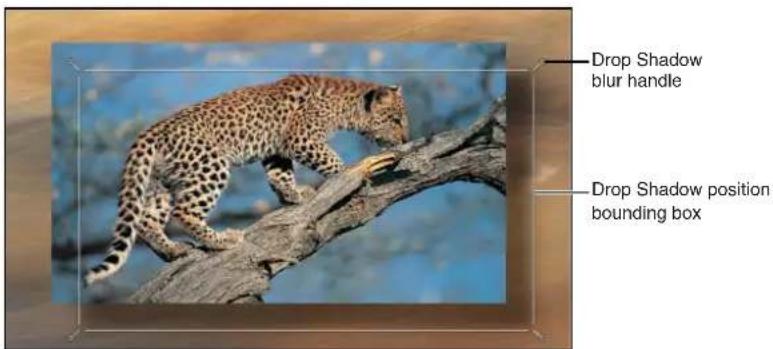
Four handles at each corner allow you to increase or decrease the blur of the drop shadow. Dragging anywhere in the drop shadow's bounding box simultaneously changes the shadow's angle and distance.
Increase or decrease a drop shadow's blur
1 Choose the Drop Shadow tool from the 2D tools pop-up menu in the toolbar.
2 In the Canvas, drag a corner handle inward to decrease a shadow's blur or outward to increase the blur.
Move a layer's drop shadow
1 Choose the Drop Shadow tool from the 2D tools pop-up menu in the toolbar.
2 Drag anywhere in the shadow's bounding box to move it around.
Drop Shadow controls in the Properties inspector
In addition to the Canvas and HUD drop shadow controls, each layer has drop shadow parameters in the Properties Inspector. Use the activation checkbox beside the Drop Shadow category in the Inspector to turn a selected layer's drop shadow on or off. Click Show on the right side of the Drop Shadow category to reveal additional controls.
Parameters in the Inspector
- Color: Color controls that set the drop shadow's color. The default color is black.
- Opacity: A slider that sets the drop shadow's transparency.
- Blur: A slider that specifies the drop shadow's softness.
- Distance: A slider that sets how close or far a layer's drop shadow is to the layer. The farther away a drop shadow is, the more distance there appears to be between the layer and anything behind it in the composition.
- Angle: A dial that lets you change the direction of the drop shadow. Changing the Angle of the drop shadow changes the apparent direction of the light casting the shadow.
- Fixed Source: A checkbox that, when selected, renders the drop shadow as if cast by a fixed light source, regardless of camera or text movement.
Retiming
Retiming overview
Your motion graphics projects may require you to perform special timing tricks on media: speeding a clip up, slowing it down, or playing it back at different speeds. There are several ways to apply retiming to a clip:
- Adjust the Timing controls in the Properties Inspector to modify speed and playback attributes of media clips. For more information, see Timing controls in the Properties Inspector on page 246.
- Apply a Retiming behavior designed commonly applied retiming tasks, including hold frames, strobing, looping, and so on. Take some time to look over the Retiming behaviors in the Library before spending a lot of time in the Inspector creating your own custom retiming from scratch. For more information, see Retiming behaviors overview on page 349.
- Manipulate clip timing in the Timeline with the help of modifier keys. Indicators in the Timeline help you visualize loops and other retiming conditions. For more information, see Retime in the Timeline on page 275.
Timing controls in the Properties Inspector
Media layers (movie clips and still images) have timing parameters in the Properties Inspector. Click Show on the right side of the Timing category to reveal the timing controls for a selected object.
When multiple objects of the same type are selected, parameters with common values are editable. When different types of objects are selected, such as a clip and text, the Timing controls are not available.
Note: Still images and other layers without an inherent time dimension have a reduced set of Timing controls (In point, Out point, and Duration).
Parameters in the Inspector
- Time Remap: A pop-up menu that sets how time is remapped in the clip. There are two menu choices:
- Constant Speed: Retimes the entire clip using the same value.
- Variable Speed: Animates the speed of the clip over time.
- Speed: A value slider that sets the speed of the clip as a percentage. The default is 100% . Values lower than 100 play back the clip more slowly than its original speed and also extend the duration of the clip. Values higher than 100 play back the clip faster than its original speed and shorten the duration of the clip.
This parameter appears only when Time Remap is set to Constant Speed.
- Retime Value: A value slider used to adjust the time value of the clip at a given frame. When you set Time Remap to Variable Speed, two keyframes are generated at the first and last frame of the clip. The two default keyframes represent 100% constant speed. Adding keyframes to this parameter and assigning them different Retime Values makes the speed of the clip ramp from one speed to another.
This parameter appears only when Time Remap is set to Variable Speed.
- In: A value slider that sets the In point of the layer, in both constant and variable speed modes. Adjusting this parameter moves the layer In point to the specified frame without affecting the duration of the layer.
- Out: A value slider that sets the Out point of the layer, in both constant and variable speed modes. Adjusting this parameter moves the layer Out point to the specified frame without affecting the duration of the layer.
- Duration: A value slider that sets the total duration of the layer. If Time Remap is set to Constant Speed, adjusting Duration will also affect the Speed and the Out point. If Time Remap is set to Variable Speed, adjusting Duration does not affect variable speed playback.
- Reverse: A checkbox that controls whether the clip is played back in reverse.
- Frame Blending: A pop-up menu that sets the method used to determine how the image is blended during each frame of playback. The Frame Blending pop-up menu contains the following items:
- None: Displays the frame from the original clip nearest the source frame.
- Blending: The default setting. Displays a blend of the individual pixels of adjacent frames.
- Motion-Blur Blending: Applies a motion blur algorithm to the blended frames.
- Optical Flow: Uses an optical flow algorithm to blend the two frames surrounding the desired frame. Using this method affects playback performance most significantly. To display frames properly, Motion analyzes the clip to determine the directional movement of pixels. Only the portion of the clip used in the project (the clip between the In and Out points) is analyzed. When you choose Optical Flow, an analysis indicator appears in the lower-left corner of the Canvas.

If you play back the project before the analysis is complete, the clip will appear as if Frame Blending is set to None. When the analysis is complete, the indicator disappears, and the clip will play back properly. You can view more detailed information about the clip analysis and stop the process before it is finished. You can perform optical flow analysis on multiple clips simultaneously. The clips are processed in the order—the first clip you apply optical flow to is processed first, and so on.
Note: The more motion contained in a clip, the longer the analysis takes.
For information on pausing, reordering, or stopping a clip analysis, see Manage retiming analysis on page 248.
Important: When importing interlaced footage and using the Optical Flow method for frame blending, be sure the Field Order parameter (in the Media Inspector) is assigned to the correct value. Otherwise, artifacts may appear in the retimed layer.
- End Condition: A pop-up menu that lets you set how playback continues when the end of the clip is reached. There are four options:
- None: The default setting. The layer's duration in your project is equal to the duration of its source media file.
- Loop: When the last frame of the clip is reached, the clip loops back to the first frame and plays again. This can cause a jump in the clip's apparent playback unless the clip was designed to loop seamlessly.
- Ping-Pong: When the last frame of the clip is reached, the next iteration of clip playback is reversed. If you set a clip of a ball rolling on the floor to loop with the Ping-Pong option, it would appear to roll forward, then backward, then forward again for the duration of the layer. The Ping-Pong option lets you extend the duration of some video clips more smoothly than the Loop option.
- Hold: This option freezes the last frame of the clip for the amount set in the End Duration slider.
Note: When using the Hold option with interlaced footage, ensure that field order is properly set in the Media Inspector. To modify a clip's field order, select the clip in the Media list, then choose an option from the Field Order pop-up menu in the Media Inspector.
- End Duration: A slider that lets you set the number of frames by which the clip is extended at the end of its duration. This value can be adjusted only if End Condition is set to a value other than None.
Manage retiming analysis
You can display processing information when retiming a clip.
Display more information about ongoing clip analysis
Do one of the following:
- Choose Window > Show Task List.
- Click the analysis indicator (in the lower-left corner of the Canvas, beside the Play/Mute audio button).

The Background Task List window appears.

The Background Task List shows all processes Motion is working on in the background. Each task is labeled, has a progress bar, and displays text describing how far along the task is. You can interrupt current and pending operations by pressing the pause button next to the progress bar.
Pause clip analysis
In the Background Task List window, click the Pause button.
A message appears detailing how many frames have been processed.
Note: When analysis is paused, projects play back at a much improved speed.
Restart clip analysis
In the Background Task List window, click the Restart button.
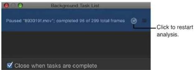
Reorder clip analysis
In the Background Task List window, drag the clip to analyze to the top of the list.

Analysis begins on the repositioned clip, and the clip previously being processed is paused.
Close the Background Task List window when analysis is complete
In the Background Task List dialog, select the "Close when tasks are complete" checkbox.
Expose commands
Motion's expose commands provide a way of viewing multiple layers at once, exploding and rescaling them. The expose commands allow you to access all layers in a project in the Canvas without having to drill down into the Layers list or Timeline. Expose commands also let you select inactive layers at the playhead's current position or jump to a selected layer's In point.
There are two expose commands: One displays all layers in a project, and the other displays only those layers active at the current position of the playhead in the Timeline.
The Expose Active Layers command lets you view the layers that are active at the position of the playhead in the Timeline.
Expose layers that are active at the playhead position
1 Click anywhere in the Canvas.
2 Press X.
Layers active at the current position of the playhead temporarily scale down and spread out over the Canvas. Each active layer is represented by a white frame in the Canvas. Moving the pointer over a frame reveals the layer's name.
3 Select the layer to work on.
The elements move and rescale back to their original positions; the element is selected in the Canvas; and the playhead moves to the first frame of the selected layer.
Expose all layers in your project
1 Click anywhere in the Canvas.
2 Press Shift-X.
Layers in the project temporarily scale down and spread out over the Canvas. Each layer in the project is represented by a white frame in the Canvas. Moving the pointer over a frame shows the layer's name.

Before

After Expose command
3 Select the layer to work on.
The layers move and rescale back to their original positions; the element is selected in the Canvas; and the playhead moves to the first frame of the selected layer.
Timeline
8
Timeline overview
The Timeline is where you control all timing aspects of a project. In the Timeline, you can organize objects to begin and end on the frames you choose, align multiple effects so they occur simultaneously, control object duration, and even perform common trim operations to edit the objects as you would in a nonlinear video editing application.
Additional controls let you manipulate masks, filters, behaviors, keyframes, and audio elements. The Timeline ruler provides an exact reference for managing timing and synchronizing effects. You can lock tracks to prevent changes, temporarily hide an object from view, and manage links between audio and video.
The Timeline is located under the toolbar in the area of the Motion workspace known as the Timing pane. In addition to the Timeline, the Timing pane contains two related partitions that can be shown or hidden: the Audio Timeline and the Keyframe Editor (for more information, see Edit audio tracks overview on page 1016 and Keyframe Editor overview on page 456). An abbreviated mini-Timeline, located at the bottom of the Canvas, provides controls to perform quick edits such as moving, trimming, and slipping without opening the Timing pane. For more information, see Mini-Timeline overview on page 290.
The Timeline itself consists of two areas: the Timeline layers list on the left and a track area on the right. You can add images and clips to your project via the Timeline, just as you add files to the Layers list or the Canvas. You can drag objects into the Timeline layers list, or drag them into the Timeline track area. The Timeline ruler, located above the track area, provides a precise reference for managing timing and synchronizing effects. Using controls in the Timeline layers list, you can lock tracks to prevent changes, temporarily hide an object from view, and manage links between audio and video.

You can hide the Timeline to enlarge other areas of the Motion workspace by deselecting the Show/Hide Timeline button in the lower-right corner of the project window. To collapse the entire Timing pane (Timeline, Audio Timeline, and Keyframe Editor), make sure that all three buttons in the lower-right corner of the Motion project window are dimmed.
Tip: You can show the Timeline on a second display, providing a larger workspace for manipulating the timing of objects. For more information, see View the Canvas or Timing pane on a second display on page 96.
To learn more about working in the Timeline, choose a topic in the Help table of contents (the sidebar to the left of this window).
Manage Timeline layers
Manage Timeline layers overview
The Timeline layers list mirrors the Layers list in the Project pane and displays your project objects (groups, layers, filters, behaviors, masks, and so on) and their stacking order. Keyframes applied to an object can also be displayed. In the Timeline layers list, you can reorder objects. This change is immediately reflected in the Layers list in the Project pane. You can also lock tracks to prevent further editing of those tracks and disable entire tracks to omit them from view in the Canvas.
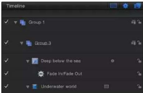
Enable Timeline tracks
To the left of each track in the Timeline layers list is an activation checkbox that turns that track on and off. When a track is turned off (disabled), it is ignored in the Canvas. Not only can you turn video or audio on and off, you can also disable or enable effects such as masks, filters, and behaviors.

Turn visibility for an object on or off
- Click the checkbox at the left edge of the track you want to control.
When the box is checked, visibility is on, and when the box is unchecked, visibility is off. Additionally, when a track is disabled, the entire track is dimmed in the Timeline.
Timeline track display
Each object in your project appears as a colored bar in the track area of the Timeline. Tracks are arranged in a hierarchy identical to that of the Layers list in the Project pane, showing you each object's place in time, as well as its relative position and duration.
You can determine the type of each object in the track area based on its appearance. The following list describes the appearance of various Timeline objects:
- Group: A double blue bar. For groups with multiple layers, the lower bar displays three lines and a value indicating the number of layers in the group.
- Objects (video, stills, shapes, text, particles, replicators, cameras, lights): A blue bar.

- Masks: a gray bar.

• Behaviors and Filters: A thin purple bar.

• Keyframes: Red diamonds beneath the keyframed object. Selected keyframes appear white.

- Audio: A green bar displaying the audio waveform. Audio tracks are not displayed by default. For more information on displaying audio tracks see Edit audio tracks overview on page 1016.

When you select an object in the Timeline, its bar becomes highlighted. When the Timeline is in Filmstrip mode, the filmstrip frames are highlighted with a white border. See Customize track display on page 257 for more information on how to set Timeline view modes.
The tracks in Motion can be displayed in a variety of ways for different working styles.
Change the Timeline track display
1 Choose Motion > Preferences (or press Command-Comma), then click Appearance.
2 In the Timeline section of the Appearance pane, choose an item from the Timebar Display pop-up menu:
- Name: Displays the name of the object on the track.
- Name Plus Thumbnail: Displays the name of the object and a single thumbnail on the track.
- Filmstrip: Displays frames of the object over the track.
Regardless of the Timebar Display setting, tracks for cameras, lights, behaviors, and filters are labeled with names only. When the Timebar Display is set to Filmstrip, computer processing time is increased.
Collapse and expand groups and layers
Motion lets you collapse and expand different parts of the Timeline layers list to show more or less data to accommodate different working styles. Layers with applied masks, filters, and other objects can be collapsed to hide those effects bars. Furthermore, whole groups can be collapsed to hide all objects contained in them.
When a layer or group is collapsed in this manner, it still appears in the Canvas. Unlike enabling or disabling tracks, collapsing and expanding the Timeline layers list is only an organizational tool to help manage the view of the Timeline.
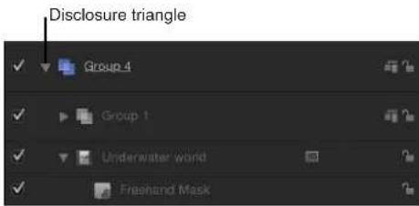
Collapse or expand a layer or group in the Timeline
- Click the disclosure triangle to the left of the layer or group name. If no disclosure triangle is present, that object cannot be collapsed or expanded any further.
Lock Timeline tracks
Occasionally, you might want to prevent changes to an item. The lock icon at the right edge of the Timeline layers list lets you lock an object and prevent any changes from affecting that object. An object that is locked in the Timeline also appears locked in the Layers list in the Project pane.
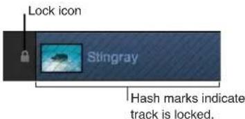
When an item is locked, the colored bar in the track area appears with a hash-mark pattern. Locked tracks still appear in the Canvas and are included in your final output. Although you cannot make changes to a locked object, you can still copy or duplicate that object or change the object's layer order.
Lock a track
- Click the lock icon at the right edge of the Timeline layers list.
Manage audio-video links
Ordinarily, objects that contain both audio and video are linked so they remain in sync. This link is represented by an icon in the Timeline layers list.

Note: To display the Audio Timeline, click the Show/Hide Audio Timeline button, located in the lower-right corner of the Motion project window.

Objects that are linked are always edited together in the Timeline. Operations such as cut, copy, paste, and split affect both audio and video. However, if you ever want to break that relationship so you can move or edit the audio or video without the other tagging along, you can disable that link and move either object freely. Beware that this might result in your audio and video playing out of sync.
Manipulate audio and video elements separately
1 Click the link icon to the right of the object name for the video or audio element.
A red slash appears over the link for all linked layers.

2 Move, trim, or slip the audio or video bar.

BeforeAfter
The link icon also appears in the Layers list and the Audio list of the Project pane.
Timeline view options
Various controls affect the view of the Timeline. The first three appear in the upper-right corner of the Timeline layers list.

The second three appear in the lower-right corner of the Motion project window.

Audio tracks and keyframes appear in separate partitions in the Timeline. When they are visible, you can resize the partitions by dragging the divider bars between them.
Note: Press F6 to hide (or show) the Timing pane, regardless of whether the Timeline, Audio Timeline, or Keyframe Editor is displayed.
Zoom in the Timeline
Controls located at the bottom of the track area allow you to zoom in and out of the Timeline horizontally, showing more or less time in the track area. As you zoom in, you can see greater detail, which lets you place objects with greater precision.

The scroller, located at the bottom of the Timeline, is a scroll bar with zoom handles on either end. The width of the scroller represents the entire duration of your project.
The zoom slider, located in the bottom-right corner of the Motion project window, zooms in and out of the track area at the position of the playhead.
Navigate the track area
■Drag the scroller left or right.
Zoom in or out of the Timeline
1 Drag the handle at either end of the scroller, inward to zoom in, or outward to zoom out.
If you hold down the Shift key while dragging a handle, the Timeline is zoomed from the center of the visible area.
2 Drag the zoom slider left to zoom out or right to zoom in at the position of the playhead.
3 To fit the Timeline in its window, press Shift-Z (with the Timeline active) or Option-Command-0.
4 Press Option-Command-Equal Sign (=) to zoom in.
5 Press Option-Command-Minus Sign (-) to zoom out.
6 On a Multi-Touch trackpad, pinch open to zoom in and pinch closed to zoom out.
Adjust Timeline track height
You can adjust the height of the tracks displayed in the track area. Audio and object tracks can be resized separately. However, some tracks, including filters and behaviors, cannot be resized.
Adjust the height of the tracks
Do one of the following:
- Drag a row separator between two layers in the Timeline layers list up or down to modify the vertical size of the tracks.

- Choose a new size from the pop-up menu at the bottom of the Timeline layers list. Options include Mini, Small, Medium, and Large.
Customize track display
Motion offers several different ways to display objects in the track area of the Timeline. You can display just the name of the object, which reduces the height of the track, allowing you to see many tracks at once. You can choose to show the name of the object plus a thumbnail image, which provides quick visual feedback about the content of the object. Or you can display a track as a filmstrip, a series of sequential thumbnails that provide visual feedback about the content of an object over time.
Customize the track display
1 Choose Motion > Preferences (or press Command-Comma) to display the Preferences window.
2 Click the Appearance icon.
3 In the Timeline section, choose an item from the Timebar Display pop-up menu.
Choices include Name, Name Plus Thumbnail, and Filmstrip.
4 Click the close box to close the Preferences window.
The objects are displayed according to your choice.
Name objects in the Timeline layers list
Masks, shapes, particles, and other content you generate in Motion are created with generic names. However, you can assign custom names to better manage and keep track of objects while you work.
Rename an object in the Timeline layers list
1 In the Timeline layers list, double-click the name of the object.
2 Enter a new name in the editable text field.
3 Press Return or Tab.
Although Motion lets you rename objects you import from your disk, changing the object's name in the Timeline layers list does not modify the name of the file on disk. Therefore, you can use one source clip multiple times, assigning a unique name to each instance inside Motion.
Manage track order
The Timeline layers list provides you with the tools to control layer order. In 2D groups, the topmost track in the list appears on top of other layers in the Canvas. You might need to rearrange the order of objects in your project to get the effects you want.
Rearrange layers in a group
1 In the Timeline layers list, drag the layer icon you want to move to a new position between the other tracks.
2 When the position indicator appears in the location you want, release the mouse button.
The tracks are reordered.
Move a layer from one group to another group
1 Drag the layer icon in the Timeline layers list over another group.
A white border highlights the group.
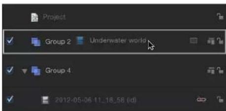
2 Release the mouse button.
The layer moves into the selected group and is placed above any existing layers in that group.

Drop a layer inside a collapsed group
You can also move a layer to a specific place in the new group by dragging it between existing tracks in the new group. Motion's groups and layers are "spring-loaded," which means that when they are collapsed, dragging an object onto them and pausing causes them to temporarily expand, like folders in the Finder.
1 Drag the layer onto the collapsed group in the Timeline layers list.
2 Position the pointer over the name of the group until the group expands.
3 Drag the layer to the desired location in the group, then release the mouse button.
Nest groups and layers
To help organize large groups of layers or to create some kinds of special effects, you can place one group inside of another. This is called nesting or grouping.
There are many reasons to nest layers or groups. Doing so simplifies your composite, grouping layers and effects objects (behaviors, filters, masks, and so on) into fewer containers. Nesting also lets you manipulate a group of layers and effects objects as one. For example, you can take the individual letters of a title (each animated on its own) and use nesting to animate the group of them across the screen. You can also use nesting to create complex particle systems. You can nest multiple layers and effects objects into a group, then use the entire group as the emitter cell. For more information on particle systems, see Particles overview on page 513.
Note: You cannot use the Group command with layers that are in different groups.
Place one group inside another
1 In the Timeline layers list, drag one group on top of another group.
A white border highlights the destination group.
2 Release the mouse button.
The first group is now nested inside the second group.
Alternatively, you can select the layers you want and choose Object > Group (or press Shift-Command-G).
Note: There is no limit to the number of groups you can nest.
Return a nested group to its original state
- Select the nested group, then choose Object > Ungroup (or press Option-Command-G).
The nested group is restored into individual layers. Any group in another group can be ungrouped.
Remove a group from a nest
1 Drag the group out of the existing parent group to the area beneath all existing groups.
The outline of the Timeline layers list area becomes highlighted.
2 Release the mouse button.
The group is restored to primary group status.
Delete a group, layer, or effects object track
1 Select the group, layer, or effects object in the Timeline layers list.
2 Press Delete.
Alternatively, you can also Control-click an object, then choose Delete from the shortcut menu.
Select more than one group, layer, or effects object track
All of the operations just described can also be performed with multiple tracks. For example, rather than moving just one object from Group 1 to Group 3, you can select two or three objects in Group 1 and move them all at once.
■Command-click to select tracks in the Layers list.
Add objects to the Timeline
Add objects to the Timeline overview
When you drag a new media item into the track area, a drop menu appears with options for how the new layer should be incorporated. Depending on where in the track area you drop the item, the menu displays different options. If you drag to a group or layer track in the track area, you can choose Composite, Insert, or Overwrite. An additional Exchange option becomes available when you exchange the same type of media (such as a QuickTime movie, an image sequence, or an image file). For example, the Exchange menu item is displayed when you drag a QuickTime movie onto another QuickTime movie's track.

Library effects (behaviors, filters, and so on) can also be dragged into the Timeline track area. However, because effects objects are applied to media layers (images, clips, audio, and so on), they cannot be grouped by themselves.
Objects such as cameras and lights that are saved to the Library can also be dragged to the Timeline.
When you drag a media item the track area, a new layer appears in the Timeline layers list. The new layer can appear above or below an existing layer; where you release the mouse button determines placement of the new layer. If you drag multiple items, you can choose Composite or Sequential from the drop menu. Composite places the new tracks one on top of the other. Sequential places the new tracks one after the other.
Note: If you release the mouse button before the drop menu appears, the default choice of Composite is applied. This means that a new track is added above the other tracks in the Timeline, and the layer appears on top of other layers in the Canvas.
Add an object using Composite edit
When you choose Composite from the drop menu, the new object is added to a new track in the active group, and all layers remain visible in the Canvas simultaneously.

Before

After Composite edit
Composite a layer
1 Drag an item from the File Browser, Library, or Media list into the Timeline track area. As you drag, a tooltip appears at the pointer, indicating the frame number where you are located.
2 When you reach the frame where you want the new layer to start, position the pointer over the layer you want as the background, holding down the mouse button until the drop menu appears.
3 Choose Composite from the drop menu. The new layer is composited into the project.
Add an object using Insert edit
When you choose Insert from the drop menu, Motion leaves the existing layer in its track, but pushes it forward in time to make room for the new layer. For example, if you insert a 100-frame movie into a group containing an existing layer, the new movie is added to the Timeline at the frame where you drop it, pushing the remaining frames of the original movie out 100 frames.
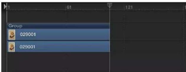
Before
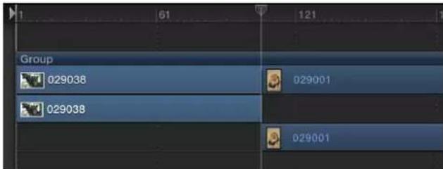
After Insert edit
If you insert a new item midway through an existing layer, the existing layer is split into two layers, each on its own track.
Insert a layer
1 Drag an item from the File Browser, Library, or Media list over an existing layer in the Timeline track area.
As you drag, a tooltip appears at the pointer, indicating the frame number where you are located.
2 Drag to the frame where you want the new layer to start, holding down the mouse button until the drop menu appears.
3 Choose Insert from the drop menu.
The new layer is inserted into the track, breaking the original bar into two, and pushing the frames after the insertion further out in time.
Add an object using Overwrite edit
The Overwrite drop menu option deletes the existing layer, overwriting it with your new layer.
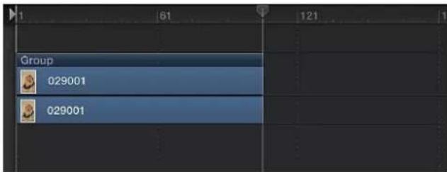
Before

After Overwrite edit
If the new layer is shorter than the one currently in the group, the Overwrite option splits the duration of the existing layer and deletes only the frames where the new layer appears.
Before

After Overwrite edit with shorter clip
Overwrite a layer
1 Drag an item from the File Browser, Library, or Media list into the Timeline track area.
As you drag, a tooltip appears, indicating the frame number where you are located.
2 Drag to the frame where you want the new layer to start, holding down the mouse button until the drop menu appears.
3 Choose Overwrite from the drop menu.
The frames of the new layer replace the frames of the original layer. If the original layer contained more frames than the new one, the old layer is split into two layers and the additional frames remain.
Add an object using Exchange edit
The Exchange drop menu option is a variant of the Overwrite option, but instead of dropping the entire duration of the new layer into the project, the duration of the existing layer is used. For example, if you drag a 30-second clip over a 5-second clip, choosing Exchange swaps the existing 5 seconds with the first 5 seconds of the longer clip. If you exchange a longer clip with a shorter one—for example, swapping a 10-second clip with one that lasts only 5 seconds—the first 5 seconds are replaced, and the final 5 seconds of the original remain.
The exchange edit transfers any filters, behaviors, and keyframes from the original layer onto the new layer.
Note: You cannot use Exchange with audio files.
Exchange a layer
1 Drag an item from the File Browser, Library, or Media list into the Timeline track area.
As you drag, a tooltip appears, indicating the frame number where you are located.
2 Drag to the frame where you want the new layer to start, holding down the mouse button until the drop menu appears.
3 Choose Exchange from the drop menu.
The old layer is replaced by the new layer.
Add multiple objects to the Timeline track area
When you drag more than one item to the Timeline, the new layers appear in their own tracks above any existing layers. This is equivalent to performing a composite edit with a single object. A drop menu lets you choose whether the additional layers should be stacked up as a composite, or whether they should appear one after another (sequentially).
Before edit
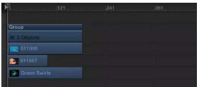
Composite edit

Sequential edit
Add multiple layers as a composite
1 Shift-click or Command-click to select multiple items in the File Browser, Library, or Media list, then drag them to the Timeline track area.
2 Drag to the frame where you want the new layers to start, holding down the mouse button until the drop menu appears.
3 Choose Composite from the drop menu.
Multiple layers are added to the project at the same point in time, each new layer on its own track.
If you release the mouse button in the Timeline track area before the drop menu appears, a composite edit is applied by default. Alternatively, you can drop the multiple layers into the Timeline layers list. Doing so results in a composite edit.
Add multiple layers sequentially
1 Shift-click or Command-click to select multiple items in the File Browser, Library, or Media list, then drag them to the Timeline track area.
2 Drag to the frame where you want the new layers to start, holding down the mouse button until the drop menu appears.
3 Choose Sequential from the drop menu.
The multiple layers are edited into the project, one after another, each on its own track.
Set drag-and-drop preferences
You can set preferences that specify where an item is dropped when you add it to the Timeline Layers list or Canvas: at the start of the project or at the current playhead position. You can also set the delay time before a drop menu appears.
Specify where new objects appear in the Timeline
1 Choose Motion > Preferences (or press Command-Comma).
The Preferences window appears.
2 Click the Project icon.
The Project pane opens.
3 In the Still Images & Layers section, click the appropriate button to create layers at "Current frame" or "Start of project."
Note: The Create Layers At preference applies only when you drag items to the Timeline layers list, the Layers list, or Canvas. Clips dropped on a specific frame in the Timeline track area appear at that exact location.
Set the drop menu delay preference
1 Choose Motion > Preferences (or press Command-Comma).
The Preferences window appears.
2 Click the General icon to view the General pane.
3 In the Interface section, adjust the Drop Menu Delay slider to set the delay pause for drop menus in Motion.
Add objects to the Timeline layers list
You can also add images and clips to your project by dragging them into the Timeline layers list. When you drag an image or clip from the File Browser or Media list into the Timeline layers list, you can choose whether to add the item to an existing group, add it to a new group, or have it replace an existing layer. When you add a layer to the Timeline layers list, a corresponding timebar appears in the track area. The new layer can appear above or below an existing layer; where you release the mouse button determines placement of the new layer.
Library effects (behaviors, filters, and so on) can also be dragged into the Timeline layers list. However, because effects objects are applied to media layers (images, video, audio, and so on), they cannot be grouped by themselves.
Note: You can also drag images and clips to the Timeline track area. For more information, see Add objects to the Timeline overview on page 260.
Add a layer to a group
1 Drag an item from the File Browser, Library, or Media list, then position the pointer over the Timeline layers list.
- If you position the pointer over a group, the track is highlighted with a white border.
- If you position the pointer between layers in a group, the position indicator appears.
- If you position the pointer over an existing layer, the pointer becomes a curved arrow, indicating that you are about to replace the existing layer with the new media item.
2 Release the mouse button to add the layer to the group.
The new layer is placed in the group below the other layers in the list, or between the layers where you dragged it. If you dragged onto an existing layer, a new layer replaces the previous one.
Note: If the media item is a clip with multiple audio tracks, a drop menu will appear, allowing you to choose between mixing down the multiple tracks to stereo or importing audio tracks individually.
Create a new group on top of existing groups
1 Drag an item from the File Browser, Library, or Media list into the Timeline layers list, at the upper edge of the top group.
2 When the position indicator appears, release the mouse button.
A new group is created above other existing groups in the hierarchy or "stack" of groups and layers.
Create a group above existing groups
1 Drag an item from the File Browser, Library, or Media list into the Timeline layers list, below the lower edge of the bottom layer.
2 Release the mouse button.
A new group is created above the other existing groups in the hierarchy or "stack" of groups and layers.
Edit objects in the Timeline
Edit objects in the Timeline overview
During the process of designing and implementing a motion graphics project, you place objects in the Timeline and Canvas, move them forward or backward in time, and trim them to correspond with the timing of other objects in your project.
Motion has several features that help you modify objects in the Timeline. You can arrange your objects to begin and end at designated frames. You can also use powerful alignment and timing tools, such as snapping and markers. You can retime objects, forcing them to play at faster or slower speeds. You can also modify keyframes in the Timeline. This section describes the various ways you can perform these actions.
Motion uses the terms move, trim, and slip to describe the different ways of editing Timeline objects:
- Move: Changes the location of an object without affecting its content or duration.
- Trim: Changes the duration of an object without affecting its location or content.
- Slip: Changes the content of an object without affecting its location or duration.
Move objects
Move an object when you want it to begin and end at a different point in the Timeline.
Move an object in the Timeline
In the Timeline track area, drag an object left or right to move it in time.
A tooltip appears, identifying the new In and Out points as you drag the bar. A delta symbol (triangle) indicates the number of frames you are moving.

Move an object and snap it to neighboring items
Do one of the following:
- Click to select the Snapping button in the upper-right corner of the Timeline.

■Press Shift as you drag the item in the Timeline.
Vertical lines appear in the track, corresponding to the In and Out points of other objects. The active object snaps to these lines as you drag.
Move an object to the playhead position
You can move an object to a new location in its track by using the Move Selected In Point or Move Selected Out Point command. This command shifts the position of the selected object to the current playhead position. You can also use this command to move and align multiple objects in one operation.
1 Select the object to move.
Shift-click to select multiple objects, if desired.
2 Place the playhead at the point in the Timeline where you want to move the object.
3 Choose Mark > Move Selected In Point (or press Shift-Left Bracket) to align the object's beginning to the playhead, or choose Mark > Move Selected Out Point (or press Shift-Right Bracket) to align the end of the object to the playhead position.
Move an object to a specific frame
1 In the Timeline, select the object (or objects) to move, then type the number of the frame (or timecode) where you want to move the object.
A value field appears, displaying the number you typed.

2 Press Return.
The object's In point moves to the specified frame number. If you selected more than one object, they all move to the specified frame number.
Move an object a specific number of frames
Do one of the following:
- To move an object forward a specific number of frames, select the object, type a plus sign (+) followed by the number of the frames you want to move, then press Return.

- To move an object backward a specific number of frames, select the object, type a minus sign (−) followed by the number of the frames you want to move, then press Return.
Trim objects
Trim an object when you want to shorten or lengthen its duration in the Timeline. You can shorten or lengthen the beginning or end of the object by dragging from the left or right edge of the object bar (the In and Out points). You can also trim an object (change its In and Out points) by using menu commands and corresponding keyboard shortcuts. You can trim multiple objects simultaneously, and you can trim on the fly while your project is playing back.
Note: Video and audio objects cannot be trimmed to be longer than the duration of their source media. To extend a video or audio object beyond the duration of its source media, you must change the object's End Condition to Loop, Ping Pong, or Hold in the object's Properties Inspector. This limitation does not apply to other objects, such as still images, cameras, text, and shapes, all of which you can extend without restriction. You can also change the effective duration of a clip without adding or removing frames by changing the clip's playback speed. For more information on the Timing controls, see Retiming overview on page 246.
When you trim a video object in the track area, Motion provides a visual representation of how much additional footage is available in the object's source clip: a dimmed extension on either end of the object indicating that unused frames exist in the source video clip. If you see no dimmed extensions when you trim an object, there are no unused frames in the source clip. Consequently, you cannot lengthen the object (unless you change the object's End Condition in the Properties Inspector for the clip).

Trim an object
1 Move the pointer to one end of the object you want to trim.
The pointer changes to a trim pointer.

2 Drag the end of the bar until it reaches the frame where you want the object to start or end.
As you drag, a tooltip indicates the new In or Out point, and the new duration of the object.

Trim an object and snap its In or Out point to neighboring objects
■ Press Shift as you drag the edge of the object in the track area.
Vertical lines appear in the track, corresponding to the In and Out points of other objects. The active object snaps to these lines as you drag.
Change an object's In or Out point
1 Select the object to trim.
2 Place the playhead at the frame where you want the new In or Out point.
3 Choose Mark > Mark In (or press I) to set a new In point or choose Mark > Mark Out (or press O) to set a new Out point.
Trim multiple objects at the same time
1 Select the objects to trim.
2 Place the playhead at the In or Out position you want.
3 Choose Mark > Mark In (or press I) or Mark > Mark Out (or press O) to set a new In or Out point.
All selected objects are trimmed to the new point.
Note: If an object has insufficient source media to complete the trim, the bar moves as far as it can toward the new point.
Slip video layers
Slip a video layer when you want to use a different section of your source clip without changing the layer's duration or where it appears in the Timeline.
Important: Slipping is only possible after you have trimmed a video layer's timeframe.
For example, if you have a shot of a door opening that is three seconds long and you want to trim it one second, you can use the Slip function to select which one-second section to use: the first second as the door leaves the jamb, the next second where it is flying open, or the last second where it bangs against the wall.
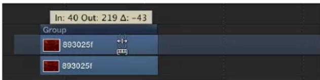
As with trimming, when you slip a video layer in the track area, Motion provides a visual representation of how much additional footage is available in the object's source clip: a dimmed extension on either end of the object indicates that unused frames exist in the source video clip. You can only slip an object as far as the existing unused frames in the source media.
Slip a video layer
1 With the pointer over the video layer's timeframe, press and hold down the Option key.
The pointer turns into the slip pointer.

2 Drag the middle part of the bar left or right.
Dragging to the left replaces the frames with a section from later in the source material, while dragging to the right uses frames from earlier in the clip.
Split tracks
You can divide a single object into multiple objects, each in its own Timeline track. Splitting tracks lets you turn one object into multiple pieces and then manipulate each segment of the object on its own track. For example, you can split an object into multiple tracks over time if want to apply an effect to the object over a specific, finite segment of time. Or you might split an object into multiple tracks to create the illusion that the object is moving in 3D space, passing in front of other objects. When working in 3D, you can even split camera tracks.

Before

After Split
Split an object
1 Select the object to split.
2 Place the playhead on the frame where you want the split to occur.
3 Choose Edit > Split.
The object is broken into two pieces, each positioned on its own track.
Delete objects
Removing objects from your project can be just as important as adding them. Motion provides three ways to remove an object from the Timeline:
- Delete: Removes the object, leaving a gap in the Timeline.
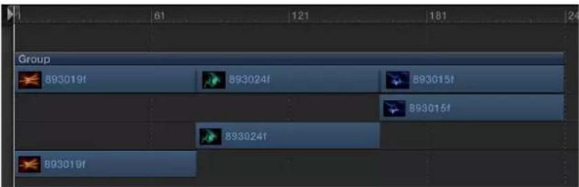
Before

After Delete
- Ripple Delete: Removes the object and closes up the gap left behind.
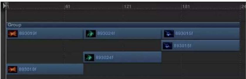
Before

After Ripple Delete
- Cut: Deletes the object, leaving a gap in the Timeline, and copies the object to the Clipboard for later pasting.
Delete an object
1 Select the object to delete.
2 Choose Edit > Delete (or press Delete).
You can also Control-click the object, then choose Delete from the shortcut menu.
Ripple delete an object
1 Select the object to delete.
2 Choose Edit > Ripple Delete (or press Shift-Delete).
Cut an object
1 Select an object to delete.
2 Choose Edit > Cut (or press Command-X).
You can also Control-click the object, then choose Cut from the shortcut menu.
Copy and paste objects
As in other applications, in Motion you can copy and paste objects. Copying leaves an object in place and copies it to the Clipboard for later pasting.
When you paste an object, it is placed at either the position of the playhead or at the beginning of the project, based on the Create Layers At setting in the Project pane of the Motion Preferences. For more information, see Project pane on page 117. For the purposes of simplicity, the remainder of this section assumes you have set the Create Layers At to Current Frame.
The pasted object is placed in a new track at the top of the other layers in the active group. If no group is selected, the object is pasted into the group it was copied from. If it was copied from outside the current project, a new group is created. Pasting multiple objects retains the relative object and layer order of the Clipboard contents.
Objects with applied filters, behaviors, keyframes, and other effects retain those effects when cut, copied, and pasted. You can also copy or cut filter and behavior objects from one media layer and then paste them into another media layer, effectively transferring the effect to a different media item.
In addition to ordinary pasting, Motion lets you paste as an insert, overwrite, or exchange edit. These three commands appear in the Paste Special dialog:
- Insert into time region: Pastes the Clipboard contents into the project, pushing existing objects farther down in time.
• Overwrite into time region: Pastes the Clipboard contents into the project, deleting any existing objects at the same point in time. - Exchange media with existing object: Replaces the selected object in the project with the Clipboard contents.
Note: Paste Special can also be used with selected regions in the Timeline to perform a special type of paste. For more information, see Work with regions on page 284.
Copy an object to the Clipboard
1 In the Timeline layers list, select the object to copy.
2 Choose Edit > Copy (or press Command-C).
Paste an object into the Timeline
1 In the Timeline layers list, select the group you to paste the object into.
2 Position the playhead at the desired time position.
3 Choose Edit > Paste (or press Command-V).
Paste an object as an insert edit
1 Select the group to paste the object into.
2 Position the playhead at the desired time position.
3 Choose Edit > Paste Special (or press Option-Command-V).
The Paste Special dialog appears.
4 Select "Insert into time region."
5 Click OK to confirm your edit.
The object is inserted into the selected region, pushing any existing objects to the right.
Paste an object as an overwrite edit
1 Select the group to paste the object into.
2 Position the playhead at the desired time position.
3 Choose Edit > Paste Special (or press Option-Command-V).
The Paste Special dialog appears.
4 Select "Overwrite into time region."
5 Click OK to confirm your edit.
The object is pasted into the selected region, overwriting any existing objects.
Paste an object as an exchange edit
1 Select an object from the File Browser and choose Edit > Copy (or press Command-C).
Note: The "Exchange media with existing object" option is only available for an item copied from the File Browser.
2 Select the group to paste the object into.
3 Position the playhead at the desired time position.
4 Choose Edit > Paste Special (or press Option-Command-V).
The Paste Special dialog appears.
5 Select "Exchange media with existing object."
6 Click OK to confirm your edit.
Retime in the Timeline
You can modify the duration and playback speed of video tracks in the Timeline, using the retime pointer or loop pointer.
Speed and duration are interdependent; that is, if you increase a clip's playback speed, its duration decreases, and vice versa. For example, a 60-frame video clip played back at 30 frames per second takes two seconds to display its 60 frames. If its In point is frame 1, its Out point is frame 60. Playing back the same clip at 15 frames per second would take twice as long; the clip's In point remains the same, but its Out point becomes 120.
For more detailed information about retiming, see Retiming overview on page 246. For more information on using custom Retiming behaviors, see Retiming behaviors overview on page 349.
Shorten the video clip's duration and speed up its playback speed
1 With the pointer over the end of a video clip (the Out point), press and hold down the Option key.
The pointer turns into the retime pointer.

2 Drag the Out point of the clip's bar to the left.
As you drag, the tooltip displays the clip's speed and duration.
Note: To use the retime pointer, Constant Speed must be chosen from the Time Remap pop-up menu in the Properties Inspector. When Variable Speed is chosen, the retime pointer has no effect. You cannot retime images, effects, and other nonvideo objects.
Lengthen a video object's duration and slow down its playback speed
1 With the pointer over the end of a video clip (the Out point), press and hold down the Option key.
The pointer turns into the retime pointer.
2 Drag the Out point of the clip's bar to the right.
As you drag, the tooltip displays the clip's speed and duration.
Loop a clip
Another way to extend a video clip's duration is to loop it. When a looped clip reaches its last frame, it starts playing again from its first frame. You can easily loop a clip by adjusting it in the Timeline.
1 With the pointer over the end of a video clip (the Out point), press and hold down the Option and Shift keys.
The pointer turns into the loop pointer.
2 Drag the Out point of the bar to the right.
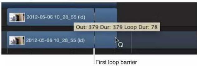
As you drag, the tooltip displays the clip's Out point, total Duration, and Loop Duration
A looped object displays barriers to indicate where loops begin and end in the Timeline.
Change the loop point of a clip
The first loop barrier in a clip's bar is interactive. Moving the barrier changes the point where the clip loops.
■Drag the first loop barrier left or right.
The end point of the clip's loop moves as you drag.
Group tracks
You can perform editing tasks in the group track, even if the track is collapsed and all objects in the group are not visible in the Timeline track area.
Group tracks contain two colored bars. The narrow, dark-blue upper bar edits all objects in the group as a single unit. It is labeled with the name of the group ("Group" by default). The lower group bar—taller and a lighter shade of blue—edits individual objects in the group. The lower group bar displays information about the names of individual objects in the group, as well as the number of objects that overlap in composited areas of the Timeline.
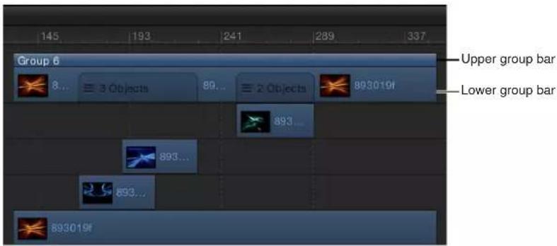
Motion lets you move objects in the Timeline via the group track. Depending on where you drag in the group track, you can move all objects, individual objects, or just those objects that overlap in time (composited objects).
Trimming the edges of the upper group bar trims the edges of the objects in the group. If there is only one object, trimming the upper group bar trims that object. If there is more than one object lined up with the edge of the group, trimming the group trims all of those objects.

Before

After Trim
You cannot trim overlapping objects via the group track.
You can modify the upper group bar to be longer or shorter than the contents of the group (the lower group bar). For example, you might shorten the upper group bar to hide a section of the objects in it. Objects that extend beyond the ends of the upper group bar are not displayed in the Canvas.

In addition to moving and trimming, you can slip video layers in the group track. Any portion of the lower group bar that contains only one video layer can be slipped in this manner. Areas where more than one layer overlap can be slipped by Control-clicking the group bar and choosing a video layer from the shortcut menu.
Edit in the group track
There are a variety of editing tasks you can perform directly in the group track. This is equivalent to making similar edits to the various tracks contained within the group, but it is sometimes more efficient to make such changes in the group track instead.
Move all objects in a group at once
■Drag the upper group bar left or right.
All objects in the group move in time.
Move a single object in a group
1 Click an area of the lower group bar where a single object is visible.
That object is highlighted in the group track.
2 Drag the section left or right to move the object in the group forward or backward in time.
The selected object moves in time.

Move overlapping (composited) objects in a group
- Drag an area of the lower group bar where multiple objects overlap.
The composited objects move in time.
Trim objects in a group
- Drag an end of the upper group bar right or left in the track area.
All objects in the group are trimmed.
Change the duration of the group independently from the objects in it
- Holding down the Command key, drag either end of the upper group bar left or right.
Only the upper group bar is trimmed.
Note: After you manually change the length of the upper group bar, it is no longer updated when you add or modify the objects to the group. To restore automatic updating, realign the edges of the upper group bar with the edges of the first and last clips in the group.
Trim an image or video object without trimming its applied effects
You can use the technique described in the task above on image and video objects, trimming them without affecting the duration of their subobjects (masks, filters, or other applied effects objects).
- Press Command while you drag the edge of the image or video clip.
The object is trimmed independently of its applied effects objects.

Slip a video layer via the group track
- Holding down the Option key, drag an area in the lower group bar where the video layer is located.
If there are overlapping (composited) layers, before performing this operation Control-click the overlapping region, then choose the video layer from the shortcut menu.
Note: You can only slip an object if there are unused frames in the source media associated with that clip. For more information on slipping, see Slip video layers on page 271.
Dragging right slips the video clip to an earlier portion of the source media. Dragging left slips the video clip to a later portion of the source media. Either way, the position of the clip in the Timeline and its duration are unchanged.
Display and modify keyframes in the Timeline
You can move or delete keyframes that are displayed in the Timeline. You can also display the animation curve for a selected keyframe, using the Keyframe Editor.
Display keyframes in the Timeline
In the upper-right corner of the Timeline, click the Show/Hide Keyframes button.

When the Show/Hide Keyframes button turns blue, keyframes appear below the objects in the track area.

Note: Don't confuse the Show/Hide Keyframes button with the Show/Hide Keyframe Editor button, located in the bottom-right corner of the Motion project window. The former turns the display of keyframes in the Timeline track area on and off; the latter expands and collapses the Keyframe Editor in the Timing pane.
Move a keyframe's position in time
Moving a keyframe in the Timeline modifies the keyframe's position in time (but not its value).
■Drag the keyframe to the left or right.
When selected, the keyframe appears white.
Change a keyframe's value
To change a keyframe's value (as opposed to its position in time), do one of the following:
- Control-click the keyframe, choose the property to adjust from the shortcut menu, enter a new value, then press Return.
- Use the Keyframe Editor, which lets you change both the value and interpolation of the keyframe. For more information on the Keyframe Editor, see Keyframing overview on page 439.
Delete a keyframe or group of selected keyframes
- Select the keyframe or keyframes to delete, then do one of the following:
- Press Delete.
- Control-click a selected keyframe, then choose Delete Keyframes from the shortcut menu.
Delete all keyframes
■ Control-click a keyframe, then choose Delete All Keyframes from the shortcut menu.
Display an animation curve in the Keyframe Editor
■ Control-click a keyframe on the track, then choose Show in Keyframe Editor from the shortcut menu.
The Keyframe Editor appears underneath the Timeline, showing the animation curve and a new, untitled curve set. For more information on curve sets, see Keyframe Editor overview on page 456.
Work in the ruler
Work in the ruler overview
You can perform several types of functions using the ruler area of the Timeline:
- Move the playhead to a specific frame to view the project at a specific time.
- Set In and Out points so playback occurs only within the specified frames.
- Select a range of frames, so you can delete, cut, or paste into the selected frames.

Navigate in the Timeline
Motion provides many controls for navigating the Timeline. You can drag the playhead to "scrub" through your project as quickly or slowly as you want, or immediately jump to a specific frame. Additionally, you can jump to object boundaries, markers, and other important indicators in the Timeline.
Many navigation tasks are accessible via the timing display in the toolbar.
Note: The timing display can be set to show frames or timecode. To set the timing display duration to frames, choose Show Frames from the pop-up menu on the right side of the timing display (the inverted arrow).

In addition to moving to new positions in time, you can navigate directly to objects in the Timeline, such as objects, markers, and keyframes. Navigating to objects is described in the tasks below. For more information on markers, see Markers overview on page 286. For information on displaying keyframes in the Timeline, see Timeline view options on page 255. For more information on keyframes, see Keyframing overview on page 439.
Play back your project
■Press the Space bar.
Move the playhead to a new point in time
Do one of the following:
- Double-click the current frame number in the timing display, enter a new frame number, then press Return.
- Drag left or right over the current frame number in the timing display to rewind or advance.
- Drag the playhead in the Timeline ruler to the frame you want.
- Click the Timeline ruler at the frame number where you want to move the playhead.
- With the Canvas or Project pane active, enter a new frame number, then press Return to jump to that frame.
- With the Timeline active (and no objects selected), enter a new frame number, then press Return to jump to that frame.
Navigate by frame
To make it easier to find specific frames in your project, you can step through the Timeline frame by frame, rather than skimming it.
Do one of the following:
- To move forward a specific number of frames: Type a plus sign (+), then type the number of frames to move forward.
- To move backward a specific number of frames: Type a minus sign (−), then type the number of frames to move backward.
- To move forward or backward one frame at a time: Click the "Go to next frame" or "Go to previous frame" button in the transport controls (to the right of the Play button), or press the Left Arrow key to move backward or the Right Arrow key to move forward.
You can also choose Mark > Go to > Previous Frame or Next Frame.
- To move forward or backward ten frames at a time: Choose Mark > Go to > 10 Frames Back or 10 Frames Forward, or press the Left Arrow key to move backward or the Right Arrow key to move forward.
Move ahead or back in seconds, minutes, or hours
1 Double-click in the timing display.
2 Do any of the following:
- To move forward in seconds, type a plus sign (+), enter the number of seconds to move forward, then enter a period. For example, to move 2 seconds ahead, enter “+2.” (with a period after the number), then press Return. To move ahead in minutes, enter two periods after the number, and to move ahead in hours, enter three periods after the number.
- To move backward in seconds, enter a minus sign (−), enter the number of seconds to move backward, then enter a period. For example, to move 2 seconds backward, enter “−2.” (with a period after the number), then press Return. To move backward in minutes, enter two periods after the number, and to move backward in hours, enter three periods after the number.
Important: When the Timeline is active and an object is selected, typing a number and pressing Return moves the selected object, rather than the playhead.
Navigate by jumping
To move the playhead quickly from point to point in the Timeline, do one of the following:
- To jump to the beginning of the project: Click the "Go to start of project" button in the transport controls, choose Mark > Go to > Project Start, or press Home.
- To jump to the end of the project: Click the "Go to end of project" button in the transport controls, choose Mark > Go to > Project End, or press End.
- To jump to the next keyframe: With an animated object selected, choose Mark > Go to > Next Keyframe, or press Shift-K.
- To jump to the previous keyframe: With the animated object selected, choose Mark > Go to > Previous Keyframe.
Jump to the beginning or end of an object in the Timeline
1 Select the object to navigate to.
2 Do one of the following:
- Choose Mark > Go to > Selection In Point or Selection Out Point.
- Press Shift-I (for the In point) or Shift-O (for the Out point).
Define the play range
Ordinarily, clicking the Play button plays your project from the first frame until the last. However, you can change the play range of your project by modifying the In and Out points in the Timeline ruler. You might do this to focus on a specific section as you fine-tune your project or make other changes to it. When you finish, reset the In and Out points to the beginning and end of your project.

Customize the playback In point
Do one of the following:
In the ruler, drag the In point marker from the left edge of the ruler to the frame where you want to set the In point. As you drag, the playhead moves with your pointer. When you release the mouse button, the playhead snaps back to its previous position.
■Choose Mark > Mark Play Range In.
In the ruler, move the playhead to the frame where you want to set the In point, then press Option-Command-I.
Customize the playback Out point
Do one of the following:
- In the ruler, drag the Out point marker from the right edge of the ruler to the frame where you want to set the Out point.
- Choose Mark > Mark Play Range Out.
In the ruler, move the playhead to the frame where you want to set the Out point, then press Option-Command-O.
Reset playback In and Out points
Do one of the following:
■ Choose Mark > Reset Play Range.
■Press Option-X.
The In and Out points reset themselves to the beginning and end of the project.
Navigate to playback In and Out points
Do one of the following:
- Choose Mark > Go to > Play Range Start or Play Range End.
■Press Shift-Home (In point) or Shift-End (Out point).
Project duration
Motion projects default to ten seconds in length. You can change this duration to match the needs of your project. To learn how to change the default project duration, see Project properties overview on page 191.
The project duration is displayed at the bottom of the Motion window. You can also display the duration in the timing display in the toolbar.
Display the project duration in the timing display
Do one of the following:
- Choose Show Project Duration from the pop-up menu in the timing display (the downward-facing arrow).
- Click the watch icon to the left of the numbers in the timing display.
Change the project duration
Do one of the following:
- With the timing display set to show project duration, double-click the number, then type a duration value.
- With the timing display set to show project duration, drag left or right over the number to decrease or increase the duration.
- Choose Edit > Project Properties (or press Command-J), then change the value of the Duration field in the Properties Inspector.
Note: Click the downward arrow to the right of the numbers in the timing display and choose Show Frames or Show Timecode to switch between viewing the project duration in frames or timecode.
Work with regions
Sometimes you might want to make changes to a range of frames, known as a region. You might do this to cut or copy a section of time to remove it or move it to a new position in your project. Regions need not align with object edges in the Timeline. You can create a region that begins midway through an object or one that includes empty frames beyond the edges of objects.
After you define a region, you can delete or ripple delete it. When you choose Ripple Delete (choose Edit > Ripple Delete), the region is deleted, and the resulting gap closes. You can cut or copy the region to move it to the Clipboard so you can paste it somewhere else.
Note: Pasting a region does not paste it at the current playhead location. To move a pasted region to the playhead location, press the Shift key while you drag the pasted object. As you approach the current playhead location, the object snaps into place.
You can also paste objects into a defined region using the Paste Special command. You have three choices for how the "paste into" operation is performed. You can insert, pushing the existing region down in time; overwrite the existing contents of the region; or exchange the existing objects with the Clipboard contents. In all these cases, the pasted objects never exceed the duration of the region they are pasted into.
You can select a region to add blank playback time into your project (which will appear black in the Canvas). For example, you might want to add some black frames between two objects, or add frames in as a placeholder for a clip you don't yet have. This is called inserting time.
Select a range of frames
■ Holding down the Command and Option keys, drag in the Timeline ruler.
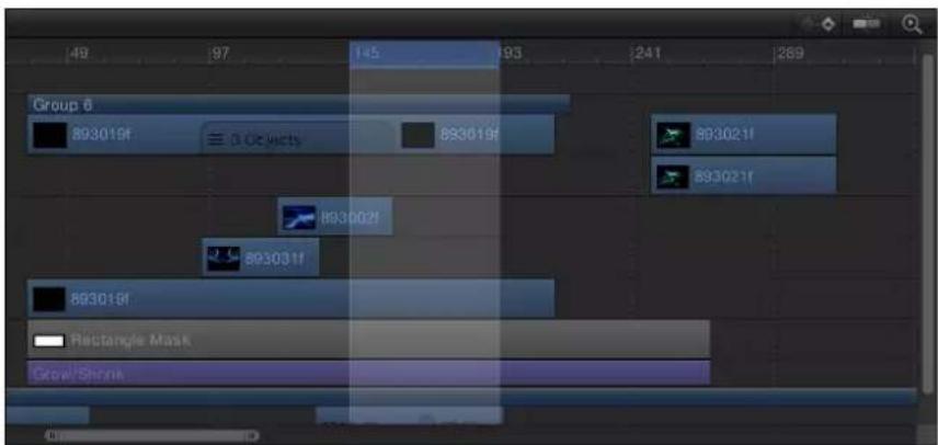
A light highlighted band appears over the selected frames.
Move a region
- Position the pointer over the region, then drag to move the region.

Note: This operation does not move objects within the region.
Deselect tracks from a selection range
■Command-click the track to deselect.
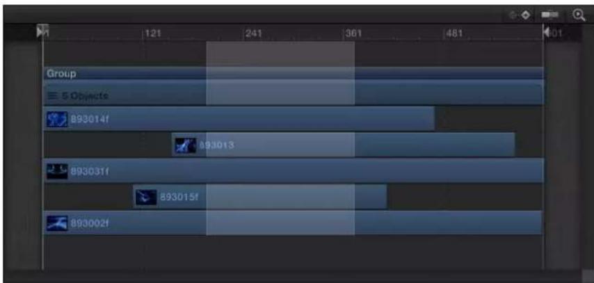
Paste into a region
1 Select the object to copy to the Clipboard to be pasted.
2 Press Command-C to copy or Command-X to cut your selection.
3 Holding down the Command and Option keys, drag in the ruler to select a region.
4 Choose Edit > Paste Special.
The Paste Special dialog appears.
5 Select Insert, Overwrite, or Exchange, then click OK.
The Clipboard contents are pasted into the region using the method you specified. For more information on the different editing types, see Add objects to the Timeline overview on page 260.
Insert time into a project
1 Holding down the Command and Option keys, drag in the ruler.
Drag as wide an area as you want to insert.
2 Choose Edit > Insert Time.
The number of frames in the region is added to the project, beginning at the end of the selected region and pushing any existing objects further out in time.
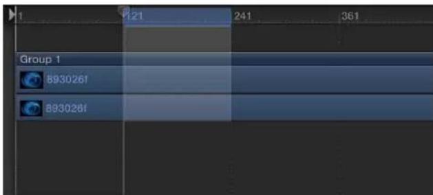
Before

After Insert Time
If time is inserted during a range that contains a video clip, the clip is split onto two tracks, and objects beyond the split point are placed in a new group.
Markers
Markers overview
A marker is a visual reference point in the Timeline that identifies a specific frame. You can add as many markers as you want in the Timeline ruler while playing the project, or when the playhead is stopped.
Use markers to:
- Add a visual reference to an object.
- Add a visual reference to a project marker in the mini-Timeline.
- Align other objects or keyframes to an important point in time.
- Add notes about a specific area in your project.
- Customize effects templates for use in Final Cut Pro X. For more information about template markers, see Template markers overview on page 428.
You can assign different colors to different types or markers and create marker groups. For example, use green to label all audio markers or pink to identify all temporary object markers.
You can add two types of markers: project markers and object markers. Project markers are fixed to a specific frame or timecode value in the ruler. Object markers are attached to an object and move around as you move the object in the Timeline.
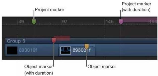
Add, move, and delete markers
You can add, delete, or move Timeline markers.
Add a project marker
1 Place the playhead at the frame where you want the marker.
2 Ensure that no objects are selected, then do one of the following:
- Choose Mark > Markers > Add Marker.
- Press M.
- Shift-click the Timeline ruler.
• Control-click Timeline ruler, then choose Add Marker from the shortcut menu.
A green marker is added in the Timeline ruler.
Note: You can also press Shift-M to add a project marker at the playhead position, even if an object is selected.
Add an object marker
1 Place the playhead at the frame where you want the marker.
2 Select the object to add the marker to, then do one of the following:
- Choose Mark > Markers > Add Marker.
- Press M.
A red marker is added to the bar for the selected object.
In this way, you can add markers while playing your project. The markers appear at the frame where the playhead is at the time you press the M key (or choose Mark > Markers > Add Marker).
Move a marker
- Drag the marker left or right to a new location.
Delete a marker
Do one of the following:
- Drag the marker vertically out of the area where it resides, then release the mouse button.
The marker disappears with a "poof" animation. - Double-click the marker, then click Delete Marker in the Edit Marker dialog.
- Position the playhead over the marker (select the group or object for group or object markers), then choose Mark > Markers > Delete Marker.
■ Control-click the marker, then choose Delete Marker from the shortcut menu.
Delete all project markers
In addition to deleting a single marker, you can delete all markers from your project in one step.
1 Choose Edit > Deselect All (or press Shift-Command-A).
2 Choose Mark > Markers > Delete All Markers.
Delete all markers in a specific object
Do one of the following:
- Select the object containing the markers you want to delete, then choose Mark > Markers > Delete All Markers.
Edit marker information
You can edit the information for a marker, including its name, starting frame, duration, and color. You can also add comments to the marker. Comments appear in a tooltip when the pointer is placed over the marker.
Edit marker information
1 Open the Edit Marker dialog by doing one of the following:
- Double-click a marker to display the Edit Marker dialog.
- Control-click the Marker, then choose Edit Marker from the shortcut menu.
- For object markers, move the playhead to the marker, then choose Mark > Markers > Edit Marker (or press Option-Command-M).
The Edit Marker dialog appears.

2 Enter a name in the Name field.
Text added to the Name and Comment fields for project markers appears when the pointer is over the marker.
3 Enter a value or drag in the Start field.
The marker moves to the frame number you enter (or timecode number, if the timing display is set to show timecode).
4 Enter a value or drag in the Duration field to specify the range of frames (or timecode) for the marker.
5 Enter text in the Comment field.
This comment appears as a tooltip when you place the pointer over project markers.
6 Click a Color button to set the marker color.
Project markers have an additional field called Type. For more information, see Template marker types on page 429.
7 Click OK to accept your changes.
Navigate with markers
You can jump from your current playhead position to a nearby project marker forward or backward.
Jump to the next marker
■ Control-click the Timeline ruler, then choose Next Marker from the shortcut menu.
The playhead jumps to the starting position of the next project marker.
Alternatively, you can choose Mark > Go To > Next Marker or press Option–Command–Right Arrow.
Jump to the previous marker
■ Control-click the Timeline ruler, then choose Previous Marker from the shortcut menu.
The playhead jumps to the starting position of the previous project marker.
Alternatively, you can choose Mark > Go To > Previous Marker or press Option–Command–Left Arrow.
Jump to the next or previous marker using the Edit Marker dialog
You can also navigate to adjacent markers via the Edit Marker dialog.
- Double-click a marker, then use the arrow buttons in the Edit Marker dialog.

The dialog remains open and the contents are replaced with the information for the next marker.
Mini-Timeline
Mini-Timeline overview
The mini-Timeline lies just above the transport controls and below the Canvas, providing an at-a-glance look at where selected objects fit into your overall project. The mini-Timeline also has a playhead to indicate which frame you are viewing as well as In point and Out point markers to identify the play range. The length of the mini-Timeline represents the duration of the entire project.

You can drag the playhead through the mini-Timeline to scrub your project, or to jump to a specific point in time. In the mini-Timeline, you can also change the play range of the entire project as well as move, trim, or slip a selected object.
For more information, see Edit in the mini-Timeline on page 290.
Edit in the mini-Timeline
You can perform many nonlinear editing functions in the mini-Timeline. You can drag clips or images from the File Browser, or objects from the Library (such as replicators or shapes), to the mini-Timeline. You can also move, trim, and slip objects to change which portion of the object appears at which point in time. For more information on editing functions such as Move, Trim, and Slip, see Edit objects in the Timeline overview on page 267.
Add an object to the mini-Timeline
1 Drag the item from the File Browser to the mini-Timeline.
As you drag, a tooltip appears to indicate the frame where your edit will take place.
2 When you reach the desired frame, release the mouse button.
The object is added to the project beginning at that frame.
Add multiple objects to the mini-Timeline
You can also add multiple objects to the mini-Timeline at once. You can choose to add the objects sequentially (one after another) or as a composite (all at the same point in time).
Tip: If the Timeline contains project markers, you can snap the imported object to a marker. Drag the imported item over the mini-Timeline, then release the mouse button when a black bar appears at the snap point. The layer's In point is aligned to the project marker.
1 Shift-click to select multiple items in the File Browser, then drag them onto the mini-Timeline.
As you drag, a tooltip appears to indicate the frame where your edit will take place.
2 Continuing to hold down the mouse button, drag to the desired frame.
A drop menu appears.
3 Choose an edit type from the drop menu, then release the mouse button.
Depending on the item dragged to the Timeline, up to four drop options are available. For more information on the Timeline drop menu, see Add objects to the Timeline overview on page 260.
Move an object in time
1 In the Layers list, Timeline Layers list, or Canvas, select the object you want to move.
The object appears in the mini-Timeline.
2 In the mini-Timeline, drag the object to the left or right to reposition it in time.
A tooltip appears, indicating the new In and Out point of the object, as well as the amount of change from the previous position.

3 When you reach the position you want, release the mouse button.
Shorten or lengthen (trim) an object
1 Select the object to display it in the mini-Timeline.
2 Position the pointer over the beginning or ending edge of the blue bar in the mini-Timeline.
The pointer changes to a trim pointer.

3 Drag the edge of the bar to change its duration.
A tooltip appears, indicating the new In or Out point and the amount of change that your edit is causing.
You cannot trim an object to be longer than the amount of frames available in the corresponding media file unless its End Condition is set to Hold, Loop, or Ping Pong in the Timing controls of the Properties Inspector.
Slip a video clip (or other multiframe object) in the mini-Timeline
1 Select the multiframe object you want to modify.
2 Position the pointer over the body of the clip in the mini-Timeline and hold down the Option key.
The pointer changes to a slip pointer.
3 Continuing to hold down the Option key, drag left or right in the mini-Timeline to use a later or earlier part of the clip.
A tooltip appears, indicating the new In and Out points.

Note: You cannot slip a clip if it has not been trimmed first. For more information, see Slip video layers on page 271.
Snap the playhead to a project marker in the mini-Timeline
■Press Shift and drag the playhead in the mini-Timeline.
The playhead snaps to the frame that contains a project marker.
Behaviors overview
Behaviors are sophisticated animation and simulation effects that you can apply to your project and adjust using a simple set of graphical controls. Behaviors can be used to create basic motion effects or complex simulated interactions between multiple objects. You can add behaviors to objects (cameras, lights, image layers, or groups) or properties in a project to create animated effects without needing to create or adjust keyframes. Drag a behavior onto an object, and the object is animated based on the type of behavior you applied. You can modify and customize these effects by adjusting behavior parameters in the HUD or in the Behaviors Inspector.
Behaviors are designed to be flexible and can be combined with one another to create all kinds of effects. Using behaviors, motion graphics design becomes interactive, allowing you to create complex motion effects and simulated object interactions very quickly.
Behaviors can also be used to animate the parameters of nearly any particle system emitter, shape, mask, replicator, filter, generator, camera, or light. This allows you to create animated backgrounds, dynamic filter effects, interesting camera and lighting effects, and incredibly complex particle systems, all using a few simple controls.
There are 11 kinds of behaviors in Motion.
- Audio behaviors are applied to audio files to create simple audio effects, such as fade-ins and fade-outs, pans, and fly-bys. There is also a separate Audio parameter behavior that can be applied to the parameters of nearly any object. For more information, see Audio behaviors overview on page 1025.
- Basic Motion behaviors are among the simplest behaviors. They animate specific parameters of the object to which they are applied. Some Basic Motion behaviors affect position while others affect scale or rotation. Examples include Fade In/Fade Out, Spin, and Throw. All Basic Motion behaviors can be applied to images and clips, particle emitters, shapes, text, and so on. Most of the Basic Motion behaviors can be applied to cameras and lights. For more information, see Basic Motion behaviors overview on page 316.
- Camera behaviors are applied to cameras in a 3D project and create basic camera motions such as dolly moves, panning, and zooming. For more information, see Camera behaviors overview on page 935.
-
Motion Tracking behaviors perform multiple tasks. Although all tracking behaviors analyze the motion present in a clip, the application of that data varies depending on the specific behavior. For example, the Stabilize behavior stabilizes movement in a clip created by camera shake. The Match Move behavior analyzes the motion in an object (such as a clip) and applies that motion to another object to integrate it with the tracking source. For more information, see Motion tracking overview on page 955. For more information, see Tracking behaviors overview on page 957.
-
A Parameter behavior is applied to a specific parameter of any object (including filters and behaviors), and the effect is limited to just that parameter. The same Parameter behavior can be applied to different parameters, resulting in different effects. For example, you can apply the Oscillate behavior to the opacity of text to make the letters fade in and out, or you can apply the Oscillate behavior to the rotation of a shape to make the shape rock back and forth. You can also apply Parameter behaviors to filter parameters, generator parameters, the parameters of particle systems and replicators, or even the parameters of other behaviors. Examples include Oscillate, Randomize, and Reverse. Most Parameter behaviors can be applied to cameras and lights. For more information, see Parameter behaviors overview on page 332.
- Particles behaviors are applied to a particle emitter or cells in particle systems. These behaviors affect how individual particles are animated over the duration of their life. For more information, see Apply Particles behaviors to emitters or cells on page 547.
- Replicator behaviors are applied to a replicator or cells in the replicator. These behaviors affect how the replicator cell parameters are animated over their pattern. For example, you can create an animation that travels over the replicator pattern in which each cell goes from 0 percent opacity to 100 percent. For more information, see Apply the Sequence Replicator behavior on page 596.
- Retiming behaviors are applied to footage and cloned layers (or groups) to create hold frames, reverse the footage, change the speed of the footage, create strobe frames or stutter, or scrub the footage. These behaviors are applied to the footage objects in the Layers list. For more information, see Retiming behaviors overview on page 349.
- Shape behaviors are applied to a shape or mask. Shape behaviors affect the individual vertices of a shape or mask. For example, applying the Randomize behavior randomly animates the control points (or tangents, or both) on the shape. For more information, see Shape behaviors overview on page 871.
- Simulation behaviors perform one of two tasks. Some Simulation behaviors, such as Gravity, animate the parameters of an object in a way that simulates a real-world phenomenon. Other Simulation behaviors, such as Attractor and Repel, affect the parameters of objects surrounding the object to which they're applied. These behaviors allow you to create very sophisticated interactions among multiple objects in your project with a minimum of adjustments. As with the Basic Motion behaviors, Simulation behaviors also affect specific object parameters. Examples include Attractor, Gravity, and Repel. Simulation behaviors can be applied to cameras and lights. For more information, see Simulation behaviors overview on page 353.
- Text behaviors animate text parameters to create various animated effects. Examples include Type On, which reveals text letter by letter over time. For more information, see Types of text behaviors on page 677 and Use the Sequence Text behavior on page 679.
For an introduction to using and applying behaviors, see Use behaviors overview on page 297. For more detailed information on how to manipulate behaviors in a project, see Behavior controls in the Layers list and Timeline on page 303.
Note: Audio, Camera, Motion Tracking, Particles, Replicator, Shape, and Text behaviors are discussed in their respective chapters.
To learn more about working with behaviors, choose a topic in the Help table of contents (the sidebar to the left of this window).
Behaviors versus keyframes
It's important to understand that behaviors do not add keyframes to the objects or parameters to which they're applied. Instead, behaviors generate a range of values that are then applied to an object's parameters, animating over the duration of the behavior. Changing the parameters of a behavior alters the range of values that behavior generates.
Keyframes apply specific values to a parameter. When you apply two or more keyframes with different values to a parameter, you animate that parameter from the first keyframed value to the last.
By design, behaviors are most useful for creating generalized, ongoing motion effects. They're also extremely useful for creating animated effects that might be too complex or time-consuming to keyframe manually. Keyframing, in turn, might be more useful for creating specific animated effects where the parameter you're adjusting is required to hit a specific value at a specific time. For more information on using keyframes, see Keyframing overview on page 439.
The animation created by behaviors can be converted into keyframes. For more information, see Convert behaviors to keyframes on page 312.
Browse for behaviors
All available behaviors appear in the Library. Selecting the Behaviors category in the category pane of the sidebar reveals the behavior subcategories (text behaviors have two categories). Selecting a subcategory reveals all behaviors of that type in the Library stack.

When you select a behavior in the Library stack, a short description and preview of the behavior appear in the preview area.

Note: To help you understand how each behavior works, the animated behavior previews provide hints in the form of animation paths and color coding. Although most previews are self-explanatory, the Parameter previews show before/after examples of the behavior's effect on an animated object, with the gear graphic turning red to show the object after the behavior takes effect. For Simulation behaviors, the red gear graphic identifies the object in a group with the applied selected behavior.
Where applied behaviors appear
When you apply a behavior to an object, it appears nested underneath that object in the Layers list and in the Timeline.

A behavior icon (a gear) also appears to the right of the object name in the Layers list and Timeline. Clicking this icon enables and disables all behaviors applied to that object. The actual parameters that let you adjust the attributes of a behavior appear in the Behaviors Inspector.
New behaviors you apply to an object appear above behaviors applied previously.
Behaviors can be hidden from view in the Layers list using the Show/Hide Behaviors button in the lower-right corner of the Layers list. For more information, see Customize the Layers list on page 73.
When any behavior is applied to an object in your project, a behavior icon (a gear) appears in the row of the affected parameter in the Properties, Behaviors, or Filters Inspector. This icon shows you that a behavior is influencing that parameter.

Animation paths
When some behaviors are applied to an object, an animation path appears in the Canvas displaying the projected path of the object over time. Consider this path a "preview" of the animation created by the behavior. Unlike animation paths created using keyframes or the path created by the Motion Path behavior, animation paths for behaviors cannot be edited. To show or hide all types of paths, use the View pop-up menu above the Canvas.
Behavior effects in the keyframe editor
If you open the Keyframe Editor and look at a parameter affected by a behavior, you see a noneditable curve that represents the behavior's effect on that parameter. The noneditable curve (in this example, opacity channel animation that corresponds to the Fade In/Fade Out behavior) appears in addition to that parameter's editable curve, which can be used in combination to keyframe that parameter.

Note: Use the pop-up menu above the Keyframe Editor to select which parameters are displayed and to create curve sets. For more information on curve sets, see Create a custom curve view on page 463.
For more information, see Combine behaviors with keyframes overview on page 310.
Use behaviors
Use behaviors overview
You apply standard behaviors to objects in the Canvas, Layers list, or Timeline. You can remove an applied behavior by selecting it in the Canvas, Layers list, Timeline, or Inspector, and then pressing Delete.
Parameter behaviors affect a specific parameter of an object (such as position). You apply Parameter behaviors in the Inspector to the parameter you want to affect or to an object in the Canvas, Layers list, or Timeline.
Important: Text, Particles, Replicator, Audio, Shape, and Camera behaviors should only be applied to their namesake objects.
When a behavior is applied to an object, the object parameters affected by that behavior are animated based on the behavior's default settings. For example, if you apply the Gravity behavior to an object in the Canvas, that object's position is animated and it moves down, according to the Gravity behavior's default setting. In most cases, a behavior's duration is the Timeline duration of the object to which it is applied. For example, if you apply a Spin behavior to an object that begins at frame 20 and ends at frame 300, the Spin behavior's duration is also frame 20 to frame 300. For information on trimming the duration of a behavior, see Trim behaviors on page 307.
Not all behaviors automatically apply motion to an object. Some behaviors, such as Throw, require you to set the throw velocity (in the HUD or in the Inspector) before the object is "thrown." Other behaviors, such as Orbit Around, require a source object to act as the central object for other objects to move around.
In addition to applying behaviors to objects, you can apply behaviors to groups in the Layers list or Timeline. Depending on the applied behavior, all objects nested in that group are affected in one of two ways: as if they were a single object or as individual elements.
Add standard behaviors
Applying a behavior instantly animates specific parameters on the selected object. Because behaviors don't add keyframes, removing a behavior instantly eliminates its animated effect. All types of behaviors are removed in the same way.
Apply a behavior to an object
Do one of the following:
- Drag a behavior from the Library to an appropriate object in the Canvas, Layers list, or Timeline.
An advantage to applying behaviors from the Library is the ability to preview the animation created by the behavior in the Library preview area.
Note: When applying a behavior to a camera or light, it's usually easier to drag the behavior to a camera or light in the Layers list or Timeline than to the object in the Canvas.
- Select an object in the Canvas, Layers list, or Timeline, then select a behavior from the Library stack and click Apply in the preview area.

- Select an object in the Canvas, Layers list, or Timeline, then choose a behavior from the Add Behavior pop-up menu in the toolbar.

Apply a behavior to multiple objects
1 Select all objects to apply the behavior to.
In the Layers list, Canvas, or Timeline, Shift-click to select a contiguous set of objects, or Command-click to select individual, noncontiguous objects.
2 Do one of the following:
• In the toolbar, choose a behavior from the Add Behavior pop-up menu.
- Select a behavior in the Library, then click Apply in the preview area.
Remove a behavior from an object
1 Select a behavior in the Layers list, Timeline, Behaviors Inspector, or pop-up menu in the title bar of the HUD.
2 Do one of the following:
- Choose Edit > Delete.
- Control-click the behavior in the Layers list or Timeline, then choose Delete from the shortcut menu.
- Press Delete.
Apply Parameter behaviors
Add a Parameter behavior
A standard behavior is applied to an object and typically affects multiple parameters of that object. However, the special class of behavior known as the Parameter behavior is applied to a specific parameter of your choosing. In this way, you can modify a single parameter belonging to a filter, particle system, shape, text, or any other object in your project. You can even apply a Parameter behavior to a parameter of another behavior.
A Parameter behavior's effect on an object depends on the parameter to which it is applied. For example, if you apply the Randomize parameter behavior to a particle emitter's Position parameter, the emitter drifts randomly around the screen when the project plays. Applying the Randomize parameter behavior to a shape's Scale parameter makes the shape randomly grow and shrink.
Important: Although you can apply a Parameter behavior to an object, the applied behavior does not affect the object until you select a specific parameter to apply the Parameter behavior to. A more direct way to apply a Parameter behavior is by using the shortcut menu in the Inspector.
Apply a Parameter behavior to a specific parameter of an object
1 Select the object to apply the Parameter behavior to.
2 Do one of the following:
- Control-click a parameter's name in the Inspector, choose Add Parameter Behavior, then choose an item from the submenu.
- Click the parameter's Animation menu, choose Add Parameter Behavior from the shortcut menu, then choose an item from the submenu.
- Control-click a parameter in the HUD, choose Add Parameter Behavior from the shortcut menu, then choose an item from the submenu.
- Control-click a parameter in the Keyframe Editor, then choose a Parameter behavior from the shortcut menu.
When you apply a Parameter behavior, the Behaviors Inspector opens.
Note: Use the pop-up menu above the Keyframe Editor to choose the parameters you want displayed in the Keyframe Editor. For more information, see Use a curve view preset on page 461.
Apply a Parameter behavior to an object
1 Do one of the following:
- Drag a Parameter behavior from the Library to an appropriate object in the Canvas, Layers list, or Timeline.
Note: When applying a behavior to a camera or light, it's usually easier to drag the behavior to a camera or light in the Layers list or Timeline than to the object in the Canvas.
- Select an object in the Canvas, Layers list, or Timeline, open the Add Behavior pop-up menu in the toolbar, then choose an item from the Parameter submenu.
The behavior is applied to the object, but no parameter is assigned to the behavior.
2 To assign a specific parameter to the Parameter behavior, do one of the following:
- Select the Parameter behavior, then choose a parameter from the Apply To pop-up menu in the HUD.
- Select the Parameter behavior, then choose a Parameter behavior from the Apply To pop-up menu in the Behaviors Inspector.
The parameter to which the behavior is applied appears in the Apply To text field.
Note: If you save a Parameter behavior as a favorite, the parameter assignment is saved with the rest of that behavior's settings. As a result, the saved behavior will affect the same parameters of any object it is applied to.
Where Parameter behaviors appear
Like other behaviors, Parameter behaviors appear nested underneath the objects they're applied to in the Layers list and Timeline, along with any other behaviors applied to that object.
Note: Although Parameter behaviors appear nested under objects in the Layers list, each Parameter behavior is applied to a single parameter of an object, and not the object itself.
Whereas standard behaviors display a simple gear icon in the Layers list, Parameter behavior icons contain a funnel-shaped image at the center of the gear. The funnel represents the "channeling" of individual parameters.

The same icon is used for the representation of Parameter behaviors in the Timeline.

Control-clicking a parameter's name in the Inspector, or clicking the pop-up menu at the right of a parameter opens the Animation menu. The Animation menu displays the names of behaviors applied to that parameter. Choosing a behavior opens the Behaviors Inspector.
As with all other behaviors, when a Parameter behavior is applied to an object in your project, a behavior icon (a gear) appears over the Keyframe button of the affected parameter in the Properties, Behaviors, or Filters Inspector where it is applied.
Reassign a Parameter behavior to another parameter
After you apply a Parameter behavior, it remains assigned to that parameter unless you reassign it via the Apply To pop-up menu, located at the bottom of the Parameter behavior controls in the HUD or Behaviors Inspector.
The Apply To pop-up menu displays all properties available for the object the behavior is applied to. If an object has other behaviors or filters applied to it, those parameters also appear in submenus of the Apply To pop-up menu.
Reassign a Parameter behavior to another parameter in the HUD
1 In the Layers list, Timeline, or Behaviors Inspector, select the Parameter behavior to reassign.
2 In the HUD, choose a new parameter from the Apply To pop-up menu.
The Parameter behavior is applied to the newly chosen parameter and the Apply To field is updated to reflect the new assignment. In the Inspector, a behavior icon (a gear) now appears next to the new parameter.
Reassign a Parameter behavior to another parameter in the Inspector
1 Select the object containing the Parameter behavior to reassign.
2 In the Behaviors Inspector, choose a new parameter from the Apply To pop-up menu.

Apply a Parameter behavior to a behavior parameter
You can also apply Parameter behaviors to the parameters of other behaviors. For example, you can apply the Oscillate parameter behavior to the Drag parameter of the Orbit Around behavior. As a result, the orbital drag fluctuates, causing the object to fall toward the center of its orbit.

natural_image
Diagram showing a celestial body with a small satellite or spacecraft near its center, set against a black background (no text or symbols)Orbit Around behavior

natural_image
Illustration of a celestial body with orbital paths and a satellite icon (no text or symbols)Orbit Around behavior with an Oscillate parameter behavior applied to its Drag parameter
For more information, see Add a Parameter behavior on page 299.
Modify behaviors
Modify behaviors in the Inspector or the HUD
Each behavior has a subset (or sometimes a complete set) of parameters that appear in the HUD. In addition, all behavior parameters appear in the Behaviors Inspector. The HUD and the Behaviors Inspector reference the same parameters, so changing a parameter in one changes the same parameter in the other.
In general, the parameters that appear in the HUD are the most essential for modifying that behavior's effect. Frequently, the controls available in a behavior's HUD are also more descriptive and easier to use than those in the Behaviors Inspector, although the Behaviors Inspector might contain more controls. For example, compare the controls for the Fade In/Fade Out behavior in the Behaviors Inspector to those available in the HUD:


As you can see, the visual controls in the HUD consolidate two of the parameters available in the Behaviors Inspector into a single, graphical control.
Display the HUD for a behavior
1 Do one of the following:
- Select the behavior to modify in the Layers list, Timeline, or Behaviors Inspector.
- Control-click an object in the Canvas, then choose a behavior from the Behaviors submenu in the shortcut menu.
Note: If the HUD doesn't appear, choose Window > Show HUD (or press F7 or D).
2 Make adjustments to the behavior using the controls in the HUD.
Cycle through the HUDs of an object
Do one of the following:
- Click the inverted triangle in the title bar of the HUD (to the right of the title) to open a pop-up menu that displays all behaviors and filters applied to that object. Choose an item from this list to display its HUD.

- Select an object in the Canvas, then press D to cycle forward through all available HUDs for that object. To cycle in reverse, press Shift-D.
Display the Behaviors Inspector
1 Select an object with an applied behavior.
2 In the Inspector, click Behaviors (if that pane is not already showing).
Applied behaviors appear in the Behaviors pane.
Unlike the HUD, the Behaviors Inspector displays all available parameters (some parameters remain hidden depending on settings chosen for other parameters).
Edit multiple behaviors at the same time
1 In the Layers list or the Behaviors Inspector, Command-click to select the behaviors (of the same type) to modify.
2 Do one of the following:
- In the HUD titled "Multiple Selected," adjust the parameters.
• In the Behaviors Inspector, adjust the parameters.
Only behaviors that apply are available. When you adjust the parameters, all selected behaviors are modified.
Note: For simultaneous adjustment to work, the selected behaviors must be the same (such as two Throw behaviors).
Work with behaviors
Behavior controls in the Layers list and Timeline
When you apply a behavior to an object, the behavior appears in three places: the Layers list, the Timeline, and the Behaviors Inspector.
The Behaviors Inspector contains all editable parameters for a behavior that's been applied to an object, The Layers list and Timeline have several controls for each behavior:
Controls in the Layers list and Timeline
- Activation checkbox: Turns each behavior on or off. Behaviors that are turned off have no effect on the object to which they're applied.
- Name field: Identifies the object by name. To edit the name, double-click text, enter a new name, then press Return.
- Lock icon: Click to lock or unlock a behavior. You cannot modify the parameters of a locked behavior.
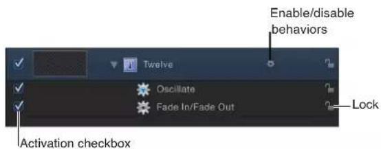
- Behavior icon: Appears when a behavior is applied to the layer or group. To turn off the effect of the behavior, click the gear icon. A red slash appears through a disabled behavior's icon.

Note: Control-clicking the behavior icon (the gear) opens a shortcut menu that displays behaviors applied to that object. Choose a behavior from this menu to display it in the Inspector.
• Show/Hide Behaviors button: Located at the bottom of the Layers list and Timeline, this button lets you show or hide all behaviors. This button neither enables nor disables behaviors applied to objects in your project; it only controls their visibility.

Copy, paste, move, and reorder behaviors
After you add behaviors to an object, there are a number of ways to copy and move them among the other items in the Timeline or Layers list. Behaviors can be cut, copied, pasted, or duplicated like any other item in Motion. When you cut or copy a behavior in the Timeline or Layers list, you also copy the current states of that behavior's parameters.
When you duplicate an object, you duplicate all behaviors applied to it. This way, if you're creating a project with a number of objects that use the same behavior, you can apply that behavior to the first instance of that object, and then duplicate that object as many times as necessary.
Cut or copy a behavior
1 Select a behavior.
2 Do one of the following:
- Choose Edit > Cut (or press Command-X) to remove the behavior and place it on the Clipboard.
- Choose Edit > Copy (or press Command-C) to copy the behavior to the Clipboard.
Paste a behavior
1 Select an object.
2 Choose Edit > Paste (or press Command-V).
The cut or copied behavior is applied to the selected object, with all its parameter settings intact.
Transfer a behavior from one object to another
You can also move a behavior from one object to another in the Layers list or Timeline by dragging it to a new position.
In the Layers list or Timeline, drag a behavior from one object and drop it on top of another.

Note: If you move a Parameter behavior to another object, it is applied to the same parameter it affected in the previous object—as long as the corresponding parameter exists. If the parameter does not exist, the parameter assignment (Apply To field) is set to none.
Duplicate a behavior
You can also duplicate a behavior in place.
1 Select the behavior to duplicate.
2 Do one of the following:
- Choose Edit > Duplicate (or press Command-D).
- Control-click the behavior to duplicate, then choose Duplicate from the shortcut menu.
Drag a duplicate of a behavior to another object
You can also duplicate a behavior and apply the duplicate to another object in the Layers list or Timeline.
- Option-drag a behavior to another object to apply the duplicated behavior.
The duplicated behavior is applied to the second object, and the original behavior is left in its original location.
Reorder behaviors
1 Drag the behavior up or down in the list of nested behaviors applied to the same object.
A position indicator appears.
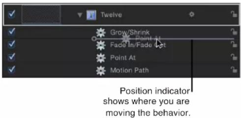
2 When the position indicator is in the correct row, release the mouse button.
All behaviors combine according to a predetermined order of operations (see Behavior order of operations on page 306) regardless of their order in the Layers list. Therefore, reordering the behaviors has no effect on the resulting animations, with a few exceptions:
- The Stop behavior suspends the activity of all behaviors beneath it that affect the same parameter. The Stop behavior has no effect on behaviors above it in the Layers list.
- Parameter behaviors are applied in the order that they are added, from the bottom to the top in the Layers list, so you need to think about how you are building the operation. For example, imagine a circle shape with an X Position of 50 in the Canvas. If you apply a Rate Parameter behavior with a positive Rate value to the X Position of the circle, the circle will move to the right from its starting X Position of 50. If you then apply a Negate Parameter behavior to the circle's X Position, the circle will start at -50 in the Canvas and move to the left. The effect you see in the Canvas is the result of each behavior acting upon the previously applied behavior: an X Position value of 50 is modified by the Rate behavior (in a positive direction), which is in turn modified by the Negate behavior, changing the X Position and rate to negative values.
If you swap the order of Rate and Negate in the Layers list, Negate is processed first. The circle's X Position value of 50 is turned into -50. This is then passed as the input to Rate, which moves the circle in a positive direction. Now the circle begins at the -50 X Position in the Canvas and moves to the right.
Behavior order of operations
There is no limit to the number of behaviors you can add to an object. When multiple behaviors are applied to a single object, they work together to create a final animated effect.
In general, each behavior applies a value to a specific parameter. The values generated by all behaviors that affect the same parameters are combined to create the end result. For example, if you apply the Throw, Spin, and Gravity behaviors to a single object, the Throw and Gravity behaviors combine to affect the position of the object. The Spin behavior affects the rotation of the object.
When combining different behavior types (such as Parameter and Simulation behaviors), or combining behaviors and keyframes, it is important to understand the behaviors' order of operations. Motion evaluates behaviors and keyframes in the following order:
Keyframes > Simulation behaviors > all other behaviors
Parameter behaviors are applied in the order in which they are added, from the bottom of the Layers list up (like the order of filters and the compositing order). For more information, see Copy, paste, move, and reorder behaviors on page 304.
Important: The order of operations is always in effect—regardless of the order in which the behaviors are applied or the keyframes added to a layer or group.
Use the following guidelines for animating layers with multiple behaviors or keyframes:
- When you animate a layer with keyframes and then apply a behavior, the effect of the keyframes is evaluated first.
For example, if you animate the Rotation parameter of a layer using keyframes and then apply a Rotational Drag (Simulation) behavior to the layer, Motion evaluates the keyframed rotation, and then applies the drag (from the Simulation behavior) to the keyframed animation. - When you animate a layer with any behavior and then add keyframes, the effect of the keyframes is evaluated first.
For example, if you animate a layer so it rotates in a clockwise direction using the Spin behavior and then keyframe the Rotation parameter so the layer rotates in a counterclockwise direction, the layer rotates in the counterclockwise direction. Motion always evaluates keyframes first. - When you animate a layer with a behavior and then apply a Simulation behavior, the Simulation behavior is evaluated before the first behavior (and therefore may have no effect).
For example, if you animate the Rotation parameter of a layer using the Oscillate (Parameter) behavior and then apply a Rotational Drag (Simulation) behavior to the layer, the layer oscillates, but is not slowed by the Rotational Drag behavior. Motion evaluates the Simulation behavior (Rotational Drag) before the Parameter behavior (Oscillate), applying the drag to a 0 value. There is no data for the Simulation behavior to affect.
Note: Although the Spin behavior appears in the Basic Motion category, Spin is treated as a Simulation behavior in the order of operations.
For information on combining keyframes with behaviors, see Behaviors and keyframes in the Keyframe Editor on page 311.
Modify behavior timing
Behavior timing overview
You can change a behavior's timing to control when it starts, how long it lasts, and when it stops. There are several ways to do this. You can use the Stop parameter behavior to suspend a behavior's effect on a single parameter. You can also trim each behavior in the Timeline. Finally, for some behaviors, you can change the Start Offset parameter to delay their beginning, and you can change the End Offset to stop the behaviors before the end of their object duration in the Timeline. These behaviors include Fade In/Fade Out, Grow/Shrink, and Snap Alignment to Motion.
Stop a behavior
The easiest way to control behavior timing is to use the Stop behavior (in the Parameter category). The Stop behavior halts the animation occurring in a single parameter, whether the animation is based on keyframes in the Keyframe Editor or behaviors applied to that object.
As explained in Add a Parameter behavior on page 299, all Parameter behaviors can be applied to a parameter of an object (such as opacity or position) or to an object (such as text or an image). If the behavior is applied to an object, you must assign a specific parameter to the behavior (in the Behaviors Inspector).
Stop a parameter from animating
1 Move the playhead to the frame where you want animation to stop.
2 Select the affected object, then open the Properties Inspector.
3 Control-click the parameter to stop, choose Add Parameter Behavior from the shortcut menu, then choose Stop.
If the behavior was applied to one dimension of a multidimensional parameter, open that parameter's disclosure triangle and Control-click the dimensional parameter to access the same shortcut menu, then choose Stop.
The parameter is animated until the frame where the Stop behavior begins.
Note: When applied in this manner, the Stop behavior takes effect at the current frame (regardless of the Create Layers At Preference setting).
4 To assign the Stop behavior to a different parameter, choose a new parameter from the Apply To pop-up menu.
The Stop behavior halts the animation of all behaviors that affect the selected parameter of that object. For example, if the Gravity, Edge Collision, and Rotate behaviors are applied to a shape and you apply the Stop parameter to the shape layer's Position parameter, the shape stops moving but continues rotating.
To control when animation affecting that parameter is stopped, trim the Stop behavior in the Timeline. For more information on trimming behaviors, see Trim behaviors on page 307.
For more information about applying Parameter behaviors, see Add a Parameter behavior on page 299.
Trim behaviors
When you apply a behavior to an object, the duration of the behavior in the Timeline defaults to the duration of the object to which it's applied. However, a behavior can be modified to limit the duration of its effect. For example, if you apply the Spin behavior to a replicator layer, by default that replicator spins for its entire duration. If you trim the Out point of the Spin behavior, the spinning stops at the new position of the Out point.
As you trim the behavior, a tooltip appears, indicating the new location of the Out point as well as the new duration of the behavior.

Change the duration of a behavior in the Timeline
1 Move the pointer to the In or Out point of any behavior in the Timeline.
2 When the pointer changes to the trim pointer, do one of the following:
- Drag the In point to delay the beginning of the behavior's effect.
- Drag the Out point to end the behavior's effect before the end of the object.
Trimming the Out point of a behavior often sets the object to its original state beyond the Out point behavior. For many behaviors, using the Stop behavior to pause the object's animation is a more efficient method than trimming its Out point. Another way to stop a behavior's effect and leave the affected object in the transformed state is to adjust a behavior's Start and End Offset parameters. See Change the offset of Parameter behaviors on page 309 for more information.
Control Simulation behaviors
The ideal use for behaviors (with the exception of Motion Tracking behaviors) is creating fluid motion graphics that do not require specific timing. This is especially true with the Simulation behaviors, which let you create sophisticated interactions among multiple objects in your project with minimal editing.
Unlike Basic Motion behaviors, you cannot stop or change the motion of a Simulation behavior in the Timeline. However, you can affect the rate of a Simulation behavior by modifying its duration in the Timeline. You can also change the starting frame of the behavior.
Because the Simulation behaviors simulate natural effects, such as Gravity, the laws of inertia apply: an external force sets the object in motion, and that object stays in motion even after the active force is no longer present. Changing the duration of a Timeline bar for a Simulation behavior does stop the “active” force on the object but does not stop the motion of the object. You can, of course, control Simulation behaviors by modifying their parameters.
In the following image, the Orbit Around (Simulation) behavior is applied to the small blue circle. The large orange circle is assigned as the object that the circle moves around. The red animation path represents the motion the small blue circle travels over its duration. The Orbit Around behavior is the same duration (240 frames) as the large circle to which it is applied.
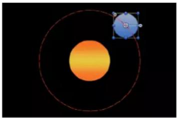
natural_image
Diagram showing a central orange sphere with a smaller blue square containing an angle symbol, enclosed by concentric red circles (no text or labels)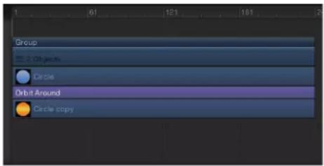
In the next image, the Orbit Around behavior is trimmed in the Timeline to a shorter duration (140 frames) than the object to which it is applied. Notice the change in the shape of the animation path: At frame 140, where the Orbit Around behavior ends, the object (the small blue circle) stops moving around its target and continues moving off the Canvas. The Orbit Around behavior—the active force—is no longer present, but the motion of the circle does not stop.

natural_image
Diagram showing a celestial body with an orange-yellow gradient and a blue circular inset with a pointer, set against a black background (no text or symbols)
Move behaviors in time
In addition to changing a behavior's duration, you can also move its position in the Timeline relative to the object under which it's nested. This lets you set the frame where that behavior begins to take effect.
Move a behavior in the Timeline
1 Click anywhere in the middle of a behavior's bar in the Timeline.
2 Drag the behavior to the left or right to move it to another position in the Timeline.
As you move the bar, a tooltip displays the new In and Out points for the behavior. The tooltip also displays the delta value, which shows the number of frames you have moved the bar.

Change the offset of Parameter behaviors
Many Parameter behaviors have two additional parameters, Start Offset and End Offset, used to change the frame where a Parameter behavior's effect begins and ends.
Use the Start Offset slider to you delay the beginning of the behavior's effect, relative to the first frame of its position in the Timeline. Adjust this parameter to make the Parameter behavior start later.
Use the End Offset slider to extend the behavior's effect relative to the last frame of its position in the Timeline. Using this slider to stop the effect, instead of trimming the end of the behavior in the Timeline, lets you freeze the behavior's effect on the object for its remaining duration.
The following example illustrates how to use the Start Offset and End Offset parameter with the Ramp behavior.
Use the Start Offset and End Offset parameters
1 Select an object, such as a shape.
2 In the Properties Inspector, Control-click the Scale parameter, then choose Add Parameter Behavior > Ramp from the shortcut menu.
The Ramp behavior is applied to the Scale parameter of the object, and the Behaviors Inspector opens. The Ramp behavior lets you create a gradual transition in any animatable parameter.
3 Set the Start Value to 0 and the End Value to 200, then play the project.
The object scales from its original size to twice its original size over the duration of the object.
4 Set the Start Offset to 90 and the End Offset to 90.
The object does not begin scaling until frame 90, and stops scaling 90 frames from its last frame in the Timeline.
Combine behaviors with keyframes
Combine behaviors with keyframes overview
Any object can have behaviors and keyframes applied to it simultaneously. When this happens, the values generated by the behavior and the keyframed values applied to the parameter are combined to yield the final value for that parameter. This lets you combine the automatic convenience of behaviors with the direct control of keyframing to achieve your final result.
Note: Motion has a specific order of operations for keyframes and behaviors. For more information, see Behavior order of operations on page 306.
For example, if you create an animation path using keyframes, you can create a completely predictable and smooth movement.
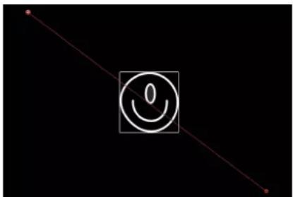
natural_image
Simple line drawing with a smiley face icon inside a square frame on black background (no text or symbols)However, if you apply the Randomize parameter behavior to the same object, its effect combines with the motion path you created. As a result, the animation path follows the general direction you want, with random variation in it to make it interesting.
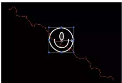
natural_image
Abstract diagram with a red wavy line and a white circular symbol on black background (no text or labels)Although this example shows how you can combine behaviors and keyframes to create animation paths, you can combine behaviors and keyframes for any parameter.
Behaviors and keyframes in the Keyframe Editor
When you display a parameter that's affected by a behavior in the Keyframe Editor, two curves appear for that parameter. A noneditable curve in the background displays the parameter as it is affected by the behavior. There are no keyframes over this first curve. Superimposed over the curve displaying the behavior's effect is the parameter's editable curve.
You can keyframe a parameter before or after applying a behavior to the object that affects it. When you keyframe a parameter already affected by a behavior, the value of the keyframe curve is combined with the value generated by the behavior at each frame, which raises or lowers the resulting value displayed by the background curve. The background curve doesn't just display the behavior's animated values, it displays the sum of all values affecting that parameter.
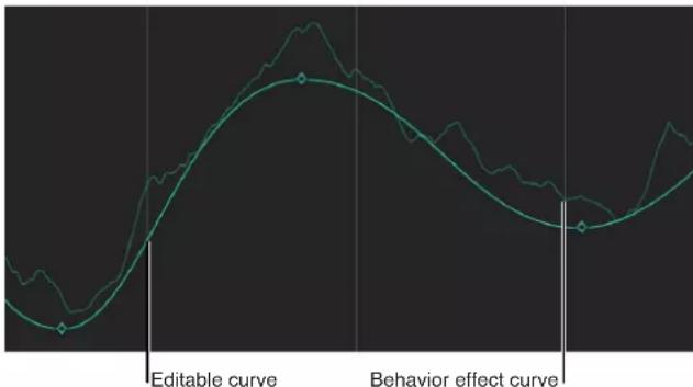
line
| Point | Editable curve | Behavior effect curve | |-------|----------------|------------------------| | 1 | Low | Low | | 2 | High | High | | 3 | Medium | Medium | | 4 | Low | Low | | 5 | High | High |Raising or lowering a keyframe in the Keyframe Editor also raises or lowers the background curve, because the keyframe is modifying the values generated by the behavior.
Important: The value displayed in the Inspector for the affected parameter reflects the combined result of keyframes and behaviors applied to that parameter. Editing a parameter's values in the Inspector only results in changes made to the underlying parameter value, whether keyframed or not. This parameter value is then combined with the behavior's effect, yielding a final value that might differ from the value you entered.
For more information on how to use keyframes in the Keyframe Editor, see Keyframing overview on page 439.
When you combine keyframes with multiple behaviors, the results can appear to be unpredictable, depending on the combination of behaviors applied.
Additionally, you can also convert behaviors into keyframes. Converting behaviors that have been combined with keyframes turns the sum of all behaviors and keyframes affecting that parameter into a thinned series of keyframes (a curve with fewer keyframes). This results in a final animation curve that closely replicates the shape of the background curve that appeared in the Keyframe Editor. These keyframes can then be edited in the Keyframe Editor.
The following screenshot shows the result of converting the behavior and keyframes in the previous example to a single keyframed channel that recreates the same motion, but in an editable fashion.
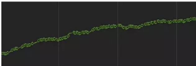
line
| Time | Value | |------|-------| | 0 | 0.5 | | 1 | 0.6 | | 2 | 0.7 | | 3 | 0.8 | | 4 | 0.9 | | 5 | 1.0 | | 6 | 1.1 | | 7 | 1.2 | | 8 | 1.3 | | 9 | 1.4 | | 10 | 1.5 | | 11 | 1.6 | | 12 | 1.7 | | 13 | 1.8 | | 14 | 1.9 | | 15 | 2.0 | | 16 | 2.1 | | 17 | 2.2 | | 18 | 2.3 | | 19 | 2.4 | | 20 | 2.5 | | 21 | 2.6 | | 22 | 2.7 | | 23 | 2.8 | | 24 | 2.9 | | 25 | 3.0 | | 26 | 3.1 | | 27 | 3.2 | | 28 | 3.3 | | 29 | 3.4 | | 30 | 3.5 | | 31 | 3.6 | | 32 | 3.7 | | 33 | 3.8 | | 34 | 3.9 | | 35 | 4.0 | | 36 | 4.1 | | 37 | 4.2 | | 38 | 4.3 | | 39 | 4.4 | | 40 | 4.5 | | 41 | 4.6 | | 42 | 4.7 | | 43 | 4.8 | | 44 | 4.9 | | 45 | 5.0 | | 46 | 5.1 | | 47 | 5.2 | | 48 | 5.3 | | 49 | 5.4 | | 50 | 5.5 | | 51 | 5.6 | | 52 | 5.7 | | 53 | 5.8 | | 54 | 5.9 | | 55 | 6.0 | | 56 | 6.1 | | 57 | 6.2 | | 58 | 6.3 | | 59 | 6.4 | | 60 | 6.5 | | 61 | 6.6 | | 62 | 6.7 | | 63 | 6.8 | | 64 | 6.9 | | 65 | 7.0 | | 66 | 7.1 | | 67 | 7.2 | | 68 | 7.3 | | 69 | 7.4 | | 70 | 7.5 | | 71 | 7.6 | | 72 | 7.7 | | 73 | 7.8 | | 74 | 7.9 | | 75 | 8.0 | | 76 | 8.1 | | 77 | 8.2 | | 78 | 8.3 | | 79 | 8.4 | | 80 | 8.5 | | 81 | 8.6 | | 82 | 8.7 | | 83 | 8.8 | | 84 | 8.9 | | 85 | 9.0 | | 86 | 9.1 | | 87 | 9.2 | | 88 | 9.3 | | 89 | 9.4 | | 90 | 9.5 | | 91 | 9.6 | | 92 | 9.7 | | 93 | 9.8 | | 94 | 9.9 | | 95 | 10.0 | | 96 | - | | 97 | - | | 98 | - | | 99 | - | | Note: The actual values may vary due to the random nature of the data generation process.)For more information, see Convert behaviors to keyframes on page 312.
Animate behavior parameters
Keyframe behaviors
If you need more control when animating a behavior's parameters, you can use keyframes. For example, you can keyframe the Speed parameter of the Oscillate parameter behavior to increase the rate of oscillation over time, creating a more complex animation path.

natural_image
Abstract wavy line diagram with a blue cube and red dots on black background (no text or symbols)Default Oscillate Parameter behavior
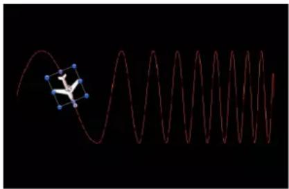
natural_image
Abstract diagram showing a red wavy line with a blue cube-like object on the left, against a black background (no text or symbols)Oscillate Parameter behavior with keyframed Speed parameter
For more information about keyframing parameters, see Apply keyframes to behaviors on page 452.
Convert behaviors to keyframes
Behaviors are best suited for fluid effects in which precise timing is not necessary. However, there might be projects in which you want finite control over the animated effects created with behaviors. If necessary, several of the behaviors can be baked into keyframes. This means that the animation curves created by the behaviors (which have no keyframes) can be converted into keyframed animation curves. You can then modify the keyframes in the Keyframe Editor to meet more precise timing requirements.
Because many (though not all) behaviors affect shared object parameters, when you convert a behavior to keyframes, all other behaviors applied to the same object are also converted into keyframes. The keyframes are applied to the individual parameters that the behaviors originally affected. Additionally, when behaviors applied to other objects affect the object being converted (for example, the Attractor or Repel behavior), their effect is baked into the object's resulting keyframes value. The original behaviors remain applied to the other objects, but the resulting effect is not doubled as a result of the keyframes combining with the behavior.
Note: You cannot convert many of the Simulation, Replicator, Particle, or Text behaviors into keyframes. Simulation behaviors such as Vortex can affect the parameters of all objects in a project, and baking such a behavior would create an overwhelming amount of keyframes. Such behaviors are designed to create very complex motion that would be too time-consuming to keyframe manually.
If a behavior (or an object with applied behaviors) can be baked, the Convert to Keyframes command appears in the Object menu when the behavior or object is selected. If the Convert to Keyframes command is dimmed, keyframes cannot be generated from the behavior.
Convert behaviors to keyframes
1 Do one of the following:
- Select an object that has behaviors to convert.
- In the Inspector, select a behavior to convert.
2 Choose Object > Convert to Keyframes (or press Command-K).
A dialog prompts you to confirm the conversion to keyframes.
3 Click Convert.
All behaviors are converted into keyframes, even if some of the behaviors fall outside of the object's time range.
Note: You cannot selectively convert individual behaviors. The Convert to Keyframes command converts all behaviors applied to an object.
Save and share custom behaviors
Save custom behaviors
You can save customized behaviors to the Library in any of several organizational categories for future use. Behaviors saved in the Library appear with a custom icon. You can also save multiple behaviors to the Library as a single file or as multiple files. For example, if you create an animation that uses multiple behaviors and you want to save the cumulative effect of those behaviors, you can save them all as one item in the Library.
Note: Items saved to the Library appear in the Finder with a .molo extension ("Motion Library object"). These items cannot be opened from the Finder.
Alternatively, you can create new folders in existing categories. You can create a folder in the Favorites or Behaviors category. Folders created in the Behaviors category appear in the Library sidebar. Folders created in the subcategories, such as the Basic Motion subcategory, appear in the Library stack and not the sidebar.
Save a behavior to the Library
1 Open the Library and select the Favorites, Favorites Menu, or Behaviors category.
For organizational purposes, it's best to save custom behaviors to the Favorites or Favorites menu category.
2 Drag the customized behavior to save from the Layers list, Timeline, or Inspector into the stack at the bottom of the Library.
When you save a customized behavior, it is saved in the /Users/username/Library/Application Support/Motion/Library/ folder.
Note: If a custom behavior is dragged to another subcategory, such as the Glow (Filters) subcategory, it is placed in the Behaviors category and the Behaviors category becomes active.
Save multiple behaviors to the Library
1 Open the Library and select the Favorites, Favorites Menu, or Behaviors category.
2 In the Layers list, select all behaviors to save and drag them to the stack, holding down the mouse button until a drop menu appears.
3 Choose "All in one file" or "Multiple files" from the drop menu, then release the mouse button.
"All in one file" saves behaviors together. They are listed as one item in the Library. "Multiple files" saves the behaviors as individual objects in the Library.
4 To name the file or files, do one of the following:
- Control-click the icon, choose Rename from the shortcut menu, then enter a descriptive name.
- Select the icon, click "Untitled," then enter a descriptive name.
Note: When you Control-click the icon, choose Edit Description from the shortcut menu to enter custom notes about an item saved in the Library.
Create a folder in the Behaviors, Favorites, or Favorites Menu category
You can create additional subfolders to further organize custom items. Folders created in the Behaviors category appear in the Library sidebar.
1 Open the Library and select the Behaviors, Favorites, or Favorites Menu category.
2 Do one of the following:
- Click the New Folder button (+) at the bottom of the window.
- Control-click an empty area of the Library stack (the lower section of the Library), then choose New Folder from the shortcut menu.
Note: You might have to expand your stack window or use icon view to access an empty area. An untitled folder appears in the subcategories list in the Library sidebar.
3 With the new folder selected, click the name, enter a new name, then press Return.
Create a folder in a Behaviors subcategory
1 Open the Library and select a Behaviors subcategory, such as Basic Motion.
2 Do one of the following:
- Click the New Folder button (+) at the bottom of the window.
- Control-click an empty area of the Library stack (the lower section of the Library), then choose New Folder from the shortcut menu.
The new untitled folder appears in the Library stack. The new folder does not appear in the Library sidebar.
3 With the new folder selected, click the name, enter a new name, then press Return.
Move a behavior to a custom folder in the Behaviors category
- Drag the behavior to the new folder in the Library sidebar.
The custom preset is added to the new folder and to the All subcategory.
Move a behavior to a custom folder in a Behaviors subcategory
- Drag the behavior to the new folder in the Behaviors subcategory in the Library stack.
The custom preset is added to the new folder and to the All subcategory.
Delete custom behaviors
Custom behaviors can easily delete from your system, if necessary.
Delete a custom behavior
In the Library stack, Control-click the custom behavior, then choose Move to Trash from the shortcut menu.
Delete a custom folder from a subcategory in the Library stack
■ Control-click the folder in the Library stack, then choose Move to Trash from the shortcut menu.
You can also delete the folder from the OS X Finder. The folder is stored in the /Users/username/Library/Application Support/Motion/Library/ folder.
Important: Deleting a custom object or folder cannot be undone.
Delete a custom folder from a category in the Library sidebar
In the Finder, navigate to the /Users/username/Library/Application Support/Motion/Library/folder, Control-click the folder, then choose Move to Trash from the shortcut menu.
Note: The Library folder is hidden in the OS X Finder. To show your Library folder, hold down the Option key, then choose Go > Library.
Move behaviors to another computer
Each customized behavior you drag into the Motion Library is saved as a separate file in the /Users/username/Library/Application Support/Motion/Library/ folder on your computer. For example, a saved custom behavior named My Motion Path in the Favorites folder of the Library appears in the /Users/username/Library/Application Support/Motion/Library/Favorites/ folder. Items saved to the Library appear in the OS X Finder with a .molo extension ("Motion Library object"). These items cannot be opened from the Finder.
If you've created custom behaviors that you rely on, you can move them to other computers that have Motion installed.
Copy a custom behavior to another computer
- Copy Motion custom behaviors to that computer's /Users/username/Library/Application Support/Motion/Library folder.
Basic Motion behaviors
Basic Motion behaviors overview
Basic Motion behaviors animate specific parameters of the object to which they are applied. Some affect position, while others affect scale, rotation, or opacity.
WARNING: Building consecutive Basic Motion behaviors or placing such a behavior before or after the Camera Framing behavior can create unexpected results. These behaviors can continue to affect the object even after the behavior ends, thus influencing the subsequent behavior's animation path. For example, if a Framing behavior is applied after a Motion Path behavior, the residual effect of the Motion Path behavior is combined with the animation path generated by the Framing behavior. Consequently, the target object might be framed improperly.
For a description of each Basic Motion behavior, see the behavior list in the Help table of contents (the sidebar to the left of this window).
Fade In/Fade Out
The Fade In/Fade Out behavior lets you dissolve into and out of any object by ramping the opacity of the object from 0 percent to 100 percent at the start, and then back to 0 percent at the end. You can eliminate the fade-in or fade-out effect by setting the duration of the Fade In Time or Fade Out Time to 0 frames.
Note: This behavior is multiplicative. This means that the Fade In and Fade Out parameters are multiplied by the object's current opacity to produce the resulting level of transparency.
The Fade In/Fade Out behavior is useful for introducing and removing animated elements. For example, you can apply the Fade In/Fade Out behavior to text that moves across the screen to make it fade into existence, and then fade away at the end of its duration.
Note: The Fade In/Fade Out behavior cannot be applied to a camera or light.
Parameters in the Inspector
- Fade In Time: A slider defining the duration, in frames, over which the object fades in from 0 to 100 percent opacity from the first frame of the object. A duration of 0 frames results in a straight cut into the object, making it appear instantly.
- Fade Out Time: A slider defining the duration, in frames, over which the object fades out from 100 to 0 percent opacity at the last frame of the object. A duration of 0 frames results in a straight cut-away from the object, making it disappear instantly.
- Start Offset: A slider that lets you delay the beginning of the behavior's effect relative to its first frame in the Timeline. Adjust this parameter to make the behavior start later. This parameter value is measured in frames.
- End Offset: A slider that lets you offset the end of the behavior's effect relative to its last frame in the Timeline, in frames. Adjust this parameter to make the behavior stop before the actual end of the behavior in the Timeline. Use this slider to offset the end of the Fade Out effect from the end of the object.
Controls in the HUD
The HUD lets you set the Fade In and Fade Out durations with a graphical control. Drag anywhere in the shaded area of the Fade In or the Fade Out ramp to adjust the duration of the effect.
Note: Continue dragging beyond the limits of the graphical HUD control to extend the durations of the Fade In or Fade Out.
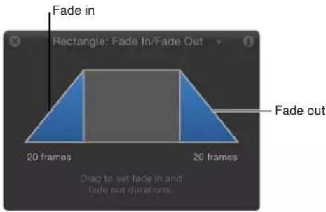
Grow/Shrink
The Grow/Shrink behavior lets you animate the scale of an object, enlarging or reducing its size over time. At the first frame of the behavior, the object appears at its original size; the settings of the behavior determine whether the object grows or shrinks over the duration of the effect. The vertical and horizontal growth rates can be set to independent values, for asymmetrical effects.
Note: The Grow/Shrink behavior cannot be applied to cameras or lights.
You can use the Grow/Shrink behavior with high-resolution graphics to zoom into an image, such as a map or photograph. You can combine this behavior with the Throw or Wind behavior to pan across the image while zooming into it. The Grow/Shrink behavior can also be used to emphasize or de-emphasize images in your project. For example, you can enlarge an object to make it the center of attention, or shrink the object while introducing another object to move the viewer's eye to the new element.
Parameters in the Inspector
- Increment: A pop-up menu that sets how the behavior's effect progresses over its duration in the Timeline. There are three options:
- Continuous Rate: Uses the Scale Rate parameter to grow or shrink the object by a steady number of pixels per second.
- Ramp to Final Value: Grows or shrinks the object from its original size to the specified percentage plus the original scale in the Scale To parameter. If the behavior is shortened in the Timeline, the Grow/Shrink effect occurs faster.
- Natural Scale: Uses an exponential curve so that the animation progresses slowly when the scale values are small and speeds up when the values are large, creating the illusion of scaling at a constant speed. This is the default option.
- Scale Rate/Scale To: A slider that sets the speed and magnitude of the effect (depending on the command chosen in the Increment pop-up menu). Click the disclosure triangle to reveal X and Y sliders that adjust horizontal or vertical scale independently.
- Curvature: A slider that adjusts the acceleration from the original to the final size. Higher Curvature values ease into and out of the effect. Because Curvature is defined by the length of the behavior in the Timeline, minus the End Offset, this setting does not affect the overall duration of the effect
Note: The Curvature parameter is not available when the Increment parameter is set to Natural Scale.
- End Offset: A slider that offsets the end of the behavior's effect relative to the last frame of its position in the Timeline, in frames. Adjust this parameter to make the behavior stop before the actual end of the behavior in the Timeline.
Controls in the HUD
The Grow/Shrink HUD consists of two rectangular regions. The first, a rectangle with a dotted line, represents the original size of the object. The second, a solid rectangle, represents the relative growth rate. Drag a border of the sold rectangle to grow or shrink the object. Drag the slider to adjust the scale of the HUD controls, increasing or decreasing their effect.

Motion Path
The Motion Path behavior lets you create a 2D or 3D motion path for an object to follow. When you apply this behavior, the motion path defaults to an open spline: a straight line defined by two points at the beginning and end of path. You can also choose from preset path shapes, such as a closed spline, loop, rectangle, or wave, or use a shape to define a path. A shape used as the source for a motion path can be animated.
You can modify the motion path in 3D space so an object travels along the path's X, Y, and Z axes. For more information, see Motion Path tasks on page 322.
The first point on the path is the position of the object in the Canvas at the first frame of the behavior. Option-click anywhere on the path to add Bezier points, which allow you to reshape the motion path by creating curves.

natural_image
Simple curved line with a small airplane icon at its tip, set against a blurred gray background (no text or symbols)When you play the project, the object moves along the assigned path. (To show or hide the motion path, choose Show Overlays from the View pop-up menu in the status bar.) The speed at which the target object travels is defined by the duration of the behavior. Speed is also affected by the Speed parameter, which lets you modify the object's velocity—adding acceleration and deceleration at the beginning and end of the behavior, for example. You can also create a custom preset defining how the object travels along the path.
Note: When you switch between the Path Shape options, the Inspector and the HUD display parameters specific to the selected option.
The Motion Path behavior is an easy way to create predictable motion without using the Keyframe Editor. It's also a great way to create reusable motion paths that you can save in the Library for future use.
When the Motion Path behavior is added to an object, the Adjust Item tool is selected, allowing you to modify the default path in the Canvas by adding points and using the Bezier (or B-Spline) controls attached to each point to adjust each curve. You can also move and resize preset motion path shapes, such as a rectangle or wave, in the Canvas.
Parameters in the Inspector
- Path Shape: A pop-up menu that defines the shape of the path on which the object travels. Choose one of the following path shapes:
- Open Spline: The default shape, a straight path defined by two points at the beginning and end of the path. You can choose to work with Bezier or B-Spline control points. Option-click (or double-click) anywhere on the path to add points.
- Closed Spline: A closed path with the last point in the same location as the first point. You can choose to work with Bezier or B-Spline control points. Option-click (or double-click) anywhere on the path to add points.
- Circle: A simplified version of Closed Spline, in which the X radius or Y radius can be adjusted to create a circle or an ellipse. Use the outer control points to resize the circle (or rectangle) motion path's shape.

natural_image
Airplane silhouette on a cloudy sky with red square markers at cardinal points (no text or symbols)- Rectangle: A closed path in which the width and the height can be adjusted to create a square or a rectangle.
• Wave: A wavy path (a sine wave) defined by two points, one at the beginning and one at the end of the path, and controlled by the End Point, Amplitude, Frequency, Phase, and Damping parameters.
- Geometry: A path based on a shape or mask. The object travels along the edge of the shape or mask. In the following figure, the outline of the shape on the left is used as the motion path in the composition shown on the right.
natural_image
Abstract white shape on black background, no text or symbols present
natural_image
Abstract wavy line with a small square containing a white symbol (no text or labels)Note: The Path Shape parameters work similarly to text on a path. For more information about working with text on a path, see Modify text on a path on page 660.
- Shape Type: A pop-up menu, available when Path Shape is set to Open Spline or Closed Spline, that sets how the path is manipulated, via Bezier or B-Spline control points.
- Bezier: Lets you manipulate the path manually by dragging Bezier handles.
Note: For more information about creating and adjusting Bezier curves, see Edit Bezier control points on page 850.
- B-Spline: Lets you manipulate the path by dragging B-Spline control points. The points themselves do not lie on the surface of the shape. Instead, each B-Spline control point is offset from the shape's surface, magnetically pulling that section of the shape toward itself to create a curve. B-Splines are extremely smooth—by default, there are no sharp angles in B-Spline shapes, although you can create sharper curves, if necessary.
Note: For more information about working with B-Spline curves, see Edit B-Spline control points on page 852.
- Radius: A slider, available when Circle is the defined path shape, that sets the size of the circular path. Click the disclosure triangle to adjust the X radius and Y radius independently.
Note: When the Motion Path behavior is selected, you can also drag the onscreen control points to resize the circle. Press Shift while dragging to resize the X and Y radii uniformly.
- Size: A slider, available when Rectangle is the defined path shape, that modifies the size of the rectangular path. Click the disclosure triangle to adjust the X scale and Y scale independently.
Note: When the Motion Path behavior is selected, you can also drag the onscreen control points to resize the rectangle. Press Shift while dragging to resize the X and Y scales uniformly.
- Offset: A slider, available when Circle, Rectangle, or Geometry is the defined path shape, that sets where the object starts moving on the path.
- End Point: Value sliders, available when Wave is the defined path shape, that sets the location of two default points on the wave's path. The end points can also be adjusted using the wave's onscreen controls (active by default when the Motion Path behavior is selected). Moving the left end point moves the entire path; moving the right end point lengthens, shortens, or angles the path.
- Amplitude: A slider, available when Wave is the defined path shape, that defines half the distance from the highest point to the lowest point in the wave. Higher values result in more extreme waves.
- Frequency: A slider, available when Wave is the defined path shape, that sets the number of waves. Higher values result in more waves.
- Phase: A dial, available when Wave is the defined path shape, that defines the degrees of the offset of the waves from the start and end points of the path. When Phase is set to 0 degrees (default), the wave begins and ends at half the distance from the highest point to the lowest point in the wave. When Phase is set to 90 degrees, the wave begins and ends at the highest point in the wave. When set to -90 degrees, the wave begins at the lowest point in the wave. When set to 180 degrees, the waves are the same as 0 degrees, but inverted.
- Damping: A slider, available when Wave is the defined path shape, that progressively diminishes the oscillation of the wave. Positive values diminish the wave forward (from left to right); negative values diminish the wave backward (from right to left). The following illustration shows positive damping applied to the wave motion path.

natural_image
Diagram showing an airplane icon with a red waveform on black background, no text or symbols present- Attach to Shape: When Geometry is the defined path shape, this checkbox, when activated, forces the motion path to follow the source shape at its original location. When disabled, the motion path can exist in a location other than its source shape.
Note: When Attach to Shape is on, you cannot move the object to another location.
Tip: To align the rotation of an object to match all changes made to its position along an animation path, apply the Snap Alignment to Motion behavior. For more information, see Snap Alignment to Motion on page 327.
- Shape Source: An object well, available when Geometry is the defined path shape, that specifies the object (a shape or mask) used as the motion path source. Choose an available shape from the adjacent "To" pop-up menu, or drag a shape from the Layers list into the object well.
- Direction: A pop-up menu that defines the object's direction along the path. There are two options:
-Forward: The object moves in a forward direction along the path (from the start point to the end point, depending upon the Offset parameter).
- Reverse: The object moves in a backward direction along the path (from the end point to the start point, depending upon the Offset parameter).
Note: The Offset parameter is available when Path Shape is set to Circle or Rectangle.
- Speed: A pop-up menu that defines the object's velocity from the first to the last point in the motion path. There are eight choices:
- Constant: The object moves at a steady speed from the first to the last point on the motion path.
- Ease In: The object starts at a slow speed, then reaches and maintains a steady speed through the last point on the motion path.
- Ease Out: The object starts at a steady speed, then slows down as it gradually decelerates to a stop at the last point of the motion path.
- Ease Both: The object slowly accelerates from the first point on the motion path, then slows down as it gradually decelerates to a stop at the last point of the motion path.
- Accelerate: The object moves along the path with increasing speed.
- Decelerate: The object moves along the path with decreasing speed.
- Natural: The speed in which the object moves over the path is determined by the shape of the path. For example, if the path is a U-shape curve, the object moves faster as it moves toward the low point of the U and slower as it moves up the edges.
- Custom: Object speed is defined by keyframes for the object's speed from 0 to 100 percent. In other words, you determine the position of the object along the path in time.
- Custom Speed: A slider, available when when Speed is set to Custom, that modifies the Custom Speed velocity curve in the Keyframe Editor. You can keyframe custom values to make an object, for example, travel forward to a specific percentage of the path, then backward, then forward, and so on before reaching the end of the animation.
- Apply Speed: A pop-up menu that determines how the Speed parameter (velocity) is applied over the duration of the behavior. (Loops must be set to a value greater than 1 for the Apply Speed parameter to have any effect.) There are two choices:
- Once Per Loop: The velocity, as defined by the Speed parameter, is applied to each cycle. For example, if Loops is set to 3 and Speed is set to Accelerate, the object accelerates each time it travels over the path. The speed is applied to the entire duration, ignoring the Loops setting.
• Over Entire Duration: The velocity, as defined by the Speed parameter, is applied one time over the duration of the behavior. For example, if Loops is set to 3 and Speed is set to Accelerate, the object accelerates the first time it travels over the path, but not the second and third time.
- Loops: A slider that sets the number of times the object travels the motion path over the duration of the behavior. For an object to travel its path more than once, or to "ping-pong," Loops must be set to a value greater than 1.
- End Condition: A pop-up menu that defines the behavior of the object after it reaches the end of its motion path. There are two options:
- Repeat: The object travels the motion path the number of times defined by the Loop parameter.
- Ping-Pong: The object moves along the path until it reaches the last point on the path, then moves backward to the first point on the path. The number of "ping-pongs" is defined by the Loops parameter.
- Control Points: Value sliders, available when the path shape is Open Spline or Closed Spline, that set the X, Y, and Z coordinates of the motion path control points. (Click the disclosure triangle to display the X, Y, and Z value sliders.)
Note: You cannot apply Parameter behaviors to the control points.
Motion Path tasks
The following tasks demonstrate how to customize the Motion Path behavior.
Move the object and its motion path
- Select the object (not the Motion Path behavior), and move the object in the Canvas.
Distance the object from the path
By default, the object is locked to the motion path by its anchor point.

natural_image
Abstract geometric diagram with a white airplane shape surrounded by blue dots and a red curved line (no text or symbols)- Select the Anchor Point tool from the toolbar, then drag the anchor point in the Canvas.
For more information on using the Anchor Point tool, see Use the Anchor Point tool on page 217.
Note: A separate Offset parameter lets you offset the starting location of the object on the motion path (but does not offset the object from the path).
Use geometry for a motion path shape
You can use a shape that is animated with behaviors or keyframes as the source for a motion path. This includes animated transforms (a shape changing its location in the Canvas) and animated control points (a shape changing its shape due to keyframed control points).
1 Import (or draw) the shape to use as the path source.
2 Choose Geometry from the Path Shape pop-up menu.
The Shape Source well appears in the Inspector and HUD.
3 From the Layers list, drag the shape to the Shape Source well.
4 When the pointer becomes a curved arrow, release the mouse button.
A thumbnail of the shape appears in the well and the shape is used as the source shape for the motion path.
Note: You can disable the source shape in the Layers list (by deselecting its activation checkbox) so that the source shape is not visible in your project.
Select another geometry source for a motion path shape
- Choose the object to use as the motion path's shape source from the To pop-up menu (located next to the Shape Source object well).
Note: To align the rotation of the object to the shape of its motion path, you can apply the Snap Alignment to Motion behavior (in the Basic Motion behaviors subcategory).
Use the Custom Speed parameter
1 In the Inspector or HUD, choose Custom from the Speed pop-up menu.
The Custom Speed parameter becomes available. By default, a keyframe is set at the first and last points of the behavior to create an animation of 0 percent to 100 percent, where at 0 the object is at the beginning of the path, and at 100 the object is at the end of the path. This is the same velocity used with the Constant preset.
2 Enable Record (press A).
Note: When Record is enabled, all keyframeable parameter value sliders are tinted red, to remind you that any value change entered creates a keyframe.
3 Move the playhead to the position where you want to create a keyframe, then enter a value in the Custom Speed field.
For example, a value of 90 moves the object 90 percent of the way through the motion path.
4 Continue moving the playhead and adding keyframes to obtain the result you want.
Note: If you change the Speed parameter to a preset (such as Constant) after creating a custom speed, the custom velocity channel is ignored but remains intact.
Adjust a motion path in 3D space
The easiest way to modify a motion path in 3D space is to add a camera to your project and manipulate the path in a modified camera view.
1 If there is no camera in your project, add a camera by doing one of the following:
- Click the New Camera button in the toolbar.
- Choose Object > New Camera (or press Option-Command-C).
Note: If none of your project groups are set to 3D, a dialog appears asking if you want to switch your 2D groups to 3D groups. Click Switch to 3D to allow the camera to affect the groups.
2 Do one of the following:
- Choose a camera view from the Camera pop-up menu in the upper-left corner of the Canvas (the default option is Active Camera). This example uses the Top view.
- With the Active Camera (or other) view selected, use the Orbit tool (the center tool in 3D View tools in the upper-right corner of the Canvas) to rotate the camera.
Note: If you use the 3D View tools with any camera selected, you are moving the camera, not just changing the camera view.
Depending on the camera view, the object on the path might not be visible. For example, if the object has not been rotated in X or Y space and you are working in Top view, the camera is looking down perpendicularly (on the Y axis) on the object. The motion path and its points are still visible (as long as the Motion Path behavior is selected).
In the following image, the motion path appears flat when viewed from above—the affected object only moves in X and Y space.

3 Drag a control point up or down to adjust the object in Z space.
In the following image, the path is no longer flat—the affected object moves in X, Y, and Z space.
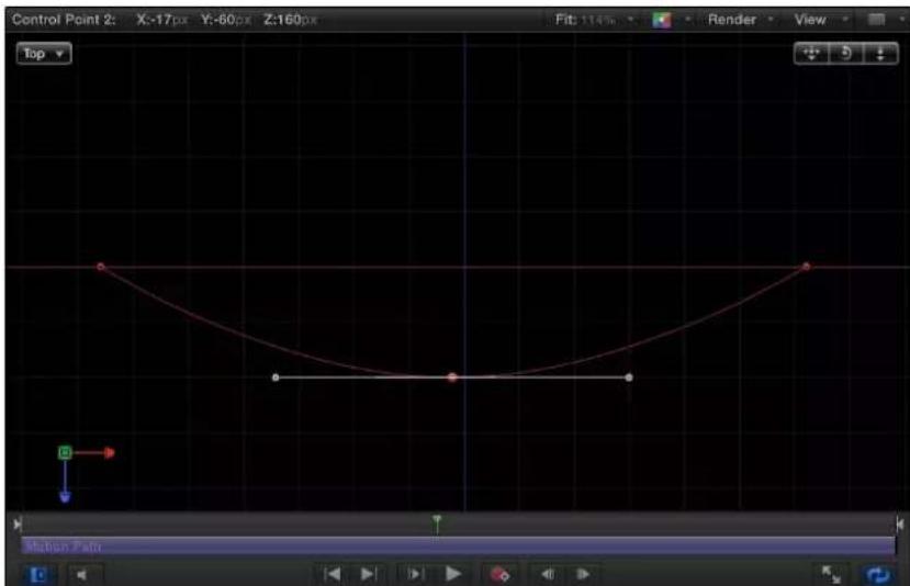
To enter specific values for the control point locations, click the Control Points disclosure triangle in the Motion Path behavior parameters. The first value field is X, the second value field is Y, and the third value field is Z.
4 To reset the camera view, do one of the following:
- Double-click the 3D View tool that you previously adjusted. For example, if you dragged the Orbit tool to rotate the current camera, double-click the Orbit tool to reset the camera.
- If you chose (and/or modified) a default camera view (such as Top, Right, Left, and so on), choose Active Camera from the Camera menu, or choose View > 3D View > Active Camera.
- With the camera selected, click the reset button in the Properties Inspector.
Move
The Move behavior places a point in the Canvas that creates a specific location for an object or group to move toward or away from in a straight line. When used with other behaviors, Move can create complex motions. For example, in the following illustration, an Orbit Around behavior is applied to the airplane shape.

natural_image
Astronomical diagram showing a planet near the Sun with a small airplane flying nearby, enclosed by concentric circles (no text or symbols present)In the next illustration, a Move behavior is added to the airplane shape. The destination point of the Move path is positioned in the center of the circle. While the airplane circles around (obeying the Orbit Around behavior), it is also drawn to the center of the target (obeying the Move behavior), creating a spiraling motion path.

natural_image
Diagram showing a spacecraft orbiting a spherical object with concentric red orbits (no text or symbols)Tip: The Move behavior is useful in 3D mode because it lets you simulate camera movements without using a camera. For example, when you apply the Move behavior to a group that contains objects offset in Z space, you can create a dolly-like move.
Parameters in the Inspector
- Position: Value sliders that allow you to define the X, Y, and Z position of the target point. The target (the end of the Move path) is placed at the center of the Canvas by default.
Note: You can also drag the target point in the Canvas using the Adjust Item tool. - Strength: A slider defining the speed at which the object moves toward the target. With a value of 0, the object doesn't move at all. The higher the value, the faster the object moves.
- Direction: A pop-up menu that sets whether the object moves toward the target point or away from the point.
- Speed: A pop-up menu that defines the object's velocity from its position in the Canvas to the position of the target. There are six choices:
- Constant: The object moves at a steady speed from its position toward the target.
- Ease In: The object starts at a slow speed, then reaches and maintains a steady speed toward the target.
- Ease Out: The object starts at a steady speed, then gradually decelerates to a stop when it reaches the target.
- Ease Both: The object slowly accelerates, then decelerates to a stop when it reaches the target.
- Accelerate: The object moves toward the target with increasing speed.
- Decelerate: The object moves toward the target with decreasing speed.
Note: To move the object more slowly toward its target, extend the duration of the Move To behavior in the Timeline or mini-Timeline. To move the object faster, shorten the duration of the behavior.
Point At
The Point At behavior causes an object or group to turn toward a target point. Use the Point At behavior with the Move To behavior to created animated objects that not only move toward a point (or each other), but that turn in the direction of the target.
Parameters in the Inspector
- Object: An object well that defines the target object. To set the target object, drag an object from the Layers list to this object well. You can also drag the target object from the Layers list onto the Point At behavior.
- Transition: A slider that determines how long it takes the object to go from its starting orientation to pointing at the center of the target object. This parameter is useful when the object is pointing at a moving target object.
If Transition is set to 50% in a 300-frame project, and the target object is not moving, the point-at object takes 150 frames to point at (or orient to) the center of the target object and then stops moving for the duration of the behavior. If Transition is set to 100%, the point-at object takes the full 300 frames to point at the target object. If the Point At behavior's duration is 100 frames, and Transition is set to 50%, the point-at object takes 50 frames to orient to the target object.
If Transition is set to 50% in a 300-frame project, and the target object is animated, the point-at object takes 150 frames to point at (or orient to) the center of the target object and then continues following the animated target object for the duration of the behavior. If Transition is set to 100%, the point-at object takes the full 300 frames to point at the target object.
- Speed: A pop-up menu that defines the object's velocity from its position in the Canvas to the position of the target. There are six choices:
- Constant: The object moves at a steady speed from its position toward the target.
- Ease In: The object starts at a slow speed, then reaches and maintains a steady speed toward the target.
- Ease Out: The object starts at a steady speed, then gradually decelerates to a stop when it reaches the target.
- Ease Both: The object slowly accelerates, then gradually decelerates to a stop when it reaches the target.
- Accelerate: The object moves toward the target with increasing speed.
- Decelerate: The object moves toward the target with decreasing speed.
- Axis: A pop-up menu that lets you align the rotation of the object to the X, Y, or Z axis. The default axis is Z. This parameter specifies which axis points at the target after the movement is complete.
- Invert Axis: A checkbox that flips the object so it faces the proper direction. Select the checkbox if the object is aligning on the correct axis, but appears backwards.
Snap Alignment to Motion
This behavior aligns the rotation of an object to match all changes made to its position along an animation path. Snap Alignment to Motion is meant to be combined with behaviors that animate the position of an object, or with a keyframed animation path you create yourself.
In the following example, a graphic of an airplane is shown traveling a spiral motion path. On its own, the orientation of the graphic doesn't change, because only the Position parameter is affected.

natural_image
Abstract spiral line drawing with a small airplane icon in the bottom-right corner (no text or symbols)If you add the Snap Alignment to Motion behavior to the airplane graphic, the Rotation parameter is affected so the graphic points in the direction of motion, without the need for additional keyframing.
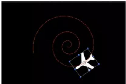
natural_image
Abstract spiral line with a small airplane icon and blue dots, set against a black background (no text or symbols)Parameters in the Inspector
- Rotation Axis: A pop-up menu that lets you rotate the object around the X, Y, or Z axis. You can also choose All to rotate the object around all three axes. The default rotation axis is Z. All uses the acceleration direction as "up," like a roller coaster.
- Axis: A pop-up menu that lets you specify whether the object aligns to its horizontal or vertical axis.
- Invert Axis: A checkbox that flips the object so it faces the proper direction. Select this checkbox if the object is aligning on the correct axis, but appears backwards.
- End Offset: A slider that offsets the end of the behavior's effect relative to the last frame of its position in the Timeline, in frames. For example, if End Offset is set to 60, the object actively snaps to the direction of the path until 60 frames before the end of behavior in the Timeline.
Spin
The Spin behavior animates the rotation of an object, spinning it around a single axis. Using the Custom axis controls, the rotation does not have to occur on a principle axis (X, Y, or Z). If you trim the end of the Spin behavior to be shorter than the duration of the object to which it is applied, it remains at the angle of the last frame of the behavior, as long as there are no other behaviors or keyframes affecting that object's Rotation parameter.
Uses for Spin are fairly obvious, but another way to use the Spin behavior is with objects that have an off-center anchor point. Because objects rotate around the anchor point, if you change an object's anchor point before you apply a Spin behavior to it, you can change the look of the motion you create. For more information on changing an object's anchor point, see Use the Anchor Point tool on page 217.
Note: Although the Spin behavior appears in the Basic Motion category, Spin is treated as a Simulation behavior in Motion's order of operations. For more information, see Behavior order of operations on page 306.
Parameters in the Inspector
- Affect Subobjects: A checkbox, available when Spin is applied to an object that contains multiple objects (such as a group, particle emitter, or text), that causes each object in the layer or group to rotate as an individual object. When this checkbox is deselected, the entire layer or group spins uniformly.
- Increment: A pop-up menu that sets how the behavior's effect progresses over its duration in the Timeline. There are two choices:
- Continuous Rate: Uses the Spin Rate parameter to spin the object by a steady number of degrees per second.
- Ramp to Final Value: Spins the object for the number of degrees specified in the Spin To parameter over the behavior's duration in the Timeline.
- Spin Rate/Spin To: A dial controlling the speed at which the object spins. When Increment is set to Continuous Rate, Spin Rate defines a continuous rate of spin in degrees per second. When Increment is set to Ramp to Final Value, Spin To defines a number of degrees to spin over that object's duration. Negative values result in clockwise motion, while positive values result in counterclockwise motion.
- Axis: A pop-up menu that sets whether the object spins about the X, Y, or Z axis. You can also choose Custom, which yields additional Longitude and Latitude parameters. The following illustration shows the Spin behavior's HUD control set to the Z axis.

When Axis is set to Custom, additional Longitude and Latitude parameters become available. These parameters allow the object to spin at an angle (not locked to the X, Y, or Z axes).
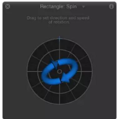
The following image shows how longitude and latitude relate to the Spin HUD control.

•Latitude/Longitude: A dial, available when Axis is set to Custom, that specifies the axis of rotation.
Controls in the HUD
The Spin behavior's HUD controls include an outer ring and an inner control. Drag along the edge of the outer ring to manipulate an arrow that indicates the direction and speed the object spins. Adjust the length of the arrow to change the speed at which the spinning occurs—drag around multiple times to increase the rate of the spin.
The inner arrow controls the axis about which the object or group spins. When you drag the inner controls, a globe control becomes available to adjust the object's spin in degrees longitude and latitude.
Note: You can spin the arrow around the ring multiple times to rotate the object more quickly.

Throw
The Throw behavior is the simplest way to set an object in motion. Controls let you adjust the speed and direction of a single force that's exerted on the object at the first frame of the behavior. After this initial force is applied, the object continues drifting in a straight line at the same speed, for the duration of the Throw behavior.
A simple example of using the Throw behavior is to send a series of offscreen objects moving across the screen. When used in conjunction with other behaviors such as Grow/Shrink and Fade In/Fade Out, you can create sophisticated moving elements without keyframing a single parameter.
The Throw behavior is also useful when you're moving an object through a simulation. For example, you might move the object past other objects that have Attractor or Repel behaviors applied to them. Because the Throw behavior only applies a single force to move the target object at the initial frame of the behavior, any other behaviors that interact with the target object have potentially greater influence over its motion.
Important: The Throw behavior does not apply a continuous force, nor can you create changes in direction or speed, because Throw cannot be keyframed. To create keyframed changes in direction or speed, use the Wind behavior. To create a more complex animation path, use the Motion Path behavior.
Parameters in the Inspector
- Affect Subobjects: A checkbox, available when Throw is applied to an object that contains multiple objects (such as a group, particle emitter, or text), that causes each object within a parent object to move as an individual object. When this checkbox is deselected, the entire layer or group moves as a whole.
- Increment: A pop-up menu that sets how the behavior's effect progresses over its duration in the Timeline. There are two choices:
- Continuous Rate: Sets the speed of the object at a steady number of pixels per second, specified in the Throw Velocity parameter.
Note: When the Canvas displays a nonsquare pixel image, the vertical rate is in pixels per second, and the horizontal rate is the perceptual equivalent.
- Ramp to Final Value: Moves the object from its original position to the specified distance (in pixels) in the Throw Distance parameter.
- Throw Velocity/Throw Distance: A slider that sets either velocity or distance, depending on the setting in the Increment pop-up menu. When Increment is set to Continuous Rate, the Throw Velocity slider sets a continuous speed for the object to move in X, Y, or Z space. When Increment is set to Ramp to Final Value, the Throw Distance slider sets a total distance (in pixels) for the object to travel in X, Y, and Z space over its duration. The slider is limited to 100 pixels. Use the value slider to enter values greater than 100.
Controls in the HUD
The 2D HUD lets you specify the direction and speed of the Throw behavior by dragging an arrow in a circular region. The direction of the arrow defines the direction of movement in X and Y space, and the length of the arrow defines speed (velocity). A slider adjusts the scale of the HUD control, increasing or decreasing the effect of the direction/speed control.

When you click the 3D button, additional 3D controls become available. The center arrow now defines the direction the object is thrown in 3D space (X, Y, and Z axes). The Speed slider lets you increase or decrease the velocity of the thrown object.
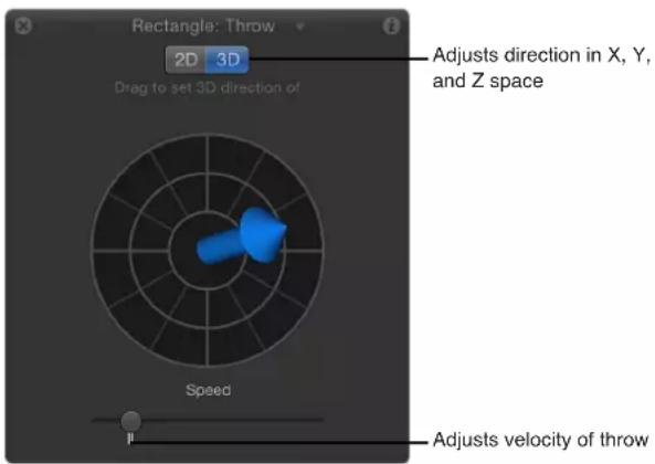
In the 2D and 3D Throw HUDs, press the Shift key while dragging the arrow to constrain it to 45 degree angles. In the 2D HUD, press the Command key to change the arrow's direction without affecting its length.
Note: The maximum speed you can define with the HUD is not the maximum possible speed. Higher values can be entered into the Throw Velocity/Throw Distance parameter in the Behaviors Inspector.
Parameter behaviors
Parameter behaviors overview
A Parameter behavior is applied to a specific object parameter, and the effect is limited to just that parameter. The same Parameter behavior can be added to different parameters, resulting in different effects. For example, you can apply the Oscillate behavior to the opacity of an object to make it fade in and out, or you can apply Oscillate to the rotation of an object to make it rock back and forth. You can also apply Parameter behaviors to filter parameters, generator parameters, the parameters of particle systems, or even the parameters of other behaviors. Examples include Oscillate, Randomize, and Reverse.
For a description of each Parameter behavior, see the behavior list in the Help table of contents (the sidebar to the left of this window).
Audio
The Audio behavior lets you animate nearly any parameter based on properties of an audio file, such as bass frequency. For example, the Audio parameter behavior can be applied to the Scale parameter of an object, causing the object to scale up and down based on the amplitude of the bass. For more information on using the Audio parameter behavior, see Apply the Audio parameter behavior on page 1026.
Average
The Average behavior smoothes the transition from one value to another in animations that are keyframed and in behaviors that are applied to a parameter. Use the Average behavior to smooth out animated effects. Averaged motion moves more fluidly, while averaged changes to parameters such as Opacity and to filter parameters appear to happen more gradually. Use the Window Size parameter to adjust the amount by which to smooth the affected parameter.
Tip: The Average behavior can be used to smooth out the sequence of values generated by a Randomize behavior.
Parameters in the Inspector
- Window Size: A slider that adjusts the amount of smoothing applied to the affected parameter, by specifying the number of adjacent frames to average together. Higher values apply more smoothing by averaging a wider range of values, resulting in more fluid animation. Lower values average a narrower range of values, resulting in less smoothing, with values closer to the original.
- Apply To: A pop-up menu that displays the parameter affected and can be used to reassign the behavior to another parameter.
Clamp
The Clamp behavior sets a minimum and maximum value for an animated parameter. In the following illustration, the center star has an applied Vortex behavior set to affect the two airplane shapes. As a result, the airplanes circle around the center star, as indicated by the red animation paths.

natural_image
Two white airplane icons with blue bounding boxes placed near a central star, surrounded by concentric red circles (no text or symbols)In the following illustration, a Clamp behavior is applied to the X Position parameter of the outer airplane shape. The Max value is set to 230 and the Min value is set to 0. As a result, the animation path is "clamped"—the image can travel 230 pixels to the right but cannot move left past the 0 point, creating a half-circle animation.
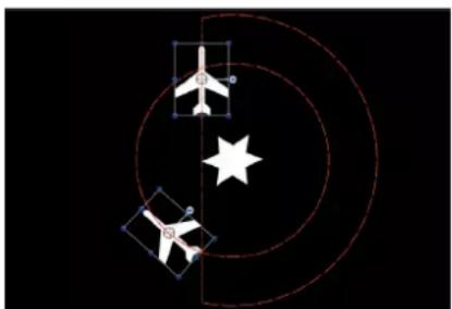
natural_image
Diagram showing airplane and star symbols with geometric outlines (no text or labels)The circle motion path is essentially cut in half. If a negative value is entered in the Min value slider, the image moves past the 0 point.
Parameters in the Inspector
- Clamp At: A pop-up menu that sets whether the behavior restricts clamping to a minimum value, a maximum value, or both minimum and maximum values.
- Min: A value slider that lets you define the minimum amount of change for an animated parameter.
- Max: A value slider that lets you define the maximum amount of change for an animated parameter.
The value is represented as a percentage, in pixels, or in degrees, depending on the parameter assignment. For example, if Clamp is applied to the Rotation parameter, the Min and Max values are degrees. If Clamp is applied to the X Position parameter, the values are in pixels.
- Apply To: A pop-up menu that shows the parameter affected and can be used to reassign the behavior to another parameter.
Custom
The Custom behavior lets you make your own behaviors by creating a set of parameters, then keyframing them to create the type of animation you want to apply to an object. By saving custom behaviors you create in the Library, you can build your own collection of behaviors to suit your needs.
The Custom behavior is not applied like the other Parameter behaviors described in this section. Rather, you apply the Custom behavior like any other non-Parameter behavior in Motion: by dragging it from the Library onto an object in the Canvas or Layers list, or by selecting an object in the Canvas or Layers list, then choosing Custom from the Add Behavior pop-up menu.
Note: Although the Custom behavior is a Parameter behavior, it does not appear in the shortcut menu when you Control-click a parameter.
Unlike other behaviors, the Custom behavior doesn't apply default parameters in the Behaviors Inspector. Instead, a pair of pop-up menus lets you add and remove any parameters you want to use.

Parameters in the Inspector
- Add Parameter: A pop-up menu used to add parameters you want to keyframe to create custom animation. Choose a parameter from this menu to add it to the Custom parameter list for keyframing.
- Remove Parameter: A pop-up menu listing parameters you've added to the current Custom behavior. Choose a parameter from this menu to remove it from the Custom parameter list, along with any keyframes applied to that parameter.
Add a Custom behavior
Before adding custom parameters to a Custom behavior, you must apply the Custom behavior to an object in the Canvas.
Add a Custom behavior to an object
1 Do one of the following:
- Select the object you want to add a Custom behavior to, choose Parameter > Custom from the Add Behavior pop-up menu in the toolbar.
• In the Library, select the Behaviors category, select the Parameter subcategory, then drag the Custom icon to the object in the Canvas, Layers list, or Timeline.
The Custom behavior is applied to the object. The behavior has no effect until you add a parameter to the behavior.
2 In the Custom area of the Behaviors Inspector, choose a parameter to add to the Custom parameter list from the Add Parameter pop-up menu. This menu contains every animatable parameter.

The parameter you chose appears near the top of the Custom area in the Behaviors Inspector.

After you add the parameters to animate in your Custom behavior, you can keyframe them in the Keyframe Editor to create whatever animated effect you require. For more information on keyframing parameters to create animation, see Apply keyframes to behaviors on page 452.
After you animate the parameters you added, you can save the Custom behavior into the Library for future use. For more information about saving Custom behaviors to the Library, see Save custom behaviors on page 313.
Remove a parameter from the Custom parameter list
- Choose the parameter to remove from the Remove Parameter list.

That parameter no longer appears in the Custom parameter list. Any keyframes applied to that parameter are deleted.
Exponential
The Exponential behavior creates more natural animations when scaling objects, especially when using high values. For example, when an object scales from very small to very large, our eyes erroneously perceive the animation to slow down as the object reaches its upper scale values. The Exponential parameter behavior allows such an animation to speed up the scaling as the values increase to compensate for that illusion, and create a more uniform-looking scale effect.
Tip: When applied to parameters other than Scale, the Exponential parameter behavior creates more organic animations than other interpolation modes.
You can also change the interpolation modes of keyframes to Exponential. For more information, see Set curve interpolation on page 474.
Parameters in the Inspector
- Start Value: A slider that sets the value that's added to the parameter at the first frame of the Exponential behavior.
- End Value: A slider that sets the value the Exponential behavior reaches at the last frame of the behavior. Over the life of the behavior, the parameter the Exponential behavior is applied to makes a transition from the Start Value to the End Value, plus the original value.
- Start Offset: A slider that delays the beginning of the behavior's effect relative to the first frame of its position in the Timeline, in frames. Adjust this parameter to make the behavior start later.
- End Offset: A slider that offsets the end of the behavior's effect relative to the last frame of its position in the Timeline, in frames. Adjust this parameter to make the behavior stop before the actual end of the behavior in the Timeline. Using this slider to stop the effect, instead of trimming the end of the behavior in the Timeline, freezes the end of the effect for the remaining duration of the object. Trimming the end of the behavior resets the object to its original parameter.
- Apply To: A pop-up menu that shows the parameter affected and can be used to reassign the behavior to another parameter.
Link
The Link behavior forces the value of one parameter to match that of another "linked" parameter. The source parameter can be attached to the same object or to another object. The linked parameters must contain numerical data. Parameters controlled by checkboxes, menus, and other non-numeric values cannot be linked. The linked parameters also must contain the same number of attributes. You cannot link a compound parameter such as Scale X-Y-Z to a parameter such as Opacity, which has only one slider. You can however, link a compound parameter such as Scale X-Y-Z to Position X-Y-Z.

The values of the source parameter can be scaled to more accurately apply to the destination parameter. For example, a source parameter with a range of 1–100 can be scaled when applied to a parameter with a range of 0–1. The values can also be offset from the source, and the effect can be mixed with the destination value to create different effects.
The Link behavior can be applied to a parameter animated with behaviors or keyframes; however, the Link behavior does not affect the parameter when the Start Values or End Values are zero.
When using the Link behavior to control an object's position parameter, the linked coordinates are based on the center point of the current group. So when an object is linked to another object in the same group, it will share an identical position. However, if the source object is in a different group, the coordinates might appear offset in space.
If your goal is to match an identical position across groups with different center points, you can create an invisible dummy object in the group containing the source, link it to the source object, then use the Match Move behavior to copy the dummy object's position to that of the intended target. Match Move compensates for inter-group position offsets and provides the option to attach one object to another or to mimic the source object's transformations. For more about Match Move, see Tracking behaviors overview on page 957.
You can also link to the group's coordinates instead of the object's, and use the Offset parameters in the Link behavior to obtain the position you want. However, if that group is subsequently added to another group, the linked object might not move as expected.
Note: When a link behavior is added, it is not enabled by default. To activate the behavior, click the activation checkbox beside the behavior name in the Behaviors Inspector.
Parameters in the Inspector
- Source Object: An object well that defines the source object in which the source parameter resides. Click the To pop-up menu to select from the objects in the current project.
- Source Parameter: A pop-up menu showing the parameter that serves as the source for the Link behavior. Use this menu to select a new source parameter. Only parameters with the same value type and number of attributes as the parameter selected in the Apply To (Target Parameters) pop-up menu appear here.
Note: When possible, Source Parameter defaults to the parameter chosen in the Apply To row (described below).
Important: Changing the Apply To (Target Parameters) setting changes which parameters appear in the Source Parameter pop-up menu. If you cannot find the parameter you are looking for, you might need to choose a Target Parameter to which you can link.
- Apply To: A pop-up menu showing the parameter affected. Use this menu to reassign the behavior to another parameter.
- Apply Mode: A pop-up menu that sets how the values from the source parameter affect the target parameter. The choices include:
- Add to source: Adds the source parameter value to the existing value of the target parameter.
- Multiply by source: Multiplies the source parameter value with the existing value of the target parameter.
-Replace with source: Replaces the existing value of the target parameter with that of the source parameter.
- Mix Over Time: A pop-up menu that sets how rapidly the source parameter values begin to affect the target parameter. Options include: Ease In, Ease Out, Ease In/Out, Accelerate, Decelerate, Accelerate/Decelerate, and Custom Mix.
- Mix Time Range: A slider, available when the Mix Over Time pop-up menu is set to an Ease or Acceleration option, that controls the number of frames over which the ease or acceleration occurs.
Tip: Ease In and Accelerate begin at the In point of the Link behavior; Ease Out and Decelerate end at the Out point of the Link behavior. Therefore, you can trim the Link behavior in the Timeline to specify where the ease or acceleration begins and/or ends.
- Custom Mix: A slider, available when the Mix Over Time parameter is set to Custom Mix, that can be animated to create a user-determined mix between the source and target parameter values.
- Scale: A slider that specifies a value to be multiplied with the Source Parameter before it is applied to the target.
- Apply Link When: A pop-up menu that enables you to limit when values from the source are applied to the target. There are five choices:
- Any source value: No limits are placed on the source parameter values. An offset slider for each setting associated with the source parameter appears at the bottom of the Behaviors Inspector. If the source parameter has a single slider, such as Opacity, a single offset slider appears. If the source parameter has multiple sliders, such as Position X-Y-Z, offset sliders for each of those settings appear.
- Source value above minimum: The link applies only when the source value exceeds a defined minimum value. If the source value falls below the defined minimum, the link behavior stops. When selected, the Clamp Source Values Within Range checkbox as well as offset and minimum sliders for each setting associated with the source parameter appear at the bottom of the Behaviors Inspector. If the source parameter has a single slider, such as drop shadow Blur, an offset and a minimum slider appear for that setting. If the source parameter has multiple sliders, such as Scale X-Y-Z, offset and minimum sliders appear for each of those settings.
- Source value below maximum: The link applies only when the source value stays below a defined maximum value. If the source value exceeds the defined maximum, the link behavior stops. When selected, the Clamp Source Values Within Range checkbox as well as offset and maximum sliders for each setting associated with the source parameter appear at the bottom of the Behaviors Inspector. If the source parameter has a single slider, such as shape Roundness, an offset and a maximum slider appear for that setting. If the source parameter has multiple sliders, such as Rotation X-Y-Z, offset and maximum sliders appear for each of those settings.
- Source value between min and max: The link applies only when the source value stays within a defined range. If the source value falls below the defined minimum, or exceeds the defined maximum, the link behavior stops. When selected, the Clamp Source Values Within Range checkbox as well as offset, minimum, and maximum sliders for each setting associated with the source parameter appear at the bottom of the Behaviors Inspector. If the source parameter has a single slider, such as shape Feather, one set of three sliders (offset, minimum, and maximum) appears for that setting. If the source parameter has multiple sliders, such as Fill Color (red, green, blue), sets of three sliders appear for each of those settings.
- Source value outside min and max: The link applies only when the source value stays outside of a defined range. If the source value falls above the defined minimum, or below the defined maximum, the link behavior stops. When selected, the Clamp Source Values Within Range checkbox as well as offset, minimum, and maximum sliders for each setting associated with the source parameter appears at the bottom of the Behaviors Inspector. If the source parameter has a single slider, such as outline Width, one set of three sliders (offset, minimum, and maximum) appears for that setting. If the source parameter has multiple sliders, such as Shear X-Y, sets of three sliders appear for each of those settings.
- Clamp Source Value Within Range: A checkbox that becomes available when the Apply Link pop-up menu is set to a choice requiring a minimum or maximum value. When selected, values that exceed the defined range are pinned to the highest or lowest allowable setting.
- (Parameter) offset: A slider that lets you create a constant offset between the source parameter value and the value applied to the target parameter.
- (Parameter) min: One or more sliders that become available when the Apply Link When pop-up menu is set to "Source value above minimum," "Source value between min and max," or "Source value outside min and max." A "min" slider appears for each component of the source parameter. Adjusting this slider defines a minimum value to limit when the link behavior is active.
- (Parameter) max: One or more sliders that become available when the Apply Link When pop-up menu is set to "Source value below maximum," "Source value between min and max," or "Source value outside min and max." A "max" slider appears for each component of the source parameter. Adjusting this slider defines a maximum value to limit when the link behavior is active.
Logarithmic
The Logarithmic behavior is the inverse of the Exponential behavior. Like the Exponential behavior, it creates more natural animations when scaling objects, especially when using high values. The Logarithmic parameter behavior applies a mathematical function to create a logarithmic curve (rather than linear) between the two values—the effect ramps up quickly, and then the effect slows down. This allows the animation to progress slowly when the scale values are small and speed up when the scale values are large. When applied to parameters other than Scale, the Logarithmic parameter behavior creates more organic animations than other interpolation modes.
The Logarithmic behavior can be applied to parameters animated with behaviors or keyframes; however, Logarithmic does not affect the parameter unless the Start Values or End Values are nonzero.
Note: You can also change the interpolation modes of keyframes to Logarithmic. For more information, see Set curve interpolation on page 474.
Parameters in the Inspector
- Start Value: A slider that sets the value added to the parameter at the first frame of the Logarithmic behavior.
- End Value: A slider that sets the value of the Logarithmic behavior at the last frame. Over the life of the behavior, the parameter that the Logarithmic behavior is applied to makes a transition from the Start Value to the End Value, plus the original value.
- Start Offset: A slider that delays the beginning of the behavior's effect relative to the first frame of its position in the Timeline, in frames. Adjust this parameter to make the behavior start later.
- End Offset: A slider that offsets the end of the behavior's effect relative to the last frame of its position in the Timeline, in frames. Adjust this parameter to make the behavior stop before the actual end of the behavior in the Timeline. Using this slider to stop the effect, instead of trimming the end of the behavior in the Timeline, freezes the end of the effect for the remaining duration of the object. Trimming the end of the behavior resets the object to its original parameter.
- Apply To: A pop-up menu that shows the parameter affected and can be used to reassign the behavior to another parameter.
MIDI
The MIDI behavior lets you edit and animate object parameters using standard MIDI devices, such as a synthesizer. For the true motion graphics mixmaster.
Parameters in the Inspector
- Control Type: A pop-up menu that sets the mode of the MIDI controller. There are three modes:
- Note: Use this mode when the control is a keyboard key on the MIDI device.
- Controller: Use this mode when the control is a knob, dial, key, slider, or foot pedal on the MIDI device.
- Learning: Use this mode to "teach" Motion which control (such as a knob, dial, or key) you want to use on the MIDI device to manipulate the parameter to which the MIDI behavior is applied. When in Learning mode, the first knob, dial, or key that you adjust on the MIDI device is set as the control.
Note: When the MIDI behavior is first applied, Learning is the default control type.
- ID: A slider that displays the identification number of the MIDI control (such as a knob, dial, or key) that you are manipulating.
- Value: A slider that displays the standard MIDI value between 0 and 1 when you are manipulating the MIDI control.
- Scale: A slider that multiplies the Value parameter in the MIDI behavior. This means that when Scale is increased, the MIDI control has a larger range of value and a greater effect on the parameter it's controlling. For example, when you use a knob to adjust an object's rotation, the default rotation value range (when Scale is set to 1) for a full turn of the knob might only be 30 percent. When the Scale value is increased to 13, the rotation value of a full turn of the knob is increased to 370 degrees.
- Apply To: A pop-up menu (parameter assignment control) that shows the parameter affected and can be used to reassign the behavior to another parameter.
Add a MIDI behavior
You apply the MIDI behavior in the same way as all other Parameter behaviors. In the following examples, the MIDI behavior is used to adjust an object's opacity and rotation.
Note: This behavior can only be used if you have a MIDI device correctly connected to your computer.
Use the MIDI behavior to adjust an object's opacity
1 Select an object, then locate the Opacity parameter in the Properties Inspector.
2 Control-click the parameter, then choose MIDI from the shortcut menu.
The MIDI parameters are displayed in the Behaviors Inspector. By default, Control Type is set to Learning.
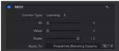
Like all other Parameter behaviors, the Apply To field displays the parameter to which the behavior is applied.
3 On your MIDI device, tweak the control (such as the knob, dial, or key) you want to use as the controller for the Opacity parameter.
The identification number of the MIDI control is displayed in the ID field. The value range of the control is 0 to 127, the default MIDI control value.
Because an object's opacity can only fall between 0 (completely transparent) to 100 (completely opaque), the default MIDI values are sufficient to adjust the parameter.
Note: When in Learning mode, the first control adjusted on the MIDI device is set as the control. To reset the selected controller, choose Learning from the Control Type pop-up menu, and adjust another control on the MIDI device.
Use the MIDI behavior to adjust an object's rotation
1 Select an object, then locate the Rotation parameter in the Properties Inspector.
2 Control-click the parameter, then choose MIDI from the shortcut menu.
3 On your MIDI device, tweak the control (knob, dial, key, and so on) you want to use as the controller for the Rotation parameter.
As mentioned above, the default Value range is 0 to 1. Because the Rotation value of an object can be much larger, you can use the Scale parameter to multiply the Value range.
4 To give the control more sensitivity, increase the Scale value.
Negate
The Negate behavior inverts the value of each keyframe and behavior effect in the parameter to which it's applied by multiplying the parameter by -1. The Negate behavior basically flips each parameter value to its opposite. Animation paths are flipped, rotation is reversed, and any effect's parameter is changed to its opposite.
For example, applying the Negate behavior to the Position parameter of an object with an animation path results in the animation path moving to the opposite quadrant of the Canvas.

natural_image
Simple curved line with red dots and a small white square containing the digit '0' on black background (no text or symbols)
natural_image
Abstract curved line with a central square marked '0' and blue dots, set against a black background (no text or symbols)Note: If you want to reverse the motion taking place on an animation path, rather than flipping the shape of the animation path itself, use the Reverse parameter behavior.
Parameters in the Inspector
- Apply To: A pop-up menu that shows the parameter affected and can be used to reassign the behavior to another parameter.
Oscillate
The Oscillate behavior animates a parameter by cycling it between two values. You can customize how wide apart the high and low values are as well as the number of oscillations per minute. The Oscillate behavior can create all kinds of cyclical effects. For example, if you apply the Oscillate behavior to the rotation property of an object, it will rock back and forth. This happens because the rotation property cycles back and forth between the original rotation value plus and minus the Amplitude value that's set in the Oscillate behavior.
Applying the Oscillate behavior to the X value of the Scale parameter instead causes the width of the object to cycle, and it repeatedly stretches and compresses for the duration of the behavior.
The Oscillate behavior is additive, meaning that the value generated by this behavior is added to the original value of the parameter to which it's applied.
Parameters in the Inspector
- Wave Shape: A pop-up menu that sets the shape of the oscillation's wave. There are four shapes:
- Sine: The default wave shape, creates a smooth animation between values. For example, if Oscillate is applied to an object's Opacity parameter, and the Wave Shape is set to Sine, the object gracefully fades in and out.

natural_image
Pure waveform diagram with no text, numbers, or symbols- Square: Creates abrupt changes in values. For example, when Oscillate is applied to an object's Opacity parameter, and the Wave Shape is set to Square, the object flashes on and off (like turning a light switch on and off).
natural_image
Pure electrical circuit lines without any symbols- Sawtooth: Ramps upward over time and then drops sharply. For example, when Oscillate is applied to an object's Opacity parameter, and the Wave Shape is set to Sawtooth, the object fades in slowly and fades out abruptly (like using a light dimmer to fade up a light, and then flicking the power switch off).

natural_image
Abstract geometric line pattern with red lines on dark background (no text or symbols)- Triangle: Similar to the sine wave, creates a smooth animation between values but with sharper changes at the transitions. For example, when Oscillate is applied to an object's Opacity parameter, and the Wave Shape is set to Triangle, the object fades in and out more acutely than the sine wave.

natural_image
Abstract pink line pattern on dark background with no text or symbols- Phase: A slider that sets the point of the specified oscillation where the behavior starts. This parameter lets you put multiple objects with identical Oscillate behaviors out of phase with one another so they don't all look the same.
- Amplitude: A slider that sets the maximum values between which the parameter oscillates. The parameter swings between the amplitude value and the negative of the amplitude value. Higher values result in more extreme swings from the beginning to the ending of each oscillation.
- Speed: A slider that sets the speed at which the oscillation occurs, in oscillations per minute. Higher values result in faster oscillations.
- Half Range: A checkbox that, when selected, cuts the sine wave (or other wave shape) in half and prevents it from crossing the value of 0. For example, when Amplitude is set to 100, the parameter oscillates between 100 and -100. When Half Range is selected, however, the parameter oscillates between 100 and 0. When Amplitude is set to -100, the parameter oscillates between -100 and 0.
Tip: When you are oscillating position parameters, set Wave Shape to Sine and enable Half Range to create a bouncing effect.

natural_image
Pure periodic wave pattern with no text or symbols- Start Offset: A slider that delays the beginning of the behavior's effect relative to the first frame of its position in the Timeline. Adjust this parameter to make the behavior start later. The units of this parameter are in frames.
- End Offset: A slider that offsets the end of the behavior's effect relative to the last frame of its position in the Timeline, in frames. Adjust this parameter to make the behavior stop before the actual end of the behavior in the Timeline. Using this slider to stop the effect, instead of trimming the end of the behavior in the Timeline, freezes the end of the effect for the remaining duration of the object. Trimming the end of the behavior resets the object to its original parameters.
- Apply To: A pop-up menu that shows the parameter affected and can be used to reassign the behavior to another parameter.
Create a decaying oscillation
When you apply the Oscillate behavior to an object's rotation or position, a common effect is to "decay" or "dampen" the animation over time. This means that the animation gradually slows or comes to a stop. You can achieve this effect using keyframes to slow the amplitude of the oscillation.
Decay an oscillating rotation using keyframes
1 Go to the frame where you want the animation to begin, then enable Record (press A).
2 In the Oscillate group of the Behaviors Inspector, set the Amplitude to the maximum value you want to use in your project.
Note: When Record is enabled, any value change to a parameter using the Inspector, HUD, or Canvas creates a keyframe.
3 Go to the frame where you want the animation to come to a stop and set the Amplitude value to 0.
When the object is selected, you can see the dampening of the animation—caused by the keyframed Amplitude parameter—in the Keyframe Editor (when Animated is chosen from the pop-up menu above the Keyframe Editor). The following illustration shows the keyframed Amplitude parameter of the Oscillate behavior superimposed over the resulting change to the Oscillate curve itself.

Note: The Oscillate behavior must be selected for its curve to be visible in the Keyframe Editor.
Quantize
The Quantize behavior creates an incremental animation in any keyframed or behavior-influenced parameter. For example, if opacity is animated so an object gradually fades in over time, you can add the Quantize behavior to make the object become opaque in steps.
Note: The Quantize behavior only works with animated parameters.
Parameters in the Inspector
- Step Size: A value slider that defines the size of the steps, based on the units of the parameter to which it is applied. For example, when Quantize is applied to rotation, the steps are in degrees (even though this parameter is not a dial control). When applied to position, the steps are in pixels.
The left image below shows the projected path (the red line) of a layer with an applied Throw behavior. The right image displays the same animation path after the Quantize behavior is added. In this example, the Step value is set to 90.

natural_image
Simple line drawing of an airplane inside a diamond-shaped frame on a black background (no text or symbols)
natural_image
Simple diagram of an airplane with blue dots and a red line extending from it, on black background (no text or symbols)- Offset: A slider that offsets the steps. For example, when Quantize is applied to a Position parameter and Step Size is set to 100, an object "steps" in increments restricted to 100 pixels; thus, the step offset is 100, 200, 300, and so on. If Offset is set to 50, the step offset is restricted to 50, 150, 250, and so on.
- Apply To: A pop-up menu that shows the parameter affected, and can be used to reassign the behavior to another parameter.
Ramp
The Ramp behavior creates a gradual transition in any parameter that can be animated, from the Start Value to the End Value. The speed of the transition is defined by the length of the Ramp behavior in the Timeline, and by the behavior's end value. Additional parameters allow you to define how the transition occurs, whether it's at a single continuous speed, or whether it accelerates over time.
Ramp is a versatile behavior. If you apply it to the Scale property, it works like the Grow/Shrink behavior. If you apply it to the Opacity property, you can fade an object in or out in different ways. Although you can use the Ramp behavior to mimic other Motion behaviors, it can be applied to any parameter. It is an additive behavior, meaning that the value it generates is added to the original value of the parameter to which it's applied.
For example, to animate different segments of a bar graph so each segment grows to a specific length, apply the Ramp behavior to the each bar's Crop parameter. After you arrange the different bars with their starting Crop values, the Ramp behaviors move the Top Crop parameter up, giving the illusion that each bar is growing. Set the End Value parameter of each Ramp behavior to the length you want each bar to reach, and you're done!

Before

After using Ramp to animate Top Crop parameters
Parameters in the Inspector
- Start Value: A slider that sets the value that's added to the parameter at the first frame of the Ramp behavior.
- End Value: A slider that sets the value the Ramp behavior reaches at the last frame of the behavior. Over the life of the behavior, the parameter the Ramp behavior is applied to makes a transition from the Start Value to the End Value, plus the original value.
- Curvature: A slider that eases the acceleration at which the Ramp behavior transitions from the Start Value to the End Value. Higher Curvature values result in an ease in/ease out effect, where the transition begins slowly, gradually speeds up as the behavior continues, then gradually slows to a stop as it reaches the end. Because Curvature is defined by the length of the behavior in the Timeline, this parameter does not affect the overall duration of the effect.
- Start Offset: A slider that delays the beginning of the behavior's effect relative to the first frame of its position in the Timeline, in frames. Adjust this parameter to make the behavior start later.
- End Offset: A slider that offsets the end of the behavior's effect relative to the last frame of its position in the Timeline, in frames. Adjust this parameter to make the behavior stop before the actual end of the behavior in the Timeline. Using this slider to stop the effect, instead of trimming the end of the behavior in the Timeline, freezes the end of the effect for the remaining duration of the object. Trimming the end of the behavior resets the object to its original parameter.
- Apply To: A pop-up menu that shows the parameter affected and can be used to reassign the behavior to another parameter.
Randomize
The Randomize behavior creates a continuous sequence of randomly increasing and decreasing values, based on the parameters defining the range and type of values generated. Use Randomize to create jittery effects, such as twitchy rotation, flickering opacity, and other effects requiring rapid and varied changes over time that would be time-consuming to keyframe.
Although the values created with this behavior appear to be random, they're predetermined by the parameter settings you've chosen. As long as you don't change the parameters, the frame-by-frame values created by this behavior remain the same. If you don't like the randomly generated values, click the Generate button in the Behaviors Inspector to pick a new random seed number. This number is used to generate a new sequence of values.
The Apply Mode parameter determines how values generated by this behavior are combined with other behaviors and keyframes that affect the same parameter. This provides you with different ways of using a Randomize behavior to modify a parameter's preexisting values.
The Randomize behavior can be modified with other behaviors, such as Average and Negate, to exercise further control over the values generated.
Parameters in the Inspector
- Amount/Multiplier: A slider that defines the maximum value the Randomize behavior will generate. The Amount slider is available when the Apply Mode is set to Add, Subtract, or Add and Subtract. The Multiplier slider is available when the Apply Mode is set to Multiply.
- Apply Mode: A pop-up menu that determines how values generated by this behavior are combined with other behaviors and keyframes that affect the same parameter. Choose Add, Subtract, Multiply, or Add and Subtract.
-
Frequency: A slider that sets the amount of random variation per second. Higher values generate faster variations; lower values generate slower variations.
-
Noisiness: A slider that adds an additional overlay of random variance to the Frequency you've set. Higher Noisiness values result in more erratic variations in the affected parameter.
- Link: A checkbox, available when you apply Randomize to a two-dimensional parameter (such as Scale) or three-dimensional parameter (such as Position) that consists of X, Y, and/or Z values. Select this checkbox to keep the behavior's effect on each value proportional.
- Affect Subobjects: A checkbox, available when you apply Randomize to a parameter of the Sequence Replicator behavior. When Affect Subobjects is selected, each object has a different random behavior. When Affect Subobjects is deselected, each object undergoes the same animation.
- Random Seed: A button that picks a new random seed number. This number is used to generate new sequences of values, based on the other parameters of this behavior.
- Start Offset: A slider that delays the beginning of the behavior's effect relative to the first frame of its position in the Timeline. Adjust this parameter to make the behavior start later. The units of this parameter are in frames.
- End Offset: A slider that offsets the end of the behavior's effect relative to the last frame of its position in the Timeline, in frames. Adjust this parameter to make the behavior stop before the actual end of the behavior in the Timeline. Using this slider to stop the effect, instead of trimming the end of the behavior in the Timeline, freezes the last random value generated by this behavior for the remaining duration of the object. Trimming the end of the behavior resets the parameter to its original value.
- Apply To: A pop-up menu shows the parameter affected and can be used to reassign the behavior to another parameter.
Rate
The Rate behavior increases a parameter's value over time, with the rate of increase determined by the Rate slider. Unlike the Ramp behavior, this behavior has no end value, but continues to increase or decrease the parameter it's applied to until the end of the parameter.
Note: To decrease a parameter over time, enter a negative value into the Rate parameter.
Parameters in the Inspector
- Rate: A slider that sets a rate of increase over time for the affected parameter. Measured in percentage increase per second.
- Curvature: A slider that eases the acceleration at which the Rate behavior transitions from the Start Value to the End Value. Higher Curvature values result in an ease in/ease out effect, beginning slowly, gradually speeding up as the behavior continues, then gradually slowing to a stop as it reaches the end. Because Curvature is defined by the length of the behavior in the Timeline, this parameter does not affect the overall duration of the effect.
- End Offset: A slider that offsets the end of the behavior's effect relative to the last frame of its position in the Timeline, in frames. Adjust this parameter to make the behavior stop before the actual end of the behavior in the Timeline. Using this slider to stop the effect, instead of trimming the end of the behavior in the Timeline, freezes the last random value generated by this behavior for the remaining duration of the object. Trimming the end of the behavior resets the parameter to its original value.
- Apply To: A pop-up menu that shows the parameter affected and can be used to reassign the behavior to another parameter.
Reverse
Unlike the Negate behavior, which inverts the value of the parameter to which it's applied, the Reverse behavior reverses the direction of any animation that affects a parameter, whether it's caused by behaviors or keyframes. For example, when you apply the Reverse behavior to path animation that begins at the left and moves to the right, the animation path won't move, but the object instead begins at the right and moves to the left. The Reverse behavior basically switches the beginning and ending points of animated objects.
Parameters in the Inspector
- Apply To: A pop-up menu that shows the parameter affected and can be used to reassign the behavior to another parameter.
Stop
The Stop behavior suspends parameter animation (created by keyframes or applied behaviors) of an object. For example, if you assign the Stop parameter behavior to the Position parameter of an object moving across the screen and rotating, the object ceases to move across the screen but continues to rotate.
Each behavior's effect on the object is frozen at the first frame of the Stop behavior in the Timeline. Keyframes applied to that parameter cease to have any effect for the duration of the Stop behavior in the Timeline. If the Stop behavior is shorter than the object to which it's applied, all keyframes and behaviors affecting that channel immediately take effect after the last frame of the Stop behavior. For more information on using the Stop behavior, see Stop a behavior on page 307.
Parameters in the Inspector
- Apply To: A pop-up menu that shows the parameter being stopped and can be used to reassign the Stop behavior to another parameter.
Track
The Track behavior applies tracking data to a parameter of an effect, such as the center point of the Light Rays filter. For more information on using the Track behavior, see Track on page 959.
Wriggle
The Wriggle behavior works similarly to the Randomize behavior, but with a slower effect.
Tip: A Wriggle behavior applied to an Opacity parameter set to 100% does not have much effect. This is because there isn't much room to "wriggle." For a better result, set the Opacity to 0, or change the Apply Mode to Subtract.
Parameters in the Inspector
- Amount/Multiplier: A slider that defines the maximum value that the Wriggle behavior generates. The Amount slider is available when the Apply Mode is set to Add, Subtract, or Add and Subtract. The Multiplier is available when the Apply Mode is set to Multiply.
- Apply Mode: A pop-up menu that determines how values generated by this behavior are combined with other behaviors and keyframes that affect the same parameter. This provides you with different ways of using a Wriggle behavior to modify a parameter's preexisting values. The options are Add, Subtract, Multiply, or Add and Subtract.
- Frequency: A slider that sets the amount of random variation per second. Higher values generate faster variations, whereas lower values generate slower variations.
- Wriggle Offset: A slider that offsets the sequence of random values when you want to apply the same Wriggle behavior to multiple objects. By offsetting each object's version of the Wriggle behavior, you can prevent objects from moving in sync.
- Noisiness: A slider that adds an additional overlay of random variance to the Frequency you've set. Higher Noisiness values result in more erratic variations in the affected parameter.
- Link: A checkbox, available when you apply the Wriggle behavior to a two-dimensional parameter (such as Scale) or three-dimensional parameter (such as Position) that consists of X, Y, and/or Z values. Turn this checkbox on to keep the behavior's effect on each value proportional.
- Affect Subobjects: A checkbox, available when the Wriggle behavior is applied to a parameter of the Sequence Replicator behavior. When Affect Subobjects is selected, each object has a different wriggle behavior. When Affect Subobjects is deselected, each object undergoes the same animation.
- Random Seed: A button that picks a new random seed number. This number is used to generate new sequences of values, based on the other parameters of this behavior.
- Start Offset: A slider that delays the beginning of the behavior's effect relative to the first frame of its position in the Timeline. Adjust this parameter to make the behavior start later. This parameter is measured in frames.
- End Offset: A slider that offsets the end of the behavior's effect relative to the last frame of its position in the Timeline, in frames. Adjust this parameter to make the behavior stop before the actual end of the behavior in the Timeline. Using this slider to stop the effect, instead of trimming the end of the behavior in the Timeline, freezes the last random value generated by this behavior for the remaining duration of the object. Trimming the end of the behavior resets the parameter to its original value.
- Apply To: A pop-up menu that shows the parameter affected and can be used to reassign the behavior to another parameter.
Retiming behaviors
Retiming behaviors overview
When a clip is selected, a group of Timing parameters appears in the Properties Inspector. These controls adjust some of the same effects as the Retiming behaviors, such as slowing down or speeding up, looping, or reversing a clip. However, the Timing controls affect the entire clip. The Retiming behaviors, on the other hand, let you define which portion of the clip is modified by a timing change. Any timing changes made to a clip using the Inspector's Timing controls are respected by the Retiming behaviors. For example, if you changed the speed of the clip to 50% in the Timing parameters, a Retiming behavior uses that half-speed clip as its source. For more information on Timing controls in the Inspector, see Retiming overview on page 246.
For a description of each Retiming behavior, see the behavior list in the Help table of contents (the sidebar to the left of this window).
Flash Frame
The Flash Frame behavior inserts a user-defined range of random frames (adjacent to the current frame) into the playback of a clip.
Parameters in the Inspector
- Random Frames: A slider that sets the probability that a frame within the duration of the behavior is replaced with a random frame. When this value is set to 0, no random frames are inserted. When set to 100, every frame is random. The default value is 10% .
- Frame Range: A slider that defines the range from which the random frames are chosen, based around the current frame. The default value is 10 frames.
- Duration: A slider that sets the duration of the sequence of random frames. The default value is 1, which means 1 random frame is inserted at a time. When Duration is set to 30, for example, 30-frame sequences (chosen from the Frame Range) are randomly inserted. The Duration value overrides the Random Frame count (so a new random frame does not interrupt the sequence).
- Random Seed: A button that picks a new random seed number. This number is used to generate new values, based on the other parameters of this behavior.
Hold Frame
The Hold Frame behavior holds the frame at the behavior's In point for the duration of the behavior. The clip continues playing normally after the behavior's Out point. For example, if the Hold Frame behavior begins at frame 60 and ends at frame 300, the clip plays normally until frame 59, frame 60 is held for 240 frames, and then normal playback resumes—frame 61 of the clip—at frame 301.
The Hold behavior is applied at the current frame, rather than at the start of the object.
Parameters in the Inspector
- Offset: A slider that sets the offset for the hold frame. When set to 0 (the default), the frame at the start of the behavior is the hold frame. When set to 60, however, the frame at the start of the behavior (the hold frame) is the start frame plus 60 frames. This parameter is measured in frames.
Tip: Flickering might occur if the Hold Frame behavior is applied to interlaced footage. To avoid this, ensure that Field Order is properly set in the Inspector. To change field order, select the footage in the Media list, open the Media pane in the Inspector, then choose a field order option from the Field Order pop-up menu.
Loop
The Loop behavior loops a segment of the clip within the duration of the behavior. The loop's starting frame is derived from the start frame of the behavior. For example, if the behavior is applied at the start of a clip, and Loop Duration is set to 30, the first 30 frames of the clip loop repeatedly until the end of the behavior. At the end of the behavior, normal playback resumes from the frame at the end of the loop duration.
Parameters in the Inspector
- Loop Duration: A slider that sets the duration of the looped frames. The default value is 30 frames.
Ping Pong
The Ping Pong behavior “ping-pongs” playback of a segment of the clip within the duration of the behavior. The ping-pong’s starting frame is derived from the start frame of the behavior. For example, if the behavior is applied at the start of a clip, and Duration is set to 30, the first 30 frames of the clip play forward, then play in reverse, then forward, and so on until the end of the behavior. At the end of the behavior, normal playback resumes.
Parameters in the Inspector
- Duration: A slider that sets the duration of the ping-pong frames. The default value is 30 frames.
Replay
The Replay behavior resets the playhead at the beginning of the behavior to a specific frame, then plays the clip normally from that frame. The clip plays back normally after the end of the behavior. Use this behavior to trigger playback of the clip at different times, without making multiple copies of the movie object.
Parameters in the Inspector
- Start From: A pop-up menu that determines whether the replay starts from an absolute frame number or an offset from the frame at the start of the behavior. There are two menu items:
- Absolute Frame: Sets the replay to start at the frame specified in the Start Time parameter. For example, if the behavior starts at frame 60 of the clip and Start Frame is set to 30, when playback reaches frame 60, the clip starts playback over from frame 30.
- Offset Frame: Offset the start frame of the replay. For example, if the behavior starts at frame 60 of the clip, and Start Frame is set to 30, when playback reaches frame 60, the clip starts playback at frame 90. If Start Frame is set to -30, the clip starts playback over from frame 30.
- Start Time: A slider that sets the start frame where the replay begins. The default is frame 1.
Reverse
The Reverse behavior plays the clip or image sequence backwards.
There are no parameters for this behavior.
Reverse Loop
The Reverse Loop behavior loops a segment of the clip in reverse within the duration of the behavior. If Loop Duration is set to 30 and the behavior begins at frame 1, frames 1–30 are played in reverse, then frames 31–60 are played in reverse, frames 61–90 are played in reverse, and so on.
Tip: To achieve a nice stutter effect, set Loop Duration to 2.
Parameters in the Inspector
- Loop Duration: A slider that sets the duration of the looped frames to be played in reverse. The default value is 30 frames.
Scrub
Like the Scrub filter, the Scrub behavior moves a virtual playhead around a clip, allowing you to change the timing of the clip without moving it in the Timeline. Additionally, the Scrub behavior lets you animate the offset parameter using keyframes or Parameter behaviors, often with interesting results. Try applying the Oscillate behavior to the Frame offset, with the Offset From parameter set to Current Frame. Scrub does not affect clip audio.
Note: You can also apply Parameter behaviors to the Retime Value parameter in the Timing controls for the clip object. The Timing controls are located in the Properties Inspector. Time Remap must be set to Variable Speed to access the Retime Value parameter.
Parameters in the Inspector
- Frame Offset: A slider that sets the offset of the virtual playhead.
- Offset From: A pop-up menu that sets the position where the virtual playhead is offset. There are two menu items: First Frame or Current Frame.
Set Speed
The Set Speed behavior lets you change the speed ( playback rate) of a clip. The speed specified in the behavior begins at the behavior's In point and exists for the duration of the behavior. The clip continues playing at its default speed after the behavior's Out point. For example, if the Set Speed behavior begins at frame 60 and ends at frame 300, the clip plays normally until frame 59, plays back at the rate specified in the behavior from frame 60 to frame 300, and then resumes its default playback speed at frame 301. You can apply an "ease-in" or "ease-out" effect to the speed change.
Parameters in the Inspector
- Speed: A slider that sets the speed of the clip as a percentage. The default is 100% (the clip's normal speed). A Speed setting of 50% plays the clip at half speed.
Note: The Speed parameter can be keyframed to create variable playback rate changes.
- Ease In Time: A slider that sets the number of frames over which the ease-in speed change occurs (from the start of the behavior). The default value is 20 frames.
- Ease In Curve: A slider that defines the curvature of the ramp when easing into the speed change. A value of 0 creates a sharp transition to the new speed; a value of 100 creates the smoothest ease in to the new speed. The default is 50% .
- Ease Out Time: A slider that sets the number of frames over which the ease-out speed change occurs (from the end of the behavior). The default value is 20 frames.
- Ease Out Curve: A slider that defines the curvature of the ramp when easing out of the speed change. A value of 0 creates a sharp transition from the new speed to the original speed; a value of 100 creates the smoothest ease out. The default is 50% .
Strobe
The Strobe behavior simulates the look of a strobe light or lower-frame-rate video by holding a number of frames as defined by the Strobe Duration parameter over the playback of the clip. For example, when Strobe Duration is set to 10, frame 1 is held for 10 frames, frame 11 for 10 frames, frame 21 for 10 frames, and so on. The frames in between (2–10, 12–20, 22–30, and so on) do not appear.
Parameters in the Inspector
- Strobe Duration: A slider that sets the number of frames to hold. A value of 1 plays the clip at normal speed. The default value is 5 frames.
Stutter
The Stutter behavior randomly inserts hold frames, of random durations, into the playback of a clip. The effect is similar to a tape that sticks during play in a videocassette recorder.
Parameters in the Inspector
- Stutter Amount: A slider that sets the probability that a hold frame is generated at the given frame. When set to 0% , no hold frames are created; when set to 100% , every frame is a hold frame. Values between 0 and 100 indicate the probability of frames (within the duration of the behavior) that are replaced by hold frames. The default value is 10% .
- Duration Range: A slider that sets the maximum duration of hold frames. A value of 1 inserts single-frame hold frames at a frequency determined by the Stutter Amount parameter. Increasing the Duration Range increases the range of hold frames. For example, a value of 30 creates random hold frames with a minimum of 1 frame and a maximum of 30 frames. The default value is 3 frames.
- Random Seed: A button that picks a new random seed number. This number is used to generate new values, based on the other parameters of this behavior.
Simulation behaviors
Simulation behaviors overview
Simulation behaviors perform one of two tasks. Some Simulation behaviors, such as Gravity, animate the parameters of an object in a way that simulates a real-world phenomenon. Other Simulation behaviors, such as Attractor and Repel, affect the parameters of objects surrounding the object to which they're applied. These behaviors allow you to create sophisticated interactions among multiple objects in your project with minimal adjustments. Like the Basic Motion behaviors, Simulation behaviors also affect specific object parameters. Examples include Attractor, Gravity, and Repel.
Important: Several Simulation behavior parameters contain object wells into which you drag target objects used as attractors, repellers, orbiters, and so on. Dragging an object to a well can be tricky—be sure to click the object name in the Layers list and immediately drag the object to the object well (without releasing the mouse button). The behavior must remain active even though you are dragging another object in the Layers list. If you click the object in the Layers list and release the mouse button, that object becomes selected, and the behavior's parameters are no longer displayed. This applies to all wells, including mask source wells and image wells.
For a description of each Simulation behavior, see the behavior list in the Help table of contents (the sidebar to the left of this window).
Align to Motion
The Align to Motion behavior changes the rotation of an object to match changes made to its direction along an animation path. This behavior is meant to be combined with Simulation behaviors that animate the position of an object or with a keyframed animation path you create yourself.
Note: The Align to Motion behavior does not work on objects animated using the Motion Path behavior. Instead, use the Snap Alignment to Motion behavior (in the Basic Motion subcategory).

natural_image
Simple line drawing of an airplane inside a square frame on a black background (no text or symbols)Before
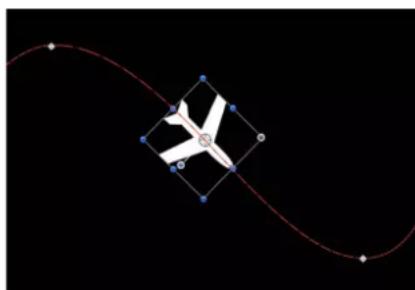
natural_image
Abstract diagram with a white star-like shape inside a diamond-shaped frame, connected by red curved lines on black background (no text or symbols)After using Align to Motion
Unlike the Snap Alignment to Motion behavior, which produces absolute changes in rotation that precisely match changes in direction, Align to Motion has a springy reaction and creates a more lively effect.
In the above example, the airplane travels along the keyframed animation path, but the plane isn't aligned to the animation path (notice the rotation handle). Using the Align to Motion behavior, the airplane's angle of rotation moves so it points in the direction of the animation path. By adjusting the Drag parameter, you can make the object careen wildly about its anchor point as it goes around curves in the animation path.
Parameters in the Inspector
- Affect Subobjects: A checkbox, available when this behavior is applied to an object that contains multiple objects, such as a group, a particle emitter, a replicator, or a text layer. When this checkbox is selected, all objects in the parent object are affected individually. When this checkbox is deselected, all objects in the parent object are affected by the behavior together.
- Rotation Axis: A pop-up menu that rotates the object around the X, Y, or Z axis. You can also select All to rotate the object around all three axes. The default rotation axis is Z.
- Axis: A pop-up menu that sets whether the object aligns to its horizontal or vertical axis.
- Invert Axis: A checkbox that flips the orientation with which the object aligns to the motion.
- Spring Tension: A slider that adjusts how quickly the object's rotation changes to match a change in the object's direction. Lower values create a delay between a change to an object's position and its subsequent change in rotation. Higher values create more responsive changes in rotation.
- Drag: A slider that adjusts whether the change in rotation made by this behavior overshoots the new direction of the object. Low drag values result in springy changes in rotation, where the object rotates back and forth as it overshoots changes in direction. High drag values dampen this effect, making the object's rotation stick more closely to the changes made in rotation. Higher values also cause the object's rotation to lag behind the object's change in position.
Attracted To
An object with the Attracted To behavior applied moves toward a single specified target, the object of attraction. Additional parameters allow you to adjust the area of influence that defines how close an object must be to move toward the object of attraction, and how strongly it is attracted.
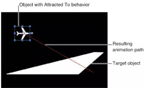
The Drag parameter lets you define whether attracted objects overshoot and bounce about the attracting object, or whether they eventually slow down and stop at the position of the target object.
You can apply two or more Attracted To behaviors to a single object, each with a different object of attraction, to create tug-of-war situations where the object bounces among all objects it's attracted to.
Parameters in the Inspector
- Affect Subobjects: A checkbox, available when this behavior is applied to an object that contains multiple objects, such as a group, a particle emitter, a replicator, or a text layer. When this checkbox is selected, all objects in the parent object are affected individually. When this checkbox is deselected, all objects in the parent object are affected by the behavior together.
- Object: An object well that defines the object of attraction. To set the defined target object, drag the object from the Layers list to the Object well in the Attracted To HUD or Inspector. In the Layers list, you can also drag the target object onto the Attracted To behavior.
- Strength: A slider defining the speed at which the object moves toward the object of attraction. With a value of 0, the object doesn't move at all. The higher the value, the faster the object moves.
- Falloff Type: A pop-up menu that determines whether the distance defined by the Influence parameter falls off linearly or exponentially. There are two menu items:
- Linear: Object attraction falls off in proportion to the object's distance.
- Exponential: The closer an object is within the area of influence, the more strongly it is attracted, and the faster it moves toward the object of attraction.
- Falloff Rate: A slider that sets how quickly the force of attraction between objects affected by this behavior falls off. A low Falloff Rate value results in objects quickly getting up to speed as they move toward the object of attraction. A high Falloff Rate causes objects to accelerate much more slowly. When set to Exponential, the attraction falls off more quickly than when set to Linear.
- Influence: A slider that defines the radius of the circle of influence, in pixels. Objects that fall within the area of influence move toward the object of attraction. Objects outside the area of influence remain in place.
- Drag: A slider that reduces the distance attracted objects overshoot the object of attraction. Lower Drag values result in the object overshooting the object of attraction, moving past and then careening back around toward the target object again and again. Higher Drag values result in the object coming to rest sooner.
- Include X, Y, and Z: Buttons that specify the axes on which the affected object (or objects) moves around the object to which it is attracted. When Z is enabled, the object moves about its attractor object in Z space.
Attractor
The Attractor behavior, when applied to an object, causes other objects that lie within the area of influence move toward it. You can manipulate the strength with which other objects are attracted, as well as the distance required for attraction to begin.
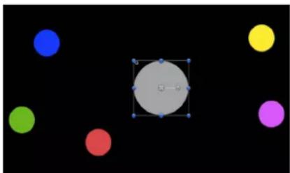
natural_image
Abstract composition of colored circles (blue, green, red, yellow, purple) arranged around a central gray circle with blue dots and a white square at center on black background (no text or symbols)Start of Attractor effect

natural_image
Diagram of a molecular or particle interaction with red and blue lines radiating from a central point (no text or labels)End of Attractor effect (motion paths shown)
By default, objects overshoot the object of attraction and bounce around, never coming to rest. The Drag parameter lets you adjust this behavior, changing whether attracted objects overshoot and bounce around, or whether they eventually slow down and stop at the position of the target object.
The Attractor behavior can affect all objects in the Canvas that fall within the area of attraction, or you can limit its effect to a specific list of objects by using the Affect parameter.
The Attractor behavior can also be applied to objects in motion. If you animate the position of the target object to which you've applied the Attractor behavior, all other objects in the Canvas continue to be attracted to its new position.
Parameters in the Inspector
- Affect: A pop-up menu that limits which objects in your project are affected by the Attractor behavior. There are three options:
- All Objects: All objects in the Canvas are affected by the Attractor behavior.
- Related Objects: The default setting. Only other objects in the same group as the object of attraction are affected.
- Specific Objects: Only objects appearing in the Affected Objects list are affected by the Attractor behavior.
- Affected Objects: A list that appears when Specific Objects is chosen in the Affect pop-up menu. Drag objects from the Layers list into this list to have the objects affected by this behavior. To remove an item from the list, select the item and click Remove. The Affected Objects list contains the following columns:
- Layer: This column lists the name of the layer containing the object.
•Name: This column lists the name of the object.
- Strength: A slider that sets the speed at which attracted objects move toward the target object. With a value of 0, attracted objects don't move at all. The higher the value, the faster attracted objects move.
- Falloff Type: A pop-up menu that determines whether the distance defined by the Influence parameter falls off linearly or exponentially. There are two menu items:
- Linear: Object attraction falls off in proportion to the object's distance.
- Exponential: The closer an object is within the area of influence, the more strongly it is attracted, and the faster it moves toward the object of attraction.
- Falloff Rate: A slider that sets how quickly the force of attraction between objects affected by this behavior falls off. A low Falloff Rate value results in objects quickly getting up to speed as they move toward the object of attraction. A high Falloff Rate causes objects to accelerate much more slowly. When set to Exponential, the attraction falls off more quickly than when set to Linear.
- Influence: A slider that defines the radius of the circle of influence in pixels. Objects that fall within the area of influence move toward the object of attraction. Objects outside the area of influence remain in place.
- Drag: A slider that reduces the distance attracted objects overshoot the object of attraction. Lower Drag values result in the object overshooting the object of attraction, moving past and then careening back around toward the target object again and again. Higher Drag values result in the object coming to rest sooner.
- Include X, Y, and Z: Buttons that specify the space in which the object (or objects) moves toward the target object. For example, when X and Y are enabled, the object moves in the XY plane; when Y and Z are enabled, the object moves in the YZ plane.
Drag
The Drag behavior simulates the force of friction on a moving object, slowing it down over time. Applying the Drag behavior is an easy way to decelerate objects with multiple behaviors that create complex motion.
Parameters in the Inspector
- Affect Subobjects: A checkbox, available when this behavior is applied to an object that contains multiple objects, such as a group, a particle emitter, a replicator, or a text layer. When this checkbox is selected, all objects in the parent object are affected individually. When this checkbox is deselected, all objects in the parent object are affected by the behavior together.
- Amount: Sliders that slow down an object over time, causing it to eventually come to a stop. Higher Drag values result in the object coming to rest sooner. Click the Amount disclosure triangle to adjust the drag applied to the X, Y, and Z values separately. An example of this is to create a situation where an object's vertical speed slows down faster than its horizontal speed.
- Include X, Y, and Z: Buttons that specify the space that Drag affects. For example, when X and Y are enabled, the object drags in the XY plane; when Y and Z are enabled, the object drags in the YZ plane.
Drift Attracted To
The Drift Attracted To behavior is similar to the Attracted To behavior, but by default an object moves toward the object of attraction and comes to rest, rather than overshooting the object of attraction and bouncing around.
Parameters in the Inspector
- Affect Subobjects: A checkbox, available when this behavior is applied to an object that contains multiple objects, such as a group, a particle emitter, a replicator, or a text layer. When this checkbox is selected, all objects in the parent object are affected individually. When this checkbox is deselected, all objects in the parent object are affected by the behavior together.
- Object: An object well that defines the object of attraction. To set the defined target object, drag the object from the Layers list to the Object well in the Drift Attracted To HUD or Inspector. In the Layers list, you can also drag the target object onto the Drift Attracted To behavior.
- Strength: A slider that sets the speed at which the object moves toward the object of attraction. With a value of 0, the object doesn't move at all. The higher the value, the faster the object moves.
- Falloff Type: A pop-up menu that determines whether the distance defined by the Influence parameter falls off linearly or exponentially. There are two menu items:
- Linear: Object attraction falls off in proportion to the object's distance.
- Exponential: The closer an object is within the area of influence, the more strongly it is attracted, and the faster it moves toward the object of attraction.
- Falloff Rate: A slider that sets how quickly the force of attraction between objects affected by this behavior falls off. A low Falloff Rate value results in objects quickly getting up to speed as they move toward the object of attraction. A high Falloff Rate causes objects to accelerate much more slowly. When set to Exponential, the attraction falls off more quickly than when set to Linear.
- Influence: A slider that sets the radius of the circle of influence, in pixels. Objects that fall within the area of influence move toward the object of attraction. Objects outside the area of influence remain in place.
- Drag: A slider that reduces the distance attracted objects overshoot the object of attraction. Lower Drag values result in the object overshooting the object of attraction, moving past and then careening back around toward the target object again and again. Higher Drag values result in the object coming to rest sooner.
- Include X, Y, and Z: Buttons that specify the space in which the affected object (or objects) drifts toward the object to which it is attracted. For example, when X and Y are enabled, the object drifts in the XY plane; when Y and Z are enabled, the object drifts in the YZ plane.
Drift Attractor
The Drift Attractor behavior is similar to the Attractor behavior, but by default objects within the area of influence move toward the object of attraction and come to rest, rather than overshooting the object of attraction and bouncing around.
Parameters in the Inspector
- Affect: A pop-up menu that limits which objects in your project are affected by the Drift Attractor behavior. There are three options:
- All Objects: All objects in the Canvas are affected by the Drift Attractor behavior.
- Related Objects: The default setting. Only other objects in the same group as the object of attraction are affected.
- Specific Objects: Only objects appearing in the Affected Objects list are affected by the Drift Attractor behavior.
- Affected Objects: A list that appears when Specific Objects is chosen in the Affect pop-up menu. Drag objects from the Layers list into this list to have those objects affected by the behavior. To remove an item from the list, select the item and click Remove. There are two menu items:
-
Layer: This column lists the name of the layer containing the object.
•Name: This column lists the name of the object. -
Strength: A slider that sets the speed at which attracted objects move toward the target object. With a value of 0, attracted objects don't move at all. The higher the value, the faster attracted objects move.
- Falloff Type: A pop-up menu that determines whether the distance defined by the Influence parameter falls off linearly or exponentially. There are two options:
- Linear: Object attraction falls off in proportion to the object's distance.
- Exponential: The closer an object is within the area of influence, the more strongly it is attracted, and the faster it moves toward the object of attraction.
- Falloff Rate: A slider that determines how quickly the force of attraction between objects affected by this behavior falls off. A low Falloff Rate value results in objects quickly getting up to speed as they move toward the object of attraction. A high Falloff Rate causes objects to accelerate much more slowly. When Falloff Type is set to Exponential, the attraction falls off more quickly than when set to Linear.
- Influence: A slider that sets the radius of the circle of influence, in pixels. Objects that fall within the area of influence move toward the object of attraction. Objects outside the area of influence remain in place.
- Drag: A slider that reduces the distance attracted objects overshoot the object of attraction. Lower Drag values result in the object overshooting the object of attraction, moving past and then careening back around toward the target object again and again. Higher Drag values result in the object coming to rest sooner.
- Include X, Y, and Z: Buttons that specify the space in which the object (or objects) drift toward the target object. For example, when X and Y are enabled, the object drifts in the XY plane; when Y and Z are enabled, the object drifts in the YZ plane.
Edge Collision
The Edge Collision behavior is ideal for setting up complex motion simulations with objects that do not exit the Canvas. Objects with the Edge Collision behavior applied come to a stop or bounce off after colliding with the edge of the Canvas frame. For example, if you apply the Throw behavior to an object and set the velocity to send the object toward the edge of the frame, then apply Edge Collision, the object will bounce off the edge of the frame according to the Bounce Strength parameter. Edge Collision has no effect on objects larger than the Canvas.
The angle at which the object bounces depends on the angle at which it hits the edge of the frame; the speed it travels after bouncing is set by the Bounce Strength parameter.
Important: By default, the Edge Collision behavior uses the size of the project and the bounding box to determine how the object collides with the edge of the Canvas. For example, in an NTSC Broadcast SD project (720 x 486 pixels), an object bounces off the right and left edges of the project at its bounding box. With groups (particles, text, and objects), only the object's center is used. You can make the object travel further off the Canvas before it bounces by adjusting the Width and Height parameters. If you're using this behavior with an object that has an alpha channel that's smaller than its bounding box, adjust the Crop parameter in the object's Properties Inspector to fit the bounding box as closely as possible to the edge of the image.
Parameters in the Inspector
- Affect Subobjects: A checkbox, available when this behavior is applied to an object that contains multiple objects, such as a group, a particle emitter, a replicator, or a text layer. When this checkbox is selected, all objects in the parent object are affected individually. When this checkbox is deselected, all objects in the parent object are affected by the behavior together.
- Bounce Strength: A slider that sets the speed at which objects travel after colliding with an edge. A value of 0 causes objects to come to a complete stop when colliding with an edge that's perpendicular to the direction of motion. Higher values cause an object to move faster after bouncing. This parameter only slows the object in the direction perpendicular to the bounced edge.
-
Active Edges: Six checkboxes that define which collision box edges are detected by the Edge Collision behavior. You can turn edges on and off in any combination.
-
Left Face: Defines the left edge for the collision.
• Right Face: Defines the right edge for the collision. - Top Face: Defines the top edge for the collision.
- Bottom Face: Defines the bottom edge for the collision.
- Back Face: Defines the back edge (in Z space) for the collision.
-
Front Face: Defines the front edge (in Z space) for the collision.
-
Width: A slider that sets a width (the right and left edges of the Canvas) other than the size of project. By default, Width is set to the project size.
- Height: A slider that sets a height (the top and bottom edges) other than the size of project. By default, Height is set to the project size.
- Depth: A slider that sets a depth (the back and front faces, in Z space) for the edge collision. By default, Depth is set to 100 pixels.
Gravity
The Gravity behavior causes an object, or the objects in a group (when Affect Subobjects is selected), to fall over time. The gravitational acceleration can be increased or decreased, resulting in a change to the rate of fall. Objects affected by the Gravity behavior continue to fall past the bottom edge of the Canvas (unless the Edge Collision behavior has been applied).
The following illustration shows an object affected by the Throw, Snap Alignment to Motion, and Gravity behaviors all at once.
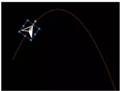
natural_image
Abstract diagram with a red curved line and blue nodes on black background, no text or symbols presentAs you can see, the Gravity behavior can be used in conjunction with other behaviors that animate the position of objects to create natural-looking arcs and animation paths that simulate thrown objects falling to the ground. For example, apply the Throw behavior to an object to send it flying through the air, and then apply the Gravity behavior to it to make the object arc up and then fall down past the bottom of the Canvas.
You can also set the Acceleration parameter to a negative value, effectively applying "antigravity" to the object and making it fly up.
Parameters in the Inspector
- Affect Subobjects: A checkbox, available when this behavior is applied to an object that contains multiple objects, such as a group, a particle emitter, a replicator, or a text layer. When this checkbox is selected, all objects in the parent object are affected individually. When this checkbox is deselected, all objects in the parent object are affected by the behavior together.
- Acceleration: A slider that sets the strength of gravity affecting the target object. The higher this value, the faster the target object falls.
Orbit Around
Similar to the Attracted To behavior, the Orbit Around behavior's default parameter settings give the object sufficient initial velocity to orbit around another object in a perfect circle.
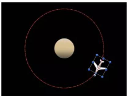
natural_image
Diagram showing a central beige sphere and a 3D molecular model with blue spheres connected by lines, set against a black background (no text or symbols)Note: Behaviors such as Attractor and Repel applied to nearby objects might disrupt an object with the Orbit Around behavior applied to it.
Parameters in the Inspector
- Affect Subobjects: A checkbox, available when this behavior is applied to an object that contains multiple objects, such as a group, a particle emitter, a replicator, or a text layer. When this checkbox is selected, all objects in the parent object are affected individually. When this checkbox is deselected, all objects in the parent object are affected by the behavior together.
- Object: An object well that defines the object to orbit around. To set the defined target object, drag the object from the Layers list to the Object well in the Orbit Around HUD or Inspector. In the Layers list, you can also drag the target object onto the Orbit Around behavior.
• Strength: A slider that sets the speed of the object.
- Falloff Type: A pop-up menu that determines whether the distance defined by the Influence parameter falls off linearly or exponentially. The default is Linear.
- Linear: Object attraction falls off in proportion to the object's distance.
- Exponential: The closer an object is within the area of influence, the more strongly it is attracted, and the faster it moves toward the object of attraction.
- Falloff Rate: A slider that sets how quickly the force of attraction between objects affected by this behavior falls off. A low Falloff Rate value results in objects quickly getting up to speed as they move toward the object of attraction. A high Falloff Rate causes objects to accelerate much more slowly. When set to Exponential, the attraction falls off more quickly than when set to Linear.
- Influence: A slider that defines the radius of the circle of influence in pixels. Objects that fall within the area of influence move toward the object of attraction. Objects outside the area of influence remain in place.
- Drag: A slider that causes the orbit to decay. The default value for Orbit Around is 0, which results in a stable orbit. Any other value causes the orbit to decay and the object to spiral into the object of attraction.
- Include X, Y, and Z: Buttons that specify the space in which the orbit occurs. For example, when X and Y are enabled, the object orbits in the XY plane. In the illustration below, X and Y are selected in the Include parameter. The red motion paths represent the motion of the white airplanes around the target object (the circle). The light gray box represents the boundary of the group.

natural_image
3D modeling software interface showing a model airplane and coordinate axes in a game environment (no text or symbols on the model itself)In the illustration below, Y and Z are turned on in the Include parameter. The white airplanes move around the target object in the YZ plane.

natural_image
3D modeling software interface showing wireframe and perspective views of a sphere and geometric shapes (no text or symbols)- Pole Axis: A pop-up menu that becomes available when the X, Y, and Z axes are enabled in the Include parameter. Because all points are at a fixed distance from the target or attractor object (the Pole Axis), the object can be visualized on a sphere of all possible orbits, with the target object at the center of the sphere. The Pole Axis defines the two points on the sphere that the orbit must pass through. There are four menu items:
•X: Aligns the Pole Axis set to the X plane.
• Y: Aligns the Pole Axis to the Y plane.
•Z: Aligns the Pole Axis to the Z plane.
•Random: When Random is selected, the axes shift to a different random position.
- Direction: A pop-up menu that sets whether objects move around in a clockwise or counterclockwise direction.
Random Motion
The Random Motion behavior animates the position of an object and makes that object move around the Canvas along a random path. The Random Motion behavior is useful for creating varied animation paths for large numbers of objects you want to move at the same time. For example, you can create an arrangement of ten objects in the Canvas and apply the Random Motion behavior to them all.
Although the motion created with this behavior appears to be random, it is predetermined by the group of parameters you've chosen. As long as you don't change the parameters, the animation path created by this behavior remains the same. If you don't like the path that was randomly generated, click the Generate button in the HUD or the Behaviors Inspector to pick a new random seed number. This number is used to generate a new path.
You can also use the Random Motion behavior to add variation to the animation paths created by other behaviors that affect an object's position. In the following example, adding Random Motion to an object with the Orbit Around behavior results in a more erratic animation path from orbit to orbit, although it still moves around the center as before.

natural_image
Diagram showing a celestial body with concentric red orbits and a molecular structure with blue spheres (no text or labels)Parameters in the Inspector
- Affect Subobjects: A checkbox that appears when this behavior is applied to an object that contains multiple objects, such as a group, a particle emitter, a replicator, or a text layer. When this checkbox is selected, all objects in the parent object are affected individually. When this checkbox is deselected, all objects in the parent object are affected by the behavior together.
- Amount: A slider that determines the speed the object moves by changing the length of the animation path. Higher values result in faster motion and longer animation paths.
- Frequency: A slider that determines the number of twists and turns in the animation path, which can be seen by the crookedness of the resulting animation path. Higher values create more turns in the animation path. Lower values result in straighter animation paths.
- Noisiness: A slider that determines an additional level of jaggedness along the animation path shape defined by the Amount parameter. Higher values result in a more jagged-looking animation path.
- Drag: A slider that controls the speed the object moves along the animation path. While the Amount parameter controls the length of the animation path, the Drag parameter shrinks or enlarges the animation path as a whole.
- Include X, Y, and Z: Buttons that specify the space in which random motion is in effect. For example, when X and Y are enabled, the motion occurs in the XY plane; when Y and Z are enabled, the motion occurs in the YZ plane.
- Random Seed: A button that picks a new random seed number. This number is used to generate new animation paths, based on the values you've picked in the other parameters of this behavior.
Repel
If you apply the Repel behavior to an object, that object pushes away all other objects within the area of influence in the Canvas. The strength with which objects are pushed away can be increased or decreased, as can the distance repelled objects travel.

natural_image
Abstract diagram with a central gray circle connected to six colored nodes (blue, yellow, purple, red, green) on a black background, no text or symbols present.Before

flowchart
graph TD
    A["Central Node"] --> B["Node 1"]
    A --> C["Node 2"]
    A --> D["Node 3"]
    A --> E["Node 4"]
    A --> F["Node 5"]
After
You can also specify which objects are affected by this behavior, creating an effect where only specific objects are moved, while others remain still.
The Repel behavior is the opposite of the Attractor behavior, and is part of a group of simulation behaviors that create complex animated relationships between two or more objects.
Parameters in the Inspector
- Affect: A pop-up menu that limits which objects in your project are affected by the Repel behavior. There are three options:
- All Objects: All objects in the Canvas are affected by the Repel behavior.
- Related Objects: The default setting. Only other objects in the same group as the repelling object are affected.
- Specific Objects: Only objects appearing in the Affected Objects list are affected by the Repel behavior.
- Affected Objects: A list that appears when Specific Objects is chosen in the Affect pop-up menu. Drag objects from the Layers list into this list to be affected by the Attractor behavior when the Specific Objects option is selected in the Affect pop-up menu. To remove an item from the list, select the item and click Remove. The Affected Objects list contains the following columns:
- Layer: This column lists the name of the layer containing the object.
•Name: This column lists the name of the object.
- Strength: A slider that defines the speed at which repelled objects move away from the object. With a value of 0, repelled objects don't move at all. The higher the value, the faster repelled objects move.
- Falloff Type: A pop-up menu that determines whether the distance defined by the Influence parameter falls off linearly or exponentially.
- Linear: Repulsion between objects falls off in proportion to the object's distance.
-
Exponential: The closer an object is within the area of influence, the more strongly it is repelled, and the faster it moves away from the object doing the repelling.
-
Falloff Rate: A slider that sets how quickly the force of repulsion between objects affected by this behavior falls off. A low Falloff Rate value results in objects quickly getting up to speed as they move away from the object of repulsion. A high Falloff Rate causes objects to accelerate much more slowly. When set to Exponential, the attraction falls off more quickly than when set to Linear.
- Influence: A slider that defines the radius of the circle of influence in pixels. Objects that fall within the area of influence move away from the object of repulsion. Objects outside the area of influence remain in place.
- Drag: A slider that reduces the distance repelled objects travel away from the repelling object.
- Include X, Y, and Z: Buttons that specify the space in which the objects move away from the object with the applied Repel behavior. For example, when X and Y are enabled, the object moves away in the XY plane; when Y and Z are enabled, the object moves away in the YZ plane.
Repel From
Whereas the Repel behavior pushes other objects away, the Repel From behavior has the converse effect, making the object it's applied to move away from a selected object in the Canvas.
Parameters in the Inspector
- Affect Subobjects: A checkbox that appears when this behavior is applied to an object that contains multiple objects, such as a group, a particle emitter, a replicator, or a text layer. When this checkbox is selected, all objects in the parent object are affected individually. When this checkbox is deselected, all objects in the parent object are affected by the behavior together.
- Object: An object well that defines the object to be repelled from.
- Strength: A slider that sets the speed at which the object is repelled. With a value of 0, the object is not repelled at all. The higher the value, the faster the object is repelled.
- Falloff Type: A pop-up menu that determines whether the distance defined by the Influence parameter falls off linearly or exponentially.
- Linear: Repulsion between objects falls off in proportion to the object's distance.
- Exponential: The closer an object is within the area of influence, the more strongly it is repelled, and the faster it moves away from the object doing the repelling.
- Falloff Rate: A slider that sets how quickly the force of repulsion between objects affected by this behavior falls off. A low Falloff Rate value results in objects quickly getting up to speed as they move away from the object of repulsion. A high Falloff Rate causes objects to accelerate much more slowly. When set to Exponential, the attraction falls off more quickly than when set to Linear.
- Influence: A slider that defines the radius of the circle of influence in pixels. Objects that fall within the area of influence move away from the object of repulsion. Objects outside the area of influence remain in place.
- Drag: A slider used to reduce the distance the object or objects travel away from the repelling object.
- Include X, Y, and Z: Buttons that specify the space in which the object moves away from the selected object. For example, when X and Y are enabled, the object moves in the XY plane; when Y and Z are enabled, the object moves in the YZ plane.
Rotational Drag
Rotational Drag is similar to the Drag behavior, except that it affects Rotation instead of position. Rotational Drag simulates friction affecting objects that are spinning due to keyframed or behavior-driven changes to the Rotation parameter. By setting higher Drag values, you can slow rotational changes to an eventual stop.
Parameters in the Inspector
- Affect Subobjects: A checkbox that appears when this behavior is applied to an object that contains multiple objects, such as a group, a particle emitter, a replicator, or a text layer. When this checkbox is selected, all objects in the parent object are affected individually. When this checkbox is deselected, all objects in the parent object are affected by the behavior together.
- Amount: A slider used to slow down an object's rotation over time, causing it to eventually come to a stop. Higher Amount values result in the rotation ending sooner.
Spring
The Spring behavior creates a relationship between two objects, so that an object with the Spring behavior applied to it moves back and forth around a second object. The Attract To parameter defines the object that serves as the target and center of the Spring behavior. Additional parameters let you adjust the speed of the behavior (Spring Tension) and the acceleration of the object at each change in direction (Relaxed Length).
If the Attract To object is at rest, the resulting motion is fairly simple and the springing object moves back and forth in a straight line. If the Attract To object is in motion, the springing object's motion is much more complex, changing direction according to the velocity of the Attract To object.
Parameters in the Inspector
- Affect Subobjects: A checkbox that appears when this behavior is applied to an object that contains multiple objects, such as a group, a particle emitter, a replicator, or a text layer. When this checkbox is selected, all objects in the parent object are affected individually. When this checkbox is deselected, all objects in the parent object are affected by the behavior together.
- Attract To: An object well that defines the object of attraction. To set the defined target object, drag the object from the Layers list to the Attract To well in the Spring HUD or Inspector. In the Layers list, you can also drag the target object onto the Spring behavior.
- Spring Tension: A slider that determines how fast the object is pulled toward the object of attraction.
- Relaxed Length: A slider that sets the distance from the target object where object attraction diminishes to zero. As the springing object's distance increases past this point, the force of attraction increases proportionally, to bring it back toward the target object.
- Repel: A checkbox that, when selected, pushes objects apart as the target object gets closer to the object of attraction than the Relaxed Length value. When this checkbox is deselected, no repelling force is applied.
- Include X, Y, and Z: Buttons that specify the space in which the affected object moves back and forth around the assigned object. For example, when X and Y are enabled, the object moves back and forth in the XY plane; when Y and Z are enabled, the object moves back and forth in the YZ plane.
Vortex
The opposite of the Orbit Around behavior, the Vortex behavior exerts a force on all objects surrounding the object to which the Vortex behavior is applied.
Parameters in the Inspector
- Affect: A pop-up menu that limits which objects in your project are affected by the Vortex behavior. There are three options:
- All Objects: All objects in the Canvas are affected by the Vortex behavior.
- Related Objects: The default setting. Only other objects in the same group as the object of attraction are affected.
- Specific Objects: Only objects appearing in the Affected Objects list are affected by the Vortex behavior.
- Affected Objects: A list that appears when Specific Objects is chosen in the Affect pop-up menu. Objects you drag from the Layers list into this list are affected by the Attractor behavior when the Specific Objects option is selected in the Affect pop-up menu. To remove an item from the list, select the item and click Remove. The Affected Objects lists contains the following columns:
- Layer: This column lists the name of the layer containing the object.
•Name: This column lists the name of the object.
- Strength: A slider that sets the speed at which the affected objects move about the object of attraction.
- Falloff Type: A pop-up menu that determines whether the distance defined by the Influence parameter falls off linearly or exponentially. The default is Linear.
- Linear: Object attraction falls off in proportion to the object's distance.
- Exponential: The closer an object is within the area of influence, the more strongly it is attracted, and the faster it moves toward the object of attraction.
- Falloff Rate: A slider that sets how quickly the force of attraction between objects affected by this behavior falls off. A low Falloff Rate value results in objects quickly getting up to speed as they move toward the object of attraction. A high Falloff Rate causes objects to accelerate much more slowly. When set to Exponential, the attraction falls off more quickly than when set to Linear.
- Influence: A slider that defines the radius of the circle of influence, in pixels. Objects that fall within the area of influence move toward the object of attraction. Objects outside the area of influence remain in place.
- Drag: A slider that causes the vortex to decay. The default value for Vortex is 0, which results in a stable vortex. Any other value causes the vortex to decay and the object to spiral into the object of attraction.
- Include X, Y, and Z: Buttons that specify the space in which the objects vortex around the target object. For example, when X and Y are enabled, the object circles around in the XY plane; when Y and Z are enabled, the object circles around in the YZ plane.
- Pole Axis: A pop-up menu that becomes available when the X, Y, and Z axes are enabled in the Include parameter. Because all points are at a fixed distance from the target or attractor object (the Pole Axis), the object can be visualized on a sphere of all possible orbits, with the target object at the center of the sphere. The Pole Axis defines the two points on the sphere that the orbit must pass through. For more information, see this parameter's discussion in Orbit Around on page 360.
- Direction: A pop-up menu that sets whether objects move around in a clockwise or counterclockwise direction.
Wind
Apply the Wind behavior to an object to animate its position and move it in a specified direction. Unlike the Throw behavior, the velocity specified by the Wind behavior is a continuous force, and its parameters can be keyframed to achieve gradual changes in speed and direction.
The Wind behavior is better than the Throw behavior when you want to vary the speed of the affected object. You can apply another behavior (such as Randomize or Ramp) or keyframe the Velocity parameter of the Wind behavior to vary the speed and direction of the object. You cannot make gradual changes in speed or direction with the Throw behavior.
Parameters in the Inspector
- Affect Subobjects: A checkbox that appears when this behavior is applied to an object that contains multiple objects, such as a group, a particle emitter, a replicator, or a text layer. When this checkbox is selected, all objects in the parent object are affected individually. When this checkbox is deselected, all objects in the parent object are affected by the behavior together.
- Air Thickness: A slider and value slider that adjust how fast the object accelerates on the X, Y, or Z axis when the speed is changed. Lower values (simulating thinner air) have less effect when pushing the object, so it takes longer to get up to speed. Higher values (thicker air) have more effect and push the object up to speed more quickly.
- Velocity: A slider and value slider that adjust the speed on the X, Y, or Z axis where the simulated air is blowing the object. Higher values result in faster motion.
Controls in the HUD
The HUD lets you specify the direction and speed of the Wind behavior by dragging an arrow in a circular region. The direction of the arrow defines the direction of movement in X and Y space, and the length of the arrow defines speed (velocity). A slider lets you adjust the scale of the HUD control, increasing or decreasing the effect the control has over the object.

Press the Shift key while dragging the arrow to constrain it to 45 degree angles. Press the Command key to change the arrow's direction without affecting its length.
When you click the 3D button, a center arrow control defines the direction the object is "blown" by the wind in 3D. The Speed slider increases or decreases the velocity of the blown object.
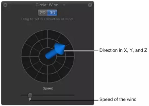
Note: The maximum speed you can define with the HUD is not the maximum speed possible. Higher values can be entered into the Velocity parameter in the Behaviors Inspector.
Additional behaviors
Audio, Camera, Motion Tracking, Particles, Replicator, Shape, and Text behaviors are designed specifically to be applied to their respective objects: Audio files, cameras, particle emitters or cells, replicators or replicator cells, shapes, and text.
Rigs and widgets
10
Rigs and widgets overview
Even a relatively simple Motion project can contain numerous parameters. Keeping track of them can be difficult. Often, you might want to modify a variety of parameters simultaneously. Finding and changing them individually would interrupt your workflow and slow you down.
Rigging lets you map multiple parameters to a single control. For example, you can create a single slider that changes the size, color, and tracking of a text object, while simultaneously adjusting the Throw Velocity of a background graphic. Similarly, you can create a checkbox that controls shadows and reflections for all objects in the project.
This chapter explains how to create and modify rigs to organize and simplify your workflow.
When you rig an object in Motion, you create a set of master controls called widgets. Widgets reside inside the rig and can affect nearly any parameter in any rigged object, including behaviors, filters, particle systems, replicators, lights, cameras and so on. Widgets can even control other widgets. There is no limit to the number of parameters each widget affects, and you can use multiple widgets in a rig to create a customized control panel where a few controls modify a wide range of parameters in the project.
The following image shows a Rig in the Inspector with a single checkbox widget controlling the color of multiple objects. The name of the checkbox has been customized.

In addition to creating widgets to simplify Motion projects, you can publish widgets for use in Final Cut Pro X so that only the rig controls you specified in Motion are visible. As a result, Final Cut Pro users can modify a complex of parameters with a small set of controls. Rigging can also be used to limit the kind and value of changes allowable in a template, ensuring that junior compositors and others in the production pipeline adhere to established specs and client needs.
To learn more about working with rigs and widgets, choose a topic in the Help table of contents (the sidebar to the left of this window).
How rigging works
Rigging works through the use of snapshots. A snapshot is a record of the current state of selected parameters in your project. Widgets let you switch between or even interpolate between stored snapshots. For example, you can create a snapshot where a text object features black type with a white shadow, and another snapshot where the same text object features white text with a black shadow. A checkbox widget in a rig toggles between the two states.
A checkbox widget that toggles between two states is the simplest rigging control. Slightly more complex is the pop-up menu widget, which lets you select between multiple parameter states. The slider widget offers even more advanced control over multiple parameter states.
For example, a slider widget lets you make gradual changes from one state to another or even use keyframes to control how the slider widget changes. You can choose which parameters are modified in the snapshot in a number of ways (described in more detail in Snapshots overview on page 378).
After you assign a parameter to a widget, changes you make to that parameter update the active snapshot in that widget. For example, if the parameter is assigned to a pop-up menu widget, the change is applied to the selected menu item.
Each parameter in a project can be assigned to only one widget at a time. However, you can store many values for that parameter as different snapshots that can be accessed using a pop-up menu or slider widget. (As previously noted, checkbox widgets can only save two snapshots.)
Because a parameter cannot be controlled simultaneously by two widgets, you cannot duplicate (or cut/copy and paste) a rig or widget object. Similarly, if you duplicate or copy and paste an object with rigged parameters, the new object's parameters are not rigged.
Further, if a parameter is assigned to a widget, that parameter cannot be modified while you are recording a different widget's snapshot. For example, if you have a slider widget controlling a shape object's color, and you begin recording a snapshot for a different widget, the shape's color is not modifiable.
Some parameter types cannot be rigged. Some parameters that use the mini-curve editor to affect an object over a range (such as the various "over stroke" parameters in the Shape inspector) cannot be added to a rig or modified while recording a snapshot. If you modify a parameter that cannot be rigged in edit mode, the change is applied globally—affecting all snapshots containing that object.
Add a rig to a project
A rig is a container for widgets. Adding a rig has no effect until you begin to add widgets and create snapshots for the widgets to control. A project can have an unlimited number of rigs, and each rig can have an unlimited number of widgets.
Add a rig to a project
Do one of the following:
- Choose Object > New Rig (or press Control-Command-R).
A new rig is added to the project. When you add a rig to a project using the Object menu or its keyboard shortcut, no widgets are created. You must add widgets manually, via the Rig Inspector. (For more information, see Add and modify widgets on page 372.)
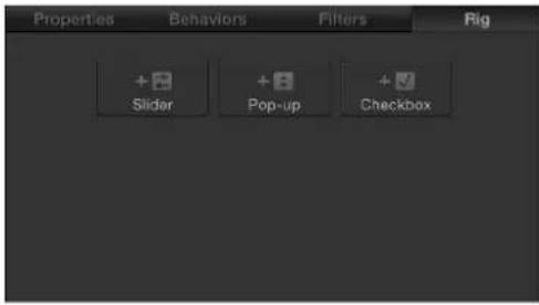
- In the Inspector, open a parameter's Animation menu (the downward arrow on the right), choose Add To Rig > Create New Rig, then choose a widget type from the submenu.
A new rig is added to the project. When you add a rig using the Animation menu, the widget you choose in the menu is created immediately and appears in the Rig Inspector, the HUD, and the Layers list (underneath the Rig object).
Rigs appear as objects in the Layers list. In the Timeline, rigs are represented as blank tracks because they cannot be edited in time.
Note: Although rigs and their widgets appear as blank tracks in the Timeline, slider widgets can be keyframed, and those keyframes can be displayed in the Timeline.
Add and modify widgets
A rig has no effect until it contains a widget. Widgets are special controls used to drive parameters in the project.
Widgets are represented in four places in the Motion project window:
• In the Layers list, under the parent rig.
- In the Rig Inspector. If the rig has multiple widgets, they all appear here.
• In the HUD.
• In the Widget Inspector.
Widgets can be reordered and renamed. Renaming widgets can be important if you have multiple widgets of the same type. Otherwise you see a list of controls that have identical, generic names.


HUD showing customized widget names HUD showing generic widget names
When viewing the Widget Inspector, the controls for the selected widget are displayed. When viewing the Rig inspector, controls for all widgets in the rig are displayed. The Widget Inspector and Rig Inspector both display the parameter controls used to modify the widget (an Edit Mode button and the parameters you've assigned to it). However, the HUD displays only the assigned widget control (the checkbox, pop-up menu, or slider that toggles or adjusts the widget), not the parameters used to modify the widget.

When a rig is selected, the HUD shows all widget controls assigned to that rig.
Add a widget to an existing rig
- Select the rig in the Layers list, then click an Add Widget button in the Rig Inspector. There are three choices: Add Slider, Add Pop-up, and Add Checkbox.

- Drag a parameter row from any Inspector pane to a rig object in the Layers list. Dropping the parameter row immediately on the rig object creates a slider widget. Pausing briefly causes a drop menu to appear, allowing you to select the widget type you want to create.
- Add a widget from the Animation menu of a parameter. For more information, see Control rigs from parameter Animation menus on page 381.
Reorder widgets in a rig
In the Layers list, drag the widgets into the order you want them to appear.
Rename a widget
By default, each widget is named according to its type ("Checkbox," for example). However, you can assign a custom name to identify the settings the widget will affect.
■ Double-click the widget name in the Layers list and enter a new name.

Widget names cannot be changed in the Inspector.
Note: If the widget has been published, the name change does not carry through to the published parameter. To synchronize names, rename the widget manually in the Publishing pane of the Project Inspector, or unpublish and republish the newly named widget.
Move a widget to another rig
If there are multiple rigs in a project, widgets can be moved easily between the different rigs.
1 In the Layers list, drag the widget you want to move to the rig.
2 When the pointer changes to the Add pointer, release the mouse button.
Widget types
Checkbox widget
Checkbox widgets allow you to switch between two snapshots—that is, between two sets of parameter states. Typically, checkbox widgets are used to create an on/off type of effect, although you can store any parameter states in either snapshot, creating more of a toggle effect.
The activation checkboxes in the Rig Inspector (highlighted blue when selected) and in the Layers list (beside the checkbox widget) have no effect on the constituent parameters of the checkbox.
Checkbox widgets contain the following controls in the Rig Inspector and Widget Inspector:

Parameters in the Inspector
- Checkbox: Use this widget control to switch between two snapshots (parameter states).
- Edit Mode: Click the Start button to enable snapshot recording. For more information about recording snapshots, see Snapshots overview on page 378.
Note: When you record a snapshot (using the Edit Mode button or the methods described in Snapshots overview on page 378), the affected parameters (those you modify in the Inspector or via onscreen controls in the Canvas) are added to the widget. When you finish recording a snapshot, new controls for the modified parameters appear in the Widget Inspector. These parameters are duplicates of the same parameters that occur in other Inspector panes. Parameters controlled by a rig display a special icon (a joystick) on the right side of the parameter row in the Inspector.
Pop-up menu widget
Pop-up menu widgets are similar to checkbox widgets but allow you to save more than two parameter states (snapshots). Each item in a pop-up menu widget represents a snapshot. When you choose an item in the pop-up menu, the affected parameters in your project toggle to a different saved state.
The activation checkboxes in the Rig Inspector (highlighted blue when selected) and in the Layers list (beside the pop-up menu widget) have no effect on the constituent parameters of the pop-up menu.
Pop-up menu widgets contain the following controls in the Rig Inspector and Widget Inspector:

Parameters in the Inspector
- Pop-up: Use this widget control to switch between multiple saved snapshots.
- Rename: Use this button to enter a custom name for the item in the pop-up menu.
- Add/Delete: Click the Add button (+) to add an item to the pop-up menu; click the Delete button (−) to remove the item in the list. Each item represents a new snapshot.
- Edit Mode: Click the Start button to enable snapshot recording. For more information about recording snapshots, see Snapshots overview on page 378.
Note: When you record a snapshot (using the Edit Mode button or the methods described in Snapshots overview on page 378), the affected parameters (those you modify in the Inspector or via onscreen controls in the Canvas) are added to the widget. When you finish recording a snapshot, new controls for the modified parameters appear in the Widget Inspector. These parameters are duplicates of the same parameters that occur in other Inspector panes. Parameters controlled by a rig display a special icon (a joystick) on the right side of the parameter row in the Inspector.
- Initial Value: Use this control (in the Options section) to set the initial value for the pop-up menu widget when it is published and used as a template in Final Cut Pro X. There are three options:
- Last Saved: When the template is used in Final Cut Pro, the pop-up menu value defaults to the menu item assigned when the project was last saved. This option ensures a consistent pop-up menu state, while still permitting users to choose alternate states manually. This is the default setting.
- Sequential: Each time the template is used (in a single project) in Final Cut Pro, the setting of this pop-up menu changes, rotating through the available menu items. The first time the template is used, this pop-up menu defaults to the first menu item. The next time the template is used, the pop-up menu is set to the second menu item, and so on. For example, in a wipe transition template with a pop-up menu widget assigned to control the shape of the wipe, the first time you add the template to the Final Cut Pro timeline, the wipe is a star; the next time you apply the template to the Final Cut Pro timeline, the wipe is a circle, and so on.

- Random: Each time the template is used in Final Cut Pro, another menu item from this pop-up menu is assigned by default. For example, in a title template with a pop-up menu widget assigned to control the title's font, each successive time the title is used in a project, a font is randomly selected from the font list.
Slider widget
Slider widgets let you select values interpolated between snapshots. When you drag the slider, the affected parameters change gradually, ramping between the values of adjacent snapshots. Each snapshot assigned to a slider is represented by a separate snapshot tag—a small shaded circle underneath the slider widget.
Double-click the area below the slider to add snapshot tags. Parameters at this position inherit their values based on the interpolation point between the two snapshot tags. For example, in a slider mapped to the Color parameter, adding a tag midway between snapshot tags set to red and blue generates a snapshot set to purple.
Snapshot tags can be dragged left and right and even reordered. To delete a snapshot tag, drag it away from the area under the slider.
Clicking a snapshot tag sets the value of the slider to the tag's value and enables the tag's snapshot for editing. Setting the slider to values between tags causes the rigged parameter values to be interpolated between the surrounding snapshot values.
The activation checkboxes in the Rig Inspector (highlighted blue when selected) and in the Layers list (beside the slider widget) have no effect on the constituent parameters of the slider.
Slider widgets contain the following controls in the Rig Inspector and Widget Inspector:
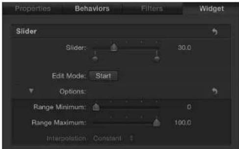
Parameters in the Inspector
- Slider: Use this widget control to move between snapshots. The snapshot tags beneath the slider indicate the saved snapshots.
- Snapshot Tag: The small shaded circles underneath the slider indicate saved snapshots. Double-click below the slider to add snapshot tags. Add as many snapshot tags as you want. Snapshot tags work similarly to tags that represent individual colors in a gradient. To learn how tags are used when creating gradients, see Gradient editor on page 135.

- Edit Mode: Click the Start button to enable snapshot recording. For more information about recording snapshots, see Snapshots overview on page 378.
Note: When you record a snapshot (using the Edit Mode button or the methods described in Snapshots overview on page 378), the affected parameters (those you modify in the Inspector or via onscreen controls in the Canvas) are added to the widget. When you finish recording a snapshot, new controls for the modified parameters appear in the Widget Inspector. These parameters are duplicates of the same parameters that occur in other Inspector panes. Parameters controlled by a rig display a special icon (a joystick) on the right side of the parameter row in the Inspector.
- Range Minimum: Use this parameter (in the Options section) to set the low end of the numeric range displayed next to the slider widget. For example, if you want the slider widget to range from 0 to 11, set Range Minimum to 0.
- Range Maximum: Use this parameter (in the Options section) to set the high end of the numeric range displayed next to the slider widget. For example, if you want the slider widget to range from 0 to 11, set Range Maximum to 11. If you want the slider widget to range from 0 to 100, set Range Maximum to 100.
Note: Range Minimum and Range Maximum have no effect on the actual parameter values that the slider widget controls. Range Minimum and Range Maximum merely designate an arbitrary numeric range that is displayed next to the slider widget.
- Interpolation: Use this pop-up menu (in the Options section) to set how values on the slider are interpolated. The interpolation applies to the segment of the slider between the current tag and the next one. You can set interpolation methods for each segment of the slider. By default, all segments are set to Linear. There are three menu options:
- Constant: Holds the value of the first snapshot until the slider reaches the next snapshot, at which point the parameter changes. (This is similar to changing states using a pop-up menu widget.)
•Linear: Creates a simple interpolation between states.
- Ease: Creates a smooth interpolation, where the effect is weighted towards the nearer snapshot tag.
Manage parameter snapshots
Snapshots overview
When you click the Edit Mode Start button in the Widget Inspector or Rig Inspector, Motion begins recording parameter changes you make (including parameters you animate). Also, a window appears containing a Stop Rig Edit Mode button.
While Rig Edit Mode is active, you can modify parameters in your project. The parameter changes you make are stored in the current snapshot. (Other snapshots in the rig are unaffected.) After you stop Rig Edit Mode, any parameter you modified (in the Canvas, or in the HUD or Inspector) is added to the Widget Inspector, and its state is saved in the snapshot.
Only one snapshot can be modified per edit mode session. To edit more than one snapshot, end the editing session, select another snapshot (by clicking another snapshot tag for a slider, by choosing a new menu item for a pop-up menu, or by changing the state of a checkbox), then start a new edit mode session.
Parameters affected by a rig display a joystick icon on the right side of the parameter row.

Any parameter controlled by a rig is added to the Widget Inspector, below the Edit Mode Start button and above the Options parameters.

To cancel the recording of the snapshot, click the close button on the Stop Rig Edit Mode window. When you stop recording, changes made to parameters are saved, but no new parameters are added to the widget.
Note: Each parameter can be controlled by only one widget. After a parameter is assigned to a widget, you cannot assign that parameter to additional widgets.
You can add parameters to a widget after a snapshot is created by clicking the Start Rig Edit Mode button again and making changes to new parameters, or by manually adding parameters to the widget. See Control rigs from parameter Animation menus on page 381.
Important: After a parameter is added to a widget, changes made to that parameter modify the selected snapshot even if Rig Edit Mode is stopped, and even if the Widget Inspector is not visible.
Record snapshots
Record a snapshot on the fly
1 Add a rig to the project by pressing Control-Command-R.
The rig appears in the Layers list.
2 In the Rig Inspector, click the Add Pop-up button (or whichever widget type you prefer).
A pop-up widget appears in the Layers list (under the rig), and pop-up widget controls appear in the Rig Inspector.
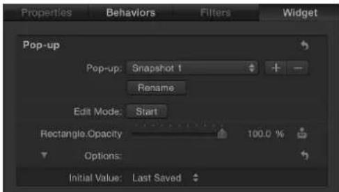
A Widget Inspector is added to the project (containing the same pop-up widget controls that appear in the Rig Inspector). To access the Widget Inspector, click the pop-up widget object in the Layers list.

3 In the Rig Inspector or the Widget inspector, choose an item from the pop-up menu.
By default, a new pop-up menu widget contains three items: Snapshot 1, Snapshot 2, and Snapshot 3. You can rename them using the Rename button.

4 In the Rig inspector or the Widget inspector, click the Edit Mode Start button.
A window appears containing a Stop Rig Edit Mode button. The appearance of this window indicates that you are in Rig Edit Mode.
5 Make changes to the objects in your project in the Canvas, the HUD, or the Inspector, creating the snapshot for the active menu item in the pop-up widget.
6 After you set the parameters to the wanted snapshot state, click the Stop Rig Edit Mode button.
The snapshot is stored. Modified parameters are added to the Widget Inspector.

7 To set additional snapshots, repeat steps 3 through 6.
For more information about other methods to create snapshots, see Control rigs from parameter Animation menus on page 381 and Add a rig to a project on page 371.
How snapshots are saved
Snapshots are saved in the widget. Any parameter affected by a snapshot is persistently displayed in the widget (even if that parameter is unmodified by the current snapshot setting). Parameter controls in widgets are duplicates of the parameter controls they are linked to.
For checkbox widgets, there are two snapshots: one for the selected state and one for the deselected state. Making changes to the linked parameters affects the snapshot for the current state of the checkbox.
For pop-up menu widgets, there are as many snapshots as there are menu items. Add menu items by clicking the Add button (+) to the right of the pop-up menu in the Widget Inspector. Making changes to the parameters affects the selected pop-up menu item.
For slider widgets, you must select a snapshot tag before enabling Edit Rig Mode.
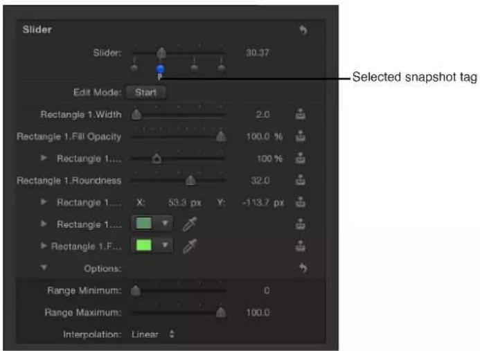
After parameters are added to the widget, they can be modified only when a specific snapshot tag is selected. If a slider widget is set between two tags, you cannot modify parameters.
Control rigs from parameter Animation menus
You can create or modify a rig while you are modifying specific parameters in your project. You can add a parameter to a rig, reveal a widget affecting a parameter, reveal the original parameter from its linked widget control, remove a parameter from a widget, or create a rig to affect a parameter. You can do all these tasks via the Animation menu for the relevant parameter in the Inspector.
Add a parameter to a rig
- In the Inspector, open the Animation menu (the downward arrow on the right) for the parameter, choose Add to Rig > Rig, then choose a rig and a specific widget from the submenus.

The parameter is added to the selected widget in the rig.
Note: You can also create a rig via this submenu.
Remove a parameter from a widget
- In the Inspector, open the Animation menu (the downward arrow on the right) of the parameter to remove, then choose Remove from Widget [name of widget].
The parameter is removed from the widget.
Note: Parameters can be removed from a widget in the parameter list in the Widget Inspector or in the Inspector containing the original parameter.
Reveal the widget driving a parameter
- In the Inspector, open the Animation menu (the downward arrow on the right) for the parameter, then choose Reveal Widget [name of widget].
The Inspector displays the Widget pane.
Reveal the original parameter used in a widget
In the Widget inspector (not the Rig Inspector), open the Animation menu (the downward arrow on the right) for the parameter, then choose Reveal Target Parameter.
The Inspector containing the original parameter is opened and the parameter name briefly blinks yellow.

Note: The Reveal Target Parameter command can be especially helpful when a widget is driving multiple similarly named parameters from different objects. This command allows you to identify the parent object.
About widget animation
You can animate slider widgets like any other parameter in Motion, through the use of keyframes. Keyframing lets you create powerful and complex effects where multiple parameters driven by a single widget are animated simultaneously.
You can also use one widget to control another. Treat the widget as you would another parameter when manipulating a snapshot for a widget.
Note: You cannot create recursively controlled widgets. That is, you cannot use one widget to drive a second widget that's already driving the first.
For more information about using keyframes, see Keyframing overview on page 439.
Use rigs in Motion
Use a single rig
Although rigs are often used to build master controls for use in Final Cut Pro X projects, they are also useful in Motion, to simplify the control set of a complex project. Instead of making changes by manipulating individual parameters, you can modify the Motion project using just a few widgets in a rig.
After a rig is built, it is immediately active. You can use the controls in the HUD, Rig Inspector, or Widget Inspector to make changes to the project.
Use the HUD to view the widgets without the other rig-related controls visible in the Inspector. Using rigs this way can be helpful when sharing a complex project with other users or when creating a project that must modified each time it is used.
For example, you can create a basic project for an animated lower-third title that incorporates two text objects, a background replicator, and a lens flare generator that moves across the text.

Each time the project is used, the size and position of the background generator must change to match the length of the text. Also, the lens flare must only appear on top of the letters. Using a rig, you can create a small set of controls that modify the parameters such changes require. That way, rather than selecting individual objects, opening their respective Inspectors, and making those changes, you can select the rig and have instant access to all parameters to change.

Alternatively, you can publish the widgets and use the Project object (in the Layers list) as a custom control pane in the Inspector. For more information about publishing, see Publish rigs on page 384.

You can even apply keyframes to a slider widget to create dynamic animated effects based on saved snapshots in the slider. Pop-up menu and checkbox widgets cannot be keyframed, nor can they accept behaviors.
Use multiple rigs
You can create multiple rigs in a single project. Rigs can be organized to control sets of parameters, and they can be grouped with the objects they affect. For example you can place a rig inside the group that contains the parameters affected by the rig. That way you can navigate to the relevant rig to control the specific, related elements.
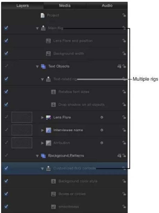
Publish rigs
One of the most common reasons to employ rigs is to create a simplified set of controls for template projects for use in Final Cut Pro X. This is achieved by publishing completed widgets to the Publishing pane of the Project Inspector in Motion. To publish a rig, you must publish its widgets individually. Widgets can be published like any other parameter in Motion.
Publish a widget
In the Rig or Widget inspector, Control-click the parameter or open the Animation menu (the downward arrow on the right) for the widget you want to publish, then choose Publish.
View published parameters in Motion
1 In the Layers list, click the Project object.
2 In the Project Inspector, open the Publishing pane.
The Publishing pane displays all published parameters, including widgets. Published parameters also appear in the Inspector in Final Cut Pro X. For more information about publishing, see Publishing parameters in templates overview on page 420.
Final Cut Pro X templates
Final Cut Pro X templates overview
Final Cut Pro X ships with numerous effects, titles, transitions, and generators, nearly all of which were created in Motion. If your Final Cut Pro project calls for additional effects, and you are an advanced Motion user, you can build them using the powerful features in Motion. If you are a content creator, you can distribute custom effects to artists and editors at your facility or to clients.
Special-effect projects created in Motion 5 for use in Final Cut Pro X are called templates. When you save a template in Motion, it becomes available in one of the Final Cut Pro media browsers. For example, a transition template saved in Motion appears in the Transitions Browser in Final Cut Pro, ready to be applied to an editing project.
You can limit or lock specific parameter controls to prevent Final Cut Pro users from modifying crucial elements in the resulting effect. Published parameters appear in the Final Cut Pro Inspector, where they can be edited and animated. For more information, see Publishing parameters in templates overview on page 420.
Note: Audio files saved in a Motion template will not be available in Final Cut Pro.
Additionally, most existing effects, transitions, titles, and generators in Final Cut Pro can be opened and modified in Motion.
To learn more about building templates, choose a topic in the Help table of contents (the sidebar to the left of this window).
For additional suggestions about streamlining the Motion-to-Final Cut Pro workflow, see Tips for creating templates on page 437.
Template types
In Motion, there are four types of Final Cut templates:
- Final Cut Effect: Use this template to create a custom stylized effect that can be applied to edits and clips in the Final Cut Pro X Timeline. An effect can subtly or dramatically shape the character of your editing project. A sepia-tone color correction might make an audience think of days gone by, while a radiant glow might suggest an otherworldly setting. After you save the template in Motion, the effect appears in the Effects Browser in Final Cut Pro.
- Final Cut Transition: Use this template to create a custom transition that can be applied to clips in the Final Cut Pro Timeline. A transition artfully connects the edit point between two clips. One scene might dissolve into the next in a cloud of smoke, or one setting might displace another on a turning page. After you save the template in Motion, the transition appears in the Transitions Browser in Final Cut Pro.
- Final Cut Title: Use this template to create a custom text animation that can be added to a Final Cut Pro sequence. Text might flare in or out in a fiery glow, or fall into place from offscreen. After you the save the template in Motion, the title effect appears in the Titles Browser in Final Cut Pro.
- Final Cut Generator: Use this template to create generalized graphical content that can be added to a Final Cut Pro project. A Final Cut Generator is nearly identical to any other Motion project—it can include text, shapes, replicators, camera moves and lighting, generators, and so on. It can be static or animated. After you the save the template in Motion, the generator appears in the Generators Browser in Final Cut Pro.
Important: Because you cannot change template types after you open a project, determine what kind of template you want to build before creating a Motion project.
Note: A standard Motion project can also be published as a generator in Final Cut Pro X. For more information, see Publish a standard Motion project as a Final Cut Pro X generator on page 418.
Like all Motion projects, Final Cut Pro templates can have 2D and 3D groups, as well as animation created with behaviors or keyframes. For more information on working in 3D, see 3D compositing overview on page 908. For more information on animation in templates, see Animation and timing in templates on page 427.
How templates work
How templates work overview
Creating a template begins in the Motion Project Browser, where you select one of four template types—Final Cut Effect, Final Cut Transition, Final Cut Title, or Final Cut Generator—then click Open. The new Motion project that opens contains graphical placeholders—target layers where you apply Motion behaviors, filters, and other effects that combine to create an effect for Final Cut Pro X. (Placeholders, which appear in the Canvas as downward arrow graphics, are similar to drop zones in standard Motion projects.) You can drag an image or video clip into a placeholder layer to preview the effect you're building, but those images do not appear in the Final Cut Pro project. This is because effect, transition, and title templates are intended to modify footage in the Final Cut Pro Timeline, not images and footage in Motion.
Even though images in the placeholder layers do not appear in the resulting Final Cut Pro effect, any new layers you add to a template (shapes, paint strokes, images, and so on) and their applied effects (lighting, camera moves, filters, for example) are visible in the Final Cut Pro project. These layers, which appear composited over the clip the effect is applied to, cannot be separated from the effect. For this reason, it is ill-advised to add image layers to effect, transition, and title templates.
However, in generator templates there are no image restrictions. Because generator templates deliver image content (not just special effects) to Final Cut Pro, images, clips, and applied effects are propagated to the Final Cut Pro project and appear in the Viewer when applied.
Note: Although you can drag a video clip into a placeholder layer for preview purposes, the clip's duration can interfere with timing built into the template. For that reason, it's better to use still images in templates when you need to preview an effect. Additionally, complex Motion layer effects such as particle emitters and replicators are not recommended for use in any template types, because they might negatively affect Final Cut Pro performance.
When you save a template in Motion, the effect is exported to the relevant Final Cut Pro media browser (the Effects Browser, Titles Browser, Transitions Browser, or Generators Browser). When the template is added to the Timeline or applied to a clip in the Timeline, an on/off activation checkbox and published parameter controls appear in the Final Cut Pro Inspector.
Each template type is described in its own topic, listed in the Help table of contents (the sidebar to the left of this window).
Final Cut Effect template
The Final Cut Effect template contains one placeholder layer: Effect Source. Drag filters and behaviors to the placeholder layer (the downward arrow graphic in the Canvas) to create custom effects. Drag an image to the placeholder layer to preview the effect. When you save the template in Motion, the template is automatically exported to the Final Cut Pro Effects Browser.

In Final Cut Pro, apply the effect to a clip in the Timeline. (Images or clips used in the Motion placeholder layer appear in the Effects Browser icon, but are not applied to the clip in the Final Cut Pro Timeline.) The duration of the effect is determined by the length of the Final Cut Pro clip it is applied to.
You can use template markers to control the timing of the sections of an effect template. For more information, see Template markers overview on page 428.
You cannot delete the Effect Source placeholder from an effect template. Nor can you create additional Effect Source placeholders. Although you can add more image layers to an effect template (and have them appear in the applied effect in Final Cut Pro), it's not recommended. This template was designed for a single purpose: to apply one custom visual effect to a Final Cut Pro clip.
Final Cut Transition template
The Final Cut Transition template contains two placeholder layers: Transition A and Transition B. Filters and behaviors added to Transition A affect the first clip in a Final Cut Pro transition. Filters and behaviors added to Transition B affect the second clip in the transition. Drag an image to each placeholder to preview the transition. When you save the template in Motion, the new transition is automatically exported to the Final Cut Pro Transitions Browser.

In Final Cut Pro, apply the transition to an edit point in the Timeline. (Images or clips in the Motion placeholder layer appear in the Transitions Browser icon, but are not applied to the clip in the Final Cut Pro Timeline.) The duration of the transition is determined by the project settings in the Editing pane of Final Cut Pro Preferences. When creating the transition in Motion, you can set the template to override the default transition duration in Final Cut Pro. The transition also has adjustable In and Out points in the Final Cut Pro project.
You can add drop zones to a transition template to add a background element in the transition. For more information, see Create a transition background on page 411.
You cannot delete the Transition A and Transition B placeholders from a transition template. Nor can you create additional Transition placeholders. Although you can add more image layers to a transition template (and have them appear in the applied effect in Final Cut Pro), it's not recommended. This template was designed for a single purpose: to apply one custom transition to the edit point between two Final Cut Pro clips.
Final Cut Title template
The Final Cut Title template contains a text layer (Type Text Here) and a placeholder layer (Title Background). Modify the text, as necessary. Animate the text using behaviors or keyframes, and add text layers and text effects, if needed. Filters and behaviors applied to the Title Background placeholder modify the clip that the title effect is applied to in Final Cut Pro. Drag an image to the Title Background layer to preview the effect. (The preview image does not appear in Final Cut Pro.) Or, if you don't want to modify the clip in Final Cut Pro, delete the Title Background placeholder.

When you save the template in Motion, the new title effect is automatically exported to the Final Cut Pro Titles Browser. There are two ways to apply a title effect in Final Cut Pro:
- Drag the title effect above a clip (or clips) in the Timeline to the frame. When you release the mouse button, the title is anchored to the clip, and the clip is used as the background. The title can span multiple clips in the Timeline. The clips populate the title background placeholder, so underlying clips assume any transforms, filters, and so on that were applied to the placeholder in Motion.
- Add the title effect to the main Timeline as a clip. If the title effect contains a Title Background placeholder, the placeholder is ignored, and a background clip cannot be specified.
If the title effect is added as a clip to the main Timeline in Final Cut Pro X, you can use a standard drop zone to specify a background source clip. For more information, see Create a title background on page 408.
When added to the Final Cut Pro Timeline, the duration of the title effect is the same as the template created in Motion. The title effect has adjustable In and Out points in the Final Cut Pro project.
To create a template that lets you use the background in the ways discussed above, you can publish a rigged checkbox that turns the drop zone on or off in the main Timeline. Alternatively, you can create two versions of the title template, one that uses a standard drop zone as a background and one that uses the default Title Background placeholder. For more information on rigging, see Rigs and widgets overview on page 370. For more information on publishing, see Publishing parameters in templates overview on page 420.
Final Cut Generator template
The Final Cut Generator template contains no placeholder layers. In fact, the generator template is nearly identical to any other Motion project. Add image layers and effects to create a composition just as you would in a standard Motion project.
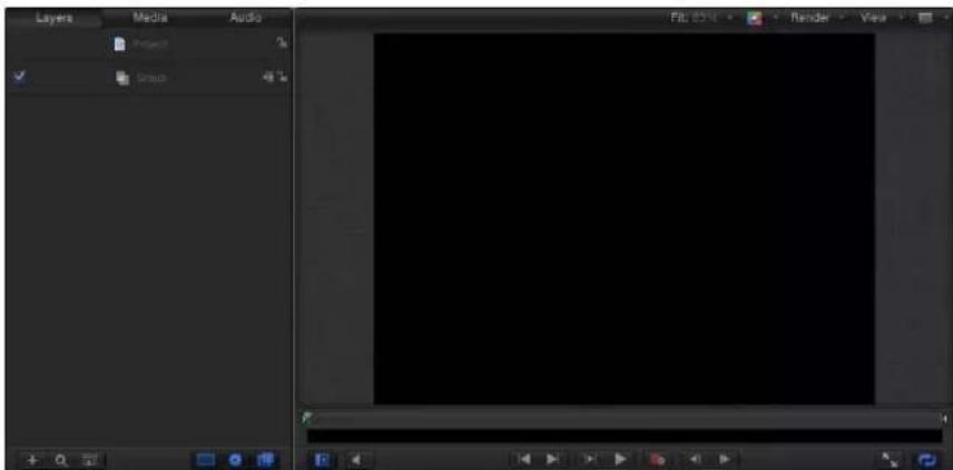
When you save the template in Motion, the generator effect is automatically exported to the Final Cut Pro Generators Browser. There are two ways to apply a generator effect in Final Cut Pro:
- Drag the generator above a clip (or clips) in the Timeline to the frame, compositing the generator over the clip. The generator can span multiple clips in the Timeline.
- Add the generator to the main Timeline as a clip.
When added to the Final Cut Pro Timeline, the duration of the generator is the same as the template created Motion. The generator has adjustable In and Out points in the Final Cut Pro project.
Standard drop zones can be added to Final Cut Generator template. For more information about drop zones, see Drop zones overview on page 197.
Note: A standard Motion project can also be published as a generator in Final Cut Pro. For more information, see Publish a standard Motion project as a Final Cut Pro X generator on page 418.
Placeholders versus drop zones
Placeholders and drop zones can be scaled or transformed in templates to create certain looks and movements. For example, you can create a picture-in-picture effect by adding a drop zone to a template, scaling the drop zone down, then positioning it in a corner of the Canvas. The difference between the placeholder and the drop zone lies in how each is used in a Final Cut Pro project: When you apply a template in a Final Cut Pro project, the target clip populates the placeholder, while drop zones remain empty until you assign source media (in Final Cut Pro).
Placeholders and drop zones share many of the same parameters, such as Pan, Scale, and Fill Color. In placeholders, these parameters allow you to simulate moving and resizing clips as you would in your Final Cut Pro project. These adjustments do not affect the clip in Final Cut Pro to which the template is applied. In drop zones, however, the parameter settings do affect the media that is assigned to the drop zone in Final Cut Pro. For more information on drop zone (and placeholder) parameters, see Drop zone parameters on page 199.
After you assign source media to a drop zone in Motion, you can use onscreen controls to pan or scale the media within the drop zone. For more information on standard drop zones, see Drop zones overview on page 197.
Create and edit an effect
Create an effect template
Use the Final Cut Effect template to create a custom effect for use in Final Cut Pro X.
For detailed information on the Project Browser, see About the Project Browser on page 146. For information on applying and editing effects in Final Cut Pro X, see Final Cut Pro X Help.
For an example of creating a Final Cut Effect that includes a rig, see Advanced example: Create an SLR effect template using rigging on page 397.
Create a new effect template
1 In Motion, choose File > New From Project Browser (or press Option-Command-N).
The Project Browser appears.
2 In the Project Browser, click Final Cut Effect, then choose a project size from the Preset pop-up menu.
natural_image
Blue square icon with a film strip and 'Final Cut Effect' text below (no additional symbols or text)Important: Be sure to create the template at the highest resolution you will use in your Final Cut Pro project. If you are creating 4K-specific templates, you can enable a setting that allows the Final Cut Pro media browsers to display only templates designed for use in 4K projects. For more information, see Template resolution on page 433.
3 Click Open (or press Return).
If the correct preset is already chosen, you can double-click Final Cut Effect in the Project Browser.
A new, untitled Motion project opens, with the Effect Source placeholder layer selected.
4 To add a reference image to the Effects Source placeholder to preview your work, do one of the following:
- From the File Browser or Library, drag an image onto the placeholder arrow in the Canvas. When the pointer becomes a curved arrow, release the mouse button.
- From the File Browser or Library, drag an image to the Effect Source layer in the Layers list. When the pointer becomes a curved arrow, release the mouse button.
Be sure to drag the image from the File Browser or Library to the placeholder. If you accidentally place the image into a new layer, you can't move it to the placeholder layer.
The image is added to the Effect Source layer, replacing the arrow graphic in the Canvas, and is resized if it is not the same size as the project. The image is temporary media used to preview the result of the effect you are building. It is not used in the Final Cut Pro X effect.
5 Add filters or behaviors to the Effect Source layer to create a custom effect.
The filter and behavior parameters can be modified and animated. For more information on working with filters, see Filters overview on page 741. For more information on behaviors, see Behaviors overview on page 293.
6 To allow Final Cut Pro users to modify specific parameters, choose Publish from the Animation pop-up menu of each parameter you want to make accessible.
Publishing a parameter makes its user interface control (the slider, checkbox, or dial) available in the Final Cut Pro Inspector when the custom effect is applied to a clip. Published parameters can be adjusted and keyframed in Final Cut Pro. For more information, see Publishing parameters in templates overview on page 420.
Tip: In addition to publishing specific parameter controls, you can publish the blue activation checkboxes that appear next to filter and behavior names in Motion Inspectors. When you publish an activation checkbox (via its Animation pop-up menu), a corresponding checkbox appears in the Final Cut Pro inspector, allowing users to turn the influence of that filter or behavior on or off. For more information, see Publishing parameters in templates overview on page 420.
7 Optional: When you're satisfied with the custom effect you've built, you can remove the preview image from the template by selecting the Effect Source layer, then clicking the Clear button in the Image Inspector.
The temporary image is removed from the project.
8 Choose File > Save, then do the following:
a In the save dialog, enter a name for the template.
If you don't specify a name, the template appears in the Final Cut Pro Effects Browser as "New Template."
b Choose a category from the Category pop-up menu.
You can also create a custom category. Categories appear in the Motion Project Browser and the Final Cut Pro Effects Browser.
c If needed, choose a theme from the Theme pop-up menu.
You can also create themes. Themes appear in the Motion Project Browser and in the Final Cut Pro Themes Browser. A theme is a metadata tag that helps categorize templates. For more information on Motion Project Browser themes and categories, see About the Project Browser on page 146.
d To retain unused media in the project (media or audio in the Media list that is not used in the template), select "Include unused media."
e If you want a preview movie to appear in the Motion Project Browser, select Save Preview Movie.
9 Click Publish.
The template and remaining media are saved and exported to the Final Cut Pro Effects Browser. If you did not remove the reference image, it appears in the template's thumbnail in the Final Cut Pro Effects Browser.
For information about applying and editing effects in Final Cut Pro, see Final Cut Pro X Help.
Modify a Final Cut Pro X effect
The presets in the Final Cut Pro X Effects Browser were created in Motion. You can modify these presets in Motion, then save them as effects in Final Cut Pro.
For a step-through example of modifying a preset Final Cut Effect, see Example: Modify the Bokeh Random effect on page 393.
Modify a Final Cut Pro X effect in Motion
1 In Final Cut Pro X, click the Effects Browser button in the toolbar.
The Effects Browser appears.
2 Locate the effect to edit.
To preview the effect, move the pointer over the effect's thumbnail.
3 Control-click the effect and do one of the following:
- If the effect is a Final Cut Pro preset, choose "Open a copy in Motion" from the shortcut menu.
A copy of the project opens in Motion, and the duplicated file appears in the Final Cut Pro Effects Browser. - If the effect is a template created in Motion, choose "Open in Motion" from the shortcut menu.
The original project opens in Motion.
If the preview image used when creating the effect in Motion was saved with the project, that media appears in the template.
4 Modify the project in Motion, then do one of the following:
- To save a copy of the Final Cut Pro preset with the default name, choose File > Save.
- To save a copy of the Final Cut Pro preset with a new name, choose File > Save As, complete the save dialog information, then click Publish.
- To save the updated Motion-created template and overwrite the original version, choose File > Save.
- To save the updated Motion-created template as a copy, choose File > Save As, complete the save dialog information, then click Publish.
Note: When a preset Final Cut Pro effect is applied to the Final Cut Pro Timeline and then modified in Motion, the saved changes do not affect instances of the template in the Final Cut Pro Timeline. However, after the modified version of the preset is applied to the Final Cut Pro Timeline, any subsequent changes made in Motion to the template affect instances of the effect in the Final Cut Pro Timeline.
The template is saved and appears in the Effects Browser in Final Cut Pro.
Example: Modify the Bokeh Random effect
In Final Cut Pro X, the Bokeh Random effect adds moving, blurred particles to a clip. The shape, blend mode, speed, and other particle parameters of the effect can be edited in Final Cut Pro X. Most Final Cut Pro X effects (as well as transitions, titles, and generators) can be opened and modified in Motion to limit or add parameter controls.
Note: Bokeh comes from the Japanese term "boke," meaning blur or haze. Bokeh is a term used in photography to describe the aesthetic quality of a blurred image.
This example describes how to modify the Bokeh Random effect in Motion. The workflow in this example is divided into the following tasks:
- Inspect the effect in Final Cut Pro.
• In Motion, add a parameter to the effect. - In Motion, remove a parameter from the effect and publish the modified effect to Final Cut Pro.
Inspect the Bokeh Random effect in Final Cut Pro
1 In Final Cut Pro, select a clip in the Timeline, then click the Effects Browser button in the toolbar.

2 In the Effects Browser, select the Light category, then move the pointer back and forth over the Bokeh Random thumbnail.
A preview of the effect plays in the Viewer.
3 To apply the effect to the selected clip, do one of the following:
• Double-click the Bokeh Random effect.
- Drag the effect to the clip in the Timeline. When the clip is highlighted and the add pointer (+) appears, release the mouse.
The Bokeh Random effect is applied to the clip.
4 Click the Inspector button in the toolbar.

The first control in the Inspector is the Type parameter, which sets the shape of particles in the effect.
5 To change the particle shapes to hexagons, choose Hexagons from the Type pop-up menu.
6 Adjust some of the other controls, such as Size, Number, and Opacity to see how they change the effect.
7 Click the Reset button (the curved arrow at the end of the activation checkbox row) to set the parameters back to their default values.
Add a parameter to the Bokeh Random effect's Final Cut Pro inspector
In this next task, a copy of the Bokeh Random effect is opened and edited in Motion so that the option to change the shape of the particles is removed from the effect, and the option to change the color of the particles is added to the effect.
1 In the Final Cut Pro Effects Browser, Control-click the Bokeh Random effect, then choose "Open a copy in Motion" from the shortcut menu.
A copy of the template opens in Motion, and the duplicated file appears in the Final Cut Pro Effects Browser.
2 If necessary, choose Fit in Window from the Zoom Level pop-up menu above the Motion Canvas.
Optional: To better see the effect you are modifying, drag a still image from the File Browser to the Canvas, releasing the mouse button when the pointer changes to a curved arrow and the placeholder is highlighted with a yellow border in the Canvas.
Note: This image is not saved with the Bokeh Random copy to the Final Cut Pro Effects Browser.
3 In the Layers list, click the Project object, then click Publishing in the Project Inspector.
The controls that are published in the preset Bokeh Random effect are listed: Type, Blend Mode, Size, Number, Pattern, Speed, Blur Amount, and Opacity. Several of the published parameters are rig widgets. For detailed information on rigs and widgets, see Rigs and widgets overview on page 370.
When a parameter is published, it becomes available in the Final Cut Pro inspector. For detailed information on publishing, see Publishing parameters in templates overview on page 420.
4 In the Layers list, open the Bokeh group, then open the Hexagons and Circles groups.
The effect is comprised of rigged particle parameters, behaviors, and a Gaussian Blur filter. For an example of rigging, see Advanced example: Create an SLR effect template using rigging on page 397.
5 In the Circles group, select the "Bokeh 4" particle emitter, then choose Colorize from the Color Mode pop-up menu in the Emitter Inspector.
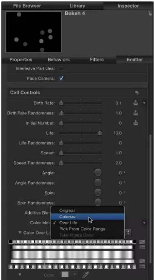
6 Select a new color from the Color parameter.
In the Canvas, the circular particles change to the new color.
7 Do one of the following:
- Click the Color parameter's Animation menu (the downward triangle that appears when you place the pointer over the right side of the parameter row), then choose Publish.
- Control-click the Color parameter's name, then choose Publish from the shortcut menu.

8 Click the Project object to view the modified published parameter list.
The Color parameter now appears in the list. When the modified template is applied to a clip in the Final Cut Pro Timeline, the Color parameter will be available in the Final Cut Pro inspector.

Remove a parameter from the Bokeh Random effect's Final Cut Pro inspector
In the next task, remove the Type parameter from controls that will appear in the Final Cut Pro inspector.
1 In the Publishing pane of the Project Inspector, do one of the following:
- Click the Type parameter's Animation menu (the downward triangle that appears when you place the pointer over the right side of the parameter row), then choose Unpublish.
- Control-click the Type parameter's name, then choose Unpublish from the shortcut menu.
The Type control is removed from the list and will not be available in Final Cut Pro.
2 Choose File > Save (or press Command-S).
If you imported a still placeholder image, a dialog appears asking if you want to copy that image to the saved Motion project. To save the image with the Motion project, click Copy. To save the project without the image, Click Don't Copy. Neither option has any affect when the template is applied in Final Cut Pro.
Note: To save the effect with a different name or to a different category in the Effects Browser, choose File > Save As. The initially created file (Bokeh Random Copy) remains in the Final Cut Pro Effects Browser and Motion Project Browser, but can be deleted from the folders in /Users/ username/Movies/Motion Templates.
The effect is now ready for use in Final Cut Pro. Unlike the original preset, Bokeh Random Copy includes a control to change the color of the particles, and no longer includes a control to change the shape of the particles.
Advanced example: Create an SLR effect template using rigging
Advanced Motion users can create sophisticated effects templates for Final Cut Pro X. The following example describes how to create one such effect, a simulation of an SLR (single-lens reflex) camera viewfinder changing focus. An SLR camera uses a moving prism-and-mirror system to show the photographer the image that will be captured on film.
This workflow in this section requires a thorough knowledge of several advanced Motion techniques, including clones, masks, and rigging. For more information on these techniques, see the following topics:
• Make clone layers on page 226
- Shapes, masks, and paint strokes overview on page 828
• Rigs and widgets overview on page 370
The workflow in this example is divided into the following tasks:
- Set up the template project in Motion.
- Create the "viewfinder" graphics.
- Add a preview image.
- Add masks.
- Create and customize a new rig.
- Publish the rig widget and effect template to Final Cut Pro.
Set up the SLR effect project in Motion
1 Choose File > New (or press Command-N).
2 In the Project Browser, select Final Cut Effect, choose the project preset required for your Final Cut Pro X project, then click Open.
Note: This example uses the Broadcast HD 720 preset.
The project opens and contains a single group with one Effect Source placeholder layer.
The placeholder (the arrow image) represents the clip or image to which the effect will be applied in the Final Cut Pro Timeline. Because this template uses multiple instances of the same image or clip to create an SLR split-prism effect, clones are made of the placeholder.
3 Clone the placeholder:
a Select the Effect Source layer, then choose Object > Make Clone Layer (or press K).
b Rename the Clone Layer "Background."
c Select the Effect Source layer again, then choose Object > Make Clone Layer (or press K).
d Rename the second Clone Layer "Top Prism."
e Rename the Effect Source layer "Bottom Prism."
4 Add new groups to the project:
a In the Layers list, select the Group, then click the Add button (+) in the lower-left corner of the Layers list four times to create four additional groups.
b Name the bottommost Group (the one containing the clones) "Background Group."
c Name Group 1 "Bottom Prism Group."
d Name Group 2 "Top Prism Group."
e Name Group 3 "Split Prism Group."
f Name Group 4 "Focus Screen Group."
Your project should look like the following illustration:

5 Organize the groups and placeholder clones:
a Drag the Bottom Prism clone layer to the Bottom Prism Group. When the highlight appears around the Bottom Prism Group, release the mouse button.
b Drag the Top Prism clone layer to the Top Prism Group.
c Shift-select the Bottom Prism Group and the Top Prism Group, then drag them to the Split Prism Group.
The Bottom Prism Group and the Top Prism Group are now members of the Split Prism Group.
d Drag the Split Prism Group to the Focus Screen Group.
Your project should look like the following illustration:

In the next task, add shapes to simulate the focus rings found in an SLR viewfinder.
Add the viewfinder focus graphics
1 With the Focus Screen group selected, choose the Circle tool from the Shape pop-up menu in the Toolbar.
2 Position the pointer in the center of the Canvas and, holding down the Shift and Option keys, draw a circle in the Canvas.
The circle should be large enough to cover the arrow graphic.
Tip: Choose Grid from the View pop-up menu above the Canvas to display a grid to assist in the positioning of graphics in the Canvas.
3 Name the circle layer "Outer Ring."
4 With the Outer Ring layer selected, do the following in the Shape Inspector:
a Turn off Fill by deselecting the blue activation box.
b Turn on Outline by selecting the blue activation box.
c Set Brush Color to black.
d Set Width to 1.
e Set Brush Opacity to 80 percent.

natural_image
Simple icon of a download arrow inside a circle (no text or symbols)5 With the Outer Ring layer selected, press Command-D, then name the duplicated shape "Texture Ring."
6 In the Shape Inspector, do the following:
a Turn off Outline by deselecting the blue activation box.
b Turn on Fill by selecting the blue activation box.
c Set Fill Color to black.
d Set Fill Opacity to 35 percent.
7 In the Properties Inspector, set Scale to 42 percent.
8 In the toolbar, choose Stylize > Halftone from the Add Filter pop-up menu.
A screen pattern is applied to the Texture Ring.
9 In the Filter Inspector, set Contrast to 0.2.
In the next task, add an image (to assist in seeing the effect you are building) and apply a blur filter. In a later task, you will rig the blur filter to create the changing focus effect.
Add an image and apply a blur filter to the background
1 In the File Browser, drag a still image to the Canvas, releasing the mouse button when the placeholder in the Canvas is highlighted yellow.
This image will allow you to see the effect you are building. When the image is dragged to the Canvas, it is applied to the clone and background layers. This example uses an image of a herd of elephants. They're neat.

natural_image
Two elephants standing in a grassy savanna with a circular frame in the background (no text or symbols visible)2 In the Layers list, select the Background layer.
3 In the toolbar, choose Blur > Gaussian Blur from the Add Filter pop-up menu.
A Gaussian Blur filter is added to the elephant image.
4 In the Filters Inspector, set Amount to 0.
The blur amount will be modified in a subsequent step (when you build the rig).
In the next task, you will add the masks that create the center of the viewfinder and the split prisms.
Add the focus screen masks
1 Add a mask to the Texture Ring layer:
a In the Layers list, select the Texture Ring layer.
b Choose the Circle Mask tool from the Mask pop-up menu in the toolbar, position the pointer in the center of the Texture Ring shape and, holding down the Shift and Option keys, draw a mask in the Canvas.
Use the following image as a reference:
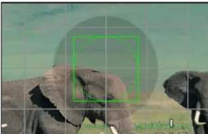
natural_image
Two elephants in a natural setting with a green circular overlay and grid lines (no text or symbols)The Texture Ring circle is masked. However, to simulate an SLR viewfinder focus ring, you need to invert the mask.
c In the Mask Inspector, select Invert Mask.

natural_image
Illustration of an elephant and a dog with a red circular target grid overlay (no text or symbols)Tip: To align objects in the Canvas, use the Dynamic Guides and snapping (press N). You can also select objects, then choose an option from the Objects > Alignment menu.
2 Add a mask to the Top Prism Group:
a In the Layers list, select the Top Prism Group.
b Choose the Bezier Mask tool from the Mask pop-up menu in the toolbar, then draw a four-sided shape in the Canvas so that the bottom side crosses the center of the circle graphics at an angle.
Use the following image as a reference:

natural_image
Photo of elephants grazing in a grassy field with hills in the background (no text or symbols visible)Tip: To quickly zoom out of the Canvas, press Command-Minus Sign. Press Command-Plus Sign to zoom into the Canvas. Alternatively, you can hold down the Space bar and Command key (in that order), then drag diagonally in the Canvas. The zoom occurs around the spot clicked in the Canvas.
c With the mask selected, choose View > Show Rulers (or press Shift-Command-R).
d Drag two guides from the horizontal ruler and align them with the lower-left and lower-right corners of the mask.

natural_image
Photo of elephants in a grassy field with mountainous background (no text or symbols visible)3 Add a mask to the Bottom Prism Group:
a In the Layers list, select the Bezier Mask created in step 2.
b Choose Edit > Duplicate (or press Command-D).
c Drag the Bezier Mask Copy to the Bottom Prism Group.
d Choose the Select/Transform tool from the pop-up menu at the far-left side of the toolbar.
e Holding down the Shift key, drag the mask's rotation handle 180 degrees.

natural_image
Photo of elephants in a grassy field with a target overlay and editing interface (no readable text or symbols)f Drag the mask downward until the upper-left and upper-right corners of the mask align with the guides.
Tip: After you begin dragging, hold down the Shift key to confine movement to the Y axis. To fine-tune the Y position of the mask, press Command-Up Arrow or Command-Down Arrow, or adjust the Y Position parameter in the mask's Properties Inspector.
To see the effects of the masks, turn the Background Group off, then turn the Top Prism Group or Bottom Prism Group off.
4 Add a mask to the Split Prism Group:
a In the Layers list, select the Circle Mask that you applied to the Texture Ring layer, then press Command-D.
b Drag the Circle Mask copy to the Split Prism Group, then turn off the Background Group to see the effect of the mask.
When the mask is applied to the Split Prism Group, it retains its inverted state, but changes in scale. This is because the mask was applied to an object that has been scaled (the Texture Ring). When applied to an object that is not scaled, the mask is applied at its nonscaled size.
c With the Circle Mask copy selected, deselect the Invert Mask checkbox in the Mask Inspector.

natural_image
Close-up of an elephant with a red circular target overlay, set against a green background (no text or symbols)d With the Circle Mask copy selected, open the Properties Inspector and set the Scale parameter to match the scale of the Texture Ring: 42 percent.

natural_image
Circular diagram with a hand holding a pen, surrounded by blue dots and a red border (no text or symbols)In the next task, create the rig that will control the positions of the Top Prism layer and the Bottom Prism layer, simulating focusing the SLR camera.
Create the SLR effect rig
1 In the Layers list, select the Top Prism clone layer (not the Top Prism Group) and in the Properties Inspector, do the following:
a Click the Position parameter disclosure triangle to show the X, Y, and Z subparameters.
b Control-click the X Position parameter name, then choose Add to Rig > Create New Rig > Add To New Slider from the shortcut menu.
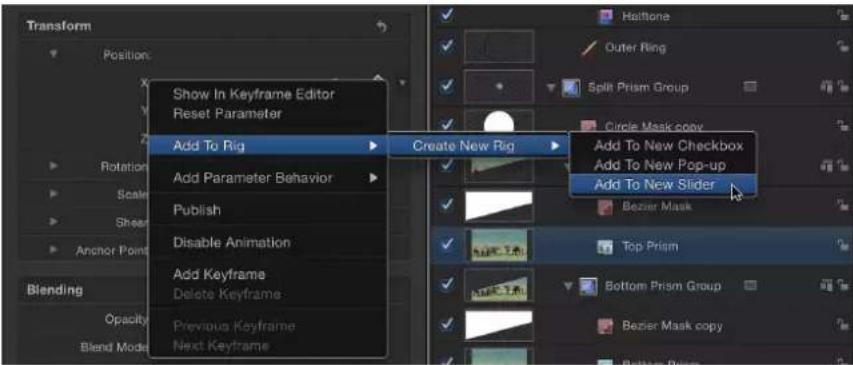
The Widget Inspector is displayed, and contains a single parameter: "Top Prism.X." A rig icon (a joystick) appears next to the parameter in the Inspector (as well as in the Properties Inspector for the Top Prism clone layer). Rig and Slider objects also appear near the top of the Layers list.
2 Select the Bottom Prism clone layer, and in the Properties Inspector, do the following:
a Click the Position parameter disclosure triangle to show the X, Y, and Z subparameters.
b Control-click the X Position parameter name, then choose Add to Rig > Rig > Add To Slider from the shortcut menu.
3 In the Layers list, select the Gaussian Blur filter, then do the following:
a Open the Filters Inspector.
b Control-click the Amount parameter name, then choose Add to Rig > Rig > Add To Slider from the shortcut menu.
4 In the Layers list, select the Rig.
The rigged parameters appear in the Rig Inspector, with the most recently added parameter at the top of the list.

In the next task, create three different snapshots simulating the viewfinder focus effect. In the first snapshot, the top prism is shifted to the left and the background image appears out of focus. In the second snapshot, the top and bottom prisms are aligned and the background image appears in focus. In the third snapshot, the bottom prism shifts to the right and the background image appears out of focus.
For detailed information on using rigs, widgets, and snapshots, see Rigs and widgets overview on page 370.
Create the SLR rig's snapshots
1 In the Layers list, select the Background Group checkbox to see the effect of the snapshots as you create them.
2 In the Rig Inspector, double-click just below the middle of the slider control to add a new snapshot, then drag the snapshot's blue tag to approximately 50.
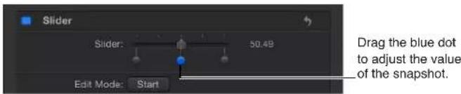
3 Click the first snapshot (the tag furthest to the left), then set the following values:
a Set the Gaussian Blur.Amount to 150.
b Set the Bottom Prism.X to 25.
c Set the Top Prism.X to -25.
This snapshot simulates the viewfinder of an SLR camera focused at one extreme.
4 Click the third snapshot, then set the following values:
a Set the Gaussian Blur.Amount to 150.
b Set the Bottom Prism.X to -25.
c Set the Top Prism.X to 25.
This snapshot represents simulates the viewfinder of an SLR camera focused at the opposite extreme.
Note: The middle snapshots values remain at 0, representing the SLR camera lens in sharp focus.
5 Drag the slider back and forth to see the effect of the rigged parameters.
Be sure to drag only the slider control, not a snapshot tag.
natural_image
Circular target symbol with a blurred background of indistinct figures (no text or symbols)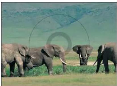
natural_image
Group of elephants in a grassy field with rolling hills in the background (no text or symbols visible)When the completed SLR effect is added to the Final Cut Pro X Timeline, this slider will appear in the Effect Inspector.
In the next task, the rig slider will be published as "Focus." In Final Cut Pro X, moving the Focus slider back and forth will simulate focusing in an SLR camera viewfinder.
Publish the slider widget and the SLR effect template
1 In the Layers list, name the slider widget "Focus."
2 Select the Rig or the Focus widget, then do one of the following in the Rig Inspector:
- Click the Focus slider's Animation menu (the downward triangle that appears when you place the pointer over the right side of the parameter row), then choose Publish from the pop-up menu.
- Control-click the Focus slider's parameter name, then choose Publish from the shortcut menu.
3 In the Layers list, select the Project object, then open the Publishing pane of the Project Inspector.
The Focus slider appears in the Published Parameters list, indicating which parameter controls will appear in the Final Cut Pro inspector.

4 Choose File > Save, then do the following:
a In the save dialog, enter a name for the template.
If you don't specify a name, the template appears in the Final Cut Pro Effects Browser as "New Template."
b Choose a category from the Category pop-up menu.
You can also create a custom category. Categories appear in the Motion Project Browser and the Final Cut Pro Effects Browser.
c If needed, choose a theme from the Theme pop-up menu.
You can also create themes. Themes appear in the Motion Project Browser and the Final Cut Pro X Themes Browser. A theme is a metadata tag that helps categorize templates. For more information on Motion Project Browser themes and categories, see About the Project Browser on page 14.6.
d If you don't want a preview movie to appear in the Motion Project Browser, deselect Save Preview Movie.
The template appears in the Final Cut Pro Effects Browser, ready for use. For information on keyframing parameters in Final Cut Pro, see Final Cut Pro X Help.
e Click Publish.
Create and edit a title
Create a title template
Use the Final Cut Title template to create a custom title for use in Final Cut Pro X.
For detailed information on the Project Browser, see About the Project Browser on page 146. For information on working with titles in Final Cut Pro, see Final Cut Pro X Help.
Create a new title template
1 In Motion, choose File > New From Project Browser (or press Option-Command-N).
The Project Browser appears.
2 In the Project Browser, click Final Cut Title, then choose a project size from the Preset pop-up menu.

Important: Be sure to create the template at the highest resolution you will use in your Final Cut Pro project. If you are creating 4K-specific templates, you can enable a setting that allows the Final Cut Pro media browsers to display only templates designed for use in 4K projects. For more information, see Template resolution on page 433.
3 Click Open (or press Return).
If the correct preset is already chosen, you can double-click Final Cut Title in the Project Browser.
A new, untitled Motion project opens containing two layers: a text layer (Type Text Here) and a placeholder layer (Title Background).
4 To add a reference image to the Title Background placeholder to preview your work, do one of the following:
- From the File Browser or Library, drag an image onto the placeholder arrow in the Canvas. When the pointer becomes a curved arrow, release the mouse button.
- From the File Browser or Library, drag an image to the Title Background layer in the Layers list. When the pointer becomes a curved arrow, release the mouse button.
Be sure to drag the image from the File Browser or Library to the placeholder. If you accidentally place the image into a new layer, you can't move it to the placeholder layer.
The image is added to the Title Background layer, replacing the arrow graphic in the Canvas, and is resized if it is not the same size as the project. The image is temporary media used to preview the result of the effect you are building. It is not used in the Final Cut Pro X title.
5 Modify the text as needed and add animation, filters, text behaviors, and other effects to create custom titles.
Because users can change the text in Final Cut Pro, it's not necessary to modify the default text ("Type Text Here") in Motion. You can adjust and animate parameters in the Text Inspector, Filters Inspector, Behaviors Inspector, and Properties Inspector to create a memorable title sequence. For more information about using text, see Text overview on page 612 and Animated text overview on page 676.
6 To allow Final Cut Pro users to modify specific parameters, choose Publish from the Animation pop-up menu of each parameter you want to make accessible.
Publishing a parameter makes its user interface control (the slider, checkbox, or dial) available in the Final Cut Pro Inspector when the custom title is added to a clip. Published parameters can be adjusted and keyframed in Final Cut Pro. For more information, see Publishing parameters in templates overview on page 420. For information specific to publishing text parameters, see Publishing text parameters on page 425.
7 Optional: When you're satisfied with the custom title you've built, you can remove the preview image from the template by selecting the Effect Source layer, then clicking the Clear button in the Image Inspector.
The temporary image is removed and not saved to the template's Media folder. For more information, see Template files and media save location on page 434.
8 Choose File > Save, then do the following:
a In the save dialog, enter a name for the template.
If you don't specify a name, the template appears in the Final Cut Pro Titles Browser as "New Template."
b Choose a category from the Category pop-up menu.
You can also create a custom category. Categories appear in the Motion Project Browser and the Final Cut Pro Titles Browser.
c If needed, choose a theme from the Theme pop-up menu.
You can also create themes. Themes appear in the Motion Project Browser and the Final Cut Pro Themes Browser. A theme is a metadata tag that helps categorize templates. For more information on Motion Project Browser themes and categories, see About the Project Browser on page 146.
d To retain unused media in the project (media or audio in the Media list that is not used in the template), select "Include unused media."
e If you want a preview movie to appear in the Motion Project Browser, select Save Preview Movie.
9 Click Publish.
The template and remaining media are saved and exported to the Final Cut Pro Titles Browser. If you did not remove the reference image, it appears in the template's thumbnail in the Final Cut Pro Titles Browser.
Create a title background
When a title template that contains a Title Background placeholder is added to the main Timeline in Final Cut Pro X, the placeholder is ignored. To specify a background source clip in the Final Cut Pro project, you can add a drop zone to the title template and then assign media to the drop zone in Final Cut Pro.
Drop zones in templates allow Final Cut Pro users to place media into designated regions of the applied effect. You can add filters, behaviors, animations, and other effects to drop zones in Motion so those effects influence clips later added in Final Cut Pro. For more information on drop zones, see Drop zones overview on page 197.
Create a background for a title template
In the Final Cut Title project, choose Object > New Drop Zone.
A drop zone layer (titled "Drop Zone") appears in the layers list and Canvas.
When the title is added to a Final Cut Pro project, a Drop Zone image well appears in the Final Cut Pro inspector. Using this image well, an editor can add a source clip that appears beneath the titles. Using the drop zone's onscreen controls (accessed by double-clicking the drop zone in the Viewer), an editor can pan or scale the source clip within the drop zone. For more information, refer to Final Cut Pro X Help.
Modify a Final Cut Pro X title
The presets in the Final Cut Pro X Titles Browser were created in Motion. You can modify these presets in Motion, then save them as new title effects in Final Cut Pro.
Modify a Final Cut Pro title in Motion
1 In Final Cut Pro, click the Titles Browser button in the toolbar.
The Titles Browser appears.
2 Locate the title effect to edit.
To preview the title effect, move the pointer over title effect's thumbnail.
3 Control-click the title and do one of the following:
- If the title is a Final Cut Pro preset, choose "Open a copy in Motion" from the shortcut menu.
A copy of the project opens in Motion, and the duplicated file appears in the Final Cut Pro Titles Browser. - If the title is a template created in Motion, choose "Open in Motion" from the shortcut menu.
The original project opens in Motion.
If the preview image used when creating the effect in Motion was saved with the project, that media appears in the template.
4 Modify the project in Motion, then do one of the following:
- To save a copy of the Final Cut Pro preset with the default name, choose File > Save.
- To save a copy of the Final Cut Pro preset with a new name, choose File > Save As, complete the save dialog information, then click Publish.
- To save the updated Motion-created template and overwrite the original version, choose File > Save.
- To save the updated Motion-created template as a copy, choose File > Save As, complete the save dialog information, then click Publish.
Note: When a preset Final Cut Pro title is applied to the Final Cut Pro Timeline and then modified in Motion, the saved changes do not affect instances of the template in the Final Cut Pro Timeline. However, after the modified version of the preset is applied to the Final Cut Pro Timeline, any subsequent changes made in Motion to the template affect instances of the title in the Final Cut Pro Timeline.
The template is saved and appears in Titles Browser in Final Cut Pro.
Create and edit a transition
Create a transition template
Use the Final Cut Transition template to create a custom transition for use in Final Cut Pro X.
For detailed information on the Project Browser, see About the Project Browser on page 146. For information on applying and editing transitions in Final Cut Pro, see Final Cut Pro X Help.
Create a new transition template
1 In Motion, choose File > New From Project Browser (or press Option-Command-N).
The Project Browser appears.
2 In the Project Browser, click Final Cut Transition, then choose a project size from the Preset pop-up menu.

Important: Be sure to create the template at the highest resolution you will use in your Final Cut Pro project. If you are creating 4K-specific templates, you can enable a setting that allows the Final Cut Pro media browsers to display only templates designed for use in 4K projects. For more information, see Template resolution on page 433.
3 Click Open (or press Return).
If the correct preset is already chosen, you can double-click Final Cut Transition in the Project Browser.
A new, untitled Motion project opens containing two placeholder layers: Transition A and Transition B.
4 To add a reference image to the placeholders to preview your work, do the following:
a From the File Browser or Library, drag an image onto the Transition A layer in the Layers list (or onto the Transition A arrow in the Canvas). When the pointer becomes a curved arrow, release the mouse button.
b From the File Browser or Library, drag a second image onto the Transition B layer in the Layers list. When the pointer becomes a curved arrow, release the mouse button.
Be sure to drag the images directly from the File Browser or Library to the placeholders. If you accidentally place the images into a new layer, you can't move them to the placeholder layers.
The images are added to the Transition A and B placeholder layers, replacing the arrow graphics in the Canvas, and are resized if they are not the same size as the project. The images serve as temporary media to preview the result of the transition you are building. They are not used in the Final Cut Pro X transition.
5 Modify Transition A and Transition B so they flow into each other midway through the transition, using filters, behaviors, or other combinations of effects. For example, animate a lens flare that moves across the screen as Transition A fades into Transition B.
When designing the template, think about how to best get the end of incoming clip A to line up with the beginning of the transition, and the end of the transition to line up with the incoming clip B. For example, a transition that begins on a full-screen Placeholder A and ends on a full-screen Placeholder B avoids jarring jumps. Because the default behavior between the transition placeholders is a cut, you will often need to adjust the placeholder timebars so they overlap in the Timeline to smooth out your transition, and then animate their opacity using keyframes or a behavior.
Note: To override the default transition length set in Final Cut Pro Preferences and use the duration of the transition template, select the Project object in the Layers list, then select the Override FCP checkbox in the Properties Inspector.
For more information on working with filters, see Filters overview on page 741. For more information on behaviors, see Behaviors overview on page 293.
6 To allow Final Cut Pro users to modify parameters, choose Publish from the Animation pop-up menu of each parameter you want to make accessible.
Publishing a parameter makes its user interface control (the slider, checkbox, or dial) available in the Final Cut Pro Inspector when the custom effect is applied to a clip. Published parameters can be adjusted and keyframed in Final Cut Pro. For more information, see Publishing parameters in templates overview on page 420.
7 Optional: When you're satisfied with the transition you've built, you can remove the preview images from the template by selecting each Transition layer, then clicking the Clear button in the Image Inspector.
The temporary image is removed.
8 Choose File > Save, then do the following:
a In the save dialog, enter a name for the template.
If you don't specify a name, the template appears in the Final Cut Pro Transitions Browser as "New Template."
b Choose a category from the Category pop-up menu.
You can also create a custom category. Categories appear in the Motion Project Browser and the Final Cut Pro Transitions Browser.
c If needed, choose a theme from the Theme pop-up menu.
You can also create themes. Themes appear in the Motion Project Browser and the Final Cut Pro Themes Browser. A theme is a metadata tag that helps categorize templates. For more information on Motion Project Browser themes and categories, see About the Project Browser on page 146.
d To retain unused media in the project (media or audio in the Media list that is not used in the template), select "Include unused media."
e If you want a preview movie to appear in the Motion Project Browser, select Save Preview Movie.
9 Click Publish.
The template and remaining media are saved and exported to the Final Cut Pro Transitions Browser. If you did not remove the reference image, it appears in the template's thumbnail in the Final Cut Pro Transitions Browser.
Create a transition background
You might want a custom transition to include a background image or clip. For example, if your Transition A and Transition B clips are animated to scale down and the Viewer background becomes visible, you might want a background image to cover the screen. A background can be created by adding a drop zone to the transition template. After the template is applied to a Final Cut Pro project, you can assign source media to the drop zone.
Drop zones in templates allow Final Cut Pro X users to place media into designated regions of the applied effect. You can add filters, behaviors, animations, and other effects to drop zones in Motion to affect clips later added in Final Cut Pro. For more information, see Drop zones overview on page 197.
Create a background for a transition template
1 In the Final Cut Transition project, choose Object > New Drop Zone.
A drop zone layer (titled "Drop Zone") appears in the layers list and Canvas.
2 Select the drop zone layer, then do one of the following in the Image Inspector:
- To use a clip as the drop zone's source media in Final Cut Pro, choose Media Source from the Type pop-up menu.

When the transition is added to a Final Cut Pro project, a Drop Zone image well appears in the Final Cut Pro inspector. Using this image well, an editor can add a source clip that appears as a background during the custom transition. Using the drop zone's onscreen controls (accessed by double-clicking the drop zone in the Viewer), an editor can pan or scale the source clip within the drop zone. For more information, refer to the Final Cut Pro X Help.
- To use a still image as the drop zone's media source in Final Cut Pro, choose Timeline Pin from the Type pop-up menu.
When the transition is added to a Final Cut Pro project, you can select a single frame of a clip as the source frame in the drop zone by dragging a numbered handle along the Timeline. For more information, see Final Cut Pro X Help.
Note: You can set a drop zone background color that is apparent when the drop zone's source media is panned or scaled. For more information, see Drop zones overview on page 197.
Modify a Final Cut Pro X transition
Many presets in the Final Cut Pro X Transitions Browser were created in Motion. You can modify these presets in Motion, then save them as transitions in Final Cut Pro.
Modify a Final Cut Pro X transition in Motion
1 In Final Cut Pro X, click the Transitions Browser button in the toolbar.
The Transitions Browser appears.
2 Locate the transition to edit.
To preview of the effect, move the pointer over the transition's thumbnail.
3 Control-click the transition and do one of the following:
- If the transition is a Final Cut Pro preset, choose "Open a copy in Motion" from the shortcut menu.
A copy of the project opens in Motion, and the duplicated file appears in the Final Cut Pro Transitions Browser.
Note: The "Open a copy in Motion" command is not available for FxPlug transitions.
- If the transition is a template created in Motion, choose "Open in Motion" from the shortcut menu.
The original project opens in Motion.
If the preview image used when creating the transition in Motion was saved with the project, that media appears in the template.
4 Modify the project in Motion, then do one of the following:
- To save a copy of the Final Cut Pro preset with the default name, choose File > Save.
- To save a copy of the Final Cut Pro preset with a new name, choose File > Save As, complete the save dialog information, then click Publish.
- To save the updated Motion-created template and overwrite the original version, choose File > Save.
- To save the updated Motion-created template as a copy, choose File > Save As, complete the save dialog information, then click Publish.
Note: When a preset Final Cut Pro transition is applied to the Final Cut Pro Timeline and then modified in Motion, the saved changes do not affect instances of the template in the Final Cut Pro Timeline. However, after the modified version of the preset is applied to the Final Cut Pro Timeline, any subsequent changes made in Motion to the template affect instances of the transition in the Final Cut Pro Timeline.
The template is saved and appears in Transitions Browser in Final Cut Pro.
Example: Create a Prism Blur transition
This example demonstrates how to create an original, simple Final Cut Pro X transition in Motion. Clip A dissolves into clip B with a prism blur effect.
Create a prism blur transition effect
1 Choose File > New (or press Command-N).
2 In the Project Browser, select Final Cut Transition, choose the project preset required for your Final Cut project, set the Duration to 200 frames, then click Open.
Note: This example uses the Broadcast HD 720 preset.
The project opens and contains a single group with two placeholder layers: Transition A and Transition B.
3 Optional: You can drag a still image from the File Browser to Transition A in the Layers list and then drag a different still image to Transition B, releasing the mouse button when the pointer changes to a curved arrow.
Doing so gives you a better view of the transition you are building.

Note: This example does not use any images.
When you play the project (press the Space bar), no transition is present by default. Transition A ends, and transition B begins abruptly.
4 In the Timeline, position the pointer over the end of the Transition A bar, and when the arrow becomes a trim pointer, drag the bar to the end of the project.

5 Drag the beginning of the Transition B bar to frame 80.
6 Animate the opacity of Transition A by doing the following:
a Click the Record button (press A) and select Transition A.
b Drag the playhead to frame 1 and set Opacity to 100 in the Properties Inspector.
Because the default Opacity value is 100, move the Opacity value slider back and forth, or enter 100 in the adjacent value slider to be sure a keyframe is created.
Tip: To see keyframes in the Timeline, click the Show/Hide Keyframes button in the upper-right corner of the Timeline track area.

c At frame 80, set Opacity to 100.
Again, adjust the Opacity value to be sure a keyframe is created. This prevents any dipping to black as transition A fades into transition B.
d At frame 130, set Opacity to 0.
When you play the project, Transition A fades into Transition B.
7 In the Layers list, select the Group.
8 In the toolbar, choose Blur > Prism from the Add Filter pop-up menu.
9 Animate the blur amount of the Prism filter by doing the following:
a Drag the playhead to frame 1, then open the Filters Inspector and set Amount to 0.
b At frame 105, set Amount to 50.
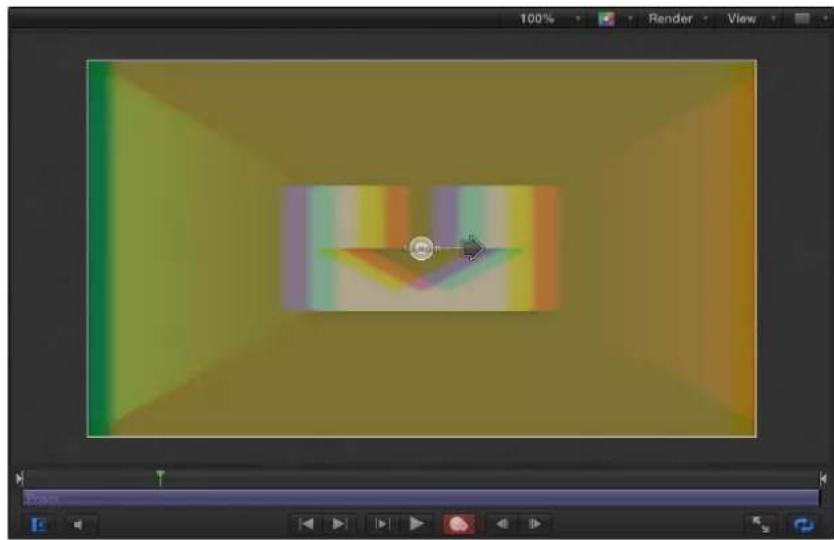
natural_image
Screenshot of a 3D graphics editing interface showing a gradient color scheme and a small circular button (no text or symbols)c At frame 200, set Amount to 0.
When you play the project, Transition A fades into Transition B with a prism blur that moves right, then left.
10 Choose File > Save, then do the following:
a In the save dialog, enter a name for the template.
If you don't specify a name, the template appears in the Final Cut Pro Transitions Browser as "New Template."
b Choose a category from the Category pop-up menu.
You can also create a custom category. Categories appear in the Motion Project Browser and the Final Cut Pro Transitions Browser.
c If needed, choose a theme from the Theme pop-up menu.
You can also create themes. Themes appear in the Motion Project Browser and the Final Cut Pro Themes Browser. A theme is a metadata tag that helps categorize templates. For more information on Motion Project Browser themes and categories, see About the Project Browser on page 146.
d To retain unused media in the project (media or audio in the Media list that is not used in the template), select "Include unused media."
e If you want a preview movie to appear in the Motion Project Browser, select Save Preview Movie.
After the prism blur transition is applied to the Final Cut Pro X Timeline, its duration can be easily modified. For more information transition duration, see Final Cut Transition template on page 388.
Create and edit a generator
Create a generator template
Use the Final Cut Generator template to create a custom generator for use in Final Cut Pro X. A generator template is similar to a standard Motion project. However, when saved, it is exported to the Generators Browser in Final Cut Pro.
Like any content added to a Final Cut Pro project, a generator template can be composited over a clip in the Final Cut Pro Timeline, or added to the main Timeline. The duration of the generator in Final Cut Pro is determined by its duration when created and saved in Motion.
For detailed information on the Project Browser, see About the Project Browser on page 146. For information on working with generators in Final Cut Pro X, see Final Cut Pro X Help.
Create a new generator template
1 In Motion, choose File > New From Project Browser (or press Option-Command-N).
The Project Browser appears.
2 In the Project Browser, click Final Cut Generator, then choose a project size from the Preset pop-up menu.

Important: Be sure to create the template at the highest resolution you will use in your Final Cut Pro project. If you are creating 4K-specific templates, you can enable a setting that allows the Final Cut Pro media browsers to display only templates designed for use in 4K projects. For more information, see Template resolution on page 433.
3 Click Open (or press Return).
If the correct preset is already chosen, you can double-click Final Cut Generator in the Project Browser.
A new, untitled project opens. The project contains no placeholders.
4 Build the project as you would any other Motion project, using shapes, text, behaviors, camera animation, and so on.
Note: You can also add drop zones to create additional effects, such as a picture-in-picture effect. Drop zones allow Final Cut Pro X users to place media into designated regions of the applied effect. For more information about adding drop zones to a Motion project, see Drop zones overview on page 197.
5 To allow Final Cut Pro users to modify specific parameters, choose Publish from the Animation pop-up menu of each parameter you want to make accessible.
Publishing a parameter makes its user interface control (the slider, checkbox, or dial) available in the Final Cut Pro Inspector when the custom effect is applied to a clip. Published parameters can be adjusted and keyframed in Final Cut Pro. For more information, see Publishing parameters in templates overview on page 420.
Note: If you have many parameters that you want to control with a single control, you can rig the parameters to a slider, pop-up menu, or checkbox. When the rig controls are published with a template, the slider, pop-up menu, or checkbox becomes available in the Final Cut Pro X project. For more information, see Rigs and widgets overview on page 370.
6 Choose File > Save, then do the following:
a In the save dialog, enter a name for the template.
If you don't specify a name, the template appears in the Final Cut Pro Generators Browser as "New Template."
b Choose a category from the Category pop-up menu.
You can also create a custom category. Categories appear in the Motion Project Browser and the Final Cut Pro Effects Browser.
c If needed, choose a theme from the Theme pop-up menu.
You can also create themes. Themes appear in the Motion Project Browser and the Final Cut Pro Themes Browser. A theme is a metadata tag that helps categorize templates. For more information on Motion Project Browser themes and categories, see About the Project Browser on page 146.
d To retain unused media in the project (media or audio in the Media list that is not used in the template), select "Include unused media."
e If you want a preview movie to appear in the Motion Project Browser, select Save Preview Movie.
7 Click Publish.
The template is saved and exported to the Final Cut Pro Generators Browser.
Modify a Final Cut Pro X generator
Many presets in the Final Cut Pro X Generators Browser were created in Motion. You can modify these presets in Motion, then save them as generators in Final Cut Pro.
Modify a Final Cut Pro X generator in Motion
1 In Final Cut Pro X, click the Generators Browser button in the toolbar.
The Generators Browser appears.
2 Locate the generator to edit.
To preview the generator, move the pointer over the generator's thumbnail.
3 Control-click the generator and do one of the following:
- If the generator is a Final Cut Pro preset, choose "Open a copy in Motion" from the shortcut menu.
A copy of the project opens in Motion.
- If the generator is a template created in Motion, choose "Open in Motion" from the shortcut menu.
The original project opens in Motion.
4 Modify the project in Motion, then do one of the following:
- To save a copy of the Final Cut Pro preset with the default name, choose File > Save.
- To save a copy of the Final Cut Pro preset with a new name, choose File > Save As, complete the save dialog information, then click Publish.
- To save the updated Motion-created template and overwrite the original version, choose File > Save.
- To save the updated Motion-created template as a copy, choose File > Save As, complete the save dialog information, then click Publish.
Note: When a preset Final Cut Pro generator is applied to the Final Cut Pro Timeline and then modified in Motion, the saved changes do not affect instances of the template in the Final Cut Pro Timeline. However, after the modified version of the preset is applied to the Final Cut Pro Timeline, any subsequent changes made in Motion to the template affect instances of the generator in the Final Cut Pro Timeline.
The template is saved and appears in Generators Browser in Final Cut Pro.
Publish a standard Motion project as a Final Cut Pro X generator
When possible, use the Final Cut Effect, Title, Transition, and Generator templates to create effects content for Final Cut Pro X. However, if necessary, you can convert a standard Motion project for use in Final Cut Pro. There are two ways to do this:
- Publish the Motion project as a Final Cut Generator, which exports the template to the Final Cut Pro Generators Browser, where it can be applied to the Timeline and edited like any other generator.
- Save the Motion project as a QuickTime file, then import the QuickTime movie into the Final Cut Pro project like any other footage.
Although you cannot add an Effect Source, Transition A, Transition B, or Title Background placeholder to a Motion project, you can add standard drop zones, which let Final Cut Pro users insert customized content into the generator.
Like template projects, standard Motion projects let you publish specific parameters to the Final Cut Pro inspector. For more information on publishing parameters, see Publishing parameters in templates overview on page 420.
Publish a standard Motion project as a generator in Final Cut Pro
1 When you save your project, choose File > Publish Template.
2 In the save dialog, enter a name for the template, complete the other options, then select Publish as Final Cut Generator.
For more information about save dialog options for templates, see Create a generator template on page 416.
3 Click Publish.
The template is saved and appears in Generators Browser in Final Cut Pro.
Use images in template placeholders
When creating a custom template for Final Cut Pro X, you can add an image to a placeholder layer to preview the effect you are building.
Important: When adding preview media to a placeholder, use a still image rather than a video clip, which can introduce timing conflicts in Final Cut Pro.
Add a placeholder image to a template
Do one of the following:
- From the File Browser or Library, drag an image onto the placeholder arrow in the Canvas. When the pointer becomes a curved arrow, release the mouse button.
- From the File Browser or Library, drag an image to the Effect Source layer in the Layers list. When the pointer becomes a curved arrow, release the mouse button.
When you publish the template, the image is saved with the template. If you replace the image placeholder after you've saved the template, you have the option to save the new image with the new template.
Replace an image in a template saved with media
1 To replace a reference placeholder image, do one of the following:
- From the File Browser or Library, drag an image onto the placeholder arrow in the Canvas. When the pointer becomes a curved arrow, release the mouse button.
- From the File Browser or Library, drag an image to the Effect Source layer in the Layers list. When the pointer becomes a curved arrow, release the mouse button.
2 Choose File > Save (or press Command-S).
The "Media exists outside the document. Do you wish to copy it?" dialog appears.
3 Do one of the following:
- To save the new image with the template in the /Users/username/Movies/ folder, click Copy.
- To save the template without the new image, click Don't Copy.
When you save a template, media used in the project is stored on your computer in the same folder as the template (/Users/username/Movies/Motion Templates/), potentially creating multiple instances of media files and taking up valuable hard disk space. If the "Include unused media" checkbox is selected in the template's save dialog, media in the Media pane (the storage area for media not used in the project) of the Motion project is also saved to this location.
To clear media from a template placeholder
To prevent creating duplicates of images on your hard disk, you can clear placeholder images from templates before saving. When you clear a placeholder image, its source media is not loaded into Motion the next time you modify the template (by choosing the "Open a copy in Motion" command in the Final Cut Pro media browsers).
1 In the template project, select an Effect Source, Title Background, Transition A, or Transition B placeholder.
2 In the Image Inspector, click the Clear button in the Final Cut Placeholder controls.
The preview media is removed from the template, and the placeholder arrow reappears in the affected layer.

Manually remove media saved with a template
1 In the Finder, go to the /Users/username/Movies/Motion Templates/ folder.
2 In the appropriate Effects, Titles, or Transitions folder, open the theme folder that contains your template, the open the Media folder.
3 Drag the media to the Trash.
Saving a template containing a source image in the placeholder saves the image to the template's Media folder (/Users/username/Movies/Motion Templates/). If you replace the placeholder image and save the template again, a dialog may appear stating "Media exists outside the document. Do you wish to copy it?" Click Copy to save the new image with the template media.
Publishing parameters in templates
Publishing parameters in templates overview
When you create a template (an effect, transition, title, or generator) for Final Cut Pro X, you can publish nearly any parameter. Publishing a parameter places its user interface control (a slider, dial, checkbox, and so on) in the Final Cut Pro inspector, where that control can be adjusted to modify an applied effect, transition, title, or generator. Publishing parameters also lets you decide how much control (if any) a Final Cut Pro user has over modifying an effect.
When creating templates in Motion, you have the following publishing options:
- Publish no parameters, making the effect a nonmodifiable preset with no adjustable controls in the Final Cut Pro inspector.
- Publish specific parameters, giving users limited control over modifications made in the Final Cut Pro inspector.
- Publish rig widgets, which map multiple parameters to a few pop-up menus, sliders, or checkboxes. (For a step-through example of creating a Final Cut Effect that includes a rig, see Advanced example: Create an SLR effect template using rigging on page 397.)
The easiest way to publish a parameter from Motion to Final Cut Pro is to choose the Publish command from the parameter's animation pop-up menu (the downward arrow on the right side of a parameter row in the Inspector). When you save the template, the published parameter is exported with the effect to Final Cut Pro.
When you publish a compound parameter (a parameter with nested subparameters), the parameter and its subparameter controls appear in the Final Cut Pro inspector, like any other published parameter. If the subparameter controls are not visible, click the disclosure triangle next to the parameter name in the Final Cut Pro inspector.
You can also publish onscreen controls for filters (in addition to filter parameters). When you do so, onscreen controls for the published filter become available in the Final Cut Pro Viewer.
Using rigs in templates
You can map multiple parameters to a single control in Final Cut Pro by adding rigs to the template and publishing them. Rigs let you link parameters to a slider, pop-up menu, or checkbox to simplify or limit the allowable adjustments in a Motion or Final Cut Pro project. When you publish a rig control (known as a widget) in Motion, a master slider, pop-up menu, or checkbox appears in the Final Cut Pro inspector, enabling editors to make complex effect adjustments with simplified controls. For more information about rigs and widgets, see Rigs and widgets overview on page 370.
In addition to publishing parameter controls, you can publish a checkbox that lets Final Cut Pro users toggle the effect of a filter or behavior used in the template. You do this in Motion by publishing the header row (the row with the blue activation checkbox) of a behavior or filter. When the template is saved in Motion and applied to a clip in Final Cut Pro, a checkbox with the name of the published filter or behavior appears in the Final Cut Pro inspector. Deselecting the checkbox disables the effect of that filter or behavior (including its constituent parameters).
Items not published in Final Cut Pro
The following Motion items cannot be published in templates for Final Cut Pro:
- Audio of any kind, including Source Audio wells in the Audio Parameter behavior
• Image wells (except for drop zone Source Media wells) - Mini-curve editors
- Timing controls in the Image Inspector or Media Inspector
- Retiming behaviors (such as Ping Pong, Loop, and Stutter)
- Some rig widget options (Slider: Range Minimum/Range Maximum)
• The Pan and Scale parameters in template placeholders - Project properties (such as Pixel Aspect Ratio, Frame Rate, and Background Color in the Properties Inspector)
- Some Keyer filter and Luma Keyer filter parameters
• Noncompound groups of controls, such as the Lighting parameter in the Properties Inspector - Onscreen path for the Motion Path behavior
Note: Although you can publish a Motion Path behavior to Final Cut Pro, the path does not appear in the Final Cut Pro Viewer.
Items not supported in Final Cut Pro
In general, Motion lets you publish most parameters in the application. However, some publishable parameters are not supported in Final Cut Pro. The following items have components that are not accessible after a template is added to a Final Cut Pro project:
- Parameters related to text path onscreen controls
- Mask or shape control points
- Parameters with deselected activation checkboxes
• The Histogram in the Levels color correction filter
• Audio behavior parameters
Note: Audio files saved in a Motion template are not available in Final Cut Pro.
Publish parameters in templates
The following tasks describe how to publish parameters, compound parameters, rig controls, and other template elements.
Publish a parameter in a template
1 In the effect, transition, title, or generator template, select the image layer, filter, or behavior containing the parameter to publish.
2 In the selected item's Inspector, do one of the following:
- Click the parameter's Animation menu (the downward triangle that appears when you place the pointer over the right side of the parameter row), then choose Publish.
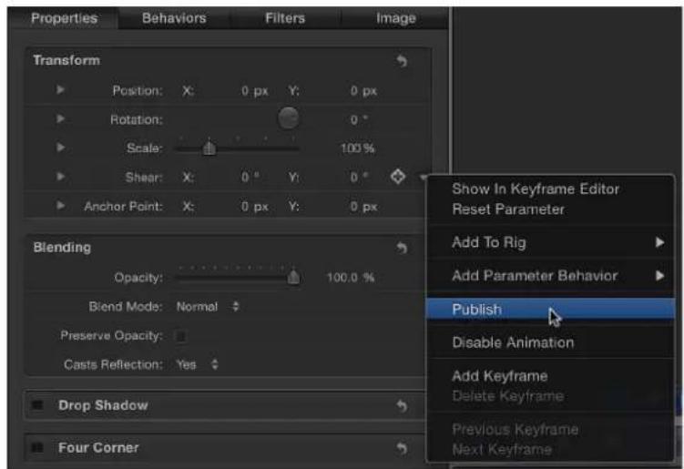
- Control-click the parameter's name, then choose Publish from the shortcut menu.
Publish a compound parameter (a parameter with nested subparameters)
1 In the template project, select the image layer or effects object containing the compound parameter to publish.
2 Open the selected item's Inspector.
To publish a compound parameter to Final Cut Pro in a collapsed state (its subparameters hidden by a disclosure triangle), make sure the parameter's disclosure triangle is closed.
To publish a compound parameter in an expanded state (disclosure triangle open and its subparameters exposed), make sure the parameter's disclosure triangle is open.
3 Do one of the following:
- Click the parameter's Animation menu (the downward triangle that appears when you place the pointer over the right side of the parameter row), then choose Publish.
- Control-click the parameter's name, then choose Publish from the shortcut menu.
The parameter and its subparameter controls are published. When the template is applied to a clip in Final Cut Pro, the compound parameter retains its state (collapsed or expanded) at the time of publishing. If the result is not what you expected, click the disclosure triangle in the Final Cut Pro Inspector to expand or collapse the subparameters manually.

—Published Rotation parameter in the Publishing pane of the Motion Project Inspector
Note: Examples of parameters with subparameters include Scale (with X, Y, and Z values) and Shear (with X and Y values).
Publish subparameters of a compound parameter
You can also publish specific subparameters of a compound parameter. This is a good way to limit an editor's control over effects parameters in Final Cut Pro project.
1 In the template project, select the image layer or effect object containing the subparameter to publish.
2 In the item's Inspector, click the compound parameter's disclosure triangle to show its subparameters.
3 For each parameter to publish, do one of the following:
- Click the parameter's Animation menu (the downward triangle that appears when you place the pointer over the right side of the parameter row), then choose Publish.
- Control-click the parameter's name, then choose Publish from the shortcut menu.
The subparameter is listed in the Published Parameters list.
Publish an on/off checkbox for a filter or behavior
1 Select the filter or behavior whose activation checkbox you want to publish.
2 In the Behaviors or Filters Inspector, do one of the following:
- In the header row of the behavior or filter, click the Animation menu (the downward triangle that appears when you place the pointer over the right side of the row), then choose Publish.
- Control-click the behavior or filter name, then choose Publish from the shortcut menu.
Note: If you publish only the blue activation checkbox and no other parameters in the behavior or filter's group of controls, only the checkbox is published.
Publish a rig control (widget)
1 Add a rig to the template, assigning specific parameters to the rig's widget controls.
For more information about building rigs, creating widgets, and assigning parameters, see Rigs and widgets overview on page 370.
2 Select the rig, then do one of the following in the Rig Inspector:
- In the Checkbox, Pop-up, or Slider widgets, click the Animation menu (the downward triangle that appears when you place the pointer over the right side of the widget's parameter row), then choose Publish from the shortcut menu. - Control-click the Checkbox, Pop-up, or Slider parameter name, then choose Publish from the shortcut menu.
Publish a gradient editor
1 In the template project, select the image layer or effect object that contains the gradient editor to publish.
2 In the item's Inspector, Control-click the Gradient parameter, then choose Publish from the shortcut menu.
Gradient editor controls are published when the template is saved.
Publish a filter's onscreen controls
1 In the template project, select the filter object.
2 In the Filters Inspector, select the Publish OSC checkbox.

Select the Publish OSC checkbox to publish the filter's onscreen controls.
The Inspector parameters that onscreen controls manipulate are not published with the template. To control the parameters numerically when the template is added to a Final Cut Pro X project, the parameters must also be published.
For more information about filter onscreen controls, see Adjust filter onscreen controls on page 749 and Publish filter parameters and onscreen controls on page 755.
Note: To animate onscreen control values in the Final Cut Pro X curve editor, the onscreen controls must be published.
Review parameters set to be published in a template
1 In the Layers list, click Project.
2 In the Project Inspector, click Publishing.
Parameters (for all object types) set to be published appear in the list.
Reorder parameters in the Publishing pane
1 In the Layers list, click Project.
2 In the Project Inspector, click Publishing.
3 Drag a parameter up or down in the Published Parameters list.
Customize a published parameter name in a template
1 In the Layers list, click Project.
2 In the Project Inspector, click Publishing.
3 In the Published Parameters list, double-click the name of a parameter, enter a name, then press Return.
Note: To navigate to the originally published parameter (before the name change), Control-click the parameter and choose Reveal Original Parameter.
Unpublish a parameter in the Inspector
In the image layer or effect object's Inspector, do one of the following:
- Click the parameter's Animation menu (the downward triangle that appears when you place the pointer over the right side of the parameter row), then choose Unpublish.
- Control-click the parameter name, then choose Unpublish from the shortcut menu.
Unpublish a parameter in the Publishing pane
1 In the Layers list, click Project.
2 In the Project Inspector, click Publishing, then do one of the following:
- Click the Animation menu (the downward triangle that appears when you place the pointer over the right side of the parameter row), then choose Unpublish from the shortcut menu.
- Control-click the parameter name, then choose Unpublish from the shortcut menu.
Publishing text parameters
When you apply a Final Cut Title template or Final Cut Generator template containing text to a clip in Final Cut Pro X, a default Text pane appears in the Final Cut Pro X inspector. The Final Cut Pro Text pane contains many of the same parameter controls as the Motion Text Inspector (Font, Size, Alignment, and so on).
When a Final Cut Title or Final Cut Generator template contains published text parameters, those parameters appear in a separate pane in the Final Cut Pro inspector: the Title pane. To modify advanced text parameters in Final Cut Pro, publish them before saving the template in Motion.
For information on text parameters in the Format, Style, and Layout panes in the Text Inspector, see Text overview on page 612.
You can also edit text in an applied Final Cut Pro template using onscreen controls in the Final Cut Pro Viewer. Text in a generator, title, or effects template can be edited using these onscreen text controls. If the text was saved in Motion in Paragraph layout (in the Layout pane of the Text Inspector), the text appears with the rulers in the Final Cut Pro Viewer when you double-click the text in the Viewer. If the text was saved in Motion with Type selected from the Layout Method pop-up menu, the text appears on a single line in the Final Cut Pro Viewer, with an onscreen transform tool.
For more information on working with text in Final Cut Pro, see Final Cut Pro X Help.
The Text pane in the Final Cut Pro inspector includes many of the same controls available in the Motion Text Inspector. If you want to control a parameter not included in the following list, publish that parameter in the title or generator template in Motion.
Format parameters in the Final Cut Pro inspector
The Text pane in the Final Cut Pro inspector contains the same basic formatting parameters as the Format pane of the Motion Text Inspector (except for the Collection pop-up menu):
- Font pop-up menu
- Typeface pop-up menu
- Size slider
- Alignment buttons
• Vertical Alignment buttons - Line Spacing slider
- Tracking slider
- Kerning slider
- Baseline slider
- Text Style preset pop-up menu (unlabeled)
Face parameters in the Final Cut Pro inspector
The Text pane in the Final Cut Pro inspector contains the following Face parameters, which correspond to the same parameters in the Style pane of the Motion Text Inspector:
• Color/Gradient/Texture controls
- Opacity slider
- Blur slider
Outline parameters in the Final Cut Pro inspector
The Text pane in the Final Cut Pro inspector contains the following Outline parameters, which correspond to the same parameters in the Style pane of the Motion Text Inspector:
• Color/Gradient/Texture controls
- Opacity slider
- Blur slider
- Width slider
Glow parameters in the Final Cut Pro inspector
The Text pane in the Final Cut Pro inspector contains some of the Glow parameters that appear in the Style pane of the Motion Text Inspector:
• Color/Gradient/Texture controls
- Opacity slider
- Blur slider
- Radius slider
Drop Shadow parameters in the Final Cut Pro inspector
The Text pane in the Final Cut Pro inspector contains the following Drop Shadow parameters, which correspond to the same parameters in the Style pane of the Motion Text Inspector:
• Color/Gradient/Texture controls
- Opacity slider
- Blur slider
- Distance slider
- Angle dial
- Text editor field
Note: When you publish a text parameter already in the Text pane of the Final Cut Pro inspector, the parameter appears in the Title pane and the Text pane of the Final Cut Pro inspector. Changes made to the parameters in the Title pane affect the same parameters in the Text pane, and vice versa.
Although you can publish nearly any Motion text parameter, not all associated controls are available after the template is applied to a clip in Final Cut Pro. For example, if the Layout Method parameter is set to Path, you can edit the text path in Motion's Canvas using the path onscreen controls. In Final Cut Pro, the text appears along the shape of its path, but no onscreen controls are available to change the shape of the path in the Final Cut Pro Viewer. If the Layout Method parameter is published, you can change the Layout Method in Final Cut Pro from Path to Paragraph or Line, for example.
Animation and timing in templates
Effect, title, transition, and generator templates can include animation like a standard Motion project. When the template is added to a clip in Final Cut Pro X, animation in the placeholder is applied to the clip, whether created by behaviors or keyframes.
Animation in the template that is longer than the duration of the clip to which it's applied in Final Cut Pro is scaled to fit.
Important: If you don't want your template animation scaled to fit the duration of the clip it is applied to in Final Cut Pro, you can use markers to designate segments where the animation is locked. Additionally, you can use markers to designate sections where animation loops indefinitely in the Final Cut Pro project. For more information, see Template markers overview on page 428.
Animation guidelines
When publishing parameters in your templates, consider the following guidelines:
- When possible, avoid publishing keyframed parameters. Published keyframes can cause unexpected results when you edit or further animate the parameters in the Final Cut Pro Inspector.
- Do not publish a parameter that is controlled by a behavior. For example, if you publish an Opacity parameter that is controlled by an applied Fade In/Fade Out behavior, you cannot adjust the opacity parameter after the template is added to the Final Cut Pro project.
- Because the duration of templates often conflicts with the duration of the Final Cut Pro clips they are applied to, try to publish nonanimated parameters in the template, then keyframe those parameters in Final Cut Pro.
- Use behaviors instead of keyframes in templates when possible. Behaviors can be a more flexible animation tool for templates. Behaviors don't rely on specific timing or use keyframes to create an animation. Publish behavior parameters that you want to control in Final Cut Pro.
For more information on working with keyframes, see Keyframing overview on page 439. For more information on using behaviors, see Behaviors overview on page 293.
Depending on the template type, different timing rules apply when the template is added to the Final Cut Pro Timeline.
Timing guidelines
Depending on the template type, different timing rules apply when the template is added to the Final Cut Pro Timeline:
- Final Cut Effect: When you apply an effect template in Final Cut Pro, the effect is integrated into the clip. For example, when a color-correction effect template that is 300 frames in Motion is saved and applied to a 2,300-frame clip in Final Cut Pro, the resulting effect is 2,300 frames.
Animated effect templates are also scaled according to the duration of the clip they are applied to in Final Cut Pro. For example, if a template in Motion is 300 frames long, and the placeholder layer is animated to rotate 360 degrees (one complete rotation) from frames 0 to 300, when the template is applied to a 900-frame clip in Final Cut Pro, the complete rotation is stretched to 900 frames.
You can override the timing adjustment in Final Cut Pro by applying markers to the template in Motion. For example, to control frame-counting effects, such as Timecode generators or grain effects, apply special markers to instruct Final Cut Pro when to play specific ranges of the template. For more information, see Add template markers on page 432.
- Final Cut Transition: In Final Cut Pro, the default transition duration is set in the Editing pane of Final Cut Pro Preferences. When you apply a transition template to an edit point in the Final Cut Pro timeline, the duration of the transition effect is modified to the default transition duration. For example, in a Final Cut Pro Broadcast HD 1080 project (29.97 fps) with a default transition duration of two seconds, an applied 300-frame transition template is compressed to 60 frames (2 seconds at 29.97 fps).
To override the transition duration setting in Final Cut Pro Preferences, select the Override FCP checkbox in the Properties Inspector in Motion. If this checkbox is selected when the transition is saved, the transition retains its original duration when added to the Final Cut Pro project.
Whether the transition duration uses the Final Cut Pro default or is overridden, you can adjust the in and out points of the transition in the Final Cut Pro Timeline.
- Final Cut Title: When added to a Final Cut Pro project, a title template is anchored to the clip to which it is applied. Its duration is based on the duration of the template in Motion. After the title is applied, you can adjust its duration in the Final Cut Pro Timeline.
- Final Cut Generator: When added to a Final Cut Pro project, a generator template uses its default duration (its duration when the template was created and saved in Motion). After the generator is applied, you can adjust its duration in the Final Cut Pro Timeline.
Template markers
Template markers overview
Markers are visual reference points you add to the Timeline to identify specific frames. There are several different types of markers. The first type, known as Standard, is designed for use in Motion and has no effect if saved in a Final Cut template. The Standard marker type can be added to an object (an object marker) or to the overall project (a project marker). The remaining marker types, known as template markers, are designed to control the timing of templates in Final Cut Pro X.
For basic information on using working with markers in the Timeline, see Markers overview on page 286.
When building a template, you typically don't know the duration of the clips it will be applied to in Final Cut Pro. Template markers let you control the timing of a template after it is applied in Final Cut Pro by designating regions in the Timeline to be played, ignored, or looped to match the duration of the target clip. You can also designate a specific frame to be used as the template's thumbnail in the Final Cut Pro Effects, Transitions, or Titles Browser.
Template marker types
Template markers fall into five categories:
- Build In: Build In markers instruct Final Cut Pro X to play an intro animation in specific instances.
- Build Out: Build Out markers instruct Final Cut Pro to play an outro animation in specific instances.
- Loop: Loop markers indicate where the template should begin looping playback.
- Poster Frame: Poster Frame markers determine the frame of a template to be used as the thumbnail for the template in the Final Cut Pro Effects Browser, Transitions Browser, or Titles Browser.
- Text Edit: Text Edit markers identify ideal edit points in your title templates.
Build In markers designate the end point of an intro section of a template, and instruct Final Cut Pro to play that section at the same speed as the original template (as created in Motion), regardless of the duration of the clip in the Final Cut Pro Timeline. Build Out markers designate the start of an outro section of a template, and instruct Final Cut Pro to play that section at the same speed as the original template (as created in Motion), regardless of the duration of the clip in the Final Cut Pro Timeline.
You can also specify a build-in or build-out section as optional. When you add the optional Build In or Build Out marker, a corresponding checkbox is added to the Publishing pane of the Project Inspector in Motion. When you apply a template to a project, the checkbox also appears in the Final Cut Pro Inspector. Deselect the checkbox to disable the build-in or build-out portion of the effect.
When you add Build In, Build Out, or Loop template markers to a Motion project, the Timeline ruler displays a gold glow over the affected region.
If no Build In or Build Out markers are present, the entire template is time-stretched to correspond to the duration of the clip when applied in Final Cut Pro. If Build In or Build Out markers are present, only the portion of the Motion project between the marker-defined intro or outro section is time-stretched; the marker-defined region retains its original timing. When creating templates, use template markers to control which portions of the effect, title, transition, or generator are time-stretched and which portion are left alone.
Note: Transition templates assume a default duration in Final Cut Pro (determined in Final Cut Pro Preferences). This duration can conflict with the effects of these marker types. For example, you might specify that the intro animation of a transition lasts for 45 frames, while the default duration in Final Cut Pro is set to 30 frames for the entire transition. To override the Final Cut Pro default duration, select the Override FCP checkbox in the Project Properties Inspector of Motion. For more information, see Create a transition template on page 409.
The marker types include:
- Build In – Mandatory: Indicates the last frame of an intro section. Frames between the beginning of the project and the Build In – Mandatory marker play for the duration specified in the Motion project.
This intro is always played, regardless of where the template is placed in the Final Cut Pro Timeline.
- Build In – Optional: Sets the last frame of an intro section. When a Build-In Optional marker is added to a template, a Build In checkbox is published (added to the Published Parameters list in the Publishing pane of the Project Inspector). After the template is added to a Final Cut Project, the Build In checkbox appears in the Inspector.
When the Build In checkbox is selected in the Final Cut Pro Inspector, frames between the beginning of the project and the Build In – Optional marker play at the duration specified in the Motion project. When the checkbox is deselected, frames before the marker are not played.

The intro section is played only when the Build In checkbox is selected in the Final Cut Pro Inspector.
- Build Out – Mandatory: Sets the first frame of an outro section. Frames between the Build Out – Mandatory marker and the end of the project play for the duration specified in the Motion project.
This outro is always played, regardless of where the template is placed in the Final Cut Pro Timeline.
- Build Out – Optional: Sets the first frame of an outro section. When a Build Out – Optional marker is added to a template, a Build Out checkbox is published (added to the Published Parameters list in the Publishing pane of the Project Inspector). After the template is added to a Final Cut Project, the Build In checkbox appears in the Inspector.
When the Build Out checkbox is selected in the Final Cut Pro Inspector, frames between the Build Out – Optional marker and the end of the project play at the duration specified in the Motion project. When the checkbox is deselected, frames before the marker are time-stretched and frames after the marker are not played.
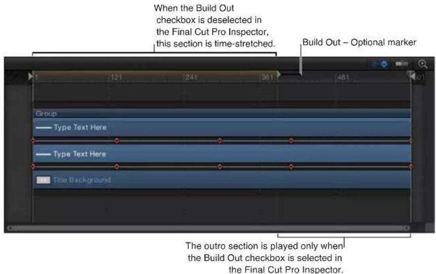
- Project Loop End: Sets the last frame of the section to be included when the template is used in Final Cut Pro. When playback reaches this frame, the project plays from the beginning of the project or from the Build In marker, if present. Frames beyond the Project Loop End marker are never played.

Setting a marker type to Project Loop End changes any marker set to a Build Out type back to Standard. Similarly, if a Project Loop End marker exists, adding an Outro marker resets the loop marker back to Standard.
Tip: Adding a loop marker to the second frame in a template signals that the effect is time-invariant—the first frame of the project loops forever. This can be useful for generators that do not contain animation, such as a solid color generator, or for filters that are not animated by default, such as a color correction filter.
Note: Templates with applied Time filters (Echo, Scrub, Strobe, Trails, or WideTime) should not use Loop markers, because unexpected timing results can occur.
- Poster Frame: Sets the frame to be used as the template's thumbnail in the Final Cut Pro Effects, Transitions, or Titles Browser.
- Text Edit: Defines the optimal edit points for text. For example, if your title animates offscreen, you can add a Text Edit marker to quickly navigate to a frame where the text is visible in the Final Cut Pro Viewer.
Add template markers
To create a Build In, Build Out, Project Loop End, or Poster Frame marker, you must first add a project marker to a Motion project, then change its type in the Edit Marker dialog.
Add a project marker (Build In, Build Out, Project Loop End, or Poster Frame marker)
1 Position the playhead on the frame where you want the marker to appear.
2 Do one of the following:
- Press Shift-M.
- Ensure that no objects in the project are selected, then choose Mark > Markers > Add Marker.
- Ensure that no objects in the project are selected, then press M or the Tilde key (').
- Ensure that no objects in the project are selected, Control-click the Timeline ruler, then choose Add Marker from the shortcut menu.
A green marker appears in the Timeline ruler, and a green vertical line appears in the mini-Timeline.
Add an object marker (Text Edit marker)
1 Place the playhead at the frame where you want the marker.
2 Select the text to add the marker to, then do one of the following:
- Choose Mark > Markers > Add Marker.
- Press M.
A red marker is added to the bar of the selected object.
In the Final Cut Pro Timeline, double-click the title to enter text-edit mode. In the Viewer, use the Next Text Layer and Previous Text Layer buttons to navigate between Text Edit markers. For more information about working with titles in Final Cut Pro, see Final Cut Pro X Help.
Move a marker
- Drag the marker to a position in the Timeline ruler.
When you drag the marker, the current frame is displayed above the pointer.
Change the marker type
1 Do one of the following:
- Position the playhead over the marker, then choose Mark > Markers > Edit Marker.
• Double-click the marker. - Control-click the marker, then choose Edit Marker from the shortcut menu.
2 In the Edit Marker dialog, choose a marker type from the Type pop-up menu.
The Build In and Build Out markers appear as small green arrows in the Timeline ruler. The Project Loop Out marker appears as a small orange arrow. At the top of the ruler, the area specified as the intro, outro, or loop section displays a gold glow.
For more information on the Edit Marker dialog, see Markers overview on page 286.
Template resolution
Before you create a template, decide what resolution your project requires. Although the template scales to fit the resolution of the Final Cut Pro X project it is applied to, you should create the template at the highest resolution you will use.
Additionally, several display aspect ratio settings for the template can be saved in a single template project. For example, if your template was created at a 16:9 aspect ratio, you can easily create a 4:3 version of it in the same project. When the template is applied to a Final Cut Pro project, Final Cut Pro applies the aspect ratio that matches the project. For more information, see Add multiple display aspect ratios to a template on page 435.
Note: An image added to a placeholder is fit based on the template project settings. Because the image in the placeholder is not used when the template is applied to a Final Cut Pro project, stretching or scaling of the media does not affect the Final Cut Pro clip the template is applied to.
When you create templates with 4K resolution, you can add a metadata flag so that Final Cut Pro users can quickly find 4K templates (and filter out all non-4K templates). You do this by selecting the Designed for 4K checkbox in the Properties Inspector of the Project layer. (This checkbox appears only in effect, transition, generator, or title projects.) When you save the project, the template is exported to Final Cut Pro with metadata indicating that the template has 4K resolution. To show only 4K templates in Final Cut Pro media browsers, select the "4K-ready content only" checkbox. (The "4K-ready content only" checkbox appears only in Final Cut Pro projects using one of the 4K or 5K formats.)
Flag a template as having 4K resolution
In the Layers list, select the Project layer and then select the Designed for 4K checkbox in the Properties Inspector.
After the template is published to Final Cut Pro, select the "4K-ready content only" checkbox in the Final Cut Pro media browsers to display only templates designed for use in 4K projects.
Using masks in templates
You can use shapes and masks in any Final Cut template type.
In general, use of shapes should be limited to generator templates. Shapes are ideal generator template elements because they can be scaled in Final Cut Pro X without degradation. (However, too many shapes in a template can adversely impact performance in Final Cut Pro.)
When you add a shape to a placeholder layer, the shape is converted to a mask. When a template with a masked placeholder is applied to a clip in Final Cut Pro, the mask is applied to the clip. Objects in the template outside the placeholder are not affected.
You can publish mask parameters (Roundness, Feather, and Mask Blend Mode, and so on) so they are editable in Final Cut Pro. However, the onscreen mask controls in Motion are not available in Final Cut Pro. To reposition a template mask in Final Cut Pro, publish the mask's transform parameters (located in the mask's Properties Inspector). For more information on publishing, see Publishing parameters in templates overview on page 420.
For more information on working with shapes and masks, see Shapes, masks, and paint strokes overview on page 828.
Template files and media save location
When you save a template, the project and all associated files are saved in your /Users/username/Movies/Motion Templates/ folder, organized by template type. The template types include Compositions (templates created in Motion for use in Motion), Effects, Generators, Titles, and Transitions.
When a Final Cut Effect template is saved, it is saved to /Users/username/Movies/Motion Templates/Effects; a Final Cut Transition is saved to /Users/username/Movies/Motion Templates/Transitions, and so on.
When you save a template in Motion, you assign a category. For example, when you save a Final Cut Effect, choose an option from the Category pop-up menu in the save dialog, such as Blur, Distortion, or Stylize. After you save a template into a category, that category's folder appears in the corresponding folder on your computer (Effects, Titles, Generators, and so on).
Categories represent the how the effects are organized in the Final Cut Pro X media browsers. For example, in the Final Cut Pro Effects Browser, video effect categories include Basics, Blur, Distortion, Keying, Light, Looks, Stylize, and Tiling. In Motion, a Final Cut Effect template saved to the Blur category is placed in the Finder in the /Users/username/Movies/Motion Templates/Effects/Blur/your template name folder.
You are not limited to the preset Final Cut Pro browser categories. You can create a template category by choosing New Category from the Category pop-up menu in the template save dialog. Custom categories also appear in Final Cut Pro browsers.
You can further organize templates using Themes. A theme is a metadata tag attached to a template that assists in categorizing different templates as being part of a single family. For example, you may have different template types that are related to the same project, such as a transition, an effect, and a group of titles. By tagging the templates with the same theme, all templates, regardless of their template type, appear in the Final Cut Pro Themes Browser.
Themed templates also appear in other effects browsers. For example, a themed Final Cut Title template appears in the Final Cut Pro Themes Browser as well as in the Titles Browser (underneath the nonthemed templates).
Assigning a theme to templates is optional.
In the Finder, templates are stored according to the following folder hierarchy: template type/category/theme. For example, a Final Cut Effect template saved to the Blur category and the News theme is stored in the Finder in the /Users/username/Movies/Motion Templates/Effects/Blur/News/your template name folder.
Note: You can also sort by theme in the Motion Project Browser using the Theme pop-up menu.
Each template folder contains the following items:
- large.png: This file is used for the preview in the Motion Project Browser and as a preview in the Final Cut Pro browser when the project loads in the background.
- small.png: This file is used for the thumbnail preview of the template in the Final Cut Pro browser. The current frame when the template is saved in Motion is used for the preview frame.
- yourtemplatename.mov: This file is used for the movie preview of the template that plays when the template is selected in the Motion Project Browser. This file is created when you select the "Save Preview Movie" checkbox before saving.
- yourtemplatename.moef, -.motn, -.moti, or -.motr: This is the Motion template's project document.
•.moef is the Final Cut Effect template extension.
- .motn is the Final Cut Generator template extension.
•.moti is the Final Cut Title template extension.
- .motr is the Final Cut Transition template extension.
- Media folder: This folder contains all media in the project—media used in the placeholder and other clips and images used in the project, including content such as particle cell sources. If you clear the media in the template placeholder before saving the template, that media is not saved in the Media folder.
Note: If you select "Include unused media" in the save dialog, media in the Media pane (the storage area for media not used in the project), is included in the Media folder.
Sharing Templates with Other Users
To share templates and associated media files between users and computers, place the associated template files in the same folder structure on another user's computer in the /Users/ username/Movies/Motion Templates/ folder.
Add multiple display aspect ratios to a template
When creating a template for Final Cut Pro X, you can build alternate versions that have different display aspect ratios—all within a single template. For example, when you create a template with a 16:9 aspect ratio, you can add an alternate version customized for 4:3 displays. When the template is applied to a clip Final Cut Pro, the editing application chooses the version that matches its display aspect ratio. These alternate display versions of a single template are called snapshots. Snapshots eliminate the need to create multiple versions of the same template for multiple display ratios.
You should add display aspect ratio snapshots if you expect to apply templates to clips of varying resolutions in Final Cut Pro, or to apply the same title or generator template in multiple Final Cut Pro projects with different resolutions.
If you expect a template to be applied to differently sized clips in Final Cut Pro, perform the workflow described in this section before saving the template.
Note: Pixel Aspect Ratio (PAR) is the ratio of the width of a pixel to its height. For example, NTSC pixels are slightly taller than they are wide. They have a pixel aspect ratio of 10/11 (approximately 0.9091). Display Aspect Ratio (DAR) is a ratio of the final displayed image's width to its height. For example, an iPad's display aspect ratio is 1.3333 (also written as 4:3), but broadcast NTSC has a display ratio of 1.3636. To calculate the display aspect ratio of an image from its dimensions and pixel aspect ratio, multiply the pixel aspect ratio by the width and divide by the height. The most common aspect ratios are 4:3 (also referred to as standard, 4x3, or 1.33:1) and 16:9 (widescreen, 16x9, or 1.78:1). Older monitors and televisions are generally 4:3, so the screen is 33 percent wider than it is high. Newer HD monitors and televisions are 78 percent wider than they are high.
Reconfigure a project for a different display aspect ratio
1 In the Layers list, select the Project object.
2 In the Project Inspector, click Snapshots.
The Display Aspect Ratio Snapshots list appears, showing the project's current default aspect ratio.
3 Click the Add button (+) and choose a different aspect ratio from the shortcut menu.

If you chose Custom, the Custom Display Aspect Ratio calculator appears.
The new aspect ratio appears in the Display Aspect Ratio Snapshots list and the project adjusts.
Note: You cannot add a snapshot that matches an existing Display Aspect Ratio snapshot.
4 To reposition your objects to better fit the new aspect ratio, click Edit Snapshot.
A small floating window appears, indicating that you are in aspect ratio-edit mode.
5 Position and scale the layers in your project to fit the new display aspect ratio, then click the Stop Rig Edit Mode button in the floating window.
Click the items in the Display Aspect Ratio Snapshots list to view the results in the Canvas.
Note: When working with an alternate snapshot, the resolution listed in the Properties pane of the Inspector (when Project is selected in the Layers list) may seem strange. This is because the Display Aspect Ratio is shown, rather than the Pixel Aspect Ratio.
6 Choose File > Save or File > Save As.
a In the save dialog, enter a name for your template.
b Choose a category from the Category pop-up menu.
c If needed, choose a theme from the Theme pop-up menu.
d To retain unused media in the project (media or audio in the Media list not used in the project), select "Include unused media."
When the template is applied to the Final Cut Pro Timeline, the template aspect ratio that matches the Final Cut Pro project is used.
Create a custom display aspect ratio (DAR) snapshot
1 In the Layers list, select the Project object.
2 In the Project Inspector, click Snapshots.
3 Click the Add button (+) and choose Custom from the shortcut menu.
4 Choose an option from the Pixel Aspect Ratio pop-up menu, such as NTSC D1/DV.
The pixel aspect ratio (PAR) appears in the field to the right of the pop-up menu.
5 Enter the width and height in the fields to the right of the PAR value, such as 720 x 480.
The new custom DAR is listed in the Display Aspect Ratio Snapshots list.
Tips for creating templates
To get the best results when creating custom templates, consider the following suggestions:
- The first time you save a template that is a work in progress, deselect the Save Preview Movie checkbox in the save dialog. Doing so prevents Motion from creating a movie preview each time you save the draft template. (The preview movie appears in the Motion Project Browser.) When you're ready to save the final version of the template, select the Save Preview Movie checkbox to create the preview movie.
- When creating complex templates that involve multiple drop zones, use a Final Cut Generator or Final Cut Title template.
- As with any project in Motion, too many effects (such as filters, text objects, and so on) adversely impact performance in Final Cut Pro X.
- Create animation using behaviors rather than keyframes. Behaviors are easier to modify when the template is applied in Final Cut Pro.
- Avoid publishing parameters animated with behaviors or keyframes. Published parameters allow template customization in Final Cut Pro.
- Shapes are nice graphic elements to add to a template project (outside of the placeholder), as they can be scaled without degradation. (Shapes added to a placeholder become masks). However, too many shapes in a template will adversely impact performance in Final Cut Pro.
- Ensure that "Create Layers At" in the Project pane of Motion Preferences (click Command-Comma to open Preferences) is set to "Start of project."
- In the Motion Timeline, ensure that all filter and behavior bars extend to the end of the project.
- To avoid placeholder duration conflicts, use still images when building templates. Using still images also prevents lengthy render times and preserves hard disk space.
- Before saving a template, decide whether you want to save or clear preview media, based on the following considerations:
- Media not cleared is saved with the template, creating longer render times and consuming hard disk space.
- Media saved with the template is available when the template is reopened in Motion (via the "Open in Motion" command in the Final Cut Pro media browsers), allowing you to pick up where you left off in the previous template-building session.
- When keying green screen or blue screen footage, using a keying template is not recommended. Footage should be keyed directly in its own project in Final Cut Pro or Motion. This is because the Keyer filter analyzes the footage it is initially applied to. You can render a keyed clip with its alpha channel and add the clip to a Final Cut Pro project. For more information, see Keying overview on page 487.
- Do not use image sequences when creating templates.
- If an object in a template has an applied Link Parameter behavior, do not move the object to another group. Doing so breaks the links.
- If you publish parameters for an object and then delete that object, all parameters set to be published are also deleted.
-
Do not use deprecated filters (older filters that are no longer supported in Motion 5) in a template. Although the filter may render correctly in Motion, it may not render correctly after the template is applied to a Final Cut Pro clip.
-
If using a third-party filter, ensure your template contains a Project Loop End marker (or that the project's duration is set to one frame). If the template does not contain a Project Loop End marker, the effect is re-rendered in Final Cut Pro following certain editing actions, such as blading or trimming.
- Template placeholder layers cannot be duplicated. If a group that contains a placeholder is duplicated, other objects in the group are duplicated, but not the placeholder.
- If you plan to loop template animation, or need to match the template and a Final Cut Pro project frame for frame, create the template with the same frame rate as the Final Cut Pro project. For more information on looping template animation, see Add template markers on page 432.
Keyframing
12
Keyframing overview
Keyframing is the process of assigning a parameter value to an object at a point in time. Although behaviors are ideal for quickly adding complex motion or effects to an object, keyframes provide additional precision, ensuring that a specific event happens at the exact frame you choose. For example, if you want to time a movement or effect to match a musical beat or a word in the soundtrack, a keyframe is the best tool for the job. Further, any effect where multiple objects are affected in a coordinated way is usually the result of keyframing.
Motion provides two different keyframing methods that allow you to animate using the workflow you are most comfortable with. The first option is to turn on the Record button, which creates a new keyframe whenever you adjust any parameter. The second option is to manually add a keyframe to a parameter. After a parameter contains a keyframe, any further adjustment to that parameter adds a keyframe at the current playhead position, regardless of the Record button state. For more information, see Keyframing methods on page 442.

natural_image
Abstract pink floral design with soft gradient background (no text or symbols)
natural_image
Pink floral background with white leaves and a 'inBlu' logo at the bottom right (no other text or symbols)
natural_image
Pink floral design with soft gradients and no visible text or symbols
When you set more than one keyframe, Motion interpolates the in-between frames, generating a smooth change over time. For example, if you want a title to change from green to blue over time, you can set two keyframes at two points in time. The first keyframe defines the text's color as green, and the second keyframe sets the color to blue. Motion makes the frames between those points change smoothly from green to blue.
Motion lets you keyframe color values, position, rotation, opacity, and almost every other parameter in the application. Further, keyframes allow you to animate static filters and modify behaviors, resulting in complex, precisely timed animations.
There are several places in Motion to create and edit keyframes and the values between them, represented in the Keyframe Editor as animation curves. For example, you can animate basic properties such as scale, rotation, and screen position by manipulating the object in the Canvas.
You can also use the Inspector and HUD to set and modify values for most options in the application. Any time you adjust a slider or other control, you can lock that change to the current frame, thereby setting a keyframe. From that point on, no matter what else you do, that parameter finds its way to that specific value when playback reaches that frame.

You can also view and modify keyframes in the Timeline by clicking the Show/Hide Keyframes button (in the top-right corner of the Timeline). Keyframes appear as small red (or white, when selected) diamonds beneath their parent object.

Additionally, you can open the Keyframe Editor by clicking the Show/Hide Keyframe Editor button (in the bottom-right corner of the Motion window). Using the Keyframe Editor, you can see and manipulate a graph for every animatable parameter in the application. Again, keyframes appear as diamonds, and the lines (or curves) connecting the keyframes indicate the values for the interpolated frames.

For information on filtering the parameter list in the Keyframe Editor to show only the parameters and keyframes you are interested in, see Use a curve view preset on page 461.
To learn more about using keyframes to animate parameters, choose a topic in the Help table of contents (the sidebar to the left of this window).
Keyframing methods
Motion provides two ways to animate your project:
- Record Button: When the Record button is turned on, any adjustment to any parameter in the Canvas, Inspector, or HUD adds a keyframe.

- Initial Keyframe: After a keyframe is added to a parameter, any further adjustment to that parameter in the Canvas, Inspector, or HUD adds a keyframe at the current playhead position, independent of the state of the Record button.
Scale an object over time using the Record button
When Record is enabled, changes made to the object are applied as keyframes at the current playhead position. If you move the playhead to a new position and change the shape or position of the object, for example, you create a keyframe. If you change multiple parameters, keyframes are created for each modified parameter. When Record is enabled, parameters that can be keyframed appear red in the Inspector.
Note: When Record is enabled, keyframes are created whether you adjust the object onscreen, in the HUD, or in the Inspector.
1 Click the Record button (or press A) to turn on keyframe animation recording.
You can also choose Mark > Record Animation.
2 Select an object in the Canvas.
3 Move the playhead to a new time position.
4 Resize the object by dragging a scale handle.
5 Click the Record button (or press A again) to turn off keyframe recording.
The object is scaled over the interval you set. In this same way, you can keyframe any transformation parameter for your object.
You can also Control-click the object to display a shortcut menu with options for modifying the Anchor Point, Distort, Drop Shadow, and Crop parameters. For example, choose Transform from the shortcut menu to activate scale and rotation handles in the Canvas. For more information on object transformations in the Canvas, see Select layers to transform on page 208.
Scale an object over time using the initial keyframe method
After an initial keyframe is added to a parameter, a new keyframe is created at the current playhead position whenever that parameter is adjusted, regardless of the state of the Record button. Parameters that have keyframes appear red in the Inspector.
1 In the Canvas, resize the object by dragging a scale handle.
2 To create an initial Scale keyframe, do one of the following:
- Press Control-K.
Note: Pressing Control-K adds a keyframe to the last modified parameter of the object. For example, if you rotate an object using the rotation handle and then press Control-K, a keyframe is added to the Rotation parameter. This also applies to the other tools in the 2D transform tools pop-up menu. For example, if you adjust a drop shadow in the Canvas using the onscreen controls and then press Control-K, a keyframe is added to the Blur, Distance, and Angle Drop Shadow parameters in the Properties Inspector.
- In the Transform section of the Properties Inspector, click the Scale parameter's Add/Delete Keyframe button.

A keyframe is added at the current playhead position, and the parameter appears red in the Inspector.
- In the Transform section of the Properties Inspector, click the Scale parameter's Animation menu, then choose Add Keyframe.

The Animation menu (the downward arrow) and the Add/Delete keyframe button appear when you move the pointer over the end of the parameter row in the Inspector. You can also Control-click a parameter's name, then choose Add Keyframe from the shortcut menu.
3 Move the playhead to a new time position.
4 Resize the object by dragging a scale handle.
A keyframe is added at the current frame. When you play back the project, the object is scaled over the interval you set.
Animate in the Canvas
Animate in the Canvas overview
The easiest way to apply keyframes is to manipulate objects directly in the Canvas while the Record button is active. Using this method, you can animate changes to basic parameters such as Scale, Rotation, Position, Distort, Anchor Point, Drop Shadow, Crop, and Four Corner. Although you can create similar object animations using behaviors, keyframing gives you the added flexibility to set specific parameter values on precise frames.
When the Record button is on and you move the playhead to a new frame, any change you make to an object generates new keyframes. When animating an object's position, an animation path is created.

natural_image
Abstract diagram with green and white lines and a small green circle on black background (no text or symbols)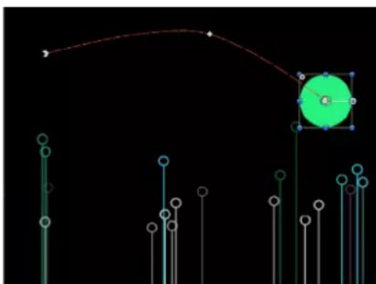
natural_image
Abstract diagram with vertical lines and a green circle, no text or symbols presentNote: To view the animation paths of keyframed objects, ensure that Animation Path is selected in the View pop-up menu (in the upper-right corner of the main window, above the Canvas).
If the playhead is positioned on a previously set keyframe, changes you make modify that keyframe rather than the curve, regardless of whether the Record button is on or off.
Move an object across the screen
1 Click the Record button (or press A) to turn on keyframe recording.
2 Place the playhead at the starting frame.
3 Place the object in a starting position.
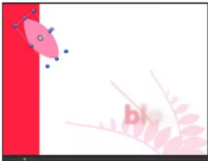
natural_image
Abstract graphic with red vertical stripe, pink curved shapes, and a small letter 'b' (no text or symbols)4 Move the playhead forward.
5 Drag the object to the ending position.

6 Click the Record button (or press A) to turn off keyframe recording.
When you play back your project, the object flies from position one to position two over the interval you set. You can see the path the object travels by turning on the Animation Path setting in the View pop-up menu above the Canvas.
Manipulate animation paths in the Canvas
You can modify an animation path by adding keyframes to or deleting keyframes from the path, by dragging keyframes on the path, or by dragging a path segment between two adjacent keyframes.

natural_image
Abstract diagram with curved line and pink elliptical shape, no text or symbols presentAdditionally, you can set the keyframe type to curved or angled, changing the shape of the path.
Note: When you drag a keyframe in the Canvas, the frame number corresponding to that keyframe and its X, Y, and Z position values are displayed in the status bar (above the Canvas).
To manipulate an object in the Canvas at a frame where no keyframe exists, use the following guidelines:
- To reposition the object as well as its bounding keyframes without setting a new keyframe for the object, drag the object's center onscreen control (or anywhere on the object's animation path).
- To reposition the object and create a new keyframe, drag the object but not its center onscreen control or animation path.
- To move the object and its entire animation path together, hold down Option-Command and drag the object's center onscreen control or any keyframe on the animation path.
Add keyframes to an animation path
■Double-click or Option-click the path.
A new keyframe point is added. By default, keyframe points are curved Bezier points.
Reposition a keyframe
After you add keyframe to an animation path, you can change its location on the path.
- Click the keyframe on the animation path, then drag it to its new position.
Change a keyframe point to be curved or angled
You can convert Bezier keyframe points into Linear keyframe points to create an angled path, or vice versa.
Do one of the following:
- To convert a keyframe point to be sharply angled, Control-click the keyframe and choose Linear from the shortcut menu.
The handles of the keyframe disappear, leaving a linear keyframe. To quickly convert the keyframe back to a curved Bezier point with handles, Command-drag the keyframe.
- To convert a keyframe point from sharply angled to smoothly curved, Control-click the keyframe and choose Smooth from the shortcut menu.
Bezier handles appear on the Smooth keyframe, and the animation path becomes curved. To quickly convert a curved Bezier point back to an angled linear point, Command-click the keyframe.
Note: The Very Smooth option is not available for animation paths and remains dimmed in the shortcut menu.
Bezier handles are modified in the same manner as with shape or mask Bezier points. For more information on manipulating Bezier splines, see Bezier shapes and B-Spline shapes overview on page 832.
Delete an animation path's keyframe point
Do one of the following:
■ Control-click a keyframe and choose Delete Point from the shortcut menu.
■Select the keyframe, then press Delete.
The keyframe point is deleted from the path.
Lock an animation path's keyframe point
■ Control-click a keyframe and choose Lock Point from the shortcut menu.
The keyframe is locked and can no longer be edited. To unlock the keyframe, Control-click the locked keyframe and choose Unlock Point from the shortcut menu.
You can also disable an animation path keyframe.
Disable an animation path's keyframe point
■ Control-click a keyframe and choose Disable Point from the shortcut menu.
The keyframe is disabled and no longer influences the shape of the animation path. To enable the keyframe, Control-click the disabled keyframe, then choose Enable Point from the shortcut menu.
Move the entire animation path
Do one of the following:
- Press Option-Command, then drag a keyframe on the animation path.
- Press Option-Command, then drag a portion of the animation path between two keyframes.
Move a segment of the animation path
- Drag the path segment between the two selected keyframes.
Note: You can also Shift-select the keyframes that bound the path segment or segments you want to move, then drag one of the selected keyframes (or the segment between two adjacent keyframes).
Select an adjacent keyframe on the animation path
- Click the path segment immediately to the right or to the left of a selected keyframe.
The adjacent keyframe is selected. Drag the path segment between the two selected keyframes to move the segment.
Animate via the HUD
Parameters that appear in the HUD can be keyframed using the Record button or by setting an initial keyframe. Using this technique, you can animate basic object properties such as opacity or position, or create advanced effects such as setting static filters into motion. In this example, the HUD is used to animate an object's opacity.
Animate a clip's opacity via the HUD
1 Place the playhead where you want to begin the fade.
2 Do one of the following:
- Click the Record button (or press A) to turn on keyframe recording, then click the Opacity slider handle in the HUD.
Even if you don't change the slider's value, clicking it sets an Opacity keyframe at that point. This way, the object remains at its previous opacity from the beginning of the clip until that keyframe, then begins the interpolation toward the next keyframe.
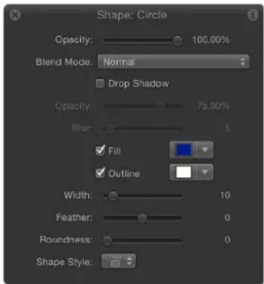
- With the Record button off, click the Opacity slider handle in the HUD, then press Control-K.
3 Move the playhead forward to a new time.
4 Change the Opacity value.
5 Move the playhead forward again.
6 Change the Opacity slider again.
7 If keyframe recording is on, click the Record button (or press A) to turn off keyframe recording.
Keyframes at the beginning and end of the curve
When you begin adding keyframes, you instruct Motion to modify the in-between frames to interpolate the effect. But what values are used for the frames before the first keyframe and after the last one?
By default, when you add your first keyframe, that same value is extended forward and backward to the beginning and end of the clip (as if you hadn't added a keyframe). After you add a second keyframe, the effect begins to change over time. The frames before that first keyframe remain at the value of that first keyframe. Similarly, the frames after the last keyframe hold at that last defined value.
You can override this default behavior to create loops and other patterns by using the Before First Keyframe and After Last Keyframe submenus as described in the Set curve extrapolation on page 478 section later in this chapter.
Animate via the Inspector
Animate parameters in the Inspector
Although you can animate many attributes using the HUD, many other parameters are accessible only in the Inspector. Each section of the Inspector contains keyframeable parameters. For example, you can animate the position and shape of a mask, the color and styles of a text object, or the options in the generators. The parameters that are keyframeable depend on which object is selected and which effects are applied to that object.
Animate parameters in the Inspector using the Record button
1 In the Canvas, select the object to keyframe.
2 Click the Record button (or press A) to turn on keyframe recording.
3 Place the playhead on the frame where you want the effect to begin.
4 Open the Inspector pane corresponding to the parameter you want to modify (Filters, in this example).
Note: When the Record button is turned on, animatable parameter values appear red. When the Record button is off, parameter values that have no keyframes remain a light shade of gray.

5 Set the parameter to the beginning value.
6 Move the playhead to a new position.
7 In the Inspector, change the parameter to a new value.
8 Click the Record button (or press A) again to disable record.
The parameter now changes over time.
Animate parameters in the Inspector by setting an initial keyframe (Record button is off)
1 In the Canvas, select the object to keyframe.
2 Place the playhead on the frame where you want the effect to begin.
3 Open the Inspector pane corresponding to the parameter you want to modify.
4 Set the parameter to the beginning value, then do one of the following:
- Press Control-K.
- In the Properties Inspector, click the parameter's Animation menu, then choose Add Keyframe.
- In the Properties Inspector, Control-click the parameter name, then choose Add Keyframe from the shortcut menu.
- In the Properties Inspector, click the parameter's Add/Delete Keyframe button.
A keyframe is added at the current frame, and the parameter appears red in the Inspector.
5 Move the playhead to a new position.
6 In the Inspector, change the parameter to a new value.
The parameter now changes over time.
Animation menu
The Animation menu in the Inspector provides additional keyframing options, such as the ability to add keyframes to parameters, delete or reset keyframe information, navigate among keyframes, open the Keyframe Editor, add Parameter behaviors, add parameters to rigs, and publish parameters.
Every keyframeable parameter has an Animation menu, available by Control-clicking a parameter's name to reveal a shortcut menu, or by moving the pointer to the right side of a parameter row in the Inspector, and clicking the downward arrow that appears.

Note: If the Animation menu corresponds to a parameter that cannot be animated, the Enable Animation and Keyframe menu items are dimmed.
The Animation menu contains the following options:
- Show in Keyframe Editor: Opens the Keyframe Editor and displays the parameter's keyframes and curves. For more information, see Keyframe Editor overview on page 456.
- Reset Parameter: Removes keyframes and settings for this parameter. The parameter value is reset to its default value.
- Add To Rig: Lets you add a parameter to an existing rig, or to a new rig that you create to control multiple parameters with a single checkbox, slider, or pop-up menu. Rigs are useful when you create templates for Final Cut Pro X. For more information, see Rigs and widgets overview on page 370 and Final Cut Pro X templates overview on page 385.
- Add Parameter Behavior: Opens a submenu listing all available Parameter behaviors you can use to animate the parameter. For more information, see Apply a Parameter behavior to a behavior parameter on page 301.
- Publish: Sends the parameter control to Final Cut Pro X when you create and save a template for the editing application. The Publish command also lets you send rig controls (widgets) to Final Cut Pro. For more information on the Publish command, see Publish parameters in templates on page 422. For more information on rigging, see Rigs and widgets overview on page 370.
- Enable/Disable Animation: Activates or deactivates the keyframed value. Choosing Disable Animation hides the keyframes already set, restoring the parameter to its default value. However, the keyframes are not thrown away. (A dash appears in the parameter row to indicate the animation is disabled.) Choosing Enable Animation again returns the parameter to its last keyframed state.
- Add Keyframe: Adds a keyframe at the current frame in the project. If the playhead is positioned on a frame where a keyframe has been added, this menu command is dimmed. To add a keyframe without accessing the Animation menu in the Inspector, press Control-K. A keyframe is added to the last modified parameter of the object (regardless of the status of the Record button) at the current frame.
- Delete Keyframe: Deletes the keyframe. The Delete Keyframe option is available only if the playhead is positioned on a frame where a keyframe exists.
- Previous Keyframe: Moves the playhead to the previous keyframe for this parameter. The Previous Keyframe command is available only if a keyframe exists earlier in the project.
- Next Keyframe: Moves the playhead to the next keyframe for this parameter. The Next Keyframe command is available only if a keyframe exists later in the project.
Note: You can also choose Mark > Go To > Previous Keyframe (or press Option-K) or Mark > Go To > Next Keyframe (or press Shift-K) to move from keyframe to keyframe.
Manage keyframes with the Animation menu
You can use the Animation menu to manage the following common tasks:
Set keyframes using the Animation menu
1 In the Inspector, change the value of the parameter you want to keyframe.
2 Click the Animation menu for the affected parameter, then choose Add Keyframe.
A keyframe is added at the frame and the affected parameter appears red in the Inspector, indicating any further edits at other playhead locations will add keyframes.
3 To set another keyframe for the same parameter, move the playhead to the next location, then change the value of the parameter.
Delete a keyframe
1 Move the playhead to the frame where the keyframe is currently set.
2 In the Inspector, click the Animation menu for the parameter you want to change, then choose Delete Keyframe.
Note: To delete all keyframes for a parameter, choose Reset Parameter from the Animation menu.
Reset all keyframes for a parameter
In the Inspector, click the Animation menu for the parameter you want to reset, then choose Reset Parameter.
All keyframes are removed for that parameter.
Keyframe controls in the Inspector
In the Inspector, basic keyframe controls are available on the right side of animatable parameter rows. These controls allow you to determine the status of a parameter at a glance, to add or delete keyframes at the current playhead, and to navigate to next and previous keyframes in the Timeline.

Moving the pointer over an animatable parameter reveals the Add/Delete Keyframe button (a plus sign enclosed in a gray diamond). Click the button to place a keyframe for that parameter at the current frame. If a parameter is keyframed at the current frame, as well as before and after the current frame, additional navigation controls appear (described below).

Controls in the Inspector
- Previous Keyframe: A left angle bracket that appears when there is a keyframe in the Timeline to the left of the playhead position. Click this control to move to a previous keyframe in the Timeline.
- Add/Delete Keyframe: A diamond-shaped button with several states. A gray diamond button indicates that there is no keyframe at the current frame. Click this button to add a keyframe at the playhead position. When you add a keyframe, the diamond turns orange, indicating that there is a keyframe at the frame. Clicking the orange diamond deletes the keyframe. When the playhead advances to a frame that is not keyframed, the diamond turns gray.
- Next Keyframe: A right angle bracket that appears when there is a keyframe to the right of the playhead position. Click this control to move to the next keyframe in the Timeline.
- Reset button: A curved arrow button at the top of each parameter group in the Inspector. Click this button to remove all keyframes applied to all parameters in the group and restore those parameters to their default state.

Use keyframes to modify behaviors
Apply keyframes to behaviors
You can also use keyframes to animate behaviors. Animating behaviors might appear complicated at first because most of the behaviors are already changing, but combining these features is a powerful way to greatly enhance behaviors' usefulness.
For example, you might want to animate a Random Motion behavior to begin as a subtle random motion and then become increasingly severe as the effect progresses. Or you might want to apply a Gravity behavior, but not have the object start falling toward the ground until five seconds into the clip. Keyframes allow you to manipulate the parameters of each behavior.
Certain parameters cannot be animated, such as the Throw Velocity parameter of the Throw behavior and the Spin Rate parameter of the Spin behavior. If a parameter can be animated, the following occurs:
- When keyframe recording is turned on (Record button), the parameter appears red in the Inspector.
- Moving the pointer over the parameter row in the Inspector reveals the Add/Delete Keyframe button.
Note: In Motion, you can bake all behaviors applied to an object into keyframes using the Convert to Keyframes command in the Object menu. For more information, see Convert behaviors to keyframes on page 312.
Keyframe a behavior using the Record button
1 Select an object in the Canvas.
2 Apply a behavior.
3 Click the Record button (or press A) to turn on keyframe recording.
4 Place the playhead at the frame where you want the effect to begin changing.
5 Using the HUD, adjust the behavior's settings.
6 Move the playhead to a new time position.
7 Adjust the behavior settings again.
8 Click the Record button (or press A) to turn off keyframe recording.
Behaviors can be animated in the Inspector. For more information, see Animate parameters in the Inspector on page 448.
About combining keyframes and behaviors
When you combine keyframes with behaviors, Motion adds the two sets of instructions together. For example, if you apply a Throw behavior toward the upper left of the Canvas, and at the same time add keyframes that instruct the object to move to the right, the behavior-driven object moves less leftward because the keyframes are pushing it in an opposite direction. The larger the Throw velocity rate, the more the behavior overpowers the keyframes, and vice versa.
You can use this method to enhance and control the effects of behaviors. For example, you can apply a Gravity behavior that causes an object to fall toward the bottom of the frame, and then keyframe the object's position to move across the screen from left to right. As a result, the object falls as it moves rightward.
Likewise, you can apply a Fade In/Fade Out behavior, but use keyframes on the object's Opacity parameter to limit the maximum opacity to 80%. The resulting clip fades in, but not completely.
Additionally, you can convert behaviors to keyframes. For more information, see Convert behaviors to keyframes on page 312.
Keyframes in the Timeline
View keyframes in the Timeline
When keyframing, it is often helpful to view your keyframes in the Timeline. This lets you move keyframes to line them up with other important timing elements in your project such as edit points, sound cues, markers, and other keyframes. You can also view keyframe parameters in the Timeline, and delete keyframes you don't need.

View keyframes in the Timeline
■ Turn on the Show Keyframes button (in the upper-right corner of the Timeline).

Identify a keyframe's value
■ Control-click a keyframe in the Timeline and view its value in the shortcut menu.
Note: Multiple keyframes on the same frame are listed in the menu.
View a Timeline keyframe in the Keyframe Editor
- Control-click the keyframe in the Timeline, then choose Show in Keyframe Editor from the shortcut menu.
The Keyframe Editor opens, showing the corresponding parameters in an "Untitled Set."
For more information about the Keyframe Editor, see Keyframe Editor overview on page 456.
Modify keyframes in the Timeline
When keyframes are visible in the Timeline, you can change their positions in time by dragging them horizontally in the track. This does not modify the keyframe's parameter value. Rather, it changes the position in time when the keyframe occurs.
Although moving a keyframe in time does not change the parameter's value, it can have a significant effect on the nature of the animation. For example, if you have two keyframes that animate an object from the top of the screen to the bottom over a duration of five seconds, dragging one of the keyframes farther from the other forces the animation to occur more slowly.
When multiple keyframe values are set in the same frame, only one keyframe marker appears in the Timeline. However, you can choose to edit any of its values.
Edit a keyframe value in the Timeline
1 Control-click (or double-click) the keyframe.
A shortcut menu appears displaying all of the parameters keyframed at the current frame.
2 Choose the keyframe parameter to edit.
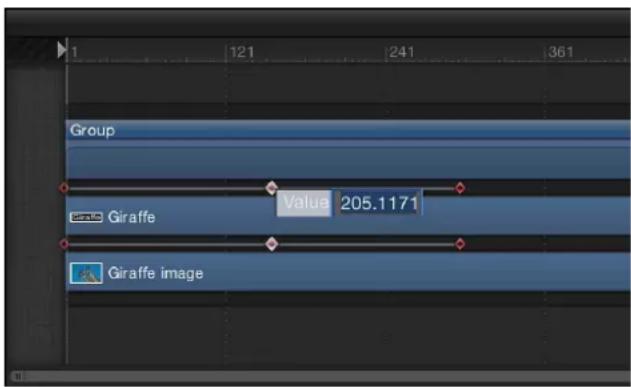
3 Enter a value into the value field, then press Return.
Note: To exit an active value field without making changes, press Esc.
Display a keyframe with its associated animation curve in the Keyframe Editor
■ Control-click the keyframe, then choose Show in Keyframe Editor from the shortcut menu.
The Keyframe Editor appears below the Timeline. For information on working in the Keyframe Editor, see Keyframe Editor overview on page 456.
Delete a keyframe in the Timeline
■ Control-click the keyframe to delete, then choose Delete Keyframes from the shortcut menu.
Delete all of an object's keyframes in the Timeline
- Control-click any keyframe for the object to clear, then choose Delete All Keyframes from the shortcut menu.
For more control of effects using keyframes, you can use the Keyframe Editor. Any keyframe in the Timeline can be viewed in the Keyframe Editor using the shortcut menu.
Note: Although you can delete keyframes in the Timeline, there is no way to add keyframes in the Timeline.
Align a keyframe to a marker in the Timeline
In the Timeline, you can align a keyframe with other important timed events. For example, you might want to align a filter keyframe applied to one object with the In or Out point of another object, or a marker, or a keyframe in another track.
1 Turn on the Show Keyframes button and identify the keyframe to move.
2 Press the Shift key and drag the keyframe in the Timeline until it snaps to the marker.
In the following image, the keyframe snaps to the purple marker in the Timeline ruler.

Keyframes and effect duration
When you change the duration of an effect such as a filter or behavior in the Timeline, the timing of all keyframes applied to that effect is scaled proportionally. This means that keyframed changes to an effect speed up or slow down if the effect is shortened or lengthened. This happens whether you change the duration of the effect object bar, or the duration of the image object bar an effect is applied to.


Note: Object parameters such as Position, Rotation, Scale, Opacity, and so on are not affected.
If you press Command while resizing an object bar that has effects applied, the object bar is trimmed without altering the timing of any keyframes. You can also prevent automatic keyframe retiming by pressing Command while changing the duration of an effect object bar.
Keyframe Editor
Keyframe Editor overview
When you create two or more keyframes, Motion generates interpolated parameter values for the frames that come between. These changing parameter values are represented by curves the Keyframe Editor. Using the Keyframe Editor, you can view and modify these curves to animate objects and effects in your project.
For example, in the real world, when objects move, they obey rules of physics such as inertia and momentum. Using Motion's Keyframe Editor, you can simulate these effects in motion graphics. The curves of animated parameters also provide a way of seeing how an effect changes over time. Curves are laid out in a graph where you can compare them, one over another.
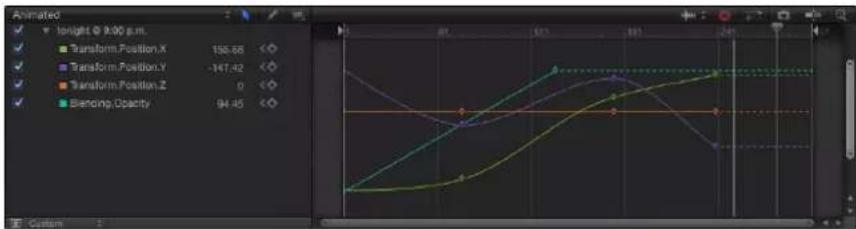
The Keyframe Editor makes it easy to add and delete keyframes, as well as move them in two-dimensional space to modify their values (up-down) and their positions in time (left-right). You can manipulate curves with the tools Motion provides, and you can define a variety of interpolation methods, creating dramatically different types of effects. You can also apply Parameter behaviors to curves via the Keyframe Editor by Control-clicking the curve name and choosing a Parameter behavior from the shortcut menu. For more information about Parameter behaviors, see Add a Parameter behavior on page 299 and Parameter behaviors overview on page 332.
Note: The parameters visible in the Keyframe Editor represent the object or objects selected in the Layers list, Canvas, or Timeline. If you select one item in the Layers list, Canvas, or Timeline, only parameters for that object are shown in the Keyframe Editor. If you select a group in the Layers list, Canvas, or Timeline, all parameters for all objects in that group are shown in the keyframe editor.
Display the Keyframe Editor
Do one of the following:
- Click the Show Keyframe Editor button in the bottom-right corner of the Motion window.

- Choose Window > Keyframe Editor.
■Press Command-8.
Parts of the Keyframe Editor
The Keyframe Editor comprises a list of parameters on the left, a multifunctional graph on the right where keyframes and curves for each parameter are displayed, and tools for modifying keyframes and curves. These elements are described below:

• Show Curve Set pop-up menu: Choose and item from the menu to filter the parameters in the Keyframe Editor, allowing to see the parameters you want to modify. For more information, see Use a curve view preset on page 461.
• Keyframe editing tools: Select any of three tools for editing keyframes and curves in the graph.
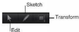
- Edit Keyframes tool: Select and edit keyframes the same way you edit Bezier curves.
- Sketch Keyframes tool: Manually draw curves that generate keyframes conforming to the shape drawn.
- Transform Keyframes tool: Drag a selection box to enclose and manipulate a group of keyframes simultaneously.
For more information about using these tools, see Add, delete, and modify keyframes on page 465.
- Parameter list: View keyframeable parameters of selected objects, including object properties, filters, and behaviors. By selecting multiple items in the Layers list or Timeline, you can compare the parameters of multiple objects. The parameter list contains the following items:
- Activation checkbox: Checkboxes in the left column set which parameters are displayed in the graph. Deselect a checkbox to hide a parameter's keyframes and curves from the graph on the right.
- Parameter name: Object and parameter names appear in the second column of the parameter list. Control-click a parameter name to apply a Parameter behavior from the shortcut menu.
- Value: Parameter values at the playhead position appear in the third column. Modify a parameter value by dragging left or right over the number in this field. Or double-click the field, then enter a value. The value displayed and editing options depend on several factors: If the playhead is parked on a keyframe, this field shows the value for that keyframe; adjusting the value alters the keyframe. If the playhead is not parked on a keyframe, this field shows the value of that parameter at the current frame. If the parameter has keyframes, adjusting the value creates a new keyframe at that frame. (For more information on changing the values of keyframes, see Add, delete, and modify keyframes on page 465. For more information on value sliders, see Value slider on page 128.)
• Keyframe and Keyframe Navigation buttons: Keyframe controls appear in the fourth column. These controls are identical to those found in the Inspector: the Previous Keyframe button, Add/Delete Keyframe button, and Next Keyframe button.
- Animation menu: The Animation menu appears in the fifth column. To open this menu, position the pointer over this column, then click the inverted arrow that appears. The Animation menu in the Keyframe Editor contains all commands found in the Inspector's Animation menu, plus several additional commands:

- Enable/Disable Animation: Activates or deactivates the keyframed value. Choosing Disable Animation hides the keyframes you set, restoring the parameter to its default value. However, the keyframes are not thrown away. Choosing Enable Animation returns the parameter to its last keyframed state.
- Reset Parameter: Removes keyframes and settings for the parameter, restoring the default value.
- Add Keyframe: Adds a keyframe at the current frame in the Keyframe Editor. If the playhead is positioned on a frame where a keyframe has been added, this command is unavailable. (Alternatively, you can use a keyboard shortcut (Control-K) to add a keyframe.)
- Delete Keyframe: Deletes the current keyframe. This command is available if the playhead is positioned on a frame where a keyframe exists.
- Previous Keyframe: Moves the playhead to the previous keyframe for this parameter. This command is available if a keyframe exists earlier in the project.
- Next Keyframe: Moves the playhead to the next keyframe for this parameter. This command is available if a keyframe exists later in the project.
- Interpolation: Sets the type of curve for the parameter. See Curve interpolation methods on page 475 for examples of the different interpolation methods. Choose Constant, Linear, Bezier, Continuous, Exponential, or Logarithmic.
•Before First Keyframe: Defines what happens between the first keyframe and the beginning of the clip. See Set curve extrapolation on page 478 for examples of extrapolation methods. Choose Constant, Linear, Ping Pong, Repeat, or Progressive. You can also turn the extrapolation into keyframes by choosing Generate Keyframes.
•After Last Keyframe: Defines what happens between the last keyframe and the end of the clip. See Set curve extrapolation on page 478 for examples of extrapolation methods. Choose Constant, Linear, Ping Pong, Repeat, or Progressive. You can also turn the extrapolation into keyframes by choosing Generate Keyframes.
- Lock/Unlock Parameter: Locks the parameter from changes. When a parameter is locked, neither keyframes nor curves are adjustable.
- Reduce Keyframes: Opens the Reduce Keyframes dialog, which lets you apply a thinning algorithm to the keyframes for the parameter. This reduces the number of keyframes in a parameter while preserving the shape of the curve. The thinning algorithm can be adjusted in two ways. Increasing the Maximum Error Tolerance results in fewer keyframes. Increasing the Smoothing Factor makes smoother curves between keyframe values.
- Set to Curve Snapshot: Reverts keyframe changes made in the selected curve to the most recent snapshot. This command is available when Take/Show Curve Snapshot is turned on (the camera button in the upper-right corner of the Keyframe Editor). For more information, see Curve snapshots on page 472.
- Curve graph: Shows the keyframes and curves of active parameters (those in the parameters list). Each curve is a different color, although some colors are duplicated. A time ruler shows the locations of keyframes, project markers, playback In and Out points, and the playhead. Zoom controls at the bottom of the graph let you focus on specific regions of the sequence. For more information on using the zoom/scroll controls, see Zoom in the Timeline on page 256.
- Audio Waveform pop-up menu: Turns on the display of audio waveforms for the selected item in the background of the graph. This lets you line up an effect to take place at the same time as an event that occurs in the audio. If there are multiple audio tracks in the project, you can use this menu to view the waveform of any individual audio track in the project, or the master track.
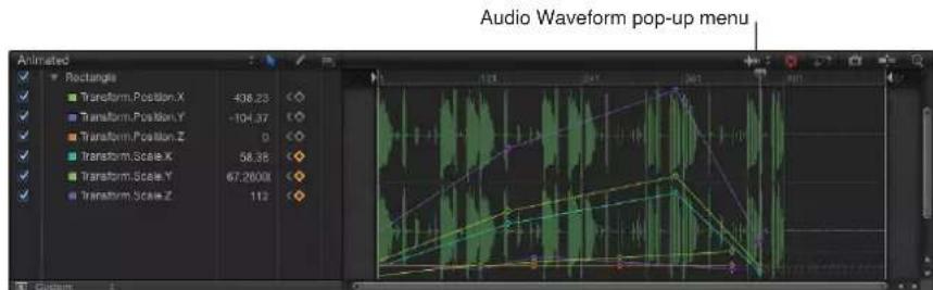
- Clear Curve List button: Deletes all items in the parameter list from a custom set.

- Fit Visible Curves in Window button: Scales the curve graph vertically and horizontally so that the curve is entirely visible. This button does not change the value of your keyframes.

Take/Show Curve Snapshot button: Turns on and turns off the state of all curves in the Keyframe Editor. With a snapshot turned on, the original unaltered curve is represented by a lighter color—visible in the background behind the curves you are adjusting—and can be used as a reference showing the curve's original values. As long as you remain in the Keyframe Editor editing the current set of curves, the snapshot curve remains available. Clicking this button again causes the current snapshot to disappear. For more information about curve snapshots, see Curve snapshots on page 472.
- Snapping button: Enables snapping. When this control is enabled, keyframes snap to markers, other keyframes, and other snappable items.
natural_image
User interface toolbar with icons and a blue downward arrow (no text or symbols)- Auto-Scale Vertically to Fit Curves button: Rescales the graph vertically so that the curve is entirely visible. This does not change the value of your keyframes.

Tip: You can show the Keyframe Editor on a second display, providing a larger workspace for modifying keyframes and curves. For more information, see View the Canvas or Timing pane on a second display on page 96.
Filter the parameter list
Use a curve view preset
Displaying too many parameters in the Keyframe Editor can make the curve graph difficult to read. You can limit the list of parameters displayed in the curve graph by choosing a view option from the Show Curve Set pop-up menu.
Located at the top of the parameter list, the Show Curve Set pop-up menu lets you display 11 built-in parameter curve sets as well as custom sets you build yourself. (For information about creating a custom curve set, see Create a custom curve view on page 463.) Choose an item from the menu to display all parameters, dynamic parameters (parameters with keyframes or behaviors), or specific parameters (Position, Rotation, Scale, Shear, Anchor Point, Opacity, and Retiming). The Curve Set pop-up menu displays the name of the selected curve set (Animated, All, or Modified, for example).

Animated

View all parameters for all selected objects
- Choose All from the Show Curve Set pop-up menu.
By default, only animated parameters display curves in the graph. Nonanimated parameters appear as dotted lines. Deselect a parameter's activation checkbox to hide it in the graph. You can display or hide all parameters associated with a group or object by selecting or deselecting its checkbox.

line
| Operation | Value | | ---------------------- | ----- | | Transform: Position X | 62.7 | | Transform: Position Y | -74.47| | Transform: Position Z | 0 | | Transform: Rotation X | 0 | | Transform: Rotation Y | 0 | | Transform: Rotation Z | 13.48 | | Transform: Scale X | 100 | | Transform: Scale Y | 100 | | Transform: Scale Z | 100 | | Transform: Shear X | 0 | | Transform: Shear Y | 0 | | Transform...or PointLX | 0 | | Transform...or PointY | 0 | | Transform...or PointZ | 0 | | Blending Opacity | 100 | | Blending...or Opacity | 0 |View only animated (keyframed or behavior-influenced) parameters
- Choose Animated from the Show Curve Set pop-up menu.
Parameters with more than one keyframe are displayed.
View parameters changed from their default values
- Choose Modified from the Show Curve Set pop-up menu.
This option shows the parameters that have been modified from their default values, or are currently being modified (in the Canvas, Inspector, or HUD).
View only active parameters
- Choose Active from the Show Curve Set pop-up menu.
This option shows only parameters being modified in real time. For example, with Active selected, dragging an object in the Canvas displays its X, Y, and Z Position parameters in the Keyframe Editor.
View keyframes corresponding to a specific parameter
- Choose a parameter type (such as Rotation) from the Show Curve Set pop-up menu.
Only parameters of the chosen type are displayed.
View keyframes corresponding to a specific parameter for multiple objects
1 In the Layers list, Canvas, or Timeline layers list, Shift-select the objects that contain keyframes you want to view.
2 Choose a parameter type (such as Scale) from the Show Curve Set pop-up menu.
Only parameters of the chosen type are displayed for the selected objects.
Create a custom curve view
In addition to using the built-in curve set views, you can make and manage your own view using the last two options in the Show Curve Set pop-up menu: New Curve Set and Manage Curve Sets. As you create and store custom parameter sets, they appear in the Show Curve Set pop-up menu, allowing you to switch between them. Deleting, duplicating, and modifying custom sets is done in the Manage Curve Sets dialog (accessible from the Show Curve Set pop-up menu).
Create a custom curve set
1 Choose New Curve Set from the Show Curve Set pop-up menu.
A dialog appears.
2 Enter a name for the set, then click OK.
After you create a curve set, you can choose it from the Show Curve Set pop-up menu.
Add parameters to a custom curve set
Do one of the following:
■ After you create a custom curve set, drag a parameter name from any pane in the Inspector into the Keyframe Editor parameter list.


- In the Inspector, click the Animation menu for the parameter, then choose Show in Keyframe Editor.
The parameter is added to the custom curve set.
Note: If Animated is chosen from the Show Curve Set pop-up menu when you use the Show in Keyframe Editor command from the Animation menu, an untitled curve set is created.
Delete a parameter from a custom curve set
In the Keyframe Editor, drag the parameter out of the list.
Delete all parameters from a custom set
- Click the Clear Curve List button in the top-right corner of the Keyframe Editor.
Delete a custom curve set
1 In the Keyframe editor, choose Manage Curve Sets from the Show Curve Set pop-up menu. The Manage Curve Sets dialog appears.

2 Select the name of the set to delete.
3 Click the Delete button (−) at the top of the dialog. The set is deleted.
4 Click Done to close the dialog.
Duplicate a custom curve set
1 In the Keyframe Editor, choose Manage Curve Sets from the Show Curve Set pop-up menu. The Manage Curve Sets dialog appears.
2 Select the name of the set to duplicate.
3 Click the Duplicate button at the top of the dialog. The set is duplicated.
4 Double-click the set name in the list, then enter a name for the set.
5 Click Done to close the dialog.
The new set now appears in the Show Curve Set pop-up menu. These sets are saved with the project, so each time you reopen the project, they are available. You can store as many parameter sets as you like. After you store a set, you can change or delete that set as needed.
Switch between custom curve sets
Use the Manage Curve Sets dialog to switch back and forth between custom curve sets that contain common animated parameters. For example, if you created a custom curve set for an object's Position and Rotation parameters, and your project also contains another object with animated Position and Rotation parameters, you can switch back and forth between their curve sets.
1 In the Keyframe Editor, choose Manage Curve Sets from the Show Curve Set pop-up menu.
2 Select the Relative checkbox in the left column of the Manage Curve Sets dialog.
The curve set is displayed for the currently selected object.
Modify keyframes and curves
Add, delete, and modify keyframes
To make basic edits to keyframes in the Keyframe Editor—adding and deleting keyframes, modifying their values—select the Edit Keyframes tool (above the parameter list), then perform the following tasks:

Add a keyframe
In the Keyframe editor, choose Add Keyframe from the Animation menu for any parameter.
A keyframe is added at the position of the playhead.
Add a keyframe to an existing animation curve
In the Keyframe Editor, double-click or Option-click the animation curve in the graph area.
A keyframe is added to the curve at the pointer position. The new keyframe is set to the interpolation method used by the rest of that curve. For example, Position parameters use Bezier curves by default, so new keyframes are added as Bezier keyframes. For more information on interpolation methods, see Set curve interpolation on page 474.
Add a keyframe to an animation curve and adjust its value
In the Keyframe Editor, Option-drag a curve segment.
A keyframe is added to the segment at the pointer position, and its value is displayed as you drag the keyframe.
Change the value of a keyframe
Do one of the following:
In the graph area of the Keyframe Editor, drag the keyframe along the Y axis (up and down) to change its parameter value. To change its position in time, drag along the X axis (left to right).
Press the Shift key while dragging to constrain movement to one axis. (To constrain keyframes to the Y axis, select "Lock keyframes in time in Keyframe Editor" in the Time pane of the Motion Preferences window.)
When dragging a keyframe in the graph, numbers appear indicating the position and value of the keyframe. The first number is the frame number (or timecode number) and the second number is the parameter value.

line
| Frame Number | Keyframe Value | | ------------ | -------------- | | 190.0 | 0.9 |When you drag two keyframes closer along the X axis, the transformation between those values happens more quickly. When you drag keyframes farther apart from each other, the change happens more slowly.
- Double-click the keyframe to modify, enter the value into the value field, then press Return.

line
| Time Step | Keyframe Value | | --------- | -------------- | | 1 | 0.937606 | | 121 | 0.92 | | 241 | 0.937606 | | 361 | 0.937606 |This changes the value of the keyframe along the Y axis (up and down).
Note: To dismiss an active value field without making changes, press Esc.
In the parameter list, drag in a value slider.
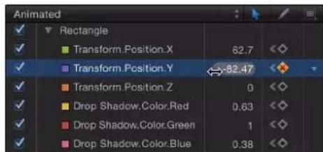
- Drag to the right to increase the value of the keyframe.
- Drag to the left to decrease the value of the keyframe.
- Press Shift while dragging to change the value in increments of 10.
- Press Option while dragging to change the value in increments of .01.
Move a keyframe in time by a specific number of frames
1 Select keyframes in the Keyframe Editor.
2 Do one of the following:
- To move the selected keyframes to a specific frame: Enter a number, then press Return.
- To move the selected keyframes forward by a specific number of frames: Enter a plus sign (+) and the number of frames, then press Return.
- To move the selected keyframes back by a specific number of frames: Enter a minus sign (−) and the number of frames, then press Return.
Delete a keyframe
Do one of the following:
■Select the keyframe in the Keyframe Editor, then press Delete.
Note: You can drag to select multiple keyframes.
■ Control-click the keyframe, then choose Delete from the shortcut menu.
- Navigate to the keyframe, then choose Delete Keyframe from the Animation menu for that parameter.
Delete all of a parameter's keyframes
In the parameter list in the Keyframe Editor, click the Animation menu for a parameter, then choose Reset Parameter.
Note: You can also use the corresponding Animation menu in the Inspector.
Move an entire curve
You can select and move animation curves in the graph area of the Keyframe Editor.
Do one of the following:
■Press Option-Command, then drag a keyframe on the curve.
- Press Option-Command, then drag a curve segment between two keyframes.
You can also move selected segments of the curve by selecting adjacent keyframes.
Move a segment of the curve
In the Keyframe Editor, Shift-select the keyframes that bound the path segment or segments you want to move, then drag one of the selected keyframes.
Reverse, lock, and disable keyframes
With the Edit Keyframes tool (above the parameter list) selected, you can also perform advanced keyframe modifications. You can reverse keyframes to invert the corresponding animated effect without re-animating it, lock keyframes (individually or in groups) to prevent accidental adjustment, or disable an entire curve to suspend animation for that parameter.

Reverse keyframes
1 In the graph area Keyframe Editor, drag a bounding box in the graph to select the keyframes to reverse.
2 Control-click a selected keyframe, then choose Reverse Keyframes from the shortcut menu.
The keyframes are reversed.
Lock keyframes
In the Keyframe Editor, select the keyframes to lock, then control-click one of the keyframes in the graph and choose Lock from the shortcut menu.
Lock prevents further modification the keyframes. (You can also lock all keyframes in the Keyframe Editor by selecting "Lock keyframes in time in Keyframe Editor" in the Time pane of Motion Preferences.)
Disable a curve
In the Keyframe Editor, select the keyframes to disable, then Control-click a keyframe in the graph and choose Disable from the shortcut menu.
Disabled keyframes are ignored and have no effect on the object's animation. If you disable a keyframe, the curve readjusts itself as if that keyframe didn't exist, even though the keyframe is present in the Keyframe Editor, in a dimmed state.
Copy and paste keyframes and curves
With the Edit Keyframes tool (above the parameter list) selected, you can copy and paste keyframes and animation curves. This technique is useful for copying a keyframed effect from one object to another, for moving a keyframe path earlier or later in the same parameter, or for creating keyframes in one parameter and applying them to another.

Copy and paste keyframes
Use this technique to copy and paste a segment of an animation curve from one parameter to another, or from one object to another.
1 Select keyframes by doing one of the following:
- In the graph area of the Keyframe Editor, drag a selection box around the keyframes you want to select.
- In the graph area, Shift-click the keyframes you want to select.
Note: If the curve appears white (and not the keyframes), the keyframes are not selected.
2 Copy or cut the selected keyframes by doing one of the following:
- Choose Edit > Copy (or press Command-C).
- Choose Edit > Cut (or press Command-X).
After you select the keyframes, cut or copy them to move them to the Clipboard.
3 To paste the keyframes to a different parameter, do the following:
a Select the destination parameter in the parameter list (on the left side of the Keyframe Editor).
b Place the playhead at the point where you want the keyframes to begin.
c Choose Edit > Paste (or press Command-V).
The keyframes are added to the new parameter.
Note: Pasted keyframes might not make a curve identical to the original if the parameter scales are different.
Copy and paste an animation curve
Use this technique to copy and paste an entire animation curve from one parameter to another, or from one object to another.
1 Select an animation curve by doing one of the following:
- Select a row in the parameter list of the Keyframe Editor.
- Shift-click or Control-click in the parameter list of the Keyframe Editor to select multiple rows.
2 Choose Edit > Copy (or press Command-C) to copy the selected curve.
Note: You cannot use the Cut command on a complete curve.
3 To paste the curve to a different parameter, do the following:
a In the parameter list of the Keyframe Editor, select the destination parameter.
b Choose Edit > Paste (or press Command-V).
The curve is added to the new parameter.
Note: Pasted animation curves might not make a curve identical to the original if the parameter scales are different.
Use the Sketch Keyframes tool
The Sketch Keyframes tool (next to the Edit Keyframes tool) lets you sketch animation curves in the Keyframe Editor graph area, creating keyframes as you go. To sketch a curve, the parameter to animate must first appear in the parameter list. See Create a custom curve view on page 463 for methods of displaying curves.

Sketch an animation curve
1 In the parameter list in the Keyframe Editor, select the parameter to sketch.
2 Select the Sketch Keyframes tool (the pencil icon above the parameter list).
3 Drag in the graph area to sketch an animation curve.
Drawing new keyframes overwrites existing keyframes at the frames where you draw.

line
| X | Y | | ---- | ------ | | 121 | -178.00 | | 241 | -329.00 | | 361 | -479.00 |
line
| Frame | Value | |-------|--------| | 1 | -29.00 | | 2 | -178.00 | | 3 | -325.00 | | 4 | -479.00 | | 5 | -479.00 | | 6 | -479.00 | | 7 | -479.00 | | 8 | -479.00 | | 9 | -479.00 | | 10 | -479.00 | | 11 | -479.00 | | 12 | -479.00 | | 13 | -479.00 | | 14 | -479.00 | | 15 | -479.00 | | 16 | -479.00 | | 17 | -479.00 | | 18 | -479.00 | | 19 | -479.00 | | 20 | -479.00 | | 21 | -479.00 | | 22 | -479.00 | | 23 | -479.00 | | 24 | -479.00 | | 25 | -479.00 | | 26 | -479.00 | | 27 | -479.00 | | 28 | -479.00 | | 29 | -479.00 | | 30 | -479.00 | | 31 | -479.00 | | 32 | -479.00 | | 33 | -479.00 | | 34 | -479.00 | | 35 | -479.00 | | 36 | -479.00 | | 37 | -479.00 | | 38 | -479.00 | | 39 | -479.00 | | 40 | -479.00 | | 41 | -479.00 | | 42 | -479.00 | | 43 | -479.00 | | 44 | -479.00 | | 45 | -479.00 | | 46 | -479.00 | | 47 | -479.00 | | 48 | -479.00 | | 49 | -479.00 | | 50 | -479.00 | | 51 | -479.00 | | 52 | -479.00 | | 53 | -479.00 | | 54 | -479.00 | | 55 | -479.00 | | 56 | -479.00 | | 57 | -479.00 | | 58 | -479.00 | | 59 | -479.00 | | 60 | -479.00 | | 61 | -479.00 | | 62 | -479.00 | | 63 | -479.00 | | 64 | -479.00 | | 65 | -479.00 | | 66 | -479.00 | | 67 | -479.00 | | 68 | -479.00 | | 69 | -479.00 | | 70 | -479.00 | | 71 | -479.00 | | 72 | -479.00 | | 73 | -479.00 | | 74 | -479.00 | | 75 | -479.00 | | 76 | -479.00 | | 77 | -479.00 | | 78 | -479.00 | | 79 | -479.00 | | 80 | -479.00 | | 81 | -479.00 | | 82 | -479.00 | | 83 | -479.00 | | 84 | -479.00 | | 85 | -479.00 | | 86 | -479.00 | | 87 | -479.00 | | 88 | -479.00 | | 89 | -479.00 | | 90 | -479.00 | | 91 | -479.00 | | 92 | -479.00 | | 93 | -479.00 | | 94 | -479.00 | | 95 | -479.00 | | 96 | -479.00 | | 97 | -479.00 | | 98 | -479.00 | | 99 | -479.00 | | 1 | -29.55 | | 2 | -29.55 | | 3 | -29.55 | | 4 | -29.55 | | 5 | -29.55 | | 6 | -29.55 | | 7 | -29.55 | | 8 | -29.55 | | 9 | -29.55 | | 1 | -29.55 | | 2 | -29.55 | | 3 | -29.55 | | 4 | -29.55 | | 5 | -29.55 | | 6 | -29.55 | | 7 | -29.55 | | 8 | -28.55 | | 9 | -28.55 | | 1 | -28.55 | | 2 | -28.55 | | 3 | -28.55 | | 4 | -28.55 | | 5 | -28.55 | | 6 | -28.55 | | 7 | -28.55 | | 8 | -28.55 | | 9 | -28.55 | | 1 | -28.55 | | 2 | -28.55 | | 3 | -28.55 | | 4 | -28.55 | | 5 | -28.55 | | 6 | -28.55 | | 7 | -28.55 | | 8 | -28.55 | | 9 | -28.55 | | 1 | -28.55 | | 2 | -28.55 | | 3 | -28.55 | | 4 | -28.55 | | 5 | -28.55 | | 6 | -28.55 | | 7 | -28.55 |Add an individual keyframe using the Sketch Keyframes tool
1 In the parameter list of the Keyframe Editor, select the parameter to modify.
2 Select the Sketch Keyframes tool (the pencil icon above the parameter list).
3 Click in the graph area to add a keyframe.
Additional clicks create additional individual keyframes.
Use the Transform Keyframes tool
Use the Transform Keyframes tool to drag a selection box around multiple keyframes and then manipulate their positions by dragging the box or or adjusting its handles. Dragging the selection box moves the selected keyframes in whatever direction you move. As a result, you can affect where the keyframes are positioned in time or you can affect their parameter values, or you can do both at the same time. Adjusting a selection box handle scales the keyframes, changing their timing and parameter values.

Draw a selection box using the Transform Keyframes tool
1 Select the Transform Keyframes tool (above the parameter list in the Keyframe Editor).
2 In the graph area, drag to create a selection box enclosing the keyframes you want to manipulate.
A selection box with eight handles appears in the graph area.

flowchart
graph TD
    A["Start"] --> B{Selection box handle}
    B --> C["Step 1"]
    C --> D["Step 2"]
    D --> E["Step 3"]
    E --> F["Step 4"]
    F --> G["Step 5"]
    G --> H["Step 6"]
    H --> I["Step 7"]
    I --> J["Step 8"]
    J --> K["Step 9"]
    K --> L["Step 10"]
    L --> M["Step 11"]
    M --> N["Step 12"]
    N --> O["Step 13"]
    O --> P["Step 14"]
    P --> Q["Step 15"]
    Q --> R["Step 16"]
    R --> S["Step 17"]
    S --> T["Step 18"]
    T --> U["Step 19"]
    U --> V["Step 20"]
    V --> W["Step 21"]
    W --> X["Step 22"]
    X --> Y["Step 23"]
    Y --> Z["Step 24"]
    Z --> AA["Step 25"]
    AA --> AB["Step 26"]
    AB --> AC["Step 27"]
    AC --> AD["Step 28"]
    AD --> AE["Step 29"]
    AE --> AF["Step 30"]
    AF --> AG["Step 31"]
    AG --> AH["Step 32"]
    AH --> AI["Step 33"]
    AI --> AJ["Step 34"]
    AJ --> AK["Step 35"]
    AK --> AL["Step 36"]
    AL --> AM["Step 37"]
    AM --> AN["Step 38"]
    AN --> AO["Step 39"]
    AO --> AP["Step 40"]
    AP --> AQ["Step 41"]
    AQ --> AR["Step 42"]
    AR --> AS["Step 43"]
    AS --> AT["Step 44"]
    AT --> AU["Step 45"]
    AU --> AV["Step 46"]
    AV --> AW["Step 47"]
    AW --> AX["Step 48"]
    AX --> AY["Step 49"]
    AY --> AZ["Step 50"]
Important: When transforming keyframes using the Transform Keyframes tool, by default keyframes are adjusted in whole-frame increments. You can adjust keyframe in sub-frame increments if the "Allow sub-frame keyframing" checkbox is turned on in the Time pane of Motion Preferences. Sub-frame adjustments allow greater precision, but use the Next/Previous Keyframe controls (or keyboard shortcuts) to move the playhead to keyframes that are between frames. If you move a sub-frame-adjusted keyframe using the pointer, the frame snaps to the nearest whole frame.
Drag the selection box to change keyframe timing and parameter values
- Drag inside the selection box to move the box and the enclosed keyframes.
Moving left and right repositions the keyframes in time, and moving up and down increases and decreases the parameter values of the keyframes.
Note: No matter where you drag the box, only the keyframes selected by the original box are manipulated, even if the repositioned box overlaps keyframes outside of the original selection. To manipulate additional keyframes, redraw the selection box in the graph area.
Scale the selection box relative to the handle opposite the one you're dragging
- Drag any handle to resize the selection box.
The selection box changes shape relative to the handle on the opposite side or corner of the box, which remains locked in place.
Scale the selection box about its center
- Hold down the Option key and drag a handle of the selection box.
Both sides of the box scale up or down around its center as you drag along the axes.
Deform the selection box asymmetrically
- Hold down the Command key and drag a corner handle of the selection box.
Each corner handle moves independently of the other three corner handles of the selection box.
Deselect the selection box
Do one of the following:
In the Keyframe Editor, click once anywhere outside the selection box.
- Choose the Edit Keyframes tool.
The selection box disappears.
Tip: You can also draw a new selection box outside of the old one to surround a different group of keyframes.
Curve snapshots
When modifying keyframes, it's helpful to have a frame of reference for your curves. A saved reference of curves lets you compare modified curves to the original curves. Additionally, a saved reference—known as a curve snapshot—acts as a safety net if you need to restore a curve's original state.
Take a curve snapshot
- Click the Take/Show Curve Snapshot button in the upper-right corner of the Keyframe Editor.

natural_image
Toolbar with icons and a blue downward arrow, no readable text or symbolsWith Take/Show Curve Snapshot enabled, as you move keyframes in the Keyframe Editor, the original curve—as it appeared when you took the snapshot—retains its color. As long as you remain in the Keyframe Editor editing the current set of curves with the Take/Show Curve Snapshot button enabled, the snapshot curve remains available.

line
| Transform | Position_X | Position_Y | Position_Z | | --------- | ---------- | ---------- | ---------- | | 1 | -134.91 | -101.49 | 0 | | 31 | | | 72.42 | | 61 | | | 69.56996 | | 91 | | | 100 | | 121 | | | |Revert a curve to its most recent snapshot
If, after editing a curve, you want to revert to the snapshot, you can do so from the Animation menu in the Keyframe Editor.
- From the Animation menu in the Keyframe Editor, choose Set to Curve Snapshot.
The curve reverts to the state of its most recent snapshot.
Important: If you leave the Keyframe Editor, or load a different set of curves into the Keyframe Editor, curve snapshots are taken again, replacing the previous curve snapshots.
Save an animation curve
After you apply keyframed animation to an object, you can save its curve to the Library and then apply your custom animation to an object in any project.Animation curves saved in the Library appear with a custom icon.
Note: Items saved to the Library appear in the Finder with a .molo extension ("Motion Library object"). These items cannot be opened from the Finder.
If you create an animation that uses multiple curves and you want to save the cumulative effect of the animation, you can save all curves as one item in the Library.
Although you can save animation curves into the Content category, it is generally recommended that you save items that you use frequently in the Favorites category—some Motion Library categories contain so many items that using the Favorites or Favorites Menu categories can save you search time. In the Favorites category, you can create additional folders to organize custom items.
You can also create folders in existing categories, including Favorites, Favorites Menu, or Content. Folders created in the Content category appear in the Library sidebar. Folders created in subcategories, such as Basic Motion, appear in the Library stack and not the sidebar. For more information on creating folders in the Library, see Save custom behaviors on page 313.
Animation curves saved to the Favorites Menu category can be applied to objects using the Favorites menu.
Save an animation curve to the Library
1 Open the Library and select the Favorites or Favorites Menu category.
2 Drag the name of the parameter animation curve to save from the parameter list in the Keyframe Editor into the stack at the bottom of the Library.
When you save an animation curve, it's placed in the /Users/username/Library/Application Support/Motion/Library/Favorites/ folder or the /Users/username/Library/Application Support/Motion/Library/Favorites Menu/ folder.
Note: If you drag an animation curve to another subcategory, such as the Glow (Filters) subcategory, the curve is placed in the Content category, which becomes active.
Save multiple animation curves to the Library
1 Open the Library and select the Content, Favorites, or Favorites Menu category.
2 In the parameter list of the Keyframe Editor, select the animation curves you want to save and drag them to the stack, holding the mouse button down.
3 When the drop menu appears, choose "All in one file" or "Multiple files."
"All in one file" saves the animation curves together, listed as one item in the Library. "Multiple files" saves the curves as individual items in the Library.
4 To name the file, do one of the following:
- Control-click its icon in the Library stack, choose Rename from the shortcut menu, then enter a descriptive name.
- Select the icon, click its name, then enter a descriptive name.
Note: When you Control-click an animation curve icon in the Library stack, the Edit Description shortcut menu item becomes available. This is a handy tool for entering custom notes about an item saved in the Library. After you choose Edit Description, enter your notes in the text field, then click OK.
Advanced curve modification
Set curve interpolation
Although you can manually create nearly any curve shape to build the animation you want, the Keyframe Editor provides tools to control the automatic interpolation of curves—that is, the computed values between keyframes. Depending on the interpolation method you choose, you can dramatically alter the shape of animation curves, and therefore the impact of your effects.
To set the interpolation for a curve, you select the keyframe you want to modify, then choose a distribution algorithm. For more information about the preset algorithms, see Curve interpolation methods on page 475.
Set an interpolation method for a keyframe
Do one of the following:
- Control-click a keyframe in the Keyframe Editor, choose Interpolation from the shortcut menu, then choose a method from the submenu.
- Select multiple keyframes, Control-click one of them, choose Interpolation from the shortcut menu, then choose a method from the submenu.
The interpolation method chosen is applied to the entire selection.
Set an interpolation method for a curve segment
■ Control-click a segment between two keyframes in the Keyframe Editor, choose Interpolation from the shortcut menu, then choose a method from the submenu.
Only the segment between the surrounding two keyframes is affected by the interpolation method you choose. You can set different interpolation methods for other segments of the same curve.

When different interpolation methods are applied to segments of an animation curve, the methods used in the curve appear with a dash next to their name in the Interpolation submenu (in the Keyframe Editor parameter list).
Change the interpolation method for an entire parameter
- Click in the fifth column of the Keyframe Editor parameter list to open the Animation menu, then choose a method from the Interpolation submenu.
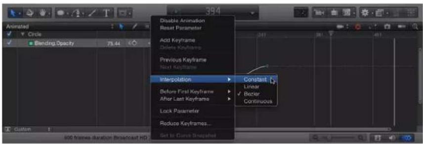
The selected interpolation method is applied to that parameter's curve.
Change the interpolation method for multiple parameters
1 In the parameter list of the Keyframe Editor, Shift-click to select multiple parameters.
2 Click in the fifth column of the Keyframe Editor parameter list to open the Animation menu, then choose a method from the Interpolation submenu.
The selected interpolation method is applied to all selected curves.
Curve interpolation methods
The Interpolation submenu of the Animation menu contains the following methods that set the shape of curves between keyframes:
- Constant: This method holds the keyframe at its current value when applied to a segment or keyframe and then abruptly changes to the new value at the next keyframe.

natural_image
Pure geometric lines forming a loop with two green diamond markers and a dashed line (no text or symbols)- Linear: When applied to a keyframe, this method creates a uniform distribution of values through the keyframe from its two adjacent keyframes. When applied to a segment, this method creates uniform distribution of values between points.
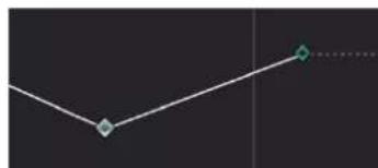
natural_image
Simple line diagram with two diamond markers and a dotted line, no text or symbols present- Bezier: This method lets you manipulate the keyframe curve manually by dragging the handles. If multiple Bezier keyframes are selected, or Bezier interpolation is applied to the curve segment, the handles of all selected keyframes are modified.

flowchart
graph TD
    A["Start"] --> B{Decision}
    B --> C["End"]
    style A fill:#f9f,stroke:#333
    style B fill:#ccf,stroke:#333
    style C fill:#cfc,stroke:#333
- Continuous: This method behaves like Bezier interpolation, but without access to the handles (which are calculated automatically). The parameter begins to change gradually, reaching its maximum rate of acceleration at the midpoint, then tapers off slightly as it approaches the second keyframe. When applied to a keyframe, the segments before and after the keyframe are affected. When applied to a curve segment, the segment between the keyframes is affected.

natural_image
Simple curved line with two diamond markers on a dark background (no text or symbols)- Exponential: This method creates an exponential curve between the current keyframe and the next, changing the value slowly at first, then reaching its maximum rate of acceleration as it approaches the next keyframe.
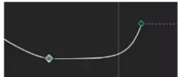
natural_image
Simple curved line with two diamond markers, no text or symbols present- Logarithmic: This method creates a logarithmic curve between the current keyframe and the next, changing the value rapidly at first, then slowing drastically as it approaches the next keyframe.

natural_image
Pure curved line diagram without any text, numbers, or symbols- Ease In: This method has a reverse-inertia effect, so a value change slows coming into a keyframe. When applied to a curve segment, the value change eases into the segment. This option is available only when you Control-click a keyframe; it is not available in the Animation pop-up menu.

natural_image
Simple curved line with two marked points on a dark background (no text or symbols)- Ease Out: This method creates a typical inertia-like lag, so a value change begins more slowly coming out of a keyframe. When applied to a curve segment, the value change eases out of the segment. This option is available only when you Control-click a keyframe; it is not available in the Animation pop-up menu.

natural_image
Simple curved line with two marked points on a dark background (no text or symbols)- Ease Both: This method combines Ease In with Ease Out, applying both at once. This option is available only when you Control-click a keyframe; it is not available in the Animation pop-up menu.

natural_image
Simple curved line with two marked points on a dark background (no text or symbols)Convert to Bezier interpolation
Bezier interpolation is the most flexible method of curve generation because it allows manual modification of the curve. Motion lets you convert any keyframe into a Bezier keyframe.
Convert a keyframe into a Bezier keyframe
■ While holding down the Command key, drag the keyframe in the keyframe graph.
Bezier handles appear and your mouse movement controls one of the handles.

line
| X | Y | | ---- | ------ | | 61 | 205.0 | | 121 | 26.6 | | 181 | 205.0 | | 241 | 26.6 | | 301 | 205.0 |Note: Command-clicking a Bezier point resets it to Linear interpolation.
To simultaneously modify the handles for more than one control point, Shift-click to select multiple points, then adjust the tangent handles. If there are no tangent handles on the point, drag the point while holding down the Command key.
Adjust tangents of a control point
Do one of the following:
- Hold down the Option key and drag a tangent's handle to adjust it independently of its other tangent handle.
- Hold down the Option key while dragging a tangent with broken handles to lock the handles together again.
- Control-click a tangent's handle, then choose Link Tangent from the shortcut menu to constrain one broken tangent to another so that both move together.
- Control-click a tangent's handle, then choose Align Tangents from the shortcut menu to line both tangents up again.
Constrain a tangent handle's angle to 45-degree increments
■While holding down the Shift key, drag the handle.
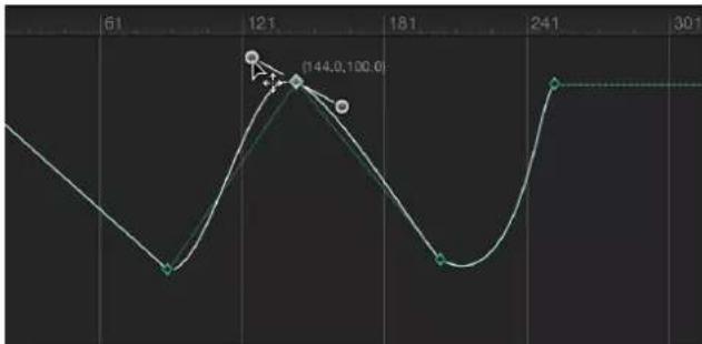
line
| X | Y | | ---- | ----- | | 121 | 144.0 | | 181 | 100.0 | | 241 | 301 |Set curve extrapolation
In addition to setting interpolation for curves between keyframes, you can define how Motion generates the values before the first keyframe and after the last one. This is known as extrapolation. When you set a such a method for a parameter, keyframes are added beyond your original keyframes, which is useful to extend the duration of an effect such as a moving background. Several extrapolation algorithms are available in the Before First Keyframe and After First Keyframe submenus of the Animation menu. For more information about the preset algorithms, see Curve extrapolation methods on page 479.
Apply an extrapolation method to a parameter before the first keyframe
- Click in the fifth column of the parameter list in the Keyframe Editor to open the Animation menu for the parameter to change, then choose an item from the Before First Keyframe submenu.
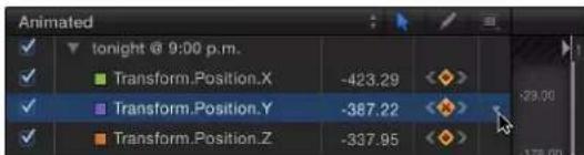

Apply an extrapolation method to a parameter after the last keyframe
- Click in the fifth column of the parameter list in the Keyframe Editor to open the Animation shortcut menu for the parameter to change, then choose an item from After Last Keyframe submenu.
Curve extrapolation methods
The following extrapolation options are available in the Before First Keyframe and After Last Keyframe submenus. (In each of the illustrated examples below, the extrapolation setting is applied after the last keyframe.)
- Constant: This method, the default, holds the beginning or ending segments of the curve to the same value as the first or last keyframe.

line
| x | y | | ---- | ------ | | 1 | -287.00 | | 121 | -162.00 | | 241 | -412.00 | | 361 | -287.00 | | 481 | -162.00 |- Linear: This method extends the curve beyond the first or last keyframes uniformly, along the existing trajectory of the first or last keyframe.
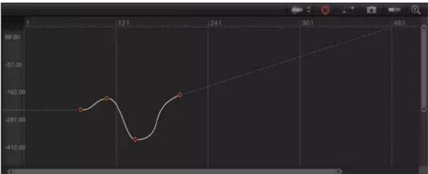
line
| X | Y | | ---- | ------ | | 1 | -287.00 | | 121 | -162.00 | | 241 | -412.00 | | 361 | -287.00 | | 481 | -287.00 |- Ping Pong: This method copies the curve and repeats it, alternating forward and backward.
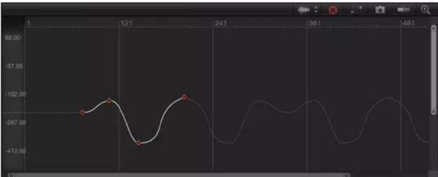
line
| Time | Value | |------|---------| | 1 | -287.00 | | 121 | -102.00 | | 241 | -412.00 | | 361 | -102.00 | | 481 | -412.00 |- Repeat: This method duplicates the curve, applying it again and again.
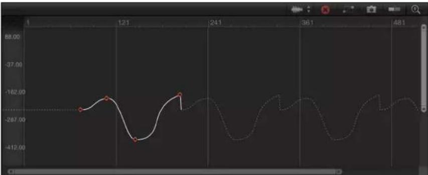
line
| Time | Value | |------|--------| | 1 | -267.00 | | 121 | -162.00 | | 241 | -412.00 | | 361 | -162.00 | | 481 | -267.00 |- Progressive: This method extends the curve by repeating the existing shape of the curve, but rather than returning to the exact values, repeats from the existing end value.

line
| x | y | | ---- | ------ | | 1 | -287.00 | | 121 | -162.00 | | 241 | -412.00 | | 361 | -37.00 | | 481 | -287.00 |Convert extrapolation data
Ordinarily, keyframe extrapolation occurs without creating keyframes. This lets you experiment with various methods. However, you can convert an extrapolation method into keyframes to further manipulate them, using the Generate Keyframes command. You can choose how many extrapolation cycles you want converted into keyframes. Cycles after the number chosen remain in the extrapolated state.

line
| x | y | | ---- | ------ | | 1 | -287.00 | | 12.1 | -162.00 | | 24.1 | -412.00 | | 36.1 | -162.00 | | 48.1 | -162.00 |Original keyframe graph
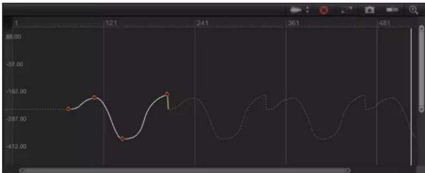
line
| Time | Value | |------|---------| | 1 | -287.00 | | 121 | -162.00 | | 241 | -412.00 | | 361 | -287.00 | | 481 | -412.00 |Repeat extrapolation applied
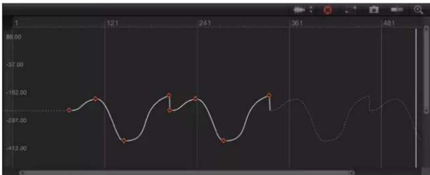
line
| Time | Value | |------|---------| | 1 | -287.00 | | 121 | -162.00 | | 241 | -412.00 | | 361 | -287.00 | | 481 | -412.00 |Generate Keyframes applied, set to one cycle
Convert extrapolation data into keyframes
1 In the Keyframe Editor's Animation menu, choose Generate Keyframes from the Before First Keyframe or After Last Keyframe submenu.
The Generate Keyframes dialog appears.

2 Choose the number of cycles to be keyframed.
3 Click OK to confirm your selection.
Mini-curve editor
Similar to the Keyframe Editor, mini-curve editors provide a way to animate parameters outside the Keyframe Editor's interface using keyframes in a graph. Animations created in a mini-curve editor don't appear in the Keyframe Editor.
Two Particle behaviors—Scale Over Life and Spin Over Life—have mini-curve editors in the Inspector (when the Increment Type parameter is set to Custom). Mini-curve editors are also present for paint objects, in the Stroke pane of the Shape Inspector.
By default, the mini-curve editor is collapsed and shows a scaled-down representation of the parameter curve.
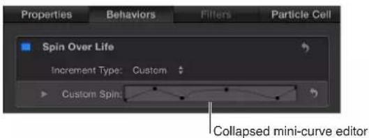
Expand a mini-curve editor
- Click the disclosure triangle next to the collapsed mini-curve editor in the Inspector. The expanded mini-curve editor appears.

When expanded, the mini-curve editor shows a representation of the relevant animation curve. In the example above, the Over Life parameter is mapped to the X axis and the Custom Spin parameter is mapped to the Y axis.
Add keyframes in the mini-curve editor
The procedure for adding keyframes in a mini-curve editor is slightly different than adding them in the full-sized Keyframe Editor.
Do one of the following:
■Double-click the curve.
■Option-click the curve.
■ Control-click the curve, then choose Add Keyframe from the shortcut menu.
Modify a keyframe value in the mini-curve editor
1 Double-click the keyframe in the mini-curve editor in the Inspector.
Its value field is activated.
2 Enter a value in the value field, then press Return.
Note: To dismiss an active value field without making changes, press Esc.
The mini-curve editor provides the Edit Keyframes, Sketch Keyframes, and Transform Keyframes tools, and each functions in the same manner as in the Keyframe Editor. For more information on using the Edit Keyframes tool, see Add, delete, and modify keyframes on page 465. For more information on using the Sketch Keyframes tool, see Use the Sketch Keyframes tool on page 469. For more information on using the Transform Keyframes tool, see Use the Transform Keyframes tool on page 470.
The Auto Fit checkbox sets whether Motion scales the animation curve to fit within the confines of the mini-curve editor.
Animate on the fly
Motion lets you create animations while your project is playing back. This is similar to how audio engineers adjust sliders for each audio channel while listening to the mix. The next time the project is played back, all changes are incorporated.
Because so many of Motion's effects are displayed in real time, you can perform a sort of "visual mix" and modify the parameters of your effects while the project is playing back. Make adjustments to any slider or parameter, interactively manipulate objects in the Canvas, and then, if you don't like the results, rewind and do it again. Each time you alter a parameter, you replace the keyframes previously assigned.
Animate a parameter on the fly via the Inspector or HUD (using the Record button)
1 Click the Record button (or press A) or choose Mark > Record Animation to turn on keyframe recording.
2 Click the Play button or press the Space bar to begin playback.
3 As your project plays, adjust a parameter slider.
4 Disable Record.
The changes you made during playback are recorded as keyframes for that parameter. You can view them in the Keyframe Editor.
Note: You can also animate on the fly using the initial keyframe method. For more information on the initial keyframe method, see Keyframing methods on page 442.
Delete keyframes recorded on the fly
If you don't like the animation you made, you can delete the keyframes and try again. Choose Edit > Undo (or press Command-Z) to revert to the state before you began recording your animation, or manually delete the keyframes to replace.
Do one of the following:
■Select a keyframe, then press Delete.
■ Control-click a keyframe, then choose Delete from the shortcut menu.
- Select a keyframe, then choose Delete from the Animation menu for that parameter.
Note: To delete all keyframes for a parameter, choose Reset Parameter from the Animation menu in the Keyframe Editor parameter list or Inspector.
Create a handmade animation path in the Canvas
A common use for animating on the fly is to create hand-drawn animation paths. Although you can choose various curve types, it is very difficult to simulate semi-random movement except by sketching with a mouse or pen.
1 Enable Record (press A).
2 Click the Play button to begin playback.
3 Select the object to manipulate and drag it in the pattern of your choice.
The position and speed of your movement are recorded and applied to the position keyframes for that object.

You can further manipulate the path by dragging individual keyframes, or re-recording a new animation path for that object.
Keyframe thinning
When a parameter contains at least one keyframe, or when the Record button is on, a keyframe is added every time you modify a parameter at a new playhead position. If you animate while the project is playing, you create a keyframe at every frame.
In many cases, the curve created by your animation can be represented using fewer keyframes. Often, this provides a smoother rate of change and lets you take advantage of interpolation methods such as Bezier or Continuous.
You can simplify your keyframes in two ways: by simplifying an existing animation curve using the Reduce Keyframes command in the Animation menu for that parameter or by adjusting keyframe thinning options before recording keyframes.
Reduce keyframes in an existing animation curve
1 Choose Reduce Keyframes from the Animation menu (click in the fifth column in the Keyframe Editor parameter list).
The Reduce Keyframes dialog appears.

2 Adjust the Error Tolerance and Smoothing parameters to obtain the curve you want.

Adjust keyframe thinning before animating on the fly
Use the Recording Options dialog to adjust the Keyframe Thinning setting or to disable recording during playback. (This setting has no effect on ordinary keyframing.)
1 Do one of the following:
- Choose Mark > Recording Options (or press Option-A).
- Double-click the Record button (under the Canvas).
The Recording Options dialog appears.
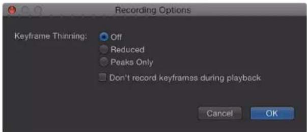
2 Select a Keyframe Thinning option:
- Off: No thinning is applied. Keyframes are added at every frame where the parameter is changed.
- Reduced: Motion eliminates keyframes that can easily be replaced with a simple curve.
- Peaks Only: Only keyframes with dramatic value changes are recorded.
- Don't record keyframes during playback: Select this checkbox if you don't want keyframes to be recorded while the project is playing back.
3 Click OK.
Disable animation recording during playback
If the Record button is enabled or a parameter contains at least one keyframe, keyframes are added when you make parameter adjustments. To prevent creating accidental animation, you can restrict automatic keyframing so it happens only when the project is not playing.
1 Choose Mark > Recording Options.
The Recording Options dialog appears.
2 Select "Don't Record keyframes during playback."
3 Click OK.
Keying
13
Keying overview
Keying is the process of isolating a foreground subject against a background area of uniform color or brightness to generate an alpha channel (a matte) based on the shape of the colored area. Keying is commonly performed on subjects photographed against a blue- or green-colored background, but keys can be based on any color (color keying), or on a specific range of brightness values (luma keying).
Color keying (also known as chroma keying) is commonly used on television to create the familiar effect of a newsreader or show host backed by a cavalcade of animated graphics. You can do the same thing in Motion using the Keyer filters.

natural_image
Woman holding a candle against a green background (no text or symbols visible)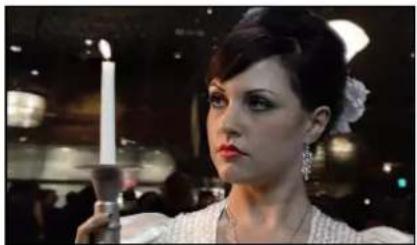
natural_image
Portrait of a woman in vintage attire holding a candle, with no visible text or symbolsGreen screen clip Keyed clip
Important: Keying to isolate a foreground subject is not always easy; learning how to use the parameters in each filter to best effect takes time and patience. Most keys are "pulled" using more than one tool. Good compositing artists usually combine masked keyer filters, matte adjustment filters, spill suppression operations, and garbage or holdout masks to isolate a single subject. The Keyer filter in Motion combines many of these operations within a single set of parameters. In some instances, it may be necessary to apply different keyer settings to different areas of the subject, requiring the use of multiple keying filters and masks.
Keying is accomplished using one of two keyer filters in Motion:
- Use the Keyer filter for blue screen or green screen keying, or for keying any range of color you choose.
- Use the Luma Keyer to generate mattes based on a sampled range of lightness in the image.
Two other Motion keying filters—Matte Magic and Spill Suppression—provide standalone access to matte finishing operations:
Both keyer filters, as well as the Matte Magic and Spill Suppression filters, are located in the Keying category of filters in the Motion Library. For more information, see Manipulate alpha channels using filters on page 757.
To learn more about keying techniques, choose an item in the Help table of contents (the sidebar to the left of this window).
Keyer filter
Keyer filter overview
The Keyer filter is intended for subjects shot in front of a blue screen or green screen. However, this filter can also be used to pull chroma keys from any range of color within a shot. The keyed portions of the image are rendered transparent, allowing background images to show through.
You apply a Keyer filter like any other filter in Motion—via the Library or the Add Filter pop-up menu in the toolbar. For more information about applying filters, see Apply and remove filters on page 742.
Important: When combining masks with a keying filter, make sure the masks you use to crop the keyed image are applied to the same image layer as the keying filter itself. Also, apply masks after you apply a keying filter.
Automatic versus manual keying
At its default settings, the Keyer filter attempts to work as automatically as possible. When you apply the Keyer filter to an object, Motion analyzes the visible frame in the Canvas to detect a dominant color such as a green or blue background. The dominant color becomes the initial sample that generates the tolerance, or core transparency, of the underlying key; this key is rendered as transparent in your composite.
However, you can override the automatic initial color sampling to key any color. You do this by setting the Strength parameter to 0, then using the Sample Color tool to draw a selection box over the region containing the color you want to key.
Keyer filter controls
After you apply the Keyer filter to a video or image layer in your project, you can modify and refine the keying parameters in the Filters Inspector or HUD. This section explains the operation of the tools and parameter controls found in the Keyer section of the Filters Inspector.

Refine Key tools
Use the Refine Key tools to manually sample regions of an image to modify the tolerance, or core transparency, of the generated key. You can sample multiple regions in an image or in a single frame of a movie clip. You can also sample regions across multiple frames of a clip or image sequence to compensate for changing conditions, such as shifting lighting that affects the keyed background.
When you sample regions in multiple frames, keyframes are added to interpolate the difference from one frame to the next. (Unlike standard keyframes, color-sampling keyframes are hidden in the Motion workspace by default.) The Jump to Sample buttons let you navigate between frames you've sampled, to make changes. For more information on keyframing the Keyer filter, see Animate parameters in the Keyer filter on page 504.
There are two Refine Key tools:
- Sample Color: Use this tool to select regions of the image to be turned transparent. Click the Sample Color tool, then drag a selection box in the Canvas to define a range of color to key. After you create a selection box, you can resize it to sample more or fewer shades of color, increasing or decreasing the range of background color used to create transparency. You can also add more selection boxes to expand the range of color that is keyed. You can also add more sample color boxes at other frames of the clip to maintain transparency when lighting conditions change.
To add selection boxes, select the Keyer filter in the Layers list, then hold down the Shift key while dragging in the Canvas.
Note: Adding a Sample Color selection box to a frame adds to the sampled region that's defined when you first apply this filter.

natural_image
Close-up of a woman's ear with decorative earrings against a green background, next to a dotted square outline (no text or symbols)- Edges: Use this tool to refine the transparency of marginal regions of the keyed subject, such as hair, reflections, smoke, or moving subjects with motion blur. Click the Edges tool, then drag in the Canvas to draw a line that crosses the boundary of the semitransparent region you want to adjust (with one point on the keyed foreground subject and the other point on the transparent background). Next, adjust the slider handle in the middle of this control line, outward to soften the matte, or inward to harden it.
If the Keyer filter is selected in the Layers list, you can press the Command key and drag in the Canvas to create Edges sampling controls.
Note: To remove a Sample Color selection box or Edges control, select the box or control, then press Delete. Alternatively, Option-click inside the selection box or control line.
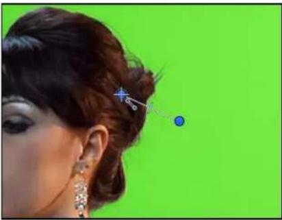
natural_image
Close-up of a woman's ear with an elegant updo hairstyle and a small blue dot, against a solid green background (no text or symbols visible)Additional key controls
- Strength: Use this slider to adjust the tolerance (core transparency) of the Keyer filter's automatic sampling. The default value is 100% . Reducing this value narrows the range of color sampled, resulting in less transparency in the keyed image. Increasing the Strength value expands the range of color sampled, resulting in more transparency in the keyed image. The Strength parameter is useful to retrieve areas of semitransparent detail such as hair, smoke, or reflections.
Important: Setting Strength to 0 bypasses the filter's automatic sampling altogether, allowing you to manually sample a range of color using the Refine Key tools.
- Jump to Sample: Use these left and right arrow buttons to navigate to frames that have been manually sampled using the Sample Color and Edges tools. When the playhead is at a sampled frame, a numeric counter to the right of these buttons indicates your current position in the range of sampled frames (for example, "3 of 5").
• View: Use these buttons to switch between three keying preview modes in the Canvas, useful for refining your key. The View setting affects what is rendered in your final output. For example, setting View to Matte lets you export a grayscale matte image that you can use as a luma channel matte in another application. There are three buttons:
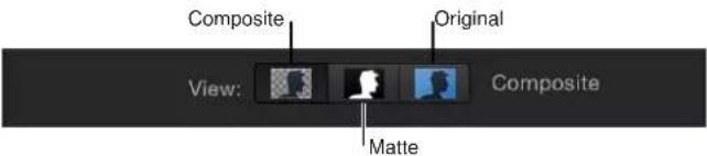
- Composite: When selected, the leftmost button displays the final composited image in the Canvas, with the keyed foreground object isolated against a transparent background, which lets layers underneath show through.
- Matte: When selected, the middle button displays the grayscale matte, or alpha channel, generated by the keying operation. Viewing the alpha channel directly lets you evaluate the parts of the generated matte. Areas in the matte that appear white are visible in the final composite; areas that appear black are transparent; and areas with shades of gray are semitransparent (lighter grays being more solid, and darker grays being more). Viewing the alpha channel makes it easier to spot unwanted holes in the key, or areas of the key that aren't transparent enough.
•Original: When selected, the rightmost button displays the original, unkeyed image in the Canvas. This view is useful to sample colors from the original image.
- Fill Holes: Use this slider adjust solidity in regions of marginal transparency throughout a key. This parameter is useful when you're satisfied with the edges of your keyed matte, but you have unwanted holes in the interior of the foreground subject that you can't eliminate using the Strength parameter without ruining your edges. Higher slider values fill more holes in the solid areas of the keyed subject.
- Edge Distance: Use this slider to adjust how close to the edge of your keyed subject the effect of the Fill Holes parameter gets. Decreasing this parameter brings the solid, nontransparent area of the matte closer to the edge of the subject being keyed, sacrificing translucence at the edges in favor of filling unwanted holes at the edge of the keyed subject, or retrieving areas of semitransparent detail, such as hair, smoke, or reflections. Increasing this parameter pushes the filled area of the matte further to the interior of the subject, away from the edges, adding translucence to regions of the image that aren't being keyed aggressively enough. Increasing this parameter too much may introduce regions of unwanted translucence in parts of the subject that should be solid.
- Spill Level: Use this slider to set how much spill suppression is applied to the keyed subject. Spill suppression is a color correction that neutralizes the green or blue colored light that often bounces off a green screen or blue screen background and tints the edges of a subject during a shoot. Consequently, it becomes more difficult to separate the foreground subject from the background during the keying process. Spill suppression is applied when you add the Keyer filter.
natural_image
Portrait of a woman holding a lit candle, wearing a white dress with green earrings (no visible text or symbols)Without spill suppression
natural_image
Portrait of a woman in vintage attire holding a candle, with no visible text or symbolsWith spill suppression
The color that is suppressed in the final image is based on the sampled portion of the image. The Spill Level slider controls how much spill suppression is applied to the keyed subject. For example, if the subject was shot in front of a green screen background, increasing the Spill Level value adds magenta to the foreground image, which neutralizes any unwanted green cast that your subject may be exhibiting. Spill suppression can be further customized using the controls in the Spill Suppression group, described later. Setting Spill to 0 turns off spill suppression.
- Invert: Select this checkbox to Invert the generated matte, so solid areas become transparent, and vice versa.
Color Selection controls
Click the disclosure triangle in the Color Selection row to reveal controls for adjusting the tolerance (core transparency) and softness (edge transparency) in the chroma and luma channels of the keyed region. Which controls are adjustable depends on the Graph mode (Scrub Boxes or Manual) you select in this group of controls.
These controls are meant to be used after you begin creating a key using automatic sampling or the Sample Color and Edges tools. (However, you can skip those tools and create a key using the Color Selection controls in Manual mode.) The graphical Chroma and Luma controls in the Color Selection group provide a detailed way of refining the range of hue, saturation, and image lightness that define the keyed matte.

Before you adjust these controls, the graphs in the Chroma and Luma controls represent ranges of color and luma in the image that have been automatically and manually sampled (using the Refine Key tools and the Strength slider).
The Color Selection group contains the following controls:
- Graph: Select one of two buttons to set how the adjustable graphs in the Chroma and Luma controls are used to fine-tune a key:
- Scrub Boxes: Select this button to limit the Chroma and Luma controls to adjusting softness (edge transparency) in the matte you are creating. In Scrub Boxes mode, you cannot manually adjust tolerance (core transparency), which is determined by the Keyer filter's automatic sampling, plus any Sample Color selection boxes you've added in the Canvas. To increase matte tolerance, add more Sample Color selection boxes or adjust the Strength slider.)
- Manual: Select this button to use the Chroma and Luma controls to adjust the softness (edge transparency) and tolerance (core transparency) in the matte you are creating. Make sure the Strength slider is set to a value greater than 0 before you switch into Manual mode, otherwise the Chroma and Luma controls are disabled. When you switch to Manual mode, the Refine Key tools and Strength slider become disabled, but samples you've made with those controls continue to contribute to the matte.
Important: When you switch to Manual mode, it's inadvisable to switch back to Scrub Boxes mode. For best results, begin keying an image using the Sample Color and Edges tools in Scrub Boxes mode. Switch to Manual mode afterwards if you feel it's necessary to refine your matte using the Chroma and Luma controls. However, after you switch to Manual mode, do not switch back to Scrub Boxes mode. If you do, you may experience unexpected combinations of additionally sampled and keyframed values that might be difficult to control.
- Chroma: Drag the two graphs in this color wheel control to adjust the isolated range of hue and saturation that help define the keyed matte. The selected mode governs which graphs in the color wheel are adjustable. The outer graph controls the softness (edge transparency) of the matte you're creating, and can be adjusted in either Scrub Boxes or Manual mode. The inner graph controls tolerance (core transparency), and is only adjustable when in Manual mode.
Drag any side of either graph to expand or contract the graph's border, which adds to or subtracts from the range of hue and saturation contributing to the key. In manual mode, you can also drag inside the tolerance graph to adjust its overall position in the color wheel.
To the left of the color wheel, a small graph displays the slope of chroma rolloff, the relative softness of matte edges in regions most affected by the Chroma control. Dragging the Chroma Rolloff slider (described below) modifies the shape of this slope.
It's possible to zoom into and pan around the Chroma control to more precisely adjust the graphs:
- Zooming the Chroma control: To zoom incrementally into the Chroma control, hold down the Z key and click the color wheel. To zoom out, hold down the Option and Z keys and click the color wheel. To smoothly zoom out, hold down the Z key and drag left in the color wheel. To smoothly zoom in, hold down the Z key and drag right in the color wheel. You can also hold down the Space bar and Command key (in that order), and drag left in the color wheel to zoom out or drag right to zoom in.
- Panning the Chroma control: To pan in the Chroma control, hold down the H key and drag in the color wheel. You can also hold down the Space bar and drag in the color wheel in the direction you want to move it.
To reset the zoom and recenter the Chroma control, move the pointer over the Chroma control and press Shift-Z.
- Luma: Drag the adjustable handles in this grayscale gradient to modify the isolated range of the luma channel (the range of lightness and darkness) that also helps define the keyed matte. The upper handles (which only appear in Manual mode) adjust the tolerance (core transparency) of the luma channel's contribution to the key. The lower handles adjust the softness (edge transparency) of the luma channel's contribution to the key.
The Graph mode governs which handles are adjustable. In Scrub Boxes mode, you can adjust only the lower softness handles, which modify the range of lightness and darkness affecting the edge transparency the matte. In addition to using the handles, you can drag the slope in the graph to adjust the softness.
In Manual mode, you can also adjust the upper tolerance handles, which modify core transparency within the luma channel of the matte. Dragging the slope in the graph adjusts the lower handles (the softness). To adjust all handles simultaneously, drag inside the curve in the graph.
By default, the slope of the left and right sides of the Luma graph has a slight "S" curve. You can modify the shape of the curve by adjusting the Luma Rolloff slider (described below).
Note: The luma softness handles may extend past the outer boundaries of the Luma control. This is due to the floating-point precision of the Keyer filter, and is an expected behavior.
- Chroma Rolloff: Use this slider to adjust the linearity of the chroma rolloff slope (displayed in the small graph to the left of the Chroma control). Chroma rolloff modifies the softness of the matte around the edges of regions that are affected most by the Chroma control. Lowering this value makes the slope of the graph more linear, which softens the edges of the matte. Raising this value makes the slope of the graph steeper, which sharpens the edges of the matte.
- Luma Rolloff: Use this slider to adjust the linearity of the luma rolloff slope (the ends of the bell-shaped luma curve displayed in the Luma control). Luma rolloff modifies the softness of the matte around the edges of regions that are affected most by the Luma control. Lowering this value makes the slope between the upper and lower handles in the Luma control more linear, which increases edge softness in the matte. Raising this value makes the slope steeper, sharpening the edges of the matte and making them more abrupt.
- Fix Video: Select this checkbox to apply subpixel smoothing to the chroma components of the image, reducing the jagged edges that result from keying compressed media using 4:2:0, 4:1:1, or 4:2:2 chroma subsampling. Although selected by default, this checkbox can be deselected if subpixel smoothing degrades the quality of your keys.
Matte Tools controls
Click the disclosure triangle in the Matte Tools row to reveal controls for post-processing the transparency matte generated by the previous sets of parameters. These parameters don't alter the range of values sampled to create the keyed matte. Instead, they alter the matte generated by the Keyer filter's basic and advanced controls (the Color Selection parameter group), letting you shrink, expand, soften, or invert the matte to achieve a better composite.

The Matte Tools group contains the following controls:
- Levels: Use this grayscale gradient to alter the contrast of the keyed matte, by dragging three handles that set the black point, white point, and bias (distribution of gray values between the black point and white point). Adjusting the contrast of a matte can be useful for manipulating translucent areas of the key to make them more solid (by lowering the white point) or more translucent (by raising the black point). Dragging the Bias handle right erodes translucent regions of the key, while dragging the Bias handle left makes translucent regions of the key more solid.
- Black, White, Bias: Click the disclosure triangle in the Levels row to reveal sliders for the Black, White, and Bias parameters. These sliders, which mirror the settings of the Levels handles described above, allow you to keyframe the three Levels parameters (via the Add Keyframe button to the right of each slider). Keyframing the Black, White, and Bias parameters may yield a better key, one that adapts to changing blue screen or green screen conditions.
- Shrink/Expand: Use this slider to manipulate the contrast of the matte to affect matte translucence and matte size simultaneously. Drag the slider left to make translucent regions more translucent while simultaneously shrinking the matte. Drag the slider right to make translucent regions more solid while simultaneously expanding the matte.
- Soften: Use this slider to blur the keyed matte, feathering the edges by a uniform amount.
- Erode: Drag this slider right to gradually increase transparency from the edge of the solid portion of the key inward.
Spill Suppression controls
Click the disclosure triangle in the Spill Suppression row to reveal controls for neutralizing a colored light that bounces off the blue screen or green screen and contaminates the isolated foreground subject. This fringing around the edge of the subject is called spill, and is difficult to eliminate because it's part of the subject you're trying to preserve.
The Spill Suppression controls work by letting you adjust the color correction that neutralizes unwanted color in the foreground subject. While the Spill Level slider (described above) controls how much suppression is applied, the controls in this group let you customize the quality of suppression being performed.
When first applied, the Keyer filter adds spill suppression to the video clip or image, based on the dominant color sampled to create the initial key. This automatic spill suppression desaturates the key color so fringing around the foreground subject appears gray (rather than blue or green). But if you reduce the Spill Level slider to 0, effectively turning off spill suppression, the gray fringing turns blue or green (the color of your background), proving that successful spill suppression is rendering the background a neutral gray.

The Spill Suppression group contains the following controls:
- Spill Contrast: Use this grayscale gradient to adjust the contrast of the color being suppressed, using Black and White point handles (and corresponding sliders). Modifying spill contrast can reduce the gray fringing surrounding a foreground subject. The Black point handle (on the left side of the gradient control) lightens edge fringing that is too dark for a successful composite. The White point handle (on the right side of the gradient control) darkens edge fringing that is too light. Depending on how much spill is neutralized by the Spill Level slider, these controls may have a greater or lesser effect on the subject.
- Black, White: Click the disclosure triangle in the Spill Contrast row to reveal sliders for the Black and White point parameters. These sliders, which mirror the settings of the Spill Contrast handles described above, allow you to keyframe the Black point and White point parameters (via the Add Keyframe button to the right of each slider).
- Tint: Use this slider to restore the natural color of the keyed foreground subject. Because the Spill Suppression controls eliminate blue or green spill by desaturating subtle blue or green fringing and reflection on the subject, the Tint slider lets you add hues to restore the natural color of the subject. Overdoing this parameter results in over-tinting the subject with the complementary color of the hue being suppressed—magenta if green, and orange if blue.
- Saturation: Use this slider to alter the range of hues introduced by the Tint slider (when the Tint slider is used at moderate levels).
Light Wrap controls
Click the disclosure triangle in the Light Wrap row to reveal controls for blending color and lightness values from the background layer of your composite with the keyed foreground layer. Using these controls, you can simulate the interaction of environmental lighting with the keyed subject, making it appear as if background light wraps around the edges of a subject. In the following image on the right, with Light Wrap applied, environmental lighting from the orange sky background layer "wraps around" the edges of the candle and the right edge of the woman's hair.

natural_image
Close-up of a woman holding a lit candle, wearing a silver lace top and earring (no visible text or symbols)Without Light Wrap

natural_image
Close-up of a woman holding a lit candle, wearing a silver top and earring (no visible text or symbols)With Light Wrap
In Motion, the Light Wrap operation blends light and dark values from the background with the edges of the keyed foreground subject, and can be used to create color mixing effects around the edges of the solid part of a key to better marry the background and foreground layers of your keyed composite.
Light Wrap is the last operation in the image-processing pipeline. In other words, the light-wrap effect is added after every other image operation is processed, including filters, lights and shading, and other composited effects. As a result, Light Wrap properly accounts for any other visual effect that might alter the look of the object it is applied to, yielding the most desirable result.
Important: If the layer is set to the Light Wrap blend mode and you increase the Light Wrap parameter in the Keyer filter above 0, the Light Wrap parameters of the Keyer filter take precedence (and the Blend Mode is ignored). However, the Light Wrap blend mode in the Properties Inspector for a group overrides the Light Wrap parameters of any Keyer filters applied to layers in that group.

The Light Wrap group contains the following controls:
- Amount: Use this slider to control the overall light-wrap effect, setting how far into the foreground the light wrap extends.
- Intensity: Use this slider to adjust gamma levels to lighten or darken the interaction of wrapped edge values with the keyed foreground subject.
- Opacity: Use this slider to fade the light wrap effect up or down.
- Mode: Use this pop-up menu to choose the compositing method that blends the sampled background values with the edges of the keyed subject. There are five modes:
- Normal: Evenly blends light and dark values from the background layer with the edges of the keyed foreground layer.
- Lighten: Compares overlapping pixels from the foreground and background layers, then preserves the lighter of the two. Good for creating a selective light wrap effect.
- Screen: Superimposes lighter portions of the background layer over wrapped areas of the keyed foreground layer. Good for creating an aggressive light wrap effect.
- Overlay: Combines the background layer with the wrapped areas of the keyed foreground layer so overlapping dark portions become darker, light portions become lighter, and colors become intensified.
- Hard Light: Similar to the Overlay composite mode, except that colors become muted.
Mix slider
Use this slider to set the percentage of the original image to be blended with the keyed image. 100% is the fully keyed image, while 0% is the original, unkeyed image.
Use the Keyer filter
Getting started with the Keyer filter is easy. After you create a basic key, you can fine-tune the default color sampling using the Sample Color and Edges tools in the Filters Inspector or HUD. Alternatively, you can override the Keyer filter's default sampling, then set the key colors manually.
When manually sampling colors to create a key, it's not necessary to click the Sample Color and Edges tools in the Inspector or HUD before you drag in the Canvas. Instead, you can use keyboard shortcuts to activate the Sample Color and Edges tools while dragging in the Canvas.
For additional control over the transparency matte, use the Color Selection controls and the Matte Tools in the Filters Inspector. These controls provide options for creating a seamless composite without adding more Keyer filters.
Create a basic key
1 Import a background image into your project.
2 Import a foreground image or video clip of a subject positioned in front of a green screen or blue screen.
This example uses video footage of an actor standing in front of a green screen. Make sure the foreground (the actor and green screen) layer is above the background layer in the Layers list.
3 Move the playhead to a frame where the green screen is visible in the Canvas, then apply the Keyer filter to the foreground layer.
The Keyer filter analyzes the frame and guesses the color you are trying to remove, based on the dominant color in the image (if blue or green). For the best results, apply the filter to the frame with the greatest amount of the color to key.
If the automatic guess is incorrect (for example, if you want to key on red), you can set the Strength parameter in the Filters Inspector to 0 to disable automatic color sampling, then use the Sample Color tool to draw a selection box in the Canvas around the color you want to key. (This workflow is covered in the next task.)
The background layer shows through as long as the View control in the Filters Inspector is set to Composite.

natural_image
Woman holding a decorative mirror with an ornate eye, set against a wooden background (no text or symbols visible)Note: If the clip you add a Keyer filter to is not visible in the Canvas, the initial key is pulled based on the first or last frame in which the subject appears, whichever is closest to the playhead.
4 If the automatic key is too aggressive (keying out soft details of the keyed subject that you want to preserve), slowly drag the Strength slider left to reduce the tolerance (core transparency) of the matte until you're satisfied with the amount of edge detail in the key.
Doing so allows areas of marginal transparency like hair, smoke, and reflections to show through. In general, it's better to err on the side of a less aggressive key, using the parameters within the Matte Tools group to fine-tune the soft details you're trying to preserve.
natural_image
Woman holding a vintage-style mirror with ornate hair and makeup, standing against a wooden background (no visible text or symbols)Strength set to 100%

natural_image
Woman in vintage dress holding a mirror, no visible text or symbolsStrength set to 35%
Tip: If you open the Color Selection controls while adjusting the Strength slider, you can see how the Chroma and Luma parameters are affected.
Override automatic color sampling and set your own key colors
1 Select the applied Keyer filter in the Layers list, then open the Filters Inspector or HUD.
2 Set the Strength slider to 0.
Automatic color sampling is disabled, and the green screen background becomes visible in the Canvas.

natural_image
Woman holding a lit candle against a green background (no text or symbols visible)3 In the Filters Inspector (or HUD), click to select the Sample Color tool.

4 In the Canvas, drag a selection box over an area of the green screen color that you are attempting to key.

natural_image
Woman holding a lit candle in a dimly lit setting (no visible text or symbols)Most of the green screen should disappear and be replaced by the image in the layer underneath the foreground layer in the Layers list. You can add as many selection boxes as necessary to sample areas of the green background (for example, highlights or shadows on the green screen) to achieve a better result.

natural_image
Portrait of a woman holding a candle, with blurred background lighting and no visible text or symbolsIf the edges of the foreground subject are too sharp, use the Edges tool to soften the foreground edges. The Edges tool is also effective for fine-tuning semitransparent features such as smoke, glass reflections, and shadows.
5 In the Filters Inspector or HUD, click to select the Edges tool.
6 In the Canvas, drag a line over the edge of the foreground subject so one end point lies in the interior of the foreground subject and the other end point lies in the background (the orange sky).
An Edges control line appears in the Canvas.
7 In the Canvas, drag the center handle of the Edges control line to adjust the edge transparency of the keyed subject.
You can also set the View mode to Matte, which helps you see the effect of using the Edges tool. (The Matte mode also helps you review your work when you modify the Fill Holes and Edge Distance parameters.)

natural_image
Silhouette of a person with a candle and floral accessory against a black background (no text or symbols)Tip: If you open the Color Selection controls while dragging the center handle, you can see how the Edges control alters the outer softness graph of the Chroma control and the bottom softness handles of the Luma controls.
Add Sample Color and Edges controls in the Canvas using keyboard shortcuts
1 In the Layers list, select the Keyer filter to adjust.
2 Do one of the following:
- To create a Sample Color selection box, hold down the Shift key while dragging over the color you want to key in the Canvas.
- To create an Edges sampling control, hold down the Command key while dragging to draw a line that crosses over the edge of the subject you're keying in the Canvas.
- To remove a Sample Color or an Edges control, Option-click anywhere in the control you want to delete, or click to select a sample control, then press the Delete key.
Refine a key using the Color Selection controls
1 With the Keyer filter selected in the Layers list, set the View mode in the Filters Inspector to Matte.
Matte mode lets you see how your adjustments affect the transparency of the image. The keyed image now appears in grayscale: white areas represent solid pixels in the final matte; black areas represent transparent pixels in the final matte, and varying levels of gray represent translucent pixels in the final matte (darker gray is more transparent; lighter gray is more opaque).
2 Click the disclosure triangle in the Color Selection row of the Filters Inspector to reveal additional controls.

3 Choose one of the two Graph modes to select a mode for the adjustments you need:
- Scrub Boxes: Remain in Scrub Boxes mode (the default) if you are satisfied with the current key but want to adjust the edge softness of the resulting matte. In Scrub Boxes mode, you can adjust the outer graph of the Chroma control and the lower handles of the Luma control to increase or decrease the translucency of the edges of the matte.
- Manual: Click Manual to make substantial alterations to tolerance (core transparency) and edge softness in matte. In Manual mode, you can adjust the inner and outer graphs of the Chroma control, as well as the upper and lower handles of the Luma control to alter all aspects of transparency in the matte. In Manual mode, you cannot alter the Strength parameter or add more Sample Color or Edges controls in the Canvas.
After you enter Manual mode, do not return to Scrub Boxes mode.
Note: For more information on keyframing the Color Selection controls, see Animate parameters in the Keyer filter on page 504.
4 Depending on the mode you selected in the previous step, adjust the controls to alter your matte:
- In Scrub Boxes mode, drag any side of the outer graph in the Chroma control to alter the range of hue and saturation contributing to the matte's edge softness (transparency around the edges of the key).

Note: In Scrub Boxes mode, you can also drag the two lower handles of the Luma control to alter the range of lightness and darkness contributing to the matte's edge softness.
- In Manual mode, drag any side of the outer graph in the Chroma control to alter the range of hue and saturation contributing to the matte's edge softness. Drag any side of the inner graph to alter the range of hue and saturation contributing to the matte's tolerance (core softness). Drag in the center of the inner graph to rotate the graph to a new position in the color wheel.

Note: In Manual mode, you can also drag any of the four Luma control handles. The two upper Luma handles alter the range of lightness and darkness contributing to the matte's tolerance (core transparency); the two lower handles alter the range of lightness and darkness contributing to matte's edge softness.
In either mode, expanding the Chroma graph or Luma handle outward increases the regions of transparency in the keyed image. Dragging the side of a Chroma graph or a Luma handle inward diminishes the transparent regions in the keyed image. In the example below, the top image shows the holes in the matte that result from increasing edge softness using the outer graph of the Chroma control. The bottom image shows how reducing edge softness closes these holes.

natural_image
3D rendered human head with a candle and earpiece, no visible text or symbols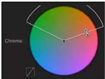
Widening softness

natural_image
Silhouette of a person's head and shoulders against a black background, with no visible text or symbols.
Narrowing softness
5 If you haven't adjusted the Luma control, drag the left or right lower handles to alter the softness of the luma component of the image.

Tip: In Manual mode, you can adjust the lower handles by dragging the bar connecting the top and bottom handles. To adjust all handles simultaneously, drag inside the curve in the graph.
6 Adjust the Chroma and Luma Rolloff sliders to subtly alter the falloff between the tolerance and softness of the key.

Refine a key using Matte Tools
1 With the Keyer filter selected in the Layers list, set the View mode in the Filters Inspector to Matte.
Matte mode lets you see how adjustments affect the transparency of the image. The keyed image appears in grayscale: white areas represent solid pixels in the final matte; black areas represent transparent pixels in the final matte; and varying levels of gray represent translucent pixels in the final matte (darker gray is more transparent; lighter gray is more opaque).
2 Click the disclosure triangle of the Matte Tools row of the Filters Inspector.
The row expands to reveal the Levels control, which adjusts the contrast of the matte. Also revealed are the Shrink/Expand slider, the Soften slider, and the Erode slider.
3 Use the Levels control to modify transparency and contrast in the matte.
A general rule for using the Levels control is to drag the center Bias handle left to decrease transparency in the matte or right to increase transparency in the matte. The Black slider on the left and the White slider on the right modify contrast in the shadows and highlights of the matte.
The effects of Levels adjustments are best seen when View is set to Matte. In this view, the white area of the matte is the solid part, and the black area of the matte is the transparent part. Gray is translucent, with lighter grays creating progressively more transparency. With this in mind, here are some guidelines:
- Dragging the black bias handle right pushes gray areas to black, expanding areas of transparency within the matte.
- Dragging the center bias handle left pushes the grays in the matte towards white, widening solid areas of the key as semitransparent areas are made solid.
- Dragging the center bias handle right pushes the grays in the matte towards black, widening transparent areas of the key as semitransparent areas are made transparent.
- Dragging the white bias handle left pushes the grays in the matte towards white, expanding areas of solidity within the matte.
4 Drag the Shrink/Expand slider left to shrink the matte inwards, widening holes in the matte; drag the Shrink/Expand slider right to expand the matte outward, filling in holes in the matte.

natural_image
Silhouette of a human hand against a black background (no text or symbols)
natural_image
Silhouette of a human hand against a black background (no text or symbols)
natural_image
Silhouette of a hand reaching toward the right, against a black background (no text or symbols)Increasing Shrink/ExpandReducing Shrink/Expand Original matte
5 Drag the Soften slider right to blur the matte overall, resulting in softer edges throughout the matte.

natural_image
Silhouette of a person's hand against a black background (no text or symbols)
natural_image
Silhouette of a human hand against a black background (no text or symbols)Original matte Softened matte
6 Drag the Erode slider right to soften the matte from the edge inward, while preserving the original matte outlines as a translucent outer boundary.

natural_image
Silhouette of a hand reaching toward the right, against a black background (no text or symbols)Original matte

natural_image
Silhouette of a human hand against a black background (no text or symbols)Eroded matte
Animate parameters in the Keyer filter
If necessary, you can animate the parameters of the Keyer filter to account for changes in the background screen you're keying. For example, if there's uneven lighting in the background, and the camera pans along with a moving subject as she walks from a bright part to a darker part of the colored background, you can animate the Keyer filter parameters to account for this change.
There are two ways of doing this. You can use the Refine Key controls (Sample Color and Edges) to sample background colors on multiple frames, or you can set manual keyframes using the Animation pop-up menu and keyframe controls found in the Filters Inspector.
- Creating keyframes using the Refine Key controls: When you add a Sample Color box or Edges control to a clip you're keying, keyframes corresponding to the Chroma and Luma controls (in the Color Selection group) are placed at that frame, whether the Record button is enabled or not. This is the only way of keyframing tolerance while in Scrub Boxes mode, although the softness of the Chroma and Luma controls can be manually keyframed no matter what mode you're in by using the Animation menu of the Filters Inspector.
- Creating keyframes using the Color Selection controls in Manual mode: In Manual mode, you can keyframe all aspects of the Chroma and Luma controls using the keyframe controls or Animation menu. Alternatively, you can use the Record button to keyframe changes to the Chroma and Luma controls. After you add the first keyframe to the Chroma or Luma parameters, additional keyframes are added at each frame where you make modifications. For more information about the Color Selection parameters, see Keyer filter controls on page 488 and Use the Keyer filter on page 497.
After you've added at least one keyframe—by using the Refine Key tools, or by manually keyframing—adjustments to the Chroma and Luma controls on other frames will generate more keyframes, whether the Record button is enabled or not.
Tip: To make an adjustment without adding keyframes, use the Jump to Sample buttons (in Scrub Boxes mode only), or the Next/Previous keyframe buttons to the right of the Chroma and Luma controls in the Filters Inspector (in Scrub Boxes or Manual modes) to navigate to a previously keyframed frame.
After you switch from Scrub Boxes mode to Manual mode, work in Manual mode from that point onward. Switching from Manual mode back to Scrub boxes mode can create unexpected combinations of additionally sampled and keyframed values that are difficult to control.
Note: Chroma and Luma control keyframes do not appear in the Keyframe Editor. They are only visible using the keyframe controls at the right of each parameter in the Filters Inspector.
Luma Keyer filter
Luma Keyer filter overview
The Luma Keyer filter pulls a key from an image or clip based on a selected range of image lightness. Although typically used to key out a white background behind a foreground subject, the Luma Keyer filter can also be used to generate creative effects by turning a narrow range of image brightness transparent. The Luma Keyer filter can also isolate rasterized logo and text graphics from a black or white background.
Luma keys are most effective when you're keying a subject with a range of lightness different from the area you're turning transparent. For example, if you're keying a black background, the foreground subject should not have deep shadows or dark areas that might get keyed with the background. Generally speaking, shadows and highlights in the image usually make this a difficult filter for pulling a perfect key.

For a description of the Luma Keyer filter parameters, see Luma Keyer filter controls on page 505.
Luma Keyer filter controls
The Luma Keyer filter appears to have similar controls to the Keyer filter. However, because the Luma Keyer generates keys based on a simple range of lightness in an image, rather than a range of color and lightness, its controls are simpler.
Basic controls
- Luma: Drag the handles of this grayscale gradient to adjust tolerance and softness in the matte. When you first apply the Luma Keyer filter to an image layer in Motion, the Luma control displays two handles: a Tolerance handle in the upper right, and a Softness handle in the lower left. Dragging the top handle to the left reveals a second tolerance handle. Together, these handles define the range of image lightness used to define the core transparency of the resulting matte. The range of lightness turned transparent is indicated by a checkerboard pattern behind the gradient. Two handles under the gradient define the softness, or edge transparency, of the key. (The second softness handle may not be visible until you drag the two tolerance handles left.) Dragging either of the lower softness handles further out and away from the upper tolerance handles results in a key with softer edges. You can also drag the slope in the graph to adjust the softness handles.
- Invert: Select this checkbox to reverse which area is transparent and which is opaque.
- Luma Rolloff: Use this slider to adjust the linearity of the falloff between the Luma control's tolerance and softness handles. Modifying this parameter changes the softness of the matte around the edges in regions that are affected most by the Luma control. Decreasing the Luma Rolloff value makes the slope between the two handles of the Luma control more linear, which visibly increases edge softness. Increasing this value makes the slope between the handles of the Luma control steeper, sharpening the edges of the matte and making them more abrupt.
-
View: Use these buttons to switch among three keying preview modes in the Canvas, useful for refining your key.
-
Composite: When selected, the leftmost button displays the final composited image in the Canvas, with the keyed foreground subject isolated against a transparent background, which lets layers underneath show through.
- Matte: When selected, the middle button displays the grayscale matte, or alpha channel, generated by the keying operation. Viewing the alpha channel lets you evaluate the parts of the generated matte. Areas in the matte that appear white are visible in the final composite; areas that appear black are transparent; and areas with shades of gray are semitransparent (lighter grays being more solid, and darker grays being more translucent). Viewing the alpha channel makes it easier to spot unwanted holes in the key, or areas of the key that aren't transparent enough.
- Original: When selected, the rightmost button displays the original, unkeyed image in the Canvas.
Matte Tools controls
Click the disclosure triangle in the Matte Tools row to reveal controls for post-processing the transparency matte generated by the previous sets of parameters. These parameters do not alter the range of values sampled to create the keyed matte. Instead, they alter the matte generated by the Luma and Luma Rolloff controls, letting you shrink, expand, soften, or invert the matte to achieve a better composite.
- Fill Holes: Use this slider to adjust solidity in regions of marginal transparency throughout a key. This parameter is useful when you're satisfied with the edges of your keyed matte but have unwanted holes in the interior of the foreground subject that you can't eliminate using the Strength parameter without ruining edges. Higher slider values fill more holes in the solid areas of the keyed subject.
- Edge Distance: Use this slider to adjust how close to the edge of your keyed subject the effect of the Fill Holes parameter gets. Reducing this parameter brings the solid, nontransparent area of the matte closer to the edge of the subject being keyed, sacrificing translucence at the edges in favor of filling unwanted holes at the edge of the keyed subject, or retrieving areas of semitransparent detail, such as hair, smoke, or reflections. Raising this parameter pushes the filled area of the matte further to the interior of the subject, away from the edges, adding translucence to regions of the image that aren't being keyed aggressively enough. Raising this parameter too much can introduce regions of unwanted translucence in parts of the subject that should be solid.
-
Levels: Use this grayscale gradient to alter the contrast of the keyed matte, by dragging three handles that set the black point, white point, and bias (distribution of gray values between the black point and white point). Adjusting the contrast of a matte can be useful for manipulating translucent areas of the key to make them more solid (by lowering the white point) or more translucent (by raising the black point). Dragging the Bias handle right erodes translucent regions of the key, while dragging the Bias handle left makes translucent regions of the key more solid.
-
Black, White, Bias: Click the disclosure triangle in the Levels row to reveal sliders for the Black, White, and Bias parameters. These sliders, which mirror the settings of the Levels handles described above, allow you to keyframe and apply Parameter behaviors to the three Levels parameters (via the Add Keyframe button to the right of each slider). Keyframing the Black, White, and Bias parameters may yield a better key, one that adapts to changing blue screen or green screen conditions.
- Shrink/Expand: Use this slider to manipulate the contrast of the matte to affect matte translucence and matte size simultaneously. Drag the slider left to make translucent regions more translucent while simultaneously shrinking the matte. Drag the slider right to make translucent regions more solid while simultaneously expanding the matte.
- Soften: Use this slider to blur the keyed matte, feathering the edges by a uniform amount.
- Erode: Drag this slider to the right to increase edge transparency from the outer edge of the matte progressively further into the interior of the keyed matte.
Light Wrap controls
Click the disclosure triangle in the Light Wrap row to reveal controls for blending color and lightness values from the background layer of your composite with the keyed foreground layer. Using these controls, you can simulate the interaction of environmental lighting with the keyed subject, making it appear as if background light wraps around the edges of a subject. In Motion, the Light Wrap operation blends light and dark values from the background with the edges of the keyed foreground subject, and can be used to create color mixing effects around the edges of the solid part of a key to better marry the background and foreground layers of your keyed composite.
Light Wrap is the last operation in the image-processing pipeline. In other words, the light-wrap effect is added after every other image operation is processed, including filters, lights and shading, and other composited effects. As a result, Light Wrap accounts for any visual effect that might alter the look of the object it is applied to, yielding the most desirable result.
Important: A separate Light Wrap option appears in the Blend Mode pop-up menu of the Properties Inspector for a selected layer or group in Motion. The Light Wrap blend mode in the Properties Inspector for a layer is ignored when you add a Keyer filter to that layer and set the Light Wrap Amount parameter to a value greater than 0. (The Light Wrap parameters of the Keyer filter take precedence.) However, if you set the Amount parameter of the Light Wrap group to 0, the Light Wrap blend mode becomes active again. Further, the Light Wrap blend mode in the Properties Inspector for a group overrides the Light Wrap parameters of any Keyer filters in that group.
- Amount: Use this slider to control the light-wrap effect, setting how far into the foreground the light wrap extends.
- Intensity: Use this slider to adjust gamma levels to lighten or darken the interaction of wrapped edge values with the keyed foreground subject.
- Opacity: Use this slider to fade the light wrap effect up or down.
- Mode: Use this pop-up menu to choose the compositing method to blend the sampled background values with the edges of the keyed subject. There are five modes:
-
Normal: Evenly blends light and dark values from the background layer with the edges of the keyed foreground layer.
•Lighten: Compares overlapping pixels from the foreground and background layers, then preserves the lighter of the two. Good for creating a selective light wrap effect. -
Screen: Superimposes lighter portions of the background layer over wrapped areas of the keyed foreground layer. Good for creating an aggressive light wrap effect.
- Overlay: Combines the background layer with the wrapped areas of the keyed foreground layer so overlapping dark portions become darker, light portions become lighter, and colors become intensified.
- Hard Light: Acts like the Overlay composite mode, except that colors become muted.
Additional controls
- Preserve RGB: Select this checkbox to preserve smooth graphics and text. Some images may be rendered as if they have an alpha channel, even though they don't. A good example is white text on a black background. Rasterized text in most images is antialiased properly, and further modification to the RGB channels by the Luma Keyer can degrade the quality of the edges. Selecting the Preserve RGB checkbox adds transparency to the image without modifying the RGB channels, leaving smoothly aliased text or graphics visually intact.
- Mix: Use this slider to set the percentage of the original image to be blended with the keyed image. 100% is the fully keyed image, while 0% is the original, unkeyed image.
Keying refinement filters
Matte Magic
The Matte Magic filter lets you manipulate the edges of a matte by shrinking, feathering, and eroding them to improve difficult keys. The Keyer and Luma Keyer filters have much of the same functionality. Matte Magic is a refinement filter to let you manipulate mattes you create via other means.
Parameters in the Inspector
- Shrink: Use this slider to manipulate the contrast of the matte in a way that renders translucent regions of the keyed matte more translucent while shrinking the matte.
- Feather: Use this slider to blur the keyed matte, softening the edges by a uniform amount.
- Erode: Drag this slider to the right to gradually increase transparency from the edge of the solid portion of the key inward.
- Levels: Use this grayscale gradient to alter the contrast of any matte or alpha channel, by dragging three handles that set the black point, white point, and bias (distribution of gray values between the black point and white point). Adjusting the contrast of a matte can be useful for manipulating translucent areas of the key to make them more solid (by lowering the white point) or more translucent (by raising the black point). Dragging the Bias handle right erodes translucent regions of the key, while dragging the Bias handle left makes translucent regions of the key more solid.
- Black, White, Bias: Click the disclosure triangle in the Levels row to reveal sliders for the Black, White, and Bias parameters. These sliders, which mirror the settings of the Levels handles described above, allow you to keyframe the three Levels parameters (via the Add Keyframe button to the right of each slider). Keyframing the Black, White, and Bias parameters may yield a better key, one that adapts to changing blue screen or green screen conditions.
- Mix: Use this slider to set the percentage of the original image to be blended with the filtered image. 100% is the filtered image, while 0% is the original, unfiltered image.
Spill Suppression
When you key an image that was shot against a blue screen or green screen, some color will have reflected from the screen to illuminate the edges, or even the interior, of the foreground subject. This unwanted coloration of the subject is called spill, and can be difficult to eliminate from the foreground subject you're trying to preserve.
Unlike the spill suppression controls found in the Keyer filter, which automatically neutralize the color being keyed, the Spill Suppression filter lets you deal with this problem by manually choosing the color to be neutralized.
Parameters in the Inspector
- Color: Use this control to sample the color to suppress in the keyed image. Click the color well and choose a hue from the Colors window, or use the eyedropper to sample a color in the Canvas.
- Level: Use this slider to adjust the amount of spill removal applied to the keyed image.
Tip: Green screen clips typically benefit from a lower spill-level setting than blue screen clips. Good starting points to try are 46% for green and 73% for blue, although you'll need to customize these values for your composites.
- Spill Contrast: Use this grayscale gradient to adjust the contrast of the color being suppressed, using Black and White point handles (and corresponding sliders). Modifying spill contrast can reduce the gray fringing surrounding a foreground subject. The Black point handle (on the left side of the control) lightens edge fringing that is too dark. The White point handle (on the right side of the control) darkens edge fringing that is too light. Depending on how much spill is neutralized by the Spill Level slider, these controls may have a greater or lesser effect on the subject.
- Black, White: Click the disclosure triangle in the Spill Contrast row to reveal sliders for the Black and White point parameters. These sliders, which mirror the settings of the Spill Contrast handles described above, allow you to keyframe the Black point and White point parameters (via the Add Keyframe button to the right of each slider).
- Tint: Use this slider to restore the natural color of the keyed foreground subject. Because Spill Suppression controls eliminate blue or green spill by desaturating subtle blue or green fringing and reflection on the subject, the Tint slider lets you add hues to restore the natural color of the subject. Overdoing this parameter results in over-tinting the subject with the complementary color of the hue being suppressed—magenta if green, and orange if blue.
- Saturation: Use this slider to alter the range of hues introduced by the Tint slider (when the Tint slider is used at moderate levels).
Tip: The best order in which to use these controls is to adjust Tint before you adjust Saturation.
- Mix: Use this slider to set the percentage of the original image to be blended with the filtered image. 100% is the filtered image, while 0% is the original, unfiltered image.
Use masks to aid keying effects
Garbage masks
Keying is rarely a one-step process. Although adding a keying filter is the first step, there is usually additional work that must be done to create a good key that retains detail around the edge of your subject. You can use the mask tools and alpha channel filters presented in this section to turn a decent key into a great one.
Important: When using masks with keying, apply any masks after applying the keyer.
The second step in many keying shots is to create a garbage mask to crop out unwanted objects in the shot that can't be keyed, such as the edge of a blue screen stage, lighting rigs, or tape that appears in the background.
natural_image
Close-up of a lion standing against a blue background (no text or symbols visible)
natural_image
Close-up of a lion standing against a black background (no text or symbols visible)Keyed ImageOriginal image
You can also use a garbage mask to conceal parts of the background too difficult to key without the loss of foreground detail.
Create a garbage mask
- Select a keyed layer and use a mask tool to draw a mask around the foreground subject.
Note: The garbage mask must be animated if the subject is moving.
By default, the Mask Blend Mode is set to Add, and crops out everything outside the mask, while leaving the transparent areas in the mask alone.
To crop out areas within masks, as shown in the following image, choose Subtract from the Mask Blend Mode pop-up menu.

natural_image
Close-up of a lion standing against a black background (no text or symbols visible)For more information about creating masks, see Masks and transparency overview on page 888.
Holdout masks
Sometimes, while pulling a key, you lose part of the image you're trying to keep. This can happen when the color of the subject's clothing is too close to the color of the background being keyed out, or when you need to use keying values that are too aggressive. In this example, small parts of the bird's head and wings are getting removed with the key, rather than just the blue sky. If left uncorrected, the background image would show through the bird in these areas.

natural_image
A white bird in flight with wings spread against a clear blue sky (no text or symbols visible)Original image

natural_image
White bird in flight against black background (no text or symbols)Keyed image with "dirt" on the key
In these cases, you can duplicate the original layer, mask the part of the subject that's being incorrectly keyed, and composite it over the keyed version to fill it back in.
Note: The Spill Suppressor filter can modify the color of the foreground subject as well. If you're using the Spill Suppressor filter on the keyed layer, you may have to apply the same filter to the holdout mask layer to make sure the color matches. For more information on the Spill Suppressor filter, see Spill Suppression on page 509.
Create a holdout mask
1 Key the foreground subject.
For more information about using Motion's keyer filter, see Keyer filter overview on page 488.
2 Duplicate the keyed layer.
3 On the newly duplicated layer (above the original layer in the Layers list or Timeline), delete the original keying filters.
If you've used a Spill Suppressor filter, don't delete it, because it's probably changing the color of the subject.
4 On the newly duplicated layer, mask the area of the foreground that is incorrectly keyed.
Make sure that the mask is entirely within the subject being keyed.
Note: The holdout mask must be animated if the subject is moving.
5 If necessary, feather the edge of the mask you've just created, to make sure that it blends in with the object you initially keyed.
In the following image, a clean key is created within the mask by removing the "dirt" left by the original key.
natural_image
Silhouette of a bird with wings spread against black background (no text or symbols)
6 As an optional step, you can nest the originally keyed layer and the holdout matte you just created inside a dedicated group so you can manipulate the entire subject as a single object.
Apply multiple keys to a single subject
In some instances, it may be difficult to key an entire subject with a single keying filter while retaining fine details. For example, uneven lighting or background color might mean that the best settings to key a subject's hair may not work elsewhere. In such cases, you can use masks to isolate different parts of a subject, and then apply different keying settings to each area.
Segment a subject into separate keying zones
1 Create a group and place the layer you're keying in the new group.
2 Duplicate the layer you're keying until you have a separate duplicate for each part of the image you want to key separately.
3 Use a mask tool to mask each part of the subject in the duplicate layers.
Note: For more about using the mask tool, see Masks and transparency overview on page 888.
Make sure the duplicate layers overlap, so there are no gaps in the foreground.
Note: You might need to animate the overlapping masks if the foreground subject is moving.
4 Apply the relevant keying filter to the isolated parts of the subject, then adjust each filter's settings.
Eventually, you may find you can achieve an optimal key for each part of the subject.
Furthermore, with all duplicates nested in a single group, you can continue to manipulate the subject as a single object.
Particles
14
Particles overview
Particle systems let you create sophisticated effects involving large numbers of automatically animated objects. You can use the included Particle Emitters library to add a premade particle system to your composition, or you can create your own custom particle effects using nearly any image layer or group in your project.
You can modify any particle system by adjusting parameter controls in the HUD or Inspector. You can further refine particle systems by adding behaviors, keyframes, masks, and filters.
natural_image
Abstract glowing elliptical shapes in blue, yellow, and purple against a black background (no text or symbols)
natural_image
Abstract wave-like visualization with glowing orange and teal curves against a black background (no text or symbols)To learn more about creating particle systems, choose a topic in the Help table of contents (the sidebar to the left of this window).
For step-by-step instructions on creating particle systems from scratch, see:
• Example 1: Create an animated background on page 551
• Example 2: Create animated pixie dust on page 553
Anatomy of a particle system
Particle systems consist of two basic elements:
- Particle emitter: A special type of effect applied to an image or shape, causing the image or shape to multiply and animate according to the parameters you set in the Inspector.
- Particle cell: The image or shape that is multiplied and animated by the particle emitter.
Think of the particle cell as the "mold" for the particles generated in the Canvas by the emitter. You can use nearly any layer or group in Motion as a source for a particle cell, including images, shapes, text, movies, and image sequences. Each particle created in the Canvas is essentially a duplicate of the cell, and is animated according to the parameters of that particle system over its lifetime.

natural_image
A small blue fish-like object floating against a solid blue background (no text or symbols visible)Object prior to becoming a particle system

natural_image
Blue background with scattered blue circular shapes (no text or symbols)Particle system
The layer you use as a particle system's cell determines the appearance of that particle system. Particle systems can contain multiple cells, resulting in the release of several types of particles from a single emitter. Many of the most sophisticated particle presets in the Particle Emitters library are constructed in this way.
natural_image
Blue background with scattered blue fish-like shapes (no text or symbols)Particle system based on a single cell

natural_image
Illustration of orange and white fish swimming in blue water (no text or symbols)Particle system based on two cells
Each element in a particle system appears in the Layers list and Timeline. In addition to the emitter and its cells, the original images or shapes used to create the cells (the cell source objects) appear in the Layers list, disabled so that they do not appear in the Canvas. Each cell appears as a sublayer underneath the emitter (click the disclosure triangle beside the emitter layer to hide or reveal its sublayers).
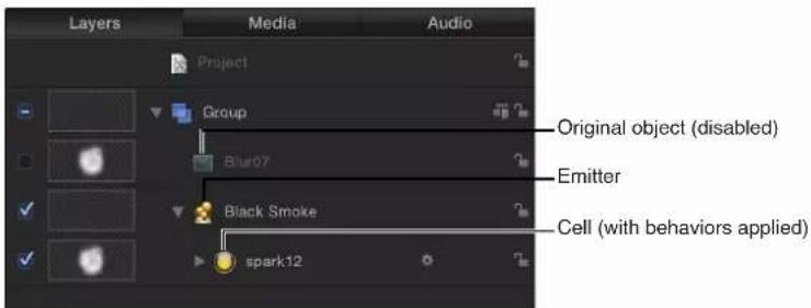
The emitter and cells have separate sets of parameters that control the particle system's behavior. If you imagine that a garden hose is a particle system, the nozzle acts as the emitter, while the water represents the flow of particles. Changing the parameters of the emitter changes the shape from which the particles are emitted as well as their direction. Changing the cell's parameters affects each particle.
As with any effect in Motion, particle system parameters can be keyframed to change a particle effect's dynamics over time. For example, you can create a path of bubbles that follows an object onscreen by keyframing the emitter's Position parameter. For more information on keyframing, see Keyframing overview on page 439.
You can also track an emitter to a moving object in a clip, or apply existing tracking data in your project to an emitter. For more information on using the Motion Tracking behaviors, see Motion tracking overview on page 955.
natural_image
A small cluster of small orange objects floating against a solid blue background (no text or symbols visible)
natural_image
Blue background with scattered white dots and small brown objects at the bottom (no text or symbols)Additionally, you can add behaviors to each cell or to the emitter to create even more varied effects (simulation behaviors can be especially effective). Any behavior that you apply to a cell is in turn applied to each particle it generates. This lets you achieve almost limitless variation. Adding behaviors to cells in addition to the particle system's own parameters is an easy way to create complex, organic motion that would be impossible to accomplish any other way. You can also apply a behavior to another object in your project (an object that is not part of the particle system). For example, applying the Repel behavior to an object will cause particles to weave around that object. For more information about behaviors, see Behaviors overview on page 293.
Note: In a particle system, cells and particles are not the same thing. A cell is a layer (in the Layers list) that acts as the "mold" for the particles (the multiple objects generated in the Canvas). The cell itself is a copy of a source object (cell source) that appears dimmed (disabled) in the Layers list, and therefore is not visible in the Canvas. Almost any object in Motion can be used as a cell source, including shapes, text, images, image sequences, and clips. Transformations that you apply to the source are respected in the cell layer, which in turn propagates those transformations to the particles generated in the Canvas. For example, if you use a rectangle shape that is sheared and rotated as the cell source, particles created using that rectangle as the cell source are sheared and rotated.
Particle systems and layer sizes
Particle systems often create particles that grow or move off the Canvas before they die. This can make the size of a layer or group much larger than the dimensions of the Canvas. Although the particles are not visible after they move off the Canvas (unless Show Full View Area is turned on in the View menu), they are still present in the project and are processed. If you apply a filter to a layer containing growing particles, or use that layer as a source object, select the Fixed Resolution checkbox in the Group Inspector (available only when a group is the selected object). The Fixed Resolution parameter lets you set the specific width and height of a group, cropping anything beyond those values. For more information, see Constrain group size on page 160.
Note: Using a movie with applied filters as a particle cell source adversely impacts your computer's processing performance. For better performance, export your sequence with the filter applied, then import it back into Motion and use the movie as the cell source.
Create particle systems
Add particle systems to a project
There are two basic ways to add a particle system to a project: choose a preset from the Particle Emitters category of the Library, or create a custom particle system using your own image, video clip, or shape.
Add a preset particle system from the Library
The easiest way to add a particle system to your project is to use a preset in the Particle Emitters category of the Library. There are many types of particle effects to choose from. If you find one close to what you need, you can easily customize its parameters after you add it to your project. Particle systems are added to a project exactly like any other object in Motion.
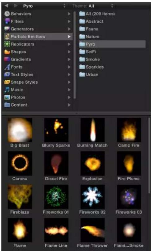
1 In the Library, click the Particle Emitters category.
2 Click a particle subcategory, such as Nature, Pyro, SciFi, and so on.
3 Select a particle preset in the Library stack.
An animated preview of the selected particle emitter plays in the preview area.
4 When you find a particle preset you want to use, do one of the following:
- Click Apply to add the selected particle system to your project at the center of the Canvas. Note: If Create Layers At is set to "Start of project" in the Project pane of Motion Preferences, the particle system is added at the first frame.
- Drag the particle system from the Library stack into the Canvas to the position where you want it to appear.
- Drag the particle system from the Library stack into a group in the Layers list or Timeline. The particle system appears at the center of the Canvas.
- Drag the particle system from the Library stack to the track area of the Timeline. When you reach the frame where you want the new particles to start, release the mouse button.
The new particle system layer appears in your project, composited against any other layers you've already added.
Note: Some emitters look best when motion blur is enabled. Preset Library emitters that benefit from motion blur include Jelly Bands, Light Transit, Rain Streaks, and Silly String. To enable motion blur, choose Motion Blur from the Render pop-up menu (in the status bar above the Canvas), or choose View > Render Options > Motion Blur (or press Option-M).
When you add a particle system from the Library, the system acts as it did in the preview area. If necessary, you can edit a particle system's Emitter parameters in the HUD or Inspector to tailor them to your own use. For more detailed information on using the particle HUD, see Adjust the Emitter HUD on page 520. For more comprehensive information on customizing all of a particle system's parameters, see Emitter parameters on page 526 and Cell parameters on page 536. You can only modify a particle system after it is added to a project.
Create a custom particle system
To create a custom particle system, you must select a layer in your project to use as the source for a cell in a new particle emitter. You can use any layer in your project as a cell source, including still graphics, animation or video clips, or shapes created in Motion. The layer you select when you create an emitter becomes the first cell in that particle system. The cell specifies the look of the actual particles generated in the Canvas.
Note: You can also use a group as the source for an emitter cell, but your computer's processing performance may slow drastically.
1 Create a layer to serve as the cell source for the particles that your emitter will generate.
This example uses an image of a simple white circular gradient, such as the "basic blur" image located in the Library (in the Particle Images subcategory of the Content category).
natural_image
Blue gradient background with a small white circular light source and control points (no text or symbols)2 Move the object in the Canvas to the location where you want the center of your particle system to be.
3 Select the object, then do one of the following:
• In the toolbar, click the Make Particles button.

- Press E.
After you add a particle emitter to a project, the following occurs:
- An emitter appears in the Layers list and is selected.
- A cell containing the image to be "particle-ized" appears underneath the emitter.
• The original source layer (the cell source) is disabled.
Note: Changes made to the original source layer, such as opacity or shearing, are also applied to the particles even after the emitter is created.
• In the Canvas, the emitter bounding box appears.
- The first particle appears in the Canvas in the same location as the original layer. Although it appears as if the particle is selected, the bounding box represents the entire emitter.
• The Emitter HUD appears. If you have hidden the HUD, press F7.
Note: For projects with a frame rate greater than 30 frames per second (fps), at times only the bounding box (not the first particle) might appear at the first frame of your project. Because Motion generates particles at a default rate of 30 per second, there is no guarantee that a particle will appear on every frame.
By default, the first frame of a new particle system (with a single cell) has one particle. If you play your project (press Space bar), additional particles are generated and emerge from the center of the emitter.
natural_image
Blue gradient background with a single white dot in the center (no text or symbols)By default, new cells emit one particle per frame in all directions (for 30-fps projects), and each particle moves 100 pixels per second away from the emitter over a lifetime of 5 seconds (150 frames in a 30-fps project).
natural_image
Abstract blue background with scattered white circular spots (no text or symbols)Note: Use the Initial Number parameter in the Particle Cell Inspector to change the default behavior so a particle system begins with a burst of particles at the first frame. For more information, see Emitter parameters on page 526.
When you create a particle system or modify a parameter of an existing particle system, the path of each particle is immediately calculated and predetermined. Although the number and motion of particles might seem random, they are completely predictable based on that system's parameters. Playing the same particle system twice with the same parameters results in exactly the same particle motion. If you want to choose a new predetermined set of random values, you can change the Random Seed setting repeatedly until you obtain a result you like.
Multiple cells in a single emitter
When you create a particle system from scratch, you can place multiple cells inside a single emitter in the Layers list. Doing so lets you create complex compositions with different overlapping particles.
You can add as many cells as you want in a single emitter. Each cell has its own parameters that govern how particles from that cell are created. When selected in the Layers list, each cell displays its own Particle Cell Inspector. Particle systems with multiple cells generate particles from each cell simultaneously, according to each cell's parameters.
For an example of using multiple cells in a single emitter, see Example 2: Create animated pixie dust on page 553.
Additional cells can be created by selecting multiple layers when initially creating the emitter, or by dragging additional source layers onto the emitter in the Layers list.
Note: When multiple sources are used to create a particle system, the resulting emitter is positioned in the Canvas at the average of the sources' positions.
Adjust a particle emitter in the HUD
Adjust the Emitter HUD
When you create an emitter, the particle system begins working according to the default parameters in its Emitter Inspector and Particle Cell Inspector. You can modify the most important of these parameters in the Emitter HUD.
Display a particle emitter HUD
■Select the emitter in the Layers list, Timeline, or Canvas.
The HUD appears. (If it does not appear, press F7.)
Create a simple smoke effect via the HUD
For this example, use the emitter created in Add particle systems to a project on page 516.

natural_image
Abstract 3D molecular or particle cluster structure with no visible text or symbolsBefore making adjustments to the selected particle system, drag the playhead forward in the Timeline to a frame where you can see the particle system in full effect. That way, any adjustments you make will be readily apparent.
1 In the Emitter HUD, drag the Scale slider to the left to reduce particle size.
This makes the individual particles easier to see.
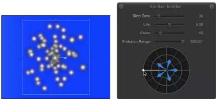
2 In the Emitter HUD, click anywhere along the outer ring of the emission control (the circle with blue arrows) and drag rightward to define a narrow segment that limits the range of the angle at which particles are created (the emission range).
As you drag, both points defining the emission range rotate symmetrically around the center of the emission control. When the emission range forms the rightward angle shown below, release the mouse button. (As you adjust the emission range, the particles rearrange themselves in the Canvas, enabling you to see the resulting effect.)
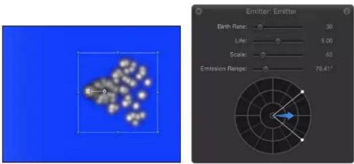
3 To make the particles drift upward, drag in the middle of the Emission Range segment, rotating the blue arrow counterclockwise until it points up and slightly to the right of the center control; continue dragging outward to lengthen the arrow.
The angle of the arrow controls the emission angle of the particles. The length of the arrow controls the speed of the particles. The longer the arrow, the faster the particles.

4 In the Emitter HUD, drag the Birth Rate slider to the right to increase the number of particles created by the emitter.
As you increase the birth rate, more particles are created, forming a nearly unified column of "smoke." The particles move farther apart as they drift away from the emitter.

Although the HUD controls are quite powerful, the Emitter and Particle Cell panes in the Inspector have many more parameters you can customize. For more information, see Emitter parameters on page 526 and Cell parameters on page 536.
Emitter HUD controls
The Emitter HUD contains frequently used emitter controls necessary to modify a particle system's size and shape. These parameters are a subset of those found in the Emitter Inspector. In 2D projects, the Emitter HUD contains a group of sliders and the emission control, which provides a visual way to manipulate three particle system parameters: Emission Range, Emission Angle, and Speed.

When 3D is enabled in the Emitter Inspector, the Emitter HUD offers additional 3D controls. In 3D, the emission control modifies the Emission Latitude and Emission Longitude parameters.

When an emitter and the 3D Transform tool (in the toolbar) are selected, the 3D Emitter HUD expands to display additional controls that allow you to transform the emitter in X, Y, and Z space, regardless of whether the group containing the emitter is 2D or 3D.
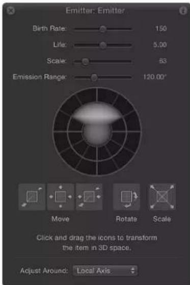
For more information on using the 3D transform controls in the HUD, see 3D Transform tool overview on page 909.
For particle systems containing multiple cells, the Emitter HUD parameters simultaneously modify the effect of each cell's parameters relative to one another. This means that for a particle system consisting of two cells with different scale values, changing the scale in the HUD resizes both cells simultaneously. For example, increasing the scale in the HUD by 200% does not change the scale of both cells to 200%, but resizes the cells relative to their original scale values.

natural_image
Abstract blue background with scattered golden-brown fish-like shapes (no text or symbols)Original particle system

natural_image
Illustration of a blue aquatic organism with orange and white lobes against a clear blue background (no text or symbols)Particle system scaled to 200 percent
For this reason, in emitters with multiple cells, the HUD parameters are displayed as percentages. When you modify the parameters of a single cell, the cell parameters are adjusted directly.
Controls in the Emitter HUD
- Birth Rate: A slider that defines how many particles are created every second.
• Life: A slider that defines how long each particle remains onscreen (in seconds) before disappearing from existence.
- Scale: A slider that defines the size of each particle, relative to the original size of the cell.
- Emission Range: A slider that defines the angle at which particles are emitted.
- Emission Control: A graphical control that lets you modify several parameters simultaneously, described below:
- Emission Range (2D only): Drag the two points on the outer ring of the graphical emission control to define the range of degrees at which particles are generated. In other words, the Emission Range parameter defines the size of the "slice" of the pie graph that the particles fill when generated. This graphical control adjusts the same parameter as the Emission Range slider.
- Emission Angle (2D only): Drag the blue arrows clockwise or counterclockwise to change the direction in which particles are emitted (within the angle defined by the Emission Range control).
- Emission Speed (2D only): Drag the blue arrows outward or inward to define how quickly particles move away from the emitter.
Use the following modifier keys to more precisely manipulate the graphical emission control in the HUD:
- Shift (while adjusting Emission Angle): Restricts angles to 45 degree increments.
- Shift (while adjusting Emission Range): When working with a 2D emitter, restricts to 22.5-degree increments.
- Command: When working with a 2D emitter, adjusts Emission Angle only.
-Option: When working with a 2D emitter, adjusts Emission Speed only.
- Emission Latitude/Emission Longitude Control (3D only): When using a 3D particle emitter (when the 3D checkbox is selected in the Emitter Inspector), the emission control of the HUD lets you modify the Emission Latitude and Emission Longitude parameters.
Drag the sphere in the center of the circle to modify the emission direction (in degrees latitude and longitude) of the particles. You can also enter specific values in the Emitter Inspector.

Drag the Emission Range slider (above the sphere) to define the range of degrees at which particles are generated. In other words, this control defines the size of the cone that the particles fill when generated in 3D space.
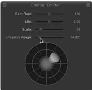
Adjust a particle emitter and its cells in the Inspector
Emitter and cell parameters overview
Particle emitter and particle cell parameters, though closely related, serve different purposes. Emitter parameters control the overall shape and direction of the animated mass of particles. Other emitter parameters simultaneously modify the parameters of all cells inside that emitter.
Particle cell parameters control the behavior of particles after they're generated by the emitter. For more information, see Cell parameters on page 536.
To open a particle system's Emitter Inspector
1 Select an emitter object in the Layers list, Timeline, or Canvas.
2 In the Inspector, click Emitter (if the pane is not already displayed).
The contents of the Emitter Inspector are dynamic—different parameters appear depending on the number of cells in the particle system, the emitter shape that's used, and whether the 3D checkbox is selected or deselected.
To open a cell's Particle Cell Inspector
1 Select any cell in an emitter in the Layers list or Timeline.
2 In the Inspector, click Particle Cell (if the pane is not already displayed).
The Cell controls appear.
Single-cell versus multi-cell emitter parameters
If a particle system has only one cell, the Emitter Inspector displays both the emitter parameters and the cell parameters. In this case, you can control every aspect of the particle system from this single Inspector, which saves you from going back and forth between the Emitter and Particle Cell Inspectors.

If a particle system has two or more cells, the Emitter Inspector looks much different. The list of parameters is much shorter, and the majority of the cell parameters are replaced with a smaller group of Master Controls (hidden by default).

Changes made using the Master Controls modify the effect of each cell's parameters relative to the other cells in the system. This means that for a particle system with three cells that have different Scale values, increasing the Scale parameter in the Emitter Inspector multiplies the Scale value of all three cells by the same percentage. This has the result of increasing or reducing the size of every particle in the system, while keeping the size of each particle relative to one another the same. For this reason, the Master Controls parameters of multi-cell particle systems appear as percentages.
Emitter parameters
The parameters in the Emitter Controls group of the Emitter Inspector determine how particles are distributed and rendered in your project.
Several of these controls are identical to those found in the Emitter HUD, with one difference: Although the emission control in the Emitter HUD lets you manipulate the Range, Angle, Latitude (3D), Longitude (3D), and Speed parameters using a single, graphical control, the Emitter Inspector uses individual controls for each parameter.
Note: The emitter parameters in the Properties and Emitter Inspectors can be keyframed to change values over time. However, there is no way to control the animation of individual particles.
Some parameters in the Emitter Inspector depend on the settings of other parameters. All combinations of parameters are described below.

Emitter parameters in the Inspector
- Shape: The first parameter in the Emitter Inspector is the Shape pop-up menu. When 3D is turned off, nine options are available. When the 3D checkbox is selected, two additional shapes become available. Different shapes significantly alter the distribution of generated particles. When you choose an emitter shape, different Emitter Inspector parameters appear that are unique to that shape. For example, when Rectangle is the selected shape, Outline, Tile Fill, and Random Fill become available in the Arrangement options. When Spiral is the selected shape, the Arrangement parameter goes away and new parameters such as Radius, Number of Arms, and Twists become available. These different parameters provide additional control over the distribution of particles.
In addition, when the 3D checkbox is selected, the Render Particles, Emission Latitude, Emission Longitude, and Depth Ordered parameters become available for all emitter shapes.
The Shape pop-up menu contains the following items:
- Point: This is the simplest emitter shape and is the default shape for new emitters. It specifies a single point of emission for a particle system. There are no additional parameters for the Point shape.
natural_image
Abstract fractal pattern with orange and yellow star-like shapes on black background (no text or symbols)•Line: Particles emerge from a line. Using the onscreen controls (with the Adjust Item tool) or the Properties Inspector, you can specify the length and location of the line. In the Inspector, you can set a specific number of points where particles emerge. This emitter shape is good for creating sheets of particles that cascade over a wide area. The Line shape displays additional parameters.

natural_image
Abstract pattern of yellow stars on black background (no text or symbols)- Rectangle: Particles emerge from a rectangle along its edge, or in a tile-fill or random-fill pattern. Using the onscreen controls (with the Adjust Item tool), you can specify the size and location of the rectangle. Drag the corners to adjust width and height; drag edges to adjust width or height independently. Depending on the selected Arrangement, the Rectangle emitter shape displays additional parameters. In the following image, the Emitter shape Arrangement parameter is set to Outline.
natural_image
Pixelated star pattern forming a square frame on black background (no text or symbols)Use the following modifier keys to more precisely manipulate the corners of the Rectangle onscreen controls (with the Adjust Item tool):
- Option: Adjustments to size are scaled uniformly, with the anchor point remaining fixed.
- Shift: Adjustments to size are made proportionally.
- Circle: Particles emerge from a circle-shaped emitter. Particles can be emitted in an outline, tile-fill, or random-fill pattern. This emitter shape is good for surrounding an element in a composition with particles that emerge from its edge. Using the onscreen controls (with the Adjust Item tool), you can specify the size and location of the circle. Depending on the selected Arrangement, the Circle emitter shape displays additional parameters. In the following image, the shape's Arrangement parameter is set to Outline.

natural_image
Circular arrangement of yellow stars on black background, resembling a ring or starburst pattern (no text or symbols)- Burst: Particles emerge from a burst pattern. Using the onscreen controls (with the Adjust Item tool), you can specify the size and location of the burst. The Burst shape displays additional parameters.

natural_image
Abstract fractal pattern with yellow star-like shapes on black background (no text or symbols)- Spiral: Particles emerge from a spiral pattern. Using the onscreen controls (with the Adjust Item tool), you can specify the size and location of the spiral. The Spiral shape displays additional parameters.

natural_image
Stylized yellow starburst graphic on black background (no text or symbols)- Wave: Particles emerge from a waveform. Using the onscreen controls (with the Adjust Item tool) or the Start Point and End Point parameters in the Emitter Inspector, you can specify the length and location of the wave. The Wave shape displays additional parameters.
natural_image
Abstract wavy pattern with glowing yellow stars on black background (no text or symbols)- Geometry: Particles emerge from the edge of a shape, defined by a spline object used as the shape source. The Geometry shape displays additional parameters. The following image on the right shows the shape used as the emitter source. The image on the left shows particles emerging from the edge of the shape source.

natural_image
Abstract arrangement of yellow stars on black background (no text or symbols)
natural_image
Abstract black and white geometric shape (no text or symbols)To apply a shape as the geometry shape source for a particle emitter, drag the shape to the Shape Source well in the Emitter Inspector (after Geometry is chosen from the Shape pop-up menu).

•Image: Particles emerge from within an area defined by an image or from only the edges of the image. The image may or may not have an alpha channel. If it does, the shape of the alpha channel can also be used to define the emitter shape. The Image shape displays additional parameters. The following image on the right shows the image used as the emitter image source. The image on the left shows the particles emerging from within the image.

natural_image
Abstract white shape on black background with no text or symbols
natural_image
Simple white diamond shape on black background (no text or symbols)To apply an image as the image source for a particle emitter, drag the image to the Image Source well in the Emitter Inspector (after Image is chosen from the Shape pop-up menu).
- Box: This option is available when the 3D checkbox is selected in the Emitter Inspector. Particles are emitted from a three-dimensional cube along its surface (Outline), or in a tile-fill or random-fill pattern. Using the onscreen controls (with the Adjust Item tool), you can specify the size and location of the rectangle. Drag the front horizontal edge to adjust height; drag the front vertical edge to adjust width; drag a back edge to adjust depth; drag a front corner to simultaneously adjust the width and height. To reposition the emitter, drag in the shape (but not on an edge or corner point). Depending on the selected Arrangement, the Box shape displays additional parameters. In the following image, the box's Arrangement is set to Tile Fill.

natural_image
3D simulation visualization of a space-fluorescent cube with colorful particles and grid background, no text or symbols present- Sphere: This option is available when the 3D checkbox is selected in the Emitter Inspector. Particles are emitted from a three-dimensional sphere along its surface (Outline), or in a tile-fill or random-fill pattern. Using the onscreen controls (with the Adjust Item tool), you can specify the radius and location of the sphere. Drag the outline of the sphere to adjust its radius; drag in the sphere to reposition it in the Canvas. When Sphere is selected, the Arrangement parameter becomes available. Depending on the selected Arrangement, the Sphere shape displays additional parameters.
- Arrangement: This pop-up menu, available when Rectangle, Circle, Image, Box, or Sphere is chosen in the Shape pop-up menu, specifies the pattern from which the particles are generated. The arrangement options are:
- Outline: Emits particles along the edge of the shape in 2D emitters and along the surface of the shape in 3D emitters.
- Tile Fill: Emits particles from a tiled pattern of rows, columns, and ranks (for 3D emitters) in the circle, rectangle, image, box, or sphere. You can specify the number of columns, rows, and ranks, as well as the Tile Offset.
- Random Fill: Emits particles randomly from within the circle, rectangle, image, box, or sphere.
- Size: This slider becomes available when Rectangle or Box is chosen in the Shape pop-up menu. Defines the size of the rectangle or cube from which particles are emitted. The Size slider is available whether the Arrangement is set to Outline, Tile Fill, or Random Fill. When Rectangle is the selected shape, the Width and Height parameters become available. When Box is selected, an additional Depth parameter is available.
Note: The Height is measured in project pixels; however, the Width is measured in square pixels. This is done so a shape that is numerically square will look square when Correct for Aspect Ratio is turned on (checkmarked) in the View pop-up menu in the top-right corner of the Canvas.
- Columns: This slider becomes available when one of the following is chosen in the Shape pop-up menu: Rectangle, Circle, Image, Box, or Sphere; in addition, Arrangement must be set to Tile Fill. This parameter specifies the number of horizontal emitter points on a grid over the selected emitter shape. In the case of an irregular shape (nonrectangular), grid points that fall outside of the shape are ignored.
- Rows: This slider becomes available when one of the following is chosen in the Shape pop-up menu: Rectangle, Circle, Image, Box, or Sphere; in addition, Arrangement must be set to Tile Fill. This parameter specifies the number of vertical emitter points on a grid over the selected emitter shape. In the case of an irregular shape (nonrectangular), grid points that fall outside of the shape are ignored.
- Ranks: This slider becomes available when Box or Sphere is chosen in the Shape pop-up menu and Tile Fill is the selected Arrangement. This parameter specifies the number of points in Z space on a grid over the selected shape from which particles are emitted.
- Tile Offset: This slider becomes available when one of the following is chosen in the Shape pop-up menu: Rectangle, Circle, Image, Box, or Sphere; in addition, Arrangement must be set to Tile Fill. Values from 0 to 100% offset the rows toward the right, and values from 0 to -100% offset the rows toward the left. A value of 50 or -50% creates a "brickwork" pattern.
- Image Source: This image well, available when Image is chosen in the Shape pop-up menu, lets you specify the object used to define the shape of the emitter.
- Shape Source: This image well, available when Shape is set to Geometry, lets you specify a spline object to define the shape of the emitter.
- Emission Alpha Cutoff: This slider becomes available when Image is chosen in the Shape pop-up menu. When the Image Source object contains an alpha channel, this slider defines the minimum opacity value necessary to create particles at that point on the source image. For example, when set to 25% , particles appear only where the alpha value of the image is equal to or greater than 25% opacity. The lower the Emission Alpha Cutoff value, the more particles appear. For this parameter to be effective, the alpha channel must have areas of varying transparency.
- Start Point: This parameter, which becomes available when Shape is set to Line or Wave, consists of two value sliders that define, in X and Y coordinates, the first point of the line used as the emitter shape. Click the disclosure triangle to modify the Z position of the start point. You can adjust these values in the Canvas using the onscreen controls (with the Adjust Item tool).
- End Point: This parameter, which becomes available when Shape is set to Line or Wave, consists of two value sliders that define, in X and Y coordinates, the second point of the line used as the emitter shape. Click the disclosure triangle to modify the Z position of the start point. You can adjust these values in the Canvas using the onscreen controls (with the Adjust Item tool).
- Emit At Points: This checkbox is available when any of the following is chosen in the Shape pop-up menu: Line, Rectangle (with Arrangement set to Outline or Random), or Circle (with Arrangement set to Outline or Random), Burst, Spiral, Wave, Geometry, Box (with Arrangement set to Outline), or Sphere (with Arrangement set to Outline). When the Emit At Points checkbox is selected, particles emerge from a limited number of points (as defined in the Points parameter). When the checkbox is deselected, particles may emerge from anywhere on the line or edge. When the Adjust Item tool is selected, the points become visible in the Canvas. When Emit At Points is selected, two additional parameters become available: Points and Offset.
- Points/Points Per Arm: This slider becomes available when any of the following is chosen in the Shape pop-up menu: Line, Rectangle, Image, or Circle (with Arrangement set to Outline or Random Fill), Burst, Spiral, Wave, or Geometry; in addition, the Emit At Points checkbox must also be selected. Defines the number of points where particles are emitted. For Rectangle or Circle shapes, the particles are emitted from evenly distributed points along the edge of the shape when Outline is chosen from the Pattern pop-up menu. When the Adjust Item tool is selected, the points are visible in the Canvas.
Using a large number of points slows your computer's processing performance.
- Radius: This slider becomes available when one of the following is chosen in the Shape pop-up menu: Circle, Burst, Spiral, or Sphere. Defines the size of the shape from which particles are emitted.
- Twists: This slider, available when Spiral is chosen in the Shape pop-up menu, defines the number of turns in the spiral. The default value is 0.25.
- Number of Arms: This slider, available when Burst or Spiral is chosen in the Shape pop-up menu, defines the number of branches from which particles are emitted. The default value is 3.
natural_image
Abstract fractal pattern with orange star-like shapes on black background (no text or symbols)Spiral emitter shape set to default Number of Arms and Twists

natural_image
Abstract spiral pattern with yellow stars on black background, no text or symbols presentSpiral emitter shape with Number of Arms set to 3 and Twists set to .70
- Amplitude: This slider, available when Wave is chosen in the Shape pop-up menu, defines half the distance from the highest point to the lowest point in the wave. Higher values result in more extreme waves.
- Frequency: This slider, available when Wave is chosen in the Shape pop-up menu, defines the number of waves. Higher values result in more waves.
- Phase: This dial, available when Wave is chosen in the Shape pop-up menu, defines the degrees of the offset of the waves from the start and end points of the path. When set to 0 degrees (default), the wave begins and ends at half the distance from the highest point to the lowest point in the wave. When set to 90 degrees, the wave begins and ends at the highest point in the wave. When set to 90 degrees, the wave begins at the lowest point in the wave. When set to 180 degrees, the waves are the same as 0 degrees, but inverted.
- Damping: This slider, available when Wave is chosen in the Shape pop-up menu, determines the direction of progressive diminishment of the oscillation of the wave. Positive damping values diminish the wave forward (from left to right); negative values diminish the wave backward (from right to left).
- Offset: This slider becomes available when any of the following is chosen in the Shape pop-up menu: Line, Rectangle (with Arrangement set to Outline), Circle (with Arrangement set to Outline), Burst, Spiral, Wave, Geometry, or Image. This parameter offsets the emitter itself or the particles generated on the shape. For example, when the emitter Shape is a Line, changing the Offset value moves the emitter's position in the Canvas. When the emitter Shape is a Rectangle and Pattern is set to Outline, changing the Offset value moves the particles along the edge of the shape.
- 3D: When this checkbox is selected, the 3D emitter shapes (Box and Sphere) become available. Because all emitter shapes can be used in 3D space, additional 3D parameters are available for all emitter shapes when the 3D checkbox is selected: Render Particles, Emission Latitude, and Emission Longitude. These additional parameters appear in the Emitter Inspector and HUD.
These parameters are available for all shapes, regardless of the Arrangement setting.
Note: When the 3D checkbox is selected, particles cannot receive reflections, and the Reflections parameter (in the Properties Inspector) is no longer available for the emitter. Additionally, when the 3D checkbox is selected, In Global 3D (Better) must be selected from the Render Particles pop-up menu for particles to cast shadows and to be affected by lights.
For more information on the additional 3D controls in the HUD, see Emitter HUD controls on page 522.
- Emission Angle: This dial, available when the Shape pop-up menu is set to a 2D shape, sets the direction in which particles travel. This parameter works in conjunction with the Emission Range parameter. It is equivalent to one of the functions of the graphical emission control in the Emitter HUD.
Note: When using an emitter shape other than a Point, such as a Line, Circle, Rectangle, Spiral, Burst, or Wave, and Outline is chosen from the Arrangement pop-up menu, setting the Emission Angle parameter to 180 degrees and the Emission Range parameter to 0 degrees restricts the emission of particles to the inside of the shape. Setting the Emission Angle parameter to 0 degrees and the Emission Range parameter to 0 degrees restricts the emission of the particles to outside of the shape.
- Emission Range: A dial that restricts the area around the center of each emission point where particles are generated, in the direction of the Emission Angle. It is equivalent to one of the functions of the graphical emission control in the Emitter HUD.
Note: When using a Line, Circle, Rectangle, Spiral, Burst, or Wave (but not Geometry) shape, setting the Emission Range parameter to 0 degrees keeps particles perpendicular to the emitter when they emerge.
- Render Particles: A pop-up menu that appears when the 3D checkbox is selected, enabling you to choose between two rendering methods for the particles:
- In Local 3D (Faster): The default setting, renders particles faster but does not allow for intersections with layers in the particles group or with layers in other groups. Nor does it allow particles to cast shadows.
- In Global 3D (Better): This setting allows the particles to intersect with layers in the emitter group and with layers in other groups. When turned on, your project's playback performance is slowed.
Important: For the 3D particles to cast shadows, and be affected by lights and depth-of-field settings, you must select the 3D checkbox and choose In Global 3D (Better) from the Render Particles pop-up menu.
- Emission Latitude: Available when the 3D checkbox is selected, this dial specifies the emission direction (in degrees latitude) of the particles.
- Emission Longitude: Available when the 3D checkbox is selected, this dial specifies the axis of rotation (in degrees longitude) from which the particles are emitted.
- Depth Ordered: This checkbox becomes available when the 3D checkbox is selected. With Depth Ordered deselected, particle distribution is completely random, regardless of size. The result is the possibility of particle arrangements appearing to violate the rules of perspective.

natural_image
3D simulation scene with colored spheres and grid background, no visible text or symbolsWhen selected, this checkbox draws the particles in the particle system according to each particle's actual 3D position in the project. In other words, particles closer to the camera appear closer; particles farther from the camera appear more distant.

natural_image
3D simulation scene with colored spheres and coordinate axes, no readable text or symbols- Render Order: A pop-up menu that determines whether new particles are drawn on top of or underneath particles that have already been generated. There are two options:
- Oldest First: New particles appear on top of older particles.
- Oldest Last: New particles appear underneath older particles.
- Interleave Particles: Selecting this checkbox mixes particles generated from multiple cells together. Deselecting this checkbox layers particles in the same order as the cells that generate them.
Note: This option has no effect with particle systems containing only one cell. Leaving this option off speeds rendering with multiple cells.
- Face Camera: This checkbox, available when 3D is enabled, forces the particle system to face the active scene camera. For more information on cameras, see Cameras overview on page 928.
Cell parameters
The parameters in the Cell Controls group in the Inspector determine how particles behave after they are released from the emitter. Cell controls appear at the bottom of the Emitter Inspector when a particle system is selected, and in the Particle Cell Inspector when a particle cell is selected.

Cell parameters in the Inspector
- Birth Rate: A slider that defines the birth rate of the cell. In other words, this parameter defines how many particles of this cell emerge from the emitter every second. Higher values create denser particle effects.
natural_image
Blue background with scattered yellow stars (no text or symbols)Low birth rate particle system
natural_image
Abstract pattern of yellow stars on a blue background (no text or symbols)High birth rate particle system
- Birth Rate Randomness: A slider that defines an amount of variance in the Birth Rate of generated particles. A value of 0 results in no variance—particles emerge from the emitter at the same rate. A value greater than 0 introduces a variance defined by the Birth Rate parameter, plus or minus a random value falling within the Birth Rate Randomness setting.
- Initial Number: A slider that defines the initial number of particles. This parameter determines how many particles of this cell appear at the first frame of a particle effect. The result is an initial burst of particles that eventually evens out according to the Birth Rate parameter.

natural_image
Abstract arrangement of light blue spheres on black background (no text or symbols)Initial Number set to 5 (frame 3)

natural_image
Abstract 3D rendering of a blue, cloud-like molecular or particle against a black background (no text or symbols)Initial Number set to 20 (frame 3)
- Life: A slider that defines the duration of every particle, in seconds. This parameter specifies how long each particle lasts before vanishing from existence. This effect is similar to how sparks disappear after flying away from a sparkler. Unless the Color Over Life parameter or Opacity Over Life parameter is used to fade each particle out over its life, particles immediately vanish at the end of their lifetimes.

natural_image
Microscopic view of blue spherical particles on a black background (no text or symbols)Life set to 5 (frame 60)

natural_image
Cluster of light blue spherical particles on a black background (no text or symbols)Life set to 2 (frame 60)
- Life Randomness: A slider that defines an amount of variance in the life of generated particles. A value of 0 results in no variance—all particles from the selected cell emerge with the same lifetime. A value greater than 0 introduces a variance defined by the Life parameter, plus or minus a random value falling within the Life Randomness setting.
- Speed: A slider that defines initial speed. This parameter determines how quickly each particle flies away from the emitter. This, in conjunction with the Life and Birth Rate parameters, determines how many particles appear in the Canvas at a given frame. It is equivalent to one of the functions of the graphical emission control in the HUD.
- Speed Randomness: A slider that defines an amount of variance in the speed of generated particles. A value of 0 results in no variance—all particles from the selected cell emerge with the same speed. A value greater than 0 introduces a variance defined by the Speed parameter, plus or minus a predetermined random value falling within the Speed Randomness setting.
- Align Angle: When this checkbox is selected, particles rotate to match the shape on which they are positioned. This parameter is available in all cases but the following: when the Shape setting (in the Emitter Inspector) is Rectangle, Circle, Image, Box, and Sphere and the Arrangement setting is with Tile Fill or Random Fill; or when the Shape setting is Point.
- Angle: A dial that defines the angle of rotation, in degrees, at which new particles are created.
- Angle Randomness: A dial that defines an amount of variance in the angle of generated particles.
- Spin: A dial that animates particles in a system by initially spinning each particle around its center. Adjustments to this control are in degrees per second.
- Spin Randomness: A dial that defines an amount of variance in the spin of generated particles. A value of 0 results in no variance—all particles from the selected cell spin at the same rate. A value greater than 0 introduces a variance defined by the Spin parameter, plus or minus a random value falling within the Spin Randomness setting.
- Additive Blend: By default, particles are composited together using the Normal blend mode. Select this checkbox to composite all overlapping generated particles together using the Additive blending mode. This blending occurs in addition to whichever compositing method is already in use. The result is that the brightness of overlapping objects is intensified. This effect applies to the particle system itself—the blend mode of the emitter determines how the result of the emitter is blended into the scene.

natural_image
Astronomical image of a bright celestial body with a diffuse orange glow against a dark starfield (no text or symbols)Additive Blend off

natural_image
Astronomical image of a bright central object with a surrounding nebula against a starry background (no text or symbols)Additive Blend on
- Color Mode: A pop-up menu that determines if and how particles are tinted. There are five options:
- Original: Particles are generated using their original colors. When Original is chosen, the Opacity Over Life parameter appears. Adjust the opacity controls to animate changes to the opacity of particles over their lifetime.
natural_image
Cluster of translucent blue spheres against a black background, resembling molecular or particle simulation (no text or symbols)For more information on using the gradient controls, see Gradient editor tasks on page 137.
- Colorize: Particles are tinted using the color specified in the Color parameter. When this setting is selected, additional Color and Opacity Over Life parameters appear.
natural_image
Microscopic view of red spherical particles against a black background (no text or symbols)- Color: Color controls that become available when the Color Mode pop-up menu is set to Colorize. Use these controls to specify a color to use to tint the particles. You can also modify the alpha channel of each particle, altering its opacity. This parameter is unique to the cell object. You can click the color well to choose a color, use the eye dropper, or open the disclosure triangle and adjust the Red, Green, Blue, and Opacity channel sliders. (For more information on using the Color controls, see Basic color controls on page 132. For more information on using the gradient controls, see Gradient editor tasks on page 137.)
• Over Life: Particles are tinted based on their age, with the range of possible colors defined by the Color Over Life gradient editor.

natural_image
Abstract visualization of red and pink spherical particles against a black background (no text or symbols)
- Pick From Color Range: Particles are tinted at random, with the range of possible colors defined by the Color Range gradient editor. A point on the gradient is randomly chosen, so the relative sizes of each color region determine the frequency of the color being used.

natural_image
Abstract composition of red and white spheres against a black background (no text or symbols)
For more information on using the gradient controls, see Gradient editor tasks on page 137.
Take Image Color: When you choose this menu item, each new particle's color is based on the color of the image at the position where the particle was generated. This menu item is available only when the Shape pop-up menu in the Emitter Inspector is set to Image.
• Color Over Life: The Color Over Life gradient editor, available when the Color Mode is set to Over Life, defines the range of color that each particle assumes as it ages, beginning with the leftmost color in the gradient, and progressing through the range of colors until finally reaching the rightmost color at the end of its life. For more information on using the gradient controls, see Gradient editor tasks on page 137.
• Color Repetitions: Available when Color Mode is set to Over Life, this slider determines the number of times the gradient color pattern is repeated over the life of the particle.
• Color Range: This gradient editor appears when Color Mode is set to Pick From Color Range. Use it to define a range of colors used to randomly tint new particles. The direction of the gradient colors is not relevant, only the number of colors that appear in the gradient. The Color Range parameter has the same controls as the Color Over Life gradient editor.
- Scale: A slider that defines the scale of every particle of a cell. Click the disclosure triangle next to the Scale parameter to reveal separate X and Y scaling subparameters, which can be used to resize the width and height of generated particles. This control affects the initial scale of the particle (compared to the Scale Over Life behavior in the Particles behavior category).
natural_image
Abstract background with blue and red star patterns (no text or symbols)Scale set to 200%

natural_image
Blue background with scattered red and blue dots, no text or symbols presentScale set to 50%
Note: When you use an image as a particle cell source and set a low Scale value, set the render quality in the Render pop-up menu (above the Canvas) or the View menu to Best (choose View > Quality > Best).
- Scale Randomness: A slider that defines an amount of variance in the scale of generated particles. A value of 0 results in no variance—all particles from the selected cell emerge with the same size. A value greater than 0 introduces a variance defined by the Scale parameter, plus or minus a random value falling within the Scale Randomness setting.
- Attach To Emitter: A slider that determines how closely particles follow the position of a moving emitter. If set to zero, particles follow their own path after being emitted, resulting in particles that trail along the motion path the emitter is following. If this parameter is set to 100, in the absence of other behaviors, all generated particles follow the emitter, surrounding it in a moving cloud of particles.

scatter
| x | y | |---|---| | 0.0 | 0.0 | | 0.1 | 0.1 | | 0.2 | 0.2 | | 0.3 | 0.3 | | 0.4 | 0.4 | | 0.5 | 0.5 | | 0.6 | 0.6 | | 0.7 | 0.7 | | 0.8 | 0.8 | | 0.9 | 0.9 | | 1.0 | 1.0 |Attach to Emitter set to 0 (zero)

natural_image
A cluster of light blue dots on a black background, no text or symbols visible.Attach to Emitter set to 100
- Play Frames: This checkbox, which appears if the particle system was created from a QuickTime movie, controls playback. If selected, playback of the animation or movie clip used to generate each particle loops. If deselected, particles are generated using the still frame specified by the Random Start Frame parameter or the Source Start Frame parameter.
- Random Start Frame: This checkbox, which appears if the particle system was created from a QuickTime movie, introduces variation into animated particles generated from QuickTime objects. If selected, each newly generated particle begins at a different frame of the animation. Stills are chosen randomly if Play Frames is deselected.
- Source Start Frame: This slider is available if the particle system was created from a QuickTime movie, and Random Start Frame is deselected. Use it to set the start frame of the animation (if the Play Frames checkbox is selected) or the still frame to display (if the Play Frames checkbox is deselected).
- Hold Frames: This slider, available if the particle system was created from a QuickTime movie, sets the number of times each frame of the source movie is repeated during playback. The larger the Hold Frames value, the slower your playback.
- Hold Frames Randomness: This slider, available if the particle system was created from a QuickTime movie, varies the number of frames to "hold."
- Show Particles As: Use this pop-up menu to view particles in different preview modes, or as they actually appear. These nonimage modes play more efficiently when viewing a complex particle system and also provide other ways of analyzing particle motion. By default, this parameter is set to Image, which displays each particle as it is supposed to appear. There are four menu items:
- Points: Each particle is represented by a single point. This is the fastest preview mode and is useful for displaying the type and speed of particle motion in a system. When selected, the Point Size parameter is revealed.
natural_image
Black background with scattered white dots, no text or symbols present- Lines: Each particle is represented by a line. This is a good preview mode to use to analyze the vector of each particle's motion. The length of each line is determined by that particle's speed, and the angle of each line equals each particle's direction.

natural_image
Abstract black background with white light streaks radiating outward (no text or symbols)- Wireframe: Each particle is represented by a bounding box. Because the bounding boxes are good indicators of each particle's orientation in the system, this preview mode is useful for evaluating the movements of individual particles. For example, it's easy to see the angle of rotation for particles spinning or following a complex motion path.
natural_image
Abstract pattern of scattered white squares on a black background, no text or symbols present•Image: Displays the full particle system effect.

natural_image
Black background with scattered yellow and gray star-shaped dots (no text or symbols)Note: Whatever is chosen in the Show Particles As pop-up menu appears in your final render. Used deliberately, this can result in some interesting effects.
- Point Size: This slider appears when Show Particles As is set to Points, and lets you adjust how large the points are.
- Random Seed: Although particle systems seem random, they're deterministic. This means that the variation in each particle system is created based on the number shown here. Unless this seed number is changed, a particle system with the same parameter settings always plays back with the same motion. If you don't like the current random motion or distribution of the particle system, you can change the seed number by typing a new number or clicking Generate. This changes the random calculations performed for that system for all randomness parameters.
For more information about the random nature of particle systems, see Add particle systems to a project on page 516.
- Particle Source: In particle systems with more than one cell, an image well representing each cell appears at the bottom of the Emitter Inspector. Each Particle Source well has a checkbox you can use to enable or disable that cell.
Adjust a particle emitter in the Properties Inspector
As with any other layer in Motion, you can modify an emitter's position, scale, blend mode, drop shadow, and other attributes in the Properties Inspector. These properties are separate from the emitter parameters in the Emitter and Particle Cell Inspectors. To access these parameters, select the emitter, then open the Properties Inspector. Some parameters are available only in 3D projects. (For detailed information on all Properties Inspector parameters, see Parameters in the Properties Inspector on page 223.)
Note: When you select a particle cell and open the Properties Inspector, only one parameter group is available: the Timing controls, which adjust the In and Out points of the particle cell. For more information, see Particle Emitter Timing controls on page 544.
Important: Some operations performed in the Properties Inspector, as well as the application of certain filters or a mask, cause a group to be rasterized. Because particle emitters live in groups, rasterization affects how particles interact with other objects in your project. For more information, see Groups and rasterization on page 1045.
Particle Emitter Timing controls
When you create a particle system, its duration can be as long or short as necessary, regardless of the duration of the original source objects used to create the particle system. The duration of a particle system is defined by the duration of the emitter object. Changing the In or Out point of an emitter in the Properties Inspector, Timeline, or mini-Timeline changes the duration of the entire particle system.
By default, particles are generated by every cell in a system for the duration of the emitter. The duration of each generated particle is defined by the Life parameter of the cell that generated it, and not by the duration of the cell itself.
The duration of the cell controls the duration over which new particles are generated. You can change a cell's duration by dragging its position or its In and Out points in the Timeline. In this way, you can adjust the timing that defines when each cell's particles emerge.
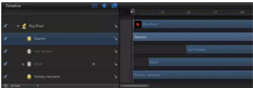
For example, you can create a particle system that simulates an explosion by offsetting the appearance of three types of particles. First, dense white sparks emerge from the center. Half a second later, more diffuse orange blast particles appear around a larger area. One second after that, hot smoke emerges from underneath both of these layers as they fade away.
natural_image
Three-panel scientific visualization showing a bright celestial object, a circular bright object, and a bright orange-yellow burst against a black background (no text or symbols)You can offset a cell in the Timeline or mini-Timeline so that the cell starts before the emitter. This creates a "pre-roll" in which the particle simulation begins before the particles are drawn.
For more information on adjusting the timing of layers in the Timeline, see Timeline overview on page 251.
Create graphics for particle systems
Create still-image graphics to use as particle cells
Creating a particle system from scratch begins with designing the particles you want it to emit. You can use any image, shape, text, or movie supported by Motion as a source for a cell.
Particle systems that use still images as their cell sources render in real time much faster than systems that use video or animation clips. A still image is often all you need to create a compelling particle system. Use the following guidelines when creating graphics for use as particles:
- Graphics size: If you are unsure what size you want your particles to be, it's a good idea to make your graphics larger rather than smaller. Increasing the size of particles beyond the size of the original graphic can introduce unwanted artifacts. One caveat, however, is that the larger the cell source size, the slower your playback performance.
- Particle edges: The quality of the edges of your graphics can be extremely important for creating convincing particles. Soft, translucent edges might look better than hard, over-defined ones.
- Object color: By default, particles are created using the original colors of the image used as the cell. If necessary, you can tint the emitted particles using the Color Mode parameters in the Emitter and Particle Cell Inspectors. Choose between tinting all particles with a single color or creating a gradient tint that changes color over time. You can also choose to apply a Library gradient to the particles. Tinting particles applies the tint color uniformly over the entire particle system.
- Alpha channels: Always create graphics that you want to use as cells with predefined alpha channels. For more information on importing files with alpha channels, see About alpha channels on page 172.
Create animations to use as particle cells
You can also use QuickTime movies as cells. For example, you can create an animation in Motion, render it as a QuickTime movie, and import it into another Motion project to use as a cell. In general, the same recommendations for creating still graphics apply to the creation of animation or video clips you intend to use as cells, but there are additional considerations.
For example, if a clip is retimed in the Properties Inspector or with a Retiming behavior, the effect of the retiming is carried through to the particle system.
Note: Using a movie as the source cell for an emitter can impact your project's playback performance.
Use the following guidelines when creating animations for use as particles:
- Looping clips: Particles created from QuickTime clips loop over and over for the duration of each particle's life. If the clip you use doesn't loop well, there will be a jump cut at every loop point. Another option is to use very short movies to introduce randomness into the appearance of the particle system.
- Minimal compression: Ideally, QuickTime clips to be used as particles should be saved using a high-quality codec, such as Animation, Uncompressed 8- and 10-bit 4:2:2, or ProRes 4444. Other codecs can be used, but they might introduce unwanted artifacts depending on the level of compression used.
There is an option to use random start frames, which causes the clips to play out of sync relative to one another in the Canvas. There is also an option to play or not play the clip.
Animate objects in particle systems
Animate particle system objects overview
You can achieve sophisticated, organic effects by adding behaviors to a particle system's emitter, or to the cells themselves. You can animate any emitter using Basic Motion, Parameter, or Simulation behaviors. Emitter parameters and cell parameters can also be animated via keyframes. If you animate emitter-specific parameters such as Emission Angle or Emission Range, the position and distribution of new particles generated by that emitter are animated. All animation occurs relative to the duration of the emitter.
Animating an emitter's Properties Inspector parameters is useful for altering the position and geometric distribution of a particle system over time. Keyframing an emitter's Position parameter moves the source of newly emitted particles without affecting any particles generated at previous frames, creating a trail of particles.
Keyframing an emitter's Emitter Inspector parameters is a good way to modify the particle system's overall characteristics over time, such as increasing or decreasing the size, speed, or lifetime of newly generated particles.
Particles also have their own category of behaviors. The Particles behaviors include Scale Over Life and Spin Over Life, which allow you to modify and animate the rotation and size of the particles over their lifetime.
Using the Motion Tracking behaviors, you can apply existing tracking data to an emitter or track an emitter to a clip. For more information on using the Motion Tracking behaviors, see Motion tracking overview on page 955.
For an example of a keyframed emitter object in a particle system, see Example 2: Create animated pixie dust on page 553. For more information on keyframing parameters in the Keyframe Editor, see Keyframing overview on page 439.
Apply behaviors to emitters
Applying behaviors to emitters is a quick and easy way to move emitters in your project. Attaching the Motion Path and Snap Alignment to Motion behaviors to an emitter affects the position of the source of all new generated particles. Throw and Spin affect the position and rotation, respectively, of the emitted particles, unless Affect Subobjects is deselected.
With all Basic Motion behaviors, after individual particles emerge, they're unaffected by changes to the position of the emitter. This means that moving the emitter around the screen using behaviors results in the creation of a trail of particles that behave according to their particle cell parameters.
Note: You can override this effect by increasing a cell's Attach to Emitter parameter value (in the Cell Controls group of the Emitter Inspector).
Apply a behavior to an emitter
- Drag a behavior from the Library onto an emitter in the Canvas, Layers list, or Timeline.
The behavior is applied to the emitter, which begins to move according to the parameters of the behavior.
Note: Not all behaviors instantly activate an object when applied. For example, when a Throw behavior is applied to an object, the Throw Velocity parameter must be adjusted before the object moves.
Apply behaviors to cells
Simulation behaviors applied to cells are in turn applied to each particle generated from that cell. This can result in some extremely complex animations as dozens of particles move according to the behaviors you've defined. Behaviors applied to cells have no effect on the position of the emitter. Parameter behaviors on a cell only affect particles when they are created.
Apply a behavior to a cell
- Drag a behavior from the Library to a cell in the Layers list or Timeline.
The behavior is applied to the cell, and all particles generated from that cell begin to move according to the parameters of the behavior.
Tip: If you do not see your expected result when applying behaviors to particle cells, try selecting or deselecting the Affect Subobjects checkbox (in the Behaviors Inspector) or selecting a different option from the Affect pop-up menu in the HUD or Behaviors Inspector. These parameters determine whether the entire object (such as the particle emitter) or its components (such as the particle cells) are affected by the behavior and how an object interacts with surrounding objects, respectively. (The Affect Subobjects checkbox only appears in the Behaviors Inspector when the Throw and Spin behaviors are applied to a group that contains multiple objects, such as a group, particle emitter, or text.)
Apply parameter behaviors to emitter or cell parameters
As with all objects in Motion, you can apply Parameter behaviors to parameters in the Emitter or Particle Cell Inspector.
Apply a Parameter behavior to an emitter or cell parameter
Do one of the following:
- Drag a behavior from the Parameter category in the Library onto an emitter or cell in the Layers list or Timeline. In the Apply To section of the Behaviors Inspector or HUD, choose an option from the Go pop-up menu.
- Select an emitter or cell in the Layers list or Timeline, then choose a Parameter behavior from the Add Behavior pop-up menu in the toolbar. In the Apply To section of the Behaviors Inspector or HUD, choose an option from the Go pop-up menu.
In the Emitter or Particle Cell Inspector, Control-click a parameter, then choose a Parameter behavior from the shortcut menu.
Apply Particles behaviors to emitters or cells
The Particles category in the Library contains two behaviors specifically for use with the cells or emitter in a particle system:
- Scale Over Life: This behavior lets you grow or shrink the particles in a system over the duration of each particle's life. It has one main parameter and three optional parameters that appear depending on the selected Increment Type.
- Spin Over Life: This behavior lets you spin the particles in a system over the duration of each particle's life.
Apply a Particles behavior to an emitter or cell
Do one of the following:
- Drag a behavior from the Particles category in the Library onto an emitter or cell in the Layers list or Timeline.
- Select an emitter or cell in the Layers list or Timeline, then choose a Particles behavior from the Add Behavior pop-up menu in the toolbar.
Particles behavior parameters
After you apply the Scale Over Life or Spin Over Life behavior, you can adjust its parameters in the Behaviors Inspector.
Scale Over Life parameters
This Scale Over Life behavior has one main parameter control and three optional parameter controls that vary, depending the selected Increment Type:
- Increment Type: Choose an option from this pop-up menu to determine which method is used to resize particles over their lifetime. There are four options:
- Natural Scale: Specifies starting and ending scale percentages used to animate each particle's size over its lifetime. Natural Scale uses an exponential curve to allow the animation to progress slowly when the scale values are small, and speed up when the values are large. This creates the illusion that the scaling is occurring at a constant speed. When Natural Scale is selected, the Scale At Birth and Scale At Death parameters become available.
- Rate: Specifies a steady rate at which particles change size over their entire lifetimes. When Rate is selected, the Scale Rate parameter becomes available.
- Birth and Death Values: Specifies starting and ending scale percentages used to animate each particle's size over its lifetime. The scale amount generated by this option for a specific particle at a specific time is multiplied by the pre-existing particle Scale (defined in the Cell Controls section of the Emitter Inspector). When this option is selected, the Scale At Birth and Scale At Death parameters become available.
- Custom: This mini-curve editor customizes the scale of the particles over their lifetime. Click the disclosure triangle to display the mini-curve editor in the Inspector. For more information on using mini-curve editors, see Mini-curve editor on page 482.
- Scale At Birth: Determines the initial size of particles when they are created. This parameter appears when Natural Scale or Birth and Death Values is selected in the Increment Type pop-up menu.
- Scale At Death: Determines the size of each particle at the end of its lifetime. This parameter appears when Natural Scale or Birth and Death Values is selected in the Increment Type pop-up menu.
- Scale Rate: Defines how quickly each particle changes size. Positive values grow particles over time, while negative values shrink particles over time. This parameter appears when Rate is selected in the Increment Type pop-up menu.
- Custom Scale group: This group of parameters (a mini-curve editor and two sliders, described below) appears when Increment Type is set to Custom. Use the mini-curve editor for more precise control over the Scale of particles in your particle system.
- Custom Scale: Use this slider to adjust the value of the selected keyframe in the mini-curve editor. This parameter appears when Custom is selected in the Increment Type pop-up menu.
• Over Life: Use this slider to adjust the position of the selected keyframe in the life of the particle. This parameter appears when Custom is selected in the Increment Type pop-up menu.
The HUD contains the Increment Type pop-up menu, and the Scale Rate, Scale At Birth, and Scale At Death parameters.
Spin Over Life parameters
The Spin Over Life behavior has one main parameter control and three optional parameter controls that vary, depending on the selected Increment Type:
- Increment Type: A pop-up menu that determines which method is used to spin particles over their lifetime. There are three options:
- Rate: Specifies a steady rate and direction in which particles spin over their lifetime. When Rate is selected, the Spin Rate parameter becomes available.
- Birth and Death Values: Specifies starting and ending spin degrees used to animate each particle's rotation over its lifetime. The spin amount generated by this option for a specific particle at a specific time is added to the pre-existing particle spin (defined in the Cell Controls section of the Emitter Inspector). When this option is selected, the Spin At Birth and Spin At Death parameters become available.
- Custom: When Increment Type is set to Custom, a mini-curve editor appears that lets you customize the spin of the particles over their lifetime. Click the disclosure triangle to display the mini-curve editor in the Inspector. For more information on using mini-curve editors, see Mini-curve editor on page 482.
- Spin Rate: Defines how quickly each particle spins and the direction of the spin. Positive values spin particles faster over time and in a counterclockwise direction; negative values spin particles slower over time and in a clockwise direction.
- Spin At Birth: Determines the initial spin of the particles when they are created.
- Spin At Death: Determines the spin of the particles at the end of their lifetime.
- Custom Spin group: This group of parameters (a mini-curve editor and several other controls, described below) appears when Increment Type is set to Custom. Use the mini-curve editor for more precise control over the Spin of particles in your particle system.
- Custom Spin: Use this dial to adjust the value of the selected keyframe in the mini-curve editor. This parameter appears when Custom is selected in the Increment Type pop-up menu.
• Over Life: Use this slider to adjust the position of the selected keyframe in the life of the particle. This parameter appears when Custom is selected in the Increment Type pop-up menu.
The HUD contains the Increment Type pop-up menu, and the Spin Rate, Spin At Birth, and Spin At Death parameters.
Note: When you animate an emitter or cell parameter using keyframes, a curve describing that animation appears in the Keyframe Editor. The selected object determines which curves appear in the Keyframe Editor (when Animated is selected from the pop-up menu in the top-left corner of the Keyframe Editor).
View animated emitter curves in the Keyframe Editor
When you animate an emitter or cell parameter using keyframes, a curve describing that animation appears in the Keyframe Editor. The selected object determines which curves appear in the Keyframe Editor (when Animated is selected from the pop-up menu in the top-left corner of the Keyframe Editor).
Display animated emitter or cell curves
- Select the emitter to display animated emitter parameters such as Position and Rotation (in the Properties Inspector) or Emission Angle and Range (in the Emitter Inspector).
- Select the cell to display animated parameters such as Birth Rate or Angle (in the Particle Cell Inspector).
Note: To manually send an animated parameter to the Keyframe Editor, choose Show In Keyframe Editor from the parameter's Animation menu.

The parameter is displayed in the Keyframe Editor in a new, untitled curve set.

line
| Position | Value | | -------------- | ------- | | Transform Position X | 92.90081 | | Transform Position Y | 508.16 | | Transform Position Z | 340.6 |Use masks with particle systems
As shown in the following images, you can apply masks to the cell source of a particle emitter. The effect of the mask on the cell source is carried through to the emitted particles.

natural_image
A single light blue circular shape against a black background, resembling a lens or moon (no text or symbols)Original source layer Bezier mask applied to source layer
natural_image
Close-up of a small, translucent, symmetrical object against a black background (no text or symbols visible)
natural_image
Close-up of a white, irregularly shaped biological or microbial structure against a black background (no text or symbols visible)Resulting particle system
You can also apply masks to the emitter object itself.

natural_image
Abstract 3D rendering of white, irregularly shaped objects against a black background (no text or symbols)Rectangle mask (inverted) applied to the emitter object
For more information on working with masks, see Masks and transparency overview on page 888.
Apply filters to particle systems
Filters can be applied to a particle system's emitter, but not to individual cells. (However, filters can be applied to the source of a cell.) Consequently, filters affect the entire particle system, including every element in the onscreen pattern.

natural_image
Abstract gradient image with vertical bands of orange and purple hues against a black background (no text or symbols)Light Valve particle system default

natural_image
Abstract glowing wave pattern with purple and blue hues on black background (no text or symbols)Light Valve with Bulge filter applied
Particle system examples
Example 1: Create an animated background
This example shows how to create an animated background using a single still image. By using the parameters available in the Emitter Inspector, a single image can be turned into a complex animated texture.
Create an animated background from a single image
1 Drag a file into the Canvas.
This example uses a simple star graphic.

natural_image
A white star centered on a black background, no text or symbols present.2 With the new layer selected, click the Make Particles button in the toolbar (or press E).
When you add an emitter to the project, the following occurs:
- The emitter appears in the Layers list and is selected.
- A cell containing the image to be "particle-ized" appears underneath the emitter.
- The original source layer (cell source) is disabled.
-
In the Canvas, the emitter bounding box appears, which can be transformed using the onscreen controls.
-
The first particle appears in the Canvas in the same location as the original object. Although it appears as if the particle is selected, it is the bounding box for the emitter.
- The Emitter HUD appears. If you have hidden the HUD, press D or F7.
Note: For projects with a frame rate greater than 30 fps, at times only the bounding box (not the particle cell) might appear at the first frame of your project. Because particles are generated at a rate of 30 per second, there is no guarantee a particle will appear on every frame.
3 In the Emitter Inspector, choose Circle from the Shape pop-up menu.
4 Choose Tile Fill from the Arrangement pop-up menu.
5 In the Cell Controls section of the Emitter Inspector, set the Initial Number parameter to 12.
This creates a distributed group of particles that partially fills the Canvas.
natural_image
Abstract white star-like shape on black background (no text or symbols)6 To turn the particles into a uniform abstract mass, adjust the following parameters:
- Set Life to 4.
- Set Speed to 140.
- Set Spin to 60.
- Set Spin Randomness to 15.
- Select Additive Blend.
- Set Color Mode to Pick From Color Range. (Or, if you prefer, select another gradient from the preset pop-up menu.)
- Set Scale to 65%.
- Set Scale Randomness to 150.
- Set Random Seed to 10000.
- Advance to frame 100.
The resulting image now looks similar to this:

natural_image
Colorful star shapes (red, blue, magenta) scattered on a black background with no text or symbols7 Apply a filter to the emitter.
In this example, adding the Crystallize filter creates an even more abstract effect. You might also consider adjusting the color gradient, or applying color correction to make the background fit more appropriately with your foreground elements.

natural_image
Abstract colorful star-like shapes in red, blue, and magenta against a black background (no text or symbols)8 Adjust the Color Range opacity gradient so the particles fade in and out rather than popping into and out of existence.

Tip: You can use the Make Clone Layer command to clone an emitter and then use the Retiming controls or Retiming behaviors to create unique animations. For example, you can create a starburst that explodes outward, then retracts, then explodes, and so on. For more information on cloning, see Make clone layers on page 226.
Example 2: Create animated pixie dust
The first task in this example shows you how to create a particle system that uses two different cells to generate a streak of particles that trails behind another animated layer. Using two cells adds more variation to a particle system than can be achieved with a single cell.
The second task shows how to convert the streaking particles into a 3D particle system.
Create a two-cell particle system that leaves a trail
1 Drag the first image file into the Canvas.
This example uses the "Flare01" image from the Particle Images subcategory in the Content category of the Library. This is a small image of a lens flare against black, with a built-in alpha channel.

natural_image
A bright, starburst light pattern centered on a black background with no text or symbols.2 With the flare object selected, click the Make Particles button in the toolbar (or press E).
An emitter is added to the project, but nothing happens yet because the playhead is at the first frame of the project, and only one particle has been created. Move the playhead forward a few seconds to view the particle system at a frame where more particles have been generated. You can also play the project while you make your modifications to the particle system.
natural_image
Abstract black-and-white pattern with glowing pink diamond shapes (no text or symbols)3 To create a variety of particles, drag additional image layers onto the emitter you just created.
This example uses the "Spark12" file, also located in the Content folder in the Library.
This results in the following image:

natural_image
Abstract pink starburst pattern on black background (no text or symbols)4 To make the particles generated by each different cell mingle together, select the Interleave Particles checkbox in the Emitter Inspector.
5 Select the "Flare01" cell in the Layers list, then set the Scale slider in the Particle Cell Inspector to 15%.
Doing this reduces the size of the particles generated by this cell.
6 Select the "Spark12" cell in the Layers list, then set the Scale slider in the Inspector to 45% . The resulting image should look approximately like this:

natural_image
Abstract pattern of white dots and stars on a black background, no text or symbols presentNote: If necessary, disable the original "Spark12" source layer.
7 Next, change the color of the particles generated by the "Spark12" cell by doing the following:
a Choose Colorize from the Color Mode pop-up menu.
b Click the color well in the Color section of the Inspector and choose a light red color in the Colors window.
c Close the Colors window.
All particles generated by that cell are now red.
natural_image
Abstract pattern of scattered white and red dots on a black background (no text or symbols)8 Use the Opacity Over Life control to make this cell's particles fade out over their life.

9 To make the spark particles spin as they move away, set the Spin parameter value to 60.
10 In the Layers list, select the "Flare01" cell of the particle system. Its parameters appear in the Inspector.
11 Follow the procedure in Step 7 to make these particles light yellow.
12 To make the particles generated from this cell spin in the opposite direction, set the Spin parameter value to -60.
natural_image
Microscopic view of scattered bright spots against a dark background, resembling star fields or cellular structures (no text or symbols)13 To create a trail of particles, the emitter must be animated to follow the required motion path; do the following to create a motion path for the particle system:
a Place the playhead at frame 1.
b Click the Record button (or press A) to turn on animation recording.
Note: As an alternative to Step b (turning on the Record button), you can manually add a keyframe to the emitter's Position parameter in the Properties Inspector after Step c. Any subsequent changes to the emitter's position result in a keyframe at the current playhead position (regardless of the Record button state).
c Select the emitter and drag the particle system to the lower-left corner of the screen.
d Press End to go to the last frame of the project.
e Drag the emitter toward the upper-right corner.
f Disable Record (press A).
g Click the Play button to begin playback.
14 Use the following illustration as a guide to adjust the Emission Range and Angle so the particles appear to follow behind the emitter.

The result should look something like this:

natural_image
Abstract pattern of scattered yellow dots on a black background, resembling a starry night sky (no text or symbols)You might want to adjust the Emitter parameters for Birth Rate, Life, and Speed to customize the effect to your liking.
Turn the system into 3D particles
1 In the Emitter Inspector, select the 3D checkbox.

2 If your project does not contain a camera, click the New Camera button in the toolbar.
If your project is a 2D project, a dialog appears asking if you want to switch your 2D groups to 3D.
3 Click Switch to 3D.
A camera is added to the project, and your layers are turned into 3D layers.
4 In the 3D View tools (in the upper-right corner of the Canvas), drag the Orbit tool (the center tool).

As the camera rotates, you can see that the particles are emitted in Z space.

natural_image
Astronomical image showing a cluster of bright, glowing celestial objects against a dark background with faint diagonal lines (no text or symbols)If you want your particles to intersect with other rotated layers, choose In Global 3D (Better) from the Render Particles pop-up menu in the Emitter Inspector. In the following image on the left, Global 3D is selected so the particles intersect with other objects in the project that are transformed in 3D space. In the image on the right, Local 3D is selected so the particles do not intersect with other objects.
natural_image
Two diverging panels showing a landscape with a fire and a building, set against a dark grid background (no text or symbols)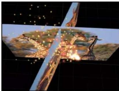
natural_image
Illustration of a futuristic landscape with glowing elements and a central geometric shape, set against a dark grid background (no text or symbols)Save custom particle effects to the Library
After you create a particle system, you can save it as a particle preset in the Particle Emitters, Favorites, or Favorites Menu folder of the Library, for future use. When you place particle systems in the Library, they become particle presets that can be used like any other particle preset.
Note: For organizational purposes, create a folder of your own in the Favorites or Favorites Menu category to store custom particle systems.
Save a particle system to the Library
1 Open the Library and select the Particle Emitters, Favorites, or Favorites Menu category.
2 Drag the emitter you want to save into the stack at the bottom of the Library.
When you save a particle preset, it's saved as a file in the /Users/username/Library/Application Support/Motion/Library/ folder (in the Particle Emitters, Favorites, or Favorites Menu subfolder). Any custom objects that you used to create that particle system are included in the file.
You can copy particle presets you create from this location to give to other Motion users, or you can place particle presets given to you in this same folder. When you copy a particle preset file, make sure that you also copy any graphics or movie files that it uses as well.
For more information, see Save custom elements to the Library on page 183.
Replicator
15
Replicator overview
Patterns of repeating elements are prevalent in various types of motion graphics projects, from television title sequences, to news intros, to bumpers, to commercials. Creating these complex collages is usually very time-consuming, requiring careful duplication of elements, followed by tedious keyframing. The Motion replicator automates many of the chores usually associated with setting up cascading arrays of kaleidoscopic imagery, allowing you to create and animate your replicated images in dramatic ways.
In Motion, the elements of the replicated patterns can consist of video, still images, shapes, text, or any other type of layer. For example, with very few clicks of your mouse you can create spinning loops based on a simple shape.

natural_image
Partial view of a white crescent moon against a black background, no text or symbols visibleReplicator source shape
natural_image
Abstract red and yellow wave pattern with concentric rings (no text or symbols)Replicator result
Replicator parameters can be keyframed to change a pattern's dynamics over time. For example, you can create a wave of dots that follow one another across the screen by keyframing the replicator's Offset parameter.

natural_image
A white dotted line with a curved arrow pointing downward on a black background (no text or symbols)
natural_image
A white dotted line with a curved tail on a black background, resembling a wave or trail (no text or symbols)
natural_image
Abstract wavy line pattern on black background (no text or symbols)You can add behaviors to the replicator or its cells to create even more varied effects (simulation behaviors can be especially effective). Behaviors applied to a replicator or a cell can be applied to each element of the pattern. This lets you achieve almost limitless variation and complexity that would take hours to animate using keyframes. You can also apply a behavior, such as Vortex, to another object in your project (an object that is not part of the replicator pattern), and have the pattern elements circumnavigate that object.
A special behavior called Sequence Replicator choreographs the parameters of your onscreen elements (their position, scale, and opacity, for example) in a sequential animation. For more information, see Apply the Sequence Replicator behavior on page 596.
Replicators take advantage of Motion's 3D capabilities. Some replicator shapes are inherently 3D, and others can have points that exist in 3D space. Additionally, behaviors applied to a replicator can pull pattern elements out of a plane. For more information, see Use replicators in 3D space on page 608.
The difference between a replicator and a particle system
Although the replicator and particle systems share many parameters, they are very different tools. Although both use layers (shapes, text, images, and so on) as cell sources and both generate onscreen elements from those sources, each produces a unique effect from those raw materials. A particle system generates dynamic elements that change over time: Particles are born, emerging from an onscreen "emitter"; they move across the Canvas; and they die, according to the "laws of nature" you specify in the parameters of the system.
A replicator, however, is not a dynamic simulation. Its elements are not emitted like particles (replicator elements do not have birth rate, life, or speed parameters). The replicator builds a pattern of static copies of a source layer in a shape and arrangement that you specify. Although the replicated elements you see onscreen are static by default, the replicator parameters can be animated. For example, you can designate a simple star shape as the source of your onscreen pattern and then replicate the star multiple times along the outline of a circle. By keyframing a few parameters of your new replicator layer, you can launch the stars into animated orbit around the center of the circle, making them change color as they whirl.
To learn more about creating replicators, choose a topic in the Help table of contents (the sidebar to the left of this window).
Anatomy of a replicator
All replicators begin with a source layer: the layer in your project that is duplicated and arrayed onscreen in a pattern. When you "replicate" that source layer, two new items appear in the Layers list:
- Replicator: A special type of effect that controls the onscreen pattern as a whole
- Cell: The image or shape layer, duplicated from the source layer, that controls the individual elements in the onscreen pattern
The replicator cell appears underneath its parent replicator in the Layers list and Timeline. This cell layer is named for the original source object, which is disabled in the Layers list and Timeline so that it does not appear in the Canvas composition.
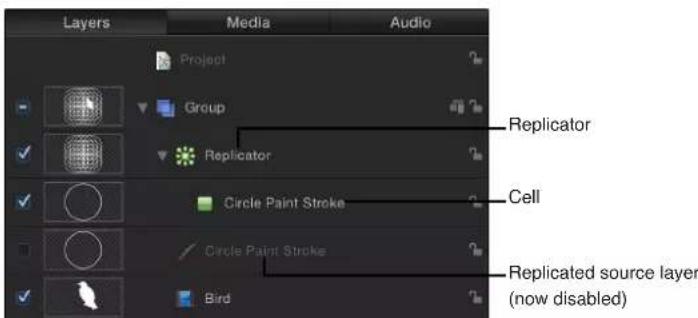
You can add additional cells to the replicator by dragging another source layer from the Layers list into the Replicator layer, as shown in the image below.
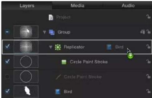
When you drag an additional source layer over the Replicator layer (while continuing to hold down the mouse button), a drop menu appears. This menu gives you options to add the object as a replicator cell or as a mask to the replicator. For more information, see Use masks with replicators on page 609.

The replicator and its cell (or cells) have separate sets of parameters that control the look of the mosaic pattern you see in the Canvas. Changing the replicator parameters modifies the overall onscreen pattern, allowing you to create rectangular, circular, spiral, and other geometric layouts. Changing the cell parameters affects each element in the onscreen pattern, allowing you to modify attributes such as the angle, color, and scale of the pattern pieces.
Replicator parameters are dynamic—different parameters appear in the Inspector depending on the layout type you choose in the Shape pop-up menu. For example, when Rectangle is the selected pattern shape, additional parameters appear in the Inspector that allow you to modify the size of the rectangle, the number of rows and columns, and other attributes. When Spiral is the selected shape, parameters appear that allow you to adjust the radius of the spiral, the number of twists and arms, the number of points per arm (the locations on the shape where the elements sit), and other attributes.

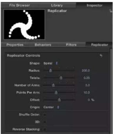
Further, different parameters are also available depending on the selected arrangement for the shape. Very different looks can be achieved by changing only a few parameters.

natural_image
Abstract pattern of white dots arranged in a star-like shape on black background (no text or symbols)
natural_image
Abstract geometric pattern with white dots arranged in a star-like shape on black background (no text or symbols)
natural_image
Abstract spiral pattern composed of white dots on black background (no text or symbols)After replicators are modified, you can save them in the Library for later use. See Save custom replicators to the Library on page 611.
About replicator cell source layers
Any image-based layer in Motion can be replicated (used as a cell source), including shapes, text, images, image sequences, and clips.
Note: Replicators themselves, particle emitters, lights, cameras, and rigs cannot be replicated.
Transformations that you apply to the source layer are respected in the replicator cells. For example, if you use a rotated rectangle shape as the replicator source layer, the replicated elements in the Canvas appear rotated. If the source layer has applied filters, the effects of the filters are retained in the elements of the replicator pattern.
Note: Replicating a movie, especially with applied filters, adversely impacts your computer's processing performance. For better performance, output your sequence with the filter applied, then import it and use the movie as a replicator source.
Create a replicator
Add a replicator to a project
There are two basic ways to add a replicator to a project: choose a preset from the Replicator category of the Library or create a custom replicator using your own image, shape, or video clip. You can increase replicator complexity by using multiple source layers.
Add a preset replicator from the Library
The easiest way to add a replicator system to your project is to use a preset in the Replicator category of the Library.
1 Select the group you want to add the replicator to.
2 In the Library, select the Replicators category.
The Replicators category is divided into subcategories, such as Mattes, Transitional, Backgrounds, and so on.
3 Select a subcategory, then select a replicator object, such as Curved Drops (in the Miscellaneous subcategory).
A preview appears in the preview area.

Note: If the preview does not start playing, position the pointer over the preview and click the play button.
4 After you select a replicator preset, do one of the following:
- Click Apply in the preview area to add the replicator to the center of the Canvas.
- Drag the replicator to the Canvas.
- Drag the replicator to a group in the Layers list or Timeline layers list.
- Drag the replicator to the track area of the Timeline or to the mini-Timeline. As you drag, a tooltip displays the current frame number.
The replicator preset appears in the project, composited above objects below it in the Layers list.
After you add a replicator preset from the Library, it acts exactly as it appeared in the preview area. If necessary, modify the replicator parameters in the HUD or in the Replicator Inspector. You can also replace the preset source with one of your own images, clips, shapes, or text layers.
Note: You can only modify a replicator after it's been added to a project.
Create a simple custom replicator
You can create simple custom replicator pattern by designating a layer in your project as a source for the cell. Applying a replicator to that layer creates a nonanimated, filled rectangular pattern. You can then modify the replicator parameters to suit your project needs.
1 Place an object to replicate into your project.
This example uses a bird graphic from the Content folder in the Library.

natural_image
Silhouette of a white bird on a solid blue background (no text or symbols)2 Select the object, then do one of the following:
• In the toolbar, click the Replicate button.

natural_image
Toolbar with icons and a blue downward arrow, no readable text or symbols- Choose Object > Replicate (or press L).
When a layer is replicated, the following occurs:
- The replicator layer (labeled "Replicator") appears in the Layers list and is selected.

- A duplicate of the original layer (the bird shape) becomes the replicator cell.
• The original source layer (the bird shape) is disabled.
Note: Changes made to the original source layer, such as opacity or shearing, are respected in the pattern after the replicator is created.
- In the Canvas, the default rectangle pattern appears, centered in the same location as the source object.
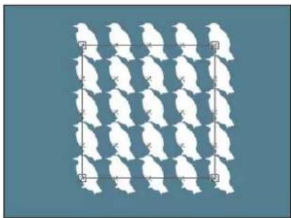
natural_image
Grid of white silhouettes on a solid blue background, no text or symbols present- In the toolbar, the Adjust Item tool is selected so you can immediately begin using the replicator's onscreen controls.

When the Adjust Item tool is selected, dragging the pattern's onscreen controls (the bounding box) resizes the replicator. Dragging in the Canvas (not over the bounding box outline) repositions the replicator object as a whole.
• The Replicator HUD appears.
Note: If you have hidden the HUD, press D.
Create a complex replicator using multiple source layers
You can create a more complex pattern containing multiple elements by adding multiple sources to a single replicator. Each source becomes a cell in the replicator, and each cell has its own set of parameters.
1 In the Layers list or Timeline, Shift-click to select the layers to replicate.
This example uses two graphics from the Content folder in the Library.

Note: Command-click to select noncontiguous layers to add to the replicator.
2 Do one of the following:
• In the toolbar, click the Replicate button.
- Choose Object > Replicate (or press L).
The cells of the default rectangle replicator pattern are created from the source layers (which are deselected so they do not appear in the composition).
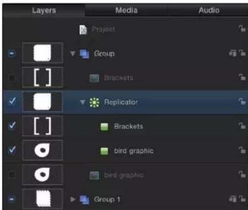
When multiple cells create a replicator pattern, the elements appear at the same points on the pattern. The replicator is positioned at the average of the source's positions.

natural_image
Abstract geometric pattern with repeating white shapes on a green background (no text or symbols)The elements in the pattern are stacked according to their order in the Layers list and Timeline. To change the stacking order of the layers, drag the lower cell above the upper cell in the Layers list.
Modify a replicator
After adding a preset replicator or creating a custom replicator, you modify it further by replacing its source image, adjusting cell opacity, removing unwanted cells, or removing the entire replicator.
Replace a preset replicator's source image
After adding a preset replicator to your project, you can replace its source image to better suit your needs.
1 In the File Browser or Library, select the file you want to use as the replacement graphic for the replicator preset, then add it to the project.
2 In the Layers list, drag the object to the replicator cell you want to replace.
Note: If the cell layer is not visible, click the disclosure triangle next to the replicator layer.
3 When the pointer becomes a curved arrow, release the mouse button.
The original source object is replaced with the new object.
Control element opacity in a replicator with more than one source
You can adjust the opacity of individual elements in a replicator by modifying their parameters in the Replicator Cell Inspector.
Do one of the following:
- Select the cell in the Layers list, then adjust the Opacity tag in the gradient editor in the Replicator Cell Inspector (or change Color Mode to Colorize and adjust the Opacity parameter in the Color controls).
- Select the original source layer—not the replicator cell—and change its opacity in its HUD or Properties Inspector.
Remove a cell from a replicator
You can remove a cell from a replicator that contains multiple cells.
In the Layers list or Timeline, select the cell to remove, then press Delete.
The original source layers remain in the project.
Remove a replicator from a project
You can remove a replicator from the Layers list or Timeline.
■Select the replicator, then press Delete.
The original source layer or layers remain in the project.
Adjust a replicator and cells in the HUD
Display the Replicator HUD and Replicator Cell HUD
When you create a replicator from a source layer, the onscreen pattern is built using the default parameters in the Replicator Inspector and Replicator Cell Inspector. You can modify the most important of these parameters in Replicator HUD and the Replicator Cell HUD.
To view the Replicator HUD
■In the Layers list or Timeline, select the replicator.
The HUD appears. If it does not appear, press F7 or D.
To view the Replicator Cell HUD
In the Layers list or Timeline, select a replicator cell.
The HUD appears. If it does not appear, press F7 or D.
Replicator HUD controls
The Replicator HUD contains frequently used controls necessary to modify the shape and arrangement of the replicator. These parameters are a subset of the parameters found in the Replicator Inspector. The HUD also provides quick access to the Opacity and Blend Mode parameters, located in the Properties Inspector.

When a replicator and the 3D Transform tool (in the toolbar) are selected, additional transform parameters become available in the HUD. For more information on using the HUD's 3D transform controls, see 3D Transform tool overview on page 909.

Important: The controls in the Replicator HUD are dynamic—different controls appear depending on what is selected from the Shape pop-up menu and the Arrangement pop-up menu (which is itself dynamic, invoking additional parameters). The Opacity, Blend Mode, and Shape parameters always appear in the Replicator HUD. For a discussion of all replicator parameters, see Replicator parameters on page 572.
Default controls in the Replicator HUD
- Opacity: Defines the opacity of the replicator pattern as a whole. If a replicator contains multiple cells, this setting affects the opacity of all pattern elements.
For information on controlling the opacity of the elements in a replicator with more than one source, see Add a replicator to a project on page 563.
- Blend Mode: A pop-up menu that defines the blend mode of the replicator. Changing this setting affects the pattern as a whole according to the layers composited beneath it in the Layers list—it does not affect the interaction of elements stacked on one another in the replicator. To affect the blending of elements in a pattern, you can enable Additive Blend in the Replicator Inspector.
Note: For more information on blend modes, see Blend modes overview on page 229.
- Shape: A pop-up menu that defines the shape of the replicator. Shape options include Line, Rectangle, Circle, Burst, Spiral, Wave, Geometry, Image, Box, and Sphere.
Note: The Box and Sphere options are available when the 3D checkbox is selected in the Replicator Inspector.

natural_image
Grid of white stars on an orange gradient background (no text or symbols)Replicator Shape set to Rectangle (default)

natural_image
Circular arrangement of white stars on a gradient orange-red background (no text or symbols)Replicator Shape set to Circle (Arrangement set to Outline)

natural_image
Abstract graphic with a white spiral line on an orange gradient background (no text or symbols)Replicator Shape set to Spiral
- Arrangement: A pop-up menu that defines the layout of the elements in the replicator pattern. When the Shape parameter is set to the default Rectangle setting, the default arrangement is Tile Fill. The Arrangement parameter is available when Shape is set to Rectangle, Circle, Image, Box, or Sphere.
natural_image
Grid of white stars on a red-orange gradient background (no text or symbols)Arrangement set to Tile Fill (default)

natural_image
Orange gradient background with a square of white stars arranged in a heart shape (no text or symbols)Arrangement set to Outline Arrangement set to Random Fill

natural_image
Abstract graphic with white stars on a gradient orange-red background (no text or symbols)- Columns: A slider that defines the number of vertical columns in the pattern. Pattern elements are distributed at points along the columns. This parameter is available when the selected shape is closed, such as Rectangle, Circle, or Image, and when Arrangement is set to Tile Fill. It is also available for Box and Sphere when Arrangement is set to Outline.

Default number of 5 Columns and 5 Rows

Columns set to 3 and Rows set to 7
- Rows: A slider that defines the number of horizontal rows in the pattern. This parameter is available when the selected shape is closed, such as Rectangle, Circle, or Image, and when Arrangement is set to Tile Fill. It is also available for Box and Sphere when Arrangement is set to Outline.
- Origin: A pop-up menu used to specify how elements traverse across the pattern from a point of origin. For example, when you use a Rectangle shape and Origin is set to Left, the elements sweep across the rectangle from left to right. When set to Upper Right, the elements build from the upper-right corner point of the shape to the lower-right corner. This parameter is available when the Arrangement is set to Tile Fill or Random Fill.
Replicator Cell HUD controls
The Replicator Cell HUD contains frequently used controls necessary to modify the attributes of elements in the replicator pattern. These parameters are a subset of the parameters found in the Cell Controls section of the Replicator Inspector (for replicators with one cell) or in the Replicator Cell Inspector (for replicators with more than one cell). The Replicator Cell HUD contains sliders to adjust the Angle, Angle End, Angle Randomness, Scale, Scale End, and Scale of Randomness parameters. For more information about replicator cell parameters, see Replicator cell parameters on page 583.

Adjust a replicator and cells in the Inspector
Replicator and cell parameters overview
Replicator and replicator cell parameters, though closely related, serve different purposes. Replicator parameters control the overall shape, arrangement, offset, stacking order, build order, and number of elements in the replicator pattern.
Replicator cell parameters control the behavior and appearance of the elements in the replicator pattern.
For a replicator with only one cell (one source layer), the replicator and replicator cell controls appear in the same Replicator Inspector. In this case, you can control every aspect of the replicator using these controls. In replicators with multiple cells, each cell has its own Replicator Cell Inspector containing all parameters for that cell.
Open the Replicator Inspector
1 Select a replicator in the Layers list or Timeline.
2 In the Inspector, click Replicator.
The replicator parameters appear.
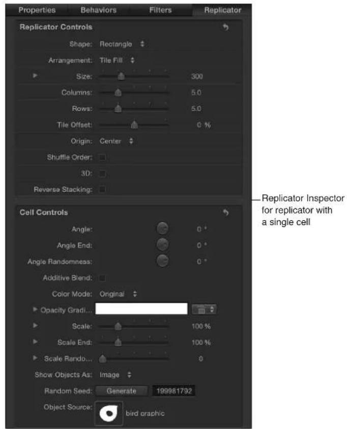
The contents of the Replicator Inspector are dynamic: different parameters appear depending on the option you choose in the Shape pop-up menu. Also, different parameters appear depending on the option you choose in the Arrangement pop-up menu.
Open the Replicator Cell Inspector
1 Select a replicator cell in the Layers list or Timeline.

2 In the Inspector, click Replicator Cell.
The replicator cell parameters appear.

Replicator parameters
The parameters in the Replicator Inspector give you complete control over every aspect of the pattern created by the selected replicator. This includes the shape upon which the pattern is built and the shape's related parameters, such as the size of the pattern, how the elements are arranged in the pattern, and so on.
Replicator parameters in the Inspector
- Shape: The Shape pop-up menu sets the overall shape of the onscreen replicator pattern. The default setting is Rectangle. Choose any of up to ten shape styles from the menu to alter the distribution of the pattern elements.
Note: Depending on the item you choose in the Shape pop-up menu, additional controls may appear in the Replicator Inspector. For example, when Rectangle is selected in the Shape pop-up menu, the Outline, Tile Fill, and Random Fill options become available in the Arrangement pop-up menu. These additional controls let you further customize the chosen shape.
The Shape pop-up menu contains the following items:
•Line: Elements are positioned on a line. In the Inspector, you can set a specific number of points on the line—one element is positioned at every point (including the end points of the line). The Line shape displays additional Start Point, End Point, Points, and Offset parameters.

natural_image
Abstract blue wave pattern on black background (no text or symbols)- Rectangle: Elements are positioned in a rectangle along the replicator outline, or in a tile or random fill pattern. When Rectangle is selected, the Arrangement parameter becomes available. Depending on the selected Arrangement, the Rectangle shape displays additional parameters.
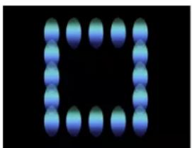
natural_image
Pixelated blue oval shapes arranged in a square pattern on black background (no text or symbols)Rectangle shape with Arrangement set to Outline

natural_image
Grid of blue gradient spheres on black background (no text or symbols)Rectangle shape with Arrangement set to Tile Fill

natural_image
Abstract arrangement of blue spheres on black background (no text or symbols)Rectangle shape with Arrangement set to Random Fill
- Circle: Elements are positioned in a circle along the replicator outline, or in a tile or random fill pattern. When Circle is selected, the Arrangement parameter becomes available. Depending on the selected Arrangement, the Circle shape displays additional parameters. In the following image, the circle's Arrangement is set to Outline.
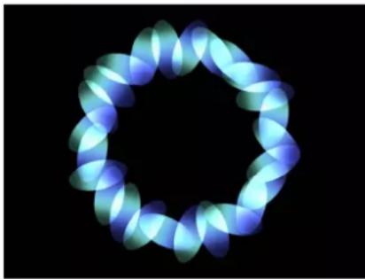
natural_image
Abstract circular pattern with blue gradient rings on black background (no text or symbols)- Burst: Elements are positioned in a flare pattern. The Burst shape displays additional Radius, Number of Arms, Points Per Arm, Offset, and Origin parameters in the Replicator Inspector.

natural_image
Abstract glowing spiral pattern on black background (no text or symbols)- Spiral: Elements are positioned in a spiral pattern. The Spiral shape displays additional Radius, Twists, Number of Arms, Points Per Arm, and Offset parameters in the Replicator Inspector.

natural_image
Abstract glowing spiral pattern with blue and white gradient against black background (no text or symbols)- Wave: Elements are positioned on a waveform. The Wave shape displays additional Start and End Point, Amplitude, Frequency, Phase, Damping, Points, and Offset parameters in the Replicator Inspector.

natural_image
Blue glowing spiral shape against black background (no text or symbols)- Geometry: Elements are positioned along the edge of a shape, defined by a spline object used as the shape source. The Geometry shape displays additional Shape Source, Points, and Offset parameters in the Replicator Inspector.

natural_image
Abstract 3D arrangement of blue spheres forming a loop shape against black background (no text or symbols)Cells along the edge of the object defined in the Shape Source image well

natural_image
Abstract white shape on black background, resembling a stylized letter or symbol (no text or symbols present)Object used as the Shape Source
For information on using geometry (a shape) as a replicator shape, see Replicator cell parameters on page 583.
- Image: Elements appear within an area defined by an image or along its border, depending on what is chosen from the Arrangement pop-up menu. The image may have an alpha channel. If so, the shape of the alpha channel can also be used to define the pattern. When Image is selected, the Arrangement parameter becomes available. Depending on the selected Arrangement, the Image shape displays additional parameters.
For information on using an image as a replicator shape, see Use image and geometry objects on page 593.
- Box: This option is available when the 3D checkbox is selected in the Replicator Inspector. Elements are positioned in a three-dimensional cube along the replicator outline, or on its surface in a tile or random fill pattern. Using the onscreen controls (with the Adjust Item tool), you can specify the size and location of the rectangle. Drag the front horizontal edge to adjust height; drag the front vertical edge to adjust width; drag a back edge to adjust depth; drag a front corner to simultaneously adjust the width and height. To reposition the replicator, drag in the replicator (but not on an edge or corner point). Depending on the selected Arrangement, the Box shape displays additional parameters. In the following image, the box's Arrangement is set to Tile.

natural_image
3D rendered grid with orange and red gradient patterns, no text or symbols visible- Sphere: This option is available when the 3D checkbox is selected in the Replicator Inspector. Elements are positioned in a three-dimensional sphere along the replicator outline, or on its surface in a tile or random fill pattern. Using the onscreen controls (with the Adjust Item tool), you can specify the radius and location of the circle. Drag the outline of the sphere to adjust its radius; drag in the sphere to reposition it in the Canvas. When Sphere is selected, the Arrangement parameter becomes available. Depending on the selected Arrangement, the Sphere shape displays additional parameters.
- Arrangement: This pop-up menu, available when Shape is set to Rectangle, Circle, Image, Box, or Sphere, specifies the layout of the elements in the selected shape. The arrangement options are:
- Outline: Elements are positioned along the edge of the shape.
- Tile Fill: Elements are positioned in a tiled pattern of rows and columns in the circle, rectangle, image, box, or sphere pattern. You can specify the number of columns and rows, as well as the Tile Offset.
- Random Fill: Elements are positioned randomly from within circle, sphere, rectangle, or box.
- Size: This slider is available when Shape is set to Rectangle or Box. Click the disclosure triangle to display separate Width, Height, and Depth (for the Box shape) parameters. When Circle is the selected shape, this parameter becomes Radius.
Note: For projects using the default camera settings and a default Z position for the replicator, the Height is measured in pixels; however, the Width is measured in square pixels. This is done so a shape that is numerically square appears square when "Correct for Aspect Ratio" is selected in the View pop-up menu in the top-right corner of the Canvas.
- Shape Source: This image well, which becomes available only when Shape is set to Geometry, lets you load a shape object as the source for the replicator pattern. To set the shape source for the replicator, drag a shape from the Layers list or Timeline into the Shape Source well.
- Image Source: This image well, which becomes available when the Shape parameter is set to Image, lets you load an image object as the source for the replicator shape. To set the image source, drag an image from the Layers list or Timeline into the Image Source well.
- Emission Alpha Cutoff: When the Image Source object contains an alpha channel, this slider defines the minimum opacity value necessary to create an element at that point on the source image. For example, when set to 25% , elements only appear at points where the alpha value of the image is equal to or greater than 25% opacity. The lower the Emission Alpha Cutoff value, the more cells appear. For this parameter to be effective, the alpha channel must have areas of varying transparency.

natural_image
Abstract white shape on black background, no text or symbols presentShape with a feathered edge used as Image Source

natural_image
Abstract arrangement of blue dots on black background (no text or symbols)Emission Alpha Cutoff set to 75%
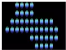
natural_image
Abstract pattern of blue dots arranged in a triangular formation on black background (no text or symbols)Emission Alpha Cutoff set to 30%
- Start Point: This parameter is available when Shape is set to Line or Wave. Two value sliders define, in X, Y, and Z coordinates, the first point of the line or wave on which the elements are positioned. Click the disclosure triangle to access the Z Start Point value slider. You can adjust these values in the Canvas using the onscreen controls (with the Adjust Item tool).
- End Point: This parameter is available when Shape is set to Line or Wave. Two value sliders define, in X, Y, and Z coordinates, the second point of the line or wave on which the elements are positioned. Click the disclosure triangle to access the Z Start Point value slider. You can adjust these values in the Canvas using the onscreen controls (with the Adjust Item tool).
- Amplitude: This slider, available only when Shape is set to Wave, defines half the distance from the highest point to the lowest point in the wave. Higher values result in more extreme waves.
- Frequency: This slider, available only when Shape is set to Wave, defines the number of waves. The default is value is 1.

natural_image
Simplified illustration of a worm-like organism with yellow to red gradient along black background (no text or symbols)Default Frequency value (1)

natural_image
Abstract wavy line gradient from yellow to red against black background (no text or symbols)Frequency value set to 2
- Phase: This slider, available only when Shape is set to Wave. A dial defines the degree of offset of the waves from the start and end points of the path. When set to 0 degrees (default), the wave begins and ends at half the distance from the highest point to the lowest point in the wave. When set to 90 degrees, the wave begins and ends at the highest point in the wave. When set to -90 degrees, the wave begins at the lowest point in the wave. When set to 180 degrees, the waves are the same as 0 degrees, but inverted.
- Damping: This slider, available only when Shape is set to Wave, progressively diminishes the oscillation of the wave. Positive damping values diminish the wave forward (from left to right); negative values diminish the wave backward (from right to left).
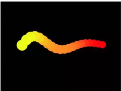
natural_image
Color gradient illustration of a worm-like organism against black background (no text or symbols)- Points: When Shape is set to Rectangle, Circle, Image, Box, or Sphere, and Arrangement is set to Outline or Random Fill, this slider specifies the number of evenly distributed element points along the edge of the shape.
When Shape is set to Line or Wave, the slider sets the number of evenly distributed element points on the line or wave. When the Adjust Item tool is selected, the points are visible in the Canvas.
When Shape is set to Geometry, the slider sets the number of evenly distributed element points around the shape.

flowchart
graph TD
    A["Red Square"] --> B["Orange Square"]
    B --> C["Yellow Square"]
    C --> D["Black Circle"]
    D --> E["Loop Back to Red Square"]
    E --> F["Red Arrow to Yellow Square"]
    F --> G["Orange Arrow to Yellow Square"]
    G --> H["Yellow Arrow to Orange Square"]
    H --> I["Red Arrow to Yellow Square"]
    I --> J["Orange Arrow to Orange Square"]
- Offset: When Shape is set to Line or Wave, adjusting this slider moves the elements along the line or wave.
When Shape is set to Rectangle, Circle, Image, Box, or Sphere, and Arrangement is set to Outline, adjusting this slider moves the elements along the edge of the shape.
When Shape is set to Geometry, adjusting this slider moves the position of the elements along the edge of the shape.
- Build Style: This pop-up menu and its options appear depending upon the selected Shape and Arrangement. Build Style specifies the how elements are built over the replicator shape.
For Rectangle, Circle, and Image replicator shapes with Arrangement set to Outline, or for a Geometry shape, the Build Style options are:
- Clockwise: Places the elements along the shape in a clockwise direction.
- Counter Clockwise: Places the elements along the shape in a counterclockwise direction.

natural_image
Circular segmented ring with alternating red and yellow segments on black background (no text or symbols)Build Style set to Clockwise
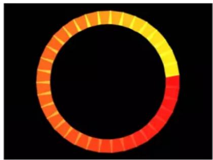
natural_image
Circular segmented ring with orange and yellow segments on black background (no text or symbols)Build Style set to Counter Clockwise
For Rectangle and Image shapes with Arrangement set to Tile Fill and Origin set to Upper Left, Upper Right, Lower Left, or Lower Right, the Build Style options are:
- Across: Builds the elements across the pattern in the direction implied by the Origin parameter.
- By Row: Builds the elements over the pattern by row.
- By Column: Builds the elements over the pattern by column.
For Box shapes with the Arrangement set to Tile Fill and Origin set to Front Upper Left, Front Upper Right, Front Lower Left, Front Lower Right, Back Upper Left, Back Upper Right, Back Lower Left, or Back Lower Right, the Build Style options are:
- Across: Builds the elements across the pattern in the direction implied by the Origin parameter.
- By Row, Column, Rank: Builds the elements over the pattern by row, column, then rank starting from the Origin.
- By Column, Row, Rank: Builds the elements over the pattern by column, row, then rank starting from the Origin.
- By Row, Rank, Column: Builds the elements over the pattern by row, rank, then column starting from the Origin.
- By Column, Rank, Row: Builds the elements over the pattern by column, rank, then row starting from the Origin.
- By Rank, Row, Column: Builds the elements over the pattern by rank, row, then column starting from the Origin.
- By Rank, Column, Row: Builds the elements over the pattern by rank, column, then row starting from the Origin.
- Radius: This slider, available when Shape is set to Burst, Spiral, Circle, or Sphere, defines the size of the selected shape.
- Twists: This slider, available only when Shape is set to Spiral, defines the number of turns in a spiral. The default value is 0.25. When Number of Arms is set to one, a single spiral is created.

natural_image
Abstract pattern of glowing yellow and red dots forming a curved shape on black background (no text or symbols)Spiral with default parameter settings

natural_image
Abstract spiral pattern composed of yellow and orange dots on black background (no text or symbols)Spiral with Number of Arms set to 1
- Number of Arms: This slider, available only when Shape is set to Burst or Spiral, defines the number of branches on which the elements are positioned. The default value is 3.
- Points Per Arm: This slider, available only when Shape is set to Burst or Spiral, defines the number of element points on each branch of the burst or spiral. When the Adjust Item tool is selected, the points are visible in the Canvas.
- Columns: This slider, available when Shape is set to Rectangle, Circle, or Image (with Arrangement set to Tile Fill), or when Shape is set to Box or Sphere (with Arrangement set to Outline or Tile Fill), specifies the number of vertical columns (or horizontal element points) on a grid over the selected replicator. In the case of an irregular shape (nonrectangular), points that fall outside the shape are ignored.
- Rows: This slider, available when the Arrangement parameter is set to Tile Fill, specifies the number of horizontal rows (or vertical element points) on a grid over the selected replicator. In the case of an irregular shape (nonrectangular), points that fall outside the shape are ignored. This control is also available for Box and Sphere when Arrangement is set to Outline or Tile Fill.
- Ranks: This slider, available when Shape is set to Box (with Arrangement set to Tile Fill or Outline), or Sphere (with Arrangement set to Tile Fill), specifies the number of points in Z space on a grid over the selected replicator. In the case of an irregular shape (nonrectangular), points that fall outside the shape are ignored.
- Tile Offset: This slider, available when Shape is set to Rectangle, Circle, Image, Box, or Sphere, and Arrangement is set to Tile Fill, specifies the amount (in percentage points) that the elements are offset from the pattern. Values from 0 to 100% offset the rows toward the right, and values from 0 to -100% offset the rows toward the left. A value of 50 or -50% creates a brickwork pattern.

natural_image
Grid of red and orange circles with a central yellow circle, no text or symbols presentRectangle shape set to Tile Fill

natural_image
Grid of colored circles on black background, no text or symbols presentTile Offset set to a value of 20%
- Origin: This pop-up menu, available when Shape is set to Rectangle, Circle, Image, Box, or Sphere, and Arrangement is set to Tile Fill or Random Fill, specifies how the elements traverse across the pattern from a point of origin. For example, when set to Left, the elements sweep across the pattern from left to right. When set to Upper Right, the elements traverse from the upper-right corner point of the shape to the lower-right corner.

natural_image
Grid of colored dots (yellow, orange, red) on black background, no text or symbols presentOrigin set to Left

natural_image
Grid of colored dots on black background, no text or symbols presentOrigin set to Upper Right
The Origin pop-up menu contains the following items:
• Upper Left: The elements originate in the upper-left corner of the pattern and end in the lower-right corner.
• Upper Right: The elements originate in the upper-right corner of the pattern and end in the lower-left corner.
- Lower Left: The elements originate in the lower-left corner of the pattern and end in the upper-right corner.
- Lower Right: The elements originate in the lower-right corner of the pattern and end in the upper-left corner.
- Center: The elements originate in the center of the pattern and move outward. This is the default Origin option.
- Left: The elements originate at the left side of the pattern and end at the right side.
• Right: The elements originate at the right side of the pattern and end at the left side.
- Top: The elements originate at the top of the pattern and end at the bottom.
- Bottom: The elements originate at the bottom of the pattern and end at the top.
When Circle or Sphere is chosen from the Shape pop-up menu and Arrangement is set to Tile Fill or Random Fill, the Origin options are:
- Center: The elements originate in the center of the pattern and build outward. This is the default Origin option.
- Edge: The elements originate along the edge of the pattern and build inward.
When Box is chosen from the Shape pop-up menu and Arrangement is set to Tile Fill or Random Fill, the Origin options are:
- Front Upper Left: The elements originate in the front upper-left corner of the pattern and end in the back lower right.
- Front Upper Right: The elements originate in the front upper-right corner of the pattern and end in the back lower left.
- Front Lower Left: The elements originate in the front lower-left corner of the pattern and end in the back upper right.
-
Front Lower Right: The elements originate in the front lower-right corner of the pattern and end in the back upper left.
-
Back Upper Left: The elements originate in the back upper-left corner of the pattern and end in the front lower right.
- Back Upper Right: The elements originate in the back upper-right corner of the pattern and end in the front lower left.
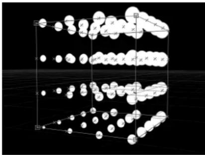
chemical
Molecular structure diagram showing layered arrangement of atoms with labeled positions and bonds- Back Lower Left: The elements originate in the back lower-left corner of the pattern and end in the front upper-right.
- Back Lower Right: The elements originate in the back lower-right corner of the pattern and end in the front upper-left.
- Left: The elements originate at the left side of the pattern and end at the right side. The pattern is identical on each row.
•Right: The elements originate at the right side of the pattern and end at the left side. The pattern is identical on each row. - Top: The elements originate at the top of the pattern and end at the bottom. The pattern is identical on each rank.

- Bottom: The elements originate at the bottom of the pattern and end at the top. The pattern is identical on each rank.
- Front: The elements originate at the front of the pattern and end at the back. The pattern is identical on each column.
- Back: The elements originate at the back of the pattern and end at the front. The pattern is identical on each column.
- Center: The elements originate in the center of the pattern and move outward. This is the default Origin option.
•X Axis: The elements originate along the X axis of the pattern and move outward.
• Y Axis: The elements originate along the Y axis of the pattern and move outward.

chemical
Crystal lattice structure diagram showing atomic positions in a 3D arrangement•Z Axis: The elements originate along the Z axis of the pattern and move outward.
Note: The origin parameter also determines where the Sequence Replicator behavior starts its animation. For more information on the Sequence Replicator behavior, see Apply the Sequence Replicator behavior on page 596.
- Shuffle Order: A checkbox that, when selected, rearranges the order in which the elements appear. When Shuffle Order is selected, the Replicate Seed parameter becomes available.

natural_image
Circular gradient design with red-orange rings on black background (no text or symbols)Pattern with Shuffle Order disabled
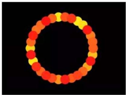
natural_image
Circular arrangement of red and yellow dots on black background (no text or symbols)Pattern with Shuffle Order enabled
- Replicate Seed: This parameter, available when Shape is set to Rectangle, Circle, Image, Box, or Sphere, and Arrangement is set to Random Fill, modifies the Random Fill pattern. Click the Generate button to set a new random seed number.
Although the result of the Random Fill option from the Arrangement pop-up menu seems random, it's deterministic. This means that the random variation in the pattern is created based on the number shown. Unless this seed number is changed, a replicator with the same parameter settings and source object always appears the same. If you don't like the current random fill, you can change the seed number by typing a new number or clicking Generate. This changes the random calculations performed for that pattern. This parameter is also used to randomize the Shuffle Order parameter.
- 3D: Select this checkbox to add the Box and Sphere shapes to the Shape pop-up menu.
- Reverse Stacking: A checkbox that, when selected, inverts the order in which elements are stacked. To see the effect of this parameter, elements must be overlapping.

natural_image
A horizontal row of colored circles transitioning from yellow to red on a black background (no text or symbols)Pattern with Reverse Stacking deselected: The element to the right overlaps the next cell to the left.

natural_image
A horizontal row of colored circles transitioning from yellow to red on a black background (no text or symbols)Pattern with Reverse Stacking selected: The element to the left overlaps the next cell to the right.
- Face Camera: When this checkbox is selected, the pattern elements actively face the camera when the camera or the replicator is rotated. When Face Camera is deselected, the elements face forward in the replicator pattern and appear flat (unless the source layer or pattern elements are rotated in 3D space). Because Motion only supports 2D objects, this option is key to giving 2D objects the appearance of 3D as the camera is animated.
Note: Because replicator pattern elements are 2D (flat) objects, the pattern elements are not visible when you use the orthogonal camera views, such as Left, Right, and Top (unless the source layer or pattern elements are rotated in 3D space). This is because orthogonal views are at right angles (perpendicular) to the elements. For more information on using cameras, see Cameras overview on page 928.
natural_image
3D rendered cube with grid of circular elements on black background, no text or symbols visibleBox Replicator with Face Camera turned off
natural_image
Abstract arrangement of translucent blue spheres against a black background, resembling a stylized molecular or crystal structure (no text or symbols)Box Replicator with Face Camera turned on
Replicator cell parameters
These controls appear at the bottom of the Replicator Inspector (for replicators with a single cell) or in the Replicator Cell Inspector.
Replicator cell parameters in the Inspector
- Align Angle: When this checkbox is selected, the replicator elements rotate to match the shape on which they are positioned. This parameter is available for all replicator types except for the following: Rectangle, Circle, Image, Box, and Sphere shapes with Tile Fill or Random Fill.

natural_image
Pixelated abstract shape resembling a stylized number or symbol, rendered in red-orange gradient against black background (no text or symbols)Spiral replicator with Align Angle disabled

natural_image
Abstract spiral graphic with red-orange gradient on black background (no text or symbols)Spiral replicator with Align Angle enabled
- Angle: A dial that specifies (in degrees) the rotation of the replicator elements. When the 3D checkbox is selected in the Replicator Inspector, the default dial modifies the Z angle. To modify the rotation of the pattern elements on all three axes (X, Y, and Z), click the disclosure triangle and adjust the X, Y, and Z dials.
When the 3D checkbox is selected, this parameter also displays the Animate pop-up menu.
- Animate: A pop-up menu that sets the angle interpolation for keyframed animation of the Angle parameter. There are two choices:
- Use Rotation: The default interpolation method. When the Angle parameter is keyframed, pattern elements rotate from their start rotation to their final rotation. Depending on the animation, the elements may twist before reaching their final orientation (the last keyframed value). For example, if the X, Y, and Z Angle parameters are animated from 0 degrees to 180 degrees in a project, the elements rotate on all axes before reaching their final orientation.
- Use Orientation: This alternate interpolation method provides smoother animation but does not allow multiple revolutions. It interpolates between the pattern elements' start orientation (first keyframe) and their end orientation (second keyframe).
- Angle End: A dial that specifies (in degrees) the rotation of the replicator elements at the end of the pattern. The angle value of the elements at the end of the pattern equals the Angle value (start) plus the Angle End value. For example, if Angle is set to 0 degrees and Angle End set to 90 degrees, the elements are not rotated at all at their origin, and are rotated by 90 degrees at the end of the pattern.

natural_image
Row of eight orange oval shapes on black background (no text or symbols)Line replicator (Origin set to Start Point) with Angle value of 0 and Angle End set to 0

natural_image
Abstract orange spiral shape on black background (no text or symbols)Line replicator (Origin set to Start Point) with Angle value of 0 and Angle End set to 90
In a 3D project, using the default dial modifies the Z angle. To modify the rotation of the pattern elements on all three axes (X, Y, and Z), click the disclosure triangle and adjust the individual X, Y, and Z dials.
When the 3D checkbox is selected, Angle End also displays the Animate pop-up menu.
- Animate: A pop-up menu that sets the angle interpolation for keyframed animation of the Angle parameter. There are two choices:
- Use Rotation: This is the default interpolation method. When the Angle End parameter is keyframed, pattern elements rotate from their start rotation to their final rotation. Depending on the animation, the elements may twist before reaching their final orientation (the last keyframed value). For example, if the X, Y, and Z Angle parameters are animated from 0 degrees to 180 degrees in a project, the elements rotate on all axes before reaching their final orientation.
- Use Orientation: This alternate interpolation method provides smoother animation but does not allow multiple revolutions. It interpolates between the pattern elements' start orientation (first keyframe) and their end orientation (second keyframe).
- Angle Randomness: A dial that defines an amount of variance in the rotation of replicator elements. A value of 0 results in no variance—all elements have the same rotational value. A value greater than 0 introduces a variance. The angle for an element is defined by the Angle and Angle End parameter, plus or minus a random value falling within the Angle Randomness.
In a 3D project, using the default dial or value slider (when the disclosure triangle is closed), modifies the Z angle. To modify the rotation of the pattern elements on all three axes (X, Y, and Z), click the disclosure triangle and adjust the X, Y, and Z dials.
When the 3D checkbox is selected, this parameter also displays the Animate pop-up menu.
- Animate: A pop-up menu that sets the angle interpolation for keyframed animation of the Angle Randomness parameter. There are two choices:
- Use Rotation: This is the default interpolation method. When the Angle Randomness parameter is keyframed, pattern elements rotate from their start rotation to their final rotation. Depending on the animation, the elements may twist before reaching their final orientation (the last keyframed value). For example, if the X, Y, and Z Angle parameters are animated from 0 degrees to 180 degrees in a project, the elements rotate on all axes before reaching their final orientation.
- Use Orientation: This alternate interpolation method provides smoother animation but does not allow multiple revolutions. It interpolates between the pattern elements' start orientation (first keyframe) and their end orientation (second keyframe).
- Additive Blend: By default, replicator elements are composited together using the Normal blend mode. Select this checkbox to composite all overlapping elements using the Additive blend mode. This blending occurs in addition to the compositing method set in the Properties Inspector. The result is that the brightness of overlapping objects is intensified.
- Color Mode: This pop-up menu specifies the origin of the color for replicated elements There are five menu options:
•Original: Elements are created using the original colors from the source layer.

natural_image
Abstract glowing orange oval shapes arranged diagonally against a black background (no text or symbols)The Opacity Gradient editor allows you to change the opacity of the replicator elements over the pattern.

-Colorize: Elements are tinted using the color specified in the Color parameter. Additional Color and Opacity Gradient parameters appear.
• Over Pattern: Elements are tinted based on how they are ordered in the pattern. When Over Pattern is chosen, the Color Gradient editor appears, allowing you to define the range of color and transparency of the pattern, beginning with the leftmost color in the gradient, and progressing through the range of colors until reaching the rightmost color at the end of the pattern.

Gradual color changes do not appear in each element, but only across the pattern as a whole. An Opacity control is available at the top of the gradient editor.
natural_image
Gradient color bar transitioning from yellow to pink on black background (no text or symbols)- Pick From Color Range: Elements are tinted at random, with the range of possible colors and transparency defined by the Color Range gradient editor. A point on the gradient is randomly chosen, so the relative sizes of each color region determine the frequency of the color being used.
For more information on using the gradient controls, see Gradient editor tasks on page 137.
•Take Image Color: Each element's color is based on the color of the image at the position of the element point. This mode is only available when an image in used as the replicator shape.

natural_image
Two brown peas on a grassy mound, one touching the other's neck (no text or symbols visible)
natural_image
Abstract pattern of vertical columns with warm-toned bokeh colors and black dots (no text or symbols)- Color: This color well becomes available when the Color Mode is set to Colorize. Use it to specify a color to tint replicator elements. You can also alter each element's opacity. This parameter is unique to the cell object. You can click the color well to choose a color, or open the disclosure triangle and use the Red, Green, Blue, and Opacity channel sliders or value sliders.
- Opacity Gradient: This gradient editor appears when Color Mode is set to Original or Colorize. Use it to change the opacity of the replicator elements over the pattern. This gradient control is limited to grayscale values, which are used to represent varying levels of transparency. White represents solid elements; progressively darker levels of gray represent decreasing opacity; and black represents complete transparency. A simple white to black gradient represents a pattern that is solid at its origin, but which fades out gradually. For more information on using gradient and opacity gradient controls, see Gradient editor tasks on page 137.
- Color Repetitions: When Color Mode is set to Over Pattern, this parameter becomes available. Drag the slider to increase the number of times the gradient is repeated over the pattern. For more information on using gradient controls, see Gradient editor tasks on page 137.
- Scale: This slider defines the scale of replicator elements. Click the disclosure triangle next to the Scale parameter to reveal separate X Scaling and Y Scaling subparameters that can be used to adjust the width and height of elements separately. By default, Scale is set to 100% — the size of the replicator elements is equal to the size of the source layer.
- Scale End: This slider specifies the scale of the replicator elements at the end of the pattern, relative to the Scale value. For example, if Scale is set to 100% and Scale End set to 50% , the elements are 100% at their origin and half their size at the end of the pattern.
- Scale Randomness: This slider defines an amount of variance in the scale of replicator elements. A value of 0 results in no variance—all elements in the pattern are the same size. A value greater than 0 introduces a variance. The scale for an element is defined by the Scale parameter, plus or minus a random value falling within the Scale and the Scale End. The disclosure triangle of the Scale Randomness parameter reveals separate X and Y subparameters that can be used to set width and height values separately.

natural_image
Seven orange oval shapes arranged in a row against a black background (no text or symbols)Line replicator with Scale set to 100%; Scale End set to 50%
natural_image
Abstract arrangement of orange oval shapes on black background (no text or symbols)Scale Randomness set to 75%
- Play Frames: This checkbox appears if the replicator is using a QuickTime object as the source for a cell. When this checkbox is selected, playback of the animation or movie clip used for each element will loop. If this checkbox is deselected, the animation or clip is frozen at the still frame specified by the Random Start Frame parameter or the Source Start Frame parameter.
- Random Start Frame: This checkbox appears if the replicator is using a QuickTime object as the source for a cell. Use this control to introduce variation into elements using QuickTime animation or movies as their source objects. When this checkbox is selected, each element in the pattern begins at a different frame of the clip. Stills are chosen randomly if Play Frames is deselected.
- Source Start Frame: This slider appears if the replicator is using a QuickTime object as the source for a cell. The value selected in the slider designates the start frame of the clip (when the Play Frames checkbox is selected) or the still frame to display (when Play Frames is deselected). This parameter appears only if Random Start Frame is deselected.
- Source Frame Offset: This slider, which appears if the replicator is using a QuickTime object as the source for a cell, and if Random Start Frame is deselected, offsets the start frame chosen in the Source Start Frame parameter over the pattern. At their origin, the elements play the animation from the frame specified in the Source Start Frame parameter. Each step away from the origin advances the start frame by the offset amount.

natural_image
Grid of nine identical panels showing a dark blue wave or ocean with no visible text, numbers, or symbols.Rectangle replicator shape with Origin set to Top and Source Frame Offset set to 0

natural_image
Grid of nine identical panels showing a stylized sea wave with no text or symbolsWhen Source Frame Offset is set to 20, each step away from the top begins 20 frames later in the source video
- Hold Frames: This slider appears if the replicator is using a QuickTime object as the source for a cell. Hold Frames sets the number of times each frame of the source movie is repeated during playback. The larger the Hold Frames value, the slower your playback.
- Hold Frames Randomness: This slider, which appears if the replicator is using a QuickTime object as the source for a cell, varies the number of frames to hold.
- Show Objects As: Use this pop-up menu to set the display of replicator elements to a preview mode, or as they actually appear. The nonimage modes play back more efficiently when viewing a complex replicator pattern. By default, this pop-up menu is set to Image, which displays each element as it is supposed to appear. Choose one of the following four options:
- Points: Each element is represented by a single point. This is the fastest preview mode. When you choose Points, the Point Size slider appears, allowing you to increase the size of the points for easier viewing. In the following image, the Point Size is set to 8.

natural_image
Grid of white dots on a black background, no text or symbols present- Lines: This option is effective only when the elements of the replicator are animated using Simulation behaviors or the Throw (Basic Motion) behavior. The movement of each pattern element is represented by a line and is useful in analyzing the vector of each element's motion. The length of each line is determined by that element's speed, and the angle of each line equals each element's direction. In the following image, the replicator elements are animated using the Vortex behavior.

natural_image
Abstract pattern of white diagonal lines on a black background (no text or symbols)Note: Element movement created by the Sequence Replicator behavior or by keyframing the replicator parameters is not displayed.
- Wireframe: Each pattern element is represented by a bounding box. Because the bounding boxes are good indicators of each element's orientation in the pattern, this preview mode is useful for evaluating the movements of individual elements. For example, it's easy to see the angle of rotation for elements that are spinning or following a complex motion path.
natural_image
Abstract geometric pattern composed of interconnected lines and squares on a black background (no text or symbols)- Image: This option displays the elements as they are supposed to appear in your final render.

natural_image
Abstract arrangement of orange oval shapes on black background (no text or symbols)Note: Whatever is selected in the Show Objects As pop-up menu appears in your final render.
- Random Seed: Although the result of adjusting the Angle Randomness, Scale Randomness, Pick From Color Range, Random Start Frame, or Hold Frame Randomness parameters seems random, it's deterministic. This means that the random variation in the pattern is created based on the number shown in the Random Seed field. Unless this seed number is changed, a replicator with the same parameter settings appears the same. If you don't like the current random scale or angle, change the seed number by typing a new number the field or by clicking Generate.
- Object Source: This image well displays a thumbnail of the replicator. To swap out a cell, drag a replacement cell from the Layers list to the Object Source well.
In a replicator with multiple cells, each cell appears in a separate image well listed at the bottom of the Replicator Inspector. A checkbox lets you enable or disable that cell.
Adjust a replicator in the Properties Inspector
As with any other layer in Motion, you can modify a replicator's position, scale, blend mode, drop shadow, and other attributes in the Properties Inspector. These properties are separate from the replicator parameters in the Replicator and Replicator Cell Inspectors, which control the shape and size of the replicator, as well as all aspects of its pattern and cells. For more information on the Properties Inspector, see Parameters in the Properties Inspector on page 223.
Note: When a replicator cell is selected (as opposed to the replicator, itself), only the Timing controls appear in the Properties Inspector. The Timing controls allow you to adjust the In and Out points of the replicator cell.
Important: Some operations performed in the Properties Inspector, as well as the application of certain filters or a mask, cause a group to be rasterized. Because replicators live in groups, rasterization affects how replicators interact with other objects in your project. For more information, see Particles, replicators, and rasterization on page 1049.
Replicator Timing controls
After you create a replicator, its duration can be as long or short as necessary, regardless of the duration of the original sources used for the pattern cells. The duration of a replicator is defined by the duration of the replicator track in the Timeline. Changing the In or Out points of a replicator in the Properties Inspector, Timeline, or mini-Timeline changes the duration of the replicator.
Although the duration of source layers has no affect on the replicator, the duration of each cell affects how long the elements created from that cell are visible in the project. You can change a cell's duration by dragging its In and Out points in the Timeline. In this way, you can adjust the timing that defines when each cell type appears. For example, to create a pattern in which three types of elements appear at different times in the animation, you can offset the cells in the Timeline. In the following image, the crosshair cells appear first. One second later, the drop cells appear. One second after that, the soft circle cells appear.

Tip: You can animate the opacity of each cell so it fades in; you do this by keyframing the Opacity parameter in the Replicator or the Replicator Cell Inspector.
For more information on adjusting the timing of layers in the Timeline, see Timeline overview on page 251.
Use replicator onscreen controls
All replicators can be modified in the Canvas via their onscreen transform controls. Use the Adjust Item tool in the toolbar to move or change the size of the replicator shape.
Use the Adjust Item tool
1 Select the replicator to adjust.
2 In the toolbar, choose the Adjust Item tool from the 2D transform tools pop-up menu.
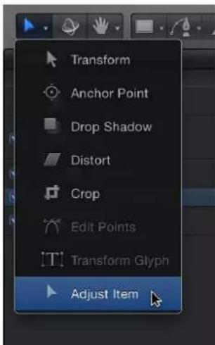
When the Adjust Item tool is selected, the replicator onscreen controls appear in the Canvas. Dragging the pattern's shape outline adjusts the size of the replicator shape. For example, if the shape is a spiral or circle, dragging the shape outline changes the Radius parameter value. Dragging inside the shape (but not directly on the outline) repositions the replicator in the Canvas.
natural_image
Abstract glowing spiral shape on black background, no text or symbols presentWhen the pointer is over the replicator shape line, the line is highlighted. Dragging the shape outline resizes the replicator.
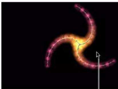
natural_image
Abstract glowing spiral shape with pink-orange gradient against black background, no text or symbols presentDragging inside the shape (but not directly on the outline) repositions the replicator.
If the replicator shape is a rectangle, dragging a corner or edge of its bounding box changes the Size parameter value. Depending on which handle you drag, you can constrain the transform to width, height, or depth (in a box-shaped replicator). Or you can drag a corner handle to scale the replicator in multiple dimensions simultaneously.

- Drag the corner handles to adjust width and height simultaneously. Press Shift to adjust width and height uniformly.
—Drag the left or right edge of the bounding box to adjust width.
—Drag the top or bottom edge to adjust height.
Use image and geometry objects
There are two ways that image and geometry objects can be used in a replicator: as a cell source or as a shape source. When used as a cell source, the image or geometry object is replicated to create the repeating elements in the pattern—the tiles in the onscreen mosaic. When used as a shape source, a geometry object (such as a circle or bezier shape) defines the shape of the replicator pattern. In other words, the elements are positioned along the edge of the shape.
Note: Image objects cannot be used as a shape source when Geometry is chosen from the Shape pop-up menu.
When used as Geometry sources, images (such as stills or clips) and geometry objects can be used to specify the shape of the replicator pattern. The following section describes how to use image and geometry objects as shape sources and element sources.
Use an image as the source of the onscreen elements
1 Import the image to use as the source for your repeating elements.
2 Select the image, then do one of the following:
- Click the Replicate button in the toolbar.
- Choose Object > Replicate (or press L).
Use an image as the shape source of the replicator pattern
1 Import the image to use as the pattern shape in an existing replicator.
2 In the Replicator Inspector, choose Image from the Shape pop-up menu.
The Image Source well appears in the Inspector and HUD.

3 From the Layers list, drag the image to the Image Source well.
4 When the pointer becomes a curved arrow, release the mouse button.
A thumbnail of the image appears in the well.
Note: The source image in the Layers list is disabled so it is not visible in your project.
5 Choose an option from the Arrangement pop-up menu.
Use a geometry shape as the source of the onscreen elements
1 Create or import the geometry object (shape or paint stroke) to use as the source for your repeating elements.
2 Select the geometry object, then do one of the following:
- Click the Replicate button in the toolbar.
- Choose Object > Replicate (or press L).
Use a geometry object as the shape source of the replicator pattern
1 Import (or draw) the shape to use as the pattern shape in an existing replicator.
2 In the Replicator Inspector, select Geometry from the Shape pop-up menu.
The Shape Source well appears in the Inspector and HUD.
3 From the Layers list, drag the shape to the Shape Source well.
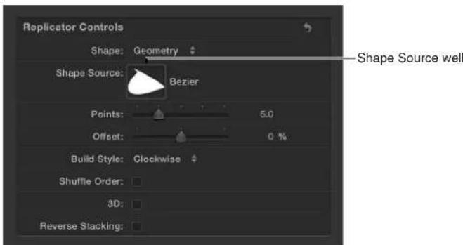
4 When the pointer becomes a curved arrow, release the mouse button.
A thumbnail of the shape appears in the well and is used as the source for the shape of the replicator.
Note: The source image in the Layers list is disabled so it is not visible in your project.
Animate replicators
Animate replicators overview
Most replicator and replicator cell parameters can be animated with keyframing or by using Parameter behaviors. If you animate the replicator's shape-specific parameters such as Radius, Twists, and Offset (in a Spiral replicator), the pattern on which the elements are built is animated, not the elements themselves. To animate the elements of the pattern, you keyframe the parameters in the Cell Controls group of the Replicator Inspector (or in the Replicator Cell Inspector).
Keyframing the replicator parameters (or using Parameter behaviors) animates all elements in the replicator symmetrically. To animate the elements in sequence over time—without creating keyframes—use the Sequence Behavior, described in Apply the Sequence Replicator behavior on page 596. To animate the replicator using Basic Motion or Simulation behaviors, see Apply behaviors to replicators on page 595.
You can also use keyframes to animate the parameters in a replicator's Properties Inspector. Parameters in the Properties Inspector affect the replicator as a whole, not replicator elements.
Apply behaviors to replicators
As with all layers in Motion, you can apply Basic Motion, Parameter, and Simulation behaviors to a replicator. Some behaviors can be applied directly to replicator cells, such as Throw and Spin (from the Basic Motion subcategory) and Gravity and Edge Collision (from the Simulation category).
Apply a behavior to a replicator
Do one of the following:
- Drag a behavior from the Library onto a replicator in the Canvas, Layers list, or Timeline.
- Select the replicator in the Layers list, Canvas, or Timeline, then choose an item from the Add Behavior pop-up menu.
The behavior is applied to the replicator, which begins to move according to the parameters of the behavior.
Not all behaviors instantly activate a layer when applied. For example, when a Throw behavior is applied to a layer, the Throw Velocity parameter must be adjusted before the object moves.
For more information on behaviors, see Behaviors overview on page 293.
As previously noted, the replicator also has a special behavior called Sequence Replicator, which animates individual cells in sequence over time. For more information, see Apply the Sequence Replicator behavior on page 596.
For more information on applying Parameter behaviors to the Sequence Replicator behavior, see Use Parameter behaviors with the Sequence Replicator behavior on page 607.
Special behavior considerations
When Simulation behaviors, as well as the Spin and Throw behaviors, are applied to a replicator that has animated parameters, some animation created by the keyframes is ignored. For example, if the Angle parameter in the Cell Controls of the Replicator Inspector is keyframed so the pattern elements rotate over time, and you apply a Spin behavior—with the Affect Subobjects checkbox selected—the elements rotate according to the rate set in the Spin behavior parameters and ignore the replicator's Angle keyframes. To rotate the entire replicator layer and enable the Angle keyframe animation, deselect Affect Subobjects in the Spin parameters.

natural_image
Circular arrangement of beige oval shapes on black background, no text or symbols presentSpin behavior applied to replicator with Affect Subobjects turned on (the individual elements spin)
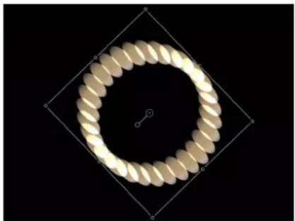
natural_image
Circular golden spiral pattern enclosed in a diamond frame against black background (no text or symbols)Spin behavior applied to replicator with Affect Subobjects turned off (the entire replicator pattern spins)
Apply the Sequence Replicator behavior
The Sequence Replicator behavior animates elements of a replicator in sequence over time. This is the only way to animate elements individually—keyframing the cell parameters or applying other behaviors affects all elements in the pattern uniformly.
Using the Sequence Replicator behavior, you can select and apply replicator cell parameters such as Position, Color, Scale, Rotation, or Opacity, then animate those parameters in a cascading sequence that passes through each element in a replicator pattern.

natural_image
Abstract gradient shape with warm orange-yellow hues on black background (no text or symbols)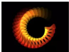
natural_image
Abstract spiral pattern with orange-to-red gradient on black background (no text or symbols)
natural_image
Abstract glowing arc pattern on black background (no text or symbols)The starting point for the sequence animation is based on the replicator's origin or build style. For example, if a spiral replicator's Origin parameter is set to Center, the sequence animation begins at the center of the spiral and moves outward; if the Origin of a rectangle replicator with a tile fill is set to Upper Left, and the Build Style is set to Across, the sequence begins with the elements in the upper-left corner of the pattern, then moves toward the lower-right corner.
The Sequence Replicator behavior can be applied to the replicator object, or to the cells of the replicator. When applied to each cell of a replicator with multiple cells, animations can be created for each cell.
After you create a Sequence Replicator behavior, you can save the behavior to the Library.
Apply the Sequence Replicator behavior to a replicator
Do one of the following:
In the Layers list or Timeline, select the replicator, then choose Replicator > Sequence Replicator from the Add Behavior pop-up menu in the toolbar.

flowchart
graph TD
    A["File Icon"] --> B["Camera Icon"]
    C["Toolbar Icon"] --> D["Search Icon"]
    E["Sensor Icon"] --> F["Settings Icon"]
    G["Gear Icon"] --> H["Hardware Icon"]
    I["Arrow"] --> J["Load Icon"]
In the Library, select the Behaviors category and then the Replicator subcategory. Drag the Sequence Replicator behavior from the stack to the replicator in the Layers list, Canvas, or Timeline.
The Sequence Replicator controls appear in the Behaviors Inspector. At the top of this group are the Parameter pop-up menus, used to add parameters to the behavior, or to remove them after they've been added. The added parameters determine which properties are animated.
Underneath the Parameter pop-up menus are the Sequence Control parameters, which determine how added parameters affect onscreen elements. These controls include options for setting the direction of the animation, whether the animation is applied per element or to the whole pattern, the number of times the animation cycles through the pattern, and so on.

Important: Before any sequencing animation can occur, you must add at least one parameter to the behavior in the Inspector and then set a value for that parameter. Until a parameter is added, adjusting the Sequence Controls in the HUD or Inspector has no effect. For more information, see Add parameters to the Sequence Replicator behavior on page 598.
Add parameters to the Sequence Replicator behavior
In the following example, the Rotation, Opacity, and Scale parameters are added to the Sequence Replicator behavior. The behavior is applied to a replicator with its Shape set to Burst and its Origin set to Center.

natural_image
Simple orange gradient shape on black background (no text or symbols)Replicator source object
natural_image
Abstract 3D geometric shape resembling a stylized 'X' or interlocking orange-yellow lines on black background (no text or symbols)Burst replicator pattern prior to applying Sequence Replicator behavior
Add and animate parameters in the Sequence Replicator behavior
1 Select the Sequence Replicator behavior.
2 In the Parameter row of the Behaviors Inspector, do the following:
a Choose Rotation from the Add Parameter pop-up menu.
b Choose Opacity from the Add Parameter pop-up menu.
c Choose Scale from the Add Parameter pop-up menu.
The added parameters appear above the Add and Remove pop-up menus. No animation occurs until you set a value for the parameters.
Play the project (press the Space bar) to see the effects of the sequencing adjustments as they begin to take effect in the next steps.
3 Ensure that Record Animation is turned off (no checkmark appears when you choose Mark > Record Animation, or the Record button in the toolbar is turned off).
4 Set Rotation to the largest (or smallest) value you want the cells to spin in the animation.
In this example, Rotation is set to 160 degrees. Each element rotates from 0 degrees to 160 degrees over the pattern for the duration of the Sequence Replicator behavior.

natural_image
Abstract 3D rendering of a stylized Y-shaped object with orange and yellow gradients against black background (no text or symbols)Note: If the elements are already rotated (in the Cell Controls), the elements are rotated 160 degrees from their original rotation value.
Each element rotates and pops into place before the next element begins its animation. To soften this effect, increase the Spread value.
5 Increase the Spread value.
In this example, Spread is set to 12. In addition to creating a more graceful animation, changing the Spread value can also dramatically change the appearance of the pattern.

natural_image
Abstract flame-like shape with orange-to-red gradient against black background (no text or symbols)6 Set Opacity to the lowest value you want the elements to become in the animation.
In this example, Opacity is set to 0. Each element fades from 100% opacity to 0% opacity over the pattern for the duration of the Sequence Replicator behavior.

natural_image
3D rendered X-shaped bone structure with gradient colors (no text or symbols)Note: If the elements contain some transparency, they fade from their original opacity value to 0%.
7 Increase the Scale value.
In this example, Scale is set to 190%.

natural_image
Abstract glowing orange and yellow geometric shape against black background (no text or symbols)The animation begins at the original value for any added parameter, then transforms to the value you specify in the Sequence Replicator parameters. The animation begins at the origin of the pattern (set in the Origin or Build Style parameter of the Replicator Inspector or HUD) and moves to the end of the pattern.
Adjust the Sequence Control parameters
After you create a sequence animation, you can use Sequence Control parameters to change the manner in which the sequence moves through the replicator pattern. The following section continues with the project used in the previous example.
Change the way the sequence moves through the pattern
1 With the Sequence Replicator behavior selected, play the project (press the Space bar) to see the effects of the sequencing.
By default, Sequencing is set to To, which specifies that the animation begins at the original value of the cells and moves to the value set in the Sequence Replicator behavior for that parameter. The starting point for the sequence animation is based on the build or origin of the pattern (as defined in the Origin or Build Style parameters in the Replicator Inspector). In the current example, the elements begin completely opaque, at 100% scale, and with 0 degrees of rotation at the origin of the pattern. As the sequence moves toward the end of the pattern, the elements become completely transparent, are scaled to 190%, and are rotated 160 degrees.

natural_image
Abstract 3D ribbon-like shape with orange-to-red gradient, no text or symbols present
natural_image
Abstract 3D shape with glowing orange and yellow colors on black background (no text or symbols)
natural_image
Abstract glowing orange and yellow shapes on black background (no text or symbols)2 In the Sequencing pop-up menu in the Behaviors Inspector, choose From.
The animation moves from the value set in the Sequence Replicator behavior to the original value of the cells. This is the opposite of the To Sequencing option.

natural_image
Abstract glowing geometric shape with orange and green hues against black background (no text or symbols)
natural_image
Abstract glowing orange shape on black background, resembling a stylized X or flame (no text or symbols)
natural_image
Abstract 3D shape resembling a stylized letter or symbol with warm colors on black background (no text or symbols)3 In the Sequencing pop-up menu, choose Through.
The sequence goes through a full animation cycle starting at the original value of the cells, moving to the value set in the Sequence Replicator, then returning to the original value of the cells. This is similar to combining the To and From Sequencing options.
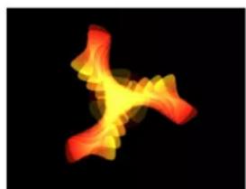
natural_image
Abstract 3D rendering of a stylized flame or smoke-like shape with red-orange gradients against a black background (no text or symbols)
natural_image
Abstract glowing orange and yellow geometric shapes on black background (no text or symbols)
natural_image
Abstract 3D rendering of a stylized flame or flame-like shape with red-orange gradients against a black background (no text or symbols)4 From the Unit Size pop-up menu, choose All.
The sequence animation affects all replicator elements simultaneously. The default is Object, which applies the sequence animation to the elements of the replicator based on the origin of the pattern.

natural_image
Abstract 3D visualization of a glowing orange-yellow star-like shape against a black background (no text or symbols)Unit Size set to All
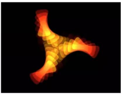
natural_image
X-ray image of a bone structure with red-orange fluorescence, no visible text or symbolsUnit Size set to Object
5 Increase the Loops value to a minimum value of 3.
By default, a sequence animation plays through one time. The value of the Loops parameter defines the number of times the animation repeats over the duration of the replicator object.
6 From the End Condition pop-up menu, choose Ping Pong.
By default, the End Condition parameter is set to Hold, which completes a sequence animation cycle, then starts the cycle again from the beginning. When set to Ping Pong, the animation cycles forward one time, then cycles backward, then forward, and so on.
Note: The End Condition parameter has no effect for Loop values less than or equal to 1.
Sequence Replicator controls
Use the following parameters to modify the sequence animation. Except for the Add and Remove Parameter pop-up menus, these parameters also appear in the Sequence Replicator HUD.
Parameters in the Inspector
- Parameter: Use the Add and Remove pop-up menus in the Parameter row to add and remove replicator cell parameters. When you choose an item from the pop-up menu, additional controls appear in the Behaviors Inspector above the Parameter row. You can adjust these controls (or keyframe them) to modify the sequence animation, which is based on the change in value between these parameters and the original values of the cells. The Add pop-up menu items include:
- Rotation: Adds a rotation dial and value slider that enables you to Specify (in degrees) the rotation of replicator elements.
- Color: Adds a row of color controls that let you specify a tint for replicator elements. You can click the color well to choose a color or open the disclosure triangle and use the Red, Green, and Blue sliders.
- Opacity: Adds an opacity slider, allowing you to define the transparency of the pattern elements.
- Scale: Adds a scale slider that lets you define the size of replicator elements. Click the disclosure triangle next to the Scale slider to reveal separate X scaling and Y scaling subparameters that can be used to adjust the width and height of the cells separately. By default, Scale is set to 100% —the size of the replicator cells is equal to the original size defined in the cell parameters.
- Position: Adds two value fields that define the offset of elements from their original position in X and Y space. Click the disclosure triangle next to the parameter name to reveal separate X, Y, and Z position subparameters. For example, to create an animation in which elements move upward in Y over the replicator pattern, enter a positive value in the Y Position field. In the following images, Y Position is set to 300.

natural_image
Abstract geometric pattern with yellow and red squares on black background (no text or symbols)
natural_image
Abstract pattern of six yellow squares on black background, no text or symbols present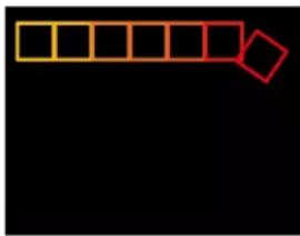
natural_image
Simple diagram with a grid of yellow squares and a red diamond shape on black background (no text or symbols)- Sequencing: This pop-up menu specifies how the sequence animation moves through the elements of the pattern, based on the change from the original parameter value to the value set in the Sequence Replicator parameters. The starting point for the sequence animation is based on the selected Origin or Build Style parameters (in the Replicator Inspector). For example, if a line replicator's Origin parameter is set to End Point, the sequence animation begins at the end of the line and moves toward the start of the line by default. To change the starting point for the sequence animation, change the Origin or Build Style of the pattern in the replicator controls (in the Replicator Inspector or HUD). The Sequencing options are:
- To: Specifies that the animation begins at the original value of the cells and moves to the value set in the Sequence Replicator behavior for that parameter. For example, if the original opacity value of a cell is 100% , and opacity is set to 0% in the Sequence Replicator parameters, onscreen elements begin completely opaque and become completely transparent.
- From: Specifies that the animation moves from the value set in the Sequence Replicator behavior to the original value of the cells. For example, if the original opacity value of a cell is 100% and opacity is set to 0% in the Sequence Replicator parameters, onscreen elements begin completely transparent and become completely opaque. This is the opposite of the To option in the Sequencing pop-up menu.
•Through: Specifies that the sequence goes through a full animation cycle starting at the original value of the cells, moves to the value set in the Sequence Replicator, and then returns to the original value of the cells. For example, if the original opacity value of a cell is 100% and opacity is set to 0% in the Sequence Replicator parameters, onscreen elements begin completely opaque, become transparent, and then become completely opaque again. - Through Inverted: Specifies that the sequence goes through an inverted animation cycle starting from the value set in the Sequence Replicator, moves to the original value of the cells, and then returns to the value set in the Sequence Replicator. For example, if the original opacity value of a cell is 100% and opacity is set to 0% in the Sequence Replicator parameters, the onscreen elements begin completely transparent, become opaque, and then become completely transparent. This is the opposite of the Through Sequencing option.
- From Keyframes: Lets you use animation originally created in the source layer's parameters (except alpha parameters). Additionally, you can keyframe how the animation moves through the values set in the Sequence Replicator parameters.
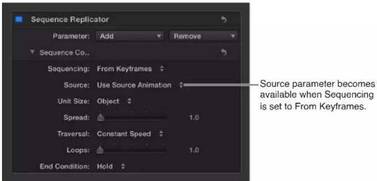
- Source: This pop-up menu becomes available when From Keyframes is chosen from the Sequencing pop-up menu. The Source options are:
- Use Source Animation: If the source layer parameters are keyframed, choose this option to enable the animation created by those keyframes.
- Ignore Source Animation: If the source layer parameters are keyframed, choose this option to ignore the animation created by those keyframes.
- Unit Size: This pop-up menu specifies whether the sequence animation is applied to the replicator pattern as a whole, to its elements, or to a keyframed range. The Unit Size options are:
- Object: Applies the sequence animation over each element as its own entity. Object is the default setting.

natural_image
Abstract 3D rendering of a stylized human figure in motion against a black background (no text or symbols)When Unit Size is set to Object, each replicator pattern cell is affected individually.
- All: Applies the sequence animation to all replicator elements simultaneously.

natural_image
Abstract 3D letter-like shape with glowing orange and yellow gradients on black background (no text or symbols)When Unit Size is set to All, every replicator pattern cell is affected simultaneously.
- Custom: Lets you specify the percentage of elements in the pattern that are affected by the sequence animation at once. Although you can create keyframes for the Custom option, it is not required to affect the sequence. As shown in the following images, the Object and All options allow you to sequence the animation through the origin or build style of the pattern, or through all pattern elements simultaneously.
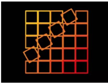
natural_image
Abstract grid pattern with orange-to-red gradient and scattered orange squares (no text or symbols)Unit Size set to Object sequences the animation over the build of the pattern.

natural_image
Abstract pattern of overlapping squares in yellow-orange gradient on black background (no text or symbols)Unit Size set to All sequences the animation over all cells simultaneously.
Custom lets you define an area of elements—based on percentage—that are affected by the sequence.
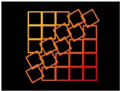
natural_image
Abstract geometric pattern with orange-yellow grid and scattered black squares on black background (no text or symbols)Unit Size set to Custom allows you to define the percentage of cells affected as the sequence moves through the pattern.
When Custom is chosen from the Unit Size pop-up menu, the Start and End parameters become available.
- Start: This slider, available when Custom is chosen from the Unit Size pop-up menu, specifies the offset of the start of the range of elements affected by the sequence animation as it moves over the replicator pattern. In the above image, Start is set to 10% .
- End: This slider, available when Custom is chosen from the Unit Size pop-up menu, specifies the end of the range of elements affected by the sequence animation as it moves over the replicator pattern. By default, End is set to 10% . In the above image, End is set to 30% .
Note: If the Sequencing pop-up menu is set to Custom, the Custom option in the Unit Size parameter has no affect. - Spread: This slider controls the amount of falloff of the animation. To create a softer transition between each element, increase the Spread value.
- Traversal: This pop-up menu sets the action of the sequence behavior to one of the following:
- Constant Speed: The sequence animation moves from the origin of the replicator pattern through the end of the pattern at a constant speed. The sequence moves in the direction specified in the replicator parameters, such as the origin or build style.
- Ease In: The sequence animation begins slowly and increases to normal speed as it moves through the replicator pattern.
- Ease Out: The sequence animation begins at normal speed and slows toward the end of the replicator pattern.
- Ease In/Out: The sequence animation begins slowly, increases to normal speed as it moves toward the middle of the duration of the replicator pattern, and slows as it reaches the end of the replicator pattern.
- Accelerate: The sequence animation increases in speed.
- Decelerate: The sequence animation decreases in speed.
- Custom: This option lets you keyframe how the animation moves through the replicator pattern. When Custom is selected from the Traversal pop-up menu, the Location parameter replaces the Loops parameter.
- Location: This slider, available when Custom is chosen from the Traversal pop-up menu, defines the location of the pattern where the animation is in effect.
For more information on using the Custom Traversal option, see Use the Sequence Replicator Custom Traversal option on page 605.
- Loops: This slider sets the number of times the animation sequences through the replicator pattern over its duration.
Note: Loops is not available when the Traversal parameter is set to Custom.
- End Condition: A pop-up menu that sets how the sequence animation is repeated over the duration of the replicator object. This parameter has no effect for Loop values less than or equal to 1. End Condition options are:
- Hold: Completes the sequence animation cycle one time, then starts it again from the beginning (after the last element in the sequence completes its animation).
- Wrap: Treats the sequence animation as a continuous loop so the spread wraps from the last element in the sequence to the first element.
- Ping Pong: Completes the sequence animation cycle forward, then completes the animation backward, then forward, and so on.
Use the Sequence Replicator Custom Traversal option
When the Traversal parameter in the Sequence Replicator behavior is set to Custom, you can create location keyframes to specify the location of the sequence at a given moment. Use the Traversal parameter to create a sequence animation that travels through a replicator pattern in a unique way. The following example shows how to use the Custom Traversal option to scale the elements around a circle replicator shape by creating keyframes.
To use the Custom Traversal parameter
1 After the Sequence Replicator behavior is applied to the replicator, add the parameters (in the Behaviors Inspector) you want to include in the sequence.
2 Set the values for the added parameters.
In this example, the Scale parameter is added and the Scale value set to 200%.

natural_image
Close-up of a golden, ring-shaped object against a black background (no text or symbols visible)Sequence behavior applied to replicator with Scale parameter set to 200%, Sequencing set to Through, and Spread set to 4
For more information on adding parameters to the Sequence Replicator behavior, see Add parameters to the Sequence Replicator behavior on page 598.
3 From the Traversal pop-up menu, choose Custom.
The Location parameter becomes available. Use the Location slider to keyframe how the sequence moves through the replicator pattern.
4 Press A to enable keyframe recording.
5 At the frame where you want to begin the animation, drag the Location slider (or use the adjacent value slider) to set where the sequence begins.
As you drag the slider, the sequence moves through the pattern elements. Values displayed in the Location parameter specify where in the pattern the sequence is (in percentage points)—0 representing the origin of the pattern, and 100% representing the end of the pattern.
In the Inspector, a keyframe is added to the Location parameter.
6 Go to the next frame where you want to set a keyframe, and move the Location slider.
7 Repeat step 6 until you create all your keyframes.
8 Play the project (press the Space bar).
The animation moves through the replicator pattern based on its keyframed locations. In this case, the scale moves erratically back and forth around the circle, rather than in a constant direction.

natural_image
Close-up of a glowing, golden ring with radial ridges against a black background (no text or symbols)
natural_image
Close-up of a golden ring with radial ridges against a black background (no text or symbols)
natural_image
Close-up of a glowing, ribbed ring against a black background (no text or symbols)Use Parameter behaviors with the Sequence Replicator behavior
Like all other layers in Motion, you can add Parameter behaviors to Sequence Replicator parameters to create even more varied, complex effects without keyframing.
Apply a Parameter behavior to a Sequence Replicator behavior
1 Add a Sequence Replicator behavior to a replicator.
2 In the Layers list or Timeline, select the Sequence Replicator behavior.
3 In the Behaviors Inspector, Control-click the parameter you want to add a Parameter behavior to, then choose a behavior from the Add Parameter Behavior submenu.
Note: You can only add a Parameter behavior to parameters that include the Animation menu. The Animation menu appears when you place your mouse at the right side of the parameter row.
The Parameter behavior is added and appears above the Sequence Replicator behavior in the Behaviors Inspector. A behavior icon appears in the Animation menu of the Sequence Replicator parameter.

Note: When the Wriggle or Randomize parameter behavior is added to a Sequence Replicator parameter, the Affect Subobjects checkbox becomes available. Select the checkbox if you want each element in the pattern to display a different random behavior.
For more information on using Parameter behaviors, see Parameter behaviors overview on page 332.
Display replicator animation curves in the Keyframe Editor
The replicator parameters in the Properties and Replicator Inspectors can be keyframed to create a change in values over time. You can view the resulting keyframe curves in the Keyframe Editor by choosing Animated from the pop-up menu in the top-left corner of the Keyframe Editor.
Different parameters (and their keyframe curves) appear in the Keyframe Editor depending on which layer you select in the Layers list:
- Select the replicator layer to display animated replicator parameters such as Position and Rotation in the Properties Inspector, or Size or Tile Offset (available when the shape is a rectangle) in the Replicator Inspector.
- Select the cell layer to display animated parameters of the Replicator Cell Inspector, such as Angle or Scale.
For more information, see Keyframing overview on page 439.
Use replicators in 3D space
Two replicator pattern styles in the Shapes pop-up menu have 3D properties: Box and Sphere. The Box and Sphere shape options are available only when the 3D checkbox is selected in the Replicator Inspector. Box and Sphere replicators build a pattern of elements in 3D space. The 2D Rectangle and Circle replicator shapes have columns (in the Y plane) and rows (in the X plane), but Box and Sphere have an additional Ranks parameter, which adds depth to the replicator.

natural_image
3D visualization of a geometric structure with orange-to-red gradient and grid lines (no text or symbols)Box replicator with 13 columns, 12 rows, and 3 ranks
Line and Wave replicator shapes have quasi-3D properties: Their start and end points can be moved into Z space. In the following image, the Z Start Point (yellow end of the pattern) is set to 20 and the Z End Point is -18 (red end of the pattern).

natural_image
3D rendered object with gradient orange-yellow shading and scattered red dots on a black grid background (no text or symbols)Although the Rectangle, Circle, Line, Wave, Image, and Geometry replicators have no inherent 3D parameters, they can be moved and rotated in 3D space. Pattern elements can also be pulled out of their plane when behaviors are applied. The replicator must be a member of a 3D group to be pulled out of the X and Y planes by a behavior.
The following illustrations demonstrate replicator pattern elements pulled into Z space. In the illustration on the left, the Burst replicator's Z position is set to 0 and the white circle's Z position is set to 225. An "Attracted To" Simulation behavior is applied to the replicator, with the white circle set as the target object. As the project plays, as shown in the center illustration, the replicator elements move forward in Z space toward the attractor. In the right illustration, the camera is rotated to look behind the replicator. Under the behavior's influence, the replicator elements move past their attractor element, and return to their original position.
natural_image
Abstract geometric pattern with orange-yellow triangular shapes on black background (no text or symbols)
natural_image
3D rendered object with orange and red gradient overlay on black background, no visible text or symbols
natural_image
Two abstract glowing shapes on a black background, one orange and one green, with no visible text or symbols.Use masks with replicators
You can apply masks to a replicator's source layer (used as the replicator cell source to create the repeating onscreen elements) or to the replicator itself.
The following images show masks applied to the source layer of a replicator.

When a masked layer is used as the source for a replicator cell, the mask is respected in the elements that appear onscreen.

natural_image
Close-up of a yellow, textured object partially submerged in green liquid (no visible text or symbols)
natural_image
Close-up of a yellow rubber duck head with dark eyes and a slightly downward mouth, against a black background (no text or symbols)
natural_image
Illustration of a coiled yellow snake with visible internal spots (no text or symbols)Original source Circle mask applied to source Masked layer used
as replicator source
You can also apply masks to the replicator layer.

When you apply a mask to a replicator, the entire pattern onscreen becomes masked.
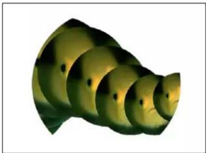
natural_image
Abstract 3D rendered spiral structure with gradient shading (no text or symbols)Circle mask applied to the replicator
Note: Although you cannot apply masks to a 3D replicator, you can apply them to an object used as a cell source for 3D replicator.
For more information on working with masks, see Masks and transparency overview on page 888.
Apply filters to replicators
You can apply filters to a replicator or its sources. When applied to the replicator, a filter affects every element of the replicator pattern. When applied to the source layers of a replicator, the effect of a filter is retained when the layer is replicated. However, filters cannot be applied to individual cells of a replicator.
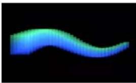
natural_image
Abstract wavy blue gradient shape on black background (no text or symbols)Replicator before any filters are applied

natural_image
Close-up of a coiled, worm-like organism against a black background (no text or symbols visible)Circle Screen filter applied to the source layer for the replicator cells

natural_image
Abstract wavy line pattern on black background (no text or symbols)Circle Screen filter applied to the replicator layer
For more information on applying filters to layers in your project, see Filters overview on page 741.
Save custom replicators to the Library
After you create a replicator you like, you can save it as a replicator preset in the Replicator or Favorites category of the Library for future use. After you place a custom replicator in the Library, it can be used like any other replicator preset.
Save a custom replicator to the Library
1 Open the Library and select the Replicators, Favorites, or Favorites Menu category.
2 From the Layers list or Timeline, drag the replicator to save into the stack at the bottom of the Library.
Note: For organizational purposes, you may find it useful to create a folder of your own in the Favorites or Favorites Menu category to store replicators.
When you save a replicator preset, it's saved as a file in the /Users/username/Library/Application Support/Motion/Library/ folder (in the Replicators, Favorites or Favorites Menu subfolder). Any custom objects that you used to create that replicator are included in the file.
You can copy replicator presets you create from this location to give to other Motion users, or you can add replicator presets given to you to this same folder.
Note: When you copy a replicator preset file, be sure you also copy graphics or movie files that it uses.
Text
Text overview
Although trends in type design change, a balanced use of type and graphics remains key to achieving the right effect in most commercials, documentaries, television and film titles, broadcast logos, corporate presentations, or your own video projects. No matter what style your project requires, Motion provides unique text animation tools that offer immediate results.

It's easy to add text to a Motion project. Simply select the Text tool, click in the Canvas, and start typing. After you create the text, you can apply text styles, special effects filters, animation behaviors, and keyframes. (For details on animating text, see Animated text overview on page 676.) You can modify text as a whole object, or as separate glyphs (characters), allowing for endless combinations of effects.
After you create a text treatment—a text style with the perfect gradient colors, radiant glow, or customized behavior—you can save the behavior or style in the Library for use on other text treatments or in a future project.
You can also use text objects as source cells for particle emitters and replicators to create stunning graphics. If you later modify the source text, Motion updates the replicator and particle system. If the text used as a cell source has applied behaviors or filters, the effect is carried over into the replicator or particle system. For more information about using particle emitters and replicators, see Particles overview on page 513 and Replicator overview on page 559.
To learn more about working with text in Motion, choose a topic in the Help table of contents (the sidebar to the left of this window). To learn about animating text elements to create dynamic effects, see Animated text overview on page 676.
Set preferences for text
Before you start a project, set your text creation preferences. You can set Motion to create text at either the current frame (the frame where the playhead is positioned at the time you add the text) or at the start of the project. By default, layers are created at the current frame. You can also specify a default duration for a created layer.
Set layer creation and duration preferences
1 Choose Motion > Preferences (or press Command-Comma).
2 Click the Project icon.
The Project Preferences pane is displayed.
3 In the Still Images & Layers section, set the Default Layer Duration preference:
- To create text that is the length of the project, select "Use project duration" (the default setting). This means that if you are working in a 300-frame project and you create text, the duration of the text (in the Timeline) is 300 frames.
Note: If Create Layers At is set to "Current frame" and you create text at frame 50, the text spans frame 50 to frame 300.
- To create text of a specific duration, select "Use custom duration." Next, enter a value in the text field, then choose Frames or Seconds from the pop-up menu.
All layers you create will span the entered duration.
4 Set the Create Layers At preference:
- To create text at the current location of the playhead, select "Current frame."
- To create text at the start of the project, select "Start of project." With this preference, all text is created at the beginning of the project, regardless of the playhead location.
Create text
Add text in the Canvas
In Motion, you create text in the Canvas using the Text tool. After selecting the Text tool in the toolbar, click once in the Canvas and begin typing at the insertion point. Alternatively, you can type text in the Text Inspector, or drag or import a text file into the Motion workspace. After you add text to a project, you can apply filters to create special effects, or behaviors or keyframes to animate the text.
Add text in the Canvas
1 In the Layers list, select the group to add a text layer to.
Note: If no group is selected, the text is added to the last selected group (the underscored group in the Layers list).
2 In the toolbar, click the Text tool (or press T).
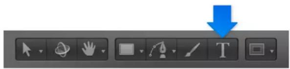
3 Click in the Canvas.
The cursor flashes in the Canvas at the insertion point. Before you enter text, an empty text object is added to the project and the Text HUD appears.
Note: If the HUD does not appear, click the Show HUD button in the toolbar.

4 Enter text.
As you type, the following occurs:
• The text appears in the Canvas.
- The mini-Timeline and the text layer in the Layers list are labeled using the characters you type.

• The same text appears in the track bars of the group and layer in the Timeline.
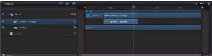
Note: By default, the text layout method (adjustable in the Layout pane of the Text Inspector) is set to Type. The Type layout option creates no right margin. Therefore, if you enter a long string of text, the characters extend on a single line beyond the edge of the Canvas until you create a manual line break (by pressing Return). The Type layout mode is useful when you are working with short strings of text and also when animating horizontal scrolling effects in the Canvas. For information on changing text layout and setting margins, see Layout controls in the Layout pane on page 653. To see items that extend beyond the edge of the Canvas, choose View > Show Full View Area.
5 When you finish typing, do one of the following:
- Press Esc.
- Press Command–Return.
- Click the Select/Transform tool in the toolbar.
The text is selected and appears with a bounding box in the Canvas.
Important: After you finish typing, press Esc or select another tool on the toolbar—do not use a keyboard shortcut. When the Text tool is selected, typing a keyboard shortcut (other than Esc) adds text to the Canvas.
Select text characters
Do one of the following:
- Select the Text tool, then drag within the text object in the Canvas.
If you don't begin the drag within a text object, a new text object is created.
- Click between two characters in the Canvas, and then while holding down the Shift key, press the Right Arrow key or the Left Arrow key to select characters.
- Click the Select/Transform tool, then double-click the text in the Canvas.
Move the cursor between words
- Click between two characters in the Canvas, then press Option–Right Arrow to move the cursor forward between words; press Option–Left Arrow to move the cursor backward between words.
Delete a word
- Click in the Canvas at the end of the word you want to delete, then press Option-Delete.
Add paragraph text in the Canvas
With Text tool is selected, clicking in the Canvas prompts basic text entry, and dragging in the Canvas activates paragraph-style text entry. Paragraph text is contained within margins that cause the text you type to wrap to the next line. You can adjust the margins of the paragraph to create a column of text as narrow or as wide as you like.
Add paragraph text to your project
- With the Text tool selected, drag in the Canvas to draw a custom text-entry field.
When you release the mouse button, the paragraph text entry field appears in the Canvas. A ruler appears above the text field. You can begin typing at the flashing insertion point. In the Layout pane of the Text Inspector, the Layout Method pop-up menu is set to Paragraph.

natural_image
Empty white rectangle with green reeds at the bottom left and a black background (no text or symbols)Paragraph text entry field
You can create a text-entry field with margins that extend beyond the edge of the Canvas. When text extends beyond the upper and lower edges of the text-entry field, a scroll control appears on the right side of the text-entry field.

Note: You can also type paragraph text in the Text editor field of the Format pane (in the Text Inspector). For more information, see Add text with the Text editor on page 617.
Adjust the width or height of text margins without scaling the text
Working in the Canvas, you can adjust the margins of the text-entry field without affecting the scale of the text.
Do one of the following:
- With the Text tool selected, drag a text-entry field's onscreen scale handle.
Note: Do not use the Select/Transform tool to resize text margins. When you exit text-entry mode (by pressing Esc or selecting a tool from the toolbar), a standard object bounding box appears around the text. If you resize a text bounding box (by dragging one of its scale handles), the text is resized, not just the width of the bounding box.

In the Layout pane of the Text Inspector, adjust the Margins controls.

Note: When text is deleted from a paragraph, the paragraph margins remain in their original locations.
Add text with the Text editor
After you add a blank text object to your project (by selecting the Text tool and clicking in the Canvas), you can enter and edit text in the Text editor rather than the Canvas. The Text editor is useful when working with large amounts of text.
Enter text in the Text editor
1 Click the Text tool (or press T), then click or drag in the Canvas to create a blank text object.
- If you click in the Canvas, you activate the default layout method (Type), which requires that you insert manual line breaks (by pressing Return) to make text wrap to a new line. - If you drag in the Canvas, you activate the Paragraph layout method, which wraps text into a column.
2 In the Text Inspector, click Format to open the Format pane.
3 Click in the Text editor at the bottom of the pane and begin typing.
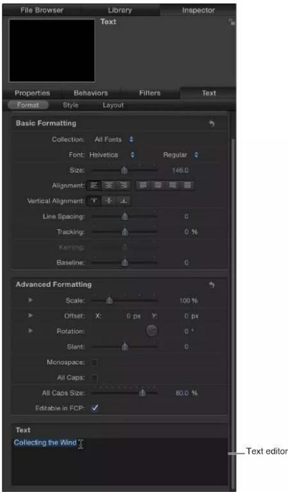
Edit text using the Text editor
You can also edit text in the Text editor and use the OS X spelling checker.
1 In the Layers list, select the text to be edited.
Note: You can also select the Text tool (in the toolbar), then click the text to edit in the Canvas.
The selected text appears in the Text editor.
2 In the Format pane of the Text Inspector, make changes in the Text Editor at the bottom of the pane.
Changes are reflected in the Canvas.
Use the spelling checker in the Text editor
In the Format pane of the Text Inspector, do one of the following:
- Click in the Text editor, then choose an option from the Edit > Spelling and Grammar submenu.
■ Control-click in the Text editor, then choose an item from the shortcut menu.
When a spelling error is found, the text is highlighted in the Text editor. If the Text tool is active when the spelling is checked, the text is selected in the Canvas.
Use text files created externally
Add a text file to a project
You can add plain text (TXT) or Rich Text Format (RTF) to a Motion project. After you add a text file, you can edit its content the same way you edit Motion-created text. The appearance (font, size, layout, and so on) of the text imported from an RTF file is preserved (although some formatting options available in RTF files, such as text wrapping, are not supported in Motion); the text appearance in a TXT file is based on the settings in the Motion Text Inspector.
Important: Text behaviors such as Tracking, Type On, and sequence behaviors can be added to text from an imported text file. However, the more text characters a behavior must animate, the more performance slows.
Add a text file from the File Browser
1 In the File Browser, select the TXT or RTF file you want to use.
2 Do one of the following:
- Drag the file to the Canvas, Layers list, or Timeline.
- Click the Import button in the preview area of the File Browser.
The text is added to the project and can be modified.
Add a text file to a project using the Import command
1 Choose File > Import.
2 In the Import Files dialog, select the TXT or RTF file to import, then click Import.
The text is added to the project and can be modified.
About TXT and RTF files
When you add a TXT file to a project, the following occurs:
- The text is formatted based on the settings in the Text Inspector.
- The Layout Method (in the Layout pane of the Text Inspector) is set to Paragraph.
Note: To change the layout of the text, choose another option from the Layout Method pop-up menu. The ruler and scroll controls become available in the Paragraph and Scroll layouts. The scroll control becomes available in the Crawl layout.
- The paragraph margins are set to the Safe Zones of the project. (Press the Apostrophe key to turn Safe Zones on and off.)
When you add an RTF file to a project, the following occurs:
- The formatting of the text (font, style, line spacing, outline, and other styles set in the text editing application) is preserved in the project.
- Double-clicking in the text in the Canvas activates the text-entry field, which includes a horizontal ruler at the top of the text and a scroll control to the right of the text.
- The Layout Method (in the Layout pane of the Text Inspector) is set to Paragraph.
- Margins in the original text file are preserved in the project. The size of the onscreen text-entry field is determined by the margins set in the application that created the text. In Motion, the margins can be edited onscreen or in the Layout pane of the Text Inspector. For more information on modifying margins, see Edit margins and tabs in RTF files on page 620. For more information on the Layout pane, see Text Layout pane on page 653.
- Tabs in the original text file are preserved in the project. The tabs appear as black icons in the ruler above the text-entry field. Tabs can be moved or deleted.
Edit margins and tabs in RTF files
Margins and tabs defined in another application (for example, the one that created the RTF text) can be modified in Motion. (For more information about the general use of tabs, see Work with tabs on page 668.)
Adjust a margin
1 Double-click the text to display the onscreen text-entry field, ruler, and scroll control.
Note: The Text tool must be selected. If you adjust the text box using the Select/Transform tool, the text is scaled.
2 Do one of the following:
- With the Text tool selected, drag a scale handle on the text-entry field.
- In the Layout pane of the Text Inspector, adjust the Left Margin, Right Margin, Top Margin, or Bottom Margin values.
Move the tabs
1 Double-click the text to display the onscreen text-entry field, ruler, and scroll control.
Note: The Text tool must be selected for the ruler and tabs to appear in the Canvas.
2 Do one of the following:
- In the Canvas, drag a tab (the small black icon) in the ruler.
- In the Layout pane of the Text Inspector, use the Tabs controls to adjust the position and layout of the tabs.
Remove a tab
1 Double-click in the text to display the onscreen text-entry field, ruler, and scroll control.
Note: The Text tool must be selected for the ruler and tabs to appear in the Canvas.
2 Drag the tab (the small black icon) off the ruler and release the mouse button.
The tab is removed from the ruler and from the Tabs controls in the Layout pane of the Text Inspector.
Copy and paste text from another application
You can copy text from another document or browser and paste the text into a Motion project.
Consider the following guidelines when pasting text from another application into Motion:
- Pasted RTF text retains the original font attributes, including family and typeface, size, color, outline, and drop shadow.
- When pasted, pure black text is converted to white text.
- White text copied from Motion is pasted to the clipboard as black text.
- Text pasted into an empty text-entry field retains the paragraph format, including alignment, justification, and tabs.
- Text pasted into an existing text-entry field does not retain its original paragraph format.
- Paragraphs pasted into a text-entry field retain the paragraph format, including alignment, justification, and tabs.
Note: A paragraph is defined as a block of text preceded by a carriage return. Text pasted into an existing text-entry field does not retain its original paragraph format. However, a paragraph pasted into a text-entry field retains its original paragraph format.
- If an image is copied with the text, the image is not included when the text is pasted in Motion.
- Dynamically numbered lists are not supported. Lists become standard text when pasted.
Copy and paste text into a project
1 Open the text document (an RTF, TXT, Pages, or other text file) in a text-editing application.
2 Select and copy the text.
3 Do one of the following:
- In the Motion Toolbar, select the Text tool, click in the Canvas, then choose Edit > Paste (or press Command-V).
- In the Format pane of the Text Inspector, click in the Text editor and choose Edit > Paste (or press Command-V).
Ways to edit text
There are two basic ways to edit text in Motion:
- As an object: When you create text, it becomes an object in your project. Because text objects share most characteristics of other objects in Motion, you can use the transform tools—Select/Transform, Anchor Point, Distort, Drop Shadow, Four Corner, and Crop—to manipulate a text object. These onscreen tools are shortcuts to the Transform controls in the Properties Inspector. When you make changes to text using the transform tools or the parameters in the Properties Inspector, modifications are applied to the text as an object rather than as text characters.
- As text characters: Text objects also have editable text parameters that are separate from the basic object parameters described above. The controls for editing these special text parameters are located in the Text Inspector, including format, style, and layout settings. Although some object properties are similar to text parameters (compare Shear in the Properties Inspector to Slant in the Format pane of the Text Inspector, for example), object properties are independent of the text format parameters, and vice versa. For example, if you apply a Slant value of 20 in the Format pane of the Text Inspector, a Slant value of 20 is applied to each character in the word, simulating italics. However, if you apply a Shear value of 20 in the Properties Inspector (or via the onscreen controls), a Shear value of 20 is applied to the object as a whole, not to text characters.
Text tools in the toolbar
The Motion toolbar contains several tools that you can use to manipulate text.
- Select/Transform tool: Use this tool to select and transform text as an object. After you finish typing text, click the Select/Transform tool (or press Esc). Text is selected in the Canvas as an object.
Note: When the Select/Transform tool is active, you can double-click existing text to enter text-editing mode. When Motion is in text-editing mode, the Text tool is highlighted in the toolbar.
- Text tool: Use this tool to create text or to edit text parameters.
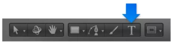
To create a blank text object, select the Text tool, then click or drag in the Canvas. Clicking in the Canvas activates the Type layout method (the default), which requires that you insert manual line breaks (by pressing Return) to make text wrap to a new line. Dragging in the Canvas activates the Paragraph layout method, which wraps text into a column.
To edit existing text, select the Text tool, then click the text in the Canvas. An insertion point appears in the Canvas, and the Text Inspector opens.
- Transform Glyph tool: Use this tool to select and transform glyphs (individual characters of text objects). After you create text, click the Select/Transform tool and, holding down the mouse button, choose the Transform Glyph tool from the pop-up menu, then click a glyph in the Canvas to select it.

For more information on editing text glyphs, see Text glyphs overview on page 669.
About fonts
Which fonts are used?
Motion uses supported fonts installed on your OS X system. OS X-supported fonts include OpenType, Type 1 (or PostScript), and TrueType. Supported fonts installed on your system appear in the Fonts category of the Motion Library, as well as in the Format pane of the Text Inspector. This includes fonts located in the following folders on your computer:
• /Library/Fonts/
• /Users/username/Library/Fonts/
For information on installing fonts, see OS X Help (in the Finder, choose Help > Help Center).
You can preview and apply fonts in the Motion Library or in the Format pane of the Text Inspector.
Preview fonts
When you select a font in the Fonts category of the Library, a preview of the font is displayed in the preview area of the Library.
Preview a font in the Library
1 In the Library, click the Fonts category.
2 Click the font subcategory to preview.
Note: The first subcategory, All Fonts, contains all fonts from the other subcategories.
If you are in list view, the font list appears in the stack. If you are in icon view, font thumbnails appear in the stack, as shown in the image below.
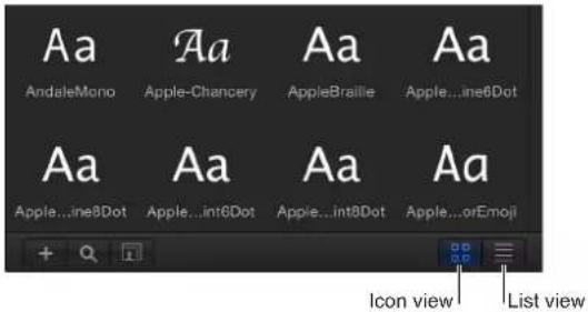
3 In the stack, click a font thumbnail or name.
The font is displayed in the preview area, with the font name and type.
Navigate the font list
There are several ways to navigate the Library font list.
Select a font by typing the first letters of its name
1 Click any font name or thumbnail in the font stack of the Library.
2 Quickly type the first two letters of font name you want.
The font you seek is highlighted in the stack.
Note: If you do not type the second letter of the font name quickly, the selection is reset and jumps to the font whose name begins with the second letter entered.
Move through the browser fonts in alphabetical order
- Drag the scroll bar on the right side of the font stack up or down to move through the fonts.
Tip: You can also search for a specific font by clicking the magnifying glass icon at the bottom of the Library and typing the name of the font in the Search field. Only fonts containing the search term appear in the font stack.
Change fonts
There are two ways to use the Library to change the font of text in the Canvas: dragging a font to a text object in the Canvas or using the Apply button.
Change the font by dragging a font to the Canvas
1 In the Library, click the Fonts category and then the font subcategory.
2 Drag a font from the stack onto the text in the Canvas.

As you drag the font over the text, a transparent thumbnail of the font appears and the pointer becomes a green add pointer (+). When you release the mouse button, the text is changed to the selected font.
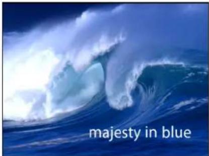
Change the font using the Apply button
1 In the Canvas, Layers list, or Timeline, select the text to modify.
2 In the Library, click the Fonts category and then the font subcategory.
3 In the stack, click a font.
4 In the preview area, click Apply.
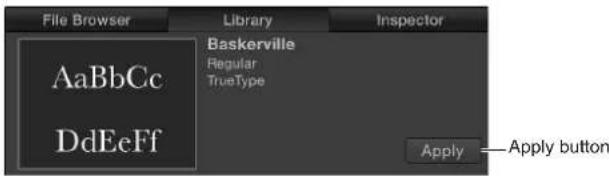
The text is changed to the selected font.
Text HUD
2D and 3D Text HUDs
The Text HUD contains commonly adjusted text parameters, such as Opacity, type Family, and Color.
Note: If no HUD is present when the text is selected, press F7 or D to display the Text HUD.
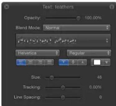
When a text object and the 3D Transform tool (in the toolbar) are selected, the 3D transform tools become available in the HUD. These additional controls allow you to transform the text object in X, Y, and Z dimensions, regardless of whether the group is 2D or 3D.

For more information on using the 3D transform tools in the HUD, see 3D transform HUD controls on page 913.
When the Transform Glyph tool is selected from the 2D transform tools in the toolbar, the Attribute pop-up menu and 3D transform tools become available in the Text HUD. The Attribute menu specifies the glyph attribute to be modified. For more information on glyphs, see Text glyphs overview on page 669.
Text controls in the HUD
The HUD for a text object contains the following controls:
- Opacity: Drag this slider to change the opacity value of the text object—the text face, outline, glow, and drop shadow. By default, the opacity of text is set to 100% . This is the Opacity parameter located in the Properties Inspector. To change text style elements (Face, Outline, Glow, and Drop Shadow), use the Style pane of the Text Inspector.
- Blend Mode: Use this pop-up menu to choose a blend mode for the selected text.
Note: The Properties Inspector also contains controls to change the blend mode of the text. When you change the blend mode of text in the Text HUD, the blend mode is also changed in the Properties Inspector and vice versa.
- Style (unlabeled): Use this pop-up menu to choose from preset or user-saved text styles, or to save the current style as a preset.
- Typeface: Use this pop-up menu to choose the type style, such as Bold, Italic, and so on. Available typefaces are specific to the selected font family.
- Alignment: Use these buttons to set the horizontal and vertical alignment of the text object.
- Color: Click the color well to display the OS X Colors window and choose another color for the text. You can also Control-click a color well to display the Motion pop-up color palette, then drag in the color spectrum to select a color.
- Size: Drag this slider to change the point size of text. Text is created at 48 points by default.
Note: The text Size sliders (in the HUD and in the Inspector) are limited to 288 points. To set text to a larger point size, enter a number in the Size field in the Format pane of the Text Inspector.
- Tracking: Drag this slider to change the tracking value of text. Drag left for a negative tracking value or drag right for a positive tracking value.
Note: The text Tracking sliders (in the HUD and in the Inspector) are limited to 100%. To set a larger tracking value, drag the value slider or enter a number in the Tracking field in the Format pane of the Text Inspector.
• Line Spacing: Drag this slider to change the space between lines of text. Dragging to the right (above 0) increases the line spacing and dragging to the left (below 0) creates negative line spacing.
Note: When the Transform Glyph tool is selected, the Text HUD contains additional controls, including the 3D transform tools, the Adjust Around pop-up menu, and the Attribute pop-up menu.
Text Inspector
Edit text in the Inspector
Text-specific controls are located in the Text Inspector.
Display the Text Inspector
1 Select the text.
2 Do one of the following:
- Choose Window > Inspector.
- Click the "i" button on the HUD.
- Press Command-3.
3 Click Text in the Inspector (if the pane is not already displayed).
The Text Inspector is divided into three subpanes: Format, Style, and Layout. The Format pane contains text basics, such as font, size, and tracking. The Style pane contains text characteristics such as face, outline, and blur. The Layout pane contains text layout controls, such as margins and controls for modifying text on a path.
If a text parameter can be animated, moving the pointer over the right side of the parameter row enables the Add Keyframe button and the Animation menu.

To reset a parameter to its default settings (including removing keyframes), choose Reset Parameter from the Animation menu. To reset a group of parameters, such as the text Face controls or the Sequence controls of a text behavior, click the reset button in the Inspector.

Note: For parameters with no default setting (including most parameters in the Format and Layout panes), there is no reset button.
Edit text format
Text Format pane
The Format pane of the Text Inspector contains the controls for text basics such as font, typeface, size, kerning, and character rotation. Many Format parameters can be animated (keyframed). See Text formatting controls in the Format pane on page 628 and Format text on page 631.
Show the Format pane of the Text Inspector
In the Text Inspector, click Format.

Text formatting controls in the Format pane
The following parameter controls affect common formatting adjustments for text objects. Of these parameters, Family, Typeface, Size, and Tracking also appear in the Text HUD.
Basic Formatting parameters
- Preset (unlabeled): Use this pop-up menu at the top of the Format pane to save the format, style, or format and style of the text to the Library, or to apply a preset text style from the Library to the text. The default menu item is Normal.
For more information on applying and saving text styles, see Use preset text styles on page 650.
- Collection: Use this pop-up menu to filter the font categories available in the Font pop-up menu. When set to All Fonts, every font installed on your OS X system appears in the Font pop-up menu.
- Font: Use this pop-up menu to choose a font for text.
- Typeface: Use this unlabeled pop-up menu to the right of the Font pop-up menu to choose a type style, such as Regular, Bold, Condensed, and so on. The available typefaces are specific to the font family selected in the Font pop-up menu.
- Size: Drag this slider to set the point size of the text. The slider is constrained to a maximum of 288 points. To create larger text, click the numerical value and drag to the right or type a new number.
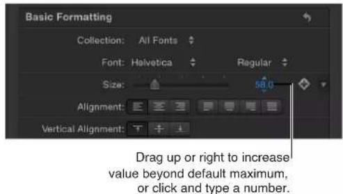
Note: You can also scale text in the Canvas using onscreen controls, but doing so scales text as an object independently of type point size via the Size slider.
- Alignment: Click a button to set the alignment and justification of text to Left, Center, Right, Left Justified, Center Justified, Right Justified, or Full Justified. Paragraphs of a text object can be aligned by selecting the text and choosing an alignment option. Vertical Alignment can be applied in addition to horizontal alignment choices.
- Vertical Alignment: Click a button to set the vertical alignment of text to Top Aligned, Middle Aligned, or Bottom Aligned. The paragraphs of a text object can be aligned by selecting text and choosing an alignment option.
- Line Spacing: Drag this slider to set the distance between each line of text (leading) in point-size increments. Dragging to the right (above 0) increases the line spacing. Dragging to the left (below 0) creates negative line spacing.
Tip: To modify the spacing for individual lines of text when hard returns are present, select text with the Text tool, then adjust the Line Spacing slider. Spacing is modified on the line that includes the selected text.
- Tracking: Drag this slider to set the spacing between text characters. Tracking applies a uniform value between each character.
- Kerning: Drag this slider to adjust spacing between text characters.
- Baseline: Drag this slider to adjust the baseline of text characters. The baseline is an invisible horizontal line defining the bottom alignment of characters.
Advanced Formatting parameters
The Advanced Formatting controls are used less often than Basic Formatting controls. They affect additional aspects of selected text.
- Scale: Drag this slider to scale text characters proportionally. To scale in only X or Y space, click the disclosure triangle to set separate X and Y scale values. In the following image, the text X Scale is set to 50%, and the Y Scale is set to 100%.

- Affects Layout: Use this checkbox to set how the layout of the text on its path is affected by changes in scale. For example, when Affects Layout is deselected and text is on an open spline path (and Wrap Around is deselected in the Layout pane), increases in scale bunch up the text characters along the length of the path; decreases in scale spread the characters out over the length of the path. When Affects Layout is selected, increases in scale extend the text characters beyond the path; decreases in scale bunch up the characters toward their set alignment (left, right, or center).

Text on a path prior to scaling

Affects Layout checkbox off
Affects Layout checkbox on
- Offset: Adjust these value sliders to offset text from its original position (anchor point). Enter a value in the left value slider to offset the text in X space; enter a value in the right value slider to offset the text in Y space. Click the disclosure triangle to access separate X, Y, and Z position values.
- Rotation: Adjust this dial to rotate text characters in Z space. Click the disclosure triangle to access separate X, Y, and Z rotation controls and also the Animate pop-up menu.
-
Animate: Use this pop-up menu, available when the Rotation parameter is disclosed, to change the interpolation for animated 3D rotation channels. By default, this parameter is set to Use Rotation. The Animate pop-up menu contains the following options:
-
Use Rotation: The default interpolation method, whereby text characters rotate from their start rotation to their final rotation. Depending on the animation, the characters may twist before reaching their final orientation (the last keyframed value). For example, if the X, Y, and Z Rotation parameters are animated from 0 degrees to 180 degrees in a project, the text characters rotate on all axes before reaching their final orientation.
- Use Orientation: This method provides smoother interpolation but does not allow multiple revolutions. This method interpolates between the text characters' start orientation (first keyframe) and their end orientation (second keyframe).
For more information about the Animate parameter, see Parameters in the Properties Inspector on page 223.
Note: The Rotation parameter must be keyframed before the Animate parameter options have an effect.
- Slant: Drag this slider to simulate italics by adding a slant value to text characters.
- Monospace: Select this checkbox to apply a fixed amount of space between each text character.
- All Caps: Select this checkbox to make text characters uppercase.
- All Caps Size: Drag this slider, available when the All Caps checkbox is selected, to set the size of uppercase characters based on a percentage of the font point size.
- Editable in FCP: When using a Motion project as a template in Final Cut Pro X, select this checkbox to allow editing of text parameters in Final Cut Pro. The editable parameters include the following:
- Text string (text characters can be modified)
- Text size
- Text tracking
For more information on publishing to Final Cut Pro X, see Final Cut Pro X templates overview on page 385.
Text editor
- Text: Type in the Text editor (the darker shaded area) to add and edit text in the Inspector. For more information, see Add text with the Text editor on page 617.
Format text
The following tasks are useful when editing text Format parameters, including changing fonts, moving the text insertion point, and adjusting kerning. For information on the controls in the Text Format pane, see Text formatting controls in the Format pane on page 628.
Preview fonts in the Canvas
1 Select text in the Canvas, Layers list, or Timeline.
2 In the Format pane of the Text Inspector, open the Font pop-up menu.
The menu of available fonts opens.
3 Drag the pointer up or down in the menu to preview fonts.
As you drag through the menu, the text changes in the Canvas.
4 After you choose a font, release the mouse button.
Note: You can also use the wheel of a three-button mouse or a two-finger swipe on a Multi-Touch trackpad to move up and down the menu.
Move the text insertion point
With the Text tool selected, click text in the Canvas, then do one of the following:
- Use the Right Arrow and Left Arrow keys to move the insertion point between adjacent characters.
- To jump to the beginning of a text line, press Command–Left Arrow.
■To jump to the end of a text line, press Command–Right Arrow.
■To jump to the beginning of the word, press Option–Left Arrow.
■To jump to the end of the word, press Option-Right Arrow.
- To move the insertion point through multiple lines of text (of a single text object), use the Up Arrow and Down Arrow keys.
Kern text characters
1 In the toolbar, click the Text tool (or press T).
2 In the Canvas, position the insertion point (click the mouse button) between the characters to kern, and do one of the following:
- In the Format pane of the Text Inspector, drag the Kerning slider or adjacent value slider to set a kerning value.
- Press Option–Command–Right Bracket (I) to increase the space between characters by one-pixel increments.

- Press Option–Command–Left Bracket (I) to reduce the space between characters by one-pixel increments.
Edit text style
Text Style pane
Use the Text Style pane to specify the text fill and to adjust text opacity, softness, and other attributes. Text can be a solid color, an image, or a color gradient. In the Style pane, you can also apply outlines, glow effects, and drop shadows to text. Most style parameters can be animated.
A set of premade text styles is available in the Motion Library. Text styles are modified Style parameters that create a specific look for text, such as a red glow and gradient face, and are applied to text like behaviors and filters. You can create custom text styles and save the styles in the Library. For more information, see Use preset text styles on page 650.
There are four groups of controls in the Style pane: Face, Outline, Glow, and Drop Shadow. You can enable or disable a group of style controls by selecting or deselecting the activation checkbox to the left of the group header. (When selected, the checkbox turns blue.) By default, Outline, Glow, and Drop Shadow are deselected.
Show the Text Style pane
In the Text Inspector, click Style.

Text Face controls in the Style pane
Use the Face parameter controls to specify whether text is a solid color, a color gradient, or a texture. Nearly all Face parameters can be animated.

Note: You can distort the fill of text independently of other style parameters. For more information, see Adjust glyph attributes on page 672.
Parameters in the Inspector
- Preset (unlabeled): Use this pop-up menu above the Face controls to save the format, style, or format and style of the text to the Library, or to apply a preset text style from the Library to the text. The default menu item is Normal.
For more information on applying and saving text styles, see Use preset text styles on page 650.
- Face: Use this activation checkbox to enable or disable all Face parameters (Fill, Color, Opacity, Blur, and Four Corner). Face is selected by default (checkbox is blue).
- Fill with: Use this pop-up menu to set text fill to Color, Gradient, or Texture.
- Color/Gradient/Texture: Use these color controls to set the text fill color, gradient, or texture, depending on which item is selected in the "Fill with" pop-up menu. Click the disclosure triangle to adjust additional parameters.
For information, see Change text color on page 634, Apply a gradient to text on page 638, and Texture parameters in the Style pane on page 640.
- Opacity: Drag this slider to set text opacity, regardless of the fill option (Color, Gradient, or Texture).
For more information, see Change text opacity on page 636.
- Blur: Drag this slider to set the softness of the text, regardless of the fill option.
- Four Corner: Adjust these value sliders to control the position of the face attribute and distort the text characters. In the following illustration, the Four Corner parameter in the Face controls has been modified (but the Four Corner parameter for the red outline has not been modified).

Click the disclosure triangle to reveal the following value sliders:
- Bottom Left: Offsets the text fill from the lower left of its original position. Enter a value in the left value slider to offset the text fill in X space; enter a value in the right value slider to offset the text fill in Y space. Click the disclosure triangle to access X and Y position values.
- Bottom Right: Offsets the text fill from the lower right of its original position. Enter a value in the left value slider to offset the text fill in X space; enter a value in the right value slider to offset the text fill in Y space. Click the disclosure triangle to access X and Y position values.
- Top Right: Offsets the text fill from the upper right of its original position. Enter a value in the left value slider to offset the text fill in X space; enter a value in the right value slider to offset the text fill in Y space. Click the disclosure triangle to access X and Y position values.
- Top Left: Offsets the text fill from the upper left of its original position. Enter a value in the left value slider to offset the text fill in X space; enter a value in the right value slider to offset the text fill in Y space. Click the disclosure triangle to access X and Y position values.
Outline onscreen controls
The Four Corner parameters can be adjusted using onscreen controls. See Transform Glyph HUD controls on page 669.
Face-related tasks
Change text color
You can change text color using the Colors window, the color controls in the Text HUD, or the color controls in the Style pane of the Text Inspector.
Note: To adjust individual color channels, you must use the Style pane of the Text Inspector.
Set text color in the HUD
1 Select the text with the Select/Transform tool.
2 If the HUD is not displayed, press F7 (or D).
3 Click the color well, then choose a text color in the Colors window.
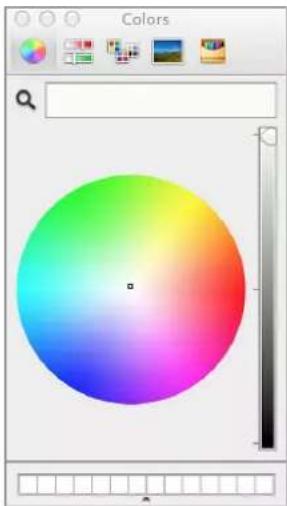
natural_image
Color picker interface with a gradient circle transitioning from red to blue, no text or symbols visible.The text is dynamically updated as you select a color.
Note: To select a color from the Canvas (or anything on the desktop), click the color picker in the Colors window, position the picker over the color you want to select, then click.

Set text color in the Inspector
1 Select the text.
2 In the Style pane of the Text Inspector, make sure that the "Fill with" pop-up menu is set to Color.
3 Do one of the following:
- Click the color well, then use the Colors window to set the text color.
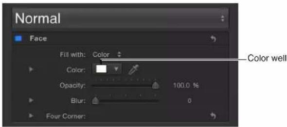
- Click the downward arrow to the right of the color well (or Control-click the color well), then click in the pop-up color palette to select a color. Drag in the lower palette to set the color to a grayscale color.

- Click the eyedropper tool to the right of the Color well, then click a color in the Canvas.
- In the Inspector, click the Color disclosure triangle to show the color channel parameters, then use the sliders or value sliders to adjust each color channel.

Change text opacity
There are several ways to change the opacity of text:
• To change the overall opacity of a text object, use the Opacity slider in the HUD or in the Properties Inspector.
• To change the opacity of a Style pane parameter, such as Face, Glow, Drop Shadow, or Outline, use the respective Opacity controls in the Style pane of the Text Inspector.
Note: The Opacity parameter in the Properties Inspector and the Opacity parameter in the Style pane of the Text Inspector are separate controls. When both are adjusted for a text object, the effect is multiplicative. In other words, if Opacity is set to 50% in the Properties Inspector and then set to 50% in the Style pane, the resulting opacity for the text is 25%.
Set text opacity in the HUD
1 Select the text using the Select/Transform tool.
2 Press F7 (or D) to display the HUD.
3 Drag the Opacity slider.
Text opacity is updated as you drag the slider.

The Opacity parameter in the Properties Inspector (not in the Text Style pane) is updated.
Set text opacity in the Properties Inspector
1 Select the text.
2 Open the Properties Inspector.
3 In the Blending controls, drag the Opacity slider or enter an opacity value in the field.
The Opacity parameter in the HUD is updated.
Set text opacity in the Style pane of the Text Inspector
1 Select the text.
2 In the Text Inspector, click Style to open the Style pane.
3 In the Face controls, drag the Opacity slider or enter an opacity value in the field.
Change text softness
Use the Blur parameter in the Style pane of the Text Inspector to adjust the softness of text.
Adjust text softness in the Inspector
1 Select the text.
2 In the Text Inspector, Click Style to open the Style pane.
3 In the Face controls, drag the Blur slider, or enter a blur amount in the value slider.
The text softness is updated as you drag the slider.
Change a style attribute for a single text character
The style attributes (face color, outline, glow, and drop shadow) for text characters (glyphs) can be individually defined.
Change a style attribute of a glyph
1 Select the Text tool in the toolbar, then drag in the Canvas to select a glyph to modify.
2 In the Style pane of the Text Inspector, modify an attribute.
Only the selected text character is affected.
Note: You can also modify the style attributes of a glyph with the Transform Glyph tool. For more information, see Text glyphs overview on page 669.
Apply a gradient to text
In the Inspector, you can apply a gradient fill to text. The gradient can be customized and animated in the Gradient editor. For general information about working with gradients, see Gradient editor on page 135.

natural_image
Leopard resting in dry grass with golden bokeh background (no text or symbols)Like preset text styles from the Library, preset gradients from the Library can be applied to text. Gradient presets are located in the Gradients category of the Library. A custom gradient that you apply to text can also be saved in the Library for use in future projects.
Apply a text gradient
1 Select the text.
2 In the Text Inspector, click Style to open the Style pane.
3 Choose Gradient from the "Fill with" pop-up menu.
In the Inspector, the Color controls are replaced with the Gradient editor. The default gradient is white and blue (Atlantic Blue).
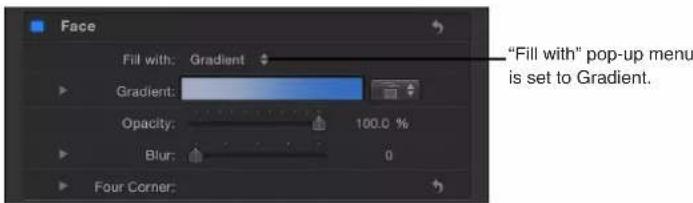
In the Canvas, the default gradient is applied to the text.
Apply a preset gradient to text
There are two ways to apply a preset (or saved) gradient from the Library to text. The first method is to use the Gradient preset pop-up menu in the Text Inspector. The second method is to drag a gradient from the Library to text. After the preset gradient is applied to a text object, the preset can be edited with the Gradient editor. For more information, see Modify gradient editor tags on page 138.
Apply a preset gradient in the Text Inspector
1 Select the text and make sure the "Fill with" pop-up menu is set to Gradient in the Style pane of the Text Inspector.
2 Choose a preset from the Gradient preset pop-up menu (on the right side of the Gradient row).

The selected gradient is applied to the text.

Apply a preset gradient from the Library
1 In the Library, click the Gradients category.
2 In the stack, select a gradient.
A preview of the selected gradient appears in the preview area.
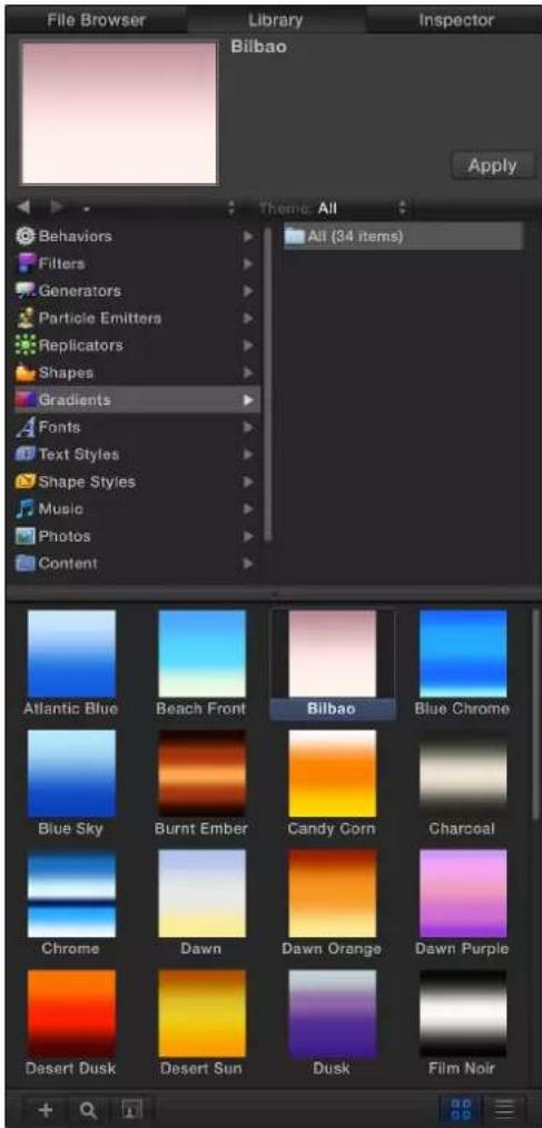
3 Do one of the following:
- Drag the gradient to the text in the Canvas, Layers list, or Timeline.
- Make sure the text is selected, then click Apply in the preview area.
The gradient is applied to the text.
Texture parameters in the Style pane
An object (image, movie, shape, group, and so on) can be used as text texture.

natural_image
Leopard lying in dry grass with a large 'leopard' text overlay (no other signage or symbols)When "Fill with" is set to Texture, the following Texture parameters appear in the Face group (open the disclosure triangle to see them):
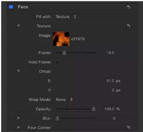
Parameters in the Inspector
- Image: Drag an image, movie clip, or other object into this image well to apply a texture source. See Use the texture Image well on page 641.
- Frame: When using a movie or image sequence as the texture source, use this slider to specify a start frame for the texture.
- Hold Frame: When using a movie or image sequence as the texture source, select the Hold Frame checkbox to freeze the frame specified in the Frame parameter. The selected frame is used as the texture for the text object's total duration.
- Offset: Adjust these value sliders to specify the X and Y values of the position of the source texture (relative to the text object). If the object applied to the image well is visible in your project, adjusting the Offset parameter does not reposition the object.
- Wrap Mode: Use this pop-up menu to specify how the edge of a texture is treated when the texture is offset and appears cut off in the text, or when it is too small to fill the text it is applied to. There are three menu items:
- None: The texture remains transparent beyond the edge of the source image. This is the default mode.
- Repeat: The texture source is repeated beyond the edge of the source image.
- Mirror: Beyond the edge of the source image, the texture source is reflected like in a mirror—duplicated, tiled, and reversed to encompass the full width and height of the text.
Note: Texture parameters respect filters applied to the source image but ignore transforms applied to the image. For example, if the image used as the source texture has a glow filter applied, the glow appears in the text's texture. However, if the image used as the source texture is scaled or moved, or if the image contains applied behaviors, the result of these transforms does not appear in the applied texture.
Texture-related tasks
Use the texture Image well
Use the Texture image well to apply, replace, and remove textures.
Apply a texture to text
1 Select the text.
2 In the Text Inspector, click Style to open the Style pane.
3 Choose Texture from the "Fill with" pop-up menu.
The Color (or Gradient) controls are replaced with the Texture controls.

By default, no texture is applied to the text.
4 Drag an image from the Layers list or Media list into the Image well.
The image appears in the well and is applied to the text. When text is filled with an image, the texture is applied to each text character. To learn how to make the texture continuous through all text characters, see Image masks overview on page 902.
Important: When dragging an image to the well, be sure to click and drag in one movement. If you click the image and release the mouse button, the image is selected and its Inspector appears.
Replace a texture
1 Select the text.
2 Drag an image from the Layers list or Media list into the Image well in the Style pane of the Text Inspector.
The new image appears in the well and is applied to the text.
Note: When an image (or a movie clip) is replaced in the Layers list or Media list and that image is used as a texture source, the texture for the text is replaced with the new image.
Remove a texture
In the Style pane of the Text Inspector, do one of the following:
- Click the Texture parameter reset button.
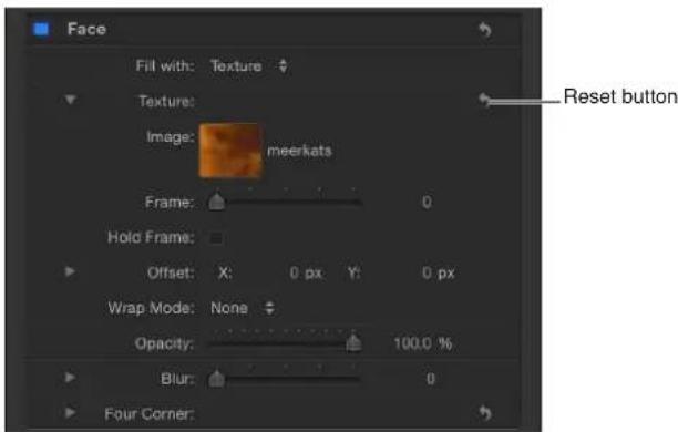
- Drag the image out of the well, then release the mouse button. The image disappears.
Change the position of a texture
You can adjust the position of a texture to fit the needs of your project.
Change the position of a texture
In the Texture controls group in the Style pane of the Text Inspector, do one of the following:
■Press Command, then drag in the Image well.
The image moves in the well and is offset in the text in the Canvas.
- Adjust the Offset values. The left value slider represents X position values; the right value slider represents Y position values. Click the disclosure triangle to display the labeled X and Y value sliders.
Note: You can adjust the position of a texture for a single glyph by selecting the glyph with the Text tool or by using the Transform Glyph tool. For more information on working with glyphs, see Text glyphs overview on page 669.
Animate a texture
You can set keyframes for the offset values of the texture source to create a moving element within text. In the following example, an image of a leopard lying in the grass is used as the texture source for the text "leopard."


natural_image
Leopard resting in dry grassland under warm golden lighting (no text or symbols visible)Original text layer prior to texture Image used as texture source
Animate the texture offset using the Record button
1 Apply a texture to the text.
For instructions on how to apply a texture to text, see Use the texture Image well on page 641.
2 Move the playhead to the frame where you want the texture animation to begin.
3 Enable Record (press A or click the Record button).
natural_image
User interface toolbar with play button icons and a blue downward arrow (no text or symbols)Note: When Record is enabled, a keyframe is created for any change you make to an object in your project.
4 To position the texture, do one of the following in the Texture controls in the Style pane of the Text Inspector:
- Holding down the Command key, drag in the Image well.
- Adjust the Offset value sliders.
The image within the text moves, and a keyframe is created in the Offset parameters.

Text layer with texture applied
5 Move the playhead to the next frame where you want to set a keyframe.
6 Move the texture to the new position.

Repositioned text layer texture
7 Disable Record.
8 Go to frame 1 (or the start frame of the animation) and play the clip.
The texture offset is animated.
Note: You can also use the Animation menu in the Inspector to set keyframes without enabling Record. For more information, see Keyframing overview on page 439.
Animate the texture offset by manually adding a keyframe
1 Apply a texture to the text.
For instructions on how to apply a texture to text, see Use the texture Image well on page 641.
2 Move the playhead to the frame where you want the texture animation to begin.
3 In the Style pane of the Text Inspector, click the Animation menu for the Offset parameter (the downward arrow appears when you move the pointer over the end of the parameter row), then choose Add Keyframe.
4 To position the texture, do one of the following:
- Press Command, then drag in the Image well.
- Use the Offset value sliders to enter an offset value.
The image within the text moves, and a keyframe is created in the Offset parameters.
5 Move the playhead to the next frame where you want to set a keyframe.
6 Move the texture to the new position.
A keyframe is added.
Note: After a parameter contains a keyframe, any further adjustment to that parameter adds a keyframe at the current playhead position, regardless of the Record button state.
7 Go to frame 1 (or the start frame of the animation) and play the clip.
The texture offset is animated.
About behaviors and filters in texture sources
You can use any object (image, movie, image sequence, shape, replicator, particle system, group, or other text object) that has applied behaviors and filters as a texture source for text. The effect of the filters appears in the texture, but animation effects do not appear in the texture.
Consider the following guidelines when using an object with an applied filter as a texture source:
- To use the object with the effect of the filter, follow the steps in Use the texture Image well on page 641.
- If the object is an image or image sequence, you can use the object without the effect of the filters by dragging the image from the Media list to the Image well in the Texture area of the Style pane, rather than from the Layers list.
- To use an object without the effect of the applied filter, make a copy of the layer in the Layers list, remove the filters from the new layer, then turn the layer off. You can then drag the layer from the Layers list to the Image well.
When using an object with an applied behavior or active transforms (for example, rotate) as a texture source, use the steps in Use the texture Image well on page 641. The effects of the behavior or transforms are ignored.
Outline controls in the Style pane
Use the Outline group of controls to create text outlines. You can change the fill of the outline, as well as its opacity, softness, width, and layer order. Except for Layer Order, all Outline parameters can be animated.
Note: You can distort the outline of text independently of other style parameters. For more information, see Adjust glyph attributes on page 672.

Parameters in the Inspector
- Outline: Use this activation checkbox to enable or disable all Outline parameters. Outline is deselected by default.
- Fill with: Use this pop-up menu to set the fill for the outline. As with the Face controls, you can set the outline fill to Color, Gradient, or Texture.
The Outline fill controls—Color, Gradient, and Texture—are equivalent to the Face controls. For information on using these controls, see Text Face controls in the Style pane on page 633.
- Color/Gradient/Texture: Use these color controls to set the color, gradient, or texture of the text outline, depending on which item is selected in the "Fill with" pop-up menu. Click the disclosure triangle to adjust additional parameters.
- Opacity: Drag this slider to set the opacity of the text outline.
- Blur: Drag this slider to set the softness of the text outline.
- Width: Drag this slider to set the thickness of the text outline.
- Layer Order: Use this pop-up menu to set whether the outline is drawn over or under the text face.
- Four Corner: Use these value sliders to control the position of the outline attribute, allowing for outline distorting effects. Click the disclosure triangle to reveal the value sliders:
- Bottom Left: Offsets the text outline from the lower left of its original position. Enter a value in the left value slider to offset the text fill in X space; enter a value in the right value slider to offset the text fill in Y space. Click the disclosure triangle to access X and Y position values.
- Bottom Right: Offsets the text outline from the lower right of its original position. Enter a value in the left value slider to offset the text fill in X space; enter a value in the right value slider to offset the text fill in Y space. Click the disclosure triangle to access X and Y position values.
- Top Right: Offsets the text outline from the upper right of its original position. Enter a value in the left value slider to offset the text fill in X space; enter a value in the right value slider to offset the text fill in Y space. Click the disclosure triangle to access X and Y position values.
- Top Left: Offsets the text outline from the upper left of its original position. Enter a value in the left value slider to offset the text fill in X space; enter a value in the right value slider to offset the text fill in Y space. Click the disclosure triangle to access X and Y position values.
Outline onscreen controls
Text outlines can be adjusted using onscreen controls. For more information, see Transform Glyph HUD controls on page 669.
Outline tasks
Add a text outline
To create a text outline, select the Outline checkbox in the Style pane of the Text Inspector.
Create an outline for text
1 Select the text.
2 In the Text Inspector, click Style to open the Style pane.
3 In the Outline controls, select the Outline checkbox.
The default outline color is red, with a width of one point.

Tip: Deselect the Face checkbox to display a text outline with no fill.
Glow controls in the Style pane
Use the Glow group of controls to create a glow in front of or behind text. Except for Layer Order, all Glow parameters can be animated.
When the Glow activation checkbox is selected, the text is rasterized. For more information, see Groups and rasterization on page 1045.
Note: You can distort the glow of text independently of other style parameters. For more information, see Adjust glyph attributes on page 672.

Parameters in the Inspector
- Glow: Use this activation checkbox to enable or disable glow parameters in this group. Glow is disabled by default.
- Fill with: Use this pop-up menu to set the fill for the glow. As with the Face and Outline controls, you can set the glow fill to Color, Gradient, or Texture.
- Color/Gradient/Texture: Use these color controls to set the color, gradient, or texture of the glow effect. Click the disclosure triangle to adjust additional parameters.
The Glow "Fill with" options—Color, Gradient, and Texture—are equivalent to the Face controls. For information on using these controls, see Text Face controls in the Style pane on page 633.
- Opacity: Drag this slider to set the opacity of the text glow.
- Blur: Drag this slider to set the softness of the text glow.
- Radius: Drag this slider to set the circumference of the glow.
- Scale: Drag this slider to set the size of the glow.
- Offset: Adjust these value sliders to offset the glow in the X or Y position.
- Layer Order: Use this pop-up menu to specify whether the glow is drawn over or under the text face.
-
Four Corner: Use these value sliders to control the position of the glow attribute, allowing for glow distorting effects. Click the disclosure triangle to reveal the value sliders:
-
Bottom Left: Offsets the text glow from the lower left of its original position. Enter a value in the left value slider to offset the text fill in X space; enter a value in the right value slider to offset the text fill in Y space. Click the disclosure triangle to access X and Y position values.
- Bottom Right: Offsets the text glow from the lower right of its original position. Enter a value in the left value slider to offset the text fill in X space; enter a value in the right value slider to offset the text fill in Y space. Click the disclosure triangle to access X and Y position values.
- Top Right: Offsets the text glow from the upper right of its original position. Enter a value in the left value slider to offset the text fill in X space; enter a value in the right value slider to offset the text fill in Y space. Click the disclosure triangle to access X and Y position values.
- Top Left: Offsets the text glow from the upper left of its original position. Enter a value in the left value slider to offset the text fill in X space; enter a value in the right value slider to offset the text fill in Y space. Click the disclosure triangle to access X and Y position values.
Text glow onscreen controls
Text glows can be adjusted using onscreen controls. For more information, see Transform Glyph HUD controls on page 669.
Glow tasks
Add a text glow
To create a text glow, select the Glow activation checkbox in the Style pane of the Text Inspector.
Create a glow for text
1 Select the text.
2 In the Text Inspector, click Style to open the Style pane.
3 Select the Glow activation checkbox.
When selected the checkbox turns blue. The default text glow is yellow, with Scale and Opacity set to 100%, and Radius set to 0.

Tip: Deselect the Face parameter activation checkbox (and other active parameters) to display only the text glow.
Drop Shadow controls in the Style pane
Use the Drop Shadow controls to create a drop shadow on text, and to adjust the shadow color, opacity, offset from the text object, softness, and angle. All Drop Shadow parameters can be animated.

Parameters in the Inspector
- Drop Shadow: Use this activation checkbox to enable or disable the drop shadow effect. Drop Shadow is deselected by default.
Note: When the Flatten checkbox is selected in the Layout pane of the Text Inspector, additional Drop Shadow controls appear in the Properties Inspector. Drop Shadow controls in the Properties Inspector are independent of the controls in the Text Inspector. Enabling Drop Shadow in both locations adds to the existing shadow.
- Fill with: Use this pop-up menu to set the fill for the shadow. As with the Face, Outline, and Glow controls, you can set the shadow fill to Color, Gradient, or Texture.
- Color/Gradient/Texture: Use these color controls to set the color, gradient, or texture of the shadow. Click the disclosure triangle to adjust additional parameters.
The Shadow "Fill with" options—Color, Gradient, and Texture—are equivalent to the Face controls. For information on using these controls, see Text Face controls in the Style pane on page 633.
- Opacity: Drag this slider to set the opacity of the text shadow.
- Blur: Drag this slider to set the softness of the text shadow.
- Scale: Drag this slider to set the size of the shadow.
- Distance: Drag this slider to specify the offset of the text shadow.
- Angle: Adjust this dial to set the angle (or direction) of the drop shadow.
- Fixed Source: Select this checkbox to make the drop shadow behave as if cast by a fixed light source, regardless of camera or text movement.
-
Four Corner: Use these value sliders to control the position of the drop shadow attribute. This allows for outline distorting effects. Click the disclosure triangle to reveal the value sliders:
-
Bottom Left: Offsets the text drop shadow from the lower left of its original position. Enter a value in the left value slider to offset the text fill in X space; enter a value in the right value slider to offset the text fill in Y space. Click the disclosure triangle to access X and Y position values.
- Bottom Right: Offsets the text drop shadow from the lower right of its original position. Enter a value in the left value slider to offset the text fill in X space; enter a value in the right value slider to offset the text fill in Y space. Click the disclosure triangle to access X and Y position values.
- Top Right: Offsets the text drop shadow from the upper right of its original position. Enter a value in the left value slider to offset the text fill in X space; enter a value in the right value slider to offset the text fill in Y space. Click the disclosure triangle to access X and Y position values.
- Top Left: Offsets the text drop shadow from the upper left of its original position. Enter a value in the left value slider to offset the text fill in X space; enter a value in the right value slider to offset the text fill in Y space. Click the disclosure triangle to access X and Y position values.
Drop shadow onscreen controls
Text drop shadows can be adjusted using onscreen controls. For more information, see Transform Glyph HUD controls on page 669.
Drop shadows tasks
Add a drop shadow
To create a text drop shadow, select the Drop Shadow checkbox in the Style pane of the Text Inspector.
Add a drop shadow
1 Select the text.
2 In the Text Inspector, click Style to open the Style pane.
3 In the Drop Shadow parameters, select the Drop Shadow checkbox.
The default black drop shadow is applied to the text.

Preset text styles
Use preset text styles
The Motion Library contains a set of preset text styles that you can apply to text. A text style is a group of Style parameters that are modified and saved in the Library. For example, the Neon text style applies a rounded font style and includes a gradient outline simulating the bright glow of an electrified glass tube filled with neon gas.

Neon text style applied to text layer
You can also customize and save your own text style or format (or both) in the Library.
Apply a text style from the Library
1 In the Library, select the Text Styles category.
2 Select a style from the stack.

3 Do one of the following:
- Select the text, then click the Apply button in the preview area.
- Drag the style from the stack to the text object in the Canvas, Layers list, or Timeline.
The text style is applied to the text.
The advantage of using the Library is that you can preview the style before it is applied to text.
Apply a text style from the Text Inspector
1 Select text you want to apply a style to.
2 In the Style pane of the Text Inspector, choose an item from the Preset pop-up menu.
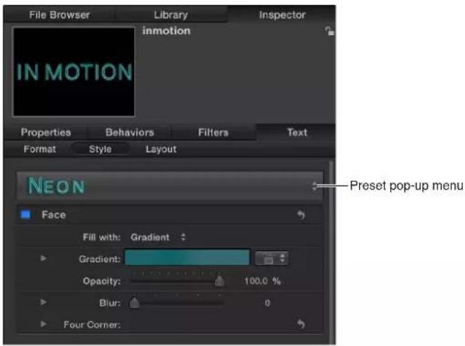
The text style is applied to the text.
Save a custom text style
After you modify parameters in the Style pane (such as Gradient or Glow) or Format pane (such as Tracking or Slant), you can save the style you create to the Text Styles category in the Library. These custom styles can then be used and applied like preset styles.
Note: Custom presets saved to the Library are stored in the /Users/username/Library/Application Support/Motion/Library/Text Styles/ folder.
Save a modified text style to the Library
1 Select the text with the modified parameters you want to save as a style.
2 In the Style pane, open the Preset pop-up menu and choose one of the following options:
- To save a style with only the Format pane parameters, choose Save Format Attributes.
• To save a style with only the Style pane parameters, choose Save Style Attributes. - To save a style with parameters from both Style and Format panes, choose Save All Format + Style Attributes.
3 In the Save Preset To Library dialog, enter the name for the preset.

4 Click Save.
The custom preset is saved to the Text Styles category in the Library. Custom presets can be identified in the Library by the small user badge that appears in the lower-right corner of the text style icon.
Edit text layout
Text Layout pane
Use the Layout pane of the Text Inspector to create text on a path, to set direction and rendering options, to add a typewriter effect, and more.
Show the Text Layout pane
■In the Text Inspector, click Layout.

Layout controls in the Layout pane
Use the Layout controls to set basic layout options for a text object.
Parameters in the Inspector
- Layout Method: Use this pop-up menu to specify whether the text layout is set to Type, Paragraph, Path, Scroll, or Crawl. (When Layout Method is set to Scroll or Crawl, the Transform Glyph tool is not available. The Offset, Rotation, and Affects Layout parameters in the Format pane are also not available.) The Layout Method menu contains the following options:
- Type: Creates a single line of text. This is the default method. As text is added, the string of text continues off the Canvas. If you create multiple lines of text by using hard returns, set Layout Method to Paragraph. This will allow you to use the Margin controls, as well as align text when using tabs.
- Paragraph: Makes the Margin controls available in the lower area of the Layout pane. Use the sliders to change margin size. Double-clicking the text in the Canvas when Layout Method is set to Paragraph displays a ruler and scroll control around the text-entry field. When text is deleted from a paragraph text-entry field, paragraph margins do not scale. For information on modifying or creating a paragraph, see Add paragraph text in the Canvas on page 615.
- Path: Creates text on a path and makes the Path Options parameter group available. The path can be an open or closed spline, a circle, a rectangle, a wave, or based on a shape.
- Scroll: Positions the margins of the text-entry field to match the project's safe zones in preparation for a scrolling animation. When Layout Method is set to Scroll, double-clicking the text in the Canvas displays a ruler and an enhanced scroll control that displays a preview of the text. Drag in the scroll bar to navigate through large amounts of text. Scroll does not animate the text—text is only positioned and formatted in preparation for you to create scrolling animation using keyframes or behaviors. For more information on animating text, see Animated text overview on page 676. When Layout Method is set to Scroll, the following occurs: The Transform Glyph tool is not available; the Offset, Rotation, and Affects Layout parameters in the Format pane are not available; and the text is flattened, so the Flatten, Render Text, and Face Camera parameters are not available. (For more information, see the Flatten checkbox description in Text Rendering controls in the Layout pane on page 655.)
- Crawl: Positions the text in a single string (within project safe zones) along the bottom of the project in preparation for a crawl or ticker-type animation. Double-clicking the text in the Canvas when Layout Method is set to Crawl displays a scroll control below the text-entry field. Crawl does not animate the text—text is only positioned and formatted in preparation for you to create an animation using keyframes or behaviors. For more information on animating text, see Animated text overview on page 676. When Layout Method is set to Scroll, the following occurs: Tabs are not available; the Transform Glyph tool is not available; the Offset, Rotation, and Affects Layout parameters in the Format pane are not available; and the text is flattened. As a result, the Flatten, Render Text, and Face Camera parameters are not available. (For more information, see the Flatten checkbox description in Text Rendering controls in the Layout pane on page 655.)
- Direction: Use this pop-up menu to set the direction for the flow of letters. Choose Horizontal or Vertical.
- Auto-Shrink: Use this pop-up menu, available when Layout Method is set to Paragraph, Scroll, or Crawl to change the vertical or horizontal scale of selected letters to ensure the text fits within the margins of the text object. Choose one of the following options:
- Off: No scaling occurs. Text exceeding the width or height of the text object extends beyond the visible edges of the screen for scrolling or crawling text, or wraps to the next line for paragraph text.
- Left And Right: Scaling occurs at the left and right margins of the text object. This setting is primarily used with scrolling text, to ensure that no characters are cut off. However, it can be applied to other text objects.
- Top And Bottom: Scaling occurs at the top and bottom margins of the text object. This setting is primarily used for crawling text, to ensure that no characters are cut off. However, it can be applied to other text objects.
• To All Margins: Scaling occurs at the left, right, top, and bottom margins of the text object.
- Crop At Margins: Select this checkbox to crop text that extends past the margins of the text object. This control is disabled when Auto-Shrink is enabled.
Note: For Crop At Margins to be active, Layout Method must be set to Paragraph, and the text object must be flattened. For more information about flattening text, see Text Rendering controls in the Layout pane on page 655.
Text Rendering controls in the Layout pane
Use the Text Rendering controls to set how text objects are displayed in 3D layers.
Parameters in the Inspector
- Flatten: Select this checkbox to force text characters to remain in a 2D plane. In 3D groups, text characters on a path may be influenced by behaviors in ways that interfere with linear alignment. For instance, a simulation behavior might pull nearby text characters out of their plane. When Flatten is selected, the text can still interact with other objects in 3D space, but only as a flattened image, like a card.
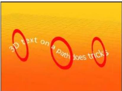
Unflattened text on a 3D path can weave through other elements in a project.
After you select Flatten, the text characters no longer move in 3D space.

natural_image
Aerial view of a person standing on a boat near the water under a clear orange sky (no text or symbols visible)Flattened text image only exists in X and Y and can only interact with other objects as a flat card.
Consider the following guidelines when using the Flatten checkbox:
•The Flatten checkbox must be selected for text to receive reflections. If the Flatten checkbox is not selected, the Reflections parameter does not appear in the Properties Inspector. For more information on using reflections, see Reflections overview on page 951.
•The Flatten checkbox must be selected to use the 2D transform tools in the toolbar (Select/Transform, Anchor Point, Distort, Drop Shadow, Four Corner, and Crop).
- The Flatten checkbox must be selected to apply a mask to text. The mask tools in the toolbar are not available when Flatten is deselected.
Note: When a text object rotated in Z space is flattened, text that is farther from the camera (further away in Z space) appears smaller. For more information, see 3D group properties on page 927.
- Render Text: Use this pop-up menu to choose a text-rendering method. This control is not available when the Flatten checkbox is selected, or when Scroll or Crawl is selected from the Layout Method pop-up menu. There are two menu items:
- In Global 3D (Better): Allows text to intersect with objects in the text group and with objects in other groups. When working with a camera, allows text in 3D space to be affected by the camera's Depth of Field settings (text outside the camera range of focus is blurred). When this option is enabled, project performance and interactivity may slow.
For text to cast shadows and to be affected by depth of field settings, In Global 3D (Better) must be enabled. For more information on using shadows, see Shadows overview on page 944. For more information on using depth of field, see Depth of field overview on page 933.
- In Local 3D (Faster): Renders text more quickly, but does not allow for intersections with objects in the text group or with objects in other groups, nor does it allow text to cast shadows.
- Face Camera: Select this checkbox to force text characters to face the camera, even when the camera is rotated or the text is rotated. This checkbox is not available when the Flatten checkbox is selected (because text cannot face the camera and flatten to the text plane at the same time). Additionally, this setting is not available when Scroll or Crawl is selected from the Layout Method pop-up menu (because those layout methods cause text to flatten).
Note: Because text characters are 2D (flat) objects, text may not be visible when you use orthogonal camera views, such as Left, Right, and Top (unless the text object or characters are rotated in 3D space). This is because orthogonal views are at right angles (perpendicular) to objects in the Canvas. For more information on using cameras, see Cameras overview on page 928.
Behavior controls in the Layout pane
Use the Behavior controls to adjust how a text object is treated when behaviors are applied, based on the position of the text object's anchor points.
Parameters in the Inspector
- Anchor Point: Use this pop-up menu to specify how anchor points are assigned: by character, word, line, or as a single object. For example, when you rotate text using the Format pane of the Text Inspector or by applying a text sequence behavior, the effect varies depending on the type of anchor point you've assigned. When Anchor Point is set to All, the text rotates as a single object; when Anchor Point is set to Character, each glyph rotates independently. To see a visual representation of the anchor point, select the text with the Transform Glyph tool. For more information on the Transform Glyph tool, see Text glyphs overview on page 669.
Note: The anchor point specified in the Layout pane is not the same as the anchor point for the object. Object anchor point controls are available in the Properties Inspector and via the Anchor Point tool in the toolbar. For more information on adjusting the anchor point of an object, see Use the Anchor Point tool on page 217.
The Anchor Point pop-up menu has four options:
- Character: Rotates each character as if each glyph has its own anchor point.
- Word: Rotates each word as if each word has its own anchor point.
•Line: Rotates each line as if individual lines had their own anchor points.
- All: Rotates all text as a single object.
- Position: Adjust these value sliders to define the position of the anchor point specified in the Anchor Point pop-up menu. Click the disclosure triangle to display individual X, Y, and Z value sliders. To see a visual representation of the anchor point, select the text with the Transform Glyph tool. For more information on the Transform Glyph tool, see Text glyphs overview on page 669.
Type On controls in the Layout pane
Use the Type On controls to create a type-on effect, similar to a typewriter-style animation. You can keyframe the type-on effect to occur forward or backward, or to move in both directions.
Note: There is also a Text Animation behavior called Type On that creates a forward type-on effect without setting keyframes. For more information on using that behavior, see Use the Type On behavior on page 699.
Parameters in the Inspector
- Start: Drag this slider to set the start point of the type-on effect (from the left side of the text). When set to the default 0%, the text is fully "typed on." When set to 100%, the text is fully "typed off." If the value animates from 0 to 100 over time, the text types off from left to right. If the value animates from 100 to 0, the text types on from right to left.
- End: Drag this slider to set the end point of the type-on effect (from the right side) of the text. When set to the default 100%, the text is fully "typed on." When set to 0%, the text is fully "typed off." If the value animates from 100 to 0 over time, the text types off from right to left. If the value animates from 0 to 100, the text types on from left to right.
- Fade In: Select this checkbox to cause text characters to fade on or off. When Fade In is deselected, the text characters pop on as they appear.
Path Options controls in the Layout pane
This group of controls in the Layout pane lets you specify the initial shape of a text path, and to modify the path and text on that path. This group is only active when the Layout Method pop-up menu at the top of the Layout pane is set to Path. For more information about creating a text path, see Modify text on a path on page 660.
The Transform Glyph tool can be used with text on a path. For more information, see Text glyphs overview on page 669.
Parameters in the Inspector
- Path Shape: Use this pop-up menu to set the shape of the path. Choosing different shapes will cause different controls to appear in the Path Options parameter group. Parameters are described below. There are six menu options:
- Open Spline: The default shape, a straight path defined by one point at the beginning and one point at the end of the path. You can work with Bezier or B-Spline control points. Option-click (or double-click) on the path to add points.
- Closed Spline: A closed path where the last point is in the same location as the first point. You can use Bezier or B-Spline control points. Option-click (or double-click) on the path to add points.
- Circle: A simplified version of Closed Spline, in which the X radius or Y radius can be adjusted to create a circle or an ellipse.
- Rectangle: A closed path where the width and the height can be adjusted to create a square or a rectangle.
- Wave: A wavy path (a sine wave) defined by one point at the beginning and one point at the end, and controlled by the End Point, Amplitude, Frequency, Phase, and Damping parameters.
- Geometry: A shape path where the object travels along the edge of a shape or mask. An animated shape can be used as the text path source—for example, a circle shape with an applied Oscillate Shape behavior.
- Path Type: Use this pop-up menu, available when Path Shape is set to Open Spline or Closed Spline, to choose how to manipulate the shape of the path. There are two menu choices:
- Bezier: Lets you manipulate the keyframe curve by dragging Bezier handles. For more information about creating and adjusting Bezier curves, see Edit Bezier control points on page 850.
- B-Spline: Lets you manipulate the keyframe curve by dragging B-Spline points. B-Splines are manipulated using points—there are no tangent handles. The points themselves do not lie on the surface of the shape. Instead, each B-Spline control point is offset from the shape's surface, magnetically pulling that section of the shape toward itself to create a curve. B-Splines are extremely smooth: By default, there are no sharp angles in B-Spline shapes, although you can create sharper curves, if necessary. For more information about working with B-Spline curves, see Edit B-Spline control points on page 852.
- Radius: Drag this slider, available when Circle is the defined path shape, to change the size of the circular path. Click the disclosure triangle to adjust the X radius and Y radius.
Note: When the Text tool is selected, you can also use onscreen control points to resize the circle. Press Shift to resize the X and Y radii uniformly.
- Size: Drag this slider, available when Rectangle is the defined path shape, to change the size of the rectangular path. Click the disclosure triangle to adjust the X scale and Y scale.
Note: When the Text tool is selected, you can also use onscreen control points to resize the rectangle. Press Shift to resize the X and Y scales uniformly.
- Start Point: Adjust these value sliders, available when Wave is selected in the Path Shape pop-up menu, to set the location of the start point on the wave's path. The left value slider sets the X coordinate of the start point. The right value slider sets the Y coordinate of the start point. The start point can also be adjusted using the wave's onscreen controls (active by default when the Text tool is selected).
- End Point: Adjust these value sliders, available when Wave is selected in the Path Shape pop-up menu, to set the location of the end point on the path. The left value slider sets the X coordinate of the end point. The right value slider sets the Y coordinate of the end point. The end point can also be adjusted using the wave's onscreen controls (active by default when the Text tool is selected).
- Amplitude: Drag this slider, available when Wave is selected in the Path Shape pop-up menu, to define half the distance from the highest point to the lowest point in the wave. Higher values result in more extreme waves.
- Frequency: Drag this slider, available when Wave is selected in the Path Shape pop-up menu, to set the number of waves. Higher values result in more waves.
-
Phase: Adjust this dial, available when Wave is selected in the Path Shape pop-up menu, to define the percentage of the offset of the waves from the start and end points of the path. When set to 0% (default), the wave begins and ends at half the distance from the highest point to the lowest point in the wave. When set to 90%, the wave begins and ends at the highest point in the wave. When set to -90%, the wave begins at the lowest point in the wave. When set to 180%, the waves are the same as 0%, but inverted.
-
Damping: Adjust this value slider, available when Wave is selected in the Path Shape pop-up menu, to progressively diminish the oscillation of the wave. Positive damping values diminish the wave forward (from left to right). Negative values diminish the wave backward (from right to left).
- Shape Source: Use this image well, available when Geometry is selected in the Path Shape pop-up menu, to define the object (shape or mask) used as the motion path source.
- To: Use this pop-up menu, available when Geometry is selected in the Path Shape pop-up menu, to choose an object in the project to be used as a shape source for the motion path.
- Attach to Shape: Select this checkbox, available when the Path Shape pop-up menu is set to Geometry, to force the motion path to follow the source shape at the shape's original location. When Attach to Shape is deselected, the motion path can be offset from its source shape (by dragging the shape object to a new location in the Canvas). To learn how to use spline objects as a text path source shape, see Use geometry for a path source on page 663.
Note: When Attach to Shape is selected, you cannot drag the shape object to another location.
- Path Offset: Drag this slider to set where text begins on the path. Animate this value to move text along a path. At 0%, the first text character is at the left end of the path; at 100%, the first character is at the right end of the path.
- Wrap Around: Select this checkbox, available when Path Shape is set to Open Spline or Wave (an open path shape), to wrap the text from the end of the path to the first point of the path. Wrap Around is enabled by default.
- Inside Path: Select this checkbox to shift the baseline of text on a loop path so the text appears inside the loop.
- Align to Path: Select this checkbox to align the text to the shape of the path. When the checkbox is deselected, text characters align vertically, regardless of the shape of the path.
- Control Points: Adjust these value sliders, available when Open Spline or Closed Spline is selected from the Path Shape pop-up menu, to adjust the X, Y, and Z coordinates of the control points.
Text path-related tasks
Place text on a path
To place text on a path, you create a text object, set the Layout Method to Path, then use the Path Options parameters to modify the text on a path.
Create text on a path
1 Select the text to place on a path.
2 In the Layout pane of the Text Inspector, choose Path from the Layout Method pop-up menu.
The Path Options parameters become available.
3 Select the Text tool (or press T) and click the text in the Canvas.
Step 3 is important—the Text tool must be selected to view or edit the text path.
The path appears below the text. The default path shape is set to Open Spline and contains three control points.

Modify text on a path
After you create text on a path, you can modify or extend the path, add or remove control points, or animate text on the path. See Animate text on a path on page 664.
Text on a path can still be edited—you can change text characters or fonts, tracking, kerning, and so on. Text Style parameters can also be modified for text on a path.
Note: The Text tool must be selected to view and edit the text path.
Adjust the text path in the Canvas
- With the Text tool selected, drag a path control point to change the shape of the path.

Extend a text path in the Canvas
When additional text characters are added to text that is on a path, the default path may appear too short. In the following images, the first image shows the original text placed on a path. The second image shows additional text. In the second image with the added text characters, the path is shorter than the text. You can extend the path by dragging it in the Canvas.
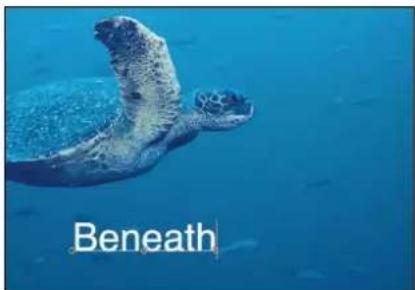
Initial text on path

Additional text added
- With the Text tool selected, drag the last control point toward the end of the text.

Tip: When dragging, press Shift to constrain the path to a straight line.
After you extend a path, add control points for extra control over the shape of the path.
Add or modify text path control points in the Canvas
Do one of the following:
- Option-click or double-click the path to add a control point.
Control points can only be added to Open Spline or Closed Spline paths.
■ To remove a control point, select the point, then press Delete.
You can also Control-click the point, then choose Delete Point from the shortcut menu.
■ To create a linear point, Control-click the point, then choose Linear from the shortcut menu.
- To create a smooth (Bezier) point, Control-click the point, then choose Smooth from the shortcut menu.
When Path Type is set to B-Spline, the Very Smooth option becomes available in the shortcut menu.
■ To lock a point, Control-click the point, then choose Lock Point from the shortcut menu.
A locked point cannot be edited.
- To unlock a point, Control-click the point, then choose select Unlock Point from the shortcut menu.
Text paths are modified in the same way as shape control points. For complete information, see Shapes, masks, and paint strokes overview on page 828.
Note: Clicking any path control point and holding down the mouse button displays the point number (based on the order the points are drawn on the path) and X, Y, and Z coordinates in the status bar. Path control points are also listed by number in the Layout pane of the Text Inspector.
Modify a text path in 3D space
A spline text path can be manipulated to move through 3D space.
Adjust the text path in 3D space
1 If there is no camera in the project, add a camera by doing one of the following:
- Click the Add Camera button in the toolbar.
- Choose Object > New Camera (or press Option-Command-C).
Note: If none of your project groups is set to 3D, a dialog appears asking you if you want to switch your 2D groups to 3D groups. Click Switch to 3D to allow the camera to affect the groups.
2 To change the default camera view (Active Camera) to Top, do one of the following:
- Click "Active Camera" in the upper-left corner of the Canvas to open the Camera menu, then choose Top.
- Choose View > 3D View > Top.
The text is no longer visible because the camera is now looking down perpendicularly (on the Y axis) at the text on a path. The text path and its points are still visible. (The yellow wireframe camera icon in the Canvas represents the Active Camera you added in step 1.)
The text path onscreen controls are available for all camera views. This example uses the Top view.
3 With the Text tool and text layer selected, drag a control point to adjust the text path in X, Y, or Z space.
Manipulating text on a path in 3D space only works when Path Shape is set to Open Spline or Closed Spline.

Text on a path in 3D Top view. The right and left control points are set to positive Z values.
If the path selection disappears, reselect the text layer in the Layers list. To enter values for the control point locations for Open Spline or Closed Spline, click the Control Points disclosure triangle in the Path Options group of the Layout pane. The first value slider is X, the second value slider is Y, and the third value slider is Z.
4 To change the camera view, choose another camera view from the Camera menu in the upper-left corner of the Canvas.

Text on a path in Right camera view.
5 To reset the camera view, do one of the following:
- Choose Active Camera from the Camera menu.
- Choose View > 3D View > Active.
Tip: When working with text in a 3D project (especially text that moves close to the camera), before exporting, set the Render Quality to Best (choose View > Quality > Best). Best mode dramatically slows project performance and interactivity, so you might want to set the Render Quality to Normal while working. You can also set the Render Quality on export in the Export Options dialog: Choose Export, click Options, then choose Best from the Render Quality pop-up menu. To customize an export, deselect the "Use current project and canvas settings" checkbox.
Isolate a group or layer to modify text on a 3D path
When working with text on a 3D path, text can be difficult to read depending on its orientation and distance from the camera. To edit the text, you can snap the text object to its original face-forward orientation using the Isolate button in the Layers list (or Timeline) or the Isolate command in the Object menu.
Note: The Isolate command is only available for selected objects.
Do one of the following:
In the Layers list (or Timeline), click the Isolate button.

■ Control-click the layer or group, then choose Isolate from the shortcut menu.
- Choose Object > Isolate.
- Click the Isolate button again to return to your previous view.
Note: Clicking a camera's Isolate button activates that camera's view.
Use geometry for a path source
The following section describes how to use a shape as the source for a text path.
Use geometry for a text path source
1 Import (or draw) the shape you want to use as the path source.

natural_image
Abstract blue shape on black background (no text or symbols)2 In the Layout pane of the Text Inspector, set the text Layout Method to path, then choose Geometry from the Path Shape pop-up menu.

The Shape Source well appears in the Inspector.
3 From the Layers list, drag the shape to the Shape Source well.
4 When the pointer becomes a curved arrow, release the mouse button.
A thumbnail of the shape appears in the well and the shape is used as the source shape for the text path.

Note: You might want to disable the source shape in the Layers list so it is not visible in your project.
Select another geometry source for a text path shape
In the Layout pane of the Text Inspector, click the To pop-up menu (located next to the Shape Source image well) and select the object to use as the text path's shape source. All shapes or masks in the project appear in the list.
Animate text on a path
Text can be animated to move across the text path.
Animate text on a path
1 Create the path for the text to travel along.

2 Go to the frame where you want to begin the animation, and enable Record (press A).
3 In the Layout pane of the Text Inspector, adjust the Path Offset slider or value slider to the amount you want to move the text on the path.
A keyframe is added to the Path Offset parameter.
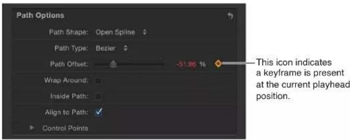
A positive value moves the text toward the right, and a negative value moves the text toward the left. You can enter values greater than 100% or less than 0% in the value slider. A value greater than 100% moves the text completely off the path to the right; a value less than 0% moves the text off the path to the left. In the following image, the Path Offset is set to 105%, so the text is completely off the right end of the text path.

natural_image
A small deer standing on rocky ground in a natural setting, with 'Dik Dik' text overlay (no other signage or symbols)4 Go to the frame where you want to place the next keyframe.
5 Adjust the Path Offset slider or value slider to reposition the text on the path.
6 Play the project to see the text travel along the text path.
7 Disable Record.
Margins controls in the Layout pane
Use the Margins controls—available when the Layout Method is set to Paragraph, Scroll, or Crawl—to set the size and location of text margins.
When a text file is imported into Motion, its margin and tab information is retained in the Motion project. The Layout Method (in the Layout pane of the Text Inspector) for the imported text is set to Paragraph. By default, text created in Motion is set to Type, creating one string of text until you enter a line break. To create columns with tabs or to use margins with text created in Motion, Layout Method (in the Layout pane of the Text Inspector) must be set to Paragraph or Scroll.
There are several ways to create and adjust text margins, including using onscreen controls and the Layout pane in the Text Inspector. You can set a margin for text before or after it is created.

Parameters in the Inspector
- Left Margin, Right Margin, Top Margin, and Bottom Margin: Drag these sliders, available when Layout Method is set to Paragraph, Scroll, or Crawl, to define the text margins in the Canvas.
Tab controls in the Layout pane
Motion allows paragraph-formatted text to contain an unlimited number of tabs to control word spacing in text. By default, text created in Motion has no tabs, so there are no controls in the Tabs section of the Layout pane. Adding, moving, and removing tabs is done in the Canvas. You can also move tabs by modifying their values in the Inspector. When a Rich Text Format (RTF) file is imported, tabs in the RTF file are retained in the Motion project and appear in the Tabs section of the Layout pane.
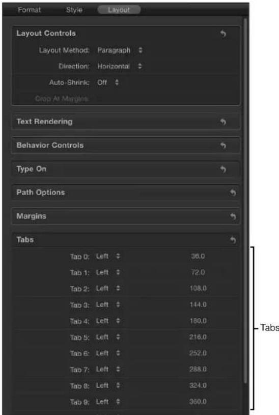
Parameters in the Inspector
- Tab 0, 1, 2, and so on: Lists the tabs in the paragraph, including their type and positions.
- Tab type pop-up menu (unlabeled): Use this pop-up menu to set the tab to Left, Center, Right, or Decimal.
- Tab value slider (unlabeled): Use the value slider to adjust the position of the tab.
Tabs can also be added, moved, and removed in the Canvas. For more information, see Work with tabs on page 668.
Margin and tab-related tasks
Create a text margin
You can create a custom margin using the Margin controls in the Layout pane of the Text Inspector or by drawing a text bounding box in the Canvas.
For information on creating a text box using the Text tool, see Add paragraph text in the Canvas on page 615.
Create text margins in the Inspector
1 Select the Text tool, click in the Canvas, and enter some text.
Clicking the Text tool in the Canvas (without dragging) creates a blank text object with its layout set to Type.
2 In the Layout pane of the Text Inspector, set Layout Method to Paragraph.
3 Set margin values using the Left, Right, Top, and Bottom Margin sliders.
4 Press Esc or click the Select/Transform tool to select the text bounding box and exit text-editing mode.
Work with tabs
When an RTF file is imported into a Motion project, tabs defined in the RTF file are retained. You can also add and modify tabs to text created in a Motion project. Lines of text that are separated by hard returns can have different tabs. Tabs are displayed in the Canvas and in the Layout pane of the Text Inspector.
Add a tab
1 In the Layout pane of the Text Inspector, make sure Paragraph (or Scroll) is selected in the Layout Method pop-up menu.
2 Double-click the text object in the Canvas to activate the paragraph onscreen controls.
3 In the ruler above the text-entry field in the Canvas, do one of the following:
- Click to add a left tab.
- Double-click to add a center tab.
-
Control-click and choose a tab option from the shortcut menu. The choices are:
-
Create left tab
- Create center tab
- Create right tab
- Create decimal tab
When you add a tab, its black icon appears in the ruler.

Change a tab type in the Canvas
■Double-click a tab icon in the ruler.
The tabs cycle through the right, center, left, and decimal types.
Change a tab type in the Inspector
In the Tabs section of the Layout pane of the Text Inspector, choose an option from the Tab type pop-up menu.
The tabs icon is updated in the ruler in the Canvas.
Move the tabs
1 Double-click the text in the Canvas to display the text box, ruler, and scroll control.
Note: The Text tool must be selected for the ruler and tabs to appear in the Canvas.
2 Do one of the following:
- In the Canvas, drag a tab (the small black icon) in the ruler.
- In the Layout pane of the Text Inspector, use the Tabs controls to adjust the position and layout of the tabs.
The affected text is repositioned to the tab.
Remove a tab
1 Double-click the text in the Canvas to display the paragraph onscreen controls.
Note: The Text tool must be selected for the ruler and tabs to appear in the Canvas.
2 Drag the tab (the small black icon) away from the ruler and release the mouse button.
The tab is removed from the ruler in the Tabs controls in the Layout pane of the Text Inspector.
Text glyphs
Text glyphs overview
Glyphs are the individual characters that make up a text object. Using the Transform Glyph tool, individual characters can be modified independently of the word, line, or paragraph in which they are a member. You can choose the text attributes to change or animate, including position, rotation, scale, face (color or fill), outline, glow, or drop shadow.
In addition to modifying text characters independently of their group, you can transform style attributes independently of the text character. For example, you can distort the drop shadow or glow of a letter without affecting its face or outline. These transforms can be applied using onscreen controls or the Four Corner parameter in the Style pane of the Text Inspector.
When the Transform Glyph tool is selected and Attribute is set to Transform Glyph (in the Text HUD), transform onscreen controls appear. These controls are identical to the 3D onscreen transform controls. For more information on using these controls, see Use 3D onscreen controls on page 910.
The Attribute parameter is also available in the Sequence Text behavior, which lets you sequence any of the glyph effects through text. For more information, see Use the Sequence Text behavior on page 679.
Transform Glyph HUD controls
When the Transform Glyph tool is selected, additional controls become available in the Text HUD. In addition to text parameters, the HUD contains the 3D transform tools, the Adjust Around pop-up menu, and the Attribute pop-up menus.
- Attribute: Use this pop-up menu to specify the glyph attribute to be modified. There are five menu options:
- Transform Glyph: Displays onscreen controls that allow you to scale, move, or rotate the glyph.
- Face: Displays onscreen controls that allow you to distort the face (color fill) of the glyph.
- Outline: Displays onscreen controls that allow you to distort the outline of the glyph.
- Glow: Displays onscreen controls that allow you to distort the glow of the glyph.
- Drop Shadow: Displays onscreen controls that allow you to distort the drop shadow of the glyph.
For more information on the Adjust Around pop-up menu, see 3D transform HUD controls on page 913.
Display onscreen glyph controls
Two modes of onscreen controls are available with the Transform Glyph tool. When Transform Glyph is chosen from the Attribute pop-up menu in the HUD, you can adjust a glyph's scale, position, or rotation without affecting the rest of the characters in the text object. When Face, Outline, Glow, or Drop Shadow is chosen from the Attribute pop-up menu, you can distort the selected attribute of a glyph without affecting the other attributes of that glyph or the rest of the characters in the text object.
In transform glyph mode, the Transform Glyph tool's onscreen controls are identical to the 3D onscreen controls. For more information on moving, rotating, or scaling objects using this tool, see Use 3D onscreen controls on page 910.
Display the transform glyph onscreen controls
1 Select the text object that contains the glyphs you want to modify.
2 Choose the Transform Glyph tool from the 2D transform tools pop-up menu in the toolbar.

If no glyph was selected, the first glyph in the text is selected.
3 Do one of the following:
- To scale, rotate, or move the glyph, select Transform Glyph from the Attribute pop-up menu in the Text HUD.
- To distort a text style attribute, select Face, Outline, Glow, or Drop Shadow from the Attribute pop-up menu in the Text HUD.
Note: If the HUD does not appear, choose Window > Show HUD (or press F7).
Select characters with the Transform Glyph tool
You can select a single text glyph or multiple text glyphs with the Transform Glyph tool. When more than one glyph is selected, the last Shift-selected glyph appears with the transform tools. This is known as the focused glyph. A box appears around the other selected characters. Any selected glyph (focused or not) is affected by transforms applied to the focused glyph.
Note: If you use the Transform Glyph tool to distort a style attribute (face, outline, glow, drop shadow) of a glyph, only one glyph can be selected at a time.
Select all glyphs
1 Select the text object that contains the glyphs to modify.
2 Choose the Transform Glyph tool from the 2D transform tools in the toolbar.
Ensure that the Attribute pop-up menu in the HUD is set to Transform Glyph. A glyph is selected.
3 Choose Edit > Select All (or press Command-A).
All glyphs are selected, and the Transform Glyph tool remains selected.
Select multiple glyphs
1 Select the text object that contains the glyphs to modify.
2 Choose the Transform Glyph tool from the 2D transform tools in the toolbar.
The first glyph in the text is selected.
3 Do one of the following:
- While pressing the Shift key, select the other glyphs to include in your edit.
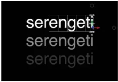
- Drag to select the other glyphs to include in your edit.
- While pressing the Command key, click to select noncontiguous glyphs to include in your edit.
Although the onscreen controls appear only around the focused (last selected) glyph, any glyph surrounded by a box is affected by when you adjust the onscreen controls.
Deselect a group of selected glyphs
- Choose Edit > Deselect All (or press Shift-Command-A).
The glyphs are deselected and the Transform Glyph tool remains selected in the toolbar.
Select a glyph in another text object
- With an active Transform Glyph tool selection, click the text layer in the Layers list or Timeline to modify. If no glyph was selected in the new text object, the first glyph is active. If a glyph was selected, the last selected glyph is active.
Reset glyph position, rotation, or scale
When a text object is moved, rotated, or scaled as a whole, the changes are reflected in the Properties Inspector. However, when a glyph is transformed, the changes are reflected in the Format pane of the Text Inspector.
Reset a rotated glyph
1 If the glyph is not selected, select the Transform Glyph tool from the 2D transform tools in the toolbar, then select the glyph or Shift-select a group of glyphs.
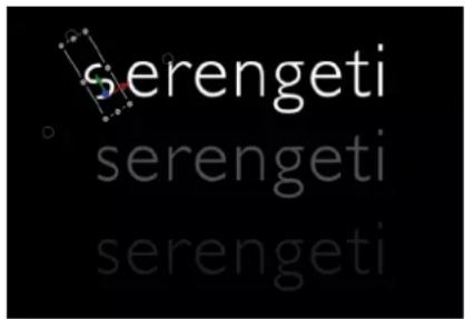
2 In the Format pane of the Text Inspector, click the Animation menu for the Rotation parameter and choose Reset Parameter.
The glyphs return to their original rotation.
Reset a repositioned glyph
1 If the glyph is not selected, select the Transform Glyph tool from the 2D transform tools in the toolbar, then select the glyph or Shift-select a group of glyphs.
2 In the Format pane of the Text Inspector, click the Animation menu icon for the Offset parameter and choose Reset Parameter.
Reset a scaled glyph
1 If the glyph is not selected, select the Transform Glyph tool from the 2D transform tools in the toolbar, then select the glyph or Shift-select a group of glyphs.
2 In the Format pane of the Text Inspector, Control-click the Scale parameter and choose Reset Parameter.
Adjust glyph attributes
The onscreen controls for adjusting a glyph's style attribute are similar to the distort onscreen controls. You can also distort a glyph's attributes in the Text Inspector.
Distort a glyph's style attribute in the Canvas
1 Select the text object that contains the glyph to modify, then select the Transform Glyph tool from the 2D transform tools in the toolbar.
2 Choose the attribute to modify (Face, Outline, Glow, or Drop Shadow) from the Attribute pop-up menu in the Text HUD.
If the Text HUD is not shown, choose Window > Show HUD (or press F7).
The glyph is enclosed by a bounding box with eight handles: four corner handles for distorting, and four shearing handles located in the middle of the bounding box edges.

3 Do one of the following:
• To shear the style attribute, drag a shearing handle.
• To distort the style attribute, drag a corner handle.

The parameters for the adjusted attribute are selected in the Style pane of the Text Inspector. That parameter is only turned on for the modified glyphs in the text object.
Distort a glyph style attribute in the Inspector
1 Select the text object that contains the glyph to modify, then select the Transform Glyph tool from the 2D transform tools in the toolbar.
2 Select the attribute to modify (Face, Outline, Glow, or Drop Shadow) from the Attribute pop-up menu in the Text HUD.
If the HUD is not shown, choose Window > Show HUD (or press F7).
3 In the Style pane of the Text Inspector, click the Four Corner disclosure triangle for the attribute to modify, then adjust the Bottom Left, Bottom Right, Top Right, or Top Left value sliders to distort the attribute.
Reset a single distorted glyph attribute
- With the glyph selected (using the Transform Glyph tool), click the reset button for the Four Corner parameter in the Style pane of the Text Inspector.
Reset multiple distorted glyph attributes
1 Select the text object containing the glyph you want to modify, then select the Transform Glyph tool from the 2D transform tools in the toolbar.
2 Select the glyph or Shift-select a group of glyphs.
3 Choose Transform Glyph from the Attribute pop-up menu in the Text HUD.
If the HUD is not shown, choose Window > Show HUD (or press F7).
4 Shift-select the glyphs to reset.
5 Click the reset button for the Four Corner parameter in the Style pane of the Text Inspector.
Animate glyphs
The Transform Glyph tool lets you animate text characters and their style attributes.
For more information, see Animate with the Transform Glyph tool on page 706.
Find and replace text
How to find and replace text
The Find and Replace window lets you locate and change a word (or a set of characters) in a Motion project. You can search in a selected text object, or in all text objects. This tool is useful for changes to long-form text objects, such as credit rolls.
Use Find and Replace
1 Choose Edit > Find and Replace (or press Command-F).
The Find and Replace window appears.
2 In the Find field, enter the text to search for; in the Replace Field enter the replacement text.
3 Select an option from the "Search in" pop-up menu:
- To search the selected text, choose Selected Text Object.
- To search all text, choose All Text Objects in Project.
4 Do one of the following:
• To search for the Find text, press Return.
- To search for the next occurrence, press Return again or click Next.
Note: The "Loop search" checkbox must be selected to have the search continue from the beginning of the text after reaching the end of the text.
- To find the previous occurrence, click Previous.
5 Do one of the following:
- To replace the current selection, click Replace.
- To replace all occurrences of the Find text, click Replace All.
- To replace the current selection and immediately find the next occurrence of the Find text, click Replace & Find.
Note: To undo an operation performed in the Find and Replace window, click in the Canvas to make it active, then choose Edit > Undo Text Replace (or press Command-Z).
Find and Replace window options
The Find and Replace window contains the following controls:
• Find: Enter the text to search for in this field.
- Replace: If performing a find-and-replace operation, enter the replacement text in this field.
- Search in: Use this pop-up menu to set the type of search operation to be performed. There are two options:
- Selected Text Object: Performs the search or search-and-replace operation on only the selected text object.
- All Text Objects in Project: Performs the search or search-and-replace operation on all text objects in the project.
- Match case: Select this checkbox to search for words that match the capitalization of the words entered in the Find field. When this checkbox is not selected, the search ignores capitalization.
- Whole words: Select this checkbox to search for whole words. When this checkbox is not selected, the search finds the specified text when it's contained anywhere within words.
- Loop search: Select this checkbox to have the search continue from the beginning of the text after reaching the end of the text. When Selected Text Object is chosen from the "Search in" pop-up menu, the search loops back to the beginning of the selected text object. When All Text Objects in Project is chosen from the "Search in" pop-up menu, the search loops back to the first text object in the project.
- Replace All: Click this button to replace all occurrences of the text in the Find field with the text in the Replace field. If there is no Replace text, this button is not available.
- Replace: Click this button to replace the text selected in the Canvas or Text Inspector with the text in the Replace field. If no text is selected, this button is not available.
- Replace & Find: Click this button to replace the text selected in the Canvas or Text Inspector with the text in the Replace field, then find the next instance of the text in the Find field. If no text is selected, this button is not available.
- Previous/Next: Use these buttons to jump to the previous or next instance of the text entered in the Find field.
Apply filters to text
Filters are applied to text in the same manner as they are to other objects in Motion. This section provides a quick guide to applying filters to text.
When a filter is applied to text, the text is flattened. In the Layout pane of the Text Inspector, the Flatten checkbox is selected and the parameter is disabled. When text is flattened, filters are applied to the text in local space—that is, "flat" to the text.

natural_image
3D wireframe model of a boat with decorative patterns on a grid background (no text or symbols)Flattened text with applied Twirl filter
Note: To deselect the Flatten checkbox when a filter is applied, deselect (or delete) the filter in the Layers list, select the text, then deselect the Flatten checkbox (in the Layout pane of the Text Inspector). If you turn the filter back on (by selecting it), the text is flattened again. (The Flatten checkbox is selected and the parameter is disabled.)
Apply a filter to text
Do one of the following:
In the Library, select a filter, then drag it to the text in the Canvas, Layers list, or Timeline.
- Select the text, then choose a filter from the Add Filter pop-up menu in the toolbar.

The Text HUD is replaced with a filter HUD.
Note: For more information, see Filters overview on page 741.
Animated text
17
Animated text overview
You can animate text using behaviors, keyframes, or a combination of both. All standard behavior types can be applied to text (Basic Motion, Parameter, or Simulation). Additionally, Motion has a special class of text behaviors that create animation by applying a range of values to text-specific parameters.

For more information on Basic Motion, Parameter, and Simulation behaviors, see Behaviors overview on page 293.
Text behaviors are an ideal way to test text treatments quickly and easily, without resorting to keyframes. You can adjust the rate of an applied behavior using the behavior's HUD and watch as the animation updates in the Canvas. For more control, you can access all parameters for a behavior in the Inspector. If your project requires specific timing and positioning of text, you can use behaviors to test effects and then create keyframes after you know what you want to do. Additionally, you can create keyframes from your applied text behaviors by using the Convert to Keyframes command. This approach lets you fine-tune the animation created by the text behaviors.
Behaviors are not required to animate text. You can create text animation via traditional keyframing, or by combining both techniques.
Note: Mixing keyframes and behaviors can yield unexpected results. For more information on combining behaviors and keyframes, see Combine behaviors with keyframes overview on page 310.
You can animate text as a whole or as individual characters (glyphs). You can animate format parameters such as text position, scale, rotation, and tracking, as well as style attributes such as outline, glow, and drop shadow. You can animate text on a path, and you can use text as an image mask source or replicator cell source.
To learn more about the various ways to animate text, choose an item in the Help table of contents (the sidebar to the left of this window).
Text animation behaviors
Types of text behaviors
In Motion, text behaviors are divided into two basic categories: Text Animation behaviors and Text Sequence behaviors.
- Text Animation behaviors allow you to create crawls, scrolls, animated text tracking, and "type-on" effects. This group also includes the powerful Sequence Text behavior, which lets you create a custom animation that sequences text style and text format attributes through text characters over time. The style attributes include face (fill color), glow, drop shadow, and outline. The format attributes include position, opacity, scale, rotation, tracking, and so on. The sequence can run through the text from left to right or right to left. Alternatively, you can create a custom animation for the direction of the sequence. The sequence can be applied per character, per word, per text object, and so on.
In the following illustration sequence, the text in the upper area of the image is animated by modifying the Scale, Blur, and Opacity parameters in the Sequence Text behavior. The lower text is animated using the Fade In/Fade Out and Tracking behaviors.

natural_image
Two small animal photos on orange background, one with blurred circular light effects (no text or symbols)
natural_image
Two animal photos labeled 'ken' and 'serengeti' against an orange background, no text or symbols on the animals themselves.
- Text Sequence behaviors are preset versions (the parameters are already selected and animated) of the Sequence Text behavior. There are six classes of Text Sequence behaviors: Basic, Continuous, Energetic, Glow, Highlighter, and Subtle. Although each Text Sequence behavior applies a specific preset animation effect to a text object, you can customize the effect by adding, removing, or modifying parameters.
Note: Although most Text Sequence behaviors have a definite start or end (fade in or out, blur in or out, and so on), the Continuous group of behaviors have no start and end points.
You can save a modified text behavior to the Library. For more information, see Save a modified text behavior to the Library on page 705.
Apply a Text behavior
Text behaviors are applied in the same manner as all other behaviors in Motion—via the Library or the Add Behavior pop-up menu in the toolbar. As with other behaviors, the Library displays a preview of the behavior before it is applied to text. The Add Behavior pop-up menu lets you apply a behavior to single or multiple text objects.
Apply a Text behavior from the Library
1 Create a text object in your project.
2 In the Library, select the Behaviors category, then select the Text Animation or Text Sequence subcategory.

3 Select a text behavior in the stack.
A preview of the animation plays in the preview area. The preview merely represents the default animation of the behavior, which can be modified.

4 Do one of the following:
- Drag the behavior to a text object in the Canvas, Layers list, or Timeline.
- Click the Apply button in the preview area.
The Text HUD is replaced with the Text Behavior HUD.
Apply a Text behavior from the Add Behavior pop-up menu
1 Select the text object (or objects) you want to apply the behavior to.
2 In the toolbar, choose a Text Animation behavior or Text Sequence behavior from the Add Behavior pop-up menu.
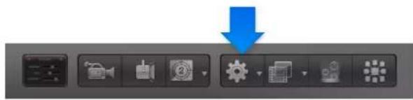
flowchart
graph TD
    A["File Icon"] --> B["Action Icon"]
    B --> C["Process Icon"]
    C --> D["Action Icon"]
    D --> E["Control Icon"]
    E --> F["Action Icon"]
    F --> G["Control Icon"]
Sequence Text behavior
Use the Sequence Text behavior
The Sequence Text behavior lets you animate text attributes, such as scale, position, color, opacity, and glow in sequence through the text characters. For example, you can create a sequence in which the text characters fall vertically into place as they scale down, fade in, and rotate.
Applying and activating a Sequence Text behavior is a two-step process: First, you add the Sequence Text behavior to a text object. Second, you assign the parameters of the text you want to animate, in the Behaviors Inspector or by manipulating the text object with the onscreen controls. After you link the text parameters to the behavior, you can use the Sequence Text controls in the Behaviors inspector to adjust the animation's direction, speed, number of loops, and other qualities.
Tip: Using the Transform Glyph tool, you can modify individual text characters independently of the influence of the applied Sequence Text behavior. For information on using the Transform Glyph tool, see Text glyphs overview on page 669.
Apply the Sequence Text behavior
- Select the text object to be animated, then choose Text Animation > Sequence Text from the Add Behavior pop-up menu.
The behavior is applied, and the first character of text is selected with the Adjust Item tool.

Important: Unless you use onscreen controls (via the Adjust Item tool) to create a sequence, you must add at least one parameter to the behavior in the Inspector before animation can occur. Until a parameter is added, adjustments made in the HUD have no effect.
Create a sequence animation using the Inspector
1 Select the applied Sequence Text behavior in the Layers list or Timeline.
The Behaviors Inspector is displayed.
The upper area of the Sequence Text controls contains Add and Remove pop-up menus, which are used to select text parameters to be sequenced, or to remove parameters after they are added. The second group of parameters are sequence controls, which include options for setting the direction and speed of the animation, whether the animation is applied per character, per word, per text object, and so on.

In this simple example, Opacity, Scale, and Glow scale are sequenced.
2 In the Parameter row, choose Format > Opacity from the Add pop-up menu.

The Opacity parameter is added in the Behaviors Inspector above the Add and Remove menus.
3 Set Opacity to 0 and play the project (press Space bar).
Because the Sequencing parameter is set to From by default, the opacity sequences from the value set in the behavior (0%) to original value of the text (100%).
4 Choose To from the Sequencing pop-up menu.
Now when you play the project from the beginning, the opacity fades to the value set in the behavior (0%) from the original value of the text (100%).



natural_image
Silhouette of a plant branch against a black background, labeled 'a' in the corner (no other text or symbols)5 Choose Format > Scale from the Add pop-up menu, then choose Glow > Scale from the same menu.
The Scale and Glow Scale parameters are added to the Behaviors Inspector.
6 Set Scale to 250%, set Glow Scale to 250%, then set Spread (in the Controls group) to 4.
The opacity sequences to the values defined in the behavior from the original values. The increased spread value softens the sequence between the characters.

Note: Although the style effects created in the Sequence Text behavior (Face, Outline, Glow, and Drop Shadow) are independent of parameters in the Style pane of the Text Inspector (Face, Outline, Glow, and Drop Shadow), changes made in the Style pane affect the sequenced text. For example, if you select the Glow checkbox in the Style pane after adding Glow to the Sequence Text behavior, the appearance of the glow may alter. This is because the Glow settings in the Style pane are additive to the sequence behavior (the glow may appear brighter or more blurred). In the following illustration, the glow is scaled and offset in the Style pane.

The above example covers only a portion of the options in the Sequence Text behavior. Using the behavior's parameters, you can create a nearly endless variety of sequences. You can define the speed in which the sequence moves through the text, as well as whether the sequence moves through the text per character, word, or line. You can also change the direction of the sequence and define the number of times the sequence loops over its duration. Variance and randomization can also be added to values defined in the behavior. For more information on these controls, see Sequence Text controls on page 688.
Create a sequence animation using onscreen controls
1 With the Sequence Text behavior applied and the first letter (glyph) selected (with the Adjust Item tool), do one of the following:
• To sequence the position of the text, drag the character in the Canvas to a new position.

In the Behaviors Inspector, the Position parameter is added to the Format category (above the Add and Remove pop-up menus). The values in the Position parameter can be modified in the Inspector (using the Position value sliders) as well as in the Canvas (by dragging the glyphs of the text object).

- To sequence the rotation of the text, rotate the selected glyph in the Canvas. To display the rotation controls, hold the Command key down. For more information on using onscreen transform controls, see Use 3D onscreen controls on page 910.

In this example, the text is rotated on its Y axis. In the Behaviors Inspector, the Rotation parameter is added to the Format category (above the Add and Remove pop-up menus).
- To sequence the scale of the text, scale the selected glyph in the Canvas by dragging a scale handle. (To scale the text uniformly, press Shift while dragging the scale handle in the Canvas.)
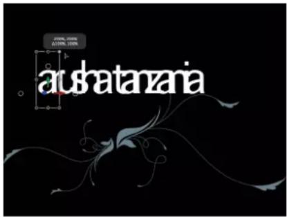
In the Behaviors Inspector, the Scale parameter is added to the Format category (above the Add and Remove pop-up menus).
2 Play the project (press Space bar).
Note that in the Controls section of the Behaviors Inspector, the Sequencing pop-up menu is set to From, the default setting. As a result, upon playback, the text in your project moves from the value in the Position parameter to the original value (the position of the text before you dragged it in the Canvas).
For more information on Sequence Text parameters, see Sequence Text controls on page 688.
Note: When using the Sequence Text behavior, glyphs are selected with the Adjust Item tool rather than the Transform Glyph tool. For more information on the Transform Glyph tool, see Text glyphs overview on page 669.
When a glyph is selected with the Adjust Item tool, a section of the Timeline becomes highlighted. This area shows when the selected glyph is affected by the sequence behavior.

Highlighted area indicates the animated location (in time) of the selected glyph
Remove a parameter from the sequence behavior
In the Parameter row of the Behaviors Inspector, choose a parameter from the Remove pop-up menu.
The parameter is removed from the behavior.
Create a softer transition between each text unit
- In the Behaviors Inspector, drag the Spread slider to the right (or click the value slider, type a number, then press Return).

Spread value set to 0

Spread value set to 11
Use the Text Style pane with the Sequence Text behavior
Parameters you want to include in a sequence animation are assigned in the Sequence Text behavior. Attributes modified in the Style pane of the Text Inspector (Face, Glow, Outline, or Drop Shadow) do not sequence. Therefore, to modify a parameter but keep it unchanged over the course of a sequence animation, modify that parameter in the Style pane of the Text Inspector. For example, you can create a sequence in which the text glow scales and fades (by setting Glow > Scale and Glow > Opacity in the Sequence Text behavior), but where the text outline remains constant (by setting the Outline parameters in the Style pane of the Text Inspector).
Note: Because parameters set in the Sequence Text behavior are independent of parameters set in the Style pane, you may see changes in the appearance of some attributes when you select parameter checkboxes in the Style pane. For example, if you create a sequence that animates text glow and then select the Glow checkbox in the Style pane of the Text Inspector, the effect is additive. The glow in the Style pane is added to the glow created in the Sequence Text behavior.
Use the Style pane with the Sequence Text behavior
1 With a text object selected, open the Style pane in the Text Inspector.
2 In the Face controls, change the color of the text to something other than white.
For more information on using color controls, see Basic color controls on page 132.
3 Select the Outline checkbox and modify some Outline parameters.
4 From the Add Behavior pop-up menu in the toolbar, choose Text Animation > Sequence Text.
5 In the Behaviors Inspector, choose Face > Color from the Add pop-up menu.
The text turns default white. When the Sequencing pop-up menu is set to the default From, the sequence behavior animates from the values defined in the Sequence Text behavior to the original values of the text. Before you applied the Sequence Text behavior, the text color was defined in the Style pane, so this is considered the original color.
6 Play the project.
The text color sequences from the color defined in the Sequence Text behavior to the original color of the text. The outline does not sequence.
Use the From Keyframes sequencing option
By choosing From Keyframes from the Sequencing pop-up menu, you can create a sequence by keyframing parameters. The following example creates a position sequence.
Create an animation using the From Keyframes sequencing option
1 Select the text object to be animated, then choose Text Animation > Sequence Text from the Add Behavior pop-up menu in the toolbar.
2 In the Behaviors Inspector, choose From Keyframes from the Sequencing pop-up menu.
3 Drag the playhead to the frame where you want to begin the animation, then click the Record button (or press A) to turn on keyframing.
When keyframing is enabled, the values in the Inspector for parameters that can be animated turn red.
Note: You can also animate parameters by manually adding an initial keyframe. After a keyframe is added to a parameter, any further adjustment to that parameter adds a keyframe at the current playhead position, independent of the Record button state. For more information, see Keyframing overview on page 439.
4 Do one of the following:
- In the Behaviors Inspector, choose Format > Position from the Add pop-up menu, then use the Position value sliders to define the beginning (or ending) position of the text.
- In the Canvas, drag the selected text character to its beginning (or ending) position.
A keyframe is added to the Position parameter.
5 Go to the next frame where you want to set a position keyframe, and do one of the following:
• In the Behaviors Inspector, enter a Position value.
- In the Canvas, drag selected text to a new position.
A second position keyframe is created.

6 Repeat Step 5 until you add all of your keyframes.
In the image below, an editable animation path appears in the Canvas. An animation path appears only when From Keyframes is chosen from the Sequencing pop-up menu.

For more information on working with animation paths, see Manipulate animation paths in the Canvas on page 445.
Note: If you change the Sequencing parameter to another option, such as Through Inverted or To, and then change Sequencing back to From Keyframes, the keyframed animation path is retained.
Sequence the distortion of style attributes
In addition to using the sliders and value sliders in the Inspector, you can use onscreen controls to sequence the Four Corner parameter, creating warp effects that manipulate the text Face, Outline, Glow, and Drop Shadow parameters. In the following simple examples, text Glow, Outline, and Drop Shadow parameters are sequenced.
Sequence the warping of a text glow effect
1 Select the text object to be animated, then choose Text Animation > Sequence Text from the Add Behavior pop-up menu in the toolbar.
2 In the Parameter row of the Behaviors Inspector, choose Glow > Four Corner from the Add pop-up menu.
In the Inspector, the Glow Four Corner parameter is added to the sequence above the Add and Remove pop-up menus. The Four Corner parameter is used to distort the text's glow attribute, allowing you to use onscreen controls to pull the glow around the text.
3 In the lower portion of the Behaviors Inspector, choose Glow from the Attribute pop-up menu.

The onscreen controls appear. Drag them to distort the attribute.
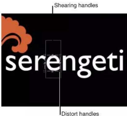
4 Do one of the following:
• To distort the glow, drag a distort handle.

Note: Some characters may not appear affected when you drag in the Canvas. However, when you play the project, all characters are affected.
• To shear the glow, drag a shearing handle.

You can also use the value sliders in the Four Corner parameters in the Behaviors Inspector. Click the Four Corner disclosure triangle to show the individual Bottom Left, Bottom Right, Top Right, and Top Left controls.
5 Play the project.
The glow distortion is sequenced through the text, based on the settings in the Sequence Text behavior parameters.
The following task describes an optional workflow in which you can distort text face, glow, outline, or drop shadow using the above steps, but without using the Add pop-up menu.
Sequence the warping of a text glow effect without using the Add pop-up menu
1 Select the applied Sequence Text behavior, then choose Glow from the Attribute pop-up menu in the lower portion of the Behaviors Inspector.
Onscreen controls appear that allow you to distort the text attribute. No parameters are added to the Inspector (above the Add pop-up menu) until the onscreen controls are adjusted.
2 Do one of the following:
• To shear the glow, drag a shearing handle.
• To distort the glow, drag a corner handle.
After you adjust a handle, the Four Corner parameter is added to the sequence above the Add and Remove pop-up menus.
Note: You can also adjust the value sliders in the Four Corner parameter in the Behaviors Inspector. Click the Four Corner disclosure triangle to show the Bottom Left, Bottom Right, Top Right, and Top Left controls.
3 Play the project.
The glow distortion is sequenced through the text, based on the settings in the Sequence Text behavior parameters.
Sequence Text controls
The Sequence Text behavior has the following parameter controls in the Behaviors Inspector.
Parameter selection controls
- Parameter (Add and Remove): Use the Add and Remove pop-up menus to add and remove text format and style parameters to the sequence. After a parameter is chosen, its controls appear above the Add and Remove pop-up menus. There are five Add pop-up menu items—Format, Face, Outline, Glow, and Drop Shadow—each of which invokes additional submenu items.
- Format: Choose any of eight Format parameters from the submenu: Position, Opacity, Scale, Rotation, Tracking, Baseline, Slant, or Character Offset. Except for Character Offset, these parameters are also found in the Format pane of the Text Inspector. (For more information on text format parameters, see Text Format pane on page 627.)
Choose the Character Offset option to offset characters alphabetically or numerically. The amount of the offset is determined by the value set in the parameter. In the following illustrations, Character Offset and Position are sequenced. The Character Offset Value is 3. The words move in sequence from the character offset value to form the original words, "offset 123."


When you choose Format > Character Offset from the Add pop-up menu, the Character Set pop-up menu appears in the Behaviors Inspector. There are two menu options: Preserve Case & Digits and Full Unicode. Choose Preserve Case & Digits to ensure that offset characters respect the case and number of the original text. For example, with this option selected, an uppercase letter remains uppercase as other letters cycle through its position.
Note: Using the onscreen controls to manipulate the scale, position, or rotation of the text unit adds Format parameters to the Sequence Text behavior. For more information on using onscreen controls to sequence text, see Use the From Keyframes sequencing option on page 685.
- Face: Choose any of four Face parameters for sequencing: Color, Opacity, Blur, or Four Corner. For more information on text face parameters, see Text Face controls in the Style pane on page 633.
- Outline: Choose any of six Outline parameters for sequencing: Color, Opacity, Blur, Width, Layer Order, or Four Corner. For more information on text outline parameters, see Outline controls in the Style pane on page 645.
- Glow: Choose any of eight Glow parameters for sequencing: Color, Opacity, Blur, Radius, Scale, Offset, Layer Order, or Four Corner. For more information on text glow parameters, see Glow controls in the Style pane on page 647.
- Drop Shadow: Choose any of seven Drop Shadow parameters for sequencing: Color, Opacity, Blur, Scale, Distance, Angle, and Four Corner. For more information on text drop shadow parameters, see Drop Shadow controls in the Style pane on page 648.
Sequencing controls
These parameters control how the sequencing occurs. Specify the direction, scope, and speed of the sequencing action, and what happens when the sequencing action reaches the end of your text object.
- Sequencing: Use this pop-up menu to set how the sequence animation moves through the text unit. (A text unit can be a character, word, line, or an entire text object, as set in the Animate pop-up menu, described below.) There are five items in the Sequencing pop-up menu:
- To: The animation begins at the original parameter value and moves to the value set in the sequence behavior. For example, if the original opacity value is 100% and opacity is set to 0% in the Sequence Text parameters, the text unit begins completely opaque and becomes completely transparent.
- From: The animation moves from the value set in the sequence behavior to the original parameter value. For example, if the original opacity value is 100% and opacity is set to 0% in the Sequence Text parameters, the text unit begins completely transparent and becomes completely opaque. This is the opposite of the To option in the Sequencing pop-up menu.
- Through: The sequence goes through a full animation cycle starting at the original value of the parameter, moves to the value set in the sequence behavior, and then returns to the original value of the parameter. For example, if the original opacity value is 100%, and opacity is set to 0% in the Sequence Text parameters, the text unit begins completely opaque, becomes transparent, and then becomes completely opaque again.
- Through Inverted: The sequence goes through an inverted animation cycle starting from the value set in the sequence behavior, moves to the original value, and then returns to the value set in the sequence behavior. For example, if the original opacity value is 100% and opacity is set to 0% in the Sequence Text parameters, the text unit begins completely transparent, becomes opaque, and then becomes completely transparent. This is the opposite of the Through Sequencing option.
- Custom: Lets you keyframe how the animation moves through the values set in the Sequence Text parameters. When Custom is selected from the Sequencing pop-up menu, the Minimum and Maximum parameters in the Variance controls (see description below) are replaced with the Amount parameter, and the Fix pop-up menu appears.
- Animate: Use this pop-up menu to specify whether the animation is sequenced by Character, Character (Without Spaces), Word, Line, All, or Custom (a keyframed range).
- Character: Sequences the animation by single characters of text (including spaces).
- Character (without spaces): Like the Character setting, sequences single characters of text, but does not treat spaces as characters (spaces are ignored).
•Word: Sequences the animation by word.
•Line: Sequences the animation by lines of text. - All: Sequences the animation through the entire text object.
-
Custom: Lets you customize the size of the sequenced text unit. When Custom is selected from the Animate pop-up menu, the Start and End parameters become available. These parameters define the size of the selection.
-
Start: Drag this slider, available when Animate is set to Custom, to define the starting point of the selection to be sequenced.
- End: Drag this slider, available when Animate is set to Custom, to define the ending point of the selection to be sequenced.
- Select: Use these controls to set the range of characters affected by the animation defined in the Animate pop-up menu.
- Range: In combination with the Start Index and End Index parameters, use this pop-up menu to specify the range of text that is sequenced by All (the default setting), Character, Character in Word, Character in Line, Word, Word in Line, or Line.
- Start Index: Sets the beginning of the range for the sequence animation.
In a simple example, if Animate is set to Character for a multiline text object, the sequence moves through the characters one at a time, line by line. If the Range parameter is then set to Character in Line and Start Index set to 1, the first character of each line is not animated, but the remaining characters are animated (as long as the End Index parameter is set to the number of characters in the longest line of text).
- End Index: Sets the end of the range for the sequence animation.
- Invert: Transposes the animation. In a simple example, the first character of each word in a line of text fades in. When Invert is selected, the first character of each word is fully visible, and the rest of the characters fade in.
- Reverse: Reverses the animation. In a simple example, the first character of each word in a line of text fades in. When Reverse is selected, the last character of each word fades in.
- Spread: Drag this slider to control the amount of falloff at the beginning and end of the sequencing. To create a softer transition between each text unit, increase the Spread value.
- Direction: Use this pop-up menu to set the direction of the sequencing.
- Forwards: Sequences in the direction of the letters (typically left to right).
- Backwards: Sequences in the reverse direction (typically right to left).
- Center to Ends: Sequences from the center of the text outwards.
- Ends to Center: Sequences from the outer edges of the text inwards.
- Random: Randomizes the direction of the sequencing. When Random is selected from the Direction pop-up menu, the Random Seed parameter becomes available.
- Random Seed: Use this button, available when Direction is set to Random, to change the current "randomness" (seed number) of the direction of the sequence by typing a new number or clicking the Generate button.
- Speed: Use this pop-up menu to set the action of the sequence behavior to Constant, Ease In, Ease Out, Ease Both, Accelerate, Decelerate, or Custom.
Note: By default, the sequence animation lasts for the duration of the text object to which it is applied. You can speed or slow the behavior by adjusting its bar in the mini-Timeline or Timeline. For more information, see Change the speed of Text Sequence behaviors on page 704.
- Constant: The sequence animation moves from one end of the text to the other at a constant rate. The sequence moves in the direction specified in the Direction pop-up menu.
- Ease In: The sequence animation begins slowly and increases to normal speed as it moves through the text.
- Ease Out: The sequence animation begins at normal speed and slows toward the end of the text.
- Ease Both: The sequence animation begins slowly, increases to normal speed as it moves toward the middle of the duration of the text, and slows as it reaches the end of the text.
- Accelerate: The rate of the sequence animation increases as it moves through the text.
- Decelerate: The rate of the sequence animation decreases as it moves though the text.
- Custom: Lets you keyframe how the selection (the animation) moves through the text. When Custom is selected from the Speed pop-up menu, the Custom Speed parameter becomes available.
- Custom Speed: Drag this slider, available when Speed is set to Custom, to keyframe the completion of the sequencing by defining the location of the text where the animation is in effect.
- Loops: Drag this slider to set the number of times the animation sequences through the text over its duration.
-
Apply Speed: Use this pop-up menu to control the speed of the sequencing over multiple loops. There are three menu options:
-
Once Per Loop: The setting chosen in the Speed pop-up menu is applied one time for each loop. For example, if Speed is set to Accelerate, the rate of the sequence animation increases as it moves through the text for every loop.
• Over Entire Duration: The setting chosen in the Speed pop-up menu is applied one time for the length of the behavior. For example, if Speed is set to Accelerate, the rate of the sequence animation increases as it moves through the text over the entire duration of the behavior, regardless of the number of loops. - Per Object: The setting chosen in the Speed pop-up menu is applied one time for each object for every loop. For example, if Speed is set to Accelerate, the rate of the sequence animation increases as it moves through each text object for every loop.
- End Condition: Use this pop-up menu to specify how the animation is applied to the end of the sequence animation. There are three options:
- Hold: Completes the sequence animation cycle one time, then starts it over from the beginning (after the last text unit in the sequence completes its animation).
- Wrap: Treats the sequence animation as a continuous loop so the spread wraps from the last text unit in the sequence to the first text unit.
•Ping-Pong: Completes the sequence animation cycle forward, then completes the animation backward, then forward, and so on.
- End Offset: Drag this slider to offset the end of the effect of the sequence behavior. By default, the sequence animation is in effect until the end of the behavior. For example, to stop the sequencing 60 frames from the end of the text object (or project), drag the End Offset slider to 60 or enter 60 in the adjacent value slider. Using this slider to stop the effect, rather than trimming the end of the behavior in the Timeline, freezes the end of the effect for the remaining duration of the object. Trimming the end of the behavior resets the text to its original settings.
Variance controls
This group of controls lets you randomize the attributes assigned to sequence through the text. For example, if you add variance to a scale sequence, the text scale is randomized rather than moving from the original Scale value to the Scale value defined in the sequence behavior. These sliders control the frequency of the randomness. When sequencing is set to To, From, Through, or Through Inverted, it is useful to see how the Variance numbers affect the randomness. The following image shows a sequence animation in which the Y Position is offset. When a low variance value (frequency) is applied, the randomness is very smooth along the line of text—like the text is riding a very slow and smooth wave.

As the variance is increased, the randomness increases across the line of text. Because the text is riding on very short and frequent waves, the letters are offset in the Y axis with more randomness.

When Custom is chosen from the Sequencing pop-up menu, the same principle applies, so a low variance value causes the text to offset from its animation with a smooth path, while a high variance causes more randomness.
Note: Because the Variance parameters are sensitive, low values are necessary for smooth animation results.
- Variance: Drag this slider to fluctuate the values of the attributes assigned to sequence through the text. For example, if you add variance to an opacity sequence, the text opacity is randomized rather than moving strictly from the original Scale value to the Scale value defined in the sequence behavior.
- Minimum: Drag this slider to define the lower boundary of the variance for the sequenced parameter value. For example, if you set Minimum to 25% for a sequence animating text scale, the minimum size that the text unit will scale to is 25% of the Scale value set in the behavior.
Note: When Custom is selected from the Sequencing pop-up menu, the Minimum and Maximum parameters are replaced with the Amount parameter.
- Maximum: Drag this slider to define the upper boundary of the variance for the sequenced parameter value. For example, if you set Maximum to 75% for a sequence animating text scale, the maximum size that the text unit scales to is 75% of the Scale value set in the behavior.
Note: When Custom is chosen from the Sequencing pop-up menu, the Maximum and Minimum sliders are replaced with the Amount slider.
- Amount: Drag this slider, available when Custom is chosen from the Sequencing pop-up menu, to define the maximum amount that the animated parameter can deviate from its animation value. For example, the following image shows a custom animation of a glyph in the positive Y direction. When Amount is set to 50, the glyph deviates no more than 50 pixels to the left or right of the animation path. The bold red line shows the animation path, and the thinner red line displays the randomized path.
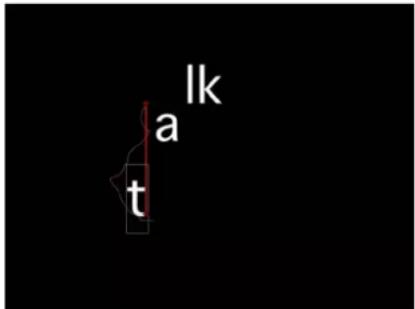
- Noisiness: Drag this slider to add an additional overlay of random variance. Higher Noisiness values result in more erratic variations in the affected parameter.
- Seed: Click the Generate button to create an initial random seed for creating randomness in the Variance parameters. To change the randomness results after you click Generate, click the button again or enter a value in the field.
- Fix: Use this pop-up menu, available when Sequencing is set to Custom, to fix the values defined in the behavior to the start, end, or start and end of the behavior. There is also an option to not fix the values. Variance must be greater than 0 for this parameter to have any effect.
- Start Point: When variance is applied, the values defined in the Sequence Text behavior (above the Add and Remove pop-up menus in the Behaviors Inspector) at the start and end of the behavior are fixed to the first frame of the behavior. In the following images, the text position is sequenced. Fix is set to Start Point.

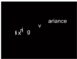

- End Point: When variance is applied, the values defined in the Sequence Text behavior (above the Add and Remove pop-up menus) at the start and end of the behavior are fixed to the last frame of the behavior. In the following images, the text position is sequenced. Fix is set to End Point.


- Both: When variance is applied, the values defined in the Sequence Text behavior (above the Add and Remove pop-up menus) at the start and end of the behavior are fixed to the first and last frames of the behavior.
- Neither: When variance is applied, the values defined in the Sequence Text behavior (above the Add and Remove pop-up menus) at the start and end of the behavior are not fixed to the first or last frames of the behavior. In the following images, the text position is sequenced. Fix is set to Neither.


- Attribute: Use this pop-up menu to sequence the warping of attributes. There are five menu options:
- Transform Glyph: Displays the glyph onscreen controls, allowing for the selection of characters of a text object for direct manipulation. For more information about sequencing using the glyph onscreen tools, see Use the From Keyframes sequencing option on page 685.
- Face: Displays onscreen controls that allow you to modify the shape, size, and position of the face (color fill) of text characters.
- Outline: Displays onscreen controls that allow you to modify the shape, size, and position of the outline of text characters.
- Glow: Displays onscreen controls that allow you to modify the shape, size, and position of the glow of text characters.
- Drop Shadow: Displays onscreen controls that allow you to modify the shape, size, and position of the drop shadow of text characters.
For more information about sequencing the warping of text attributes, see Sequence the distortion of style attributes on page 686.
- Position Type: Use this pop-up menu to specify whether an attribute is offset from the text uniformly (choose Absolute), or offset based on the size of text characters (choose Relative).
- Absolute: When offsetting attributes, such as glows, shadows, and so on from text objects, choose Absolute to create an even offset regardless of the size of the text characters. In the following image, the yellow glow is uniformly offset from the white text because Absolute is chosen from the Position Type pop-up menu.

- Relative: When offsetting attributes, such as glows, shadows, and so on from text objects, choose Relative to create an offset based on the size of the text characters. In the following image, the yellow glow is offset from the white text based on the size of the text characters because Relative is chosen from the Position Type pop-up menu.

Scroll Text behavior
Use the Scroll Text behavior
The Scroll Text behavior creates scrolling or crawling text. Scroll Text can also be applied to other objects, such as shapes and images, to create integrated credits, prologues, and so on.
When the Scroll Text behavior is applied to text, whether the text is imported (RTF or TXT files) or created in Motion, the Scroll Direction is set to Vertical by default (in the Behaviors Inspector), and the Layout Method is set to Scroll in the Layout pane of the Text Inspector. When Scroll Direction is set to Horizontal, the Layout Method is set to Crawl in the Layout pane of the Text Inspector. When the Scroll Text behavior is actively applied to text, you cannot change the Layout Method parameter unless the Allow Layout Override checkbox is selected in the Behaviors Inspector.
Note: The Transform Glyph tool is not available with the Scroll or Crawl layout methods.
Create a vertical scroll
1 Apply the Scroll Text behavior (from the Text Animation behavior category) to the object you want to animate.
For information on applying text behaviors, see Apply a Text behavior on page 677.
Because the Scroll Direction is set to Vertical and the Start Off-Screen checkbox is selected by default, the object shifts to below the Canvas for the beginning of the scroll. The direction, position, and speed of the scroll can be changed in the Inspector or HUD.
2 Click the Play button.
The object scrolls upward in the Canvas.
3 To edit the text, double-click the text in the Canvas.
The text stops scrolling, the ruler appears at the top edge of the text, and the scroll control becomes available at the right edge of the text. To continue playback, deselect the text by pressing Esc or by clicking in an empty area of the Layers list or the Timeline layers list. For more information on scroll controls, see Layout controls in the Layout pane on page 653.
4 To customize the scroll, adjust the parameters in the Behaviors Inspector.
For more information on Scroll Text behavior parameters, see Scroll Text controls on page 697.
Create a horizontal scroll
1 Apply the Scroll Text behavior (from the Text Animation behavior category) to the object to animate.
For information on applying text behaviors, see Apply a Text behavior on page 677.
2 In the Scroll Text HUD or Behaviors Inspector, select Horizontal from the Scroll Direction pop-up menu.
Because the Start Off-Screen checkbox is selected by default, the object shifts off the Canvas to the right for the beginning of the crawl. The text is positioned in a single line and Layout Method is set to Crawl in the Layout pane of the Text Inspector. Change the direction, position, and speed of the scroll in the Inspector or HUD.
3 Click the Play button.
The object crawls left in the Canvas.
4 To edit the text, double-click the text in the Canvas.
The text stops scrolling, and the scroll control becomes available at the lower edge of the text. To continue playback, deselect the text by pressing Esc or clicking in an empty area of the Layers list or Timeline layers list. For more information on scroll controls, see Layout controls in the Layout pane on page 653.
5 To customize the scroll, adjust the parameters in the Behaviors Inspector.
For more information on Scroll Text behavior parameters, see Scroll Text controls on page 697.
Change the speed of the scroll in the Timeline
In the Timeline, do one of the following:
- Drag the behavior bar to the left to speed up the scroll.
- Drag the behavior bar to the right to slow down the scroll.
For more information about adjusting behaviors in the Timeline, see Behavior timing overview on page 307.
Scroll Text controls
Use the parameters in the Behaviors Inspector to adjust the direction, rate, and position of the scroll.
Parameters in the Inspector
- Scroll Direction: Use this pop-up menu to set the direction of the text scroll to Vertical or Horizontal.
- Speed Control: Use this pop-up menu to set the speed of the scroll or crawl. There are three options:
- Automatic: The speed of the scroll is determined by the length of the behavior in the Timeline. In other words, the length of the behavior determines how long it takes the object to scroll or crawl across the Canvas. By default, the duration of an applied Scroll Text behavior is the same as the object or group to which it is applied.
- Fixed: The speed of the scroll is based on the value in the Scroll Rate parameter (pixels per second).
-
Custom: Specifies the start and end positions (defined as offsets from the current position) of the scrolling object.
-
Scroll Rate Mult: Use this slider, available when Speed Control is set to Automatic, to multiply the rate of the scroll. Amounts higher than those available in the slider can be entered in the value slider (the number field at the right of the slider).
- Scroll Rate: Use this slider, available when Speed Control is set to Fixed, to set the speed of the scroll in pixels per second.
-
Reduce Flicker: Use this pop-up menu to modify the speed of the scroll to reduce flickering on interlaced or progressive displays. When Scroll Direction is set to Vertical and Speed Control is set to Automatic or Custom, the options are None, Progressive, or Interlaced. When Scroll Direction is set to Horizontal and Speed Control is set to Automatic or Custom, the options are No or Yes.
-
None: Available when Scroll Direction is set to Vertical, this option has no effect on the speed of the scroll.
- Progressive: Available when Scroll Direction is set to Vertical, this option prevents flicker on a progressive display (such as an LCD television). The Progressive setting is not guaranteed to prevent flicker on an interlaced display (such as a CRT television).
- Interlaced: Available when Scroll Direction is set to Vertical, this option prevents flicker on a progressive display (such as an LCD television) or on an interlaced display (such as a CRT television).
Note: Because the minimum speed to prevent flicker on an interlaced display is 2 pixels per frame, and the minimum speed to prevent flicker on a progressive display is 1 pixel per frame, the Interlaced option may result in faster scroll rates.
- No: Available when Scroll Direction is set to Horizontal, this option does not modify the scroll speed to reduce flickering on interlaced or progressive displays.
- Yes: Available when Scroll Direction is set to Horizontal, this option modifies the speed of the scroll to reduce flickering on interlaced or progressive displays.
- Allow Layout Override: Select this checkbox, to permit manual changes to text layout. For example, when horizontally scrolling imported RTF text, the text is placed in a single line. If the Allow Layout Override checkbox is selected, the text retains its paragraph form.
Note: This parameter is available only when the Scroll Text behavior is applied to a text object.
- Start Off-Screen: Select this checkbox to move the text to an off-Canvas position for the start of the scroll.
Text Tracking behavior
Use the Text Tracking behavior
The Text Tracking behavior applies a rate of change to the Tracking parameter of the Format pane (in the Text Inspector). Tracking applies a uniform space between each character of text.
Use the Text Tracking behavior
■ Apply the Text Tracking behavior (from the Text Animation subcategory) to the text.

As the project plays, the characters spread out based on the rate set in the Rate parameter of the Text Tracking behavior.
Note: Like the Tracking parameter in the Format pane of the Text Inspector, the Text Tracking behavior respects the Alignment setting of the text. For example, to track from the center of the text outward, the Alignment of the text must be set to Center. This parameter is located in the text HUD or the Layout pane of the Text Inspector.
Use Text Tracking parameters to modify the rate and end offset of character tracking. The identical Text Tracking behavior parameters appear in the Text Tracking HUD and in the Behaviors Inspector.
Text Tracking controls
Use Text Tracking parameters to control the rate and end offset of the tracking animation.
Parameters in the Inspector
- Rate: Drag this slider to control the rate of the change in tracking values. The higher the rate, the greater the tracking values.
- End Offset: Drag this slider to offset the end of the effect of the Tracking parameter. By default, text characters track to the end of the duration of text. For example, to stop tracking animation 60 frames from the end of the text object (or project), drag the End Offset slider to 60 or enter 60 in the value slider.
Note: Use the End Offset parameter to stop the effect of the tracking behavior before the end of the text object (or project) rather than changing the duration of the Tracking behavior in the mini-Timeline or Timeline. If you trim the end of the behavior, the text snaps back to its default tracking value at the end of the behavior.
Type On behavior
Use the Type On behavior
The Type On behavior creates a "type-on" effect.
Apply the Type On behavior
■ Apply the Type On behavior (from the Text Animation subcategory) to the text object.
By default, the text pops on. To create a softer fade-in effect, enable Fade In in the Type On HUD or Behaviors Inspector.

The Type On behavior is applied over the duration of the text object. You can modify the timing of the effect (make it start later or stop sooner) by resizing the Type On behavior's timeframe (in the mini-Timeline or Timeline).
Increase the speed of the type on effect
1 Select the Type On behavior.
The Type On behavior bar is selected in the mini-Timeline and Timeline.
2 Do one of the following:
- In the Timeline or mini-Timeline, drag the right end of the Type On bar toward the left, to the frame where you want the animation to end. As you drag the new Out point, a tooltip displays the duration and delta (amount of change) of the behavior.
- Drag the playhead to the frame where you want to set the new Out point, then choose Mark > Mark Out (or press O).
By the time the playhead reaches the end of the new behavior duration bar, the type on effect is complete.
Note: You can also slow the type-on effect by extending the behavior beyond the duration of the text object.
To gradually increase the visibility of the type-on text
In the Behaviors Inspector or HUD, select the Fade In checkbox.
Type On controls
The Type On behavior contains only the Fade In parameter.
- Fade In: Select this checkbox to cause each text character to fade in rather than appearing with the default pop effect.
Note: You can also create this type of animation using the Type On parameter group in the Layout pane of the Text Inspector. For more information, see Layout controls in the Layout pane on page 653.
Preset Text Sequence behaviors
Preset Text Sequence behaviors overview
As previously noted, Text Sequence behaviors are customized, preset versions of the Sequence Text behavior in the Text Animation subcategory. (For more information on the Sequence Text behavior, see Use the Sequence Text behavior on page 679.) Although behaviors in the Text Sequence behavior subcategory are predefined, values can be modified and other parameters added, or existing parameters can be removed. For example, the Awaken In behavior (from the Basic group) animates text Opacity, Scale, and Rotation values (Format parameters) by default. However, you can add a parameter, such as Position, to the behavior.
Text Sequence behaviors are applied to text objects in the same manner as other behaviors. However, there is one big difference between the Text Sequence behaviors and other behaviors in Motion: When added to text, Text Sequence behaviors do not last the duration of the text. However, you can modify the default duration of the behavior to slow down or speed up the effect of the animation.
As with all behaviors, you can save a modified behavior to the Library as a custom behavior. For more information, see Save a modified text behavior to the Library on page 705.
Clicking a Text Sequence behavior in the Library stack plays the preset animation in the preview area.
Customize a preset Text Sequence behavior
In this section, the Flare In behavior (from the Glow group) is used to show how to modify a Text Sequence behavior.
The following steps begin at the first frame of the text.
Modify the Flare In behavior
1 Select the text object to be animated, then choose Text-Glow > Flare In from the Add Behavior pop-up menu in the toolbar.
At the first frame, the text is not visible because Face opacity and Glow opacity are animating from 0% to 100%.
2 Click Play (or press the Space bar).
The text characters fade in from 0% to 100% percent opacity, and sharpen from a blur value of 10. A glow rides the effect in as the text appears.

3 Select the Flare In behavior.
The Behaviors Inspector is shown, listing the specific text parameters used to create the animation (above the Add and Remove pop-up menus). The sequence Controls are not disclosed by default.

Although most sequence Controls appear in the Flare In HUD, the Add and Remove pop-up menus (and the parameters they affect) do not.
4 In the Parameter row, choose Format > Rotation from the Add pop-up menu.
A Rotation parameter is added to the sequence.

Tip: Because most preset text sequence behaviors are keyframed, it is often helpful to see where the keyframes occur when customizing. In the Timeline, click the Show/Hide Keyframes button. The keyframes appear on the behavior's bar.

5 Move the playhead to frame 1, then click Record to turn on keyframing.
6 In the Behaviors Inspector, set the Rotation dial to 90.
7 Play the project (press the Space bar).
Because the Rotation parameter has only a single keyframe, the text remains static at 90 degrees.

natural_image
Abstract light propagation pattern with flowing orange and yellow lines against a black background (no text or symbols)8 Move the playhead to frame 30, and set Rotation to 0.
Now that you've set a second keyframe value, the sequence is animated.
Note: You can edit the keyframes in the Keyframe Editor. For more information, see Keyframing overview on page 439.
9 Return the playhead to frame 1 and play the project (press the Space bar).
As the project plays, the text rotates from 90 degrees to 0 degrees.

You can change the color or other attributes of the text glow by using the Glow controls in the Style pane of the Text Inspector.
Change the default settings of Text Sequence behaviors
Text Sequence behaviors use default text settings, such as glow color (yellow) and alignment (left). You can change these settings in the Inspector.
Change the default glow color of a preset sequence behavior in the Text Style pane
1 Select the text sequence behavior.
2 In the Text Inspector, open the Style pane.
Glow is not selected by default when using the preset Text Sequence behavior. However, the Color well is still accessible.
3 Without selecting the Glow checkbox, choose a color in the Color well of the Glow controls.
Important: Selecting the Glow checkbox results in an additive effect: The values defined in the Style pane are added to those in the sequence behavior. This may cause the preset to change in appearance.
Change the default glow color of a preset sequence behavior in the Behaviors Inspector
1 Select the text sequence behavior.
2 In the Parameter row of the Behaviors Inspector, click the Add pop-up menu, then choose Glow > Color.
The Color parameter is added to the Glow parameters in the behavior.
3 Use the Color controls to change the color of the glow.
Change the default text alignment for a preset sequence behavior in the Text Format pane
1 Select the text.
2 In the Text Inspector, open the Format pane.
3 From the Alignment pop-up menu, choose Center.
Change the speed of Text Sequence behaviors
When a behavior from the Text Animation group is added to a text object, the behavior spans the duration of that text object. However, most behaviors from the Text Sequence group are much shorter than the duration of the text object.
For example, with the Awaken In behavior selected, the duration of the behavior is much shorter than the duration of the text object to which it is applied. You can see this in the mini-Timeline or the Timeline.

You slow down or speed up the animation by changing the duration of the behavior.
Slow the sequence animation
1 Select the sequence behavior.
2 Do one of the following:
- In the mini-Timeline or Timeline, drag the right end of the behavior bar right (to extend the behavior) to the frame where you want the animation to end.
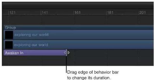
- Go to the frame where you want to set the new Out point, then choose Mark > Mark Out (or press O).
Speed up the sequence animation
1 Select the sequence behavior.
2 Do one of the following:
- In the mini-Timeline or Timeline, drag the right end of the behavior bar left (to shorten the behavior) to the frame where you want the animation to end.
- Go to the frame where you want to set the new Out point, then choose Mark > Mark Out (or press O).
Save a modified text behavior to the Library
As with all modified behaviors, filters, generators, and so on, you can save a modified text behavior to the Library.
Save a modified behavior to the Library
1 Select the behavior to save
Note: You can rename the behavior for organizational purposes.
2 In the Library, select the location where you want to store the behavior, such as the Text Sequence subcategory or Favorites category.
3 From the Layers list or Timeline, drag the behavior to the Library stack, releasing the mouse button when the green add pointer (+) appears over the stack window.
The behavior is saved to the Library. A custom behavior is represented by a user icon in the lower-right corner of the behavior icon.
For more information, see Save custom elements to the Library on page 183 and Manage Library folders and files on page 185.
Use behaviors to animate text in 3D
Although text has no inherent 3D parameters, a text object can be moved and rotated in 3D space. Simulation behaviors can also influence text characters to move out of their X and Y planes into Z space. The text must be a member of a 3D group to be pulled out of the X and Y planes by a behavior. Additionally, text on a Spline path can be manipulated in 3D space.
For example, you can apply an Orbit Around behavior to a text object and assign a target object that is offset in Z space. With Affect Subobjects selected and all three axes (X, Y, and Z) enabled in the Orbit Around behavior, text characters circle about the target object in X, Y, and Z space.
When the Face Camera checkbox is selected (in the Text Layout pane), the text characters actively face the camera if the camera or text is rotated.
Tip: When working with text in a 3D project, especially text that moves close to the camera, set the Render Quality in the View pop-up menu or the View pull-down menu to Best before exporting (choose View > Render Quality > Best). Use Normal when working in your project, because Best mode dramatically slows your project's interactivity. You can also set the Render Quality on export in the Export Options dialog: Choose Export, click Options, then choose Best from the Render Quality pop-up menu. To customize an export, turn off the "Use current project and canvas settings" checkbox.
For more information about 3D effects in Motion, see 3D compositing overview on page 908.
Animate text with keyframes
You can create keyframes for most of the text parameters. As with all objects in Motion, there are two ways to create keyframes: by activating the Record button in the Canvas transport controls or by manually adding a keyframe to a parameter in the Inspector.
Keyframes versus behaviors
The text animation method you use (keyframing or behaviors) depends on your project, or more specifically, your timing needs. In general, if you need an action to happen at a specific point in time in your project, use keyframing. For example, if you want text to be completely transparent at frame 1, become completely opaque at frame 60, become transparent again at frame 90, and opaque again at frame 120, use keyframing. Keyframes apply specific values to an object's parameters at specific frames.
If the effect you want is more general, use behaviors. For example, if you want the text to be completely transparent at frame 1, become opaque over frames 60–90, and become transparent by frame 120, use the Fade In/Fade Out behavior. Behaviors generate a range of values that are applied to an object's parameters.
You can combine keyframing and behaviors on all objects in Motion. For example, if you keyframe text opacity, you can then apply the Tracking behavior to animate text tracking, or you can keyframe the Tracking parameter. However, if you keyframe the text Opacity parameter and then apply a Fade In/Fade Out behavior to the text, unexpected results may occur. For more information, see Combine behaviors with keyframes overview on page 310.
Animate with the Transform Glyph tool
The Transform Glyph tool lets you animate text characters independently of their text objects.
Animate text characters with the Transform Glyph tool
1 Select the text object that contains the glyphs to modify.
2 Choose the Transform Glyph tool from the 2D transform tools pop-up menu in the toolbar.

Selecting the Transform Glyph tool activates glyph transform handles in the Canvas and adds additional controls to the Text HUD.
3 In the Text HUD, ensure that the Attribute pop-up menu is set to Transform Glyph.
When Transform Glyph is selected, you can modify and animate the position, rotation, and scale of text characters. You can choose other options from the Attribute pop-up menu to activate transform handles that modify Face, Outline, Glow, and Drop Shadow parameters of text characters.
4 Move the playhead to the frame where you want the animation to begin, and click the Record button (or press A) to enable keyframing.
5 In the Canvas, select and drag glyphs to their starting position in the animation sequence.

6 Go to the frame where you want the animation to end, and drag the glyphs to their ending positions.

An editable animation path is created for the keyframed glyphs. You can add and remove control points and change the shape of the path in the Canvas. For more information on working with animation paths, see Manipulate animation paths in the Canvas on page 445.
7 Move the playhead back to the start frame and play the project (by pressing the Space bar).
The glyphs animate from their starting positions to their ending positions.
Note: The other options in the Attribute pop-up menu—Face, Outline, Glow, and Drop Shadow—can be animated in the same manner as the Transform Glyph option.
Add nontext behaviors to text
Nontext behaviors are applied to text in the same manner as they are to other objects in Motion. This section provides a quick guide to applying behaviors to text.
Depending on their parameter settings, behaviors applied to text can affect the text object as a whole or can affect the individual text characters. For example, when you apply the Spin behavior to a text phrase on a circular path, the entire phrase rotates around its anchor point. To rotate individual text characters, select the Affect Subobjects checkbox in the Spin parameters.

Spin behavior applied to text on a path with Affect Subobjects turned on (the individual text characters spin)

Spin behavior applied to text on a path with Affect Subobjects turned off (the text layer as a whole spins)
Apply a behavior to text
Do one of the following:
In the Library, select a behavior, then drag it to the text in the Canvas, Layers list, or Timeline.
- Select the text, then choose an item from the Add Behavior pop-up menu in the toolbar.

The Text HUD is replaced with a behavior HUD, and the Behaviors Inspector is shown.
Note: For more information on applying text behaviors, see Types of text behaviors on page 677 and Preset Text Sequence behaviors overview on page 701. For more information on other behaviors, see Behaviors overview on page 293.
Generators
Generators overview
Generators are objects in the Library that you add to a project to create instant graphical treatments such as colors, bars, stripes, noise, or gradients. Some generators create animated patterns. However, most default to static, patterned images that can be animated using behaviors or keyframes.
There are two categories of generators in the Library:
- Generators: Static images, such as the Checkerboard generator, and images animated by default, such as the Clouds generator. Although static generators are not animated by default, you can keyframe their parameters to create an animated pattern.
- Text Generators: Animated text treatments.
You can use any generator as is or modify its settings to create different effects. Like all other objects in Motion, generators can be moved, rotated, duplicated, copied and pasted, and animated. Generators can be reordered in the Layers list and set to different blend modes. Also, as with other objects, you can apply behaviors to generators and apply Parameter behaviors to the individual parameters of a generator. You can also apply filters to generators, or use a generator as the source for a particle or replicator cell. After you modify a generator, you can save it to the Library for later use.
To learn more about working with generators, choose a topic in the Help table of contents (the sidebar to the left of this window).
Add a generator
You add generators to a project in the same manner as other files—by dragging the generator into your project from the Library. Alternatively, you can apply generators from the Add Generator pop-up menu in the toolbar. After you add a generator, it becomes a layer in the Layers list (and Timeline) and appears in the Canvas. The generator is set to the duration and size of your project by default. For example, if you are working on an NTSC D1 project and you add a generator, the generator has a 720 x 486 (.90) pixel aspect ratio.
Note: The duration of the generator depends on the Project settings in Motion Preferences. If Create Layers At is set to "Start of project," the generator starts at the first project frame regardless of where the playhead is when the generator is added. If set to "Current frame," the generator starts at the playhead's frame.
Add a generator to a project
1 In the Library, click the Generators category.
2 In the stack, click a generator.
The generator preview appears in the preview area. If the generator is animated, such as Clouds, the animation plays in the preview area.
3 Drag the generator to your project.
As with other objects, you can add the generator to your project by dragging it to the Canvas, the Layers list, or the Timeline. The generator and its HUD appear in your project. (If the HUD in not visible, press F7.) The HUD contains a subset of the complete controls that appear in the Generator pane of the Inspector.
Note: Generators added to a project are not added to the Media list. The Media list only includes media files imported into Motion, such as image sequences, video files, Photoshop files, and audio files.
Alternatively, you can add a generator to your project by clicking the Add Generator pop-up menu in the toolbar (to the right of the New Camera and New Light buttons) and choosing an item from a submenu. Using the Add Generator pop-up menu in the toolbar is quick, but it does not provide a way to preview the generator before adding it to the project.
Modify a generator
You can modify a generator in the HUD, in the Inspector, or using onscreen transform controls. You can animate generator parameters with keyframes or behaviors, and you can use a generator as the basis for a particle system. After you customize a generator, you can save it custom generator to the Library for future use.
Modify a generator in the HUD
In this task, the Checkerboard generator is used to illustrate how to edit a generator using the HUD.
1 Add the Checkerboard generator to your project.
Note: For information on adding a generator to your project, see Add a generator on page 709.
The default Checkerboard generator appears in the Canvas, Layers list, and Timeline, and the HUD appears. The Checkerboard generator HUD contains controls for editing and animating the checkerboard, such as Opacity, Blend Mode, Width, Height, Color, Size (of the checkers), and Contrast. The only Checkerboard parameters that do not appear in the HUD are Center and Pixel Aspect Ratio (which appear in the Generator Inspector).
2 In the HUD, click the Color 1 color well and select a color from the Colors window.
If the HUD is not shown, choose Window > Show HUD (or press F7).
Color 1 is replaced with the new color.

natural_image
Checkerboard pattern with alternating black and orange squares (no text or symbols)3 Click the Color 2 color well and select a color from the Colors window.
Color 2 is replaced with the new color.

natural_image
Checkerboard pattern with alternating orange and yellow squares (no text or symbols)4 Drag the Size slider to change the size of the squares.
The checker size is 80 by default. Drag the slider to the left to make smaller checkers, and to the right to make larger checkers. To change the size of the generator (rather than the size of the checkers), adjust the Width and Height parameters.
Note: You can also use standard object scaling-methods—the onscreen transform controls or the Scale parameter in the Properties Inspector. However, scaling generators in this manner changes the size of the checkers and has a greater impact on your system's performance.
5 Drag the Contrast slider to adjust the contrast between Color 1 and Color 2.
Although the checkerboard pattern does not change, adjusting the Contrast parameter can create dramatically different textures.
natural_image
Abstract pattern of orange and yellow diamond shapes on white background (no text or symbols)Modify a generator using onscreen controls
You can modify a generator using onscreen transform controls, such as Transform, Anchor Point, Drop Shadow, and so on. Changes made to the generator using these tools are reflected in the Properties Inspector. The Adjust Item tool is the only tool that directly modifies a generator parameter, usually the Center or Offset parameter. These changes are reflected in the Generator Inspector. For more information on the transform tools, see Move layers in the Canvas overview on page 211.
1 Select the generator to modify.
2 Open the 2D transform tools pop-up menu in the toolbar and choose the Adjust Item tool (the last tool in the list).

In the center of the Canvas, the center onscreen control appears.
Note: If the generator has no onscreen controls, the Adjust Item tool is not available.
3 Drag the control to a new position.
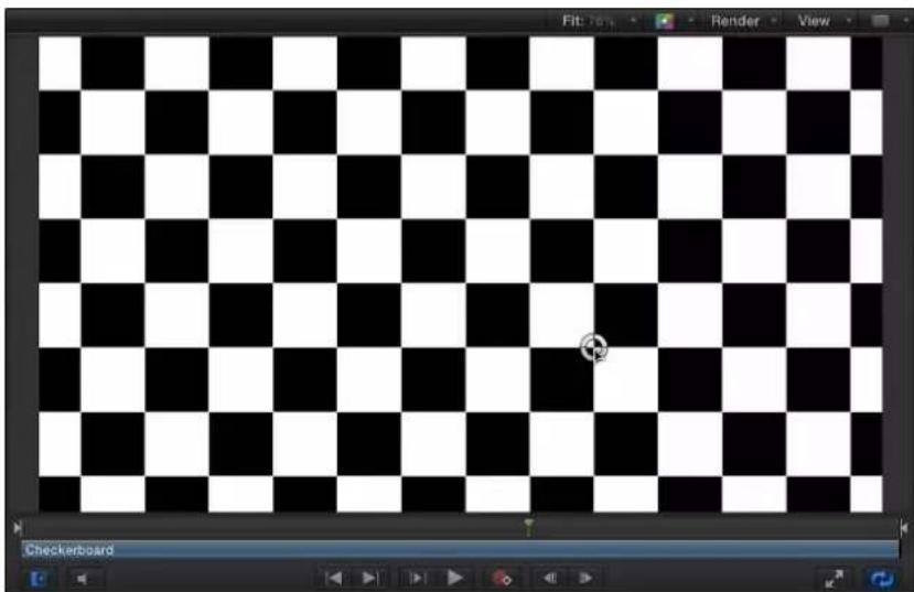
natural_image
Checkerboard pattern with alternating black and white squares, no text or symbols presentThe Offset or Center parameter is adjusted accordingly in the Generator Inspector.
Animate a generator using keyframes
Although most generators create static images, you can animate the parameters of a generator to create a moving texture over time. This task uses the Generator Inspector to animate the Checkerboard generator from the above example.
1 Move the playhead to the frame where you want to begin the animation.
2 Press A to turn on keyframe animation recording.
3 With the generator selected, set the initial parameter values in the Generator Inspector:
a Drag the Size slider to set the initial checker size.
b Click the color wells and pick the initial colors.
c Drag the Contrast slider to set the initial contrast value.
d Drag a Center parameter value slider to set the initial Center value.
The value slider on the left of the Center parameter controls the X position of the checkers, and the value slider on the right controls the Y position. To animate checkers horizontally, use the left value slider. To animate checkers vertically, use the right slider.
4 Move the playhead to the frame where you want to create the next keyframe.
5 In the Generator Inspector, change the generator Size, Colors, and Contrast parameter values.
6 Play the project (press the Space bar).
The animated generator parameters create a moving, changing texture. If you're satisfied with the result, press A again to turn off keyframe recording.
natural_image
Red and orange checkerboard pattern with no text or symbols
natural_image
Pattern of orange and yellow circles arranged in a grid (no text or symbols)
natural_image
Abstract pattern of orange diamond shapes on white background (no text or symbols)Animate a generator using behaviors
As with all other objects in Motion, you can apply Basic Motion, Parameter, or Simulation behaviors to a generator. The following task randomizes the opacity of the Star generator to create a flickering star.
1 Add the Star generator to your project and display the Generator Inspector.
2 In the Generator Inspector, move the pointer over the Spike Opacity parameter row.
The Animation menu (an inverted triangle) appears on the right side of the parameter row.
3 Click the Animation menu for the Spike Opacity parameter, then choose Randomize from the Add Parameter Behavior submenu.

The Randomize parameter behavior is applied to the Spike Opacity parameter, and the Behaviors Inspector is displayed so you can adjust the Randomize parameters.

4 In the Behaviors Inspector, drag the Amount slider to the right to increase the randomization effect.
5 In the transport controls (under the Canvas), click the Play button (or press the Space bar).
Because the Randomize parameter behavior is applied to the opacity of the star spikes, the star appears to flicker. When a Parameter behavior is applied to a parameter of a generator, a behavior icon (a gear) appears in the Generator Inspector in the row for the affected parameter. In this example, the behavior icon appears in the Spike Opacity parameter row.

6 To increase or decrease the effect of the flicker, adjust the Randomize parameters (in the Behaviors Inspector). To jump to the Randomize parameters from the Generator Inspector, control-click Spike Opacity parameter name, then choose Randomize from the shortcut menu.
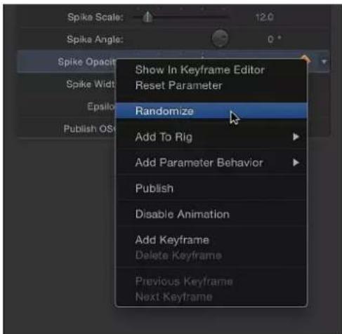
For more information on using Parameter behaviors such as the Randomize behavior, see Randomize on page 346.
Use a generator as a particle cell source
As with other objects, generators can be used as a source for particle cells. The following example uses the Soft Gradient generator. To give your particle system more flexibility and reduce processing strain on your computer, scale the generator down in the Generator Inspector.
1 Add the Soft Gradient generator to your project.

natural_image
Grayscale gradient image with a bright central glow and soft edges, no text or symbols present.2 In the HUD or Generator Inspector, reduce the Radius value.
This example uses a Radius value of 40.
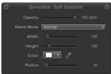
3 Reduce the Width and Height values.
The size of the gradient and its bounding box are scaled down.

4 With the generator still selected, do one of the following:
- Press E.
• In the toolbar, click the Make Particles button.
After you add an emitter to the project, the new "Emitter" object is selected In the Layers list; a duplicate of the generator object (the Soft Gradient) becomes an emitter cell for the new particle system; and the original source object (the Soft Gradient generator object) is disabled.

In the Canvas, the emitter bounding box appears. You can transform the bounding box using the onscreen controls or controls in the Inspector. The particle appears in the Canvas in the same location as the original object. Although it appears as if the particle is selected, the bounding box for the emitter is selected.
5 Press the Space bar to play the project.
Soft gradient particles are emitted.
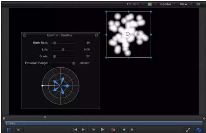
You can change the particle color, emitter shape, scale, emission angle, birth rate, and so on in the Emitter Inspector or HUD. For more information on working with particles, see Particles overview on page 513.
Modified particles using the Soft Gradient generator as a particle cell source
Save a customized generator to the Library
After you modify or animate the parameters of a generator, you can save the generator to the Library. For organizational purposes, name objects that you save to the Library with a descriptive title.
1 To rename the modified generator, double-click the generator name in the Layers list.

2 Type the new generator name, then press Return.
3 In the Library, navigate to the Generators category.
Note: You can also save the modified generator in another category, such as Favorites.
4 From the Layers list, drag the modified generator to the Library stack.
The modified generator is saved in the Generators category and appears organized alphabetically in the stack. Custom items saved in the Library are identified with a user badge in the lower-right corner of the icon.

By default, any generator that you save in the Generators category in the Library is stored in your user folder: /Users/username/Library/Application Support/Motion/Library/Generators/. To share custom presets, templates, layouts, behaviors, filters, or Library content with another user, the other user must copy the files into his or her home folder.
Parameters common to all generators
All generators have a reset button and Width, Height, and Pixel Aspect Ratio controls, located in the Generator Inspector. The controls specific to each type of generator are discussed later in this chapter.
Parameters in the Inspector
- Reset: A curved arrow button that restores the generator to its default settings.

- Width: A slider that sets the width of the generator, in pixels. Values range from 1 to the width of your project.
- Height: A slider that sets the height of the generator, in pixels. Values range from 1 to the height of your project.
- Pixel Aspect Ratio: A pop-up menu that sets the aspect ratio of the pixels drawn by the generator. Values can be selected from the following menu options: Square, NTSC D1/DV, NTSC D1/DV Anamorphic, PAL D1/DV, PAL D1/DV Anamorphic, Anamorphic 2:1, D4/D16, D4/D16 Anamorphic, HD (960 x 720, 1440 x 1080), HD (1280 x 1080), or Custom. When a value other than Custom is selected, the Pixel Aspect Ratio of that selection appears in a value field next to the pop-up menu. Enter values from 0 to 10000 in the value field. If the value does not correspond to a preset value (for example, 2 for Anamorphic 2:1), Custom appears in the pop-up menu.
Controls in the HUD
In general, Generator HUDs contain a subset of the larger group of controls located in the Generator Inspector. Additionally, the HUDs contain the Opacity and Blend Mode parameters.
Important: The Opacity parameter in the HUD is identical to the Opacity control located in the Properties Inspector. This slider sets the transparency of the generator as a whole. Several generators contain a separate opacity control in the Generator Inspector, which is independent of the like-named control in the Properties Inspector.
Image generators
Image generators overview
Image generators quickly add animated or static graphics, such as stars, swirls, rays of color, or lens flares to a project. The image generator category is labeled Generators in the Library.
For a description of each of the Image Generators, see the list in the Help table of contents (the sidebar to the left of this window).
Caustics
The Caustics generator creates an animated, simulated water surface. The size, speed, refraction, brightness, and color of the Caustics pattern can be modified and animated. You can use the Caustics generator to add light patterns to a project, or as the source object for an image map.
natural_image
Abstract pattern of glowing, flowing lines against a black background (no text or symbols)
natural_image
Underwater view of a damaged ship hull in deep blue water, no visible text or symbolsDefault Caustics generator Modified Caustics generator over an image
Parameters in the Inspector
- Size: A slider that sets the size of the shapes and spaces in the pattern.
- Speed: A slider that sets the speed of movement of the light patterns.
- Refraction: A slider that sets the refraction of the light shapes.
- Brightness: A slider that sets the brightness of the light shapes.
• Color: Color controls that set the color of the light shapes. For more precise color selection, click the disclosure triangle to display Red, Green, and Blue sliders.
Cellular
The Cellular generator creates an animated pattern that looks like cells moving under a microscope. You can change the color, size, and speed of the cells.

natural_image
Microscopic view of a granular or cellular structure with scattered bright spots (no text or symbols visible)
natural_image
Microscopic view of blue-stained cellular structures (no text or symbols)Default Cellular generator Modified Cellular generator
Parameters in the Inspector
- Size: A slider that sets the size of cells in the pattern. Values range from 3 to 64.
• Speed: A slider that sets the speed of movement of cells. Values range from 0 to 2. - Gradient: Controls that set the color gradient used for cells. For information on using gradients, see Gradient editor on page 135.
Checkerboard
The Checkerboard generator creates a static checkerboard pattern. The contrast, color, size, and position of checkerboard squares can be edited and keyframed.
natural_image
Black and white checkerboard pattern with no text or symbolsDefault Checkerboard generator
natural_image
Orange checkerboard pattern with no text or symbolsModified Checkerboard generator
Parameters in the Inspector
- Center: Value sliders that set the center of the generator. (You can also use the Adjust Item tool to adjust this parameter via onscreen controls. For more information, see Modify a generator on page 710.)
• Color 1: Color controls that set the first color in the checkerboard. For more precise color selection, click the disclosure triangle to display Red, Green, Blue, and Opacity sliders. - Color 2: Color controls that set the second color in the checkerboard. For more precise color selection, click the disclosure triangle to display Red, Green, Blue, and Opacity sliders.
-
Size: A slider that sets the size of the squares in the checkerboard. Values range from 0 to 800.
-
Contrast: A slider that sets the sharpness of the division between squares. Values range from 0 to 1.
- Publish OSC: A checkbox that, when selected, ensures that if this generator is sent to Final Cut Pro X as part of a template, the onscreen controls are accessible in Final Cut Pro. For more information about publishing onscreen controls and other parameters, see Final Cut Pro X templates overview on page 385.
Clouds
The Clouds generator creates an animated cloud pattern. You can modify or animate the color, scale, speed, and strength of the cloud layers.
natural_image
Blue sky with scattered white clouds (no text or symbols)Normal Clouds

natural_image
Abstract blue and white gradient background with no discernible text or symbolsTurbulent Clouds
Parameters in the Inspector
- Horizontal Scale: A slider that simulates zooming into or out of the cloud pattern by horizontally scaling the generator. Larger numbers indicate a higher level of zoom.
- Vertical Scale: A slider that simulates zooming into or out of the cloud pattern by vertically scaling the generator. Larger numbers indicate a higher level of zoom.
- Speed: A slider that sets the speed of movement of the clouds. Values range from 0 to 2.
- Gradient: Controls that set the color gradient used for the clouds. For information on using gradients, see Gradient preset pop-up menu on page 135.
- Method: A pop-up menu that sets the algorithm used to generate the clouds. Values can be set to Normal (default) or Turbulent.
- Offset: Value sliders that set the coordinates of the center of the clouds. Coordinates are calculated from the center of your object, which is the coordinate origin. (You can also use the Adjust Item tool to adjust this parameter using onscreen controls. For more information, see Modify a generator on page 710.)
- 1st Layer Strength: A slider that sets the strength of the first layer of clouds. Values range from 0 to 1.
- 2nd Layer Strength: A slider that sets the strength of the second layer of clouds. Values range from 0 to 1.
- 3rd Layer Strength: A slider that sets the strength of the third layer of clouds. Values range from 0 to 1.
- 4th Layer Strength: A slider that sets the strength of the fourth layer of clouds. Values range from 0 to 1.
Color Solid
The Color Solid generator creates a single-colored object. You can adjust the color of the solid, as well as keyframe the color to create an animated texture of changing colors.
natural_image
Solid blue rectangle with no text, symbols, or patterns
natural_image
Solid light blue background with no text, symbols, or discernible features.Default Color Solid generator Modified Color Solid generator
Note: To create and animate a small, color-filled box or shape, use the Shape tools to draw a vector-based shape rather than creating and masking a Color Solid generator. This is more efficient in terms of processor performance and workflow.
Parameters in the Inspector
• Color: Color controls that set the color. For more precise color selection, click the disclosure triangle to display Red, Green, and Blue sliders.
Concentric Shapes
The Concentric Shapes generator creates a repeating pattern of shapes.
natural_image
Concentric black and white spiral pattern with no text or symbols
natural_image
Abstract geometric pattern with red and orange concentric triangles (no text or symbols)Concentric Shape Circles Concentric Shape Polygons
Parameters in the Inspector
- Shape: A pop-up menu that sets the shape type. There are two choices:
• Circles: Creates concentric circles.
- Polygons: Creates concentric polygons with a minimum of three sides.
- Number of Sides: A slider, available when Polygons is selected from the Shape pop-up menu, that determines the number of sides on the polygonal shape. A polygon must have at least three sides.
- Rotation: A dial, available when Polygons is selected from the Shape pop-up menu, that determines the orientation of the polygonal shapes.
- Center: Value sliders that set the center point of the generator in the Canvas. The left value slider represents X; the right value slider represents Y. To access individual X and Y controls, click the disclosure triangle.
- Inner Cutoff: A slider that defines a center stopping area for the generator. A value greater than 0 creates a hole in the middle of the generator; the greater the value, the larger the hole. Objects composed below the generator in the project appear in the cutoff areas.
- Outer Cutoff: A slider that defines an outer stopping area for the generator. The lower the value, the more the outer edges of the generator are cut off. Objects composited below the generator in the project appear in the cutoff areas.
- Color Type: A pop-up menu that specifies color type. There are two choices:
- 2 Color: Creates two-color concentric shapes. When 2 Color is chosen from the Color Type pop-up menu, the Color 1, Color 2, and Contrast parameters become available.
- Gradient: Adds additional gradient parameters to the Inspector: the Gradient editor and Gradient Handling pop-up menu. For more information on gradient editors, see Gradient editor on page 135.
- Color 1: Color controls, available when 2 Color is selected from the Color Type pop-up menu, that set the first color in the generator. Using the default settings, this color appears in the center of the concentric shapes.
- Color 2: Color controls, available when 2 Color is selected from the Color Type pop-up menu, that set the second color in the generator.
-
Gradient Handling: A pop-up menu available when Gradient is chosen from the Color Type pop-up menu; specifies whether to clamp, repeat, or mirror the gradient in the areas beyond the end of the shape (determined by the Center parameter and the rightmost color tag in the gradient). There are three choices:
-
Clamp to End Point: Limits the gradient to its edge (as defined by the Center parameter and the rightmost color tag in the gradient).
- Mirror: Mirrors the gradient from its edge (as defined by the Center parameter and the rightmost color tag in the gradient).
- Repeat: Repeats the gradient from its edge (as defined by the Center parameter and the rightmost color tag in the gradient).
- Width: A slider that sets the width of the concentric shapes.
- Contrast: A slider, available when 2 Color is chosen from the Color Type pop-up menu, that controls the transition between the two colors. A value of 1 creates the highest contrast between the colors; lower values create less contrast, softening the shapes.
- Phase: A slider that cycles through the colors or gradient.
Tip: Animate the Phase parameter to create a hypnotic effect.
- Publish OSC: A checkbox that, when selected, ensures that if this generator is sent to Final Cut Pro X as part of a template, the onscreen controls are accessible in Final Cut Pro. For more information about publishing onscreen controls and other parameters, see Final Cut Pro X templates overview on page 385.
Gradient
The Gradient generator initially creates a linear gradient. You can change the gradient type from linear to radial, add and remove colors in the gradient, and change the gradient start and end points. You can save a modified gradient to the Gradient category in the Library and apply it to shapes, text objects, or particle cells. Additionally, gradient controls can be keyframed to create a moving, color-changing gradient.

natural_image
Gradient color field transitioning from red to blue (no text or symbols)
natural_image
Solid blue gradient background with no text, symbols, or discernible objectsDefault Gradient generator Modified Gradient generator
Parameters in the Inspector
- Gradient: Controls that set the color gradient. For information on using gradients, see Gradient editor on page 135.
- End Condition: A pop-up menu, available when Radial is chosen from the Type pop-up menu in the Gradient editor, that specifies the end condition. (For more information on the Type pop-up menu, see Basic gradient controls on page 135.) The End Condition pop-up menu has two choices:
- Hold Last Tag: Extends the last color defined in the gradient editor beyond the gradient (defined by the Start and End parameters) to the edge of the Canvas.
- Transparent Tag: Ends the gradient at the location defined by the Start and End parameters. Because transparency is created, objects below the gradient in the project appear beyond the end of the gradient.
Grid
The Grid generator creates a grid pattern made of two colored lines. By default, they are white lines on a black background. Using the controls in the Inspector, you can customize the colors and line widths of the grid, and add graph paper lines.
natural_image
Pure grid pattern with no text, numbers, or symbolsDefault Grid generator

natural_image
Illustration of a stylized insect-like figure on a grid background (no text or symbols)Modified Grid generator (brown lines over a blue background that is set to .23 opacity, over a butterfly image)
Parameters in the Inspector
- Offset: Values sliders that set the coordinates of the center of the grid. Coordinates are calculated from the center of your object, which is the coordinate origin. (You can also use the Adjust Item tool to modify this parameter with onscreen controls. For more information, see Modify a generator on page 710.)
• Line Color: Color controls that set the color of grid lines. - BG Color: Color controls that set the color of the grid background.
- BG Opacity: A slider that sets the opacity of the background. Values range from 0 to 1.
- Feather: A slider that sets the feathering or sharpness of grid lines. Values range from 0 to 1.
• Line Width: A slider that sets the width of grid lines. - Autofit: A checkbox that bounds grid background width and height values to ensure that there aren't partial columns or rows at the edge of the grid.
- BG Width: A slider that sets the width of the background or space between lines.
- BG Height: A slider that sets the height of the background or space between lines.
- Graph Paper Lines: A checkbox that adds a grid pattern on top of the existing grid. With this option selected, the Graph Line Color and Graph Line Frequency controls become available.
- Graph Line Color: Color controls, available when the Graph Paper Lines checkbox is selected, that set the color of the "graph paper" lines.
- Graph Line Frequency: A slider, available when the Graph Paper Lines checkbox is selected, that sets how frequently a grid line is also a graph line.
- Publish OSC: A checkbox that, when selected, ensures that if this generator is sent to Final Cut Pro X as part of a template, the onscreen controls are accessible in Final Cut Pro.
Lens Flare
Lens flares result from a bright light source pointed right at a lens, refracting off multiple elements in the lens assembly of a camera. This generator adds a simulated lens flare.

natural_image
Underwater view of a shark swimming in deep blue water (no text or symbols visible)Original image

natural_image
Underwater view of a shark swimming in deep blue ocean (no text or symbols visible)Lens Flare applied
Parameters in the Inspector
- Center: Value sliders that set the position of the center of the lens flare. (You can also use the Adjust Item tool to modify this parameter with onscreen controls. For more information, see Modify a generator on page 710.)
- Size: A slider that sets the radius of the ring of the lens flare.
- Intensity: A slider that sets the intensity of the lens flare. Values range from 0 to 4.
- Falloff: A slider that sets how fast the lens flare falls off. Values range from 0 to 10.
-
Color: Color controls that pick the color of the lens flare. Click the disclosure triangle to display Red, Green, and Blue sliders for more precise color selection.
-
Outer Color: Color controls that pick the outer color of the lens flare.
- Ring Color: Color controls that pick the color of the ring of the lens flare.
- Streak Color: Color controls that pick the color of the streaks in the lens flare.
- Streak Intensity: A slider that sets the intensity of the streaks. Values range from 0 to 1.
- Streak Count: A slider that sets the number of streaks in the lens flare. Values range from 1 to 100.
- Streak Noise Frequency: A slider that sets the frequency of the noise in the streaks. Values range from 1 to 100.
- Streak Noise Level: A slider that sets the level of noise in the streaks of the lens flare. Values range from 0 to 20.
- Ring Radius: A slider that sets the radius of the ring of the lens flare. Values range from 0 to 1.
- Ring Width: A slider that sets the ring's width. Values range from 0 to 1.
- Glow Falloff: A slicer that sets how fast the glow falls off of the lens flare. Values range from 0 to 20.
- Streak Map: An image well that displays a thumbnail of the map chosen for the streaks of the lens flare. For information on using image wells, see Source well on page 132.
- Publish OSC: A checkbox that, when selected, ensures that if this generator is sent to Final Cut Pro X as part of a template, the onscreen controls are accessible in Final Cut Pro. For more information about publishing onscreen controls and other parameters, see Final Cut Pro X templates overview on page 385.
Membrane
The Membrane generator creates a sheer, animated sheet that appears to move gracefully about in 3D space. The speed, start and end points, offset, brightness, and color can be modified and animated. To expand the animation beyond the Canvas borders, increase the Width and Height parameters in the Inspector.

natural_image
Abstract 3D rendering of a curved, translucent ribbon-like structure against a black background (no text or symbols)
natural_image
Abstract gradient background with orange-to-yellow transition and soft white curved lines (no text or symbols)Default Membrane generator Modified Membrane generator
(composited over a gradient)
Parameters in the Inspector
- Speed: A slider that sets the speed of movement of the sheet.
- Start 1–4: Sliders that set the starting point for the sheet wave. Experiment with these controls to find wave shapes.
- End 1–4: Sliders that set the ending point for the sheet wave. Experiment with these controls to find wave shapes.
-
Offset: A slider that sets the coordinates of the center of the sheet. Coordinates are calculated from the center of your object, which is the coordinate origin.
-
Brightness: A slider that sets the brightness of the sheet.
• Color: Color controls that pick the color of the membrane. Click the disclosure triangle to display Red, Green, and Blue sliders for more precise color selection.
Noise
The Noise generator creates a random, colored static pattern. To make animated noise, you can keyframe the Random Seed parameter in the Noise HUD or Inspector. When filters are applied to an animated Noise generator, you can create unique textures. In the second image below, the Stripes distortion filter is applied to an animated Noise generator to create a vibrant, electric light-type texture.
natural_image
Completely blank or indistinct image with no visible text, symbols, or discernible content.
natural_image
Abstract pattern of vertical color stripes with no text or symbolsDefault Noise generator Modified generator with applied Stripes filter
Parameters in the Inspector
- Random Seed: A slider that sets a different noise value. Modifying this value over time yields a constantly changing noise pattern. The easiest way to see and use the Random Seed parameter is to add a Ramp behavior to it (in the Parameter behavior category), then ramp from a very small random seed value to a very large random seed value over time.
One Color Ray
The One Color Ray generator creates a ray pattern based on variations of a color. You can select the color, the degree of variance, the number of divisions represented, and the rotation of the pattern.

natural_image
Abstract geometric pattern with radial gray stripes radiating from center (no text or symbols)
natural_image
Abstract blue radial pattern with concentric lines and a central dot (no text or symbols)One Color Ray generator One Color Ray generator modified
Parameters in the Inspector
- Color Space: A pop-up menu that sets the color space. Generally, if you are working in NTSC, use YIQ. If you are working in PAL, use YUV.
- Offset: Value sliders that set the coordinates of the ray pattern's center. Coordinates are calculated from the center of your object, which is the coordinate origin. (You can also use the Adjust Item tool to modify this parameter with onscreen controls. For more information, see Modify a generator on page 710.)
• Color: Color controls that pick the base color. - Color Variance: A slider that sets how much the colors differ from each other.
- Divisions: A slider that sets the number of divisions in the ray pattern.
- Rotation: A dial that sets the rotation of the whole pattern from the center point.
- Sharpness: A slider that defines the hardness of the edges of the rays. Values range from .25 to 1.
- Waviness: A slider that warps the rays into waves. Values range from -10 to 10.
- Frequency: A slider that determines the number of waves in the rays when Waviness is set to any value other than 0.
- Phase: A slider that defines the offset of the waves from the start and end of the rays when Waviness is set to any value other than 0. (Animate this value to create interesting effects.)
- Inner Cutoff: A slider that defines a center stopping area for the generator. A value greater than 0 creates a hole in the middle of the generator; the greater the value, the larger the hole. Objects composed below the generator in the project appear in the cutoff areas.
- Outer Cutoff: A slider that defines an outer stopping area for the generator. The lower the value, the more the outer edges of the generator are cut off. Objects composited below the generator in the project appear in the cutoff areas.
- Publish OSC: A checkbox that, when selected, ensures that if this generator is sent to Final Cut Pro X as part of a template, the onscreen controls are accessible in Final Cut Pro. For more information about publishing onscreen controls and other parameters, see Final Cut Pro X templates overview on page 385.
Op Art 1
There are three Op Art generators to help confuse your background-foreground senses. The Op Art generators create mathematically oriented patterns using a repetition of simple shapes. Although some static patterns create a visual illusion of movement, you can keyframe Op Art parameters to create moving moiré patterns.

natural_image
Abstract wavy pattern with concentric lines, no text or symbols presentDefault Op Art 1 generator

natural_image
Abstract pattern of repeating wavy black and blue lines on a dark gray background (no text or symbols)Modified Op Art 1 generator at 50% opacity over blue rectangle
Parameters in the Inspector
• Line Thickness: A slider that sets the thickness of the lines in the pattern.
- Color 1: Color controls that set the first color of the pattern. Click the disclosure triangle to display Red, Green, Blue, and Opacity sliders for more precise color selection.
• Color 2: Color controls that set the second color of the pattern. Click the disclosure triangle to display Red, Green, Blue, and Opacity sliders for more precise color selection.
- Contrast: A slider that sets how sharp or blurred the division is between the lines and the background.
- Wavelength 1: A slider that sets the frequency of the wave up and down.
- Wavelength 2: A slider that sets the frequency of the wave from left to right.
- Amplitude: A slider that sets the amplitude of the waves.
• Roundness: A slider that sets the shape of the waves.
Op Art 2
This generator creates mathematically oriented patterns using a repetition of simple shapes. Although some static patterns create a visual illusion of movement, you can keyframe Op Art parameters to create moving moiré patterns.
natural_image
Abstract pattern of black oval shapes arranged in a grid (no text or symbols)
natural_image
Close-up of a textured surface with orange and black dots, no visible text or symbolsDefault Op Art 2 generator Modified Op Art 2 generator (composited over a second image with Blend Mode set to Soft Light in the Properties Inspector)
Parameters in the Inspector
- Scale: A slider that sets how close or far away the dots appear.
• Angle: A dial that sets the angle of the dot rows. - Dot Color: Color controls that set the color of the dots.
- Background Color: Color controls that set the color of the background. For more information on using the color controls, see Basic color controls on page 132.
- Contrast: A slider that sets how sharp or blurred the division is between the dots and the background.
- Dot Size: A slider that sets the dot size.
- Compression: A slider that sets how shallow or deep the fold in the imaginary paper appears.
Op Art 3
This generator creates mathematically oriented patterns using a repetition of simple shapes. Although some static patterns create a visual illusion of movement, you can keyframe Op Art parameters to create moving moiré patterns.
natural_image
Abstract pattern of repeating wavy black and white lines on a gray background (no text or symbols)Default Op Art 3 generator

natural_image
Abstract black-and-white pattern with wavy, interwoven lines (no text or symbols)Modified Op Art 3 generator (with Random Tile filter)
Parameters in the Inspector
• Line Thickness: A slider that sets the thickness of the lines in the pattern.
• Color 1: Color controls that set the first color of the generator. Click the disclosure triangle to display Red, Green, Blue, and Opacity sliders for more precise color selection.
• Color 2: Color controls that set the second color of the generator. Click the disclosure triangle to display Red, Green, Blue, and Opacity sliders for more precise color selection. For more information on using the color controls, see Basic color controls on page 132.
- Contrast: A slider that sets how sharp or blurred the division is between the lines and the background.
• Wavelength: A slider that sets the frequency of the wave.
• Amplitude: A slider that sets the height of the wave.
- Skew: A slider that sets rotation of the wave pattern.
• Roundness: A slider that sets the shape of the wave.
Soft Gradient
The Soft Gradient generator creates a soft-edged, radial gradient. The gradient contains an alpha channel, so you can place the generator over another image in the project. You can change and keyframe the color, size, and position of the Soft Gradient.
natural_image
Circular gradient image with soft yellow-to-brown transition against black background (no text or symbols)Default Soft Gradient generator
![kenya | africa [giraffe]](/content/2026/05/956304/images/c908be28d1583db6a4e46ea29d8b4cf99b20e241afaa4d008986549d74fd2263.jpg)
Modified Soft Gradient generator over image (yellow radial gradient in upper-left corner)
Parameters in the Inspector
- Center: Value sliders that set the position of the center of the gradient. (You can also use the Adjust Item tool to modify this parameter with onscreen controls. For more information, see Modify a generator on page 710.)
- Color: Color controls that set the color of the gradient. Click the disclosure triangle to display Red, Green, and Blue sliders for more precise color selection.
- Radius: A slider that sets the radius of the gradient circle. Values range from 0 to 1000.
- Publish OSC: A checkbox that, when selected, ensures that if this generator is sent to Final Cut Pro X as part of a template, the onscreen controls are accessible in Final Cut Pro. For more information about publishing onscreen controls and other parameters, see Final Cut Pro X templates overview on page 385.
Spirals
This generator creates a repeating circular spiral pattern.

natural_image
Black and white spiral pattern with concentric circles (no text or symbols)
natural_image
Abstract spiral pattern with blue and white concentric circles (no text or symbols)Spiral default Modified Spiral
Parameters in the Inspector
- Type: A pop-up menu that specifies whether a modern or classic spiral is created. There are two menu items:
- Modern (Linear): Creates a modern spiral pattern, with the color swirls evenly spaced as they move toward the center of the spiral. When Modern is selected, the Scale parameter becomes available.

natural_image
Concentric green spiral pattern with white inner rings (no text or symbols)- Classic (Exponential): Creates a classic spiral pattern with color swirls becoming thinner as they move toward the center of the spiral. When Classic is selected, the Tightness parameter becomes available.

natural_image
Concentric green and white spiral pattern with no text or symbols- Center: Value sliders that set the center point of the generator in the Canvas. The left value slider represents X; the right value slider represents Y. To access individual X and Y controls, click the disclosure triangle. (You can also use the Adjust Item tool to modify this parameter with onscreen controls. For more information, see Modify a generator on page 710.)
- Color Type: A pop-up menu that specifies whether the spirals are two-color or a gradient fill.
- 2 Color: Creates two-color spirals. When 2 Color is selected from the Color Type pop-up menu, the Color 1, Color 2, and Contrast parameters become available.
- Gradient: Lets you add colors to the spiral, creating soft transitions between colors. Spiral colors are determined by the Gradient editor. You can create a custom gradient or apply a preset gradient to the spirals. For more information on using gradient editors, see Modify gradient editor tags on page 138

natural_image
Abstract spiral pattern with rainbow gradient on green background (no text or symbols)- Color 1: Color controls, available when 2 Color is selected from the Color Type pop-up menu, that set the first color of the spiral.
- Color 2: Color controls, available when 2 Color is selected from the Color Type pop-up menu, that set the second color of the spiral.
- Gradient: Gradient controls, available when Gradient is selected from the Color Type pop-up menu, that allow you to pick a gradient from the Library.
- Scale: A slider, available when Modern is selected from the Type pop-up menu, that determines the size of the spiral arms.
- Tightness: A slider, available when Classic is selected from the Type pop-up menu, that determines the curl of the spiral. The lower the Tightness value, the looser the spiral.
- Contrast: A slider that controls the transition between the two colors. A value of 1 creates the highest contrast between colors; lower values create less contrast, softening the spiral. The Contrast parameter is not available when Gradient is chosen from the Color Type pop-up menu.
- Rotation: A dial that rotates the spiral around its center. (Animate the Rotation parameter to create a hypnotic effect.)
- Publish OSC: A checkbox that, when selected, ensures that if this generator is sent to Final Cut Pro X as part of a template, the onscreen controls are accessible in Final Cut Pro. For more information about publishing onscreen controls and other parameters, see Final Cut Pro X templates overview on page 385.
Star
The Star generator creates a glowing star shape that contains an alpha channel. The scale, width, angle, epsilon (which fine-tunes the size of the star spikes), and opacity of the spikes can be modified and keyframed, as well as the position, color, and radius of the star.
natural_image
Abstract white starburst pattern on black background (no text or symbols)Default Star generator

natural_image
Abstract pink gradient background with white starburst patterns (no text or symbols)Multiple modified Star generators over gradient
Parameters in the Inspector
- Center: Value sliders that set the position of the center of the star. (You can also use the Adjust Item tool to modify this parameter with onscreen controls. For more information, see Modify a generator on page 710.)
- Color: Color controls that pick the color of the halo around the star. Click the disclosure triangle to display Red, Green, Blue, and Opacity sliders for more precise color selection.
- Radius: A slider that sets the radius of the circle at the center of the star. Values range from 0 to 300.
- Spike Scale: A slider that sets the size of the star spikes. Values range from 0 to 100.
- Spike Angle: A dial that sets the angles of the star spikes.
- Spike Opacity: A slider that sets the opacity of the star spikes. Values range from -8 to 0.
- Spike Width: A slider that sets the width of the star spikes. Values range from 0 to 50.
- Epsilon: A slider that fine-tunes the strength of the star spikes. Values ranges from -2 to 0.
- Publish OSC: A checkbox that, when selected, ensures that if this generator is sent to Final Cut Pro X as part of a template, the onscreen controls are accessible in Final Cut Pro. For more information about publishing onscreen controls and other parameters, see Final Cut Pro X templates overview on page 385.
Stripes
The Stripes generator creates a default image with vertical bands of two alternating colors. You can change and keyframe the position, colors, size, and contrast of the stripes. Animate the Center parameter to make the stripes move continuously across the screen.

natural_image
Black and white striped pattern with no text or symbolsDefault Stripes generator
![unforgettable Africa... kenya safari [ serengeti ]](/content/2026/05/956304/images/945c3e9e79139a3691969584de7f0b5c91f272c968123ebb39ad6eb6ed12de33.jpg)
Modified Stripes generator used as animated background
Parameters in the Inspector
- Center: Value sliders that set the position of the center of the stripe pattern. (You can also use the Adjust Item tool to modify this parameter with onscreen controls. For more information, see Modify a generator on page 710.)
• Color 1: Color controls that set the color of the first stripe. For more precise color selection, click the disclosure triangle to display Red, Green, Blue, and Opacity sliders.
• Color 2: Color controls that set the color of the second stripe. For more precise color selection, click the disclosure triangle to display Red, Green, Blue, and Opacity sliders. - Size: A slider that sets the width of individual stripes.
- Contrast: A slider that sets the sharpness or blurriness of the edge between stripes. Values range from 0 to 1.
- Publish OSC: A checkbox that, when selected, ensures that if this generator is sent to Final Cut Pro X as part of a template, the onscreen controls are accessible in Final Cut Pro. For more information about publishing onscreen controls and other parameters, see Final Cut Pro X templates overview on page 385.
Two Color Ray
The Two Color Ray generator creates a ray pattern alternating between two colors. You can select the colors, the number of divisions represented, and rotation of the pattern.

natural_image
Abstract black and white geometric pattern with radial symmetry (no text or symbols)Default Two Color Ray generator

natural_image
Geometric pattern with alternating green and yellow triangles radiating from a central point (no text or symbols)Two Color Ray generator modified
Parameters in the Inspector
- Offset: Value sliders that set the coordinates of the center of the ray pattern. Coordinates are calculated from the center of the object, which is the coordinate origin. (You can also use the Adjust Item tool to modify this parameter with onscreen controls. For more information, see Modify a generator on page 710.)
• Color 1: Color controls that set the base color for the two-color ray.
• Color 2: Color controls that set the alternating color for the two-color ray.
- Divisions: A slider that sets the number of divisions in the ray pattern.
- Rotation: A dial that sets the rotation of the whole pattern from the center point.
- Contrast: A slider that sets the sharpness or softness of the division between rays.
- Waviness: A slider that makes the rays wavy. Positive or negative values create waves in the rays. Values range from -10 to 10.
- Frequency: A slider that determines the number of waves in the rays when Waviness is set to a value other than 0.
- Phase: A slider that determines the offset of the waves from the start and end of the rays when Waviness is set to a value other than 0.
- Inner Cutoff: A slider that defines a center stopping area for the generator. A value greater than 0 creates a hole in the middle of the generator; the greater the value, the larger the hole. Objects composed below the generator in the project appear in the cutoff areas.
- Outer Cutoff: A slider that defines an outer stopping area for the generator. The lower the value, the more the outer edges of the generator are cut off. Objects composited below the generator in the project appear in the cutoff areas.
- Publish OSC: A checkbox that, when selected, ensures that if this generator is sent to Final Cut Pro X as part of a template, the onscreen controls are accessible in Final Cut Pro. For more information about publishing onscreen controls and other parameters, see Final Cut Pro X templates overview on page 385.
Text generators
Text generators overview
Text generators use text characters to create text-and-number-based animations, such as timecode, time-and-date, or countdown animations. The Inspector for each Text generator contains four panes: Format, Style, Layout, and Generator.
The first three panes (Format, Style, and Layout) control the font, size, color, outline, glow, drop shadow, and other standard text attributes. These panes are nearly identical to those in the Text Inspector for standard text layers, with two exceptions: The Text Generator Inspector has no Text editor (a field in which custom text can be typed) and no Editable in FCP checkbox. Additionally, the Text and Transform Glyph tools cannot be used to modify text in Text generators. For information on the Format, Style, and Layout panes, see Edit text in the Inspector on page 626.
For a description of each Text Generator, see the list in the Help table of contents (the sidebar to the left of this window).
File
The File generator displays the contents of a text file. The appearance (font, weight, size, and so on) of the text in the source text file is ignored in favor of the settings in the Inspector. The text file must be in plain text (TXT) format.
In a File generator, each line of text appears onscreen, holds for a moment, and then disappears before the next line appears. You can control how the text appears using the controls in the Inspector. The duration of the generator bar in the Timeline determines how long it takes for all lines of text in the source file to reveal themselves.
Parameters in the Inspector
- Browse: A button that opens a browser window where you can select the plain text (TXT) file to use as the text source.
-
Speed: A pop-up menu that sets the behavior of the text as it appears and disappears onscreen. Choose any of several options:
-
Constant: The text appears and disappears at a steady speed from the first word or line to the last word or line in the text file.
- Ease In: The text appears at a slow speed.
- Ease Out: The text disappears at a slow speed.
- Ease Both: The text appears and disappears at a slow speed.
- Accelerate: The text appears and disappears with increasing speed.
- Decelerate: The text appears and disappears with decreasing speed.
-
Custom: Defines the speed of appearance and disappearance of the text by setting keyframes for the text from 0 to 100 percent using the Custom Speed slider, described below. In other words, you determine the rate of the appearance and disappearance of the text over time.
-
Custom Speed: A slider, available when Custom is chosen from the Speed pop-up menu, that lets you keyframe the timing of the appearance or disappearance of the text. At 0 percent, none of the text has appeared; at 100 percent, the last of the text in the file is displayed (the last line or word).
- Random: A checkbox that, when selected, randomizes the order in which the lines of text appear.
- Random Seed: Controls that let you change the seed number (by typing a new number in the text field or clicking Generate). This changes the random calculations to display the text in a different order.
Numbers
The Numbers text generator displays random numbers based on settings in the Inspector.
Parameters in the Inspector
- Animate: A checkbox that, when selected, enables animation of the numbers as the project plays. When deselected, a static number is displayed.
- Start: A slider that sets the beginning number for the generator. Slider values range from 0 to 100. For negative numbers or numbers greater than 100, use the value slider (to the right of the slider). Default values are based on the project. For example, when the Numbers generator is added to a default project of 300 frames, the Start value is 1 and the End value is 300.
Tip: You can use the Link parameter behavior to set the numbers to show values of any parameter used in your project. In some cases, the number display may appear at a scaled rate. In other cases, the number display may be translated into another form (such as a percentage). For example, if you use the Link behavior to link to the value of a point light's Falloff parameter, the number is scaled by a factor of .1 and the Intensity parameter is displayed as a percentage. You can scale and offset the value of the linked parameter using the Scale slider in the Behavior Inspector. To convert the number to a different format, use the Format pop-up menu in the Numbers generator. For more information about the Link behavior, see Link on page 336.
- End: A slider that sets the ending number for the generator. Slider values range from 0 to 100. For negative numbers or numbers greater than 100, use the value slider (to the right of the slider). Default values are based on the project. For example, when the Numbers generator is added to a default project of 300 frames, the Start value is 0 and the End value is 300. If the End value is set to 200, a range of 0 to 200 is counted over the 300 frames.
- Format: A pop-up menu that specifies the format of displayed numbers. There are seven choices:
•Number: Numbers are used in the generator.
•Currency: Currency is used for the generator. The default is U.S. dollars. To change to another currency, chose an option in the Region pop-up menu.
•Percent: Percentages are used for the generator.
•Scientific: Scientific numbers are used for the generator.
- Spell Out: Numbers are spelled out in the generator.
- Binary: The binary numeral system is used for the generator. The binary system uses two symbols (0 and 1) to represent numeric values.
-Hexadecimal: Hexadecimal numerals are used for the generator. This system uses 16 symbols. The symbols 0 to 9 represent the numbers 0 to 9, and the letters A through F represent 10 to 15.
Tip: When using Hexadecimal or Binary formats, inputs of very large numbers are required to create change in every character in the generator. For example, if the default Start and End values of 1 and 300 are used (in a default project of 300 frames), only the last two or three digits appear animated in the Hexadecimal format.

If a number such as 4,294,967,296 is used, nearly all characters are animated.
- Decimals: A slider, available when Number, Currency, Percent, or Scientific is chosen from the Format pop-up menu, that sets the number of decimal places.
-
Capitalize: A checkbox, available only when Spell Out is chosen from the Format pop-up menu, that displays initial uppercase letters.
-
Minimum Digits: A slider, available when Number is chosen from the Format pop-up menu, that defines the minimum digits used in the generator. The default value is 1.
- Thousands Separator: A checkbox, available when Number, Currency, or Percent is chosen from the Format pop-up menu, that displays a comma or other character to separate thousands (based on what is chosen in the Region pop-up menu).
- Random: A checkbox that, when selected, displays numbers randomly.
- Random Seed: Controls that change the Random Seed number if you don't like the current random number count. Enter a new number in the text field or click Generate. This changes the random calculations to display different numbers.
- Random Hold Frame: A slider that specifies how long (in frames) each number is held onscreen. For example, If Random is selected and Random Hold Frame is set to 20, a number is displayed for 20 frames, then the next number is displayed and held for 20 frames, and so on.
- Region: Controls that change the numeric format to that of another geographical region. By default, the generator uses the current system's region. Click the Current button to set the current system's region as the region for the generator. Click the Region pop-up menu to select another region.
Note: The selected region is saved with the generator. If opened on another computer with a different regional setting, the generator retains the saved region.
Time Date
The Time Date text generator displays the date and time based on settings in the Inspector. You can create a countdown or count-up animation by defining start and end values. You can also specify time units, as well as time and date format. The default date and time are based on the computer's system clock at the time the generator is added to the project. This can be changed in the Inspector by manually entering a value or clicking the Set Current Time button.
Parameters in the Inspector
- Animate: A checkbox that enables animation of the time and date as the project plays. The animation, such as a countdown or count up, is based on the values set in the Start and End fields. When Animate is deselected, static information is displayed.
- Start: A field, available when the Animate checkbox is selected, that sets the start date and time for the generator. This parameter can be animated using keyframes.
- End: A field, available when the Animate checkbox is selected, that sets the end date and time for the generator. This parameter can be animated using keyframes.
- Value: A field that specifies the date and time displayed in the generator. Value is not available when the Animate checkbox is selected. This parameter can be animated using keyframes.
- Set Current Time: A button that loads the current time into the generator.
- Time Units: A pop-up menu that sets the units of time used in the generator to Seconds, Minutes, Hours, Days, Months, or Years.
- Time Format: A pop-up menu that sets the time format used in the generator. Choose one of four options:
- None: Displays no time in the generator. (The date appears in the generator if any option other than None is chosen from the Date Format pop-up menu.)

- Short: Displays the time in hours and minutes.

•Medium: Displays the time in hours, minutes, and seconds.
- Long: Displays the time in hours, minutes, seconds, and time zone.

- Date Format: A pop-up menu that sets the date format used in the generator. Choose one of five options:
- None: Displays no data in the generator. (The time appears in the generator if any option other than None is chosen from the Time Format pop-up menu.)
- Short: Displays the month, day, and year in all-numeral style.
•Medium: Displays the month abbreviated to three letters without a period, the day, and the year.
- Long: Displays the month spelled out completely, the day, and the year.
•Full: Displays the day of the week and the month spelled out completely, the day, and the year.
- Region: Controls that change the numeric format to that of another geographical region. By default, the generator uses the current system's region. Click the Current button to set the current system's region as the region for the generator. Click the Region pop-up menu to select another region.
- Padding: A checkbox that, when selected, adds a 0 in front of single-digit times or dates.
Timecode
The Timecode text generator displays timecode based on the current project or the settings in the Inspector. You can specify a specific timecode value, an offset to the current timecode, the timecode format, and the timecode base. You can also customize the color of the text and the color and opacity of the background.
Parameters in the Inspector
- Current Timecode: A checkbox that, when selected, loads the project's current timecode as the value displayed in the generator.
- Value: A field, available when the Current Timecode checkbox is deselected, that sets the timecode value displayed. This parameter can be animated using keyframes.
- Offset: A field, available when the Current Timecode checkbox is selected, that specifies an offset value to the current timecode. This parameter can be animated using keyframes.
- Format: A pop-up menu that sets the timecode format. There are three choices:
• HMSF: Timecode is displayed in hours, minutes, seconds, frames format.
• HMS: Timecode is displayed in hours, minutes, seconds format.
•Frames: Frame numbers are displayed.
- Timecode Base: A pop-up menu that sets the timecode for the generator to the frame rate of the current project. Menu choices include 23.976, 24, 25, 29.97, 29.97 Drop, 30, 50, 59.94, 59.94 Drop, or 60.
- Label: A field that specifies a label. Text entered in the Label field is added as a prefix to the timecode displayed in the Canvas.
- Background Color: Color controls that set the background color for the timecode window. By default, the background color is black. Click the disclosure triangle to access Red, Green, Blue, and Opacity sliders.
Filters
19
Filters overview
Filters are special effects used to modify the appearance of images and video clips in Motion. You can apply filters to obtain artistic effects (blurs, distortions, glows, stylized looks), to perform image corrections (color balancing, deinterlacing, sharpening), and to create sophisticated composting effects (green screen keying). For information on keying filters, see Keying overview on page 487.
Filter categories are organized alphabetically in the Library.
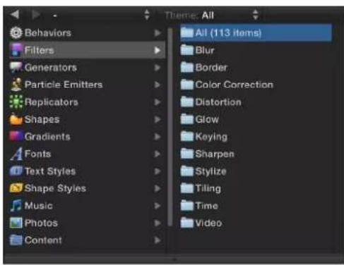
If you open a project created in a previous version of Motion containing filters or media that are no longer available, an alert message appears listing the missing or obsolete items. For filter descriptions in earlier versions of Motion, see the user manual associated with that version of the application.
Many third-party companies offer FxPlug filters and effects. If you install a third-party product, additional effects appear in the Filters list, usually in a separate, custom-named category.
For information on how to apply and modify filters, as well as a description of each filter, choose a topic in the Help table of contents (the sidebar to the left of this window).
Browse and preview filters
Filters appear in the Filters category in the Library, organized into subcategories specific to their function (such as Color Correction, Blur, and Tiling). After you select a filter in the stack, a preview and brief description of the filter appears in the Library preview area.

Browse for a filter
1 In the Library sidebar, click the Filters category.
A list of subcategories appears on the right side of the sidebar.
2 Click a filter subcategory.
A list of filters in that subcategory appears in the stack.
3 Click a filter in the stack to select it.
A preview and short description of the filter appear in the preview area at the top of the Library.
Apply and remove filters
Filters are applied to image layers (still images, video clips, shapes, and so on) in the Canvas, Layers list, or Timeline. An applied filter appears in the Layers list nested underneath its target layer (or a folder containing layers).
Important: Some filters can cause a group to be rasterized. When a group is rasterized, it is converted into a bitmap image. In 2D groups, the application of any filter causes rasterization. In 3D groups, the application of specific filters causes rasterization. For more information on rasterization, see Filters and rasterization on page 1050.
Apply a filter
Do one of the following:
- Drag a filter from the Library stack to an object in the Canvas, Layers list, or Timeline.
- Select an object or folder in the Canvas, Layers list, or Timeline, then select a filter from the Library stack and click Apply in the preview area.
- Select an object in the Canvas, Layers list, or Timeline, then choose an option from the Add Filter pop-up menu in the toolbar.

The filter is applied to an image layer.
Note: Although you can apply a filter from the Library to another effects object in the Layers list (a behavior or another filter), the filter affects the parent image layer, not the effects object.
Apply multiple filters to an object
When multiple filters are applied to an object, they have a cumulative effect. In the Layers list and Timeline, multiple filters appear nested under the object to which they are applied.

Do one of the following:
- Select the image layer or folder to apply the filters to, Shift-select contiguous filters or Command-select noncontiguous filters in the Library, then click Apply.
Shift-select contiguous filters or Command-select noncontiguous filters in the Library, then drag them to the image layer or folder in the Layers list, Canvas, or Timeline.
The filters are applied to the image layer in the order they are selected. For example, if you select Echo, Brightness, and Bevel, in that order, and then apply them to an object, their stacking order in the Layers list is Bevel above Brightness above Echo. The stacking order of filters determines the order of application which, in turn, affects the result of the composite effect. For more information about managing filter order, see Reorder filters on page 747.
Remove a filter from the Layers list or Timeline
- Select a filter that's been applied to an object in the Layers list or Timeline and do one of the following:
- Choose Edit > Delete (or press Delete).
- Choose Edit > Cut (or press Command-X).
• Control-click the filter and choose Cut or Delete from the shortcut menu.
The filter is removed from the project.
Remove a filter from the Filters Inspector
■ Select a filter in the Filters Inspector and do one of the following:
- Choose Edit > Delete (or press Delete).
- Choose Edit > Cut (or press Command-X).
Filter performance considerations
In large projects with complex motion graphics, applying multiple filters can adversely affect your computer's performance. To ensure smooth playback, use the following suggestions to optimize your use of filters:
- When multiple layers are affected by a filter, rather than applying the filter multiple times, place the targeted layers in a single group and apply the filter to the group.
- When applying filters to very large 2D groups (such as a group containing a growing particle system), select the Fixed Resolution checkbox in the Group Inspector. When Fixed Resolution is enabled, layers in the group that expand beyond the edges of the Canvas are cropped, reducing the processing load on your computer. For more information, see Constrain group size on page 160.
Filters affect text, 2D groups, and 3D groups in different ways. For more information, see 2D group properties on page 927 and 3D group properties on page 927.
Filters and cropping
In Motion's normal order of operations, cropping is always applied after filters are applied. In order to apply a filter after a crop, you can crop the image at the media level or apply the filter at the group level.
Crop the image at the media level
1 Select the image or clip in the Media list (in the Project pane).
2 In the Media Inspector, click the Crop disclosure triangle, then use the sliders to crop the image.
3 Select the layer in the Layers list, then apply the filter.
Apply a filter at the group level
1 In the Layers list, select the cropped layer, then choose Object > Group (or press Shift-Command-G).
2 Apply the filter to the new group.
Adjust filters
Adjust filters overview
After you apply a filter to an object, the filter is represented in the following places in the Motion project window, allowing you to make adjustments:
- In the Layers list, underneath the object it was applied to, where you can select the filter, turn its effect on or off, or lock it to prevent modification
- In the Timeline layers list, underneath the object it was applied to, where you can select the filter, turn its effect on or off, or lock it to prevent modification
- In the Timeline track area, as a purple bar underneath the blue bar of the object it was applied to, where you can select the filter and modify its timing by slipping or trimming the bar
- In the Canvas, where you can manipulate the filter's onscreen controls (where available)
- At the top of the Filters Inspector, where you can turn the filter's effect on or off and adjust all its parameters using sliders and other controls
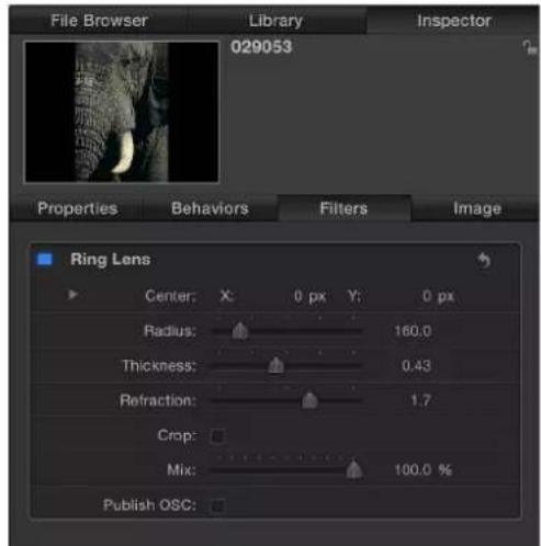
• In the HUD, where you can adjust many filter parameters using sliders and other controls
Modify an applied filter in the Filters Inspector or HUD
1 Select a filter in the Layers list, Timeline, or Filters Inspector.
2 Adjust parameters in the Filters Inspector or HUD.
Enable, rename, and lock filters
The Layers list and Timeline contain three basic controls for each filter:
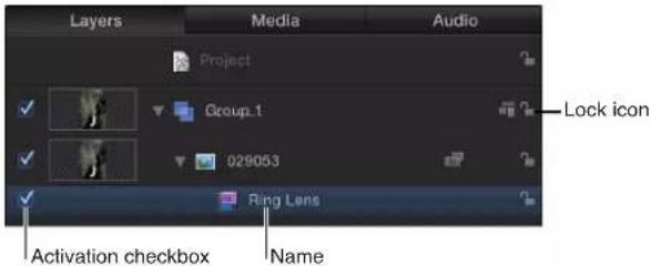
- Activation checkbox: Turns the filter on or off. Deselected filters are not rendered.
- Name: Displays the name of the filter. Customize the name by double-clicking it and entering a name.
- Lock: Locks or unlocks the filter. Locked filters cannot be adjusted.
Copy, paste, move, and duplicate filters
Because filters modify image layers (still images, video clips, shapes, and so on), an applied filter is attached to its target layer (or folder), nested underneath it in the Layer's list. You can copy, paste, and move filters like any other object in Motion, but a filter must be applied to an image layer or folder containing image layers. When you cut or copy a filter in the Layers list or Timeline, the copy preserves the current state of the filter's parameters.
Copy a filter
Do one of the following:
- Select the filter in the Layers list, Timeline, or Inspector, then choose Edit > Copy (or press Command-C).
In the Layers list or Timeline, Control-click the filter, then choose Copy from the shortcut menu.
Paste a filter
Do one of the following:
- Select the image layer or folder to apply the filter to, then choose Edit > Paste (or press Command-V).
- Control-click the image layer or folder to apply the filter to, then choose Paste from the shortcut menu.
The filter is applied to the image layer or folder with its parameter settings intact.
Note: Pasting a filter does not paste it at the playhead location. To move the filter to the playhead location, press the Shift key while dragging the pasted object in the Timeline or mini-Timeline. As you approach the playhead location, the filter snaps into place.
Move a filter
1 Drag the filter from its location onto another image layer or group.
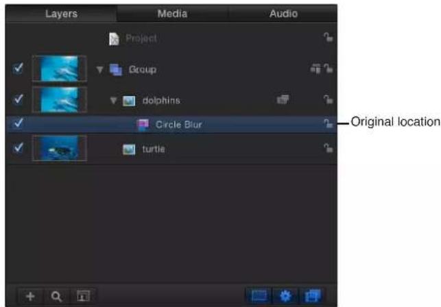
2 When the destination layer or group is highlighted, release the mouse button.
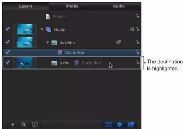
Duplicate a filter
Do one of the following:
- Option-drag the filter from its location onto another image layer or group.

■Choose Edit > Duplicate (or press Command-D).
The duplicate appears with "copy" appended to its name. When you use the Duplicate command (or keyboard shortcut), the duplicate appears above the original filter. Drag the duplicate to another layer or group. If you leave the duplicate where it is, the filter will be applied twice to the current image layer.
Reorder filters
Multiple filters applied to a single image layer (or folder) appear nested underneath it in the Timeline and Layers list, in the order the filters were selected in the Library. You can change the order of filter application to change how they interact.
Some filters yield better results depending on the order they are applied. For instance, never apply a color correction filter after applying a blur filter. A color correction is most effective when it acts on the original image, rather than a filtered distortion of the original image. The same holds true for chroma keying operations and any other effects process requiring unmediated color information.
Reorder a filter
Do one of the following:
- Drag the filter name or icon up or down in the list.
A position indicator shows the new location for the filter.
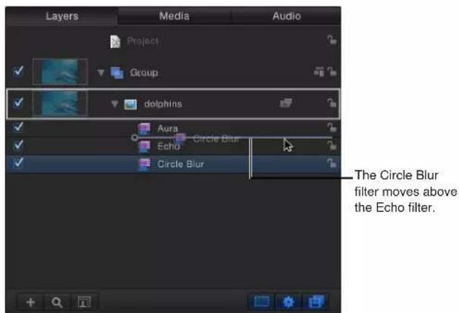
- Drag the filter name up or down in the Filters Inspector.
The filters are reordered.
Change filter timing
In Motion, the timing component of a filter is represented as purple a bar in the Timeline and mini-Timeline. Like other duration bars, filter timebars can be trimmed or moved (slipped) in their Timeline tracks to adjust the timing of an applied effect.
When you apply a filter to an object, the duration of the filter defaults to the length of the object it is applied to. In the following image, the purple bar represents the filter.
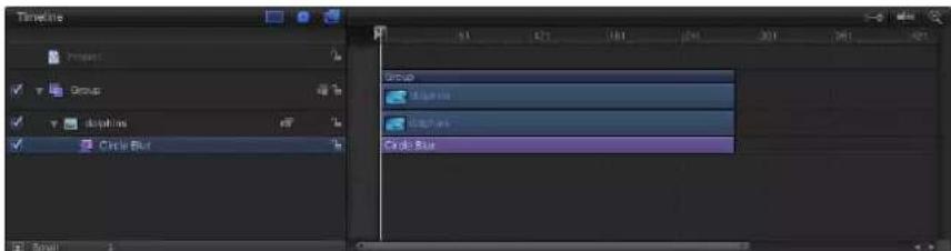
After you apply a filter, its duration can be modified to affect the target image for a specific amount of time. For example, applying the Circle Blur filter to an object blurs the object for the object's entire duration. However, changing In and Out points of the Circle Blur filter bar changes how long the blur is applied to the object.
Trim a filter in the Timeline
1 In the Timeline track area, position the pointer over the In or Out point (the left or right edge) of the filter bar to trim.
2 When the pointer becomes a trim pointer, drag the In or Out point to change the duration of the filter.
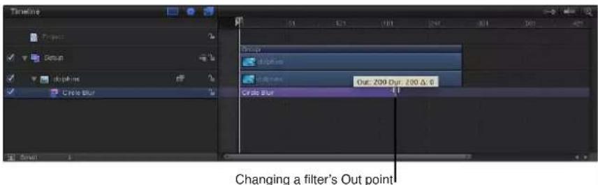
As you drag, the new In or Out point is displayed in a tooltip. Also displayed is the delta value, representing the amount of change.
In addition to changing a filter's duration, you can also slip a filter bar's position in the Timeline track area relative to the layer under which it's nested. Slip the bar's position to set the frame where a filter begins to take effect.
Slip a filter in the Timeline
- Drag the filter bar left or right to move its In point (and Out point) to a new frame.
The filter is moved but its duration is unaffected. While you drag, the new In and Out points are indicated, along with the amount of change (the delta).
Trim or slip a filter in the mini-Timeline
1 In the Layers list or Timeline, select the filter to trim.
2 Do one of the following:
• To trim the filter, position the pointer over the In or Out point (the left or right edge) of the filter bar in the mini-Timeline, then drag when the pointer changes to a trim pointer.
- To slip the filter, drag the filter bar in the mini-Timeline left or right to change its position in the Timeline.
Adjust filter onscreen controls
Many filters have onscreen controls that let you manipulate parameters visually. As you modify these controls by dragging them in the Canvas, the parameters are updated in the Inspector.
Display a filter's onscreen controls
1 Select the filter in the Layers list or Timeline.
2 If it isn't enabled, choose the Adjust Item tool from the pop-up menu in the toolbar.
If the Adjust Item tool is not enabled, no onscreen controls are available for the selected filter.

The onscreen controls appear in the Canvas.
Note: Many filter onscreen controls adjust multiple parameters. To modify one parameter at a time, use the Filters Inspector or HUD.
Types of onscreen controls
Several onscreen controls, such as Center, are common to many filters. However, some filters have unique onscreen controls. The following list provides examples of the types of controls available. If you're unsure of an onscreen control's function, drag it in the Canvas while viewing the Filters Inspector to see which parameter changes.
- Center: This is the most common filter onscreen control. Drag in the center of the circle to reposition the filter's Center parameter.
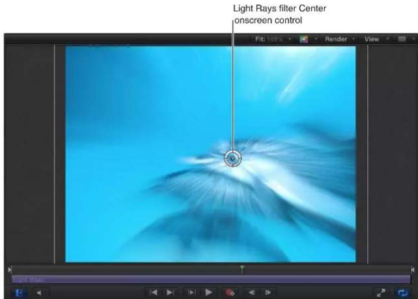
- Amount: This onscreen control has different representations, depending on the filter. In the Zoom Blur filter, drag the small circular handle (above the Center onscreen control) to adjust the Amount parameter.

In the Prism filter, drag the arrow handle inward or outward to adjust the Amount parameter. (Dragging the arrow in an arc adjusts the Angle parameter.)
- Angle: This onscreen control also has different representations, depending on the filter. In the Page Curl Filter, drag the circular middle handle to adjust the Angle parameter.

In the Kaleidotile filter, drag a corner handle to adjust the Angle parameter.
- Rotate/Rotation/Twirl: This onscreen control has different representations. In the Page Curl Filter, drag the outer arrow handle to adjust the Rotation parameter. In the Scrape, Stripes, and Target filters, drag the small outer handle to adjust the Rotation parameter.

- Radius/Thickness/Size/Falloff: This onscreen control has different representations. In the Disc Warp and Circle Blur filters, drag the large ring inward and outward to adjust the Radius parameter. In the Droplet and Ring Lens filters, drag the inner ring to adjust the Radius and Thickness parameters simultaneously. Drag in the area between the inner and outer rings to adjust the Radius parameter. Drag the outer ring to adjust the Thickness parameter.
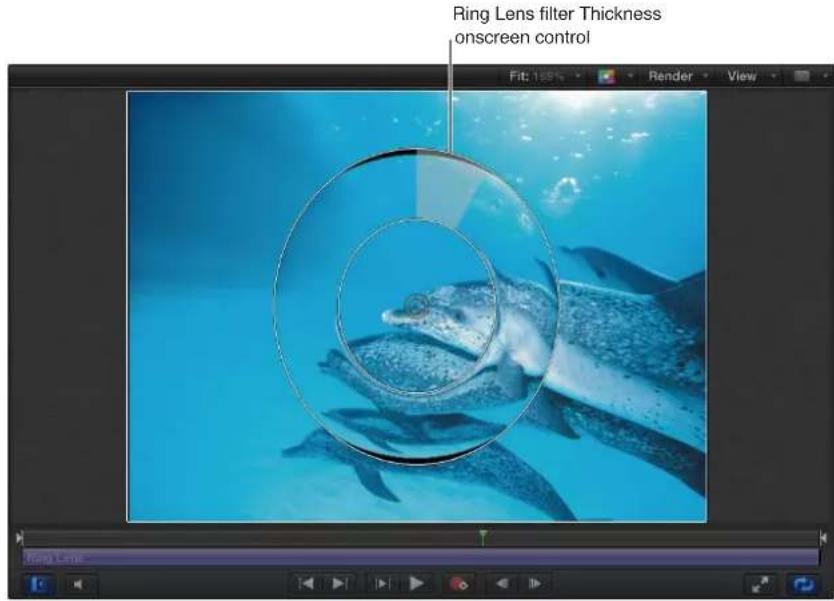
In the Vignette filter, drag the inner ring to adjust the Size parameter. Drag the outer ring to adjust the Falloff parameter. Drag in the area between the inner and outer ring to adjust both parameters simultaneously.
- Segment Angle/Offset Angle: This onscreen control has multiple representations. In the Kaleidoscope filter, drag the outer handle to adjust the Segment Angle parameter. Drag the middle handle (between the center and outer handle) to adjust the Offset Angle parameter.
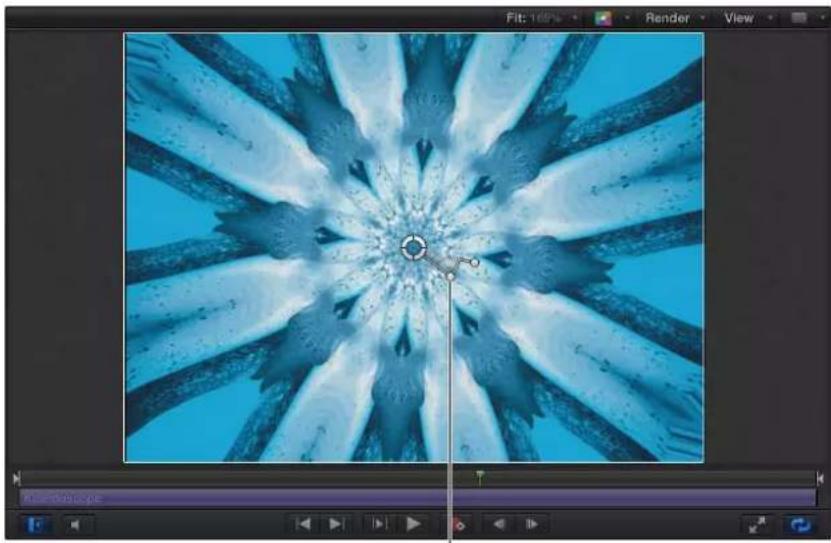
natural_image
Abstract digital artwork of a blue water crystal with radial blades and central circular highlights (no text or symbols)Kaleidoscope filter Offset Angle onscreen control
Animate filter parameters
Although several Motion filters are animated (Bad Film, Bad TV, and Overdrive, for example), most are not. However, it's easy to create filter animations by using keyframes to change parameters over time.
Animate filter parameters using Record
1 Select the filter to animate.
2 Click the Record button (or press A) to enable recording.
3 Move the playhead to the frame where you want to add a keyframe.
4 In the Filters Inspector or HUD change the parameter to a new value.
A keyframe is added when you modify a parameter value.
5 Go to the next frame where you want a keyframe.
6 Repeat steps 3–5 until you finish.
Click the Play button (or press the Space bar) to see the results.
Animate filter parameters using Record and the onscreen controls
1 Select the filter to animate.
If the filter has an onscreen control, the Adjust Item tool is selected and the onscreen controls appear in the Inspector.
2 Click the Record button (or press A) to enable recording.
3 Move the playhead to the frame where you want to add a keyframe.
4 In the Canvas, adjust the onscreen control.
A keyframe is added when you modify a parameter value using the onscreen control.
5 Go to the next frame where you want a keyframe.
6 Repeat steps 3–5 until you finish.
Click the Play button (or press the Space bar) to see the results.
Animate filter parameters using the Add Keyframe button or the Animation menu
1 Select the filter to animate.
2 Move the playhead to the frame where you want to add a keyframe.
3 In the Filters Inspector, do one of the following:
- Position the pointer over the right side of the row of the parameter to animate. When the Add Keyframe button appears, click it.
- Position the pointer over the right end of the parameter row, click the downward arrow to open the Animation pop-up menu, then choose Add Keyframe from the menu.

-Click to show the Animation pop-up menu
- Control-click the parameter name, then choose Add Keyframe from the shortcut menu.
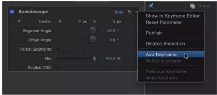
Adding a keyframe in the Animation menu
A keyframe is added at the current frame.
4 In the Inspector or HUD, or via the onscreen controls (if available), adjust the parameter value.
5 Go to the next frame where you want a keyframe.
6 Repeat steps 3–5 until you finish.
Click the Play button (or press the Space bar) to see the results.
Note: Add a keyframe before adjusting a parameter value.
For more detail on using keyframes and the Animation menu, see Animation menu on page 449.
Apply behaviors to filter parameters
Animating filter parameters is easy using Parameter behaviors. For example, if you have an object with an applied Circle Blur filter, you can randomize the amount of blur applied to the object over time.
Apply a Parameter behavior to a filter parameter
1 Select the object with the applied filter.
2 In the Filters Inspector, do one of the following:
- Choose Add Parameter Behavior from the Animation pop-up menu (on the right side of the parameter row), then choose a behavior from the submenu.
- Control-click the parameter name, choose Add Parameter Behavior from the shortcut menu, then choose a behavior from the submenu.

A behavior icon (a gear) appears in the parameter row, and the Behaviors pane opens in the Inspector.

For more detailed information, see Parameter behaviors overview on page 332.
Publish filter parameters and onscreen controls
When you create effects templates in Motion 5 for use in Final Cut Pro X, you can choose which parameter controls are available in the special effect, title, transition, or generator when it is applied to a clip in Final Cut Pro. For example, if you create a Final Cut effect template using a Scrape filter, you can export the Rotation control to Final Cut Pro, but not the Amount or Mix sliders. In essence, you place limits on how the effect can be modified in Final Cut Pro by deciding which parameters to publish. It's easy to publish specific filter controls, including onscreen controls, in Final Cut templates. You do so via the Publish command in the Motion Animation menu.
For more information on publishing and Final Cut Pro X templates, see Final Cut Pro X templates overview on page 385.
Publish filter parameters in a Final Cut template
1 In an open Final Cut template project, select a filter.
2 In the Filters Inspector, do one of the following:
- Click the Animation menu (the downward triangle that appears when you move the pointer over the right end of the parameter row), then choose Publish from the pop-up menu.
- Control-click the parameter name, then choose Publish from the shortcut menu.
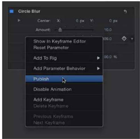
Important: Choosing Publish in the filter name row (the row containing the blue activation checkbox) publishes the filter's on/off checkbox—but not parameter controls for the filter (sliders, dials, and so on). Publishing a filter's checkbox lets you turn on or off all published parameters simultaneously in Final Cut Pro X.
Publish a filter's onscreen controls
1 In the open template project, select a filter.
2 In the Filters Inspector, select the Publish OSC checkbox.
Review parameters set to be published in your template
1 In the Layers list, click the Project object.
2 In the Project Inspector, click Publishing.
All parameters (for all object types) set to be published appear in the Publishing pane.
Note: Published filter onscreen controls do not appear in the Publishing pane.
Unpublish filter parameters in the Filters Inspector
■In the Filters Inspector, do one of the following:
- Click the Animation menu (the downward triangle that appears when you move the pointer over the right end of the parameter row), then choose Unpublish from the pop-up menu.
- Control-click the parameter name, then choose Unpublish from the shortcut menu.
Unpublish filter parameters in the Publishing pane
1 In the Layers list, click the Project object.
2 In the Project Inspector, click Publishing, then do one of the following:
- Click the Animation menu (the downward triangle that appears when you move the pointer over the right end of the parameter row), then choose Unpublish from the pop-up menu.
- Control-click the parameter name, then choose Unpublish from the shortcut menu.
Manipulate alpha channels using filters
There are filters you can use to manipulate or even replace a layer's alpha channel. For example, the Keying filters create transparency by generating an alpha channel based on colors or luminance values in that layer. Keying filters are usually used on layers that have no alpha channel information; these filters add a new alpha channel to the layers to which they're applied. For more information on the use of the keying filters, see Keying overview on page 487.
The process of improving a keying effect or of customizing an alpha channel created using shape or image masks may require the use of special filters. Although you can apply any filter to a shape or image mask to modify that mask's effect, the filters described in this section modify a layer's entire alpha channel, including the sum of all masks and other filters applied to that layer.
For example, if you've applied a keying filter, you can use the following filters to modify the resulting alpha channel even though no mask appears for that layer in the Layers list or Timeline.
- Channel Blur: This filter, found in the Blur category of the Filters library, lets you selectively blur the alpha channel. You can set the amount of horizontal and vertical blur independently.

natural_image
Close-up of an African elephant's head and face against a solid yellow background (no text or symbols visible)Original (color channel)
natural_image
Close-up of an elephant's head with white fur and dark spots against a solid gold background (no text or symbols)Original (alpha channel)

natural_image
Close-up portrait of an elephant with large ears and visible teeth against a solid yellow background (no text or symbols)Channel Blur (color channel)

natural_image
Blurred abstract image with no discernible text, symbols, or structured contentChannel Blur (alpha channel)
- Matte Magic: This filter, found in the Keying subcategory of the Filters library, lets you manipulate various qualities of an alpha channel, shrinking, feathering, and eroding the alpha channel to fine-tune it. For more information, see Matte Magic on page 508.
Blur filters
Blur filters overview
Blur filters can be used to simulate the real-world blurring that occurs due to the depth of field in photographed material. They can also be used to create designed effects.
For a description of each Blur filter, see the filters list in the Help table of contents (the sidebar to the left of this window).
Channel Blur
Gives you control over blurring each color channel of an object. The Channel blur can be applied selectively to each color channel of an object: red, green, blue, and alpha. Blurring individual channels lets you create customized glow effects by retaining sharpness in selected channels while softening others.

natural_image
Orange and white clownfish swimming among green sea anemones (no text or symbols visible)Original image Channel Blur filter applied

natural_image
Close-up of a clownfish swimming among green sea anemones (no text or symbols visible)(Amount = 250, Blur Red on)
Parameters in the Inspector
- Amount: Sets the radius of the object blur.
- Blur Red: Sets the blur to affect the red channel.
- Blur Green: Sets the blur to affect the green channel.
- Blur Blue: Sets the blur to affect the blue channel.
- Blur Alpha: Sets the blur to affect the alpha channel.
• Horizontal: Sets the percentage of maximum horizontal blur. This is a percentage of the Amount parameter. - Vertical: Sets the percentage of maximum vertical blur.
- Crop: Sets whether the image is cropped beyond its original borders.
- Mix: Sets the percentage of the original image to be blended with the blurred image.
Circle Blur
Creates a circular blur within an image, specified by a center point that sets the center of the blur effect and a radius that sets the size of the affected region. The amount of blur in the affected area can also be customized.
This filter is useful for blurring a limited area in an image. For more sophisticated control of the image region to be blurred, use the Compound Blur filter.
This filter causes rasterization in 3D groups. For more information on rasterization, see Groups and rasterization on page 1045.

natural_image
Close-up of a golden crab floating in water, no visible text or symbolsOriginal image Circle Blur filter applied

natural_image
Close-up of a yellow crab standing in shallow water, no visible text or symbolsParameters in the Inspector
- Center: Sets the position of the center of the blur effect. Drag the Center onscreen control to adjust its value in the Canvas.
- Amount: Sets the amount of the blur.
- Radius: Sets the radius of the circle defining the blurred area. Drag the outer circle of the onscreen controls to adjust the Radius value in the Canvas.
- Crop: Sets whether the image is cropped beyond its original borders.
- Mix: Sets the percentage at which the original image is blended with the blurred image.
- Publish OSC: Publishes the filter's onscreen controls in Final Cut Pro X. For more information on creating content for use in Final Cut Pro, see Final Cut Pro X templates overview on page 385.
Compound Blur
Blurs an object using the specified channel of a designated map image. You can use any shape, text object, still image, or movie file as the map image. You can select any red, green, blue, alpha, or luminance channel to create the shape of the blur.
Tip: Use this filter to blur specific sections of an image. For example: trace the subject of the image to blur with a Bezier or B-spline shape, then assign this shape as the Blur Map image. Use its Luminance or Alpha channel to define the blurred area, then turn off the original shape object in the Layers list or Timeline to hide the source of the blur. For more information, see Edit shape fill, outline, and feathering on page 837.
This filter causes rasterization in 3D groups. For more information on rasterization, see Groups and rasterization on page 1045.

natural_image
Close-up of an orange and white jellyfish swimming among a translucent sea anemone (no text or symbols visible)Original image Map image

natural_image
Black and white striped pattern with vertical stripes (no text or symbols)
natural_image
Close-up of a small orange fish swimming in a dense coral reef (no text or symbols visible)Compound Blur filter applied
Parameters in the Inspector
• Amount: Sets the radius of the blur.
- Blur Map: Displays a thumbnail of the current map. To add an object (image, shape, text, and so on) to use as the blur map, drag the object to the Blur Map well.
Note: You can also apply or replace the blur map by dragging the source object onto the filter in the Layers list.
- Map Channel: Sets the channel to be blurred. The blur is applied to the red, green, blue, alpha, or luminance channel.
- Invert Map: Sets whether the blur map is inverted.
- Stretch Map: Stretches (or compresses) the map image so it exactly overlaps the image the filter is applied to.
• Horizontal: Sets the percentage of maximum horizontal blur.
• Vertical: Sets the percentage of maximum vertical blur. - Mix: Sets the percentage of the original image to be blended with the blurred image.
Defocus
Mimics the out-of-focus effect that occurs through a real-world camera lens. The Defocus filter blurs an image while creating realistic lens artifacts that mimic the aperture shape in brighter areas of the image. The shape of the blur can be customized.
Tip: Use this filter when you are trying to blur an image to match video or stills shot with a camera. For example, if you key a woman standing in front of a blue screen, and you intend to place a background image behind her to make it look like she's standing in a valley with mountains in the background, use the Defocus filter instead of a Gaussian Blur to create a realistic depth-of-field effect for the mountains in the distance.

natural_image
Two giraffes facing each other against a solid blue background (no text or symbols visible)Original image

natural_image
Two giraffes facing each other against a solid blue background (no text or symbols visible)Defocus filter applied
Parameters in the Inspector
- Amount: Sets the radius of the defocus.
- Gain: Sets the amount of gain applied to the high luminance areas.
- Shape: Sets the shape of the lens aperture to Circle or Polygon.
- Sides: Sets the number of sides of the lens aperture, if Shape pop-up menu is set to Polygon.
- Rotation: Sets the angle of rotation of the polygonal lens aperture, if Shape is set to Polygon.
- Aspect Ratio: Sets the aspect ratio of the lens aperture.
- Crop: Sets whether the blur is cropped at the object's original border.
- Mix: Sets the percentage of the original image to be blended with the blurred image.
Directional Blur
Blurs an object along a specific angle. This filter creates a blurred streaking effect.
Note: The more filters you use in a project, the more you impact the performance of Motion.

natural_image
Group of purple and blue fish swimming in a dark aquatic environment (no text or symbols visible)Original image Directional Blur filter applied

natural_image
Abstract close-up of green and purple cellular structures with blue fluorescent lines (no text or symbols)Parameters in the Inspector
- Amount: Sets the radius of the blur. Drag the arrow onscreen control to adjust the amount (and angle) of the blur in the Canvas.
- Angle: Sets the angle of the direction of movement. Drag the arrow onscreen control to adjust the angle (and amount) of the blur in the Canvas.
- Crop: Sets whether the blur is cropped at the object's original boundaries.
- Mix: Sets the percentage of the original image to be blended with the blurred image.
- Publish OSC: Publishes the filter's onscreen controls in Final Cut Pro X. For more information on creating content for use in Final Cut Pro, see Final Cut Pro X templates overview on page 385.
Gaussian Blur
Creates a soft blur effect. The Gaussian blur is the softest blur effect you can apply and is a frequently used blur effect. By default, this filter affects the image uniformly, although you can control the amount of horizontal and vertical blur independently.
Gaussian blur is relevant for most motion graphics tasks, and can be animated for various focus-control effects. However, to more accurately simulate camera focus, the Defocus filter might be a better choice. For more information on the Defocus filter, see Defocus on page 760.

natural_image
Close-up of a dragon's eye with visible iris and pupil, no text or symbols presentOriginal image

natural_image
Close-up of a cat's eye with yellow iris and dark fur (no text or symbols visible)Gaussian Blur filter applied
Parameters in the Inspector
- Amount: Sets the radius of the blur.
• Horizontal: Sets the percentage of the Amount applied in the horizontal direction.
• Vertical: Sets the percentage of the Amount applied in the vertical direction. - Crop: Sets whether the object is cropped at its original boundaries.
- Mix: Sets the percentage of the original image to be blended with the blurred image.
Gradient Blur
Creates a graduated blur between two points. Point one is the beginning of the blur, and the point at which the image is at its sharpest. Point two is the end of the blur, and the point at which the image is at its blurriest, depending on the value set in the Amount parameter.
This filter causes rasterization in 3D groups. For more information on rasterization, see Groups and rasterization on page 1045.

natural_image
Close-up of a red, elongated object partially submerged in green seaweed-like aquatic plants (no text or symbols visible)Original image

natural_image
Close-up of a red, oval-shaped object partially submerged in dense green aquatic plants (no text or symbols visible)Gradient Blur filter applied
Parameters in the Inspector
- Point 1: Sets the position of the start point of the gradient. Drag the Point 1 onscreen control (the lower-left point) to adjust the X and Y position of the blur start point in the Canvas.
- Point 2: Sets the position of the end point of the gradient. Drag the Point 2 onscreen control (the upper-right point) to adjust the X and Y position of the blur end point in the Canvas.
- Amount: Sets the radius of the blur.
- Crop: Sets whether the object is cropped at its original boundaries.
- Mix: Sets the percentage of the original image to be blended with the blurred image.
- Publish OSC: Publishes the filter's onscreen controls in Final Cut Pro X. For more information on creating content for use in Final Cut Pro, see Final Cut Pro X templates overview on page 385.
Prism
Blurs and refracts the image as if seen through a prism, creating a rainbow effect.

natural_image
Two dolphins leaping out of the ocean under a clear sky (no text or symbols visible)Original image

natural_image
Two dolphins leaping out of the ocean under a clear sky (no text or symbols visible)Prism filter applied
Parameters in the Inspector
- Amount: Sets the radius of the blur. Drag the arrow onscreen control inward and outward to adjust the amount (and angle) of the blur in the Canvas.
- Angle: Sets the angle of refraction. Drag the arrow onscreen control in an arc to adjust the angle of the blur in the Canvas.
- Crop: Sets whether the object is cropped at its original boundaries.
- Mix: Sets the percentage of the original image to be blended with the blurred and refracted image.
- Publish OSC: Publishes the filter's onscreen controls in Final Cut Pro X. For more information on creating content for use in Final Cut Pro, see Final Cut Pro X templates overview on page 385.
Radial Blur
Creates a rotational blur centered on a point. The effect is similar to the motion blur you would see if an image were spinning quickly.

natural_image
A white bird in flight against a clear blue sky, wings fully extended (no text or symbols visible)Original image
natural_image
Bird in flight against a clear blue sky, wings fully extended (no text or symbols visible)Radial Blur filter applied
Parameters in the Inspector
- Center: Sets the position of the center of the radial blur. Drag the Center onscreen control to adjust its value in the Canvas.
- Angle: Sets the angle of rotation of the blur.
- Crop: Sets whether the object is cropped at its original boundaries.
- Mix: Sets the percentage of the original image to be blended with the blurred image.
- Publish OSC: Publishes the filter's onscreen controls in Final Cut Pro X. For more information on creating content for use in Final Cut Pro, see Final Cut Pro X templates overview on page 385.
Soft Focus
Creates an effect similar to duplicating an object, applying the Screen blend mode to composite the object against itself, then blurring an overlapping object—within a single filter. The Strength parameter controls how much of the blurred image is added back to the original image.

natural_image
A lion standing in a dry grassland field, no visible text or symbols.Original Image
natural_image
A lion standing in a dry grassland field, no visible text or symbols.Soft Focus filter applied
Parameters in the Inspector
- Amount: Sets the radius of the blur.
• Strength: Sets the amount of opacity of the blurred composite.
• Horizontal: Sets the percentage of the maximum horizontal blur.
• Vertical: Sets the percentage of the maximum vertical blur. - Crop: Sets whether the object is cropped at its original boundaries.
- Mix: Sets the percentage of the original image to be blended with the blurred image.
Variable Blur
Creates a tunnel focus effect with a blur applied inside or outside a circular region. If the inner radius of the circle is larger than the outer radius of the circle, the blur is applied inside the circle.
This filter causes rasterization in 3D groups. For more information on rasterization, see Groups and rasterization on page 1045.

natural_image
Close-up of a tiger swimming in water with green grass (no text or symbols visible)Original image
natural_image
Close-up of a tiger's face in profile, focusing on its eyes and mouth, surrounded by green foliage (no text or symbols visible)Variable Blur filter applied (outside of circle)
Parameters in the Inspector
- Center: Sets the position of the center of the circle. Drag the center onscreen control to adjust its value in the Canvas.
- Amount: Sets the percentage of the blur.
- Inner Radius: Sets the inner radius of the circle.
- Outer Radius: Sets the outer radius of the circle.
- Crop: Sets whether the object is cropped at its original boundaries.
- Mix: Sets the percentage of the original image to be blended with the blurred image.
- Publish OSC: Publishes the filter's onscreen controls in Final Cut Pro X. For more information on creating content for use in Final Cut Pro, see Final Cut Pro X templates overview on page 385.
Zoom Blur
Creates a blur that simulates a fast camera zoom-in to a point. This filter causes rasterization in 3D groups. For more information on rasterization, see Groups and rasterization on page 1045.
natural_image
Close-up of a pufferfish with spiky tentacles and translucent body, resting on a blue mesh surface (no text or symbols visible)Original image

natural_image
Close-up of a dandelion seed head with bright, spiky lobes against a dark blue background (no text or symbols)Zoom Blur filter applied
Parameters in the Inspector
- Look: Sets the type of blur operation. This pop-up menu has two options:
-
Variable: The blur increases toward the edges of the image. This option is faster when using high blur values.
•Uniform: The blur is consistent from the center of the image outward. -
Amount: Sets the radius of the blur. Drag the small circle (above the Center onscreen control) to adjust the amount of the blur in the Canvas.
- Swirl: Sets the quantity and direction of the swirl. Positive and negative values affect the direction of the swirl.
- Center: Sets the position of the center of the blur. Drag the Center onscreen control to adjust its value in the Canvas.
- Crop: Sets whether the object is cropped at its original boundaries.
- Mix: Sets the percentage of the original image to be blended with the blurred image.
- Publish OSC: Publishes the filter's onscreen controls in Final Cut Pro X. For more information on creating content for use in Final Cut Pro, see Final Cut Pro X templates overview on page 385.
Border filters
Border filters overview
Border filters allow you to frame objects in a composition in various ways.
For a description of each Border filter, see the filters list in the Help table of contents (the sidebar to the left of this window).
Bevel
Creates a bevelled border around the edges of an image by superimposing an angled frame over the original image. The simulated direction of reflected light and opacity of the bevel can be adjusted to vary the effect.
This filter causes rasterization in 3D groups. For more information on rasterization, see Groups and rasterization on page 1045.
natural_image
Two giraffes facing each other against a solid blue background (no text or symbols visible)Original image

natural_image
Two giraffes facing each other against a solid blue background (no text or symbols visible)Bevel filter applied
Parameters in the Inspector
• Light Angle: Sets the angle at which the light hits the bevel.
- Bevel Width: Sets the width of the bevel as a percentage of the area of the object.
- Opacity: Sets the opacity of the bevel, ranging from 0 (invisible) to 1.0 (opaque).
• Light Color: Picks the color of the light hitting the bevel border. Color controls can be expanded with the disclosure triangle to include Red, Green, and Blue sliders to more precisely select colors.
- Mix: Sets the percentage of the original image to be blended with the beveled image.
Simple Border
Creates a solid color border of variable width around the edges of an image. This filter causes rasterization in 3D groups. For more information on rasterization, see Groups and rasterization on page 1045.

natural_image
Lion resting on a tree branch under clear sky (no text or symbols visible)Original image

natural_image
A lion resting on a tree branch in a natural outdoor setting (no text or symbols visible)Simple Border filter applied
Parameters in the Inspector
- Width: Sets the thickness of the border.
• Color: Picks the color of the border. The color controls can be expanded with the disclosure triangle to include Red, Green, Blue, and Opacity sliders to more precisely select the color of the border. - Border Placement: Sets where the border is drawn on the image. This pop-up menu has three options:
•Inside: Places the border along the inner edge of the image.
•Overlap: Centers the border over the inner and outer edges of the image. - Outside: Draws the border along the outer edge of the image.
- Mix: Sets the percentage of the original image to be blended with the bordered image.
Widescreen
"Letterboxes" an object by masking the object at its top and bottom to simulate different video and film aspect ratios. Because this filter masks the image, what appears behind the object is the background color of the project or the object beneath the masked object in the composite. You can add a border to the masked image and customize the color and size of the border.
This filter causes rasterization in 3D groups. For more information, see Groups and rasterization on page 1045.
Note: Because the Widescreen filter masks the object it is applied to, the object is not cropped and retains its original shape.
natural_image
A cheetah running through golden grass, no visible text or symbols.Original image

natural_image
A cheetah standing in a golden grassy field, no visible text or symbols.Widescreen filter applied
Parameters in the Inspector
- Aspect Ratio: Sets the aspect ratio of the mask. Values include 1.66:1, 1.70:1, 1.78:1, 1.85:1, 2.35:1, 2.55:1, and 3.00:1.
- Offset: Sets the position of the mask relative to the Y center of the object. Values range from -1.0 (the bottom of the object) to 0 (the center of the object) to 1.0 (the top of the object).
• Border Size: Sets the thickness of the border.
Note: The border has no effect on the aspect ratio mask. It adds a frame at the edge of the image created by the mask.
- Border Color: Picks the color of the border. Color controls can be expanded with the disclosure triangle to include Red, Green, Blue, and Opacity sliders to more precisely select the color of the border.
- Mix: Sets the percentage of the original image to be blended with the letterboxed image.
Color Correction filters
Color Correction filters overview
The filters in the Color Correction category can be used in a number of ways. For example, you can set a mood by making an image sepia-colored. In addition, these filters can fix a problem with contrast, color, gamma, or brightness.
For a description of each Color Correction filter, see the filters list in the Help table of contents (the sidebar to the left of this window).
Brightness
Boosts or lowers the uniform brightness of an image by a specified amount.
Although this may seem to be the first filter to use to correct for improper exposure in an image, Brightness boosts or lowers everything in an image at once. This means that raising the brightness in an image raises brightness everywhere, including in the shadows. Consequently, a brightened image can look washed out.
However, this filter is useful for modifying the edges and effects of shapes, masks, particle systems, and generators.
A better filter for exposure correction is the Gamma filter. For more information, see Gamma on page 776.

natural_image
Two young cubs resting on a fallen tree branch in a grassy outdoor setting (no text or symbols visible)Original image

natural_image
Two young lion cubs resting on a tree branch in a grassy outdoor setting (no text or symbols visible)Brightness filter applied
Parameters in the Inspector
- Brightness: Sets the multiplying brightness value applied to the object.
- Mix: Sets the percentage of the original image to be blended with the color-corrected image.
Channel Mixer
Allows cross-mixing of red, green, blue, and alpha channels into one another. The Channel Mixer filter's main parameters are divided into four sections—Red Output, Green Output, Blue Output, and Alpha Output—each of which manipulates an individual channel. In each section, you can adjust the value of the relevant color channel added to or subtracted from the red, green, blue, and alpha channels.
Parameters in the Inspector
- Red - Red: Sets the amount of input red added to the output red. The default value is 1.0, which leaves the red channel unmodified. As this value increases, the output value of red increases by the amount of input red multiplied by the value of Red - Red.
- Red - Green: Sets the amount of input green added to the output red. The default value is 0, which leaves the red channel unmodified. As this value increases, the output value of red increases by the amount of input green multiplied by the value of Red - Green.
- Red - Blue: Sets the amount of input blue added to the output red. The default value is 0, which leaves the red channel unmodified. As this value increases, the output value of red increases by the amount of input blue multiplied by the value of Red - Blue.
- Red - Alpha: Sets the amount of input alpha added to the red channel. The default value is 0, which leaves the red channel unmodified. As this value increases, the value of red increases by the amount of input alpha multiplied by the value of Red - Alpha.
- Green - Red: Sets the amount of input red added to the output green. The default value is 0, which leaves the green channel unmodified. As this value increases, the output value of green increases by the amount of input red multiplied by the value of Green - Red.
- Green - Green: Sets the amount of input green added to the output green. The default value is 1.0, which leaves the green channel unmodified. As this value increases, the output value of green increases by the amount of input green multiplied by the value of Green - Green.
- Green - Blue: Sets the amount of input blue added to the output green. The default value is 0, which leaves the green channel unmodified. As this value increases, the output value of green increases by the amount of input blue multiplied by the value of Green - Blue.
- Green - Alpha: Sets the amount of input alpha added to the green channel. The default value is 0, which leaves the green channel unmodified. As this value increases, the value of green increases by the amount of input alpha multiplied by the value of Green - Alpha.
- Blue - Red: Sets the amount of input red added to the output blue. The default value is 0, which leaves the blue channel unmodified. As this value increases, the output value of blue increases by the amount of input red multiplied by the value of Blue - Red.
- Blue - Green: Sets the amount of input green added to the output blue. The default value is 0, which leaves the blue channel unmodified. As this value increases, the output value of blue increases by the amount of input green multiplied by the value of Blue - Green.
- Blue - Blue: Sets the amount of input blue added to the output blue. The default value is 1.0, which leaves the blue channel unmodified. As this value increases, the output value of blue increases by the amount of input blue multiplied by the value of Blue - Blue.
- Blue - Alpha: Sets the amount of input alpha added to the blue channel. The default value is 0, which leaves the blue channel unmodified. As this value increases, the value of blue increases by the amount of input alpha multiplied by the value of Blue - Alpha.
- Alpha - Red: Sets the amount of input red added to the output alpha. The default value is 0, which leaves the alpha channel unmodified. As this value increases, the output value of pixels with nontransparent alpha increases by the amount of input red multiplied by the value of Alpha - Red.
- Alpha - Green: Sets the amount of input green added to the output alpha. The default value is 0, which leaves the alpha channel unmodified. As this value increases, the output value of pixels with nontransparent alpha increases by the amount of input green multiplied by the value of Alpha - Green.
- Alpha - Blue: Sets the amount of input blue added to the output alpha. The default value is 0, which leaves the alpha channel unmodified. As this value increases, the output value of pixels with nontransparent alpha increases by the amount of input blue multiplied by the value of Alpha - Blue.
- Alpha - Alpha: Sets the amount of input alpha added to the output alpha channel. The default value is 1.0, which leaves the alpha channel unmodified. As this value increases, more alpha is added to the pixels in the alpha channel. Values above 1 have no effect, unless the alpha is eroded by negative values in other alpha parameters.
- Monochrome: Sets the filter to monochrome mode. In monochrome mode, all three color channels are affected by the Red controls.
- Allow Mono > 1: Allows monochromatic color channels to be set to values greater than 1. By default, this checkbox is selected. Color values are normally between 0 and 1, but can go over 1 or below 0 because the project's bit depth is set to 16 bits per channel. If this checkbox is deselected, each Red color output control is linked. Moving any of them causes the others to adjust so the total value remains at 1.0. The filter must be in monochrome mode for this parameter to be active.
- Include Alpha: Sets whether to include the alpha channel in the mono calculation. The filter must be in monochrome mode for this parameter to be active.
- Mix: Sets the percentage of the original image to be blended with the color-corrected image.
Color Balance
Color balance refers to the relative strength of the red, green, and blue channels that constitute an image. For example, a blue-tinted image has a strong blue channel and weaker green and red channels.

natural_image
Two rhinoceroses walking across a grassy field with rolling hills in the background (no text or symbols visible)The Color Balance filter lets you adjust the relative balance of all three color channels of an image at once—for example, lowering the blue channel and raising the red and green channels to reduce blue tinting and yield an image that appears more orange and warm.

natural_image
Two rhinoceroses walking across a grassy field with rolling hills in the background (no text or symbols visible)Color balance also relates to color temperature, which describes the quality of light in an image. For example, sunlight is generally more bluish than tungsten light, which is more orange. In professional film and video productions, white-balancing the camera before shooting usually ensures that whites in an image are neutral (with all three color channels balanced evenly). However, film stocks, optical filters, and digital white-balance settings can modify the tint of an image.
Note: The imbalanced color channels caused by a dominant color temperature in the lighting of an image is often referred to as a color cast.
You can use the Color Balance filter to adjust the three color channels of an image to eliminate a color cast or introduce one. Here are some uses for the Color Balance filter:
- To correct problems in lighting—for example, rebalancing an image that's too orange to appear more neutral.
• To match two images to one another—for example, matching the quality of light on an actor in a foreground green screen clip to the lighting in a background image.
• To stylize the color of an image used in a creative composition—for example, creating a high-contrast, blue-tinted silhouette from the image of two actors dancing for a title sequence.
The Color Balance filter doesn't just let you rebalance the overall strength of an image's three color channels, it also lets you rebalance color specifically in three tonal zones of an image: shadows, midtones, and highlight. Three correspondingly named color controls let you make color balance adjustments in each zone of image tonality.

To make an adjustment to a zone, click the corresponding color well to open the Mac OS Colors window, then drag in the color wheel. As you drag, the image updates. Dragging in a specific hue's direction rebalances the image, tinting it with that hue. The farther towards the edge of the color wheel you drag, the more intensely you tint the image.

natural_image
Two rhinoceroses in a grassland, one with a cursor pointing at the camera (no text or symbols on the main image)Tip: You can use any controls in the OS X Colors window to make color adjustments, including sliders, web-safe colors, and the magnifying glass picker. Further, you can save frequently used tints by dragging a color from the color bar at the top to an empty white swatch below. Clicking a filled swatch selects that color.
The adjustments to shadows, midtones, and highlights of an image overlap widely. For example, adjustments to shadows affect the darkest parts of the image the most, but the effect also influences midtones and lower highlights. This overlap ensures that adjustments you make blend seamlessly with the original colors of the image.
For a practical example of using the Color Balance filter, see Use the Color Balance filter to match two composited layers on page 772.
Note: Although you can make small contrast adjustments using the vertical lightness slider in the color wheel pane of the Colors window, it's better to use the Contrast or Levels filters to make adjustments to the overall lightness and darkness of an image.
Parameters in the Inspector
- Shadows: Adjusts color channels in the darkest regions of the image. Click the color well to open the Colors window, then adjust the color balance of the darkest portion of the image. An eyedropper lets you sample any color in the Canvas to use for balancing the image. You can also click the disclosure triangle to reveal individual red, green, and blue channel sliders, with a numeric range from 0 (no color) to 0.5 (unaltered color) to 1.0 (maximum color).
- Red: Adjusts the color gain applied to the shadow range of the red color channel.
- Green: Adjusts the color gain applied to the shadow range of the green color channel.
- Blue: Adjusts the color gain applied to the shadow range of the blue color channel.
- Midtones: Adjusts color channels in midtone regions of the image. Click the color well to open the Colors window, then adjust the color balance of the range of color falling between shadows and highlights. An eyedropper lets you sample any color in the Canvas to use for balancing the image. You can also click the disclosure triangle to reveal red, green, and blue channel sliders with a numeric range from 0 (no color) to 0.5 (unaltered color) to 1.0 (maximum color).
- Red: Adjusts the color gain applied to the midtone range of the red color channel.
- Green: Adjusts the color gain applied to the midtone range of the green color channel.
- Blue: Adjusts the color gain applied to the midtone range of the blue color channel.
• Highlights: Adjusts color channels in the lightest regions of the image. Click the color well to open the Colors window, then adjust the color balance of the brightest portion of the image. An eyedropper lets you sample any color in the Canvas to use for balancing the image. You can also click the disclosure triangle to reveal red, green, and blue channel slider with a numeric range from 0 (no color) to 0.5 (unaltered color) to 1.0 (maximum color).
- Red: Adjusts the color gain applied to the highlights of the red color channel.
- Green: Adjusts the color gain applied to the highlights of the green color channel.
- Blue: Adjusts the color gain applied to the highlights of the blue color channel.
- Clip Color Values: Turns clipping on and off. Clipping prevents color adjustments from forcing color values out of the allowable digital range. Clipping can prevent illegal signal levels in clips that are output to video. This pop-up menu has four options:
• None: No clipping occurs.
- At White: Any color channel exceeding the maximum value of 1 is clipped to 1.
- At Black: Any color channel falling below the minimum value of 0 is clipped to 0.
- At Black and White: All color channels are clipped to a minimum of 0 and a maximum of 1.
- Mix: Sets the percentage of the original image to be blended with the color-corrected image.
Use the Color Balance filter to match two composited layers
This example demonstrates how to use the Color Balance filter to match the color of a green-screened foreground image to a background plate. A green screen clip has been composited with a background layer using the Keyer filter. (For information about using the Keyer filter, see Keyer filter overview on page 488.) The background layer has already been modified with the Defocus and Contrast filters to appear moody and blurred (simulating a shallow depth of field).

Although the key is successful, the light illuminating the woman doesn't quite match the light that illuminates the background.

natural_image
Woman holding a mirror with makeup, wearing a white lace top and earrings (no visible text or symbols)You can fix this using the Color Balance filter.
Match a foreground subject to a background image using the Color Balance filter
1 Open the Library, click the Filters category, then click the Color Correction category to reveal the color correction filters in the stack.
2 Drag the Color Balance filter from the stack to the Layers list, onto the topmost layer of the composite (the keyed foreground layer).
Color Balance filter appears on top of the Keyer filter in the Layers list.
3 In the Filters Inspector, click the Highlights color well in the Color Balance controls.
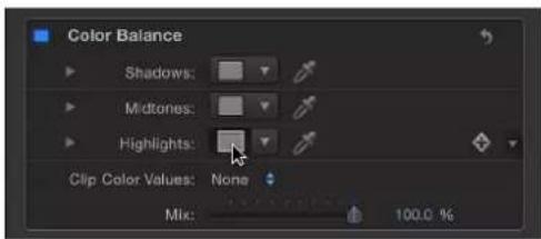
Highlights are often a good place to start when you need to match the color temperature of one image to another.
4 In the OS X Colors window, drag from the center of the color wheel toward orange, which is the predominant color of the background layer's lighting in this example.

natural_image
Woman applying makeup with a mirror, displayed in a photo editing interface (no text or symbols on the image itself)As you drag in the color wheel, the color of highlights in the Canvas changes, with the color in the brightest highlights of the foreground image changing the most. Midtones are less affected, and shadows aren't affected at all.
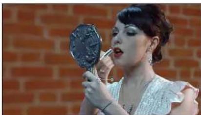
natural_image
Woman applying makeup with a mirror on her hand, set against a brick wall background (no text or symbols visible)Before
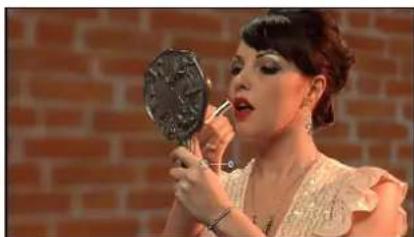
natural_image
Woman applying makeup with a mirror on her lips, set against a brick wall (no visible text or symbols)After Color Balance
Stop adjusting when the color of the foreground layer's highlights matches the color of similar highlights in the background.
Tip: You can also use the eyedropper tool in the Highlights color control to sample a highlight color in the background layer. (Click the eyedropper, then click a color in the background.) This can be a simpler adjustment, but it can also be tricky to sample the best color for a natural-looking match.
Color Reduce
Reduces the full range of color in an image to two, three, or four colors that you select. Depending on the number of substitute colors you choose in the Reduce To parameter, this filter breaks down the full range of colors in the image into a color range for each Match Color parameter that's available. The filter then substitutes the selected Replace With color for each interpreted range of color.
If two colors are selected, color information in the object is reduced to the selected two colors; if three colors are selected, color information is reduced to three colors; and so on.
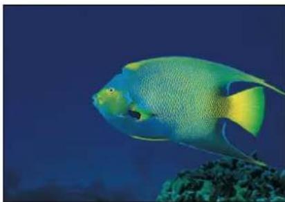
natural_image
Colorful fish swimming near coral (no text or symbols visible)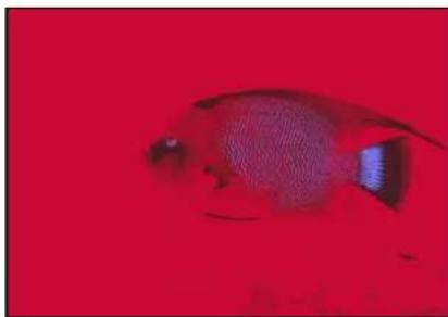
natural_image
Close-up of a small fish against a solid red background (no text or symbols visible)Original image Color Reduce filter (with defaults) applied
Parameters in the Inspector
- Smoothness: Sets the smoothness of the transitions between reduced areas. Values range from 0 (hard edges) to 1 (smooth blending).
- Reduce To: Selects the number of colors in the reduced object. Choices are 4 Colors, 3 Colors, or 2 Colors.
- Match Color 1: Picks the color of the first selection color for reduction. The color controls can be expanded with the disclosure triangle to reveal Red, Green, and Blue sliders for more precise color selection.
- Replace With: Picks the color that is substituted for the selection determined by Color 1.
- Match Color 2: Picks the color of the second selection color for reduction.
- Replace With: Picks the color that is substituted for the selection determined by Color 2.
- Match Color 3: Picks the color of the third selection color for reduction. This parameter is used only if Reduce To is set to 3 Colors or 4 Colors.
- Replace With: Picks the color that is substituted for the selection determined by Color 3. This parameter is used only if Reduce To is set to 3 Colors or 4 Colors.
- Match Color 4: Picks the color of the fourth selection color for reduction. This parameter is used only if Reduce To is set to 4 Colors.
- Replace With: Picks the color that is substituted for the selection determined by Color 4. This parameter is used only if Reduce To is set to 4 Colors.
- Mix: Sets the percentage of the original image to be blended with the color-corrected image.
Colorize
Substitutes the blacks and whites in an image with colors you select. All other colors in the image are remapped to a duochrome range that falls between these two colors.
Interesting colorized negative effects can be achieved by remapping the blacks in an image to a lighter color than the whites.

natural_image
Close-up of a red and white whalefish swimming among an aquarium with entangled corals (no text or symbols visible)Original Image

natural_image
Close-up of a dark-colored fish swimming among spiky sea creatures (no text or symbols visible)Colorize filter (with defaults) applied
Parameters in the Inspector
- Remap Black To: Sets the color that is mapped to black. The color controls can be expanded with the disclosure triangle to include Red, Green and Blue sliders to more precisely select the color.
- Remap White To: Sets the color that is mapped to white. The color controls can be expanded with the disclosure triangle to include Red, Green, and Blue sliders to more precisely select the color.
- Intensity: Sets the strength of the colorization. Values range from 0 (no colorization) to 1.00.
- Mix: Sets the percentage at which the original image is blended with the color-corrected image.
Contrast
Adjusts the difference between the lightest and darkest parts of an image.

natural_image
Close-up of a coyot walking through dry grassland (no text or symbols visible)Original image

natural_image
Close-up of a cayot with a bright brown fur and dark ears, standing in a natural outdoor setting (no text or symbols visible)Contrast filter applied
Parameters in the Inspector
- Contrast: Sets the amount of contrast to be applied to the object.
- Pivot: Sets the point around which the contrast is adjusted. The point of contrast adjustment is the level that is displayed if Contrast is set to 0.
- Smooth Contrast: Smooths the falloff on both the low and high ends of the contrast change.
- Affect Luminance: Select this checkbox to protect the image from oversaturation when its contrast is increased.
- Clip Color Values: Turns clipping on and off. Clipping prevents color adjustments from forcing color values out of the allowable digital range. Clipping can prevent illegal signal levels in clips that are output to video. This pop-up menu has four options:
• None: No clipping occurs.
- At White: Any color channel exceeding the maximum value of 1 is clipped to 1.
- At Black: Any color channel falling below the minimum value of 0 is clipped to 0.
- At Black and White: All color channels are clipped to a minimum of 0 and a maximum of 1.
- Mix: Sets the percentage of the original image to be blended with the color-corrected image.
Gamma
Adjusts the relative distribution of brightness in the midtones of an image, without adjusting the white and black points. The perceived result is to brighten and darken the areas of medium brightness in an image, while leaving the highlights and shadows untouched. This avoids a washed-out effect.
This is one of the most useful filters for correcting poor exposure in images, and should almost always be used first before trying the Brightness filter.

natural_image
Close-up portrait of a buffalo with large antlers (no text or symbols visible)Original image

natural_image
Close-up portrait of a buffalo with large antlers (no text or symbols visible)Gamma filter applied
Tip: When opening projects created in earlier versions of Motion, previous gamma adjustments may be lost. Use the Gamma filter to reproduce the effect.
Parameters in the Inspector
• Gamma: Sets the gamma correction.
- Mix: Sets the percentage of the original image to be blended with the color-corrected image.
Gradient Colorize
Uses each pixel's color value to determine the application of a color value from a gradient.

natural_image
Colorful fish swimming near coral (no text or symbols visible)Original image
natural_image
Colorful fish swimming near coral (no text or symbols visible)Gradient Colorize filter applied (using Rainbow gradient)
Parameters in the Inspector
- Gradient: Selects a gradient preset to be applied to the object. Is also used to edit a custom gradient.
For more information on using the Gradient editor, see Gradient editor tasks on page 137.
- Offset: Sets an amount, in degrees, that the color wheel is offset to determine color application. Values start at 0 degrees.
- Repeats: Sets the number of times the gradient repeats over the course of its range.
- Repeat Method: Sets the method by which the gradient is mapped when repeating. Values can be set to Mirror (default) or Wrap. This parameter affects the filter when Repeats is set to a number greater than 1.
- Map Channel: Sets the channel used to determine how the image is colorized. Values can be selected from the following: Luminance (default), Red, Green, Blue, or Alpha.
- Mix: Sets the percentage of the original image to be blended with the color-corrected image.
Hue/Saturation
Provides controls to adjust Hue, Saturation, and Value levels in an image. The Hue control is an angular representation of the color values in an image. By rotating the Hue angle, you uniformly remap the colors throughout an image, similar to the effect of turning the hue or phase knob of a broadcast monitor.
The Saturation slider controls the intensity of color in an image, with a high value resulting in vivid color, and a low value resulting in a grayscale image with no color at all. The Value slider adjusts the overall brightness or darkness of all colors in an image, including the blacks and whites in a desaturated image.

natural_image
Silhouettes of two elephants against a vibrant sunset sky (no text or symbols visible)Original image
natural_image
Silhouettes of two elephants standing on a hill under a cloudy sky (no text or symbols)Hue/Saturation filter applied (Saturation set to -1)
Parameters in the Inspector
- Hue: Sets the angle of adjustment used to set the zero point of the color wheel.
- Saturation: Sets the color saturation of the object, ranging from -1.0 (no color information) to 0.0 (unadjusted color) to 3.0.
- Value: Sets the intensity adjustment applied to the object.
- Mix: Sets the percentage of the original image to be blended with the color-corrected image.
Levels
Provides controls to remap the white and black points of an image, with a Gamma control to adjust midtones, all at once. A histogram provides an analysis of the image to help you judge the adjustments to make.
A powerful option in this filter is the ability to make independent adjustments to the red, green, blue, and alpha channels of an object.
Parameters in the Inspector
- Histogram: Displays an analysis of the object. By default, the RGB channels are selected. A pop-up menu can be used to select Red, Green, Blue, or Alpha channels for viewing.
Click the disclosure triangles to expose the RGB, Red, Green, Blue, and Opacity parameter groups. Click the group parameter disclosure triangles to display sliders:
- Black In: Sets the In point for black, below which values are considered black.
- Black Out: Sets the minimum brightness value that appears in the output. Other values are scaled between Black Out and White Out values.
- White In: Sets the In point for white, above which values are not output.
- White Out; Sets the maximum brightness value that appears in the output. Other values are scaled between Black Out and White Out values.
•Gamma: Sets the amount of gamma correction.
- Mix: Sets the percentage of the original image to be blended with the color-corrected image.
Negative
Inverts color and brightness in an image. This filter can be used to turn a scanned negative image into a positive.

natural_image
Orange seahorse swimming in deep underwater environment (no visible text or symbols)
natural_image
Abstract painting of a blue seahorse figure with textured brushstrokes (no text or symbols)Original image Negative filter applied
Parameters in the Inspector
- Mix: Sets the percentage of the original image to be blended with the color-corrected image.
OpenEXR Tone Map
Applies tone mapping to an OpenEXR image, reducing the dynamic range of the image so that it can be viewed on your monitor. The Exposure, Defog, Knee Low, and Knee High parameters allow you to control how the pixels in the high-dynamic range image are mapped to a lower dynamic range.
Tip: A recommended workflow is to apply the OpenEXR Tone Map filter to the result of your composite. In other words, apply the OpenEXR Tone Map filter after you have applied other filters to the OpenEXR image or blended the image with other images in your project.
Note: An OpenEXR file imported into Motion 5.0.2 or later is maintained as a high-dynamic range image and will appear brighter than in earlier versions of Motion (until you specifically alter the image). Prior to version 5.0.2, Motion forced tone mapping on imported OpenEXR images. In Motion 5.0.2 or later, when you open an older project containing an OpenEXR image, an OpenEXR Tone Map filter is automatically applied to the image so that the project retains its original appearance.
Tip: To maintain the full dynamic range of an image being exported as an OpenEXR file, disable the OpenEXR Tone Map filter prior to exporting.
Parameters in the Inspector
- Exposure: Lightens or darkens the displayed image, revealing more detail at the low end or high end of the image.
- Defog: Attempts to remove "fog" in an image. While recording, stray light in the camera may cause fogging of your image, creating unwanted light.
- Knee Low: Sets the low end of the white and middle gray values displayed in the image. Values between Knee Low and Knee High are compressed, allowing you to display a wider range of pixel values without clipping.
- Knee High: Sets the high end of the white and middle gray values displayed in the image.
- Mix: Sets the percentage of the original image to be blended with the color-corrected image.
Sepia
Tints an object with a sepia tone. The black and white points are remapped to dark and light sepia colors. The amount of tinting can be adjusted to achieve a subtle mix of the original and tinted colors, or a completely tinted image.
This filter can create an old-time western look.

natural_image
A zebra standing in a grassy field against a blue sky (no text or symbols visible)Original image
natural_image
A zebra standing in a dry grassland field under warm sunlight (no text or symbols visible)Sepia filter applied
Parameters in the Inspector
- Amount: Sets the amount of sepia tone applied to the object.
- Mix: Sets the percentage of the original image to be blended with the color-corrected image.
Threshold
Reduces all colors in an image to a duotone, and optionally limits the range of midtones preserved in the image. The result is an extremely high-contrast image that defaults to black and white—but you can reduce the image to any two colors.

natural_image
Underwater scene of numerous small fish swimming in deep blue water (no visible text or symbols)Original image Threshold filter applied
natural_image
Black-and-white photo of a group of fish swimming in dark water (no text or symbols visible)Parameters in the Inspector
- Threshold: Sets the threshold of selection for color substitution. The threshold determines what is considered light and what is considered dark in the object.
- Smoothness: Sets the smoothness of transition between the substituted colors.
- Dark Color: Sets the color used to represent the dark interpreted areas of the object. The color controls can be expanded with the disclosure triangle to include Red, Green, and Blue sliders, for more precise color selection.
- Light Color: Sets the color used to represent the light-interpreted areas of the object. The color controls can be expanded with the disclosure triangle to include Red, Green, and Blue sliders, for more precise color selection.
- Correct For Alpha: Renders semitransparent pixels correctly. Enable this setting if the edges of the filtered image show artifacts.
- Mix: Sets the percentage of the original image to be blended with the color-corrected image.
Tint
Tints an image with a single color. Shadows and highlights are less affected, but all midrange colors in the image are gradually replaced with the tint color as the Intensity parameter is increased.

natural_image
Underwater scene with colorful fish swimming near coral and aquatic vegetation (no text or symbols visible)Original image

natural_image
Underwater scene with numerous fish swimming among aquatic plants under warm lighting (no visible text or symbols)Tint filter applied
Parameters in the Inspector
• Color: Picks the color used to tint the object. The color controls can be expanded with the disclosure triangle to display Red, Green, and Blue sliders for more precise color selection.
- Intensity: Sets the amount of tint applied to the object.
- Mix: Sets the percentage of the original image to be blended with the color-corrected image.
YIQ Adjust
Allows color adjustment in YIQ color space. The YIQ color space definition was formerly used to describe an NTSC broadcast signal.
Parameters in the Inspector
- Y: Sets the intensity of the Y color channel. (Y represents the luma component/grayscale information.)
- I: Sets the phase of the I color channel. (I represents the hue component/chroma information.)
• Q: Sets the phase of the Q color channel. (Q represents the saturation component/chroma information.)
- Mix: Sets the percentage of the original image to be blended with the color-corrected image.
YUV Adjust
Allows color adjustment in YUV ( Y^_BC_R ) color space. The YUV color space definition is used to describe NTSC and PAL broadcast signals.
Parameters in the Inspector
- Y: Sets the intensity of the Y color channel. (Y represents luma/brightness information.)
- U : Sets the phase of the U color channel. (U represents chroma/color information.)
- V: Sets the phase of the V color channel. (V represents chroma/color information.)
- Mix: Sets the percentage of the original image to be blended with the color-corrected image.
Distortion filters
Distortion filters overview
Distortion filters are used to change the shape of objects—warping, twisting, and pulling them in different directions.
For a description of each Distortion filter, see the filters list in the Help table of contents (the sidebar to the left of this window).
Black Hole
Distorts an image by causing part of it to disappear into the specified center point, and by bowing the top, bottom, and sides inward. As the value of the Amount parameter increases, the more the sides bow in, and the more of the image at the center point disappears into it. The Poke filter has a similar effect without removing part of the image.
This filter causes rasterization in 3D groups. For more information on rasterization, see Groups and rasterization on page 1045.

natural_image
Whale leaping out of the ocean under a clear blue sky (no text or symbols visible)
natural_image
A person leaving a boat on the open sea under a partly cloudy sky (no text or symbols visible)Original image Black Hole filter applied
Parameters in the Inspector
- Center: Sets the position of the center of the black hole. Drag the Center onscreen control to adjust its value in the Canvas.
- Amount: Sets the amount of force pulling on your object. Default values range from 0 (no gravity) to 3000 (the entire object is pulled into the black hole).
- Mix: Sets the percentage of the original image to be blended with the distorted image.
- Publish OSC: Publishes the filter's onscreen controls in Final Cut Pro X. For more information on creating content for use in Final Cut Pro, see Final Cut Pro X templates overview on page 385.
Bulge
Distorts an image as if pushed outward by something pushing it from behind.
This filter causes rasterization in 3D groups. For more information on rasterization, see Groups and rasterization on page 1045.

natural_image
Yellow and white striped fish swimming in blue water (no text or symbols visible)
natural_image
Yellow and white striped fish swimming in blue water (no text or symbols visible)Original image Bulge filter applied
Parameters in the Inspector
- Center: Sets the position of the center of the bulge. Drag the Center onscreen control to adjust its value in the Canvas.
- Amount: Sets the amount of the bulge.
- Scale: Sets the direction and scale of the bulge. Lower values make the image appear to bulge inwards; higher values make the image appear to bulge outwards.
- Mix: Sets the percentage of the original image to be blended with the distorted image.
- Publish OSC: Publishes the filter's onscreen controls in Final Cut Pro X. For more information on creating content for use in Final Cut Pro, see Final Cut Pro X templates overview on page 385.
Bump Map
Uses a source object to define a bump pattern that can be used to deform an object, with parameters to control the amount of displacement. You can use any image, movie, or shape as the source object.
This filter causes rasterization in 3D groups. For more information on rasterization, see Groups and rasterization on page 1045.

natural_image
Underwater scene of a small orange fish swimming among dense green aquatic plants (no text or symbols visible)
natural_image
Underwater scene with a large orange object near a rocky cliff, surrounded by greenery and blue water (no visible text or symbols)Original image
Bump Map filter applied
Parameters in the Inspector
- Map Image: Displays a thumbnail of the map chosen. To add a map image or replace the current one, drag an object (image, shape, text, and so on) into the well. To learn how to add an object to the Map Image well, see Source well on page 132.
- Controls: Sets the map controls to either of two settings: - Direction and Amount: Lets you offset the angle and amount of the map protrusion.
• Horizontal and Vertical Scale: Lets you offset the map by a single axis (X or Y).
- Direction: Sets the angle at which the bump map protrudes when the Controls pop-up menu is set to Direction and Amount.
- Amount: Sets how far the bump map protrudes when the Controls pop-up menu is set to Direction and Amount. Positive values push upward; negative values push downward.
- Horizontal Scale: Sets horizontal scaling of the map object when the Controls pop-up menu is set to Horizontal and Vertical Scale.
- Vertical Scale: Sets the vertical scaling of the map object when the Controls pop-up menu is set to Horizontal and Vertical Scale.
- Repeat Edges: Sets whether the edges of the object are repeated.
- Mix: Sets the percentage of the original image to be blended with the distorted image.
Disc Warp
Stretches the image outward around a circular region. As the radius of the warping region increases, the image is warped outward with a greater amount of distortion. The color of the resulting disk is determined by the color value of the pixel where the center is placed.
This filter causes rasterization in 3D groups. For more information on rasterization, see Groups and rasterization on page 1045.

natural_image
Whale leaping out of the ocean under a clear blue sky (no text or symbols visible)Original image

natural_image
A whale leaping out of the ocean under a clear blue sky (no text or symbols visible)Disc Warp filter applied
Parameters in the Inspector
- Center: Sets the position of the center of the disk. Drag the Center onscreen control to adjust its value in the Canvas.
- Radius: Sets the size of the disk. Drag the outer circle of the onscreen controls to adjust the Radius value in the Canvas.
- Crop: Sets whether the object is cropped at its original boundaries.
- Mix: Sets the percentage of the original image to be blended with the distorted image.
- Publish OSC: Publishes the filter's onscreen controls in Final Cut Pro X. For more information on creating content for use in Final Cut Pro, see Final Cut Pro X templates overview on page 385.
Droplet
Simulates the effect of a drop of liquid falling onto the surface of a pool, with the image displaced by concentric ripples. This filter is not automatically animated, but animating the Thickness parameter of this filter creates the effect of the ripples spreading out from the center.
This filter causes rasterization in 3D groups. For more information on rasterization, see Groups and rasterization on page 1045.

natural_image
Close-up of a spotted fish swimming in an aquarium (no visible text or symbols)Original image

natural_image
Close-up of a spotted marine creature swimming near coral (no visible text or symbols)Droplet filter applied
Parameters in the Inspector
- Center: Sets the position of the center of the droplet effect. Drag the Center onscreen control to adjust its value in the Canvas.
- Radius: Sets the radius of the droplet effect. Drag the inner circle of the onscreen controls to adjust the Radius value in the Canvas. Drag between the inner and outer circles to adjust the Radius and Thickness parameters simultaneously.
- Thickness: Sets the width of the rippling waves from the droplet. Drag the outer circle of the onscreen controls to adjust the Thickness value in the Canvas. Drag between the inner and outer circles to adjust the Thickness and Radius parameters simultaneously.
• Height: Sets the height of the droplet ripples.
- Crop: Sets whether the object is cropped at its original boundaries.
- Mix: Sets the percentage of the original image to be blended with the distorted image.
- Publish OSC: Publishes the filter's onscreen controls in Final Cut Pro X. For more information on creating content for use in Final Cut Pro, see Final Cut Pro X templates overview on page 385.
Earthquake
Creates an animated displacement effect on an object, adjusting its position as if shaken by an earthquake. This filter causes rasterization in 3D groups. For more information on rasterization, see Groups and rasterization on page 1045.

natural_image
Sea turtle swimming in deep coral underwater (no visible text or symbols)Original image

natural_image
Sea turtle swimming underwater with green seabed (no visible text or symbols)Earthquake filter applied (using three layers)
Parameters in the Inspector
- Twist: Sets the amount the object is rotated as it is displaced.
• Horizontal Shake: Sets the maximum amount the image is displaced horizontally. -
Vertical Shake: Sets the maximum amount the image is displaced vertically.
-
Layers: Sets the number of copies of the original object that are overlaid. Larger values create a motion-blurred effect.
- Epicenter: Sets the position of the center of the earthquake, around which the Twist occurs. Drag the center onscreen control to adjust the Epicenter value in the Canvas.
- Random Seed: Sets the value of the random seed used to determine which frames are changed by the filter.
- Mix: Sets the percentage of the original image to be blended with the distorted image.
- Publish OSC: Publishes the filter's onscreen controls in Final Cut Pro X. For more information on creating content for use in Final Cut Pro, see Final Cut Pro X templates overview on page 385.
Fisheye
Distorts an object as if it were seen through the view of a fisheye lens. The result is an extremely wide-angle warping effect also known as barrel distortion. Use the Fisheye filter with a negative Amount value as an imprecise way to correct for barrel distortion in images shot using a wide-angle lens.
This filter causes rasterization in 3D groups. For more information on rasterization, see Groups and rasterization on page 1045.

natural_image
Close-up of a fish head in water, showing eye and mouth (no text or symbols visible)
natural_image
Close-up of a fish head with visible eye and mouthparts, no text or symbols presentOriginal image Fisheye filter applied
Parameters in the Inspector
- Radius: Sets the radius of the fisheye lens effect.
- Amount: Sets the amount and nature of the distortion. Lower values create concave distortion; higher values create convex distortion.
- Center: Sets the position of the center of the fisheye effect. Drag the Center onscreen control to adjust its value in the Canvas.
- Mix: Sets the percentage of the original image to be blended with the distorted image.
- Publish OSC: Publishes the filter's onscreen controls in Final Cut Pro X. For more information on creating content for use in Final Cut Pro, see Final Cut Pro X templates overview on page 385.
Flop
Reverses an image horizontally, vertically, or in both directions. This filter causes rasterization in 3D groups. For more information on rasterization, see Groups and rasterization on page 1045.
natural_image
A cheetah walking on a sandy trail, no visible text or symbols.Original image

natural_image
A cheetah walking on a sandy trail with dark dust in the background (no text or symbols visible)Flop filter applied
Parameters in the Inspector
- Flop: Sets the direction in which the object is flopped (Horizontal, Vertical, or Both).
- Mix: Sets the percentage of the original image to be blended with the flopped image.
Fun House
Simulates the distortion caused by an imperfectly shaped mirror, similar to those in a carnival fun house. This filter causes rasterization in 3D groups. For more information on rasterization, see Groups and rasterization on page 1045.

natural_image
Close-up of red coral with white spherical structures (no text or symbols)Original image
natural_image
Close-up of a red, textured surface with white speckles (no text or symbols visible)Fun House filter applied
Parameters in the Inspector
- Center: Sets the position of the center of the fun house mirror. Drag the Center onscreen control to adjust its value in the Canvas.
- Width: Sets the width of the fun house mirror.
- Amount: Sets the amount of distortion of the fun house mirror.
- Angle: Sets the angle at which the fun house mirror is set.
- Mix: Sets the percentage of the original image to be blended with the distorted image.
- Publish OSC: Publishes the filter's onscreen controls in Final Cut Pro X. For more information on creating content for use in Final Cut Pro, see Final Cut Pro X templates overview on page 385.
Glass Block
Cuts an object into a series of tiles and offsets the portion of the image in each tile to create a duplicated pattern effect. The number of tiles and the amount that each tile is offset, can be customized.
This filter causes rasterization in 3D groups. For more information on rasterization, see Groups and rasterization on page 1045.

natural_image
Underwater scene of multiple blue fish swimming in a dark blue water body (no text or symbols visible)Original image

natural_image
Underwater scene with multiple translucent fish swimming in blue water (no text or symbols visible)Glass Block filter applied
Parameters in the Inspector
- Center: Sets the position of the origin of the glass block effect. Drag the Center onscreen control to adjust its value in the Canvas.
- Scale: Sets the scale of the portions of the duplicated parts.
- Angle: Sets the angle of offset used to sample the duplicated parts.
- Tile Size: Sets the size of the glass blocks.
- Mix: Sets the percentage of the original image to be blended with the distorted image.
- Publish OSC: Publishes the filter's onscreen controls in Final Cut Pro X. For more information on creating content for use in Final Cut Pro, see Final Cut Pro X templates overview on page 385.
Glass Distortion
Simulates the effect of your object being deformed as it shows through a piece of glass. An image well lets you assign an object to use as the pattern in the glass, using any image, movie, or shape. Other parameters let you control the scale and amount of distortion.
When this filter is initially applied, Glass Distortion behaves as if there were a black image applied to the Distort Input well, which leaves the target object unchanged.
This filter causes rasterization in 3D groups. For more information on rasterization, see Groups and rasterization on page 1045.
natural_image
Two rhinoceroses walking across a grassy field under a partly cloudy sky (no text or symbols visible)Original image Glass Distortion filter applied

natural_image
Two rhinoceroses resting in a grassy field behind a chain-link fence (no text or symbols visible)(using diamond Image)
Parameters in the Inspector
- Center: Sets the position of the center of the tiling of the glass distortion. Drag the Center onscreen control to adjust its value in the Canvas.
- Distort Input: Displays a thumbnail of the image map chosen. To learn how to add an object to the Distort Input well, see Source well on page 132
• Fit: Sets the relative scale of the map image. - X Scale: Sets the horizontal scale of the map image (when the Fit checkbox is deselected).
- Y Scale: Sets the vertical scale of the map image (when the Fit checkbox is deselected).
- Amount: Sets the amount of offset.
- Softness: Sets how much blur is applied to the map image.
- Mix: Sets the percentage of the original image to be blended with the distorted image.
- Publish OSC: Publishes the filter's onscreen controls in Final Cut Pro X. For more information on creating content for use in Final Cut Pro, see Final Cut Pro X templates overview on page 385.
Insect Eye
Maps a repeating hexagonal distortion pattern to an image, mimicking the POV of an insect. This filter causes rasterization in 3D groups. For more information on rasterization, see Groups and rasterization on page 1045.
natural_image
Whale leaping out of the ocean with visible wake and splash (no text or symbols)Original image

natural_image
Hexagonal frame partially submerged in blue water, showing a dark object partially submerged (no text or symbols visible)Insect Eye filter applied
Parameters in the Inspector
- Size: Sets the size of the hexagons, in pixels.
- Refraction: Sets the amount of distortion present in each hex.
- Border Size: Sets the width, in pixels, of the border of each hex.
- Border Color: Picks the color of the border of the hexagons. Use the disclosure triangle to display Red, Green, and Blue sliders, for more precise color selection.
- Mix: Sets the percentage of the original image to be blended with the distorted image.
Mirror
Splits an image in half vertically and reverses the remaining half to create a reflection. The center point and angle of this split point can be customized. This filter is excellent for recreating the magic of 1980s music videos.
This filter causes rasterization in 3D groups. For more information on rasterization, see Groups and rasterization on page 1045.
natural_image
Black-and-white photo of a moose standing in a snowy field with white flowers (no text or symbols visible)Original image
natural_image
Two moths standing in a snowy field with wildflowers (no text or symbols visible)Mirror filter applied
Parameters in the Inspector
- Center: Sets the position of the center of the mirror. Drag the Center onscreen control to adjust its value in the Canvas.
- Angle: Sets the angle of the mirror's orientation.
- Repeat Border Pixels: Sets the edge pixels to repeat to fill in the remainder of the shape when the Center and/or Angle parameters are offset from the center.
- Mix: Sets the percentage of the original image to be blended with the distorted image.
- Publish OSC: Publishes the filter's onscreen controls in Final Cut Pro X. For more information on creating content for use in Final Cut Pro, see Final Cut Pro X templates overview on page 385.
Page Curl
Animates the image as if it is a page peeling away from the upper-left corner of the Canvas to the lower-right corner.
This filter causes rasterization in 3D groups. For more information on rasterization, see Groups and rasterization on page 1045.

natural_image
Underwater scene with multiple dolphins swimming in blue water (no visible text or symbols)Original image Page Curl filter applied
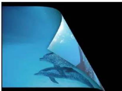
natural_image
Underwater scene showing two dolphins swimming near a curved surface (no text or symbols visible)Parameters in the Inspector
- Direction: Sets the animation of the page curl to Open or Close.
- Angle: Defines the angle of the page turn. Alternatively, use the Angle onscreen control (the small circle between the center circle and arrow) with the Rotate control (the arrow) to set the direction of the page turn. For example, at an Angle value of 180 degrees, the page turn begins along the right edge of the image.
- Rotation: Defines the rotation of the page turn. Alternatively, use the Rotation onscreen control (the arrow) with the Angle control (the small circle between the center circle and arrow) to set the direction of the page turn. For example, when Angle is set to 180 degrees and Rotation is set to 130 degrees, the page turn begins along the upper-right corner of the image.
- Radius: Defines the size of the page curl. The larger the value, the more subtle the curl.
- Fade Out: Defines the image's opacity over the page curl animation. When set to 1, the image remains opaque throughout the animation. When set to 100, the image is transparent by the end of the animation.
- Shadow: Controls the darkness of the shadow that appears beneath the curling portion of the image.
- Highlight Color: Defines a highlighted color on the back of the page.
- Back Color: Defines the color and opacity on the back of the page.
- Animate: Turns animation of the page-turn effect on and off.
- Percent: Defines the amount of curl in the static image when the Animate checkbox is deselected.
- Mix: Sets the percentage of the original image to be blended with the distorted image.
- Publish OSC: Publishes the filter's onscreen controls in Final Cut Pro X. For more information on creating content for use in Final Cut Pro, see Final Cut Pro X templates overview on page 385.
Poke
Distorts an image by bowing the top, bottom, and sides inward, and appears to push the object into the Canvas at the specified Center point. As the value of the Amount parameter increases, the more the sides bow in. The Black Hole filter has a similar effect but also removes part of the image at the center point.
This filter causes rasterization in 3D groups. For more information on rasterization, see Groups and rasterization on page 1045.

natural_image
Underwater close-up of a greenish, blue-tinted marine creature with dark mouth and open mouth (no visible text or symbols)Original image

natural_image
Close-up of a greenish fish head with blue eyes and mouthparts, partially submerged in water (no text or symbols visible)Poke filter applied
Parameters in the Inspector
- Center: Sets the position of the center of the poke. Drag the Center onscreen control to adjust its value in the Canvas.
- Radius: Sets the radius of the poke effect. The higher the value, the smaller the image appears. Scale must be set to greater than 0 for the Radius parameter to have an effect.
• Scale: Sets the scale of the distortion. - Mix: Sets the percentage of the original image to be blended with the distorted image.
- Publish OSC: Publishes the filter's onscreen controls in Final Cut Pro X. For more information on creating content for use in Final Cut Pro, see Final Cut Pro X templates overview on page 385.
Polar
Converts images from rectangular coordinates to polar coordinates, and vice versa.

natural_image
Underwater scene with numerous fish swimming in blue water (no visible text or symbols)Original image

natural_image
Abstract swirling pattern with blue and green tones, no text or symbols presentPolar filter applied
Tip: This filter works well with objects containing horizontal or vertical lines, such as the Stripes or Checkerboard generators. A similar effect can be created with any image by adding the Line Screen or other related filters.
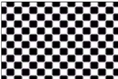
natural_image
Black and white checkerboard pattern with no text or symbols
natural_image
Black and white striped pattern with vertical stripes (no text or symbols)
natural_image
Abstract black-and-white circular pattern with concentric rings and radial segments (no text or symbols)
natural_image
Black and white radial burst pattern with no text or symbolsParameters in the Inspector
- Center: Sets the center point of the distortion from Polar to Rectangular or Rectangular to Polar. Drag the Center onscreen control to adjust its value in the Canvas.
- Polar to Rect: Applies a Polar-to-Rectangular distortion to the image. When this checkbox is deselected, a Rectangular-to-Polar distortion is applied.
- Mix: Sets the percentage of the original image to be blended with the distorted image.
- Publish OSC: Publishes the filter's onscreen controls in Final Cut Pro X. For more information on creating content for use in Final Cut Pro, see Final Cut Pro X templates overview on page 385.
Refraction
Creates a glass-distortion effect on an image, with an optional height map. This filter causes rasterization in 3D groups. For more information on rasterization, see Groups and rasterization on page 1045.

natural_image
Underwater view of a silver shark swimming in deep blue water (no text or symbols visible)Original image

natural_image
Underwater view of a shark swimming near the ocean surface (no visible text or symbols)Refraction filter applied (using a height map)
Parameters in the Inspector
- Softness: Sets the amount of softness applied to the refracted edges.
- Refraction: Sets the amount that the image is distorted.
- Height Map: Displays a thumbnail of the height map chosen. The height map is used to determine the edges along which the image is refracted. To learn how to add an object to the Height Map well, see Source well on page 132.
- Map Channel: Sets the channel used to determine how the image is refracted. If a height map is present, the channel is selected from the height map; otherwise the channel is selected from the source object. Values can be selected from the following: Luminance (default), Red, Green, Blue, or Alpha.
- Mix: Sets the percentage of the original image to be blended with the distorted image.
Ring Lens
Creates a ring of distortion over the image, creating a donut-like bulge. This filter causes rasterization in 3D groups. For more information on rasterization, see Groups and rasterization on page 1045.

natural_image
Two yellow fish swimming near coral and underwater plants (no text or symbols visible)Original image Ring Lens filter applied

natural_image
Underwater scene with two fish swimming near coral and dark seabed (no text or symbols)Parameters in the Inspector
- Center: Sets the position of the center of the lens. Drag the Center onscreen control to adjust its value in the Canvas.
-
Radius: Sets the radius of the ring. Drag the inner circle of the onscreen controls to adjust the Radius value in the Canvas. Drag between the inner and outer circles to adjust the Radius and Thickness parameters simultaneously.
-
Thickness: Sets the thickness of the ring as a percentage of the radius. Values range from 0 (no thickness) to 1.00 (no hole in the center of the ring lens). Drag the outer circle of the onscreen controls to adjust the Thickness value in the Canvas. Drag between the inner and outer circles to adjust the Thickness and Radius parameters simultaneously.
- Refraction: Sets the amount of refraction of the lens.
- Crop: Sets whether the object is cropped at its original boundaries.
- Mix: Sets the percentage of the original image to be blended with the distorted image.
- Publish OSC: Publishes the filter's onscreen controls in Final Cut Pro X. For more information on creating content for use in Final Cut Pro, see Final Cut Pro X templates overview on page 385.
Ripple
Creates animated ripples over the surface of an object. This filter is automatically animated to create an undulating effect on the surface of the affected image. The amplitude can be adjusted to increase or decrease the rippling effect.
This filter causes rasterization in 3D groups. For more information on rasterization, see Groups and rasterization on page 1045.

natural_image
Hippoceros head partially submerged in water, showing its open mouth and head (no text or symbols visible)Original image
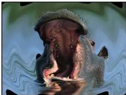
natural_image
A phipal with a head covering its mouth, partially submerged in water, against a wavy green background (no text or symbols visible)Ripple filter applied
Parameters in the Inspector
- Center: Sets the position of the origin of the effect. Drag the Center onscreen control to adjust its value in the Canvas.
• Amplitude: Sets the width of the waves. - Crop: Sets whether the object is cropped at its original boundaries.
- Mix: Sets the percentage of the original image to be blended with the distorted image.
- Publish OSC: Publishes the filter's onscreen controls in Final Cut Pro X. For more information on creating content for use in Final Cut Pro, see Final Cut Pro X templates overview on page 385.
Scrape
Smears an image along an angle defined by the Rotation parameter. The Scrape effect starts at the center point, and continues to the edge of the object.
This filter causes rasterization in 3D groups. For more information on rasterization, see Groups and rasterization on page 1045.
natural_image
Two translucent jellyfish with floral patterns, underwater in blue tones (no text or symbols)Original image

natural_image
Close-up of translucent jellyfish with glowing blue light trails (no text or symbols visible)Scrape filter applied
Parameters in the Inspector
- Center: Sets the position of the center of the scrape. Drag the Center onscreen control to adjust its value in the Canvas.
- Rotation: Sets the angle of rotation of the scrape. Drag the outer handle of the onscreen control to adjust the Rotation value in the Canvas.
- Amount: Sets the ramping of the number of pixels spread across the range of the scrape. Values range from 0 (very gradual) to 200 (hard edge).
- Mix: Sets the percentage of the original image to be blended with the distorted image.
- Publish OSC: Publishes the filter's onscreen controls in Final Cut Pro X. For more information on creating content for use in Final Cut Pro, see Final Cut Pro X templates overview on page 385.
Sphere
Simulates the effect of an image wrapped around a sphere. This filter can be used to turn an image of a map into an imprecise globe.
This filter causes rasterization in 3D groups. For more information on rasterization, see Groups and rasterization on page 1045.

natural_image
A small deer standing on a rocky outdoor path, no visible text or symbols.Original image

natural_image
Close-up of a deer standing in a circular frame with golden light, no visible text or symbolsSphere filter applied
Parameters in the Inspector
- Center: Sets the position of the center of the sphere. Drag the Center onscreen control to adjust its value in the Canvas.
- Radius: Sets the radius of the sphere.
- Crop: Sets whether the object is cropped at its original boundaries.
- Mix: Sets the percentage of the original image to be blended with the distorted image.
- Publish OSC: Publishes the filter's onscreen controls in Final Cut Pro X. For more information on creating content for use in Final Cut Pro, see Final Cut Pro X templates overview on page 385.
Starburst
Radiates solid-colored rays out from the center of your object. The colors are derived from pixel values around the selected center point, with the number of colors used determined by the Radius parameter.
This filter causes rasterization in 3D groups. For more information on rasterization, see Groups and rasterization on page 1045.

natural_image
Close-up of three orange fabric strips with a red starfish on top, resting on sandy seabed (no text or symbols visible)Original image
natural_image
Abstract radial burst pattern with gradient colors from red to brown (no text or symbols)Starburst filter applied
Parameters in the Inspector
- Center: Sets the position of the center of the starburst. Drag the Center onscreen control to adjust its value in the Canvas.
- Radius: Sets the radius of pixel sampling for ray color determination.
- Mix: Sets the percentage at which the original image is blended with the distorted image.
- Publish OSC: Publishes the filter's onscreen controls in Final Cut Pro X. For more information on creating content for use in Final Cut Pro, see Final Cut Pro X templates overview on page 385.
Stripes
Turns an image into a series of vertical stripes. The angle of generated stripes can be changed using the Angle parameter. The stripe colors are derived from pixel values along a line through the center point at the angle specified by the Angle parameter. The distribution of colors is determined by the Offset parameter.
This filter causes rasterization in 3D groups. For more information on rasterization, see Groups and rasterization on page 1045.

natural_image
Yellow butterfly swimming in deep blue ocean (no text or symbols visible)Original image

natural_image
Abstract blue and green diagonal stripe pattern (no text or symbols)Stripes filter applied
Parameters in the Inspector
- Center: Sets the position of the center of the stripe effect. Drag the Center onscreen control to adjust its value in the Canvas.
- Angle: Sets the angle of the stripes. Drag the outer handle of the onscreen control to adjust the Angle value in the Canvas.
- Offset: Sets the angle of pixel sampling used for sampling pixel color values.
- Mix: Sets the percentage of the original image to be blended with the striped image.
- Publish OSC: Publishes the filter's onscreen controls in Final Cut Pro X. For more information on creating content for use in Final Cut Pro, see Final Cut Pro X templates overview on page 385.
Target
Draws bands of concentric circles outward from the center point value. The target colors are derived from pixel values around the selected center point, with the distribution of colors determined by the Angle parameter.
This filter causes rasterization in 3D groups. For more information on rasterization, see Groups and rasterization on page 1045.

natural_image
Close-up of a golden crab standing in shallow water, no visible text or symbolsOriginal image
natural_image
Abstract concentric circular pattern with blue and gold tones, no text or symbols presentTarget filter applied
Parameters in the Inspector
- Center: Sets the position of the center of the target. Drag the Center onscreen control to adjust its value in the Canvas.
- Angle: Sets the angle of the line used to select pixels for the bands of circles in the target. Drag the outer handle of the onscreen control to adjust the Angle value in the Canvas.
- Crop: Sets whether the image is cropped beyond its original borders.
- Mix: Sets the percentage at which the original image is blended with the distorted image.
- Publish OSC: Publishes the filter's onscreen controls in Final Cut Pro X. For more information on creating content for use in Final Cut Pro, see Final Cut Pro X templates overview on page 385.
Twirl
Twirls an image like a fork twisting a plate of spaghetti. The image appears to stretch from the sides to the center in a spiral. The amount of spiraling is determined by the Twirl parameter.
This filter causes rasterization in 3D groups. For more information on rasterization, see Groups and rasterization on page 1045.
natural_image
Close-up of a dragon's eye with visible eye and eyelid, no text or symbols presentOriginal image
natural_image
Close-up of a spiral-shaped biological structure with textured surface (no visible text or symbols)Twirl filter applied
Parameters in the Inspector
- Amount: Sets the radius of the twirl. Larger values affect more of the image. Values range from 0 (none of the image is affected) to 1.00 (largest amount of the image is affected). Drag the outer circle of the onscreen controls to adjust the amount in the Canvas.
- Twirl: Sets the amount of twist. Drag the handle of the onscreen control to adjust the Twirl value in the Canvas.
- Center: Sets the position of the center of the twirl. Drag the Center onscreen control to adjust its value in the Canvas.
- Crop: Sets whether the object is cropped at its original boundaries.
- Mix: Sets the percentage of the original image to be blended with the twirled image.
- Publish OSC: Publishes the filter's onscreen controls in Final Cut Pro X. For more information on creating content for use in Final Cut Pro, see Final Cut Pro X templates overview on page 385.
Underwater
Applies an animated distortion to an image, simulating a view through water. This filter causes rasterization in 3D groups. For more information on rasterization, see Groups and rasterization on page 1045.
natural_image
Underwater scene featuring a striped fish swimming near coral (no text or symbols visible)Original image
natural_image
Underwater scene with a colorful coral formation and blue seabed (no visible text or symbols)Underwater filter applied
Parameters in the Inspector
- Size: Sets the size of the ripples in the water. The smaller the number, the more ripples there are in the water simulation.
• Speed: Sets the speed at which the distortion is animated.
• Refraction: Sets the amount that the image is distorted.
- Repeat Edges: Sets whether the edges of the object are repeated.
- Mix: Sets the percentage of the original image to be blended with the distorted image.
Wave
Distorts an image to simulate waves oscillating across it. The wave filter is not automatically animated, but you can animate the Offset parameter to create an undulating effect.
For information on animating parameters, see Parameter behaviors overview on page 332.
This filter causes rasterization in 3D groups. For more information on rasterization, see Groups and rasterization on page 1045.

natural_image
Group of five savanna antelopes standing on a dirt path surrounded by green foliage (no text or symbols visible)Original image
natural_image
Group of five savanna dunks standing in formation against a backdrop of green foliage (no text or symbols visible)Wave filter applied
Parameters in the Inspector
• Amplitude: Sets the amplitude of the waves.
• Wavelength: Sets the length of the waves.
- Offset: Sets the offset of the wave.
• Vertical: Sets whether the waves run vertically or horizontally.
- Repeat Edges: Sets whether the edges of the object are repeated.
- Mix: Sets the percentage of the original image to be blended with the distorted image.
Glow filters
Glow filters overview
Glow filters combine blur with brightness and color effects. The results are automatically recomposited over the original image in various ways. Glows can be used to simulate film effects, as a method to render your footage more abstract, or as accents to make elements in a composition stand out.
For a description of each Glow filter, see the filters list in the Help table of contents (the sidebar to the left of this window).
Aura
Adds highly stylized light or dark halos around well-defined areas of an image. The resulting glow appears solarized, and the underlying image creates outlines that show through the glow effect.

natural_image
Dolphin swimming underwater with visible eye and fish (no text or symbols)Original image
natural_image
Close-up of a dolphin swimming underwater with visible teeth and ocean background (no text or symbols)Aura filter applied
Parameters in the Inspector
- Inner Radius: Sets the amount the aura extends inward from its point of origin.
- Outer Radius: Sets the amount the aura extends outward from its point of origin.
- Brightness: Sets the brightness of the aura.
- Crop: Sets whether the aura is cropped at the original boundaries of the object.
- Mix: Sets the percentage of the original image to be blended with the filtered image.
Bloom
Simulates the effect of extremely overexposed highlights on film. Highlights above a specific threshold are blurred, brightened, and recomposited with the original. Unaffected regions of the image interact with the glow effect, but otherwise retain their detail.

natural_image
Close-up of a yellow fish head emerging from a dark, textured surface (no text or symbols visible)Original image

natural_image
Close-up of a glowing yellow-orange fish head with a blue eye, partially obscured by red and black light (no text or symbols visible)Bloom filter applied
Parameters in the Inspector
- Amount: Sets the amount of the bloom.
• Brightness: Sets the brightness of the bloom.
• Threshold: Sets the luminance threshold at which the bloom starts.
• Horizontal: Sets the distance of horizontal bloom.
• Vertical: Sets the distance of vertical bloom. - Crop: Sets whether the bloom is cropped at the original boundaries of the object.
- Mix: Sets the percentage of the original image to be blended with the filtered image.
Dazzle
Adds glowing star-shaped accents to the highlights in an image. This filter can be customized to create effects ranging from subtle highlights to outrageous, colorful flashes of color.

natural_image
Underwater view of a large ship with visible hull and crew, surrounded by deep blue water (no text or symbols)Original image
natural_image
Underwater scene of a large ship with illuminated green lights on its deck, surrounded by deep blue water (no visible text or symbols)Dazzle filter applied
Parameters in the Inspector
- Amount: Sets the radius of the spikes from the glow.
• Angle: Sets the angle of rotation of the spikes. - Brightness: Sets the amount of brightness of the glow.
• Threshold: Sets the luminance threshold of the glow. - Spike Count: Sets the number of spikes coming off of glows.
- Crop: Sets whether the glowed object is cropped at its original borders.
- Mix: Sets the percentage of the original image to be blended with the filtered image.
Gloom
Creates a muted, dark glow. The image is darkened, and areas of detail are evened out into larger regions of color. It's spooky.
natural_image
Underwater photo of a small striped lightfish swimming near coral (no visible text or symbols)Original image
natural_image
Underwater photo of a small fish swimming near the seabed (no visible text or symbols)Gloom filter applied
Parameters in the Inspector
- Radius: Sets the radius of the gloom.
- Amount: Sets the amount of gloom. Values range from 0 (no gloom) to 2 (maximum gloominess).
- Mix: Sets the percentage of the original image to be blended with the filtered image.
Glow
Creates a basic glow effect. It is the most basic glow filter in this category, but can be customized to create many effects.
Parameters in the Inspector
- Radius: Sets the radius of the glow.
- Opacity: Sets the opacity of the glow.
• Threshold: Sets the luminance threshold at which the glow begins. - Softness: Sets the amount of softness applied to the glow.
- Mix: Sets the percentage of the original image to be blended with the filtered image.
Light Rays
Uses the zoom blur rather than a gaussian blur to distribute the glow effect. The resulting effect is that of light rays shining through an object from a specified point.
This filter causes rasterization in 3D groups. For more information on rasterization, see Groups and rasterization on page 1045.

natural_image
Close-up of a yellow fish head with white stripes against a dark background (no text or symbols visible)Original image

natural_image
Close-up of a yellow fish head with visible eye and tail against dark background (no text or symbols)Light Rays filter applied
Parameters in the Inspector
- Amount: Sets the amount of the light ray effect. Larger values extend the length of the rays.
- Center: Sets the position of the center point of the light source. Drag the center onscreen control to adjust its value in the Canvas.
• Glow: Sets the brightness multiplier of the light rays. - Expansion: Sets the distance the light rays extend outside the boundary of the source object.
- Mix: Sets the percentage of the original image to be blended with the filtered image.
- Publish OSC: Publishes the filter's onscreen controls in Final Cut Pro X. For more information on creating content for use in Final Cut Pro, see Final Cut Pro X templates overview on page 385.
Outer Glow
Adds a glow to the alpha channel of an image. The result is a glow around the outside of the image that leaves the interior unaffected.

natural_image
Two large lions resting in a dry grassy field with trees in the background (no text or symbols visible)Original image

natural_image
Two lions resting in a dry grassland, no visible text or symbolsOuter Glow filter applied
Parameters in the Inspector
- Radius: Sets the size of the glow.
• Brightness: Sets the brightness of the glow. - Inner Color: Picks the inner color of the glow. Use the disclosure triangle to display Red, Green, and Blue sliders for more precise color selection.
- Outer Color: Picks the outer color of the glow.
- Range: Sets the gradient position between the glow colors.
• Horizontal: Sets the amount of horizontal glow.
• Vertical: Sets the amount of vertical glow. - Crop: Sets whether the object is cropped at its original boundaries.
- Mix: Sets the percentage of the original image to be blended with the filtered image.
Overdrive
Creates an animated glow effect by compositing numerous glowing tinted duplicates of the original image. Fine detail is lost, and the highlights of the image are emphasized. You can customize the inner glow and outer glow colors.
natural_image
Underwater scene with numerous orange fish swimming near a coral reef (no visible text or symbols)Original image
natural_image
Microscopic view of red fluorescent biological cells with green cytoplasmic structures (no text or symbols visible)Overdrive filter applied
Parameters in the Inspector
- Intensity: Sets the number of samples.
- Size: Sets the radius of the effect.
- Rotation: Sets the angle of rotation of the collected offsets.
- Inner Glow: Picks the color of the inner part of the glow. Use the disclosure triangle to display Red, Green, and Blue sliders for more precise color selection.
- Outer Glow: Picks the color of the outer part of the glow. Use the disclosure triangle to display Red, Green, and Blue sliders for more precise color selection.
- Crop: Sets whether the object is cropped at its original boundaries.
- Mix: Sets the percentage of the original image to be blended with the filtered image.
Sharpen filters
Sharpen filters overview
Sharpen filters sharpen images by creating a high contrast overlay that emphasizes edges in the image.
For a description of each Sharpen filter, see the filters list in the Help table of contents (the sidebar to the left of this window).
Sharpen
Sharpens an image by enhancing the color contrast around edges in the image.
This filter causes rasterization in 3D groups. For more information on rasterization, see Groups and rasterization on page 1045.

natural_image
Side view of a silver sedan car with visible wheel and spray trail (no text or symbols)Original image

natural_image
Side view of a silver sedan car on water, showing rear wheel and side window (no visible text or symbols)Sharpen filter applied
Parameters in the Inspector
- Intensity: Sets the radius for the effect.
- Amount: Adjusts the contrast for the sharpening.
- Mix: Sets the percentage of the original image to be blended with the sharpened image.
Unsharp Mask
Creates an effect similar to Sharpen, but provides more options to refine and control the amount of sharpening applied to the image. This filter causes rasterization in 3D groups. For more information on rasterization, see Groups and rasterization on page 1045.

natural_image
Three young lion cubs resting on a tree in a grassy outdoor setting (no text or symbols visible)Original image

natural_image
Three young lion cubs resting on a tree branch in a lush green forest (no text or symbols visible)Unsharp Mask filter applied
Parameters in the Inspector
- Radius: Sets the amount of the mask's effect.
- Amount: Sets the amount of the multiplier used to sharpen the object's edges.
- Threshold: Sets the threshold of luminance difference to be considered as a high contrast range, between 0 and 1.
• Horizontal: Sets the horizontal width of the unsharp mask.
• Vertical: Sets the vertical scale of the unsharp mask. - Mix: Sets the percentage of the original image to be blended with the filtered image.
Stylize filters
Stylize filters overview
Unlike distortion filters, which warp and deform an image, stylize filters simulate different media, such as film, television, or print, for example.
For a description of each Stylize filter, see the filters list in the Help table of contents (the sidebar to the left of this window).
Add Noise
Adds an overlay noise of the selected type to an image. This filter causes rasterization in 3D groups. For more information on rasterization, see Groups and rasterization on page 1045.

natural_image
Underwater photo of a bright mala swimming in the ocean surface (no text or symbols visible)Original image

natural_image
Underwater photo of a large fish swimming near the surface (no visible text or symbols)Add Noise filter applied
Parameters in the Inspector
- Amount: Sets the amount of noise added to the image.
- Type: Sets the type of noise added to the image. Values include Pink Noise (TV Static), White Noise (Uniform), Gaussian Noise (Film Grain), and Blue Noise, which reduces banding.
- Monochrome: Sets whether the added noise is monochrome or color.
- Blend Mode: Sets the blend mode used to add noise to the image. For blend mode descriptions, see How blend modes work on page 231.
- Autoanimate: Sets whether the noise is animated automatically.
- Random Seed: Sets the seed used to generate the position of the noise. This parameter is only available if Autoanimate is deselected.
- Mix: Sets the percentage of the original image to be blended with the filtered image.
Bad Film
Simulates old or damaged film and/or playback equipment. This filter is animated.
This filter causes rasterization in 3D groups. For more information on rasterization, see Groups and rasterization on page 1045.
natural_image
A lion walking across a grassy field with mountainous background (no text or symbols visible)Original image

natural_image
Lion walking across a grassy field with mountainous background (no text or symbols visible)Bad Film filter applied
Parameters in the Inspector
- Focus Amount: Sets the amount of blur applied to the image, simulating a projector lens going in and out of focus.
- Focus Variance: Varies the amount defined in the Focus Amount parameter. For example, if Focus Amount is set to 3 and Focus Variance set to 1, the Focus Amount varies between 2 and 4.
- Brightness Amount: Simulates underexposed footage or an inconsistent projector bulb by lightening and darkening the image.
- Brightness Variance: Varies the amount defined in the Brightness Amount parameter. For example, if Brightness Amount is set to 2.5 and Brightness Variance set to 2, the Brightness Amount varies between .5 and 4.5.
- Saturate Amount: Adjusts the effect to simulate aged film stocks. Values below 0 lower the saturation, creating a faded film appearance. A value of -100 removes saturation to simulate black-and-white film. Values above 0 simulates oversaturation.
- Saturate Variance: Varies the amount defined in the Saturate Amount parameter. For example, if Saturate Amount is set to -20 and Saturate Variance set to 10 , the Saturate Amount varies between -30 and -10 .
- Scratches: Simulates scratches on film. The higher the value, the more scratches.
- Scratch Color: Sets the color of the film scratches. The color controls can be expanded with the disclosure triangle to include Red, Green, Blue, and Opacity sliders to more precisely select the color.
- Hairs: Simulates hairs on film. The higher the value, the more hairs.
- Dust: Simulates dust or dirt on film. The higher the value, the more dirt.
Tip: Hair, dust, and scratches occur with random variance and may not appear on every frame. If you don't see any effect while adjusting these sliders, play the clip and observe the effect over the duration of the shot. - Jitter Amount: Simulates the look of a film projector that has a problem with its gate, reminding you of high school, if you are old. Increasing the amount of jitter increases the appearance of horizontal shake in the film.
- Jitter Variance: Varies the amount defined in the Jitter Amount parameter. For example, if Jitter Amount is set to .25 and Jitter Variance set to .05, the Jitter Amount varies between .2 and .3.
- Grain: Sets the amount of grain, allowing you to simulate different types of film stock.
- Frequency of Change: Defines how often (in frames), the values set in the parameters with variance are recalculated. For example, if Frequency of Change is set to 30, and Jitter Amount and Jitter Frequency are set to values greater than 0, the jitter parameters are recalculated every 30 frames, creating additional randomness.
- Random Seed: Lets you pick a new random seed number. This number is used to randomly generate new sequences of values, based on the other parameters of this behavior.
- Mix: Sets the percentage of the original image to be blended with the filtered image.
Bad TV
Simulates poor analog television reception, adding attributes like exaggerated video field scan lines, static and roll. This filter causes rasterization in 3D groups. For more information on rasterization, see Groups and rasterization on page 1045.
natural_image
Close-up of a yellow cartoon character inside a green tunnel-like opening (no text or symbols visible)Original image
natural_image
Close-up of two abstract circular shapes with green and yellow tones, no text or symbols visibleBad TV filter applied
Parameters in the Inspector
- Waviness: Sets the amount of horizontal offset applied to video fields.
- Roll: Sets the amount of vertical offset applied to the image. The entire image is displayed, but the image is split along the roll line, with the otherwise missing part of the footage shown joined along the roll line.
• Static: Sets the amount of static added to the image.
• Color Synch: Sets the amount of horizontal RGB channel offset applied to the image. - Saturate: Sets the amount of color saturation applied to the image. Negative values reduce saturation, positive values add saturation.
- Scan Line Brightness: Sets the brightness of the video field scan lines added to the image.
- Scan Line Percentage: Sets the thickness of the video field scan lines added to the image.
• Number of Scan Lines: Sets the amount of scan lines added to the image. - Mix: Sets the percentage of the original image to be blended with the filtered image.
Circle Screen
Reduces an image to a high-contrast grayscale version of itself, then screens the result using a pattern of concentric circles, simulating an etched screening technique. The image is represented by varying thicknesses in the circular pattern.
This filter causes rasterization in 3D groups. For more information on rasterization, see Groups and rasterization on page 1045.

natural_image
Underwater photo of a diver in full-body water, creating a circular wake (no text or symbols visible)Original image Circle Screen filter applied
natural_image
Person swimming in water with ripples, no visible text or symbolsParameters in the Inspector
- Center: Sets the position of the center of the circle screen. Drag the Center onscreen control to adjust its value in the Canvas.
• Scale: Sets the scale of the circle screen.
• Contrast: Sets the contrast level. - Mix: Sets the percentage of the original image to be blended with the filtered image.
- Publish OSC: Publishes the filter's onscreen controls in Final Cut Pro X. For more information on creating content for use in Final Cut Pro, see Final Cut Pro X templates overview on page 385.
Circles
Adds elliptical facets to an image, giving it a mosaic-like appearance. Each facet takes a color sample from the center of itself. Unlike other mosaic filters, the edges of the facets do not join, allowing parts of the untouched image to be visible between facets.
This filter causes rasterization in 3D groups. For more information on rasterization, see Groups and rasterization on page 1045.

natural_image
Close-up of vibrant orange coral-like structures with no visible text or symbolsOriginal image

natural_image
Abstract composition of glowing orange and purple dots on dark background (no text or symbols)Circles filter applied
Parameters in the Inspector
• Size: Sets the size of the facets.
- Falloff: Sets the amount of alpha blending done at the edges of each facet.
- Invert: Sets whether the facets are elliptical or tiles with elliptical cut-outs.
- Mix: Sets the percentage of the original image to be blended with the filtered image.
Color Emboss
Traces high-contrast edges in the image with darker versions of the color in the image. This gives the object the appearance of being stamped into the Canvas, while retaining the colors of the original image. The Direction and amount of Relief can be customized.

natural_image
Close-up of a golden crab standing on water, no text or symbols visibleOriginal image Color Emboss filter applied
natural_image
Close-up of a golden crab standing on water, with visible legs and feet (no text or symbols)Parameters in the Inspector
- Direction: Sets the angle of direction of the offset emboss.
- Relief: Sets the amount of the offset.
- Crop: Sets whether the image is cropped beyond its original borders.
- Mix: Sets the percentage of the original image to be blended with the filtered image.
Crystallize
Simulates the effect of viewing an image through a pane of glass with irregular facets patterned into it. These mosaic-like facets give an image a crystallized appearance. This filter is automatically animated, and the facets appear to shift and turn according to the value in the Speed parameter. To prevent the facets from moving, set the Speed to 0 (zero).
This filter causes rasterization in 3D groups. For more information on rasterization, see Groups and rasterization on page 1045.

natural_image
Underwater scene with multiple purple fish swimming in a coral reef (no visible text or symbols)Original image

natural_image
Microscopic view of fluorescently labeled cells with purple, green, and blue staining (no text or symbols)Crystallize filter applied
Parameters in the Inspector
- Size: Sets the size of the facets.
• Speed: Sets the speed of the animation of the facets. - Smooth: Sets whether facet colors are based on average values in the area they are replacing, or single samples taken from the center of the facet.
- Feathering: Sets the amount of feathering applied to the edges of facets.
- Mix: Sets the percentage of the original image to be blended with the filtered image.
Edges
Creates an edge-detection effect by examining the luminance of an image to render high contrast borders between regions of brightness. These edges are then traced, and all other detail is replaced by black. The amount of eliminated detail depends on the value of the Intensity parameter. The colors of the resulting highlights are intensified variants of the colors from the original image.
This filter causes rasterization in 3D groups. For more information on rasterization, see Groups and rasterization on page 1045.

natural_image
Underwater scene of multiple blue fish with yellow-green fins, swimming in a dark blue water body (no text or symbols visible)Original image

natural_image
Microscopic view of elongated, red-stained biological cells with fluorescent labeling (no text or symbols visible)Edges filter applied
Parameters in the Inspector
- Intensity: Sets the intensity of the edges.
- Mix: Sets the percentage of the original image to be blended with the filtered image.
Extrude
Gives an object simulated depth, by creating a front and back side, and then offsetting them and extruding the edges so they connect.
Note: Because this filter only simulates depth, an object with the Extrude filter applied does not interact with 3D aspects of Motion.
This filter causes rasterization in 3D groups. For more information on rasterization, see Groups and rasterization on page 1045.
Original image

Extrude filter applied
Parameters in the Inspector
- Angle: Sets the angle at which the object is extruded. Drag the onscreen control to adjust its value in the Canvas.
- Distance: Sets the distance the object is extruded. Drag the onscreen control to adjust its value in the Canvas.
- Clipping: Sets the distance at which the extrusion is clipped.
- Back Size: Sets the size of the back object, as a proportion of its original size.
- Face Brightness: Sets a brightness level applied to the face of the object.
- Front Brightness: Sets a brightness level applied to the front of the object.
-
Back Brightness: Sets a brightness level applied to the back of the object.
-
Extrude Style: Selects the method used to extrude the sides of the object. Shading or Gradient can be selected. With Shading selected, the color values of the pixels at the edges of the object are used along the extrusion. With Gradient selected, a gradient preset or custom gradient can be used.
- Gradient: Selects a gradient preset to be applied to the object. Can also be used to edit a custom gradient. The gradient is applied only if the Extrude Style is set to Gradient.
- Mix: Sets the percentage of the original image to be blended with the filtered image.
- Publish OSC: Publishes the filter's onscreen controls in Final Cut Pro X. For more information on creating content for use in Final Cut Pro, see Final Cut Pro X templates overview on page 385.
Halftone
Reduces an image to a black and white version of itself, simulating the halftone screening method for print, in which the shadows and highlights of an image are recreated using patterns of small and large dots.
This filter causes rasterization in 3D groups. For more information on rasterization, see Groups and rasterization on page 1045.

natural_image
Whale leaping out of the ocean under a clear blue sky (no text or symbols visible)Original image

natural_image
Black-and-white photo of a whale leaping out of water, no text or symbols visibleHalftone filter applied
Parameters in the Inspector
- Center: Sets the position of the center of the halftone dots. Drag the center onscreen control to adjust its value in the Canvas.
• Angle: Sets the angle of the alignment of the dots.
• Scale: Sets the scale of the halftone dots. - Contrast: Sets the amount of contrast between lightest and darkest dots.
- Mix: Sets the percentage of the original image to be blended with the filtered image.
- Publish OSC: Publishes the filter's onscreen controls in Final Cut Pro X. For more information on creating content for use in Final Cut Pro, see Final Cut Pro X templates overview on page 385.
Hatched Screen
Reduces an image to a black and white version of itself, simulating a halftone pen-and-ink method of shading an image, in which the shadows and highlights of an image are recreated using hatched patterns of lines.
This filter causes rasterization in 3D groups. For more information on rasterization, see Groups and rasterization on page 1045.

natural_image
Underwater photo of a dolphin swimming near the seabed (no visible text or symbols)Original image
natural_image
Abstract pattern of diagonal striped lines and a blurred white shape on a black background (no text or symbols)Hatched Screen filter applied
Parameters in the Inspector
- Center: Sets the position of the center of the hatched screen. Drag the Center onscreen control to adjust its value in the Canvas.
• Angle: Sets the angle of the hatched screen.
• Scale: Sets the scale of the hatched screen.
- Skew: Sets the amount of skew of the hatched screen.
- Stretch: Sets the amount of stretch of the hatched screen.
- Contrast: Sets the relative amount of contrast between light and dark areas.
- Mix: Sets the percentage of the original image to be blended with the filtered image.
- Publish OSC: Publishes the filter's onscreen controls in Final Cut Pro X. For more information on creating content for use in Final Cut Pro, see Final Cut Pro X templates overview on page 385.
Highpass
Emphasizes areas of detail in an image and stylizes the colors in the resulting image to create a psychedelic display. This filter causes rasterization in 3D groups. For more information on rasterization, see Groups and rasterization on page 1045.

natural_image
Underwater scene with a dense cluster of fish swimming among coral-like structures (no visible text or symbols)Original image

natural_image
Underwater view of a colorful coral reef with green and red-green vegetation (no text or symbols)Highpass filter applied
Parameters in the Inspector
- Radius: Sets the amount of variance of detail to consider. Values range from 0 (entire range of color) to 100 (only the most detailed portions).
- Amount: Sets the amount of emphasis.
- Mix: Sets the percentage of the original image to be blended with the filtered image.
Indent
Creates a shiny, bump-mapped effect, giving the appearance of depressed and flat areas. This filter causes rasterization in 3D groups. For more information on rasterization, see Groups and rasterization on page 1045.

natural_image
Dolphin swimming in deep blue ocean (no text or symbols visible)Original image

natural_image
Underwater photo of a dolphin swimming in blue water (no visible text or symbols)Indent filter applied
Parameters in the Inspector
- Softness: Sets the softness of the transition between flat and raised areas.
- Brightness: Sets the level of brightness of the object.
- Ambient: Sets the amount of ambient light hitting the object.
- Highlight Brightness: Sets the amount of brightness applied to highlights of the object.
- Highlight Sharpness: Sets the degree of sharpness applied to highlights of the object.
• Light Rotation: Sets the angle, in degrees, at which the ambient light hits the object.
- Depth: Sets the amount of depth between flat and raised areas.
- Height Map: Displays a thumbnail of the height map chosen. If present, the height map is used to determine the flat and raised areas of the object. To learn how to add an object to the Height Map well, see Source well on page 132.
- Map Channel: Sets the channel from the object used to determine the flat and raised areas of the image. If a height map is present, the channel is selected from the height map. Otherwise, values include Luminance (default), Red, Green, Blue, or Alpha.
- Stretch To Fit: Sets whether the Height Map is stretched to fit the dimensions of the filtered object.
- Height Map X Scale: Sets the scaling used to determine the width of the Height Map. This parameter becomes available when the Stretch To Fit checkbox is deselected.
- Height Map Y Scale: Sets the scaling used to determine the height of the Height Map. This parameter becomes available when the Stretch To Fit checkbox is deselected.
- Height Map X Offset: Sets the amount of offset used to position the Height Map horizontally. This parameter becomes available when the Stretch To Fit checkbox is deselected.
- Height Map Y Offset: Sets the amount of offset used to position the Height Map vertically. This parameter becomes available when the Stretch To Fit checkbox is deselected.
- Mix: Sets the percentage of the original image to be blended with the filtered image.
Line Art
Performs an edge detection of the high-contrast borders between regions of differing brightness in an object, tracing the edges and reducing other detail in the image to the color specified by the Paper Color parameter. The color of the resulting outline can also be customized. The effect is that of a line drawing on paper.
This filter causes rasterization in 3D groups. For more information on rasterization, see Groups and rasterization on page 1045.

natural_image
Black-and-white photo of a striped beachon swimming in clear turquoise water (no text or symbols visible)Original image
natural_image
Pencil sketch of a stylized animal head on grass (no text or symbols)Line Art filter applied
Parameters in the Inspector
• Threshold: Sets the threshold of edge detection.
- Smoothness: Sets the level of smoothness of transition between the lines and the background.
- Paper Color: Sets the color of the paper. The color controls can be expanded with the disclosure triangle to reveal Red, Green, and Blue sliders to more precisely select the color.
• Paper Opacity: Sets the opacity of the paper.
- Ink Color: Sets the color of the ink used in the line drawing.
- Mix: Sets the percentage of the original image to be blended with the filtered image.
Line Screen
Reduces an image to a high-contrast grayscale version of itself, then screens the image using a pattern of straight lines, simulating an etched screening technique. The image is represented by varying thicknesses in the pattern of the parallel lines.
This filter causes rasterization in 3D groups. For more information on rasterization, see Groups and rasterization on page 1045.

natural_image
Underwater view of a shark swimming in deep blue ocean (no visible text or symbols)Original image Line Screen filter applied

natural_image
Black-and-white photo of a white object floating on a textured surface, possibly a vehicle or aircraft (no visible text or symbols)Parameters in the Inspector
- Center: Sets the position of the center of the line screen. Drag the Center onscreen control to adjust its value in the Canvas.
• Angle: Sets the angle of the line screen.
• Scale: Sets the scale of the line screen. - Skew: Sets the amount of skew of the line screen.
- Stretch: Sets the amount that the line screen is stretched.
- Contrast: Sets the relative amount of contrast between light and dark areas.
- Mix: Sets the percentage of the original image to be blended with the filtered image.
- Publish OSC: Publishes the filter's onscreen controls in Final Cut Pro X. For more information on creating content for use in Final Cut Pro, see Final Cut Pro X templates overview on page 385.
MinMax
Softly patterns an image by choosing a maximum or minimum color value for pixels in the specified radius. The result erodes or dilates the light or dark areas of your object into soft, blocky regions.
This filter causes rasterization in 3D groups. For more information on rasterization, see Groups and rasterization on page 1045.

natural_image
Close-up of a vibrant orange-colored fish head swimming in deep underwater water with green seabed (no visible text or symbols)
natural_image
Close-up of a colorful, textured object with red and green patterns (no visible text or symbols)Original image MinMax filter applied (dark areas dilated)
Parameters in the Inspector
- Mode: Sets the mode of the effect. The following modes are available: Minimum and Maximum.
- Radius: Sets the radius of the effect.
- Mix: Sets the percentage of the original image to be blended with the filtered image.
Noise Dissolve
The Noise Dissolve filter dissolves an object by adding a pattern of noise to it. Raising the value of the Dissolve Amount parameter gradually eats away at more and more of the image. The alpha channel is set to zero within the noisy areas, so background images are revealed as the Dissolve Amount increases.

natural_image
Underwater photo of a silver shark swimming in blue water (no text or symbols visible)Original image

natural_image
Underwater photo of a shark swimming in deep blue water (no visible text or symbols)Noise Dissolve filter applied (Dissolve Amount = 50%)
Parameters in the Inspector
- Dissolve Amount: Sets the percentage of pixels dissolved by noise.
- Random Seed: Sets a number to be used as a seed for noise placement.
- Mix: Sets the percentage of the original image to be blended with the filtered image.
Pixelate
Turns an image into a mosaic of blocks using colors taken from an object. The scale of the blocks can be increased or decreased.
This filter causes rasterization in 3D groups. For more information on rasterization, see Groups and rasterization on page 1045.
natural_image
Colorful fish swimming near coral (no text or symbols visible)Original image

natural_image
Pixelated image of a fish swimming against a dark blue background (no text or symbols)Pixelate filter applied
Parameters in the Inspector
- Center: Sets the position of the center of the pixelation effect. Drag the Center onscreen control to adjust its value in the Canvas.
- Scale: Sets the scale of the pixellation.
- Mix: Sets the percentage of the original image to be blended with the filtered image.
- Publish OSC: Publishes the filter's onscreen controls in Final Cut Pro X. For more information on creating content for use in Final Cut Pro, see Final Cut Pro X templates overview on page 385.
Posterize
Reduces the number of colors in an image to a set number per color channel, adjustable using the Levels parameter.

natural_image
Underwater photo of a seal swimming in the ocean surface (no text or symbols visible)Original image

natural_image
Underwater photo of a fish swimming near coral (no visible text or symbols)Posterize filter applied
Parameters in the Inspector
• Levels: Sets the number of levels of posterization.
- Mix: Sets the percentage of the original image to be blended with the filtered image.
Relief
Uses the color values of an object or height map to calculate height vertices, creating the appearance of a 3D height map.
Note: Because this filter simulates depth, an object with the Relief filter applied does not interact with 3D aspects of Motion.
This filter causes rasterization in 3D groups. For more information on rasterization, see Groups and rasterization on page 1045.

natural_image
Close-up of a small orange-and-white clownfish swimming among a dense green sea anemone (no text or symbols visible)Original image
natural_image
Close-up of a flower with white petals and orange center, no text or symbols visibleRelief filter applied
Parameters in the Inspector
- Front: Sets the position of the center point of the front of the height map, determining the direction to which the height vertices are projected. Values are coordinates. Drag the inner or outer onscreen controls to adjust this value.
- Front Size: Sets the size of the front object, as a proportion of its original size.
- Back: Sets the position of the center point of the back of the height map, determining the direction from which height vertices are projected. Values are coordinates. Drag the inner or outer onscreen controls to adjust this value.
- Back Size: Sets the size of the back object, as a proportion of its original size.
- Fuzziness: Sets the amount of fuzziness applied to the height vertices. The higher the value, the softer the edges of the height vertices.
- Height Map: Displays a thumbnail of the height map chosen. If present, the height map is used to calculate height vertices. To learn how to add an object to the Height Map well, see Source well on page 132
- Map Channel: Sets the channel used to calculate height vertices. If a height map is present, the channel is selected from the height map, otherwise the channel is selected from the source object. Values can be selected from the following: Luminance (default), Red, Green, Blue, or Alpha.
- Mix: Sets the percentage of the original image to be blended with the filtered image.
- Publish OSC: Publishes the filter's onscreen controls in Final Cut Pro X. For more information on creating content for use in Final Cut Pro, see Final Cut Pro X templates overview on page 385.
Slit Scan
Creates an animated fly-through effect by simulating the slit scan process used to create "stargate" images in science fiction films.
This filter causes rasterization in 3D groups. For more information on rasterization, see Groups and rasterization on page 1045.
natural_image
A red and white fish swimming among green coral-like marine organisms (no text or symbols visible)
natural_image
Abstract red and green striped tunnel with white centerline (no text or symbols)Original image Slit Scan filter applied
Parameters in the Inspector
- Center: Sets the position of the center of the slit. Drag the Center onscreen control to adjust its value in the Canvas.
- Rotation: Sets the angle of rotation of the slit.
• Speed: Sets the speed of the simulation.
• Perspective: Sets the angle of perspective on the object.
- Glow: Sets the amount of the glow on the slit.
- Glow Color: Picks the color of the glow of the slit. Use the disclosure triangle to display Red, Green, and Blue sliders for more precise color selection.
- Offset: Sets the amount of offset between what is above and what is below the slit.
- Mix: Sets the percentage of the original image to be blended with the filtered image.
- Publish OSC: Publishes the filter's onscreen controls in Final Cut Pro X. For more information on creating content for use in Final Cut Pro, see Final Cut Pro X templates overview on page 385.
Slit Tunnel
Simulates a circular version of the slit scan process used to create "warp tunnel" images in science fiction films. This filter is automatically animated to create a fly-through effect.
This filter causes rasterization in 3D groups. For more information on rasterization, see Groups and rasterization on page 1045.

natural_image
Leopard resting on a tree branch against a solid blue background (no text or symbols visible)
natural_image
Blurred abstract image with indistinct shapes and colors, no readable text or symbolsOriginal image
Slit Tunnel filter applied
Parameters in the Inspector
- Center: Sets the position of the center of the tunnel. Drag the Center onscreen control to adjust its value in the Canvas.
- Rotation: Sets the angle of rotation of the object during movement.
• Speed: Sets the speed of the simulation.
• Perspective: Sets the angle of perspective on the object. - Glow: Sets the amount of the glow at the end of the tunnel.
- Glow Color: Picks the color of the glow at the end of the tunnel. Use the disclosure triangle to display Red, Green, and Blue sliders for more precise color selection.
- Mix: Sets the percentage of the original image to be blended with the filtered image.
- Publish OSC: Publishes the filter's onscreen controls in Final Cut Pro X. For more information on creating content for use in Final Cut Pro, see Final Cut Pro X templates overview on page 385.
Texture Screen
Uses a source object specified by the Map Image parameter to screen the target. The source object can be any image, movie, or shape. By default, Texture Screen behaves as if there were a black image applied to the Map Image well, which makes the target appear desaturated and washed out.
This filter causes rasterization in 3D groups. For more information on rasterization, see Groups and rasterization on page 1045.

natural_image
Group of giraffes standing in a dry savanna landscape under clear blue sky (no text or symbols visible)Original image

natural_image
Black-and-white illustration of giraffes standing on a patterned surface with circular patterns in the background (no text or symbols)Texture Screen filter applied (using a circle image)
Parameters in the Inspector
- Map Image: Displays a thumbnail of the map chosen to generate the screen. To learn how to add an object to the Map Image well, see Source well on page 132.
- Center: Sets the position of the center of the texture screen. Drag the Center onscreen control to adjust its value in the Canvas.
- Angle: Sets the angle at which the texture screen is placed.
- Skew: Sets the amount of skew applied to the map image.
- Stretch: Sets the amount of stretch applied to the map image.
- Scale: Sets the scale applied to the map image.
- Contrast: Sets the amount of contrast applied to the image by the screen.
- Threshold: Sets the threshold of brightness of the background image used to determine the brightness of the luminance map.
- Noise Contrast: Sets the amount of contrast added to the noise.
- Noisiness: Sets the amount of noise.
- Mix: Sets the percentage of the original image to be blended with the filtered image.
- Publish OSC: Publishes the filter's onscreen controls in Final Cut Pro X. For more information on creating content for use in Final Cut Pro, see Final Cut Pro X templates overview on page 385.
Vignette
Simulates the light fall-off and corner-blurring effect characteristic of images viewed through some camera lenses.
This filter causes rasterization in 3D groups. For more information on rasterization, see Groups and rasterization on page 1045.

natural_image
Underwater scene of a shark swimming in blue water with smaller fish nearby (no text or symbols visible)Original image

natural_image
Underwater scene of a shark swimming in blue water with smaller fish nearby (no text or symbols visible)Vignette filter applied
Parameters in the Inspector
- Size: Sets the size of the vignette. The larger the size, the more area of the object is affected by the vignette. Drag the inner ring of the onscreen control to adjust this value. Drag in the center of the inner and outer rings to adjust the Size and Falloff values simultaneously.
- Falloff: Sets the amount of feathering applied to the border of the vignette. The higher the falloff, the softer the edge of the vignette. Drag the outer ring of the onscreen control to adjust this value. Drag in the center of the inner and outer rings to adjust the Size and Falloff values simultaneously.
- Center: Sets the position of the center of the vignette. Drag the center onscreen control to adjust its value in the Canvas.
- Blur Amount: Sets the amount of blur applied to the part of the image affected by the vignette.
- Darken: Sets the amount the affected part of image is darkened by the vignette.
- Saturation: Sets the amount of color saturation applied to the parts of the image affected by the vignette.
- Mix: Sets the percentage of the original image to be blended with the filtered image.
- Publish OSC: Publishes the filter's onscreen controls in Final Cut Pro X. For more information on creating content for use in Final Cut Pro, see Final Cut Pro X templates overview on page 385.
Wavy Screen
Reduces an image to a high-contrast grayscale version of itself, then screens the resulting image using a pattern of angled lines, simulating an etched screening technique. The image is represented by varying thicknesses in the pattern of the zigzagging lines.
This filter causes rasterization in 3D groups. For more information on rasterization, see Groups and rasterization on page 1045.

natural_image
Underwater scene of multiple fish swimming in blue water (no visible text or symbols)Original image

natural_image
Black-and-white photo of a dark, textured surface with indistinct shapes and no visible text or symbols.Wavy Screen filter applied
Parameters in the Inspector
• Amplitude: Sets the amplitude of the waves.
• Wavelength: Sets the wavelength.
• Scale: Sets the scale of the waves.
- Contrast: Sets the contrast of the screen.
- Mix: Sets the percentage of the original image to be blended with the filtered image.
Tiling filters
Tiling filters overview
Tiling filters create geometric patterns from simple to complex, using shapes that are arranged into mosaics.
For a description of each Tiling filter, see the filters list in the Help table of contents (the sidebar to the left of this window).
Kaleidoscope
Simulates the effect of looking at an image through a kaleidoscope. It is not automatically animated, but by animating the Offset Angle parameter you can simulate the effect of twisting the kaleidoscope's knob to rotate the image pattern.
This filter causes rasterization in 3D groups. For more information on rasterization, see Groups and rasterization on page 1045.

natural_image
A red and white fish swimming among green coral-like marine formations (no text or symbols visible)Original image

natural_image
Symmetrical floral pattern with red center and white outer ring, surrounded by green leaf-like background (no text or symbols)Kaleidoscope filter applied
Parameters in the Inspector
- Center: Sets the position of the center of the kaleidoscope. Drag the Center onscreen control to adjust its value in the Canvas.
- Segment Angle: Sets the angle at the tip of each triangular tile. Drag the outer handle of the onscreen control to adjust this value.
- Offset Angle: Sets the rotation of the whole kaleidoscope. Values range from 0 to 360. Drag the inner handle (between the center and outer handle) of the onscreen control to adjust this value.
- Partial Segments: Sets whether partial segments are used to complete the radius of the kaleidoscope. When Partial Segments is deselected, segments may be distorted to map them across the radius of the kaleidoscope with facets of equal size.
- Mix: Sets the percentage of the original image to be blended with the filtered image.
- Publish OSC: Publishes the filter's onscreen controls in Final Cut Pro X. For more information on creating content for use in Final Cut Pro, see Final Cut Pro X templates overview on page 385.
Kaleidotile
Simulates looking through a kaleidoscope with rectangular facets. This filter is not automatically animated, but by animating the Angle parameter you can simulate the effect of twisting the kaleidoscope to rotate the image pattern.
This filter causes rasterization in 3D groups. For more information on rasterization, see Groups and rasterization on page 1045.

natural_image
A red and white fish swimming in a vibrant coral reef (no text or symbols visible)Original image

natural_image
Repeating pattern of stylized fish and animal motifs in red, orange, and green (no text or symbols)Kaleidotile filter applied
Parameters in the Inspector
- Center: Sets the origin of the kaleidotile effect. Drag in the center of the onscreen control (the box) to adjust this value in the Canvas.
- Width: Sets the width of the panels of the kaleidotile effect. Drag the right or left center handle of the onscreen control to adjust this value. Drag a corner handle to adjust the Width and Height parameters simultaneously.
- Height: Sets the height of each panel. Drag the top or bottom center handle of the onscreen control to adjust this value. Drag a corner handle to adjust the Height and Width parameters simultaneously.
- Angle: Sets the angle of rotation of the panels. Drag a corner handle in an arc to adjust this value.
- Mix: Sets the percentage of the original image to be blended with the filtered image.
- Publish OSC: Publishes the filter's onscreen controls in Final Cut Pro X. For more information on creating content for use in Final Cut Pro, see Final Cut Pro X templates overview on page 385.
Offset
Treats an object as a tile, offsetting its horizontal and vertical origins but displaying the entire object. This filter causes rasterization in 3D groups. For more information on rasterization, see Groups and rasterization on page 1045.
natural_image
A red fish swimming in a vibrant coral reef (no visible text or symbols)Original image

natural_image
Underwater scene with two red fish swimming among green vegetation (no visible text or symbols)Offset filter applied (Mix = 50%)
Parameters in the Inspector
• Horizontal Offset: Sets the horizontal offset of the object.
• Vertical Offset: Sets the vertical offset of the object.
- Mix: Sets the percentage of the original image to be blended with the filtered image.
Parallelogram Tile
Simulates looking through a kaleidoscope with facets made of parallelograms. This filter is not automatically animated, but by animating the Angle parameter you can simulate the effect of twisting the kaleidoscope to rotate the image pattern.
This filter causes rasterization in 3D groups. For more information on rasterization, see Groups and rasterization on page 1045.
natural_image
A red clownfish swimming in a vibrant coral reef (no text or symbols visible)Original image
natural_image
Patterned textile with repeating diamond and floral motifs in red and green tones (no text or symbols)Parallelogram Tile filter applied
Parameters in the Inspector
- Center: Sets the position of the origin of the parallelogram tiles. Drag the Center onscreen control to adjust its value in the Canvas.
• Angle: Sets the angle of rotation of the panels. - Acute Angle: Sets the acute angle at which the parallelogram sides meet.
- Tile Size: Sets the size of the panels.
- Mix: Sets the percentage of the original image to be blended with the filtered image.
- Publish OSC: Publishes the filter's onscreen controls in Final Cut Pro X. For more information on creating content for use in Final Cut Pro, see Final Cut Pro X templates overview on page 385.
Perspective Tile
Endlessly tiles an image, mapping it onto a grid that can be positioned in simulated 3D space. Use Perspective Tile to create an endlessly repeating video wall stretching off into the distance.
This filter causes rasterization in 3D groups. For more information on rasterization, see Groups and rasterization on page 1045.

natural_image
Underwater scene with colorful fish swimming near coral and blue water (no text or symbols visible)Original image
natural_image
Grid of underwater scenes showing coral, fish, and marine environments (no visible text or symbols)Perspective Tile filter applied
Parameters in the Inspector
- Top Left: Sets the position of the top-left corner of the grid. Drag the onscreen control handles to adjust the right and left tile values.
- Top Right: Sets the position of the top-right corner of the grid.
- Bottom Right: Sets the position of the bottom-right corner of the grid.
- Bottom Left: Sets the position of the bottom-left corner of the grid.
Note: Drag the onscreen control handles to adjust the Top Left, Top Right, Bottom Right, and Bottom Left values.
- Mix: Sets the percentage of the original image to be blended with the filtered image.
- Publish OSC: Publishes the filter's onscreen controls in Final Cut Pro X. For more information on creating content for use in Final Cut Pro, see Final Cut Pro X templates overview on page 385.
Random Tile
Tiles an image in an irregular pattern with circular panels. This filter causes rasterization in 3D groups. For more information on rasterization, see Groups and rasterization on page 1045.

natural_image
Underwater scene with a dense cluster of green fish swimming near dark sea (no visible text or symbols)Original image

natural_image
Close-up of a green mesh pattern with no visible text or symbolsRandom Tile filter applied
Parameters in the Inspector
- Center: Sets the center point on the object where the tiles are generated. Values are coordinates. Drag the Center onscreen control to adjust its value in the Canvas.
-
Radius: Sets the radius of each tile.
-
Feathering: Sets the amount of feathering applied to the edges of each tile.
- Seed: Sets a number to be used as a seed for tile placement and stacking.
- Mix: Sets the percentage of the original image to be blended with the filtered image.
- Publish OSC: Publishes the filter's onscreen controls in Final Cut Pro X. For more information on creating content for use in Final Cut Pro, see Final Cut Pro X templates overview on page 385.
Tile
Tiles an image. The number of tiles depends on the value of the Scale parameter.
This filter causes rasterization in 3D groups. For more information on rasterization, see Groups and rasterization on page 1045.

natural_image
A red and white striped fish swimming among green coral-like marine organisms (no text or symbols visible)Original image
natural_image
Patterned textile with repeating red and green fabric textures (no text or symbols)Tile filter applied
Parameters in the Inspector
- Center: Sets the position of the origin of the tiles. Drag the Center onscreen control to adjust its value in the Canvas.
- Skew: Sets the amount of skew applied to tiles.
• Scale: Sets how much tiles are scaled. - Stretch: Sets the amount tiles are stretched vertically.
• Angle: Sets the angle of rotation of tiles. - Mix: Sets the percentage of the original image to be blended with the filtered image.
- Publish OSC: Publishes the filter's onscreen controls in Final Cut Pro X. For more information on creating content for use in Final Cut Pro, see Final Cut Pro X templates overview on page 385.
Triangle Tile
Tiles an image with triangular shaped panels. The effect is similar to a kaleidoscope filter. This filter is not automatically animated, but by animating the Angle parameter you can simulate the effect of twisting the kaleidoscope to rotate the image pattern.
This filter causes rasterization in 3D groups. For more information on rasterization, see Groups and rasterization on page 1045.

natural_image
A red fish swimming among green coral-like marine organisms (no visible text or symbols)Original image

natural_image
Patterned fabric with repeating red and white triangular shapes on a dark background (no text or symbols)Triangle Tile filter applied
Parameters in the Inspector
- Center: Sets the origin of the tile. Drag the Center onscreen control to adjust its value in the Canvas.
• Angle: Sets the angle of rotation of the triangles.
- Tile Size: Sets the size of the triangles.
- Mix: Sets the percentage of the original image to be blended with the filtered image.
- Publish OSC: Publishes the filter's onscreen controls in Final Cut Pro X. For more information on creating content for use in Final Cut Pro, see Final Cut Pro X templates overview on page 385.
Time filters
Time filters overview
Other filters manipulate objects in two or three dimensions, but Time filters manipulate objects temporally. Time filters are most often used to modify moving footage.
For a description of each Time filter, see the filters list in the Help table of contents (the sidebar to the left of this window).
Echo
Echoes an object's motion by repeating frames. As a result, moving areas of an image leave a streaking trail behind.
This filter causes rasterization in 3D groups. For more information on rasterization, see Groups and rasterization on page 1045.
Parameters in the Inspector
- Delay: Sets the amount of delay between echoes. Values range from 0.1 to 1. A value of 0.1 is a zero frame echo, and a value of 1 represents a 60-frame echo.
• Number: Sets the number of echoes.
- Decay: Sets the amount of time it takes for an echo to decay.
- Amount: Sets the relative opacity of each echo.
- Mix: Sets the percentage of the original image to be blended with the filtered image.
Scrub
Moves a virtual playhead around a clip, allowing you to change the timing of the clip without moving it in the Timeline. Additionally, this filter lets you animate the offset parameter, often with interesting results. Try adding the Scrub filter to a clip, then apply the Randomize behavior to the Frame offset, with the "Offset from" parameter set to Current Frame. Also, you can create a hold frame by setting Offset to First Frame, then using "Frame offset" to find the frame you want.
Important: Scrub does not affect clip audio.
This filter causes rasterization in 3D groups. For more information on rasterization, see Groups and rasterization on page 1045.
Parameters in the Inspector
• Frame offset: Sets the offset of the virtual playhead.
- Offset from: Sets the position where the virtual playhead is offset. Values include First Frame or Current Frame.
• Frame Blending: Turns the blending between frames on and off.
- Mix: Sets the percentage of the original image to be blended with the filtered image.
Strobe
Strobes the image by holding frames for a set duration. As a result, moving images appear to skip frames as they play.
This filter causes rasterization in 3D groups. For more information on rasterization, see Groups and rasterization on page 1045.
Parameters in the Inspector
- Strobe Rate: Controls the number of frames played back per second.
- Mix: Sets the percentage of the original image to be blended with the filtered image.
Trails
Draws light or dark trails following an object's movement. This filter is only effective with moving images.
This filter causes rasterization in 3D groups. For more information on rasterization, see Groups and rasterization on page 1045.
Parameters in the Inspector
• Duration: Sets the duration of trails.
- Echoes: Sets the number of echoes trailing behind.
- Decay: Sets whether trails decay over time or disappear at the end of the duration.
- Trail On: Sets the value type that triggers trails. This pop-up menu can be set to Light or Dark.
- Mix: Sets the percentage of the original image to be blended with the filtered image.
WideTime
Holds frames before and after the current frame to stretch the image's motion out in time.
This filter causes rasterization in 3D groups. For more information on rasterization, see Groups and rasterization on page 1045.
Parameters in the Inspector
- Duration: Sets the number of frames before and after the current frame that are blended.
- Decay: Sets the amount of time the added frames are held.
- Amount: Sets the amount of opacity of the delayed object being overlaid. Values range from 0 (no reduction) to 1.0 (transparent).
- Mix: Sets the percentage of the original image to be blended with the filtered image.
Video filters
Video filters overview
Video filters are utilitarian in nature, and can help prepare a project for broadcast output.
For a description of each Video filter, see the filters list in the Help table of contents (the sidebar to the left of this window).
Broadcast Safe
Limits the range of luminance or chrominance in an image to the broadcast legal limit.
Parameters in the Inspector
- Video Type: Sets the rule set to be used for filtering image data. Value can be NTSC or PAL.
- Fix Method: Sets the type of fix to be made to the image: Luminance or Reduce Saturation.
- Mix: Sets the percentage of the original image to be blended with the filtered image.
Deinterlace
Deinterlaces an interlaced object using one of several possible methods.
Tip: In order to create a progressive scan clip when using the Deinterlace filter, ensure the Field Order pop-up menu in the Media Inspector is set to None.
This filter causes rasterization in 3D groups. For more information on rasterization, see Groups and rasterization on page 1045.
Parameters in the Inspector
- Dominant Field: Selects the dominant field. Value can be Upper or Lower.
- Method: Sets how the object is interlaced. This pop-up menu has three options:
- Duplicate: The nondominant field is eliminated and the data from the dominant field is duplicated to fill in the missing lines.
- Interpolate: The nondominant field is eliminated and a new field is created by averaging each pair of adjacent video lines to create new ones.
- Blend: The nondominant field is eliminated and new lines are created by averaging the eliminated line with each pair of adjacent video lines.
- Mix: Sets the percentage of the original image to be blended with the filtered image.
Shapes, masks, and paint strokes
20
Shapes, masks, and paint strokes overview
Shapes, masks, and paint strokes are vector-based objects that you create in Motion.
Shapes
Shapes are primarily used to create visual elements in a composition. A single shape can be used as a background or colored graphic in a composition, or you can create complex illustrations that combine many shapes. Shapes work like any other layer, except that they are created in Motion, by clicking point by point in the Canvas, and are stored in your project file. Each control point in a shape defines some sort of corner or curve, and the actual spline that makes up the shape connects these control points together like a connect-the-dots drawing. You can edit or animate any shape by moving and editing its control points or by applying a Shape behavior. Each illustration below is composed of shapes created in Motion.

natural_image
Anime-style character with red pigtails and green eyes, smiling with a pink background (no text or symbols)Character drawn in Motion using Bezier tool
natural_image
Abstract spiral design with orange and yellow-orange tones on black background (no text or symbols)Replicator using Bezier shape
A special category of behavior designed for shapes lets you animate your shape-based illustrations. Using Shape behaviors, you can oscillate the positions of shape control points, track shapes to other moving objects and video clips, draw shapes over time ("writing on"), and randomize or "wriggle" a shape's edges. For more information, see Shape behaviors overview on page 871. As with all layers in Motion, you can also apply Basic Motion, Parameter, and Simulation behaviors to shapes. Additionally, you can keyframe a shape's control points. For more information, see Keyframe the Shape Animation parameter on page 884.
Masks
Masks are a special type of shape used to create regions of transparency in layers. Although shapes work as layers by themselves, masks must be assigned to a layer to have an effect. For example, if you have a picture in which you want to isolate the foreground subject, you can create a mask to cut out the background.
natural_image
Close-up of a leopard resting on tree bark (no text or symbols visible)Original layer

natural_image
Silhouette of a horse's head and shoulders against a black background (no text or symbols)
natural_image
Close-up portrait of a leopard with spotted fur against a black background (no text or symbols visible)Masked layerMask
You can apply Shape behaviors (and standard behaviors) to masks to create complex regions of animated transparency that change over time. And as with any shape, you can keyframe a mask's control points.
Paint strokes
Like shapes, paint strokes are used to create visual elements in a composition. But whereas traditional shapes are created one point at a time, paint strokes are drawn in a single, continuous movement. You can create a paint stroke from scratch, by drawing in the Canvas, or you can convert an existing shape to a paint stroke. You can use a stylus and graphics tablet to draw paint strokes in a fluid fashion. (You can also use a mouse or Multi-Touch device to draw paint strokes.) After you create a paint stroke, you can manipulate it as a unified object, or animate its constituent parts over time, building "drawn-on" effects.
natural_image
Abstract glowing yellow shape against black background, resembling a comet or photon (no text or symbols)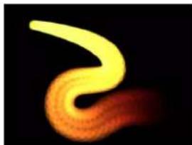
natural_image
Abstract glowing yellow and orange curved shape against black background (no text or symbols)
natural_image
Illustration of a yellow worm-like organism with a red tail-like tail against a black background (no text or symbols)Paint stroke with applied Sequence Paint behavior
Note: The Paint Stroke feature is a design and graphics tool, not a retouching or rotoscoping tool.
Although paint strokes share the same parameters as all other shapes, they have additional specialized parameters that allow you to change the look of the paintbrush and to create particle-like animation effects. Additionally, paint strokes have a special behavior called Sequence Paint, which animates the specific stroke parameters over time, including opacity, rotation, and scale. For more information, see Sequence Paint on page 877.
For specific information about shapes, masks, or paint strokes, choose a topic in the Help table of contents (the sidebar to the left of this window).
Draw simple shapes
The Rectangle, Circle, and Line tools create simple shapes.
Draw a rectangle shape
1 Select the Rectangle tool in the toolbar (or press R).

The Rectangle Tool HUD appears. To change the color or roundness of the shape before it is drawn, use the controls in the HUD. Select the Outline checkbox to create an outline with the shape. The Width slider adjusts the width of the outline. The Rectangle shape layer does not appear in the Layers list until the shape is drawn.
Note: Outlines can be added and edited after a shape is drawn.
2 Click in the Canvas to define the first corner of the rectangle, drag until the resulting rectangle is the size you want, then release the mouse button to finish drawing.
To create a perfect square, press Shift while you drag. To draw the rectangle from its center, press Option while you drag.
3 After you create the shape, press Esc to exit shape-drawing mode and activate the Select/Transform tool.
The Shape HUD appears.
Draw a rounded rectangle shape
1 Create a rectangle shape as described above.
2 Do one of the following:
- Drag the roundness handle in the upper-left corner of the shape.

• In the HUD, adjust the Roundness slider.
Note: You can also set the Roundness value in the Shape HUD before drawing the rectangle.
- In the Inspector, open the Geometry pane and adjust the Roundness slider.
Draw a circle shape
1 Choose the Circle tool from the shape tools pop-up menu in the toolbar (or press C).

The Circle Tool HUD appears. To change the color of the shape before it is drawn, use the color controls in the HUD. Select the Outline checkbox to create an outline with the shape. The Width slider adjusts the width of the outline.
2 Click in the Canvas to define the start point of the bounding box that defines the circle, drag until the resulting circle is the size you want, then release the mouse button to finish drawing.
To create a perfectly symmetrical circle, press Shift while you drag. To draw the circle from its center, press Option while you drag.
Tip: If you change a circle's Shape Type to B-Spline in the Geometry pane of the Shape Inspector, you can use different methods to manipulate the circle.
3 After you create the shape, press Esc to activate the Select/Transform tool.
The Shape HUD appears.
Draw a line
1 Choose the Line tool from the shape tools pop-up menu in the toolbar.

The Line Tool HUD appears. To adjust the color and width of the line before it is drawn, use the controls in the HUD.
2 Click in the Canvas to define the start point of the line, and keep holding down the mouse button.
3 Drag until the resulting line is the length you want, then release the mouse button.
Pressing Shift while dragging constrains the line movement to 45-degree angles.
Important: Because a line is really an outline, all Outline parameters in the Inspector apply to a line.
4 After you create the shape, press Esc to activate the Select/Transform tool.
The Shape HUD appears.
Add shapes from the Library
The Shapes category in the Library contains pre-drawn shapes that can be added to a project. After you add a shape from the Library, the shape can be edited.
Add a shape to a project from the Library
1 In the Library, select the Shapes category.
2 Do one of the following:
- Select a shape, then click Apply in the preview area.
- Drag a shape from the Library into the Canvas, Layers list, or Timeline.
The shape is added to the project and can be modified. For information on editing shapes, see Edit shape fill, outline, and feathering on page 837.
Draw complex spline shapes and masks
Bezier shapes and B-Spline shapes overview
In Motion, you can draw complex shapes using splines. Splines are vector-based curves that allow for complex, customized shapes. There are two spline-drawing methods available in Motion: Bezier splines and B-Splines. You can use Bezier splines and B-Spline splines interchangeably for any task, and for either shapes or masks. The default spline shape type is Bezier.
Bezier splines are good for drawing shapes for illustration. The controls used to manipulate Bezier splines are similar to those found in many other drawing and compositing applications, so they may be familiar to you. Bezier controls lend themselves to the creation of precise, detailed shapes. Tangent handles adjust the curvature of the shape on either side of the control point, and this defines the surface of the shape.

B-Splines can also be used to draw shapes, but unlike Bezier controls, B-Splines are manipulated using only points—there are no tangent handles. Furthermore, the points themselves do not lie on the surface of the shape. Instead, each B-Spline control point is offset from the shape's surface, magnetically pulling that section of the shape toward itself to create a curve. By combining the influence of multiple B-Spline points, you can create different curves. B-Splines are extremely smooth—by default, there are no sharp angles in B-Spline shapes, although you can create sharper curves, if necessary.

Because B-Spline controls are so simple, they're easy to animate and manipulate. The tools you use for a specific task are largely a matter of personal preference.
Note: Shapes drawn with Bezier and B-Spline tools can be converted into paint strokes by selecting the shape's Outline checkbox and choosing a different brush type in the Inspector. For more information, see Paint strokes overview on page 839.
Draw Bezier shapes and masks
This section describes how to draw a Bezier shape. These methods apply to both the Bezier shape and mask tools. This section focuses on drawing shapes. For more information on drawing masks, see Masks and transparency overview on page 888.
Draw a Bezier shape
1 Choose the Bezier tool from the pop-up menu in the toolbar (or press B).

Note: The Bezier Mask tool is located in the mask tools pop-up menu in the toolbar.

The Bezier Tool HUD appears. (If it does not appear, press F7.) To change the color of the shape before it is drawn, use the color controls in this HUD. Select the Outline checkbox to create an outline with the shape. The Width slider adjusts the width of the outline. After you create the shape, the Shape HUD appears.
Note: Outlines can be added and edited after a shape is drawn.
2 Click in the Canvas to draw the first point.
3 To add points to further define the shape, do one of the following:
- Click to make a linear corner point.
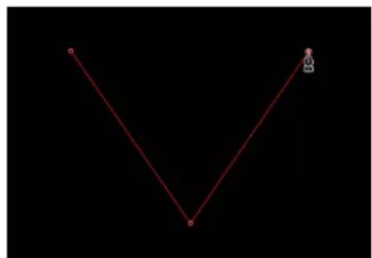
natural_image
Simple V-shaped line drawing with two endpoints and a small robot icon on the right (no text or symbols)- Click, then drag to make a curved Bezier point, adjusting it to the shape you want.

natural_image
Abstract red curved line on black background with a diagonal gray line and marked points (no text or symbols)Press Shift while making a curved point to constrain its tangents to 45-degree angles. Press Command-Equal Sign (=) to zoom in for a closer look and Command-Hyphen (-) to zoom out. You can scroll around by pressing the Space bar as you drag in the Canvas. If you have a Multi-Touch trackpad, it's even easier: pinch open or closed to zoom in or out, and use a two-finger swipe to scroll around.
4 To finish the shape, do one of the following:
- Click the first point you drew to create a closed shape.
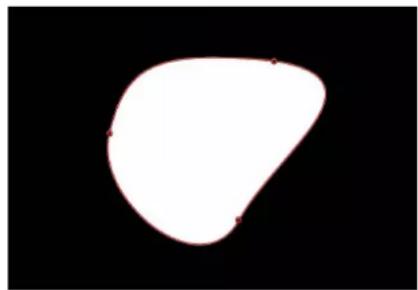
natural_image
Abstract white irregular shape on black background (no text or symbols)- Press C to close the shape, joining the first point you created to the last.
- Double-click anywhere in the Canvas to create the last point of an open shape.
- Press Return to create the last point of an open shape.
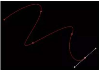
natural_image
Abstract red curved line on black background with white dots and diagonal lines (no text or symbols)Note: Before a shape is closed, you can press Esc to cancel the entire operation, deleting the shape.
Immediately after finishing a shape, the Shape HUD appears and the Edit Points tool is selected, which lets you edit the shape you've just created.
Draw B-Spline shapes and masks
This section describes how to draw a B-Spline shape. These methods apply to both the B-Spline shape and mask tools, but this section focuses on drawing shapes. For more information on drawing masks, see Masks and transparency overview on page 888.
Draw a B-Spline shape
1 Choose the B-Spline tool from the pop-up menu in the toolbar (or press B).
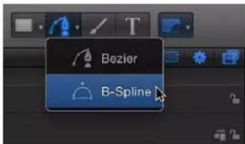
Note: If the Bezier tool is selected, pressing B once selects the B-Spline tool. If another tool is selected, such as the Text tool, press B twice to select the B-Spline tool. The B-Spline Mask tool is located in the mask pop-up menu in the toolbar.

The B-Spline Tool HUD appears. (If it does not appear, press F7.) To change the color of the shape before it is drawn, use the color controls in this HUD. Select the Outline checkbox to create an outline with the shape. The Width slider adjusts the width of the outline. After you create the shape, the Shape HUD appears.
2 Click in the Canvas to draw the first point.
3 Continue clicking to draw additional points to define the shape you need.
While drawing a shape, you can move and adjust the control points you've created before finishing the shape. You can adjust any control point except the first one you created, because clicking the first point closes the shape. Press Shift while making a curved point to constrain its tangents to 45-degree angles. As you create new B-Spline control points, keep the following in mind:
- The control points you draw influence the shape of the curve from a distance. They do not lie directly on the surface of the curve.
- To create more detailed curves, create more points. However, it's best to use the fewest number of points necessary to create the amount of detail you need. Shapes with an excessive number of points can be difficult to edit later on.
- In many instances, it is easier to create a loose group of control points first and then adjust them afterwards to create the precise curve you need in a later step.
4 When you're ready to finish your shape, do one of the following:
- Click the first point you drew to create a closed shape.
- Press C to close the shape, joining the first point you created to the last.
- Press Return to finish an open shape at the last point you made.
- Double-click anywhere in the Canvas to define the last point of an open shape.
Note: You can press Esc to cancel the entire operation and delete the shape.
Immediately after finishing a shape, the Shape HUD appears and the Edit Points tool is selected, which lets you edit the shape you've just created.
Modify the smoothness of B-Spline control points
Each control point on a B-Spline path affects the curvature of the shape nearby. By default, these curves are very rounded, but you can adjust the degree of roundness, even creating sharp corner points by adjusting the control point weight handle.
1 Create a shape using B-Splines.
2 With the Edit Points tool selected, Command-drag a control point.
A weight handle appears.

natural_image
Simple white speech bubble shape with a red outline and small green arrow pointer on the right side (no text or symbols)3 Drag the weight handle away from the control point to sharpen the path or towards the control point to smooth the path.
Draw masks using the Freehand Mask tool
Like the Paint Stroke tool, the Freehand Mask tool lets you create a mask shape in one movement, rather than drawing the shape in a point-by-point fashion (like a Bezier or B-Spline shape). For best results, use a stylus and tablet when using the Freehand Mask tool. For more information on drawing masks, see Masks and transparency overview on page 888.
Draw a freehand mask
1 Select the layer to mask, choose the Freehand Mask tool from the mask pop-up menu in the toolbar.

The Freehand Mask Tool HUD appears.
2 Adjust the controls in the Freehand Mask Tool HUD.
• To change the blend mode of the mask before it is drawn, choose an item from the Mask Blend Mode pop-up menu.
- Adjust the Feather slider to soften the mask. Positive values spread the feathering outward; negative values feather the shape inward.
3 Do one of the following:
- If using a mouse, click in the Canvas, but don't release the mouse button.
- If using a tablet, touch the stylus on the tablet to begin drawing the mask in the Canvas.
Continue drawing around the layer you are masking. To close the mask, finish the line at the mask's starting point. A small circle appears when the pointer is over the starting point.
Note: If you don't close the mask at its starting point, the mask is closed when you release the mouse button.

natural_image
Close-up of a giraffe's head in a forested enclosure, no visible text or symbols- A small circle indicates target to close mask.
The mask is completed.
4 Edit your control points to fine-tune the mask.
For more information on editing control points, see Move control points to adjust a shape on page 847.
Edit shape fill, outline, and feathering
After you draw a shape using the Bezier or B-Spline shape tools or the basic shape tools, you can adjust the fill, outline, and feathering to suit your needs.
Edit a shape's outline
1 Select a shape, then open the Shape Inspector.
2 To manipulate the shape's outline, do any of the following in the Style pane of the Shape Inspector:
- To turn a shape's outline on or off, click the Outline checkbox. When selected, the checkbox turns blue.
- To change the color of the outline, adjust the Brush Color parameter in the Outline controls.
- To change the width of the outline, drag the Width slider.
Note: You can also use the Shape HUD to turn the outline on and off, and to change its color, roundness, and width.
- To change how the outline's sharp corners are drawn, choose an item from the Joint pop-up menu.
- To change the shape of an outline's start and end caps, choose an item from the Start Cap or End Cap pop-up menu.
- To change whether the outline appears over or under a shape's fill, choose a command from the Order pop-up menu.
- To change the outline from the default solid to an editable paint stroke, set Brush Type to Airbrush or Image. For more information, see Shape Inspector on page 855.
3 To change the roundness of the outline, adjust the Roundness slider in the Geometry pane of the Shape Inspector (or in the Shape HUD).
Edit a shape's fill
1 Select a shape.
2 In the Style pane of the Shape Inspector, do any of the following:
- To turn a shape's fill on or off, click the Fill checkbox.
- To change a shape's fill mode from a solid color to a gradient, choose an item from the Fill Mode pop-up menu.
- If the shape's fill mode is set to a solid color, you can choose the color using the Fill Color controls.
- If the shape's fill mode is set to a gradient, you can choose a gradient from the gradient preset pop-up menu, or click the Gradient parameter's disclosure triangle to display the gradient editor and create your own custom gradient. For more information on using gradient editors, see Gradient editor on page 135.


Filled shape Empty shape
Feather a shape
1 Select a shape.
2 If the shape's outline is visible, deselect the Outline checkbox in the Style pane of the Shape Inspector.
3 Adjust the Feather slider in the HUD or in the Style pane of the Shape Inspector.
Positive values spread the feathering outward, while negative values feather the shape inward.
4 Optionally, you can also adjust the Falloff parameter in the Style pane of the Shape Inspector, which controls how steep the feathering is.

natural_image
Circular diagram with a red outline and three black dots on a white background (no text or symbols)
natural_image
Circular gradient shape with red outline on black background, no text or symbols presentFeathered inFeathered out
Note: You can only feather shapes that have the outline turned off.
Draw paint strokes
Paint strokes overview
Unlike a freehand Bezier or B-Spline shape drawn one point at a time, a paint stroke is typically created with one continuous movement. Technically, paint strokes are outline-only shapes created using any shape tool. An outline-only shape is indicated by a paintbrush icon in the Layers list and Timeline. This icon changes to a shape icon when a shape fill is enabled.
Note: The Paint Stroke feature is a design and graphics tool, not a retouching or rotoscoping tool.
There are two ways to create a paint stroke:
- Select the Paint Stroke tool in the toolbar, then draw a stroke in the Canvas using a stylus and tablet (or a mouse or Multi-Touch device).
- Create a shape (paint stroke, line, rectangle, or circle) in the Canvas, select the Outline checkbox in the Style pane of the Shape Inspector, then choose Airbrush or Image from the Brush Type pop-up menu.
For more information about converting a shape to an editable paint stroke, see Convert shape outlines to paint strokes on page 843.
The Paint Stroke tool creates a shape outline comprised of dabs. Dabs are vector or image parcels that combine to create the outline of paint stroke. Dabs are analogous to the particles of a particle system but are arrayed along the spline of a paint stroke rather than scattered across the Canvas. The default Airbrush paint stroke is comprised of circular dabs. You can also use an image as the source of dabs. By default, dabs are spaced so closely along the paint stroke spline that they appear to form a solid, unbroken line. However, if you increase the Spacing value in the Inspector, the dabs will appear as separate parcels along the stroke outline. In addition to spacing, you can modify dab color, opacity, scale, and angle in the Inspector after a stroke is created. For more information, see Stroke pane on page 860.
Paint strokes can be animated by applying Basic Motion, Simulation, and Parameter behaviors, or a special category of behaviors called Shape behaviors, including a behavior to sequence effects over the length of the stroke. For more information on using the Shape behaviors, see Shape behaviors overview on page 871. Paint strokes can also be keyframed.
Note: The stroke's shape (defined by its control points) and open/closed state can be modified in the Canvas or Inspector. Because a stroke is a shape, it can be edited like any other shape, using the methods described in Edit shape fill, outline, and feathering on page 837.
After you select the Paint Stroke tool in the toolbar and before drawing the stroke in the Canvas, you can define the color and other attributes of the stroke in the Paint Stroke Tool HUD. Depending on the effect you want, you may achieve better results using a stylus and tablet with the Paint Stroke tool. Many styles and brushes take advantage of the pen pressure and speed applied when creating the stroke using a graphics tablet. You can apply the pressure or speed to different stroke parameters, such as width, opacity, and spacing. For example, choosing Width from the Pen Pressure pop-up menu in the Paint Stroke Tool HUD results in wider strokes when you apply more pen pressure.
Using the Write On parameter, you can record a stroke so it "draws" over time. In this case, a Write On Shape behavior is applied to the stroke using as its settings the time it took to draw the stroke and the speed at which each section of the stroke was created. These settings can be modified after the stroke is created. A Write On behavior can also be applied after a paint stroke is created. For more information on using the Write On behavior, see Write On on page 881.
Create a paint stroke
Create paint strokes and preview the stroke attributes using controls in the HUD.
Make a paint stroke
1 Select the Paint Stroke tool (or press P).

The Paint Stroke Tool HUD appears. (If it doesn't appear, press F7.)
Important: Like the other drawing tool HUDs, the Paint Stroke Tool HUD is available only after the Paint Stroke tool is selected and before you create your stroke in the Canvas. The Paint Stroke Tool HUD lets you set the properties derived from the pressure and speed of the stylus before the stroke is drawn.
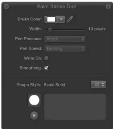
2 Define a paint stroke style in the HUD:
a Choose an option from the Shape Style preset pop-up menu.
b Modify the Brush Color and Width settings.
If a preset is not used, a basic solid stroke is created. You can still apply a preset to the stroke using the Inspector. Presets do not override the width or color of the stroke set in the HUD.
Note: The Pen Pressure and Pen Speed parameters become available depending upon the chosen style. These parameters are not available with a solid brush type.
3 If you want to create a stroke that's drawn over time, select the Write On checkbox.
Selecting the Write On checkbox applies a Write On behavior the stroke. As with any other behavior, you can modify its parameters in the HUD or Inspector. For more information on using the Write On behavior, see Write On on page 881.
4 Draw your stroke in the Canvas, then press S or Esc to activate the Select/Transform tool.
The Paint Stroke Tool HUD is replaced with the Shape HUD, which contains basic parameters identical to all other shape HUDs. Consequently, after a stroke is drawn, you must use the Inspector to modify parameters unique to the paint stroke and its dabs.
Preview the paint stroke in the Paint Stroke Tool HUD
The lower portion of the Paint Stroke Tool HUD contains a sketch area displays a preview of a paint stroke effect.
1 Select the Paint Stroke tool in the toolbar.
2 Do one of the following:
- Select any brush style in the Paint Stroke Tool HUD, then draw a stroke in the sketch area to see a preview of the paint stroke.
- Select the Write On checkbox, draw a stroke in the sketch area, then click the Play button to see a preview of the write-on stroke.
- Apply a preset from the Shape Style pop-up menu to an existing stroke in the sketch area. If the preset is an animated stroke, the stroke is automatically drawn in the sketch area. Press the Play button to see the stroke animation again.
Important: Some operations, as well as the application of some filters or a mask, cause a group to be rasterized. Because all paint strokes reside in groups, this affects how strokes interact with other objects in your project. For more information, see Groups and rasterization on page 1045.
Paint Stroke tool controls in the HUD
The Paint Stroke Tool HUD appears after the Paint Stroke tool is selected in the toolbar and before a stroke is drawn. This HUD contains controls that define the color and width of the stroke and how pen pressure and speed affect the stroke (opacity, width, and so on), a checkbox that allows the stroke to be "drawn in" over time, smoothing controls, and a Shape Style pop-up menu for quick access to preset brush styles and a sketch area for sampling these brush styles.
Controls in the HUD
- Brush Color: Color controls that set the color of the brush. For more information on using these controls, see Basic color controls on page 132.
- Width: A slider that defines the width of the paint stroke.
- Pen Pressure: A pop-up menu that sets stroke properties derived from the pressure of your pen before creating the stroke. This parameter is not available for solid brush types. Only strokes drawn using a stylus and tablet will have recorded pressure variations. Choose from one of the following:
•Nothing: Pen pressure is ignored.
- Width: The harder the pen pressure, the wider the stroke. To adjust the width of the dabs after the stroke is created, use the width and brush scale controls in the Style and Stroke panes.
- Opacity: The harder the pen pressure, the more opaque the stroke. To adjust the opacity of the dabs after the stroke is created, use the opacity controls in the Style or Stroke pane.
- Spacing: The harder the pen pressure, the greater the spacing between stroke dabs. To adjust the spacing of the dabs after the stroke is created, use the spacing controls in the Style or Stroke pane.
•Angle: The harder the pen pressure, the greater the angle of the stroke dabs. To adjust the angle of the dabs after the stroke is created, use the angle controls in the Stroke pane.
- Jitter: The harder the pen pressure, the larger the amount of jitter on the stroke. Jitter randomizes the position of the paint dabs, giving the dabs a particle-like appearance. To adjust the jitter of the dabs after the stroke is created, use the jitter controls in the Stroke pane.
Note: You can affect multiple parameters on a single stroke, such as pressure affecting opacity and spacing. Choose an option, such as Opacity, before the stroke is created. After you create the stroke, apply a pen shape behavior to the stroke and apply the action to another parameter, such as Spacing. For more information on the pen shape behaviors, see Shape behaviors overview on page 871.
- Pen Speed: A pop-up menu that sets the stroke's width, opacity, spacing, angle, and jitter based on the speed recorded when drawing the stroke with the Paint Stroke tool. These settings can be applied to paint strokes created using a stylus and graphics tablet or mouse. This parameter is not available for solid brush types. Choose from one of the following:
•Nothing: Pen speed is ignored.
- Width: The faster you move the pen, the more narrow the stroke; the slower you move the pen, the wider the stroke. To adjust the width of the dabs after the stroke is created, use the width and brush scale controls in the Style and Stroke panes.
- Opacity: The faster you move the pen, the less opaque the stroke. To adjust the opacity of the dabs after the stroke is created, use the opacity controls in the Style or Stroke pane.
- Spacing: The faster you move the pen, the greater the spacing between the dabs of the stroke. To adjust the spacing of the dabs after the stroke is created, use the spacing controls in the Style or Stroke pane.
•Angle: The faster you move the pen, the greater the angle of the stroke dabs. To adjust the angle of the dabs after the stroke is created, use the angle controls in the Stroke pane. -
Jitter: The faster you move the pen, the larger the amount of jitter on the stroke. Jitter randomizes the position of the paint dabs so they appear more like particles. To adjust the jitter of the dabs after the stroke is created, use the jitter controls in the Stroke pane.
-
Write On: A checkbox that, when selected, allows a stroke to be "painted" on the Canvas over time. For more information, see Write On on page 881.
- Smoothing: A checkbox that, when selected, creates a smoother stroke with fewer control points. Paint strokes drawn with smoothing on are created as bezier shapes. Paint strokes drawn with smoothing off are created as linear shapes.
- Shape Style: A pop-up menu that specifies a preset shape style (from the Library) to the selected shape. You can also save any custom shape style to the Library using this pop-up menu. Any stroke (shape) presets you have saved to the Library also appear in this list.
- Sketch area: An empty field where brush styles can be sampled in combination with the current Paint Stroke Tool HUD settings.
Convert shape outlines to paint strokes
You can convert a shape outline into a paint stroke by modifying the Brush Type in the Inspector. After a shape outline is assigned a different brush type, paint stroke parameters become available. You can modify and animate its brush parameters, as well as apply the Sequence Paint behavior.
Convert an existing shape into an editable paint stroke
1 Select an existing shape.
2 In the Shape HUD or Style pane of the Shape Inspector, select the Outline checkbox.
Modify any Outline parameter you want. In this example, the outline is widened and colored orange.
natural_image
A white circle centered on a black background, no text or symbols present.Default circle shape with Outline checkbox deselected

natural_image
Simple orange circular shape on black background, no text or symbols presentCircle shape with Outline checkbox selected
3 If you don't want the shape filled, deselect the Fill checkbox in the Shape HUD or Style pane of the Shape Inspector.

natural_image
Simple orange circular ring on black background (no text or symbols)Note: Solid must be chosen from the Brush Type pop-up menu in the Style pane of the Shape Inspector for the shape fill options to remain available.
After Fill is deselected, the shape icon in the Layers list becomes a paint stroke icon.
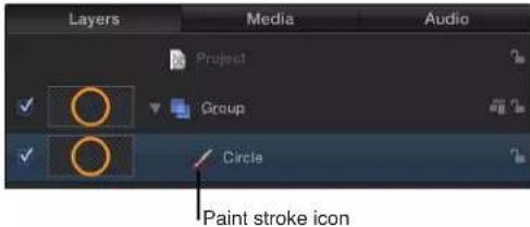
4 In the Style pane of the Shape Inspector, choose Airbrush from the Brush Type pop-up menu.
After the Brush Type is changed to Airbrush (or Image), the following occurs:
- The stroke softens because it is using a soft brush type. A paint stroke is comprised of dabs and the brush type is the source for the dabs. The brush profile can be modified to vary opacity within the brush. You can apply a custom opacity gradient to the brush profile.
- The Stroke pane becomes available. Use the Stroke pane to set the Stroke Color mode and Brush Scale parameters, and to adjust various options.
• The Advanced pane becomes available. The Advanced pane contains a single group of Dynamics controls that allow the dabs of a paint stroke to be animated like particles. For more information on Dynamics, see Advanced pane on page 867.
Note: When a paint stroke is created using the Paint Stroke tool in the toolbar, additional stylus parameters appear in the Advanced pane.
5 Use the controls in the Style, Stroke, and Advanced panes of the Shape Inspector to modify or animate your paint stroke.
For a complete description of these parameters, see Shape Inspector on page 855, Stroke pane on page 860, and Advanced pane on page 867. In the example below, the Additive Blend parameter is enabled in the Style pane. Additionally, the Color Over Stroke, Spacing Over Stroke, Width Over Stroke, Brush Scale, and Brush Scale Randomness parameters are modified in the Stroke pane.

natural_image
Circular glowing object with yellow-orange gradient against black background (no text or symbols)Edit control points
Edit control points overview
Complex shapes, masks, and paint strokes are defined by Bezier splines and B-Splines, which are built with control points. The control points, which lie along the spline in connect-the-dot fashion, determine the shape and curvature of the spline. You can modify a spline by dragging its control points and adjusting the tangent handles attached to each control point. You can transform multiple control points simultaneously. You can add, delete, and lock control points. And you can use dynamic guides and snapping to align control points to other control points and other objects. This section covers various ways to edit control points.
Display control points
There are several ways to display the control points of a shape to allow point-by-point editing in the Canvas.
Display a shape's control points
Do one of the following:
- Select a shape in the Canvas, Layers list, or Timeline, then choose the Edit Points tool from the 2D tools pop-up menu in the toolbar.

- Choose the Edit Points tool from the 2D tools pop-up menu in the toolbar, then select a shape in the Canvas, Layers list, or Timeline.
■Double-click a shape in the Canvas.
■ Control-click a shape in the Canvas, then choose Edit Points from the shortcut menu.
Note: Overlays must be enabled in the View pull-down menu (or the View pop-up menu) to see the control points and spline of a shape. In addition, if Handles are turned off in the View > Overlays submenu (or the View pop-up menu), you cannot see a shape's Bezier or B-Spline control points when editing. When editing shapes, make sure that Handles are enabled (in the View pull-down menu or View pop-up menu).
After you display a shape's control points, select control points to edit them. While editing the control points of a shape, you can select another shape and remain in control point-adjustment mode. This allows for quick modification of multiple shapes' control points.
Select and deselect control points
The following tasks describe how to select and deselect control points in the Canvas. For all these procedures, use the Edit Points tool (in the 2D tools pop-up menu).
Select control points
Do one of the following:
- Click any control point.
- Drag a selection box over multiple control points.
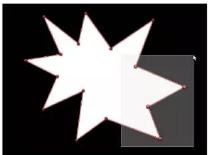
natural_image
Abstract geometric shape composed of white star-like shapes on black background, no text or symbols presentShift-click unselected control points to add them to the selection.
Shift-drag a selection box around unselected control points to add them to the selection.
Note: In Edit Points mode, when you place the pointer over a control point, an info window appears identifying the control point name. When dragging a control point, the info window displays the point's name and coordinates. You can choose not to display this info by opening the General pane of the Motion Preferences window and deselecting Show Tooltips.
Select every control point on a shape
- With the shape selected in the Canvas, choose Edit > Select All (or press Command-A).
Deselect control points
Do one of the following:
■Shift-click selected points.
■Shift-drag a selection box over selected points.
Deselect every control point on a shape
Do one of the following:
- Click the Canvas anywhere outside the selected shape.
- Choose Edit > Deselect All (or press Shift-Command-A).
Display an info window showing the control point number
By default, shape control points are numerically labeled in the order they were created in the Canvas.
- Enable Show Tool Info in the View pop-up menu, then position the pointer over any control point.
An info window appears showing the numeric name of the control point—"Control Point 1," for example.
Note: Shape control points are also listed by number in the Geometry pane of the Shape Inspector.
Move control points to adjust a shape
Because control points define the shape, you can move control points to change the shape. For all procedures described below, use the Edit Points tool (in the 2D tools pop-up menu).
Tip: You can also modify multiple control points across different shapes simultaneously by selecting them all at once.
Move control points
- Select control points on the shape in the Canvas, then drag the points to a new position.
As you drag selected control points, the rest of the shape stretches or curves to accommodate the change.

natural_image
Simple geometric shape composed of a white triangle and a red outline on black background (no text or symbols)Three shape control points selected

natural_image
Abstract geometric shape with white triangular form on black background (no text or symbols)Moving all three points simultaneously
- Press Command–Left Arrow, Command–Right Arrow, Command–Up Arrow, or Command–Down Arrow to nudge a point by one pixel (or Shift-Command to nudge by 10 pixels).
Constrain the movement of selected control points
1 Select control points.
2 Press Shift while you drag a selected point horizontally, vertically, or diagonally.
Important: Selected control points can only be moved—you cannot corner-pin them. To rotate or scale them, you must use the Transform Control Points command. See Transform multiple control points on page 848.
Modify shape edges
You can also select the line between two control points and drag the edge of the shape without affecting the rest of the shape.
Move a shape edge
1 With the Edit Points tool active, click any edge of a shape object.
The control points on either side of the line are selected.
2 Drag the line segment.

The distance between the two points remains constant, but the line can be moved freely. Press Shift to constrain the movement horizontally, vertically, or diagonally.
3 To release the selection, click anywhere outside the selection, or choose a different tool in the toolbar.
Transform multiple control points
You can scale and rotate a group of points as if they were a single object by using the Transform Control Points command. The lines connecting the selected points to unselected points will move and adjust.
Transform a group of control points
1 With the Edit Points tool selected, drag a selection box around the points you want to modify.
2 Choose Edit > Transform Control Points or press Shift-Command-T.
A transform box appears around the selected points.
Note: Transform Control Points is only available when at least two points on the same spline are selected.
3 Scale, rotate, offset the anchor point, and reposition the group of points as if they were a single object.
4 To release the selection, click anywhere outside the selection, or switch to a different tool.
Add and delete control points
If you did not create enough control points to make the shape you need, you can add more to the existing shape. You can also extend or close an open shape.
Add control points to a selected shape
1 Choose the Edit Points tool.
2 Do one of the following:
- Option-click or double-click the edge of a shape to add a new control point.
Note: To add control points to a B-Spline shape, Option-click or double-click the B-Spline frame's edge, rather than the edge of the shape itself.
- Control-click the edge of a shape, then choose Add Point from the shortcut menu.
Add control points to the end of an open shape
1 Select an open shape with the Edit Points tool.
2 Option-click anywhere outside the shape to add control points to the end of the shape.
3 Click the first point in the shape to close it (or place the pointer over the first point and press C).
The closed shape is not filled.
Close an open shape
Do one of the following:
■ With the Edit Points tool active, click the first point in the shape to close it (or press C).
The closed shape is not filled.
■ Control-click a control point, then choose Close Curve from the shortcut menu.
■ Display the Geometry pane in the Shape Inspector, then select the Closed checkbox.
You can reopen the shape by deselecting the Closed checkbox.
Create an open shape from a closed shape
Do one of the following:
■ Control-click a point on the shape, then choose Open Curve from the shortcut menu.
The segment before the point (in a clockwise order) is removed from the shape. This action causes the selected point to become Control Point 1 and the remaining points to be renamed accordingly. If the originally closed shape was filled, the Fill checkbox remains selected. To disable the fill, deselect the Fill checkbox in the HUD or Style pane of the Shape Inspector.
- Select the shape and deselect the Closed checkbox in the Geometry pane of the Shape Inspector.
Note: The spline before the first point drawn is removed. To change the start point (the first point drawn) of the shape, Control-click a point and choose Set Start Point from the shortcut menu.
Delete control points from a shape
If a shape has more control points than are necessary, you can delete points from it to make it easier to edit. This can be helpful if you animate the shape later on.
1 Select a shape with the Edit Points tool.
2 Select points to delete, then do one of the following:
- Choose Edit > Delete.
- Control-click the selected points, then choose Delete Point from the shortcut menu.
- Press Delete.
The shape changes to adjust to the missing point. If you remove points from a closed shape, the shape remains closed.
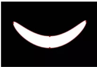
natural_image
Simple curved white shape on black background with no text or symbols
natural_image
Simple white semicircular shape on black background with no text or symbolsAfter deleting pointBefore deleting point
WARNING: If you delete a point from a shape that has a keyframed shape animation parameter in the Keyframe Editor, that control point is removed from the entire animation.
Lock control points
You can lock control points in a shape to fix them in place and prevent accidental modification. A shape with locked points can still be moved.
Lock and unlock points
1 Choose the Edit Points tool, then select a shape.
2 Control-click a control point, then choose Lock Point from the shortcut menu.
If the point was unlocked, it becomes locked. If the point was locked, Unlock Point appears in the shortcut menu, and the point becomes unlocked.

Locked points appear gray with a black dot in the middle of the point.
Edit Bezier control points
The methods used to adjust Bezier shapes are similar to those used by many other applications. Bezier control points are widely used to modify curves, and allow you to easily draw any shape you may need. Each point in a Bezier shape can be converted from a hard corner to a curve.
Note: For all procedures described below, use the Edit Points tool (in the 2D transform tools pop-up menu).
Convert control points between corners and curves
Do one of the following:
- Command-click a curved point to turn it into a corner (Linear) point.
- Command-drag a corner point to turn it into a curved (Bezier) point, creating adjustable tangent handles.
■ Control-click selected points, then choose Linear, Smooth, or Very Smooth (for B-Splines) from the shortcut menu to change the control point type.
Adjust a Bezier curve using the control point's tangent handles
Curved Bezier control points have two tangent handles that you use to adjust the curvature of the shape on either side of the control point. These handles can be adjusted in various ways to create symmetrical and asymmetrical curves. By default, these tangent handles are locked to one another at an angle of 180 degrees, although this can be overridden to allow each tangent to be independently adjusted.
Do one of the following:
- Drag a tangent handle to adjust its length. By default, the opposing tangent is locked to 180 degrees, and adjusting the angle of one tangent adjusts the other. However, the length of each tangent can be independently adjusted.
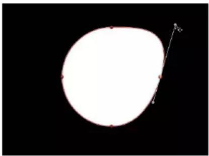
natural_image
Simple white oval shape on black background with a small arrow pointing upward (no text or symbols)- Option-drag either tangent to break the relationship between opposing tangents. After this relationship is broken, adjustments to one tangent have no effect on the other, and both tangents can be rotated freely.

natural_image
Simple white circular shape with a small arrow pointing to its right side, set against a black background (no text or symbols)■ Control-click a handle point, then choose Break Handle from the shortcut menu to break the relationship between opposing handles.

- Option-drag a broken tangent or Control-click a handle point and choose Link Handle from the shortcut menu to lock the angle of the tangents together again. The tangents now maintain their relationship when moved and rotated.
You can also press Option-Command and drag a handle point so the tangents maintain their broken relationship when moved and rotated.
- Control-click a handle point and choose Align Handles from the shortcut menu to align the tangents to a 180-degree angle.
Press Shift while you adjust a tangent to constrain its movement to 45-degree angles. To simultaneously modify the handles for more than one control point, Shift-select the points (on the same spline) and then adjust the tangents.
Important: If Record (automatic keyframing) is enabled, curve adjustments are keyframed, creating animated shape changes. Additionally, if a keyframe has been added to the Control Points parameter in the Geometry pane of the Shape Inspector, curve adjustments are keyframed, regardless of the Record button state.
Edit B-Spline control points
Editing the position of control points in B-Spline shapes is similar to editing Bezier shapes. In fact, the steps for selecting, moving, adding, deleting, and locking control points are almost exactly the same. The main difference in editing both types of shapes lies in how you manipulate and adjust curves.
The simplest, and usually fastest, way to manipulate B-Spline curves is to move B-Spline points closer to or farther from one another. When B-Spline points are moved closer to one another, a sharper curve is created. B-Spline points that are farther from one another create shallower curves.

natural_image
Simple curved line diagram with red endpoints and black fill on black background (no text or symbols)
natural_image
Abstract red line diagram forming a symmetrical V-shape on black background (no text or symbols)Sharper curve (B-Spline points are closer) Shallow curve
Each B-Spline control point tugs on a section of the shape, pulling it toward itself. As a result, you manipulate a shape's curve by moving its control points in the direction you want to pull the shape. For example, notice how every control point creating the S curve below is offset in the direction of the curve it influences.

natural_image
Abstract geometric shape with red curved lines inside a white square frame against black background (no text or symbols)Note: You can show and hide the B-Spline frame lines that enclose B-Spline control points by choosing View > Overlays > Lines.
By default, B-Spline shapes have no corners. However, you can adjust the amount of curvature at each B-Spline control point to create sharper curves using fewer control points. (You can even create corners at a single point, if necessary.)
The easiest way to adjust B-Spline point curvature is by Command-dragging the control point. You can also switch among three preset degrees of curvature.
Adjust B-Spline control point curvature
1 Command-drag selected B-Spline control points to make their curves progressively sharper.
A handle appears indicating the curvature adjustment you're making.
2 Do any of the following:
- Drag away from the point to make the curve progressively sharper.
- Drag toward the point to make the curve progressively looser.

natural_image
Simple geometric diagram showing a white circle inscribed in a black square with red dots at corners (no text or symbols)
natural_image
Simple geometric shape with a white circle inside a red diamond outline on black background (no text or symbols)
natural_image
Simple geometric shape with a white inner circle and red outline on black background (no text or symbols)Very smooth B-Spline point Smooth B-Spline point Linear B-Spline point
Note: After the handle appears, you can modify the curve without the Command key.
- Command-click the handle to switch between three progressively sharper amounts of curvature.
Alternatively, you can Control-click a B-Spline point, then choose Very Smooth, Smooth, or Linear from the shortcut menu.
Use dynamic guides and snapping
The Canvas dynamic guides and control point snapping help you align selected points with other objects. Use the following guidelines to turn off snapping, to allow for subtle shape adjustments:
- Press N to turn off snapping. Press N again to turn snapping back on.
- As you begin to move the selected control point, press and hold the Command key to turn off snapping as you drag the point.
Note: If you press Command and then drag a control point, adjustable tangent handles are created. If you press Command and click a curved point, that point becomes a corner point. For more information on editing Bezier curve control points, see Edit Bezier control points on page 850.
In Motion Preferences, you can specify whether control points snap to the center, edges, or both the center and edges of an object. For more information, see Canvas overview on page 55.
Use control point snapping on a shape
1 In the View pop-up menu above the right side of the Canvas, ensure that the Dynamic Guides item is checkmarked.
2 In the menu bar, choose View > Snap to ensure that snapping is turned on.
When active, a check mark appears next to the menu item.
3 Select the shape to edit, then choose the Edit Points tool from the 2D transform tools pop-up menu in the toolbar.

Note: In the Canvas, you can also Control-click a shape and choose Edit Points from the shortcut menu.
4 In the Canvas, drag a control point.
Yellow guides appear when the selected control point aligns with the edges or center of the original shape, the edges or center of other objects, or the center of the Canvas.
natural_image
Abstract white curved shape on black background (no text or symbols)
natural_image
Abstract curved shape with red highlights on black background, no text or symbols presentControl point snapping to left boundary of shapeOriginal shape
Shape parameters
Shape Inspector
The Shape Inspector appears when you select a shape in the Canvas, Layers list, or Timeline. This Inspector contains the Style, Stroke, Advanced, and Geometry panes. These panes contain parameters that set the fill and outline of shapes, the appearance and dynamic animation of paint strokes, the geometry of control points, and other advanced shape attributes. Some of these controls also appear in the Shape HUD.
Style pane
The Shape Inspector's Style pane contains controls to modify the fill and outline of a shape, including changing the brush type for an outline or paint stroke. The parameters are grouped into two main categories of controls: Fill and Outline. The Style pane is available for all shapes and paint strokes.
Shape Style pop-up menu
Use this pop-up menu to apply a preset shape style (from the Shape Styles category in the Library) to the selected shape. In addition to the preset styles, any custom styles you have saved to the Library also appear in this list.
Fill controls
Adjust this group of parameters to set custom color, opacity, and feathering attributes of shape fills. An activation checkbox turns on or off the fill parameters for the selected shape. By default, this checkbox is selected (highlighted blue) for new closed shapes.
- Fill Mode: A pop-up menu that sets how a shape is filled. There are two options:
•Color: Activates the Fill Color and Fill Opacity controls.
- Gradient: Activates the Gradient editor and Gradient preset pop-up menu.
- Fill Color: Color controls, available when Fill Mode is set to Color, that let you pick a color fill for the shape. For more information on using color controls, see Basic color controls on page 132.
- Fill Opacity: A slider, available when Fill Mode is set to Color, that adjusts the opacity of the fill (independently of the outline, if the Outline parameter is enabled).
- Gradient preset pop-up menu (unlabeled): A pop-up menu, available when Fill Mode is set to Gradient, that applies a preset gradient (from the Gradients category in the Library) to the selected shape. In addition to the preset gradients, any custom gradients you have saved to the Library also appear in this list.
- Gradient editor: A standard gradient editor, available when Fill Mode is set to Gradient, that sets custom color and opacity gradients. Click the disclosure triangle to the left to display all the gradient controls. For more information on using gradient editors, see Gradient editor on page 135. The controls for the Gradient editor are identical to the gradient controls for text, with one exception: The text gradient parameters include a dial to control the angle of the gradient. The shape gradient parameters, however, use Start and End point controls, available in the Inspector or via onscreen controls.
- Feather: A slider that feathers (softens) the edges of a shape. Positive feathering values soften the edge of the shape from its edge outward. Negative feathering values soften the edge of a shape inward from the edge.
Note: You cannot feather an object when the Outline checkbox is selected.
- Falloff: A slider that controls how "steep" the feathering is. Higher values result in feathering that's pushed farther inward, so the edge of the feathering effect is more transparent. Lower values result in the "core" of the feathering effect being pushed farther outward, so the edge of the feathering effect is less transparent.
Note: You cannot adjust Falloff when the Outline checkbox is selected.
Outline controls
Use this group of parameters to set the outline attributes of a shape. An activation checkbox turns on or off the outline parameters for a selected shape. By default, this checkbox is deselected for closed shapes and is selected for open shapes and paint strokes. When you select the Outline checkbox, the Brush Type, Brush Color, Brush Opacity, Width, First and Last Point Offsets, Order, and other controls become available.
- Brush Type: A pop-up menu that sets whether the outline is drawn with a Solid brush, Airbrush, or Image brush.

natural_image
Abstract white curved line on black background (no text or symbols)
natural_image
Abstract white curved line on black background (no text or symbols)
natural_image
Abstract orange spiral shape on black background (no text or symbols)Solid brush type Airbrush brush type Image brush type
- Solid: Creates a solid outline along the shape spline or paint stroke. The default setting.
•Airbrush: Creates an outline made up of editable brush strokes referred to as dabs. You can set the dabs to be close together so the line appears solid, or you can space the dabs further apart. When Brush Type is set to Airbrush, the Stroke and Advanced panes become available in the Shape Inspector. - Image: Lets you use a layer as a dab source. When Brush Type is set to Image, the Stroke and Advanced panes become available in the Shape Inspector.
- Brush Color: Color controls that let you pick a color to use for the outline or paint dabs. These color controls are identical to the shape Fill Color controls (and all color controls throughout Motion).
Note: When Stroke Color Mode (in the Stroke pane) is set to Color Over Stroke or Pick From Color Range, Brush Color is not available.
- Brush Opacity: A slider that defines the opacity of the entire stroke, regardless of the Brush Type setting.
Note: When Stroke Color Mode (in the Stroke pane) is set to Color Over Stroke or Pick From Color Range, the Brush Color and Brush Opacity parameters are unavailable. When Stroke Color Mode (in the Stroke pane) is set to Use Brush Color, you can adjust the opacity, in the Stroke pane, to change over the course of the stroke. For more information on using the Opacity Over Stroke parameter, see Stroke pane on page 860.
The Brush Opacity control defines a different opacity value for a shape and its outline.
natural_image
Simple orange square frame centered on black background (no text or symbols)Outline opacity set to 100%

natural_image
Simple geometric shape: a white square with a light orange border on a black background (no text or symbols)Outline opacity set to 50%
- Brush Source: An image well, available when Image is the selected Brush Type, that lets you set an image as the outline's brush source. Drag an image, image sequence, QuickTime movie, text object, or shape from the Layers list into the Brush Source image well.
Note: When a movie or image sequence is the brush source, additional parameters appear in the Outline group of controls. For more information, see Style pane movie controls on page 859.
- Brush Profile: A gradient editor, available when Airbrush is the selected Brush Type, that sets varying levels of opacity within the brush. The brush profile uses the same opacity controls as a standard gradient editor. For more information, see Gradient editor on page 135. The default Brush Profile gradient creates a soft airbrush.

natural_image
A blurred circular light source against a black background, no text or symbols present.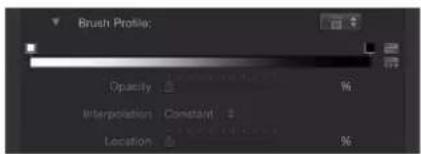
Modify the Brush Profile opacity gradient to create new brush looks.

natural_image
Circular gradient pattern on black background (no text or symbols)
- Width: A slider that changes the width of a shape's outline or width of a paint stroke's dabs. On paint strokes, width adjustments will alter the size of the dab while also maintaining the spacing between each dab.
Note: If you used the pressure parameters in the Paint Stroke Tool HUD to create variations in the stroke when the stroke was created, adjusting the Width parameter affects the width of the stroke uniformly.
- Preserve Width: A checkbox that, when selected, maintains the defined width of the outline/stroke when the shape is scaled. This option is available only when Solid is the selected Brush Type.
- Joint: A pop-up menu, available when Solid is the selected Brush Type, that sets how hard corners on a shape's outline are drawn. There are three options:
• Square: All corners are squared off.
•Round: All corners are rounded.
- Bevel: All corners are cut at an angle.
- Start Cap: A pop-up menu, available when Solid is the selected Brush Type, that lets you choose the shape of an open outline's start cap (the shape of the edge of an outline). There are five options:
• None: The stroke ends at the control point.
• Square: The cap is squared off.
•Round: The cap is rounded.
- Bevel: The cap is cut at an angle.
- Arrow: The cap is a customizable arrow. When Arrow is selected from the Start Cap or End Cap pop-up menus, the Arrow Length and Arrow Width sliders appear.
- End Cap: Pop-up menus that let you choose the shape of an outline's end cap. This option is only available when Solid is the selected Brush Type.
There are five options:
•None: The stroke ends at the control point.
• Square: The cap is squared off.
•Round: The cap is rounded.
- Bevel: The cap is cut at an angle.
- Arrow: The cap is a customizable arrow. When Arrow is selected from the Start Cap or End Cap pop-up menus, the Arrow Length and Arrow Width sliders appear.
- Spacing: A slider, available when Airbrush or Image is the selected Brush Type, that defines the space between dabs. A lower number creates a more solid line, and a higher number creates a greater distance between dabs.
- Additive Blend: A checkbox, available when Airbrush or Image is the selected Brush Type, that composites all overlapping dabs together using the Additive blend mode. By default, dabs are composited together using the Normal blend mode. The Additive blend mode occurs in addition to whichever compositing method is already in use.
- Reverse Stacking: A checkbox, available when Airbrush or Image is the selected Brush Type, that inverts the order in which the dabs are stacked. To see the effect of this parameter, dabs must be overlapping.
- First Point Offset: A slider that lets you offset and animate the start point of the outline. This is very useful for effects such as drawing a line across a map over time. (You can also use the Shape Write On behaviors to draw a stroke or outline over time. For more information, see Write On on page 881.)
- Last Point Offset: A slider that lets you offset and animate the end point of the outline.
- Order: A pop-up menu that sets whether an outline is drawn over or under the shape fill color or gradient. The effect is more apparent with thicker outline widths. There are two menu items:
• Over Fill: Outlines appear on top of the selected fill of the shape. - Under Fill: Outlines are obscured beneath the selected fill of the shape.
Style pane movie controls
Additional controls appear in the Style pane when the Brush Source is a multi-frame object such as a QuickTime movie or image sequence.
Movie parameters in the Style pane
- Play Frames: A checkbox that controls playback of Brush Source movie or image sequence. If the checkbox is selected, playback of the clip loops. If the Play Frames checkbox is deselected, the paint dabs use the still frame specified by the Random Start Frame parameter or the Source Start Frame parameter.
- Random Start Frame: A checkbox that introduces variation to image brush strokes when the Brush Source parameter contains a multi-frame movie or image sequence. If the checkbox is selected, each dab will pull from a random frame in the source clip. The dab will start animating from this random frame or remain still, depending on whether the Play Frames checkbox is selected or deselected. This pattern of randomness can be adjusted by using the Random Seed button in the Stroke pane.
- Source Start Frame: A mini-curve editor that defines the frame where playback of the source clip begins in the paint dabs. (For information on using the mini-curve editor, see Mini-curve editor on page 482.) The Source Start Frame default keyframe value is 0. You can change the start frame for all dabs, or you can create a curve so start frames vary over the length of the stroke (different dabs use different start frames). For example, if the first Source Start Frame value is 50, each dab begins playback at frame 50. If you create an animation curve that begins at 50 and ends at 250, each dab begins clip playback at a progressively later frame.
Note: The Play Frames checkbox must be selected for playback to occur. If Play Frames is deselected, you can display different still frames over the length of the stroke. This parameter only appears if Random Start Frame is deselected.
When you click the Source Start Frame disclosure triangle, the Stroke Length and Source Start Frame subparameters become available:
- Source Start Frame Over Stoke: A slider that adjusts the value of the selected keyframe in the mini-curve editor.
- Stroke Length: A slider that adjusts the value of the selected keyframe. Stroke Length is mapped horizontally on the mini-curve editor graph and provides a visual representation of the position of the changes in start frame value (keyframes) over the length of the stroke.
- Hold Frames: A slider that sets the number of times each frame of the source movie is repeated during playback. The larger the Hold Frames value, the slower your playback.
- Hold Frames Randomness: A slider that varies the number of frames to "hold."
Stroke pane
After you create an airbrush or image paint stroke, a set of paint stroke controls becomes available in the Stroke pane. These controls are similar to those of a particle system or replicator. Use them to set the Stroke Color Mode and Brush Scale parameters, and to adjust the Opacity, Spacing, Width, and Angle Over Stroke parameters.

The Stroke pane is available only when Brush Type pop-up menu in the Style pane is set to Airbrush or Image.
Stroke controls
- Stroke Color Mode: A pop-up menu that specifies how color is applied to the stroke over its length. There are three options:
- Use Brush Color: Uses the color of the brush as defined by the Brush Color parameter in the Style pane. The stroke is a solid color over its length. When you choose Use Brush Color from the Stroke Color Mode pop-up menu, the Opacity Over Stroke control becomes available.
•Color Over Stroke: Dabs are tinted based on their position over the length of the paint stroke. When you choose this option, the Color Over Stroke control becomes available.
- Pick From Color Range: Dabs are tinted at random, with the range of possible colors defined by a gradient editor. A point on the gradient is randomly chosen, so the relative sizes of each color region determine the frequency of the color being used.
- Opacity Over Stroke: An opacity gradient editor that appears when Stroke Color Mode is set to Use Brush Color. Use it to change the opacity of dabs based on their location on the stroke. This gradient control is limited to grayscale values, which are used to represent varying levels of transparency. White represents solid dabs, progressively darker levels of gray represent decreasing opacity, and black represents complete transparency. A simple white-to-black gradient represents a stroke that is solid at its start, but fades out gradually over its length until finally vanishing at the end. For information on using gradient editors, see Gradient editor on page 135.
• Color Over Stroke: A gradient editor defining the range of color of the stroke, beginning with the leftmost color in the gradient, and progressing through the range of colors until reaching the rightmost color at the end of the stroke. Gradual color changes do not appear in each dab, but only across the stroke as a whole. An opacity bar appears at the top of the gradient editor. For information on using gradient editors, see Gradient editor on page 135.

- Color Range: A gradient editor that appears when the Stroke Color Mode is set to Pick From Color Range. Use it to define a range of colors to randomly tint the stroke's paint dabs. The direction of the gradient colors is not relevant, only the number of colors that appear in the gradient. The Color Range parameter has the same controls as the Color Over Stroke parameter. For information on using gradient editors, see Gradient editor on page 135.
• Color Repetitions: A slider, available when you choose Color Over Stroke from the Stroke Color Mode pop-up menu, that increases the number of times the gradient is repeated over the stroke.
- Spacing Over Stroke: A mini-curve editor that lets you customize the spacing of the dabs over the length of the stroke. You can create a curve that gradually increases the dabs' spacing over the length of the stroke, create a curve that varies the dabs' spacing over the length of the stroke, and so on. Select or add a keyframe in the graph to make changes to the Spacing Over Stroke and Stroke Length parameters.
In the following illustrations, the default Spacing Over Stroke value of 100% in the mini-curve editor creates an even distribution of the dabs—based on the value set in the Spacing parameter in the Style pane. For more information on using the mini-curve editor, see Mini-curve editor on page 482.

natural_image
Simple gradient-colored diagonal line on black background (no text or symbols)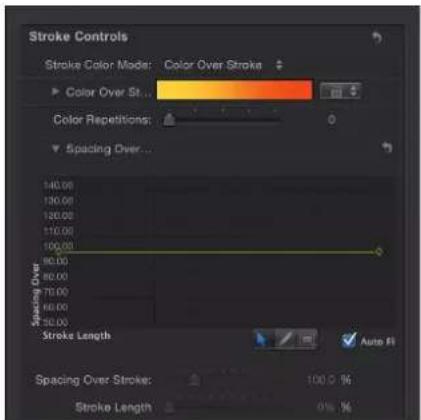
In the following illustrations, the Spacing Over Stroke curve in the mini-curve editor is adjusted so a greater value is used at the start of the stroke, and 100% is used at the end of the stroke. The dabs at the beginning of the stroke are spaced more widely apart and get closer at the end of the stroke.
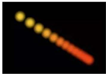
natural_image
Abstract gradient of yellow and red dots on black background (no text or symbols)
Two additional controls in the Spacing Over Stroke mini-curve editor let you fine-tune the value of selected points of the curve in the graph:
- Spacing Over Stroke: A slider that adjusts the spacing between dabs at the selected keyframe. Increasing this parameter increases the spacing between each dab in the stroke.
- Stroke Length: A slider that determines where along the range of the dabs within the stroke the Spacing Over Stroke value (for the selected keyframe) is applied.
- Fixed Brush Dabs: A checkbox that, when selected, keeps the number and spacing of the dabs constant regardless of the changes in the stroke's shape over time caused by behaviors or keyframe animation. The effect of this parameter is not visible when editing a paint stroke on a single frame.
- Anchor Dabs To: A pop-up menu, available when the Fixed Brush Dabs checkbox is deselected, that defines how dabs are added to or removed from a paint stroke when the length of the paint stroke is modified. When the Fixed Brush Dabs checkbox is selected, dabs are anchored to the start and end of the paint stroke. There are two options:
- Start: Adds dabs to or removes dabs from the start point of a paint stroke when the length of the paint stroke is modified. The first dab on the stroke remains fixed.
- Start and End: Adds dabs to or removes dabs from the start and end points of a paint stroke when the length of the paint stroke is modified. The first and last dabs on the stroke remain fixed.
Note: Changing a shape's control points or adjusting the Width or Spacing parameters (in the Style pane) or Spacing Over Stroke and Width Over Stroke parameters (in the Stroke pane) affects the dab spacing because larger dabs can be spaced further apart.
- Width Over Stroke: A mini-curve editor that lets you customize the width of the dabs over the length of the stroke. You can create a curve that gradually increases the dabs' width over the length of the stroke, create a curve that varies the dabs' width over the length of the stroke, and so on. Select or add a keyframe in the graph to make changes to the Width Over Stroke and Stroke Length parameters. The start value for the dab width is based on the value set in the Width parameter in the Style pane. For more information on using the mini-curve editor, see Mini-curve editor on page 482.
Two additional controls in the Width Over Stroke mini-curve editor let you fine-tune the values of selected points of the curve in the graph:
- Width Over Stroke: A slider that adjusts the width of the dab at the selected keyframe.
- Stroke Length: A slider that determines where along the range of the dabs within the stroke the Width Over Stroke value (for the selected keyframe) is applied.
The Width Over Stroke parameter can be adjusted on the selected paint stroke in the Canvas. For more information, see Use the Width Over Stroke onscreen controls on page 866.
- Brush Scale: A slider that adjusts the size of the brush (the source of the dabs). Click the disclosure triangle to adjust the X and Y scale values independently. By default, Scale is set to 100% — the size of the dabs is equal to the size of the source brush. Unlike the width parameter in the Style pane, brush scale adjustments affect only the size of the dabs and don't preserve the spacing between dabs.
- Brush Scale Randomness: A slider that defines an amount of variance in the scale of the stroke's brush. A value of 0 results in no variance—all dabs in the stroke are the same size. A value greater than 0 introduces a variance. The scale for an individual dab is defined by the Scale parameter, plus or minus a random value falling within the Brush Scale, Width Over Stroke, and Width (in the Style pane) parameters. Click the disclosure triangle to adjust the X and Y values independently.

natural_image
Abstract white dot pattern on black background (no text or symbols)- Align Brush Angle: A checkbox that, when selected, causes the stroke dabs rotate to match the shape on which they are positioned.
- Brush Angle: A dial that specifies (in degrees) the rotation of the stroke dabs. Using the default dial or value slider modifies the Z angle. When the Local 3D checkbox is selected, additional Brush Angle Randomness controls become available. Click the disclosure triangle to expose X, Y, and Z rotation dials and the Animate pop-up menu.
- Animate: A pop-up menu, available when the Local 3D checkbox is selected, that lets you change the interpolation for animated 3D rotation channels. Click the Brush Angle disclosure triangle to display the Animate parameter. By default, Animate is set to Use Rotation.
- Use Rotation: Dabs rotate from their start rotation to their final rotation. Depending on the animation, the elements may rotate multiple times before reaching their final orientation (the last keyframed value). For example, if the X, Y, and Z angle parameters are animated from 0 degrees to 180 degrees in a project, the elements rotate on all axes before reaching their final orientation.
- Use Orientation: Dabs rotate more smoothly and without multiple rotations. This option interpolates between the dabs' start orientation (first keyframe) and their end orientation (second keyframe).
- Angle Over Stroke: A mini-curve editor that lets you customize the Z rotation (in degrees) of the dabs over the length of the stroke. You can create a curve that gradually increases the dabs' angle over the length of the stroke, a curve that varies the dabs' angle over the length of the stroke, and so on. Select or add a keyframe in the graph to make changes using the Angle Over Stroke and Stroke Length controls, available under the graph:
- Angle Over Stroke: A dial that adjusts the angle of the dab at the selected keyframe.
- Stroke Length: A slider that determines where along the range of the dabs within the stroke the Angle Over Stroke value (for the selected keyframe) is applied.
- Brush Angle Randomness: A dial that defines an amount of variance in the rotation of the stroke dabs. A value of 0 results in no variance—all dabs have the same rotational value. A value greater than 0 introduces a variance. The angle for an individual dab is defined by the Brush Angle and Angle Over Stroke parameters, plus or minus a random value falling within the Brush Angle Randomness. Using the default dial modifies the Z angle. To modify the rotation of the dabs in X, Y, and Z space, or to access the Animate parameter, click the disclosure triangle when the Local 3D checkbox is selected.
- Animate: A pop-up menu, available when the Local 3D checkbox is selected, that lets you change the interpolation for animated 3D rotation channels. Click the Brush Angle Randomness disclosure triangle to display the Animate parameter. By default, Animate is set to Use Rotation.
- Use Rotation: Dabs rotate from their start rotation to their final rotation. Depending on the animation, the elements may rotate multiple times before reaching their final orientation (the last keyframed value). For example, if the X, Y, and Z Angle parameters are animated from 0 degrees to 180 degrees in a project, the elements rotate on all axes before reaching their final orientation.
- Use Orientation: Dabs rotate more smoothly and without multiple rotations. This option interpolates between the dabs' start orientation (first keyframe) and their end orientation (second keyframe).
- Local 3D: A checkbox that lets you take advantage of the Motion 3D workspace. When the Local 3D checkbox is selected, the following become possible:
- When the Face Camera checkbox is selected, paint dabs actively face the camera when the camera or stroke is rotated and/or animated.
- When the Dab Depth Ordered checkbox is deselected, dab ordering remains consistent when the paint stroke (or the camera) is rotated in X or Y space. When this checkbox is selected, the dabs jump in front of each other each time the stroke rotates 180 degrees. In other words, this checkbox draws the dabs in the stroke according to each dab's actual 3D position in the project. Dabs that are closer to the camera appear closer; dabs that are farther from the camera appear more distant.
- When the Dynamics checkbox is selected in the Advanced pane, a paint stroke acts similarly to an emitter—the dabs become particles. When the Local 3D checkbox is selected, the dabs are animated in 3D space. When the Local 3D checkbox is deselected, the particles are animated in X and Y space only. For more information on Dynamics, see Advanced pane on page 867.
- When the Dynamics checkbox is selected in the Advanced pane, dabs can be pulled out of their plane when some Simulation behaviors are applied. For example, if a paint stroke has an applied Attracted To behavior (with the Affect Subobjects checkbox selected), and the target layer is in a different location in Z space, the dabs are pulled into Z space and move toward the target layer. The paint stroke must be a member of a 3D group to be pulled out of the X and Y planes by a behavior.
Use the following guidelines when working in 3D with paint strokes:
- Even in a 2D project, a paint stroke's general properties can be adjusted in 3D space. For example, you can modify the Z parameter using the Position, Scale, Rotation, and Anchor Point controls in the Properties Inspector.
- Paint strokes do not receive reflections (controlled in the Properties Inspector) unless the Local 3D checkbox is deselected.
- Paint strokes do not cast shadows (controlled in the Properties Inspector) unless the Local 3D checkbox is deselected.
- Lighting does not effect paint strokes unless the Local 3D checkbox is deselected.
Important: Even if the Local 3D checkbox is selected, paint strokes do not intersect with the "global" 3D world. This means that paint strokes can exist in 3D space, but do not intersect with objects that exist inside their own group, or objects in other groups. A 3D paint stroke is composited with the rest of the objects in the project based on layer order.
- Face Camera: A checkbox, available when the Local 3D checkbox is selected, that forces stroke dabs to actively face the camera if the camera is rotated or if the paint stroke is rotated or animated. When the Face Camera checkbox is deselected, the dabs face forward in the stroke and appear flat (unless the source layer or paint dabs are rotated in 3D space).
Because paint source dabs are 2D (flat) objects, dabs are not visible when you use the orthogonal camera views, such as Left, Right, and Top (unless the source layer or dabs are rotated in 3D space). This is because orthogonal views are at right angles (perpendicular) to the dabs. For more information on using cameras, see Cameras overview on page 928.
- Dab Depth Ordered: A checkbox, available when the Local 3D checkbox is selected, that keeps paint dab ordering consistent when the paint stroke is rotated in X or Y space. When Dab Depth Ordered is not selected, the dabs jump in front of each other each time the stroke rotates 180 degrees.
-
Jitter: A slider that lets you create a little chaos in your paint dabs. The higher the value, the more dispersed the dabs become parallel and perpendicular to the stroke's control points. Jitter can be animated with keyframes so the dabs behave like particles. Click the disclosure triangle to display the individual X and Y sliders:
-
X : Moves the dabs parallel to the stroke's curves at control points.
- Y: Moves the dabs perpendicular to the stroke's curves at control points.
- Jitter Over Stroke: A mini-curve editor that lets you customize the scatter of the dabs over the length of the stroke. You can create a curve that gradually increases the dabs' jitter over the length of the stroke, a curve that varies the dabs' jitter over the length of the stroke, and so on. Select or add a keyframe in the graph to make changes using the Jitter Over Stroke and Stroke Length controls, available under the graph:
- Jitter Over Stroke: A slider that adjusts the amount of dab movement along the X and Y axes at specific points along the curve. Click the disclosure triangle to reveal individual X and Y axis sliders, to customize the jitter effect. Drag the X slider to adjust keyframes that define the amount of dab movement parallel to the stroke's curve at specific points along the stroke. Drag the Y slider to adjust keyframes that define the amount of dab movement perpendicular to the stroke's curve at specific points along the stroke. Use the Jitter Over Stroke parameter to adjust the amount of dab movement in both directions at specific points along the curve (adjusts red and green curve simultaneously).
- Stroke Length: A slider that determines where along the range of the dabs within the stroke the Jitter Over Stroke value (for the selected keyframe) is applied.

line
| Stroke Length | Jitter Over St... | | ------------- | ----------------- | | 0 | 35.68 % | | 1 | 35.68 % | | 2 | 0 % |- Random Seed: Controls that vary the Jitter, Brush Angle Randomness, and Brush Scale Randomness parameters (in the Stroke pane) and the Life, Speed, and Spin Randomness parameters (in the Advanced pane). If you don't like the current random distribution of the dabs, you can change the seed number by typing a new number in the value field or clicking Generate. The Jitter value must be 1 or more for this parameter to have any effect.
Use the Width Over Stroke onscreen controls
Typically the Width Over Stroke control is set in the Stroke pane of the Shape Inspector (which is only available when the Brush Type for the Outline of the selected shape is set to Airbrush). However, you can also adjust Width Over Stroke keyframe values in the Canvas by dragging an editable control that appears at each keyframe in the stroke.
Use the onscreen Width Over Stroke controls
1 In the Canvas, Control-click the paint stroke, then choose Stroke from the shortcut menu.
Small control points (+) appear at each keyframe along the red spline.
2 Click the control point that represents the keyframe you want to adjust.
Control handles appear on either side of the control point.
3 To increase the width of the dabs, drag away from the point; to decrease the width of the dabs, drag toward the point.

natural_image
Abstract white cloud-like shape with a red diagonal line intersecting it, against a black background (no text or symbols)4 To change the position of a width keyframe, drag the control point left or right to move it along the length of the stroke. (Keyframes can be dragged over one another.)
The mini-curve editor is updated as you make your onscreen adjustments.
5 To add width keyframes, Option-click or double-click the red spline.
6 To delete width keyframes, select the keyframe and press Delete.
Advanced pane
The Advanced pane of the Shape Inspector contains Dynamics controls that animate the dabs of a paint stroke like particles. Unlike particles, dabs are only "born" one time; but they can age and die like particles. Dynamic dabs share several controls with particles, such as Emission Angle, Life, Speed, and Spin. When the Dynamics checkbox is deselected, dabs are immortal and are not animated. The Advanced pane is not available until the Brush Type pop-up menu in the Style pane is set to Airbrush or Image.
Note: Although the Dynamics parameters are animated by default, you can customize the animation by keyframing or applying Parameter behaviors to the Dynamics parameters.
In addition to the Dynamics controls, the Advanced pane also contains controls for adjusting pen pressure and speed.
Dynamics controls
Select the activation checkbox and adjust this group of parameters to animate paint stroke dabs like particles. Click the Show button on the right side of the Dynamics row to reveal the Dynamics controls:
Note: When a Simulation behavior is applied to a paint stroke, the Affect Subobjects parameter appears in the behavior only when the Dynamics checkbox is selected for the paint stroke.
- Emission Angle: A dial and value slider that set the direction in which the paint dabs travel. This parameter works in conjunction with the Emission Range parameter.
- Emission Range: A dial and value slider that restrict the area in which the dabs travel, in the direction of the Emission Angle. Setting the Emission Range parameter to 0 degrees keeps dabs perpendicular to the paint stroke.
- Life: A slider that defines the duration of each dab, in seconds. This specifies how long each dab lasts before disappearing—similar to how sparks disappear after flying away from a sparkler.
- Life Randomness: A slider and adjacent value slider that define an amount of variance in the life of the paint dabs. A value of 0 results in no variance—all dabs from the selected stroke share the same life span. A value greater than 0 introduces a variance defined by the Life parameter, plus or minus a random value falling within the Life Randomness value.
- Speed: A slider that defines initial speed, determining how quickly each dab flies away from the stroke.
- Speed Randomness: A slider that defines an amount of variance in the speed of the paint dabs. A value of 0 results in no variance—all dabs from the selected stroke move with the same speed. A value greater than 0 introduces a variance defined by the Speed parameter, plus or minus a predetermined random value falling within the Speed Randomness value.
- Spin: A dial that animates the dabs of a paint stroke by initially spinning each dab around its center. Adjustments to this control are in degrees per second.
- Spin Randomness: A dial that defines an amount of variance in the spin of the paint dabs. A value of 0 results in no variance—all dabs from the selected stroke spin at the same rate. A value greater than 0 introduces a variance defined by the Spin parameter, plus or minus a random value falling within the Spin Randomness value.
Pen Pressure and Pen Speed controls
The Pen Pressure controls let you adjust the width, opacity, spacing, angle, or jitter of the paint stroke based on the pressure of your stylus on the tablet when the stroke was created. The Pen Speed controls let you adjust the width, opacity, spacing, angle, or jitter of the paint stroke based on the speed of your stylus on the tablet when the stroke was created. These controls appear when you create a paint stroke using the Paint Stroke tool in the toolbar or apply a shape style from the Shape Style pop-up menu to an existing paint stroke.
Note: Only strokes drawn using a stylus and tablet will have recorded pressure variations. You can select how the pressure of the stylus affects the stroke in the Paint Tool HUD before the stroke is created or afterwards by activating this parameter in the Advanced pane.
These controls are identical to the Apply Pen Pressure (Shape behavior) and Apply Pen Speed (Shape behavior) parameters. For more information, see Shape behaviors overview on page 871. The inspector parameters can be used in combination with these shape behaviors to affect more than one parameter (such as Opacity, Width, or Jitter) of the stroke using the same pressure and speed data.
Geometry pane
The Geometry pane of the Shape Inspector contains controls that allow you to change the shape type, to close or open a shape, and to individually adjust the position of a shape's control points using value sliders. The Geometry pane controls are available for all shapes regardless of what is selected in the Brush Type pop-up menu in the Style pane. You can change a shape's type at any time. Changing a shape's type changes its form. For example, a single set of control points produces the following three shapes, depending on the selected Shape Type.

natural_image
Simple white triangle shape on black background (no text or symbols)
natural_image
Simple geometric diagram showing a white oval inside a triangle with red dots at vertices (no text or symbols)
natural_image
Simple white irregular shape on black background (no text or symbols)Linear shape B-Spline shape Bezier shape
Geometry controls
- Shape Type: A pop-up menu that sets the type of control points used to define the shape. For example, if you originally created a Bezier shape, you can choose B-Spline from this menu to change each Bezier control point into a B-Spline control point. Changing the shape type does not move the control points, although the shape is changed, sometimes dramatically. There are three options:
- Linear: All control points are joined by hard angles, and the resulting shape is a polygon. The control points of a Linear shape lie directly on its edges.
- Bezier: Control points can be a mix of Bezier curves and hard angles, creating any sort of shape. The control points of a Bezier shape lie directly on its edge.
- B-Spline: Control points are all B-Spline points, with different degrees of curvature. B-Spline control points lie inside, outside, or on the edge of the shape, and are connected by the B-Spline frame.
Note: To show or hide the display of the B-Spline frame, choose View > Overlays > Lines.
- Closed: A checkbox that, when selected, connects the first and last points of an open shape. If you select a closed shape in the Canvas, this checkbox is selected. Deselecting this checkbox disconnects the first and last points, converting the object into an open shape.
- Roundness: A slider that adjusts the roundness of shape corners. Use this control to create rounded rectangles or to smooth the edges of any shape.
- Preserve Scale: A checkbox that controls whether the Roundness setting is absolute or relative to the overall shape size. When this parameter is enabled, the roundness will remain at the same approximate percentage of curvature as the object is scaled. When it is disabled, the curvature will vary as the overall shape changes size.
- Control Points: A numbered list of control points comprising the selected shape, with value sliders for modifying the position parameters of each control point in the shape. The Control Points list also contains a single Animation menu (at the right of the Control Points header row) that affects all the points, letting you add keyframes, reset the shape's animation, display the animation curve in the Keyframe Editor, and so on. For more information on using the Animation menu, see Animation menu on page 449.
Shape controls in the HUD
After you create and select a shape or paint stroke, the Shape HUD appears.
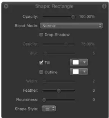
Note: As with all other layers, you can adjust the overall opacity of a shape (with its outline) in the Properties Inspector.
Additional parameters appear in the HUD along with standard Opacity, Blend Mode, and Drop Shadow controls. For more information on these standard parameters, see Parameters in the Properties Inspector on page 223.
Controls in the HUD
- Fill: A checkbox that, when selected, enables the shape fill. Use the adjacent color controls to select a fill color.
- Outline: A checkbox that, when selected, turns on an outline for the shape. Use the adjacent color controls to select an outline color.
- Width: A slider that sets the width of the shape's outline in pixels.
- Feather: A slider that feathers (softens) the edges of a shape. Positive feathering values soften the edge of the shape from its edge outward. Negative feathering values soften the edge of a shape inward.
Note: You cannot feather a shape when the Outline checkbox is selected.
- Roundness: A slider that controls the roundness of the corners of a shape. Use this control to create rounded rectangles or to smooth the edges of any shape.
- Shape Style: A pop-up menu that applies a preset shape style (from the Library) to the selected shape.
Edit shapes as layers
After you create a shape or a paint stroke, it becomes a layer. Because shape and paint stroke layers share most of the characteristics of other layers in Motion, you modify them as you would any other layer. Use the following tools and methods to modify shapes and paint strokes as layers:
- Transform tools: Choose a transform tool from the toolbar (Select/Transform, Anchor Point, Drop Shadow, Distort, or Crop) to activate onscreen transform to modify a selected shape layer.
- Transform controls in the Properties Inspector: The onscreen transform tools are shortcuts to like-named controls in the Properties Inspector. To set specific values, or fine-tune any of the transforms, use the Properties Inspector. For more information on the Properties Inspector and onscreen transform tools, see Parameters in the Properties Inspector on page 223.
- Opacity, Blend Mode, and Preserve Opacity controls in the Properties Inspector: Use these controls to modify a shape's overall transparency. For more information on using object blending parameters, see Blend modes overview on page 229.

natural_image
Color mixing diagram with overlapping circles in green, red, blue, yellow, orange, and magenta (no text or symbols)Shapes with multiple blend modes
- Masks: Use the mask-drawing tools in the toolbar to create masks that punch holes inside shapes. You can also apply an image mask to a shape, using another layer in Motion to define areas of transparency. For more information on using masks and image masks, see Masks and transparency overview on page 888.
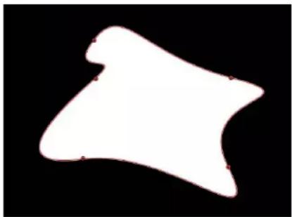
natural_image
Abstract white shape on black background, no text or symbols presentOriginal shape

natural_image
Abstract white star-shaped shape with a central black circle and red crosshair dots on a black background (no text or symbols)Shape with mask set to Subtract
- Filters: Apply filters to shapes to create specific looks. When you apply a filter to a shape, the shape remains editable, even though the filter changes it from a vector-based object into a bitmapped object to perform the operation. You can apply filters to individual shapes or to a group that contains a number of shapes. You can use filters to stylize shapes far beyond the options available in the Shape Inspector. More importantly, you can use filters in conjunction with the Shape Inspector parameters to customize a shape's look, while preserving the ability to re-edit the shape later. For more information on using filters, see Filters overview on page 741.

natural_image
Simple orange emoji-like shape resembling a stylized face or emblem on black background (no text or symbols)
natural_image
Simple flame icon with orange and red colors on black background (no text or symbols)Original shape Shape with filter applied
Important: After you apply a filter to a shape, you can no longer smoothly increase the size of that shape using the object's transform controls. This is because filters change shapes from vector objects to bitmapped objects. As a result, they scale like other bitmapped objects, which display artifacts if they're enlarged too much.
- Behaviors and keyframes: Animate shapes using both behaviors and keyframes. Shapes have their own special category of Shape behaviors that allow you to oscillate, randomize, or "wriggle" the individual control points of shapes, to "write on" a shape outline over time, or to apply tracking data to the control points of a shape. For more information, see Shape behaviors overview on page 871. Basic Motion and Simulation behaviors animate multiple parameters of a shape, such as Position, Rotation, and Scale. For more information on using Basic Motion, Parameter, and Simulation behaviors, see Behaviors overview on page 293. Keyframed animation of any parameter is stored in the Keyframe Editor.
Important: Some operations, as well the application of some filters or a mask, cause a group to be rasterized. When a group is rasterized, it is converted into a bitmap image. Because all shape (masks, shapes, and paint strokes) layers live in groups, this affects how shapes interact with other objects in your project. For more information, see Shapes and rasterization on page 1048.
Shape behaviors
Shape behaviors overview
Although you can apply any standard behavior to a shape layer, a special category of behavior is designed specifically for shapes and their parameters, available in the Shape category in the Behaviors section of the Library and Add Behavior pop-up menu in the toolbar. Apply Shape behaviors to make shapes, masks, and paint strokes wriggle or oscillate, to add randomized motion to a shape's control points, or to map pen pressure to various paint stroke characteristics. Several of the Shape behaviors are intended for use with paint strokes, including the Apply Pen Pressure, Apply Pen Speed, Apply Pen Tilt, and Sequence Paint behaviors. All of the Shape behaviors are described in the following sections.
You apply Shape behaviors as you would any other behavior.
Apply a Shape behavior
Do one of the following:
- Drag a behavior from the Shape category in Behaviors section of the Library to a shape, mask, or paint stroke in the Canvas, Layers list, or Timeline.
- Select a shape, mask, or paint stroke in the Canvas, Layers list, or Timeline, then select a Shape behavior in the Library and click Apply in the preview area.
- Select a shape, mask, or paint stroke in the Canvas, Layers list, or Timeline, then choose a Shape behavior from the Add behavior pop-up menu in the toolbar.
The Shape behavior is applied to the shape, mask, or paint stroke.
For a description of each Shape behavior, see the behavior list in the Help table of contents (the sidebar to the left of this window).
Apply Pen Pressure
This behavior is designed to be applied to a paint stroke created using a stylus and graphics tablet. After you create a stroke, this behavior lets you affect the width, opacity, spacing, angle, or jitter of the paint stroke based on the pressure of your stylus on the tablet when the stroke was created.
Note: These parameters are identical to the Pen Pressure parameters in the Advanced pane of the Shape Inspector. You can choose to use the Advanced pane parameters or this shape behavior to apply the pressure data to the paint stroke. You can use a combination of Pen Pressure parameters in the Advanced pane and Apply Pen Pressure shape behaviors to affect more than one parameter (such as Opacity, Width, or Jitter) of the stroke using the same pressure data.
Parameters in the Inspector
- Apply To: A pop-up menu that sets how your paint stroke is affected by pen pressure. There are five options:
- Width: Pen pressure affects the width of the stroke. The harder the pressure, the wider the stroke.
- Opacity: Pen pressure affects the opacity of the stroke. The harder the pressure, the more opaque the stroke.
- Spacing: The harder the pressure, the greater the spacing between stroke dabs.
•Angle: The harder the pressure, the greater the angle of the stroke dabs. - Jitter: The harder the pressure, the larger the amount of jitter on the stroke. Jitter randomizes the position of the paint dabs so they appear more like particles.
- Min Pressure: A slider that adjusts the minimum threshold of pressure sensitivity. Pressure values below the minimum value are remapped to 0. For Opacity and Width, those remapped values do not appear. For Spacing, Angle, and Jitter, the values are not modified. If the Min and Max pressure are plotted on a graph, Min Pressure represents the minimum value, or 0. The area of the graph between Min and Max is remapped to the output values.
- Max Pressure: A slider that adjusts the maximum threshold of pressure sensitivity. Pressure values above the maximum value are remapped to 1. For Opacity, Width, Spacing, Angle, and Jitter, those values will have the greatest effect. If the Min and Max pressures are plotted on a graph, Max Pressure represents the maximum value, or 1. The area of the graph between Min and Max is remapped to the output values.
- Scale: A slider that sets the magnitude of the effect. The Scale slider defines the output range for the dabs based on the mapped values between minimum (0) and maximum (1) pressure, multiplied by the value defined in the slider (or adjacent value slider). This amount is then applied to the parameter (width, opacity, and so on) by multiplying (for width, opacity, spacing, and jitter) or adding (for angle). This control is independent of the Scale parameter in the Stroke pane.
- Invert: A checkbox that inverts the attributes of the stroke created by the behavior. For example, if pen pressure is set to affect the opacity of the stroke, transparent areas of the stroke become more opaque and opaque areas become more transparent when the checkbox is selected.
Apply Pen Speed
When using a stylus or mouse to create paint strokes, this behavior controls the width, opacity, spacing, angle, or jitter of the paint stroke based on the speed of your pen strokes. (A paint stroke created using a mouse can also be affected by the Apply Pen Speed behavior.) The parameters in the HUD are identical to the parameters in the Inspector.
Note: In the Paint Stroke Tool HUD, you can select how the speed of the stylus affects the stroke before the stroke is created. Use the Pen Speed behavior to affect more than one parameter of the stroke (such as Opacity, Width, or Jitter) using the same pressure data. The Pen Speed parameter also appears in the Advanced pane of the Shape Inspector.
Parameters in the Inspector
- Apply To: A pop-up menu that sets how your paint stroke is affected by pen speed. There are five options:
- Width: The quicker you move the pen, the more narrow the stroke; the slower you move the pen, the wider the stroke.
- Opacity: Pen speed affects the opacity of the stroke. The faster you move the pen, the less opaque the stroke.
- Spacing: The faster you move the pen, the greater the spacing between stroke dabs.
- Angle: The faster the movement of the pen, the greater the angle of the stroke dabs.
- Jitter: The faster the movement of the pen, the larger the amount of jitter on the stroke. Jitter randomizes the position of the paint dabs so they appear more like particles.
- Min Speed: A slider that adjusts the minimum threshold of speed sensitivity. Speed values below the minimum value are remapped to 0. For Opacity and Width, those values do not appear. For Spacing, Angle, and Jitter, the values are not modified. If the Min and Max speeds are plotted on a graph, Min Speed represents the minimum value, or 0. The area of the graph between Min and Max is remapped to the output values.
- Max Speed: A slider that adjusts the maximum threshold of speed sensitivity. Speed values above the maximum value are remapped to 1. For Opacity, Width, Spacing, Angle, and Jitter, those values will have the greatest effect. If the Min and Max speeds are plotted on a graph, Max Speed represents the maximum value, or 1. The area of the graph between Min and Max is remapped to the output values.
- Scale: A slider that determines the magnitude of the effect. The Scale slider defines the output range for the dabs based on the mapped values between minimum (0) and maximum (1) speed, multiplied by the value defined in the slider (or adjacent value slider). This amount is then applied to the channel (width, opacity, and so on) by multiplying (for width, opacity, spacing, and jitter) or adding (for angle). This control is independent of the Scale parameter in the Stroke pane.
- Invert: A checkbox that inverts the attributes of the stroke created by the behavior. For example, if pen speed is set to affect the width of the stroke, thin areas of the stroke become wide and wide areas become thin when the checkbox is selected.
Apply Pen Tilt
When you use a stylus to create paint strokes using the paint stroke tool, this behavior controls the width, opacity, spacing, angle, or jitter of the paint stroke based on the tilt of the pen while creating strokes.
Note: You can use a combination of Apply Pen Tilt shape behaviors to affect more than one parameter (such as Opacity, Width, or Jitter) of the stroke using the same tilt data.
Parameters in the Inspector
- Apply To: A pop-up menu that sets how your paint stroke is affected by the tilt of your pen as you draw. There are five options:
- Width: The tilt of the stylus affects the width of the stroke. The greater the tilt, the wider the stroke.
- Opacity: The tilt of the stylus affects the opacity of the stroke. The greater the tilt, the more opaque the stroke.
- Spacing: The greater the tilt of the stylus, the greater the spacing between stroke dabs.
- Angle: The greater the tilt of the stylus, the larger the value of the angle of the stroke.
- Jitter: The greater the tilt of the stylus, the larger the amount of jitter on the stroke. Jitter randomizes the position of the paint dabs so they appear more like particles.
- Calculate Tilt: A pop-up menu that sets how the tilt of the stylus affects the stroke. Pen tilt is measured on two axes: X and Y. X represents the stylus tilting to the right and left (toward the right or left side of the tablet); Y represents the stylus tilting up and down (toward the top or bottom of the tablet). There are five menu options:
•Absolute: Takes the maximum tilt from any axis.
• X Only: Measures the tilt only on the X axis.
- Y Only: Measures the tilt only on the Y axis.
- Axis: Makes the Tilt Axis parameter (described below) available.
- Polar: Uses the tilt of the stylus as if it were an angle. When viewed from above, the stylus points in a specific direction. That angle represents a polar value.
- Tilt Axis: A dial and value slider, available when Calculate Tilt is set to Axis, that defines the axis along which the tilt is measured.
- Min Tilt: Adjusts the minimum threshold of tilt sensitivity. Tilt values below the minimum value are remapped to 0. For Opacity and Width, those remapped values do not appear. For Spacing, Angle, and Jitter, the values are not modified. If the Min and Max tilt are plotted on a graph, Min Tilt represents the minimum value, or 0. The area of the graph between Min and Max is remapped to the output values.
- Max Tilt: A slider that adjusts the maximum threshold of tilt sensitivity. Tilt values above the maximum value are remapped to 1. For Opacity, Width, Spacing, Angle, and Jitter, those values will have the greatest effect. If the Min and Max tilt are plotted on a graph, Max Tilt represents the maximum value, or 1. The area of the graph between Min and Max is remapped to the output values.
- Scale: A slider that determines the magnitude of the effect. The Scale slider defines the output range for the dabs based on the mapped values between minimum (0) and maximum (1) tilt, multiplied by the value defined in the slider (or adjacent value slider). This amount is then applied to the parameter (width, opacity, and so on) by multiplying (for width, opacity, spacing, and jitter) or adding (for angle). This control is independent of the Scale parameter in the Stroke pane.
- Invert: A checkbox that inverts the attributes of the stroke created by the behavior. For example, if pen tilt is set to affect the width of the stroke, thin areas of the stroke become wide and wide areas become thin when the checkbox is selected.
Oscillate Shape
The Oscillate Shape behavior animates a shape by cycling its control points between two values. You can customize how wide apart the high and low values are, as well as the number of oscillations per minute. This behavior is useful for creating fluid shape movements (think shape yoga) that would be time-consuming to keyframe.
When the Oscillate Shape behavior is applied to a shape, all control points of the shape are affected by default. When the behavior is selected in the Layers list, affected control points are highlighted in white on the blue shape behavior spline. To disable control points, click the control points. A disabled point appears blue.
Parameters in the Inspector
- Wave Shape: A pop-up menu that sets the shape of the oscillation's wave. The options are Sine (default), Square, Sawtooth, and Triangle. For more information on wave shapes, see Oscillate on page 342.
- Phase: A slider that adjusts the point of the specified oscillation where the behavior starts. Use this control to place multiple shapes with identical Oscillate behaviors out of phase with one another (so they don't all look the same).
- Amplitude: A slider that adjusts the maximum values that the control points oscillate between. The control point swings between the amplitude value, and the negative of the amplitude value. Higher values result in more extreme swings from the beginning to the ending of each oscillation.
- Speed: A slider that adjusts the speed at which the oscillation occurs, in oscillations per minute. Higher values result in faster oscillations.
- Alternate Phase: A checkbox that offsets the motion of each control point by a phase of 180 degrees from its neighboring control point.
- Oscillate Around: A pop-up menu that sets whether the oscillation for each vertex is generated from a point or a perpendicular line. There are two options:
- Point Origin: Each vertex's oscillation is generated from a point. You can change the location of the point using the onscreen controls (dragging the small blue circle at the center of the shape) or using the X and Y Origin parameters in the Inspector.
- Line: Each vertex's oscillation is generated from a line. You can change the location of the line using the onscreen controls (dragging the ends of the blue dotted line) or using the using the Start and End coordinates in the Inspector.
Randomize Shape
The Randomize Shape behavior animates the control points of a shape by applying a random offset to each point of the shape. This behavior is useful for creating rapid and varied effects on a shape.
When the Randomize Shape behavior is applied to a shape, all control points of the shape are affected by default. When the behavior is selected in the Layers list, affected control points appear blue with white dots in the center of the point on the blue shape behavior spline. To disable control points, click the control points. A disabled point is a darker blue with a dark dot in the center of the point.

natural_image
Abstract geometric shape with green fill and blue outlines on black background (no text or symbols)- The darker blue control point is disabled and is not affected by the behavior.
- The lighter blue control point with the white dot is enabled and is affected by the behavior.
Parameters in the Inspector
- Amount/Multiplier: This parameter is set to Amount when the Apply Mode is set to Add, Subtract, or Add and Subtract; it is set to Multiplier when the Apply Mode is set to Multiply. This parameter defines the maximum value the Randomize behavior will generate.
-
Apply To: A pop-up menu that defines whether the behavior is applied to the shape's control points, tangent handles, or both points and handles.
-
Points: The control points of the shape are randomized, changing their position over the duration of the behavior.
- Tangents: The control points' tangent handles (rather than the control points) of the shape are randomized. The control points stay in a fixed position while the curves between the points are animated.
- Points and Tangents: Both the control points and handles are animated.
- Apply Mode: A pop-up menu that determines how values generated by this behavior are combined with other behaviors and keyframes that affect the same parameter. This provides you with different ways of using a Randomize behavior to modify a vertex's preexisting values. There are four options:
- Add: Values generated by this behavior are added to other behaviors and keyframes that affect the same parameter.
- Subtract: Values generated by this behavior are subtracted from other behaviors and keyframes that affect the same parameter.
- Multiply: Values generated by this behavior are multiplied by other behaviors and keyframes that affect the same parameter.
- Add and Subtract: Values generated by this behavior are added to and subtracted from other behaviors and keyframes that affect the same parameter.
- Frequency: A slider that lets you adjust the amount of random variation per second. Higher values generate faster variations, whereas lower values generate slower variations.
- Noisiness: A slider that adds an additional overlay of random variance to the Frequency you've set. Higher Noisiness values result in more erratic variations in the affected parameter.
- Link: A checkbox available when you apply this behavior to a two-dimensional parameter (such as Distort) or three-dimensional parameter (such as Position or Rotation) that consists of X, Y, and/or Z values. Select this checkbox if you want the transformation applied to the X and Y vertices to be the same. For instance, a +10 change to X will result in an identical +10 change to Y.
- Preserve Angle: A checkbox that causes the tangent handles become (or remain) flat, maintaining the continuity of the curves.
- Random Seed: A button that selects a new random seed number. This number is used to randomly generate new sequences of values, based on the other parameters of this behavior.
Sequence Paint
The Sequence Paint behavior animates the individual dabs of a paint stroke in sequence over time. This is the only way to animate the dabs individually—keyframing the stroke parameters or applying other behaviors affects all dabs in the stroke uniformly.
The Sequence Paint behavior is very similar to the Sequence Text and Sequence Replicator behaviors, which allow you to animate the Rotation, Color, Opacity, Scale, and Position parameters in sequence through the characters of a text layer or the elements of a replicator pattern. The Sequence Paint behavior adds Width to that list of parameters, allowing you to create sequenced animation through the dabs of a paint stroke.

natural_image
Abstract glowing orange and yellow curved shape on black background (no text or symbols)
natural_image
A blurred red elongated object against a black background, resembling a faint abstract shape or light trail.For an example of using a sequence behavior, see Apply the Sequence Replicator behavior on page 596.
Parameters in the Inspector
- Sequence Paint: An activation checkbox that turns sequencing on or off. Before any sequencing animation can occur, you must add at least one parameter to the behavior in the Inspector, and then set a value for that parameter. Until a parameter is added, adjustments in the Inspector or HUD have no effect.
- Parameter: Add and Remove pop-up menus that add and remove parameters to the sequence. After you add the parameter, additional controls appear in the Behaviors Inspector. Adjust those controls to create a sequence animation based on the difference between the original value of the dabs and the modified value. There are six menu options and related controls:
- Rotation: Specifies (in degrees) the rotation of the stroke dabs. You can rotate the dial or use the value slider. Click the disclosure triangle next to the Rotation parameter to reveal separate X, Y and Z Rotation controls.
•Color: Specifies a color to tint the stroke dabs. You can click the color well to choose a color, or open the disclosure triangle and use the Red, Green, and Blue sliders.
- Opacity: Defines the opacity of the stroke dabs. Set a new value using the slider.
- Scale: Defines the scale of the stroke dabs. Click the disclosure triangle next to the Scale parameter to reveal separate X Scaling and Y Scaling subparameters to scale the width and height of the dabs separately. By default, Scale is set to 100% —the size of the stroke dabs is equal to the original size defined in the stroke parameters.
- Width: Defines the width of the dabs. Unlike Scale, Width adjustments will alter the size of the dab while also maintaining the spacing between each dab. Set a new value using the slider.
- Position: Defines the offset of the dabs from their original position. Click the disclosure triangle next to the Position parameter to reveal separate X, Y, and Z Position subparameters. For example, to create an animation in which the dabs move upward in the Y axis over the paint stroke, enter a positive value in the Y Position field.
- Sequencing: A pop-up menu that specifies how the sequence animation—the value change from the original parameter value to the value set in the Sequence Paint parameters—moves through the dabs of the stroke. The starting point for the sequence animation is based on the first control point of the paint stroke. (To change the start point of the shape, select the shape, and choose the Edit Points tool from the 2D tools shortcut menu in the toolbar. Then Control-click a control point and choose Set Start Point from the shortcut menu.) There are five options:
- To: Specifies that the animation begins at the original value of the dabs and moves to the value set in the Sequence Paint behavior for that parameter. For example, if the original opacity value of a stroke is 100% , and opacity is set to 0% in the Sequence Paint parameters, the dabs begin completely opaque and become completely transparent.
- From: Specifies that the animation moves from the value set in the Sequence Paint behavior to the original value of the stroke. For example, if the original opacity value of a stroke is 100% , and opacity is set to 0% in the Sequence Paint parameters, the dabs begin completely transparent and become completely opaque. This is the opposite of the To Sequencing option.
•Through: Specifies that the sequence goes through a full animation cycle starting at the original value of the stroke, moves to the value set in the Sequence Paint behavior, and then returns to the original value of the stroke. For example, if the original opacity value of a stroke dab is 100%, and opacity is set to 0% in the Sequence Paint parameters, the dabs begin completely opaque, become transparent, and then become completely opaque again.
- Through Inverted: Specifies that the sequence goes through an inverted animation cycle starting from the value set in the Sequence Paint behavior, moving to the original value of the stroke, and then returning to the value set in the Sequence Paint behavior. For example, if the original opacity value of a stroke is 100% , and opacity is set to 0% in the Sequence Paint parameters, the dabs begin completely transparent, become opaque, and then become completely transparent. This is the opposite of the Through option.
- Custom: Lets you keyframe how the animation moves through the values set in the Sequence Paint parameters over a stroke. Each dab undergoes the same value sequence. When Custom is selected, added parameters must be animated to yield any effect.
- Unit Size: A pop-up menu that specifies whether the sequence animation is applied to the stroke as a whole, to its individual dabs, or to a custom range.
- Dab: Applies the sequence animation over each dab as its own entity. Dab is the default setting.
- All: Applies the sequence animation to all stroke dabs simultaneously.
- Custom: Lets you specify the percentage of dabs on the stroke affected by the sequence animation at once. Although you can create keyframes for the Custom option, it is not required to affect the sequence. Use Custom to define an area of dabs affected by the sequence.
- Start: A slider, available when Unit Size is set to Custom, that sets the starting point for the dabs on the stroke affected by the animation.
- End: A slider, available when Unit Size is set to Custom, that sets the ending point for the dabs on the stroke affected by the animation.
- Spread: A slider that, when increased, creates a softer transition between dabs. (This parameter is not available when Unit Size is set to All.)
-
Traversal: A pop-up menu that sets the action of the sequence behavior to any of the following options:
-
Constant Speed: Moves the animation from the origin of the paint stroke through the end of the stroke at a constant speed.
- Ease In: The sequence animation begins slowly and increases to normal speed as it moves through the paint stroke.
- Ease Out: The sequence animation begins at normal speed and slows toward the end of the paint stroke.
- Ease In/Out: The sequence animation begins slowly, increases to normal speed as it moves toward the middle of the stroke, and slows as it reaches the end of the paint stroke.
- Accelerate: The sequence animation increases in speed.
- Decelerate: The sequence animation decreases in speed.
- Custom: Lets you keyframe how the animation moves through the paint stroke. When you choose Custom from the Traversal pop-up menu, the Location parameter replaces the Loops parameter.
- Loops: A slider that sets the number of times the animation sequences through the paint stroke over its duration.
Note: Loops is not available when the Traversal parameter is set to Custom.
- Location: A slider, available only when Custom is selected from the Traversal pop-up menu, that defines the location of the stroke where the animation is in effect.
For more information on using the Custom Traversal option, see Use the Sequence Replicator Custom Traversal option on page 605.
- End Condition: A pop-up menu that determines how the sequence animation is repeated over the duration of the sequence behavior. This parameter has no effect for Loop values less than or equal to 1. The End Condition options are:
- Hold: Completes the sequence animation cycle one time, then starts it over again from the beginning (after the last dab in the sequence has completed its animation).
- Wrap: Treats the sequence animation as a continuous loop so the spread wraps from the last dab in the sequence to the first dab.
• Ping Pong: Completes the sequence animation cycle forward, then completes the animation backward, then forward, and so on.
Track Points
This behavior lets you track the control points of a shape or mask to a moving clip or animated object, or to apply existing tracking data to a shape or mask. For information on using the Track Points behavior, see Track Points on page 958.
Wriggle Shape
This behavior works similarly to the Randomize behavior, but with a slower effect.
natural_image
Simple oval shape with a glowing orange border on black background (no text or symbols)
natural_image
Simple white irregular shape on black background, resembling a simplified rounded triangle (no text or symbols)
natural_image
Simple white teardrop-shaped object on black background, no text or symbols presentWhen the Wriggle Shape behavior is applied to a shape, all control points of the shape are affected by default. When the behavior is selected in the Layers list, affected control points are highlighted in white on the blue shape behavior spline. To disable control points, click the control points. A disabled point appears blue.
Parameters in the Inspector
- Amount/Multiplier: A slider that defines the maximum value the Wriggle behavior generates. When the Apply Mode is set to Add, Subtract, or Add and Subtract, the slider is labeled Amount; when the Apply Mode is set to Multiply, the slider is labeled Multiplier.
- Apply To: A pop-up menu that defines whether the behavior is applied to the shape's control points, tangent handles, or both points and handles.
- Points: The control points of the shape are wriggled, changing their position over the duration of the behavior.
- Tangents: The control points' tangent handles (rather than the control points) are wriggled. The control points stay in a fixed position while the curves between the points are animated.
- Points and Tangents: Both the control points and tangent handles are animated.
- Apply Mode: A pop-up menu that determines how values generated by this behavior are combined with other behaviors and keyframes that affect the same parameter. This provides you with different ways of using a Wriggle behavior to modify a vertex's preexisting values. There are four options:
- Add: Values generated by this behavior are added to other behaviors and keyframes that affect the same parameter.
- Subtract: Values generated by this behavior are subtracted from other behaviors and keyframes that affect the same parameter.
- Multiply: Values generated by this behavior are multiplied by other behaviors and keyframes that affect the same parameter.
- Add and Subtract: Values generated by this behavior are added to and subtracted from other behaviors and keyframes that affect the same parameter.
- Frequency: A slider that sets the amount of random variation per second. Higher values generate faster variations, whereas lower values generate slower variations.
- Wriggle Offset: A slider that offsets the sequence of random values when you want to apply the same Wriggle behavior to multiple shapes. By offsetting each shape's version of the Wriggle behavior, you can prevent them from moving in sync.
- Noisiness: This slider adds an additional overlay of random variance to the Frequency you've set. Higher Noisiness values result in more erratic variations in the affected vertices.
- Link: A checkbox available when you apply this behavior to a two-dimensional parameter (such as Distort) or three-dimensional parameter (such as Position or Rotation) that consists of X, Y, and/or Z values. Select this checkbox to keep the behavior's effect on each value proportional.
- Preserve Angle: A checkbox that causes the tangent handles to become (or remain) flat, maintaining the continuity of the curves.
- Random Seed: A button that picks a new random seed number. This number is used to randomly generate new sequences of values, based on the other parameters of this behavior.
Write On
The Write On behavior provides a quick way to draw a paint stroke or outline on the Canvas over time. Write On lets you create a handwritten text effect, build the ever-popular old serial travel map effect, create a hand-sketched alpha mask for a transition or reveal, draw an animated graph for a business presentation, produce graphics to prevent monitor burn-ins, and so on. The Write On behavior can be applied to a paint stroke created with the Paint Stroke tool or added to an existing shape. You set the animation effect to draw, erase, draw and erase, draw in reverse, and so on, over time.
When Write On is applied to a filled shape with an outline, only the outline of the shape is drawn.
Note: You can manually animate the First Point Offset and Last Point Offset parameters in the Style pane of the Shape Inspector to achieve the same effect as the Write On behavior.
Parameters in the Inspector
- Shape Outline: A pop-up menu that sets whether the stroke is drawn, erased, or drawn and erased. Choose one of the following menu items:
- Draw: The stroke is drawn over the duration of the behavior.
- Erase: The stroke is completely drawn at the beginning of the behavior and is erased over the duration of the behavior.
- Draw and Erase: The stroke is drawn, then erased over the duration of the behavior.
-
Erase and Draw: The stroke is completely drawn at the beginning of the behavior, is erased, then is drawn again.
-
Stroke Length: A slider that defines the length as a percentage of the drawn or erased stroke. A value of 100% uses the entire length of the stroke, bounded by the First Point Offset and Last Point Offset parameters. If Stroke Length is set to 50% , when 50% of the stroke is drawn on, it begins to erase (from the beginning of the stroke) so only half of the length of the stroke is ever displayed over the duration of the behavior.
- Stroke Offset: A slider that offsets where the stroke begins on the shape. The value is expressed as a percentage of the total length of the shape from the start point defined on the shape.
- Direction: A pop-up menu that sets the direction in which the stroke is drawn. There are two options:
-Forward: The stroke is drawn in a forward direction.
•Reverse: The stroke is drawn in reverse.
- Speed: A pop-up menu that defines the stroke's "draw-on" velocity from the first to the last point in the stroke. There are nine options:
- Constant: The stroke is drawn at a steady speed from the first to the last point in the stroke.
- Ease In: The drawing of the stroke starts at a slow speed, then reaches and maintains a steady speed through the last point on the stroke.
- Ease Out: The drawing of the stroke starts at a steady speed, then slows down as it gradually decelerates to a stop at the last point of the stroke.
- Ease Both: The drawing of the stroke slowly accelerates from the first point on the stroke, and then slows down as it gradually decelerates to a stop at the last point of the stroke.
- Accelerate: The stroke is drawn with increasing speed.
- Decelerate: The stroke is drawn with decreasing speed.
- Natural: The speed at which the stroke is drawn along the path is determined by the shape of the path. For example, if the stroke is a U-shape curve, the stroke is drawn along more quickly as it moves toward the low point of the U, and more slowly as it moves up the edges.
- Recorded: This option only appears if there is a recorded time over which the stroke was drawn. In other words, if a shape is converted to a paint stroke, this parameter does not appear. If the paint stroke is created with the Paint Stroke tool in the toolbar (using a stylus or mouse), this option does appear.
- Custom: Lets you draw the stroke along its path by setting keyframes for the stroke's speed from 0 to 100% . In other words, you determine what portion of the stroke is drawn along its path in time.
- Custom Speed: A slider that becomes available when Speed is set to Custom. You can modify the Custom Speed velocity curve in the Keyframe Editor. For example, you can keyframe custom values to draw a stroke forward to a specific percentage of its path, then backward, then forward, and so on before it reaches the end of the animation.
- End Offset: A slider that offsets the end of the behavior inward from the defined Out point and holds the last value. In other words, it offsets the visible paint stroke from the end of the path of the stroke.
Create "write-on" paint strokes
To create a paint stroke that appears over the course of several frames, select the Write On checkbox in the Paint Stroke Tool HUD. After you create the stroke, additional parameters become available in the Behaviors Inspector.
Paint a stroke over time
1 In the toolbar, click the Paint Stroke tool (or press P).
The Paint Stroke Tool HUD appears. If the HUD does not appear, press F7 or D.
2 In the Tool HUD, select the Write On checkbox and any other desired stroke settings.
3 In the Canvas, create your stroke.
4 When you complete stroke, press Esc to exit the paint mode.
The Paint Stroke Tool HUD is replaced with the Shape HUD. In the Layers list, a Write On Shape behavior is applied to the stroke. To modify the Write On parameters, select the behavior and use the HUD or the Behaviors Inspector.
The speed at which the stroke is "painted" (including the duration it took to draw the stroke) is mapped over the time extent (in frames) of the stroke. The faster a stroke is drawn, the shorter the duration of the Write On behavior.
Note: If your Motion Project Preferences Create Layers At option is set to Current Frame, the paint stroke is created at the current playhead position. If set to Start of Project, the stroke is created at frame 1.
5 Play back your project.
The stroke is "painted on" as the project plays.
6 To modify the speed at which the stroke is painted, adjust the duration of the behavior in the Timeline or mini-Timeline.
You can also modify additional parameters, such as customizing the speed at which the stroke is drawn, drawing on only a percentage of the stroke, offsetting the stroke, or drawing the stroke in reverse. These parameters are available in the Write On behavior, described above.
Create a write on stroke using an existing shape
You can apply the Write On behavior to an existing shape to draw its outline over time. Because the Write On behavior only affects outlines, Outline must be enabled in the Shape parameters.

natural_image
Simple illustration of a smiling face with an orange curved arrow on black background (no text or symbols)
natural_image
Simple graphic with a smiling yellow smiley face and an orange curved line on black background (no text or symbols)
natural_image
Simple orange smiley face with curved lines on black background (no text or symbols)Note: When a Write On behavior is added to an existing shape, the behavior spans the duration of the shape to which it is applied.
1 Select the shape you want to use and select its Outline checkbox in the HUD or Shape Inspector.
Note: You can leave the Fill checkbox selected, but only the outline is affected by the Write On behavior.
2 In the toolbar, choose Shape > Write On from the Add Behavior pop-up menu.
The Write On behavior appears in the Layers list. If the playhead is located at the start of the shape, the visual shape disappears and only the path is visible.
3 Play the project (press the Space bar).
The outline is drawn over the length of the behavior.
4 To adjust the speed at which the stroke is painted, adjust the duration of the behavior in the Timeline or mini-Timeline.
5 To adjust the properties of the stroke, use the Shape Inspector.
For more information, see Stroke pane on page 860.
Keyframe the Shape Animation parameter
You can also keyframe a shape's animation channel to animate adjustments to the collection of its control points. Changes to the individual control points are made in the Canvas or the Geometry pane of the Shape Inspector. Keyframes added to this parameter affect all of the shape's control points simultaneously.
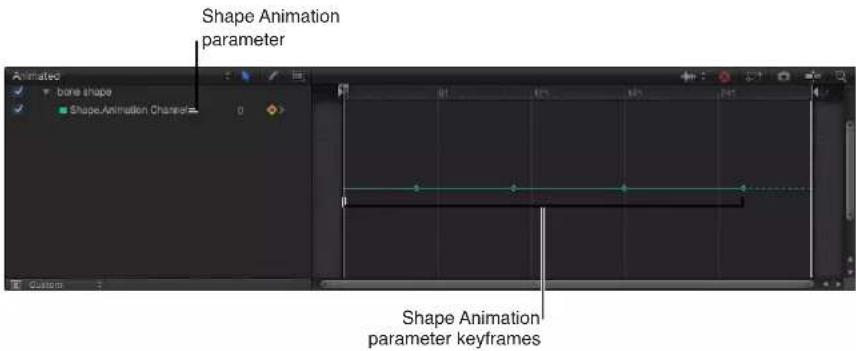


A series of corresponding keyframed shape changes
Keyframe a shape's control points
1 Use the Edit Points tool (in the 2D tools pop-up menu) to select the shape to animate.
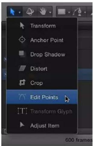
The shape's control points appear in the Canvas. In this example, the selected shape is the lower lip of the mouth illustration.

natural_image
Red lips on black background (no text or symbols)2 Turn on keyframe recording in the transport controls under the Canvas (or press A).

natural_image
User interface control bar with playback buttons and a blue downward arrow pointing to a play button (no text or symbols)3 Move the playhead to the frame where you want to change the shape, then make any necessary changes to the shape's control points.
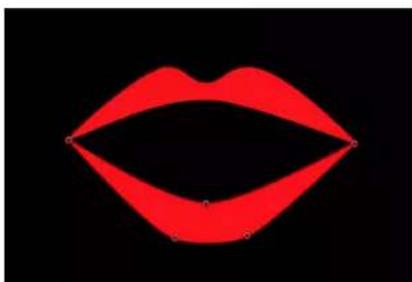
natural_image
Red stylized lips on black background, no text or symbols presentIn the Keyframe Editor (and also in the Timeline, if the Show/Hide Keyframes button is turned on), a keyframe appears for each adjustment you make at a new frame.

natural_image
Pure horizontal line with diamond markers on dark background, no text or symbols presentNote: Adjusting a shape while the playhead is on an existing keyframe adjusts the shape at that keyframe.
4 Continue advancing frames and making changes.
Every time you make a change to the shape at a new frame, you create a keyframe in that shape's Shape Animation parameter.
5 When you are done animating the shape, disable Record.
The animated shape object interpolates between each keyframed shape. If you don't like how the interpolation is working, you can add more keyframes to force the control points to follow the path you want.
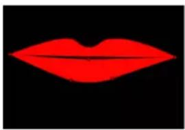
natural_image
Red stylized lips on black background (no text or symbols)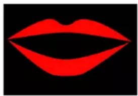
natural_image
Red stylized lips on black background (no text or symbols)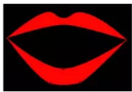
natural_image
Red stylized lips on black background (no text or symbols)Interpolated shapeFirst keyframe Second keyframe
You can also create, delete, and edit the timing of Shape Animation keyframes in the Keyframe Editor. For simplicity, each change you make to a shape is recorded as a single keyframe, no matter how many control points are edited. The Shape Animation parameter only allows keyframes set to linear interpolation. You cannot use any other form of keyframe interpolation.
The process used to animate both shapes and masks is identical. To see an example of mask animation, see Keyframe a mask's shape for animation and rotoscoping on page 896. For more information on keyframing in general, see Keyframing overview on page 439.
Save shapes and shape styles
Like all objects in Motion, custom shapes and shape styles (a custom gradient fill and outline, for example) can be saved to the Library. You can augment the Motion Library with your own custom objects and styles, including customized behaviors and filters or whole project groups. Content you put into the Library is available to every project in Motion.
Custom shapes (including masks) can be saved in the Shapes, Favorites, or Favorites Menu categories of the Library. Custom shape styles, which are saved via the Shape Style pop-up menu, are saved in the Shape Styles category. You can create your own folders in the Library categories or subcategories to better organize your effects. Each customized shape or shape style saved to the Library is saved as a separate file in the Motion folder of the Application Support directory. For example, a saved custom shape named "red heart" in the Shapes category of the Library appears in the /Users/username/Library/Application Support/Motion/Library/Shapes/ folder. Items saved to the Library appear in the Finder with a .molo extension ("Motion Library object"). These items cannot be opened from the Finder.
When you drag a custom shape from the Library to the Canvas, the center of the shape is placed where you release the mouse button. If you use the Apply button in the preview area to add the shape, the shape is added at the center of the Canvas.
When you drag shapes that were saved with the "All in one file" option to the Canvas, the shapes are dropped where you release the mouse button and are positioned according to their arrangement when originally saved to the Library. If you use the Apply button in the preview area to add the shapes, the shapes are added at the center of the Canvas.
When you drag a custom mask from the Library into a project, the mask retains the position with which it was saved (relative to the image or footage on which it is dropped).
Save a shape to the Library
1 Open the Library and select the Favorites, Favorites Menu, or Shapes category.
2 Drag the shape you want to save from the Layers list or Timeline into the stack at the bottom of the Library.
Shapes saved to the Favorites Menu category can be added to a project via the Favorites menu.
The saved custom shape appears in the Shapes category of the Library in the /Users/username/Library/Application Support/Motion/Library/Shapes/ folder.
Save multiple shapes to the Library
1 Open the Library and select the Favorites, Favorites Menu, or Shapes category.
2 In the Layers list, select the shapes to save, drag them to the stack, and hold down the mouse button.
3 When the drop menu appears, choose "All in one file" or "Multiple files."
"All in one file" saves the shapes together, and they are listed as one item in the Library. "Multiple files" saves the shapes as individual objects in the Library.
4 To rename the file, do one of the following:
- Control-click the icon, choose Rename from the shortcut menu, then enter a descriptive name.
- Select the icon, click the current name, then enter a new descriptive name.
Note: When you Control-click the icon, the Edit Description option becomes available. This is a handy tool for entering custom notes about an item saved in the Library. After you choose Edit Description, enter your notes in the text field, then click OK.
Save a shape style to the Library
1 With the shape selected, choose Save Shape Style from the Shape Style pop-up menu in the Style pane of the Shape Inspector (or in the Shape HUD).
2 Enter a name for the style in the Save Preset to Library dialog and click Save (or press Return).
The custom style is saved to the Library in the All subcategory of the Shape Styles category by default. You can move the preset into an existing subcategory, or create your own folders to organize your custom styles (see below).
When the style is selected in the Library stack, a preview is displayed in the Preview pane.
The new preset now appears in the Shape Style pop-up menu in the Style pane of the Shape Inspector.
The saved custom shape style appears in the Shape Styles category of the Library in the /Users/ username/Library/Application Support/Motion/Library/Shape Styles/ folder.
Create a folder in a Library category
1 Open the Library and select the Shapes, Shape Styles, Favorites, or Favorites Menu category.
2 Do one of the following:
- Click the New Folder button (+) at the bottom of the window.

- Control-click an empty area of the Library stack (the lower section of the Library), then choose New Folder from the shortcut menu.
Note: You may have to expand your stack window or use icon view to access an empty area.
The new untitled folder appears in the Library stack. The new folder does not appear in the Library sidebar.
3 Double-click the name of the folder, enter a new name, then press Return.
Move a shape or shape style to a custom folder in a Library category
- Drag the shape to the new folder in the Library sidebar.
The custom preset is added to the new folder and to the All subcategory.
Delete a custom shape, shape style or folder
■ Control-click the custom item, then choose Move to Trash from the shortcut menu.
Note: You can also delete the folder from the Finder. The folder is stored in /Users/username/Library/Application Support/Motion/Library/.
Important: Deleting a custom object or folder cannot be undone.
Copy styles between shapes
After modifying the fill or outline of a shape, you can apply that shape style to another shape in the project.
Apply a shape's style to another shape
1 In the Layers list, drag the stylized shape object onto another shape object and pause, holding down the mouse button.
A drop menu appears.
2 Choose Copy Style To Shape.
The shape's fill and outline are copied to the other shape. For more information on saving shape styles to the Library, see Save shapes and shape styles on page 886.
Masks and transparency
Masks and transparency overview
When you create a mask to define transparency in a layer, you're drawing a shape to use as that layer's alpha channel. Because a layer's alpha channel is a grayscale channel, masks are grayscale objects, where white defines solid areas, progressively darker levels of gray define decreasingly opaque areas, and black defines areas of complete transparency. If you choose View > Channels > Alpha to set the Canvas to display the alpha channel only, you can see the grayscale alpha channel directly.

natural_image
Close-up of a human eye with visible iris and eyelid, no text or symbols presentMasked object

natural_image
Abstract grayscale gradient shape with no text or symbolsObject alpha channel
You can apply masks to layers that already have an alpha channel, to add to, subtract from, intersect, or replace the layer's original alpha channel.
Use the mask tools to create different shapes with which to mask a layer or group. There are five mask tools available that are analogous to the five shape-drawing tools covered earlier in this chapter:
- Rectangle Mask tool
- Circle Mask tool
• Freehand Mask tool (used like the Paint Stroke tool) - Bezier Mask tool
• B-Spline Mask tool
Note: You can also use an Image Mask to mask a layer. For more information, see Image masks overview on page 902.
Important: A mask cannot be applied to a nonflattened 3D group. (To flatten a 3D group, select the Flatten checkbox in the Group Inspector.) A mask can be applied to a layer in a 3D group. To add a mask to a layer that has been manipulated in 3D space, use the Isolate button. Masks cannot be manipulated in 3D space. For example, the Position parameter for a mask only includes the X and Y position parameters, but not the Z position parameter; the Rotation parameter only includes Z, but not X or Y. For more information, see Mask objects in a 3D project on page 891.
Drawing and editing masks using these tools works identically to drawing and editing shapes. The main difference is that while drawing a shape creates a new layer in your project, masks must be drawn on top of another layer in your project. After you draw a mask, it is nested in the specific layer or group for which it was created, in the Layers list and Timeline. When a mask is attached to a layer, a mask icon appears to the right of the name of the layer. Turn the mask display on or off by clicking this icon.
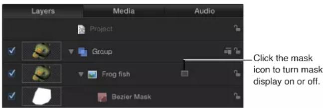
Note: Masks created for one layer can be copied or moved to other layers.
Important: When a mask is applied to a 2D or flattened 3D group, the group is rasterized. For more information, see Groups and rasterization on page 1045.
Create a mask
Masks can be created on any layer in the Motion project.
Mask a layer
1 Select a layer in the Canvas or Layers list.

natural_image
Underwater close-up of a textured, coral-like surface with green and beige patches against a blue background (no text or symbols visible)2 Choose a mask drawing tool from the pop-up menu in the toolbar (the Rectangle Mask tool, the Circle Mask tool, the Freehand Mask tool, the Bezier Mask tool, or the B-Spline Mask tool).

Note: If you haven't selected a layer, the mask tools are not available.
3 Begin drawing the shape to mask the layer.
In the example below, a Bezier mask is used. For more information about how to draw and edit shapes, see Bezier shapes and B-Spline shapes overview on page 832.

natural_image
Underwater close-up of a coral with visible sedimentation and small fish (no text or symbols)4 When you're done, you can finish the mask by doing one of the following:
- Click the first point to close the mask.
- Press C to close the mask, joining the first point you created to the last.
- Double-click to close the mask, joining the first point you created to the last.
- Press Return to close the mask, joining the first point you created to the last.
- When using the Freehand Mask tool, join the end of the mask to the target circle at the beginning of the mask. If you don't reach the beginning of the mask, the mask shape is closed when you lift the stylus or release the mouse button.
Note: Unlike standard shapes, masks are always closed.
After you've finished drawing the mask, its effect is immediate, and the mask you created appears nested underneath the layer to which it's applied in the Layers list and Timeline.

natural_image
Close-up of a greenish, irregularly shaped object against a black background (no text or symbols visible)You can create multiple masks for a single layer. To add masks, select the object again, then follow the above procedure. By default, all new masks are set to the Add blend mode. You can change the Mask Blend Mode parameter in the Inspector to combine masks for different effects. For more information about using multiple masks together, see Combine multiple masks on page 892.
Mask objects in a 3D project
When working in a 3D project, you might want to mask a layer after it is transformed or the camera is rotated. You can immediately switch a transformed object into a "work view" using the Isolate button in the Layers list or Timeline, or the Isolate command in the Object menu. After you add a camera to a project, the Isolate option becomes available for any layer, group, or camera in the project.
Note: Masks can be applied to the layers in a 3D group, but not the 3D group itself (unless you've activated the Flatten checkbox in the Group Inspector). For more information about the Flatten checkbox, see Mask controls in the Inspector on page 899.
Isolate a layer
1 In the 3D project, select the layer to mask.
In this example, the center leopard image is the layer to be masked.

natural_image
Close-up photo of a leopard with spotted fur and a tiger, shown in profile against a blurred background (no text or symbols visible)The Isolate button appears to the right of the layer name in the Layers list.
Note: A project must contain a camera before you can access the Isolate option.
2 Click the Isolate button or choose Object > Isolate.

Note: You can also Control-click the layer or group and choose Isolate from the shortcut menu. The layer is switched into "work view," allowing you to mask the layer at its original orientation.

natural_image
Close-up photo of a leopard with spotted fur and visible stripes, resting on tree bark (no text or symbols)3 To return to your previous view (the view before you isolated the layer), click the Isolate button again.

Note: Clicking a camera's Isolate button activates that camera's view.
Combine multiple masks
Often you may find that it is impossible to create the mask shape you need using only a single mask. For example, when masking something that has a hole in it, you need at least two masks—one set to Add to mask the overall object, and a second one set to Subtract to cut the necessary hole in the middle of it. In the following example, the only way to mask the space between the diver's arms and legs is to create three overlapping masks set to Subtract.
natural_image
Underwater photo of a diver swimming in blue water (no text or symbols visible)
natural_image
Silhouette of a person in motion against a black background (no text or symbols)
natural_image
Silhouette of a person in motion, possibly swimming or falling, against a transparent background (no text or symbols)Original object Three overlapping masks Result
Other times, you may find that it's more convenient to mask a complex object using multiple masks. This is frequently the case when rotoscoping an object and animating the masks. In this example, the dog's head is masked with four masks set to Add—one for the head, one for each ear, and a separate mask for the mouth. This makes it easier to make adjustments later on, especially when animating a mask to do rotoscoping.
natural_image
Close-up of a black-and-white dog's head and neck, smiling outdoors with green foliage in the background (no text or symbols visible)
natural_image
Silhouette of a human head with a pointed ears and curved lines, against a black background (no text or symbols)
natural_image
Close-up portrait of a dog with dark fur and open mouth (no text or symbols visible)Original object Four overlapping masks Result
Whatever the reason, you can easily combine multiple masks for any object by adjusting each mask's Mask Blend Mode parameter in the Inspector to create any combination.

Each mask's blend mode determines whether the mask adds to, subtracts from, or replaces a layer's previously existing alpha channel. Additionally, blend modes affect how masks interact with one another. Ultimately, every mask applied to a layer combines according to the specified blend modes to create that layer's final alpha channel. Mask Blend Modes can be changed at any time.
Blend mode operations are also determined by the order in which each mask appears in the Layers list, particularly with the Replace and Intersect modes. For example, a mask set to the Intersect mode masks out all other regions of a layer that do not overlap it. A mask set to Intersect affects all masks nested underneath it. Masks added above it are unaffected by this behavior. Similarly, a mask set to Replace mode effectively turns off any masks beneath it (including the image object's built-in alpha channel, if one exists).
For more information on mask blend modes, see Mask controls in the Inspector on page 899.
Feather masks
One of the easiest ways to adjust a mask is to feather its edges. Feathering a mask by a few pixels can make the masked object blend more seamlessly with a background. Feathering a mask by larger amounts creates progressively softer edges for various design purposes.
You can feather mask edges outward or inward. The direction in which you feather a mask is dictated by the subject you're masking. When rotoscoping a subject, a combination of inward and outward feathered masks may be necessary for the best results.
Feather the edge of a mask
1 Select a mask.
2 In the Mask Inspector, do one of the following:
- Drag the Feather value slider to the right for a positive value to feather the mask outward.
natural_image
Five-pointed starfish with a red center against a black background (no text or symbols)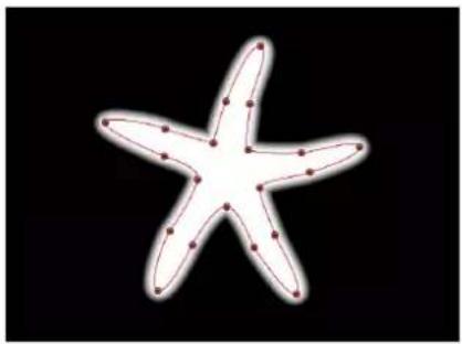
natural_image
White starfish with red outline on black background (no text or symbols)Feathered out (alpha channel)Feathered out (color channel)
- Drag the Feather value slider to the left for a negative value to feather the mask inward.

natural_image
Close-up of a five-pointed starfish with a red center against a black background (no text or symbols)Feathered in (color channel)

natural_image
Five-pointed starfish against a black background (no text or symbols)Feathered in (alpha channel)
Apply filters to masks
As with shapes, you can apply filters to masks, which remain editable even after the application. It's an extremely powerful way to further manipulate the alpha channel created by a mask. For example, you can apply the Crystallize filter to a mask to add stylized, jagged edges that resemble facets of crystal.
natural_image
Close-up of a human eye with visible iris and pupil, no text or symbols presentOriginal mask (color channel)

natural_image
Circular bright spot on black background, no text or symbols visibleOriginal mask (alpha channel)

natural_image
Close-up of a human eye with visible iris and pupil, no text or symbols presentCrystallize filter applied to alpha channel (color channel view)

natural_image
Abstract geometric pattern with a bright central shape surrounded by translucent polygons (no text or symbols)Crystallize filter applied to alpha channel (alpha channel view)
When applying filters to masks, it's useful to bear in mind that masks are just grayscale images. In the example above, the Crystallize filter creates patterns in the grayscale mask image, which results in a rippled translucent pattern.
Apply a filter to a mask
Do one of the following:
- Drag a filter from the Library onto a mask in the Layers list or Timeline.
- Select a mask in the Layers list or Timeline, then choose a filter from the Add Filter pop-up menu in the toolbar.
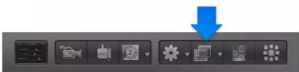
The filter appears nested underneath the mask layer to which it's applied.
Apply behaviors to masks
You can apply behaviors to masks. When you apply a behavior to a mask, the mask is animated like any other layer. However, because the mask only affects the transparency in a layer, and not the position, rotation, or scale of the layer, the result is similar to that of a “traveling matte,” where the mask moves in the layer it is applied to, hiding and showing different areas of the image as it moves.
Apply a behavior to a mask
Do one of the following:
- Drag a behavior from the Library onto a mask in the Layers list or Timeline.
- Select a mask in the Layers list or Timeline, then choose a behavior from the Add Behavior pop-up menu in the toolbar.
The behavior appears nested underneath the mask to which it's applied.
Keyframe a mask's shape for animation and rotoscoping
You can keyframe a mask's animation parameter to change its shape over time. For example, you can animate a subtractive mask to change the shape of a hole in a foreground object, allowing other layers in the background to show through.
A more conventional use of animated masks is to rotoscope a foreground subject. Rotoscoping is the process of manually tracing a foreground subject to isolate it from the background. The end result is similar to a blue screen or green screen effect. Why would you bother? In a wide variety of situations, keying is impractical or impossible if the shot wasn't well planned. Even for shots where keying is possible, manual rotoscoping is often necessary to create garbage or holdout mattes to improve the effect. (For more information on creating garbage and holdoutmattes or masks using masks, see Garbage masks on page 509 and Holdout masks on page 511.)
All mask animation is stored in the Shape Animation channel. It's worth noting that animated masks trigger the same motion blur as any other keyframed parameter in Motion. For example, if you animate a layer's position so it moves really fast, the layer is blurred when you enable motion blur. If you animate a layer's mask so it also moves fast, the edges of the mask are blurred as well. This is important because an animated mask's blur should match any blur present in the foreground subject.
The following example demonstrates how to use a mask to isolate an object in a clip in order to apply separate effects to the isolated object and its background.

Rotoscope a subject by animating a mask
1 Choose View > Resolution > Full to ensure that you are viewing the Canvas at full resolution.
Important: If the Canvas resolution is not set to full, the outlines of objects and images may shift slightly. As a result, masks created to trace a subject at less than full resolution may not be accurate.
2 Move to the first frame where the mask animation should begin, then draw a mask that accurately isolates the subject.
3 When you're finished drawing the first mask, click the Record button in the transport controls (or press A).

4 Move to the first frame of the Timeline where you want to change the shape of the mask, then make any necessary changes to its control points.
When rotoscoping a moving subject, it's a good idea to play the clip and examine its direction and speed to get a sense of how the mask must be animated. You may find it helpful to place markers indicating frames where the subject or camera stops, changes direction, or changes speed, because these are likely candidates for your first pass of keyframed mask changes. By noting these changes, you can attempt to reduce the amount of keyframing by making your first keyframed mask shape adjustments at these major changes in speed and direction. Because animated masks are interpolated to change from one keyframed shape to another, you can let Motion do some of your work for you. (For more information, see Rotoscoping tips on page 898.)

natural_image
3D rendering of a car viewed from rear angles against black background (no text or symbols)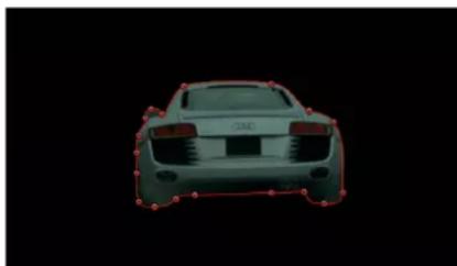
natural_image
Front view of a car with red outline and black outline on black background (no text or symbols)Note: If the mask is deselected, you must select it in the Layers list so its control points become visible in the Canvas. Make sure that the Show/Hide Masks button is selected in the Layers list so masks are visible.
5 Continue moving the playhead and making changes.
One imprecise rule of thumb is to move to the frame that's halfway between any two keyframed mask shapes and make new adjustments. Continue keyframing shape changes at the halfway point between every two keyframes until the mask accurately follows the motion of the subject. For irregularly shaped objects or objects with complex motion, don't be surprised if you need to add a large number of keyframes. Nobody ever said that rotoscooping was fast!
Every time you move the playhead to a new frame and make a change to the mask's shape, a keyframe is created in that shape's Shape Animation channel. If you move the playhead directly on top of a previously existing keyframe, you change the mask's shape at that point without creating a keyframe.
Note: You can also transform masks as you would any other layer. If you move, rotate, scale, or change the anchor point for a mask while animation recording is enabled, you add keyframes to additional channels in the Keyframe Editor.
You can also create, delete, and edit the timing of a mask's Shape Animation keyframes in the Keyframe Editor. For simplicity, each change you make to a mask is recorded as a single keyframe, no matter how many control points you edited. The Shape Animation parameter only allows keyframes set to Constant—you cannot use any other form of keyframe interpolation.
The process used to animate both masks and shapes is identical. To see an example of shape animation, see Keyframe the Shape Animation parameter on page 884. For more information on keyframing in general, see Keyframing overview on page 439.
6 When you've finished animating the mask, disable Record (press A).
Rotoscoping tips
A good way to start rotoscribing an image is to find the frame with the most detail showing in the subject you're masking, and use that as your starting frame. For example, if you're masking someone walking, choose a frame where that person's arms and legs are extended in mid-stride. Doing so lets you specify how many control points to start with. Using as few control points to achieve the necessary level of detail in your mask makes it much easier to animate.
It's not always necessary to rotoscope an entire subject with a single mask. Motion lets you apply multiple masks to a single object, so you can rotoscope different parts of a subject with separate masks. This can make your job much easier. For example, if you're rotoscribing someone carrying something while walking across a room, you can use one mask for the upper part of the person's body, which doesn't change shape very much, and another two masks for the legs, which change shape considerably as the person walks.
To pan the image in the Canvas while rotoscoping, press the Space bar. You can then pan in the Canvas without losing your mask selection or progress.
You can also use the Track Points behavior to apply tracking data to a shape or mask. For more information on the Track Points behavior, see Track Points on page 958.
Mask controls in the Inspector
A selected mask's parameters appear in the Mask Inspector. These controls allow you to adjust how the mask is drawn, how each mask operates upon an object, and how masks are combined with one another. The Mask Inspector also lets you fine-tune mask control point positions using value sliders.
Except for control points parameters, the parameters in the Mask HUD are identical to the parameters in the Inspector.
Parameters in the Mask Inspector
- Shape Type: A pop-up menu that sets the type of control points used to define the mask. For example, if you originally created a Bezier mask, you can choose B-Spline from this menu to change how the mask is drawn. Changing the shape type might dramatically change the mask's form even though its control points remain fixed at their original coordinates. There are three options:
- Linear: All of a mask's control points are joined by hard angles, and the resulting mask is a polygon. The control points of a Linear mask lie directly on its edge.
- Bezier: Control points can be a mix of Bezier curves and hard angles, creating any sort of mask. The control points of a Bezier mask lie directly on its edge.
- B-Spline: Control points are all B-Spline points, with different degrees of curvature. B-Spline control points lie outside the surface of the mask, but are connected by the B-Spline frame.
Note: You can hide the B-Spline frame by turning off Lines in the View pop-up menu above the Canvas.
- Mask Blend Mode: A pop-up menu that determines how a mask interacts with the alpha channel of the layer to which it's applied. When a layer has multiple masks, each mask can have a different Mask Blend Mode. When this happens, each mask adds to, or subtracts from, the layer's alpha channel according to the selected mode. The final alpha channel is the combined result of all masks applied. There are four choices in this pop-up menu:
- Add: Removes all pixels from areas outside the mask shape. Each new mask adds more transparency, letting more of the underlying image show through. The Add blend mode (the default for new masks) is useful for adding back regions of an image that other masks are cutting out or when masking multiple areas that do not intersect in a single image. In the following example, both the rectangle and circle masks remove areas outside of the mask shapes, revealing the underlying black canvas.

natural_image
Simple geometric diagram with a blue circle and rectangle, no text or symbols presentIf the layer contains an alpha channel, a mask set to Add mode reveals only the masked section of the original alpha channel.

natural_image
Silhouette of a butterfly on black background (no text or symbols)Original alpha channel of butterfly clip
natural_image
Abstract white shape on black background with red circular outline (no text or symbols)Circle mask set to default. Add mode applied to butterfly clip.
Note: To display the rest of a masked layer so you can trace it to create a second mask, turn off the first mask in the Layers list or Timeline. The outline of the first mask remains visible, even though it's no longer affecting the layer's transparency.
- Subtract: Removes all pixels from the area inside the mask shape, effectively punching a hole in the image. In the following example, the rectangle and circle masks punch a hole through the blue gradient object, revealing the underlying black Canvas.
natural_image
Abstract geometric shape with black rectangle and red outline on blue background (no text or symbols)- Replace: Completely replaces the image object's alpha channel as well as any other masks that appear beneath the mask in the Layers list. In the following example, the circle mask overrides the rectangle mask, because the circle mask appears above the rectangle mask in the Layers list and is set to Replace. For more information, see Combine multiple masks on page 892.

natural_image
Simple geometric diagram showing a blue circle with a red rectangle and dots on its side (no text or symbols)- Intersect: Shows pixels only in regions where masks overlap. In the following example, only the overlapping areas of the rectangle and circle masks are visible.

natural_image
Simple geometric diagram with a blue rectangle and red circle on black background (no text or symbols)In another example, if you import a TIFF file with an alpha channel and you want to cut out part of it without losing alpha information, you must use the Intersect blend mode. This is also true for layers with keying filters applied.
natural_image
Silhouette of a fish against a black background (no text or symbols)Original alpha channel from key
natural_image
Abstract white shape with black outline on black background, no text or symbols presentIntersecting mask cropping unwanted opaque areas
- Invert Mask: A checkbox that reverses the mask—its solid and transparent areas are swapped. This is useful if you need to switch the solid and transparent areas of an existing mask.
Tip: You can apply different filters and effects to the foreground and background of an image by first masking the foreground subject, duplicating the layer and its mask, then inverting the duplicate layer's mask. Effects applied to the background can then be completely isolated from the foreground, or vice versa. You can adjust the opacity of a mask in the Properties Inspector.
- Roundness: A slider that controls the roundness of the corners of a mask. This facilitates the creation of rounded rectangle masks, as well as generally smoothing the edges of any mask.
- Preserve Scale: A checkbox that controls whether the Roundness setting is absolute or relative to the overall mask size. When the checkbox is selected, the roundness will remain at the same approximate percentage of curvature as the object is scaled. When the checkbox is disabled, the curvature will vary as the overall mask changes size.
- Feather: A slider that feathers (softens) the edges of a mask. Positive feathering values soften the edge of the mask from its edge outward. Negative feathering values soften the edge of a mask inward from the edge. Feathering the edge of a mask can soften a harsh rotoscoping job, making the masked object blend more easily with the background.
- Falloff: A slider that controls how "steep" the feathering is. Higher values result in feathering that's pushed in farther inward, so the edge of the feathering effect is more transparent. Lower values result in the "core" of the feathering effect being pushed farther outward, so the edge of the feathering effect is less transparent.
- Mask Color: A pop-up menu that controls the color of the mask as displayed in the Canvas when it is selected. This setting has no effect on the final output. Setting masks to different colors may aid you in identifying which mask is which.
- Control Points: A list, visible when you click the disclosure triangle, displaying the position parameters for the mask control points. Use the value sliders to adjust the position of a control point. The left value slider represents X and the right value slider represents Y.
Image masks
Image masks overview
Another way to create transparency in a layer is by using image masks. An image mask creates transparency in a layer by deriving an alpha channel from another image layer, such as a shape, text, movie, or still image.

Text layer

natural_image
Three close-up portraits of a lion, showing detailed facial features and expressions (no text or symbols visible)Image layers Layers masked by text layer

Note: You can use masks and image masks together.
The power of image masks is that they do not have to be drawn or animated. Instead, you can use virtually any image or movie clip to create transparency in another layer. By default, movie clips create animated image masks, but you can also set an image mask to use only a single frame. Image masks can also be used to assign masks created in other applications. For example, you can import an animated mask that was created in another application and exported as a QuickTime movie into your Motion project, then use it as an image mask.
When you use a layer as an image mask, you can choose which of the layer's color channels to apply to create transparency via the Source Channel pop-up menu in the Image Mask Inspector. The choices include:
• Red
- Green
- Blue
• Alpha
• Luminance
Because alpha channels are basically 8-bit grayscale images, you can use any single color channel as an image mask. You can also use another layer's alpha channel. Luminance lets you use the aggregate luminance from the red, green, and blue channels of an image to create transparency. For all these options, color is ignored.
Filters and image masks
Like shape masks, you can add filters to image masks to further manipulate the transparency effect. You may be able to improve the mask that's created by using color correction filters such as Brightness, Contrast, and Gamma to manipulate the contrast of the mask, pulling out or reducing detail to create the transparency effect you need. Filtering image masks works identically to filtering shape masks. For more information, see Apply filters to masks on page 895.
Behaviors and image masks
You can also apply behaviors to image masks to create animated transparency effects. For more information, see Apply behaviors to masks on page 896.
Apply an image mask to a layer
Assigning an image mask is a two-part process. First, you create a blank image mask underneath a layer. Then you assign the image you want to use to create transparency.
Add an image mask to a layer
1 Select the layer to mask.
2 Choose Object > Add Image Mask (or press Shift-Command-M).
The image mask appears underneath the layer in the Layers list and Timeline.
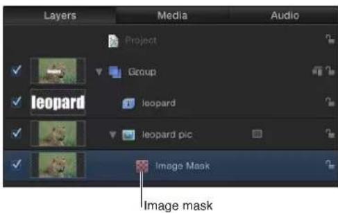
3 With the image mask selected, do one of the following:
- Open the Image Mask Inspector, then drag the layer to use as the mask into the Mask Source well.

- Open the HUD (press D or F7 if the HUD is hidden), then drag the layer to use as the mask into the Mask Source well.
Important: Click and drag in one movement to successfully drop a layer in an image well. If you select the layer to use as the source, then release the mouse button, you lose the selection.
In this example, text is used as the mask layer.
4 Choose the channel you want to use to create transparency from the Source Channel pop-up menu (in the Image Mask Inspector), as well as any other options necessary to create the required transparency.
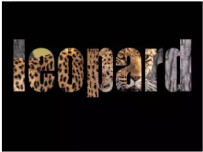
Image mask controls in the Inspector
After you add an image mask to a layer, the following parameters become available in the Image Mask Inspector.
The Image Mask HUD contains the Mask Source, Source Channel, Mask Blend Mode, Invert Mask, Stencil, and Stretch parameters. These controls, and the additional parameters in the Inspector, are described below.
Parameters in the Image Mask Inspector
- Mask Source: An image well that assigns a layer (a shape, text, an image, a movie, particle emitter, numbered image sequence, and so on) to use to mask a layer.
- Frame: A slider, available when you use a movie or image sequence as the assigned image, that sets the start frame for playback.
- Hold Frame: A checkbox, available when you use a movie or an image sequence as the assigned image, that freezes the frame specified in the Frame parameter. That frame is then used as the mask for the masked layer's total duration.
- Offset: Value sliders that offset the X and Y values of the mask's position, relative to the layer being masked, allowing you to change which part of the layer is masked.
- Wrap Mode: A pop-up menu that increases the area an image mask affects (if the image mask is smaller than the layer it is assigned to). There are three options:
•None: The object is used as is.
- Repeat: The object is duplicated and tiled to fill up the full width and height of the image.
- Mirror: The layer is duplicated, tiled, and reversed to fill up the full width and height of the image. This may create a more seamless repetition for some images.
- Source Channel: A pop-up menu that sets which channel of the assigned image is used to create the mask. There are five choices:
- Red: Uses the red channel as a grayscale mask.
•Green: Uses the green channel as a grayscale mask.
- Blue: Uses the blue channel as a grayscale mask.
•Alpha: Uses the alpha channel from the mask layer.
•Luminance: Uses the aggregate luminance from the red, green, and blue channels as a grayscale mask.
- Mask Blend Mode: A pop-up menu that determines how an image mask interacts with the alpha channel of the layer to which it is applied. When a layer has multiple image masks, each mask can have a different Mask Blend mode. When this happens, each mask adds to, or subtracts from, the layer's alpha channel according to the selected mode. The final alpha channel is the combined result of all image masks applied. These modes are identical to the Mask Blend Mode options available for shape masks. The four options are:
- Add: Adds the mask to the alpha channel (the default setting). This is useful for adding back regions of an image that other masks are cutting out.
- Subtract: Subtracts a mask from the alpha channel. This is useful for creating holes in the middle of layers, or for masking out additional regions of an image that are untouched by other masks.
-Replace: Replaces the layer's original alpha channel, as well as any other masks applied to the same layer that appear underneath the current mask in the Layers list, with the current mask. You can add masks above, set to whatever blending mode you like.
- Intersect: Masks out all regions of the layer that do not overlap the mask itself (but does not replace a layer's original alpha channel). This includes other masks applied to the same layer that appear nested underneath the intersecting mask in the Layers list.
- Invert Mask: A checkbox that reverses the mask—its solid and transparent areas are swapped. This is useful if you need to switch the solid and transparent areas of an existing mask.
- Stencil: A checkbox that preserves the layer's geometric transforms. If you're creating a mask with transformed Scale, Position, Rotation, or other parameters, select this checkbox to use the modified layer.
- Stretch: A checkbox, available when Stencil is deselected, that stretches the mask to fit the boundaries of the image and centers the mask on the layer's center point.
Convert between shapes and masks
Because masks and shapes are created in similar ways but perform different tasks, there are occasions where you may create a shape and later want to convert it into a mask, or vice versa. Changing shapes to masks and masks to shapes is done by changing the object's position in the Layers list or by using the Object menu.
Note: Masks are not applicable to 3D paint strokes, 3D particle systems or replicators, 3D text objects or unflattened 3D groups. To convert a shape to a mask on such an object, the item must be flattened.
Different options are available when converting shapes to masks, depending on the type of object being masked. When you need to convert a shape to a mask, consider the following:
- When a shape is converted to a mask and applied to a scaled object, the resulting mask is scaled as well. This may lead to unexpected results. To prevent surprises, set the object to 100% scale or place the object in a new group and apply the mask to the group.
- Converting a shape that has been manipulated in 3D into a mask may produce unexpected results. For more information on applying masks to 3D objects, see Mask objects in a 3D project on page 891.
- When a transformed (scaled, rotated, or anchor point-adjusted) shape is converted to a mask, the transforms are not maintained.
Convert a shape to a mask on an image
1 Use any of the shape tools to create a shape (or draw a paint stroke).
Note: You can also add a preset shape from Shapes category in the Library.
2 In the Layers list, drag the shape object onto the layer to be masked.
The shape is converted into a mask. If the layer to which the mask is applied is not centered in the Canvas, the position of the mask is slightly offset. This is because the position of the converted mask is dependent upon the original position of the shape relative to the center of its parent group.
Convert a shape to a mask on a group
1 Use any of the shape tools to create a shape (or draw a paint stroke).
2 In the Layers list, drag the shape onto the group layer and pause, holding down the mouse button. When the drop menu appears, choose Move Mask To Group.
Convert a shape to a mask on the enclosing group
1 Use any of the shape tools to create a shape (or draw a paint stroke).
2 In the Layers list, select the shape object and do one of the following:
- Drag the shape onto the group layer and pause, holding down the mouse button. When the drop menu appears, choose Move Mask To Group.
- Choose Object > Convert Shape to Mask.
Convert a shape to a mask on another shape
1 Use any of the shape tools to create a shape (or draw a paint stroke).
2 In the Layers list, drag the shape object onto another shape object and pause, holding down the mouse button.
A drop menu appears.
3 Choose Add Mask To Shape.
The shape is converted into a mask on the other shape.
Note: Spline masks are not applicable to 3D paint strokes. The Local 3D checkbox must be deselected in the Stroke pane of the Shape Inspector for the drop menu to appear.
Convert a shape to a mask on a particle emitter or replicator
1 Use any of the shape tools to create a shape (or draw a paint stroke).
2 In the Layers list, drag the shape object onto an emitter or replicator and pause, holding down the mouse button.
A drop menu appears.
3 Choose Add Mask To Emitter or Add Mask to Replicator.
The shape is converted into a mask on the particle emitter or replicator.
Note: The 3D checkbox must be deselected in the Emitter or Replicator Inspector for the drop menu to appear.
Convert a shape to a mask on text
1 In the Layers list, select the text layer to mask.
2 In the Layout pane of the Text Inspector, ensure the Flatten checkbox is selected.
3 Use any of the shape tools to create a shape (or draw a paint stroke).
4 In the Layers list, drag the shape object onto a text layer.
Convert a mask to a shape
In the Layers list, select a mask and do one of the following:
- Choose Object > Convert To Shape.
The shape moves to the bottom of the group. - Drag the mask between two objects in the Layers list.
- Drag the mask onto the group layer and pause, holding down the mouse button. When the drop menu appears, choose Move Shape To Group.
3D compositing
21
3D compositing overview
Motion includes a robust set of tools for creating projects that display objects in a true three-dimensional space. You can arrange objects in a 3D environment so they intersect and interact with one another. You can also employ cameras and lighting, and apply related effects such as depth of field, shadows, and reflections.
Real-world coordinates
3D compositing introduces a number of new concepts to the art of motion graphics. At first glance, these concepts might seem daunting. However, because you move around in a real three-dimensional world, you'll likely find the virtual 3D world of the Motion Canvas intuitively familiar.
The position of any object in the real world can be described using a simple coordinate system. For example, you might describe your computer's position as being four feet across from the door, three feet up from the floor, and five feet in front of the window. In a coordinate system, the three numbers used to describe an object's position correspond to a coordinate axis. The place where the zero values along each axis meet is called the origin. In this example, the X equals 4, Y equals 3, and Z equals 5.
Coordinates and object position in space
The location of an object in Motion can be described in these terms as well. The coordinate system used by Motion specifies the center of the Canvas as 0, 0, 0. Moving an object to the left subtracts from the X value, while moving to the right adds to the X value. Moving an object up adds to the Y value, and moving an object down subtracts from the Y value. Moving an object closer adds to the Z value, while moving further away subtracts from the Z value. The main difference between a 2D scene and a 3D scene is that in a 3D scene, you can change your point of view, so that moving an object up doesn't always mean increasing its Y Position value.
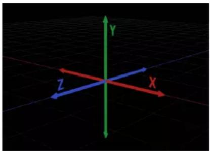
natural_image
3D coordinate system with X, Y, Z axes and colored arrows on a grid background (no text or symbols)Note: In a new project, the Canvas is oriented with the Z axis pointing straight at you. This orientation preserves the traditional two-dimensional orientation of the X and Y axes, which span the default Canvas from left to right (X) and top to bottom (Y).
3D conventions
There are a few conventions commonly used to discuss and display three-dimensional environments.
- Object movement is along an axis.
- Object rotation is around an axis.
• Each axis is color-coded: X is red, Y is green, and Z is blue. - Positive rotation is counterclockwise around an axis.
To learn more about incorporating 3D in your Motion projects, choose a topic in the Help table of contents (the sidebar to the left of this window).
3D Transform tool
3D Transform tool overview
There is no inherent difference between 2D and 3D project files in Motion. At any point, you may decide to start working with groups or layers in 3D. Doing so requires no preplanning on your part; in fact, it's possible to go back and forth between manipulating objects in 2D and 3D space. This section covers the tools you can use to move objects around in the Canvas.

natural_image
Close-up of a dragon's eye with visible iris and eyelid, captured in an image editing interface (no text or symbols on the eye itself)The image in the screenshot above has just been imported into the scene and is positioned at the scene's origin. Use the 3D Transform tool—located to the right of the 2D transform tools in the toolbar—to move the image.

Tip: You can select the 3D Transform tool by pressing Tab when the 2D Select/Transform tool is active (and an object is selected in the Canvas). Pressing Tab again cycles through the various 2D transform tools.
Use the 3D Transform tool
■Select the 3D Transform tool in the toolbar (or press Q).
Two things happen immediately when you select the 3D Transform tool. The onscreen controls change, and the object's HUD displays additional 3D transform controls.

Use 3D onscreen controls
When you select the 3D Transform tool, three colored arrows appear in the Canvas near the center of the image. Each arrow corresponds to one of the three coordinate axes. In the default view, the Z axis points directly toward you, so only the tip of the blue Z arrow is visible. Dragging an arrow moves the image along an axis.

Move an object using the onscreen controls
1 Select the object to move.
2 Drag a colored arrow.
When dragging, the active arrow turns yellow and the status bar above the Canvas displays the current coordinates of the object as well as the distance the object has moved. Coordinates are given in the form of X, Y, and Z.

natural_image
3D rendering software interface showing a dynamic sunburst light effect on a grid background, with no readable text or symbols.Near the three colored arrows are three small circles.

These are rotation handles. Placing the pointer over a circle invokes a rotation ring for the axis.
• The red ring indicates rotation around the X axis.
• The green ring indicates rotation around the Y axis.
• The blue ring indicates rotation around the Z axis.
Rotate an object around a single axis using the onscreen controls
1 Select the object to rotate.
2 Move the pointer to the rotation handle (small circle) corresponding to an axis of rotation.
The rotation ring appears.
3 Drag the ring to rotate the object.
The status bar displays the current Rotation values as well as the amount the object is rotated.

natural_image
Close-up of a dragon eye with visible corneal and eyelid, captured in a photo editing interface (no text or symbols on the eye itself)Rotate an object around all axes using the onscreen controls
1 Select the object to rotate.
2 Place the pointer on a rotation handle, then hold down the Command key.
All three rotation rings appear.
3 While continuing to hold down the Command key, drag anywhere inside the rings to rotate the object.
The status bar displays the absolute rotation values as well as the delta (amount of change) in rotation.
Important: When you rotate an object using the 2D Select/Transform tool, rotation occurs around the Z axis. However, when you rotate an object using the 3D Transform tool, you can rotate the object around its X, Y, or Z axis.

natural_image
Close-up of a dragon's eye with visible eye and eyelid, no text or symbols presentRotation using 2D Select/Transform tool

natural_image
Close-up of a stylized eye with visible iris and pupil, no text or symbols presentRotation using 3D Transform tool around Z-axis
Display a subset of the 3D transform onscreen controls
Do one of the following:
- Press the Comma key (,) to display the axis arrows (but not the rotation handles or scale handles).
- Press the Period key (.) to display the rotation handles (but not the axis arrows or scale handles).
- Press the Slash key (/) to display the scale handles (but not the axis arrows or rotation handles).
When you press any key a second time, the display switches back to the default, with all three of the onscreen controls visible.
3D transform HUD controls
In addition to the onscreen controls, the HUD provides another method of transforming objects in 3D space, via a set of graphical transform controls.

Controls in the HUD
- Move: Three controls in the Move section of the HUD for dragging the selected object in one or more axes at once. Drag inside one of the square control areas to change the relevant parameter values of the object in the Canvas.
- Move Z: Drag here to move the selected object along the Z axis. Dragging to the right decreases the Z value (moving the object further away), and dragging to the left increases the Z value (bringing the object closer). Hold down the Command key when dragging to simultaneously scale the object as it is moved, preserving its size relative to the camera.
- Move XY: Drag here to move the object along the X and Y axes. Dragging right or left increases or decreases the X value. Dragging up or down increases or decreases the Y value. Using this control is identical to dragging a 2D object in the Canvas. Hold down the Command key when dragging to constrain movement to the initial direction of the drag.
- Move XZ: Drag here to move the object along the X and Z axes. Dragging right or left increases or decreases the value of X. Dragging up or down increases or decreases the value of Z. Hold down the Command key when dragging to constrain movement to the initial direction of the drag.
Tip: As in the Inspector, holding down the Shift key while you drag in the HUD makes larger changes. Holding down the Option key while you drag makes smaller changes.
- Rotate and Scale: Two additional drag controls in the HUD for rotating and scaling the selected object in the Canvas:
- Rotate XYZ: Drag in this square control area to rotate the object around all axes. Starting at the origin, dragging up and down rotates the object around the X axis. Dragging to the left and right rotates the object around the Y axis.
To constrain rotation to the Z axis, hold down the Command key while dragging.
- Scale: Drag in this square control area to uniformly scale the selected object in the Canvas. Dragging to the right or up (or both) increases the Scale value. Dragging to the left or down (or both) decreases the Scale value.
To constrain scaling to the axis corresponding to the initial direction of the drag, hold down the Command key while dragging.
- Adjust Around: A pop-up menu, located under the Move, Rotate, and Scale controls in the HUD, that sets which relative coordinate space to use for transforms. The Adjust Around pop-up menu has three options:
- Local Axis: The default, this option orients the onscreen transform controls to the object's local axes.
- World Axis: This option orients the onscreen transform controls to the axes of the 3D grid in the Canvas.
- View Axis: This option orients the onscreen transform controls to the view space of the current view. The Z axis is aligned along the view's line of sight. For more information on views, see 3D workspace and views overview on page 918.
Relative coordinates
To better understand the concept of relative coordinates, think of a system of satellites, like the earth, the moon, and the sun. The moon's parent is the earth, and the earth's parent is the sun. Usually, when considering these three bodies, the moon's position is described in terms of its position relative to the earth (the moon's parent), and the earth's position is described relative to the sun (the earth's parent). In Motion, an object's position and orientation are always relative to its parent.
When you add a group to a Motion project, that group is created at the origin coordinates of its parent. In the case of a root-level group (a group that is not nested inside other groups in the Layers list), the parent is the project itself. An object placed inside a group has its position described relative to its parent—the group.

natural_image
Black-and-white photo of a small dark object emerging from sandy ground under a clear blue sky (no text or symbols visible)
Group position set to 100,100,100
In the example above, a group is positioned at X, Y, and Z coordinates of 100, 100, and 100, respectively. The group is located 100 pixels away from its parent's origin on all axes (the parent in this case being the project itself). The image inside the group is positioned at 0, 0, 0. Because the image's position is relative to its parent, the group, it shares its parent's origin and has an apparent position in the world of 100, 100, 100.
Moving the image to a position of 50, 50, 50 displaces it by 50 pixels from the group's origin in all axes. You can see in the image below that the porcupine is now exceeding the visible area of the Canvas. Although the image's apparent position relative to the world is 150, 150, 150, its Position values in the Inspector are 50, 50, 50 because its position is always relative to its parent.

Object position set to 50, 50, 50
Rotation values are also relative to an object's parent.

Group rotation set to 45°
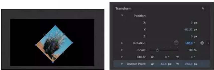
Object rotation set to -90°
Important: World and view transforms are limited to the HUD and onscreen controls; all transforms made in the Inspector are relative to an object's parent's space.
Layer order and depth order
When compositing in 2D, the Layers list shows the layer order, which determines the stacking order of objects in the Canvas. Objects higher up in the Layers list appear in the Canvas on top of objects lower than them in the Layers list.
Important: The children of 2D groups are composited in layer order.
In the following example, the Layers list shows the Blue A group is above the Red B group, and the Canvas displays the Blue object above the Red one.
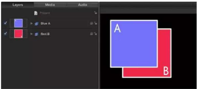
If you move Group A below Group B in the Layers list, Group B is rendered on top of Group A.

The Layers list also shows object relationships in terms of parenting. The parent-child relationship is displayed in the Layers list through the use of indenting and disclosure triangles.

The Layers list is not the only indicator of order when considering objects in 3D. When depth-sorted, an object can be at the bottom of the Layers list and yet appear to be on top of everything else in the Canvas because of the object's position relative to the current camera. The most common way to adjust depth order is to change the Z position of a layer or group.
Important: The children of 3D groups are composited in depth order by default.
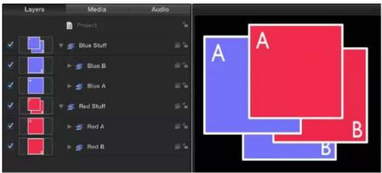
With the 3D groups above, objects are composited in depth order; their position in the Layers list does not correlate to their position in 3D space relative to the camera.
In the above example, the Blue A group is above the Red A group in the Layers list but it appears behind the Red A group in the Canvas because it is depth-sorted. The same principle applies to the Blue B group and the Red B group.
3D transformations in 2D groups
All objects have 3D transformations available, even when in 2D groups. Objects can be rotated around any axis and moved along any axis. Objects in 2D groups are not depth-sorted, and cannot intersect, regardless of their position in 3D space.
In the image below, groups A and B are positioned at the same point in 3D space. But because they are layer-ordered, group A does not intersect with group B.

However, when you change the parent group to 3D, groups A and B intersect, as shown in the image below.

Note: If two groups are coplanar (occupy the same plane), they are composited in layer order, regardless of whether the objects' parent is a 2D group or 3D group. In a 2D composite, all objects are coplanar.
3D workspace and views
3D workspace and views overview
In a 3D workspace, everything is seen from the viewpoint of a camera. The default views presented in the 3D workspace are reference cameras that can be used and manipulated to help place and animate objects but are not used for rendering output. To render from one of the camera views, you must create a scene camera. For more information on cameras, see Cameras overview on page 928.
There are several view layouts, with each layout consisting of an arrangement of viewports. Each viewport displays the scene from the point of view of a camera. Reference camera views have a specific default position and orientation.
There are two types of reference cameras:
- Orthographic
- Perspective
An orthographic camera views the scene by looking straight down one of the world axes: X, Y, or Z. The default orthographic cameras do not appear in the Layers list, Timeline, or Canvas. The Front and Back cameras look straight down the Z axis. The Top and Bottom cameras look straight down the Y axis. The Left and Right cameras look straight down the X axis.

Orthogonal camera view with no rotation
Orthographic cameras do not show perspective. Perspective cameras—and scene cameras that you add to a project—distort the view the way a real-world camera would.

Object rotated in orthogonal camera view
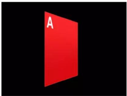
Object rotated in perspective camera view
To access camera views and camera controls, add a scene camera to your project.
Add a scene camera to a Motion project
1 Choose Object > New Camera or press Option-Command-C or click the New Camera button in the toolbar.
A camera object is added to the Layers list, the Timeline, and the Canvas (represented there by a wireframe icon). The 3D Transform tool in the toolbar becomes active, the Camera HUD appears (if it isn't visible, press F7), and the Camera pane in the Inspector becomes available.
If you add a camera to a project that contains no existing 3D groups, the following dialog appears:

2 Click Keep as 2D or Switch to 3D.
After you add a camera to a project, the Camera menu becomes available in the upper-left corner of the Canvas.

3D Canvas overlays
3D overlays overview
There are six 3D overlays that can appear in the Canvas:
- The Camera pop-up menu lists the active camera view.
• The 3D View tools control reference and scene cameras. - The Inset view displays the scene from a different camera's perspective.
• The 3D grid shows the ground plane of the 3D world.
• The 3D Compass changes the Canvas view in 3D space.
- The 3D scene icons display onscreen representations of cameras, lights, and edge-on lines.

You can turn the display of these overlays on or off.
Show or hide 3D overlays
Do one of the following:
- Choose View > 3D Overlays, then choose the type of 3D overlay to show or hide.
- From the View pop-up menu in the status bar, choose the type of 3D overlay to show or hide.
Camera pop-up menu
The Camera pop-up menu, located in the upper-left corner of the Canvas, lists the active camera view. Choose from a list of reference cameras and scene cameras. This menu also contains several view-related commands.
The Camera pop-up menu is divided into three sections:
- The top section lets you select the active camera as well as any other scene cameras you've added to the project. If a scene contains more than one camera, the topmost camera in the Layers list at the current frame in the Timeline is the active camera. For more information on scene cameras, see Cameras overview on page 928.
- The middle section lets you select a default reference camera: Perspective, Front, Back, Left, Right, Top, or Bottom.
Note: The Left, Right, Top, and Bottom camera views are orthogonal views. You cannot animate or export these views.
- The bottom section allows access to five frequently used commands: Reset View, Select Active Camera, Fit Objects Into View, Frame Objects, and Focus on Object. For details on these commands, see the 3D View section in View menu on page 106.
3D View tools
The 3D View tools control reference and scene cameras.
The scene camera indicator appears at the left of the 3D View tools when a scene camera is the active camera.
Important: The gray scene camera icon appears to the left the 3D View tools when a user-created scene camera is active. A scene camera is used for rendering specific camera views. This icon is a reminder (not a button or control) that when you use the 3D View tools, you are moving the scene camera, which affects your project's output.

There are three 3D View tools:
- Pan: Drag in this box to move the camera along the X and Y axes relative to the current view. - Orbit: Drag in this box to orbit the camera around the selected scene object. If nothing is selected, the camera orbits around its focal plane. For more information on the camera focal plane, see Camera controls on page 929. Orbit can affect X, Y, and Z Position values, as well as X and Y Rotation values.
Note: If you use the orbit control to change an orthogonal reference camera, an asterisk appears next to the view's name in the Camera menu, indicating that the view is no longer a true orthogonal view.
- Dolly: Drag in this box to dolly the camera, moving it along the Z axis relative to the current view.
Tip: Double-clicking a 3D View tool resets all parameters that can be affected by the tool.
As in the Inspector, holding down the Shift key while you drag in the 3D View tools makes larger changes. Holding down the Option key makes smaller changes.
It is possible to use the Pan, Orbit, and Dolly tools with keyboard commands and a three-button mouse:
- Pan: Drag in the Canvas while holding down the Option key and the right mouse button.
- Orbit: Drag in the Canvas while holding down the Command key and the right mouse button.
• Dolly: Drag in the Canvas while holding down the Command key, the Option key, and the right mouse button.
3D Compass
Located in the lower-left corner of the Canvas, the 3D Compass acts as an orientation and shortcut device. It has active and passive states, depending on whether the pointer is positioned over it. In its passive state, it displays the orientation of the three world axes (X, Y, and Z). In its active state, the compass presents color-coded shortcuts to activate the reference (orthogonal and perspective) cameras.
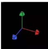
natural_image
Three-dimensional 3D coordinate system with green, red, and blue arrows on black background (no labels or text)3D Compass in passive state
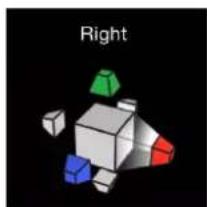
natural_image
3D geometric shapes in a cube with colored faces (green, blue, red) against black background, labeled 'Right' above.3D Compass in active state
Select a reference camera view using the 3D Compass
1 Position the pointer over the compass.
The compass changes to its active state, displaying a labeled icon for each reference camera view.
2 Click the icon representing the camera to activate.
The view in the Canvas updates to the selected reference camera view.
Select a scene camera view using the 3D Compass
1 Position the pointer over the 3D Compass.
The compass changes to its active state.
2 Control-click the 3D Compass, then choose a scene camera from the shortcut menu.
The view in the Canvas changes to the selected scene camera view.
Note: You can also choose a reference camera view from the 3D Compass shortcut menu.
Inset view
When you move an object in a 3D project, an Inset view appears in the lower-right corner of the Canvas, showing the scene from a different camera's point of view. If you are viewing the scene through the active camera, the Inset view shows the Perspective camera's point of view. If you are viewing the scene through any other camera, the Inset view shows the active camera. Use the Inset view to see the results of changes that you make in orthogonal views.

Use Motion Preferences to set the Inset view's size and when it appears in the Canvas.
3D grid
The 3D grid shows the ground plane of the 3D world. The ground plane is, as the name states, a plane attached to the ground of the scene, where Y equals 0. The ground plane represents the dividing line between up and down, that is, between positive Y values and negative Y values. It is centered on 0, 0, 0.

natural_image
3D modeling software interface showing a red square labeled 'A' on a grid background with no readable text or symbols in the scene itself.3D scene icons
3D scene icons are the onscreen representations of cameras, lights, and edge-on lines. An edge-on line is drawn when an object's edge faces the camera—which normally results in an invisible object. Because you can select edge-on lines in the Canvas, you can manipulate objects that would otherwise be invisible.
Note: No 3D scene icons appear in exported images or movie clips.

Tip: Double-click a camera scene icon to select it and change the current view to that camera.
Viewport layouts
You can have multiple viewport windows active at the same time in the Canvas, which helps you animate and position objects in 3D space. Use the pop pop-up menu located in the status bar just above the 3D View tools to choose from seven viewport layouts.

Each layout is represented by an icon in the pop-up menu:
- Single: The default value, displays a single viewport window in the Canvas.
- Two-up, side by side: Displays two viewport windows in the Canvas, one next to the other.
- Two-up, top and bottom: Displays two viewport windows in the Canvas, one on top of the other.
- Three-up, large window below: Displays three viewport windows, two next to each other on top and a larger window below.
- Three-up, large window right: Displays three viewport windows, two stacked on the left side and a larger window spanning the right side.
- Four-up, large window right: Displays four viewport windows, three stacked on the left side and one larger window on the right side.
- Four-up: Displays four viewport windows, all the same size.
When working with multiple viewports, the most recent view clicked in is the active view. The active viewport is indicated by a yellow border. Only the active viewport displays onscreen controls.
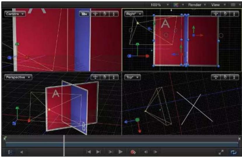
The lower-left view is active.
Note: The active viewport in the Canvas is not the same as the Active Camera. For more information, see Cameras overview on page 928.
2D and 3D group intersection
2D and 3D group intersection overview
Although 2D and 3D groups share many common properties, there are distinct differences in how they and their children behave and interact with other objects in a project. 2D and 3D groups can be parents or children of each other; there are no restrictions on mixing group types. You can change a group's type at any time.
Change a group's 2D/3D type
In the Layers list or Timeline, select the group to change, then do one of the following: - Choose Object > 3D Group (or press Control-D).
- Click the 2D/3D icon in the right side of the Layers list.
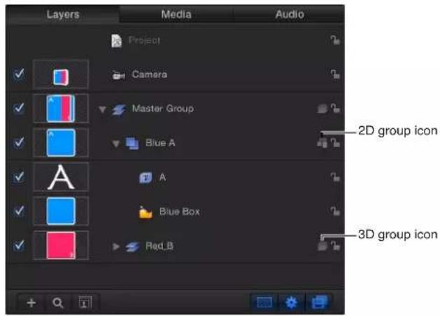
• From the Type pop-up menu in the Group Inspector, choose 2D or 3D.
Important: Some operations, as well as the application of some filters or a mask, cause a group to be rasterized. When a group is rasterized, it is converted into a bitmap image. Rasterization affects 2D and 3D groups in different ways. For more information, see Groups and rasterization on page 1045.
Root-level behavior
At the root level of the project, 2D groups behave differently than when they are nested inside 3D groups. (For more information about root-level groups, see Relative coordinates on page 914.) 2D groups at the root level are locked to the camera, even if the camera is animated. 2D groups at the top of the Layers list are rendered in the foreground, and 2D groups at the bottom of the Layers list are rendered in the background. Adjacent root-level 3D groups can intersect based on depth order.

In the example above, the two gray balls in the 2D "Foreground" layer are composited on top of the rest of the scene. The 2D "Background" layer is composited beneath the rest of the scene. "Group A" and "Group B" intersect because they are 3D groups, but neither of them can intersect with the 2D root-level groups.
Group Inspector
In the Inspector, the Group pane appears when a group is the selected object. The Group pane contains the Type pop-up menu, used to switch a group between 2D and 3D mode. A 2D group has different available parameters than a 3D group.
When the Type parameter is set to 3D, the Flatten and Layer Order parameters become available. When the Flatten checkbox is selected, the elements in the 3D group are flattened into a two-dimensional plane. When the Layer Order checkbox is selected, the group's children are sorted by their order in the Layers list rather than depth order (position along the Z axis). For more information, see Layer order and depth order on page 915.
When the Type parameter is set to 2D, Fixed Resolution parameters become available, allowing you to manually define the size of a group. By default, Fixed Resolution is disabled and the size of the group is determined by the layers in that group. For more information, see Constrain group size on page 160.
Note: When selected, Fixed Resolution crops the group to the size specified in the Fixed Width and Fixed Height parameters, around the anchor point of the group.
2D group properties
A 2D group has the following properties:
- Its children are composited in layer order.
- Filters are applied to the group in local space—that is, flat to the image.
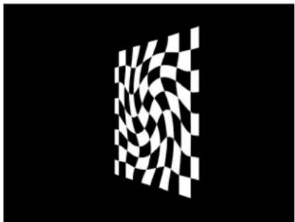
natural_image
Abstract black-and-white checkerboard pattern with no text or symbolsCheckerboard in 2D group with Twirl filter applied
- When lights are used, the group is lit as a single object; its children are not lit individually.
Note: 2D groups at the root level are not affected by lights. - Because it is flat, a 2D group has Crop, Drop Shadow, and Four Corner parameters.
- It can have a fixed resolution.
3D group properties
A 3D group has the following properties:
- Its children are composited in depth order (according to their position along the Z axis).
- Filters are applied to the group in view space. In other words, the filter affects the group as if it were applied to the lens of the camera viewing the group.
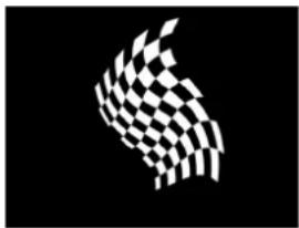
natural_image
Abstract black-and-white checkered pattern resembling a stylized bird or wing (no text or symbols)
natural_image
Abstract white curved line on black background, no text or symbols present
natural_image
Abstract white checkered wing-like shape on black background (no text or symbols)Checkerboard in 3D group with Twirl filter applied from three different angles
- When lights are used, the group's children are lit individually.
- Only a 3D group with the Flatten parameter enabled has the Crop, Drop Shadow, and Four Corner parameters.
Working with objects inside 2D groups and flattened 3D groups
You can use the Isolate command to align the active view with the axis of a 2D group or flattened 3D group. Doing so facilitates making adjustments to objects inside the group. For more information on the Isolate command, see Isolate an object in the Canvas on page 932.
If you cannot find an object in your project, you can locate it by resetting its Position parameter to 0, 0, 0. This centers the object in the flat group.
When moving an object along its Z axis inside a flat group—which includes 2D groups and flattened 3D groups—the object appears to grow larger or smaller rather than move closer to or further away from the camera.
Cameras
Cameras overview
In 3D mode, anything you see in the Canvas represents the viewpoint of a camera, either a default reference camera or a scene camera that you create. You can create cameras to look at your scene from different points of view. You can place, animate, and apply behaviors to cameras in your scene. Creating multiple cameras lets you make different cameras active at different times, allowing you to "cut to" different views over the course of the project.
Note: When building a 3D project, it can be useful to position cameras to examine your project's layout from different viewpoints. Rather than repeatedly moving the Perspective camera, you can add scene cameras to use as spatial bookmarks. You won't want to use these cameras during export, so be sure to disable them before rendering.
The scene cameras you create are used for rendering output. Scene cameras appear in the Canvas as wireframe camera icons and as objects in the Layers list and Timeline.
Add a scene camera to a Motion project
1 Choose Object > New Camera or press Option-Command-C or click the New Camera button in the toolbar.
A camera object is added to the Layers list, the Timeline, and the Canvas (represented there by a wireframe icon). The 3D Transform tool in the toolbar becomes active, the Camera HUD appears (if it isn't visible, press F7), and the Camera pane in the Inspector becomes available.
If you add a camera to a project that contains no existing 3D groups, the following dialog appears:

Cameras only affect 3D groups. Do you want to switch your 2D groups to 3D?
There are no 3D groups in this project. Switching the existing groups to 3D will allow the camera to affect them.
Cancel
Keep as 2D
Switch to 3D
2 Click Keep as 2D or Switch to 3D.
After you add a camera to a project, the Camera menu becomes available in the upper-left corner of the Canvas.

If a scene contains more than one camera, the topmost camera in the Layers list and in the Timeline at the current frame is the active camera. Although the active camera is the default camera used for export, you can select any scene camera to export. (The active camera is not the same as the active view. The active view is the last viewport you clicked in when working with multiple viewports.)

Note: Dragging and dropping an object onto the Canvas adds the object to the scene at the focal plane of the current camera. Dragging an object into the Layers list or clicking the Apply button in the preview area of the File Browser positions the object at 0, 0, 0.
Camera controls
You can modify a scene camera's properties in the Camera Inspector (and the Camera HUD).
To open the Camera Inspector, select the camera in the Canvas, Layers list, or Timeline, then click Camera in the Inspector.
Parameters in Inspector
- Camera Type: A pop-up menu that sets the type of camera used. There are two options:
- Framing: Sets the camera origin at the focal plane. The focal plane of a camera is a plane located at a distance equal to the camera's focal distance along its local Z axis (or line of sight) and oriented perpendicular to the camera's local Z axis.
•Viewpoint: Sets the camera origin at the center of projection.

Tip: The position of a Framing camera's origin makes it useful for orbiting moves. Rotating the camera causes it to orbit, whereas rotating a Viewpoint camera causes it to pivot—also known as panning (horizontal) or tilting (vertical).
- Angle of View: A slider that sets the angle of view of the camera, which is the number of degrees in which the camera sees. Values range from 0 to 180 degrees.
Note: When you animate the Angle of View parameter on a Framing camera, the result is an opposing dolly effect. An opposing dolly zooms in the opposite direction that the camera moves. When you animate the Angle of View parameter on a Viewpoint camera, the result is a regular camera zoom.

Framing camera
- Near Plane: A slider that sets the distance where the camera begins to see objects. Objects closer to the camera than this distance are not rendered from this camera's point of view.
- Far Plane: A slider that sets the distance where the camera ceases to see objects. Objects further from the camera than this distance are not rendered from this camera's point of view.
- Near Fade: A slider that sets the softness factor for the near plane. The softness factor sets a boundary range over which near objects fade in.
- Far Fade: A slider that sets the softness factor for the far plane. The softness factor sets a boundary range over which far objects fade out.
Note: Camera depth of field parameters are also contained in this window. For a complete description of these controls see Depth of field overview on page 933.
The Camera HUD contains the Camera Type, Angle of View, Focal Length, and DOF Blur Amount parameters, which are also available in the Inspector. The Camera HUD also contains 3D transform controls. For more information, see 3D transform HUD controls on page 913.
Scale, position, and animate cameras
Motion affords you various ways to to scale, position, "walk," and animate cameras. After you position cameras in a project, you can select a single camera view using the Isolate command. For more information on using the Isolate command, see Isolate an object in the Canvas on page 932.
Scale a camera
Use the Scale parameter in the Properties pane of the Inspector to scale what a camera sees. For example, when the camera "shrinks," the scene it views seems to become larger.
1 Select a camera in the Canvas, Layers list or Timeline.
2 Drag the Scale slider in the Properties Inspector.
Note: Changing the Scale value does not affect a camera's Angle of View parameter. Additionally, changing the Scale value only affects Framing cameras.
Position a camera in the Canvas
Do one of the following:
- Drag a camera or its onscreen controls in the Canvas.
For more information, see Use 3D onscreen controls on page 910.
- Select a camera in Canvas, Layers list, or Timeline, then adjust the Position or Rotation controls in the Properties Inspector.
- Select a camera in Canvas, Layers list, or Timeline, then adjust the 3D transform HUD controls.
For more information, see 3D transform HUD controls on page 913.
- Select a camera in Canvas, Layers list, or Timeline, then adjust the 3D View tools in the upper-right corner of the Canvas.
For more information, see 3D View tools on page 920.
Position a camera using the Walk 3D View tool
The Walk 3D View tool lets you position the camera in 3D space as you would in a video game, using a keyboard-and-mouse navigation method.
1 Select the Walk 3D View tool in the toolbar.

Note: If the tool is not visible, press and hold the Pan or Zoom tool to open the pop-up menu, then select the Walk 3D View tool.
The pointer changes to indicate that the Walk 3D View tool is active.
2 Use the Up Arrow, Down Arrow, Right Arrow, and Left Arrow keys to move the camera in 3D space; hold down the Option key while using the arrow keys to move the camera more slowly.
You can also drag in the Canvas to orient the camera.
If you're using a scene camera, you can also record the movement you create using the Walk 3D View tool, by creating keyframes. For more information on keyframing, see Keyframing methods on page 442.
Note: The Walk 3D View tool is available only when Active Camera, Camera, or Perspective is selected from the Camera menu. For more information on the Camera menu, see Camera pop-up menu on page 920.
Animate a camera
Do one of the following:
- Add keyframes to a camera parameter in the Camera Inspector or Properties Inspector.
For more information on animating with keyframes, see Keyframing overview on page 439.
■Apply a basic behavior or a Camera behavior to a camera.
For more information on Camera behaviors, see Camera behaviors overview on page 935.
- Apply a Parameter behavior to camera parameter in the Camera Inspector or Properties Inspector.
For more information on Parameter behaviors, see Add a Parameter behavior on page 299.
Isolate an object in the Canvas
The Isolate command (and Isolate button) temporarily aligns the current view with the selected object and hides all other objects in the scene, facilitating access to distant or obscured objects.
The Isolate command is not intended for creating a camera view to be rendered or exported, but rather to temporarily restrict your view to a single object so you can modify or manipulate that object more effectively.
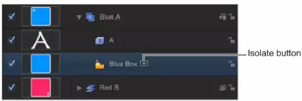
Isolate an object
1 Select the object to isolate in the Canvas, Layers list, or Timeline.
2 Do one of the following:
- Choose Object > Isolate (or press Control-I).
- In the Layers list or Timeline, click the Isolate button.
The current view changes to align itself with the selected object, and all other objects in the scene are hidden.

natural_image
Red vertical panel labeled 'A' against a dark background with faint grid lines (no text or symbols on the panel itself)Object in the Canvas

Object after isolation
When an object is isolated, a temporary camera is created and listed in the Camera menu. The camera shares its name with that of the isolated object.
Exit the isolated view
Do one of the following:
- Choose Object > Isolate (or press Control-I).
In the Layers list or Timeline, click the Isolate button. - Choose a different camera from the Camera menu.
Note: You can isolate as many objects as you have views. It is a common workflow to edit an object in an isolated view while looking at the results through a scene camera in another view. After an object is isolated in a view, you can activate another viewport and isolate a different object.
Depth of field
Depth of field overview
In the real world, cameras have a limited range of focus. Objects within that range appear sharp, and the further outside that range an object is, the blurrier it appears. This effect is used by camera operators to help limit which part of a scene the viewer pays attention to. Motion lets you simulate that phenomenon, thereby increasing the sense of depth in a 3D scene.

natural_image
Two sea turtles swimming in blue water, one large and one smaller, with no visible text or symbols.
Every camera in Motion has a focus offset that determines the precise location of perfect focus. Stretching away from that point in either direction are near and far focus points, which determine the range of the depth of field.

Note: Some complex objects, such as local 3D text and paint strokes with enabled Dynamics, are not affected by depth-of-field settings.
Depth of Field controls
Depth of Field controls, found in the Camera pane of the Inspector, allow you to set a range of focus by changing the Near Focus and Far Focus parameters. Objects outside that range are blurred. You can also modify the type and amount of blur used to render the out-of-focus effect.
Parameters in the Inspector
- DOF Blur Amount: A slider to control the maximum amount of blur applied to out-of-focus objects.
- Focus Offset: A slider to set the distance from the camera where objects are in perfect focus.
- Near Focus: A slider to set the nearest point of focus, measured in pixels as an offset from the focal distance.
- Far Focus: A slider to set the farthest point of focus, measured in pixels as an offset from the focal distance.
- Infinite Focus: A checkbox that sets the far focus to infinity, overriding the setting chosen in the Far Focus slider.
- Filter: A pop-up menu to set the type of blur algorithm used to render the out-of-focus areas. Choices include Gaussian or Defocus. The Defocus setting renders a more realistic effect, but may impact performance.
Tip: For best results, use Gaussian when setting up a scene, and Defocus for final output.
- Filter Shape: When the Filter pop-up menu is set to Defocus, this pop-up menu lets you choose between a disk-shaped, or polygon-shaped render kernel. Different shapes produce subtly different blur patterns simulating different types of camera lenses.
- Sides: When the Filter Shape pop-up menu is set to Polygon, this slider sets the number of sides in the polygon.
- Depth: A pop-up menu that sets the depth to Radial or Planar. Although radial typically exhibits more realistic results, there are some cases where it may look artificial. These include cases where the camera is set to a high DOF Blur Amount and/or the object is close to the edge of the frame, the object is very large, the object is rotated, and other similar instances. In these cases, switching to Planar may produce improved results.
Render depth of field effects
When depth of field is employed, playback performance may be significantly impacted. To alleviate this, you can disable the effects of depth of field settings while working on other aspects of your project.
Enable or disable depth of field effects
- From the Render pop-up menu in the status bar, select Depth of Field (or press Control-Option-D).
When a check mark is visible next to the menu item, the effects are rendered. When no check mark is visible, all objects remain in focus.
Turn off depth of field in the Inspector
- Select the camera in the Layers list or Timeline layers list, then set the DOF Blur Amount value (in the Depth of Field parameters) to 0 in the Camera Inspector.
Camera behaviors
Camera behaviors overview
Although most types of behaviors in Motion can be applied to cameras, there is an additional set of behaviors specifically designed to be applied to a camera in a 3D project. These Camera behaviors create common camera moves such as dolly moves, panning, and zooming without keyframing.
There are six camera-specific behaviors: Dolly, Focus, Framing, Sweep, Zoom In/Out, and Zoom Layer.
Add a Camera behavior
1 Select a scene camera in the Layers list, Timeline, or Canvas.
2 In the Add Behavior pop-up menu in the toolbar, choose Camera, then choose an item from the submenu.
The behavior is applied to the camera object.
Dolly
Moves the camera a specified distance along the camera's Z axis.
Parameters in the Inspector
- Distance: A slider that sets the distance of the dolly movement.
- Speed: A pop-up menu that sets the type of interpolation used for the movement. The value can be set to Constant, Ease In, Ease Out, Ease Both, Accelerate, or Decelerate.
The HUD contains the same controls as the Inspector.
Focus
Animates the camera's Focus Offset parameter to focus on a target object. For more information on camera focus settings, see Depth of field overview on page 933.
Tip: Use this behavior to perform a rack-focus effect during a scene.
Parameters in the Inspector
- Target: An image well to specify the object upon which the camera will focus. Drag an object from the Layers list into the well.
- Transition: A slider to set how long it takes for the camera to reach the focus position, measured as a percentage of the behavior's duration.
- Speed: A pop-up menu that sets the type of interpolation used for the movement. The value can be set to Constant, Ease In, Ease Out, Ease Both, Accelerate, or Decelerate.
The HUD contains the same controls as the Inspector.
Framing
Animates the camera along a path to position it in front of a selected object. You can control how the object fits into the frame at the ending position, and you can control the shape of the path to affect the amount of bend or curvature, as well as the apex of such a curved path. Other parameters allow you to customize the camera's orientation along the path, the speed at which it travels, and at what point it begins orienting towards the target object.
The Framing behavior has onscreen controls to allow you to manipulate the path and ending position in the Canvas. For more information on using the Framing behavior's onscreen controls, see Use Framing behavior onscreen controls on page 937.
Tip: Multiple framing behaviors can be arranged consecutively to move a camera from one object to another over the course of a scene.
WARNING: Applying a Framing behavior before or after a Basic Motion behavior, such as Motion Path or Throw, can create unexpected results. These behaviors can continue to affect the object even after the behavior ends. For example, If a Framing behavior is applied after a Motion Path, the residual effect of the Motion Path is combined with the path generated by the Framing behavior, resulting in the target object being framed improperly.
Parameters in the Inspector
- Target: An image well to specify the object upon which the camera is framed.
- Target Face: A pop-up menu listing the primary axes: Right (+x), Left (-x), Top (+y), Bottom (-y), Front (+z), and Back (-z), to specify which face of the target to frame.
- Up Vector: A pop-up menu providing a constraint for the camera to keep it the right way up. The pop-up menu offers the following choices: Auto, Target +X, Target -X, Target +Y, Target -Y, Target +Z, Target -Z, World +X, World -X, World +Y, World -Y, World +Z, World -Z.
Auto tries to guess which axis should be pointing up, and the other choices allow the user to specify an axis. - Framing: A pop-up menu to choose how the target should be framed. The menu choices include:
- Fit Horizontally: Positions the camera so the full width of the target fits in the width of the frame.
- Fit Vertically: Positions the camera so the full height of the target fits in the height of the frame.
-
Fit Both: Positions the camera so both width and height of the target fit in the frame.
-
Simple Fit: Positions the camera so both width and height of the project fit in the frame. If the target object is larger or smaller than the project dimensions, it may not properly fill the frame.
- Custom Fit: This option appears when the Framing Offset parameter is manipulated manually.
- Framing Offset: Three value sliders (X, Y, and, when expanded, Z) to offset (in pixels) the point on the target that is centered, relative to the camera. By adjusting Framing Offset, you can target a point other than the center of the object. The Z slider moves the camera nearer to or farther from the target.
- Offset Path Apex: A slider to set the position along the path (from the original position to the framing position) where the bend (if any) occurs if the user chooses to offset the path. It is expressed as a value between 0 and 1 (0 being at the start of the path, 1 at the end, and 0.5 being halfway along the path).
- Path Offset: Three value sliders (X, Y, and when expanded, Z) to offset the camera's position from the path, measured in pixels.
- Orientation: A pop-up menu to set whether the camera is oriented towards the target at every frame (Orient to Current) or oriented towards the target at its final position (Orient to Final).
- Position Transition Time: A slider to set how long it takes the camera to reach the framing position, measured as a percentage of the behavior's duration.
- Rotation Transition Time: A slider to set how long it takes the camera to reach the framing orientation, measured as a percentage of the behavior's duration.
• Transition: A pop-up menu listing choices for the speed of the transition. Choices include Constant, Ease In, Ease Out, Ease Both, Accelerate, or Decelerate. - Ease Out Time: A slider to set the percentage of the behavior's duration when the ease-out effect starts. The ease out ramps down the behavior's effect until the end of the behavior.
- Ease Out Curve: A slider that sets the rate of the ease out.
The HUD contains a subset of the controls in the Inspector.
Use Framing behavior onscreen controls
The Framing behavior has onscreen controls that allow you to manipulate the behavior settings in the Canvas.
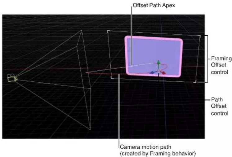
When a Framing behavior is applied and selected, the controls in the Canvas allow you to create a custom framing size and shape, and to visually adjust the Framing Offset and the Offset Path Apex.
Create a custom framing size and shape
- With the Framing behavior selected in the Layers list or Timeline, click any corner of the white framing control in the Canvas.
Adjust the Offset Path Apex
- With the Framing behavior selected in the Layers list or Timeline, drag the small white box along the diagonal white line to reposition the apex.
Adjust the Framing Offset
- With the Framing behavior selected in the Layers list or Timeline, drag the onscreen control or any colored arrow.
Sweep
Pivots the camera across a specified arc.
Parameters in the Inspector
- Start: A dial that sets the camera's starting angle relative to its current orientation. A nonzero value causes the camera to jump to this value at the start of the behavior.
- End: A dial that sets the camera's final angle relative to its Start parameter value.
- Speed: A pop-up menu that sets the type of interpolation used for the rotation. The value can be set to Constant, Ease In, Ease Out, Ease Both, Accelerate, or Decelerate.
- Axis: A pop-up menu that sets the axis around which the sweep occurs. Value can be set to Tilt X, Swivel Y, or Roll Z.
The HUD contains the same controls as the Inspector.
Zoom In/Out
Animates the camera's Angle of View parameter.
Parameters in the Inspector
- Zoom: A slider that sets a proportional value to modify the camera's Angle of View parameter. For more information about the Angle of View parameter, see Camera controls on page 929.
- Speed: A pop-up menu that sets the type of interpolation for the movement. The value can be set to Constant, Ease In, Ease Out, Ease Both, Accelerate, or Decelerate.
The HUD contains the same controls as the Inspector.
Zoom Layer
Moves a camera to the position of a target object's anchor point. When the camera reaches the object's anchor point, the angle of view changes while offsetting the camera's position based on the Zoom parameter. (This parameter is set to 0 by default so no animation of the Angle of View occurs.)
This behavior also lets you animate the camera's Angle of View during the camera's movement, based on the behavior's Transition value. For more information about the Angle of View parameter, see Camera controls on page 929.
Parameters in the Inspector
- Object: An image well to set the target of the camera's movement. Drag an object from the Layers list into the well.
- Transition: A slider that determines how far into the behavior the camera stops moving and the camera's Angle of View parameter begins to animate instead.
If Transition is set to 50% in a Zoom Layer behavior that has a length of 300 frames, the camera move takes 150 frames to arrive at the position of the target object and then stops moving for the duration of the behavior, and the camera's Angle of View parameter animates over the rest of the duration. If Transition is set to 100%, the camera move takes the full 300 frames to arrive at the position of the target object, and the camera's angle of view does not animate. If the Zoom Layer behavior's duration is 100 frames and Transition is set to 50%, the camera move takes 50 frames to arrive at the position of the target object. - Speed: A pop-up menu that sets the type of interpolation used for the rotation. The value can be set to Constant, Ease In, Ease Out, Ease Both, Accelerate, or Decelerate.
- Zoom: A slider that sets a proportional value to modify the camera's Angle of View parameter. A nonzero value determines how much the angle of view (and thus perspective) changes relative to the camera's initial angle of view. A zero value for Zoom leaves the Angle of View parameter unchanged.
The HUD contains the same controls as the Inspector.
Lighting
Lighting overview
You can apply lighting to a motion graphics project to enhance the depth and scope of compositions, and to help create realistic environments for composites. Although light sources are not visible, you can simulate a visible light source by combining a point light with an image or shape (the simulated light source).

Simulated visible light source created by combining a light with a shape
Note: Use the Match Move behavior to move a simulated light source with a light in a movie clip. For more information on the Match Move behavior, see Basic Match Move workflows on page 962.
Motion's lighting system works only on 3D groups and their children.
Add a light to a project
- Choose Object > New Light (or press Shift-Command-L).
A light object is added to the Layers list, the Timeline, and the Canvas (represented by a wireframe icon), and the 3D Transform tool in the toolbar becomes active.
If you add a light to a project with no existing 3D groups, the following dialog appears:

If you select Keep as 2D, a light at the root level has no effect until you have at least one root-level 3D group. By default, 3D groups and objects display the shading from lights as soon as lights are added.
A light is activated when it is a child of the following objects:
• The project (for example, a light is at the root level of the project)
• An unflattened 3D group
Properties affecting the appearance of lights
When you add lights to a scene, two groups of properties contribute to the appearance of lights: light properties and object lighting properties. You can adjust light properties by selecting a light object in the project and then modifying the parameter values in the Light pane in the Inspector. You can manipulate object lighting properties by selecting a nonlight layer in your project (an image, movie clip, shape, and so on) and then adjusting the Lighting parameters in that object's Properties pane.
Light properties—the quality of the light source itself—fall into the following categories: the type of light, its intensity, and its color. A light bulb, the sun, and lighting in a dance club have different appearances. You can use lighting properties to simulate these differences.
You can use multiple lights to mix color. If one red and one blue spot light are pointed at a white object, they mix to make magenta. Each type of light has its own attributes. It may take a combination of light types to achieve a specific effect. For example, you might want to include a dim ambient light with a spot light to add depth or prevent total darkness where the spot light's effect drops off.
Light controls
When you create a light, or select a light object in the Layers list, the Light pane becomes available in the Inspector.
Parameters in the Inspector
• Light Type: A pop-up menu that lets you choose from four categories of light.
•Ambient: An ambient light emits light in all directions, illuminating all objects in the scene from all directions equally. This type of light has no position and no representation in the Canvas. The most common use for ambient lights is to add an overall fill effect or color cast.
Note: There is no global ambience property in Motion, so you may have to add an ambient light to prevent total blackness.
- Directional: A directional light emits parallel rays of light in a specified direction from a source located at an infinite distance. Only the rotation of this light has bearing on its effect. A directional light icon, in conjunction with the transform controls, can be used to assist in visualizing the direction the light is traveling in a scene. The directional light icon appears as a cylinder with one end removed. The circle represents the back of the light, and the lines indicate the direction in which the light is traveling.

natural_image
3D wireframe and solid-state model of a cylindrical object with grid background, no text or symbols presentDirectional light Directional light example
- Point: A point light emits light outward from a single point in 3D space in all directions. Optionally, you can add falloff based on an object's proximity to the light. This is Motion's default light, and it produces results similar to that of an incandescent light bulb.

natural_image
Two-panel image: left shows a circle with crosshair, right shows a 3D grid with a small green circle and light source (no text or symbols)Point light Point light example
- Spot: A spot light emits light from a conical light source and casts an elliptical pattern on objects hit by the light. Using a spot light allows for a high degree of accuracy when you need to limit the area affected by the light.

natural_image
Two 3D visualizations: a wireframe cone and a curved surface with a small green dot, both without any text or symbols.Spot light Spot light example
• Color: A standard set of controls that enable you to select the color of the light.
- Intensity: A slider that acts as a dimmer switch for lighting. If you use a Directional light at 100% intensity pointed straight at a red object, the object looks red. If you lower the intensity, the object and scene get darker. However, if you increase the intensity above 100% you can begin to overexpose your scene, eventually causing the object to appear white. The Intensity value slider ranges from 0 and 400, but there is no upper limit for Intensity (use the adjacent value slider to set a value above 400).
Note: Multiple lights interacting with an object combine to increase the object's apparent brightness as they would in the real world. If you have two spot lights overlapping in space and pointing in the same direction with Intensity set to 100%, you see the same result as having a single spot light with its Intensity set to 200%.
- Falloff Start: A slider that enables you to adjust where the falloff point of a light begins. In the real world, light falls off—or has less of an effect—as the distance from the light source increases. Usually falloff starts at the center of the light object. Setting Falloff Start adds additional control to your lighting. This parameter applies to light types that use a Position parameter (Point and Spot).
In the example below, a light is positioned slightly above the origin of the scene. There are three rings of cards at a distance of 200, 500, and 1000 units from the light. (In this example, a visible light source—the bulb at the center of the rings of cards—is simulated for illustrative purposes.) The light's Intensity is set to 100% and Falloff is set to 10% . When Falloff Start is set to 0 (left, below), the light begins to fall off by the time it hits the innermost ring. When Falloff Start is set to 200 (right, below), the inner ring is lit at 100% intensity and the outer rings are slightly brighter than before.
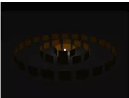
natural_image
Abstract 3D rendering of a circular structure with a central glowing spot, set against a dark background (no text or symbols)
natural_image
Abstract 3D rendering of a circular mechanical or architectural component with glowing orange highlights (no text or symbols)Falloff Start set to 0 Falloff Start set to 200
When Falloff Start is increased to 500 (left, below), the inner and middle rings are lit at 100% intensity, and the outer ring is brighter than before. Finally, when Falloff Start is set to 1000 (right, below), all rings are lit at 100% intensity.

natural_image
Abstract 3D rendering of a circular mechanical or architectural component with orange highlights, set against a dark background (no text or symbols)
natural_image
Abstract 3D rendering of a circular mechanical or architectural component with orange square elements on a dark background (no text or symbols)Falloff Start set to 500 Falloff Start set to 1000
In the next example, the image on the left contains a light with Intensity set to 100%, while the image on the right has a light Intensity of 500%. In the image on the right, the outer rings are slightly brighter, but the innermost ring is overexposed. If the Falloff Start of the light in the image on the right is increased to 1000, the rings are overexposed.

natural_image
Abstract 3D rendering of a circular structure with a central glowing spot, rendered in warm tones against a dark background (no text or symbols)
natural_image
Abstract 3D rendering of a circular tunnel or ring structure with glowing yellow-orange highlights (no text or symbols)Intensity set to 100; Falloff Start set to 0 Intensity set to 500; Falloff Start set to 0
- Falloff: A slider that controls the rate of falloff for a point or spot light based on the Falloff Start setting. At low values, light falls off over a long distance from the light source; therefore, the light travels farther in the image. At high values, the falloff occurs more rapidly.
- Cone Angle: A dial that becomes available only when Light Type is set to Spot. The Cone Angle is measured from the center of the light outward. The angle may be set to a value between 0 and 90 degrees. The distance of the light from its target affects the result of this parameter. If the light is close, a wider spot cone angle may be needed to light more of the object. If the light is further away, a lower Cone Angle may be needed to isolate objects.
- Soft Edge: A dial that becomes available only when Light Type is set to Spot. Like Cone Angle, this parameter can be set to a value between 0 and 90 degrees. Its starting point begins at the outer edge of the Cone Angle. If set to 0, spot lights have a hard edge. Low values produce a slight softening effect to the boundary of the lit area. Higher values produce a wide, more natural fade. Adding softness expands the area of your light, so you might need to adjust the angle to achieve a specific effect.
Note: Point lights and spot lights also contain a set of parameters to control how they cast shadows. For more information on these parameters, see Shadows overview on page 944.
The Light HUD contains the Light Type, Color, Intensity, Falloff Start, and Falloff parameters, which are also available in the Inspector. The Light HUD also contains 3D transform controls. For more information, see 3D transform HUD controls on page 913.
Object lighting parameters
All lightable objects have properties that control how they react to lights in a scene. You can adjust these properties for an object via the Lighting section of the Properties Inspector.
Parameters in the Inspector
- Shading: A pop-up menu that enables you to set how an object responds to lights in the scene. If set to On, the object can be lit. If set to Off, the object ignores scene lights. If set to Inherited (the default), the object uses the Shading value of its parent.
Note: It is possible to set the Shading parameter of a child of a group (however deep it is nested) to On. That setting overrides any group settings previously applied to the child object.
- Highlights: A checkbox that controls whether lit objects show highlights. This parameter has no effect if Shading is set to Off. Click the disclosure triangle to reveal an additional Shininess parameter.
- Shininess: A slider that sets how strong an object's highlights appear. Higher values create a glossier appearance. This Shininess parameter is disabled when the Highlights parameter is deselected.
Disable lighting
Lighting effects can significantly impact playback performance. You can temporarily disable lighting to improve playback speed while working on other aspects of your project.
Disable rendering of lighting
■ From the Render pop-up menu in the status bar, choose Lighting (or press Option-L).
Shadows
Shadows overview
Motion scenes that include Point or Spot lights can recreate more natural, realistic effects by casting shadows. Shadows are created when an opaque or semi-opaque object blocks light from hitting another object. To see a shadow in Motion, you need at least three things: A shadow-casting light source, an object to cast a shadow, and another object upon which the shadow is cast. Multiple lights cast multiple shadows that may or may not be visible depending on the relative positions and settings of the objects in the scene.
Note: Ambient and Directional lights do not cast shadows.
WARNING: Some changes you make to 3D objects with shadows applied cause shadows to disappear. This occurs when the change causes rasterization of the 3D object—adjusting the opacity of a group or turning on the glow attributes for a text object, for example. Flattening the 3D group allows it to cast shadows again. For more information about disappearing shadows, see Shadows and rasterization on page 1052.
In Motion, you can control whether a light source creates shadows and whether each object in the scene receives shadows and/or casts shadows. You can even have an object cast a shadow when it is invisible. The strength, sharpness, shape, and position of the shadow depends on the type and positions of the lights and relative position of all three objects.
Cast shadows versus drop shadows
There are two common types of shadow effects used in motion graphics work: drop shadows and cast shadows. Motion can create both effects, but because they have different purposes and applications, it may be helpful to consider the differences between them. Cast and drop shadows simulate the effect of light blocked by an opaque object. But a cast shadow is a 3D effect requiring a light source and an object for the shadow to fall upon, whereas a drop shadow is a 2D effect simulating a cast shadow without a light source and therefore is limited to a very small range of settings.


Drop shadow Cast shadow
Drop shadows are commonly used to simulate depth and separate foreground objects from the background in 2D projects. The classic drop shadow effect is used on light-colored titles so the text is legible against dark and light backgrounds. In a drop shadow effect, the imaginary light source does not create any shading effect on the surface of the object, and the shadow's position is set at a fixed direction.
A drop shadow is rendered as a part of the foreground object, so it doesn't interact with background objects. However, because it is an effect, its appearance can be customized. The softness, opacity, position, and color can be adjusted and animated without having to manipulate a light source.
Cast shadows are true 3D effects, and their appearance is determined by the light source and the other objects in the scene. Multiple cast shadows interact with each other and take their shapes based on the surfaces and positions of the objects upon which they are cast.
This section addresses cast shadow effects. For information on drop shadows, see Drop shadows overview on page 244.
Shadow controls
Shadows are controlled by adjusting settings in two places. Point and spot lights have a Shadows section in the Light Inspector, and all visible objects have a Shadows section in the Properties Inspector.
Note: 2D groups at the root level of the project do not have lighting or shadow controls. To enable shadows on such a group, convert it to 3D or embed it in another 3D group.
Shadow Parameters in the Light Inspector
- Shadows: This checkbox turns on Shadows controls. (When activated, the checkbox is blue.) The Shadows checkbox lets you set some lights to cast shadows, and others not to cast shadows.
Selecting this checkbox causes the light to cast shadows on objects in front of it if the objects also have shadow controls enabled. Deselecting it exempts the light from generating shadows, regardless of settings of individual objects.
- Opacity: This slider controls the apparent opacity of the shadow. Dragging the slider to the left creates a lighter shadow.

natural_image
3D rendering of two blue circles on a green screen with a grid background and a small coordinate axis (no text or symbols)Opacity set to 75%

natural_image
3D rendering of a blue oval and a green square on a grid background, with no visible text or symbolsOpacity set to 25%
- Softness: This slider determines how blurry a shadow will appear.
Note: The appearance of a shadow depends on the rendering quality of the object casting it. Because a shadow may be larger than the original object, you may see some jagged edges or aliasing on the shadow. If you see such artifacts, check how your image looks when the project is set to best quality, rather than draft or normal. For more about Canvas display quality, see Canvas view options on page 57.
- Uniform Softness: This checkbox lets you constrain the results of the softness slider to a uniform amount of blur on the shadow regardless of distance between the light, the object casting the shadow, and the object receiving the shadow.
By deselecting the checkbox, you enable nonuniform softness, where the farther the objects are from each other, the more blur is applied.
Note: Selecting nonuniform softness can impact playback performance.
Uniform softness Nonuniform softness
Note: Intersecting objects reveal an unnatural effect of using uniform softness. Because an equal amount of blur is applied to the entire shadow, the blur appears to spill out in front of the intersecting object, creating a strange appearance. This effect can be eliminated in two ways: by deselecting the Uniform Softness checkbox or by setting the object to not receive shadows (by deselecting the Receive Shadows checkbox in the Properties Inspector).
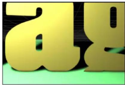
- Shadow appears in front of intersecting objects.
Uniform Softness checkbox selected

No shadow appears.
Uniform Softness checkbox deselected

The shadow is not visible on the text object.
Uniform Softness checkbox selected and text object's Receive Shadows checkbox deselected
- Color: This control sets the color of the shadow. Although semitransparent objects cast lighter shadows than opaque objects, you cannot create light transmission effects wherein a semitransparent object allows some light to pass through it, picking up its color or pattern and projecting that as part of the shadow, as light passing through stained glass does. For more information on using the color controls, see Basic color controls on page 132.
Note: When light shading is turned on, shadows are multiplied with the objects upon which they are cast. This means that the result is a darkening effect, regardless of the color of the shadow. If you select a shadow color lighter than the background upon which is cast, the shadow may not be visible. So, for example, when shading (lighting) is turned on, it is not possible to cast a white shadow on a dark surface. To override this effect, you must disable shading. For more about using shadows without lights, see Shadows without lights on page 950.
Shadow Parameters in the Properties Pane
Every visible object in a 3D space has shadow controls in the Properties pane of its Inspector. This includes shapes, clips, particles, and so on. Lights, Cameras, and 2D groups at the root level of the project do not have shadow controls.
- Cast Shadows: This checkbox sets whether an object casts a shadow if it is between a light source and another object.
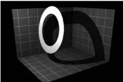
natural_image
3D rendered object inside a tiled room with a circular opening, no visible text or symbols- Receive Shadows: This checkbox controls whether neighboring objects' shadows affect the current object. When deselected, light affects the object as if the shadow-casting object did not exist. The following image depicts an object (the white ring) with the Receive Shadow checkbox selected and the Casts Shadow checkbox deselected.

natural_image
3D-rendered scene with a large white ring and two blue stars on a grid background (no text or symbols)- Shadows Only: This checkbox allows an object to block light and cast a shadow, while the object itself does not appear in the scene.
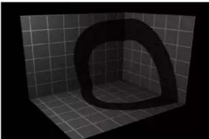
natural_image
3D rendered corner view of a curved, hollow object on a tiled floor (no text or symbols)You can select both Receives Shadows and Shadows Only, which makes the object invisible except for the regions where a shadow is cast upon it.

natural_image
3D-rendered scene with a blue star and a black star on a grid background (no text or symbols)Shadows and complex 3D objects
When using shadows with objects such as particle systems, text objects, or replicators that are set to 3D, shadows are cast from one part of the object onto another part. This is called self-shadowing.

natural_image
Abstract diagram with green oval shapes and a teal cone on black background (no text or symbols)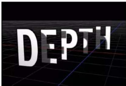
Modifying the object in a way that causes rasterization prevents shadows from displaying.

natural_image
Abstract illustration of green oval shapes on a dark grid background with a teal cone-shaped object nearby (no text or symbols)
In some cases you may be able to find another way to perform the effect that does not require rasterization. For example, in the following images, rather than modifying the opacity of the particle emitter, which causes rasterization, you can modify the opacity of the particle cells and maintain the shadows.

natural_image
Abstract graphic with three colored blocks (brown, blue, purple) and green dots on black background, no text or symbols present.
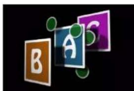
natural_image
Abstract graphic with three colored blocks (brown, blue, purple) and green dots on black background, no text or symbols present.Emitter set to 100% Opacity Emitter set to 60% Opacity Particle cells set to 60% Opacity
In the second figure, the layer order of the particle system is affected, and particles appear in front of the letter A. For more about how rasterization affects shadows, see Shadows and rasterization on page 1052.
Shadows without lights
Lighting and shadows can each be disabled independently. You can keep shadows visible, even when lighting is disabled, allowing you to keep the original unshaded look of the scene. Turning off lighting also changes the way shadows are rendered.
When Shading (the visible effect of lighting) is disabled, shadows behave differently. Rather than being multiplied with the object upon which they are cast, the shadow's color and opacity are controlled only by the Shadows settings in the Light pane of the shadow-casting light's Inspector.
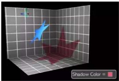
natural_image
3D rendered scene with a blue star and red shadow on a grid background, no text or symbols presentShading enabled

natural_image
3D rendered scene with two pink star-shaped objects on a grid background, one in blue and the other in red, labeled 'Shadow Color' in the corner (no other text or symbols)Shading disabled
This enables you to create shadows of any color or opacity, from traditional dark shadows to brightly colored or even white shadows.

natural_image
3D wireframe model of a robotic arm in a grid, with shadow color legend (no text or symbols on the model itself)Shading can be disabled globally by choosing View > Render Options > Lighting or by choosing Lighting in the Render pop-up menu in the status bar. (Make sure there is no checkmark beside the menu item.) Shading can also be disabled for a specific object in the Lighting section of an object's Properties Inspector. For more about disabling lighting/shading, see Disable lighting on page 944.

natural_image
3D rendered scene with a blue object and pink geometric shapes on a grid background, labeled 'Shadow Color' in the corner (no other text or symbols)
natural_image
3D rendered scene with a blue star and red arrow on a grid, no text or symbols present
natural_image
3D wireframe model of a character with shadow color legend (no text or symbols on the character itself)Shading disabled globally
Shading disabled on floor object
Spot lights and shadow shading
With spot lights, enabling shadows but disabling shading can create a seemingly strange result where the shadow is suddenly cut off because it has exceeded the scope of the light cone.
Because the shading effect of the light cone is turned off, the shadow edge looks unnatural.
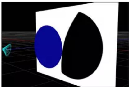
natural_image
Abstract 3D rendering of a blue oval and black semicircle on a white square, with a small teal cone and grid background (no text or symbols)To correct such an occurrence, increase the Cone Angle in the Light Inspector.
Disable shadows
Rendering shadows can significantly impact playback performance. You can temporarily disable shadows to improve playback speed while working on other aspects of your project.
To disable rendering of shadows
- From the Render pop-up menu in the status bar, choose Shadows (or press Control-Option-S).
Reflections
Reflections overview
In the real world, all objects exhibit some degree of reflectivity based on surface shine, brightness, angle of view, and proximity to reflected objects. Motion simulates this natural effect, equipping every object with a set of parameters to create and control realistic-looking reflections. When reflections are enabled for an object, all other objects in the scene are reflected but may only be visible from specific angles and distances.

Reflection controls
Reflections are controlled by adjusting settings in the Reflection section of Properties Inspector.
Reflection Parameters in the Properties Inspector
- Reflection: This checkbox enables reflections based on the settings of the parameters in the group. (When selected, the checkbox turns blue.)
- Reflectivity: This slider controls how shiny the object's surface appears. 0% indicates no reflectivity, while 100% is perfectly reflective, like a mirror.
- Blur Amount: This slider controls whether real reflections appear in sharp focus or quite blurry, depending on the surface quality of the reflecting object.
- Falloff: This checkbox determines whether the reflection fades with distance from the object, producing a more realistic result.


No Falloff With Falloff
When the Falloff checkbox is selected, additional controls become available. Click the disclosure triangle beside the Falloff checkbox to reveal these controls:
- Begin Distance: This slider determines the distance (inside the reflection) where the falloff begins. When the slider is set to 0, falloff starts at the reflection plane.
- End Distance: This slider determines the distance where the falloff ends, beyond which the reflection isn't visible. Adjusting this slider moves the falloff point closer to the reflection plane, which causes less of the reflected image to appear.
- Exponent: This slider controls how quickly a reflection gets fainter as the reflected object gets farther from the reflective surface.
- Blend Mode: This pop-up menu determines the blend mode used for the reflection. Blend modes other than "add" are useful for achieving different looks, even if they aren't physically intuitive. For more about blend modes, see Blend modes overview on page 229.
Other reflection parameters
- Casts Reflection: The Properties Inspector of every object also contains a Casts Reflection pop-up menu (in the Blending section) that controls whether an object is reflective. There are three options:
- Yes: The object is reflected in nearby reflective objects.
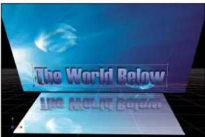
•No: The object is ignored by reflective surfaces.

•Reflection Only: The object becomes invisible, but appears in reflective surfaces around it.

Reflections and groups
In addition to choosing reflection settings for individual objects, you can adjust settings for an entire group. Reflection settings for a group override the settings of individual layers in the group. For example, if an object in a group is not set to receive reflections, turning that setting on for the whole group forces the individual object to receive them. Turning off the setting for the group allows the objects' settings to act as expected.
Cast Reflection settings work differently. If the group is set to cast reflections, individual objects' reflections can still be turned off (or set to Reflection Only). However, if the group is set to not cast reflections at all, individual objects never cast a reflection, regardless of their setting.
Disable reflections
Rendering reflections can significantly impact playback performance. You can temporarily disable reflections to improve playback speed while working on other aspects of your project.
Disable rendering of reflections
- From the Render pop-up menu in the status bar, choose Reflections (or press Control-Option-R).
Limit recursive reflections
When a reflective object is reflected in another object, the first object can be seen in the reflection, potentially causing an endless repetition of reflections. Motion limits the number of reflective bounces that can occur in a scene, preserving performance and preventing the viewer from getting lost in infinity. The number of allowed reflections is set per project.
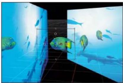
natural_image
Underwater scene with fish swimming near a grid-patterned wall, no visible text or symbolsLimit the number of recursive reflections in a project
1 Choose Edit > Project Properties (or press Command-J).
The Properties Inspector for the project opens.
2 In the Reflections section, adjust the Maximum Bounces slider.
Motion tracking
22
Motion tracking overview
Motion tracking is a method of recording the movement of an element (a shape or reference point in a movie clip) in the Canvas, then applying that recorded movement data to another element in the Canvas.
Motion provides a set of automated tracking behaviors that allow you to do the following:
- Match move elements in movie clips: You can apply tracking data from a background element (such as a billboard) to a composited foreground element (such as a graphic of a logo) so both elements appear to be locked together. This technique is known as match moving.
- Match move animated objects in the Canvas: You can apply the motion data of an animated object to another object in the project. For example, you can attach a smoke particle emitter to an animated spaceship so a rocket exhaust trail follows wherever the spaceship moves.
- Stabilize camera movement in movie clips: You can apply tracking data to remove unwanted camera movement or jitter in a movie or image sequence. For example, you can smooth handheld camera shots.
- Unstabilize movie clips: You can restore movement to a previously stabilized movie. This technique is useful when you stabilize a clip to add a foreground effect but want to restore the original camera movement to the final composite.
- Track the position parameter of a filter: You can apply tracking data to the position parameter of a filter. For example, you can make the center point of a Light Rays filter follow a moving flashlight beam in a movie clip. The tracking data from the flashlight beam is applied to a single parameter of the filter (the Center parameter), rather than to the filter as a whole.
- Track the control points of a shape or mask: You can apply tracking data from reference points in a movie clip to the control points of a shape or mask. For example, you can use this technique to attach a mask to a moving element in a movie clip, isolating that element to apply additional effects to it.
Motion lets you track one or multiple reference features in a clip:
- One-point tracking: Track a single reference pattern (a small area of pixels) in a movie clip to record position data.
- Two-point tracking: Track two reference patterns in a movie clip and use the relationship between the tracked points to record position, scale, and rotation data.
- Four-point tracking: Often referred to as four-corner pinning. Track four reference patterns in a movie clip to record position, scale, and rotation data. The four trackers analyze the relationship between four reference patterns, such as the corners of a picture frame or television monitor. This data is applied to each corner of an image or clip to "pin" the clip so it appears locked in the picture frame or television monitor.
- Multiple-point tracking: Track as many reference patterns in a clip as you like. You can manually add trackers in the Analyze Motion behavior. When you apply a Track Points behavior from the Shape behaviors subcategory to a shape or mask, a tracker is assigned to each shape control point.
Note: Although Motion provides a 3D workspace, tracking in Motion is planar. In other words, tracking does not occur in Z space. For example, if you are analyzing two features in a clip—and that clip is moving in 3D space—you are recording the changes in position, scale, or rotation over time in the clip, but not its actual 3D transformation.
The object tracked is called the background or source element. The object to which the tracking data is applied is called the foreground or destination element.
To learn more about tracking, choose a topic in the Help table of contents (the sidebar to the left of this window).
How a tracker works
In Motion, you apply a tracking behavior to an object—typically a movie clip—to record and analyze its motion. The result of this analysis is a track—recorded movement data—that can be applied to any other object in the project, transferring the motion of a source object to a destination object.
Tracking behaviors analyze an area of pixels known as a reference pattern over a range of frames in a movie clip to "lock onto" the pattern as it moves across the Canvas. You specify the reference pattern to be tracked (a specific swatch or snapshot of pixels in the clip) by dragging one or more onscreen trackers (a red crosshair in a circle, shown below) to the area of the clip you want to analyze. Motion then proceeds to track the designated reference pattern for a specified duration of time. This duration of time is based on the length of the tracking behavior, the length of the defined play range, or the length of the clip.

Ideally, the reference pattern should be a consistent, easily identifiable detail with high contrast. This makes the pattern easier to track.
During the analysis, the tracker advances to each subsequent frame, sampling many positions in the search region around the center point of the tracker. Some of those positions fit the designated reference pattern more closely than others; the tracker finds the position where the search region most closely matches the reference pattern (with subpixel accuracy). For every frame analyzed, the tracker assigns a correlation value by measuring how close the best match is.
In addition to searching for the reference pattern's position, the tracker identifies how the pattern transforms (scales, rotates, or shears) from one frame to the next. Imagine you are tracking a logo on the shirt sleeve of a person walking past the camera. If the person turns slightly as he passes the camera, the reference pattern rotates. The tracker looks for the reference pattern and any shifts in that pattern's scale or rotation.
When the tracker's position and correlation values for a given frame are determined, Motion records this information in keyframes. This process is repeated for every frame, until the end of the track range is reached.
You can apply the recorded data, stored as keyframes in the tracking behavior, to many project elements.
Note: The Stabilize behavior uses an advanced technology that analyzes the motion of the entire frame of a clip, without the use of trackers.
Tracking behaviors
Tracking behaviors overview
There are six tracking behaviors in Motion: four in the Motion Tracking behaviors subcategory, one in the Shape behavior subcategory, and one in the Parameter behaviors subcategory. You apply these behaviors like any other behavior in Motion. For a general overview of Motion behaviors, see Behaviors overview on page 293.
Motion uses behaviors to collect, analyze, store, and apply tracked motion data. Because the data is stored in the behavior (as keyframes), it can easily be applied to other objects in a project. A tracking behavior can also be used to apply animation data created by standard behaviors or keyframes. Tracking behaviors are applied in the same manner as all other behaviors.
When a tracking behavior performs its analysis, track points appear in the Canvas, and tracking keyframes are created in the behavior. These keyframes live in the behavior that is applied to an object—the keyframes are not applied to the object itself.
Note: Onscreen track points (and their corresponding tracking keyframes that appear in the Keyframe Editor) are not created when using the default motion analysis in the Stabilize behavior. For information about the Stabilize behavior, see Motion Tracking on page 957.
For information about specific tracking behaviors, choose a topic in the Help table of contents (the sidebar to the left of this window).
Motion Tracking
There are four Motion Tracking behaviors, accessible in the Add Behavior pop-up menu:
- Analyze Motion: This behavior is used to generate and store tracking information from a clip. Unlike the Match Move and Stabilize behaviors, Analyze Motion cannot apply its tracking information to other objects. However, the tracks gathered by the Analyze Motion behavior can be applied to other objects via the Match Move, Track (in the Parameter behaviors category), and Track Points (in the Shape behaviors category) behaviors. The Analyze Motion behavior lets you add multiple trackers to a clip. In this way, you can analyze multiple reference patterns at the same time. The Analyze Motion behavior can only be applied to footage (a QuickTime movie or image sequence).
- Match Move: This behavior is used to match a foreground element to a background element so they appear locked together. This effect can be achieved in three ways:
- You can match a foreground element to a background element using one-point (position), two-point (position, scale, or rotation), or four-point (corner-pinning) tracking. Unlike other tracking behaviors, the Match Move behavior can perform the analysis and compositing operations. You can add further modifications (blur, color corrections, and so on) before you create the final composite.
- You can use the Match Move behavior to apply a reference a track recorded by another tracking behavior. You do this by choosing a track from the Action pop-up menu (the gear icon) in the Match Move behavior's HUD or Inspector.
- You can apply the animation data of one object (animation created by behaviors or keyframes, for example) to another object. You do this by dragging an animated source object from the Layers list into the Source well in a destination object's Match Move behavior HUD or Inspector. In this way, you can apply the animated source object's movement to the destination object without analyzing the motion of the source object.
Note: You can apply the Match Move behavior to nearly any object type.
- Stabilize: This behavior removes unwanted motion in a clip, such as camera jitter. The stabilization can be applied to the horizontal or vertical movement in the clip, or to a combination of horizontal and vertical movement. This effect can be achieved in any of three ways:
•The Stabilize behavior can analyze and stabilize a clip without onscreen trackers. In this case, the Stabilize behavior evaluates the entire frame of a clip using motion analysis to record the movement of the camera. This behavior offers two ways to use this recorded data: clip smoothing, which eliminates unwanted jitter while maintaining the general motion of the camera; and clip locking, which stabilizes a subject. This behavior can analyze and affect position, scale, and rotation.
- In addition to full-frame motion analysis, you can add onscreen trackers for one-point (position) tracking or two-point (position, scaling, or rotation) tracking. When you add manual trackers to the Stabilize behavior, Motion stabilizes the clip using data from the trackers rather than from an automated motion analysis. When using this method, the tracker moves the frame so the track point falls in the same spot in each subsequent frame. You can also combine these methods; for example, you can track part of a clip with the full-frame method and then switch to manually added trackers later on.
- You can load analysis tracks recorded in one Stabilize behavior into another. To load an analysis track, choose a track from the Action pop-up menu in the destination object's Stabilize behavior HUD or Inspector.
Note: The Stabilize behavior can only be applied to footage (a QuickTime movie or an image sequence).
- Unstabilize: This behavior does not perform tracking analysis. Instead, the Unstabilize behavior applies the movement recorded by a Stabilize behavior to a clip or object. Use Unstabilize to match the camera shake in a movie clip to foreground elements added in post-production. To load the tracking data, choose a track from the Action pop-up menu, located in the tracking behavior HUD or Inspector. The Unstabilize behavior can be applied to nearly any object type.
When applicable, you can convert tracking data recorded or referenced by the Match Move, Stabilize, or Unstabilize behaviors to object keyframes. When converted, the tracking behavior is removed and the transform keyframes are "baked" into the object. For more information on converting behaviors, see Advanced strategies to improve tracking results on page 984.
Track Points
The Track Points behavior, a member of the Shape behavior subcategory, lets you do either of the following:
- Track the control points of a shape, paint stroke, or mask to reference features on a source clip. For example, you can draw a mask around a car in a clip and then track the control points of the mask to the moving car, cutting the car out of the background. You can then apply effects to the isolated car, and the surrounding image is not affected.
- Apply existing tracking data recorded by the Analyze Motion, Match Move, or Stabilize tracking behaviors to the control points of a shape or mask.
Note: The Track Points behavior can be applied only to shapes (including paint strokes) and masks.
Track
The Track behavior, a member of the Parameter behavior subcategory, lets you match the position parameters of shapes, clips, or filters (such as the Center parameter of a Circle Blur filter) to a reference feature of a clip.
The tracking data is obtained in one of two ways:
• After you add the Track behavior to a position parameter, another clip is analyzed in the Track behavior, and the recorded data is applied to that position parameter.
- Tracking data from another tracking behavior is referenced by the Track behavior. The recorded data from the referenced behavior is applied to the position parameter.
Note: Although it's a Parameter behavior, the Track behavior is only designed for use with position parameters.
About tracking behavior data
If the project contains footage or animated objects when a Match Move, Stabilize, Unstabilize, or Track Points behavior is applied, the nearest footage or animated object below the behavior in the Layers list is applied to the tracking behavior and appears in the behavior's Source well. This data is overwritten when you choose another track from the Action pop-up menu.
You can assign an animated object or tracking data to a tracking behavior in any of four ways:
- Choose another tracking behavior from the Action pop-up menu.
- Drag a tracking behavior or footage object to the Source well in the HUD or Behaviors Inspector.
- Drag an animated object to the Source well in the HUD or Behaviors Inspector. The referenced animated object is applied as the source for the current behavior. (This option applies only to the Match Move and Track Points behaviors.)
- Drag a tracking behavior or footage object to the tracking behavior in the Layers list. The referenced tracking behavior or footage object is assigned as the source for the current behavior.
Note: To clear a Source well, drag the item away from the well and release the mouse button.
Tracking workflows
Tracking workflows overview
Motion's tracking behaviors perform many different tasks:
- The Analyze Motion behavior analyzes the movement of a clip at a reference point you select, and saves the analyzed data. This data can then be applied to other objects. See Analyze Motion workflow on page 960 and Analyze Motion controls on page 994.
- The Match Move behavior applies the movement data of a source object to a destination object. See Basic Match Move workflows on page 962 and Match Move controls on page 996.
- The Stabilize behavior smoothes motion in a clip. See Stabilize workflow on page 971 and Stabilize controls on page 1001.
- The Unstabilize behavior applies movement analyzed using the Stabilize behavior to another object. See Unstabilize workflow on page 974.
- The Track Points behavior analyzes and applies the control point movement of shapes, masks, and paint strokes. See Track Points workflow on page 974 and Track Points controls on page 1003.
- The Track behavior tracks a object's position parameter to a clip, or applies tracking data to a position parameter. See Track behavior workflow on page 978 and Track controls on page 1006.
Analyze Motion workflow
The Analyze Motion behavior analyzes and stores tracking data from a clip but does not transform the tracked object. Analyze Motion data tracks are meant to be referenced by other tracking behaviors.
For a full description of Analyze Motion parameters, see Analyze Motion controls on page 994.
Tracking in one pass rarely yields perfect results. For information on tracking methods and tips, see Basic strategies to improve tracking results on page 981.
Generate a track for a clip using the Analyze Motion behavior
1 In the Layers list, Timeline, or Canvas, select the video object to track, then choose Motion Tracking > Analyze Motion from the Add Behavior pop-up menu in the toolbar.
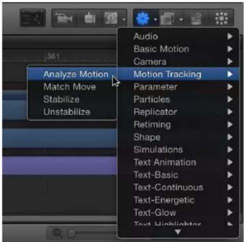
Note: You can also select the video object, select the Analyze Motion behavior in the Library, then click the Apply button in the Library preview area. Alternatively you can drag the behavior from the Library to the video object in the Layers list, Timeline, or Canvas.
An onscreen tracker is added to the footage. By default, a single tracker appears at the center of the footage.

2 Play your background clip several times to determine a good reference point in the footage, then move the playhead to the frame where you want to start the track analysis.
3 In the Canvas, drag the tracker to the reference point you want to use.
Note: For more information on using the onscreen tracker, see Adjust onscreen trackers on page 978. For more information on selecting a tracking reference point, see Basic strategies to improve tracking results on page 981.
4 To add trackers, click the Add button in the Behaviors Inspector.
Each new tracker is added to the center of the footage.
5 Drag the additional trackers to the reference points you want to use.
6 To track a specific range of frames, adjust the start and end points of the purple tracking behavior bar in the Timeline or mini-Timeline.
Note: If you adjust the length of the tracking behavior bar, make sure to set your tracking reference points within the range of the behavior.
7 Click the Analyze button in the HUD or Behaviors Inspector.

When the tracking analysis begins, a progress window opens, and track points appear on a motion path in the Canvas. The track point at the current playhead position is emphasized.

natural_image
Red Mini Cooper car driving on a residential street with trees and a building in the background (no visible text or symbols)The tracking keyframes contained in the behavior appear in the Keyframe Editor. (If the Keyframe Editor is not visible, click the Show/Hide Keyframe Editor button in the lower-left corner of the Motion project window.)

line
| Position Curve | Value | | -------------------- | ------ | | Track 1 Resun.X | 58.37 | | Track 1 Resun.Y | -29.4 | | Track 1 Confidence | 92.47 |Because the Analyze Motion behavior does not transform the source object, only the tracking keyframes appear in the Keyframe Editor. When using a Match Move or Stabilize behavior, the tracking keyframes appear as well as the transform curves of the source object (for Stabilize) or destination object (for Match Move).
A confidence curve is also displayed in the Keyframe Editor. This curve provides a visual indication of the tracker's accuracy relative to its parameter settings in the Inspector. The confidence curve is not for editing purposes.
8 To stop a track analysis, click the Stop button in the progress window or press Esc.
Tip: If the tracker loses its reference pattern, do not click the Stop button. Allow the analysis to continue for a few seconds. When the tracker fails, the playhead jumps to the exact frame where the track was lost.
The analyzed track, contained in the Analyze Motion behavior, can now be loaded into other tracking behaviors (via an Action pop-up menu in the HUD or Inspector of the other tracking behaviors). In the image below, a track from the Analyze Motion behavior is loaded into a Match Move behavior HUD.
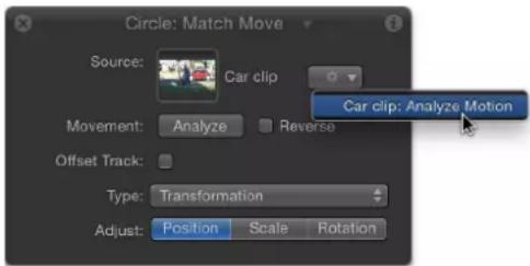
Note: The Stabilize behavior can only load tracks from other Stabilize behaviors.
Important: Although the Stabilize behavior's automatic analysis mode starts from the beginning of a clip (regardless of the playhead's position), the analysis of other tracking behaviors begins at the current playhead position for all workflows. To define a tracking region, set an Out point for the tracked clip. If you are performing a reverse track analysis, set In and Out points for your track. To set an Out point, position the playhead at the correct frame, select the clip, then choose Mark > Mark Play Range Out (or press Option-Command-O). To set an In point, position the playhead at the correct frame, select the clip, then choose Mark > Mark Play Range In (or press Option-Command-I).
Match Move workflows
Basic Match Move workflows
This section provides an overview of several basic Match Move behavior workflows. For a full description of Match Move parameters, see Match Move controls on page 996.
To use a Match Move behavior, you need at least two objects in your project: a background or source object and a foreground or destination object. The source object provides movement data based on a tracking analysis of its video or its animation attributes (keyframes or behaviors applied to a shape, for example). The movement from the source object is then applied to the destination object. The destination object can be a shape, text, particle emitter, and so on.
Match move a foreground object to a background video clip
In this typical workflow, the Match Move behavior tracks an element of a background video clip and then applies the resulting track data to a foreground element. As a result, the foreground element matches the movement of the tracked element in the background clip.
1 Create a Motion project containing a video clip and a shape or image object.
The video clip becomes the background element. The shape or image object serves as the foreground element.
2 Play the background clip several times to determine a good, clearly defined track analysis point.
3 Select the foreground object, then choose Motion Tracking > Match Move from the Add Behavior pop-up menu in the toolbar.
A single onscreen tracker (a red crosshair in a circle) is added to the Canvas. Because the default Match Move tracker records position data, it is known as an anchor tracker. (In the Behaviors Inspector, you can deactivate this tracker by deselecting the Anchor checkbox.)
4 Determine if you need to activate additional trackers for two- or four-point tracking.
- For two-point tracking, select the Rotation-Scale checkbox in the Behaviors Inspector (under the Anchor checkbox).
- For four-point tracking, choose Four Corners from the Type pop-up menu in the Behaviors Inspector and proceed to Four-point tracking workflows on page 965.
5 Move the playhead to the frame where you want the track analysis to begin.
6 In the Canvas, drag the tracker (or trackers) to the reference area (or areas) to track.
As you drag the tracker in the Canvas, the region around the tracker becomes magnified to help you find a suitable reference pattern.

7 Click the Analyze button in the HUD or Behaviors Inspector.
The foreground element is tracked to the background element.
Apply animation data of a source object to a destination object
You can instantly apply the animation of a source object to a destination object via the Match Move behavior, without tracking analysis. The source object can be animated by behaviors or keyframes. The following simple example uses a magic wand image (made up of a rectangle shape) animated using the Spin behavior. The animation of the wand is then tracked to a particle emitter to create the illusion of sparkles flying off the tip of the wand.
1 With the destination object selected, choose Motion Tracking > Match Move from the Add Behavior pop-up menu in the toolbar.
In this example, a Match Move behavior is applied to a nonanimated particle emitter.

The closest animation data (such as position or rotation changes caused by keyframes or behaviors) beneath the Match Move behavior in the Layers list is applied as the source and appears in the Source well. In this example, the spinning Magic Wand Shape is the source animation.
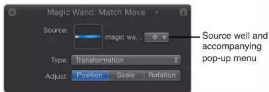
Important: Animated objects, tracking behaviors, and footage can be dropped in the Source wells.
2 Ensure that the Type parameter is set to Transformation in the Behaviors Inspector.
3 Position the destination object (the object to which you applied the Match Move behavior—in this case, the particle emitter) in the Canvas at the location you want.
In this example, the particle emitter is positioned at the tip of the wand. The motion path inherited from the source object appears in the Canvas, attached to the destination object.

natural_image
Diagram showing a blue arrow and a small figure inside a square frame against a black background, with no visible text or symbols.As a result, the particle emitter and the wand now share the same animation path.
4 Play the project.
The particles match the movement of the wand.

natural_image
A bright blue comet with a tail extending into the night sky, emitting a bright yellow trail against a black background (no text or symbols visible)Reorder Match Move behaviors in the Layers list
When you add a Match Move behavior to a project, the closest active footage or animated object in the Layers list below the clip with the behavior is applied as the source animation. This source of animation appears in the Source well of the Match Move Behaviors Inspector. When you move Match Move behaviors in the Layers list, that data is reset. To retain the source animation data, rather than dragging to reorder layers, copy the Match Move behavior and paste it to another object.
1 Select the behavior to copy in the Layers list.
2 Choose Edit > Copy (Command-C).
3 Select the layer to apply the copied behavior to.
4 Choose Edit > Paste (Command-V).
The copied behavior is applied to another object.
Note: You can also Option-drag the behavior to copy and paste it to a different object.
About two-point tracking
If you use two-point tracking in a Match Move behavior, turn on (or off) the Position, Scale, or Rotation buttons (in the Adjust row of the Behaviors Inspector) to add or remove tracking parameters, thereby achieving different effects.
In the following example, an oval shape (the foreground object) is match-moved to a video clip of picture frames (the background object) using two-point tracking. In the first three images below, only Position is enabled in the Adjust row of the Behaviors Inspector. As a result, although the camera pushes in toward the picture frames, the white elliptical shape does not change its scale or rotation based on the position of the two trackers.
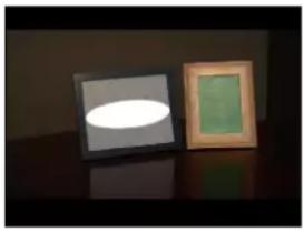
natural_image
Two framed artworks displayed on a reflective surface, one with a white oval and the other with a green square (no text or symbols visible)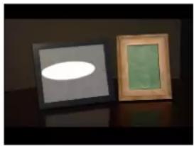
natural_image
Two framed artworks displayed on a dark surface, one with a glowing oval light and the other with a green and brown interior (no text or symbols visible)
natural_image
Two framed artworks displayed on a dark surface, one with a glowing oval light and the other with a green rectangle (no text or symbols visible)In the next example, Position, Scale, and Rotation are enabled in the Adjust row of the Behaviors Inspector. Consequently, the white elliptical shape changes its position, scale, and rotation based on the position of the two trackers, matching the camera's push toward the picture frames and preserving the illusion that the shape is physically attached to the picture frame.

natural_image
Two framed artworks displayed on a dark surface, one with a glowing oval light and the other with a green frame (no text or symbols visible)
natural_image
Two framed artworks displayed on a dark surface, one with a glowing oval light and the other with a green square (no text or symbols visible)
natural_image
Two framed artworks displayed on a dark surface, one with a white oval highlight and the other with a green rectangle (no text or symbols visible)Note: When using four-point tracking, scale and rotation are applied to the corner-pinned object.
Four-point tracking workflows
For more control over tracking, use the four-corner option, which lets you track four points on a background clip and apply the recorded motion to the four corners of a foreground object. There are two basic four-corner pinning workflows:
- After applying the Match Move behavior, use four-corner trackers to pin a foreground object to a background element: This workflow is useful when the pinned image is the same size as the background reference patterns to be tracked.
- Use onscreen controls to corner-pin a foreground object before applying the Match Move behavior: This method lets you position, resize, and rotate the foreground object to fit the background reference pattern.
Note: If one of the Match Move pinning options below don't result in a successful track, try four-point tracking using the Analyze Motion behavior or the Stabilize behavior as described below.
Use four-corner trackers to pin a foreground object to a background element
This workflow is ideal for a four-corner pin in which the transformed or pinned image is the same size as the background frame (or reference patterns) it is being tracked to. In the following example, a foreground image is pinned to a background clip of a picture frame.
1 Drag the playhead to the frame where you want to start the track analysis, then apply a Match Move behavior to the foreground object.
2 In the Behaviors Inspector, choose Four Corners from the Type pop-up menu.
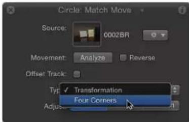
Note: The Four Corners option is not available when Match Move is applied to a 3D group. To corner-pin a 3D group, select the Flatten checkbox in the Group Inspector.
In the Canvas, a tracker appears at each corner of the foreground object's bounding box. In the Inspector, the default track list (Anchor and Rotation-Scale), is replaced with the Top Left, Top Right, Bottom Right, and Bottom Left trackers.
As with the Analyze Motion trackers, when you drag a tracker to a new position in the Canvas, a magnified inset appears to help you position each tracker.
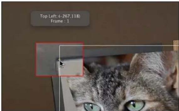
3 In the Canvas, drag each tracker to a corner of the background element (in this example, the corners of the picture frame).

natural_image
Two framed photos: one showing a gray tabby cat with green eyes, the other a plain wooden frame (no text or symbols visible)4 Click the Analyze button in the HUD or Behaviors Inspector.
The foreground element is pinned to the background element; four motion paths show the transformation occurring at each corner.
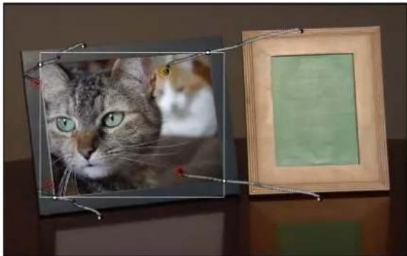
natural_image
Two framed photos: one showing a gray tabby cat with green eyes, the other a wooden frame with a green background (no text or symbols visible)Note: In this example, a reflection is created on the table using a duplicated and transformed copy of the tracked image.
To fine-tune the track (when Four Corners is chosen from the Type pop-up menu), you might need to make minor adjustments to the foreground element, such as modifying its scale or rotation. When you choose the Attach to Source option from the Transform pop-up menu in the Behaviors Inspector, you cannot transform the tracked object. To transform the tracked object, choose Mimic Source from the Transform pop-up menu.
5 To transform the foreground element after the tracking data is applied:
a From the Transform pop-up menu in the Behaviors Inspector, choose Mimic Source.
b Open the Properties Inspector and make any necessary adjustments to the foreground object using the Scale, Rotation, and other parameters.
For more information on the Mimic Source and Attach to Source transform options, see Match Move controls on page 996.
Use onscreen controls to corner-pin a foreground object
In this workflow, a foreground object is pinned to a background picture frame using the Four Corner parameter in the Properties Inspector before applying the Match Move behavior.
1 Select the foreground object to corner-pin.
2 In the toolbar, choose the Distort tool from the 2D transform tool pop-up menu.
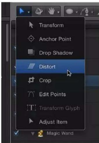
3 In the Canvas, drag each corner of the foreground object into the correct position.
You can fine-tune the corner positions by adjusting the Position, Rotation, Scale, and Four Corner parameters in the Properties Inspector.
When you drag a corner in the Canvas, the Four Corner checkbox is selected in the Properties Inspector.
Tip: You can lower the opacity of the foreground object to better see the reference points on the background clip. You may also want to disable snapping so the image you are adjusting does not snap to the Canvas guidelines. To turn snapping on or off, choose View > Snap or press N.
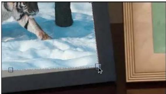
natural_image
Illustration of a dog walking through snow with a tree in the background, framed by decorative frames (no text or symbols)4 Move the playhead to the frame where you want to start the track analysis, then apply the Match Move behavior to the foreground object.
In the Canvas, a tracker appears at each corner of the foreground object. In the Inspector, the default track list (Anchor and Rotation-Scale) is replaced with the Top Left, Top Right, Bottom Right, and Bottom Left trackers.

natural_image
Illustration of a dog walking on ice with a red circular marker (no text or symbols)5 If necessary, drag each tracker in the Canvas to further fine-tune its position, watching the magnified view in the Tracker Preview area of the Inspector.

Important: To move the tracker positions independently of the foreground object, choose Mimic Source from the Transform pop-up menu in the Behaviors Inspector. When Attach to Source is chosen from the Transform pop-up menu, the foreground image is distorted when you drag the trackers in the Canvas.
6 Click the Analyze button in the HUD or Behaviors Inspector.
The foreground object is pinned to the background element.
Note: If you adjust the Four Corner parameter for a layer and then apply a Match Move behavior, the Four Corner parameter is applied in the behavior. If you delete the behavior, the four corner settings for the layer remain. If you reset the Match Move behavior, the four corner settings are reset.
Use Analyze Motion behavior to track points
You can also use the Analyze Motion behavior to record a four-point track. In this workflow, the four-point tracking data collected from the Analyze Motion behavior is loaded into a Match Move behavior to corner-pin a foreground object.
1 Go to the frame where you want to start the track and apply an Analyze Motion behavior to the background element.
By default, a single tracker appears in the Canvas.
2 Drag the tracker (Track 1) to a reference pattern in the top-left corner of the background element.
Note: For four-point analysis, the trackers should be positioned in a clockwise order, starting in the upper-left corner. This ensures the proper alignment of your element when the transformation is applied.

3 In the Behaviors Inspector, click Add to add a second tracker, then drag the second tracker (Track 2) to a reference pattern in the top-right corner of the background element.
4 Add another tracker (Track 3) and drag it to a reference pattern in the bottom-right corner of the background element.
5 Add another tracker (Track 4) and drag it to the reference pattern in the bottom-left corner of the background element.
6 Click the Analyze button in the HUD or Behaviors Inspector.
The track is generated and its data is saved in the behavior.
Note: You can save tracking behaviors to the Library for later use.
7 Apply a Match Move behavior to the foreground element you want to corner-pin.
8 From the Action pop-up menu at the right of the Source well (the gear icon), choose the Analyze Motion track.
Doing this applies the Analyze Motion tracking data recorded in step 6 to the Match Move behavior.
9 Choose Four Corners from the Type pop-up menu in the HUD or Behaviors Inspector.
The four-point tracking data from the Analyze Motion behavior is applied to the foreground object.
Note: When using the Match Move behavior for four-point tracking, the trackers are placed in the correct order (clockwise from the top left) in the Canvas after Four Corner is chosen from the Type pop-up menu in the Behaviors Inspector. If you've used more than four trackers or you need to change the order of the trackers, choose a different order from the Top Left, Top Right, Bottom Right, or Bottom Left pop-up menus.
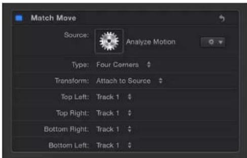
About destination object animation
You can use the Match Move behavior to apply the movement of a source object to a destination object. When a destination object has no animation of its own, it precisely follows the motion of the source object. However, if the destination object is animated (has its own applied behaviors or keyframes), more complicated motion effects can be achieved by combining motion paths.
You can specify whether the animation of the destination object is ignored by or added to the Match Move behavior. You do this in the Match Move Behaviors Inspector, by choosing one of two options from the Transform pop-up menu: Attach to Source or Mimic Source.
Choosing Attach to Source applies the movement of the source object to the destination object, but disables any animation inherent in the destination object. (However, you can reactivate the destination object's own animation and deactivate the source object's recorded track by turning off the Position, Scale, and Rotation buttons in the Adjust row of the Behaviors Inspector.)
Choosing Mimic Source combines the motion paths of the source object and destination object's own animation. In other words, the destination object maintains its own animation while at the same time mimicking the motion in the source object's recorded track. When the Match Move behavior is set to Mimic Source, turning off the Position, Scale, and Rotation buttons deactivates the source object's recorded track. For more information on Attach to Source and Mimic Source, see Match Move controls on page 996.
Combine masks with tracking behaviors
When a mask is added to an object with applied tracking data, the data is applied to the mask. In the following image, the foreground object is tracked to four points on the background clip, but still must be masked to fit into the picture frame.
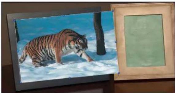
natural_image
Illustration of a tiger walking through snow under a blue sky, framed by a wooden frame (no text or symbols)By masking the image being tracked, you can include only the portion of the image you want to fit in the frame.

natural_image
Illustration of a tiger walking through snow under blue sky, framed in two wooden frames (no text or symbols)Although the mask is attached to the foreground image, you might need to animate changes in the mask's position and scale to accommodate changes in the background clip over time.
Note: As an alternative to using masks, you can also crop an object with applied tracking data using Crop controls in the Properties Inspector.
You can track the control points of a mask to a clip or apply existing tracking data to the control points of a mask. For more information, see Track Points workflow on page 974.
Stabilize workflow
Use the Stabilize tracking behavior to smooth shaky motion in a movie or image sequence. For a full description of Stabilize parameters, see Stabilize controls on page 1001.
With the Stabilize behavior, there are three ways to analyze a clip:
- Use the default advanced motion analysis technique that evaluates the entire frame of a clip at once to extract movement data without onscreen trackers.
- Use onscreen trackers that analyze a reference pattern (a small group of pixels) in the Canvas. These are the same trackers used by the Match Move and Analyze Motion behaviors.
- Use a combination of the advanced motion analysis and onscreen trackers.
Important: For information on using onscreen trackers with the Stabilize behavior, see Basic strategies to improve stabilization on page 990.
After the motion analysis is complete, you can apply it in either of two ways. The clip can be smoothed, eliminating unwanted jitter while maintaining the general motion of the camera, or the clip can be locked, stabilizing the subject. The smoothing can affect translation, rotation, or scale, making it more flexible for some operations than the other tracking behaviors.
The Stabilize behavior is primarily useful for removing unwanted trembling from less-than-stable crane or jib arm moves, eliminating teetering from handheld walking shots, or reducing vibrations in automotive shots.
Note: Motion blur present in the image remains, even though the subject in the shot is smoothed or locked.
Stabilize a clip using the Stabilize behavior
1 Apply a Stabilize behavior to the clip you want to stabilize.
Note: Unlike other behavior workflows, the Stabilize behavior's automatic mode analyzes the entire clip from its first frame, rather than from the current playhead position.
2 Set the options for the analysis:
a Choose one of the following options from the Method pop-up menu in the HUD or Behaviors Inspector:
- Choose Stabilize to lock down an image, removing problems such as camera shake.
- Choose Smooth to smooth camera movement in the clip.
b Choose one of the following options from the Borders pop-up menu:
- Choose Normal to maintain the size of the stabilized footage. Resulting transformations made to the stabilized image may cause moving black borders to appear around the edges of the clip. A very shaky clip results in large black borders.
- Choose Zoom to expand the clip to the full size of the Canvas. This prevents black borders from appearing around the edges of the stabilized clip.

natural_image
Side profile of a white sports car with sleek design and reflection stripes (no visible text or symbols)- Normal borders maintain the size of the stabilized clip but create black borders around the clip's edges.

natural_image
Side profile of a silver sedan car with sleek wheel and side mirror, displayed indoors under dramatic lighting (no visible text or symbols)- Zoomed borders scale the stabilized clip so the clip does not move away from the edge of the Canvas.
Note: For suggestions on correcting the black borders, see Remove black borders from stabilized clips on page 991.
c Choose one of the following options from the Direction pop-up menu:
- Choose Horizontal and Vertical to apply the stabilize transformation to the X and Y dimensions.
- Choose Horizontal to apply the stabilize transformation to the X dimension.
- Choose Vertical to apply the stabilize transformation to the Y dimension.
d Enable or disable the Adjust options, as follows:
- Turn on Position to apply the analyzed position data to the clip. (The X and Y position changes in the footage are smoothed or stabilized.) To stabilize the X and Y position of the shot and leave scale or rotation changes intact, turn on Position and turn off Scale and Rotation.
- Turn on Scale to apply any analyzed scale data to the clip. (Scale changes in the footage are smoothed or stabilized.) To stabilize or smooth changes in scale and leave position or rotation changes intact, turn on Scale and turn off Position and Rotation. (The Scale option is not related to the Zoom option in the Borders pop-up menu.)
- Turn on Rotation to apply analyzed rotation data to the clip. (Changes in the rotation of the footage are smoothed or stabilized.) To stabilize or smooth changes in rotation in the shot and leave position or scale changes intact, turn on Rotation and turn off Position and Scale.
For the smoothest result, turn on all three Adjust options (Position, Scale, and Rotation).
Note: You can change the Method, Borders, Direction, and Adjust parameters before or after the clip is analyzed.
3 Click the Analyze button in the HUD or Behaviors Inspector.
Note: The clip is stabilized according to defined parameters. Unlike Motion trackers, the default Stabilize analysis does not create keyframes in the Keyframe Editor. However, the stabilized object's transformation can be converted to keyframes. For more information, see Advanced strategies to improve tracking results on page 984. When correlation trackers are added to and analyzed with the Stabilize behavior, keyframes are created.
For more information on correcting problems associated with stabilization, see Basic strategies to improve stabilization on page 990.
Adjust the Stabilize behavior's Track Region parameter
When stabilizing a clip, you can use the Track Region parameter to define an area to be analyzed (isolating the stabilization to a limited area of the analyzed source). During analysis, the area outside the region is ignored. Use this option for faster processing of a clip.
1 In the Stabilize parameters (in the Behaviors Inspector), select the Track Region checkbox.
A transparent red overlay appears in the Canvas.
2 Do one of the following:
- Drag in the region to change its position.
- Drag a handle to resize the region. The corner handles simultaneously resize width and height; the top and bottom center handles resize height; the left and right center handles resize width.
- Press Option while dragging a handle to resize the region from its center.
- Drag the rotation handle in the center of the region to change the angle of the region.

3 After defining the track region, click the Analyze button in the Behaviors Inspector.
Because analysis takes place in the defined track region, the clip is analyzed more quickly.
Unstabilize workflow
Use the Unstabilize tracking behavior to reapply camera shake or movement into a finished clip.
The Unstabilize behavior's sole function is to apply movement recorded by a Stabilize behavior to a clip or object, letting you match the camera movement from a background clip to foreground elements, or to unstabilize a stabilized clip.
Note: A project must include a Stabilize behavior with recorded motion data before you can use the Unstabilize behavior.
Apply the Unstabilize behavior
1 Select the object to unstabilize, then choose Motion Tracking > Unstabilize from the Add Behavior pop-up menu in the toolbar.
The behavior is added. If a Stabilize behavior (that has completed an analysis) is present in the project, the Stabilize data is applied to the Unstabilize behavior.
2 If you don't want to use the automatically selected Stabilize behavior, do one of the following:
• In the HUD or Behaviors Inspector, choose a Stabilize behavior from the Action pop-up menu at the right of the Source well.
- Drag an analyzed tracking behavior to the Source well in the HUD or Behaviors Inspector.
The motion is applied to the destination object.
Track Points workflow
The Track Points behavior (located in the Shape Behaviors category) is designed for use with shapes, masks, and paint strokes. Use the Track points behavior in the following ways:
• To track the control points of a shape or mask to a clip (for example, when rotoscribing)
• To apply tracking data from another tracking analysis to the control points of a shape or mask
• To apply the animation of an object to the control points of a shape or mask
Note: To apply the analyzed movement of an object to a shape or mask as a whole (not to the shape's control points), use the Match Move behavior.
For a full description of the Track Points parameters, see Track Points controls on page 1003.
Track a mask using the Track Points behavior
In the following example, the Track Points behavior is applied to a loose mask of seven control points isolating a car in a background clip.
1 With a background clip visible in the Canvas, use a mask tool to isolate part of the background clip. For more information on working with masks, see Masks and transparency overview on page 888.
2 Select the mask object, then choose Shape > Track Points from the Add Behavior pop-up menu in the toolbar.
The behavior is added to the mask object, and trackers appear for each control point on the shape. The trackers are ordered in the same order that the shape was drawn: Control Point 1 is Track 1, Control Point 2 is Track 2, and so on.
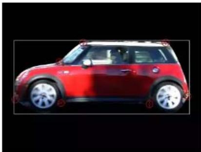
natural_image
Side view of a red Mini Cooper car (no visible text or symbols)3 Drag the trackers to fine-tune their position on the reference patterns.
As you drag, a magnified inset view of the area around the tracker appears.
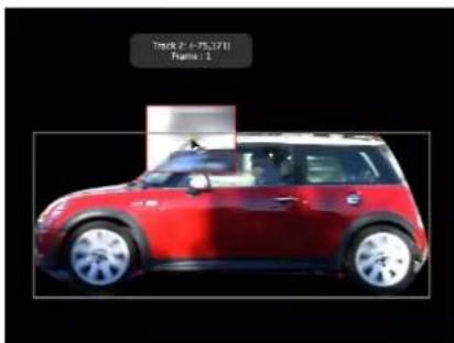
natural_image
Red Mini Cooper car displayed against black background (no visible text or symbols)4 To disable a tracker, deselect its checkbox in the Behaviors Inspector.
Note: Control points without an associated tracker are not modified.
5 Click the Analyze button in the HUD or Behaviors Inspector.
The mask control points are tracked to the reference patterns.
In this example, a mask is tracked to a moving car so the car can be isolated from the rest of the clip. The illustration on the left shows the original unmodified clip. In the illustration on the right, the tracked mask isolates the car (and can be seen as the desaturated background), allowing separate effects to be applied to the car and its background even though they are part of the same image. The mask protects the car from the effects of the heavy blur and desaturation.

natural_image
Red Mini Cooper car parked on a road with blurred background (no visible text or symbols)
natural_image
Red Mini Cooper car driving on a road with motion blur background (no visible text or symbols)As with all behaviors, you can drag or copy (Option-drag) a Track Points behavior to a new shape in the Layers list. When you apply the behavior to a new shape, the trackers are applied to the control points of the new shape. If the new shape has more control points than the originally tracked shape, only the original track points are applied. For example, if the originally tracked shape has three control points, and the new shape has five control points, trackers are applied to the first three control points of the new shape. If the new shape has fewer control points than the originally tracked shape, trackers are applied to the existing points on the new shape.
Note: Paint strokes usually have a large number of control points. Simplify a paint stroke by deleting or disabling control points before applying a Track Points behavior to the stroke. To track the stroke as a whole, rather than by its control points, use the Match Move behavior.
Apply the animation of one shape to the control points of another shape
Applying the animation of one animated shape to another is an easy way to create fun, complementary animations in which the objects appear to play with each other. For this workflow, your project must contain an object animated with keyframes or behaviors.
1 In a project that contains two shapes, animate one of the shapes using keyframes or a Basic Motion behavior.
In this example, a simple line shape is animated with the Spin behavior.
For more information about animating with keyframes, see Keyframing overview on page 439. For more information about Basic Motion behaviors, such as the Spin behavior see Spin on page 328.
2 Apply the Track Points behavior to a nonanimated shape.
The Track Points behavior inherits the animation data of the animated object closest to it in the Layers list. (A thumbnail of the animated object appears in the Source well of the Track Points Behaviors Inspector.)
In this example, the Track Points behavior is applied to a Bezier shape.

Note: To reference another animated object, drag that object to the Track Points behavior's Source well or to the behavior in the Layers list.
3 In the Behaviors Inspector, choose Attach to Source from the Transform pop-up menu.
The spinning animation of the line is applied to the Bezier shape. The Bezier shape changes form because the vertex tangents match the transformation of the source animation.

natural_image
Two abstract geometric shapes on black background: one with a vertical line and oval, the other with a curved shape and a diagonal line (no text or symbols)4 To align the tangents to the transformation of the source object, select the Align Tangents checkbox in the Behaviors Inspector.

The spinning animation of the line is applied to the Bezier shape. The tangents remain aligned at their original angles along the shape.

natural_image
Simple diagram showing a white oval shape inside a square frame and a diagonal line on black background (no text or symbols)Note: By default, Mimic Source is chosen from the Transform pop-up menu. For more information on the Transform pop-up menu, see Track Points controls on page 1003.
Track behavior workflow
The Track behavior (in the Parameter category of behaviors) lets you track a position parameter of an object. For example, you can track the center of a Light Rays filter to a moving light in a clip.
Note: This behavior applies only to filters with position parameters, such as Scrape, Ring Warp, Light Rays, Slit Tunnel, and so on.
For a full description of the Track behavior, see Track controls on page 1006.
Apply the Track behavior to a filter
1 In the Canvas, position the center point of the filter over the reference pattern.
In this simple example, the center point of a circle blur is positioned over the license plate of a car.

natural_image
Red Mini Cooper car on a grassy road, with a circular overlay highlighting the wheel (no text or symbols visible)2 In the Filters Inspector, Control-click the Center parameter, then choose Add Parameter Behavior > Track from the shortcut menu.
In the Canvas, the filter's onscreen control is replaced with a tracker. The Behaviors Inspector becomes active, and the Track behavior parameters are displayed.
Note: In the Filters Inspector, a behavior icon (a gear) appears next to the Center parameter, indicating that it is influenced by a behavior.
If necessary, adjust the tracker in the Canvas. If the reference pattern you want to track is offset from the center of the filter, use the Offset Track checkbox. For more information on using the Offset Track parameter, see Track obscured or off-frame points on page 988.
3 Click the Analyze button in the HUD or Behaviors Inspector.
The filter's center is tracked to the clip. You can make changes to the filter parameters after the analysis is performed.
Adjust onscreen trackers
The Analyze Motion, Stabilize, and Match Move behaviors share common onscreen and Inspector controls. Each track is represented by a single onscreen control—the tracker.
The default onscreen tracker color is red. Depending on the color of your subject, you might need to change the color of the tracker to see the tracker in the Canvas.
When the tracking analysis begins, a progress window opens and track points appear in the Canvas. The track points are the post-analysis motion path (the path that looks like a string of pearls) that appears in the Canvas. The track point at the current playhead position is emphasized.
Note: Track points in the Canvas correspond to the tracking keyframes that appear in the Keyframe Editor.
Position the tracker
1 Drag the tracker in the Canvas.
As you drag, the area around the tracker in the Canvas is magnified and tracker coordinates appear in an info window. The magnified inset is a visual aid for positioning the tracker and does not represent a search area or region.

The magnified inset also appears as a Tracker Preview area in the Behaviors Inspector.
2 Fine-tune the tracker position by doing one of the following:
- Drag in the Tracker Preview area.
As you drag in the preview area, the tracker in the Canvas also updates.

If you use rotated footage, the rotation is not reflected in the Tracker Preview in the Inspector. The rotation is reflected in the magnified visual aid in the Canvas.
- Click the track's disclosure triangle at the bottom of the Behaviors Inspector, then use the Position controls to numerically adjust the tracker's position.
Note: You can Option-drag in the Tracker Preview area to override the pattern search size. Option-drag left to reduce the size of the search pattern in the Canvas, and Option-drag right to increase the pattern search size. Alternatively, you can modify the search size using the Track Size slider in the track parameters.
Move multiple trackers at the same time
- Drag to select or Shift-select the trackers in the Canvas, then drag them to a new position.
A selected tracker appears yellow.
Note: Because you risk moving onscreen trackers when Shift-selecting, dragging to select may be a better option.
Turn off onscreen trackers
Do one of the following:
■ Control-click a tracker in the Canvas, then choose Hide Selected Tracker from the shortcut menu.
■ Deselect the relevant Track checkbox in the Behaviors Inspector.
When the tracker is turned off, it is not used in the analysis.
Turn on onscreen trackers
■Select the relevant Track checkbox in the Behaviors Inspector.
Change the color of the onscreen tracker
1 Select the tracker and open the Behaviors Inspector.
2 Click the track's disclosure triangle and use the Color controls to change the color of the tracker.

Strategies for better tracking
General tracking guidelines
The Motion tracker uses the source image for its tracking analysis. This means that the tracker uses the best search area, the best color, the best contrast, subpixel accuracy, and so on in the clip to generate the best possible tracking data. Common tracking strategies, such as using filter tricks, manually resizing a tracking box or search area, or specifying a subpixel sampling amount are not required.
This does not mean that you do not need work to achieve a perfect track. Use the following guidelines to help you decide what may assist you in your tracking analysis.
What will help you
- Removing interlacing (fields) from the footage before tracking. To remove the fields from footage, select the footage in the Media list of the Project pane, click the Media list, then choose an option from the Field Order pop-up menu.
Note: Interlacing can be present in clips stabilized using the automatic analysis mode in the Stabilize behavior.
- Stabilizing a clip, exporting the clip, importing the clip, then stabilizing the clip again.
- Sharpening or blurring a clip or an object with a filter, exporting the clip, importing the clip into the same group as the original footage, tracking the filtered clip, then using that tracking data as the source for other tracking behaviors.
Note: Other filter tricks may be helpful, such as using a filter to isolate a less-noisy color channel of a clip or an object. - Setting the View resolution to a lower setting, which may speed the tracking analysis.
What does not help you
- Applying any filter to a clip or object before tracking.
- Soloing or isolating a tracked clip. This does not speed tracking analysis.
- Adding multiple Stabilize behaviors. This does not help to further stabilize an analyzed clip, because the tracker analyzes the original source footage and not the analyzed clip (or a filtered clip).
- Converting a track to keyframes and stabilizing again.
- Selecting a tracking reference feature that does not change perspective, scale, or rotation. The Motion tracker handles changes in perspective, scale, and rotation very well.
Basic strategies to improve tracking results
Selecting a good tracking reference feature in a movie or image sequence is pivotal in achieving an accurate track. Tracking a single reference pattern with a single analysis pass rarely yields a perfect result. More often, a successful track combines automatic and manual tracking, experimenting with parameter settings, and resetting reference points at various locations in the clip.
Use the following basic techniques to improve your tracking results.
Find a good reference pattern
- Play the footage several times to locate a reference pattern that satisfies as many of the following rules as possible:
- Contains perpendicular edges, such as dots, intersections, and corners. Lines and straight boundaries should be avoided as tracking reference patterns.
• Is a high-contrast pattern. - Contains even changes in brightness or color. An example of an uneven color or brightness change is a sharp-edged shadow that passes over your reference pattern.
- Appears in every frame of the clip (does not move offscreen or become obscured by other objects).
- Is distinct from other patterns in the same neighborhood in the clip.
Manually modify track points
If you are not satisfied with the location of a track point, you can drag it to adjust its position.
1 Position the playhead at the frame you want to modify.
The track point at the playhead position is highlighted.
2 Do one of the following:
- Drag the highlighted track point in the Canvas to adjust its position.
- Drag in the Tracker Preview area in the Behaviors Inspector.
For fine-tuning, you can zoom in and out of the clip using the Zoom tool. The zoom follows the pointer, so place the pointer on the track point in the Canvas and drag right to zoom in. Drag left to zoom out of the clip. To return to normal view, choose 100% from the Zoom Level pop-up menu (above the right side of the Canvas). If you have a Multi-Touch trackpad, pinch open or closed to zoom in or out, then scroll the zoomed view using two-finger swipes.
You can also adjust a tracking curve in the Keyframe Editor. For more information on using the Keyframe Editor, see Keyframing overview on page 439.
Delete bad keyframes in the Keyframe Editor
When an analysis is complete, you might need to retrack a portion of the clip. Rather than tracking over bad tracking keyframes, delete bad keyframes before retracking. If bad keyframes are not deleted, the tracker may continue to use the old reference point.
1 Position the playhead at the frame where you want to retrack the reference pattern.
2 In the Keyframe Editor, drag to select the keyframes you want to delete.
If the Keyframe Editor is not visible, click the Show/Hide Keyframe Editor button in the bottom-left corner of the Motion project window.

flowchart
graph TD
    A["Red Line"] --> B["Orange Line"]
    B --> C["Purple Line"]
    D["Input"] --> E["Cluster 1"]
    E --> F["Cluster 2"]
    F --> G["Output"]
    style E fill:#f9f,stroke:#333
    style F fill:#ccf,stroke:#333
    style G fill:#cfc,stroke:#333
3 Control-click in the Keyframe Editor, then choose Cut from the shortcut menu (or press Delete).
4 In the Canvas, drag the tracker to the reference point, then click Analyze.
New track keyframes are created.
Tip: When dealing with multiple problem trackers, you can turn off the trackers you are not correcting to simplify the Keyframe Editor. Additionally, when fine-tuning tracks in the Keyframe Editor, you can simplify what appears in the graph. The following image displays all curves for a simple four-corner pin.

To solo a curve, Option-click the parameter's checkbox in the Keyframe Editor's parameter list.
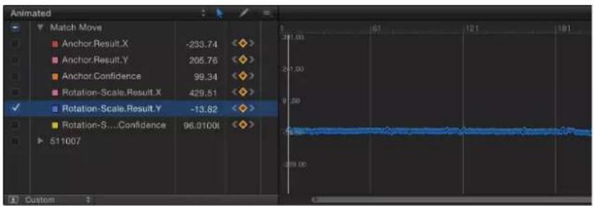
Delete bad track points in the Canvas during analysis
You can also delete bad track points in the Canvas. Track points in the Canvas represent keyframes in the Keyframe Editor.
1 During analysis, press Esc to stop the tracking.
2 In the toolbar, ensure that the Adjust Item tool is selected.
3 Ensure that a track point is active in the Canvas.
You can to zoom into the Canvas to better see the active track points. The track point at the current playhead position appears larger than other track points.

natural_image
Red Mini Cooper car with sensor points connected by a line, outdoors on a paved surface (no visible text or symbols)Note: If you press Delete when a track point is not selected, the entire path is deleted.
4 Do one of the following:
- Press Delete to delete the track point at the current position of the playhead.
- Move the playhead to the frame where you want to begin deleting track points, and press Delete.
Only active keyframes are deleted.
Delete bad track points in the Canvas after analysis is complete
You can also delete bad track points in the Canvas. Track points in the Canvas represent keyframes in the Keyframe Editor.
1 With the tracking analysis complete and the tracking behavior selected, move the playhead to the frame with the track point (or start of the track points) you want to delete.
2 In the toolbar, ensure that the Adjust Item tool is selected.
3 Ensure that a track point is active in the Canvas.
You can zoom into the Canvas to better see the active track points. The track point at the current playhead position appears larger than other track points.
4 Press Delete.
Each press of the key removes one track point.
Tip: The direction in which track points are deleted is determined by the Reverse checkbox in the Behavior Inspector. When reverse is turned off, each track point you delete moves the playhead towards the beginning of the clip. When it is turned on, each track point you delete moves the playhead towards the end of the clip.
Ask Motion for a hint
You can have Motion display suggested tracking points. You need at least one tracker in the Canvas to display suggested tracking reference points.
- Press the Option key, click a tracker in the Canvas, and hold down the mouse button.
The suggested reference points appear in the Canvas on the footage and in the magnified inset as small red plus signs.

When you move a tracker toward a suggested point, the tracker snaps to the point. The suggested points are not necessarily ideal tracking reference points for the feature you want to track in the clip. Motion is merely picking locations in the current frame that meet the track point criteria, such as an area of high contrast.

natural_image
Red Mini Cooper car with bounding box highlighting a vehicle (no visible text or symbols)Advanced strategies to improve tracking results
Use the following advanced techniques to improve your tracking results.
Smooth a track curve in the Keyframe Editor
You can smooth a track with the Keyframe Thinning function. Before smoothing the curve, you might want to copy the behavior (as a backup) to the Library or duplicate the behavior in the project.
In the following graph, you can see that there's a keyframe placed at every frame, and the curve is quite jagged. The following example, shows how you can smooth this curve.

line
| Track | Value | |-------|-------| | Track 1 Return X | 278 | | Track 1 Result Y | 83 | | Track 1 Confidence | 100 | | Track 2 Return X | -57 | | Track 2 Return Y | 2 | | Track 2 Confidence | 100 |1 In the Keyframe Editor, click in the fifth column of the parameter to open the Animation menu, then choose Reduce Keyframes.
The Reduce Keyframes dialog appears.
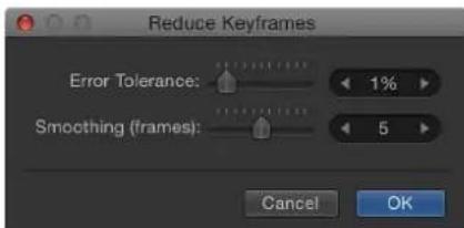
Reduce Keyframes applies a thinning algorithm to the keyframes for the parameter. This reduces the number of keyframes while attempting to maintain a similar shape to the curve. The thinning algorithm can be adjusted in two ways. Increasing the Error Tolerance results in fewer keyframes. Increasing the Smoothing (frames) makes smoother curves between keyframe values.
This example uses 5, which means that 5 track points centered on the evaluated point are used to compute the current point's new, smoothed value. This is a standard Gaussian (bell-curve type) filter. In other words, if you leave the Smoothing value at 5, when the value of frame 12 is computed, frames 10, 11, 12, 13, and 14 are considered. If Smoothing is set to 3, the algorithm uses frames 11, 12, and 13. The larger the Smoothing value, the more points are considered (and thus more calculations done) for every point in the curve.
2 Set the values in the Reduce Keyframes dialog.
As you adjust the sliders or value sliders in the dialog, the curve is modified in the Keyframe Editor. There are now fewer keyframes on the curve, and the curve becomes smoother.
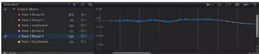
line
| Track | Value | |-------|-------| | Track 1 Result X | 278 | | Track 1 Result Y | 63 | | Track 1 Confidence | 100 | | Track 2 Result X | -57 | | Track 2 Result Y | 198 | | Track 2 Confidence | 100 |3 Click OK.
Apply an Average parameter behavior to a track curve
Another smoothing option is to apply the Average parameter behavior to a track curve in the Keyframe Editor. This behavior smoothes the transition from one keyframe value to another. Averaged motion moves more fluidly.
In the parameter list of the Keyframe Editor, control-click the parameter name, then choose Average from the shortcut menu.
The track is averaged, indicated by the simplified curve that appears behind the keyframes in the Keyframe Editor.
For more information on using the Average parameter behavior, see Average on page 333.
Convert tracks to keyframes
Tracking data recorded or referenced by the Match Move, Stabilize, or Unstabilize behavior can be "baked" into keyframes on the transformed object. The tracking keyframes are applied to the tracked object and the behavior is deleted. You can then modify the animation curves in the Keyframe Editor.
Because the Analyze Motion behavior does not transform the image, analyzed tracks cannot be converted into keyframes. However, a Match Move or Stabilize behavior that references data from an Analyze Motion behavior can be converted into keyframes.
1 Select the Match Move, Stabilize, or Unstabilize behavior to convert.
2 Choose Object > Convert to Keyframes (or press Command-K).
A dialog appears confirming the conversion.
3 Click OK.
The behavior is converted into editable keyframes and the tracking behavior is deleted.
For more information on converting behaviors to keyframes, see Convert behaviors to keyframes on page 312. For more information on using the Keyframe Editor, see Keyframing overview on page 439.
Define look-ahead frames
When using the Analyze Motion behavior, you can direct a tracker where to look in a later frame for its reference pattern. This tool is ideal for the following types of clips:
• Clips that contain fast-moving features
• Clips with subjects moving in a relatively straight vector (with or without obstructions)
- Clips with swish pans (you may need to reset the "look-ahead" tracker at each panning change)
Important: If your track fails and you reposition your tracker, you must also reset the look-ahead tracker in the Canvas to provide a new motion vector from the new reference point.
1 Apply an Analyze Motion behavior to a clip.
2 In the Canvas, position the tracker on a reference pattern.
In the following image, the tracker is positioned on a reference pattern on the front bumper of the car.

3 In the Behaviors Inspector, use the Look Ahead Frames slider or value slider to specify how many frames you want the tracker to look ahead.
Note: The maximum default for the Look Ahead Frames slider is 10 frames. However, you can enter a larger frame amount using the adjacent value slider.
4 While holding down the Command key, click the tracker in the Canvas, then drag in the direction the reference pattern is moving in the clip.
As you Command-drag the track point, an inset displays a magnified view of the frame specified in the Look Ahead Frames parameter.

5 When the look-ahead tracker is positioned on the reference pattern, release the mouse button.
When you click the Analyze button, the new reference point is used as the tracking pattern.
Note: Look Ahead Frames can be used when tracking in reverse. When the Reverse checkbox is selected in the tracking behavior's parameters and you use the Look Ahead Frames parameter, you are looking at previous frames rather than future frames. The Reverse checkbox is only available for the Analyze Motion, Track (in the Parameter behaviors category), and Track Points (in the Shape behaviors category) behaviors.
Manually coax a track using the Record button
For challenging tracks, you can manually insert track position keyframes to help guide the tracker towards a reference pattern. For example, if you have footage with significant motion blur or objects that partially obscure the tracking pattern, you can manually create tracker position keyframes to help guide the tracker.
1 Apply a Motion Tracking behavior to the clip, then enable Record (press A).
2 In the Canvas, position the tracker at the reference point you want to track.
A track position keyframe is created in the behavior (visible in the Keyframe Editor).
3 Navigate to the next frame where you want to create a keyframe.
Note: You can press Shift-Right Arrow key to jump forward ten frames, or press Shift-Left Arrow key to jump backward ten frames.
4 In the Canvas, position the tracker at the reference point you want to track.
5 Repeat steps 3 and 4 until you've completed the track.
6 In the Behaviors Inspector, click the disclosure triangle for the track you have manually adjusted, then choose Use Existing Keyframes from the Fail Behavior pop-up menu.
7 Turn off the Record button (press A).
8 Go to the first frame of the clip, then click the Analyze button in the behavior HUD or Inspector.
Important: Even though keyframes are created, you must analyze the footage to obtain the tracking data.
Manually coax a track without enabling Record
1 Apply a Motion Tracking behavior to the clip.
2 In the Canvas, position the tracker at the reference point you want to track.
3 Choose Object > Add Position Keyframe.
This command is available for the Analyze Motion, Match Move, Stabilize (with manual trackers), Track Points (in the Shape behaviors category), and Track (in the Parameter behaviors category) behaviors.
Note: Keyframes cannot be created for automatically stabilized footage. Use the Track Region option for adjusting automatic stabilization, or convert the stabilized footage to keyframes. For more information on the Track Region parameter, see Stabilize workflow on page 971. For more information on converting tracking data to keyframes, see "Convert tracks to keyframes" above.
4 Navigate to the next frame where you want to create a keyframe.
Repeat steps 2–4 until you've completed the track.
5 In the Behaviors Inspector, click the disclosure triangle for the track you have adjusted, then choose Use Existing Keyframes from the Fail Behavior pop-up menu.
6 Go to the first frame of the clip, then click the Analyze button in the behavior HUD or Inspector.
Note: You can also use the Tracker Preview in the Behaviors Inspector to reposition trackers in the Canvas.
Important: Even though keyframes are created, you must analyze the footage to obtain the tracking data.
Track perspective, scale, or rotational shifts
For images with significant change in size and angle, you can try a few different strategies.
Use a larger search area
In the Behaviors Inspector, click the track's disclosure triangle to display the Search Size parameter, then increase the value.
Lower the Fail Tolerance value
In the Behaviors Inspector, click the track's disclosure triangle to display the Fail Tolerance parameter, then decrease the value. With a lower Fail Tolerance value, the tracker is more likely to find a false match. With a higher value, the tracker is more strict in finding a match.
Begin the analysis at the clip's midpoint
■ Move the playhead to midpoint frame of the clip and track forward to the end frame of the clip, then return to the midpoint frame and track backward to the beginning of the clip.
Track obscured or off-frame points
In addition to experimenting with tracker parameter settings, there is a basic technique to correct track points that become obscured by moving offscreen or by an object passing in front of them.
The following sequence is a simple example of a candidate for offset tracking. As the car moves forward, it passes a tree that temporarily obstructs the reference pattern.


When the reference pattern becomes obscured, the Offset Track checkbox lets you move the tracker, picking a new reference pattern in a different area from the original reference pattern. The offset between the original reference pattern and the new pattern is calculated to maintain continuity in the resulting track path.
In the following example, the track is obscured by a tree, so the tracker is moved to a nearby reference pattern, and tracking continues until the original pattern reappears. Even though one region is examined, the points are saved in another region. The second tracking pattern should travel in the same direction as your original pattern.
Offset (move) the onscreen tracker control to an unobstructed area of the image
1 Go to the frame where you want to begin the offset track.
When a track is lost during an analysis, Motion jumps back to the frame where the track failed. The bad track point is identified by an "x" in the Canvas.

natural_image
Red Mini Cooper parked on a tree-lined street, no visible text or symbolsYou can use the bad track point, or any point before the failed track frame, to move the tracker and select a new reference feature. In the Canvas, the track point at the current playhead position is emphasized.

natural_image
Red Mini Cooper parked outdoors near a tree, with no visible text or symbols on the car or background.The track point at the current playhead is highlighted.
2 Select the Offset Track checkbox in the HUD or Behaviors Inspector.

Note: The Offset Track parameter is available in the Analyze Motion, Match Move, Stabilize, Track Points, and Track Parameter behaviors. Before the parameter becomes available in the Stabilize behavior, you must add a tracker using the Add button in the Inspector.
3 Drag the tracker to a new, unobscured reference pattern in the Canvas.
4 Click Analyze to restart the motion analysis.
Motion continues to keyframe the trajectory of the original track point, based on the movement of the new offset reference pattern.
Tip: When you use Offset Track, make sure that the new reference pattern is as close to the original tracking feature as possible. Ideally, the offset feature should share the same motion as the originally tracked feature and appear on the same subject.
Note: When the pointer is positioned over a tracker in the Canvas, a tool tip displays the start frame for the tracking analysis. When you perform an offset track, the tool tip displays the frame where the offset track began (if the playhead is in the range of the offset track).
Track retimed footage
When working in a project that includes tracking and retiming tasks, use the following guidelines for more successful results:
- Because the Motion tracker analyzes in a project's frame rate, ensure that the frame rate of the footage you plan to track matches the frame rate of the project. For example, to track 24 frames-per-second (fps) footage, your project's frame rate should be 24 fps. When the tracking analysis is completed, retime the clip using the Retiming parameters in the Media list or by using the Retiming behaviors.
- Do not retime the footage before the tracking analysis.
- Do not retime the footage, perform a tracking analysis, then retime the footage again. This may adversely affect your track.
Note: To track a clip after it is retimed, export the retimed clip, then import it back into your project before you perform the tracking analysis.
Basic strategies to improve stabilization
The automatic motion analysis (analysis without trackers) used by the Stabilize behavior works best with real images. Artificial images, such as those with no texture, are not recommended for use with the Stabilize behavior's automatic mode. Shots with very strong pans are also not recommended.
Use the following techniques to improve the results of footage stabilization.
Add trackers to a portion of a stabilize operation
If a stabilized clip has a bumpy section that is not getting smoothed, you can add trackers to noncontiguous sections of a clip. Any stabilize data from the automatic motion analysis is overwritten by the portions of the clip analyzed using the onscreen trackers.
1 After the Stabilize motion analysis is complete, play the clip to determine the section you want to track.
Important: Before adding any trackers, always review the entire clip. The Stabilize behavior needs meaningful data—a large range of frames—to yield the best results.
2 Set an Out point for the tracker analysis: Position the playhead at the frame where you want to stop the analysis, then choose Mark > Mark Play Range Out (or press Option-Command-O).
3 Position the playhead at the frame where you want to start the track, then do one of the following:
- To analyze X and Y position changes in the footage, click the Add button in the Inspector to add an Anchor tracker.
- To analyze changes in X and Y position as well as rotation and scale in the footage, click the Add button two times to add the Anchor and Rotation-Scale trackers.
4 Position the newly added tracker on the reference pattern you want to track in the Canvas, then click the Analyze button in the HUD or Inspector.
The specified play range is tracked, creating track points in the Canvas and tracking keyframes in the Keyframe Editor.
Note: When using this strategy to track multiple noncontiguous sections of the clip, use the same tracker to simplify the track and to avoid clutter in the Keyframe Editor.
This strategy is not recommended for small portions of the clip, such as using the default stabilization for 25 frames, a tracker analysis for 10 frames, and so on.
Modify smoothing parameters
If you're trying to smooth the motion in a clip, first try adjusting the smoothing parameters. These parameters include Translation Smooth, Rotation Smooth, and Scale Smooth. This can be accomplished without reanalyzing the clip.
In the Behaviors Inspector, choose Smooth from the Method pop-up menu, then adjust the Translation Smooth, Rotation Smooth, and Scale Smooth sliders.
Reanalyze the clip at a higher-quality setting
■ Before analyzing a clip, choose Better from the Quality pop-up menu in the Behaviors Inspector.
Although the analysis may take longer at this setting, the quality will be higher.
Edit the analysis data
If none of the prior solutions helps, look at the Analyze.Confidence parameter in the Keyframe Editor, then look for frames where the Confidence parameter falls to very low values. You can convert the Stabilize behavior to keyframes to create transform keyframes on the stabilized object. These keyframes can then be edited in the Keyframe Editor. Try deleting keyframes that create unusual spikes at the frames where the Confidence curve value was low.
For more information on converting behaviors to keyframes, see Advanced strategies to improve tracking results on page 984.
Remove black borders from stabilized clips
When you use the Stabilize behavior, the resulting transformations that smooth or stabilize the shot cause moving black borders to appear around the edges of the image. Although this is necessary to achieve the desired effect, you probably don't want these black borders to appear in the final shot.
Use the following methods to remove black borders.
Zoom the clip
You can zoom the clip using the Borders pop-up menu in the Behaviors Inspector. The disadvantage of this method is the resulting softening of the image, depending on how much it is enlarged.
In the Behaviors Inspector, choose Zoom from the Borders pop-up menu.
The clip is expanded to the full size of the Canvas, preventing black borders from appearing around the edges.
Scale the stabilized clip
If you want to output the resulting clip at the same size as the original, the quickest fix is to scale the image after the Stabilize analysis. You'll need to enlarge the image to the point where all instances of black borders fall outside the edges of the frame. Like the Zoom option (in the Borders pop-up menu), this method softens the image.
Note: This workflow is a manual version of zooming the clip using the Zoom option from the Borders pop-up menu.
1 Select the clip and open the Properties Inspector.
2 Adjust the Scale parameter so the borders no longer appear at the edges of the clip.
Distort the edges of the clip
You can experiment with filters to stretch the edges of the image to fill gaps. The following example uses the Scrape filter. (This solution is highly dependent on the type of image and may introduce other image artifacts that may not be acceptable.)
1 Select the group in which the stabilized clip resides.

natural_image
Red Mini Cooper parked on a road with trees and buildings in the background (no visible text or symbols)2 Apply a Scrape filter to the group, then adjust the Center and Rotation parameters.
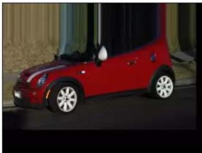
natural_image
Red Mini Cooper car parked on a dark surface, no visible text or symbols
natural_image
Red Mini Cooper parked on a paved road at night, no visible text or symbolsThe left image shows the clip when the filter is applied to the group. The right image shows the result of adjusting the Center and Rotation parameters: the black edge is stretched to the right side of the image.
Track groups
You can apply tracking to groups in Motion.
Corner-pin a 2D or 3D group
You can corner-pin groups using the Match Move behavior.
Do one of the following:
- To corner-pin a 2D group, select the group, then select the Fixed Resolution checkbox in the Group Inspector.
- To corner-pin a 3D group, select the group, then select the Flatten checkbox in the Group Inspector. If Flatten is not enabled for the group, the Four Corners option is not available from the Type pop-up menu in the Match Move parameters.
When you choose Four Corners from the Type pop-up menu, Four Corner is enabled in the Properties Inspector, causing the group to be rasterized. For more information on rasterization, see Groups and rasterization on page 1045.
Using either of the above techniques may still result in dynamic resizing. If you receive unwanted results, export the group, import the group, then corner-pin the object.
Remove parallax from a 3D group
When match moving 3D groups that contain objects offset in Z space, parallax is simulated. Parallax is the apparent shift of an object against a distant background caused by a shift in perspective, such as a change in camera position.
- Select the Flatten checkbox for the tracked group in the Group Inspector.
The parallax effect is removed.
Save tracks
As with all behaviors in Motion, you can save tracking behaviors to the Library. However, a tracking behavior must reference the tracked source object. Therefore, it may make more sense to save the group that contains the tracking behavior, as well as the source footage, to the Library.
Save a group to the Library
1 Open the Library and select the category where you want to save the group, such as the Favorites category.
2 Drag the group that contains the tracking behavior and its source (tracked) footage from the Layers list or Timeline into the stack at the bottom of the Library.
The group is added to the Library category.
Save a behavior to the Library
1 Open the Library and select the Favorites, Favorites Menu, or Behaviors category.
2 Drag the customized behavior you want to save from the Layers list, Timeline, or Inspector into the stack at the bottom of the Library.
When you save a customized item to the Library, it is saved in the /Users/username/Library/Application Support/Motion/Library/ folder.
For more information on saving behaviors to the Library, see Save custom behaviors on page 313.
Add a group to a project from the Library
1 Open the Library and select the category that contains the group.
2 Do one of the following:
- To nest the group in an existing group, drag it to the existing group in the Layers list.
- To create a group, drag it to an empty area in the lower portion of the Layers list.
The group is added to the project.
Apply a behavior to a clip from the Library
1 Open the Library and select the Favorites, Favorites Menu, or Behaviors category.
2 Drag the behavior to the clip in the Layers list, Timeline, or Canvas.
Reference another tracking behavior in a project
1 Add an Analyze Motion, Match Move, Stabilize, or Unstabilize behavior.
2 In the tracking behavior's HUD or Inspector, choose a track from the tracking behaviors pop-up menu.
The track is applied to the tracking behavior.
Note: In a Stabilize behavior, only tracks from other Stabilize behaviors can be chosen from the tracking behaviors pop-up menu.
Tracking behavior controls
Analyze Motion controls
The Analyze Motion behavior is designed for use with footage (a movie or image sequence). This behavior can be thought of as a traditional correlation tracker—you position an onscreen tracker on a reference pattern on a clip. The movement of the clip at the specified reference point is analyzed, and the analyzed data is saved in the behavior. The recorded data can then be applied to other objects in the project.
The Analyze Motion behavior does not transform the input image. It is used to generate tracks that can be referenced by the Match Move, Stabilize, Track Parameter, and Track Shape behaviors.
For information on using the Analyze Motion behavior, see Analyze Motion workflow on page 960.
Analyze Motion cannot reference other tracking behaviors. It can be applied only to footage objects (a QuickTime movie or image sequence).
Parameters in the Inspector
- Movement: The Movement parameter group contains the Analyze and Reverse controls:
- Analyze: This button, when clicked, begins the motion-tracking analysis. When you click Analyze, a status window appears and displays the tracking progress. To stop the analysis, click the Stop button in the status window or press Esc.
The start of the track is based on the current playhead position, rather than the start of the behavior in the Timeline.
- Reverse: This checkbox, when selected, reverses the analysis direction, going from the playhead position to the first frame of the clip (or the first frame of the tracking behavior).
Note: You must move the playhead to the frame where you want the reverse analysis to begin.
- Tracker: This button lets you add trackers to the Analyze Motion behavior. By default, one tracker is available. New trackers are added at the center of the Canvas.
- Tracker Preview: This preview area provides a magnified view of the tracking reference area for the selected tracker. The preview updates as you adjust the position of the tracker in the Canvas. You can drag in the preview area to adjust the position of the tracker. When dragging in the preview area, the image moves around the red crosshair that represent the tracker, while the tracker moves in the Canvas. You can also Option-drag left or right to decrease or increase pattern size. (You can also adjust the Track Size slider to achieve the same result.)
- Offset Track: This checkbox lets you select a new reference point when the original reference point becomes temporarily hidden or goes off the screen. Motion uses the new tracking point to continue the same tracking path as the original reference point. For more information on offset tracking, see Track obscured or off-frame points on page 988.
- Auto-Zoom: This pop-up menu lets you choose a magnification level when positioning the tracker in the Canvas. You can zoom in on the Canvas when searching for an ideal tracking reference pattern. There are four choices: None, 2x, 4x, and 8x.
- Auto-Zoom Mode: This pop-up menu lets you set the display of the auto-zoomed tracker in the Canvas. There are three choices:
•Normal: Displays a normal pattern.
- Contrast: Displays the tracker pattern with contrast detection.
- Edge: Displays the tracker pattern with edge detection.
The Auto-Zoom Mode applies to trackers in the Canvas and does not appear in the Tracker Preview in the Behaviors Inspector.
Note: When None is chosen from the Auto-Zoom pop-up menu, the Auto-Zoom Mode setting has no effect.
- Look Ahead Frames: This slider and value slider allow you to specify the number of future frames to be analyzed by the tracker. In other words, you can direct the tracker to look in a specific location for its reference point. This is useful for footage that contains fast-moving objects, because the reference point can quickly get away from the tracker. For more information on using Look Ahead Frames, see Advanced strategies to improve tracking results on page 984.
- Track list: This list displays the trackers in the behavior. In the Analyze Motion behavior, the trackers in this list are called Track 1, Track 2, and so on. To disable a tracker, deselect its checkbox. To remove a tracker, click the Remove button. A tracker that is turned off is not analyzed. Click the disclosure triangle next to the track name to reveal these additional parameters:
- Position: This parameter displays the X and Y positions of the tracker. The X position is the value slider on the left; the Y position is the value slider on the right. Click the disclosure triangle to display labeled position value sliders.
- Track Size: This slider adjusts (in pixels) the pattern search size for the tracker. As you adjust the tracker size, the Tracker Preview is updated to show the new tracker size. There is no visual change in the Canvas tracker.
To adjust the Track Size without exposing its parameters, Option-drag left in the Tracker Preview area to reduce the tracker size; Option-drag right to increase the tracker size.
- Search Size: This slider increases or reduces the tracker's search area size. In Motion, you do not specify the size of a search area when setting up trackers in the Canvas. To change the default search size, use the slider or value slider. If Search Size is set to 200 percent, the tracker's search area is twice the default search area size.
- Fail Tolerance: This parameter defines the amount of tolerance for error, or confidence value, of the tracker. In other words, it defines at what score the tracker determines it can match a reference feature. When above the score, the tracker accepts the match. When below the score, the tracker rejects the match. When the match is rejected, the Fail Behavior kicks in.
- Fail Behavior: This pop-up menu specifies what happens if the track confidence value falls below the Fail Tolerance amount. The following options are available:
- Smart Retry: The tracker attempts to find the reference pattern in a larger search area. If the pattern cannot be found, the tracker switches to the Predict option. Smart Retry is the default fail behavior.
- Stop: The analysis stops when the tracker loses the reference pattern. You can also click the Stop button in the tracking progress dialog or press Esc to stop an analysis.
- Predict: The tracker predicts a new search area without creating keyframes until it finds a match for the reference pattern. This is excellent for tracked objects that pass behind foreground objects.
- Predict and Key: If a failure is detected, the tracker predicts the location of the keyframe based on a vector of the last two keyframes, and continues tracking in the new area.
- Don't Predict: The tracker remains in its position and searches for subsequent matches as the clip's frames progress. While searching for a match, the tracker does not create keyframes.
- Use Existing Keyframes: The tracker uses keyframes you have manually created as a guide. After manually adding keyframes, return to the start frame and start the tracking analysis. If the tracker has difficulty locating the track pattern, the manually created tracking keyframes are referenced to guide the tracker.
- Color: This color control sets a new color for the onscreen tracker. The default tracker color is red. When a tracker is selected, its center point is yellow and the border of its magnified inset is the color set in the color well. To adjust individual color channels, including the tracker's opacity, click the disclosure triangle.
Match Move controls
The Match Move behavior can be applied to many object types, including groups, cameras, shapes, particle emitters, and so on.
Important: When applying the Match Move behavior to a group, make sure the footage being analyzed resides outside of the group being tracked.
To use Match Move (and access its parameters), your project must contain a foreground and a background object. For information on using the Match Move behavior, see Basic Match Move workflows on page 962.
Parameters in the Inspector
- Source: Drag the source object for the match move into this well. The source object can be another tracking behavior, an animated object, or a footage object. When a Match Move behavior is added to an object, the nearest animated object, recorded track, or footage object beneath the behavior in the Layers list appears in this well. To clear a Source well, drag the item away from the well and release the mouse button.

When any nonfootage object (such as a shape or mask) is dropped in the Source well, the trackers are no longer available in Match Move.
Note: When the Match Move behavior is applied to a mask, the masked object is selected as the source.
- Action pop-up menu: Choose from a list of tracking data (from other tracking behaviors) in the project.
- Movement: The Movement parameters contain the Analyze and Reverse controls, which appear when there is a tracking source (footage) in the source well.
- Analyze: Click the Analyze button to begin the motion-tracking analysis. When you click Analyze, a status window appears and displays the tracking progress. To stop the analysis, click the Stop button in the status window or press Esc. The start of the track is based on the current playhead position, rather than the start of the behavior in the Timeline.
- Reverse: When the Reverse checkbox is selected, the clip is analyzed from the current playhead position to the first frame of the clip (or the first frame of the tracking behavior).
Note: You must move the playhead to the frame where you want to begin the reverse analysis.
- Type: This pop-up menu lets you choose between one-point, two-point, or four-point tracking. There are two options:
- Transformation: This option allows one-point or two-point tracking, transforming the destination object.
- Four Corners: This option enables four-point tracking, corner-pinning the destination object. When this option is chosen, the Direction and Adjust parameters are no longer available.
Important: The Four Corners option is not available when Match Move is applied to a 3D group or a mask. To corner-pin a 3D group, select the Flatten checkbox in the Group Inspector.
- Direction: This pop-up menu specifies the dimension in which the recorded movement is applied to the destination object: Horizontal and Vertical (X and Y), Horizontal (only X), or Vertical (only Y).
- Transform: This pop-up menu sets how the destination object (the object to which the Match Move behavior is applied) moves. There are two options:
- Attach to Source: This option anchors the foreground object to the recorded track or animation source. Use Attach to Source when the source object is scaling or rotating, and you want the destination object to stick to a spot on the source object. Any animation that existed on the destination object before applying the track can be preserved by using the Adjust parameters (Position, Scale, and Rotation), available when Transformation is chosen from the Type pop-up menu.
Note: Although the destination object is attached to the movement of the source object, the position of the destination object can be changed (offset from the source object).
In the following example, Match Move is applied to the red pill shape and uses the animated white arrow as the source object. The white arrow has an applied Spin behavior and is spinning in a clockwise direction. Additionally, the arrow's anchor point is positioned at the bottom of the arrow (at the opposite end from the tip).

natural_image
Abstract diagram with a large white upward arrow and blue nodes, set against a black background (no text or symbols)Arrow's anchor point
When Attach to Source is chosen from the Transform pop-up menu and Position and Rotation are selected in the Adjust parameter row, the red shape is anchored to one spot on the arrow (the tip, in this example) as it matches the movement of the arrow.
natural_image
Simple graphic with a white arrow pointing to a red curved shape on a black background (no text or symbols)
natural_image
Simple graphic with a white arrow pointing downward and a red rounded rectangle on black background (no text or symbols)
natural_image
Simple graphic with a white arrow pointing to a red curved shape on black background (no text or symbols)- Mimic Source: This option allows the destination object to mimic the recorded track or animation source. Any animation that existed on the foreground object before applying the track can be added to the track by selecting Position, Rotation, or Scale in the Adjust parameters.
Note: As with Attach to Source, the position of the destination object can be changed (offset from the source object). Additionally, the destination object can be scaled and rotated.
In the following images, Mimic Source is chosen from the Transform pop-up menu and Position and Rotation are selected in the Adjust parameter row. The red shape is not locked to one spot on the white arrow, but rather mirrors the arrow's animation.

natural_image
Simple white arrow pointing right on black background, no text or symbols present
natural_image
Simple graphic of a red and white arrow pointing downward on a black background (no text or symbols)
natural_image
Simple red arrow pointing diagonally down-right on black background (no text or symbols)Mimic Source lets you transform a tracked object in the Properties Inspector. For example, you can change the scale, position, or rotation of a corner-pinned object. Also when using Four Corners, Mimic Source lets you adjust the trackers without adjusting the foreground image.
- Adjust: This parameter sets the type of transformation applied to the destination object.
- Position: When enabled, the position of the source (or background) object is applied to the destination (or foreground) object, and the Anchor (position) tracker is turned on.
- Scale: When enabled, the scale of the source (or background) object is applied to the destination (or foreground) object. The source track must include scale data for this parameter to have any effect. When Scale is enabled, the Rotation-Scale tracker is turned on.
- Rotation: When enabled, the rotation of the source (or background) object is applied to the destination (or foreground) object. The source track must include rotation data for this parameter to have any effect. When Rotation is enabled, the Rotation-Scale tracker is turned on.
- Tracker Preview: This preview area appears only when there is a tracking source (footage) in the source well. Use the preview to see a magnified view of the tracking reference area for the selected tracker. The preview updates as you adjust the position of the tracker in the Canvas. You can also drag in the preview area to adjust the position of the tracker. When dragging in the preview area, the image moves around the red crosshairs in the preview and the tracker moves in the Canvas.
- Offset Track: This parameter appears only when there is a tracking source (footage) in the source well. If a tracker's reference point becomes temporarily hidden or goes off the screen, this parameter lets you select a different reference point that continues the same tracking path as the original reference point. For more information on offset tracking, see Track obscured or off-frame points on page 988.
- Auto-Zoom: This parameter appears only when there is a tracking source (footage) in the source well. Choose an option from this pop-up menu to set the magnification level when positioning the tracker in the Canvas, to zoom in on the Canvas when searching for an ideal tracking reference pattern. There are four choices: None, 2x, 4x, and 8x.
- Auto-Zoom Mode: This parameter appears only when there is a tracking source (footage) in the source well. Choose an option from this pop-up menu to set the display of the auto-zoomed tracker in the Canvas. There are three choices:
•Normal: Displays a normal pattern.
- Contrast: Displays the tracker pattern with contrast detection.
- Edge: Displays the tracker pattern with edge detection. The Auto-Zoom Mode applies to trackers in the Canvas and does not appear in the Tracker Preview in the Behaviors Inspector. When None is chosen from the Auto-Zoom pop-up menu, the Auto-Zoom Mode setting has no effect.
- Look Ahead Frames: This parameter appears only when there is a tracking source (footage) in the source well. This slider and value slider allow you to specify the number of future frames to be analyzed by the tracker. In other words, you can direct the tracker to look in a specific location for its reference point. This is useful for footage that contains fast-moving objects, because the reference point can quickly get away from the tracker. For more information on using Look Ahead Frames, see Advanced strategies to improve tracking results on page 984.
- Anchor/Rotation-Scale: Available when one-point or two-point tracking is enabled (when Transformation is chosen from the Type pop-up menu), these checkboxes turn the Anchor and Rotation-Scale trackers on or off. The anchor tracker records position data. When Position is enabled in the Adjust parameters, the Anchor tracker is turned on. Rotation and scale data are recorded by using the relationship between the Anchor and Rotation-Scale trackers. When Scale or Rotation is enabled in the Adjust parameters, the Rotation-Scale tracker is turned on. When the Match Move behavior references another behavior, such as Analyze Motion, the Anchor tracker becomes the Anchor pop-up menu. Likewise, the Rotation-Scale tracker (if there is one) becomes the Rotation-Scale pop-up menu. Click the Anchor or Rotation-Scale disclosure triangles to reveal these additional parameters:
- Position: Displays the X and Y positions of the tracker. The X position is the value slider on the left; the Y position is the value slider on the right. Click the disclosure triangle to display labeled position value sliders.
- Track Size: Use this slider to adjust (in pixels) the pattern search size for the tracker. As you adjust the track size, the Tracker Preview is updated to show the new track size. There is no visual change in the Canvas tracker.
To adjust the Track Size without exposing its parameters, Option-drag left in the Tracker Preview area to reduce the track size; Option-drag right to increase the track size.
- Search Size: Use this slider or value slider to increase or reduce the tracker's search area size. In Motion, you do not specify the size of a search area when setting up trackers in the Canvas. To change the default search size, use the slider or value slider. If Search Size is set to 200 percent, the tracker's search area is twice the default search area size.
- Fail Tolerance: This parameter defines the amount of tolerance for error, or confidence value, of the track. In other words, it defines at what score the tracker determines it is able to match a reference feature. When above the score, the tracker accepts the match. When below the score, the tracker rejects the match. After the match is rejected, the Fail Behavior kicks in.
- Fail Behavior: This pop-up menu specifies what happens if the track confidence value falls below the Fail Tolerance amount. The following options are available:
- Smart Retry: The tracker attempts to find the reference pattern in a larger search area. If the pattern cannot be found, the tracker switches to the Predict option. Smart Retry is the default fail behavior.
- Stop: The analysis stops when the tracker loses the reference pattern. You can also click the Stop button in the tracking progress dialog or press Esc to stop an analysis.
- Predict: The tracker predicts a new search area without creating keyframes until it finds a match for the reference pattern. This is excellent for tracked objects that pass behind foreground objects.
- Contents
- Chapter 5: User interface controls
- Chapter 6: Create and manage projects
- Chapter 7: Basic compositing
- Chapter 8: Timeline
- Chapter 9: Behaviors
- Chapter 11: Final Cut Pro X templates
- Chapter 12: Keyframing
- Chapter 13: Keying
- Chapter 17: Animated text
- Chapter 21: 3D compositing
- Chapter 27: Gestures
- Chapter 28: Keyboard shortcuts
- Motion basics
- 1
- What is Motion?
- In Motion, you can:
- About Motion projects
- About input devices
- Introduction to the Motion interface
- 2
- Motion interface overview
- Project Browser
- Workspace
- File Browser
- File Browser overview
- Open the File Browser
- File Browser preview area
- Play a preview of a file
- Pause or resume playback of a file
- Import a file displayed in the preview area
- File Browser stack
- View the contents of a folder displayed in the file stack
- Return to a previously viewed folder
- Add media from the File Browser
- Add media via the File Browser
- Manage folders and files
- Rename a folder or file
- Delete a folder or file
- Create a folder
- Move a file into a folder
- Search for a file
- Clear a file search
- Display icon view or list view
- View the File Browser in icon view
- View the File Browser in list view
- Change the size of the icons while in icon view
- Sort columns
- Sort the File Browser list
- Collapse animations
- Import a series of numbered still images as a single object
- Library
- Library overview
- Open the Library
- Library preview area
- Play a preview of a Library element
- Pause or resume preview playback
- Library sidebar
- Library file stack
- Library content
- View the Library in icon view
- View the Library in list view
- Add items from the Library
- Add Library content
- Inspector
- Inspector overview
- Open the Inspector
- Show or hide a group of controls by double-clicking
- Inspector preview area
- Properties
- Behaviors
- Filters
- Object
- HUD
- Display a HUD
- Jump to the Inspector from the HUD
- Toolbar
- Toolbar overview
- 2D Transform tools
- 3D Transform tool
- View tools
- Shape tools
- Path Shape tools
- Paint Stroke tool
- Text tool
- Mask tools
- HUD button
- Object controls
- Effects controls
- Timing display
- Timing display overview
- Modify the duration dynamically
- Change the project to a specific duration
- Modify the current time dynamically
- Change the duration in seconds, minutes, or hours
- Navigate using the timing display
- Move the playhead to a specific time
- Increase or decrease the current time one frame at a time
- Move ahead or back in seconds, minutes, or hours
- Move forward or backward a specific number of frames
- Timecode versus frame counters
- Switch between timecode and frame numbers
- Canvas
- Canvas overview
- Status bar
- Display pixel color in the status bar
- Display the current pointer position in the status bar
- Monitor the project's playback frame rate
- FPS: 60
- Canvas view options
- Zoom Level pop-up menu
- Channels pop-up menu
- Render menu
- View and Overlay pop-up menu
- View Layouts pop-up menu
- Zoom the Canvas
- Zoom in or out on the Canvas
- Use the dynamic zoom mode
- Zoom in and out using a Multi-Touch device
- Zoom in and out of a specific area of the Canvas
- Zoom the Canvas so the viewable area of the project fills the window
- Reset the Canvas Zoom level or Pan
- Advanced Quality settings
- Canvas rulers
- Turn on rulers
- Change the location of the rulers
- Add a horizontal or vertical guide to the Canvas
- Simultaneously add a horizontal and vertical guide to the Canvas
- Remove a guide from the Canvas
- Change the color of the guides
- Mini-Timeline
- Add an object to the mini-Timeline
- Move an object in time
- Shorten or lengthen an object
- Canvas buttons and transport controls
- Player mode
- Switch into player mode
- Return to normal view
- Canvas shortcut menu
- Use the Canvas shortcut menu
- Work in 3D mode
- Add a camera to your project
- Project pane
- Project pane overview
- Collapse or expand the Project pane
- Resize the Project pane
- Layers list
- Layers list overview
- Display the Layers list
- Layers list controls
- Add or remove items from the Layers list
- Add an item via the Layers list
- Create a group in the Layers list
- Remove an object from the Layers list
- Customize the Layers list
- Adjust row height
- Filter the Layers list
- Stop filtering and return to the complete list
- Turn on and off the display of masks in the Layers list
- Additional Layers list options
- Media list
- Media list overview
- Display the Media list
- Media list columns
- Column Description
- Customize the Media list
- Show or hide a column
- Reorder columns
- Adjust column width
- Increase or decrease the size of each item's thumbnail in the Media list
- Sort items in a column by file type
- Reverse the direction of the sort
- Filter the Media list
- Additional Media list options
- Audio list
- Audio list overview
- Display the Audio list
- Controls in the Audio list
- Master audio track
- Add and remove audio
- Add an audio file to the project
- Remove a file from the Audio list
- Additional Audio list options
- Timing pane
- Timing pane overview
- Display the Timing pane
- Resize the Timing pane
- Zoom the Timing pane
- Zoom the Timing pane using the zoom/scroll control
- Zoom the Timing pane using the zoom slider
- Zoom the Timing pane using a Multi-Touch device
- Zoom the Timing pane to fit the entire project or play range
- Timing pane ruler
- Timeline
- Timeline overview
- Display the Timeline
- Timeline Layers list
- Show or hide mask, filter, or behavior timebars
- Disable mask, filter, or behavior effects in the Canvas
- Timeline track area
- Add objects to the Timeline
- Add an item to the Timeline
- Adjust the Timeline
- Adjust track height
- Change the width of the Timeline
- Collapse or expand a group or layer
- Turn on or off the display of keyframes in the Timeline
- Audio Timeline
- Audio Timeline overview
- Display the Audio Timeline
- Play audio
- Keyframe Editor
- Keyframe Editor overview
- Use the Keyframe Editor
- Display the Keyframe Editor
- Animate an object across the screen by setting an initial keyframe
- Keyframe Editor controls
- Show Curve Set pop-up menu
- Keyframe editing tools
- Parameter list controls and features
- Animation menu options
- Additional Keyframe Editor controls
- Keyframe graph
- View the Canvas or Timing pane on a second display
- Show the Canvas on a second display
- Show the Canvas in the main window
- Show the Timing pane on a second display
- Show the Timing pane in the main window
- Use full-screen view
- Enter full-screen view
- Exit full-screen view
- Motion menus
- 3
- Motion menus overview
- Application menu
- File menu
- Edit menu
- Mark menu
- Object menu
- Favorites menu
- View menu
- Share menu
- Window menu
- Help menu
- Preferences
- 4
- Motion Preferences overview
- Open Motion Preferences
- Reset Motion Preferences
- General pane
- Startup
- Interface
- Media
- Appearance pane
- Thumbnail Preview
- Default Project Settings
- Still Images & Layers
- Time pane
- Time Display
- Playback Control
- Keyframing
- Cache pane
- Memory & Cache
- Autosave
- Optical Flow Retiming
- Canvas pane
- Alignment
- Zones
- 3D pane
- General 3D
- 3D Grid
- Presets pane
- Presets pane overview
- Project Preset Editor
- Gestures pane
- User interface controls
- 5
- User interface controls overview
- Toolbar controls
- Access a toolbar control's additional modes or options
- Slider controls
- Basic slider
- Change the value of a basic slider
- Value slider
- Modify the value of a parameter using a value slider
- Coordinate controls
- Modify a coordinate value in the inspector
- Dial
- Adjust a parameter using a dial
- Value field
- Activation checkbox
- Menus
- Pop-up menu
- Parameter selection menu
- Source well
- Use a source well
- Color controls
- Basic color controls
- Pop-up color palette
- Colors window
- Show the Colors window
- Pick a color in the Colors window
- Save a color to the saved swatch area in the Colors window
- Eyedropper
- Pick a color using the eyedropper
- Expanded color controls
- Gradient controls
- Basic gradient controls
- Gradient preset pop-up menu
- Change the current gradient to a saved preset
- Gradient editor
- Controls in the gradient editor
- Gradient editor tasks
- Change the colors in a gradient
- Change the opacity in a gradient
- Modify gradient editor tags
- Move the position of a color tag or opacity tag
- Duplicate a color or opacity tag
- Change the transition midpoint between adjacent color or opacity tags
- Change the color or opacity tag interpolation
- Edit color and opacity direction and distribution
- Reverse the gradient color or opacity direction
- Evenly distribute the gradient color or opacity tags
- Change the direction of a shape's gradient
- Save gradient presets
- Save a gradient in the Library
- Onscreen gradient controls
- Display the onscreen gradient controls
- Adjust the start and end gradient positions
- Change the location of gradient tags
- Add a color or opacity tag
- Change the color or opacity of a gradient tag
- Change a tag's interpolation
- Reverse the direction of the gradient
- Evenly distribute the tags
- Generic Inspector controls
- Blending
- Rasterization indicator
- Text field shortcut menu
- Use the text field shortcut menu
- Create and manage projects
- 6
- Create and manage projects overview
- Create projects
- Create Projects Overview
- About the Project Browser
- Open a project
- Open a project from the Project Browser
- Open an existing Motion project file that does not appear in the Project Browser
- Open a recent project
- Create a project prepopulated with specific media files
- Create projects from templates
- Create a project from a template
- Create a blank Motion project
- Create a project
- Create a project with custom project settings
- Create Final Cut Pro X templates
- Bypass the Project Browser
- Set a default project preset
- Create, edit, and delete presets
- Create a custom preset
- Duplicate a preset before editing it
- Edit a preset
- Delete a custom preset
- Moving presets between computers
- Copy a project preset to another computer
- Project background color
- Organize groups and layers
- Organize groups and layers overview
- Select layers and groups
- Select or deselect multiple noncontiguous layers or groups
- Select all layers or groups in the Layers list
- Deselect all objects or groups in the Layers list
- Show and hide layers and groups
- Show or hide selected layers
- Solo a layer
- Collapse and uncollapse group hierarchies
- Open or collapse a single group
- Reorganize in the Layers list
- Move a layer or group up or down in the Layers list
- Create a new, empty group
- Move a layer from one group to another
- Copy a layer from one group to another
- Copy a layer or group from one project to another
- Group and ungroup layers
- Group selected layers together, nesting them in a group
- Ungroup nested layers
- Nest groups inside other groups
- Move a group inside another group
- Constrain group size
- Fix the resolution of a group
- Lock layers and groups
- Rename groups
- Rename a group or layer
- Search for layers and groups
- Find a group or layer by name in the Layers list
- Clear the search results
- Add media to a project
- Add media to a project overview
- Add and remove files
- Add media files to a new group
- Add media files to an existing group
- Add media files to a project without using them in the composition
- About file types
- File types supported by Motion
- QuickTime video codecs
- Still image formats
- Other image formats
- Audio formats
- QuickTime movies
- About high-resolution still image files
- Import large still images
- Set the large still image import preference
- Image sequences
- Collapse image sequences
- Layered Photoshop files
- Add a layered Photoshop file using the drop menu
- Add a layered Photoshop file using the Import command
- PDF files
- Fixing the resolution of a PDF object
- Mixed content in PDF files
- Multipage PDF files
- About alpha channels
- Audio files
- Text files
- Manage media
- Manage media overview
- Source media and Motion layers
- Reveal source media
- Reveal a layer's source media in the Media list
- Duplicate files
- Online versus offline media
- Manually reconnect an offline file
- Search for and reconnect offline media files
- Cancel an active search
- Restore offline media using the Reconnect button
- Reconnect offline media via the Media Inspector
- Delete objects from a project
- Delete a single instance of an object from a project
- Delete all objects that correspond to source media file in the Media list
- Exchange media in a project
- Exchange media in a layer
- Exchange source media via the Media Inspector
- Source media parameters
- Parameters in the Inspector
- About networked disks and removable media
- Work with the Library
- Add Library elements to a project
- Add a Library effect or element to a project
- Drag a Library effect or element to a project
- Add iTunes and iPhoto files from the Library
- Add an audio file from iTunes
- Add a file from iPhoto
- Save custom elements to the Library
- Save an object to the Library
- Save multiple objects to the Library
- Create a custom note for a saved Library object
- Manage Library folders and files
- Create a new folder
- Create a subcategory in a category
- Remove objects or folders from a Content category
- When Library media becomes unavailable
- Work with Library themes
- Sort using the Theme pop-up menu
- Create a new custom theme
- Assign a theme to custom content
- Remove a custom theme
- Manage projects
- Save projects
- Save a project
- Save a duplicate of a project
- Save a project and copy all project media into a folder
- Use autosave
- Store autosaved projects in a specific location
- Set a location for the Autosave Vault folder
- Revert to an autosaved project
- Revert projects
- Revert a project to the last saved version
- Open and close projects
- Open a project file in the Finder
- Create a project prepopulated with specific media
- Close projects
- Move and archive Motion project files
- Search for projects using the Finder
- Project properties
- Project properties overview
- Edit the properties of an existing project
- Do one of the following:
- Properties Inspector controls
- General controls
- Motion Blur and Reflections controls
- Description field
- About project frame size
- Customize and create templates
- Customize projects created with templates
- Exchange media
- Customize text objects
- Modify behaviors and keyframes
- Use objects, behaviors, and keyframes from templates
- Drop zones
- Drop zones overview
- Create drop zones
- Add an empty drop zone
- Scale a drop zone
- Convert an image layer to a drop zone
- Modify drop zone images
- Add an image to a drop zone
- Scale a drop zone image in the Canvas
- Scale a drop zone image in the Inspector
- Pan a drop zone image in the Canvas
- Pan a drop zone image via the Inspector
- Assign a background color to a drop zone
- Drop zone parameters
- Control and expose drop zones
- Turn drop zones on and off
- Expose all drop zones in a project
- Create templates
- To save a Motion project as a template
- Template rules of thumb
- Organize templates in the Project Browser
- Add a category in the Project Browser
- Delete a category in the Project Browser
- Delete individual templates from the Project Browser
- Control project playback
- RAM Preview your entire project
- Interrupt the RAM Preview
- Clear RAM Preview
- RAM Preview the play range
- RAM Preview a selection
- Basic compositing
- 7
- Basic compositing overview
- Group and layer order
- Objects and layers
- Arrange objects
- Arrangement commands in the Object Menu
- Reorder nonconsecutive selections
- Transform layers
- Select layers to transform
- Select a single layer in the Canvas
- Select multiple layers in the Canvas
- Add layers to a selection
- Deselect one of multiple selected layers in the Canvas
- Select all layers in the Canvas
- Deselect all layers in the Canvas
- Select hidden or inactive layers
- Transform layers and groups
- Transform a single layer
- Transform multiple layers
- Transform a group
- Switch among tools
- Move layers in the Canvas
- Move layers in the Canvas overview
- Duplicate a layer
- Use object alignment commands
- Use the Select/Transform tool
- Resize the height and width of a layer in the Canvas independently
- Do one of the following:
- Rotate a layer in the Canvas
- Use the Anchor Point tool
- Change the anchor point of a layer in the Canvas
- Use the Drop Shadow tool
- Adjust the drop shadow of a layer in the Canvas
- Use the Distort tool
- Distort a layer in the Canvas
- Shear a layer in the Canvas
- Use the Crop tool
- Crop a layer in the Canvas
- Use the Edit Points tool
- Use the Transform Glyph and Adjust Item tools
- Layer properties in the Inspector
- Adjust layer Properties in the Inspector
- Modify parameter values in the Properties Inspector
- Parameters in the Properties Inspector
- Transform parameters
- Blending parameters
- Lighting parameters
- Shadows parameters
- Reflection parameters
- Additional parameters in the Properties Inspector
- Make clone layers
- Create a clone layer
- Opacity and Blending parameters
- Opacity
- Change a layer's opacity
- Preserve Opacity option
- Turn on Preserve Opacity
- Blend Modes
- Blend modes overview
- Change a selected layer's blend mode
- How blend modes work
- Use blend modes with groups
- Pass Through
- Normal
- Other blend modes
- Normal blend mode
- Darkening blend modes
- Lightening blend modes
- Complex blend modes
- Inversion blend modes
- Blend modes that manipulate alpha channels
- Mask-Affecting Modes
- Drop shadows
- Drop shadows overview
- Drop Shadow tool
- Increase or decrease a drop shadow's blur
- Move a layer's drop shadow
- Drop Shadow controls in the Properties inspector
- Retiming
- Retiming overview
- Timing controls in the Properties Inspector
- Manage retiming analysis
- Pause clip analysis
- Restart clip analysis
- Reorder clip analysis
- Close the Background Task List window when analysis is complete
- Expose commands
- Expose layers that are active at the playhead position
- Expose all layers in your project
- 8
- Manage Timeline layers
- Manage Timeline layers overview
- Enable Timeline tracks
- Turn visibility for an object on or off
- Timeline track display
- Change the Timeline track display
- Collapse and expand groups and layers
- Collapse or expand a layer or group in the Timeline
- Lock Timeline tracks
- Lock a track
- Manage audio-video links
- Manipulate audio and video elements separately
- Timeline view options
- Zoom in the Timeline
- Navigate the track area
- Zoom in or out of the Timeline
- Adjust Timeline track height
- Adjust the height of the tracks
- Customize track display
- Customize the track display
- Name objects in the Timeline layers list
- Rename an object in the Timeline layers list
- Manage track order
- Rearrange layers in a group
- Move a layer from one group to another group
- Drop a layer inside a collapsed group
- Nest groups and layers
- Place one group inside another
- Return a nested group to its original state
- Remove a group from a nest
- Delete a group, layer, or effects object track
- Select more than one group, layer, or effects object track
- Add objects to the Timeline overview
- Add an object using Composite edit
- Composite a layer
- Add an object using Insert edit
- Insert a layer
- Add an object using Overwrite edit
- Overwrite a layer
- Add an object using Exchange edit
- Exchange a layer
- Add multiple objects to the Timeline track area
- Add multiple layers as a composite
- Add multiple layers sequentially
- Set drag-and-drop preferences
- Specify where new objects appear in the Timeline
- Set the drop menu delay preference
- Add objects to the Timeline layers list
- Add a layer to a group
- Create a new group on top of existing groups
- Create a group above existing groups
- Edit objects in the Timeline
- Edit objects in the Timeline overview
- Move objects
- Move an object in the Timeline
- Move an object and snap it to neighboring items
- Move an object to the playhead position
- Move an object to a specific frame
- Press Return.
- Move an object a specific number of frames
- Trim objects
- Trim an object
- Change an object's In or Out point
- Trim multiple objects at the same time
- Slip video layers
- Slip a video layer
- Split tracks
- Split an object
- Delete objects
- Delete an object
- Ripple delete an object
- Cut an object
- Copy and paste objects
- Copy an object to the Clipboard
- Paste an object into the Timeline
- Paste an object as an insert edit
- Paste an object as an overwrite edit
- Paste an object as an exchange edit
- Retime in the Timeline
- Shorten the video clip's duration and speed up its playback speed
- Loop a clip
- Change the loop point of a clip
- Group tracks
- Edit in the group track
- Move a single object in a group
- Move overlapping (composited) objects in a group
- Change the duration of the group independently from the objects in it
- Trim an image or video object without trimming its applied effects
- Slip a video layer via the group track
- Display and modify keyframes in the Timeline
- Display keyframes in the Timeline
- Move a keyframe's position in time
- Change a keyframe's value
- Delete a keyframe or group of selected keyframes
- Delete all keyframes
- Display an animation curve in the Keyframe Editor
- Work in the ruler
- Work in the ruler overview
- Navigate in the Timeline
- Play back your project
- Move the playhead to a new point in time
- Navigate by frame
- Navigate by jumping
- Jump to the beginning or end of an object in the Timeline
- Define the play range
- Customize the playback In point
- Customize the playback Out point
- Reset playback In and Out points
- Navigate to playback In and Out points
- Project duration
- Display the project duration in the timing display
- Change the project duration
- Work with regions
- Select a range of frames
- Move a region
- Deselect tracks from a selection range
- Paste into a region
- Insert time into a project
- Markers
- Markers overview
- Add, move, and delete markers
- Add a project marker
- Add an object marker
- Move a marker
- Delete a marker
- Delete all project markers
- Delete all markers in a specific object
- Edit marker information
- Navigate with markers
- Jump to the next marker
- Jump to the previous marker
- Jump to the next or previous marker using the Edit Marker dialog
- Mini-Timeline overview
- Edit in the mini-Timeline
- Add multiple objects to the mini-Timeline
- Shorten or lengthen (trim) an object
- Slip a video clip (or other multiframe object) in the mini-Timeline
- Behaviors overview
- Behaviors versus keyframes
- Browse for behaviors
- Where applied behaviors appear
- Animation paths
- Behavior effects in the keyframe editor
- Use behaviors
- Use behaviors overview
- Add standard behaviors
- Apply a behavior to an object
- Apply a behavior to multiple objects
- Remove a behavior from an object
- Apply Parameter behaviors
- Add a Parameter behavior
- Apply a Parameter behavior to a specific parameter of an object
- Apply a Parameter behavior to an object
- Where Parameter behaviors appear
- Reassign a Parameter behavior to another parameter
- Reassign a Parameter behavior to another parameter in the HUD
- Reassign a Parameter behavior to another parameter in the Inspector
- Apply a Parameter behavior to a behavior parameter
- Modify behaviors
- Modify behaviors in the Inspector or the HUD
- Display the HUD for a behavior
- Cycle through the HUDs of an object
- Display the Behaviors Inspector
- Edit multiple behaviors at the same time
- Work with behaviors
- Behavior controls in the Layers list and Timeline
- Controls in the Layers list and Timeline
- Copy, paste, move, and reorder behaviors
- Cut or copy a behavior
- Paste a behavior
- Transfer a behavior from one object to another
- Duplicate a behavior
- Drag a duplicate of a behavior to another object
- Reorder behaviors
- Behavior order of operations
- Modify behavior timing
- Behavior timing overview
- Stop a behavior
- Stop a parameter from animating
- Trim behaviors
- Change the duration of a behavior in the Timeline
- Control Simulation behaviors
- Move behaviors in time
- Move a behavior in the Timeline
- Change the offset of Parameter behaviors
- Use the Start Offset and End Offset parameters
- Combine behaviors with keyframes
- Combine behaviors with keyframes overview
- Behaviors and keyframes in the Keyframe Editor
- Animate behavior parameters
- Keyframe behaviors
- Convert behaviors to keyframes
- Save and share custom behaviors
- Save custom behaviors
- Save a behavior to the Library
- Save multiple behaviors to the Library
- Create a folder in the Behaviors, Favorites, or Favorites Menu category
- Create a folder in a Behaviors subcategory
- Delete custom behaviors
- Delete a custom behavior
- Move behaviors to another computer
- Basic Motion behaviors
- Basic Motion behaviors overview
- Fade In/Fade Out
- Controls in the HUD
- Grow/Shrink
- Motion Path
- Motion Path tasks
- Move the object and its motion path
- Distance the object from the path
- Use geometry for a motion path shape
- Select another geometry source for a motion path shape
- Use the Custom Speed parameter
- Adjust a motion path in 3D space
- Move
- Point At
- Snap Alignment to Motion
- Spin
- Throw
- Parameter behaviors
- Parameter behaviors overview
- Audio
- Average
- Clamp
- Custom
- Add a Custom behavior
- Add a Custom behavior to an object
- Remove a parameter from the Custom parameter list
- Exponential
- Link
- Logarithmic
- MIDI
- Add a MIDI behavior
- Use the MIDI behavior to adjust an object's opacity
- Use the MIDI behavior to adjust an object's rotation
- Negate
- Oscillate
- Create a decaying oscillation
- Decay an oscillating rotation using keyframes
- Quantize
- Ramp
- Randomize
- Rate
- Reverse
- Stop
- Track
- Wriggle
- Retiming behaviors
- Retiming behaviors overview
- Flash Frame
- Hold Frame
- Loop
- Ping Pong
- Replay
- Reverse Loop
- Scrub
- Set Speed
- Strobe
- Stutter
- Simulation behaviors
- Simulation behaviors overview
- Align to Motion
- Attracted To
- Attractor
- Drag
- Drift Attracted To
- Drift Attractor
- Edge Collision
- Gravity
- Orbit Around
- Random Motion
- Repel
- Repel From
- Rotational Drag
- Spring
- Vortex
- Wind
- Additional behaviors
- Rigs and widgets
- 10
- Rigs and widgets overview
- How rigging works
- Add a rig to a project
- Add and modify widgets
- Add a widget to an existing rig
- Reorder widgets in a rig
- Rename a widget
- Move a widget to another rig
- Widget types
- Checkbox widget
- Pop-up menu widget
- Slider widget
- Manage parameter snapshots
- Snapshots overview
- Record snapshots
- Record a snapshot on the fly
- How snapshots are saved
- Control rigs from parameter Animation menus
- Add a parameter to a rig
- Remove a parameter from a widget
- Reveal the widget driving a parameter
- Reveal the original parameter used in a widget
- About widget animation
- Use rigs in Motion
- Use a single rig
- Use multiple rigs
- Publish rigs
- Publish a widget
- Final Cut Pro X templates
- Final Cut Pro X templates overview
- Template types
- How templates work
- How templates work overview
- Final Cut Effect template
- Final Cut Transition template
- Final Cut Title template
- Final Cut Generator template
- Placeholders versus drop zones
- Create and edit an effect
- Create an effect template
- Create a new effect template
- Modify a Final Cut Pro X effect
- Modify a Final Cut Pro X effect in Motion
- Example: Modify the Bokeh Random effect
- Inspect the Bokeh Random effect in Final Cut Pro
- Add a parameter to the Bokeh Random effect's Final Cut Pro inspector
- Remove a parameter from the Bokeh Random effect's Final Cut Pro inspector
- Advanced example: Create an SLR effect template using rigging
- Set up the SLR effect project in Motion
- Add the viewfinder focus graphics
- Add an image and apply a blur filter to the background
- Add the focus screen masks
- Create the SLR effect rig
- Create the SLR rig's snapshots
- Publish the slider widget and the SLR effect template
- Create and edit a title
- Create a title template
- Create a new title template
- Create a title background
- Create a background for a title template
- Modify a Final Cut Pro X title
- Modify a Final Cut Pro title in Motion
- Create and edit a transition
- Create a transition template
- Create a new transition template
- Create a transition background
- Create a background for a transition template
- Modify a Final Cut Pro X transition
- Modify a Final Cut Pro X transition in Motion
- Example: Create a Prism Blur transition
- Create a prism blur transition effect
- Create and edit a generator
- Create a generator template
- Create a new generator template
- Modify a Final Cut Pro X generator
- Modify a Final Cut Pro X generator in Motion
- Publish a standard Motion project as a Final Cut Pro X generator
- Use images in template placeholders
- Add a placeholder image to a template
- Replace an image in a template saved with media
- To clear media from a template placeholder
- Manually remove media saved with a template
- Publishing parameters in templates
- Publishing parameters in templates overview
- Using rigs in templates
- Items not published in Final Cut Pro
- Items not supported in Final Cut Pro
- Publish parameters in templates
- Publish a parameter in a template
- Publish a compound parameter (a parameter with nested subparameters)
- Publish subparameters of a compound parameter
- Publish an on/off checkbox for a filter or behavior
- Publish a rig control (widget)
- Publish a gradient editor
- Publish a filter's onscreen controls
- Review parameters set to be published in a template
- Reorder parameters in the Publishing pane
- Customize a published parameter name in a template
- Unpublish a parameter in the Inspector
- Unpublish a parameter in the Publishing pane
- Publishing text parameters
- Format parameters in the Final Cut Pro inspector
- Face parameters in the Final Cut Pro inspector
- Outline parameters in the Final Cut Pro inspector
- Glow parameters in the Final Cut Pro inspector
- Drop Shadow parameters in the Final Cut Pro inspector
- Animation and timing in templates
- Animation guidelines
- Timing guidelines
- Template markers
- Template markers overview
- Template marker types
- Add template markers
- Add an object marker (Text Edit marker)
- Change the marker type
- Template resolution
- Flag a template as having 4K resolution
- Using masks in templates
- Template files and media save location
- Sharing Templates with Other Users
- Add multiple display aspect ratios to a template
- Reconfigure a project for a different display aspect ratio
- Create a custom display aspect ratio (DAR) snapshot
- Tips for creating templates
- 12
- Keyframing overview
- Keyframing methods
- Scale an object over time using the Record button
- Scale an object over time using the initial keyframe method
- Animate in the Canvas
- Animate in the Canvas overview
- Move an object across the screen
- Manipulate animation paths in the Canvas
- Add keyframes to an animation path
- Reposition a keyframe
- Change a keyframe point to be curved or angled
- Delete an animation path's keyframe point
- Lock an animation path's keyframe point
- Disable an animation path's keyframe point
- Move the entire animation path
- Move a segment of the animation path
- Select an adjacent keyframe on the animation path
- Animate via the HUD
- Animate a clip's opacity via the HUD
- Keyframes at the beginning and end of the curve
- Animate via the Inspector
- Animate parameters in the Inspector
- Animate parameters in the Inspector using the Record button
- Animate parameters in the Inspector by setting an initial keyframe (Record button is off)
- Animation menu
- Manage keyframes with the Animation menu
- Set keyframes using the Animation menu
- Delete a keyframe
- Reset all keyframes for a parameter
- Keyframe controls in the Inspector
- Controls in the Inspector
- Use keyframes to modify behaviors
- Apply keyframes to behaviors
- Keyframe a behavior using the Record button
- About combining keyframes and behaviors
- Keyframes in the Timeline
- View keyframes in the Timeline
- Identify a keyframe's value
- View a Timeline keyframe in the Keyframe Editor
- Modify keyframes in the Timeline
- Edit a keyframe value in the Timeline
- Display a keyframe with its associated animation curve in the Keyframe Editor
- Delete a keyframe in the Timeline
- Delete all of an object's keyframes in the Timeline
- Align a keyframe to a marker in the Timeline
- Keyframes and effect duration
- Parts of the Keyframe Editor
- Filter the parameter list
- Use a curve view preset
- View all parameters for all selected objects
- View parameters changed from their default values
- View only active parameters
- View keyframes corresponding to a specific parameter
- View keyframes corresponding to a specific parameter for multiple objects
- Create a custom curve view
- Create a custom curve set
- Add parameters to a custom curve set
- Delete a parameter from a custom curve set
- Delete all parameters from a custom set
- Delete a custom curve set
- Duplicate a custom curve set
- Switch between custom curve sets
- Modify keyframes and curves
- Add, delete, and modify keyframes
- Add a keyframe
- Add a keyframe to an existing animation curve
- Add a keyframe to an animation curve and adjust its value
- Change the value of a keyframe
- Move a keyframe in time by a specific number of frames
- Delete all of a parameter's keyframes
- Move an entire curve
- Move a segment of the curve
- Reverse, lock, and disable keyframes
- Reverse keyframes
- Lock keyframes
- Disable a curve
- Copy and paste keyframes and curves
- Copy and paste keyframes
- Copy and paste an animation curve
- Use the Sketch Keyframes tool
- Sketch an animation curve
- Use the Transform Keyframes tool
- Draw a selection box using the Transform Keyframes tool
- Drag the selection box to change keyframe timing and parameter values
- Scale the selection box relative to the handle opposite the one you're dragging
- Scale the selection box about its center
- Deform the selection box asymmetrically
- Deselect the selection box
- Curve snapshots
- Take a curve snapshot
- Revert a curve to its most recent snapshot
- Save an animation curve
- Save an animation curve to the Library
- Save multiple animation curves to the Library
- Advanced curve modification
- Set curve interpolation
- Set an interpolation method for a keyframe
- Set an interpolation method for a curve segment
- Change the interpolation method for an entire parameter
- Change the interpolation method for multiple parameters
- Curve interpolation methods
- Convert to Bezier interpolation
- Convert a keyframe into a Bezier keyframe
- Adjust tangents of a control point
- Set curve extrapolation
- Apply an extrapolation method to a parameter before the first keyframe
- Curve extrapolation methods
- Convert extrapolation data
- Convert extrapolation data into keyframes
- Mini-curve editor
- Expand a mini-curve editor
- Add keyframes in the mini-curve editor
- Modify a keyframe value in the mini-curve editor
- Animate on the fly
- Animate a parameter on the fly via the Inspector or HUD (using the Record button)
- Delete keyframes recorded on the fly
- Create a handmade animation path in the Canvas
- Keyframe thinning
- Reduce keyframes in an existing animation curve
- Adjust keyframe thinning before animating on the fly
- Disable animation recording during playback
- Keying
- 13
- Keying overview
- Keyer filter
- Keyer filter overview
- Automatic versus manual keying
- Keyer filter controls
- Refine Key tools
- Additional key controls
- Color Selection controls
- Matte Tools controls
- Spill Suppression controls
- Light Wrap controls
- Mix slider
- Use the Keyer filter
- Create a basic key
- Add Sample Color and Edges controls in the Canvas using keyboard shortcuts
- Refine a key using the Color Selection controls
- Refine a key using Matte Tools
- Animate parameters in the Keyer filter
- Luma Keyer filter
- Luma Keyer filter overview
- Luma Keyer filter controls
- Basic controls
- Additional controls
- Keying refinement filters
- Matte Magic
- Spill Suppression
- Use masks to aid keying effects
- Garbage masks
- Create a garbage mask
- Holdout masks
- Create a holdout mask
- Apply multiple keys to a single subject
- Segment a subject into separate keying zones
- Particles
- 14
- Particles overview
- Anatomy of a particle system
- Particle systems and layer sizes
- Create particle systems
- Add particle systems to a project
- Add a preset particle system from the Library
- Create a custom particle system
- Multiple cells in a single emitter
- Adjust a particle emitter in the HUD
- Adjust the Emitter HUD
- Emitter HUD controls
- Controls in the Emitter HUD
- Adjust a particle emitter and its cells in the Inspector
- Emitter and cell parameters overview
- To open a particle system's Emitter Inspector
- To open a cell's Particle Cell Inspector
- Single-cell versus multi-cell emitter parameters
- Emitter parameters
- Emitter parameters in the Inspector
- Cell parameters
- Cell parameters in the Inspector
- Adjust a particle emitter in the Properties Inspector
- Particle Emitter Timing controls
- Create graphics for particle systems
- Create still-image graphics to use as particle cells
- Create animations to use as particle cells
- Animate objects in particle systems
- Animate particle system objects overview
- Apply behaviors to emitters
- Apply a behavior to an emitter
- Apply behaviors to cells
- Apply a behavior to a cell
- Apply parameter behaviors to emitter or cell parameters
- Apply a Parameter behavior to an emitter or cell parameter
- Apply Particles behaviors to emitters or cells
- Apply a Particles behavior to an emitter or cell
- Particles behavior parameters
- Scale Over Life parameters
- Spin Over Life parameters
- View animated emitter curves in the Keyframe Editor
- Display animated emitter or cell curves
- Use masks with particle systems
- Apply filters to particle systems
- Particle system examples
- Example 1: Create an animated background
- Example 2: Create animated pixie dust
- Turn the system into 3D particles
- Save custom particle effects to the Library
- Save a particle system to the Library
- Replicator
- 15
- Replicator overview
- The difference between a replicator and a particle system
- Anatomy of a replicator
- About replicator cell source layers
- Create a replicator
- Add a replicator to a project
- Add a preset replicator from the Library
- Create a simple custom replicator
- Create a complex replicator using multiple source layers
- Modify a replicator
- Replace a preset replicator's source image
- Control element opacity in a replicator with more than one source
- Remove a cell from a replicator
- Remove a replicator from a project
- Adjust a replicator and cells in the HUD
- Display the Replicator HUD and Replicator Cell HUD
- To view the Replicator HUD
- To view the Replicator Cell HUD
- Replicator HUD controls
- Default controls in the Replicator HUD
- Replicator Cell HUD controls
- Adjust a replicator and cells in the Inspector
- Replicator and cell parameters overview
- Open the Replicator Inspector
- Open the Replicator Cell Inspector
- Replicator parameters
- Replicator parameters in the Inspector
- Replicator cell parameters
- Replicator cell parameters in the Inspector
- Adjust a replicator in the Properties Inspector
- Replicator Timing controls
- Use replicator onscreen controls
- Use the Adjust Item tool
- Use image and geometry objects
- Use an image as the shape source of the replicator pattern
- Use a geometry shape as the source of the onscreen elements
- Use a geometry object as the shape source of the replicator pattern
- Animate replicators
- Animate replicators overview
- Apply behaviors to replicators
- Apply a behavior to a replicator
- Special behavior considerations
- Apply the Sequence Replicator behavior
- Apply the Sequence Replicator behavior to a replicator
- Add parameters to the Sequence Replicator behavior
- Adjust the Sequence Control parameters
- Change the way the sequence moves through the pattern
- Sequence Replicator controls
- Use the Sequence Replicator Custom Traversal option
- To use the Custom Traversal parameter
- Use Parameter behaviors with the Sequence Replicator behavior
- Apply a Parameter behavior to a Sequence Replicator behavior
- Display replicator animation curves in the Keyframe Editor
- Use replicators in 3D space
- Use masks with replicators
- Apply filters to replicators
- Save custom replicators to the Library
- Save a custom replicator to the Library
- Text
- Text overview
- Set preferences for text
- Set layer creation and duration preferences
- Create text
- Add text in the Canvas
- Enter text.
- Select text characters
- Move the cursor between words
- Delete a word
- Add paragraph text in the Canvas
- Add paragraph text to your project
- Adjust the width or height of text margins without scaling the text
- Add text with the Text editor
- Enter text in the Text editor
- Edit text using the Text editor
- Use the spelling checker in the Text editor
- Use text files created externally
- Add a text file to a project
- Add a text file from the File Browser
- Add a text file to a project using the Import command
- About TXT and RTF files
- Edit margins and tabs in RTF files
- Adjust a margin
- Move the tabs
- Remove a tab
- Copy and paste text from another application
- Copy and paste text into a project
- Ways to edit text
- Text tools in the toolbar
- About fonts
- Which fonts are used?
- Preview fonts
- Preview a font in the Library
- Navigate the font list
- Select a font by typing the first letters of its name
- Move through the browser fonts in alphabetical order
- Change fonts
- Change the font by dragging a font to the Canvas
- Change the font using the Apply button
- Text HUD
- 2D and 3D Text HUDs
- Text controls in the HUD
- Text Inspector
- Edit text in the Inspector
- Display the Text Inspector
- Edit text format
- Text Format pane
- Text formatting controls in the Format pane
- Basic Formatting parameters
- Advanced Formatting parameters
- Text editor
- Format text
- Preview fonts in the Canvas
- Move the text insertion point
- Kern text characters
- Edit text style
- Text Style pane
- Show the Text Style pane
- Text Face controls in the Style pane
- Outline onscreen controls
- Face-related tasks
- Change text color
- Set text color in the HUD
- Set text color in the Inspector
- Change text opacity
- Set text opacity in the HUD
- Set text opacity in the Properties Inspector
- Set text opacity in the Style pane of the Text Inspector
- Change text softness
- Adjust text softness in the Inspector
- Change a style attribute for a single text character
- Change a style attribute of a glyph
- Apply a gradient to text
- Apply a text gradient
- Apply a preset gradient to text
- Apply a preset gradient in the Text Inspector
- Texture parameters in the Style pane
- Texture-related tasks
- Use the texture Image well
- Apply a texture to text
- Replace a texture
- Remove a texture
- Change the position of a texture
- Animate a texture
- Animate the texture offset using the Record button
- Animate the texture offset by manually adding a keyframe
- About behaviors and filters in texture sources
- Outline controls in the Style pane
- Outline tasks
- Add a text outline
- Create an outline for text
- Glow controls in the Style pane
- Text glow onscreen controls
- Glow tasks
- Add a text glow
- Create a glow for text
- Drop Shadow controls in the Style pane
- Drop shadow onscreen controls
- Drop shadows tasks
- Add a drop shadow
- Preset text styles
- Use preset text styles
- Save a custom text style
- Save a modified text style to the Library
- Edit text layout
- Text Layout pane
- Layout controls in the Layout pane
- Text Rendering controls in the Layout pane
- Behavior controls in the Layout pane
- Type On controls in the Layout pane
- Path Options controls in the Layout pane
- Text path-related tasks
- Place text on a path
- Create text on a path
- Modify text on a path
- Adjust the text path in the Canvas
- Extend a text path in the Canvas
- Add or modify text path control points in the Canvas
- Modify a text path in 3D space
- Adjust the text path in 3D space
- Isolate a group or layer to modify text on a 3D path
- Use geometry for a path source
- Use geometry for a text path source
- Select another geometry source for a text path shape
- Animate text on a path
- Margins controls in the Layout pane
- Tab controls in the Layout pane
- Margin and tab-related tasks
- Create a text margin
- Create text margins in the Inspector
- Work with tabs
- Add a tab
- Change a tab type in the Canvas
- Change a tab type in the Inspector
- Text glyphs
- Text glyphs overview
- Transform Glyph HUD controls
- Display onscreen glyph controls
- Display the transform glyph onscreen controls
- Select characters with the Transform Glyph tool
- Select all glyphs
- Select multiple glyphs
- Deselect a group of selected glyphs
- Select a glyph in another text object
- Reset glyph position, rotation, or scale
- Reset a rotated glyph
- Reset a repositioned glyph
- Reset a scaled glyph
- Adjust glyph attributes
- Distort a glyph's style attribute in the Canvas
- Distort a glyph style attribute in the Inspector
- Reset a single distorted glyph attribute
- Reset multiple distorted glyph attributes
- Animate glyphs
- Find and replace text
- How to find and replace text
- Use Find and Replace
- Find and Replace window options
- Apply filters to text
- Apply a filter to text
- Animated text
- 17
- Animated text overview
- Text animation behaviors
- Types of text behaviors
- Apply a Text behavior
- Apply a Text behavior from the Library
- Sequence Text behavior
- Use the Sequence Text behavior
- Apply the Sequence Text behavior
- Create a sequence animation using the Inspector
- Create a sequence animation using onscreen controls
- Remove a parameter from the sequence behavior
- Create a softer transition between each text unit
- Use the Text Style pane with the Sequence Text behavior
- Use the Style pane with the Sequence Text behavior
- Use the From Keyframes sequencing option
- Create an animation using the From Keyframes sequencing option
- Sequence the distortion of style attributes
- Sequence the warping of a text glow effect
- Sequence Text controls
- Parameter selection controls
- Sequencing controls
- Variance controls
- Scroll Text behavior
- Use the Scroll Text behavior
- Create a vertical scroll
- Create a horizontal scroll
- Change the speed of the scroll in the Timeline
- Scroll Text controls
- Text Tracking behavior
- Use the Text Tracking behavior
- Text Tracking controls
- Type On behavior
- Use the Type On behavior
- Apply the Type On behavior
- Increase the speed of the type on effect
- To gradually increase the visibility of the type-on text
- Type On controls
- Preset Text Sequence behaviors
- Preset Text Sequence behaviors overview
- Customize a preset Text Sequence behavior
- Modify the Flare In behavior
- Select the Flare In behavior.
- In the Parameter row, choose Format > Rotation from the Add pop-up menu.
- Change the default settings of Text Sequence behaviors
- Change the speed of Text Sequence behaviors
- Slow the sequence animation
- Speed up the sequence animation
- Save a modified text behavior to the Library
- Save a modified behavior to the Library
- Use behaviors to animate text in 3D
- Animate text with keyframes
- Keyframes versus behaviors
- Animate with the Transform Glyph tool
- Add nontext behaviors to text
- Apply a behavior to text
- Generators
- Generators overview
- Add a generator
- Add a generator to a project
- Modify a generator
- Modify a generator in the HUD
- Modify a generator using onscreen controls
- Animate a generator using keyframes
- Animate a generator using behaviors
- Use a generator as a particle cell source
- Save a customized generator to the Library
- Parameters common to all generators
- Image generators
- Image generators overview
- Caustics
- Cellular
- Checkerboard
- Clouds
- Color Solid
- Concentric Shapes
- Gradient
- Grid
- Lens Flare
- Membrane
- Noise
- One Color Ray
- Op Art 1
- Op Art 2
- Op Art 3
- Soft Gradient
- Spirals
- Star
- Stripes
- Two Color Ray
- Text generators
- Text generators overview
- File
- Numbers
- Time Date
- Timecode
- 19
- Filters overview
- Browse and preview filters
- Browse for a filter
- Apply and remove filters
- Apply a filter
- Apply multiple filters to an object
- Remove a filter from the Layers list or Timeline
- Remove a filter from the Filters Inspector
- Filter performance considerations
- Filters and cropping
- Crop the image at the media level
- Apply a filter at the group level
- Adjust filters
- Adjust filters overview
- Modify an applied filter in the Filters Inspector or HUD
- Enable, rename, and lock filters
- Copy, paste, move, and duplicate filters
- Copy a filter
- Paste a filter
- Move a filter
- Duplicate a filter
- Reorder filters
- Reorder a filter
- Change filter timing
- Trim a filter in the Timeline
- Slip a filter in the Timeline
- Trim or slip a filter in the mini-Timeline
- Adjust filter onscreen controls
- Display a filter's onscreen controls
- Types of onscreen controls
- Animate filter parameters
- Animate filter parameters using Record
- Animate filter parameters using Record and the onscreen controls
- Animate filter parameters using the Add Keyframe button or the Animation menu
- Apply behaviors to filter parameters
- Apply a Parameter behavior to a filter parameter
- Publish filter parameters and onscreen controls
- Publish filter parameters in a Final Cut template
- Review parameters set to be published in your template
- Unpublish filter parameters in the Filters Inspector
- Unpublish filter parameters in the Publishing pane
- Manipulate alpha channels using filters
- Blur filters
- Blur filters overview
- Channel Blur
- Circle Blur
- Compound Blur
- Defocus
- Directional Blur
- Gaussian Blur
- Gradient Blur
- Prism
- Radial Blur
- Soft Focus
- Variable Blur
- Zoom Blur
- Border filters
- Border filters overview
- Bevel
- Simple Border
- Widescreen
- Color Correction filters
- Color Correction filters overview
- Brightness
- Channel Mixer
- Color Balance
- Use the Color Balance filter to match two composited layers
- Match a foreground subject to a background image using the Color Balance filter
- Color Reduce
- Colorize
- Contrast
- Gamma
- Gradient Colorize
- Hue/Saturation
- Levels
- Negative
- OpenEXR Tone Map
- Sepia
- Threshold
- Tint
- YIQ Adjust
- YUV Adjust
- Distortion filters
- Distortion filters overview
- Black Hole
- Bulge
- Bump Map
- Disc Warp
- Droplet
- Earthquake
- Fisheye
- Flop
- Fun House
- Glass Block
- Glass Distortion
- Insect Eye
- Mirror
- Page Curl
- Poke
- Polar
- Refraction
- Ring Lens
- Ripple
- Scrape
- Sphere
- Starburst
- Target
- Twirl
- Underwater
- Wave
- Glow filters
- Glow filters overview
- Aura
- Bloom
- Dazzle
- Gloom
- Glow
- Light Rays
- Outer Glow
- Overdrive
- Sharpen filters
- Sharpen filters overview
- Sharpen
- Unsharp Mask
- Stylize filters
- Stylize filters overview
- Add Noise
- Bad Film
- Bad TV
- Circle Screen
- Circles
- Color Emboss
- Crystallize
- Edges
- Extrude
- Halftone
- Hatched Screen
- Highpass
- Indent
- Line Art
- Line Screen
- MinMax
- Noise Dissolve
- Pixelate
- Posterize
- Relief
- Slit Scan
- Slit Tunnel
- Texture Screen
- Vignette
- Wavy Screen
- Tiling filters
- Tiling filters overview
- Kaleidoscope
- Kaleidotile
- Offset
- Parallelogram Tile
- Perspective Tile
- Random Tile
- Tile
- Triangle Tile
- Time filters
- Time filters overview
- Echo
- Trails
- WideTime
- Video filters
- Video filters overview
- Broadcast Safe
- Deinterlace
- Shapes, masks, and paint strokes
- 20
- Shapes, masks, and paint strokes overview
- Shapes
- Masks
- Paint strokes
- Draw simple shapes
- Draw a rectangle shape
- Draw a rounded rectangle shape
- Draw a circle shape
- Draw a line
- Add shapes from the Library
- Add a shape to a project from the Library
- Draw complex spline shapes and masks
- Bezier shapes and B-Spline shapes overview
- Draw Bezier shapes and masks
- Draw a Bezier shape
- Draw B-Spline shapes and masks
- Draw a B-Spline shape
- Modify the smoothness of B-Spline control points
- Draw masks using the Freehand Mask tool
- Draw a freehand mask
- Edit shape fill, outline, and feathering
- Edit a shape's outline
- Edit a shape's fill
- Feather a shape
- Draw paint strokes
- Paint strokes overview
- Create a paint stroke
- Make a paint stroke
- Preview the paint stroke in the Paint Stroke Tool HUD
- Paint Stroke tool controls in the HUD
- Convert shape outlines to paint strokes
- Convert an existing shape into an editable paint stroke
- Edit control points
- Edit control points overview
- Display control points
- Display a shape's control points
- Select and deselect control points
- Select control points
- Select every control point on a shape
- Deselect control points
- Deselect every control point on a shape
- Display an info window showing the control point number
- Move control points to adjust a shape
- Move control points
- Constrain the movement of selected control points
- Modify shape edges
- Move a shape edge
- Transform multiple control points
- Transform a group of control points
- Add and delete control points
- Add control points to a selected shape
- Add control points to the end of an open shape
- Close an open shape
- Create an open shape from a closed shape
- Delete control points from a shape
- Lock control points
- Lock and unlock points
- Edit Bezier control points
- Convert control points between corners and curves
- Adjust a Bezier curve using the control point's tangent handles
- Edit B-Spline control points
- Adjust B-Spline control point curvature
- Use dynamic guides and snapping
- Use control point snapping on a shape
- Shape parameters
- Shape Inspector
- Style pane
- Shape Style pop-up menu
- Fill controls
- Outline controls
- Style pane movie controls
- Movie parameters in the Style pane
- Stroke pane
- Stroke controls
- Use the Width Over Stroke onscreen controls
- Use the onscreen Width Over Stroke controls
- Advanced pane
- Dynamics controls
- Pen Pressure and Pen Speed controls
- Geometry pane
- Geometry controls
- Shape controls in the HUD
- Edit shapes as layers
- Shape behaviors
- Shape behaviors overview
- Apply a Shape behavior
- Apply Pen Pressure
- Apply Pen Speed
- Apply Pen Tilt
- Oscillate Shape
- Randomize Shape
- Sequence Paint
- Track Points
- Wriggle Shape
- Write On
- Create "write-on" paint strokes
- Paint a stroke over time
- Create a write on stroke using an existing shape
- Keyframe the Shape Animation parameter
- Keyframe a shape's control points
- Save shapes and shape styles
- Save a shape to the Library
- Save multiple shapes to the Library
- Save a shape style to the Library
- Create a folder in a Library category
- Copy styles between shapes
- Masks and transparency
- Masks and transparency overview
- Create a mask
- Mask a layer
- Mask objects in a 3D project
- Isolate a layer
- Combine multiple masks
- Feather masks
- Feather the edge of a mask
- Apply filters to masks
- Apply a filter to a mask
- Apply behaviors to masks
- Apply a behavior to a mask
- Keyframe a mask's shape for animation and rotoscoping
- Rotoscope a subject by animating a mask
- Rotoscoping tips
- Mask controls in the Inspector
- Parameters in the Mask Inspector
- Image masks
- Image masks overview
- Filters and image masks
- Behaviors and image masks
- Apply an image mask to a layer
- Add an image mask to a layer
- Image mask controls in the Inspector
- Parameters in the Image Mask Inspector
- Convert between shapes and masks
- Convert a shape to a mask on an image
- Convert a shape to a mask on a group
- Convert a shape to a mask on the enclosing group
- Convert a shape to a mask on another shape
- Convert a shape to a mask on a particle emitter or replicator
- Convert a shape to a mask on text
- Convert a mask to a shape
- 3D compositing
- 21
- 3D compositing overview
- Real-world coordinates
- Coordinates and object position in space
- 3D conventions
- 3D Transform tool overview
- Use the 3D Transform tool
- Use 3D onscreen controls
- Move an object using the onscreen controls
- 3D transform HUD controls
- Relative coordinates
- Layer order and depth order
- 3D transformations in 2D groups
- 3D workspace and views
- 3D workspace and views overview
- Add a scene camera to a Motion project
- 3D Canvas overlays
- 3D overlays overview
- Show or hide 3D overlays
- Camera pop-up menu
- 3D View tools
- 3D Compass
- Select a reference camera view using the 3D Compass
- Select a scene camera view using the 3D Compass
- Inset view
- 3D scene icons
- Viewport layouts
- 2D and 3D group intersection
- 2D and 3D group intersection overview
- Change a group's 2D/3D type
- Root-level behavior
- Group Inspector
- 2D group properties
- 3D group properties
- Working with objects inside 2D groups and flattened 3D groups
- Cameras
- Cameras overview
- Camera controls
- Parameters in Inspector
- Scale, position, and animate cameras
- Scale a camera
- Position a camera in the Canvas
- Position a camera using the Walk 3D View tool
- Animate a camera
- Isolate an object in the Canvas
- Isolate an object
- Exit the isolated view
- Depth of field
- Depth of field overview
- Depth of Field controls
- Render depth of field effects
- Enable or disable depth of field effects
- Turn off depth of field in the Inspector
- Camera behaviors
- Camera behaviors overview
- Add a Camera behavior
- Dolly
- Focus
- Framing
- Use Framing behavior onscreen controls
- Create a custom framing size and shape
- Adjust the Offset Path Apex
- Adjust the Framing Offset
- Sweep
- Zoom In/Out
- Zoom Layer
- Lighting
- Lighting overview
- Add a light to a project
- Properties affecting the appearance of lights
- Light controls
- Object lighting parameters
- Disable lighting
- Disable rendering of lighting
- Shadows
- Shadows overview
- Cast shadows versus drop shadows
- Shadow controls
- Shadow Parameters in the Light Inspector
- Shadow Parameters in the Properties Pane
- Shadows and complex 3D objects
- Shadows without lights
- Spot lights and shadow shading
- Disable shadows
- To disable rendering of shadows
- Reflections
- Reflections overview
- Reflection controls
- Reflection Parameters in the Properties Inspector
- Other reflection parameters
- Reflections and groups
- Disable reflections
- Disable rendering of reflections
- Limit recursive reflections
- Motion tracking
- 22
- Motion tracking overview
- How a tracker works
- Tracking behaviors
- Tracking behaviors overview
- About tracking behavior data
- Tracking workflows
- Tracking workflows overview
- Analyze Motion workflow
- Generate a track for a clip using the Analyze Motion behavior
- Match Move workflows
- Basic Match Move workflows
- Match move a foreground object to a background video clip
- Apply animation data of a source object to a destination object
- Reorder Match Move behaviors in the Layers list
- About two-point tracking
- Four-point tracking workflows
- Use four-corner trackers to pin a foreground object to a background element
- Use onscreen controls to corner-pin a foreground object
- Use Analyze Motion behavior to track points
- About destination object animation
- Combine masks with tracking behaviors
- Stabilize workflow
- Stabilize a clip using the Stabilize behavior
- Adjust the Stabilize behavior's Track Region parameter
- Unstabilize workflow
- Apply the Unstabilize behavior
- Track Points workflow
- Track a mask using the Track Points behavior
- Apply the animation of one shape to the control points of another shape
- Track behavior workflow
- Apply the Track behavior to a filter
- Adjust onscreen trackers
- Position the tracker
- Move multiple trackers at the same time
- Turn off onscreen trackers
- Turn on onscreen trackers
- Change the color of the onscreen tracker
- Strategies for better tracking
- General tracking guidelines
- What will help you
- What does not help you
- Basic strategies to improve tracking results
- Find a good reference pattern
- Manually modify track points
- Delete bad keyframes in the Keyframe Editor
- Delete bad track points in the Canvas during analysis
- Delete bad track points in the Canvas after analysis is complete
- Ask Motion for a hint
- Advanced strategies to improve tracking results
- Smooth a track curve in the Keyframe Editor
- Apply an Average parameter behavior to a track curve
- Convert tracks to keyframes
- Define look-ahead frames
- Manually coax a track using the Record button
- Manually coax a track without enabling Record
- Track perspective, scale, or rotational shifts
- Use a larger search area
- Lower the Fail Tolerance value
- Begin the analysis at the clip's midpoint
- Track obscured or off-frame points
- Track retimed footage
- Basic strategies to improve stabilization
- Add trackers to a portion of a stabilize operation
- Modify smoothing parameters
- Reanalyze the clip at a higher-quality setting
- Edit the analysis data
- Remove black borders from stabilized clips
- Zoom the clip
- Scale the stabilized clip
- Distort the edges of the clip
- Track groups
- Corner-pin a 2D or 3D group
- Remove parallax from a 3D group
- Save tracks
- Save a group to the Library
- Add a group to a project from the Library
- Apply a behavior to a clip from the Library
- Reference another tracking behavior in a project
- Tracking behavior controls
- Analyze Motion controls
- Match Move controls
Brand : APPLE
Model : Motion 5.1
Category : Software