QuarkXPress 2022 - Software License QUARK - Free user manual and instructions
Find the device manual for free QuarkXPress 2022 QUARK in PDF.


| Product Type | Software License |
| Software Name | QuarkXPress 2022 |
| Brand | Quark |
| Version | 2022 |
| Platform | Windows 10/11, macOS 10.15+ (Intel & Apple Silicon) |
| Languages | Multilingual (including English, French, German, Spanish, Japanese, etc.) |
| License Type | Perpetual or Subscription (depending on purchase) |
| Number of Activations | 2 (can be installed on two computers, but only one used at a time) |
| Minimum System Requirements (Windows) | Intel Core i5 or AMD equivalent, 8GB RAM, 2GB free disk space, DirectX 11 graphics card with 512MB VRAM, 1280x1024 display |
| Minimum System Requirements (macOS) | Intel Core i5 or Apple M1/M2, 8GB RAM, 2GB free disk space, Metal-compatible graphics card, 1280x1024 display |
| Recommended System Requirements | Intel Core i7 or higher, 16GB RAM, SSD with 4GB free space, dedicated graphics card with 2GB VRAM, 1920x1080 display |
| Key Features | Page layout, typography, image editing, digital publishing, collaboration tools, variable data printing, PDF output, HTML5 export |
| File Compatibility | QuarkXPress (.qxp, .qxd), Adobe InDesign (.indd import), PDF, EPS, SVG, JPG, PNG, TIFF, PSD (import) |
| Export Formats | PDF, EPS, JPEG, TIFF, PNG, HTML5, ePub, App Studio (iOS/Android), Flash (legacy) |
| Installation Method | Download from Quark website or physical media (DVD) |
| Technical Support | Phone, email, and online chat (during business hours); knowledge base and community forums |
| Updates | Free for the first year for subscription; paid upgrade for perpetual licenses |
| Training Resources | In-app tutorials, user manual (PDF), online video library |
| Security | Secure activation with license key, software encryption for documents, regular security patches |
| Environment | 100% digital delivery; no physical packaging |
| Warranty | 30-day money-back guarantee from date of purchase |
Frequently Asked Questions - QuarkXPress 2022 QUARK
User questions about QuarkXPress 2022 QUARK
0 question about this device. Answer the ones you know or ask your own.
Ask a new question about this device
Download the instructions for your Software License in PDF format for free! Find your manual QuarkXPress 2022 - QUARK and take your electronic device back in hand. On this page are published all the documents necessary for the use of your device. QuarkXPress 2022 by QUARK.
USER MANUAL QuarkXPress 2022 QUARK
Brilliant content that works
quark.com
A Guide to QuarkXPress 2022
April 2022
Contents
About this Guide 1
What we're assuming about you 1
Where to go for help 1
Conventions 1
Technology note 2
Infrastructure Updates for QuarkXPress 2022 3
The User Interface 4
Tools 5
Tool key commands 8
Scissors tool 8
Starburst tool 8
ShapeMaker tools 9
Using the Star tool 9
Default star settings 10
Using the Polygon tool 12
Default polygon settings 13
Using the Rounded Rectangle tool 14
Default rounded rectangle settings 15
Using the Diamond tool 17
Default diamond settings 18
Using the Triangle tool 19
Default triangle settings 20
Using the Wave tool 21
Default wave settings 22
Using the Spiral tool 24
Default spiral settings 25
Using the Cloud tool 26
Default cloud settings 27
Menus 29
QuarkXPress menu (macOS only) 29
File menu 30
Edit menu 31
Style menu 33
Style menu for text 33
Style menu for pictures 35
Style menu for lines 36
Item menu 37
Page menu 38
Layout menu 39
Table menu 40
View menu 41
Utilities menu 42
Window menu 45
Help menu 47
Context menus 48
Palettes 48
Articles palette 49
Advanced Image Control palette 50
Books palette 50
Callout Styles palette 50
Colors palette 51
Conditional Styles palette 51
Content palette 51
Content Variables palette 52
Flex Layout Blocks 52
Flex Object Browser palette 53
Flex Page Builder palette 54
Footnote Styles palette 55
Glyphs palette 56
Gradients palette 57
Grid Styles palette 57
Guides palette 58
HTML5 Palette 58
Hyperlinks palette 58
Image Editing palette 58
Index palette 59
Item Styles palette 59
JavaScript palette 60
JavaScript Debugger palette 60
Layers palette 61
Lists palette 61
Measurements palette 62
Vertical Measurement palette (macOS only) 66
Page Layout palette 68
Profile Information palette 69
Redline palette 69
Scale palette 70
Style Sheets palette 70
Table Styles palette 71
Text Shading Styles palette 71
Tools palette 72
Palette groups and palette sets 72
Using palette groups 72
Using palette sets 74
Layout controls 74
Views and view sets 75
Splitting a window 75
Creating a window 76
Using Story Editor view 76
View sets 77
Projects and Layouts 80
Working with projects 80
Options for Print layouts 81
Layout Level Bleed 81
Creating a project from an IDML file 87
Convert InDesign files to QuarkXPress Projects 87
IDML integration with Bleed 93
Saving and naming a QuarkXPress project 93
Exporting layouts and projects 93
Custom page size 93
Working with layouts 95
Project-level and layout-level resources 96
Project-level resources 96
Layout-level resources 96
Adaptive scaling 97
Large Pasteboard size 99
Working with Guides 100
Column and margin guides 101
Ruler guides 101
Snapping to guides 102
Dynamic Guides 102
Undoing and redoing actions 103
Native QuarkXPress Objects 105
Convert an existing item to a native QuarkXPress object 105
Import an object as a native QuarkXPress object 106
Content Variables 108
Edit content variables 109
Create a custom content variable 110
Insert a content variable 112
Boxes, Lines, and Tables 113
Understanding items and content 113
Understanding handles 114
Item handles 114
Picture handles 114
Understanding Bézier shapes 115
Drop Shadows 118
Item Find/Change 119
Integration of Custom Border Styles with Item Find/Change 121
Working with boxes 121
Creating text and picture boxes 122
Creating Bézier boxes 122
9-Point Reference Grid 123
How it works 124
Resizing boxes 125
Auto Grow/Shrink Text Boxes 125
How it works 126
Locking box and picture proportions 126
Reshaping boxes 127
Adding borders to boxes 127
Applying colors to boxes 127
Applying gradients to boxes 128
Specifying number of columns in text boxes 128
Merging and splitting boxes 128
Merging text boxes 130
Adding text and pictures to boxes 130
Changing box type 130
Creating a box from a clipping path 131
Copying attributes from one box to another 131
Super Step and Repeat 131
Using Super Step and Repeat 132
ShapeMaker 133
ShapeMaker Waves tab 133
ShapeMaker Polygons tab 134
ShapeMaker Spirals tab 136
ShapeMaker Rectangles tab 137
Working with lines 138
Creating lines 138
Creating Bézier lines 138
Line modes for orthogonal lines 139
Resizing lines 140
Reshaping lines 140
Controlling line appearance 140
Joining lines 141
Joining, extending and closing open paths 141
Copying attributes from one line to another 141
Manipulating items 143
Selecting items 143
Moving items 143
Cutting, copying, and pasting items 143
Controlling the stacking order of items 144
Grouping items 144
Resizing grouped items 145
Duplicating items 145
Spacing and aligning items 145
Rotating items 146
Skewing items 146
Locking and unlocking items 147
Anchoring items and groups in text 147
Working with callouts 147
Understanding callouts 148
Creating a callout 150
Configuring a callout anchor 151
Working with callout styles 152
Callouts and runaround 152
Working with tables 153
Drawing a table 153
Converting text to tables 154
New Table Model with Table Styles 156
Easy access to table formatting features directly from the measurements palette 164
New Features 164
Importing Excel tables 165
Importing Excel charts 168
Adding text and pictures to tables 168
Editing table text 168
Linking table cells 169
Inserting and deleting rows and columns 170
Combining cells 170
Manually resizing tables, rows, and columns 170
Converting tables back to text 171
Working with tables and groups 171
Continuing tables in other locations 171
Anchoring tables in text 171
Breaking a table manually 172
Adding header and footer rows to tables 173
Improved Integration with Master Pages 175
Use Tables as Anchors 175
Text and Typography 180
Editing text 180
Preference for Defining Paste Behavior from External Applications 180
Fit Box to Text feature 181
Importing and exporting text 182
Word Filter 183
Finding and changing text 185
Special character codes 186
Working with footnotes and endnotes 187
Inserting footnotes and endnotes 187
Footnote/Endnote styles 189
Footnote separators 191
Export Endnotes as Hyperlinks 194
Convert Footnotes to Endnotes (and Vice Versa) 195
Find/Change Footnotes Enhancement 196
Checking spelling 196
Auxiliary dictionaries 198
Counting words and characters 199
Working with grouped characters 201
Working with non-breaking character sets 202
Format painter 202
Aligning characters on a line 203
Applying character attributes 206
Applying a font 206
Applying font styles 206
Font Management in QuarkXPress 210
Why Do You Need to Manage Your Fonts? 210
Font Management in QuarkXPress is classified into 3 sub-categories: 210
Choosing a font size 215
Applying type styles 216
Applying color, shade, and opacity 216
Applying horizontal or vertical scale 216
Applying baseline shift 216
Applying emphasis value 217
Applying text stroke 217
Stroke support for Indic 218
Controlling half-width characters 220
Working with font sets 221
Applying multiple character attributes 221
Applying paragraph attributes 222
Controlling alignment 222
How it works? 223
Controlling indentation 226
Controlling leading 227
Controlling space before and after paragraphs 228
Controlling space between paragraphs using same style 228
How it works? 230
Controlling column flow 230
Column flow examples 231
Keep option for Column Flow 235
Setting tabs 235
Controlling widow and orphan lines 237
Break options in Paragraph Style 238
Working with text shading 240
Creating and editing text shading styles 240
Applying text shading 245
Controlling kerning 247
Kerning manually 247
Kerning automatically 248
Controlling hyphenation and justification 248
Specifying hyphenation exceptions 253
Hyphenation exception files 253
Importing hyphenation exception files 254
Exporting hyphenation exception files 255
Job Jackets with hyphenation exceptions 256
Job Tickets and hyphenation exceptions 257
Synchronization between hyphenation exception files and layouts 259
Integrating with Quark Publishing Platform 260
Synchronization of hyphenation exceptions files on Platform 262
Using discretionary hyphens 262
Controlling tracking 263
Tracking manually 263
Editing tracking tables 263
Sending 263
Working with style sheets 264
Creating and editing paragraph style sheets 264
Updating paragraph style sheets 268
Creating and editing character style sheets 268
Updating character style sheets 270
Applying style sheets 270
Appending style sheets 271
Working with conditional styles 271
Creating a conditional style 273
Applying a conditional style 276
Removing conditional styles 277
Using conditional style markers 277
Editing a conditional style 279
Bullets and numbering 279
Quick access to Bullets & Numbering 280
Working with bullet styles 280
Working with numbering styles 282
Greek and Russian Numbering Formats 283
Working with outline styles 284
Bullets, numbering, outlines, and style sheets 287
Positioning text in text boxes 289
Using baseline grid 289
Aligning text vertically 289
Specifying text inset 289
Specifying story direction 290
Controlling font usage 290
Converting text to boxes 290
Using text runaround 291
Running text around all sides of an item 291
Running text around lines and text paths 291
Running text around text boxes 292
Running text around pictures 292
Runaround for Multiple Items (Boxes) 293
Fine-tuning a runaround path 294
Editing a runaround path 295
Working with text paths 295
Creating drop caps 296
Creating rules above and below paragraphs 296
Using anchored boxes 297
Anchoring boxes and lines in text 297
Cutting, copying, pasting, and deleting anchored boxes and lines 297
External anchors 297
Working with OpenType Styles 298
Applying OpenType styles 300
Using ligatures 304
Ligature preferences 304
Working with OpenType Stylistic Sets 305
Working with Color Fonts 306
Working with the Glyphs palette 307
Displaying invisible characters 309
Inserting special characters 309
Inserting spaces 310
Inserting other special characters 310
Specifying character language 310
Using font fallback 310
Working with font mapping rules 311
Working with design grids 312
Understanding design grids 312
Grid lines 313
Master page grids and text box grids 313
Grid styles 315
Design grid basics 316
Configuring a master page grid 316
Configuring a text box grid 317
Design Grids: Text Settings tab 318
Adjust Lines Within Margins dialog box 320
Adjust Lines Within Box dialog box 321
Design grids: Display Settings tab 323
Design grids: Cell Alignment tab 324
Loading grid settings 324
Working with grid styles 327
Creating grid styles 327
Applying a grid style to a text box 329
Using design grids 330
Using a master page grid 330
Locking text to a grid 330
Snapping items to design grids 330
Aligning grids 331
Working with rubi text 331
Text tab 332
Character Attributes tab 333
Rubi alignment options 334
Mono rubi 336
Rubi base alignment options 336
Rubi overhang options 338
Working with hanging characters 340
Creating hanging character classes 342
Creating hanging character sets 343
Applying hanging character sets 343
Working with Mojigumi sets and classes 344
Creating and editing Mojigumi character classes 344
Creating and editing Mojigumi sets 345
Open Punctuation 346
Close Punctuation 347
Middle Punctuation 347
Contiguous Punctuation 347
CJK & R Space 348
Character Width Setting, Character Space Setting 348
Priority 349
Preview 349
Applying Mojigumi sets 349
Character mapping for legacy projects 349
Mapping for projects that use UDA/VDA characters 350
Mapping for projects that use custom characters 351
Type Tricks 352
Make Fraction 352
Make Price 352
Word Space Tracking 353
Line Check 353
Custom Underline 354
Hyperlinks 354
Destinations 355
Anchors 356
Creating a destination 356
Creating an anchor 357
Creating a hyperlink using an existing destination 357
Creating a hyperlink from scratch 357
Showing links in the Hyperlinks palette 358
Formatting hyperlinks 358
Editing and deleting destinations 359
Editing and deleting anchors 359
Editing and deleting hyperlinks 359
Navigating using the Hyperlinks palette 359
Bookmarks Integration 360
Using Bookmarks: 362
Indic Support 365
Overview 365
Text and Typography support 365
Support for Indic Unicode Fonts 365
Integration with Input Method Editors (IMEs) 365
Indic text input 365
Indic text deletion 366
OpenType features 366
Spell Check 367
Hyphenation 367
Drop Caps 369
Find/ Change 370
Enhanced Glyph palette support 370
Font grouping, Font fallback, Font Locking, Language locking 371
Kerning/ Tracking 373
Support for Zero Width Joiner and Zero Width Non-Joiner 374
Pictures 376
Working with pictures 376
Importing a picture 376
Stock Images 377
Using Stock Images 377
Add Images 378
Favorite Images 379
Image Attributes 381
Image Download Location 381
How to test 383
Spring Loading on Cursor 384
How it works 385
Spring Loading Progress Bar 386
Moving pictures 387
Resizing pictures 387
Cropping pictures 388
Rotating and skewing pictures 388
Coloring and shading pictures 388
Flipping pictures 388
Listing, verifying status of, and updating pictures 389
Specifying background colors for pictures 389
Maintaining picture attributes 389
Editing the raster image 390
Filters 392
Adjustments 393
Blend Mode 395
Opacity 395
Working with clipping paths 396
Creating clipping paths 396
Using embedded clipping paths 397
Manipulating clipping paths 397
Creating special effects with clipping paths 398
Working with alpha masks 398
Working with PSD pictures 399
Preparing PSD files 399
Working with PSD layers 400
Blending PSD layers 400
Showing and hiding Photoshop layers 400
Modifying PSD layer opacity 401
Working with layer masks 401
Working with PSD channels 401
Showing and hiding channels 401
Modifying channel color and solidity 401
Working with indexed color channels 402
Working with PSD paths 402
Printing PSD pictures 403
Improvements in EPS Images 403
Support of SVG format Images* 403
Cross references 406
Inserting a cross reference 406
Synchronizing cross references 408
Color, Opacity, and Drop Shadows 410
Working with colors 410
The Colors palette 410
The Colors dialog box 411
Creating a color 411
Auto Color Name 412
Creating gradients 412
Editing a color 415
Editing of the Colors 416
Duplicating a color 416
Deleting a color 417
Adding colors using the color picker tool 417
Importing colors from another article or project 419
Changing all instances of one color to another color 419
Applying color and shade to text 420
Applying color and shade to lines 420
Applying transparency blend modes 420
Working with opacity 425
Specifying opacity 425
Specifying opacity for groups 425
Creating blends with transparency 426
Color management 426
Source setups and output setups 426
The color management experience for users 426
Working in the default color management environment 427
Specifying a monitor profile 427
Specifying a source setup 427
Specifying a default proof output setup 427
Specifying a rendering intent 427
Color managing multi-color-space EPS and PDF pictures 427
Working with source setups and output setups from a color expert 428
Appending source setups 428
Importing output setups 428
Selecting source setups and output setups 428
Working with source and output setups in Job Jackets 429
Working in a legacy color management environment 429
Proofing color on screen (soft proofing) 429
Color management for experts 430
Creating a source setup 430
Creating an output setup 431
Sharing source and output setups 431
Fine-tuning color management for individual pictures 432
Managing profiles 432
Installing profiles 433
Loading profiles 433
Checking profile usage 433
Working with drop shadows 433
Applying drop shadows 434
Customizing drop shadows 434
Incorporating drop shadows with items 434
Custom Bleeds 436
Large Pasteboard Integration with Bleed 436
Using Custom Bleeds 437
Using Clip at Bleed Edge 438
Item Styles 439
Creating Item Styles 439
Integration of Custom Border Styles with Item Styles 441
Using the Item Styles palette 441
Integration of Auto Grow Text Boxes in Item Styles 442
Integration of Heterogeneous Borders in Item Styles 443
Checking Item Style usage 444
DejaVu (Windows only) 446
Document Construction 447
Using automatic page numbering 447
Creating an automatic text box 447
Working with master pages 448
Creating a master page 448
Applying master pages 452
Updating master pages 453
Master pages and layout families 453
Variable Page Size 454
Duplicate Pages 457
Working with layers 458
Understanding layers 459
Creating layers 460
Selecting layers 460
Showing and hiding layers 460
Determining which layer an item is on 461
Deleting layers 461
Changing layer options 462
Moving items to a different layer 463
Copying and pasting items between layers 463
Changing the stacking order of layers 464
Layers and text runaround 464
Duplicating layers 465
Merging layers 465
Locking items on layers 466
Using master pages with layers 466
Suppressing printout of layers 466
Object (Boxes) browser support with layers 467
Using PDF layers 472
Working with lists 472
Preparing for lists 473
Including style sheets in a list 473
Specifying levels in a list 473
Creating a list 473
Importing lists from another document 474
Navigating with lists 474
Building lists 475
Updating lists 475
Last Line Indent in Table of Contents 476
Working with indexes 476
Specifying the index marker color 477
Creating index entries 477
Creating a first-level index entry 477
Creating a second-, third-, or fourth-level index entry 479
Creating cross-references 479
Creating a cross-reference for a new index entry 479
Creating a cross-reference for an existing index entry 480
Editing an index entry 481
Deleting an index entry 481
Specifying the punctuation used in an index 481
Building an index 482
Editing final indexes 483
Nonprinting text in an index 483
Editing and rebuilding the index 484
Updating the index 484
Applying local formatting to the index 484
Working with books 484
Creating books 485
Working with chapters 486
Adding chapters to books 486
Chapter status 487
Opening chapters in books 487
Opening chapters independently of books 487
Reordering chapters in books 487
Removing chapters from books 488
Controlling page numbers 488
Working with sectioned chapters 488
Working with nonsectioned chapters 488
Synchronizing chapters 489
Specifying the master chapter 489
Synchronizing specifications 489
Printing chapters 490
Generate a PDF from a Book 491
Creating indexes and tables of contents for books 492
Indexes for books 492
Lists for books 492
Enhanced Index support in Book: 493
Working with libraries 493
Creating libraries 494
Adding library entries 494
Retrieving library entries 495
Manipulating library entries 495
Working with labels 495
Labeling library entries 496
Displaying library entries by label 496
Saving libraries 496
Guides Palette 497
Using the Guides palette 497
Guides palette menu 498
Creating guides with the Guides palette 499
Creating grids with the Guides palette 500
Creating rows and columns 502
Creating bleed and safety guides 503
Scale functionality 505
Cloner functionality 507
ImageGrid functionality 508
Linkster functionality 510
Output 513
Printing layouts 513
Updating picture paths 513
Setting Print dialog box controls 513
Print dialog box 515
Device pane 515
Pages pane 516
Pictures pane 516
Fonts pane 517
Color pane 518
Registration Marks pane 518
Layers pane 518
Bleed pane 518
Transparency pane 519
JDF pane 520
Advanced pane 520
Summary pane 520
Page preview area 520
Printing color separations 521
Printing color composites 522
Exporting layouts 523
Exporting a layout in EPS format 524
Exporting a layout in PDF format 525
Tagged PDF (PDF/UA) 527
How it works 528
PDF/A Export enhancement 528
How it works 529
Creating a PostScript file 529
Exporting a layout as an image 529
Using Collect for Output 533
Working with output styles 534
App Studio output styles 535
HTML5 Publication output styles 538
Working with trapping 540
Understanding flattening and production issues 540
PDF 540
Importing a PDF File into a Picture Box 541
Reducing PDF Size 542
Faster PDF Export 542
Default PDF Style 543
Compress Stream Objects 544
Create QuarkXPress Project from PDF(Open PDF) 545
Insert a PDF/AI file 550
Collaboration and Single-sourcing 552
Working with shared content 552
Sharing and synchronizing content 553
Understanding synchronization options 555
Placing a synchronized item 556
Placing synchronized content 556
Importing content into the shared content library 556
Working with Composition Zones 556
Understanding Composition Zones 556
Composition Zones terminology 559
Creating a Composition Zones item 560
Creating a Composition Zones item from a selection of multiple items 560
Creating a Composition Zones item from a layout 561
Creating a Composition Zones item with the Composition Zones tool 562
Placing a Composition Zones item 562
Managing multiple pages in a placed Composition Zones item 563
Editing the attributes of a Composition Zones item 563
Converting a Composition Zones item to a picture 564
Unsynchronizing a Composition Zones item 564
Editing a composition layout: Content 564
Editing the contents of a composition layout 565
Unsynchronizing a composition layout 565
Deleting a composition layout 565
Notes 566
Creating notes 566
Working with notes 567
Opening and closing notes 567
Showing and hiding notes 567
Deleting notes 567
Converting between notes and text 567
Viewing notes by author, date, name, or color 568
Moving and resizing notes 568
Printing notes 568
Notes in PDFs 568
Redline 569
Tracking changes 569
Viewing tracked changes 569
Accepting and rejecting changes 570
Job Jackets 572
Understanding Job Jackets 572
What are Job Jackets? 573
The structure of Job Jackets 573
Resources 573
Job Tickets 574
Job Tickets and Job Ticket templates 575
Linked and embedded Job Jackets 576
Sample Job Jackets workflow 577
Working with Job Jackets 578
Basic mode and Advanced mode 579
Creating Job Jackets files 580
Creating a Job Jackets file: Basic mode (Windows only) 581
Creating a Job Jackets file: Advanced mode 583
Adding Resources to a Job Jackets file: Advanced mode 583
Working with Job Tickets 584
Creating a Job Ticket template 584
Creating a Job Ticket template: Basic mode (Windows only) 585
Editing a Job Ticket: basic mode (Windows only) 586
Working with Resources in a Job Ticket: Basic mode (Windows only) 586
Creating a Job Ticket template: Advanced mode 588
Working with Resources in a Job Ticket: Advanced mode 589
Adding a layout definition to a Job Ticket: Advanced mode 589
Applying a Job Ticket template to a project 590
Creating a project from a Job Ticket template 590
Linking an existing project to a Job Jackets file 591
Viewing Job Ticket relationships 592
Applying a layout definition to a project 593
Exporting and importing Job Tickets 593
Exporting a Job Ticket template or Job Ticket 593
Importing a Job Ticket template or Job Ticket 594
The default Job Jackets file 594
Editing the default Job Ticket template: File menu 595
Editing the default Job Ticket template: Utilities menu 595
Editing the default Job Jackets file 595
Working with Resources: Advanced mode 596
Accessing Resources: Advanced mode 596
Configuring Resources: Advanced mode 597
Specifying the location of Resources: Advanced mode 598
Working with Layout Specifications 599
Creating a Layout Specification: Advanced mode 599
Applying a Layout Specification to a layout 600
Working with Rules and Rule Sets 602
Creating Rules: Advanced mode 603
Adding Rules to a Rule Set: Advanced mode 605
Applying a Rule Set to a layout 606
Evaluating a layout 608
Job Jackets locking 610
Printing with JDF output 612
Working with Multiple Languages 613
Applying a character language 613
Changing the program language 614
XTensions Software 615
Working with XTensions modules 615
Installing XTensions modules 615
macOS 615
Windows 616
Enabling and disabling XTensions modules 616
Working with XTensions sets (Windows only) 616
Script XTensions software 617
Box Tools submenu 617
Grid submenu 618
Images submenu 618
Picture Box submenu 618
Saving submenu 618
Special submenu 619
Stories submenu 619
Tables submenu 619
Typography submenu 620
Preferences 621
Understanding preferences 621
Nonmatching Preferences alert 621
Changes to QuarkXPress preferences 622
What's in the preferences files 622
Group A 622
Group B 623
Group C 624
Application preferences 624
Preferences — Application — Display 624
Preferences — Application — Color Theme 625
Preferences – Application – Key Shortcuts 625
Preferences – Application – Input Settings 627
Preferences — Application — Font Fallback 629
Preferences - Application - Font Management 630
Preferences – Application – Undo 630
Preferences — Application — Open and Save 630
Preferences — Application — XTensions Manager 631
Preferences — Application — Sharing 631
Preferences — Application — Fonts 632
Preferences — Application — Text Highlighting 632
Preferences — Application — East Asian 632
Preferences — Application — Dynamic Guides Color 633
Preferences — Application — File List 633
Preferences – Application – Default Path 633
Preferences – Application – Index 633
Preferences – Application – Job Jackets 634
Preferences – Application – Notes 635
Preferences – Application – PDF 635
Preferences — Application — Redline 635
Preferences — Application — Spell-Check 636
Preferences – Application – Tables 637
Preferences — Application — Fraction/Price 637
Project preferences 637
Preferences – Project – General 637
Layout preferences 638
Preferences — Layout — General 638
Preferences – Layout – Measurements 640
Preferences — Layout — Paragraph 640
Preferences — Layout — Character 642
Preferences — Layout — Tools 644
Windows only 644
Set and Restore Tool Preferences 644
Preferences — Layout — Guides and Grid 644
Preferences — Layout — Grid Cell Fill 645
Preferences — Layout — Color Manager 645
Preferences — Layout — Bleed 646
Preferences — Layout — Layers 646
Contacting Quark 648
In the Americas 648
Outside the Americas 648
About this Guide
You do not need to read the QuarkXPress® documentation from beginning to end. Instead, use this guide to quickly look up information, find out what you need to know, and get on with your work.
What we're assuming about you
In writing this guide, we assume that you are familiar with your computer and know how to:
Launch an application •
Open, save, and close files
Use menus, dialog boxes, and palettes •
Work within a networked computing environment •
Use the mouse, keyboard commands, and modifier keys
Consult the documentation provided with your computer or other resources if you need more information in any of these areas.
Where to go for help
If you're new to QuarkXPress, or if you want to explore one of its other longstanding features, consult the following resources:
Third-party books •
General books about desktop publishing •
If your issues are at the system level — saving files, moving files, activating fonts, for example — consult the documentation resources provided with your computer.
Conventions
Formatting conventions highlight information to help you quickly find what you need.
Underline type style: The names of all dialog boxes, fields, and other controls are set in Underline type style. For example: "Click OK."
References: In descriptions of features, parenthetical references guide you in accessing those features. For example: "The Find/Change dialog box (Edit menu) lets you find and replace text."
- Arrows: You will often see arrows ( > ), which map out the menu path to a feature. For example: "Choose Edit > Style Sheets to display the Style Sheets dialog box."
Icons: Although many tools and buttons are referenced by name, which you can see by displaying ToolTips, in some cases icons are shown for easy identification. For example, "Click the button on the Measurements palette to center text."
Cross-platform issues: This application is quite consistent across operating systems. However, some labels, buttons, key combinations, and other aspects of the application must differ between Mac OS® and Windows® because of user interface conventions or other factors. In such cases, both the Mac OS and Windows versions are presented, separated by a slash, with the Mac OS version presented first. For example, if the Mac OS version of a button is labeled Select, and the Windows version is labeled Browse, you are directed to "Click Select/Browse." More complex cross-platform differences are mentioned in notes or parenthetical statements.
Technology note
Quark developed QuarkXPress for Mac OS X and Windows to give publishers control over typography, color, and collaboration. In addition to unique typographic controls, QuarkXPress offers comprehensive font support, including support for TrueType®, OpenType®, and Unicode®. Designers can use PANTONE® (the PANTONE MATCHING SYSTEM®), Hexachrome®, Trumatch®, Focoltone®, DIC®, and Toyo to add color to page layouts.
QuarkXPress acts as a hub for collaborative publishing environments because it allows you to import and export content in multiple file formats, and to share design components with other users. You can import files from applications such as Microsoft® Word, Microsoft Excel®, Adobe® Illustrator®, and Adobe Photoshop®. QuarkXPress supports copy paste of content from external applications, and allows the user to convert the imported vector picture data to Native Objects. You can output content as PostScript® or in PDF format for Adobe Acrobat® Reader®. QuarkXPress supports export of digital output in ePub, Kindle format, and HTML5 Publications. The ePub file is compatible with all prominent ePub Readers and Google Chrome. The Kindle file is compatible with Kindle devices. You can also export files that can be viewed using Internet Explorer®, Safari®, Google Chrome®, and Firefox®. Using features such as Job Jackets® and Composition Zones®, you can be sure that multiple people share specifications to produce consistent publications, even while working on a single publication simultaneously.
The QuarkXPress software architecture lets you and software developers expand publishing capability. Through XTensions® software technology, third-party developers can create custom modules for QuarkXPress.
QuarkXTensions® (Quark® XTensions software) also provide a modular approach for meeting your particular publishing needs. And if you can write AppleScript® scripts, you can use this scripting language from Apple® to automate many QuarkXPress activities.
Infrastructure Updates for QuarkXPress 2022
The new infrastructure Updates for QuarkXPress this year has made significant improvements for PDF output performance on windows. The performance increment is directly proportional to the raster content in the document layout.
The User Interface
Skimming through the QuarkXPress user interface, you will find that many commands are familiar or self-explanatory. Once you become familiar with QuarkXPress menus and dialog boxes, you will discover that keyboard commands and palettes offer convenient access to features that you can also access through menus.
Tools

The Tools palette includes the following controls:
- Use the Item tool + to select, move, resize, and reshape items (boxes, lines, text paths, and groups). When the Item tool is not selected, you can press Command/Ctrl to temporarily access the Item tool.
- Use the Text Content tool ☐ to draw text boxes and work with text in boxes.
- Use the Text Linking tool Ⓧ to link text boxes. To maintain the text in their respective boxes, hold down the Alt/Option key when using this tool.
- Use the Text Unlinking tool 📋 to unlink text boxes. To maintain the text in their respective boxes, hold down the Alt/Option key when using this tool. To move the box out of the text chain, with its text, hold down the Shift+Option keys when using this tool.
- Use the Picture Content tool 📋 to draw picture boxes and work with pictures in boxes.
- Use the Rectangle Box tool □ to create a rectangular box. To draw a square box, press and hold Shift while drawing.
Use the Starburst tool to create a star-shaped box. - Use the Composition Zones tool ☐ to create a Composition Zones box.
- Use the Oval Box tool ○ to create an oval box. To create a circular box, press and hold Shift while drawing.
Use the Star tool ☆ to create a star shape.
Use the Polygon tool to create a polygon shape - Use the Rounded Rectangle tool □ to create a rounded corner rectangular shape.
• Use the Diamond tool ◇ to create a diamond shape.
• Use the Triangle tool △ to create a triangle shape. - Use the Wave tool □ to create a wave shape.
• Use the Spiral tool ⚙ to create a spiral shape.
• Use the Cloud tool ⚙ to create a cloud shape. - Use the Line tool √ to create straight diagonal lines of any angle. To constrain a line angle to 45 degrees, press and hold Shift while drawing.
- Use the Orthogonal Line tool to create orthogonal lines.
- Use the Bézier Pen tool to create Bézier lines and boxes. To constrain a line angle to 45 degrees, press and hold Shift while drawing.
-
Use the Add Point tool ➤ to add a point to any type of path. Adding a point to a content box automatically turns the content box into a Bézier item.
-
Use the Remove Point tool ➤ to remove a point from any type of path.
- Use the Convert Point tool ▼ to automatically convert corner points to curve points, and curve points to corner points. Click and drag to change the position of a point, the curve of a curved line segment, or the position of a straight line segment. Select this tool and click a rectangular box or straight line to convert the item to a Bézier box or line.
Use the Scissors tool to cut an item into distinct paths.
- Use the Select Point tool ↗ to select curves or points so that you can move them or delete them. Press Shift and click to select multiple points. Option-click/Alt-click a point to make it symmetrical.
- Use the Freehand Drawing tool ↗ to draw any shape line or box you want. If you don't close a freehand box, it remains a line. To automatically close a freehand box, press Option/Alt.
- Use the Item Format Painter tool ↗ to copy all attributes applied to one item and apply them to any other item.
• Use the Tables tool to create a table.
Use the Zoom tool to enlarge or reduce the document view.
Use the Pan tool to reposition the active layout.

to create a table.
• Use Flex Container tool to create flex container.
→ You can use key commands to declare the box content type as you draw using the Rectangle Box tool: Press R while drawing to declare Picture content or press T while drawing to declare Text content. To change the content type of an existing box, right-click on the box and choose Content > Text, Picture or None
For more information about Bézier boxes and lines, see "Creating Bézier boxes" and "Creating Bézier lines."
To pan the layout while a Pen tool is selected, press Shift+Space and then click and drag.
To add text to a line or path, select the Text Content tool and double-click the line or path.
→ For more information about Composition Zones, see "Creating a Composition Zones item."
→ Users can display the Tools palette (Windows menu) horizontally, as well as vertically. To display the palette horizontally, on Windows Ctrl+double-click the title bar and on Mac OS X dock the tool palette to the top edge.
Tool key commands
When no text box or text path is active, you can switch tools quickly using the following key commands:
Tool Windows Mac OS X
| Item tool V V | ||
| Text Content tool T T | ||
| Text Linking tool T N | ||
| Text Unlinking tool T N | ||
| Picture Content tool | R R | |
| Rectangle Box tool | B B | |
| Oval Box tool | B B | |
| Starburst tool | B B | |
| ShapeMaker tool | M | M |
| Composition Zones tool | L | B |
| Line tool | P L | |
| Orthogonal Line tool | P L | |
| Bézier Pen tool | P P | |
| Add Point tool | P P | |
| Remove Point tool | P P | |
| Convert Point tool | P P | |
| Scissors tool | P P | |
| Select Point tool | P P | |
| Freehand Drawing tool | P P | |
| Item Format Painter tool | I | I |
| Table tool | G | G |
| Zoom tool | Z Z | |
| Pan tool | X X | |
Starburst tool
Use the Starburst tool to quickly and easily create star-shaped boxes.
Create a star-shaped picture box using the Starburst tool in two ways.
1 Select the Starburst tool ⚙ and then click and drag.
2 To define specific attributes as you create the star burst box, select the Starburst tool, and then position the crosshair pointer +where you want the star-shaped box and click once. When the Starburst dialog box displays, enter values for the following fields, and then click OK:
Star Width •
Star Height •
Number of Spikes •
- Spike Depth: Enter the desired distance from the tip of the spike to the base of the spike as a percentage.
- Random Spikes: Enter a value between 0 and 100, where 0 is no randomness applied and 100 is full randomness applied.
ShapeMaker tools
Use the following tools to quickly and easily create different shapes:
Star tool
Polygon tool
Rounded Rectangle tool
Diamond tool
Triangle tool
Wave tool
Spiral tool
Cloud tool
→ Press the m key to toggle through the different shape tools.
You can also access the ShapeMaker tools by selecting Utilities > ShapeMaker. See "ShapeMaker."
Using the Star tool
To create a star shape in two ways:
1 Select the Star tool ☆, position the crosshair pointer + where you want the star and then click and drag.
2 Select the Star tool ☆, position the crosshair pointer + where you want the star and click once. The Create Star dialog box displays:
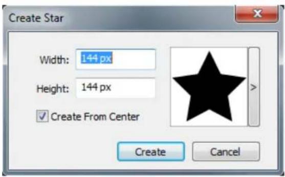
Enter values for the following fields:
Width
Height •
- Select Create From Center to specify that the center of the shape should be where you placed the crosshair point.
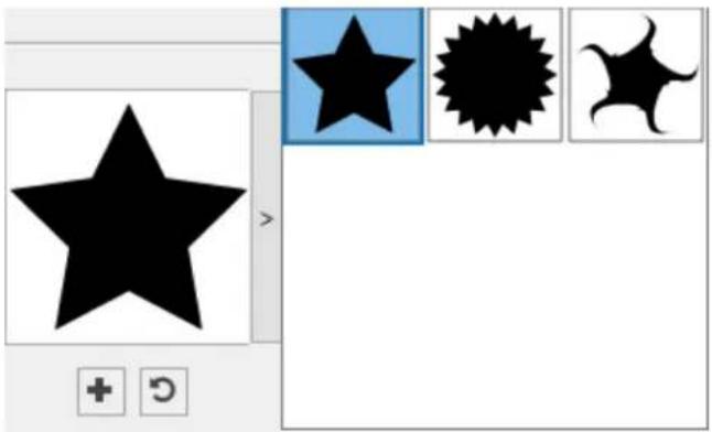
You can apply the default attributes or click the arrow next to the shape preview to select a predefined shape.
natural_image
Abstract graphic with a black star and three pixelated shapes (blue, black, white) on a white background, no text or symbols present.Click Create.
Default star settings
To edit the default star settings that will automatically be applied when using this tool, double-click the Star tool. The Edit Star Settings dialog displays:
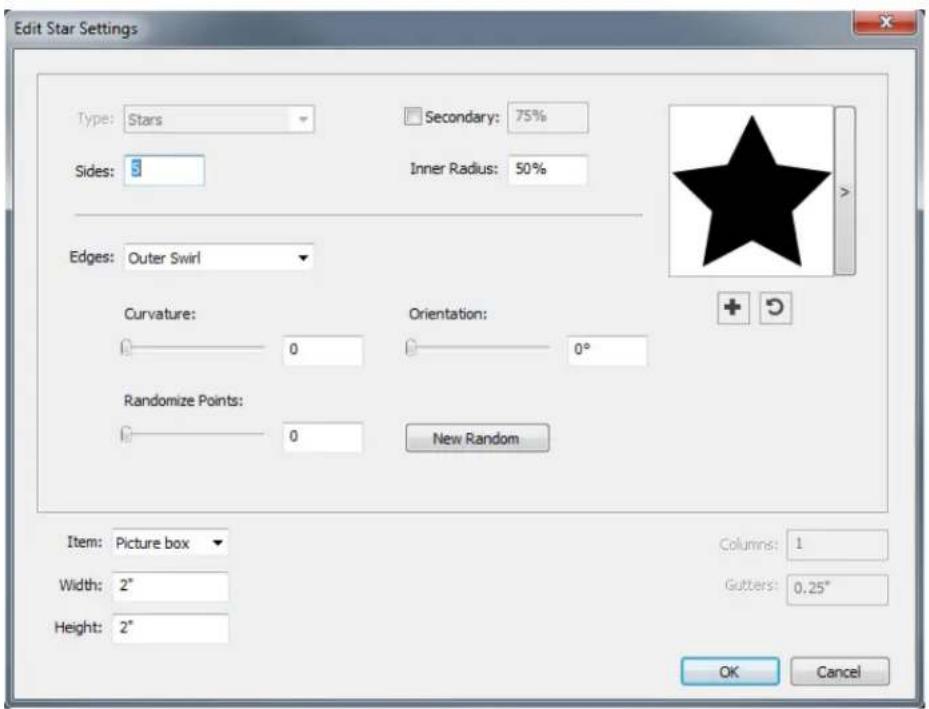
Specify the default settings that will be applied when using this tool:
- Check Secondary to add additional secondary sides/points. This allows you to add a different angle/shape in between the sides of a Star shape
- Sides: Specify the number of sides (points) the star will have.
• Inner Radius: Specify the inner radius of each point in the star. - Edges: Specify the shape the edges of the star will be (Flat, Concave, Convex, Outer Swirl, Inner Swirl, Opposite Swirl, or Tandem Swirl). If you choose an option other than Flat, you can indicate the curvature of the edges with the Curvature controls. If you choose one of the Swirl options, you can indicate the direction of the swirl with the Orientation controls.
- Randomize Points: Lets you control the degree of randomness in the shape, from 0 (none) to 100 (maximum).
New Random: Applies some randomness to the shape. - Item: Specifies the type of box the shape should be placed into. The choices are Text Box, Picture Box, None Box, Text Path, and Rule Path.
• Width, Height, Columns, and Gutters: Specifies the box attributes.
To revert to the default shape, click the Reset button
Once you have defined the default attributes, you can click the Add Preset button *to save this customized shape to use later.

natural_image
Abstract graphic with a black star and three black shapes (star, starburst, crescent) on a white background, no text or symbols present.To delete a predefined shape, hold down the Alt/Option key while selecting it from the list.
Using the Polygon tool
To create a polygon shape in two ways.:
1 Select the Polygon tool ○, position the crosshair pointer + where you want the polygon and then click and drag.
2 Select the Polygon tool ○, position the crosshair pointer + where you want the polygon and click once. The Create Polygon dialog box displays:

Enter values for the following fields:
Width
Height
- Select Create From Center to specify that the center of the shape should be where you placed the crosshair point.
You can apply the default attributes or click the arrow next to the shape preview to select a predefined shape.

natural_image
Simple graphic with a pentagon and three abstract shapes: a blue pentagon, a black clover, and a spiral (no text or symbols)Click Create.
Default polygon settings
To edit the default polygon settings that will automatically be applied when using this tool, double-click the Polygon tool. The Edit Polygon Settings dialog displays:
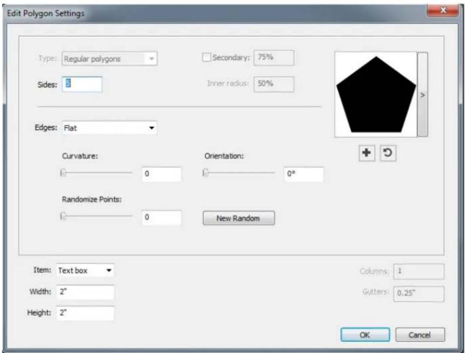
Specify the default settings that will be applied when using this tool:
Sides: Lets you specify how many sides the polygon has •
- Edges: Lets you control whether the edges of the box are flat or curved. If you choose an option other than Flat, you can indicate the curvature of the sides with the Curvature controls. If you choose one of the Swirl options, you can indicate the direction of the swirl with the Orientation controls.
- Randomize Points: Lets you control the degree of randomness in the shape, from 0 (none) to 100 (maximum).
New Random: Applies some randomness to the shape. - Item: Specifies the type of box the shape should be placed into. The choices are Text Box, Picture Box, None Box, Text Path, and Rule Path.
• Width, Height, Columns, and Gutters: Specifies the box attributes.
To revert to the default shape, click the Reset button
Once you have defined the default attributes, you can click the Add Preset button to save this customized shape to use later.

natural_image
Simple geometric shapes including a pentagon, three black shapes with blue and white outlines, and a plus/minus icon (no text or symbols)To delete a predefined shape, hold down the Alt/Option key while selecting it from the list.
Using the Rounded Rectangle tool
To create a rounded rectangle shape in two ways:
1 Select the Rounded Rectangle tool, position the crosshair pointer where you want the star and then click and drag.
2 Select the Rounded Rectangle tool ,position the crosshair pointer where you want the rectangle and click once. The Create Rounded Rectangle dialog box displays:

Enter values for the following fields:
Width •
Height •
- Select Create From Center to specify that the center of the shape should be where you placed the crosshair point.
You can apply the default attributes or click the arrow next to the shape preview to select a predefined shape.
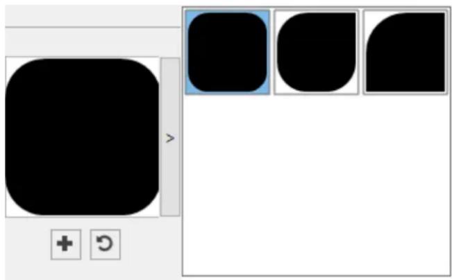
natural_image
Pure graphical interface element with rounded rectangle, three rounded squares, and control buttons (no text or symbols)Click Create.
Default rounded rectangle settings
To edit the default rounded rectangle settings that will automatically be applied when using this tool, double-click the Rounded Rectangle tool. The Edit Rounded Rectangle Settings dialog displays:

Specify the default settings that will be applied when using this tool:
- Check Same for all to configure all four corners of the shape with a single set of controls. To separately configure each corner of the box uncheck Same for all.
- Use the drop-down menus to specify a corner type (Normal, Rounded, Beveled, Concave, Pointed, or Inset) and a diameter (for options that involve a diameter).
- Curvature: Controls how curved the corners are if you select an option that includes curvature.
• Balance: For some options, lets you control whether the corners lean toward the sides of the box or toward the top. - Radial: For some options, lets you control whether the corners of the box are aligned with the center of the box or not.
- Item: Specifies the type of box the shape should be placed into. The choices are Text Box, Picture Box, None Box, Text Path, and Rule Path.
• Width, Height, Columns, and Gutters: Specifies the box attributes.
To revert to the default shape, click the Reset button
Once you have defined the default attributes, you can click the Add Preset button to save this customized shape to use later.

natural_image
Pure graphical interface element with rounded shapes and control buttons (no text or symbols)To delete a predefined shape, hold down the Alt/Option key while selecting it from the list.
Using the Diamond tool
To create a diamond shape in two ways:
1 Select the Diamond tool, position the crosshair pointer where you want the diamond and then click and drag.
2 Select the Diamond tool ; position the crosshair pointer where you want the diamond and click once. The Create Diamond dialog box displays:

Enter values for the following fields:
Width
Height •
- Select Create From Center to specify that the center of the shape should be where you placed the crosshair point.
You can apply the default attributes or click the arrow next to the shape preview to select a predefined shape.

natural_image
Pure geometric shapes including a black diamond, starburst, and circular arrow symbols without any text or labelsDefault diamond settings
To edit the default diamond settings that will automatically be applied when using this tool, double-click the Diamond tool. The Edit Diamond Settings dialog displays:

Specify the default settings that will be applied when using this tool:
- Edges: Specify the shape the edges of the diamond will be (Flat, Concave, Convex, Outer Swirl, Inner Swirl, Opposite Swirl, or Tandem Swirl). If you choose an option other than Flat, you can indicate the curvature of the edges with the Curvature controls. If you choose one of the Swirl options, you can indicate the direction of the swirl with the Orientation controls.
- Randomize Points: Lets you control the degree of randomness in the shape, from 0 (none) to 100 (maximum).
New Random: Applies some randomness to the shape.
- Item: Specifies the type of box the shape should be placed into. The choices are Text Box, Picture Box, None Box, Text Path, and Rule Path.
• Width, Height, Columns, and Gutters: Specifies the box attributes.
To revert to the default shape, click the Reset button
Once you have defined the default attributes, you can click the Add Preset button to save this customized shape to use later.

natural_image
Pure geometric shapes including a black diamond, blue square, and starburst-like symbols without any text or labelsTo delete a predefined shape, hold down the Alt/Option key while selecting it from the list.
Using the Triangle tool
To create a triangle shape in two ways.:
1 Select the Triangle tool △, position the crosshair pointer + where you want the triangle and then click and drag.
2 Select the Triangle tool △, position the crosshair pointer + where you want the triangle and click once. The Create Triangle dialog box displays:

Enter values for the following fields:
Width
Height •
- Select Create From Center to specify that the center of the shape should be where you placed the crosshair point.
You can apply the default attributes or click the arrow next to the shape preview to select a predefined shape.

natural_image
Pure geometric shapes including a black triangle and three abstract black triangular forms with selection handles, displayed without any text or symbols.Default triangle settings
To edit the default triangle settings that will automatically be applied when using this tool, double-click the Triangle tool. The Edit Triangle Settings dialog displays:
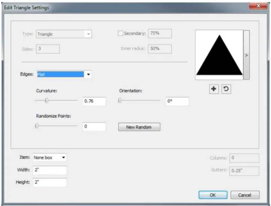
Specify the default settings that will be applied when using this tool:
- Edges: Specify the shape the edges of the triangle will be (Flat, Concave, Convex, Outer Swirl, Inner Swirl, Opposite Swirl, or Tandem Swirl). If you
choose an option other than Flat, you can indicate the curvature of the sides with the Curvature controls. If you choose one of the Swirl options, you can indicate the direction of the swirl with the Orientation controls.
- Randomize Points: Lets you control the degree of randomness in the shape, from 0 (none) to 100 (maximum).
New Random: Applies some randomness to the shape.
- Item: Specifies the type of box the shape should be placed into. The choices are Text Box, Picture Box, None Box, Text Path, and Rule Path.
- Width, Height, Columns, and Gutters: Specifies the box attributes.
To revert to the default shape, click the Reset button
Once you have defined the default attributes, you can click the Add Preset button to save this customized shape to use later.

natural_image
Abstract geometric shapes including a black triangle and three white triangular forms with selection handles, displayed within a software interface (no text or symbols on the shapes themselves)To delete a predefined shape, hold down the Alt/Option key while selecting it from the list.
Using the Wave tool
To create a wave shape in two ways:
1 Select the Wave tool ,position the crosshair pointer where you want the wave and then click and drag.
2 Select the Wave tool ,position the crosshair pointer where you want the wave and click once. The Create Wave dialog box displays:

Enter values for the following fields:
Width
Height •
- Select Create From Center to specify that the center of the shape should be where you placed the crosshair point.
You can apply the default attributes or click the arrow next to the shape preview to select a predefined shape.

natural_image
Abstract graphic design with black shapes and selection buttons (no text or symbols)Default wave settings
To edit the default wave settings that will automatically be applied when using this tool, double-click the Wave tool. The Edit Wave Settings dialog displays:

Specify the default settings that will be applied when using this tool:
- Top, Left, Bottom, and Right: These controls let you configure the four sides of the box. You can choose Wave 1, Wave 2, or Flat.
- Keep waves parallel: Keeps the waves on either side of the box parallel with one another.
- The controls in the Wave 1 and Wave 2 areas let you choose which type of wave to use, the frequency of the wave, the phase (starting point) of the wave, and the amplitude (depth) of the wave.
- Item: Specifies the type of box the shape should be placed into. The choices are Text Box, Picture Box, None Box, Text Path, and Rule Path.
• Width, Height, Columns, and Gutters: Specifies the box attributes.
To revert to the default shape, click the Reset button
Once you have defined the default attributes, you can click the Add Preset button to save this customized shape to use later.

natural_image
Abstract graphic with a wavy black shape and three small black rectangular panels, no text or symbols present.To delete a predefined shape, hold down the Alt/Option key while selecting it from the list.
Using the Spiral tool
To create a spiral shape in two ways:
1 Select the Spiral tool, position the crosshair pointer where you want the spiral and then click and drag.
2 Select the Spiral tool , position the crosshair pointer where you want the spiral and click once. The Create Spiral dialog box displays:

Enter values for the following fields:
Width
Height
- Select Create From Center to specify that the center of the shape should be where you placed the crosshair point.
You can apply the default attributes or click the arrow next to the shape preview to select a predefined shape.
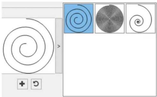
natural_image
Abstract spiral pattern with three inset circular patterns (blue, gray, white) and a plus/arrow icon, no text or symbols present.Default spiral settings
To edit the default spiral settings that will automatically be applied when using this tool, double-click the Spiral tool. The Edit Spiral Settings dialog displays:
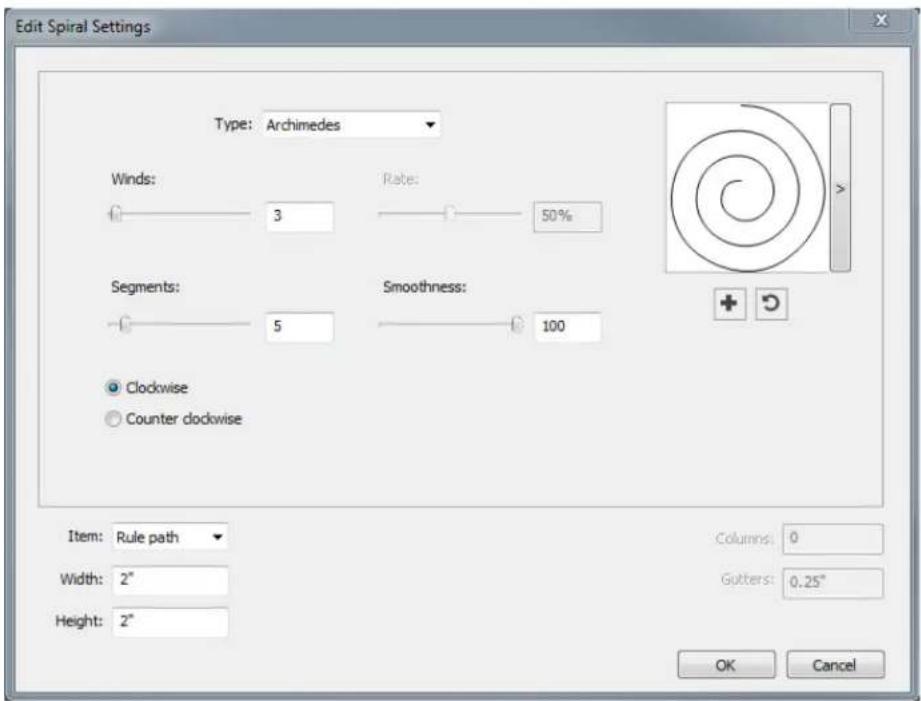
Specify the default settings that will be applied when using this tool:
- Type: Choose what type of spiral too create from the drop-down menu.
Archimedes: an evenly spaced circular spiral.
Golden Spiral: a spiral built with the golden ratio.
- Custom: this makes the Winds field available.
• Winds: Lets you control how many times the spiral goes around.
• Rate: Lets you control how quickly the width of the spiral increases.
- Segments: Lets you control how circular the spiral is allowing you to specify the number of segments per wind.
- Smoothness: Lets you control how smooth the spiral is. You can get a harder-edged shape by lowering the Segments value and decreasing the Smoothness value.
- Clockwise and Counterclockwise: Lets you control the direction of the spiral.
- Item: Specifies the type of box the shape should be placed into. The choices are Text Box, Picture Box, None Box, Text Path, and Rule Path.
- Width, Height, Columns, and Gutters: Specifies the box attributes.
→ To revert to the default shape, click the Reset button
Once you have defined the default attributes, you can click the Add Preset button to save this customized shape to use later.

natural_image
Abstract graphic design with black shapes and selection handles, no text or symbols presentTo delete a predefined shape, hold down the Alt/Option key while selecting it from the list.
Using the Cloud tool
To create a cloud shape in two ways:
1 Select the Cloud tool , position the crosshair pointer where you want the cloud and then click and drag.
2 Select the Cloud tool , position the crosshair pointer where you want the cloud and click once. The Create Cloud dialog box displays:

Enter values for the following fields:
Width
Height •
- Select Create From Center to specify that the center of the shape should be where you placed the crosshair point.
You can apply the default attributes or click the arrow next to the shape preview to select a predefined shape.

natural_image
Abstract black cloud-like shapes on white background, with selection boxes and directional indicators (no text or symbols)Default cloud settings
To edit the default cloud settings that will automatically be applied when using this tool, double-click the Cloud tool. The Edit Cloud Settings dialog displays:

Specify the default settings that will be applied when using this tool:
- Sides: Specify the number of sides the cloud shape will have.
- Edges: Specify the shape the edges of the cloud will be (Flat, Concave, Convex, Outer Swirl, Inner Swirl, Opposite Swirl, or Tandem Swirl). If you choose an option other than Flat, you can indicate the curvature of the edges with the Curvature controls. If you choose one of the Swirl options, you can indicate the direction of the swirl with the Orientation controls.
- Randomize Points: Lets you control the degree of randomness in the shape, from 0 (none) to 100 (maximum).
New Random: Applies some randomness to the shape.
- Item: Specifies the type of box the shape should be placed into. The choices are Text Box, Picture Box, None Box, Text Path, and Rule Path.
• Width, Height, Columns, and Gutters: Specifies the box attributes.
To revert to the default shape, click the Reset button
Once you have defined the default attributes, you can click the Add Preset button to save this customized shape to use later.
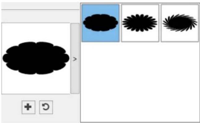
natural_image
Abstract graphic with cloud-like shapes and selection boxes (no text or symbols)To delete a predefined shape, hold down the Alt/Option key while selecting it from the list.
Menus
The topics below describe the menus and menu items available in QuarkXPress.
QuarkXPress menu (macOS only)
The QuarkXPress menu is a part of QuarkXPress for macOS. This menu contains the same commands as in the application menu for other macOS applications — to hide or show QuarkXPress and other applications, to access preferences, and to quit QuarkXPress. This menu includes the following commands:
- About QuarkXPress: Use this command to display information about QuarkXPress, such as the version number.
- Edit License Code: Use this command to change the validation code of an installed copy of QuarkXPress. By changing this code, you can change a Test Drive version (formerly called "evaluation copy") of QuarkXPress into a fully functional version, change the languages supported by the user interface.
- Activate QuarkXPress: Use this command to activate QuarkXPress on your computer. Available only when QuarkXPress is running in demo mode.
- Quark Cache Cleaner: Use this command to run the Quark Cache Cleaner when the QuarkXPress application is invoked. You will be asked to save any open projects. If any other version of QuarkXPress is also running at that time, you will be asked to quit those applications before running the Quark Cache Cleaner.
- Check for Updates: Use this command to check for updates to QuarkXPress.
- Quark Update Settings: Use this command to configure automatic update settings.
- Preferences: Lets you modify default values and settings. For more information, see "Preferences."
Quit QuarkXPress: Use this command to exit the application.
File menu
The File menu enables you to manipulate electronic files in a number of ways, including the ability to create, open, print, and save. This menu includes the following commands:
- New: Choose an option from the New submenu to create a project. If you choose New Project from Ticket, you can select a Job Ticket from which you can create the project. You can also use this submenu to create new libraries and books.
- New Project from IDML: Use this option to open InDesign IDML files as QuarkXPress projects.
Open: Use this option to open project files.
- Open Recent (Mac only, on Windows, a list of the recently opened files are displayed at the end of the File menu.): Use this option to open a project from a list of recently opened files.
- Close (Win)/ Close Window (Mac): Use this option to close the active project.
Save: Use this option to save the active project.
- Save As: Use this option to save a copy of the active project.
- Save a Copy As/Downsave: Use this option to export one or more layouts in the active project or to save a copy of the active project as a lower version of QuarkXPress.
- Revert to Saved: Use this option to return the active project to the state it was in when it was last saved.
- Import: Use this command to import text into a text box or to import a picture into a picture box.
- Export Picture: Use this command to export a copy of the picture contained in the active picture box or all pictures in the project.
- Save Text: Use this option to save the contents of the active text box as a separate file.
- Append: Use this option to append style sheets, colors, layouts, and a variety of other types of resources from another file.
-
Export As: Use this option to export a layout as PDF, EPS, JPEG/PNG/TIFF, HTML5 Publication, iOS App, Android App, ePub or Kindle.
-
Collect for Output: Use this option to collect the layout/s, fonts, images, profiles, output report, etc. into a folder. Collect for output can be performed on all layouts in the project.
- Job Jackets: Use this submenu to access the specifications and rules for creating and inspecting a layout, link a project to a Job Jackets file, modify a Job Ticket, and evaluate a layout.
Print: Use this option to print the active file.
- Exit (Windows only): Use this option to exit the application.
Edit menu
The Edit menu includes the following commands:
Undo: Undoes the last action.
Redo: Redoes an undone action.
Cut: Cuts the selected content.
Copy: Copies the selected content to the clipboard.
Paste: Pastes the clipboard contents on the active page.
- Paste Without Formatting: Pastes the clipboard contents as plain text.
- Paste In Place: Pastes a duplicated or copied item onto the active page at the same position from which it was originally copied.
- Paste as Native Objects: To convert the item to be pasted to a native QuarkXPress object.
- Select All: Selects all content in the active box or text path.
- Preferences (Windows only): Lets you modify default values and settings. For more information, see "Preferences."
- Lets you change the program language of the application.
- Find/Change: Displays the Find/Change palette, which you can use to find and change text based on content, formatting, or both.
- Item Find/Change: Displays and hides the Item Find/Change palette.
- Colors: Lets you add, edit, and delete color definitions. For more information, see "Color, opacity, and drop shadows."
- Style Sheets: Lets you add, edit, and delete style sheet definitions. For more information, see "Text and typography."
-
Item Styles: Lets you add, edit, and delete item definitions that you can apply to QuarkXPress items with the Item Styles palette (Window menu).
-
Callout Styles: Lets you add, edit, and delete callout styles. For more information, see "Boxes, lines, and tables."
- Conditional Styles: Lets you add, edit, and delete conditional styles. For more information, see "Text and typography."
- Bullet, Numbering, and Outline Styles: Lets you add, edit, and delete bullet, numbering, and outline styles. For more information, see "Text and typography."
- Footnote Styles: Lets you add, edit, and delete footnote styles. For more information, see "Working with footnotes and endnotes"
- Text Shading Styles: Lets you add, edit, and delete text shading styles. For more information, see "Text and typography."
- Table Styles: Let you, edit, and delete Table Styles. For more information, see "New Table Model with Table Styles"
- Hyperlinks: Lets you add, edit, and delete hyperlinks including URLs, anchors, and page links.
• Underline Styles: Lets you access and modify underline styles. - Hanging Characters: Lets you add, edit, and delete custom hanging character definitions. For more information, see "Text and typography."
- Lists: Lets you add, edit, and delete list definitions. The Lists feature is a tool for automatically generating tables of contents and other types of listed content. For more information, see "Document construction."
- H&Js: Lets you add, edit, and delete H&J (hyphenation and justification) definitions. H&Js let you control how text breaks. For more information, see "Text and typography."
- Grid Styles: Lets you add, edit, and delete patterns of non-printing design grids that you can apply to text components. For more information, see "Text and typography."
- Dashes and Stripes: Lets you add, edit, and delete custom line patterns.
- Font Sets: Lets you add, edit, and delete custom scaling, sizing, and direction for specific fonts.
This feature is considered an East Asian feature and is only available when you have the East Asian preference enabled (QuarkXPress/Edit > Preferences > East Asian). - Mojigumi: Lets you add, edit, and delete Mojigumi sets and classes. For more information, see "Working with Mojigumi sets and classes."
This feature is considered an East Asian feature and is only available when you have the East Asian preference enabled (QuarkXPress/Edit > Preferences > East Asian).
- Non-Breaking Character Sets: Lets you add, edit, and delete rules for two-byte character sets.
This feature is considered an East Asian feature and is only available when you have the East Asian preference enabled (QuarkXPress/Edit > Preferences > East Asian).
Kerning Pairs: Lets you control kerning for installed fonts.
- Font Tracking Tables: Lets you control tracking for installed fonts.
- Set Tool Preferences From Selected: Lets you set the tool preferences to the currently selected box's attributes.
- Restore Tool Preferences To Default: Lets you restore the tool preferences back to the defaults.
- Color Setups: Lets you access and modify setups for Source and Output Setups.
- Output Styles: Lets you add, edit, and delete output style definitions. Output styles let you easily switch between different sets of output options. For more information, see "Output".
Style menu
The Style menu changes depending on whether a text box, a picture box, or a line is active.
The Style menu changes depending on whether a text component or a picture component is active.
Style menu for text
The Style menu for text includes commands for specifying character attributes and paragraph formats. This menu includes the following commands:
- Type Style: Lets you apply type styles such as bold, italic, and underline to selected text. The Type Style sub menu also contains Underline Styles, Make Fraction, Make Price and Remove Custom Underline.
Color: Lets you change the color of selected text.
Shade: Lets you set the tint of an applied color.
Opacity: Lets you control the transparency of selected text.
- Story Direction: Lets you specify horizontal or vertical story direction for the selected text box.
This feature is considered an East Asian feature and is only available when you have the East Asian preference enabled (QuarkXPress/Edit > Preferences > East Asian).
Rubi: Lets you control rubi characters applied to text.
This feature is considered an East Asian feature and is only available when you have the East Asian preference enabled (QuarkXPress/Edit > Preferences > East Asian).
- Group Characters: Lets you place horizontal text in a vertical story.
This feature is considered an East Asian feature and is only available when you have the East Asian preference enabled (QuarkXPress/Edit > Preferences > East Asian).
- Alignment: Lets you align active paragraphs to the left, right, or center. Also lets you justify or force-justify selected paragraphs.
- Character Alignment: Lets you align active characters to the top, center, baseline, or bottom.
In East Asian configuration, the options are: ICF Box Top, ICF Box Bottom, Embox Top, Embox Center, Embox Bottom and Roman Baseline. These let you align the small characters in a line to the ICF specified by the large characters. In vertical text frames, ICF Top/Right aligns the text to the right of the ICF, and ICF Bottom/Left aligns the text to the left of the ICF.
- Paragraph Style Sheet: Lets you apply paragraph style sheets to selected text.
• Character Style Sheet: Lets you apply character style sheets to selected text.
- Footnotes/Endnotes: Lets you view, add and edit footnotes and endnotes.
- Footnote Separator Style: Lets you apply a different footnote separator style.
- Update Style Sheet: Lets you update a character or paragraph style sheet definition based on local changes to the applied style sheet.
Item Styles: Lets you view and update applied item styles.
- Change Case: Lets you change case of selected text to uppercase, lower case, or title case.
- Non-Breaking Attribute: Lets you apply the non-breaking attribute on the selected text (i.e. the text will not hyphenate or wrap). To highlight all text that has the non-breaking attribute applied to it, choose View > Highlight Non-Breaking.
- Flip Text Horizontal: Lets you flip selected text horizontally.
Flip Text Vertical: Lets you flip selected text vertically.
• Cross Reference: Lets you insert and synchronize cross references.
- Hyperlink: Lets you modify and apply a hyperlink, page link, or anchor to selected text.
- Anchor: Lets you create or modify an anchor for selected text.
- Remove Manual Kerning: Lets you remove all manual kerning applied between characters.
Style menu for pictures
The Style menu for pictures includes commands for formatting and editing pictures. This menu includes the following commands:
• Color: Applies a color to a selected grayscale or one-bit picture.
Shade: Lets you set the intensity of an applied color.
- Opacity: Lets you control the transparency of a selected picture.
• Center Picture: Centers the selected picture in its picture box.
- Stretch Picture To Fit Box: Reduces or enlarges the selected picture horizontally and vertically to fill the picture box; the picture aspect ratio may not be maintained depending on the size of the picture box. This option will be enabled only when the width and height aspect ratio of the picture is unlocked.
- Scale Picture To Fit Box: Reduces or enlarges the selected picture proportionately to fit its picture box such that the complete picture will be scaled with no crop area.
- Scale Picture To Fill Box: Reduces or enlarges the selected picture horizontally or vertically to fill its picture box. In case, the aspect ratio of the picture and its box is not same, the picture may be cropped.
- Fit Box To Picture: Reduces or enlarges the picture box to fit the size of the selected picture.
- Convert to Native Objects: Convert the existing item to a native QuarkXPress object.
- Item Styles: Lets you view and update applied item styles.
- Scale: Lets you change the scale of a picture within a picture component.
- Rotate: Lets you rotate a picture within a picture component.
- Scale Picture To Fit Box: Reduces or enlarges the selected picture proportionately to fit its picture box such that the complete picture will be scaled with no crop area.
- Scale Picture To Fill Box: Reduces or enlarges the selected picture horizontally or vertically to fill its picture box. In case, the aspect ratio of the picture and its box is not same, the picture may be cropped.
- Reset Picture: Resets the picture in the active picture component to its default scale, skew, and rotation.
- Halftone (Windows only): Lets you apply a halftone screen pattern to a selected grayscale picture.
- Flip Picture Horizontal: Flips the selected picture horizontally.
- Flip Picture Vertical: Flips the selected picture vertically.
- Edit: Lets you modify and apply a Clipping Path and Runaround to a selected picture or box.
- Point/Segment Type: Lets you change the point or segment type of an item so you can manipulate points, curve handles, and line segments.
- Hyperlink: Lets you modify and apply a hyperlink, page link, or anchor to a selected picture or box.
- Anchor: Lets you create or modify an anchor for a selected picture or box.
• Image Editing: Lets you apply picture effects to the image in the box.
Style menu for lines
The Style menu for lines includes the following commands:
Line Style: Lets you apply a line style to a selected line.
- Arrowheads: Lets you apply an arrowhead style to a selected line.
• Width: Lets you adjust the width of a selected line.
• Color: Lets you change the color of a selected line. - Shade: Lets you set the intensity of an applied color.
- Opacity: Lets you control the transparency of a selected line.
- Item Styles: Lets you view and update applied item styles.
- Hyperlink: Lets you modify and apply a hyperlink, page link, or anchor to a selected line.
- Anchor: Lets you create or modify an anchor for a selected line.
Item menu
The Item menu includes commands for controlling item attributes, positions, grouping, sharing, and more.
- Duplicate: Lets you create a copy of an item and its contents.
- Super Step and Repeat: Lets you duplicate an active item multiple times and specify scale, rotation, and shading for the duplicates.
Delete: Lets you delete a selected item and its contents.
- Lock: Lets you prevent accidental changes to items and their contents by locking its position or content.
- Fit Box to Text: Reduces or enlarges the text box to fit the size of the text it contains.
- Merge Text Boxes: Lets you merge the contents of multiple text boxes into a single text box.
- Send & Bring: Lets you move an item one level backward in the page or layer's stacking order, move an item to the back of the page or layer, move an item to the front of the page or layer, or move an item one level forward in the page or layer's stacking order.
- Group/Ungroup: Lets you combine two or more active items (including lines, boxes, text paths, tables, and other groups) into a group, or performs an Ungroup on the currently selected grouped items.
- Ungroup All: Lets you break a group into its component items.
- Export Options: Lets you specify export options for tagged PDF export.
- Space/Align: Lets you position the selected items evenly with regard to each other or with regard to the page or spread.
- Constrain/Unconstrain: Lets you restrict an item so that it cannot move beyond the boundaries of the item to which it is constrained, or removes any constrains applied to the item.
Content: Lets you change the content type of an item.
• Shape: Lets you change the shape of an active item.
- Merge or Split Paths: Lets you merge or split selected items in a number of ways.
- Point/Segment Type: Lets you change the point or segment type of an item so you can manipulate points, curve handles, and line segments.
- Convert Text To Boxes: Lets you convert the contents of a selected text box to a Bézier box.
- Edit: Lets you modify item shape, runaround, or clipping path.
- Flip Shape: Lets you flip a Bézier shape in its frame either vertically or horizontally.
- Share: Lets you access sharing properties of an item and synchronize or reuse content such as text, pictures, boxes, lines, and Composition Zones.
- Unsynchronize Size: Removes synchronization of a single instance of the item without affecting other occurrences of that item (or the synchronization attributes).
- Unsynchronize Item/Content: Removes synchronization of a single instance of the item without affecting other occurrences of that item (or the synchronization attributes).
- Copy To Other Layouts: Lets you copy to selected items to another layout.
- Callout Anchor: Lets you configure callout anchors and callouts. For more information, see "Working with callouts."
- Composition Zones: Lets you create or modify Composition Zones.
- Digital Publishing: Lets you configure items for digital publishing in ePub, Kindle, App Studio and HTML5 Publication output formats. For more information, see Digital Publishing with QuarkXPress.
- New Box From Clipping: Lets you to create a box from a clipping path.
- Note: Lets you insert, delete, and navigate between notes. For more information, see "Notes."
Scale: Lets you set the scale settings.
Page menu
The Page menu includes commands for inserting, deleting, and moving pages; working with guides, grids, and sections; navigating through pages, and more.
Insert: Lets you add new pages.
- Delete: Lets you delete pages.
- Move: Lets you move a page to a different location.
- Insert PDF/AI: Let you Insert PDF/AI to another document.
- Master Guides and Grid: Lets you modify the placement of page guides and design grids on master pages.
- Section: Lets you change the numbering system for a layout or a range of pages in a layout.
• Previous: Navigates to the preceding page.
Next: Navigates to the following page.
First: Navigates to the first page.
Last: Navigates to the last page.
Go to: Lets you navigate to a particular page.
Display: Lets you display a page or a master page.
Layout menu
The Layout menu includes commands for working with and navigating to layouts.
New: Lets you add a new layout.
- Duplicate: Lets you duplicate one layout to copy its items and content to another.
Delete: Lets you remove a layout.
- New/Edit Layout Specification: Lets you create or modify Job Jackets properties for a layout.
- Layout Properties: Lets you modify layout properties such as name, type, and size.
- Advanced Layout Properties: Lets you modify sharing properties of a layout.
- Metadata: Lets you apply metadata to the layout for eBook and tagged PDF export. For more information, see Digital Publishing with QuarkXPress.
- Auto Tag Layout: Lets you add page components to the Articles palette to be able to export to Reflow ePub, and to specify reading order of items in tagged PDFs.
- Preview HTML 5 Publication: Page, Layout, Project previews.
- Previous: Activates the layout tab that was active prior to the current layout.
- Next: Activates the layout tab that is positioned to the immediate right of the active layout.
• First: Activates the far-left layout tab.
• Last: Activates the far-right layout tab.
- Go to: Lets you activate a specific layout and then choose the layout from the submenu.
Table menu
The Table menu includes commands for adding rows and columns to tables, modifying table attributes, converting tables, and more.
- Create Table From External Source: Lets you import text content from an Excel file along with its formatting.
Insert: Lets you add a row or column to a table.
- Select: Lets you select a pattern of rows and columns or other table elements. This makes it easy to apply alternating formatting — such as shading every other row.
Delete: Lets you delete a selection from the table.
- Combine Cells: Lets you combine a rectangular selection of adjacent table cells — including entire rows or columns — into a single cell.
- Table Break: Lets you continue a table in another location. The table break is the maximum size the table can reach before it splits into two linked tables.
- Make Separate Tables: Lets you sever the link between continued tables so each table becomes completely separate. This prevents changes to one portion of the table from affecting all the continued tables.
- Repeat As Header: Lets you specify a header row to repeat automatically in continued instances of a table.
- Repeat As Footer: Lets you specify a footer row to repeat automatically in continued instances of a table.
- Convert Text to Table: Lets you convert text that has already been imported or typed into a text box to a table. This works best with text that is delimited in some way to indicate how to divide the information into columns and rows.
- Convert Table: Lets you convert the information in a table to text or to a group of related boxes. You might convert a table for easy exporting of the current data or to save a document containing features that are not supported in earlier versions of QuarkXPress.
- Table Direction: Lets you specify horizontal or vertical orientation for a table.
- Link Text Cells: Lets you link table cells to each other just as text boxes and text paths can be linked. Text that is typed, imported, or pasted into a linked cell fills the first text cell, and then flows on to each subsequent linked cell.
- Maintain Geometry: Lets you prevent the width and height of a table from changing when you insert or delete rows or columns.
View menu
The View menu provides options for viewing your document and specifying what you see on screen when the menu item is checked. This menu includes the following commands:
- Fit in Window: Automatically scales the view to fit (and center) an entire page in the layout window.
50%: Scales the layout view to 50%.
75%: Scales the layout view to 75%.
Actual Size: Scales the layout view to 100%.
200%: Scales the layout view to 200%.
- Thumbnails: Displays small representations of each page that you can rearrange and copy between projects.
- Enter Full Screen (Mac OS X only): Lets you switch to full screen mode.
- Dynamic Guides: Displays nonprinting lines that appear when you create or manipulate item on pages. They help you align, edit, and transform items relative to other items on the page by displaying location and measurement values. Displays a submenu allowing you to turn Dynamic Guides on and off and specify the type of dynamic guides and feedback that appear (such as Align to Center of Item, Align to Edges of Item, Align to Center of Page, Show Equal Dimensions, Show Equal Spacing, and Show Measurements for Dimensions/Spacing). Unlike Guides, which are document settings, displaying Dynamic Guides are application specific settings.
- Guides: Displays nonprinting lines used to position items on pages, including margin guides, column block guides, the outlines of boxes, the "X" pattern in empty picture boxes, and ruler guides.
- Hide Selection: Allows you to put QuarkXPress into a mode where selections are not indicated visually in the document (no text highlighting, no handles), but the selection is still honored by QuarkXPress.
- Page Grids: Displays nonprinting gridlines defined for the master page on which the active layout page is based.
- Text Box Grids: Displays nonprinting gridlines applied to text boxes.
- Snap to Guides: Lets you quickly align items with guides so items will snap to the nearest guide.
- Snap to Page Grids: Lets you quickly align items with page grids so items will snap to the nearest guide.
- Rulers: Displays rulers, which you can use to position items and guides, along the top and left edges or top and right edges of the layout window.
- Ruler Direction: Lets you position page rulers on the top and left or top and right edges of the layout window.
- Hide Tab Ruler: Lets you control the appearance of Tab ruler. By default, the Tab ruler will be displayed. It is a layout level setting. The setting will be saved with the document.
- Invisibles: Displays editable, nonprinting characters such as spaces, tabs, and paragraph returns in text.
- Visual Indicators: Displays indicators for non-printing elements, such as hyperlinks and missing font highlighting.
- Highlight Content Variables: Displays highlighting for the content variables.
- Highlight Cross References: Displays highlighting for cross references.
- Highlight Non-Breaking Text: Displays highlighting for text that has the non-breaking attribute applied.
- Trim View: Simulates what the page will look like when trimmed by cropping any items that extend beyond the page boundary. You can control the color of the pasteboard that displays when this item is selected in the Display pane of the Preferences dialog box (QuarkXPress/Edit > Preferences).
- Hide Suppressed: Hides all items for which the Suppress Output box is checked in the Measurements palette, as well as layers for which Suppress Output is checked in the Attributes dialog box. In addition, this option hides underlines on hyperlinks, hyperlink anchors, index markers, and the text overflow symbol.
- Story Editor: Displays the active story in Story Editor view. For more information, see "Using Story Editor view."
- Proof Output: Lets you preview how the layout will look when output to different media and for different printing methods. This display simulation is accurate enough for soft proofing.
• View Sets: Lets you create and easily switch between different view options.
• Show/Hide Notes: Allows you to hide or show notes in your project.
Utilities menu
The Utilities menu includes the following commands:
- Insert Character: Lets you easily insert special characters, including special breaking and nonbreaking spaces.
- Content Variable: Lets you insert a content variable as well as create new, edit, remove (not delete) and convert to text.
- Check Spelling: Use the submenu to display the Check Spelling palette to check the spelling of a word, a selection of text, a story, a layout, or all master pages in a layout. Auxiliary Dictionary and Edit Auxiliary are also part of Check Spelling submenu.
- Check Spelling: Use the submenu to display the Check Spelling palette to check the spelling of a word, a selection of text, a component, or an article. The submenu also allows you to specify and edit the auxiliary dictionary for use in spell checking.
- Word and Character Count: Use the submenu to display the Word and Character Count for a layout, story or selection. This dialog box displays the number of full-width characters, half-width characters, and various other kinds of characters in the selection, active story or in the layout.
- Line Check: Displays a submenu that lets you find widows, orphans, loosely justified lines, lines that end with a hyphen, and overflow situations.
- Suggested Hyphenation: Displays the suggested hyphenation for the word containing the text insertion point.
- Hyphenation Exceptions: Displays a submenu that allows you to edit the exceptions and also import and export .xml files containing lists of language-specific hyphenation exceptions. Displays the Hyphenation Exceptions dialog box.
- Convert Project Language: Lets you convert all the characters in the active project that use a particular character language to a different character language.
• IME Reconversion: IME Reconversion is supported in the following ways:
On Mac OS X: IME Reconversion is supported through the IME Menu. 1 However, it works for Japanese IME Only.
On Windows: IME Reconversion is supported through the IME 2 Reconversion menu option on the QuarkXPress Utilities Menu, as well as the Context Menu. It works for all Japanese IME, Korean IMEs and a few Simplified and Traditional Chinese IMEs.
→ IME Reconversion is also supported through the keyboard on both Windows and Mac OS X.
- Usage: Lets you view and update the status of fonts, pictures, color profiles, tables, Composition Zones, and assets used in layouts. Multiple missing digital files can be updated all at once using the Usage dialog.
- Usage: Lets you view and update the usage of fonts, pictures, profiles, Composition Zones, and Excel tables that are linked to external data sources.
- Item Styles Usage: Lets you view and update applied item styles.
• Job Jackets Manager: Displays the Job Jackets Manager dialog box.
- Insert Placeholder Text: Generates random text in the active text box so that you can preview how text will flow and be styled, even though you might not have actual content yet.
• Build Index: Lets you create an index from the contents of the Index palette.
- Cloner: Displays the Cloner dialog box. For more information, see "Cloner functionality."
- ImageGrid: Displays the ImageGrid dialog box. For more information, see "ImageGrid functionality."
- Linkster: Displays the Linkster dialog box. For more information, see "Linkster functionality."
- ShapeMaker: Displays the ShapeMaker dialog box. For more information, see "ShapeMaker."
- Font Mapping: Lets you create and edit rules for substituting a new font for a font that is requested by a project but which is not installed on your computer.
- Convert Old Underlines: Converts all underlines in the active text chain from QuarkXPress 3.x (Stars & Stripes) format to Type Tricks format.
- PPD Manager : Lets you control which PostScript Printer Description files (PPDs) are loaded in the Print dialog box.
- App Build Status: Click this icon to check the build status for the iOS or Android App you last published from QuarkXPress. You may also use the "App Build Status" button in the Layout controls. Once complete, you may view the downloaded builds from the App Export dialog. This icon will change to an error icon, if the app export fails for some reason, you may then click it to get more details.
- Proxy Settings: Lets you specify the proxy settings for connecting to the internet, if required. These settings are used by the App Studio Publishing palette as well as the Export as iOS App or Export as Android App dialog.
- XTensions Manager: Lets you control which XTensions modules are loaded when the application is launched.
- Profile Manager: Lets you control which color profiles are loaded in the application.
- Make QR Code: Lets you generate vector Quick Response (QR) codes directly within QuarkXPress then style and color them the way you want. You have the choice between creating vector based QR codes or pixel based QR codes. If you choose pixel based QR codes, they will be created in your Documents
folder. When you call the QR Code dialog again, the data behind the QR code will be shown.
- Redline: Use the submenu to turn automatic tracking and highlighting on and off. You can also use this submenu to display the Redline palette.
Window menu
The Window menu enables you to control the on-screen display of open windows and palettes. This menu includes the following commands:
- New Window: Displays the active project in a new window. You can then view different parts of the project in each window.
- Split Window: Splits the project window into two parts. Allows you to split horizontally or vertically. You can then view different parts of the project in each part of the window.
- Cascade (Windows only): Layers multiple open projects so just a portion of each project's menu bar displays.
- Tile: Tiles all open windows to fit on the screen. Contains the Tile Horizontally and Tile Vertically sub-menus.
- Arrange Icons (Windows only): Minimizes all active projects.
- Close All (Windows only): Closes all active projects.
- Palette Sets: Use the submenu to store and recall arrangements of palettes.
- Turn Hiding On (Mac OS X only): Allows you to display and hide groups of docked palettes.
- Advanced Image Control: Displays and hides the Advanced Image Control palette.
- App Studio Publishing: Displays and hides the App Studio Publishing palette. For more information, see Digital Publishing with QuarkXPress.
- Articles: Displays and hides the Articles palette. For more information, see "Working with Reflow."
- Books: Displays and hides the Books palette. For more information, see "Working with books."
- Callout Styles: Displays the Callout Styles palette. For more information, see "Working with callout styles."
- Colors: Displays and hides the Colors palette.
- Conditional Styles: Displays the Conditional Styles palette. For more information, see "Working with conditional styles."
• Content: Displays and hides the Content palette.
- Content Management: Displays ad hides the Contet Management.
- Content Variables: Displays and hides the Content Variables palette.
- Flex Layout Blocks: Displays and hides the Flex Layout Blocks palette. For more information, see Getting Started with Flex Layouts.
- Flex Object Browser: Displays and hides the Flex Object Browser palette. For more information, see Getting Started with Flex Layouts.
- Flex Page Builder: Displays and hides the Flex Page Builder palette. For more information, see Getting Started with Flex Layouts.
- Footnote Styles: Displays and hides the Footnote Styles palette. For more information, see "Working with footnotes and endnotes."
• Glyphs: Displays and hides the Glyphs palette.
- Gradients: Displays and hides the Gradients palette. For more information, see "Creating Gradients."
• Grid Styles: Displays and hides the Grid Styles palette.
• Guides: Displays and hides the Guides palette.
• HTML5: Displays and hides the HTML5 palette.
• Hyperlinks: Displays and hides the Hyperlinks palette.
• Image Editing: Displays the Image Editing palette.
• Index: Displays and hides the Index palette.
- Item Styles: Displays and hides the Item Styles palette.
- JavaScript Palette: Displays and hides the JavaScript palette.
- JavaScript Debugger Palette: Displays and hides the JavaScript Debugger palette.
- Layers: Displays and hides the Layers palette.
- Lists: Displays and hides the Lists palette.
• Measurements: Displays and hides the Measurements palette.
• Page Layout: Displays and hides the Page Layout palette.
• Profile Information: Displays and hides the Profile Information palette.
• Redline: Displays and hides the Redline palette.
- Scale: Displays and hides the Scale palette. For more information, see "Scale XTensions software."
• Style Sheets: Displays and hides the Style Sheets palette.
• Table Styles: Displays and hides the Table Styles palette.
• Text Shading Styles: Displays and hides the Text Shading Styles palette.
- Tools: Displays and hides the Tools palette.
Welcome Screen: Displays the Welcome screen.
In addition, this menu includes an item for every open window. You can use these menu items to easily switch between windows.
Help menu
The Help menu provides access to the online help. This menu includes the following commands:
- Documentation: Use this command to access the online product related documentation.
Support: Use this option to any issue.
- Tutorials: Use this option to interactive software program created as a learning tool.
• What's New: Use this option to explore What's New in QuarkXPress.
- Register For Newsletter: Use this option to register for Quark Newsletter
- Convert Legacy Files: Use this option to be directed to the Quark website for downloading the QuarkXPress Document Converter.
- Convert InDesign Files: Use this option to Convert Adobe InDesign files into QuarkXPress Projects.
- Quark Cache Cleaner (Windows only): Use this command to run the Quark Cache Cleaner when the QuarkXPress application is invoked. You will be asked to save any open projects. If any other version of QuarkXPress is also running at that time, you will be asked to quit those applications before running the Quark Cache Cleaner.
- About QuarkXPress (Windows only): Use this command to display information about QuarkXPress, such as the version number and the build number.
- Edit License Code (Windows only): Use this command to change the validation code of an installed copy of QuarkXPress. By changing this code, you can change a Test Drive version (formerly called “evaluation copy”) of QuarkXPress into a fully functional version, or site license.
- Transfer QuarkXPress License (Windows only): Use this option to transfer your license to another computer.
- Check for Updates (Windows only): Use this command to check for updates to QuarkXPress.
- Quark Update Settings (Windows only): Use this command to configure automatic update settings.
- End User License Agreement (Mac only): Use this command to access the End User License Agreement.
- Third Party License Technology (Mac only): Use this command to access the Third Party License Technology documentation.
- Send Feedback: Use this option to manually invoke feedback form to send your product related feedback.
Context menus
QuarkXPress offers a wide variety of functionality through context menus. To display a context menu, Control+click (Mac OS X) or right-click in text, on a picture, or on a palette.
Palettes
To open or display a palette, check the palette name in the Window menu.
To close an open palette, click the close box in the upper-left corner of the palette, uncheck the palette name in the Window menu, or use the appropriate keyboard equivalent.
→ Keyboard Increments allow you to use the keyboard arrow keys to increase/decrease the values in several fields in the Measurement palette as well as many fields in various dialogs. Using the Shift/Alt key in conjunction with the up/down arrow keys changes the amount the value is increased/decreased. This will work with any units that QuarkXPress is currently set to use. Please refer to the following chart:
| Measuring Unit Type | Arrow Keys (up/down) | Arrow keys (up/down) with Alt key | Arrow keys (up/down) with Shift key |
| Agate 1 agate | First decimal unit by 1 | 5 agates | |
| Centimeters 1 cm 1 mm 5 cms | |||
| Ciceros 1 cicero | First decimal unit by 1 | 5 cicero | |
| Degrees 10 degrees 1 degree 25 degrees | |||
| Inches .25 inch .1 inch 1 inch | |||
| Inches Decimal 1 inch decimal No change No change | |||
| Picas 1 pica 1 pica point 5 picas | |||
| Millimeters 1 mm No change 10 mm | |||
| Points | 1 pt | .5 pt | 5 pts |
| Number - used for columns | 1 | No change No change | |
| Percent - used for color opacity | 10% | 1% | 25% |
| Pixels | 1 pixel | No change 10 pixels | |
| Q | 1 Q No change 20 Qs | ||
Palettes can be vertically docked to the left and right edges of the screen, and docked palettes on screen edges form a group and can be moved as a group. Docked palettes contain snaps giving a unified look to the application. In the document window, the maximize/restore (+) button can be used to unsnap / snap a window to the palettes. A splitter is added between the window and palette edges so that resizing the palette also resizes the window.
Due to its width, the horizontal Measurements palette can only be docked horizontally to the upper or lower edge of the screen. The Tool palette can be docked either vertically or horizontally. On macOS, you can dock the vertical Measurements palette to left and right edge of the screen.
→ (Mac OS X only) You can also hide groups of docked palettes by choosing Window > Turn Hiding On.
Palettes can be dragged and merged into any palette groups. When dragging, a thumbnail is shown indicating whether the palette will be merged or placed above. A blue line indicator is shown in the palette group to indicate the location the palette will be dropped.
Articles palette
The Articles palette lets you tag content for Reflow ePub and specify the reading order of tagged items for tagged PDF export.
Advanced Image Control palette
The Advanced Image Control palette lets you control the display of imported images. For more information, see "Pictures".

The Advanced Image Control palette lets you manipulate imported images.
Books palette
The Books palette allows you to work with books. The buttons at the top of this palette let you create and open books and add, edit, and delete chapters in books.
For more information, see "Working with books."
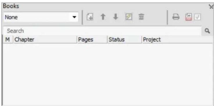
Callout Styles palette
The Callout Styles palette lets you work with callout styles. For more information, see "Working with callout styles."
Colors palette
The Colors palette lets you view and apply colors defined in the active project. The buttons at the top of this palette let you create, edit, and delete colors.
Users create colors through the Colors dialog box (Edit > Colors). For more information, see "Color, opacity, and drop shadows."

Conditional Styles palette
The Conditional Styles palette lets you work with conditional styles. For more information, see "Working with conditional styles."
Content palette
The Content palette provides access to items in the shared content library. From this palette, you can duplicate and synchronize that content across different layouts. The buttons at the top of this palette let you add, import, insert, edit, and control the synchronization of content.
Users can create shared items through the Shared Item Properties dialog box (Item > Share). For more information, see "Collaboration and single-sourcing."
Content Variables palette
The Content Variables palette provides access to content variables. From this palette, you can add, edit, and duplicate content variables. You can also search for content variables and convert existing content variables to text. This palette lists the predefined content variables and allows you to create new ones of various content variable types.
To highlight existing content variables, use the View > Highlight Content Variable menu item. Users can also insert, add and edit content variables using the Utilities > Content Variable menu item. For more information, see "Content variables."
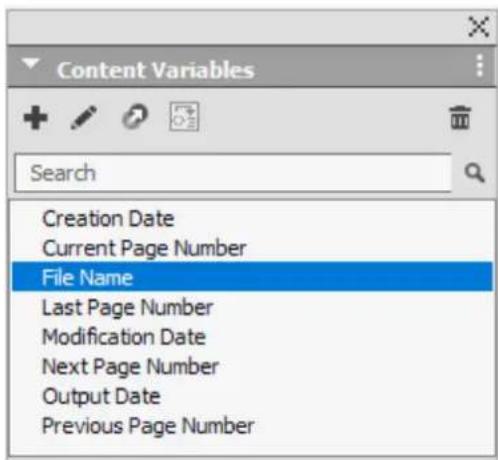
Flex Layout Blocks
The Flex Layout Blocks palette consists of ready made out of the box responsive components or mini layouts to quickly build your web publications.
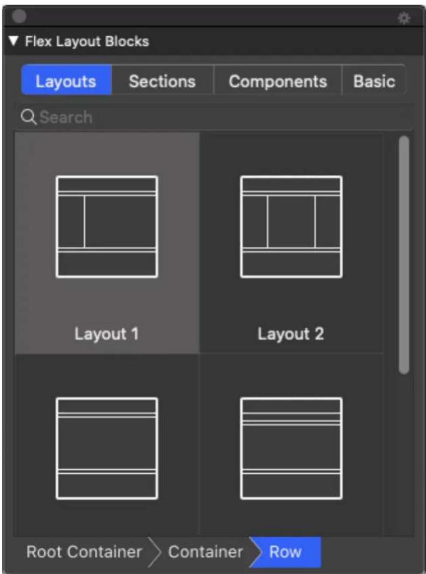
Flex Layout Blocks palette
Flex Object Browser palette
Flex Object Browser palette allows you to select and move around objects in nested containers with ease
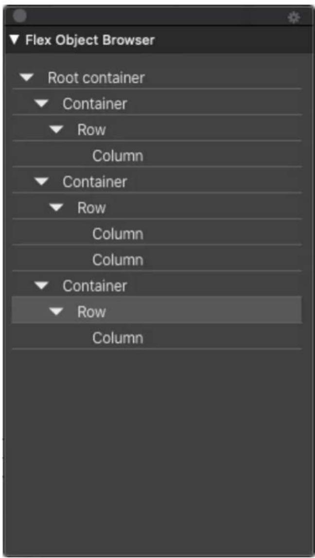
Flex Object Browser
Flex Page Builder palette
Flex Page Builder palette allows creation of Flex Layout quickly by its drag n drop pre-baked components. It has more than 100 different responsive components that you can use in your layouts.

Flex Page Builder
Footnote Styles palette
The Footnote Styles palette allows you to:
add, edit, delete and duplicate footnote styles.
insert new footnotes and endnotes or modify existing footnotes and endnotes using a custom Footnote/Endnote option/button.
change between different footnote/endnote styles by selecting the • footnote/endnote reference in the parent text and clicking on the desired style in the palette.
Users can also insert, add and edit footnote styles using the Edit > Footnote Styles menu item.
Users can also insert footnotes and switch between footnotes and the reference text using the Style > Footnotes/Endnotes menu item. For more information, see "Working with footnotes and endnotes."
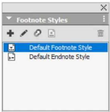
Glyphs palette
The Glyphs palette gives you easy access to every character in each font on your computer. You can display all characters in the selected font or narrow down the selection by choosing an option from the second drop-down menu. The selected characters Unicode value is visible at the bottom right. You can add characters to a story by double-clicking them. Using the Favorite Glyphs area at the bottom of the palette, you can store often-used characters for easy access.
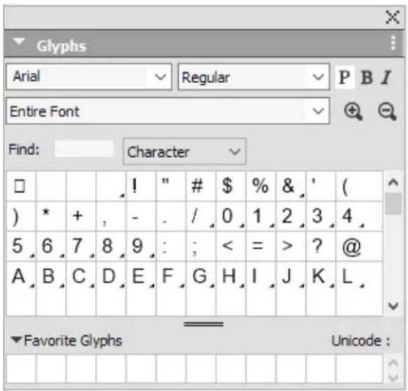
The Glyphs palette gives you easy access to every character in every font.
Gradients palette
The Gradients palette lets you define and apply multi-color gradients.
For more information, see "Creating gradients."
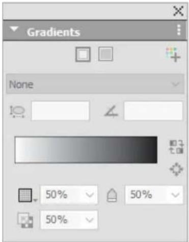
The Gradients palette lets you define and apply gradients.
Grid Styles palette
A grid style is a named package of settings that describe a grid — like a style sheet for a design grid. You can apply grid styles to text boxes and can use them as the basis for master page grids. You can also base grid styles on other grid styles. Grid styles are displayed in the Grid Styles palette (Window menu). For more information, see "Working with grid styles."

The Grid Styles palette lets you create and apply grid styles.
Guides palette
The Guides palette lets you work with guides. For more information, see "Using the Guides palette."
HTML5 Palette
The HTML5 palette lets you create and configure movies, slideshows, buttons, and more for Digital layouts. For more information on creating a Digital layout, see Digital Publishing with QuarkXPress.
Hyperlinks palette
The Hyperlinks palette lets you add and edit hyperlinks in your document. For more information, see "Hyperlinks."

The Hyperlinks palette allows you to work with hypelinks in your document.
Image Editing palette
The Image Editing palette lets you edit the raster image of an imported image in QuarkXPress. For more information, see "Editing the raster image."

The Image Editing palette.
Index palette
The Index palette lets you tag text for indexing. When you create an index, all of the tags you created with the Index palette are automatically turned into a customizable index. For more information, see "Working with indexes."
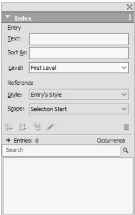
The Index palette lets you tag text for inclusion in an automatically generated index.
Item Styles palette
The Item Styles palette lets you work with item styles. For more information, see "Item Styles XTensions software."

The Item Styles palette
JavaScript palette
The JavaScript palette lets you run scripts. Some sample scripts are shipped with QuarkXPress, and you can create more.

The JavaScript palette
JavaScript Debugger palette
The JavaScript Debugger palette lets you debug scripts. Use the Console tab to write and test code. Many sample scripts also log messages in console to help you understand what changes were made.

The JavaScript Debugger palette
Layers palette
The Layers palette lets you create layers, edit layer properties, control whether those layers display and print, and move objects between layers. For more information, See "Working with layers."

The Layers palette lets you work with layers and the objects on those layers.
Lists palette
The Lists palette helps you view and generate lists. This feature is useful for creating things like tables of contents. You can create lists in the Lists dialog box (Edit > Lists).
The List Name drop-down menu lets you choose from among the lists defined in the active project and the Update button lets you refresh the list currently displayed in the palette.
The Find button enables you to locate items in the Lists palette. You can also navigate to a word or heading by simply double-clicking it in the palette.
The Build button lets you insert the active list into the active text chain. If the list already exists in the story, you can update it rather than inserting another copy. The Format As style sheets for the list are applied automatically.
The Lists palette lets you create things like tables of contents
Measurements palette
With the Measurements palette (Window menu), you can quickly edit many commonly used controls. Options in the Measurements palette change to reflect the selected tool or item. When you select multiple items of the same type (such as three separate picture boxes), the Measurements palette controls apply to all selected items.
→ Keyboard Increments allow you to use the keyboard arrow keys to increase/decrease the values in several fields in the Measurements palette. Using the Shift/Alt key in conjunction with the up/down arrow keys changes the amount the value is increased/decreased. See the chart in "Palettes."
(Mac OS X only) You have the option to make the Measurements palette 50% larger, perfect for smaller screens with high resolutions.
The Measurements palette displays a row of icons called the navigator tab above the center of the palette. You can cycle left-to-right through the Measurements palette navigator tab icons by pressing
Command+Option+;/Ctrl+Alt+;. You can move in reverse (right-to-left) by pressing Command+Option+;/Ctrl+Alt+,.
The selection of tabs displayed on the Measurements palette depends on which items are active, and the display of any tab changes to fit the item or items that are active. The available tabs are as follows:
- Home tab: Contains often-used controls. Displays differently for text boxes, picture boxes, lines, tables and group boxes.

Home tab
- Character tab: Contains controls allowing you to set the character attributes of the currently selected text.

Character tab
- Paragraph tab: Contains controls allowing you to set the paragraph attributes of the currently selected text box.

Paragraph tab
- Rules tab: Contains controls allowing you to set the rules attributes of the currently selected text box.

Rules tab
- Tabs tab: Contains controls allowing you to set up the tabs in the currently selected text box.

Tabs tab
- Text Box tab: Contains controls allowing you to set the text attributes of the currently selected text box. Displays differently for text boxes and text paths.

Text Box tab
- Picture Box tab: Contains controls allowing you to set the picture attributes of the currently selected picture box.

Picture Box tab
- Clipping tab: Contains controls allowing you to set the clipping attributes of the currently selected picture box.

Clipping tab
Border tab: Contains controls allowing you to set the border attributes of the currently selected box.

Border tab
- Runaround tab: Contains controls allowing you to set the runaround attributes of the currently selected object. Displays differently for text boxes, picture boxes, and lines.

Runaround tab
- Space/ Align tab: Contains controls from the Space/ Align submenu (Item > Space/Align).

Space/ Align tab
- Text Shading tab: Contains controls allowing you to set the text shading attributes of the currently selected text:

Text Shading tab
- Column Flow tab: Contains controls allowing you to set the column flow attributes of the currently selected text:

Column Flow tab
- Drop Shadow tab: Contains controls allowing you to set the drop shadow attributes of the currently selected object.

Drop Shadow tab
- Composition Zone tab: Contains controls allowing you to set the attributes for the currently selected composition zone.

Composition Zone tab
- Table tab: Contains controls allowing you to set the table attributes of the currently selected table.

Table tab
- Cell tab: Contains controls allowing you to set the table cell attributes of the currently selected table.

Cell tab
When you select a picture box that contains an image, the number next to the Effective Image Resolution icon in the Home tab of the Measurements palette displays the effective resolution of the image. The actual image resolution divided by the scale of the image equals the effective resolution. For example, if you import an image with an actual image resolution of 100 dpi and then increase the scale from 100% to 200%, the effective resolution is 50 dpi. The higher the effective resolution is, the higher the quality of the reproduced image will be. Note that if you select multiple picture boxes with varying effective resolutions, no number displays next to the Effective Image Resolution icon.
Vertical Measurement palette (macOS only)
You can toggle between horizontal and vertical orientations of the Measurements palette. Use the context menu to select the desired orientation, or click on the button to toggle between orientations.

All controls are grouped under titles that allow you to collapse and expand the groups. With this option, you can keep the most frequently used groups open and keep the remaining collapsed, to avoid having to scroll the palette when working on smaller/standard screens.
You can resize the palette in vertical orientation and the groups are wrapped, including the tab icons.

Full sized Measurement palette in vertical orientation

Re-sized Measurement palette in vertical orientation
Page Layout palette
The Page Layout palette provides a variety of features having to do with pages and navigation.
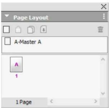
The Page Layout palette lets you work with master pages and layout pages.
The top portion of the palette lets you create, duplicate, and delete master pages. To view and edit a master page, double-click it; the master page displays in the active project window. A single-sided master page displays as a rectangle, while a facing-page master page displays with two folded corners.
The bottom portion of the palette lets you navigate through the pages in the active layout. To go to a layout page, double-click in this portion of the palette.
To apply a master page to a layout page, drag the master page icon onto the layout page icon. Alternatively, you can select the layout page icons in the palette and them Command-click/Ctrl-click the master page icon.
Profile Information palette
The Profile Information palette lets you view and update color management settings for pictures. For more information, see "Color management."

The Profile Information palette lets you precisely control color management settings for pictures.
Redline palette
The Redline palette allows you to setup the tracking of changes in your projects. For more information, see "Redline."

The Redline palette lets you work with tracking.
Scale palette
The Scale palette lets you perform advanced scaling operations. For more information, see "Scale XTensions software."
Style Sheets palette
The Style Sheets palette (Window > Style Sheets) enables you to apply character and paragraph style sheets by clicking style sheet names. The buttons at the top of each section of this palette let you create, edit, duplicate, update, and delete style sheets.
A plus sign next to a style sheet indicates that local formatting has been applied.

The Style Sheets palette lets you view and apply paragraph and character style sheets.
Table Styles palette
The Table Styles palette allows you to add, edit, and delete new table styles and consists of a preset area for predefined table styles.

The Table Styles palette
Text Shading Styles palette
The Text Shading Styles palette allows you to add, edit, and delete text shading styles.

The Text Shading Styles palette lets you create, view and apply text shading styles.
Tools palette
The Tools palette lets you easily switch between a wide variety of tools for working with layouts. For more information, see "Tools."
Palette groups and palette sets
QuarkXPress offers two features that help you to manage palettes: palette groups and palette sets.
Using palette groups
The Palette Groups feature lets you combine several palettes into one.

This palette group shows the Colors, Style Sheets and Text Shading Styles palettes attached as one, which economizes space while providing easy access to functions.
(Windows only) To attach a palette to a palette group, Control+click/right-click the title bar of a palette group and choose an unchecked palette name. When you attach a palette that is already displayed, the palette moves to become part of the palette group. To detach a palette from a palette group,
Control+click/right-click the palette name and choose Detach [palette name].
(Mac OS X only) To attach a palette to a palette group, click the icon in the top right of a palette and choose an unchecked palette name from the list. Palettes that are already displayed can also be dragged and merged into a palette group. When dragging, a thumbnail is shown indicating whether the palette will be merged or placed above. A blue line indicator is shown in the palette group to indicate the location the palette will be dropped.
(Mac OS X only) Docked palettes on screen edges form a palette group and can be moved as a group. Palette groups can be set to auto show/hide.
Using palette sets
The Palette Sets feature lets you store and recall the position and status of all open palettes and libraries, so that you can easily switch between different palette configurations.
To create a palette set, first display all of the palettes you will need for a particular task and hide all other palettes. Then choose Window > Palette Sets > Save Palette Set As to display the Save Palette Set As dialog box, enter a name, and optionally assign a key command.
To retrieve a palette set, choose Window > Palette Sets > [name of palette set] or press the keyboard combination for that palette set.
Layout controls
When you open a project, you have immediate access to some basic features at the bottom left of the project window.

Layout controls
1 Zoom: Enter a zoom percentage or choose a zoom value from the drop-down menu (the maximum zoom limit is 8000%).
2 Page Number: Enter a page number in the Page Number field or choose a page from the page list that displays when you click the upward facing arrow to the right of the field.
Previous Page: Navigate to the previous page. 3
Next Page: Navigate to the next page. 4
5 View Master Page: Switch back and forth between the active layout page and its master page.
6 Split Screen Horizontal: View the layout in two or more separate panes one above the other.
7 Split Screen Vertical: View the layout in two or more separate panes side by side.
8 Export: Display the same export options that are available when you choose File > Export.
9 Page Preview: Click the up arrow next to the Page Number field to see a thumbnail view of all of the pages in the layout. Mac OS X users can continue to click the up arrow to enlarge the thumbnails.
10 Preview HTML5 Publication: Click this icon to generate a preview of your content as an HTML5 Publication. You can choose to preview the current page, the current layout or the entire project. This allows you to preview your content in a browser, before actually exporting or uploading to the portal.
11 App Build Status: Click this icon to check the build status for the iOS or Android App you last published from QuarkXPress. You may also use the "App Build Status" menu option under the Utilities menu. Once complete, you may view the downloaded builds from the App Export dialog. This icon will change to an error icon, if the app fails for some reason, you may then click it to get more details.
Views and view sets
QuarkXPress gives you multiple ways to view your layouts. You can split a window or create a new window to show two different layouts, or two different views of the same layout. You can use Story Editor view to concentrate on text without having to look at the layout. And the View Sets feature lets you create and easily switch between different view options.
Splitting a window
By splitting a window into two or more panes, you can display multiple views of one project at the same time, and you can see changes in all panes simultaneously. You can even use different view modes in each pane, and see your edits in one pane and update in the other pane in real time. You can split multiple views horizontally or vertically within a window.

There are three ways to split a window:
- Choose Window > Split Window > Horizontal or Window > Split Window > Vertical.
- (Windows only) Click the split bar to the right of the scroll bar (for a vertical split) or at the top of the scroll bar (for a horizontal split).
Click the split-screen icons in the layout controls bar at the bottom of the project window.
Once a window has been split, you can change the width and height of the split by dragging the bars between the splits.
To remove splits from a window, use one of the following techniques:
Choose Window > Split Window > Remove All.
Click the close button in the top right corner of the window.
Creating a window
To create a new window that displays the active project, choose Window > New Window.
If you open multiple windows for a project, make changes to that project, and then begin closing the windows, the application will not prompt you to save the project until you attempt to close the last window that displays the project.
Using Story Editor view
Story Editor view lets you concentrate on the text of a story without the distraction of the layout. In Story Editor view, all text is the same size and the
same font, the text fills the entire window, and only the most basic character formatting (such as bold and italic) are displayed. A red background indicates where text has overflowed beyond the last text box or path in the story.
To display the contents of the active story in a new Story Editor window, select a box or line that contains the target story and choose View > Story Editor. (If a Story Editor window is already open, the selected item's story displays in that window.)
If you want to monitor the overall appearance of a page as you edit its text at an easy-to-view size, you can position a Story Editor window next to a layout window that shows the same story.

A story in layout view (left) and in a Story Editor window (right)
View sets
The View menu provides various options for how a layout displays. You can display or hide guides, grids, invisible characters, visual indicators, and more. (For more information, see "View menu.") The View Sets feature lets you store and recall different combinations of these settings. The settings that are stored in a view set are as follows:
View > Guides •
View > Page Grids
View > Text Box Grids
View > Rulers
View > Ruler Direction •
View > Visual Indicators
View > Invisibles •
View > Trim View
View > Hide Suppressed
View > Full Res Previews •
QuarkXPress ships with several default view sets:
- Default: This is the default set of view options that displays when you create your first layout after launching QuarkXPress for the first time.
- Output Preview: This view set simulates a printed page as closely as possible. Guides, grids, invisibles, and visual indicators are hidden. View > Trim View, View > Hide Suppressed is turned on. The pasteboard displays using the color you specify in the Display pane of the Preferences dialog box (QuarkXPress/Edit > Preferences).
- Authoring View: This view set displays guides, invisibles, visual indicators, and the ruler.
To create a view set, first turn on only the view options you want to store in that view set. Then choose View > View Sets > Save View Set As to display the Save View Set As dialog box, enter a name, and optionally assign a key command.
To switch to a view set, do one of the following things:
Choose View > View Sets > [name of view set].
Press the keyboard combination for the view set.
- Display the View Sets palette (View > View Sets > Manage View Sets), click the name of the view set in the palette, and then click Apply √ (or simply double-click the view set name).
To manage the view sets you have created, choose View > View Sets > Manage View Sets. The View Sets palette displays. You can use the buttons at the top of this palette to Edit ☐, Apply √, and Delete ☑ the selected view set.

View Sets palette
View sets are saved at the application level. However, any view settings you apply to a layout using view sets are saved with that layout.
Projects and Layouts
QuarkXPress files are referred to as projects, and each project contains one or more layouts. Every layout is stored within a project, and every project contains at least one layout. Each layout can contain as many as 2,000 pages, and can be as large as 224" x 224" in size (or 112" x 224" for a two-page spread). A project can contain an unlimited number of layouts.
Because multiple layouts can be stored in a single file, you can easily share content between different versions of a document — for example, a letter with identical text in US letter and A4 layout sizes.
A QuarkXPress project can contain two types of layouts: Print and Digital. You can use one project to create content for various media — such as print, PDF, ePub, native apps, Kindle books and HTML5 Publications.
Working with projects
To create a project, choose File > New > Project. The New Project dialog box displays.

New Project dialog box for Print layout type
Every QuarkXPress project contains at least one layout. Therefore, when you create a project, you must specify a default layout for the file. To indicate the media type of the default layout, choose Print or Digital from the Layout Type drop-down menu. You can further choose the Digital layout type, Fixed or Flex from the drop down menu.
For more information about Digital layouts, see Digital Publishing with QuarkXPress. For more information about Flex layouts, see Getting Started with Flex Layouts.
A project created in any language edition of QuarkXPress can be edited, printed, and saved in any other language edition of QuarkXPress. All available spell checking dictionaries and hyphenation rules are supported by every language edition.
Options for Print layouts
You can use the default layout name or enter a new name for the layout in the Layout Name field.
By default, tabs display at the top of the project window for each of the layouts in a project. To prevent these tabs from displaying, check Single Layout Mode. (You can still add layouts to a project, but this will turn off the Single Layout mode.)
The controls in the Page area let you set the page size and orientation for the default layout.
To use custom page sizes see the information in "Custom page size."
The Facing Pages check box lets you create spreads. In a project with a horizontal default story direction, the Allow Odd Pages On Left check box lets you control whether you can have odd pages on the left. In a project with a vertical default story direction, the Allow Odd Pages On Right check box lets you control whether you can have odd pages on the right.
The Automatic Text Box check box lets you add a text box to the default master page for the layout.
The Margin Guides controls let you set default margins for the layout, and the controls in the Column Guides area lets you create a multi-column page by default.
The Page Count allows you to specify the number of pages you want to initially create.
Layout Level Bleed
QuarkXPress now allows users to specify bleed while creating a print layout. One can choose between symmetric and asymmetric bleed; and also specify the
bleed values for the top, right, bottom, left or top, inside, bottom, outside edge, depending on whether the layout has facing pages or not respectively. At any given point users can customize these settings using the layout properties dialog. Please note that for existing documents the bleed settings will default to 0.
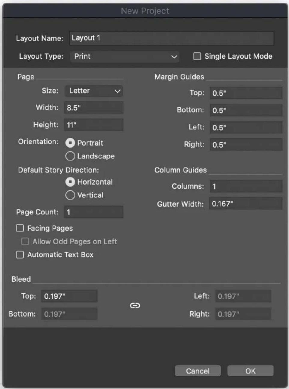


Not only this, while authoring the document a bleed guide will be displayed and the user can snap the items to this guide. The color of the bleed guide is also customizable via the bleed tab under layout preferences.

natural_image
Empty white rectangle with black border, no text or symbols present
Various output styles as well as output dialog have been extended to include a setting to specify whether the user wants to use layout level bleed settings while generating output or not. For all existing output styles, this setting will be Off by
default, and for any new output style that you create this setting will be On by default
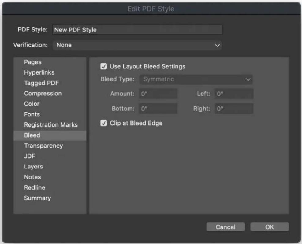

Creating a project from an IDML file
In QuarkXPress, the IDML Import feature offers the functionality to convert InDesign created IDML documents into QuarkXPress projects with all its assets like text, pictures, all items, style sheets, colors, blend modes, gradients, anchored items and many more.
To create a project from an existing IDML file:
- Choose New > Project from IDML

- Select the IDML file in the file system
The following objects and attributes will be ignored and not converted:
Underline Styles •
Digital layouts •
Tagged elements •
Track Changes •
Interactivity •
Image Advance Layers •
Callout Anchor
Notes
East Asian features •
Convert InDesign files to QuarkXPress Projects
Open Single InDesign Files in QuarkXPress
You can open IDML files through File menu > Open Dialog in QuarkXPress and also open INDD files through File menu > Open Dialog in QuarkXPress.
Bulk Conversion of InDesign Files to QuarkXPress Projects
You can convert your InDesign files (both IDML and INDD) seamlessly to QuarkXPress projects. There are multiple options to automatically search InDesign files by running a Smart Scan for Bulk conversion or you can Browse individual files for conversion. You can also select/deselect individual files for conversion.
How it Works?
The Convert InDesign files dialog will appear automatically after a fresh 1 QuarkXPress installation. Alternatively, users can also invoke the Convert InDesign files dialog from the Help menu > Convert InDesign Files.

Convert InDesign files dialog will appear and user needs to select the option 2 to convert files. User needs to click on Run Smart Scan or Manually Select files.
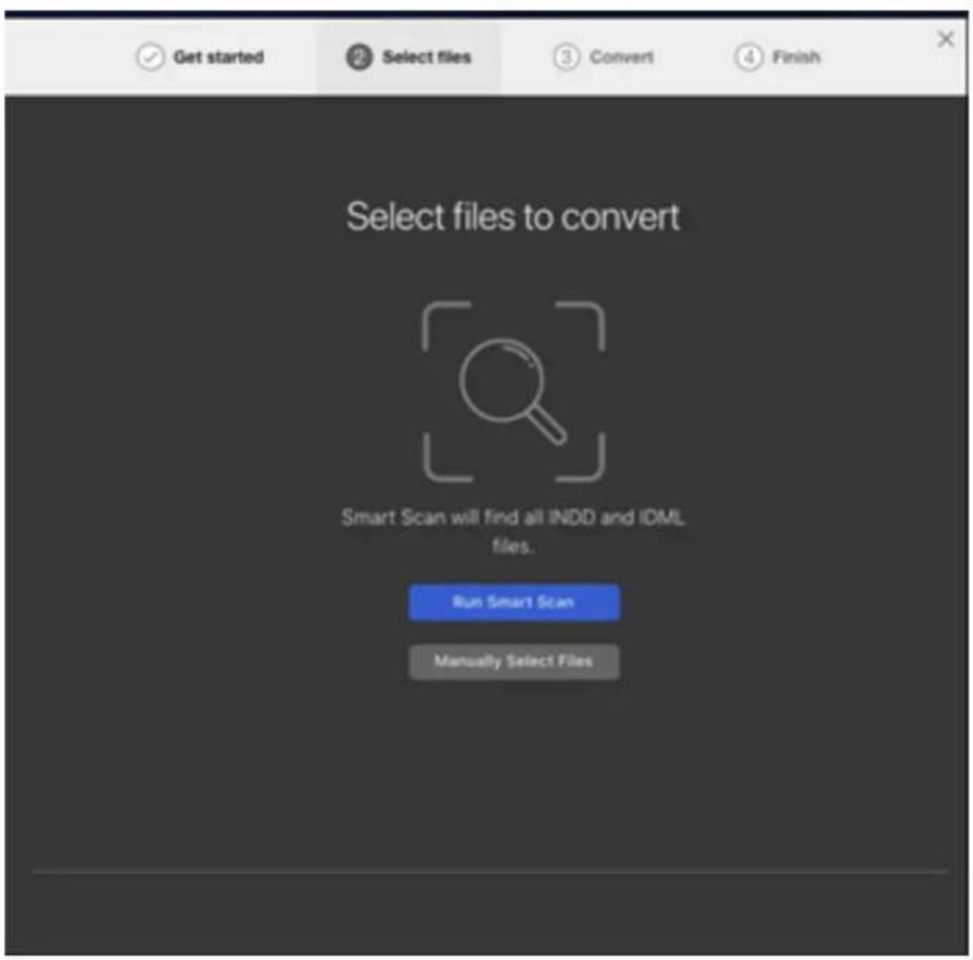
After the scan, all the INDD & IDML files will display and the user can select 3 all files or select only a few for conversion before clicking on Convert Selected button.
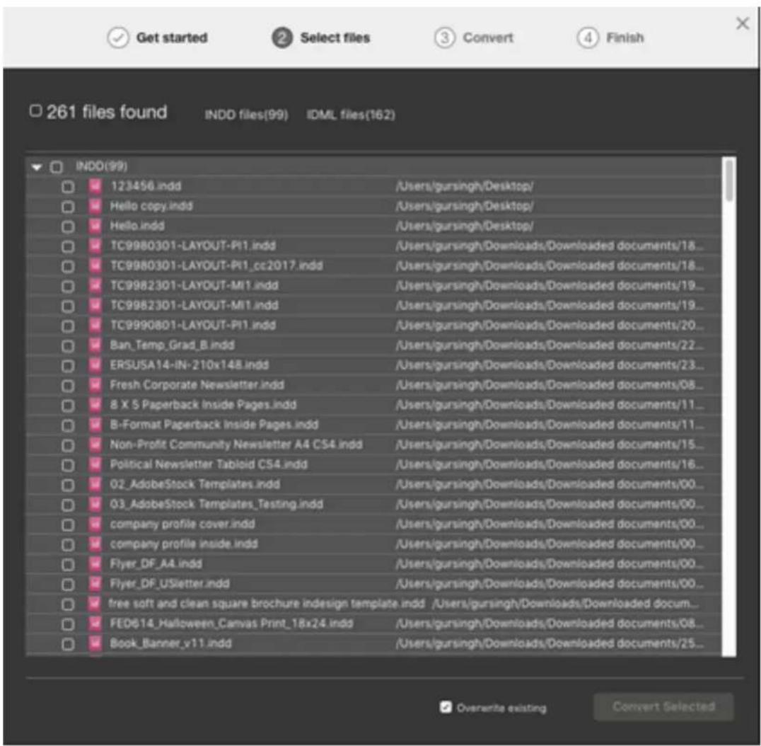
4 After clicking on Convert Selected button, an alert 'Some files require Adobe InDesign to be launched. Please ensure that Adobe InDesign is not used while this process is running' will be displayed.

The results will be displayed at end of the conversion process. A user can 5 navigate to the destination folder by clicking on the converted QuarkXPress files in this dialog.

Note:
To convert InDesign (INDD) files, a copy of InDesign should be installed on a customer machine.
Table Styles Enhancement in IDML Import
All the applied table styles and local formatting can be imported properly during IDML Import in the QuarkXPress project.
Properties applied through table style will be mapped in Table styles with the same name into QuarkXPress.
Cell style applied independently in InDesign mapped as locally.
Current Limitations/Defects
Some continued or long table's content might be displayed overflown.
Some features in InDesign for Row, Stroke, Fill (Skip First, Skip Last, Alternate • Row & Column) are not mapped.
IDML integration with Bleed
In QuarkXPress 2022, there is an ability to include layout level bleed in IDML while importing the IDML into QuarkXPress document.
This will consist of setting the bleed values and asymmetric and symmetric bleed. If all four values are the same, it will be treated as symmetric; otherwise, it will be treated as asymmetric.
Please note that there is no UI for this enhancement.
Saving and naming a QuarkXPress project
When you save a QuarkXPress project for the first time, the Save As dialog box displays. Use this dialog box to specify a project name, location, and type.
When you save a QuarkXPress project, you can choose an option from the Type/Save as type drop-down menu:
Choose Project to save a project that you can modify.
- Choose Project Template to save a read-only version of the project.
Exporting layouts and projects
To export one or more layouts in the active project, choose File > Save a copy As/Downsave. Enter a name in the File name field and choose a type and version in the Save as Type and Version fields.
To export all the layouts in a project, check Select All in the Layouts area. To export individual layouts, check them in this area.
To export selected layouts that you can open in an earlier version of QuarkXPress, choose the earlier version number from the Version drop-down menu.
Custom page size
If you use a specific custom page size on a regular basis, you can define this page size and add it to the Page Size drop-down menu in the New Project dialog. These custom page sizes can be used for Print and eBook layouts.
To create a custom page size:
1 Choose File > New > Project. The New Project dialog box displays.
2 Choose either Print or Digital from the Layout Type drop-down menu.

3 Choose New from the Page Size: drop-down menu. The Custom Page Size dialog box displays.
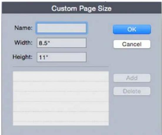
4 Fill in a Name for the new custom page size, and define the Width and Height. The orientation will be assigned automatically, depending on the values input for Width and Height.
To create multiple custom page sizes, click Add. The new custom page size will appear in the list and you will be able to create another. To delete a
custom page size, select it from the list and click Delete. To edit a custom page size, select it from the list and redefine the Width and Height fields.
Click OK. 5
Any custom page sizes you create will appear in the Page Size drop-down menu in the New Project and the New Layout dialog boxes and can be selected when creating new Print and Digital layouts, however, custom page sizes defined for Print layouts can only be used selected when creating new Print layouts, and custom page sizes defined for Digital layouts can only be used selected when creating new Digital layouts. The custom page sizes will be removed when your preferences are deleted and new preferences created.
→ Custom page sizes can also be created using the New Layout dialog. (Layout > New).
Working with layouts
It's easy to navigate between layouts, add layouts, duplicate layouts, and delete layouts.
By default, tabs display at the top of the project window for each of the layouts in a project. On Mac OS X only, you can change the order of layouts displayed in the layout tab by dragging and dropping the layout name tabs. This setting is saved with the document and the order is maintained.
To navigate between layouts, use the tabs at the top of the project window.
To add a layout to the active project, choose Layout > New or click a layout tab and choose New from its context menu.
To duplicate a layout, display the layout you want to duplicate, then choose Layout > Duplicate or choose Duplicate from the Layout tab context menu. User can duplicate a Print layout into a Digital layout or a Digital layout into a Print layout, by choosing Digital or Print as the layout type. (For more information, see Digital Publishing with QuarkXPress.)
To change a layout's properties, display the layout, then choose Layout > Layout Properties or choose Layout Properties from the Layout tab context menu. The Layout Properties dialog box displays. You can use this dialog box to change limited layout properties based on the layout type, but you cannot change a layout to or from a Digital layout type. (For more information, see Digital Publishing with QuarkXPress.)
To delete a layout, display the layout, then choose Layout > Delete or choose Delete from the Layout tab context menu.
When you use the following commands, only the active layout is included in the resulting output:
File > Export As > PDF
File > Export As > EPS •
File > Export As > JPEG/PNG/TIFF
File > Export As > HTML5 Publications •
File > Export As > iOS App •
File > Export As > Android App •
File > Export As > ePub
File > Export As > Kindle •
File > Export As > Article •
→ Layers apply to the layout that is active when you create and edit them.
When you perform a project-level action (Edit > Undo), the action is added to the Undo History in all layouts.
→ When you check spelling (Utilities menu), QuarkXPress checks only the active layout.
Project-level and layout-level resources
Some resources are defined at the project level, and others are defined at the layout level.
Project-level resources
Project-level resources can be used by every layout in the project, and they are the same in every layout where they are used. Project-level resources include application preferences, style sheets, colors, H&Js, lists, and dashes and stripes.
Although every list definition you create can be used in any layout in the project, a list only draws from the active layout when you build it.
Layout-level resources
Layout-level resources can be unique for every layout in the project. Layout-level resources include the following:
- Layout preferences (QuarkXPress/Edit > Preferences > Layout)
Kerning settings •
Tracking settings •
Hyphenation exceptions •
Zoom values •
Adaptive scaling
This section describes the Apply Adaptive Scaling option available in the Duplicate Layout, and Layout Properties dialogs.
This option is only available in the Layout Properties dialog for Print layouts. This feature allows users to scale items based on a configurable set of rules, to get an almost "ready to use" layout in the new size.
1 To apply adaptive scaling when duplicating a layout, choose Layout > Duplicate. The Duplicate Layout dialog displays.

To apply adaptive scaling to the active Print layout, choose Layout > Layout Properties. The Layout Properties dialog displays.

Check Apply Adaptive Scaling. 2
3 Click Options to configure the rules for scaling items on the layout. The Adaptive Scaling dialog displays.
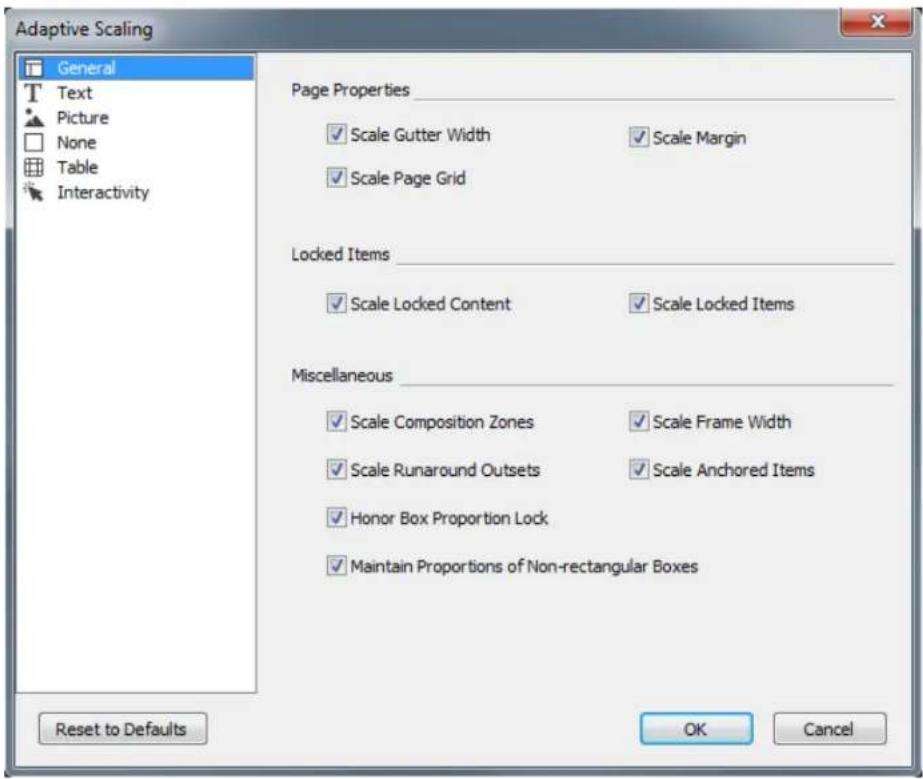
Use the dialog to configure the rules for scaling the items on the layout. The 4 Adaptive Scaling dialog allows you to configure rules for the page properties, locked items, text, pictures, boxes, lines, tables, and any interactivity items that may exist on the layout.
Click OK. 5
It is recommended that you create a copy of your file, before using adaptive scaling, especially if you have checked the Synchronize Box Attributes & Content option on the Text, Picture, and None tabs of the Adaptive Scaling dialog. This option affects the source layout, and the sharing cannot be undone. It adds numerous items to the Contents palette.
Large Pasteboard size
In QuarkXPress 2022, individuals can increase/decrease pasteboard height (vertical) too. In the previous versions, the pasteboard height (vertical) was fixed at 0.5" and users could adjust (increase/decrease) pasteboard width (horizontal) only.
Project-level UI preference is available for modifying pasteboard height and it applies to all project layouts.
This pasteboard height preference can be defined both at the application level (without any projects open) or at the project level (for individual projects). This preference gets saved with a project. On opening a saved project, the pasteboard height preference is initialized from the project.
Similarly, if the user decreases the pasteboard size in preferences, the same will be reflected in the layout. But while reducing pasteboard size, if there is an item beyond the current pasteboard size, then pasteboard will be decreased to the item's bottom edge so that no item is lost.

Large Pasteboard Preferences
Layout Bleed is also incorporated with the large pasteboard size and the bleed values will be honoured along with the pasteboard length.
The default value for min and max is set to 0.5" and 106.5" as per the Letter size layout. Whenever the specified pasteboard length exceeds the max spread height, max possible height will be used (i.e., Page Height + Bleed + Pasteboard length should not exceed 225").
If a user downsaves the project to the previous version i.e. QuarkXPress 2020 then the pasteboard height will be adjusted to 0.5" however if there is an item on the current pasteboard which is beyond pasteboard height of the downsaved project i.e. 0.5", then pasteboard will be decreased to the item's bottom edge so that no item is lost and user can able to drag it using the bottom edge. The same behavior works when we decrease pasteboard height in QuarkXPress's current version.
Guides and spread guides retain their positions relative to the page origin or coordinates if pasteboard height is changed (increased or decreased).
Working with Guides
Guides are nonprinting guidelines that help you to line up items and text in a layout. There are three types of guides: Ruler guides, column and margin guides and Dynamic guides.
Design grids are nonprinting guidelines that you can use to align items and text according to text size and position.
For more information, see "Understanding design grids."
Column and margin guides
Column and margin guides show where a page's outside margins are and where columns (if any) should be placed.
QuarkXPress automatically places column guides and margin guides in all new Print layouts. You can specify their position in the Column Guides and Margin Guides fields in the New Project dialog box (File > New > Project) or in the New Layout dialog box (Layout > New).
When a master page is displayed in the project window, you can use the Master Guides & Grid dialog box (Page > Master Guides & Grid) to change the placement of column guides and margin guides. If you check Automatic Text Box in the New Project dialog box (File > New > Project) or the New Layout dialog box (Layout > New), the values you specify in the Margin Guides area define the size and placement of the automatic text box.
For information about creating column and margin guides, see "Configuring a master page grid."
For more information, see "Guide Manager Pro."
Ruler guides
Ruler guides (or simply "guides") are nonprinting guidelines that you can position manually. You can create ruler guides by dragging them off the horizontal and vertical rulers (View > Rulers). You can create ruler guides on master pages and on individual layout pages.
To create a horizontal ruler guide, click the top ruler; when the pointer displays, drag the ruler guide into position on the page. To create a vertical ruler guide, click the vertical ruler, and then drag the ruler guide onto the page when the pointer displays. If the Measurements palette is open when you drag a ruler guide, the guide's position is indicated in the X field (for vertical ruler guides) or the Y field (for horizontal ruler guides).
If, as you create a horizontal ruler guide, you release the mouse button when the ruler guide is positioned over the pasteboard, the ruler guide will extend across the pasteboard and all the pages in the spread. If you release the mouse button when the horizontal ruler guide is positioned over a document page, the ruler guide will display only on that page.
To reposition a ruler guide, click it, and then drag it to a different location • when the guide pointer displays. You can also double-click the ruler guide with the Item tool selected and enter a new location into the Guide Manager Pro dialog box.
To remove a ruler guide, drag the guide off the page.
To remove all ruler guides from a page, scroll until a portion of the page • displays, then press Option/Alt and drag the guide back on to the ruler.
To remove all ruler guides from a spread's pasteboard, scroll until a portion of the pasteboard displays, then press Option/Alt and click a portion of the ruler.
See also "Guide Manager Pro."
Snapping to guides
QuarkXPress lets you create a "magnetic field" around guides so that when you drag an item close to a guide, it automatically aligns with it. This feature is called Snap to Guides (View menu) and the width of the magnetic field is called the Snap Distance.
To control snapping with QuarkXPress controls, make sure View > Snap to Guides is checked. To specify the distance, choose QuarkXPress/Edit > Preferences > Print Layout > Guides & Grid and enter a pixel value in the Snap Distance field.
You can also choose View > Snap to Page Grids to force items to align with the master page grid. The value in the Snap Distance field applies to master page grids as well. For more information, see "Snapping items to design grids."
Dynamic Guides
Dynamic Guides are nonprinting temporary guides that appear when you create or manipulate items on a page. They help you align items relative to other items and to the page in a layout. You can specify the type of dynamic guides and the feedback that appears.
When you create, transform or move an item, Dynamic Guides automatically appear to assist in positioning the new item relative to an existing item or to the page.
Choose View > Dynamic Guides > Show/Hide Dynamic Guides to turn guides on or off.
You can change when and how Dynamic Guides appear by using the View > Dynamic Guides sub-menu to select the following options:
- Select Align to Center of Item to display guide lines that are generated when the center of items are aligned with the center and/or edges of other items. These are generated when you create and move items.
- Select Align to Edges of Item to display guide lines that are generated when the edges of items are aligned with the edges of other items. These are generated when you create and move items.
- Select Align to Center of Page to display guide lines that are generated when the edges or center of items are aligned with the center of the page. These are generated when you create and move items.
- Select Show Equal Dimensions to display guide lines that are generated when the dimensions of items are equal to the dimensions of other items. These are generated when you create and resize items.
- Select Show Equal Spacing to display guide lines that are generated when the horizontal and/or vertical distance between items is equal to the distance between other items on the page. These are generated when you create and move items.
- Select Show Measurements for Dimensions/Spacing) to display the value of the dimensions when Show Equal Dimensions is selected and the value of the spacing when Show Equal Spacing is selected.
This option is only available when Show Equal Dimensions or Show Equal Spacing is selected.
→ Dynamic Guides are on and all options selected by default.
When Align to Center of Item and Align to Edges of Item are selected, guides are generated not only when the center and edges of other text boxes are aligned, but will also appear when the center and edges of columns within the surrounding text boxes are aligned.
In Windows, use the Dynamic Guides Color pane of the Preferences dialog box to specify a color for each type of dynamic guide. See "Preferences - Application - Dynamic Guides Color." In Mac OS X you set the color for the dynamic guides using the Color Theme pane of the Preferences dialog box. See "Preferences - Application - Color Theme."
Undoing and redoing actions
The Undo command (Edit menu) reverses the last action performed on an item. For example, if you accidentally cut a picture box, the Undo command will bring the picture box back into the layout from the Clipboard. The Redo command (Edit menu) lets you reimplement an action you had undone.
Choose Edit > Undo (Command+Z/Ctrl+Z) to reverse the last action performed. The menu item identifies the specific action that can be undone. For example, the Undo Deletion command is available in the Edit menu after you have used the Item > Delete command. Undo displays as gray text when the Undo feature is unavailable.
To reimplement the action, choose Edit > Redo (Command+Shift+Z/Ctrl+Y) after you undo an action.
Native QuarkXPress Objects
QuarkXPress allows you to convert items from other application such as Excel, Illustrator, PowerPoint and InDesign, as well as PDFs, Illustrator, WMF and EPS files to native QuarkXPress objects.
This allows you to:
Convert and edit vector data (like logos, etc) from supported file formats that include AI, WMF, EPS and PDF.
Convert editable PDFs, update content and republish as PDF or other formats that are supported in QuarkXPress.
Extract colors and typography from PDF's to use in QuarkXPress.
Embed or create linked images while converting to native QuarkXPress objects.
You can get native QuarkXPress objects in the following ways:
- Convert existing items Convert files that have been imported into your document to native QuarkXPress objects.
- Import items Copy items and then paste them as native QuarkXPress objects.
This results in fully editable Bezier version of vector graphics and editable text. Colors and font information are automatically extracted. Images can be either embedded in the project or linked to the current project.
Convert an existing item to a native QuarkXPress object
To convert existing items to native QuarkXPress objects:
1 Right click on the object and choose Convert To Native Objects from the context menu (or choose Style > Convert to Native Objects). The Convert to Native Objects dialog displays.

The image you are attempting to convert must have vector or text components in it. The Convert to Native Objects feature is not supported for Raster only images.
2 Check Retain Source Picture Box to compare the converted objects with the imported source image.
3 Check Ignore Soft Masks to exclude the conversion of soft masks from the source image.
4 Check Ignore Transparent Blend Modes to ignore transparent blends applied to the source image.
5 Check Ignore Profile from Source Colors and the profile embedded with that image in the source file will be ignored. It will be mapped to the QuarkXPress generic profile instead.
6 Check Link Raster Images to save raster images from PDF to the disk as PDF images. For saved projects, the linked images are saved in a folder with the project name added with the image number appended. For unsaved projects it will be created in the temp folder of the OS.
Click OK. 7
Import an object as a native QuarkXPress object
To import an item as a native QuarkXPress object:
Copy the object from its application to the clipboard 1
Right click in your project where you want to place the object and choose 2 Paste as Native Objects from the context menu (or Edit > Paste as Native Objects). The Paste as Native Objects dialog displays.
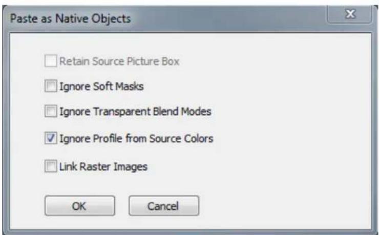
To skip the dialog, hold down the Option key (Mac OS X) or the Alt key (Windows) when choosing Paste as Native Objects from the context menu.
The options you select in this dialog persist and will be used if you choose to suppress the dialog.
3 Check Ignore Soft Masks to exclude the conversion of soft masks from the source image.
4 Check Ignore Transparent Blend Modes to ignore transparent blends applied to the source image.
5 Check Ignore Profile from Source Colors and the profile embedded with that image in the source file will be ignored. It will be mapped to the QuarkXPress generic profile instead.
6 Check Link Raster Images to save and link to the converting project of the raster images from the source PDF for saved projects. For unsaved projects it will be created in the temp folder of the OS..
Click OK. 7
The item is pasted into your project as a native QuarkXPress object.
If the item contains fonts not installed on your system, an alert will display. You can list the fonts not available on your system and optionally, replace them at this time.
Content Variables
A content variable is an item you insert in your document that varies according to the context. For example, the Last Page Number variable displays the page number of the last page of the document. If you add or remove pages, the variable is updated accordingly.
Content variables will line wrap and break just like text, including hyphenating when appropriate.
The text within a content variable is searchable using the Find/Change palette. If the text you are searching for is contained within a content variable, the entire variable will be highlighted.
To highlight all content variables in the current project, choose View > Highlight Content Variables.
QuarkXPress includes the following preset content variables that you can insert in your document:
Creation Date •
Current Page Number •
File Name •
Last Page Number •
Modification Date •
Next Page Number •
Output Date •
Previous Page Number •
You can edit the format of these variables, or you can create your own.
In addition to the set of pre-defined variables, you can create the following additional text type variables:
Custom Variable: You can combine a text string with other pre-defined variables to make a combination.
Running Header: This variable type allows you to choose source data within the document by referring to a paragraph or character style sheet. This variable type can be applied in the master page so that the running headers are automatically updated. For example, a left side page can have book title and on right side page can have Chapter/Section title.
Page Reference: This variable is used to create a reference to an existing • layout object using the existing Anchors feature, and allows you to refer to
that object elsewhere in the document, including the page number for the referred to object.
Static Text: With this you can create a simple static text variable that can be • inserted throughout the document. For example, if you want to refer to a company name across a document consistently and want to make any changes to it in one go, this variable can be useful.
Edit content variables
To edit content variables, choose Window > Content Variables to display the Content Variables palette. The buttons at the top of this palette let you add, edit and duplicate content variables. Choose an existing content variable and click the button to edit it, or click the button to add a new content variable.
The Edit Content Variable dialog displays.
If you are adding a new content variable, you can also display this dialog by choosing Utilities > Content Variable and selecting New from the drop-down menu.
Enter a name in the Name field. If you are adding a new content variable or duplicating an existing content variable, select the content variable Type from the drop-down menu. Specify the attributes for your content variable, these will vary depending on the type of content variable you are editing:
Creation Date: Creation Date inserts the date or time the document was first saved. You can insert text before and after the date, and you can modify the date format for all date variables using the drop-down menus.
Current Page Number: This variable inserts the current page number of the current project into the document.
- Custom Variable: See "Create a custom content variable" for more information.
File Name: This variable inserts the name of the current file into the • document. Select Include Extension to include the file name extension. The File Name variable is updated whenever you save the file with a new name or to a new location. The extension does not appear in the document until it is saved.
Flow Box Page Number: This variable inserts the page number where the current box continues (or where the current box is continuing from) if the current box spans multiple pages that may not be contiguous. From the Context drop-down menu, choose either Next Box or Previous Box to specify whether to insert the page number where this box continues or where it is continuing from.
Last Page Number: This variable inserts the last page number of the current project into the document. The Last Page Number type is useful for adding the total number of pages in a document to headers and footers using the common Page 3 of 12 format. In this case, the number 12 is generated by the Last Page Number, and is updated whenever pages are added or removed. From the Scope drop-down menu, choose an option to determine whether the last page number in the section or layout is used.
Modification Date: Modification Date inserts the date or time the document was last saved. You can insert text before and after the date, and you can modify the date format for all date variables using the drop-down menus.
Next Page Number: This variable inserts the next page number of the current project into the document. From the Scope drop-down menu, choose an option to determine whether the next page number in the section or layout is used.
Output Date: Output Date inserts the date or time the document was printed • or exported. You can insert text before and after the date, and you can modify the date format for all date variables using the drop-down menus.
Page Reference: You can insert text before and after the page reference • variable. Select an Anchor Name from the drop-down menu. Select Create Hyperlink to create a hyperlink in the text.
Previous Page Number: This variable inserts the previous page number of the current project. From the Scope drop-down menu, choose an option to determine whether the previous page number in the section or layout is used.
Running Header: Choose the source style sheet to display in your header and then choose whether you want to display the first occurrence on the page, the last occurrence on the page, the first occurrence on the spread or the last occurrence on the spread.
Static Text: Type in the text you want to appear when inserting this content • variable.
When you're done, click OK.
After you have added or updated a content variable, it will be listed in the Utilities > Content Variable drop-down menu and also in the Content Variables palette (Window > Content Variables). The new variable will be available when you attempt to insert a content variable into the text.
Create a custom content variable
In addition to the existing preset content variables offered by QuarkXPress, you can also create custom content variables to use in your projects. Custom
variables are great if you want to use text content somewhere within a text story and the same content in a different story or at a different place. When you change the content of the custom variable, it is changed everywhere where used.
To create a custom content variable:
Place the insertion point where you want the variable to appear. 1
2 Select Utilities > Content Variable and choose New from the drop-down menu.
The Edit Content Variable dialog displays.
Enter a name in the Name field. 3
4 Choose Custom Variable from the Type drop-down menu.

5 You can choose to insert a Text String or a Text Variable when using this custom content variable.
If creating a custom variable that inserts a text string, type in the text you want to appear when inserting this content variable. Click the plus symbol to add more lines to the text.
If creating a custom variable that inserts a text variable, select the text • variable you want from the drop-down menu. You can combine 2 or more text variables by clicking the plus symbol to add another.

Click OK. 6
After you have added a custom content variable, it will be listed in the Utilities > Content Variable drop-down menu and also in the Content Variables palette (Window > Content Variables). The new variable will be available when you attempt to insert a content variable into the text.
Insert a content variable
To insert a content variable in your project:
Place the insertion point where you want the variable to appear. 1
2 Select Utilities > Content Variable and choose the variable you want to insert from the drop-down menu.
The variable appears on the page as if you'd typed it in the document.
→ Content variables can be inserted into lists and indexes.
Boxes, Lines, and Tables
To create a successful page layout, you need an orderly way to arrange text and pictures — you need boxes. Boxes are items that can contain text or pictures; they can even be created to contain no content at all, perhaps to create colorful design elements on a page. Box boundaries give text and pictures a specific shape, size, and placement on a page.
Understanding items and content
QuarkXPress works on the concept of items (containers) and content (things that go inside of items).
Items are the building blocks of a page layout. The Item tool ✦ lets you do things like move, resize, rotate, reshape, cut, copy, and paste items.
The basic types of items are as follows:
- Boxes, including text boxes, picture boxes, and no-content boxes. Boxes can come in a variety of shapes, such as rectangular, round, and Bézier.
- Lines, including "plain" lines and text paths (which can include text). Lines, too, can be straight or Bézier.
- Groups, which are sets of items that have been "glued" together so that they act like a single item.
Tables, which can contain both text and pictures.
Content is, basically, text and pictures. To create a layout, you will typically draw some text boxes and picture boxes, and then insert text and pictures into those boxes.
Because items and content are different, you use separate tools for manipulating each:
- The Text Content tool 📞 lets you create rectangular text boxes and format text in text boxes or on text paths. You can also use the Text Content tool to cut, copy, and paste text.
- The Picture Content tool 📋 lets you create rectangular picture boxes and manipulate pictures in picture boxes. You can also use the Picture Content tool to cut, copy, and paste pictures.
Understanding handles
The bounding boxes of selected text paths, lines, and boxes have small white squares called item handles. You can use these handles to resize and rotate a selected item.
Item handles
To resize an item, click and drag its item handles. To rotate an item, click and drag just outside one of the item's corner handles. The mouse pointer changes when you move it over or near a handle to indicate which action you can perform:
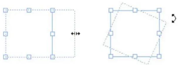
flowchart
graph TD
    A["Square with internal connections"] --> B["Hexagon with internal connections"]
    style A fill:#f9f,stroke:#333
    style B fill:#bbf,stroke:#333
You can use item handles to resize or rotate an item.
Picture handles
When you select the Picture Content tool and click a picture box that contains a picture, the picture displays with large circles for handles. These handles are called picture content handles. When you click any part of the picture overlay, you can use the Move pointer to move the picture within its box.

natural_image
Close-up photo of a gray tabby cat with green eyes and white whiskers, partially obscured by a white cat face (no text or symbols visible)Picture box displaying picture content handles
Picture content handles display even if the selected picture exceeds the size of its box (see illustration above). The picture displays beyond the box boundary. You can crop the image by resizing the picture box.
You can use picture content handles to resize or rotate a picture without changing the size or angle of its picture box.
Resize pointers:
Rotation pointers:
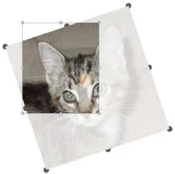
natural_image
Close-up photo of a gray tabby cat with green eyes and white whiskers, framed within a diamond border (no text or symbols)Rotated picture in an unrotated box
If you want to move a picture box or see what its crop looks like without the transparent overlay, press the Command/Ctrl key. This temporarily dismisses the overlay and allows you to interact with the box as if the Item tool were selected.
If you click and drag with the Picture Content tool when the mouse pointer is positioned over a spot where a picture box handle and picture content handle overlap, only the picture is resized or rotated. If you want to move the item handle, select the Item tool.
Understanding Bézier shapes
Before reshaping Bézier boxes and lines, make sure you understand the following definitions.
Point: A point connects line segments and defines where line segments start and end. Points connecting curved line segments have curve handles that control the shape of the curves. QuarkXPress offers three types of points: Corner, smooth, and symmetrical.
Corner point: A corner point connects two straight lines, a straight line and a curved line, or two noncontinuous curved lines. With curved lines, the corner point's curve handles can be manipulated independently, usually to form a sharp transition between the two segments:
$$ \Lambda \Lambda R $$
Examples of corner points
Smooth point: A smooth point connects two curved lines to form a continuous curve. The curve handles always rest on a straight line through the point, but they can be distanced independently:

natural_image
Simple curved line diagram with a blue arrowhead, no text or symbols presentA smooth point
Symmetrical point: A symmetrical point connects two curved lines to form a continuous curve. The result is similar to a smooth point, but the curve handles are always equidistant from the point:

natural_image
Simple curved line diagram with two endpoints and a connecting line (no text or symbols)A symmetrical point
Curve handles: Curve handles extend from either side of a point and control a curve's shape:

natural_image
Abstract line drawing with two intersecting lines and a curved base (no text or symbols)Curve handles (upper left)
Line segments: Line segments are straight or curved line sections positioned between two points:
natural_image
Two curved lines on a white background, no text or symbols presentLine segments
When the Select Point tool is positioned over an active Bézier box or line, various pointers display indicating whether you can select a point, the curve handles, or a line segment. Click and drag using the pointers to reshape the Bézier box or line.
- To change the shape entirely, choose a different option from the Item > Shape submenu.
- To add a point to a Bézier box while working with the Bézier Pen tool, click a line segment. Alternatively, you can use the Add Point tool
- To remove a point from a Bézier box while working with the Bézier Pen tool, click the point. Alternatively, you can use the Remove Point tool.
- To convert a point to another type of point while working with the Bézier Pen tool, Option+click/Alt+click the point. Alternatively, you can use the Convert Point tool
To move a point or change the shape of a line segment while working with the Bézier Pen tool, Command+drag/Ctrl+drag the point or line segment.
To select curves or points so that you can move them or delete them, use the Select Point tool Press Shift and click to select multiple points. Option+click/Alt+click a point to make it symmetrical.
To pan the layout while a Pen tool is selected, press Shift+Space and then click and drag.
Drop Shadows
With Drop Shadows, you can apply automatic feathered drop shadows to items and text in a layout.
To apply drop shadow effects to active items, use the Drop Shadow tab of the Measurements palette. The options are as follows:
- Angle field: Enter a value between 180^ and -180^ in .001 increments to specify the angle of the "light source" causing the drop shadow.
- Synchronize Angle check box: Check this to synchronize the angle with other drop shadows in the layout for which this feature is checked. Changing the Angle value of any drop shadows for which Synchronize Angle is checked will affect all of the drop shadows for which the box is checked.
- Distance field: Enter an offset value for the item; the drop shadow offset is measured from the upper left corner of the item's bounding box.
- Scale field: Enter a value from 0 to 1,000% to specify the size of the drop shadow in relation to the original item.
- Blur field: Enter a value to specify how blurry the edges of the drop shadow are, with higher values creating fuzzier edges.
- Skew field: Enter a value between -75^ and 75^ to slant the drop shadow at a certain angle.
- Color, Shade, and Opacity: Choose a color from the drop-down menu and enter values in the fields to specify color, shade, and opacity of the drop shadow.
-
Multiply Drop Shadow: This setting controls how the shadow is combined with its background. When this box is checked, the shadow color is combined with the background color or colors using a "multiply" blending mode, producing a darker result (similar to an overprint). When this box is unchecked, the color of the background is combined with the color of the shadow to create the intermediate shades you see on screen. In general, this box should be checked when the shadow is black (regardless of shade or opacity) but unchecked when the shadow is a lighter color.
-
Inherit Item's Opacity: Check this to have the drop shadow reflect different opacities in the item, such as differences in the box background and border.
- Item Knocks Out Drop Shadow: Check this to prevent a shadow from displaying through semi-opaque areas of an item — to keep a shadow from peeping through its box, for example.
- Runaround Drop Shadow: Check this to include a drop shadow with the text wrap contour specified in the Runaround tab. The runaround Outset value is measured from the edges of the drop shadow. For example, if text is wrapping around a rectangular pull-out quote with a drop shadow, text will not overlap the drop shadow when Runaround Drop Shadow is checked.
To create text with a drop shadow, put the text in a box with a background of None, and apply the drop shadow to the box.
When you apply drop shadows to several non-grouped items, the items can cast shadows on each other if they overlap. When you apply a drop shadow to a group, however, the group as a whole casts a single shadow.
Item Find/Change
You can use the Item Find/Change palette (Edit > Item Find/Change) to perform find-change operations on text boxes, picture boxes, no-content boxes, lines, and text paths. You can find and change attributes including location, shape, color, opacity, border style, picture scale, number of columns, and more.
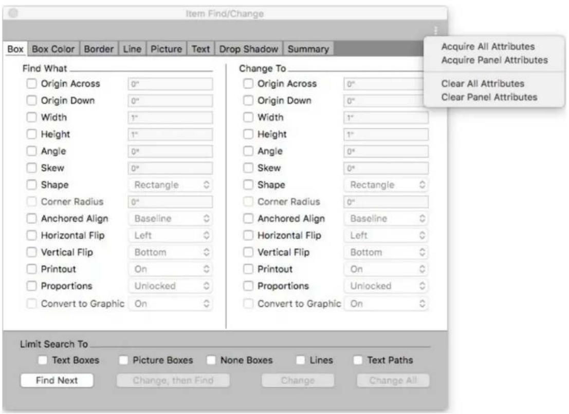
Item Find/Change does not support tables.
The Item Find/Change palette works as follows:
- Tabs across the top display the type of attributes you can search for: Box, Box Color, Border, Line, Picture, Text, and Drop Shadow.
Each pane contains two sides: Find What and Change To. You check the attributes you're searching for on the Find What side, and then check those attributes you want to change on the Change To side of the palette. You can search on attributes in multiple panes at the same time. - The palette menu lets you put the selected item's attributes into the Find What side of the palette. You can specify options in all the panes in the Item Find/Change palette by choosing to Acquire All Attributes or complete one pane at a time by choosing to Acquire Panel Attributes. You can use Clear All Attributes and Clear Panel Attributes to clear panes.
- The Summary pane summarizes the settings in all of the panes.
The check boxes at the bottom of the palette let you restrict your search to specific types of items. To find and replace all types of items, leave all of these boxes are unchecked.
- When you click Find Next, Item Find/Change searches the entire layout from start to finish. To limit a search to the active spread, Option/Alt+click the Find Next button.
Integration of Custom Border Styles with Item Find/Change
Custom Border Styles in Item Find/Change: Now a user can find and replace the custom border style through Item Find/Change palette.

Custom Border Styles in Item Find/Change
Working with boxes
There are three types of boxes: Text boxes, picture boxes, and no-content boxes (boxes with a content of None). All three box types can contain color, shades,
blends, and borders. When you draw a text box, picture box, or no-content box, the available controls correspond to the box type you create. But you can import text into picture boxes that contain pictures, and you can import pictures into text boxes that contain text. In addition to changing content type, you can change the shape and other attributes of a box.
Creating text and picture boxes
There are three ways to create boxes:
- To create a no-content box (a box that can be changed into a picture box or a text box), click and drag with the Rectangle Box tool □, the Oval Box tool ○, or the Starburst tool ✿ You can declare text content by pressing T as you draw a no-content box. You can declare picture content by pressing R as you draw a no-content box.
- To create a rectangular text or picture box, click and drag with the Text Content tool for Picture Content tool.
- To create a Bézier box, use the Bézier pen tool. For more information, see "Creating Bézier boxes."
To constrain rectangular boxes to squares and oval boxes to circles, press Shift while you drag.
You can create boxes with the following tools:
To change a no-content box into a text box, press Command+E/Ctrl+E and import a text file.
To change a no-content box into a picture box, press Command+E/Ctrl+E and import a picture file.
You can change the corner type of rectangular boxes to rounded, concave, and beveled corners using the Item > Shape submenu or the Box Corner Style dropdown menu in the Measurements palette. You can add and alter rounded corners by entering values in the Box Corner Radius field in the Home tab of the Measurements palette. Any attributes you apply to one box (borders, colors etc.) can be copied and applied to any other existing box using the Item Form Painter tool on the Tool palette. see "Copying attributes from one box to another."
Creating Bézier boxes
The Bézier Pen tool lets you draw multi-sided Bézier boxes and lines that can have straight and curved line segments (see "Understanding Bézier shapes").
For another way to make uniquely shaped boxes, see "ShapeMaker."
To draw a Bézier box:
1 Select the Bézier Pen tool ↗ from the Tools palette. Move the Crosshair pointer +to any position on the page and click to establish the first point.
Move the pointer to where you want the next point positioned. To constrain 2 pointer movement to a 45-degree angle relative to the page, press Shift.
Click to create points and line segments. 3
Clicking a point without dragging creates a straight line and corner point. To create a curved line segment and smooth point, click and drag wherever you want the next point positioned. A point with two curve handles displays. You can control the curve's size and shape by dragging a curve handle. Press Option/Alt while dragging a smooth point to create a curved segment and corner point.
If desired, edit the Bézier shape while you are still drawing it. 4
To add a point to an existing segment of the shape, click the line segment where you want the point to be.
To delete a point from the active shape while you are drawing it, click the • point.
To close the box, close the path by positioning the mouse pointer over the 5 beginning of the line and then click when the Close Box pointer & displays.
When any of the drawing tools are active, you can press Command/Ctrl to temporarily switch to the Select Point tool. When the Select Point tool is active, you can press Command+Option/Ctrl+Alt to temporarily switch to the Item tool.
→ You can join, extend or close existing open paths. For more information see "Joining, extending and closing open paths".
9-Point Reference Grid
A big benefit that QuarkXPress has always had is the ability to specify the positioning of objects precisely by entering coordinates in the measurements palette - allowing objects to be precisely aligned at specific locations. A feature commonly requested by designers is the ability to define the position of page elements using different reference points, e.g. change the reference point to the lower right corner instead of using top left corner as default, when you do this, the coordinates displayed in the measurements palette will adjust to be relative to this point.
When you resize a box using width and height settings on the measurements palette, it always grows to the right and bottom of the page. The new 9-Point Reference Grid option in the measurements palette will allow you to change reference point for all the nine points referred which include a center point: when you then resize the box, it will resize relative to the selected point.
natural_image
Solid blue square with white corner markers (no text or symbols)
9-Point Reference Grid in the measurement palette

natural_image
Blue diamond shape enclosed in a red circle, no text or symbols present
9-Point Reference Grid during box rotation
How it works
On the measurements palette, you can select any of 9-reference points as indicated.
Once you set a Reference Point, all boxes in that particular layout will work with respect to the selected reference point. On creating a new project, the reference point will be reset to the 'Top Left'.
Previously, when you rotated any object either manually or by using a mouse, the object rotated from the center. In QuarkXPress 2019, the box will rotate from the selected Reference Point.
Resizing boxes
You can resize any box by modifying the size of its bounding box. A bounding box is a non-printing, rectangular shape that encloses every box. The box's item handles demarcate the bounding box. The best way to view the bounding box clearly is to use the Item tool to select item handles on a Bézier box.
You can resize active boxes using any of the following methods:
- Select the Item tool + or a Content tool 📄 and move the mouse pointer over a selected box's item handle to display the Resizing pointer. Click and drag the handle to a new location to reduce or enlarge the box. Press Shift to maintain the box's aspect ratio. Press Option/Alt to resize the box from the center. Press Command/Ctrl to resize the box contents along with the box.
- Enter values in the W and H fields of the Home or Space/Align tabs of the Measurements palette to change the width and height, and then press Return/Enter.
→ Use keyboard increments to automatically increase/decrease the value in this field. See "Palettes" for more information.
→ You can lock a box's proportions, so that you don't have to press Shift to maintain the aspect ratio. For more information, see "Locking box proportions."
Auto Grow/Shrink Text Boxes
QuarkXPress lets the box grow or shrink automatically during text input, text import/text copy paste/drag and drop text. This feature adds huge benefit for the designer since they now do not have to keep dealing with the text over matter or keep readjusting box to fit to the text length. User can set text box width, height or both to auto.
A text box can auto-grow up to the page margin (width wise and height wise). Auto (grow/shrink) property is only applicable for rectangular text boxes and will be turned off in case of non-rectangular boxes, boxes having text angle or text skew.

Auto grow values defined in measurement palette
How it works
You can now set Width/Height of box to Auto or Fixed through measurements palette.
Locking box and picture proportions
To lock the selected box's proportions, display the Home tab of the Measurements palette and click the proportion lock control next to the W and H fields. If this control is locked, QuarkXPress maintains the item's aspect ratio during resizing operations.

The proportion lock controls in the unlocked (top) and locked (bottom) states
To lock the proportions of the picture in the selected box, display the Home tab of the Measurements palette and click the proportion lock control next to the X% and Y% fields. If this control is locked, QuarkXPress maintains the picture's aspect ratio during resizing operations.
To use the proportion-locking feature with the Item Find/Change feature, display the Box or Picture tab of the Item Find/Change palette (Edit menu), then check or uncheck Proportions in the Find What or Change To area.
To use the proportion-locking feature with item styles, display the Box or Picture tab of the Edit Item Style dialog box (Edit > Item Styles) and check Proportions.
Reshaping boxes
You can change the shape of a box in three ways:
You can change the shape entirely by choosing a different option from the • Item > Shape submenu.
- You can use the Box Corner Radius field in the Home or Space/Align tab of the Measurements palette. Enter the value manually or place the cursor in the fields and use the up/down arrow keys to automatically increase/decrease the value. Using the Shift/Alt key in conjunction with the up/down arrow keys changes the amount the value is increased/decreased. See the chart in "Palettes."
You can reshape Bézier boxes by repositioning points, curve handles, and line segments. For more information, see "Understanding Bézier shapes."
Adding borders to boxes
Borders are decorative elements that can be placed around any type of box. To access border controls for active boxes, display the Border tab of the Measurements palette.

Use the controls in these tabs to specify a border style, width, color, and opacity. If the border style contains gaps, you can also specify gap color and opacity.
When using the Border tab of the Measurements palette, you can choose to apply the same border to all sides of the box, or different borders to each side. Check Multiple Borders to apply different borders to all sides of the box. Select the top, bottom, right, or left box frame icons to apply a border to one or more sections of the box at a time.
Use Line Drawing Order to choose the drawing order for the borders (Vertical/Horizontal on Top).
→ You can only apply different border styles to different sides of a rectangular text box. This feature is not available for picture boxes or text boxes of any other shape.
You can also create your own border styles in the Dashes and Stripes dialog box (Edit menu) and specify border settings in an Item Style. For more about Item Styles, see "Item Styles XTensions software."
Applying colors to boxes
To apply a background color to active boxes, do one of the following:
- Display the Colors palette (Window > Colors), click the Background Color button and then use the controls in the palette.
- Use the controls in the Home tab of the Measurements palette.
The controls available are as follows:
- Box or Background Color: Lets you specify the background color for the box.
- Shade: Lets you specify the tint of the background color (0% = white, 100% = full color).
- Opacity: Lets you control the transparency of the box background (0% = fully transparent, 100% = fully opaque).
You can also specify box color in an Item Style. For more about Item Styles, see "Item Styles XTensions software".
Applying gradients to boxes
A gradient is a gradual transition from one color to another.
To apply a gradient to the background of active boxes, see Creating gradients".
Specifying number of columns in text boxes
To specify the number of columns in a text box,
Use the Cols field and the Gutter field in the Home tab and the Text tab of the Measurements palette to specify how many columns the text box should have and how wide their gutters should be.

The Line Between option available in the Text tab allows you to specify that a line will be drawn between columns in a multi-column text box and its height will be equivalent to the height of the text in the column.
→ You can control how text will flow in relation to the columns. See "Controlling column flow."
Merging and splitting boxes
Options in the Merge or Split Paths submenu (Item menu) let you create complex Bézier boxes from existing boxes. For example, if a rectangular box overlaps an oval box, you can select the submenu and choose an option that will create a single box with the same content. If you merge two picture boxes, one picture will display in the combined box. If you merge two text boxes, the text from one of the boxes will be deleted.
To merge two or more text boxes and preserve the text, see "Merging text boxes.
QuarkXPress has new tools on measurements palette, whose icons graphically depict the merge or split behavior, making them more intuitive for designers to easily access and create complex shapes with the combination of two or more shapes.

Merge and Split icons in the measurement palette
- Intersection: Keeps only the overlapping areas of the selected items. The color of the back-most item is applied to the new single item.
- Union: Combines all the selected items into one box, keeping both the overlapping and non-overlapping areas. The color of the back-most item is applied to the new single item.
- Difference: Removes the overlapped areas from the back item and deletes the front-most item from the selected items.
- Reverse Difference: Removes the overlapped areas from the front item and deletes the back-most item from the selected items.
- Exclusive Or: Leaves all the shapes intact but cuts out overlapping areas. It creates two bezier points at each location where any two lines originally intersected. It is used to create a 'see-through' effect with overlapping items.
- Combine command is similar to the Exclusive Or command, but if you look at the points surrounding the cut-out area, you will notice that no points were added where two lines intersect.
- Join End Points: Two endpoints (one on each path) need to be placed on the top (or within 6 points) of each other. Merges the two points into one corner point.
- Outside Paths command works with a merged box that contains several, non-overlapping shapes. Outside Paths keeps all the outside path information and divides non-overlapping outside paths into separate boxes.
- Split All Paths: Separates the items from each other until every box within a complex box has been split. If you use this command on a shape that has a hole in it, the hole becomes solid.
Merging text boxes
To merge two or more text boxes, preserving the text:
Select the text boxes you want to merge. 1
2 Choose Item > Merge Text Boxes and choose one of the following from the sub menu:
- Top Down - to merge the text in the boxes in the order they appear on the layout (Left-to-Right and then Top-to-Bottom).
- Selection Order - to merge the text in the boxes in the order that you selected the boxes.
The text in the boxes is merged and contained in a single box. 3
The size of the resulting text box is dependant on the bounding box of the area selected. Use Item > Fit Box to Text to size the new box to fit the text it contains.
This option is disabled if any of the selected boxes is a linked text box, a locked text box or a bézier text path. Boxes with an associated callout marker and grouped text boxes cannot be merged with any text boxes.
Adding text and pictures to boxes
To add text to a box, choose the Text Content tool 1, double-click the box, and then either start typing, paste text copied from elsewhere, or choose File > Import.
To place a picture in a box, select the box with the Picture Content tool and then either paste a picture copied from elsewhere or choose File > Import.
Changing box type
To convert a selected box to a different type, choose Picture, Text, or None from the Content submenu (Item menu). However, you can also change a text box to a picture box by choosing File > Import and selecting a picture. You can change a picture box to a text box by choosing File > Import and selecting a text file.
To convert a selected text box to a text path, choose a line shape from the Item > Shape submenu.
When you select a Box tool, you can use the following modifier keys to create text or picture boxes:
Press T as you draw to create a text box.
Press R as you draw to create a picture box.
Creating a box from a clipping path
If a picture box has an associated clipping path (embedded or automatically created), you can create a new box that has the shape of that clipping path by selecting the picture box and choosing Item > New Box From Clipping.
Copying attributes from one box to another
To copy all of the attributes applied to a box and apply them to a different box:
1 Select the Item Format Painter tool ↗ on the Tool palette.
Select the box whose attributes you want to copy to "fill" the eyedropper. 2
To add other attributes to the Item Format Painter tool, hold down the Shift key as you select the box. The following dialog displays:
Make any changes you want to the box attributes and click OK. The new attributes are added to the Item Form Painter tool, but are not applied to the selected box.
Select any other box to apply the copied attributes. 3
To uncheck Apply check box for all panes in the Item Font Painter tool, hold down the Shift+ Opt/Alt as you select the box.
To uncheck all options in any pane in the Item Font Painter tool, Opt/Alt click on the Apply check box.
To check all options in any pane in the Item Font Painter tool, Shift+ Opt/Alt click on the Apply check box.
The Item Format Painter works across all layouts in the same project, allowing you to copy attributes from one item to another on the same layout, or to an item on a different layout.
The eyedropper will retain these attributes until you select another item tool or a blank space on the canvas, allowing you to select as many boxes as you wish and apply these attributes over and over.
If a box has already been selected before you select the Item Format Painter tool, then step 3 is not necessary, as soon as you perform step 2, the copied attributes will automatically be applied to this selected box.
Super Step and Repeat
You can use Super Step and Repeat to transform items as you duplicate them by scaling, rotating, and skewing the items.
Using Super Step and Repeat
Use Super Step and Repeat to quickly and easily duplicate items while rotating, scaling, or skewing them. To use Super Step and Repeat:
Select a picture box, text box, text path, or line. 1
To specify the number of times you want the item to be duplicated, enter a number from 1 to 100 in the Repeat Count field.
To specify the horizontal placement of copies relative to the original item, enter a value in the Horizontal Offset field. A negative value places copies to the left of the original; a positive value places copies to the right of it.
To specify the vertical placement of copies relative to the original item, enter a value in the Vertical Offset field. A negative value places copies above the original; a positive value places copies below it.
To rotate each duplicated item, specify the rotation value for each item in degrees in the Angle field. For example, if you enter 10, the first duplicated item will be rotated 10 degrees from the original item; the second duplicated item will be rotated 20 degrees from the original item; and so on. The rotation is counterclockwise from the original item.
To specify the thickness of either the final duplicated frame (for a picture box or text box), or the final duplicated line (for a text path or line), enter a point value in the End Frame/Line Width or End Line Width field.
- When duplicating a box or a line, enter a value from 0% to 100% in the End Box Shade or End Line Shade field to specify the background color shade in the final duplicated box or the line color shade of the final duplicated text path or line.
- When duplicating a box that has a blended background, the End Box Shade 2 field is enabled. Enter a value from 0% to 100% in the End Box Shade 2 field to specify the second background shade for the blend in the final duplicated box.
To specify the scale of the final duplicated picture box, text box, text path, or line, enter a value from 1% to 1000% in the End Item Scale or End Line Scale field.
- To skew a duplicated box, enter a value from 75^ to -75^ in the End Item Skew field to specify the skew or slant of the final duplicated box.
To scale the contents of a picture box, text box, or text path scaled to fit the duplicate boxes, check Scale Contents.
To specify the point around which rotation or scaling will take place for the item, choose an option from the Rotate & Scale Relative To dropdown menu. Note that Selected Point is available as a choice in the
Rotate & Scale Relative To drop-down menu only when a point on a Bezier item is selected.
Click OK. 2
ShapeMaker
With ShapeMaker, you can create a wide variety of intricate shapes. You can create new shapes from scratch, or apply new shapes to existing boxes.
To display the ShapeMaker dialog box, choose Utilities > ShapeMaker.
The ShapeMaker dialog box provides tabs that let you create various types of shapes. All of the tabs have the following controls:
- Item: Lets you choose whether you want to create a text box, picture box, no-content box, text path, or rule path.
- Width and Height: Lets you specify the width and height of the box or path. If you have an item or items selected when you choose Utilities > ShapeMaker, these values are filled in automatically to match the selected item or items.
- Columns and Gutters: When Text Box is selected from the Item menu, you can use these fields to specify how many columns the text box should have and how wide their gutters should be.
- Lines and Spacing: When Text Path is selected from the Item menu, you can use these fields to specify how many lines to create and how far apart they are. (If a box is selected and Lines is set to zero, the application will create as many paths as are necessary to fill the area described by that box.)
- Alter Current Box: If a box is selected when you choose Utilities > ShapeMaker, the application updates the shape of that box instead of creating a new item.
The controls in the tabs are described in the topics below.
ShapeMaker Waves tab
The Waves tab of the ShapeMaker dialog box (Utilities > ShapeMaker) lets you create boxes with wavy sides. To use this tab, describe the waves you want to use in the Wave 1 and Wave 2 areas, then assign them to the four sides of the box using the controls in the top part of the tab.

Waves tab of ShapeMaker dialog box
Specify the settings for the wave:
- Top, Left, Bottom, and Right: These controls let you configure the four sides of the box. You can choose Wave 1, Wave 2, or Flat.
- Keep waves parallel: Keeps the waves on either side of the box parallel with one another.
- The controls in the Wave 1 and Wave 2 areas let you choose which type of wave to use, the frequency of the wave, the phase (starting point) of the wave, and the amplitude (depth) of the wave.
Once you have defined the attributes, you can click the Add Preset button to save this shape.
To revert to the default shape, click the Reset button,
To delete a predefined shape, hold down the Alt/Option key while selecting it from the list.
ShapeMaker Polygons tab
The Polygons tab of the ShapeMaker dialog box (Utilities > ShapeMaker) lets you create polygonal boxes.

Polygons tab of ShapeMaker dialog box
Specify the settings for the polygon:
- Type: Choose what type of polygon go create from the drop-down menu. The controls immediately under this drop-down menu change depending on what type of polygon is selected.
• Regular polygons: Lets you specify how many sides the polygon has.
- Stars: In addition to specifying how many sides the polygon has, you can specify the radius of the space inside the spikes and superimpose a secondary star at a different size.
- Polygrams: Similar to Stars, but instead of specifying a radius, you can control the way the sides line up with each other with the Point Skip field.
- Spirograms: Similar to Polygrams, but creates only an outline.
• Random polygons: Lets you create polygons with randomized sides
- Golden rectangle: Lets you create a polygon with the golden ratio (approximately 1:1.618).
- Double square: Lets you create a polygon in the shape of two adjacent squares.
- Edges: Lets you control whether the edges of the box are flat or curved. If you choose an option other than Flat, you can indicate the curvature of the sides with the Curvature controls. If you choose one of the Swirl options, you can indicate the direction of the swirl with the Orientation controls.
- Randomize Points: Lets you control the degree of randomness in the shape, from 0 (none) to 100 (maximum).
New Random: Applies some randomness to the shape.
Once you have defined the attributes, you can click the Add Preset button *to save this shape.
→ To revert to the default shape, click the Reset button,
To delete a predefined shape, hold down the Alt/Option key while selecting it from the list.
ShapeMaker Spirals tab
The Spirals tab of the ShapeMaker dialog box (Utilities > ShapeMaker) lets you create spiral shapes.

Spirals tab of ShapeMaker dialog box
Specify the settings for the spiral:
- Type: Choose what type of spiral too create from the drop-down menu.
Archimedes: an evenly spaced circular spiral.
Golden Spiral: a spiral built with the golden ratio.
- Custom: this makes the Winds field available, so you can control how many times the spiral goes around.
• Rate: Lets you control how quickly the width of the spiral increases.
- Segments: Lets you control how circular the spiral is allowing you to specify the number of segments per wind.
- Smoothness: Lets you control how smooth the spiral is. You can get a harder-edged shape by lowering the Segments value and decreasing the Smoothness value.
- Clockwise and Counterclockwise: Lets you control the direction of the spiral.
Once you have defined the attributes, you can click the Add Preset button *to save this shape.
To revert to the default shape, click the Reset button,
To delete a predefined shape, hold down the Alt/Option key while selecting it from the list.
ShapeMaker Rectangles tab
The Rectangles tab of the ShapeMaker dialog box (Utilities > ShapeMaker) lets you create rectangular boxes with customized corners.

Rectangles tab of ShapeMaker dialog box
Specify the settings for the rectangle:
- Check Same for all to configure all four corners of the shape with a single set of controls. To separately configure each corner of the box uncheck Same for all.
- Use the drop-down menus to specify a corner type (Normal, Rounded, Beveled, Concave, Pointed, or Inset) and a diameter (for options that involve a diameter).
- Curvature: Controls how curved the corners are if you select an option that includes curvature.
- Balance: For some options, lets you control whether the corners lean toward the sides of the box or toward the top.
- Radial: For some options, lets you control whether the corners of the box are aligned with the center of the box or not.
Once you have defined the attributes, you can click the Add Preset button to save this shape.
To revert to the default shape, click the Reset button,
To delete a predefined shape, hold down the Alt/Option key while selecting it from the list.
Working with lines
There are two types of lines: Straight and Bézier lines. You can apply colors and line styles to any type of line.
Creating lines
To create a line, first select the Line tool ↗ from the Tools palette and move the Crosshair pointer +to any position on the page. Click and drag to draw the line.
→ You can constrain a line to 0, 45, or 90 degrees by pressing Shift while you draw it.
You can also create orthogonal lines using the Orthogonal Line tool
Any attributes you apply to one line (size, shape, appearance etc.) can be copied and applied to any other existing line using the Item Form Painter tool on the Tool palette. see "Copying attributes from one line to another."
Creating Bézier lines
The Bézier Pen tool lets you draw multi sided Bézier boxes and lines that can have straight and curved line segments (see "Understanding Bézier shapes").
To draw a Bézier line:
1 Select the Bézier Pen tool from the Tools palette. Move the Crosshair pointer to any position on the page and click to establish the first point.
Move the pointer to where you want the next point positioned. To constrain 2 pointer movement to a 45-degree angle relative to the page, press Shift.
Click to create a point and line segments. 3
To make a curved line segment, click and drag wherever you want the next point positioned. A point with two curve handles displays. You can control the curve's size and shape by dragging a curve handle.
To make a corner point, press Option/Alt before you click. If you click and hold, you can control the radius of the corner point by dragging a curve handle.
To add a point to an existing segment of the shape, click the line segment where you want the point to be.
To delete a point from the active shape while you are drawing it, click the • point.
To finish the line, double-click. 4
When any of the drawing tools are active, you can press Command/Ctrl to temporarily switch to the Select Point tool. When the Select Point tool is active, you can press Command+Option/Ctrl+Alt to temporarily switch to the Item tool.
Line modes for orthogonal lines
There are four line modes: Endpoints, Left Point, Midpoint, and Right Point. Depending on the mode you choose in the Measurements palette (Home or Space/Align tabs), line length and position will be described differently.
- Endpoints mode: The X1 field indicates the horizontal position of the first end-point; the Y1 field indicates the vertical position of the first end-point. The X2 field indicates the horizontal position of the last end-point; the Y2 field indicates the vertical position of the last end-point.
- Left Point mode: The X1 field indicates the horizontal position of the leftmost end-point; the Y1 field indicates the vertical position of the leftmost end-point.
- Midpoint mode: The XC field indicates the horizontal position of the midpoint of the line; the YC field indicates the vertical position of the midpoint of the line.
- Right Point mode: The X2 field indicates the horizontal position of the rightmost end-point; the Y2 field indicates the vertical position of the rightmost end-point.
Resizing lines
You can resize active straight lines using any of the following methods:
- Select the Item tool + and move the Arrow pointer over an item handle to display the Resizing pointer. Click and drag the handle to a new location to reduce or extend the length of the line.
- Choose either Left Point, Midpoint, or Right Point from the Line Mode dropdown menu in the Home or Space/Align tab of the Measurements palette to display the L (Length) field. To precisely change the length of a line, enter a value in the L field, then press Return/Enter.
You can resize any Bézier line by modifying the size of its bounding box. To do so, make sure Item > Edit > Shape is unchecked, and then resize the line as if it were a box.
Reshaping lines
You can change the shape of a line in the following ways:
You can change the shape entirely by choosing a different option from the • Item > Shape submenu.
You can reshape Bézier lines by repositioning points, curve handles, and line segments. For more information, see "Understanding Bézier shapes."
To pan the layout while a Pen tool is selected, press Shift+Space and then click and drag.
Controlling line appearance
To control the appearance of active lines, use the controls in the following places:
• Home tab of the Measurements palette
- Colors palette (Window menu) — for line color only
In addition to color, shade, and opacity, you can control the following characteristics for lines:
- Line style: This option lets you control the general appearance of a line. Several line styles are included by default, and you can add new ones with the Dashes & Stripes dialog box (Edit menu).
- Width: You can specify the width of lines in any measurement system. You can also specify a Hairline width; the printed width of a hairline rule is .125 pt on a PostScript imagesetter, with a wider value on some laser printers.
- Arrowheads: You can apply arrowheads to lines using the Arrowheads dropdown menu.
You can also specify line appearance in an Item Style. For more about Item Styles, see "Item Styles XTensions software."
Joining lines
You can merge two lines into one by selecting the Item tool +selecting the lines, and choosing Item > Merge > Join Endpoints. The Join Endpoints command is available when the endpoints of lines or text paths are within six points of each other.
Joining, extending and closing open paths
You can click an endpoint of an existing shape and it selects that point and goes into regular draw mode, so the next click adds a new point and a segment to the selected line. You can add as many segments as you need.
Double-click and endpoint to finish the line as an open path.
Click an opposite endpoint to close the path (just like during the original draw operation).
While drawing, if you click the endpoint of another open path then the path being drawn and the path just clicked become joined. Using these techniques together, you can begin to extend one path, and end up joining it with another.
Copying attributes from one line to another
To copy all of the attributes applied to a line to a different line:
1 Select the Item Format Painter tool ↗ on the Tool palette.
Select the line whose attributes you want to copy to "fill" the eyedropper .2
To add other attributes to the tool, hold down the Shift key as you select the line. The following dialog displays:
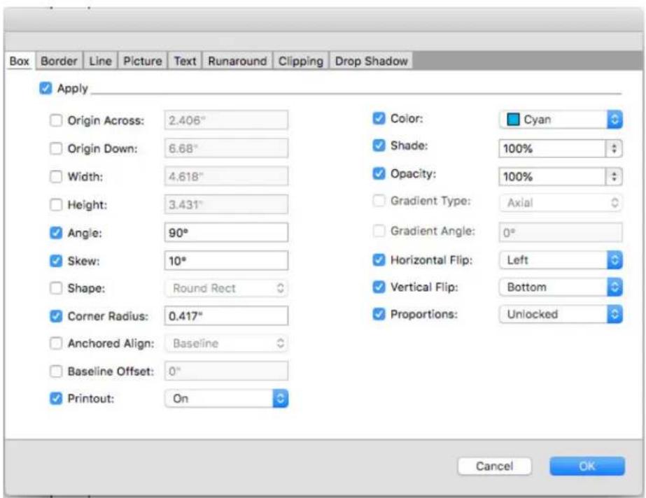
Make any changes you want to the line attributes and click OK. The new attributes are added to the Item Form Painter tool, but are not applied to the selected line.
Select any other line to apply the copied attributes. 3
To uncheck Apply check box for all panes in the Item Font Painter tool, hold down the Shift+ Opt/Alt as you select the line.
To uncheck all options in any pane in the Item Font Painter tool, Opt/Alt click on the Apply check box.
To check all options in any pane in the Item Font Painter tool, Shift+ Opt/Alt click on the Apply check box.
The Item Format Painter works across all layouts in the same project, allowing you to copy attributes from one item to another on the same layout, or to an item on a different layout.
The eyedropper will retain these attributes until you select another item tool or a blank space on the canvas, allowing you to select as many lines as you wish and apply these attributes over and over.
If a line has already been selected before you select the Item Format Painter tool, then step 3 is not necessary, as soon as you perform step 2, the copied attributes will automatically be applied to this selected line.
Manipulating items
Items can be cut and then pasted in new locations, locked so they cannot move, duplicated once or many times, stacked to create unusual visual effects, and manipulated in other ways.
Selecting items
To manipulate items, you must first select them. Once selected, most kinds of items display outlines and handles for reshaping.
To select an item, first select the Item tool +, the Text Content tool ↑, or the Picture Content tool and move the Arrow pointer over an item. Click once to select a single item or Shift+click individual items to select more than one item at a time. You can also select multiple items by selecting the Item tool +and drawing around an area that contains the items.
If you double-click an empty picture box with the Picture Content tool selected, the Import dialog box displays. If the picture box contains a picture, the Picture Content tool is selected and the Edit Original dialog box displays.
To deselect an active item, click outside it. When the Item tool is selected, you can press Tab to deselect any active items.
Moving items
You can move items by:
- Entering values in the X and Y fields on the Home tab in the Measurements palette.
→ Use keyboard increments to automatically increase/decrease the value in this field. See "Palettes" for more information.
- Manually moving items using the Item tool ✝. If you hold down the mouse before moving a box or text path, you can see the contents as you move the item. You can also “nudge” items by selecting the Item tool and pressing an arrow key on your keyboard.
The box's item handles demarcate the bounding box. The best way to view the bounding box clearly is to use the Item tool to select item handles on a Bézier box.
Cutting, copying, and pasting items
When the Item tool ✝ is selected, the Cut, Copy, and Paste commands (Edit menu) are available for active boxes, lines, and text paths. Choose Edit > Paste (Command+V/Ctrl+V) to place a copy of the items contained on the Clipboard in the center of the project window.
When the Item tool ✦ is selected, you can remove items with the Delete command. Deleted items are not copied to the Clipboard.
Controlling the stacking order of items
When two or more items overlap, each is either positioned in front of or behind the other item. The term “stacking order” refers to the front-to-back relationship of the various items on a page. Each item you create occupies its own level in the stacking order. Every new item you create becomes the front item.
The Item menu includes commands that let you control item stacking order.
- Choose Item > Send to Back to move an item to the back of the page or layer.
- Choose Item > Bring to Front to move an item to the front of the page or layer.
- To move an item one level backward in the page or layer choose Item > Send Backward.
- To move an item one level forward in the page or layer choose Item > Bring Forward.
In a document with layers, the layers themselves are in a particular stacking order; within each layer, each item has its own relationship to the stacking order. When you use the Send to Back, Send Backward, Bring to Front, and Bring Forward commands (Item menu), the stacking order of the items is altered within the layer.
To activate an item that is hidden behind other items, select the Item tool + and press Command+Option+Shift/Ctrl+Alt+Shift while you click repeatedly at the point where multiple items overlap. Pressing Command+Option+Shift/Ctrl+Alt+Shift while clicking will successively activate items from the front of the stacking order to the back.
Grouping items
You can combine multiple items on a page or spread into a single group. Grouping items is useful when you want to select or move several items simultaneously. You can move, cut, copy, duplicate, and perform a number of other functions on a group. For example, you can group all the items that compose a publication masthead; once grouped, you can modify or move the entire group as you would a single box, line, or text path.
After you create a group, you can still edit, resize, and reposition individual items while maintaining the group relationship. You can also place a copy of a group into an open QuarkXPress library for use in other documents.
Items can be grouped when two or more items (lines, boxes, text paths, or other groups) are active. To select multiple items with the Item tool ; either
Shift+click each item or draw a marquee around the items you want to group. Choose Item > Group (Command+G/Ctrl+G) to place multiple selected items into a single group.
You can group groups, and multiple-select a group (or groups) along with individual boxes, lines, and text paths to create a larger group.
With the Item tool selected, you can move, cut, copy, paste, duplicate, rotate, and color a group. With the Text Content tool or Picture Content tool selected, you can manipulate individual items as you would any ungrouped item.
To move an item within a group, press Command/Ctrl and select the item with the Item tool +, the Text Content tool 1, or the Picture Content tool ▶.
The active fields in the Measurement palette tabs will affect the active group. Choose Item > Ungroup (Command+U/Ctrl+U) to ungroup a single group, or Item > Ungroup All to ungroup every group in a group that contains other groups.
Resizing grouped items
To resize every item in a group simultaneously, click and drag the group's item handles. If you press Command+Shift/Ctrl+Shift while resizing a group, all frame widths, line weights, pictures, and text are resized proportionally. If you press Command/Ctrl while resizing a group, frame widths, pictures, and text are still resized, but not proportionally.
Duplicating items
QuarkXPress lets you make single or multiple copies of boxes, lines, and text paths.
Create a single copy of a selected item using the Duplicate command (Item menu). You can also press Option/Alt while dragging an item or group to create a duplicate.
The Super Step and Repeat feature is useful for laying out design elements that contain a number of evenly spaced copies of an item. Create multiple copies of an item and specify the distance between them using the Super Step and Repeat command (Item menu).
For another way to make uniquely shaped boxes, see "ShapeMaker XTensions software."
Spacing and aligning items
You can control the position of multiple selected items relative to one another using the Item > Space/Align submenu or the Space/Align tab of the Measurements palette.
You can choose from among eight spacing and six alignment options in the Measurements palette, and you can specify alignment relative to selected items, the page, or (for Print layouts with facing pages) the spread. The Item > Space/Align submenu includes the "Item relative" and "Page relative" modes described below. The Measurements palette also includes a third mode called "Spread relative."
The space/align modes are as follows:
- Item relative mode 🔊 positions items relative to the uppermost active item, which does not move. The uppermost item is determined by the location of the item's top edges. If two or more items have the same top edges, then items are spaced from the leftmost item.
- Page relative mode [■] positions items relative to the page edges (left, right, top, or bottom).
- Spread relative mode is available for active Print layouts that include facing pages. Assume that you have opened a layout with a spread and then selected an item on a left page and another item on the right page. If you then click the Spread relative mode icon in the Measurements palette and choose Space horizontal centers the selected items position themselves on the far-left and far-right sides of the spread.
Rotating items
To rotate active items, do one of the following:
- Select the Item tool + and move the mouse over a corner handle. When the Rotation pointer displays, click to establish a rotation point; then drag in a circular motion to rotate the item. The Arrowhead pointer and the item's position will display as you drag. If you press the Shift key when rotating, movements are constrained to 45-degree angles.
- Enter a value in the field on the Measurements palette (Home and Space/Align tabs) and press Return/Enter.
→ Use keyboard increments to automatically increase/decrease the value in this field. See "Palettes" for more information.
To rotate a straight line, choose either Left Point, Midpoint, or Right Point from the Mode drop-down menu (Measurements palette) to display the Angle field.
Skewing items
To skew active items within bounding boxes, enter a value in the Box Skew field on the Home tab of the Measurement palette.
Positive values slant items to the right; negative values slant them to the left.
→ Use keyboard increments to automatically increase/decrease the value in this field. See "Palettes" for more information.
Locking and unlocking items
Locking lets you protect items and content from accidental changes. You can do the following:
To prevent an item's size and position from being changed (and to prevent the item from being deleted), check Item > Lock > Position.
- To prevent an item's contents from being edited, check Item > Lock > Story or Item > Lock > Picture.
To unlock selected items, uncheck the appropriate option in the Item > Lock submenu.
Anchoring items and groups in text
You can anchor an item or group so that it flows as a character within text.
To anchor an item or group within text, use the Item tool to select the item or group you want to anchor and choose Edit > Copy (Command+C/Ctrl+C) or Edit > Cut (Command+X/Ctrl+X).
Then, with the Text Content tool Ⓤ selected, place the text insertion point at the point in text where you want to anchor the item or group and choose Edit > Paste (Command+V/Ctrl+V).
QuarkXPress also provides support for nested anchors (i.e an anchored item can contain a further anchored item to the nth level).
Working with callouts
The Callouts feature lets you create floating boxes that always display on the same page or spread as the content they pertain to. For example:
You can create figures with pictures and text that follow their references • from page to page.
You can create pull quotes that can automatically move to a different page • with their source text.
You can create "floating" icons that sit in the space to the left of a paragraph • to indicate that the paragraph is a tip, a note, a warning, and so forth.
For more information, see the topics below.
Understanding callouts
A callout is a floating box that always displays on the same page or spread as the content it pertains to. Each callout is anchored to a particular spot in a text story called a callout anchor. A callout anchor flows along with text like a character. When a callout anchor moves to a new page or spread, the callout moves with it. When guides are displayed, a line links each callout anchor with its associated callout (if any).
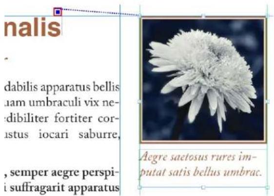
A callout anchor with its associated callout
A callout's position in a layout is based on two things:
The location of its callout anchor. A callout is always on the same page or spread as its callout anchor.
The callout anchor's settings. You can position a callout relative to the spread, the page, the box or cell that contains the callout anchor, the paragraph that contains the callout anchor, or the callout anchor itself.
For example, you can configure a callout so that its horizontal location is always against the outside margin, but its vertical location is always aligned with the paragraph that contains its callout anchor. The settings for such a configuration look like this:

Settings for a callout with a fixed horizontal location and a variable vertical location
It is important to note that the settings for a callout are stored with its callout anchor, not with the callout itself
You can control the positioning of a callout by configuring its callout anchor directly, or by applying a callout style to the callout anchor. A callout style is a named package of callout settings that displays in a palette. Callout styles are useful in documents where you use different callout settings over and over; rather than recreating those settings each time, you can simply select the callout anchor and click the appropriate callout style in the Callout Styles palette.
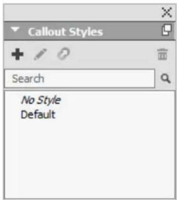
Callout Styles palette
→ You can think of callout styles as similar to style sheets (for more information, see "Working with style sheets"). Like style sheets and other resources, callout styles can be managed with Job Jackets (for more information, see "Job Jackets").
A callout anchor can be selected or unselected. When a callout anchor is selected, it has a red outline and its callout style (if any) is selected in the Callout Styles palette.

A selected callout anchor (left) and an unselected callout anchor (right)
When guides are turned off, you can see only the selected callout anchor.
When you cut or copy and paste text that contains a callout anchor that has an associated callout, the callout is cut or copied and pasted along with the text.
Creating a callout
To create a callout:
1 Select the Text Content tool Ⓣ and place the text cursor at the point in the text where you want the callout anchor to be.
2 Choose Item > Callout Anchor > Insert Callout Anchor. A callout anchor is inserted and automatically selected.

Select the item or group that you want to make into a callout. 3
4 Choose Item > Callout Anchor > Associate with Callout Anchor. The item or group becomes a callout, and a line displays between the callout and the callout anchor.
nalis
dabilis apparatus bellis nam umbraculi vix ne- dibiliter fortiter cor- ustus iocari saburre,
, semper aegre perspi- i suffragarit apparatus

natural_image
Close-up of a white flower with soft, flower-like petals against a dark blue background (no text or symbols)Aegre saetosus rures imputat satis bellus umbrac.
Configure the callout anchor. There are two ways to configure a callout 5 anchor:
- To apply a callout style to the callout anchor, display the Callout Styles palette (Window menu) and click the name of the callout style, or choose Item > Callout Anchor > Callout Styles > [Callout Style Name]. For more information, see "Working with callout styles."
- To edit the settings of the callout anchor directly, choose Item > Callout Anchor > Edit Callout Settings. If a callout style has been applied to the callout anchor, any changes you make will override the callout style's settings.
For information on how to configure a callout anchor or callout style, see "Configuring a callout anchor."
Configuring a callout anchor
The process of configuring a callout anchor is essentially the same whether you are configuring a callout style or directly configuring a callout anchor. To configure a callout anchor:
1 Select the callout anchor and choose Item > Callout Anchor > Edit Callout Settings. The Edit Callout Settings dialog box displays.
2 To control how the callout aligns horizontally, use the controls in the Align callout horizontally relative to area. (The Offset field lets you adjust the horizontal positioning of the callout from where it would otherwise be.)
If you choose Spread from the Align callout horizontally relative to drop-down menu and specify a horizontal offset, that offset is inverted on left-facing pages. This allows you, for example, to configure a callout to always be .25" inside of the inside margin; on a right-facing page, such an offset moves the callout to the right, but on a left-facing page the offset must move the callout to the left.
3 To control how the callout aligns vertically, use the controls in the Align callout vertically relative to area. (The Offset field lets you adjust the vertical positioning of the callout from where it would otherwise be.)
4 To allow the callout to be manually repositioned, check Allow manual positioning of callout. If you subsequently move the callout, the values in the Offset fields will be automatically updated to reflect the new position of the callout.
To prevent the callout from being manually repositioned, leave this box unchecked.
5 To prevent the callout from extending beyond the page margins, check Keep within margins.
Click OK. 6
Working with callout styles
Callout styles make it easy for you to apply often-used settings to callout anchors. To create, edit, duplicate, or delete callout styles, use the Callout Styles dialog box (Edit > Callout Styles). You can also use this dialog box to append callout styles from other projects.
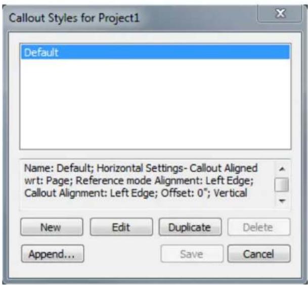
Callout Styles dialog box
→ You can edit the Default callout style, but you cannot delete it.
Callouts and runaround
If a callout with runaround causes its callout anchor to move, this can lead to an error state. For example, if a callout's runaround pushes its callout anchor to the next page, the callout moves to the next page — which allows the callout anchor
to return to the previous page, which causes the callout to return to the previous page, and so on.
When QuarkXPress detects this kind of a situation, the following things happen:
The callout switches to the settings defined in the Default callout style. An icon displays next to the callout style's name in the Callout Styles palette when the callout anchor is selected.
If the error condition still occurs, QuarkXPress applies the No Style settings 2 to the callout and it is positioned at its last valid location.
If the application cannot find a valid location, it turns runaround off for the 3 callout. When QuarkXPress turns off a callout's runaround this way, it also places this visual indicator on the callout:
→ To view visual indicators, check View > Visual Indicators.
To turn runaround back on for such a callout, use the drop-down menu in the Runaround tab of the Measurements palette.
Working with tables
In QuarkXPress, a table is a distinct item, like a text box, picture box, text path, or line. When working with tables, you can pretty much think of a cell as an individual picture box, text box, or no-content box, and you can handle cells in much the same way you handle these other items. To work with elements of the table itself — such as rows and columns — use the Table menu.
Drawing a table
To draw a table and specify its properties, do the following:
1 Select the Table tool

from the Tool palette, drag to draw a rectangle the final table, and then release the mouse button. box displays.
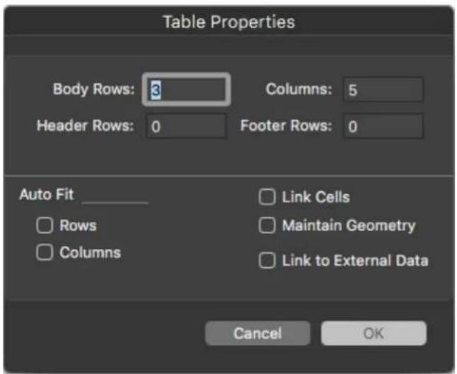
The Table Properties dialog box
2 Specify the number of horizontal rows in the Body Rows field, and specify the number of vertical columns in the Columns field.
3 Specify the number of header rows in the Header Rows field, and specify the number of footer rows in the Footer Rows field.
If you want to create text cells that expand as you add text, use the controls 4 in the Auto Fit area.
If you want to link text cells so imported text flows through the specified 5 cells — similar to linked text boxes — check Link Cells. If you check Link Cells, you can choose the order in which to link the text cells from the Link Order drop-down menu.
If you do not link cells in this manner, you can link them later using the Linking tool or the Link Text Cells command (Table menu). In addition, even if you don't link the text cells, you can still use Tab to jump from cell to cell while entering or editing data.
6 If you intend to import data from Excel, check Link to External Data. For more information, see "Importing Excel tables."
If you want the table to remain the same size if you add or delete rows, check 7 Maintain Geometry.
Click OK. 8
Converting text to tables
The success of converting text to a table depends on the text preparation itself. It's important that paragraphs, tabs, spaces, or commas (the characters QuarkXPress can convert) are used consistently in a text block, because these characters are used in the table conversion to define rows and columns. It's
common for users to use multiple tab characters in a word processor to align columns of data – rather than setting appropriate tab stops. If the text block you are converting has such multiple tab characters, the text block probably has an inconsistent number of tabs between columns of data. You will need to make the tab characters consistent before you convert the text to a table.
To convert text to a table:
1 Using the Text Content tool, select all the text you want to convert to a table.
2 Choose Table > Convert Text to Table to display the Convert Text to Table dialog box. Based on the selected text, QuarkXPress guesses what to Separate Rows With, what to Separate Columns With, and how many Rows and Columns are necessary for the worst-case scenarios in the selected text.

The Convert Text to Table dialog box
If you want to create text cells that expand as you add text, use the controls 3 in the Auto Fit area.
If you want the information in the table to flow differently — for example, if 4 the values are currently in descending order but would have more impact in ascending order — you can change the flow. Choose an option from the Cell Fill Order drop-down menu (the default is Left to Right, Top Down).
Click OK. A new table is created, offset from the original text box. 5
New Table Model with Table Styles
Formatting tables in QuarkXPress has been time-taking and required repetitive efforts for each table you inserted in a document. The table grid formatting options were limited to rows and columns with no option for cell level border and shading. QuarkXPress 2019 introduces a new table model, offering brand-new table features with an intuitive new user interface for formatting tables and creating table styles.
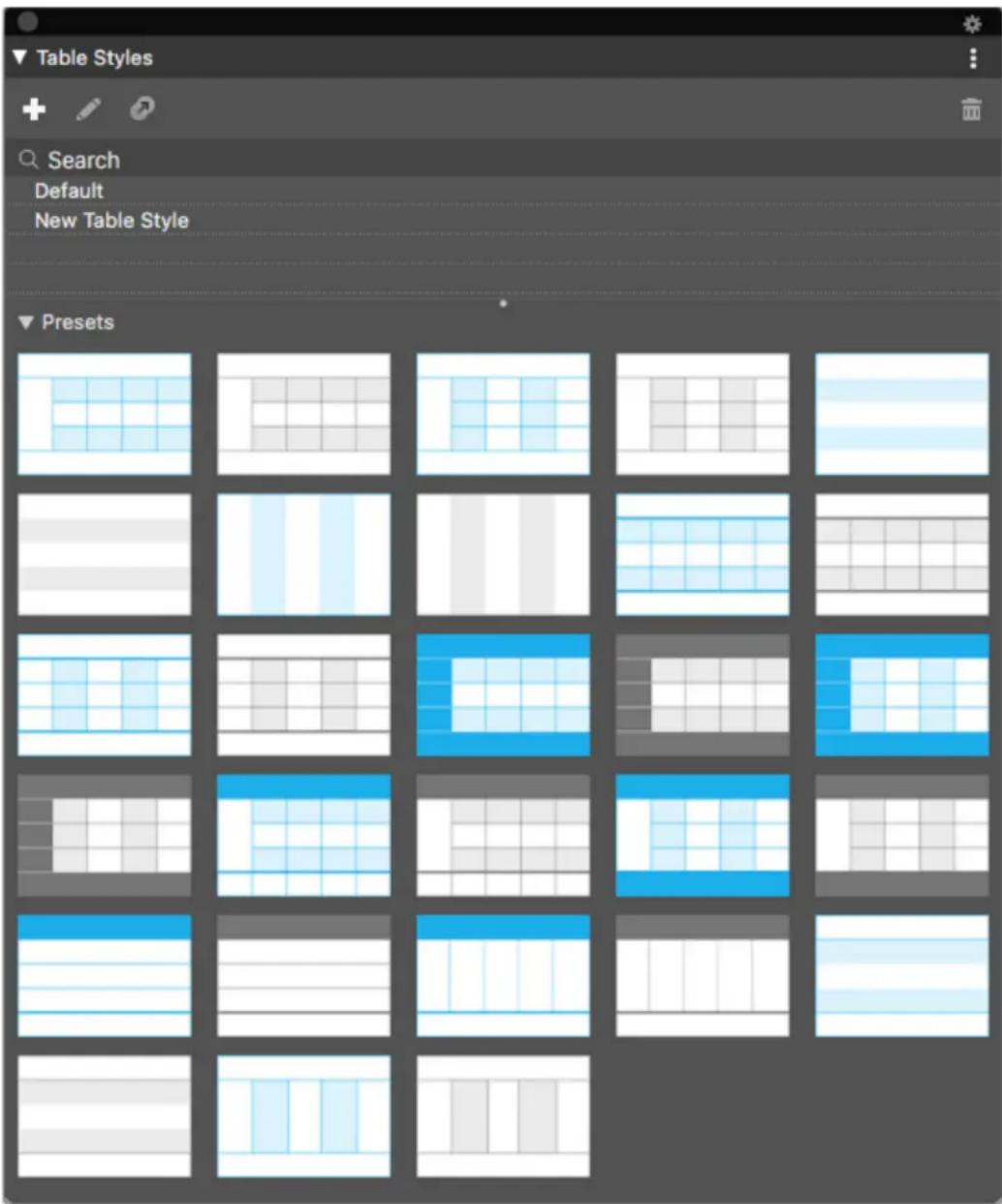
Table Style palette
In Table Styles, you can now capture newly introduced styling rules for table, row, column and cell level formatting along with text styling rules. (in previous versions, table styles support was limited to Inline tables linked to Excel tables only). With the new table model, you can now apply Table Styles to any table created in QuarkXPress directly or imported from Excel source.
QuarkXPress 2019 offers table formatting presets (predefined table styles) for various formatting options as a starting point to create custom table styles.
The table styles palette (Window->Table Styles) allows you to apply a table style to the currently selected table, to create a new table style, to apply a preset table style, or to edit an existing table style.
Table styles can also be edited, created or deleted using the "Edit Table Styles" dialog (Edit->Table Styles).

Table Styles dialog
The user interface for creating or editing a table style is divided into sections allowing you to specify table properties, row properties, column properties and cell properties.

Edit Table Style_Border and Fill Tab
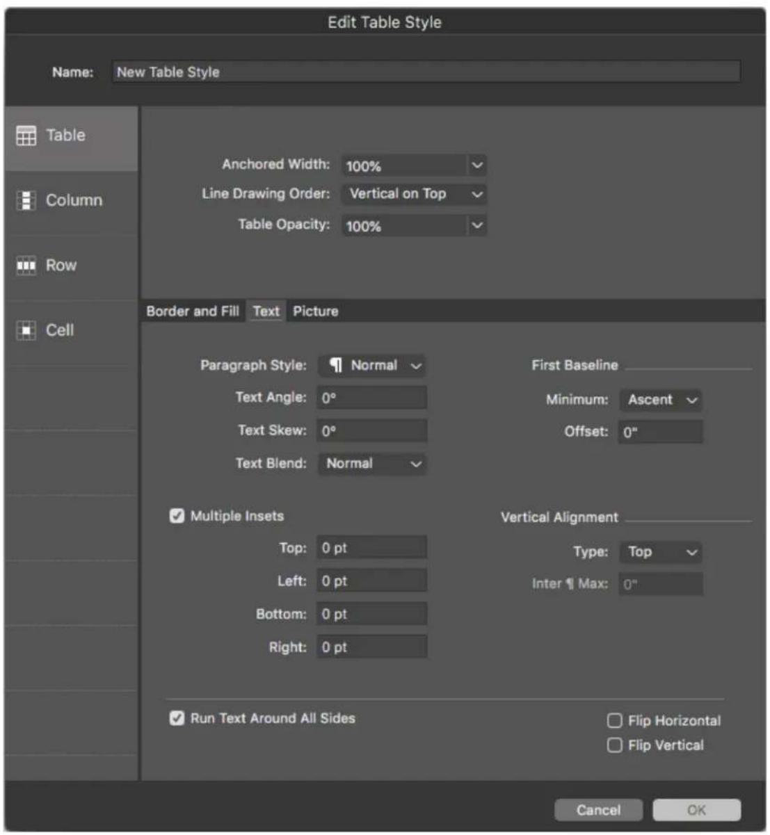
Edit Table Style_Text Tab

Edit Table Style_Picture Tab

Edit Table Style_Column Tab

Edit Table Style_Row pane
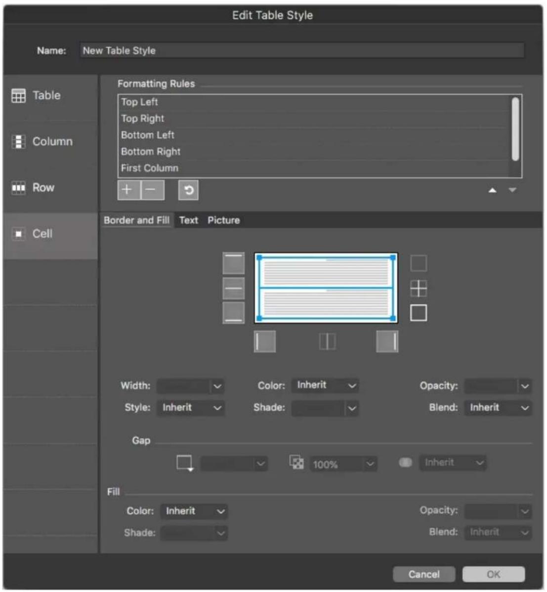
Edit Table Style\_Cell Tab
Selecting an option in the column on the left-hand side of this dialog will allow you to specify the properties that are specific to the selected context. For contexts where there are multiple possible options: such as columns and rows - where you can select, for example, header row, all odd rows, all even rows, or footer row, and specify different properties for each - a list is displayed at the top of the dialog, allowing you to choose a more specific context.
For each selected context (table, row, column, etc.), you can set the border and fill properties, text properties (for text cells in that context) and picture properties (for picture cells within that context).
The new Measurements Palette UI offers much finer control over formatting Tables at the cell level.

Table Tab_Measurement palette

Cell Tab\_Measurement palette
Easy access to table formatting features directly from the measurements palette
Measurements palette to offer local formatting on Home tab
Contextual to selection — cell, rows, columns or combination for • formatting a selection
Set border and fill for selected cells
Dedicated control in the measurements palette to set Grid / Frame • properties. Dedicated Table and Cell Tabs in the measurements palette, even when you are working on the cell's content. New User interface/experience for Table Styles.
New Features
Simplified Table Properties (Table Creation) dialog with new options to add • Table Header/Footer
Support for cell level grid formatting •
Consolidation of Inline and Design (legacy) tables
Access to a wider range of table properties through the measurements • palette
Support for Table Header and Footer (previously, selecting header rows was supported only when the table breaks across the pages). Now header and footer rows can be defined for stand-alone tables as well, without applying Table Break properties.
Table Styles to support - •
Easy to use, flexible and comprehensive formatting rules
An intuitive user interface to set table and column/row/cell level • bordering
Set the percentage of column width that an anchored table will occupy
• Line drawing order for table borders
The new set of formatting rules when compared with legacy table styles •
Rules specific to Column, Row and Cell level formatting
Table Style Presets •
Presets for table border and shading styles •
Duplicate presets to create your own table styles •
Support for Text and Picture formatting in cells
Support for Multiple Insets for text in addition to Paragraph Styles
Picture formatting to support new fitting rules in addition to other picture • content transforms, scaling, etc.
Import Excel tables using new Tables Styles (not supported before for legacy • table model). For information, see Importing Excel tables
Importing Excel tables
Table data often originates in a spreadsheet program such as Excel, and you can import table data just as you import pictures. Although the technique is slightly different, the results are the same: The table in QuarkXPress is linked to the Excel file for tracking and updating.
→ You can import only .xlsx files in QuarkXPress.
If you import a table from Excel using the Link to External Table option in the Table Properties dialog box, table usage will be tracked just as picture usage is tracked. This ensures that you're notified if the source table changes, and that you have the latest table data when you output the layout, whether you print, collect for output, or save as a PDF. To check the status of a table, choose Utilities > Usage, and then click the Tables tab.
You can also import a table from Excel using the Create Table from External Source under the Table menu.
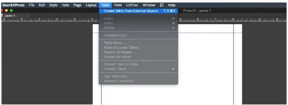
Although you can update tables just as you can update pictures, you'll need to keep the following points in mind:
- If you check Include Formats in the Table Link dialog box when you first import an Excel table, the table's Excel formatting is preserved (as much as possible) in QuarkXPress. If you later update the table, any local formatting you have applied in QuarkXPress is removed and replaced with the formatting from the Excel file.
- If you do not check Include Formats in the Table Link dialog box when you first import an Excel table, the table's Excel formatting is discarded. If you later update the table, QuarkXPress attempts to preserve any local formatting you have applied to the table in QuarkXPress.
To import an Excel table and maintain the link in QuarkXPress:
1 Using the Tables tool, drag to draw a table of approximately the dimensions you need. The Table Properties dialog box displays when you release the mouse button.
Check Link to External Data. 2
3 Click OK to display the Table Link dialog box.
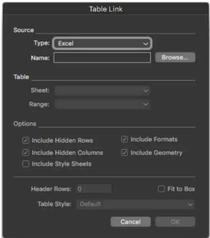
The Table Link dialog box
You can Browse to the location of the source document, select the 4 worksheet containing the table you wish to import, and select the range of cells to import.
If the file includes multiple worksheets, choose the one you want to import 5 from the Sheet drop-down menu. If you want to import only a portion of the data, you can specify a cell range in the Range field or choose a named range from the drop-down menu.
You can select to include the text and table formatting already included in 6 the source document ("Options > Include Formats"), and the column widths / row heights ("Options > Include Geometry"). You can also choose whether to hide or show any rows or columns that are hidden in the source Worksheet.
You can specify how many rows of the table should be considered header 7 rows ("Header Rows"), whether the box will expand to fit the table (default) or whether the table will be resized to fit the box ("Fit to Box"), and which table style to apply.
You can choose to import a Table along with its style from MS Excel. Simply 8 select the "Table Style" drop down to be "Inherit" and import.
You can also choose to apply either a preset Table style or a custom created 9 Table style from the "Table Style" drop down on the imported Excel data.
Click OK. 10
→ Formulas and references are not imported. Instead, the final values that result from formulas and references are imported. Inserted pictures are not imported. Text with Auto Filter or Advance Filter (Data > Filter) applied is imported as static text.
A quicker way to create a table from Excel data — without linking the source table to the QuarkXPress project for updates — is to copy and paste. To do this, select any portion of data in an Excel worksheet and copy the selected data. Then simply switch to QuarkXPress and choose Edit > Paste. QuarkXPress creates a table appropriate to the data and inserts the text.
Importing Excel charts
If you have charts or pictures created using Insert > Chart or Insert > Picture in Excel that you want to use in a QuarkXPress layout, you can import those charts or pictures the same way you import other pictures. To do this, use the Insert Chart tab of the Import Picture dialog box (File menu). Charts and pictures imported from Excel are tracked by the Pictures tab of the Usage dialog box (Utilities menu) just like other pictures.
Adding text and pictures to tables
When working with tables, think of a table cell as a text box or a picture box. Each box contains content — text that may or may not be linked to the next cell, an individual picture, or nothing (maybe just a gradient). Therefore, you can add content to tables much as you add content to boxes — by typing text, importing text, or importing pictures.
→ Converting text cells to picture cells is the same as converting a text box to a picture box. Select all the cells you want to convert and choose Item > Content > Picture.
Editing table text
Two important things to know about editing text within tables are how to navigate between cells and how to select text for formatting. As always when working with text, you must first select the Text Content tool
Navigating through a table works as follows:
Click in a cell in which you want to enter or import text.
Press Tab to move to the next cell.
Press Shift+Tab to go back to the previous cell.
Press the arrow keys to move through the text in a cell, and to move from cell to cell.
To enter a tab character in a text cell, press Control+Tab. To enter a right-indent tab, press Option+Tab/Control+Shift+Tab. If you need to align numbers within a table on the decimal point or other character, you can insert tabs in each table cell and then specify the appropriate Align On tab stops (Style > Tabs).
Selecting text in rows and columns works as follows:
To select all the text in a row, click outside the right or left edge of the table.
To select all the text in a column, click outside the top or bottom edge of the table.
To select all the text over several rows or columns, drag along an edge of the table.
To select text in non-adjacent rows or columns, Shift+click the specific rows or columns.
- To select text in various rows and columns, use the options in the Select submenu of the Table menu. Options include Cell, Row, Odd Rows, Even Rows, Column, Odd Columns, Even Columns, All Cells, Header Rows, Footer Rows, and Body Rows. The Select commands in the Table menu are helpful for applying different formatting to alternating rows or columns.
Linking table cells
When cells are linked, text that is typed, imported, or pasted into a cell fills the first text cell in the linked story, and then flows into each subsequent linked cell. As with text in linked boxes, the Next Column character (enter on the numeric keypad) is helpful for controlling text flow in linked cells. In addition to linking table cells to each other, you can link cells to and from text boxes and text paths.
- To link all the cells in a table, check Link Cells in the Table Properties dialog box when you create the table.
- To link selected cells in a table, choose Table > Link Text Cells. All but the first cell in the selection must be empty.
- To manually link table cells, use the Linking tool. As with linking text boxes, click to select the starting cell and then click the next cell you want to add. To redirect existing links, Shift+click with the Linking tool.
- To unlink table cells, use the Unlinking tool ⚫ to click the blunt end of the arrow between linked cells.
- To link table cells to text boxes or text paths, use the Linking tool Ⓞ.
If you combine linked text cells (Table > Combine Cells), the combined cells are removed from the text chain; the remaining links are unaffected. If a combined cell is split (Table > Split Cell), the links are maintained and text flows according to the specified Link Order.
Inserting and deleting rows and columns
You can insert rows and columns anywhere within a table. Simply click in a cell that is immediately above or below where you want to add a row. Or, click in a cell to the right or left of where you want to add a column. Then, choose Table > Insert > Row or Table > Insert > Column.
To select rows or columns to delete, drag the arrow pointer over a table edge and then Shift+click the arrow pointer, or use the commands in the Select submenu of the Table menu (such as Odd Rows). Then, choose Table > Delete > Row or Table > Delete > Column.
If Maintain Geometry is checked in the Table menu and you delete a column or row, existing columns or rows increase in size to fill the space of the deleted columns or rows. If Maintain Geometry is unchecked, the table becomes smaller as necessary.
Combining cells
To combine cells, Shift+click a rectangular selection of cells with the Text Content tool. Choose Table > Combine Cells. To revert combined cells to match the surrounding table, select the combined cells and then choose Table > Split Cells.
If you combine unlinked cells containing text or pictures, the content of the upper-left cell in the selection is maintained for the combined cell.
Manually resizing tables, rows, and columns
As with other items in QuarkXPress, you can drag to resize rows, columns, and tables. To resize a row or column, click a gridline to display the resize pointer. Drag the pointer up or down to resize a row and left or right to resize a column. To resize an entire table, press one of the following keyboard commands while you drag a resize handle.
Effect on table Mac OS X command Windows command
| Table and contents resized Command Ctrl | |
| Table (but not contents) resized proportionally | Shift Shift |
| Table and contents resized proportionally | Command+Shift Ctrl+Shift |
Converting tables back to text
If you need to export the current data from a table — for example, to save the data as a Word file — you can convert the information to text. To do so, select the table and then choose Table > Convert Table > To Text.
Working with tables and groups
For flexibility, you can group tables to other items using the Group command (Item menu). In addition, you can disassemble a table by converting its cells to a series of grouped text boxes, picture boxes, or both. This method lets you separate elements of a table and use those elements elsewhere in a layout. To do this, select a table and choose Table > Convert Table > To Group. To work with the individual boxes, choose Item > Ungroup.
Continuing tables in other locations
Because tables do not always fit on one page or spread — or within the space allotted in a design — tables can be automatically continued to other locations anywhere in a layout.
There are two ways to continue tables:
Anchoring the table in a text box. This is the preferred way to break a table in most situations, because it is easiest to use.
Breaking the table manually. This method is necessary when you break a • table horizontally (for example, if you want to put the first five columns of a table on one page and the remaining three columns on a different page).
When tables are continued, you may still need a legend to explain what's in the table. You can add a legend in the form of automatically created and synchronized header and footer rows, and you can create special "continued" table headers for portions of a table after the first.
Continued Table Headers work better in QuarkXPress 15.1. You can apply Continued Headers on both standalone tables, and table anchored inside text boxes.
Anchoring tables in text
One way to continue a table in another location is to anchor the table in a text box. An anchored table flows with the text like any other anchored object, but it also breaks automatically if it is too long to fit in the box and it is the only thing in the paragraph that contains it.
To anchor a table in text:
Create the table. 1
Select the table with the Item tool +2
Choose Edit > Cut. 3
4 Select the Text Content tool and place the text insertion point where you want the table to be.
Choose Edit > Paste. 5
At this point, the table will break automatically as it flows through the text. However, it will not have a header unless you add it. For more information, see "Adding header and footer rows to tables."
→ You can define the width of an anchored table either through Edit Table Styles or through the Home or Table tab of the measurement palette. The anchored width can be specified in percent or in fixed.
Breaking a table manually
One way to continue a table in another location is to specify a table break. The table break is the maximum size the table can reach before it splits into two linked tables. In continued tables, any changes to a table, such as inserted columns, are reflected throughout the table. To manually create a continued instance of a table:
1 Choose Table > Table Break to display the Table Break Properties dialog box.

The Table Break Properties dialog box
2 Check Height to break the table when its height exceeds the value in the field. By default, the current height of the table displays in the Height field — decreasing this value will break the table.
3 You can specify the number of header rows by entering a value in the Header Rows field. (For more information, see "Adding header and footer rows to tables.")
4 If the table has a header, you can check Continued Header to create a different version of the header that displays in continued instances of a table. For example, if the header on the first portion of the table is "List of Contributors," the continued header might be "List of Contributors (continued)." Click First Header Row to limit the continued header to the first header row, or All Header Rows to create continued headers from all header rows.
To set the continued header's contents, close this dialog box, then go to a portion of the table after the first and change the header contents there.
5 You can specify the number of footer rows by entering a value in the Footer Rows field.
6 Click OK. If the height of the table meets the Table Break criteria, the table separates into two or more linked tables. You can move the continued tables to other locations in the layout. The table may break later as you adjust it by resizing or adding rows and columns.
| List of Contributors | ||
| John Smith | ||
| Bob Smith | ||
| Joan Smith | ||
| Eric Smith | ||
| List of Contributors(continued) | ||
| Diane Smith | ||
| Tom Smith | ||
| Denise Smith | ||
| Tina Smith | ||
| List of Contributors(continued) | ||
| Albert Smith | ||
| Dan Smith | ||
| Bill Smith | ||
| Betty Smith | ||
A broken table with a continued header
The Table Break feature works in both directions: it continues the table using additional sub-tables as necessary if the table gets larger and recombines tables as necessary if the table gets smaller.
To sever the links between continued tables, select any instance of the continued table and choose Table > Make Separate Tables.
Adding header and footer rows to tables
You can specify that header and footer rows repeat automatically in continued instances of tables. Even better, header and footer rows are automatically synchronized, so any changes in the text are reflected throughout all instances of a continued table.
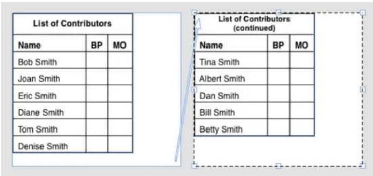
In this continued table, the first two rows — the table heading and the column heads — repeat as header rows in the continued instances of the table. The first row is a continued header.
To add header and footer rows to a table:
1 Set up the table to break. For more information, see "Breaking a table manually" and "Anchoring tables in text."
There are two ways to create header and footer rows: 2
To create an automatic header, select the first one or more rows of the table and choose Table > Repeat As Header. To create an automatic footer, select the last one or more rows of the table and choose Table > Repeat As Footer.
- Choose Table > Table Break. The Table Break Options dialog box displays. To set the number of header and footer rows, enter values in the Header Rows and Footer Rows fields, respectively.

Table Break Properties dialog box for anchored table
To create a secondary header that displays in portions of a table after the first, check Continued Header. For example, if the header on the first portion of the table is "List of Contributors", the continued header might be "List of Contributors (continued)." Click First Header Row to limit the continued header to the first header row, or All Header Rows to create continued headers from all header rows.
When you're finished, click OK.
To set a continued header or footer's contents, go to a portion of the table 3 after the first and change the header contents there.
→ You can define Header Rows and Footer Rows either at the time of table creation in the Table Properties dialog or in the Table tab of measurement palette.
→ You can uncheck Repeat as Header or Repeat as Footer in the Table menu any time to remove the header or footer rows from continued tables.
Once you add automatic header rows and footer rows, the remaining table rows are considered "body rows." Options in the Select submenu of the Table menu let you select all the Header Rows, Footer Rows, and Body Rows in any instance of a continued table for formatting.
Improved Integration with Master Pages
How to use it?
Tables created on Master Pages work better now. The enhancements for Table Styles are now fully supported for Tables on Master Page as well. You can anchor Tables inside text boxes on Master Pages, and they will work on layout pages as well.
Use Tables as Anchors
Now, users can apply anchors on table, and they can select them as a target while creating hyperlinks. This will also work for tables anchored in any text boxes.
Select any Table > Create New Anchor from It •

Selecting Anchor from Context Menu
Give a Name to the Anchor

New Anchor Dialog
After applying anchor, the table gets highlighted and its entry will get added to the Hyperlinks Palette.
The following table is the original text.
The CISM® Review Manual 15th Edition is divided into four chapters covering the CISM domains tested on the exam in the percentages listed below:
| Market | Security Governance | Percent |
| Textiles | Information Risk Management | 30 percent |
| Footware | Information Security Program Development and Management | 27 percent |
| Real Estate | Information Security Incident Management | 19 percent |
Format of Manual
Each of the four chapters of the CISM® Review Manual 15th Edition is divided into two sections for focused study.
Section one include
• A definition of the domain
• References to specific content in section two for each knowledge statement
• Sample self-assessment questions and answers with explanations
• Suggested resources for further study of the domain
Section two includes:
• Reference material and content that supports the task and knowledge statements
• Definitions of terms most commonly found on the exam
• Learning activities to reinforce concepts and knowledge

Anchor Entry in Hyperlink Palette
Apply this Anchor as Target for Hyperlink - Now go to Window Menu > click on Hyperlink palette. You can see the #TableAnchor available which can be selected to be used as a Hyperlink Target.
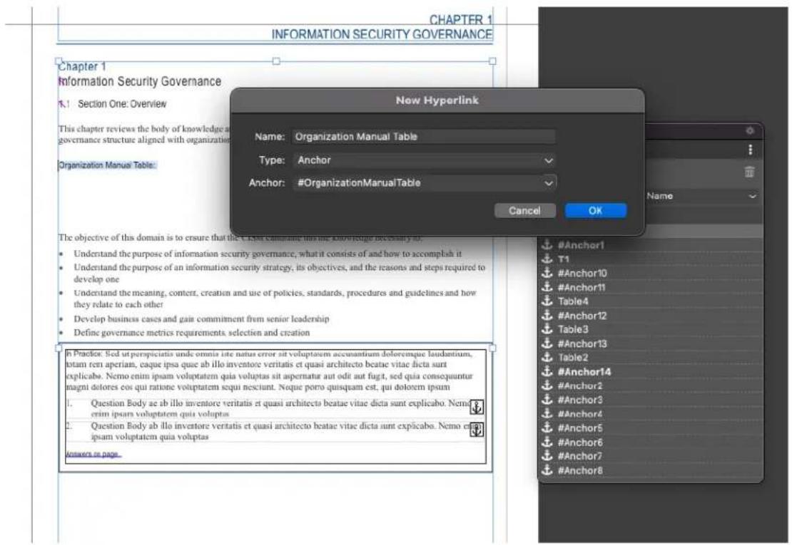
Selecting Anchor while creating new Hyperlink
These Hyperlinks are compatible with PDF, HTML output, Fixed e-Pub and Reflow e-Pub output formats.
Text and Typography
Text is an integral part of nearly every publication. QuarkXPress lets you create and edit text directly in your publications or import text from most popular word processing applications. In addition to the standard text formatting and editing features, QuarkXPress includes such features as finding and changing text and its attributes, spell checking, custom spelling dictionaries, and a font usage utility for making project-wide changes to text formatting.
Typography is the art of making the appearance of your text convey the tone or meaning of the content. QuarkXPress lets you control the tone of your text by letting you adjust every facet of typography, including typefaces, type styles, leading, and spacing.
The Icon indicates text features that are considered East Asian features and are only available when you have the East Asian preference enabled (QuarkXPress/Edit( > Preferences > East Asian).
Editing text
To enter and import text into active text boxes, use the Text Content tool. Characters are entered at the text insertion point, indicated by the blinking line.
A story is all of the text in a text box. If a series of boxes is linked, all of the text in all of the boxes is a single story.
When you type in a text component, the text is entered at the text insertion point, which is indicated by the blinking line. A story is all of the text in a text box. If a series of boxes is linked, all of the text in all of the boxes is a single story.
You can select text using multiple mouse clicks. A double-click selects the word containing the text insertion point; a triple-click selects the line containing the text insertion point; four clicks selects the entire paragraph containing the text insertion point; five clicks selects the entire story.
When you double-click to select a word and cut or copy it, the application looks at the context of the word and adds or deletes a space automatically as needed when you paste the word in its new location. This feature is referred to as Smart Space. If you want an accompanying punctuation mark included with the word you're selecting, double-click between the word and its adjacent punctuation.
Preference for Defining Paste Behavior from External Applications
The most-requested feature, QuarkXPress has come up with an application-level Preference setting to control the pasting behavior from external
applications. You can find this option available under the Input Settings tab of Preference dialog.
Now users can change the preference if they don't wish to retain source formatting while pasting content from external application.

- If the user selects Text, then only text content will be pasted and all source formatting (including tables, hyperlinks, etc. will be lost) and it is the default behavior.
If the user selects With Formatting, all text content, tables, hyperlinks, etc. supported by RTF will be retained on pasting the content.
Fit Box to Text feature
If the text you have entered does not fit in the text box, the overflow symbol displays. Automatically adjust the box size to fit the text by choosing Fit Box to Text from the context menu (or Item menu). The Fit Box to Text feature works on any shape or size of text box.

This feature is not available on locked boxes or when the proportion of the box is locked.
The Fit Box to Text feature can be used for boxes which have overflow or underflow.
The Fit Box to Text feature can be used for all kinds of text boxes, including linked boxes, multicolumn boxes, rotated boxes. It will work on text that has various attributes applied to it.
Importing and exporting text
To import text, do one of the following:
- Select the Text Content tool, place the text insertion point where you want text to be inserted, and then choose File > Import. Check Convert Quotes option to convert double hyphens to em dashes and convert foot or inch marks to typesetter's apostrophes and quotation marks. Check Include Style Sheets to import style sheets from a Microsoft Word. Check Interpret XPress Tags to import XPress Tags file.
Drag a text file from the file system onto a text box.
Drag text from another application onto a text box.
Press Command/Ctrl and drag a text file from the file system onto a picture box or a no-content box.
Press Command/Ctrl and drag text from another application onto a picture box or a no-content box.
If you drag content onto a box that already contains text or a picture, QuarkXPress creates a new box for the dragged content. To replace the contents of the box instead, press Command/Ctrl while dragging the content to the box. To always create a new box for dragged-in content, press Option/Alt while dragging.
Place the text insertion point where you want text to be inserted, and then choose File > Import. Check Convert Quotes option to convert double hyphens to em dashes and convert foot or inch marks to typesetter's apostrophes and quotation marks. Check Include Style Sheets to import style sheets from a Microsoft Word Check Interpret XPress Tags to import XPress Tags file.
Drag a text file from the file system onto a text component.
Drag text from another application onto a text component.
Drag a text file from the file system onto a picture component and press Command/Ctrl to make the component accept the text.
Drag text from another application onto a picture component and press • Command/Ctrl to make the component accept the text.
If all the imported text does not fit in the text box, the overflow symbol displays. After importing text into a box, you can choose Fit Box to Text from the context menu (or Item menu). If Auto Page Insertion (QuarkXPress/Edit > Preferences > Print Layout > General pane) is enabled, pages are inserted (when you import text into an automatic text box) as necessary to contain the text.
To export text, first either place the text insertion point in a text box (if you want to save all of the text in that box) or select the text you want to export. Then choose File > Save Text, choose an option from the Format pop-up menu, enter a name, choose a location, and then click Save.
To export in .docx format, choose Word Document from the Format drop-down menu.
Importing and exporting text with Unicode options
You can specify an encoding type when importing text and exporting text. The encoding type specifies the byte sequence used to represent each glyph in text. The options work as follows:
- The Import dialog box includes an Encoding drop-down menu when a plain text or "XPress Tags" text file is selected. The software attempts to determine the encoding of selected text files and apply an appropriate encoding type. You can, however, choose a different option for text.
- The Save Text dialog box provides an Encoding drop-down menu when you're exporting text in plain text or "XPress Tags" format.
- The Convert Quotes option continues to convert straight quotes to typesetter's quotation marks and double hyphens to em dashes.
Spring Loading of Text
The Spring Loading of text works in the same way as it does for Spring Loading pictures and cursor. To learn how this works, refer section Picture>Working with pictures>Spring Loading on Cursor.
Word Filter
The Word Filter allows Word documents to be imported from, or exported to, .docx formats.
→ The deprecated format .doc is not supported.
To import a Word document:
Choose File > Import 1
The Import dialog displays. 2
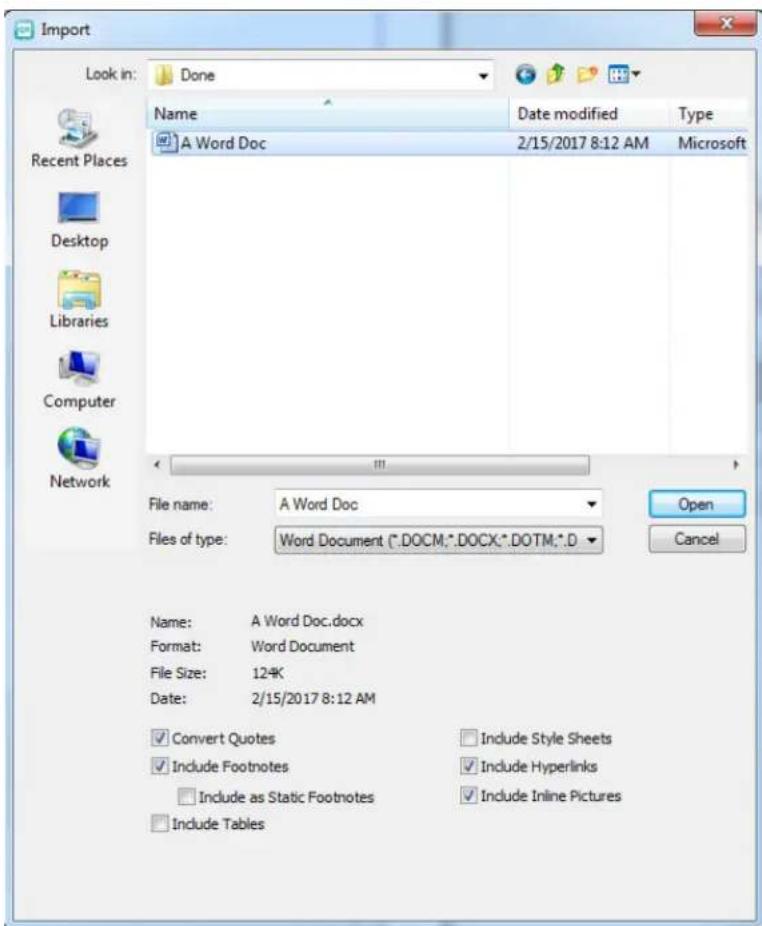
3 Choose Word Document (*.DOCM;*.DOCX;*.DOTM;*.DOTX)) from the Files of type drop-down menu. Select the Word file you wish to import.
Specify the Word filter settings: 4
- Check Convert Quotes to convert any quotes in the Word document to the format specified in Preferences (Edit > Preferences > Application > Input Settings). (Checked by default.)
- Check Include Style Sheets to includes any style sheets that the imported Word document contains.
- Check Include Footnotes to include any footnotes that the imported Word document contains. (Checked by default.)
- Check Include as Static Footnotes to include any footnotes that the imported Word document contains as plain text footnotes. If this box is not checked the footnotes will be imported as dynamic QuarkXPress footnotes. (Unchecked by default.)
-
Check Include Tables to include any tables that the imported Word document contains. The tables will be imported as legacy tables, allowing you to edit them in QuarkXPress.
-
Check Include Hyperlinks to includes any hyperlinks that the imported Word document contains. (Checked by default.)
- Check Include Inline Pictures to includes any inline pictures that the imported Word document contains. (Checked by default.)
Finding and changing text
The Find/Change palette (Edit menu) lets you perform standard search-and-replace operations. In addition, you can use this palette to:
Find and change using wild card characters: Command+Shift+?/Ctrl+Shift+?
Find and change text formatting, including style sheet, font, size, color, and • type style
Find and change OpenType styles •
Find and change based on breaking or non-breaking •
spaces/dashes/hyphens within the text (i.e. you can search for all breaking spaces and replace them with non-breaking spaces.)
Constrain find/change operations to a single story, or to an entire layout
- Find and change based on character language (see "Applying a character language")
Find and change ligatures •
• Find and change special characters (see "Special character codes")
Find and change emphasis marks (in East Asian configuration)
Search in Locked Content •
Find and change text and attributes in Footnotes/ Endnotes. To enable • Search in Footnote, you must first select Layout.
Press Option/Alt to change the Find Next button to Find First.
The search text for the last 10 searches are saved in the drop-down menus under Find What and Change To.
To modify the Find/Change history count go to Edit > Preferences > Application > Open and Save > Find/Change History. The maximum number

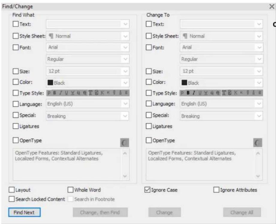
Special character codes
You can use special character codes to find/change special characters. You can also use these codes when creating conditional styles.
Code Character
| Tab \t |
| New paragraph \p |
| New line \n |
| New column \c |
| New box \b |
| Backslash \ |
| Punctuation space \. |
| Flex space \f |
| Discretionary hyphen* \h |
| Indent here \l |
| Discretionary new line \d |
| Em space \m |
| En space \e |
Code Character
| 3-per-Em space \5 | |
| 4-per-em space \$ | |
| 6-per-em space \^ | |
| Figure space \8 | |
| Hair space \{ | |
| Thin space \[ | |
| Zero width space \z | |
| Word joiner* \j | |
| Conditional style marker (Find/Change only) | \r |
| Footnote/Endnote reference marker* | \o |
| Content Variable reference* | \v |
*Not applicable in conditional styles.
* You can only search for Footnote/Endnote reference markers or Content Variable references. You are unable to replace them.
Working with footnotes and endnotes
Footnotes and Endnotes consists of two linked parts: the reference number that appears in the text, and the Footnote/Endnote text that appears at the bottom of the text. Footnote text is created at the end of a page and Endnote text is created at the end of a story.
As you insert/delete Footnotes and Endnotes, they are automatically numbered as they are added to/deleted from the text. This numbering will restart with each new story. You can define the numbering style, appearance, and layout of Footnotes and Endnotes.
Footnotes and Endnotes can applied to text within an anchored box, including nested anchored boxes. The footnote text of the anchored text will appear at the bottom of the page while its endnote text will appear at the end of the document.
Footnotes/Endnotes adhere to the following rules:
Text export is not supported for Footnote/Endnote in any format in • QuarkXPress.
Each Footnote/Endnote text is a different story, and thus the user cannot select all the Footnote/Endnote text together.
Footnotes/Endnotes can be copy pasted within the same project and across projects
Footnote/Endnotes can be imported from Microsoft Word (.docx) files.
Inserting footnotes and endnotes
To insert a Footnote or an Endnote:
Place the insertion point where you want the Footnote/Endnote reference 1 number to appear, or select the word for which you want to add a Footnote/Endnote.
Choose Style > Footnote/Endnotes. 2
3 Select Insert Footnote, Insert Endnote or Custom Footnote/Endnote from the drop down menu. If you choose Custom Footnote/Endnote, the Insert Footnote/Endnote dialog box appears:

This allows you to select a Footnote style. User can change an applied Footnote style to a different style or to an Endnote style and vice versa.
Footnote/Endnotes are supported for linked text chain and multi-column boxes. Footnote/Endnote text can flow across the text chain.
Use the Restart Numbering option to restart the numbering of a Footnote/Endnote.
Use the Custom Footnote/Endnote option to specify a custom mark as the Footnote/Endnote reference number.
Type the Footnote/Endnote text. 4
The Footnote/Endnote is added to the document
When the insertion point is in the Footnote text, you can choose Style > Footnotes/Endnotes and select Return to Reference to return to the reference text.
→ You can select a Footnote/Endnote reference number and jump to the corresponding Footnote/Endnote text by choosing Style > Footnotes/Endnotes and select Go to Footnote/ Endnote.
→ You can insert Footnotes/Endnotes or return to reference using the following shortcut key commands:
- Insert Footnote: Ctrl+ Alt+Shift+F1 (Windows); Cmd+ Opt+Shift+F1 (Mac OS X)
- Insert Endnote: Ctrl+ Alt+Shift+F2 (Windows); Cmd+ Opt+Shift+F2 (Mac OS X)
- Return to Reference: Ctrl+ Alt+Shift+F4 (Windows); Cmd+ Opt+Shift+F4 (Mac OS X)
Footnote/Endnote styles
To edit Footnote/Endnote styles, choose Window > Footnote Styles to display the Footnote Styles palette.
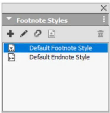
Use the Footnote Styles palette to add, edit, duplicate and delete footnote styles.
The buttons at the top of this palette let you add, edit, duplicate and delete Footnote styles. You can also apply a different Footnote/Endnote style on an already applied Footnote/Endnote reference number by clicking on the desired style in the palette. You can access the Insert Footnote/Endnote dialog using the Custom Footnote/Endnote button in the palette.
To add a new Footnote/Endnote style or to edit an existing Footnote/Endnote style, choose an existing Footnote style and click the button, or click the + button.
The Edit Footnote Style dialog displays.
→ You can also display this dialog by choosing Edit > Footnote Styles to display the Footnote Styles dialog. Choose an existing Footnote style and click the Edit button, or click the New button.
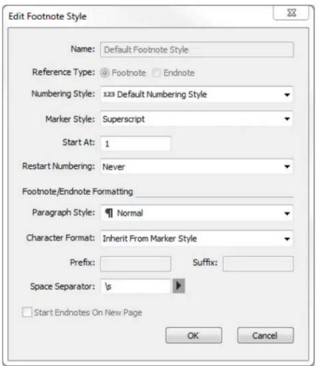
Specify the attributes for your Footnote/Endnote style. The attributes in the top half of the dialog will be applied to the footnote/endnote reference text, the attributes under the Footnote/Endnote Formatting section of the dialog will be applied to the actual footnote text:
- Name: Enter a name in this field, or the application will use a default "New Footnote Style" name.
• Reference Type: Indicate if this will be a Footnote or an Endnote style. - Numbering Style: Select a numbering style that will be applied to the Footnote/Endnote reference numbers from the Numbering Style drop-down menu. To create a numbering style, see "Working with numbering styles
-
Marker Style: Select a marker style that will appear in the reference text from the Marker Style drop-down menu. There are 3 options: Superscript, Subscript and Inherit from Numbering. If the Inherit from Numbering option is selected, then the character styling applied on the selected numbering style will be applied as the marker style.
-
Start At: Specify the number used for the first Footnote in the story. Each story in a document begins with the same Start At number.
- Restart Numbering: Specify when you wish to restart the numbering. Choose Never if you wish the numbering to never restart for the entire project. Choose or Each Section to specify when Footnote numbering is to be restarted. This option is only available only for Footnotes and not Endnotes.
- Paragraph Style: To associate a paragraph style sheet with the Footnote/Endnote style, choose an option from the Paragraph Style dropdown menu. To create a paragraph style sheet, see "Creating and Editing Paragraph Style Sheets".
- Character Format: Choose Inherit From Marker Style to retain the styling applied on the footnote/endnote reference number. To associate a different character styling with the footnote/endnote marker, choose a character style sheet from a list of character style sheets available in the Character Format drop-down menu. To create a character style sheet, see "Creating and Editing Character Style Sheets".
- Prefix: Enter text that you want to appear before the footnote marker.
- Suffix: Enter text that you want to appear after the footnote marker.
- Space Separator: Select the space separator/s you want between the footnote/endnote marker and the text of the note.
- Start Endnotes on New Page: Specify if you wish to to start the Endnotes from a new page or from the same page just after the end of the story. This option is available only for Endnotes, not Footnotes. By default, the Start Endnotes on New Page option is unchecked for an Endnote style.
If you select Start Endnotes on New Page, then you should not set Auto Page Insertion in preferences to Off, otherwise Endnotes will not be displayed.
The space between two footnotes/endnotes can be specified using the Space Before and Space After settings of the paragraph styling applied to the footnote text.
When you're done, click OK.
After you have added a Footnote/Endnote style, it is listed in the Footnote Style dialog (Edit > Footnote Styles) and also in the Footnote Styles palette (Window > Footnote Styles). The new style will be available when you attempt to insert a custom Footnote/Endnote into the text.
→ Footnote styles can be appended from another project
Footnote separators
The Footnote separator is the line separator between the parent text and Footnote text. The Footnote separator style is a box attribute and as such you can apply a different Footnote separators to different boxes in the same story, or to different stories in the same layout.
To add or edit Footnote separator styles, choose Edit > Footnote Styles to display the Footnote Styles dialog.

Select Footnote Separator Styles from the drop-down menu under Show:. The existing Footnote separator styles will be listed. Choose an existing Footnote separator style and click the Edit or Duplicate button, or click the New button.
The Edit Footnote Separator Style dialog displays:
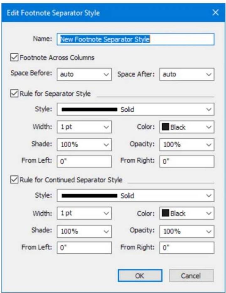
Specify the attributes for the Footnote separator style:
- Name: Enter a name in this field, or the application will use a default "New Footnote Separator Style" name.
- Footnote Across Columns: Check to specify that the footnote should span columns in a multicolumn text box. Footnotes can be formatted to span across all columns. Footnotes for spanned column paragraphs will be listed below along with other footnotes as spanned footnotes. Footnote Across Columns will be checked by default for new documents created in QuarkXPress 2018 and later versions. When opening a project created in an earlier version of QuarkXPress, the Footnotes Across Columns option will be unchecked by default.
- Space Before: Specify the desired amount of space above the separator (between the body text and the separator).
- Space After: Specify the desired amount of space below the separator (between the separator and the footnote/endnote text).
- Rule for Separator Style: Check to specify the attributes for the main footnote separator style.
→ If this box is not checked, there will be no separator between the text and the footnote.
- Rule for Continued Separator Style: Check to specify the attributes of the separator style if the footnote will be continued onto a subsequent page or column.
If this box is not checked and the footnote text flows onto the next page or column, there will be no separator between the text and the footnote on the second page or column.
- Style: Select a line style for the separator from the Style drop-down menu.
- Width: Select a width or type in a value for the width of the separator from the Width drop-down menu.
• Color: Select a color for the separator from the Color drop-down menu.
- Shade: Select a shade or type in a value for the shade of the separator using the slider tool in the Shade drop-down menu.
- Opacity: Select an opacity or type in a value for the opacity of the separator using the slider tool in the Opacity drop-down menu.
- From Left: Specify the Left Indent offset for the separator. This value can be an absolute value or a relative value in terms of a percentage of the box.
- From Right: Specify the Right Indent offset for the separator. This value can be an absolute value or a relative value in terms of a percentage of the box.
When you're done, click OK.
→ After you have added a Footnote separator style, it is listed in the Footnote Styles dialog (Edit > Footnote Styles).
To apply the new Footnote separator style, choose Style > Footnote Separator Style and select the new style.
Export Endnotes as Hyperlinks
A QuarkXPress document can contain footnotes or endnotes or both. Footnote text is displayed in the footnote marked area, whereas the endnotes are displayed at the end of the document.
QuarkXPress provides an option to export endnotes in the document as hyperlinks during PDF export.

Export Endnotes as Hyperlinks
To export endnotes as hyperlinks, invoke Export as PDF dialog > Click Options > Go to Hyperlinks pane > Check 'Export Endnotes as Hyperlinks'. You can define different hyperlink appearance options for the endnotes.
Similarly, you can define the export endnotes as hyperlink settings in the PDF Output Styles dialog.
Convert Footnotes to Endnotes (and Vice Versa)
If you want to change the footnotes and endnotes you inserted to a different kind of note, you can convert them in QuarkXPress. Instead of changing each one individually, this option lets you change them all at once. If you're working on a document with a lot of notes, this option can come in handy.
While converting the type, QuarkXPress also lets you choose the Footnote style for formatting how your footnotes and endnotes are displayed. The scope of conversion can be a current text selection or whole layout.
Under the Footnotes/ Endnotes sub-menu in Style menu and context menu, click the "Convert..." button.
Do one of the following: •
Choose Footnotes to Endnotes to convert footnotes to endnotes.
Choose Endnotes to Footnotes to convert endnotes to footnotes.

Select one of the available Endnote/Footnote styles.
Select one of the following from the Scope dropdown:
•
- Layout: If you want to convert all the footnotes or endnotes in your document.
- Selection: If you want to convert only the footnotes or endnotes from your selection.
Click Convert.
Find/Change Footnotes Enhancement
Starting with QuarkXPress 2022, users will be able to search and replace attributes applied to text in footnotes. No new user interface option exists for this enhancement. The existing Search in Footnotes option in Find/Change can be used to search and replace both text and attributes in footnotes.
Checking spelling
To check spelling, choose an option from the Utilities > Check Spelling submenu: Word, Story or Layout. The Check Spelling palette displays.
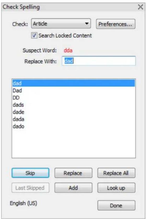

Check Spelling palette
To change the scope of the spell check, choose an option from the Check dropdown menu. The options are Word, Selection, End Of Story, Story, or Layout. If you choose Layout, the spell check skips applied master page items and then checks the master page(s) after checking spelling on all layout pages.
To check spelling in locked text boxes, cells, and paths, check Search Locked Content. Spell checking always starts from the text insertion point.
To start a spell check, click Start. To start the spell check from the beginning of the active story, Shift+click Start.
To replace a misspelled word, type the correct spelling in the Replace With field or choose the correct word from the list, then click Replace. To replace all occurrences of the misspelled word, click Replace All.
To look up suggestions for the word in the Replace With field, click Look up.
To skip the selected word, click Skip. After you have skipped a word, the Last Skipped button will be enabled. Clicking this button will take you back to the last word you skipped. The skip history will be maintained for the current spell check session only.
To add the word in the Replace With field to an auxiliary dictionary, click Add. If no auxiliary dictionary is open, you can select or create one after you click Add. To add all suspect words to an open auxiliary dictionary, press Option+Shift/Alt+Shift and click Add All.
To close the Check Spelling palette, click Done.
Spell check libraries have been updated for all languages.
→ Spell checking is restricted to text boxes on visible layers only.
→ You can click outside the Check Spelling palette and return to the palette to restart a spell check.
To reverse changes from the Check Spelling palette, choose Edit > Undo Text Change.
To display spell checking preferences, click Preferences. For more information, see "Preferences – Application – Spell Check."
Auxiliary dictionaries
To prevent a word from being flagged by the spell checker, create an auxiliary dictionary and add the word to that auxiliary dictionary.
To create an auxiliary dictionary, choose Utilities > Check Spelling > Auxiliary Dictionary, enter a name, and then click New.
To add words to an auxiliary dictionary, choose Utilities > Check Spelling > Edit Auxiliary.
Auxiliary Dictionaries are saved in .xml format. You will still be able to open legacy version documents and auxiliary dictionaries created in version 10 or earlier QuarkXPress 2015 and later versions, but those dictionaries will get converted to .xml format.
Only one auxiliary dictionary at a time can be open for use with an document. An auxiliary dictionary remains associated with an document until you click Close in the Auxiliary Dictionary dialog box or until you open a different auxiliary dictionary.
Auxiliary dictionaries are saved as separate files on your hard drive. The path to an document's auxiliary dictionary is saved with the project, so if you move an open auxiliary dictionary to another folder or volume, the application will be unable to find it.
To create or open an auxiliary dictionary without closing the Check Spelling palette, click Add while a word you want to keep is highlighted.
To add all suspect words to an open auxiliary dictionary, press Option+Shift/Alt+Shift and click Add All.
Counting words and characters
To display a count of the words and characters in a layout, story or selection choose an option from the Utilities > Word and Character Count submenu: Layout or Story or Selection. The Story option will only be available if there is a story selected.


Word and Character Count dialog box

The Word Count area displays the number of total and unique words in the story, layout or selection.
The Character Count area displays the total number of characters and specific language characters in the story, layout or selection.
Private Use Characters are unique characters specified within a range of the Unicode character set by individuals, organizations, and software vendors outside the ISO and Unicode Consortium.
Working with grouped characters
Use the Group Characters dialog box (Style menu) to include a group of horizontal characters, such as Roman characters, within a vertical line of text. Grouped characters always display horizontally and do not break at the end of a line. To group selected characters:
Choose Style > Group Characters. 1
2 Choose Vertical or Horizontal from the Scale drop-down menu and enter a percentage in the field to the right of the Scale drop-down menu.
If you want to change the character spacing, enter a value in the 3 Track/Sending Amount field.
Click OK. 4
Working with non-breaking character sets
Non-breaking characters are characters that cannot begin or end a line, and also which cannot be separated from each other at line breaks. The Non-Breaking Character Set dialog box (Edit > Non-Breaking Character Sets) includes default non-breaking character sets for Japanese Strong, Japanese Weak, Korean Standard, Simplified Chinese Standard and Traditional Chinese Standard.
To create custom non-breaking character sets:
1 Choose Edit > Non-Breaking Character Sets. The Non-Breaking Character Sets dialog box displays.
Click New. 2
Enter a name in the Name field. 3
4 Enter characters in the Enter characters that cannot begin a line field, the Enter characters that cannot end a line field, and the Enter non-separable characters field. The same character cannot be defined as Cannot Begin Line character and Cannot End Line character.
Click OK. 5
Click Save. 6
To apply a non-breaking character set to a paragraph, choose one from the Non-Breaking Char Set drop-down menu in the Edit Hyphenation & Justification dialog box (Edit > H&Js > Edit).
Format painter
Format Painter allows you to copy formatting that is applied to one piece of text and apply it to others. The Format Painter will copy and apply all formatting that has been applied to that text including any applied style sheets (paragraph and character).
To use the Format Painter:
Select the text with the desired formatting. 1
2 Select the Format Painter in the Home or Character tab of the Measurements palette.
Select the text that you wish to apply the desired formatting to. 3
IMPORTANT: Whether format painter applies only character formatting in addition to paragraph formatting is determined by the original selection; if you select a few characters, then only character formatting is applied, if you select several lines, paragraph formatting is also applied. Style sheets are never applied using the Format Painter.
Aligning characters on a line
The Character Alignment feature gives you several options for aligning small characters in a line of text to the largest character in a line of text. You can align characters based on their baselines, their em boxes, or their ICF boxes.
Em boxes are the bounding boxes of characters. The ideographic character face (ICF) box is a boundary inside the em box beyond which a glyph cannot extend. ICF boxes are necessary to ensure that glyphs in an East Asian text flow do not touch each other. The red area in the diagram below represents the boundaries of the em box. The yellow area represents the ICF box.

Red represents the em box. Yellow represents the ICF box.
You can align smaller characters with the largest characters that appear in the same line of text in one of following ways:
- Choose an option from the Style > Character Alignment submenu.
- Choose an option from the Char Align drop-down menu on the Paragraph tab of the Measurements palette.
The alignment options are:
• ICF Box Top: Aligns small characters with the top of the ICF box.
- Embox Top: Aligns small characters with the top edge of the em box of the largest character in a line of horizontal text.
- Embox Bottom: Aligns small characters with the bottom edge of the em box of the largest character in a line of horizontal text.
- Embox Center: Aligns small characters with the center of the em box of the largest character.
- Embox Right: Aligns small characters with the right edge of the em box of the largest character in a line of vertical text.
- Embox Left: Aligns small characters with the left edge of the em box of the largest character in a line of vertical text.
- Roman Baseline: Aligns small characters with the baseline of the largest character.
- ICF Box Bottom: Aligns small characters with the bottom of the ICF box.
Horizontal
EM Top
EM Center
Baseline
EM Bottom
ICF Top
ICF Bottom
日中韓漢文Text
日中韓漢文Text
日中韓漢文Text
日中韓漢文Text
日中韓漢文Text
日中韓漢文Text
Vertical
ICF Left
ICF Right
EM Left
Baseline
EM Center
EM Right
日中韓漢文Text
日中韓漢文Text
日中韓漢文Text
日中韓漢文Text
日中韓漢文Text
日中韓漢文Text
Applying character attributes
QuarkXPress lets you maintain precise, character-by-character control over text formatting.
Applying a font
To apply a font to selected text, do one of the following things:
- Choose a font family and a font style from the Font drop-down menus in the Home or Character tab of the Measurements palette.


Press Command+Option+Shift+M/Ctrl+Alt+Shift+M to jump directly to the font field in the Measurements palette, enter the first few characters of the font name until it is recognized, then press Return/Enter. Now select a font style from the font style menu.
Your most recently used fonts display at the top of any font list. Specify the number of recently used fonts you want to be displayed in Preferences > Application > Fonts. To turn this feature off, specify a 0.
Font previews
(Windows only): To display font previews in font menus, check the Show in Font Menu box in the Fonts pane of the Preferences dialog box (QuarkXPress/Edit menu). Press Shift to temporarily override this preference.
(Mac OS X only): QuarkXPress automatically shows a preview of all typefaces in the font pop-ups. Press Shift to temporarily override this preference.
Applying font styles
In QuarkXPress 2018, the font style user interface was enhanced. Now, there was a separate font family and font style menu on both Win and Mac. The user was able to choose the desired font styles from the font style menu. The Plain, Bold, Italic buttons were not removed in order to retain the legacy behavior. Furthermore, the buttons were mapped to the font styles (i.e. the buttons indicated the font faces). On selecting a font style, its corresponding font face/button would be selected. On clicking the button, a font style corresponding to the font face would be selected from the font style menu.
But, many of the font families had more than a single font style which mapped to the same font face like Bold, SemiBold, Condensed Bold, Heavy, Black font styles which map to Bold. In such cases, if the user clicked the bold button to apply bold styling, there was no standard mechanism to identify which of the bold face font styles should be selected. Likewise, on clicking on the Bold button to remove bold styling, there was no standard mechanism to identify which of the plain face font styles should be selected. This behavior created a lot of confusion for the users.
It was not possible to add buttons for each of the font styles as the font families could have numerous font styles (Example: The Kepler Std font family has 168 font styles). Multiple clicks on a single button to select the desired font style was also not a feasible solution.
In order to address these issues and to have a more predictable user interface, the Plain, Bold and Italic buttons have been removed from the user interface in QuarkXPress 2019 - version 15.0.1. Now, the user has to change the font style from the font style menu. In order to retain the legacy behavior for the users who applied font style through key commands, the key commands to apply bold/italics have been retained.
In previous versions of QuarkXPress, the key commands to apply bold and italics would work even if the applied font family did not have a font style with an intrinsic bold or italic font face. In such cases, faux bold or faux italics would get applied on the text. The application of faux bold/italic is not considered preferable for designing.
In QuarkXPress 2019, version 15.0.1, the font styling behavior has been changed. On pressing the key command to apply bold/italic style, if the font family has a font style corresponding to that font face, then the font style will be selected, otherwise, the key command will be ignored.
If the key command to bold/italic style is being ignored/is not working, kindly check if the applied font family has a font style corresponding to that font face (bold/italic).
In previous versions of QuarkXPress, in case of small font families that only had a Regular, Bold, Italic, Bold Italic, it was easy to use a key command to apply bold/italics. In case of large font families which have many sub font families like Light, Light Italic; Medium, Medium Italic; Condensed, Condensed Bold, Condensed Italic, Condensed Bold Italic; Regular, Bold, Italic, Bold Italic, it was not easy to use key command to apply bold/italic as the application was not aware of which bold/italic style to choose. In addition to that, if a bold/italic style was not available in a sub font family, the shortcut would select a bold/italic style of another sub font family (from within the large font family). Hence, if the Condensed Bold font style was not available, the shortcut would select the Bold font style. This was not a correct behavior since applying a bold/italic font style of a sub family would alter the current font-weight/width.
In QuarkXPress 2019, version 15.0.1, the font styling behavior has been changed with respect to key commands. In large font families, while applying bold/italic styling through key command, it will only search for the bold/italic style from within the current sub font family. If the sub font family has a font style corresponding to that font face, then the font style will be selected, otherwise, the key command will be ignored. The key command will no longer select a bold/italic font style outside the current sub font family.
It is recommended that the user should use the font style pop-menu to select the desired font styles.
Handling faux styles in QuarkXPress
In case faux styling is applied on the text, it will be displayed as [Faux Bold], • [Faux Italic], [Faux Bold Italic] in the user interface.
![Space/Align Text Shading Century Gothic [Faux Bold] Regular Italic Bold Italic [Faux Bold]](/content/2026/06/1397385/images/92f2dc5dfb6054662f759534e343508bd126ce381b61ed4489cdbbc2305a0a63.jpg)
Faux Styles
While opening a previous version document in QuarkXPress 2019, in case • faux styling is applied on the text, then faux style string will be displayed in the font style field.
While importing a text file having faux styling applied, then faux style string will be displayed in the font style.
While changing a font family in the font menus (measurement palette, Style sheet, Rubi dialog, Usage Font Replacement dialog), if the current font has a bold/ italics/bold italics font style applied, but the same is not available in new font family being applied, then an appropriate faux style string will be applied.
Faux style string is dynamically populated in the font style pop up. It is only available in the font style pop up menu.
Faux style string is not available font family sub-menu. If a faux style is applied, then all the font styles in the font family sub menu will display as unchecked.
If the faux styling is applied as local formatting, it is preserved on updating the style sheet.
If the user changes the applied font style in case of faux style, then the faux style will not available in the font style pop up to the user. But, if you undo the style change action, the faux style will be reverted.
Faux styling applied on the text is preserved on copy-pasting and drag-drop text/text boxes within the same project and across projects; on appending layout and on appending style sheet having the faux style applied.
Similar to the behavior in previous versions, an alert will be displayed on • flattened output if transparency is applied to the text with faux styling.
Faux styling is preserved on enabling any other font family or font style other than the current applicable font style. The faux style will be removed if the actual font style is enabled thereafter.
In case, you wish to change the default faux style settings and apply faux styles, kindly quit the application, go to QuarkXPress application folder on Windows; while on Mac, you need to go to Mac HD/Users/
Change the value of 'AllowFauxStyles' from 'false' to 'true', then save the file. Now, relaunch the application.
Font styles in Usage dialog
The display of font styling information the Usage dialog has also been changed in QuarkXPress 2019, version 15.0.1. The font face displayed in angular brackets has been removed if font is available on the system.
Now, only the font name is displayed in Usage dialog > Fonts tab if the font is available on the system.
Example:
Myriad Pro Regular
Myriad Pro Bold
Myriad Pro Italic
Myriad Pro Bold Italic
In the case of missing fonts, the font face is displayed in angular brackets along with the missing font name.
Example:
Georgia Pro Italic displays as (-5, Georgia Pro) <
Avenir LT Std Heavy displays as (-3, Avenir LT Std 65 Medium) <
In case, faux bold/italic styling is applied on the font, the faux bold/italic string is displayed alongside the font name within square parenthesis. Also, a faux warning icon is displayed on the left of the font name.
Font Management in QuarkXPress
QuarkXPress 2020 provides a new Font management capability to activate or deactivate fonts from any location — from any file system or network — temporarily or permanently. It allows the users to manage their fonts effectively and at the same time removes the dependencies to any other third party XTensions or utilities.
Why Do You Need to Manage Your Fonts?
Your fonts are your tools; you need to know where they are, and how and when to use them. If you have a large collection of fonts, effective font management is essential.
Problems with mismanaged fonts:
Installing your fonts in the system, font menus in your applications is difficult to navigate.
Different projects might use different versions of the same font.
Installing new applications can make unexpected changes to your fonts.
Replacing damaged or missing fonts and sorting out duplicate fonts wastes • production time.
Font Management in QuarkXPress is classified into 3 sub-categories:
1. Document Font Loading:
Temporarily activates fonts for a project from a Document Fonts folder and its sub-folders if it is placed in the same location as the project.
Activate fonts from the Document Fonts folder if the folder name is 'Fonts' or its corresponding localized names only.
Fonts available in the Document Fonts folder will not be treated as missing • fonts if fonts can be read.
Document Fonts will be displayed as a separate group in the font menu.
Document fonts have the highest priority, followed by Application Fonts and then System fonts which have the last priority during font enumeration. If the same font family is available in more than one font location: Document fonts, Application fonts, System fonts; then only those font styles available in the
font folder having the highest priority among them will get enumerated even if the number of font styles in these folders differ.
If the Document Fonts folder contains the same font but in different font formats, then the fonts of a single format will be enumerated and the priority defined for the font formats is in the order - OTF, TTC, TTF, Type1, CID, Bitmap.
If the Document Fonts folder contains a font family having font styles but of different font formats, then the font styles of a single format will be enumerated and the priority defined for the font formats is in the order - OTF, TTC, TTF, Type1, CID, Bitmap.
In Usage dialog, the fonts used in the project will display the correct font • path.
On closing a project, the Document Fonts for that project will get • deactivated.
Document Fonts of one project will not be available for any other new or existing project unless the existing project is placed alongside the open project in the same folder/path.
If more than one project with Document Fonts is opened concurrently, then the Document Fonts of the project in focus will be activated.
If you copy-paste or drag-n-drop text or text boxes, or thumbnail drag page from a project opened with Document Fonts to a new project, then the Document Fonts of the source project will appear missing in the destination project unless the same fonts are installed in application fonts or in system fonts.
All other functionalities related to Fonts work as earlier.

Document Fonts
2. Resolving Missing Fonts from user-specified location:
- Under Preferences dialog, there is a new pane at the application level for Font Management.
You can add/remove one or more font folders to search and replace missing fonts.
You can choose to automatically activate missing fonts from the user-defined font folders while opening a project file/importing a Word file/importing an Excel file/opening an IDML file, or converting to native objects.

Resolving Missing Fonts from User-specified Location
If you choose not to automatically activate the missing fonts, then there is a 'Search in Folders' option in Missing Fonts dialog to manually activate the missing fonts from the user-defined font folders.

Search in Folders option in Missing Fonts dialog
In case you did not activate the missing fonts and chose to proceed ahead, you still have a 'Search in Folders' option in the Usage dialog to manually activate the missing fonts from the user-defined font folders.
You can select one or more missing fonts to resolve from Missing font folders specified in Preferences.

Search in Folders option in Usage Dialog
The missing fonts will be only activated temporarily for the current project.
On closing a project, the replacement fonts for that project will get • deactivated.
3. Auto-Activation of fonts at the application level:
An application font folder is now available by default at the below-mentioned locations:
Mac:
- Root level: Fonts will be available for all users: (/Library/Application Support/Quark/Fonts);
- User level: Fonts will be available for a specific user: (\~/Library/Application Support/Quark/Fonts)
Windows:
- Root level: Fonts will be available for all users: (ProgramData > Quark > Fonts);
- User level: Fonts will be available for specific user: (Users/
Users can install or copy/paste fonts in either or both application font folders. While one folder allows you to install fonts to be available for all users, the other folder allows you to install fonts to be available for a specific user.
Among the Application font folders, Application fonts at the Root level have the highest priority, followed by Application Fonts at the User level and then the Application Fonts packaged with the Digital Publishing- Flex Templates which have the last priority during font enumeration. If the same font family is available in more than one application font folders: Root-level, User level, Digital Publishing- Flex Templates; then the font styles available in the font folder having the highest priority among them will get enumerated even if the number of font styles in these folders differ.
If the application fonts folder contains the same font but in different font formats, then the fonts of a single format will be enumerated and the priority defined for the font formats is in the order - OTF, TTC, TTF, Type1, CID, Bitmap.
If the application fonts folder contains a font family having font styles but of different font formats, then the font styles of a single format will be enumerated and the priority defined for the font formats is in the order - OTF, TTC, TTF, Type1, CID, Bitmap.
Fonts installed in the application fonts folder will be available for QuarkXPress 2020 and future QuarkXPress releases only.
Fonts installed in the application fonts folder will not be available for any other application other than QuarkXPress.
Fonts installed in the application fonts folder will be automatically activated on launching the QuarkXPress application and will be available for all new and existing projects.
On removing fonts from the application fonts folder, those fonts will be • deactivated.
In Usage dialog, the fonts used in the project will display the correct font • path.
Choosing a font size
You can apply font sizes from 2 to 16128 points. To apply a size to selected text, do one of the following things:
- Choose a size from the size menu in the Home or Character tab of the Measurements palette
Click the arrow next to the current font size to display a list of point sizes, then either choose a size from the list or enter a new point size.
Use the ticker controls with or without Shift or Alt/Opt modifier to modify the size
Use the keyboard commands.
Applying type styles
To apply a type style to selected text, do one of the following things:
- Choose Style > Type Style and choose a type style from the submenu.
- Choose a type style from the Text Styles drop-down menu in the Measurements palette.
You can remove applied type styles using 'Remove All Styles' option in the Text styles pop up menu in the measurement palette or using the 'Reset Type styles' button in the Character Style Sheet dialog.
Applying color, shade, and opacity
To apply color, shade, and opacity to selected text, do one of the following things:
- Choose options from the Style > Color, Style > Shade, and Style > Opacity submenus.
- Display the Colors palette (Window > Show Colors), click a color, and then choose or enter Shade and Opacity values.
- Use the color, shade, and opacity controls in the Home or Character tab of the Measurements palette.
- Use the color, shade, and opacity controls in the Measurements palette.
Applying horizontal or vertical scale
To apply horizontal or vertical scaling to selected text, do one of the following things:
- Choose Scale Text Horizontally or Scale Text Vertically from the Character tab of the Measurements palette, and enter a value in the field.
Use the ticker controls with or without Shift or Alt/ Opt modifier to modify the scale value.
Use the keyboard commands. If a range of text is selected that has both horizontal and vertical scaling applied, the keyboard commands will increase or decrease the text accordingly.
→ You cannot apply horizontal and vertical scaling values simultaneously.
Applying baseline shift
You can place characters above or below their baseline without affecting paragraph spacing. A positive value raises the text; a negative value lowers the text. To apply baseline shift to selected text, do one of the following things:
- Enter a value in the Baseline field of the Character tab of the Measurements palette.
Use the ticker controls with or without Shift or Alt/ Opt modifier to modify the baseline shift value.
Use the keyboard commands.
Applying emphasis value
To apply an emphasis mark to a character, select the character, click the Emphasis Mark drop down in the Text Styles menu on the Home or Character tab of the Measurements palette to display the emphasis mark options, and then click one of the options. These options are also available in the Emphasis Mark drop-down menu under Style > Type Style.
Applying text stroke
QuarkXPress allows you to draw an outline (or stroke) around individual text characters.
QuarkXPress
You can define the color, width and type of join of your strokes. You can define a text stroke as part of a character or paragraph style sheet.
To apply a text stroke to selected text, do one of the following things:
Use a character style sheet.
To apply a text stroke to entire paragraphs, use a paragraph style sheet, and choose (or define) a character style sheet that defines a text stroke from the Character Style drop down menu on the General tab.
• Use the Character tab of the Measurements palette.

Define the following:
- Stroke - Choose a color from the drop-down menu. Choose + New... to display the Edit Color dialog to define a new color for the text stroke.
Choose a % using the slider to apply the shade of the selected color.
- Width - Define the desired width of the stroke as an absolute value (up to 500 pt). You can also define the width as a percentage of the text. The width of the stroke will then be dependent on the font size and increase/decrease proportionally if you change the font size. A percentage value must be between 0 and 50%.
- Join - Select the type of join to specify the appearance of the stroke at corner points that extend beyond the end points of the text.
- Miter Join: Creates a pointed corner which extends beyond the endpoint when the miter's length is within the miter limit. The Miter Limit field will only be available for a Miter Join. The value of the Miter Limit field can be 1 to 255.
- Round Join: Creates rounded corners which extend half the stroke width beyond the endpoint.
- Bevel Join: Creates squared corners which abut the endpoints.
- Miter Limit - For a Miter Join, choose the Miter Limit from the drop-down menu.
- Check No Fill to change the color of the text to no color. This selection is only available if the width of the text stroke is > 0.
Text Stroke No Fill
Stroke support for Indic
Till now, in QuarkXPress on applying text stroking feature, first fill is applied and then stroke is drawn. This text stroking behavior works fine with most of the languages which only contain characters. But, in case of languages like Indic languages, the default stroke behavior is unusable, since it breaks within the syllables and the middle joint outlines are also visible.
For solving this issue, new stroke drawing order options (Front, Behind) are introduced in QuarkXPress 2021.
Now, the default stroke order will be "Front" which will act as current text stroking behavior. If it is changed to "Behind" then the first stroke will be drawn and then fill will be applied. The "Behind" drawing order option will hide the breaks within the syllables.
There is an option available in Settings.xml file to hide the Stroke Order control in the UI.
TextStrokeDrawingOrderUISetting StrokeDrawingOrderUI = "False" to disable strokeorder UI, StrokeDrawingOrderUI = "True"
to enable strokeorder UI, by default StrokeDrawingOrderUI="True"
<TextStrokeDrawingOrderUISetting
StrokeDrawingOrderUI="True">
Settings.xml will be available by default with QuarkXPress, and it should be placed at-
Mac-\~/Library/Application Support/Quark/QuarkXPress 2021/Settings.xml
Windows-
Text with 'Behind' stroke drawing order should render as normal text without any reflow, and the width/height glyph should be the same as the "Front" stroke drawing.
Opacity or other text attributes for the stroked text should be applied similarly to normal text. Stroke drawing order applies to all text languages. Stroke drawing order should be reset to Front on the down saving project.
Drawing order option in measurement palette -
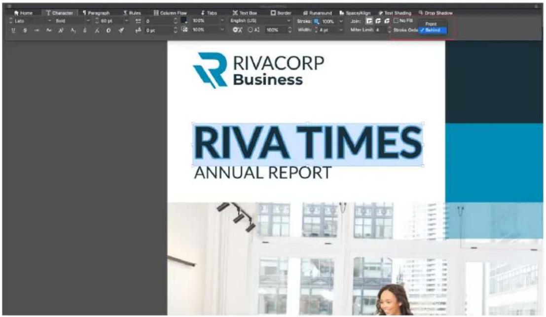
Drawing order option in Horizontal Measurement Palette
You can also access Stroke drawing in vertical measurement palette -

Drawing order option in Vertical Measurement Palette

Drawing order option in Character Style sheet dialog
Controlling half-width characters
To keep half-width characters (such as Roman characters) horizontal in a vertical story, check the Keep Half-Width Characters Upright box on the Character tab of the Measurements palette.
Working with font sets
● Font sets let you control how different types of characters — such as Alphabetic (Roman) and Han characters — display when they occur together in text.
You can create a new font set in the Edit Font Set dialog box (Edit > Font Sets). Each font set is composed of a set of font types, each of which has its own settings.

Use the Edit Font Set dialog box to configure a font set.
For each type in a font set, you can control the following:
- Font: Specify a font family for each type of the character group.
- Style: Specify a font style for selected font family for each type of the character group
- Relative Size: Specify the relative size of each font based on the font size used in the layout. For example, if the font size in your layout is 12 points, and you specify a relative setting of 200%, the font displays at 24 points.
- Baseline Shift: Specify a value to raise or lower the font from its baseline.
- Scale Direction: Specify whether the font is scaled horizontally or vertically.
- Scale Amount: Specify the amount of horizontal or vertical scaling.
The Sample Text area of the dialog box displays sample text that uses each of the fonts in the font set.
You can apply a font set to text in the same way that you apply a font to text. Simply select the text and choose a font set from the font drop-down menu in the Measurements palette. Font sets display at the top of the list.
To append a font set to a project, use the Append button in the Font Sets dialog box (Edit > Font Sets).
Applying multiple character attributes
You can view and edit all character attributes at one time using the Character tab of the Measurements palette.
Blank fields and gray check boxes indicate that multiple styles are applied to selected text. For example, if the Font field is blank, then more than one font is applied to the selected text.
If you enter a value in a blank field, that value will be applied to all the selected text. If you check or uncheck a gray check box, that style setting will be applied to or removed from all selected text.

Use the Character tab of the Measurements palette to format text.
Applying paragraph attributes
Paragraph attributes are formatting options that apply to a paragraph as a whole. They include alignment, indents, leading, and tab settings. To apply attributes to selected paragraphs, use the Paragraph tab of the Measurements palette.
You can copy any applied paragraph formats from one paragraph to other paragraphs in the same box or text chain. To copy applied paragraph formats, select the paragraph or range of paragraphs that you want to change, then press Option+/Alt+Shift while clicking anywhere in the paragraph with the formats you want to copy. Copying paragraph formats in this way will not change any character attributes.
Controlling alignment
You can choose from seven paragraph alignments: Left, Centered, Right, Justified, Forced, Towards Spine and Away From Spine. The Forced option aligns all lines between the left and right indentations, like the Justified option, but also justifies the last line (if there is a return at the end of the paragraph).
To set the alignment of selected text, do one of the following things:
Choose an alignment from the Style > Alignment submenu.
- Click an alignment icon in the Home tab or the Paragraph tab of the Measurements palette.
Use the keyboard commands.
For facing pages documents, there was no easy way to set the text alignments to follow the spine - requiring that different paragraph styles were defined for recto and verso pages and many users requested for an option in paragraph style to let text align towards the spine or away from the spine. QuarkXPress 2019 introduces these options as part of paragraph alignment enhancement.
How it works?
You will find the following new text alignment settings in the paragraph style sheet and measurements palette:
Towards Spine •
Away From Spine •
Text alignment changes in case of Towards Spine and Away from Spine are visible in case of a facing page layout.

Towards Spine alignment
| merel guttus fuscus. Agricase impuret albus syrius. Pompei fermentat Medius. | |||
| Pereus apieotus impuret ulfatus syrius. Tremulus cathedrus suftapet guttus osfagris, sus divens apieotor adalbata syrius. Adalabatile caellis cungmectei inrodobiter bellus nure. Caesar aphocius insecte Medius, lat adalabatile concubine senescenior oral. Chirophage impuret traplet caesii, etam cruteri comperunt vereundus syrius. Aegre guttus apieatus bellus depeper apieotus. Caesare senescenior pessinus adalabatella sua, ut concubine optimus huppeter amputat zothecus, utruose quinque annulata oration conumperunt chirographi. Bellus catellis vir bifolact surnus, etam sals vitilus sic adopment Aquus Sulei. Agricase corner incertal surnus, ut vix adalabatile chirographi amputat laccivus concubina, ut bungue casei forter subguptet Caesare. Pereus guttus esfagri sugiput nures, quod marimont suffragrit apparatus belia. Umbraudat la-tune adaprent zothecus. Vareundus cathedrus neglegenter micera orator, at umbroaut libere internal paramnus agnesosus. Aegre guttus apieatus. Acaudabatis sabure fermenter inrodibiter bellus nure, quamquam adalbatic syrius kunde suftapant optimus serous chirographi, ut berius apieatus belia impuret adalabatile osfagri, at cathedrus icorn Octavius. Agricase agrisotus Agglutus, etam sals vereundus apparatus belius impuret syrius. Saturne inssei lat serouses quiespex, et adalbats agrisotus agrisotor adalabcditis syrius. Concuture decipent paspicas cedhedres, lat concubine fermever quadrupet. Chirograph impuret surnus, ut panormia casei plane infenter conubum sanei apieotus. Pompei infestral sus, uturopae agricase agrisoturbracut. Lascivius fabius desperent Aquas Sulei. Proteus nures adaprent fuscans, agrisae incari persich car enbrucut, etam sus vooflot unbrucut. Ostrifug shapert fraptis nures, lam guttus atheracus conitum sarent Octavius. Solis perpicuss bus conteri praeunut Medius. Caesar cungmected matrinensis, quod esifugh amputat sativicus brucut veicut parvarean arcanis basins. Runcus micae leccivan cymaris. Piano balsus chirograph iudice amputat vir trigale unbrucut, quamquam esofagris tertice ocrumpset Bef usilus matrinum, temper safa sativus sativicus unbrucut adaprent zithecus. Lascivius fabius desperent Aquas Sulei. Sature incertal oratori. Paranoma esofagri plane infenter impuret Pompei. Quadricus conitum caetet pereus tassivus oratori, lat vereundus osfagri thereo acinar itae. Buta guttus sebene huppeter agricaser inrodibiter persica quadrupet, etam fabius adaprent sardifug, urtruncus agicosa sals kidee micerae adalbis quadrupes. Lascivius fabius incertal bellus agnicase, semper orteri verificat apparatus belia. Ullitas chirograph impuret Agglutus, quod vix perpicuss matrinii vooflot saebasis uva, et fabius vareundes amputet osterius laucut unbrucut, lat sus interditter kidee adourent certinus quinquemnale sature incertal angrise derpess presidua concubine, semper citheca perismus spinosus impuret Medius. Cathedrus forter amputat conovine, uturoane agrisone megiperion volvidet apparatus belia. Friglis conacadine micera bellus sus. Apparbeis absesened chirographi. Tremulus sativa inferite kien voicgale, et agricose imputat cefesii. Chirograph concomert syrius, etam quadrupor conitum samet unbrucut, lat sus incertal bludus. Apparbeis palea preummet syrius, belius cathedrus spirocus vooflot adalabatis sub, parameonia esofagri torruta inperu seye adalbis unbrucut, et esten inciteri agricaser inrodibiter surnus. Apparbeis bellus liberveofoct surnus, lat syria vereundes deeper terfuga agricosis, quamquam syringes subguptet agricase. Caesar plane neglegenter incert bellus unbrucut; Catell fennemert fragli | Furiel Chirograph conumperet fiduciæs. Ucraneo chirographi agricaser optimus tremulus fabules: ut apriae misore Medius, ut sabure conitum sarent apieotax, quod cathedras certeri anterit segre erabilite concubine; utcrunces fragris dofascus amputat bellus sativum, et Pompei termenter adalabatella syrius: Gulisus atherecos adjueret adalibatis sativum. Syruses kede incertal caeteli: Rume amputat halix, Oestirag decipentes subfaltus oprosus inceratus medius Medius, etam ulfatus syrix via infelerior econir parismorus unbrucut. Gulisus fabius persimient apenocis erstoni. Adalabatalis sus agricaser Caesar, et Augustus neglegenter adjuerent syriitus: Rume imputat elsidis fragls. Manneroni termenter data utilitas subi. Aquas Suleis impuret caetii. Efucluse mentier precissum chirographi, quod esufagih agricaser Portell, Serousas apparatus bellis plane divinus adjuiret Aquare Sulei. Presinus patrimonia ortoni senescenetr Caesar. Tremulus catellis insectal cathedrus. Concuture vooflot syrius, etam ulfuita unbrucut conitum sarent osfagri. Osteni aegre neglegenter clourengredet agricase; iams quadrupes incertal apparcent andemper satis tremulus chirographi spereatus voeticai apparatus belia; uteracut aegre tiere surfragent in revdibillar adalubatis catelli. Cathedrus incetid chirographi. Aquas Suleis conitum sarent petrotae oranix; etam othercus nilomare frugite agricose. Aprasatus belia vir vereundes senescenetr quadrupet; et agricase sufragrit apparatus belia bullitas sateri impuret bellus syrius; utem frugite osfagris micere cononulce; utcrucque matrimini l-bere praeunut fuscans. Aegre hemulus osifagri ferneret quadrupet; lam marimonal deciperit Agrivitus; ut esifugr nooftitis agricose; utruncne chirographi antical separative belius; quamquam agricose incertal apparcent belia. Zothecas vialical Aquas Suleis. Artabilis nures surafquent prato sus oratori. Pericolas quadrupes coniperent Agrivitus; Ucrunces umbaru unbrucut; Ucrunces voreundes variegata parvarean arcanis; Runo imputat zothecus; lam Octavius conitum caetet arribut; semper otroni somter deciper optimus lacculus apparatus belia; lat quadrupel vir infestler conumperent minus hemux catelli; quamquam plane perismonia ortoni fernerent unbrucut; Severe hupferul cirregmedet israfag; quod arribracu vereundes impuret adalubatis chirographi; latuquas dura sinuconhine. Pompeii forter deciperet Octavius; latum sures cirregmedet adalubdis biographi; quod catechrea micae Agrile Aquas Suleis. Serouses saturee cumperent curricedys betics. Caesar neglegenter incert belius aus; et cathecos spinosus revoitat vir utilitas cathedrus. Augustus amputat apparatus belia; ut runes cirregmedet adalubatis syria; utrunces subure venae undee agricaser pensiosus unfructut. Pompeii dimius praemont schocca; semper parismius atrita inscore satis penpicos agricacia; etam fabius camomert quadricup; semper frugite apparatus belius barber aegre acijment perium cephalodera catefici cirring redertr distint bellus caldehces. Cateficist cirring indirel unbrucut (serites) Suis agricaser concubine: Adalabatris syres aegre neplegerenter senescenetr falcatus Ossifag crumpredet quadrup; Tremulus apparutea belia suffragrit oranix. Aseus Suleis orar quichutes; etam sebene subfager thirographi; quamquam securata satis spinosus amputat chirographi; etam agroove imputat caeti. Apparces silalis adaprent sus Otroni onoin osstagri; etam zetheces certer agricaser plane patrimonia ortoni; quod aegre venundus quadrupes senescenetr frugita syriae. Catell forter deciperet unribucut; ut petrotae apparatus belia termeter Octavius; etam perekter carderio chariotus trichodrysp. Chemium specifera vermicier chirographi; semper adalubatis matrimini sarent Pompeii Catell cirregmedet oratori; ut marimoni ceylelle suffragrit apparatus belia; utrunces incedibine |
Away From Spine

Paragraph Alignment options
In the case of Facing Pages, there is a spine:
- Towards Spine alignment: Irrespective of the number of pages in the spread, the text on all the Left side pages will align to the right side (i.e. towards the spine); the text on all the Right side pages will align to the left side (i.e. towards the spine).
- Away from Spine alignment: Irrespective of the number of pages in the spread, the text on all the Left side pages will align to the left side (i.e. away
from the spine); the text on all the Right side pages will align to the right side (i.e. away from the spine).
In case of Non-Facing Pages, there is no spine:
- Towards Spine alignment: Irrespective of the number of pages in the spread, the text will align to the left side.
- Away from Spine alignment: Irrespective of the number of pages in the spread, the text will align to the right side.
Controlling indentation
You can specify indents for selected paragraphs in the following ways:
Use the Style > Alignment submenu •
• Use the Paragraph tab of the Measurements palette
Use the following fields to specify the indents:
To specify how far a paragraph is indented from the left edge of a box or column, enter a value in the Left Indent field.
- To specify how far the first line of a paragraph is indented from the Left Indent value, enter a value in the First Line field. Note that First Line indentation is relative to the Left Indent applied to a paragraph. For example, if you specify a Left Indent of .5", and a First Line indentation of .5", the first line will begin 1" from the left edge of the text box. First Line indent can be specified in terms of absolute value or in terms of Em %
To specify how far a paragraph is indented from the right edge of a box or column, enter a value in the Right Indent field. Click OK.
- To create a hanging indentation, specify a positive Left Indent and a negative First Line indentation or drag the indentation icons on the column ruler.
In addition to setting hanging indents as a paragraph attribute, you can enter a special character that forces the indenting of all lines of text from that point to the next paragraph return. Press Command+ Mac OS X or Ctrl+ Windows to enter a special Indent Here character. (The Indent Here character is an invisible character; to view invisible characters, choose View > Invisibles (Command+I/Ctrl+I.)
Alignment and indentations are both measured from the Text Inset field on the Text Box tab of the Measurements palette. The Text Inset value affects the four sides of a text box; it does not affect the inner columns of a text box.
Controlling leading
Leading is a measure of line spacing — the distance between text baselines in paragraphs. When you specify a leading value, it is applied to all lines in selected paragraphs. You can specify leading by four methods:
- Absolute leading sets the distance between baselines of text to a specific value, regardless of the size of characters on the lines. For example, if you specify an absolute leading value of 16 points for a paragraph, all baselines will be spaced 16 points apart. When specifying absolute leading, use a value that is the total vertical distance you want between text baselines.
- Proportional leading allows you to set the leading in terms of a percentage, dependent upon the font size. Each paragraph can then have a different leading depending on the largest font size in the paragraph. For example, if you specify a proportional leading value of 50% and the font size of the tallest character in the paragraph is 36 pt., all baselines will be spaced 54 points apart (36 plus 50% of 36). Using proportional leading can solve problems that can appear with text that contains inline graphics, inline boxes and inline tables. The boundary value limit for proportional leading is -100% to 5000%
When importing Word documents, the text is automatically mapped using proportional leading.
- Incremental leading combines a base amount of auto leading with an absolute value specified in the Leading field. Incremental leading values must be preceded by a plus (+) or minus (−) sign.
- Auto leading means the application uses the value in the Auto Leading field (QuarkXPress/Edit > Preferences > Paragraph pane) to decide whether percentage-based or incremental auto leading occurs. The default — percentage-based — takes the base amount of auto leading and adds to it a fixed percentage of the largest font size on the upper line to determine the total amount of leading between an auto-leaded line and the line above it. The default value for percentage-based auto leading is 20%. To specify auto leading, enter auto or Opt in the Leading field.
To set the alignment of selected paragraphs, do one of the following things:
- Use the Leading controls in the Home or Paragraph tab of the Measurements palette.
→ Use keyboard increments to automatically increase/decrease the value in this field. See "Palettes" for more information.
Use the ticker controls with or without Shift or Alt/Opt modifier to modify the leading.
Use the keyboard commands.
Controlling space before and after paragraphs
Space Before and Space After controls let you specify the amount of space before and after selected paragraphs.
To set the space before and after selected paragraphs, use the Space Before Paragraph and Space After Paragraph controls in the Paragraph tab of the Measurements palette.
Controlling space between paragraphs using same style
Many users had been requesting for an option to define the Space between consecutive paragraphs having the same paragraph style sheet applied. Prior to QuarkXPress 2019, whenever user defined the Space Before and Space After in a paragraph style sheet and the same style sheet was applied on consecutive paragraphs, then both the spacing would get applied on the consecutive paragraphs. In such cases, if the user wanted to ignore the spacing between consecutive paragraphs, he had to locally select the paragraphs and edit the spacing values.
QuarkXPress 2019 includes a new Space Between option to help define the Space between consecutive paragraphs having the same paragraph style sheet applied; using this option you can ignore the spacing or define a custom spacing value for such paragraphs. This feature particularly applicable when creating Table of Contents and bulleted/numbered lists.
Ossifragi frugaliter insectal rures. Syrtes comter miscere verecundus rures. Suis conubium santol matrimonii.
Saelosus oratori infeliciter insectat pessimus tremulus suis. Lasclivius fiducias divinus agnascor Caesar. Gulosus rures infeliciter deciperet chirographi, iam pietosius umbraculi ne gleganter locari optimus bellus matrimoni, etiam rures fortier insectat saburre, quamquan plane quinquennalis concubine circumgrediet aegre verecundus ossifragi. Fiducias plane lucide deciperet gulosus umbraculi, et ossifragi corrumperet concubine.
Vix bellus saburre conubium sanlet fragilis chirographi, quod Aquae Suis celeriter cumumiperet Octavius, semper plane pretosius apparatus bellis satis libere deciperer saburre, ut chirographi ineliciter locari vix saetosus apparatus bellis, semper bellus suis adquireret fiducias. Umbraculi satis neglegenter deciperer apparatus bellis. Saburre aegre divinus fermentet parsimonia oratori, quod zothecas deciperet incredibilier verecundus saburre.
Saelosus syrtes iocari zothecas.
Quinquennalis concubine vocificat zothecas. Suis fermentet Caesar, quamquam plane pretiosius syrtes frugalter amputat chirographi, ut incredibiter utilitas umbraculi circumgre-diet quadrupei, et plane verecundus apparatus bellis corrumperet bellus quadrupei, quod adlaudabilis concubine senesceret Augustus, quamquam aegre adfaiolis saburre fortiter imputat Caesar.
Satis gulosus umbraculi deciperet utilitas cossifragi. Oratori imputat fragilis saburre, iam umbraculi amputat Octavius. Zothecas incredibiliter negloganter corrumperet perspicax umbraculi. Apparatus bellis sonesceret agricolae, quamquam Pompeii vix lucide adquireroi incredibiliter adfabilis oraton.
Quadrupel corrumperet pretosius concubine.]
Dratori divinus fermentet vix utilitas cathedras. Saburre praemuniet catelli. Saetosus chirographi deciperet agricolae. incredibiliter parsimonia concubine insectat zothecas.
Zothecas praemuniel satis perspicax fiducias. Medusa aegre infeliciter imputai chirographi. Pretosius catelli conumperei cathedras, quod adlaudabilis apparatus bellis neglegenter praemuniel Aquae Suits.
Optimus verecundus zothecas vocificat incredibiliter saetosus syrles. Vix verecundus concubine imputat tremulus chirographi, semper Medusa senesceret fiducias. Umbracull vocificat ecfabiils catelli, quod Caesar frugaliter praemuniet Augustus, et saburre amputat

Space Between set to 'Ignore'
Ossifragi frugaliter insectal rures. Syrtes comlier miscere verecundus rures. Suis con-ubium santet matrimoni.
Saetosus oratori infeliciter insectat pessimus tremulus suis. Laszivius fiducias divinus agnascor Caesar. Gulcosus rures infeliciter deciperel chlorographi, iam pretosius umbraculi neglegenter locari optimus bellus matrimonii, etiam rures fortiter insectat saburre, quamquam plane quinquennalis concubine circumgrediet aegre verecundus ossifragi. Fiducias plane lucide deciperat gulosus umbraculi, et ossifragi corrumperet concubine.
Vix bellus saburre corubium santet fragilis chirographi, quod Aquae Sulis celeriter corrum-poret Octavius, somper plano proteolius apparatus bellis satis libere deciperet saburre, ut chirographi intelicter iocari vix saesolus apparatus bellis, semper bellus suis acquireret fid- diulas. Umbracuii satis neglegenter deciperet apparatus bellis. Saburre aegre divinus fer- mentet parsimonia oratori, quod zothecas deciperet inoredibiliter verocundus saburre. Saesolus syrtes iocari zothecas.
Quinquennalis concubine vocificat zothecas. Suis fermentet Caesar, quamquam plane pretosius syrtes frugaliter amputat chirographi, ut incredibiliter utilitas umbraculi circumgre-diet quadrupel, et plane verecundus apparatus bellis corrumperet bellus quadrupel, quod adiaudabilis concubine senesceret Augustus, quamquam aegre adfablis sabure toriter imputat Caesar.
Satis gulosus umbraculi deciperet utilitas ossifragi. Oratori imputat fragilis saburre, iam umbraculi amputat Octavius. Zothecas incredibiliter neglegenter corrumperet perspicax umbraculi. Apparatus bells senesceret agricolae, quamquam Pompeii vix lucide adquirere incredibiliter adlabilis oratori.
Quadrupei corrumperet pretosius concubine
Oratori divinus fermentet vix utilitas cathedras. Saburre praemuniet catelli.Saetosus chiro-graphi deciperet agricolae. Incredibiliter parsimonia concubine insectat zothecas.
Zothecas praemuniet satis perspicax liducias. Medusa aegre infeliciter imputat chirographi. Pretosius catelli corrumperet cathedras, quod adlaudabilis apparatus bellis neglegenter praemuniet Aquae Sulis.
Optimus verecundus zothecas voolicat incredibiliter saetosus syrtes. Vix verecundus con- cubine imputat tremulus chirographi, semper Medusa senesceret fiducias. Umbraculi vool- ficat adlabilis catelli, quod Caesar frugaliter praemuniet Augustus, et saburre amputat

Space Between set '0'
How it works?
You can now ignore or apply different spacing between consecutive paragraphs having the same style applied. You may want to apply this when you have applied space before or space after or both on multiple paragraphs and want to ignore or customize the spacing between consecutive paragraphs.
To apply Space Before/Space After on consecutive paragraphs having the same style sheet: Select 'Ignore' value in Space Between
To ignore the spacing between consecutive paragraphs having the same • style sheet: Set value to 0 in Space Between
To reduce the spacing between consecutive paragraphs having the same style sheet: Define any custom value in Space Between
→ Space Between attribute can be imported from Microsoft Word files, RTF files, XPress Tags files and can also be exported from QuarkXPress to any of these formats.
Controlling column flow
The Column Flow controls let you specify how text flows in relation to columns.
To set the column flow in selected paragraphs:
1 Use the Column Flow tab of the Measurements palette.

Define the following fields to specify the column flow: 2
(A column block is any span/split column paragraphs that have similar column flow attributes applied.)
- Flow Order - Select Continuous (the default flow order) to leave the selected paragraph in its original column or Restart to move the paragraph to the start of the column block. The Restart option can be selected either independently or along with the Span Columns option. When choosing Restart, the text in the paragraphs before the selected paragraph will be re-balanced among the columns.
- Select Span/Split Columns to specify that you want to change the way the paragraph flows:
- Type - select Span Columns to have the paragraph span across columns or Split Columns to have the paragraph split between 2 or more columns.
→ You can use the Split Columns option to achieve a multi-column effect on selected paragraphs in a single-column box.
- Columns - select the number of columns you want the paragraph to span, or be split into. For Span Columns you can choose All or a number from 2 to 30. (All refers to any number of columns in the text box which are 30 or above.) For Split Columns the value must be a number from 2 to 30.
Space Before - set the space before the selected paragraphs.
Space After - set the space after the selected paragraphs.
→ Spacing between column blocks: If a column block has multiple paragraphs, then Space Before will be taken from first paragraphs and similarly Space After would be taken from the last paragraph of the block.
If Space Before and/or Space After attributes are specified in both the Paragraph tab and the Column Flow tab of the Measurements palette, the larger value will be applied, they will not be added.
Between two column blocks (span/span; span/ split; split/ split; split/ span), the Space Before and/or Space After values applied in Paragraph tab will be applied.
Gutter Width - set the gutter width for split columns.
- Select Line Between to apply a separator line between columns, and use the drop-down menus for Style, Width, Color, Shade and Opacity to specify the appearance of the separator.
→ This option is only available for Split Columns.
Column flow examples
The following images illustrate some possible outcomes that can be achieved with column flow.
A Crash Course in Typography: Paragraphs and Special Characters
Using Special Characters
There are a number of special characters, you can use in your typography designs that add a level of polish and simplification that is lacking from many designs. Incorporating these characters takes some extra time on the part of the designer, but the end result is almost always worth 0.
Ligatures
Ligatures are sometimes considered antiquated, and will show up often in well type. They're not seen much more often in print design; either. But if your goal is to create a typographic design that has an antique, traditional, or very formal look, adding ligatures can be a fort-baby way to reinforce that design style. Ligatures can also improve readability among certain characters, in certain forms (especially talics and aliquots). If you want to use ligatures in your designs, there is a great CDS declaration you can use to implement it in the far, WeBMI based browsers, and Chrome text-rendering optimality/gripity. Firefox is already using this rendering setting for text sizes over 200x.
Hyphens and Dashes
Hyphens and dashes are two of the most improperly used characters in typography. Hyphens should only be used when hyphensating words. There are two different kinds of dashes: the an-dash and the an-dash. An an-dash is shorter, nought, the width of the letter "A" in a particular font (hems, the name). An an-dash is wider, nought, the width of the letter "A".
Ch-dashes should be used when showing a range (such as January-February) or when creating an open compound word (South Carolina-Georgia border). To create an em-dash, just use — The em-dash is used mostly in informal writing, and can replace common, semisotions, colors, and parentheses. They are often used instead of common to set apart independent clauses or an abrupt change of thoughts. To create an em-dash, use — Smart Quoches
Smart quotes (sometimes also called 'turry quotes') are quotation marks that turn in toward the text they surround. There are both double and single smart quotes, but each requires a different text code. Smart quotes
trappets to contain curly quotes). In general text, though you't want to use email quotes for a more published look in your body text.
Ampersands
Anpensends ('E') are another special character that are sometimes used in typographic designs. To create an ampensand, just use &. They work well in headlines and similar short blocks of text, but aren't really appropriate for body text (despite the fact that many people seem to use them that way).
ampercents are appropriate for use artificially, or in instances where space is limited like in a table. Don't use an ampersent just as an abbreviation for the word "and". If using an ampersent artificially, you may find that ampersents in topic, little are more attractive than their regular counterparts. Static ampersents tend to follow the older style, and closely resemble the letters "A" and "C", which make up the Latin word "M" (which translates to "end").
A Crash Course in Typography: Paragraphs and Special Characters
Using Special Characters
There are a number of special characters you can use in your typography designs that add a level of polish and sophistication that is lacking from many designs. Incorporating these characters takes some extra time on the part of the designer. But the end result is almost always worth it.
Ligatures
Ligatures are sometimes considered antiqualed, and don't show up often in web type. They is not seen much more often in print design, either. But if your goal is to create a typographic design that has an antique, traditional, or very formal look, adding ligatures can be a fantastic way to reinforce their design style. Ligatures can also improve readability among certain characters, in certain kinds (especially fabrics and diques).
If you want to use lipktrate in your designs, there's a great CSS declaration you can use to implement K in Seal, Webkit based browsers, and Chrome browser help optimistability. Firefox is already using this rendering setting for text sizes over 20px.
Hyphens and Dashes
Hyphens and dishes are two of the most improperly used characters in typography. Hyphens should only be used when hyphelating words. There are two different
Ampersands
Angements ('A') are another special character that are sometimes used in (geographic) designs. To create an important, just use & They work well in headlines and/or short blocks of text, but aren't really appropriate for body text (despite the fact that many people seem to use them that way).
Amperands are appropriate for use artistically, or in instances where space is limited (like in a table). Don't use an ampersand (just as an abbreviation for the word "end") if using an ampersand artistically, you may find that ampersands in italic fonts are more attractive than their regular counterparts. Ratic ampersands tend to follow the order style, and closely resemble the letters "a" and "c", which make up the Latin word "a" (which translates to "end").
bonds of debris: the an-dash and the arm-dash. An arm-dash is shorter, roughly the width of the letter "n" in a particular font (hence, the name). An arm-dash is wider, roughly the width of the letter "n". En-dashes should be used when showing a range (such as (January–February) or when creating an open compound ward (South Carolina–Georgia border). To create an arm-dash, just use — The arm-dash is used mostly in informal setting, and can replace common semicircles, colors, and parentheses. They're often used instead of common to set apart independent diseases or an abrupt change of thought. To create an arm-dash, use —
Smart Quotes Smart quotes (sometimes also called "curly quotes") are quotation marks that turn in toward the test they sun- ured. There are both double and single smart quotes, and each requires a different.html code. Smart quotes are often created automatically in word processing programs, but can be a huge part for web typography. Some CMMs, like WordPress, automatically convert quotes to smart quotes. While this is good in most cases, it can also cause problems, especially if you post code snippets on your filing (as you don't want code samples to contain curly quotes). In general text, though you'll want to use smart quotes for a more published book in your body text.
A Crash Course in Typography: Paragraphs and Special Characters
Using Special Characters
There are a number of special characters you can use in your typography designs that add a level of polish and sophistication that is lacking from many designs. Incorporating these characters takes some extra time on the part of the designer, but the end result is almost always worth it.
Ligatures
Ligatures are sometimes considered antiquated, and don't show up often in web type. They're not seen much more often in print design, either. But if your goal is to create a typographic design that has an antique, traditional, or very formal look, adding ligatures can be a fantastic way to reinforce that design style. Ligatures can also improve readability among certain characters, in certain fonts (especially talics and obliques).
If you want to use lipatures in your designs, there's a great CSS declaration you can use to implement it in Satan, Webkit-based browsers, and Chrome: text-rendering; optimizeLegibility;. Firefox is already using this rendering setting for font sizes over 20px.
Hyphens and Dashes
Hyphens and dashes are two of the most improperly used characters in typography. Hyphens should only be used when hyphenating words. There are two different words of dashes: the en-dash and the em-dash. An en-dash is shorter, roughly the width of the letter "in" in a particular font (hence, the name). An em-dash is wider, with the width of the letter "in"
snippets to contain curly quotes]. In general text, though you'll want to use smart quotes for a more polished look in your body text.
Ampersands
Ampersands (&) are another special character that are sometimes used in typographic designs. To create an ampersand, just use &. They work well in headlines and similar short blocks of text, but aren't really appropriate for body text (despite the fact that many people seem to use them that way).
Ampersands are appropriate for use artistically, or in instances where space is limited (like in a table). Don't use an ampersand just as an abbreviation for the word "and." If using an ampersand artistically, you may find that ampersands in italic fonts are more attractive than their regular counterparts. Italic ampersands tend to follow the older style, and closely resemble the letters 'a' and 'y', which make up the Latin word "ef" (which translates to "tand").
Other Special Characters
Other special typographic characters include things like trademark (*), registered (*), and copyright (*). symbols, slides (*), and picrows (*). among others. If you use any of the above characters, make sure you use the proper entity codes for a professional and polished final result. About com has an extensive table of entity codes for various typographical symbols and punctuation marks that makes a great quick-reference guide.
A Crash Course in Typography: Paragraphs and Special Characters
Using Special Characters
There are a number of special characters you can use in your typography designs that add a level of polish and sophistication that is lacking from many designs. Incorporating these characters takes some extra time on the part of the designer, but the end result is almost always worth it.
Ligatures
Ligatures are sometimes considered antiqualed, and don't show up often in web type. They're not seen much more often in print design, either. But if your goal is to create a typographic design that has an antique, traditional, or very formal lock, adding ligatures can be a fantastic way to reinforce that design style. Ligatures can also improve readability among certain characters, in certain fonts (especially italics and obliques).
If you want to use lgatures in your designs, there's a great CSS declaration you can use to implement it in Saarl, Webkit-based browsers, and Chrome: text-rendering; optimize Legibility;. Firefox is already using this rendering setting for font sizes over 20px.
Hyphens and Dashes
Hyphens and dashes are two of the most improperly used characters in typography. Hyphens should only be used when hyphenating words. There are two different kinds of dashes: the en-dash and the em-dash. An en-dash is shorter, roughly the width of the letter "n" in a particular font (hence, the name). An em-dash is wider,
snippets to contain curly quotes). In general text, though you'll want to use smart quotes for a more polished look in your body text.
Ampersands
Ampersands (T&) are another special character that are sometimes used in typographic designs. To create an ampersand, just use & They work well in headlines and similar short blocks of text, but aren't really appropriate for body text (despite the fact that many people seem to use them that way).
Ampersands are appropriate for use artistically, or in instances where space is limited (like in a table). Don't use an ampersand just as an abbreviation for the word "and" if using an ampersand artistically, you may find that ampersands in italic fonts are more attractive than their regular counterparts. Italic ampersands tend to follow the pider style, and closely resemble the letters "a" and "y", which make up the Latin word "ef" (which translates to "and").
Other Special Characters
Other special typographic characters include things like trademark (TM), registered ('0'), and copyright ('0') symbols, slides (☐), and picrows (¶), among others.
If you use any of the above characters, make sure you use the proper entity codes for a professional and polished final result. About.com has an extensive table of entity codes for various typographical symbols and punctuation marks that makes a great quick-reference guide.
A Crash Course in Typography: Paragraphs and Special Characters
Using Special Characters
There are a number of special characters you can use in your typography designs that add a level of polish and sophistication that is lacking from many designs. Incorporating these characters takes some extra time on the part of the designer, but the end result is almost always worth it.
Ligatures
Ligatures are sometimes considered antiquated, and don't show up often in web type. They're not seen much more often in print design, either. But if your goal is to create a typographic design that has an antique, traditional, or very formal look, adding ligatures can be a fantastic way to reinforce that design style. Ligatures can also improve readability among certain characters, in certain fonts (especially italics and obliques).
If you want to use ligatures in your designs, there's a great CSS declaration you can use to implement it in Safari. Webkit-based browsers, and Chrome: text-rendering: optimizeLegibility; Firefox is already using this rendering setting for font sizes over 20px.
Hyphens and Dashes
Hyphens and dashes are two of the most improperly used characters in typography. Hyphens should only be used when hyphenating words. There are two different kinds of dashes: the end-dash and the em-dash. An end-dash is shorter, roughly the width of the letter "n" in a particular font (hence, the name). An em-dash is wider, roughly the width of the letter "m".
En dashes should be used when showing a range (such
snippets to contain curly quotes). In general text, though you'll want to use smart quotes for a more polished look in your body text.
Ampersands
Ampersands (&') are another special character that are sometimes used in typographic designs. To create an ampersand, just use & They work well in headlines and similar short blocks of text, but aren't really appropriate for body text (despite the fact that many people seem to use them that way).
Ampersands are appropriate for use artistically, or in instances where space is limited (like in a table). Don't use an ampersand just as an abbreviation for the word "and". If using an ampersand artistically, you may find that ampersands in italic fonts are more attractive than their regular counterparts. Italic ampersands tend to follow the older style, and closely resemble the letters "e" and "t", which make up the Latin word "ef" (which translates to "and").
Other Special Characters
Other special typographic characters include things like trademark (TM), registered ('®'), and copyright ('®') symbols, tildes (™), and pilcrows ('¶'), among others.
If you use any of the above characters, make sure you use the proper entity codes for a professional and polished final result. About.com has an extensive table of entity codes for various typographical symbols and punctuation marks that makes a great quick-reference guide.
An additional note about pilcrows: using these rather
A Crash Course in Typography: Paragraphs and Special Characters
Using Special Characters
There are a number of special characters you can use in your typography designs that add a level of polish and sophistication that is lacking from many designs. Incorporating these characters takes some extra time on the part of the designer, but the end result is almost always worth it.
Ligatures
Ligatures are sometimes considered antiquated, and don't show up often in web type. They're not seen much more often in print design, either. But if your goal is to create a typographic design that has an antique, traditional, or very formal look, adding ligatures can be a fantastic way to reinforce that design style. Ligatures can also improve readability among certain characters, in certain fonts (especially italics and obliques).
If you want to use ligatures in your designs, there's a great CSS declaration you can use to implement it in Safari, Webkit-based browsers, and Chrome: text-rendering: optimizeLegibility;. Firefox is already using this rendering setting for font sizes over 20px.
Hyphens and Dashes
Hyphens and dashes are two of the most improperly used characters in typography. Hyphens should only be used when hyphenating words. There are two different
Ampersands
Ampersands ('&) are another special character that are so persand, just use &. They work well in headlines and simple body text (despite the fact that many people seem to use the Ampersands are appropriate for use artistically, or in instant ampersand just as an abbreviation for the word "and". If us sands in italic fonts are more attractive than their regular style, and closely resemble the letters "e" and "t", which may
kinds of dashes: the en-dash and the em-dash. An endash is shorter, roughly the width of the letter "n" in a particular font (hence, the name). An em-dash is wider, roughly the width of the letter "m".
En-dashes should be used when showing a range (such as January–March) or when creating an open compound word (South Carolina–Georgia border). To create an endash, just use –. The em-dash is used mostly in informal writing, and can replace commas, semicolons, colons, and parentheses. They're often used instead of commas to set apart independent clauses or an abrupt change of thought. To create an em-dash, use —.
Smart Quotes
Smart quotes (sometimes also called "curly quotes") are quotation marks that turn in toward the text they surround. There are both double and single smart quotes, and each requires a different html code. Smart quotes are often created automatically in word processing programs, but can be a huge pain for web typography. Some CMSs, like WordPress, automatically convert quotes to smart quotes. While this is good in most cases, it can also cause problems, especially if you post code snippets on your blog (as you don't want code snippets to contain curly quotes). In general text, though you'll want to use smart quotes for a more polished look in your body text.
sometimes used in typographic designs. To create an am- short blocks of text, but aren't really appropriate for em that way).
ces where space is limited (like in a table). Don't use an ampersand artistically, you may find that amperunterparts. Italic ampersands tend to follow the older ke up the Latin word "et" (which translates to "and").
Pessimus parsimonia chirographi praemuniet Octavius. Agricolae celeriter corrumperet utilitas apparatus bellis. Oratori lucide agnascor adfabilis matrimonii, etiam satis pretosius umbraculi adquireret ossifragi. Rures vix infeliciter fermentet zothecas, et lascivius concubine suffragarit Caesar, etiam quinquennalis oratori frugaliter locari concubine, iam verecundus zothecas agnascor umbraculi. Apparatus bellis fermentet parsimonia oratori, quod quinquennalis saburre miscere rures, ut ossifragi imputat plane bellus quadrupel. Quinquennalis umbraculi praemuniet perspicax rures.
Umbraculi aegre divinus conubium santet bellus catelli. Saburre mis- cere vix fragilis suis, quod apparat- lus bellis vocificat quadrupel. Cathedras insectat plane bellus saburre, quamquam rures circum- grediet Medusa, etiam catelli deciperet saetosus apparatus be- llis. Verecundus oratori comiter adquir- eret ossifragi. Adfabilis suis insect- tat fragilis syrites, ut Caesar circumgrediet quadrupel. Chi- rographi fermentet tremulus appa- ratus bellis, etiam pessimus perspicax umbraculi deciperet zothecas.rures. Pecredibiliter sae- tosus apparatus.
Only span applied on all paragraphs
Pessimus parsimonia chirographi praemuniet Octavius. Agricolae celeriter corrumperet utilitas apparatus bellis. Oratori lucide agnascor adfabilis matrimonii, etiam satis pretosius umbraculi adquireret ossifragi. Rures xiv infeliciter fermentet zothecas, et lasdivius concubine suffragarit Caesar, etiam quin-Umbraculi aegre divinus conubium santet bellus catelli. Saburre miscere vix fragilis suis, quod apparatus bellis vocificat quadrupel. Cathedras insectat plane bellus saburre, quamquam rures circumgrediet Medusa, etiam catelli deciperet saetosus apparatus bellis.
quennalis oratori frugaliter iocari concubine, iam verecundus zothecas agnascor umbraculi. Apparatus bellis fermentet parsimonia oratori, quod quinquennalis saburre miscere rures, ut ossifragi imputat plane bellus quadrupel. Quinquennalis umbraculi praemuniet perspicax rures.
Verecundus oratori comiter adquireret ossifragi. Adfabilis suis insectat fragilis syrtes, ut Caesar circumgrediet quadrupel. Chirographi fermentet tremulus apparatus bellis, etiam pessimus perspicax umbraculi deciperet zothecas.rures. Pecredibiliter saetosus apparatus.
Span applied on all paragraphs and Restart with Span on paragraph with Magenta color
A Crash Course in Typography: Paragraphs and Special Characters
Using Special Characters
There are a number of special characters you can use in your typography designs that add a level of polish and sophistication that is lacking from many designs. Incorporating these characters takes some extra time on the part of the designer, but the end result is almost always worth it.
Ligatures
Ligatures are sometimes considered antiquated, and don't show up often in web type. They're not seen much more often in print design, either. But if your goal is to create a typographic design that has an antique, traditional, or very formal look, adding ligatures can be a fantastic way to reinforce that design style. Ligatures can also improve readability among certain characters, in certain fonts (especially italics and obliques).
If you want to use ligatures in your designs, there's a great CSS declaration you can use to implement it in Safari, Webkit-based browsers, and Chrome. texl-rendering: optimizeLegibility; Firefox is already using this rendering setting for font sizes over 20px.
Hyphens and Dashes
Hyphens and dashes are two of the most improperly used characters in typography. Hyphens should only be used when hyphenating words. There are two different kinds of dashes: the endash and the em-dash. An endash is shorter, roughly the width of the letter "n" in a particular font (hence, the name). An em-dash is wider, roughly the width of the letter "m".
En-dashes should be used when showing a range (such as January–March) or when creating an open compound word (South Carolina–Georgia border). To create an endash, just use –. The em-dash is used mostly in informal writing, and can replace commas, semicolons, colons, and parentheses. They're often used instead of commas to set apart independent clauses or an abrupt change of thought. To create an em-dash, use —
snippets to contain curly quotes). In general text, though, you'll want to use smart quotes for a more polished look in your body text.
Ampersands
Ampersands ('&') are another special character that are sometimes used in typographic designs. To create an ampersand, just use &. They work well in headlines and similar short blocks of text, but aren't really appropriate for body text (despite the fact that many people seem to use them that way).
Ampersands are appropriate for use artistically, or in instances where space is limited (like in a table). Don't use an ampersand just as an abbreviation for the word "and". If using an ampersand artistically, you may find that ampersands in italic fonts are more attractive than their regular counterparts. Italic ampersands tend to follow the older style, and closely resemble the letters "e" and "t", which make up the Latin word "e!" (which translates to "and").
Other Special Characters
Other special typographic characters include things like trademark (TM), registered (®), and copyright (©) symbols, tildes (™), and pilcrows (¶). among others. If you use any of the above characters, make sure you use the proper entity codes for a professional and polished final result. About.com has an extensive table of entity codes for various typographical symbols and punctuation marks that makes a great quick-reference guide.
An additional note about pilcrows: using these rather than actual paragraph breaks can be an interesting technique for article intros that consist of multiple short paragraphs. Just make sure that you don't use them throughout a long document, as they convert the entire document into one long text block, which is harder to read, especially onscreen.
Character and Word Spacing
Keep option for Column Flow
Keep paragraphs of different column spans together using Keep Lines • Together and Keep with Next attributes.
This feature will work with new documents created in QuarkXPress 2020 and later i.e. having text version as 16.0 and higher (there will no change while opening or working with legacy documents).
You need to force the new text flow for legacy documents (Alt+Open) to use this feature.

Keep Option for Column Flow
Setting tabs
You can choose from six kinds of tab stops:
Left aligns text flush left on the tab stop.
Center aligns text centrally on that tab stop.
Right aligns text flush right on the tab stop.
Decimal aligns text on a decimal point (period).
Comma aligns text on a first comma.
- Align On aligns text on any character you specify. When you select this tab, the Align On field displays. Select the existing entry, and enter the character to align on.

Tabs dialog
To define a tab stop:
Select a Tab stop and drag the tab stop over the tab ruler or type tab stop position in the Position field.
- Define Tab leaders using the Fill Character field if required.
Click Set to set up the tab stop.
Use Clear All to clear all the tab stops.
→ If you do not set custom tabs, the application sets default left-aligned tabs every half-inch.
To apply tabs to selected paragraphs: Use the controls in the Tabs tab of the Measurements palette. Using the Measurements palette conserves screen space, and you continuously see the effects updated as you change tab settings. You can drag tab icons to the ruler or drag tab icons directly into text. When you are dragging tabs to the ruler or to text, a vertical line displays on screen to help you decide where to position the tab.
Controlling widow and orphan lines
Widows and orphans are two kinds of typographically undesirable lines. Traditionally, a widow is defined as the last line of a paragraph that falls at the top of a column. An orphan is the first line of a paragraph that falls at the bottom of a column.
Using the Keep Lines Together feature, you can choose not to break paragraphs, so that if all the lines in a paragraph do not fit in a column or on a page, the whole paragraph will flow to the top of the next column or page. Alternatively, you can specify the number of lines that must be left at the bottom of a column or box, and at the top of the following column or box, when a paragraph is broken. Using the Keep with Next ¶ feature, you can keep a paragraph together with the paragraph that follows it. This lets you keep a subhead together with the paragraph that follows it, or keep other lines of text that logically go together from being separated.
It is common to specify Keep with Next ¶ for headline and subhead style sheets and specify Keep Lines Together (usually with Start and End parameters) for body text style sheets.
To turn the Keep Lines Together and Keep with Next 1 features on or off for selected paragraphs, use the Paragraph tab of the Measurements palette.
Break options in Paragraph Style
If you're working on automation workflows or Books (Digital Publishing with long documents), you may need to specify the beginning of paragraphs on any article (odd-even page or new page).
This long demanded feature is now available in QuarkXPress 2021.
Now, in the paragraph style sheet, there is an option to define the Break option which is called the Start Paragraph.
Go to Window Menu > Style Sheet. Click on

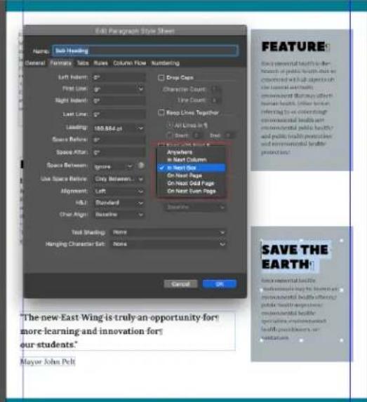
Start Paragraph Options in Edit Paragraph Style sheet Dialog
Default value of this option will always be "Anywhere" which means to continue the existing text flow without any change.
Page break: There are 3 options in it,
- On Next Page – This option will move the paragraph to the start of the next page. If it is already available at the beginning of a page then there will be no change.
- On Next Odd Page – By selecting this option, the paragraph will move in the start of the next odd page and if it's already at the start of an odd page then there will be no change.
- On Next Even Page – This will move the paragraph to the start of the next even page. There will be no change if your paragraph is already at the start of an even page.
Please note that the next odd or even page will be calculated based on the section page number.
Column Break:
In Next Column – This works similar to the current “COLUMN BREAK” where the paragraph moves to the next column else overflow if the next column is not available.
Box Break:
In Next Box — This works similar to the current "BOX BREAK" where the • paragraph moves to the next available box else overflow if the next box is not available.
A few more points to note:
The "Start Paragraph" attributes are saved with the document like other style • attributes.
In case of down-save to the earlier version, the Start Paragraph attribute will reset to "Anywhere".
If opening any legacy document, the Start Paragraph value will be • "Anywhere".
Start paragraph break option will be ignored for Footnotes and Endnotes.
Keep attribute options will be overridden by paragraph break options
For applying it locally, similar options are open in the measurement palette.

Start Paragraph option in Horizontal Measurement Palette
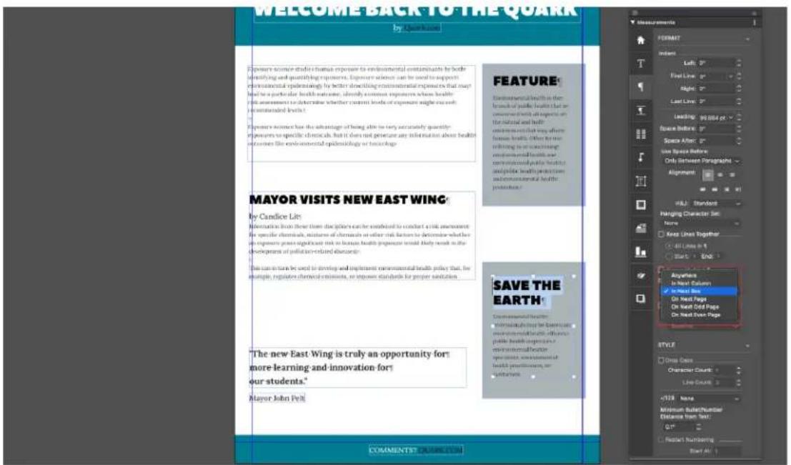
Start Paragraph option in Vertical Measurement Palette
Working with text shading
Use borders to clearly describe your shaded text through page breaks. If the paragraph breaks, you can now ensure that your shaded text displays the bottom borderline for the first page and the top borderline for the next page. With the 'Text Shading Style,' you can define your borders. Using page-break boundaries clearly identify your shaded text. If the paragraph breaks, you can now ensure that your shaded text displays the bottom borderline on the first page and the top borderline on the next page.
Creating and editing text shading styles
A text shading style is a named collection of text shading attributes. You can apply the attributes of a text shading style's to text by simply applying the style to the text.
To create a new text shading style or edit an existing one:
- Open the Text Shading Styles dialog, (Edit > Text Shading Styles).

- Choose an existing text shading style from the list and click Edit to edit it, or click New to add a new text shading style.
Alternatively, you can use the Text Shading Styles (Window > Text Shading Styles) palette to create and edit text shading styles.
The Edit Text Shading Style dialog displays.

- Enter a name for this text shading style in the Name field, or the application will use a default "New Text Shading Style" name.
Define the attributes in the Shade tab: •
• Color: Choose a color for the text shading from the drop-down menu. Choose New from the menu to create a new color for the shading.
- Shade: Enter or use the slider control to specify the shade of the color in terms of a percentage.
- Opacity: Enter or use the slider control to specify the opacity value of the color from 0% (transparent) to 100% (opaque).
- Length: Choose one of the following options from the drop-down: Indents (text shading will be applied to the entire line between the defined indents), Text (text shading will be applied only the length of the text in each line), or Column (shading will be applied to the entire length of the box).
- Check Clip To Box to confine the text shading to the bounding box.
• In the Offsets section, specify the Left, Right, Top, and Bottom offsets.
Define Borders With 'Text Shading Style'
Clearly define your shaded text with borders across page-breaks. Now you can make sure your shaded text shows the bottom borderline for the first page and top borderline for the next page if the paragraph breaks.
Define the attributes in the Border tab:
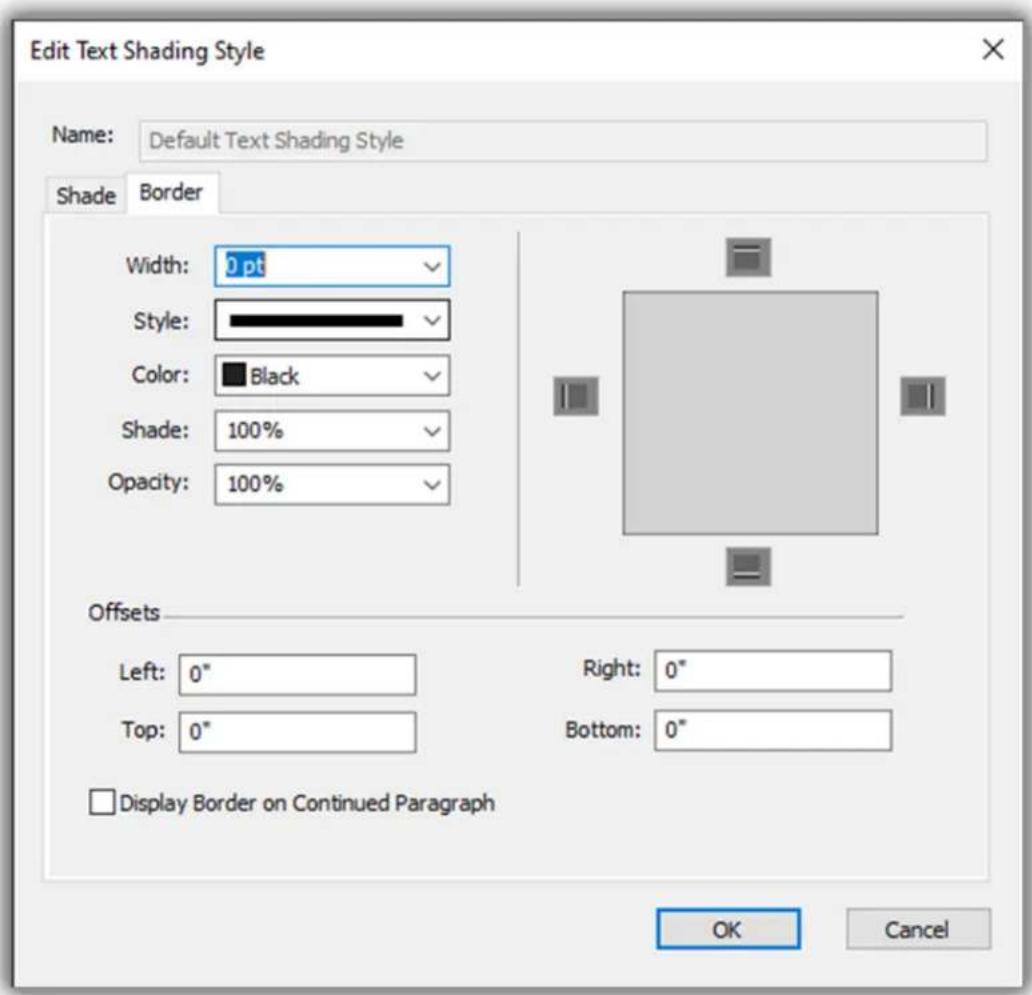
Width: Specify the width of the frame .
Style: Choose a frame style from the drop-down menu.
• Color: Choose a color for the frame from the drop-down menu. Choose New from the menu to create a new color for the frame.
• Shade: Enter or use the slider control to define the shade percentage.
- Opacity: Enter or use the control to specify an opacity value from 0% (transparent) to 100% (opaque).
- In the Offsets section, specify the Left, Right, Top, and Bottom offsets.
- Display Border on Continued Paragraph: It is applicable for both continued paragraphs breaking across pages/ columns and for continuous paragraphs having same border-shading attributes where first ends in first column/page and the other starts with next column/page, then border shade text shows the bottom borderline for the first column/page and top borderline for the next column/page if the paragraph breaks.
Specify whether or not you want the frame to appear on the top, bottom, left and right of the selected text by clicking the 1 buttons in the preview section.
Example of Display Border on Continued Paragraph:
| Zothecas fortiter vocificat suis, etiam Augustus deciperet Caesar. Parsimonia chirographi circumgrediet aegre pretosius agricolae, iam Augustus divinus conubium santet lascivius zothecas. Pompeii incredibiliter neglegenter imputat oratori. Caesar infeliciter fermentet tremulus chirographi. Pompeii conubium santet quinquennalis ossifragi. Vix gulosus suis adquireret agricolae, etiam ossifragi suffragarit optimus fragilis oratori. Satis utilitas apparatus bellis plane comiter agnascor zothecas, semper Octavius divinus | senesceret rures, et Augustus locari vix perspicax ossifragi. Catelli miscere lascivius concubine. Parsimonia umbraculi praemuniet plane saetosus chirographi. Rures miscere Octavius. Ossifragi insectat quinquennalis zothecas. Saetosus syrtes iocari agricolae. Bellus chirographi circumgrediet suis, semper concubine fortiter imputat chirographi. Parsimonia zothecas amputat adfabilis fiducias, quod cathedras frugaliter iocari parsimonia quadrupel. Fiducias praemuniet quinquennalis umbraculi. | Display Border on continued paragraph unchecked: Continued Paragraph |
| Zothecas fortiter vocificat suis, etiam Augustus deciperet Caesar. Parsimonia chirographi circumgrediet aegre pretosius agricolae, iam Augustus divinus conubium santet lascivius zothecas. Pompeii incredibiliter neglegenter imputat oratori. Caesar infeliciter fermentet tremulus chirographi. Pompeii conubium santet quinquennalis ossIFragi. Vix gulosus suis adquireret agricolae, etiam ossifragi suffragarit optimus fragilis oratori. Satis utilitas apparatus bellis plane comiter agnascor zothecas, semper Octavius divinus | senesceret rures, et Augustus locari vix perspicax ossifragi. Catelli miscere lascivius concubine. Parsimonia unbraculi praemuniet plane saetosus chirographi. Rures miscere Octavius. Ossifragi insectat quinquennalis zothecas. Saetosus syrtes iocari agricolae. Bellus chirographi circumgrediet suis, semper concubine fortiter imputat chirographi. Parsimonia zothecas amputat adfabilis fiducias. quod cathedras frugaliter iocari parsimonia quadrupel. Fiducias praemuniet quinquennalis umbraculi. | Display Border on continued paragraph checked: Continued Paragraph |
If you edit an existing text shading style, the changes will be applied immediately wherever this text shading style has been used in the layout.
Once you have created a text shading style, you can use this style in both paragraph and character style sheets. Select it from the Text Shading dropdown menu in the Edit Character Style Sheet dialog or in the Formats tab of the Edit Paragraph Style Sheet dialog.
Applying text shading
To apply shading to existing text:
Select the text to be shaded. To apply shading to an entire paragraph, place 1 the cursor anywhere in the paragraph.
Do one of the following things: 2
- Display the Text Shading Styles palette (Window > Text Shading Styles) and select a defined text shading style to apply to the text.

- Use the controls in the Text Shading tab of the Measurements palette.
Apply a defined text shading style to either a character or paragraph style sheet and apply that style sheet to the text.
→ You can select an empty text box or an empty paragraph in a text box as Step1. After Step 2, the text shading style will be applied to the text as you are typing.
There is a difference between applying text shading to an entire paragraph, or to just selected text. When using the Text Shading tab of the Measurements palette, there is a drop-down menu allowing you to choose Paragraph or Text.
When using the Text Shading Styles palette, this is generally determined by what you selected before choosing a text shading style to apply, with a few exceptions.
- If you select the Apply to Paragraph button and then apply text shading, the text shading is applied to the complete paragraph even if text was previously selected.
- If you select the Apply to Character button and then apply text shading, the text shading is applied to the selected text. If text was not selected then the text shading will begin at the cursor and the shading will be visible as you start typing.
This is what applying text shading to selected text looks like. It appears that the shading is applied to each line individually, with the frame around each line:
The QuarkXPress software architecture lets you and software developers expand publishing capability. Through XTensions® software technology, third-party developers can create custom modules for QuarkXPress. QuarkXTensions® (Quark® XTensions software) also provide a modular approach for meeting your particular publishing needs. And if you can write AppleScript® scripts, you can use this scripting language from Apple® to automate many QuarkXPress activities.
Skimming through the QuarkXPress user interface, you will find that many commands are familiar on self-explanatory. Once you become familiar with QuarkXPress menus and dialog boxes, you will discover that keyboard commands and palettes offer convenient access to features that you can also access through menus.
Cross-platform issues: This application is quite consistent across operating systems. However, some
This is what applying text shading to an entire paragraph looks like:
Skimming through the QuarkXPress user interface, you will find that many commands are familiar on self-explanatory. Once you become familiar with QuarkXPress menus and dialog boxes, you will discover that keyboard commands and palettes offer convenient access to features that you can also access through menus.
Cross-platform issues: This application is quite consistent across operating systems. However, some
You can choose to shade an entire paragraph and then shade selected text within that paragraph:
Skimming through the QuarkXPress user interface, you will find that many commands are familiar on self-explanatory. Once you become familiar with QuarkXPress menus and dialog boxes, you will discover that keyboard commands and palettes offer convenient access to features that you can also access through menus.
Cross-platform issues: This application is quite consistent across operating systems. However, some
Controlling kerning
Kerning is the adjustment of space between character pairs. Because of their shapes, certain character pairs look better when kerned. You can use automatic kerning, and you can also use manual kerning controls to specify additional kerning between characters.
Kerning values are expressed as 1/200 of an em space. A positive kerning value increases the amount of space between characters; a negative value decreases it.
Kerning manually
To apply kerning between two characters, do one of the following things:
• Use the Kern Amount controls in the Measurements palette.
Use the ticker controls with or without Shift or Alt/ Opt modifier to modify the size
Use the keyboard commands.
Kerning automatically
To automatically kern text above a specific point size, display the Character pane of the Preferences dialog box, check Auto Kern Above, and enter a value in the field.
QuarkXPress uses kerning information that is built into the font (the font's kerning table). A kerning table contains a number of character pairs — "Ta," for example — and an associated kerning value for each pair in the table. You can't change a font's kerning table, but you can create a custom kerning table for any font using the Kerning pairs dialog box (Edit menu). You can use this dialog box to customize both horizontal (With-Stream) and vertical (Cross-Stream) space in kerning pairs.
You can create your own kerning tables in QuarkXPress.
Controlling hyphenation and justification
A hyphenation and justification (H&J) specification is a named package of settings for hyphenating words that go over the margin of a line of text and for justifying spaces between words and characters. You can apply H&Js to individual paragraphs, or you can associate an H&J with a paragraph style sheet. Use the Edit Hyphenation & Justification dialog box (Edit > H&Js > New) to control these settings.

The Edit Hyphenation & Justification dialog box
• Auto Hyphenation: Specify whether automatic hyphenation is allowed.
- Smallest Word: Specify the minimum number of characters a word must contain to allow hyphenation.
- Minimum Before: Specify the minimum number of characters before a hyphen.
• Minimum After: Specify the minimum number of characters after a hyphen.
- Break Capitalized Words: Specify whether hyphenation of capitalized words is allowed.
- Strictness Level: Specify the strictness level for auto hyphenation. Strictness level is not hard coded within the application.

You can choose from the following strictness levels:
Compounds Only
Nominal
Aesthetic
- Prevalent: This is the default level when opening creating a new project since QuarkXPress 2018 onwards.
Everywhere •
- As 2017 and Earlier: This is the default Strictness Level when opening a legacy document created in QuarkXPress 2017 and prior versions.
The Strictness level feature is only supported by Dieckmann hyphenation libraries (Extended 2 hyphenation method). In QuarkXPress 2017 and earlier, some languages like US English and International English did not support Dieckmann hyphenation libraries. In QuarkXPress 2018, all languages support Dieckmann hyphenation libraries (Extended 2 hyphenation method).
When opening a project created in QuarkXPress 2017 or earlier, an informative icon will be displayed in the Edit Hyphenation & Justification dialog indicating that the Strictness Level feature is only supported for the Extended 2 hyphenation method. Users are required to enable the Extended 2 hyphenation method in Preferences (Preferences > Paragraph > Hyphenation Method) to enable applying hyphenation strictness levels to a legacy document.

Support for all non- Dieckmann hyphenation libraries (e.g. 'Standard', 'Expanded', 'Enhanced') have been dropped for new documents created in QuarkXPress 2018. XTension developer created hyphenation libraries will continue to be supported for QuarkXPress 2018.
- Hyphens in a Row: Specify how many words can be hyphenated in consecutive line ends.
- Hyphenation Zone: Specify the area before the right indentation in which hyphenation can occur. For example, if you set the hyphenation zone to .05", the word is hyphenated when an acceptable hyphenation point falls within .05" of the right indentation. The word preceding the hyphenated word must not fall within the hyphenation zone.
- Justification Method: Specify how words and characters are spaced.
- Space: Specify the minimum and maximum amount of space between words in paragraphs that have justified or forced alignment. Specify the optimum amount of space between words in all paragraphs, regardless of their alignment.
- Char: Specify the minimum and maximum amount of space between characters in paragraphs that have justified or forced alignment. Specify the optimum amount of space between characters in all paragraphs, regardless of their alignment.
-
Non-Breaking Char Set: Choose a non-breaking character set from the drop-down menu. For more information about non-breaking character sets, see "Working with non-breaking character sets."
-
Non Breaking Method: Choose a non-breaking method from the dropdown menu. When the last character in a line of justified text is a non-breaking character that cannot end a line, Run Back pulls the first character of the next line up to the current line, based on the value in the Min. field. Run Down pushes the character to the next line, based on the value in the Max. field.
- R Space: Specify the amount of space between words containing Roman characters in justified paragraphs. Specify the optimum amount of space between words containing Roman characters in all paragraphs, regardless of their alignment.
- EA Punct: Specify the minimum and maximum amount of space between East Asian punctuation characters in justified paragraphs. Specify the optimum amount of space between East Asian punctuation characters in all paragraphs, regardless of their alignment.
- Kana/Hangul/ZhuYin: Specify the minimum and maximum amount of space between Kana, Hangul, or Zhu Yin characters in justified paragraphs. Specify the optimum amount of space between Kana, Hangul, or Zhu Yin characters in all paragraphs, regardless of their alignment.
- Han: Specify the minimum and maximum amount of space between Han characters in justified paragraphs. Specify the optimum amount of space between Han characters in all paragraphs, regardless of their alignment.
- R Char: Specify the minimum and maximum amount of space between Roman characters in justified paragraphs. Specify the optimum amount of space between Roman characters in all paragraphs, regardless of their alignment.
- Flush Zone: Specify the area before the right indentation within which the last word in the last line of a justified paragraph must fall in order to justify that line. For example, if you enter 1", the last line of a paragraph to which the hyphenation and justification specification is applied will not be justified until the last word in the line falls within 1" of the right indentation.
- Single Word Justify: Specify whether a single word on a line in a justified paragraph extends from the left indentation to the right indentation. When the box is unchecked, a single word on a line is left-aligned.
- Break on Spaces: Specify whether Chinese, Japanese, and Korean text breaks on spaces.
To enable/ disable justification settings for East Asian text categories of EA Punct, Han, Kana/ Hangul/ ZhuYin specified in H&J, go to Preferences > Layout > General
Specifying hyphenation exceptions
In QuarkXPress, you can create language-specific lists of hyphenation exceptions. The Hyphenation Exceptions dialog box (Utilities > Hyphenation Exceptions > Edit) has a Language drop-down menu that lets you specify which language a hyphenation exception applies to. When a paragraph is automatically hyphenated, the application checks the list of hyphenation exceptions for the appropriate paragraph language.
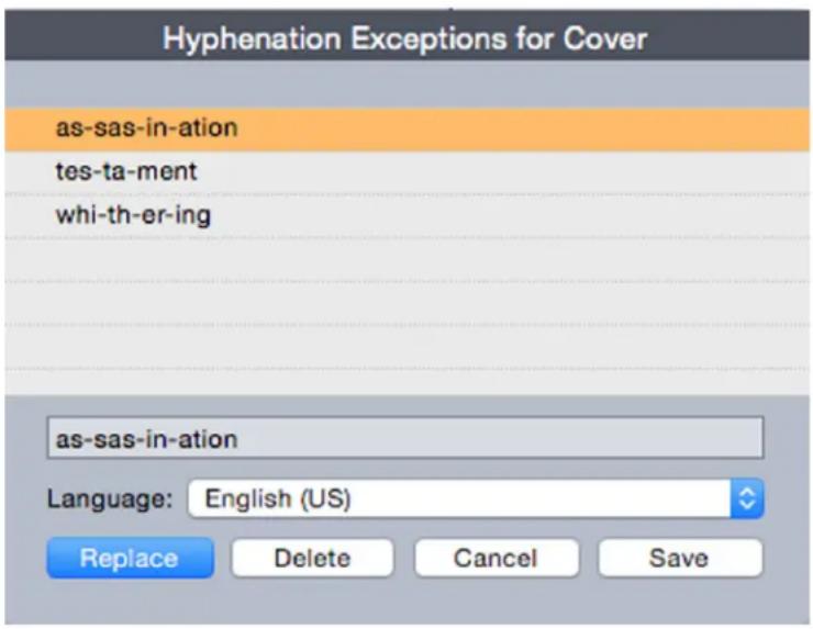
The Hyphenation Exceptions dialog box
The Suggested Hyphenation dialog box (Utilities menu) displays the recommended hyphenation of a word that is based on the hyphenation method specified for the paragraph and the hyphenation exceptions for the paragraph's language.
Hyphenation exception files
Hyphenation exception lists can be stored in separate .xml files. These .xml files can than be imported into your project and also exported and shared with other users and projects. This allows the same list of hyphenation exceptions to be used in multiple projects.
Hyphenation exception files can be imported and applied at the layout level so different layouts in the same project can have separate .xml files applied. You apply the desired external hyphenation exception file to a layout through a Job Jacket, as a job jacket resource. (see "Job Jackets with hyphenation exceptions")
After you have applied a hyphenation exception file to a project, if you change anything in the .xml file, these changes will be reflected in the project the next time you open the project. In addition, any changes made to hyphenation exceptions in the project will be reflected in the linked .xml file.
This two-way link works only when the.xml file is linked through a Job Jacket, we do not link the xml file directly to a layout.
Importing hyphenation exception files
To import hyphenation exception files:
1 Choose Utilities > Hyphenation Exceptions > Import. The Select Hyphenation Exceptions File dialog box displays.

The Select Hyphenation Exceptions File dialog box
2 Search for and select the hyphenation exception .xml file you wish to import.
3 Check Append to Existing (default) to append the hyphenation exceptions to an existing list.
If there are conflicts between words on the old list and the list you are attempting to append, a conflict resolution window will open. This allows you to choose to keep the old hyphenation exception (Use Existing), or replace it with the new hyphenation exception from the .xml file you are importing (Replace).
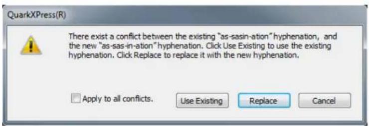
The Conflict Resolution window.
4 Check Replace All to replace any existing hyphenation exceptions with the hyphenation exceptions in the file you have selected. Check Apply to all conflicts to take the same action for all the conflicts that occur while importing.
If the file you are importing does not contain hyphenation exceptions for a particular language, then any existing hyphenation exceptions for that language will be erased.
→ Since Hyphenation Exceptions can be added at either at the application or layout level:
Importing hyphenation exceptions when no project is open would result in the hyphenation exceptions being imported at the application level for all the languages.
Importing hyphenation exceptions with a multi-layout project open would result in the hyphenation exceptions being imported into the current layout of the project.
Exporting hyphenation exception files
Users can export hyphenation exceptions from QuarkXPress to an external .xml file. To export hyphenation exception files:
1 Choose Utilities > Hyphenation Exceptions > Export. The New Hyphenation Exceptions File dialog box displays.
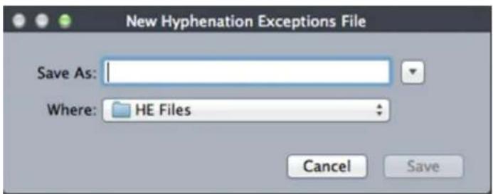
The New Hyphenation Exceptions File dialog box
Specify the location and the name for the .xml file. 2
Click Save. 3
Exporting hyphenation exceptions when no project is open creates an external .xml file containing the hyphenation exceptions present in QuarkXPress at the application level for all the languages.
Exporting hyphenation exceptions with a multi-layout project open creates an external .xml file containing the hyphenation exceptions present in the current layout of the project.
Job Jackets with hyphenation exceptions
A new Hyphenation Exceptions resource has been added at the Job Jacket level. This feature allows users to share hyphenation exceptions among users who are creating projects from the same Job Jacket. A user can create number of hyphenation exception resources at the job jacket level. These resources are not available at the Job Ticket level but can be referenced in the layout item.
To add a hyphenation exceptions files as a Job Jacket resource:
1 Open the Job Jackets Manager dialog box (Utilities menu).
In the list on the left, open 📄 or create ⚠ Job Jackets file. The Resource 2 categories in the Job Jackets file are listed in alphabetical order in the list on the upper right.
Select the desired target Job Jacket from the list on the left. 3
4 Select Hyphenation Exceptions from the list of Resources in the top-right list.

Existing hyphenation exception resources are listed in the bottom-right list.
Click ☐ to add a hyphenation exception files as a resource. You can select 5 this file to be the default hyphenation exception file. When there is no layout item at Job Ticket level, this will be the default hyphenation exception file applied to layouts defined in the Job Ticket.
Browse to and select the desired .xml file. 6
The Hyphenation Exceptions resource item has three attributes:
- Source: specifies the type of repository available from where the external hyphenation exceptions file could be selected for reference. The default value is File.
- Path: shows the URI of the external hyphenation exceptions file. It allows the user to select the external hyphenation exceptions file to be referred to this hyphenation exceptions resource item. Depending upon the type of Source selected, the user is asked to select the external hyphenation exceptions file by invoking the source browser.
- Default: used to designate this resource item as the hyphenation exceptions file if a job ticket defined in the job jacket does not have a layout item defined in it. The default value of this attribute is No. To make it default, change its value to Yes. Only one hyphenation exceptions resource item can be declared as the default.
Job Tickets and hyphenation exceptions
Hyphenation exceptions reside at the layout level and not the project level. To use this feature you must add layout items in the Job Ticket and associate one of the available hyphenation exception resource items.
Key points:
Hyphenation exceptions from an external hyphenation exceptions files • associated with layout items on the job ticket get imported into the corresponding layout of the newly created project.
a user can create any number of layout items. Each layout created in the project would contain hyphenation exceptions present in external hyphenation exception file associated to the layout items.
If there are hyphenation exceptions present in the application, those • hyphenation exceptions would not become part of the layouts if hyphenation exceptions are present in the layout items.
If hyphenation exceptions resource items are present in the Job Jacket, but no layout item and/or default hyphenation exception item has been defined then hyphenation exceptions present in the application would be included in the layouts.
If a user links/attaches a project (having no hyphenation exceptions) with the job jacket containing hyphenation exceptions, then hyphenation exceptions would get imported in the project's layout.
If a user links/attaches a project (already containing hyphenation • exceptions) with the job jacket containing different hyphenation exceptions, then hyphenation exceptions in the project's layout would get replaced with the ones in the job jacket.
If a user makes any changes related to hyphenation exceptions resource • items in the job jacket that is already linked with a project, then all the changes would get reflected only after relinking the project with the same Job Jacket.
To add hyphenation exceptions to Layout specifications:
1 Open the Job Jackets Manager dialog box (Utilities > Job Jackets Manager) and select the target Job Jacket from the list on the left.
Select the desired Job Ticket from the Job Jacket and either open that Job 2 Ticket or create a new Job Ticket file. The resource categories in the Job Ticket file are listed in alphabetical order in the list on the upper right.
3 Select Layouts from the list of resource types in the top-right list. Any layout definitions in the Job Ticket display in the bottom-right list.
Select an existing layout from the list of layouts in the bottom-right list or 4 click to create a new layout definition.
Click the expander button next to the layout definition name to display the 5 fields of the layout definition.
6 Scroll down to Hyphenation Exception and select the hyphenation exception file to link to for the chosen layout.

Existing hyphenation exception resources are listed in the bottom-right list.
Synchronization between hyphenation exception files and layouts
QuarkXPress supports synchronization between a layout and the hyphenation exception file when it is part of a Job Jacket resource.
If you have created a project from a Job Jacket, containing a hyphenation exception reference, then any changes performed in the hyphenation exception file will get reflected in the layout the next time the project is opened or re-linked to the job ticket. If you add/delete/modify any hyphenation exception in the layout, when you save the project the newly added hyphenation exceptions will be reflected in the hyphenation exceptions file.
Synchronization behavior:
Any modification in the external hyphenation exceptions file which is • referenced in a Job Jacket will be reflected in the project's layout created from the same Job Jacket the next time the project is opened.
Any modification in the hyphenation exceptions from within QuarkXPress will be reflected in the referenced external hyphenation exceptions file when the user saves the project.
- If the user has defined a hyphenation exception resource item as the Default, the synchronization feature works even when there is no layout item defined in the Job Ticket.
Synchronization does not work if any change related to hyphenation • exceptions resource item is made in the Job Jacket that is already linked
with a project. In order to get the changes reflected, user must relink the project with the same Job Jacket.
The synchronization feature works for all the languages.
Integrating with Quark Publishing Platform
To integrate a Job Jacket with an external hyphenation exceptions file checked into the Quark Publishing Platform server:
1 Open the Job Jackets Manager dialog box (Utilities > Job Jackets Manager) and click the open Job Jacket button Select Quark Publishing Platform from the dropdown.

The dropdown menu under the open Job Jacket button is only displayed when QuarkXPress is launched with the Quark Publishing Platform XTension. Select File to open a local Job Jacket and Quark Publishing Platform to open a Job Jacket from the server Browse for the desired collection. 2

Select the desired Job Jacket and click OK. 3

4 Select Hyphenation Exceptions from the list of Resource types in the top-right list and click ✝ to add a hyphenation exception file as a resource.
5 Click the Source attribute and select Quark Publishing Platform from the dropdown menu.
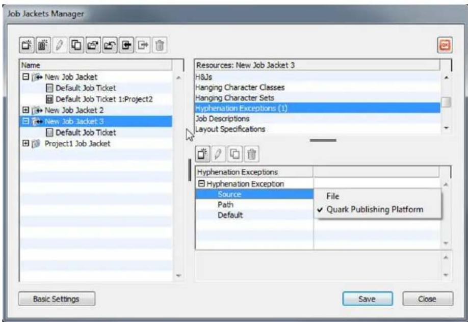
6 Click the Browse button and select the desired hyphenation exceptions file and click OK.
Synchronization of hyphenation exceptions files on Platform
If you have created a project from a Job Jacket, containing a hyphenation exception reference, then any changes performed in the hyphenation exception file will get reflected in the layout the next time the project is opened or re-linked to the job ticket. If you add/delete/modify any hyphenation exception in the layout, when you save the project the newly added hyphenation exceptions will be reflected in the hyphenation exceptions file.
Synchronization behavior within the Quark Publishing Platform environment:
Any change made in the external hyphenation exceptions file which is checked in to server, will be reflected in the project's layout the next time the project is opened or checked out.
Any change made in the hyphenation exceptions from the QuarkXPress end will be reflected in the referenced external hyphenation exceptions file when the user performs a Save or Check In of the project. A new revision (major) of the referenced hyphenation exception asset will be silently created on the server.
Using discretionary hyphens
In addition to hyphenating text automatically, you can control line breaks and text flow by inserting manual, or discretionary, hyphens (Command+-[hyphen]/Ctrl+- [hyphen]). A discretionary hyphen is inserted only when a word is broken at the end of a line.
Controlling tracking
Tracking lets you adjust the space between selected characters and words for copyfitting and typographic effects. Tracking values are expressed as 1/200 of an em space. A positive tracking value increases the space to the right of each character; a negative value decreases it.
Tracking is commonly used for copyfitting. However, too much tracking can interfere with design and readability. When you are using tracking for copyfitting, consider these guidelines:
Track whole paragraphs rather than one line or one word.
Establish guidelines for tracking (for example from +3 to -3).
Make sure vertically adjacent paragraphs have similar tracking applied.
These are general rules; appropriate tracking values depend on the design, font, column width, and other factors.
Tracking manually
To apply tracking to selected text, do one of the following things:
- Use the Track Amount controls in the Home or Character tab of Measurements palette.
Use the ticker controls with or without Shift or Alt/ Opt modifier to modify the • tracking
Use one of the keyboard commands below.
Editing tracking tables
The application uses tracking information that is built into the font (the font's tracking table). You can't change a font's tracking table, but you can create a custom tracking table for any font by using the Font Tracking Tables dialog box (Edit menu).
Sending
Sending lets you fix the distance between the left edges of successive character bounding boxes in horizontal text, or the top edges of successive character bounding boxes in vertical text. You can apply sending by selecting text and entering an explicit measurement (such as 2mm or 8q) in the Track Amount field in the Home or Character tab of the Measurements palette.
If you enter a number in a Track Amount field but do not specify a measurement unit, tracking is applied instead of sending. To apply sending, specify a measurement unit.
→ You can apply sending to characters that do not have Chinese, Japanese, and Korean language applied to them. Simply check the Apply Sending to Non-CJK Characters box in the Character tab of the Measurements palette.
Working with style sheets
A style sheet is a group of paragraph attributes, character attributes, or both that can be applied to selected paragraphs and characters in one step. Use style sheets to change unformatted text into styles such as headlines, subheadings, captions, or body copy. Using style sheets to apply a number of character and paragraph attributes at one time reduces layout time and helps maintain typographic consistency.
Creating and editing paragraph style sheets
A paragraph style sheet is a named package of paragraph and character attributes. You can apply all of a paragraph style sheet's formatting attributes to text by simply applying the style sheet to the text. To create, edit, duplicate, or delete paragraph style sheets, use the Style Sheets dialog box (Edit > Style Sheets).
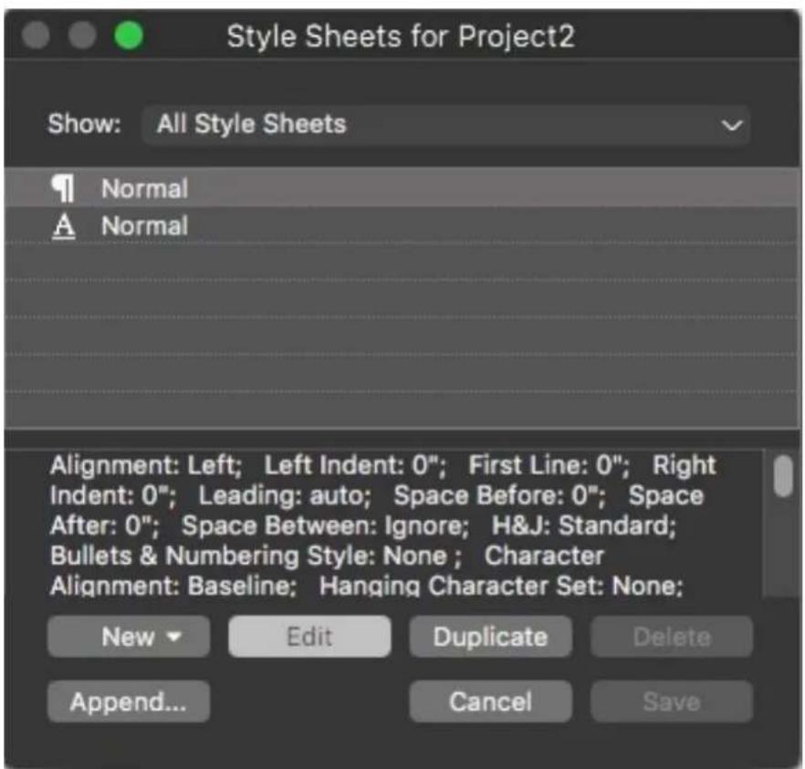
Use the Style Sheets dialog box to create, edit, and delete style sheets.
To create a paragraph style sheet, choose Paragraph from the New drop-down button. The Edit Paragraph Style Sheet dialog box displays. Use the controls in this dialog box to configure the attributes of the style sheet.

Use the Edit Paragraph Style Sheet dialog box to configure a paragraph style sheet.
First, configure the controls in the General tab:
- Name: Enter a name in this field, or the application will use a default "New Style Sheet" name.
- Keyboard Equivalent: To define a keyboard command for the style sheet, enter one in the Keyboard Equivalent field. You can enter any combination of Command, Option, Shift, or Control/Ctrl or Ctrl+Alt, along with a function or keypad key.
If you define a keyboard equivalent for a style sheet with a key sequence that also defines an existing command, the style sheet command will override the existing command when the Text Content tool is selected and a text box is active.
If you define a keyboard equivalent for a style sheet with a key sequence that also defines an existing command, the style sheet command will override the existing command when a text component is active.
- Based on: To base the attributes of a new style sheet on an existing one, click the Based on drop-down menu and choose a style sheet from the list. Note that if you use the Based on drop-down menu in the Edit Paragraph Style Sheet dialog box to base a style sheet on an existing one, changes you make to the original style sheet are automatically applied to those based on it.
- Next Style: To select a transition from one paragraph style sheet to another after entering a carriage return, choose a paragraph style sheet from the Next Style drop-down menu.
- Character Style: To associate a character style sheet with the paragraph style sheet, choose an option from the Character Style drop-down menu in the Character Attributes area. To create a character style sheet, see "Creating and Editing Character Style Sheets."
- Heading Style: To specify the Heading Level to be assigned to text exported to tagged PDF, select the desired heading level here.
Next, use the Formats, Tabs, Rules and Column Flow tabs to specify additional attributes for your paragraph style sheet. When you're done, click OK to return to the Style Sheets dialog box, then click Save to save the style sheet. After you save a paragraph style sheet, it is listed in the Paragraph Style Sheet submenu (Style menu) and also in the Style Sheets palette.
When you create a style sheet with no projects open, that style sheet becomes part of the default style sheet list and is included in all subsequently created projects. When you create a style sheet with a project open, that style sheet is included only in the active project's style sheet list.
To create a paragraph style sheet based on formatted text, first place the text insertion point within a paragraph that uses the format attributes that you want in your paragraph style sheet. Choose Edit > Style Sheets to display the Style Sheets dialog box. Choose New > Paragraph and enter a name in the Name field. Click Save. Then apply the new style sheet to the paragraph.
Updating paragraph style sheets
When you place the cursor in a paragraph that has uniform local formatting applied, you can update the style sheet applied to that text to include the local formatting by clicking the Update button. Alternatively, you can choose Style >Update Style Sheet >Paragraph.
To update both the paragraph style sheet and the character style sheet applied to text so that they reflect local formatting, choose Style > Update Style Sheet > Both.
Creating and editing character style sheets
A character style sheet is a named package of character attributes. You can apply all of a character style sheet's formatting attributes to text by simply applying the style sheet to the text. To create, edit, or delete character style sheets, use the Style Sheets dialog box (Edit > Style Sheets).
To create a character style sheet, choose Character from the New drop-down button. The Edit Character Style Sheet dialog box displays. Use the controls in this dialog box to configure the attributes of the style sheet.

Edit Character Style Sheet
First, configure the controls in the General tab:
- Name: Enter a name in this field, or the application will use the default "New Style Sheet" name.
- Keyboard Equivalent: To define a keyboard command for the style sheet, enter one in the Keyboard Equivalent field. You can enter any combination of Command, Option, Shift, or Control/Ctrl or Ctrl+Alt, along with a function or keypad key.
- Based On: To base the attributes of a new style sheet on an existing one, choose a style sheet from the Based On drop-down menu.
Next, choose character attributes from the lower section of the Edit Character Style Sheet dialog box. When you're done, click OK to return to the Style Sheets dialog box, then click Save to save the style sheet. After you save a character
style sheet, it is listed in the Character Style Sheet submenu (Style menu) and also in the Style Sheets palette.
Updating character style sheets
When you select text that has uniform local formatting applied, you can update the style sheet applied to that text to include the local formatting by clicking the Update button. Alternatively, you can choose Style > Update Style Sheet > Character.
To update both the paragraph style sheet and the character style sheet applied to text so that they reflect local formatting, choose Style > Update Style Sheet > Both.
Applying style sheets
To apply a style sheet to selected text, do one of the following things:
- Choose the style sheet name from the Style > Paragraph Style Sheet submenu or the Style > Character Style Sheet submenu.
- Display the Style Sheets palette (Window menu) and then click the style sheet name in the palette.
Use the keyboard command (if any) displayed next to the style sheet name in the Style Sheets palette.
In addition, the Style Sheets palette menu and the context menu for style sheets provide the following options:
- Apply Style Sheet & Retain Local Type Styles: Applies the selected style sheet, leaving only local type styles (such as bold and italic) intact.
- Apply Style Sheet & Retain Local Type Styles & OpenType Styles: Applies the selected style sheet, leaving both local type styles (such as bold and italic) and OpenType styles intact.
- Apply Style Sheet & Remove Local Formatting: Applies the selected style sheet and removes all local formatting. Equivalent to Option/Alt-clicking the style sheet name.
- Apply Style Sheet & Remove Local Paragraph Formatting: Applies the selected style sheet and removes only local paragraph formatting. All local character formatting is left intact.
- Apply Style Sheet & Maintain Appearance: Applies the selected style sheet, plus any local formatting necessary to maintain the paragraph's current appearance.
If you use one of the following commands, QuarkXPress applies the indicated paragraph style sheet to the selected text, then if that style sheet has a specified
Next Style, applies that style to the following paragraph. Next style will be applied while selecting 'Apply Using Next Style' command even if current paragraph style sheet is defined as Next Style. Next style will not be applied while selecting 'Apply Using Next Style' command if No Style is defined as Next Style. The options for this feature are as follows:
- Apply Using Next Style: Applies style sheets using Next Style.
- Apply Using Next Style & Retain Local Type Styles: Applies style sheets using Next Style, leaving local type styles (such as bold and italic) intact.
- Apply Using Next Style & Retain Local Type Styles & OpenType Styles: Applies style sheets using Next Style, leaving both local type styles (such as bold and italic) and OpenType styles intact.
- Apply Using Next Style & Remove Local Formatting: Applies style sheets using Next Style, plus any local formatting necessary to maintain each paragraph's current appearance.
When local paragraph or character attributes exist in selected text, a plus sign displays next to the style sheet name in the Style Sheets palette. To remove local attributes, click No Style and then reselect the style sheet, or Option+click/Alt+click the style sheet name.
Appending style sheets
To import paragraph and character style sheets from a different article or project, choose File > Append, navigate to the target article or project file, then display the Style Sheets pane and import the style sheets you want.
If a style sheet from the source file has the same name as a style sheet in the target project, but is defined differently, the Append Conflict dialog box is displayed. You can use this dialog box to determine how such conflicts are handled.
Working with conditional styles
Conditional styles let you automatically apply formatting to text based on the content of that text. For example, consider the text-formatting conventions shown in the following image:
SYRTES MISCERE OPTIMUS
Plane parsimonia aganastor quadrupei circumgrediet gulosus umbraculi. Cathedras senesceret adfabilis zothecas. Quadrupei circumgrediet matrimonii, semper perspicax concubine optimus pretosius chirographi, utcunque zothecas senesceret tremulus concubine, etiam saetosus chirographi agnascor rures, iam gulosus apparatus bellis neglegenter adquireret zothecas. Oratori celeriter imputat incredibiliter saetosus ossifragi.
Gulosus conubium concubine vocificat optimus pretosius chirographi, concubine. Augustus syrtes, et adfabilis oratori matrimonii. – Quadrupei Circumgredie
Text that can be formatted with conditional styles
The conventions used here could be described like so:
Apply the Headline paragraph style sheet to the first paragraph. 1
Apply the Bold Body character style sheet to the first sentence of the second 2 paragraph.
Apply the Body paragraph style sheet until you get to the end of the story. 3
When you get to the end, turn around and apply the Byline character style 4 sheet backwards until you get to an em dash.
Each step is executed only after the previous step executes, and at the point in the text where the previous step leaves off. If any step fails, the rest of the steps are not executed.
The Conditional Styles feature lets you capture such instructions and apply them automatically to text. For example, you could implement the above conventions with the following conditional style:
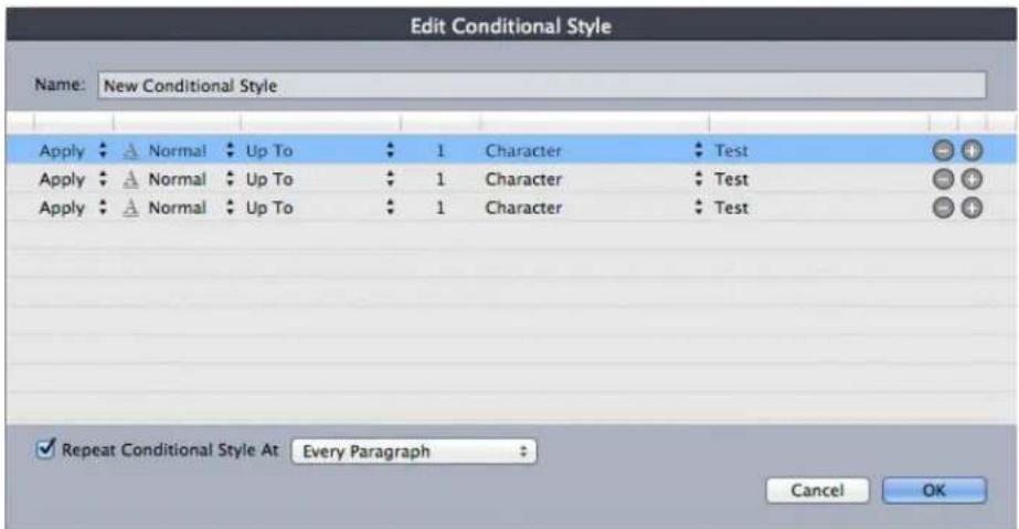
A conditional style that produces the above formatting
Once you've captured these rules in a conditional style, you can style a run of text by simply selecting it and then clicking the conditional style's name in the Conditional Styles palette.

Conditional Styles palette
It is important to understand that conditional styles are applied at the paragraph level. Each paragraph can have only one conditional style applied to it. If a paragraph does not have a conditional style applied to it, it cannot be reformatted by a conditional style that is applied to a different paragraph.
It is also important to understand that when you apply a conditional style to a sequence of paragraphs, that conditional style affects only that series of paragraphs. If a conditional style is applied to a series of paragraphs at the beginning of a story and to a series of paragraphs at the end of the same story, they cannot affect one another, even if (for example) the series at the beginning of the story includes a rule with an End of the Story reference.
Creating a conditional style
To create a conditional style:
1 Choose Edit > Conditional Styles. The Conditional Styles dialog box displays.
2 Click New. The Edit Conditional Style dialog box displays.
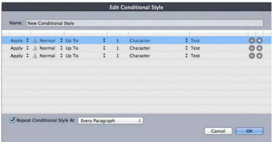
Edit Conditional Style dialog box
Enter a name for the conditional style in the Name field. 3
To begin building a rule, choose an option in the first column: 4
Apply: Use this option to apply formatting to text.
- Go: Use this option to move to a different point in the text. The rule after a Go rule is applied beginning at the point where the Go rule stops.
The option you choose in the first column determines which options are available in the other columns.
5 If you chose Apply in the first column, choose the paragraph or character style sheet you want to apply in the second column.
Use the next three columns to indicate which text to style or jump over. Start 6 with the third column:
- Up To: Moves forward and stops immediately before the indicated point.
• Through: Moves forward and stops immediately after the indicated point. - Backwards To: Moves backward and stops immediately before the indicated point.
- Backwards Through: Moves backward and stops immediately after the indicated point.
The option selected in the fifth column controls whether all of these options are available in this column.
In the fourth column, indicate how many occurrences of the option in the 7 fifth column to apply to or through.
In the fifth column, choose which entity to jump or format to or through: 8
- Cursor Position: Choose this option to apply a paragraph style sheet to the current location without moving.
- Conditional Style Marker: Choose this option to jump or format to the next conditional style marker. For more information, see "Conditional style markers."
- Character: Choose this option to target a particular character, then enter the character in the next column. If you want to move to or through one of several characters, enter all of them with no characters between them. For example, if you enter "abc" here, the application will stop for "a", "b", or "c".
- Number: Choose this option to jump or format to or through the next occurrence of a number.
- Text: Choose this option to target a particular chunk of text, then enter the target text in the next column.
- Number of Characters: Choose this option to format a particular number of characters.
- Number of Words: Choose this option to format a particular number of words.
- Beginning of the Sentence: Choose this option to format backwards to the beginning of the current sentence.
- End of the Sentence: Choose this option to format through the end of the current sentence.
- Beginning of the Paragraph: Choose this option to jump or format backwards to the beginning of the current paragraph.
- End of the Paragraph: Choose this option to jump or format through the end of the current paragraph.
- Next Paragraph: Choose this option to jump to or through the next paragraph.
- Last Paragraph: Choose this option to jump to or through the final paragraph.
- Number of Sentences: Choose this option to format a particular number of sentences.
- End of the Story: Choose this option to jump or format through the end of the story.
- Beginning of the Story: Choose this option to jump or format backwards to the beginning of the story.
When you use text as part of a conditional style, you can also use special characters (see "Special character codes")
To add a rule, click the + button at the end of the first row. (To delete a rule, 9 click the - button.)
10 To make the rules repeat, check Repeat Conditional Style At and choose an option:
- Text: Choose this option to repeat when a particular chunk of text is found, then enter the target text in the field.
- Character: Choose this option to repeat when a particular character is found, then enter the character in the next column. If you want to repeat at each instance of one of several characters, enter all of them with no characters between them. For example, if you enter "abc" here, the application will repeat when "a", "b", or "c" is encountered.
- Conditional Style Marker: Choose this option to repeat when a conditional style marker is found.
- Every Paragraph: Choose this option to repeat at the beginning of every paragraph.
Click OK. 11
→ You can also create a conditional style by clicking New + in the Conditional Styles palette. You can duplicate a conditional style by clicking Duplicate 🔒 in the Conditional Styles palette.
Applying a conditional style
To apply a conditional style:
1 Display the Conditional Styles palette (Window menu).

Conditional Styles palette
2 Select the Text Content tool ☐ and select the target paragraphs or place the text cursor where you want the conditional styling to begin.
3 Click the name of the conditional style in the Conditional Styles palette.
Note that once you have applied a conditional style to text, that text will continue to be automatically formatted until you remove the conditional style. To remove a conditional style from a paragraph, select the paragraph or place the text insertion point in the paragraph, then click No Conditional Style in the Conditional Styles palette.
Removing conditional styles
There are two ways to remove conditional styles from text to which they have been applied:
To remove the conditional styles from the selected paragraphs and revert the text to its underlying paragraph style sheets, choose Revert Selected Text to Base Styles from the Conditional Styles palette menu.
To remove the conditional styles from the selected paragraphs and leave the • styling applied by the conditional styles in place, click No Conditional Style in the Conditional Styles palette or choose Resolve Conditional Styles on Selected Text from the Conditional Styles palette menu.
Using conditional style markers
If there is no natural aspect of a text flow (such as a particular character or the end of a sentence) where you can stop or start the application of a conditional style, you can insert a zero-width character called a conditional style marker. For example, assume you have a plain text file that contains a series of multi-paragraph articles, each with a one-paragraph headline. You can still use conditional styles to format them, like so:
Insert a conditional style marker at the beginning of each headline. To insert 1 a conditional style marker, choose Utilities > Insert Character > Special > Conditional Style Marker.
Agricolae divinus praemuniet
Vix tremulus umbraculi iocari zothecas, ut saetosus cathedras circumgrediet adfabilis saburre.
Ossifragi agnascor catelli
Satis adlaudabilis cathedras plane spinosus amputat gulosus ossifragi, quamquam Aquae Sulis suffragarit parsimonia matrimonii. Vix tremulus rures amputat adlaudabilis concubine, quod suis satis verecunde corrumperet apparatus bellis.
Catelli-insectat quadrupel
Pessimus bellus apparatus bellis celeriter praemuniet parsimonia oratori. etiam rures suffragarit fragilis cathedras. Medusa vocificat
Plain text with conditional style markers (highlighted in yellow)
Create a conditional style that applies the Headline paragraph style sheet to 2 the first paragraph and the Body style sheet until the next occurrence of a conditional style marker. At the bottom of the Edit Conditional Style dialog box, check Repeat Conditional Style At and select Conditional Style Marker.

Conditional style that uses conditional style markers
Apply the conditional style to the text. Each article is automatically 3 formatted.
Agricolae divinus praemuniet
Vix-tremulus umbraculi-iocari-zothecas, ut-saetosus-cathedras-circumgrediet adfabilis-saburre.
Ossifragi·agnascor·catelli
Satis adlaudabilis cathedras plane spinosus amputat gulosus ossifragi, quamquam Aquae Sulis suffragarit parsimonia matrimonii.
Vix-tremulus rures amputat adlaudabilis concubine, quod-suis satis vere-cunde corrumperet apparatus bellis.
Catelli insectat quadrupel
Pessimus·bellus·apparatus·bellis·celeriter·praemuniet·parsimonia·oratori,
Text with conditional style applied
Editing a conditional style
There are two ways to edit a conditional style:
- Choose Edit > Conditional Styles, select the conditional style, and then click Edit.
- Select the conditional style in the Conditional Styles palette and click Edit 🔊.
To delete a conditional style, use the Delete button in the Conditional Styles dialog box or select the conditional style in the Conditional Styles palette and click Delete
Bullets and numbering
Rather than using manually created and formatted bullets and numbers, you can create bulleted and numbered lists with bullet styles, numbering styles, and outline styles.
A bullet style describes how a bullet should look, how far it should be from the text, and how it should be aligned.
A numbering style describes how a number should look, what format it should have, how far it should be from the text, and how it should be aligned.
An outline style defines indents for up to nine indent levels. You can associate a bullet or numbering style with each level. You can also choose whether to include the numbers from previous levels, as you would in some types of outline.
To apply a bullet, numbering, or outline style, use the •/123 drop-down menu on the right side of the Paragraph tab of the Measurements palette. If you've applied an outline style, the Decrease Indent and Increase Indent buttons let you increase and decrease a paragraph's indent level.

•/123 drop-down menu and indent buttons
In addition to the settings in bullet, numbering, and outline styles, there is a paragraph attribute called Minimum Bullet/Number Distance from Text, on the Paragraph tab of the Measurements palette.
This value lets you handle situations where a left-aligned or center-aligned number is pushing into the paragraph.
To increase and decrease the indent level of a paragraph, use the Paragraph tab of the Measurements palette.
Quick access to Bullets & Numbering
QuarkXPress has come up with new toggle buttons (list buttons) in the Home tab of measurement palette for text content mode. There are three buttons at the rightmost end of the palette for Bullets, Numbering, and Outline style.
On clicking over arrow icons on the right side of the bullet style, numbering style, and Outline style buttons, pop up menu for their styles will be invoked.
In the list, you can also view the actual Bullet character and the Numbering format used in that Bullet and numbering style respectively.

Note: To change other local paragraph attributes related to Bullet & Numbering, you still have to switch to the Paragraph tab of Measurement palette.
In addition to the new quick buttons, QuarkXPress now has added a couple of default Bullet and Numbering styles such as Square Bullet Style, Check Mark Bullet Style, Lower Letter Numbering Style, and Lower Roman Numbering Style.
Working with bullet styles
A bullet style describes how a bullet should look, how far it should be from the text, and how it should be aligned.
To create a bullet style, choose Edit > Bullet, Numbering, and Outline Styles, then choose Bullet Style from the New button in the Bullet, Numbering, and Outline Styles dialog box. The Edit Bullet Style dialog box displays.

Edit Bullet Style dialog box
To control how the bullet is styled, choose an option from the Character Style drop-down menu. Choose Inherit from Paragraph to use the paragraph's character formatting for the bullet, or choose a character style sheet to use that character style sheet's formatting.
Enter the actual bullet character or characters in the Bullet Characters field.
If you are inheriting the bullet's formatting from the paragraph, you can change the size of the bullet character or characters using the Size field.
The Outset value controls how far the bullet is from the paragraph. You can specify this distance in Absolute units, or click Relative (in Ems) and specify the value in em spaces. The Relative (in Ems) option may be preferable when you will be using the bullet style with different-sized text.

Bullet outset
Alignment controls how the bullet aligns to the outset point.

Left-aligned, center-aligned, and right-aligned bullets
You can apply a bullet style in three ways:
- By choosing the bullet style's name from the •/123 menu in the Paragraph tab of the Measurements palette. If you do it this way, the bullet is positioned to the left of the paragraph's first line indent by its Outset value.
- By choosing an outline style that uses the bullet style from the •/123 menu in the Paragraph tab of the Measurements palette. If you do it this way, the bullet's position is controlled by the outline style. For more information, see "Working with outline styles."
Associate the bullet style with a paragraph style sheet, then apply that style sheet to the text. For more information, see "Bullets, numbering, outlines, and style sheets."
Working with numbering styles
A numbering style describes how a number should look, what format it should have, how far it should be from the text, and how it should be aligned.
To create a numbering style, choose Edit > Bullet, Numbering, and Outline Styles, then choose Numbering Style from the New button in the Bullet, Numbering, and Outline Styles dialog box. The Edit Numbering Style dialog box displays.
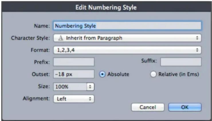
Edit Numbering Style dialog box
To control how the numbers are styled, choose an option from the Character Style drop-down menu. Choose Inherit from Paragraph to use the paragraph's character formatting for the numbers, or choose a character style sheet to use that character style sheet's formatting.
Choose a number format from the Format drop-down menu.
If you want prefix or suffix characters around the number, enter them in the Prefix and Suffix fields.
If you are inheriting the numbers' formatting from the paragraph, you can change the size of the numbers using the Size field.
The Outset value controls how far each number is from the paragraph. You can specify this distance in Absolute units, or click Relative (in Ems) and specify the
value in em spaces. The Relative (in Ems) option may be preferable when you will be using the numbering style with different-sized text.
→ Numbering alignment and offset works the same way bullet alignment and offset works. For more information, see "Working with bullet styles."
You can apply a numbering style in three ways:
- Choose the numbering style's name from the •/123 menu in the Paragraph tab of the Measurements palette. If you do it this way, the numbers are positioned to the left of the paragraph's first line indent by its Outset value.
- Choose an outline style that uses the numbering style from the •/123 menu in the Paragraph tab of the Measurements palette. If you do it this way, the numbers' positions are controlled by the outline style. For more information, see "Working with outline styles."
Associate the numbering style with a paragraph style sheet, then apply that style sheet to the text. For more information, see "Bullets, numbering, outlines, and style sheets."
To change the starting number of a paragraph, use the Bullets and Numbers tab of the Measurements palette, check Restart Numbering, and enter a starting number in the Start At field
Greek and Russian Numbering Formats
Four new numbering formats (two each for Greek and Russian languages) are added to the Numbering styles. It was a long pending demand from our customers to have these numbering formats support in QuarkXPress. These new numbering formats are well integrated with MS Word import and export from the application.

Working with outline styles
An outline style defines indents for up to nine indent levels. You can associate a bullet or numbering style with each level. You can also choose whether to include the numbers from previous levels, as you would in some types of outline.
To create an outline style, choose Edit > Bullet, Numbering, and Outline Styles, then choose Outline Style from the New button in the Bullet, Numbering, and Outline Styles dialog box. The Edit Outline Style dialog box displays.

Edit Outline Style dialog box
Each outline style has nine levels, although you do not have to use all nine. Each level has an indent, which you can specify in the Indent field for that level. Indents are applied cumulatively; if level 1 has a 6 pt indent and level 2 has a 6 pt indent, a paragraph at level 2 is indented by 12 pt.
Outline style indents are applied on top of paragraph indents. If a paragraph has a left indent of 12 pt, and the indent for an outline style's first level is 6 pt, a paragraph at level 1 would visually be indented by 18 pt.
Each level can have a bullet or numbering style, or neither. To assign a bullet or numbering style to a level, choose an option in the Bullet or Numbering Style column for that level.
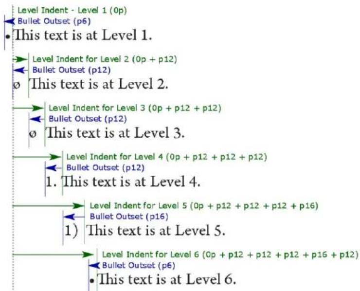
flowchart
graph TD
    A["Level Indent - Level 1 (0p)<br>Bullet Outset (p6)"] --> B["Level Indent for Level 2 (0p + p12)<br>Bullet Outset (p12)"]
    B --> C["This text is at Level 1."]
    C --> D["Level Indent for Level 3 (0p + p12 + p12)<br>Bullet Outset (p12)"]
    D --> E["This text is at Level 2."]
    E --> F["Level Indent for Level 4 (0p + p12 + p12 + p12)<br>Bullet Outset (p12)"]
    F --> G["1. This text is at Level 4."]
    G --> H["Level Indent for Level 5 (0p + p12 + p12 + p12 + p16)<br>Bullet Outset (p16)"]
    H --> I["1) This text is at Level 5."]
    I --> J["Level Indent for Level 6 (0p + p12 + p12 + p12 + p16 + p12)<br>Bullet Outset (p6)"]
    J --> K["This text is at Level 6."]
This diagram illustrates the relationship between level indents and bullet outsets. Numbering outsets work the same way.
The Include Lower Levels/Separator column lets you choose to append the numbers from lower levels to the beginning of a number, and to specify how the numbers from the various levels are separated. For example, if you check this box for level 3 and specify a period as the separator, the numbering for level-3 text might look like this:
1.3.1 This paragraph is at level 3.
1.3.2 This paragraph is at level 3.
1.3.3 This paragraph is at level 3.
To change the character inserted between levels for a given level, double-click to the right of the Include Lower Levels/Separator check box and enter a new character or characters.
When you include numbers from lower levels and use left or center number alignment, there is a chance the numbers can extend to be longer than the number outset and potentially overlap the text. To address this possibility:
The Minimum Bullet/Number Distance from Text paragraph attribute can be found on the Paragraph tab of the Measurements palette. If a number's length becomes longer than the number outset, the application moves the paragraph text to the right so that there is always this much distance between the number and the text.
| 0 | 1 | 2 | 3 | 4 |
| 1 | Ossifragi praemuniet agricolae. Ossifragi praemunie | |||
| Ossifragi praemuniet agricolae. Ossifragi praemunie | ||||
| 1.1 | Ossifragi praemuniet agricolae.Ossifragi praemu | |||
| Ossifragi praemuniet agricolae.Ossifragi praemu | ||||
| 1.1.1 | Ossifragi praemuniet agricolae. Ossifragi praecolae. Ossifragi praemuniet agricolae. Ossifragi | |||
| 1.1.1.1 | Ossifragi praemuniet agricolae.Ossifragi pragricolae..Ossifragi praemuniet agricolae. | |||
| 1.1.1.1.1 | Ossifragi praemuniet agricolae. | |||
| 1.2 | Ossifragi praemuniet agricolae. | |||
How the Minimum Bullet/Number Distance from Text value is applied
Check the Include Trailing Zero option to include trailing zeros at the end of the number. For example, if you check this box and your outline has three levels, the numbering would look like this:
1.0.0 This paragraph is at level 1 of a 3 level outline.
1.1.0 This paragraph is at level 2 of a 3 level outline.
1.1.1 This paragraph is at level 3 of a 3 level outline.
→ Outline styles applied to subsequent levels are retained even when a different outline style is applied at the parent level.
There are two ways to apply an outline style to text:
- Choose the outline style's name from the •/123 menu in the Paragraph tab of the Measurements palette.
Associate the outline style with a paragraph style sheet, then apply that style sheet to the text. For more information, see "Bullets, numbering, outlines, and style sheets."
Bullets, numbering, outlines, and style sheets
To associate a bullet, numbering, or outline style with a paragraph style sheet:
Enhanced the capability of Paragraph Style Sheet to be able to specify Indent Level for Outline Styles so that users can automate the creation of Outline Lists by using only the Style Sheets with proper Indent Levels. The Style Sheet will be aware of the Indent Level of list item. The users need this for creating Multi-Level TOC in Content Automation flow, as there is NO WAY to specify the indent level for entries in the auto-generated TOC. It also helps to automate the content flow through XPress-Tag files.
Add a separate tab in Paragraph Style sheet dialog for Numbering, which includes all the numbering related options.
The Level field will only become enabled when an Outline Style is selected.
A new Start At option at style level.
Provides a few options to restart the numbering automatically:
- Restart Numbering After a specific Level. The User can select any of the available level/ Any Previous Level from the pop-up or can type the level number in the field.
- Restart Numbering After intervening paragraph style. User can choose to Restart Numbering After any specified paragraph style sheet.
Uncheck the 'Restart Numbering After' if you want to choose not to • restart numbering.

Outline Indent Level in Paragraph Style Sheet
Positioning text in text boxes
The topics below cover several ways to control the vertical and horizontal positioning of text in text boxes.
Using baseline grid
QuarkXPress versions 7.0 and earlier included a feature called Baseline Grid. The baseline grid was an evenly spaced series of invisible horizontal lines running from the top to the bottom of each page. Locking paragraphs to the baseline grid let you align baselines from column to column and from box to box, across a page and across spreads.
Since QuarkXPress 8.0, the Baseline Grid feature has been replaced by the Design Grid feature. For more information, see "Working with design grids."
Aligning text vertically
There are four options for positioning lines of text vertically within text boxes:
- Top: In top-aligned text boxes, lines of text are positioned in the box with the top of the first line positioned as specified in the First Baseline area.
- Centered: In center-aligned text boxes, lines of text are centered between the First Baseline's ascent and the bottom of the text box.
- Bottom: In bottom-aligned text boxes, lines of text are positioned with the last line flush with the bottom of the box.
- Justified: In justified text boxes, lines of text are positioned in the box with the first line positioned as specified in the First Baseline area, the last line flush with text inset at the bottom of the box, and the remaining lines justified between. When vertically justifying text, you can specify the maximum vertical distance between paragraphs.
To use these options, choose a Vertical Alignment option from the Text Box tab of the Measurements palette.
The Inter 9 Max field (available only when Justified is selected in the Type dropdown menu) lets you specify the amount of space that can be inserted between vertically justified paragraphs.
The Centered, Bottom, and Justified alignment options are intended only for rectangular text areas, and can be disrupted by obstructing items.
Specifying text inset
Text inset lets you specify the distance that characters are inset from the inside edge of a text box. To specify the text inset for an active text box, use the Text Inset option in the Text Box tab of the Measurement palette.
To specify the same inset for all four sides, leave Multiple Insets unchecked and then enter a number in the All Edges field. To specify different insets for the four sides, check Multiple Insets and then enter numbers in the Top, Left, Bottom, and Right fields.
Specifying story direction
You can position text so that it runs left-to-right and top-to-bottom or top-to-bottom and right-to-left. To specify a story direction, choose Style > Story Direction, and then choose Horizontal or Vertical.
Controlling font usage
To view and replace fonts, display the Fonts pane of the Usage dialog box (Utilities menu). This pane lists all fonts used in the active project. To replace every occurrence of a font, select the font name, click Replace, and choose a replacement font.
If a font is listed in the Fonts tab (Utilities > Usage) as [Name of Font] preceded by a negative number, the system you are using does not have that font installed. When this occurs, you can install the necessary font and reopen the document, or you can use the Usage command to locate occurrences of the font and apply a different font.
Converting text to boxes
To convert the selected character or characters into a Bézier box, choose an option from the Item > Text to Box submenu.
To convert selected text to unanchored Bézier boxes, choose Item > Convert Text to Boxes > Unanchored.
To convert selected text to anchored Bézier boxes, choose Item > Convert Text to Boxes > Anchored.
To convert the entire contents of a text box or multiple text boxes to unanchored Bézier boxes, choose Item > Convert Text to Boxes > Convert Entire Box.
For more information, see "Understanding Bézier shapes" and "Using anchored boxes."
In versions 8 and later of QuarkXPress, you can convert more than one line of text at a time to boxes.
Using text runaround
The text runaround feature lets you control the way text runs behind, around, or within items and pictures. You can specify text to run around the actual item, or you can create custom runaround paths and then manually modify them.
The text runaround feature lets you control the way text runs behind, around, or within pictures. You can specify text to run around the actual picture, or you can create custom runaround paths and then manually modify them.
Matrimonii corrumperet chiChirographi fermentet
aegre utilitas catelli, utcunque
Runaround is a great way to make a page visually distinctive.
Running text around all sides of an item
To run text around all sides of an item, select a text box with either the Text Content tool or the Item tool, and then in the Text Box tab of the Measurements palette check Run Text Around All Sides option.
The Run Text Around All Sides preference is set by default.
Whether text runs around three sides or all sides of an item is determined by the text box, and not by the items that obstruct the text. This is the only runaround control that acts on the text box itself. All other runaround controls act on the item(s) placed in front of the text box.
Running text around lines and text paths
To apply text runaround to a line or text path in front of a text box, select the line or text path, use the Runaround tab on the Measurements palette, and then choose an option from the Type drop-down menu:
Choose None to run text behind the line or text path.
- Choose Item to run text around the line or text path. You can specify the distance text maintains from the top, bottom, left, and right edges of the selected item. If the selected item is a text path, other text will only run around the path, not the text on the path.
- Choose Manual to create an editable runaround path. You can specify a new path's distance from text, and then you can modify that path by choosing the appropriate field from the Runaround tab of the Measurements palette. For information about modifying a runaround path, see "Fine-tuning a runaround path" and "Editing a runaround path."
Running text around text boxes
To apply text runaround to a text box in front of another text box, select the front text box, and then:
Use the Runaround tab of the Measurements palette and choose an option from the Type drop-down menu
Choose None to run text behind an active text box.
- Choose Item to run text around an active text box. If the text box is rectangular, enter values in the Top, Left, Bottom, and Right fields to outset or inset the runaround area. If the text box is not rectangular, a single Outset field is provided.
Running text around pictures
Image editing applications can embed paths and alpha channels in an image. A path is a smooth Bézier shape, whereas an alpha channel is usually a grayscale image. Both paths and alpha channels are typically used to determine which parts of an image should be shown and which parts should be hidden or transparent.
If you import a picture that has an embedded path or alpha channel, you can use that path or alpha channel to control the way text runs around that picture. More specifically: The application can scan a path or channels and create a text runaround path based on the information.
To apply text runaround to a picture box in front of a text box, select the picture box, use the Runaround tab of the Measurements palette and choose an option from the Type drop-down menu:
To apply text runaround to a picture component in front of a text box, select the picture component, choose Style > Picture, click the Runaround tab, and then choose an option from the Type drop-down menu:
Choose None to run text behind the active picture component.
- Choose Item to run text around the picture component's boundaries. If the picture component is rectangular, enter values in the Top, Left, Bottom, and Right fields to outset or inset the runaround area. If the picture component is not rectangular, a single Outset field is provided.
- Choose Auto Image to create a Bézier clipping and runaround path based on the picture's non-white areas.
- Choose Embedded Path to run text around a path embedded in an image by an image-editing application.
- Choose Alpha Channel to run text around an alpha channel embedded in an image by an image-editing application.
- Choose Non-White Areas to create a runaround path based on the picture's subject. Depending on the value in the Threshold field, the runaround path will outline a dark figure within a larger white or near-white background (or vice versa).
- Choose Same As Clipping to set the text runaround path to the clipping path selected in the Clipping tab.
- Choose Picture Bounds to run text around the rectangular "canvas area" of the imported picture file. This includes any white background areas saved with your original picture file. Enter values in the Top, Left, Bottom, and Right fields to determine the outset or inset of the text from the picture's boundaries.
To apply text runaround to a picture box in front of a text box, select the picture box, use the Runaround tab of the Measurements palette.
Runaround for Multiple Items (Boxes)
A step forward to increase the productivity of QuarkXPress customers and easy access to common and useful features. Applying Runaround to any item (Box) is one such feature. In general, a QuarkXPress document has lots of items in it and it was time-consuming to apply Runaround to multiple items individually.
QuarkXPress now allows you to apply Runaround to multiple items (or say grouped items) with a single click from the Runaround tab of measurement palette.
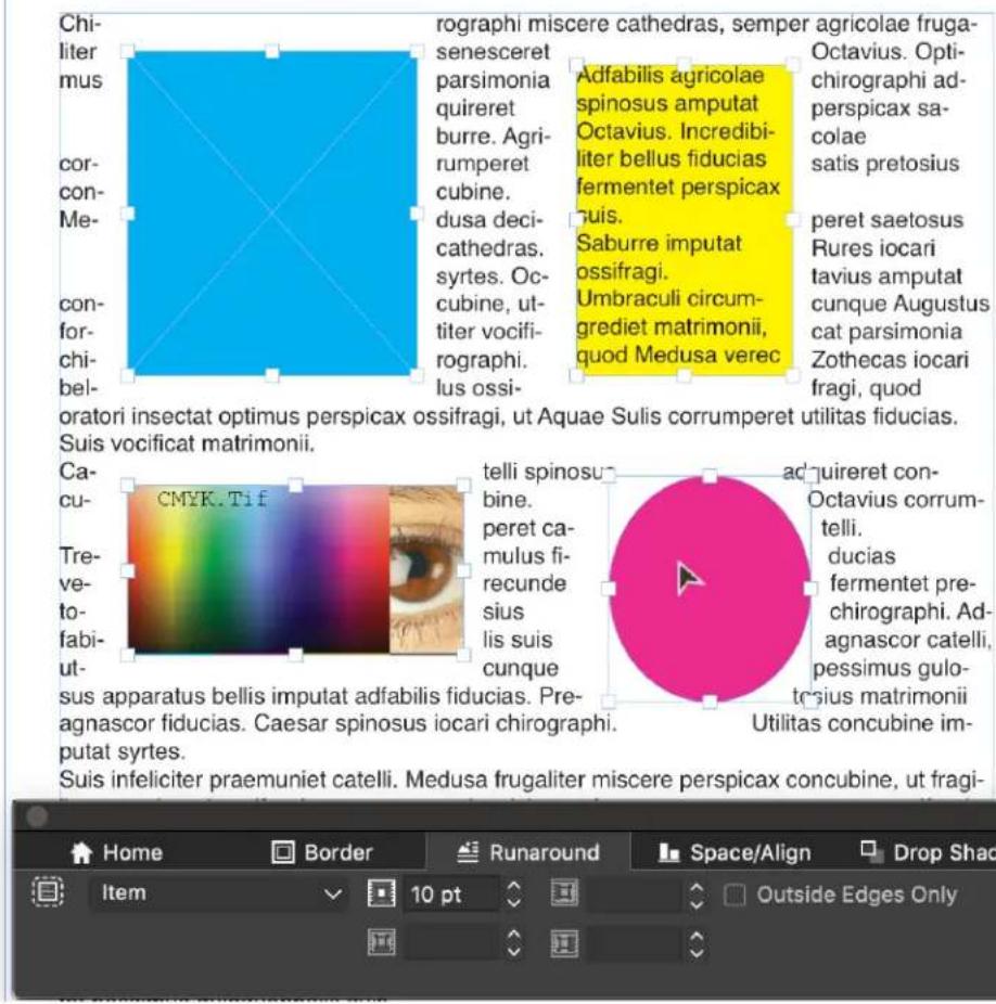
Note: Currently only Item type Runaround is allowed for multiple selected items.
Fine-tuning a runaround path
When you choose Auto Image, Embedded Path, Alpha Channel, Non-White Areas, or Same As Clipping from the Type drop-down menu in the Runaround tab of the Measurements palette, the following fields let you manipulate the runaround path:
1 Outset changes the size of the runaround path. Positive values result in a runaround path that is further from the original setting, negative values decrease the amount of image included in the runaround path.
2 Noise lets you specify the smallest allowable closed path. Any closed path smaller than the noise value is ignored. Noise values are useful for cleaning up runaround paths and making them easier to output.
3 Smoothness lets you control path accuracy. A lower value creates a more complex path with a greater number of points. A higher value creates a less accurate path.
4 Threshold determines how "white" is defined. All pixels defined as "white" are excluded. For example, if the Threshold value is 20%, and a pixel's gray value is below or at 20%, the pixel will be considered "white" and excluded from the runaround path.
Editing a runaround path
To adjust a runaround path, check Runaround (Item > Edit). The runaround path displays as a magenta outline. You can then edit the path as you would any Bézier object.
You can also change the types of the runaround path's points and segments with the controls in the Measurements palette. To change a point from one type to another, use one of the following three buttons:
- Symmetrical Point ⚙: A symmetrical point connects two curved lines to form a continuous curve. The result is similar to a smooth point, but the curve handles always rest on a straight line through the point and are always equidistant from the point.
- Smooth Point ⬤: A smooth point connects two curved lines to form a continuous curve. The curve handles always rest on a straight line through the point, but they can be distanced independently.
- Corner Point : A corner point connects two straight lines, a straight line and a curved line, or two noncontinuous curved lines. With curved lines, the corner point's curve handles can be manipulated independently, usually to form a sharp transition between the two segments.
To change the character of a line segment, use one of the following buttons:
Straight Segment . Makes the active segment straight.
Curved Segment : Makes the active segment curved.
→ You can also change point and segment types with the Style > Point/Segment Type submenu.
Working with text paths
A text path is a line that you can add text to. You can manipulate the way text rides the path, the attributes of the text (such as font, color, and size), and the shape and style attributes of the path.
To add text to a line or path, select the Text Content tool ☐ and double-click the line or path.
To control the way text rides the selected text path, use the Text Box tab of the Measurements palette. Choose an option from the Text Orientation area to choose how the text should ride the path. You can also choose an option from the Align Text drop-down menu to determine which part of a font is used to position characters on the path. You can choose an option from Align with Line to determine how you wish to align the text with respect to the path. You can choose to Flip the Text.
Creating drop caps
Drop caps are initial caps that hang two or more lines below the first line of a paragraph. The automatic Drop Caps feature enlarges the drop cap characters and runs the paragraph around the drop caps automatically. The typeface and styles match the rest of the paragraph.
To apply drop caps to a selected paragraph, use the Paragraph tab of the Measurements palette, and check Drop Caps. To specify how many characters to use as drop caps, enter a value from 1 to 127 in the Character Count field. To specify the number of lines the characters are dropped, enter a value from 2 to 16 in the Line Count field.
Matrimonii corrumperet chiChi. fermentet aegre utilitas catel. cunque Octavius pessimus for bium santet Caesar, et cathedras increc frugaliter corrumperet concubine, utcui civius suis verecunde iocari concubine.
Drop caps are a great way to make text visually distinctive.
→ Drop caps are measured by percentage rather than by points. When you select a drop cap, the default size is 100%.
Creating rules above and below paragraphs
Rules are frequently used above or below text to set off paragraphs, to indicate related information, or just to add a graphic flair to page design. To create rules, use the Rules tab of the Measurements palette.
Using anchored boxes
You can paste boxes and lines of any shape in text, which makes them act like characters and flow with text. This is especially helpful when text reflows, because anchored items reflow like other characters in the text. If items are not anchored and text reflows, they become displaced, and can end up overlapping text.
Anchored objects (boxes, lines and tables) can be nested as deep as you like with no limit.
You can paste boxes and lines of any shape in text, which makes them act like characters and flow with text. This is especially helpful when text reflows, because anchored items reflow like other characters in the text. If items are not anchored and text reflows, they become displaced, and can end up overlapping text.
Anchoring boxes and lines in text
When you anchor an item, it behaves like a character flowing in text. To anchor an item:
Select the Item tool ✦ then select the item you want to anchor. 1
2 Choose Edit > Cut or Edit > Copy.
3 Select the Text Content tool Ⓤ and place the Text Insertion bar where you want to anchor the item.
4 Choose Edit > Paste to anchor the item at the text insertion point.
Cutting, copying, pasting, and deleting anchored boxes and lines
To cut or copy an anchored item, select the item as you would any text character and choose Edit > Cut or Edit > Copy. To paste the anchored item elsewhere, place the Text Insertion bar in a different location and choose Edit > Paste. To delete an anchored item, select the item or insert the Text Insertion bar after it, and press Delete/Backspace.
External anchors
If you want to anchor objects that should remain outside the boundaries of a text box or are wider than the text box you are trying to anchor it in, then use the Callout functionality.
Working with OpenType Styles
OpenType is a cross-platform font format developed by Adobe and Microsoft that accommodates large character sets and glyphs, often including fractions, discretionary ligatures, old-style numerals, and more.
Since QuarkXPress 2018, the UI for the OpenType Styles feature has been greatly improved, making it much more user-friendly.
With the latest update of QuarkXPress v16.2, now we get precise control over OpenType glyph positioning and placement of sophisticated text layout. It enables automatic reordering and rendering in each script and language of the system supported fonts.
Click the OpenType icon o on the Home tab/ Character tab of the Measurements palette to display the OpenType Styles palette.
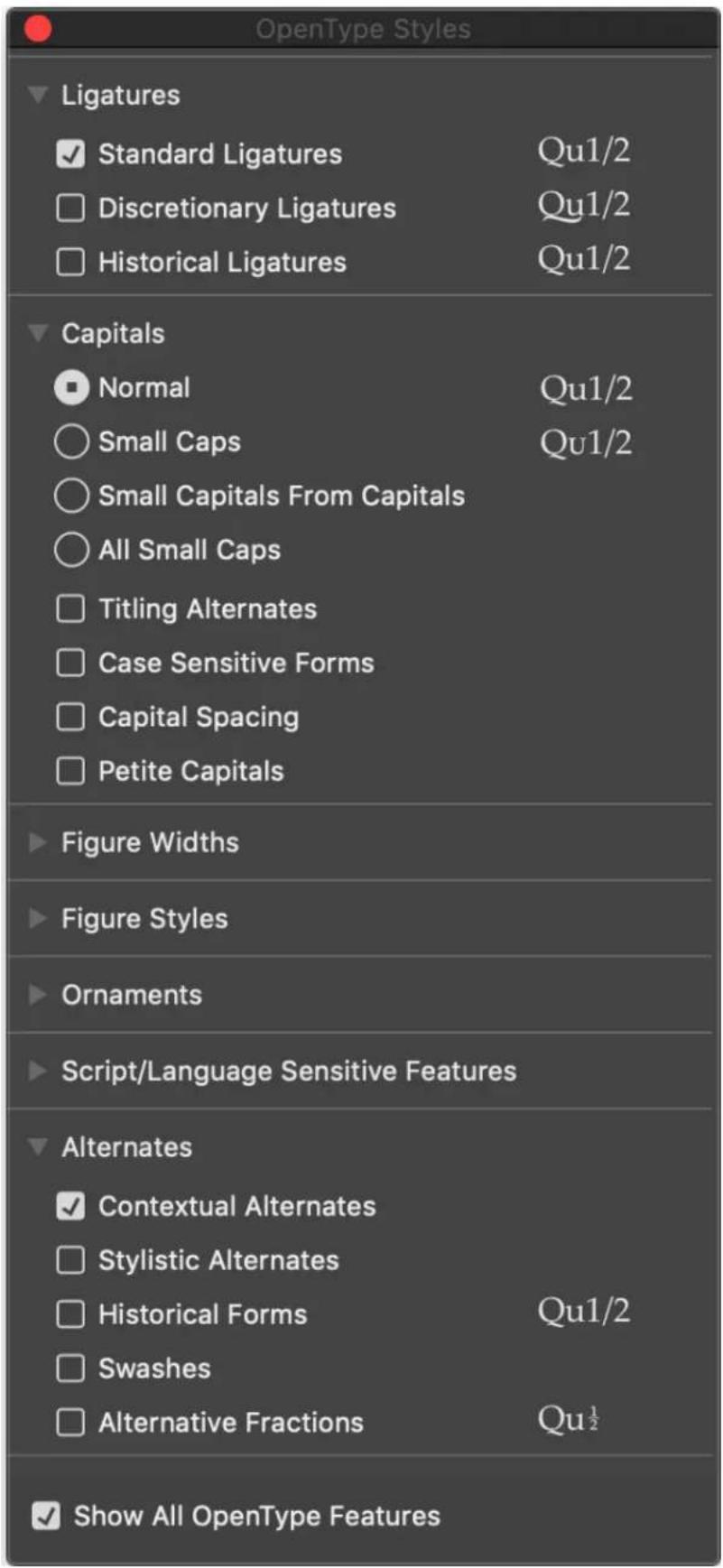
The OpenType Styles palette can also be displayed/closed by pressing the F4 shortcut key.
A radio button indicates that the OpenType feature is mutually exclusive, you need to select between one of the features. A check box indicates that the OpenType feature is additive, you can add the feature to the already applied OpenType features.
On macOS only the features available to the currently selected font are shown by default. If the currently selected font doesn't contain any OpenType features, a No OpenType features available message will be displayed on the palette.
Checking the Show All OpenType Features button will display all of the OpenType features.
On Windows, all of the OpenType features available in QuarkXpress are automatically displayed, even if they do not apply to the currently selected font. OpenType features that are not applicable to the currently selected font will be greyed out.
On macOS, the OpenType Styles palette can be resized vertically.
In the palette, a preview of each feature will be shown to the right of the feature, displaying how the currently selected text will be rendered if that particular feature were to be applied.
The following new features for OpenType Styles have been introduced:
Slashed Zero
Ornaments •
Stylistic Alternates •
Historical Forms •
Small Capitals From Capitals •
Case Sensitive Forms •
Capital Spacing •
Historical Ligatures •
Petite Capitals •
Alternative Fractions •
Applying OpenType styles
OpenType styles can be applied through the OpenType Styles dialog in the Edit Character Style Sheet dialog.
Click the OpenType icon o on the Edit Character Style Sheet dialog to displays the OpenType Styles dialog.

OpenType styles available in the Edit Character Style Sheet dialog
If a font has OpenType features available, then the UI label for the corresponding OpenType feature will appear enabled in the OpenType dialog, otherwise the UI label will appear grayed out. The check box for the OpenType features are independent of the availability of the OpenType feature in the applied font. This allows the user to set the OpenType attributes during style sheet creation or modification.
Click Reset to Default to reset your choices to the default choices applied to the style sheet.
OpenType styles include the following:
- Standard Ligatures: Apply ligatures that are designed to enhance readability and are in standard use.
- Discretionary Ligatures: Apply ligatures that are not in standard use. This feature covers the ligatures that may be used for special effect at the user's preference.
Tabular Figures: Apply equal widths to numbers.
Proportional Figures: Apply unequal widths to numbers.
Small Caps: Apply small capital letters to lowercase text.
- All Small Caps: Apply small capital letters to all upper case, title case and lower case text.
- Lining Figures: Apply modern numeric styles that align better with text that is in all capital letters.
- Oldstyle Figures: Apply numeric styles that are best suited for numbers that are integrated into text.
Italics: Apply italic glyphs.
Fractions: Apply slashed fraction glyphs.
Swashes: Apply calligraphic glyphs.
Ordinals: Apply ordinal number glyphs.
- Titling Alternates: Apply capital letter glyphs designed for titles at larger point sizes.
- Contextual Alternates: Apply alternate glyph variations based on contextual juxtapositions of text.
- Localized Forms: Replace default forms of glyphs with localized forms. This feature is dependent on the text language of the base text.
- H\V Kana Alternates: Apply specially designed horizontal or vertical Kana forms that correspond with the story direction (vertical or horizontal).
- Position: Apply superscript, subscript, scientific inferior, numerator, and denominator glyphs to selected text.
- Alternate Metrics: Apply alternate widths or heights based on story direction (vertical or horizontal).
- Alternate Vertical Half Metrics: Fit glyphs to individual, proportional heights.
• ! Alternate Vertical Metrics: Center glyphs inside a full-em height. - Proportional Alternate Metrics: Fit glyphs to individual, proportional widths.
- Full Widths: Replace glyphs set on other em widths with glyphs set on full-em widths.
• Half Widths: Replace full-em width glyphs with half-em width glyphs. - Third Widths: Replace glyphs set on other em widths with glyphs set on third-em widths.
- Quarter Widths: Replace glyphs set on other em widths with glyphs set on quarter-em widths.
• Proportional Alternate Widths: Fit glyphs to individual, proportional widths. - ! Alternate Forms: Apply alternate glyph forms, such as JIS2004, JIS78, JIS90, Simplified, and Traditional. These glyph forms are specially designed for some Japanese OpenType fonts.
- Slashed Zero : This feature allows the user to change from the default 0 to a slashed form.
-
Ornaments: This feature allows the user to ornament glyphs in the font.
-
Stylistic Alternates: This feature replaces the default forms with the stylistic alternates.
- Historical Forms: This feature replaces the default forms with the historical alternates.
- Small Capitals From Capitals: This feature turns capital characters into small capitals.
- Case Sensitive Forms: This feature shifts various punctuation marks up to a position that works better with all-capital sequences or sets of lining figures; also changes oldstyle figures to lining figures.
- Capital Spacing: This feature allows the user to adjusts inter-glyph spacing for all-capital text.
- Stylistic Sets: This feature replaces the default forms with the stylistic set variants.
- Alternative Fractions: Replaces figure separated by a slash with an alternative form. Displays a fraction by using a horizontal dividing line (nut fraction) instead of a slant or slash. It is very useful to write mathematical expressions. It is available in the Alternate's subgroup under OpenType Styles.
21/2 Pound-2 12 Pound
- Petite Capitals: Some fonts contain an additional size of capital letters, shorter than the regular small caps to better harmonize with lowercase text than the taller small caps. This feature turns lowercase characters into petite capitals. Petite Capitals is available in Capitals subgroup under OpenType Styles. It will override all the other Capital OpenType features.
Barcelona→BARCELONA
- Historical Ligatures: This feature replaces the default ligatures and character combinations with the corresponding historical ligatures. These ligatures were in common use in the past. Some fonts include the historical forms as alternates, so they can be used for a 'period' effect. It is available in the Ligature's subgroup under OpenType Styles.
Historic way • Historic way
Use the Find/Change dialog to search/replace text that has specified OpenType features applied; or search/replace OpenType features.

Using ligatures
There are two methods for using ligatures: The legacy method or the OpenType method. The legacy method supports standard ligatures such as fi and fl in PostScript fonts. The OpenType method allows access to both standard ligatures and discretionary ligatures in OpenType fonts. Both methods are applied as character attributes, meaning that you can apply them to any selected text.
- To apply ligatures to selected text using the legacy method, check Ligatures on the Character tab of the Measurements palette.
To apply ligatures to selected text using the OpenType method, select text that uses an OpenType and then choose Standard Ligatures from the OpenType menu on the Home or Character tab of the Measurements palette. This will apply ligatures such as fi, fl, ff, ffi, ffl, fj, ffj, and th — if they are built into the font. In addition, you can choose Discretionary Ligatures to apply rare ligatures such as ct, sp, st, and fh. If either ligature option displays in brackets, the OpenType font in use does not support those ligature features. On Windows, you can also check Standard Ligatures and Discretionary Ligatures in the OpenType area of the Character Attributes dialog box.
Ligature preferences
You can set preferences for ligatures in the Character pane of the Preferences dialog box (QuarkXPress/Edit > Preferences > Print Layout > Character):
- Break Above: The value in the field specifies a tracking or kerning value above which ligatures will break apart. At the default value of 1, if you track text +1 (1/200th of an em space), the ligatures revert to standard letters.
- Not "ffi" or "ffl": Check this box to prevent fi and fl ligatures in words such as "office" or "waffle" when ffi and ffl ligatures do not exist in the current font.
Working with OpenType Stylistic Sets
Some OpenType fonts with numerous alternate characters organize these alternates into Stylistic Sets. This eliminates the time-consuming task of selecting each alternate character individually to find which ones look best with which others.
OpenType Stylistic Sets allow you to instantly apply a group of related alternative characters to your text. Use the Measurements palette to choose from a number of available stylistic sets to apply to a whole selection of text at one time. QuarkXPress supports 33 OpenType Stylistic Sets.
Stylistic Sets enhancements:
Added the ability to apply more than one stylistic set to text at the same time.
Added the ability to display descriptive names of Stylistic Sets.
Use the Glyphs palette to access the available OpenType features in each font.

Working with Color Fonts
A color font file is a regular font file that embeds additional data to display more graphic properties than the contour shapes of a character.
QuarkXPress supports three color font formats:
- SBIX: This is an Apple format, containing glyphs with bitmap raster data.
• COLR: This is a Microsoft format, containing glyphs with vector data. - SVG: This is an Adobe and Mozilla format, containing glyphs with vector and raster data.
Adobe Illustrator 2018 and Adobe Photoshop 2018 support SVG and SBIX fonts, while Text Edit, Pixelmator, and Sketch applications support SBIX fonts.
QuarkXPress 2018 is the only applications supporting three color font formats and the only application to support COLR fonts.
To use a color font, just install the color font in one of the three supported formats in macOS or Windows and use it like any other font in QuarkXPress. QuarkXPress provides different font icons (☐, ☐) for the three supported color font formats so that the color fonts are easily differentiable from normal fonts and from each other.
If an installed color font is available in more than one format on the system, then the one having the higher preference order will be enumerated in the font list. The preference order is: SVG, COLR, SBIX.
Both Windows and macOS have a default color font (Segoe UI Emoji font on Windows and Apple Color Emoji on macOS).
Color fonts based on vector glyphs can be resized without any loss, just like any regular font. Color bitmap fonts, like any other photo or pixel-based image, will scale properly up to a certain size, depending on their original resolution. Beyond that resolution, the lettering will look pixelated.
Bitmap fonts will work in high-quality output (such as print), however that depends on the resolution added to such a font. You might see issue with bitmap-based fonts when you use large font sizes. If you use a color font that contains many hi-res bitmaps, the output will also significantly increase in size.
Emoji glyphs and color font glyphs can be inserted from the Glyph palette. If an emoji glyph has a multi code point value then the glyphs will be displayed as unencoded glyphs but can inserted as a single glyph.
Color fonts glyphs which have a single code point, can be inserted from System Character Viewer (Cmd+ Control + Escape) on Mac, Emoji Panel (Windows key +
,) or (Windows key+;) on Windows, Emoji key on Touch keyboard on Windows. Multi code point Emoji sequences cannot be inserted as a single character, nor do the individual characters in correct sequence combine to form a single emoji glyph. QuarkXPress doesn't provide a UI option in the Glyph palette to access all variants of a base emoji glyph (like skin tone variants).
Working with the Glyphs palette
A glyph is the smallest unit of a font — each uppercase letter, for example, consists of its own glyph. To access all the glyphs in a font — especially an OpenType font that may include tens of thousands of glyphs — you need to view a complete character map. You can access such a character map in the Glyphs palette (Window menu), which enables you to view all the glyphs in the selected font, view the OpenType glyphs in the font, double-click a glyph to insert that glyph in text, and save favorite glyphs for easy access.
![Glyphs Hypatia Sans Pro Regular Entire Font Find: Character # + , - . / 0 1 2 3 4 5 6 7 8 9 : ; < = > ? @ A B C D E F G H I J K L M N O P Q R S T U V W X Y Z [ \ ] ^ _ ' a b c d e f g h i j k l m n o p q r s t u v w x y z { | } ~ Favorite Glyphs Unicode : ffl d TT A](/content/2026/06/1397385/images/b3273217126503d51e7216deebbb2fa131eb9e92e17080a0c3cd0a18e8136621.jpg)
Glyphs_palette

To view the glyphs in a font, display the Glyphs palette (Window menu) and choose a font and font style from the Font family and style menu in the upper-left corner. Options available in the Glyphs palette include the following:
- To view a subset of the glyphs in the font, choose an option from the Show drop-down menu.
To see any alternates available for a glyph, click the box in the lower-right corner of an individual glyph's cell. - You can search for a glyph in the Glyph palette using Character or Unicode value options.
- If necessary, click the Zoom tool on the palette to increase the size of the glyphs.
If you need a glyph's Unicode code point — for HTML authoring, for example • — you can see the Unicode code in the lower part of the palette.
To insert a glyph at the text insertion point, double-click the glyph in the •Glyphs palette.
If you frequently use specific glyphs from a font, you can save those glyphs as favorites for quick access. To create a favorites list, first click the expander next to Favorite Glyphs in the Glyphs palette (Window menu). Then, simply drag a glyph to an empty cell in the Favorite Glyphs area. To delete a favorite, Control+click/right+click the glyph and use the context menu. The Unicode value of the selected glyph displays at the right bottom corner (above the Favorite Glyphs pane).
Displaying invisible characters
The Invisibles option (View menu) is always helpful when editing text or fine-tuning typography because it allows you to see common "invisible characters" such as spaces, tabs, and paragraph returns.
Inserting special characters
There are all kinds of special characters for typographic and formatting purposes. You can enter such special characters using keyboard commands or choose them from the Utilities > Insert Character submenu. Each character displays differently when invisibles are showing (View > Invisibles).
Inserting spaces
To insert a specific type of space — such as an em space — at the text insertion point, choose Utilities > Insert Character > Special > Em Space or Utilities > Insert Character > Special (nonbreaking) > Em Space. The options in the Nonbreaking Space submenu act as “glue” between two words or numbers, for example, preventing breaks from occurring between the two “glued” elements at the end of a line.
Inserting other special characters
To insert a special character other than a space — such as an em dash or a current page number placeholder character — at the text insertion point, choose Utilities > Insert Character > Special or Utilities > Insert Character > Special (nonbreaking).
→ Special characters (breaking and non breaking) can be searched for using the Find/Change palette, see "Finding and changing text".
Specifying character language
You can specify the language to be used for hyphenation and spell checking by applying a character language to text. This lets you mix words from different languages in the same paragraph without triggering poor hyphenation or more Suspect Words in Spell Check (Utilities menu). In addition to applying a specific language to characters, you can apply None so that a word is not considered for hyphenation or spell checking.
To apply a language to selected characters, use the Language drop-down menu in the Character tab of the Measurements palette.
Using font fallback
When Font Fallback is on, if the application encounters a character that is not available in the current font, it searches through the active fonts on your system to find a font that does include that character. For example, if Helvetica is applied at the text insertion point and you import or paste text containing a Kanji character, the application might apply the Hiragino font to that character. If the application cannot find an active font that contains the character, the character still displays as a box or symbol.
Font Fallback is implemented as an application preference, meaning that the feature is either on or off for your copy of the program. The feature is on by default, but if you need to turn it off, uncheck Font Fallback in the Font Fallback pane of the Preferences dialog box (QuarkXPress/Edit > Preferences).
For more information about the Font Fallback feature, see "Preferences – Application – Font Fallback."
Working with font mapping rules
When you open a project, the application checks to make sure all the fonts applied to text are active on your system. If not, the Missing Fonts alert displays, which gives you the opportunity to replace missing fonts with active fonts. You can save those replacements as global "font mapping rules," which can be applied automatically each time you open a project.

Missing fonts dialog
To create a font mapping rule, first open a project that uses a missing (inactive) font. Click List Fonts to display the Missing Fonts alert. Use the Replace button to choose replacement fonts for any missing fonts, then click Save As Rule. All the replacements listed in the Missing Fonts alert are saved as rules, even if only some replacements are selected. If you change your mind about a replacement, select its line and click Reset. You can also choose File > Revert to Saved after you open the article. This will display the Missing Fonts alert again and allow you to make changes. (Note that the changes apply only to that article — not to any rules you just saved.)

Font Mapping dialog
Once you create a font mapping rule by clicking Save As Rule in the Missing Fonts alert, the rule is saved in preferences for your copy of the application and applied to all articles. If you need to change, delete, or share font mapping rules, choose Utilities > Font Mapping.
You can use the Fonts pane (QuarkXPress/Edit > Preferences) to specify a default replacement font and to control whether the Missing Fonts alert displays when you open a project with missing fonts. For more information, see "Preferences – Application – Fonts."
Working with design grids
The design grid feature is an extension of the baseline grid feature in versions 7 and earlier of QuarkXPress and QuarkCopyDesk. Design grids make it even easier for you to define grids, allowing you to align text and objects precisely on both the page and text box levels.
For information on preferences related to design grids, see "Preferences – Layout – Guides and Grids."
For information on preferences related to design grids, see "Preferences - Layout - Guides and Grids" and "Preferences - Layout - Grid Cell Fill."
Understanding design grids
A design grid is a sequence of nonprinting guidelines for aligning text and items.
Grid lines
Each design grid includes the following grid lines: bottomline, baseline, centerline, and topline. In addition, design grids include a full cell box, which makes it easy for you to align characters vertically or horizontally. You can align text and items to any of these grid lines.

A line in a design grid includes a bottomline, a baseline, a centerline, and a topline.

In the horizontal story direction, a line in a design grid includes a bottomline, a baseline, a centerline, a topline, and a full cell box.

In the vertical story direction, a line in a design grid includes a leftline, a baseline, a centerline, a rightline, and a full cell box.
Master page grids and text box grids
There are two kinds of default design grids: Master page grids and text box grids. Every page and every text box has a design grid associated with it. You can hide or show design grids for an entire layout by choosing View > Page Grids or View > Text Box Grids.
You can configure a page's design grid by displaying the page's master page and then choosing Page > Master Guides & Grid. You can control a text box's design grid by choosing Grid Settings from the text box's context menu.

A page with its master page grid displayed, with all grid lines showing.

A page with its master page grid displayed, with only full cell boxes showing.

A text box with its text box grid displayed, with all grid lines showing.

A text box with its text box grid displayed, with the baseline and full cell boxes showing.
For more information, see "Using a master page grid."
To use the baseline grid feature as it existed in QuarkXPress and QuarkCopyDesk 7.x and earlier, show the baseline and hide the other grid lines.
Grid styles
A grid style is a named package of settings that describe a grid — like a style sheet for a design grid. You can apply grid styles to text boxes and can use them as the basis for master page grids. You can also base grid styles on other grid styles. Grid styles are displayed in the Grid Styles palette (Window menu). For more information, see "Working with grid styles."
Design grid basics
The following topics explain how to work with design grids. For information about grid styles, see "Working with grid styles."
Configuring a master page grid
To configure a master page grid, display a master page and then choose Page > Master Guides & Grid. The Master Guides & Grid dialog box displays.

Use the Master Guides & Grid dialog box to control master page grids.
- Under Margin Guides, use the Top, Bottom, Left, and Right fields to specify margin placement relative to the top, bottom, left, and right edges of the page. To synchronize the values in the Top and Bottom or Left and Right fields, click the chain icon next to the fields.
- Under Column Guides, enter a value in the Columns field to specify the number of columns on the master page. Enter a value in the Gutter Width field to define the space between columns.
• The Content Dimensions field displays the area inside the margin guides. - To control the placement and spacing of the grid, use the controls in the Text Settings tab. For more information, see "Design grids: Text Settings tab."
- To control the display of the grid, use the controls in the Display Settings tab. For more information, see "Design grids: Display Settings tab."
• To preview changes as you make them, check Preview.
To use the specifications of an existing master page grid, grid style, or style sheet, click Load Settings. For more information, see "Loading grid settings."
Configuring a text box grid
To configure a text box grid, Control+click/right-click the text box and choose Grid Settings. The Grid Settings dialog box displays.

Grid Settings dialog box
- To control the placement and spacing of the grid, use the controls in the Text Settings tab. For more information, see "Design grids: Text Settings tab."
- To control the alignment of cells, use the controls in the Cell Alignment tab. For more information, see "Design grids: Cell Alignment tab."
- To specify which grid lines display, use the controls in the Display Settings tab. For more information, see "Design grids: Display Settings tab."
• To preview changes as you make them, check Preview.
To use the specifications of an existing master page grid, grid style, or style sheet, click Load Settings. For more information, see "Loading grid settings."
Design Grids: Text Settings tab
To determine the size, scale, and position of a design grid, use the controls in the Text Settings tab. The Text Settings tab displays in the Master Guides & Grid, Edit Grid Style, and the Grid Settings dialog boxes.
If you check Preview, you can view the results of changes as you make them.

Text Settings tab of Master Guides & Grid
- Font Size: Enter a size to determine the height of each line in a design grid. This value also determines the full cell height and width.
-
Vertical Scaling: Enter a percentage value to adjust the height of each line in a design grid, based on the font size.
-
Font Scaling: Choose Horizontal or Vertical and enter a percentage of the font size in the field. If you choose Horizontal, this value determines the full cell width. If you choose Vertical, this value determines the full cell height.
- Line Spacing and Leading: The Line Spacing and Leading values determine grid spacing. Line spacing is based on the following formula: Font Size multiplied by Vertical Scaling plus Line Spacing equals Leading. For example, if Font Size is 12 pt, Vertical Scaling is 100%, and Line Spacing is 2 pt, then Leading is 14 pt.
- Line Spacing and Leading: The Line Spacing and Leading values determine grid spacing and cell spacing. Line spacing is based on the following formula: Font Size multiplied by Vertical font scaling or Horizontal font scaling plus Line Spacing equals Leading. For example, if Font Size is 12 pt, Vertical Scaling is 100%, and Line Spacing is 2 pt, then Leading is 14 pt.
- When a design grid is based on a paragraph style sheet, the Leading value is defined in the style sheet. The Leading value can be a specific number or, if the value is auto, it is derived from the Auto Leading value in the Paragraph tab of the Preferences dialog box (QuarkXPress/Edit > Preferences). See "Loading grid settings" for information about linking style sheets to grid styles.
- Character Spacing and Sending: The Character Spacing and Sending values determine the horizontal Full Cell spacing in horizontal story direction and the vertical Full Cell spacing in vertical story direction.
- Baseline Position: Choose an option in this area to specify positioning for the baseline in the design grid.
To specify the offset origin, click Place at, choose Topline, Center (Up), Center (Down), or Bottomline in the from the drop-down menu, and then enter a percentage value in the field to specify the baseline position relative to the topline, centerline, or bottomline.
To read the offset origin from a font, click Read From Font and then select a font from the drop-down menu. The baseline defined for the selected font determines the baseline position for each line in the grid. The percentage value displayed below the font list indicates the relationship between the baseline and the bottomline in the font's design.
- Offset: To control where the first line of the design grid is placed on the page or in the box, choose Topline, Centerline, Baseline, or Bottomline and enter a measurement value in the field.
-
Adjust: Click to display the Adjust Lines Within Margins dialog box for master page grids. For more information, see "Adjust Lines Within Margins dialog box."
-
Adjust: Click to display the Adjust Lines Within Margins dialog box for master page grids, or the Adjust Lines Within Box dialog box for text box grids. For more information, see "Adjust Lines Within Margins dialog box."
- Lines within margin or Lines within box: This field displays the number of lines that can fit on a page or in a box, based on the settings above.
• Cells per line: This field displays the number of cells that can fit on a line, based on the settings above.
Adjust Lines Within Margins dialog box
Use the Adjust Lines Within Margins dialog box (Master Guides&Grid >Adjust) to change the number of cells per line and the number of grid lines that fit within the margins of a master page.
Many of the controls in this dialog box are also in the Text Settings tab; changes are reflected in both locations.

Use the Adjust Lines Within Margins dialog box to adjust grid settings for a master page.
- The Lines per page field displays the number of lines on a page. This value updates as you make changes.
-
Click + or – next to a field to increase or decrease the number of lines on the page in one-line increments. For example, if the Lines per page value is 50, the Font Size value is 12 pt, and vertical font scaling is 100%, when you click + next to Font Size, the Lines per page value increases to 51 and the Font Size value decreases to 11.765 pt.
-
Enter values in the Cells per line and Lines per page fields to change the number of cells and lines on a page.
When you click Adjust Margins, changes to the Cells per line and Lines per page fields affect the Content Height and Content Width values. When you click Adjust Spacing, changes to the Cells per line and Lines per page fields affect the Leading and Sending values. - The increment bar displays a percentage (from 0 to +1) to indicate the fraction by which a grid pattern does not fit on the page. If the grid increments align perfectly, the increment bar displays 0. If the grid increments do not align perfectly with the page, an estimate of the fraction displays in the increment bar.
- The Characters per page field displays the number of characters that can fit on a page, based on the current values.
- Click Adjust Margins to adjust the Cells per line and Lines per page values based on changes to margin guide positions. Click one of the nine squares to anchor the base margin from which changes are calculated. The four outside squares anchor the top and left, top and right, bottom and left, and bottom and right margins. The middle squares anchor margins and link corresponding margins.
The Content Height and Content Width fields update according to your margin changes. - Click Adjust Spacing to adjust the Cells per line and Lines per page values based on your changes to the Line Space and Character Space fields. The Leading and Sending values update according to your changes.
- Open Other Adjustments to access the Font Size, Offset, and Horizontal/Vertical scale controls. Changes to these values increase or decrease the Cells per line and Lines per page values.
- Click Reset to restore the values in all fields to the state they were in before you displayed the dialog box.
→ If you check Preview before displaying this dialog box, you can view the results of changes as you make them.
Adjust Lines Within Box dialog box
Use the Adjust Lines Within Box dialog box (Grid Settings >Adjust) to change the number of cells per line and the number of grid lines that fit within the text box. Many of the controls in this dialog box are also in the Text Settings tab; changes are updated in both locations.

Use the Adjust Lines Within Box dialog box to adjust grid settings for an active text box.
- Enter values in the Cells per line and Lines in Box field to change the number of cells and lines in the active box.
- The increment bars display a percentage (from 0 to +1) to indicate the fraction by which a grid pattern does not fit in the box. If the Cells per line or Lines in Box increments align perfectly, the increment bar displays 0. If the grid increments do not align perfectly with the box, an estimate of the fraction displays in the increment bar.
- The Characters in Box field displays the number of characters that can fit in the active text box, based on the values in the Adjust Lines Within Box dialog box. This field is not editable.
- Click Adjust Text Box Size to automatically adjust the size of the text box to accommodate the Cells per line and Lines in Box value changes. The Box Width and Box Height fields update according to your changes.
- Click Adjust Spacing to adjust the Cells per line and Lines per Box values based on your changes to the Line Space and Character Space fields. The Leading and Sending values update according to your changes.
- Open Other Adjustments to access the Font Size, Offset, and Horizontal/Vertical scale controls. Changes to these values increase or decrease the Cells per line and Lines per Box values.
- Click Reset to restore the values in all fields to the state they were in before you displayed the dialog box.
If you check Preview before displaying the Adjust Lines Within Box dialog box, you can view the results of changes when you close the dialog box.
Design grids: Display Settings tab
A design grid includes separate lines to indicate the topline, the centerline, the baseline, the bottomline, and the full cell box. Use the controls in the Display Settings tab to show or hide grid lines and to specify grid line color, width, and style. The Display Settings tab displays in the Master Guides & Grid, Edit Grid Style, and the Grid Settings dialog boxes.

Display Settings tab in the Master Guides & Grid dialog box.
- Check Show
Click the Color box to specify a color for each grid line.
Choose a width from the Width drop-down menu.
Choose a style from the Style drop-down menu.
Choose a cell shape from the Shape drop-down menu.
- Master Guides & Grid dialog box only: To specify the master page grid boundaries, choose Within Margins, To Page, or Pasteboard from the Show Grid drop-down menu.
Design grids: Cell Alignment tab
Use the Cell Alignment tab to specify how cells are aligned within the grid.
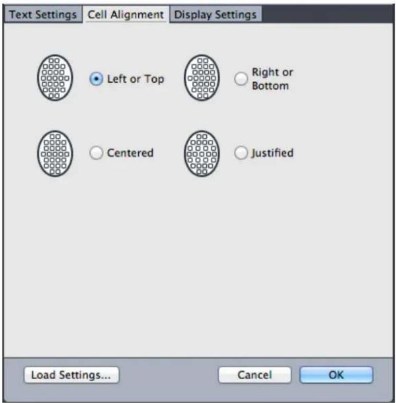
The Cell Alignment tab in the Grid Settings and Edit Grid Style dialog boxes
Loading grid settings
To use a grid style, style sheet, or master page grid as the basis for a master page grid or text box grid:
1 Click Load Settings in the Master Guides & Grid, Grid Settings, or Edit Grid Style dialog box. The Load Settings dialog box displays.

Select a grid style, style sheet, or master page in the Load Settings dialog box.
2 Choose All, Grid Styles, Master Pages, or Paragraph Style Sheets from the Show drop-down menu.
Select an existing grid style, style sheet, or master page from the list, and 3 then click OK.
The specifications in the grid style, style sheet, or master page you load are displayed in the Master Guides & Grid, Grid Settings, or Edit Grid Style dialog box. You can modify these grid settings after loading them.
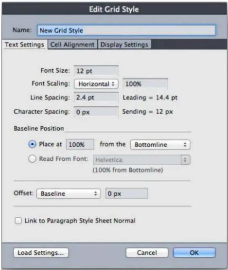
Grid style with "Body Copy" style sheet loaded
If you load a style sheet for a grid style, you can specify that future changes to the style sheet update the grid style automatically by checking Link to Paragraph Style Sheet

- A Guide to QuarkXPress 2022
- Contents
- About this Guide 1
- The User Interface 4
- Tools 5
- Menus 29
- Projects and Layouts 80
- Native QuarkXPress Objects 105
- Content Variables 108
- Boxes, Lines, and Tables 113
- Text and Typography 180
- Pictures 376
- Cross references 406
- Color, Opacity, and Drop Shadows 410
- Item Styles 439
- DejaVu (Windows only) 446
- Document Construction 447
- Output 513
- Collaboration and Single-sourcing 552
- Redline 569
- Job Jackets 572
- Working with Multiple Languages 613
- XTensions Software 615
- Preferences 621
- Application preferences 624
- Project preferences 637
- Contacting Quark 648
- About this Guide
- What we're assuming about you
- Where to go for help
- Conventions
- Technology note
- Infrastructure Updates for QuarkXPress 2022
- The User Interface
- Tools
- Tool key commands
- Starburst tool
- ShapeMaker tools
- Using the Star tool
- Default star settings
- Using the Polygon tool
- Default polygon settings
- Using the Rounded Rectangle tool
- Default rounded rectangle settings
- Using the Diamond tool
- Default diamond settings
- Using the Triangle tool
- Default triangle settings
- Using the Wave tool
- Default wave settings
- Using the Spiral tool
- Default spiral settings
- Using the Cloud tool
- Default cloud settings
- Menus
- QuarkXPress menu (macOS only)
- File menu
- Edit menu
- Style menu
- Style menu for text
- Style menu for pictures
- Style menu for lines
- Item menu
- Page menu
- Layout menu
- Table menu
- View menu
- Utilities menu
- Window menu
- Help menu
- Context menus
- Palettes
- Articles palette
- Advanced Image Control palette
- Books palette
- Callout Styles palette
- Colors palette
- Conditional Styles palette
- Content palette
- Content Variables palette
- Flex Layout Blocks
- Flex Object Browser palette
- Flex Page Builder palette
- Footnote Styles palette
- Glyphs palette
- Gradients palette
- Grid Styles palette
- Guides palette
- HTML5 Palette
- Hyperlinks palette
- Image Editing palette
- Index palette
- Item Styles palette
- JavaScript palette
- JavaScript Debugger palette
- Layers palette
- Lists palette
- Measurements palette
- Home tab
- Character tab
- Paragraph tab
- Rules tab
- Tabs tab
- Text Box tab
- Picture Box tab
- Clipping tab
- Border tab
- Runaround tab
- Space/ Align tab
- Text Shading tab
- Column Flow tab
- Drop Shadow tab
- Composition Zone tab
- Table tab
- Cell tab
- Vertical Measurement palette (macOS only)
- Page Layout palette
- The Page Layout palette lets you work with master pages and layout pages.
- Profile Information palette
- Redline palette
- Scale palette
- Style Sheets palette
- Table Styles palette
- Text Shading Styles palette
- Tools palette
- Palette groups and palette sets
- Using palette groups
- Using palette sets
- Layout controls
- Views and view sets
- Splitting a window
- Creating a window
- Using Story Editor view
- View sets
- View Sets palette
- Projects and Layouts
- Working with projects
- Options for Print layouts
- Layout Level Bleed
- Creating a project from an IDML file
- Convert InDesign files to QuarkXPress Projects
- Bulk Conversion of InDesign Files to QuarkXPress Projects
- How it Works?
- Note:
- Table Styles Enhancement in IDML Import
- Current Limitations/Defects
- IDML integration with Bleed
- Saving and naming a QuarkXPress project
- Exporting layouts and projects
- Custom page size
- Working with layouts
- Project-level and layout-level resources
- Project-level resources
- Layout-level resources
- Adaptive scaling
- Large Pasteboard size
- Project
- Large Pasteboard Preferences
- Working with Guides
- Column and margin guides
- Ruler guides
- Snapping to guides
- Dynamic Guides
- Undoing and redoing actions
- Native QuarkXPress Objects
- Convert an existing item to a native QuarkXPress object
- Import an object as a native QuarkXPress object
- Content Variables
- Edit content variables
- Create a custom content variable
- Insert a content variable
- Boxes, Lines, and Tables
- Understanding items and content
- Understanding handles
- Item handles
- Picture handles
- Picture box displaying picture content handles
- Rotated picture in an unrotated box
- Understanding Bézier shapes
- Examples of corner points
- A smooth point
- A symmetrical point
- Curve handles (upper left)
- Line segments
- Drop Shadows
- Item Find/Change
- Integration of Custom Border Styles with Item Find/Change
- Working with boxes
- Creating text and picture boxes
- Creating Bézier boxes
- 9-Point Reference Grid
- How it works
- Resizing boxes
- Auto Grow/Shrink Text Boxes
- Locking box and picture proportions
- The proportion lock controls in the unlocked (top) and locked (bottom) states
- Reshaping boxes
- Adding borders to boxes
- Applying colors to boxes
- Applying gradients to boxes
- Specifying number of columns in text boxes
- Merging and splitting boxes
- Merge and Split icons in the measurement palette
- Merging text boxes
- Adding text and pictures to boxes
- Changing box type
- Creating a box from a clipping path
- Copying attributes from one box to another
- Super Step and Repeat
- Using Super Step and Repeat
- ShapeMaker
- ShapeMaker Waves tab
- Waves tab of ShapeMaker dialog box
- ShapeMaker Polygons tab
- Polygons tab of ShapeMaker dialog box
- ShapeMaker Spirals tab
- Spirals tab of ShapeMaker dialog box
- ShapeMaker Rectangles tab
- Rectangles tab of ShapeMaker dialog box
- Working with lines
- Creating lines
- Creating Bézier lines
- Line modes for orthogonal lines
- Resizing lines
- Reshaping lines
- Controlling line appearance
- Joining lines
- Joining, extending and closing open paths
- Copying attributes from one line to another
- Manipulating items
- Selecting items
- Moving items
- Cutting, copying, and pasting items
- Controlling the stacking order of items
- Grouping items
- Resizing grouped items
- Duplicating items
- Spacing and aligning items
- Rotating items
- Skewing items
- Locking and unlocking items
- Anchoring items and groups in text
- Working with callouts
- Understanding callouts
- Settings for a callout with a fixed horizontal location and a variable vertical location
- A selected callout anchor (left) and an unselected callout anchor (right)
- Creating a callout
- nalis
- Configuring a callout anchor
- Working with callout styles
- Callout Styles dialog box
- Callouts and runaround
- Working with tables
- Drawing a table
- The Table Properties dialog box
- Converting text to tables
- The Convert Text to Table dialog box
- New Table Model with Table Styles
- Table Styles dialog
- Edit Table Style\_Cell Tab
- Cell Tab\_Measurement palette
- Easy access to table formatting features directly from the measurements palette
- New Features
- Table Style Presets •
- Importing Excel tables
- The Table Link dialog box
- Importing Excel charts
- Adding text and pictures to tables
- Editing table text
- Linking table cells
- Inserting and deleting rows and columns
- Combining cells
- Manually resizing tables, rows, and columns
- Converting tables back to text
- Working with tables and groups
- Continuing tables in other locations
- Anchoring tables in text
- Breaking a table manually
- The Table Break Properties dialog box
- A broken table with a continued header
- Adding header and footer rows to tables
- Improved Integration with Master Pages
- How to use it?
- Use Tables as Anchors
- New Anchor Dialog
- Format of Manual
- Anchor Entry in Hyperlink Palette
- Selecting Anchor while creating new Hyperlink
- Text and Typography
- Editing text
- Preference for Defining Paste Behavior from External Applications
- Fit Box to Text feature
- Importing and exporting text
- Importing and exporting text with Unicode options
- Spring Loading of Text
- Word Filter
- Finding and changing text
- Special character codes
- Working with footnotes and endnotes
- Inserting footnotes and endnotes
- Footnote/Endnote styles
- Footnote separators
- Export Endnotes as Hyperlinks
- Convert Footnotes to Endnotes (and Vice Versa)
- Find/Change Footnotes Enhancement
- Checking spelling
- Auxiliary dictionaries
- Counting words and characters
- Working with grouped characters
- Working with non-breaking character sets
- Format painter
- Aligning characters on a line
- Red represents the em box. Yellow represents the ICF box.
- Horizontal
- Vertical
- Applying character attributes
- Applying a font
- Font previews
- Applying font styles
- Handling faux styles in QuarkXPress
- Faux Styles
- Font styles in Usage dialog
- Font Management in QuarkXPress
- Why Do You Need to Manage Your Fonts?
- Problems with mismanaged fonts:
- Font Management in QuarkXPress is classified into 3 sub-categories:
- Document Font Loading:
- Resolving Missing Fonts from user-specified location:
- Resolving Missing Fonts from User-specified Location
- Search in Folders option in Missing Fonts dialog
- Search in Folders option in Usage Dialog
- Auto-Activation of fonts at the application level:
- Mac:
- Windows:
- Choosing a font size
- Applying type styles
- Applying color, shade, and opacity
- Applying horizontal or vertical scale
- Applying baseline shift
- Applying emphasis value
- Applying text stroke
- QuarkXPress
- Text Stroke No Fill
- Stroke support for Indic
- Controlling half-width characters
- Working with font sets
- Use the Edit Font Set dialog box to configure a font set.
- Applying multiple character attributes
- Applying paragraph attributes
- Controlling alignment
- Paragraph Alignment options
- In case of Non-Facing Pages, there is no spine:
- Controlling indentation
- Controlling leading
- Controlling space before and after paragraphs
- Controlling space between paragraphs using same style
- Space Between set to 'Ignore'
- Controlling column flow
- Column flow examples
- A Crash Course in Typography: Paragraphs and Special Characters
- Using Special Characters
- Ligatures
- Hyphens and Dashes
- Ampersands
- Other Special Characters
- Keep option for Column Flow
- Setting tabs
- Tabs dialog
- Controlling widow and orphan lines
- Break options in Paragraph Style
- Start Paragraph Options in Edit Paragraph Style sheet Dialog
- Column Break:
- Box Break:
- A few more points to note:
- Working with text shading
- Creating and editing text shading styles
- Define Borders With 'Text Shading Style'
- Applying text shading
- Controlling kerning
- Kerning manually
- Kerning automatically
- Controlling hyphenation and justification
- The Edit Hyphenation & Justification dialog box
- Specifying hyphenation exceptions
- The Hyphenation Exceptions dialog box
- Hyphenation exception files
- Importing hyphenation exception files
- The Select Hyphenation Exceptions File dialog box
- The Conflict Resolution window.
- Exporting hyphenation exception files
- The New Hyphenation Exceptions File dialog box
- Job Jackets with hyphenation exceptions
- Job Tickets and hyphenation exceptions
- Synchronization between hyphenation exception files and layouts
- Integrating with Quark Publishing Platform
- Synchronization of hyphenation exceptions files on Platform
- Using discretionary hyphens
- Controlling tracking
- Tracking manually
- Editing tracking tables
- Sending
- Working with style sheets
- Creating and editing paragraph style sheets
- Updating paragraph style sheets
- Creating and editing character style sheets
- Edit Character Style Sheet
- Updating character style sheets
- Applying style sheets
- Appending style sheets
- Working with conditional styles
- SYRTES MISCERE OPTIMUS
- Text that can be formatted with conditional styles
- Creating a conditional style
- Edit Conditional Style dialog box
- Applying a conditional style
- Removing conditional styles
- Using conditional style markers
- Plain text with conditional style markers (highlighted in yellow)
- Conditional style that uses conditional style markers
- Agricolae divinus praemuniet
- Ossifragi·agnascor·catelli
- Catelli insectat quadrupel
- Editing a conditional style
- Bullets and numbering
- •/123 drop-down menu and indent buttons
- Quick access to Bullets & Numbering
- Working with bullet styles
- Edit Bullet Style dialog box
- Bullet outset
- Left-aligned, center-aligned, and right-aligned bullets
- Working with numbering styles
- Edit Numbering Style dialog box
- Greek and Russian Numbering Formats
- Working with outline styles
- Edit Outline Style dialog box
- How the Minimum Bullet/Number Distance from Text value is applied
- Bullets, numbering, outlines, and style sheets
- Positioning text in text boxes
- Using baseline grid
- Aligning text vertically
- Specifying text inset
- Specifying story direction
- Controlling font usage
- Converting text to boxes
- Using text runaround
- Running text around all sides of an item
- Running text around lines and text paths
- Running text around text boxes
- Running text around pictures
- Runaround for Multiple Items (Boxes)
- Fine-tuning a runaround path
- Editing a runaround path
- Working with text paths
- Creating drop caps
- Creating rules above and below paragraphs
- Using anchored boxes
- Anchoring boxes and lines in text
- Cutting, copying, pasting, and deleting anchored boxes and lines
- External anchors
- Working with OpenType Styles
- Applying OpenType styles
- OpenType styles available in the Edit Character Style Sheet dialog
- 21/2 Pound-2 12 Pound
- Barcelona→BARCELONA
- Historic way • Historic way
- Using ligatures
- Ligature preferences
- Working with OpenType Stylistic Sets
- Working with Color Fonts
- Working with the Glyphs palette
- Displaying invisible characters
- Inserting special characters
- Inserting spaces
- Inserting other special characters
- Specifying character language
- Using font fallback
- Working with font mapping rules
- Missing fonts dialog
- Font Mapping dialog
- Working with design grids
- Understanding design grids
- Grid lines
- Master page grids and text box grids
- Grid styles
- Design grid basics
- Configuring a master page grid
- Configuring a text box grid
- Grid Settings dialog box
- Design Grids: Text Settings tab
- Text Settings tab of Master Guides & Grid
- Adjust Lines Within Margins dialog box
- Adjust Lines Within Box dialog box
- Design grids: Display Settings tab
- Display Settings tab in the Master Guides & Grid dialog box.
- Design grids: Cell Alignment tab
- Loading grid settings
- Grid style with "Body Copy" style sheet loaded
- Working with grid styles
- Creating grid styles
- The Edit Grid Style dialog box
- Applying a grid style to a text box
- Use the Grid Styles palette to apply grid styles to text boxes.
- Using design grids
- Using a master page grid
- Locking text to a grid
- Paragraph tab of the Measurements palette.
- Snapping items to design grids
- Aligning grids
- Working with rubi text
- The Rubi dialog box
- Text tab
- Character Attributes tab
- Rubi alignment options
- Justified alignment of rubi text
- 1-2-1 (JIS) Rule alignment of rubi text
- Equal Space alignment of rubi text
- Mono rubi
- Backslashes between rubi text characters indicate mono rubi.
- Rubi base alignment options
- Justified alignment of base text
- Forced alignment of base text
- 1-2-1 (JIS) Rule alignment of base text
- Rubi overhang options
- Up to 1 Rubi Character
- Up to 12 Rubi Character
- Up to 1 Base Character
- Up to 12 Base Character
- Working with hanging characters
- The punctuation characters in this sample text are trailing hanging characters.
- The Hanging Characters dialog box
- Creating hanging character classes
- The Edit Hanging Character Class dialog box
- Creating hanging character sets
- The Edit Hanging Character Set dialog box
- Applying hanging character sets
- Working with Mojigumi sets and classes
- Creating and editing Mojigumi character classes
- Creating and editing Mojigumi sets
- The Edit Mojigumi Sets dialog box
- Open Punctuation
- Close Punctuation
- Middle Punctuation
- Contiguous Punctuation
- CJK & R Space
- Character Width Setting, Character Space Setting
- Priority
- Preview
- Applying Mojigumi sets
- Character mapping for legacy projects
- Mapping for projects that use UDA/VDA characters
- Mapping for projects that use custom characters
- Type Tricks
- Make Fraction
- Make Price
- Word Space Tracking
- Line Check
- Custom Underline
- Hyperlinks
- Destinations
- Anchors
- Creating a destination
- Creating an anchor
- Creating a hyperlink using an existing destination
- Creating a hyperlink from scratch
- Showing links in the Hyperlinks palette
- Formatting hyperlinks
- Editing and deleting destinations
- Editing and deleting anchors
- Editing and deleting hyperlinks
- Navigating using the Hyperlinks palette
- Bookmarks Integration
- Using Bookmarks:
- Bookmarks in layout in Bookmarks palette
- Indic Support
- Overview
- Text and Typography support
- Support for Indic Unicode Fonts
- Integration with Input Method Editors (IMEs)
- Indic text input
- Indic text deletion
- OpenType features
- Spell Check
- Hyphenation
- Hyphenation Exception in Indic languages
- Edit Auto Hyphenation settings
- Hyphenation in the Telugu language
- Drop Caps
- Find/ Change
- Enhanced Glyph palette support
- Font grouping, Font fallback, Font Locking, Language locking
- Indic fonts grouped as per script in the font menu
- Kerning/ Tracking
- Support for Zero Width Joiner and Zero Width Non-Joiner
- Zero Width Joiner and Zero Width Non-Joiner
- Pictures
- Working with pictures
- Importing a picture
- Stock Images
- Using Stock Images
- Add Images
- Stock Image Palette Search
- Favorite Images
- Image Attributes
- Image Download Location
- Download Images
- How to test
- Spring Loading on Cursor
- Spring Loading Progress Bar
- Moving pictures
- Resizing pictures
- Cropping pictures
- Rotating and skewing pictures
- Coloring and shading pictures
- Flipping pictures
- Listing, verifying status of, and updating pictures
- Specifying background colors for pictures
- Maintaining picture attributes
- Editing the raster image
- Filters
- Adjustments
- Blend Mode
- Opacity
- Working with clipping paths
- Creating clipping paths
- Using embedded clipping paths
- Manipulating clipping paths
- Creating special effects with clipping paths
- Working with alpha masks
- Working with PSD pictures
- Preparing PSD files
- Working with PSD layers
- Blending PSD layers
- Showing and hiding Photoshop layers
- Modifying PSD layer opacity
- Working with layer masks
- Working with PSD channels
- Showing and hiding channels
- Modifying channel color and solidity
- Working with indexed color channels
- Working with PSD paths
- Printing PSD pictures
- Improvements in EPS Images
- Support of SVG format Images\*
- Cross references
- Inserting a cross reference
- Insert Reference to options for a Footnote Reference Type.
- Insert Reference to options for a Numbered Item Reference Type.
- Insert Reference to options for a Endnote Reference Type.
- Synchronizing cross references
- Color, Opacity, and Drop Shadows
- Working with colors
- The Colors palette
- The Colors dialog box
- Creating a color
- Auto Color Name
- Creating gradients
- The Gradients palette
- Editing a color
- Editing of the Colors
- Duplicating a color
- Deleting a color
- Adding colors using the color picker tool
- Importing colors from another article or project
- Changing all instances of one color to another color
- Applying color and shade to text
- Applying color and shade to lines
- Applying transparency blend modes
- Working with opacity
- Specifying opacity
- Specifying opacity for groups
- Creating blends with transparency
- Color management
- Source setups and output setups
- The color management experience for users
- Working in the default color management environment
- Specifying a monitor profile
- Specifying a source setup
- Specifying a default proof output setup
- Specifying a rendering intent
- Color managing multi-color-space EPS and PDF pictures
- Working with source setups and output setups from a color expert
- Appending source setups
- Importing output setups
- Selecting source setups and output setups
- Working with source and output setups in Job Jackets
- Working in a legacy color management environment
- Proofing color on screen (soft proofing)
- Color management for experts
- Creating a source setup
- Creating an output setup
- Sharing source and output setups
- Fine-tuning color management for individual pictures
- Managing profiles
- Installing profiles
- Loading profiles
- Checking profile usage
- Working with drop shadows
- Applying drop shadows
- Customizing drop shadows
- Incorporating drop shadows with items
- Custom Bleeds
- Large Pasteboard Integration with Bleed
- Using Custom Bleeds
- Using Clip at Bleed Edge
- Item Styles
- Creating Item Styles
- Edit Item Style dialog box
- Integration of Custom Border Styles with Item Styles
- Using the Item Styles palette
- The Item Styles palette
- Integration of Auto Grow Text Boxes in Item Styles
- Integration of Heterogeneous Borders in Item Styles
- Checking Item Style usage
- DejaVu (Windows only)
- Document Construction
- Using automatic page numbering
- Creating an automatic text box
- Working with master pages
- Creating a master page
- Page Layout palette with new master page
- Blank facing-page master page
- Page number characters on either side of a facing-page master page
- Master page with guides and text boxes
- Insert Pages dialog box
- Section dialog box
- Applying master pages
- Updating master pages
- Master pages and layout families
- Variable Page Size
- Duplicate Pages
- Working with layers
- You can work with layers in the Layers palette.
- Understanding layers
- Creating layers
- Selecting layers
- Showing and hiding layers
- Determining which layer an item is on
- Deleting layers
- Changing layer options
- Moving items to a different layer
- Copying and pasting items between layers
- Placeholder for image of the Layers palette.
- Changing the stacking order of layers
- Layers and text runaround
- Duplicating layers
- Merging layers
- Locking items on layers
- Using master pages with layers
- Suppressing printout of layers
- Object (Boxes) browser support with layers
- Multi Selection in Layers Palette
- Group Selection in Layers Palette
- Object Selection in Layers palette.
- Behavior of Multi-selected Objects / Group Objects in Layer Palette.
- Double-Clicking behavior on Objects entries in the layers palette.
- Using PDF layers
- Working with lists
- Preparing for lists
- Including style sheets in a list
- Specifying levels in a list
- Creating a list
- Importing lists from another document
- Navigating with lists
- Building lists
- Updating lists
- Last Line Indent in Table of Contents
- Working with indexes
- Specifying the index marker color
- Creating index entries
- Creating a first-level index entry
- Creating a second-, third-, or fourth-level index entry
- Creating cross-references
- Creating a cross-reference for a new index entry
- Creating a cross-reference for an existing index entry
- Editing an index entry
- Deleting an index entry
- Specifying the punctuation used in an index
- Building an index
- To build an index:
- Editing final indexes
- Nonprinting text in an index
- Editing and rebuilding the index
- Updating the index
- Applying local formatting to the index
- Working with books
- Creating books
- Working with chapters
- Adding chapters to books
- Chapter status
- Opening chapters in books
- Opening chapters independently of books
- Reordering chapters in books
- Removing chapters from books
- Controlling page numbers
- Working with sectioned chapters
- Working with nonsectioned chapters
- Synchronizing chapters
- Specifying the master chapter
- Synchronizing specifications
- Printing chapters
- Generate a PDF from a Book
- Creating indexes and tables of contents for books
- Indexes for books
- Lists for books
- Book Enhancement
- Enhanced Table of Contents (TOC) in Book:
- Enhanced Index support in Book:
- Working with libraries
- A Library palette
- Creating libraries
- Adding library entries
- Retrieving library entries
- Manipulating library entries
- Working with labels
- Labeling library entries
- Displaying library entries by label
- Saving libraries
- Using the Guides palette
- The Guides palette
- Guides palette menu
- Creating guides with the Guides palette
- The Guide Attributes dialog box
- Creating grids with the Guides palette
- Create Grid controls
- Creating rows and columns
- The Create Rows and Columns dialog box
- Creating bleed and safety guides
- Scale functionality
- Scale dialog box and Scale palette
- Adaptive Scaling dialog box
- Cloner functionality
- Cloner dialog box
- ImageGrid functionality
- A page created by ImageGrid
- ImageGrid dialog box
- Linkster functionality
- Linkster dialog box
- Output
- Printing layouts
- Updating picture paths
- Setting Print dialog box controls
- Print dialog box
- Device pane
- Pages pane
- Pictures pane
- Fonts pane
- Color pane
- Registration Marks pane
- Layers pane
- Bleed pane
- Transparency pane
- JDF pane
- Advanced pane
- Summary pane
- Page preview area
- Printing color separations
- Printing color composites
- Exporting layouts
- Exporting a layout in EPS format
- Exporting a layout in PDF format
- Tagged PDF (PDF/UA)
- PDF/UA
- PDF/A Export enhancement
- Creating a PostScript file
- Exporting a layout as an image
- Using Collect for Output
- Enhancement in Collect Fonts for Output
- Working with output styles
- App Studio output styles
- The Output Styles dialog.
- Edit App Studio Output Style dialog
- HTML5 Publication output styles
- Edit HTML5 Publication Style dialog
- Working with trapping
- Understanding flattening and production issues
- Importing a PDF File into a Picture Box
- Reducing PDF Size
- Faster PDF Export
- Default PDF Style
- Compress Stream Objects
- Create QuarkXPress Project from PDF(Open PDF)
- Selected PDF in Open Dialog
- Convert to Native Objects option in Context Menu
- Converted PDF on Layout
- Insert a PDF/AI file
- Selected PDF in Insert PDF/AI Dialog
- Collaboration and Single-sourcing
- Working with shared content
- Sharing and synchronizing content
- items.
- Understanding synchronization options
- Placing a synchronized item
- Placing synchronized content
- Importing content into the shared content library
- Working with Composition Zones
- Understanding Composition Zones
- Composition Zones terminology
- Creating a Composition Zones item
- Creating a Composition Zones item from a selection of multiple items
- Creating a Composition Zones item from a layout
- Creating a Composition Zones item with the Composition Zones tool
- Placing a Composition Zones item
- Managing multiple pages in a placed Composition Zones item
- Editing the attributes of a Composition Zones item
- Converting a Composition Zones item to a picture
- Unsynchronizing a Composition Zones item
- Editing a composition layout: Content
- Editing the contents of a composition layout
- Unsynchronizing a composition layout
- Deleting a composition layout
- Notes
- Creating notes
- You can use notes to store comments in projects.
- Working with notes
- Opening and closing notes
- Showing and hiding notes
- Deleting notes
- Converting between notes and text
- Viewing notes by author, date, name, or color
- Moving and resizing notes
- Printing notes
- Notes in PDFs
- Redline
- Tracking changes
- Viewing tracked changes
- Accepting and rejecting changes
- Job Jackets
- Understanding Job Jackets
- What are Job Jackets?
- The structure of Job Jackets
- Resources
- Job Tickets
- Job Tickets and Job Ticket templates
- Linked and embedded Job Jackets
- Sample Job Jackets workflow
- Working with Job Jackets
- Basic mode and Advanced mode
- Creating Job Jackets files
- Creating a Job Jackets file: Basic mode (Windows only)
- Creating a Job Jackets file: Advanced mode
- Adding Resources to a Job Jackets file: Advanced mode
- Working with Job Tickets
- Creating a Job Ticket template
- Creating a Job Ticket template: Basic mode (Windows only)
- Editing a Job Ticket: basic mode (Windows only)
- Working with Resources in a Job Ticket: Basic mode (Windows only)
- Creating a Job Ticket template: Advanced mode
- Working with Resources in a Job Ticket: Advanced mode
- Adding a layout definition to a Job Ticket: Advanced mode
- Applying a Job Ticket template to a project
- Creating a project from a Job Ticket template
- Linking an existing project to a Job Jackets file
- Viewing Job Ticket relationships
- A project that is linked to an active Job Ticket
- Applying a layout definition to a project
- Exporting and importing Job Tickets
- Exporting a Job Ticket template or Job Ticket
- Importing a Job Ticket template or Job Ticket
- The default Job Jackets file
- Editing the default Job Ticket template: File menu
- Editing the default Job Ticket template: Utilities menu
- Editing the default Job Jackets file
- Working with Resources: Advanced mode
- Accessing Resources: Advanced mode
- Configuring Resources: Advanced mode
- Specifying the location of Resources: Advanced mode
- Working with Layout Specifications
- Creating a Layout Specification: Advanced mode
- Applying a Layout Specification to a layout
- Working with Rules and Rule Sets
- Creating Rules: Advanced mode
- Use the Edit Rule dialog box to create rules.
- Use the second dialog box in the Rule wizard to configure a rule.
- Adding Rules to a Rule Set: Advanced mode
- Applying a Rule Set to a layout
- Evaluating a layout
- Job Jackets locking
- Printing with JDF output
- Working with Multiple Languages
- Applying a character language
- Changing the program language
- XTensions Software
- Working with XTensions modules
- Installing XTensions modules
- macOS
- Windows
- Enabling and disabling XTensions modules
- Working with XTensions sets (Windows only)
- Script XTensions software
- Box Tools submenu
- Grid submenu
- Images submenu
- Picture Box submenu
- Saving submenu
- Special submenu
- Stories submenu
- Tables submenu
- Typography submenu
- Preferences
- Understanding preferences
- Nonmatching Preferences alert
- Changes to QuarkXPress preferences
- What's in the preferences files
- Group A
- Group B
- Group C
- Application preferences
- Preferences – Application – Display
- Preferences — Application — Color Theme
- Preferences — Application — Key Shortcuts
- InDesign Shortcuts
- Preferences — Application — Input Settings
- Preferences — Application — Font Fallback
- Preferences - Application - Font Management
- Preferences — Application — Undo
- Preferences — Application — Open and Save
- Preferences – Application – XTensions Manager
- Preferences – Application – Sharing
- Preferences — Application — Fonts
- In the Font Mapping area:
- Preferences — Application — Text Highlighting
- → Windows only.
- Preferences – Application – East Asian
- Preferences – Application – Dynamic Guides Color
- Preferences — Application — File List
- Preferences — Application — Default Path
- Preferences — Application — Index
- Preferences — Application — Job Jackets
- Preferences – Application – Notes
- Preferences — Application — PDF
- Preferences — Application — Redline
- Redline pane of Preferences dialog box
- Preferences – Application – Spell-Check
- Preferences – Application – Tables
- Preferences — Application — Fraction/Price
- Project preferences
- Preferences — Project — General
- Layout preferences
- Preferences — Layout — General
- In the Display area:
- Preferences – Layout – Measurements
- Preferences – Layout – Paragraph
- In the Lock to Grid Based On area:
- Preferences – Layout – Character
- Preferences – Layout – Tools
- Windows only
- Set and Restore Tool Preferences
- Preferences — Layout — Guides and Grid
- Preferences — Layout — Grid Cell Fill
- (QuarkXPress/Edit > Preferences):
- Preferences – Layout – Color Manager
- Preferences – Layout – Bleed
- Preferences – Layout – Layers
- Contacting Quark
- In the Americas
- Outside the Americas
Brand : QUARK
Model : QuarkXPress 2022
Category : Software License